#i just know I LIKE making full illustrations with nice colors and a background and character interactions
Explore tagged Tumblr posts
Text
i just put together my year in review art summary for the year and its interesting because compared to last year i think my technical skills improved but it feels a little bittersweet overall because as soon as i got my job all of that ambition just vanished LOL
#txt#tbd#not to say i dont still want to draw and create stuff--i still love drawing and ive been expanding into multimedia a lot this year#but more like..#last year every month just about had some big like full illustration that i felt very proud of#sometimes more than one alongside other art!#and this year started with some of those (tho i feel like ive been in and out of art block for kind of a while now)#but as soon as september hit i literally like. i was finishing ref sheets and then its like#lineart only headshot . lineart only drawing with pink laid under it . and those are the most finished things i have for a month#and i like those drawings! and for some people that IS a finished piece which im trying to work towards in my head#i just know I LIKE making full illustrations with nice colors and a background and character interactions#and i have ideas for them but im just so worn out from working. and im barely even part time#and im not working an art job thats draining my creativity or anything. i wonder if an art job would help or if id just#be doubly burned out#i hope maybe i can adapt to work again or maybe theyll give me health insurance and i can talk to a doctor#about my energy issues. idk. cuz if i cant even work part time and keep drawing then its fucking over for me mentally haha#i do draw sometimes but im much slower. and i have to give myself the grace of knowing like#my ass is chipping away at several larger projects during that time that arent visible on my review cuz theyre not done het#yet*#but that doesnt mean i was doing nothing. and even if i was i should know thats fine#like fuck i made my own nendos this year !! im sewing plushes! i just painted a flower pot! im making animations and studying code!#and even then again i like the art i made this year i just want More of it#realistically i have a lot of free time but its hard because i work best starting At the hour i have to be asleep for work#so my peak productive hours im sleeping. :(#except on days off ig but even then its complicated
1 note
·
View note
Text

my new year's artwork won't be done until tomorrow, but i at least wanted to make a little post celebrating it before it turns! see you in 2025 ❤️
going into a personal ramble about my year under the cut. im mostly just talking to the void but feel free to read if you want!
this year has been. wow. if i had to put the definition of an emotional rollercoaster it would be this year for me
so much happened, yet so much DIDN'T happen simultaneously?? i don't really know how to think tbh 😭 i think above all i'm relieved it's over and i get to (hopefully) have a fresh start again
i got a lot accomplished this year. i graduated and got a degree which is a huge thing!!! i went for and accomplished lot of difficult things i had to do that i wouldn't even think about considering last year, and i feel my mental health has been beyond improved from it. last year i took note of how i consistently put myself in a box to make others happy, and i noticed i significantly improved in regards to how i see myself and made sure to put my own health first. there's still MUCH more to work on, god, and i've still been struggling with it, but i've been taking steps and that's all that matters to me. i want to continue taking better care of myself next year
on the downside though.. a bunch of personal stuff i had no control over happened in july and to put it in a way, i was scared for my life. it's settled now, and even got better, but i haven't been that terrified in a very long time. it was so difficult for me to cope with and i'm very grateful it's not something to worry about anymore, but i would be lying if i said i wasn't scared for what horrific event next year will bring for me. i noticed the past few years, something awful happened that made me seriously question, doubt or even straight up hating myself :') and i'm not looking forward to experiencing that again next year in the slightest. but at least, i'll try to get better at it
i've felt pretty disappointed and unhappy with my art this year as well, for whatever reason. it was mentioned to me that it could just be burnout (i HAVE been drawing more consistently than i ever have throughout this year, especially due to college, which makes sense) but whatever i try to do experimental-wise, i just can't be happy with it. i think the major reason is the way i've been shading, because i might be instinctively holding myself back. i don't want my art to be too eyestrainy or give people headaches by looking at it obviously, but i feel like as a result i've been making my art feel too "muddy" for my liking. so! i decided one of my new years resolutions will be to be way more spontaneous with the way i use colors and try not to put that box on myself. one thing i can say is, i tried a Lot of new things with art this year, including working on complex backgrounds, putting in way more effort into pieces enough to be full illustrations, etc etc. and i hope to break a ton more boundaries next year too. regardless, i can't thank you enough for your continued support. it seriously means a ton to me. i know i repeat myself a lot but i always mean it
hopefully 2025 will bring us more kirby too! we haven't had a full year without a new kirby game since 2021, and even then forgotten land got revealed! so i get the feeling something HUGE is coming. also looking forward to pokemon legends z-a too (im insane over it). and the hypothetical manager magolor plush. <- copium.
thanks for reading, and i hope 2025 is a fun, enjoyable year. hopefully it'll be nice to us
~ mac ❤️
68 notes
·
View notes
Note
Well I really love your art, may I ask how do u color? I struggle with coloring turtles and I wasn't to know how do u do that?
Hi anon! That's a very broad question, so you've given me a great excuse to ramble anything I want about my coloring, eehehehee~! This will be in two parts and I'll start with talking about my simpler coloring style.
As in, when I color characters on a white background, with a limited or light palette.
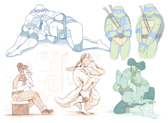
The driving force behind this style is me being lazy. My time, energy, and attention span are pretty limited, so if I want to finish anything, I gotta do it fast. And with fanart, I'm usually just doing it for fun and relaxation, so there's no need to push myself to polish it too much.
Despite that, I rarely post just black and white sketches or line arts. I always try to add at least a little bit of toning or shading, because that makes the image easier to read. The characters and their shapes pop out and catch the eye of the viewer better.
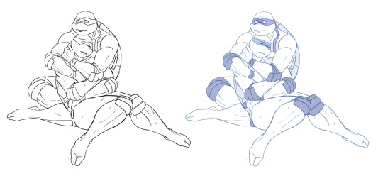
However, in this particular example, just the couple toning colors don't quite do the job. The way Don and Leo are entangled makes the center area of this illustration very busy and hard to read.
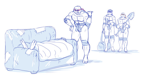
As a comparison; this pic has only one tone + mask colors, and it works. This is because all the characters are standing separately and their poses are very stationary and simple.
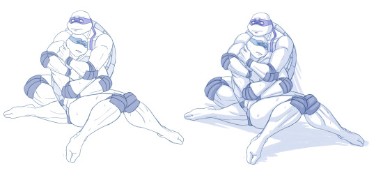
So for the Don + Leo pic, adding some shadows helps in bringing out shapes and depths. Also in general, if you don't feel like drawing BGs, it's good to at least add a shadow below the characters. It grounds them and makes them feel like they exist within a space.
Sometimes if the posing looks too complex and busy, it might just be best to color in the characters fully.
However, even if I do full flat colors, I tend to use a lighter palette. Putting characters in their neutral/default color on a white BG can look a bit jarring as if they're floating in a void. It feels less immersive and like the picture is unfinished.
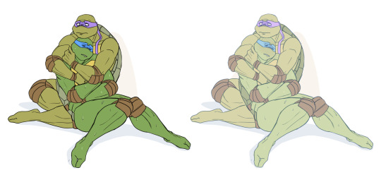
Using lighter colors makes the image more cohesive, and fits the characters into the white environment a bit more naturally.
If I'm too lazy to draw a BG, I prefer using stylized and limited colors. It feels deliberate and that the whiteness is just part of the palette, whereas the character-accurate colors on white don't match as well, even if they're more pastel.

That being said, there's nothing wrong with just slapping the flat-colored characters on a white background. As you know, I do it too. I'm just exposing my 'fancy coloring style' for what it is; me being lazy, hah!
Limited and monochromatic palettes are a nice shortcut even when you do actual backgrounds. It's faster and you don't have to worry about clashing colors. And you can still convey atmosphere and mood.
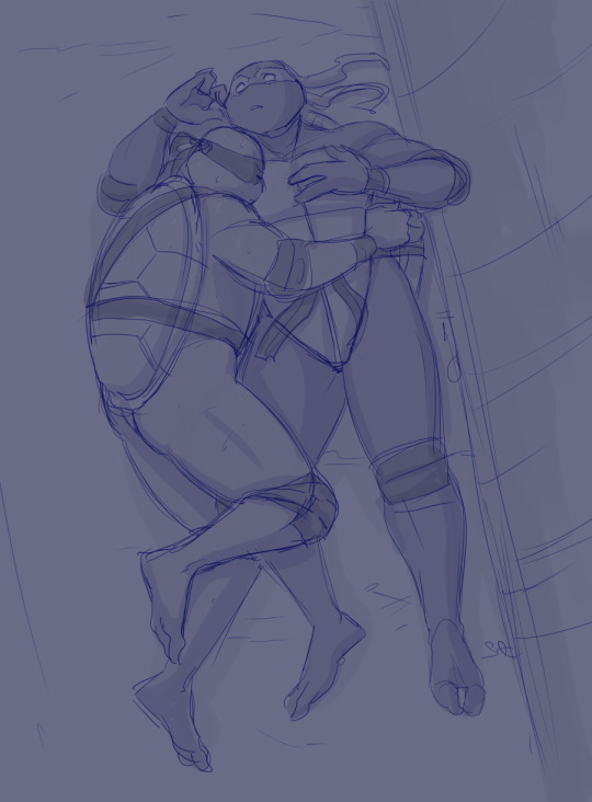
Also, on the topic of conserving your time and efforts; I think it's very common among younger/less experienced artists to think that the amount of time you spend on your art piece = how good and well received that piece will be.
Which has some merit to it of course, but it can lead to putting too much effort into areas where it's not necessary. E.g. filling the piece with tons of details and clutter that don't serve an actual purpose, but rather make the image hard to read. Or doing really complicated shading for a meme/comic, where simplicity would deliver the joke better.
So whenever I'm drawing something I intend to publish, whether it's a quick doodle or a more polished piece, I try to follow these two principles: Make it easily readable and do the bare minimum that needs to be done to convey what I want to convey.
Putting time into practice is important, but if you draw for work, it's also crucial that you know how to prioritize and use your time efficiently!
Anyway, thanks for reading! In the next part I'll go into how I do my fully colored pieces, so stay tuned for that!
186 notes
·
View notes
Text
Bestiaryposting Results: The Maritime Finale
This is definitely the last one of these, as it's rounding up a bunch of sea creatures I've missed. I assume by this point everyone who sees this knows what it's about, but just in case: https://maniculum.tumblr.com/bestiaryposting. (I'll get the rest of the entries on there soon.)
The entry people are working from is here:
The one for next week does not exist. (Also I apologize if I seem rushed, this is a busy week for me.)
Art below the cut!
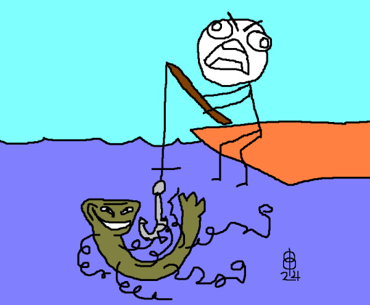
@pomrania (link to post here) has us off on a weird start with their interpretation of the Fatrihrukh. I don't have any particular nostalgia for rage-face comics (I was online during that era, just not in circles where they were common), but honestly this made me smile. Also I like imagining some fisherman on a dock, still sitting in a normal pose and holding his fishing rod, just full-throat screaming at the sky, apparently apropos of nothing in particular. This is a fun one, is what I'm saying.
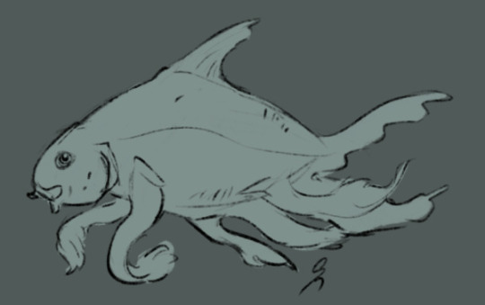
@silverhart-makes-art (link to post here) has an uncanny ability to make me think, "sure, that looks like an animal that could be real" even when they're drawing something like Fish With Tentacles, which I am 99% sure is not a thing. Though if fish did have tentacles, they would look like that. This is of course also the Fatrihrukh; apparently people like that one.

@cheapsweets (link to post here) has done the whole set. A lot of these turned out really well -- I think the Ormlalaehr is stealing the show here, but the Bursgaenga is pretty darn cute. The linked post has details on each of them, which I recommend checking out. (Also thank you for providing alt text.)
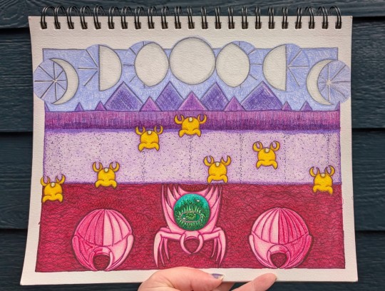
@wendievergreen (link to post here) continues to impress with their delightful art style. Love the little space-invader Magtlegyegs, and the Lungyoggeas are just... wild. Extremely cool looking. (Also, thank you for providing alt text.)
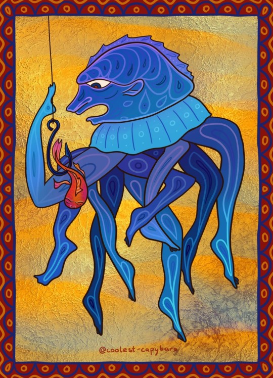
@coolest-capybara (link to post here) joins the broad consensus that if you're only drawing one of these, it's the Fatrihrukh. I love the (medieval-art-appropriate) choice to give it human-like parts since the entry doesn't say otherwise. The colors are also really pretty; I like the effect on the background.
Okay. Aberdeen Bestiary. No illustrations for this one -- this whole section is just blocks of text.
Ahrmegyaeb
The wording is ambiguous as to whether whales and dolphins also do this -- but the creature in question is the seal. I have no idea how this works; either baby seals are way smaller than I think or I have completely the wrong idea about how seal mouths look.
Bursgaenga
This one is of course the scarus or escarius, which does not exist. Bestiary.ca notes that Scarus is a genus of parrotfish in modern taxonomy, and that the Rackham translation of Pliny the Elder has decided they are wrasse. No idea how well that reflects medieval understanding.
Chraekhret
Another one that doesn't exist, the echenais. Apparently Pliny has heard of some magical applications in love-charms, litigation, and obstetrics. The fish that anchors ships is a good addition to a fantasy setting, I think.
Dhrakyetor
Naturally the fish that looks like a serpent is the eel. More spontaneous generation, too, which is always nice. I swear I've heard that "giant eels in the Ganges" line somewhere before, but can't place it.
Eavbechtgi
Here we have the lamprey. I kind of wonder if this "head vs. tail" thing has something to do with its unusual head shape?
Fatrihrukh
Honestly I probably should have redacted the "many-footed" thing, because the name given is polippus, which... yeah, that actually tracks. I thought maybe this was the result of someone not bothering to actually count the limbs on an octopus, but it's apparently an obsolete umbrella term for octopus, squid, cuttlefish... all manner of tentacled cephalopod.
Griggkhraz
This is the torpedo, which is some fun etymology. The modern usage of torpedo is inherited from non-self-propelled naval mines, which were named after this torpedo, an electric ray. (Presumably they named mines after it because it hides itself & zaps you if you accidentally step on it.) The rays were named for their effect on people whom they zap: torpidus, 'numb'. This is of course cognate with English torpid. Which is a strange word to be cognate with the thing you shoot at boats.
Also:
...if a torpedo from the Indian sea is touched by a spear or rod, even from a considerable distance, the muscles of the fisherman's arms, even if they are very strong, grow numb...
Would that work if it were a metal rod?
Hretchngin
This is the crab. I did not know all of that about crabs, especially the basil thing.
Khaboghrad
Meet the sea urchin. That's why it specifies "the maritime kind" -- the other kind of urchin is a hedgehog. I don't know why the author calls it "worthless and contemptible", especially since they go on to say it can do this really cool thing. Just seems unnecessarily mean.
Lungyoggea
This one is just shellfish. All of them, apparently. The words given are conca and concle -- Latin concha covers shellfish in general.
Magtlegyeg
Naturally the pearl-bearing shellfish is the oyster, but I love the imagery of oysters going ashore to be fertilized by dew from heaven. The idea of going out at night to watch the oysters migrate onto land and catch the dew is another thing I'm taking note of for a fantasy setting.
Nolthrigyo
Someone probably clocked this one: it's the murex snail, source of the famous "tyrian purple" dye.
Ormlalaehr
Really pushing the definition of "fish" here is... the tortoise. Technically also the turtle, I guess, since the author specifies that this includes land and sea varieties. This is, I think, one that makes total sense once you know what it is, so we're moving on to our last one, which is also really pushing the "what is a fish" envelope...
Riggmungku
This is the frog, also obvious once you see it. The fact that it's being called a fish really throws you off, though, I think.
And that's the whole lot. This has been fun, but I'm also glad to have it completed. (Well, completed with the exception of any responses to this one I've missed or that came in late.) Thanks to everyone who's been looking in on this project -- thanks doubly to everyone who contributed -- and thanks triply to the handful of people who drew something practically every week.
#maniculum bestiaryposting#maniculumsneakyseabeasties#Fatrihrukh#Ahrmegyaeb#Bursgaenga#Chraekhret#Dhrakyetor#Eavbechtgi#Griggkhraz#Hretchngin#Khaboghrad#Lungyoggea#Magtlegyeg#Nolthrigyo#Ormlalaehr#Riggmungku
45 notes
·
View notes
Text
(I'd like to take just a brief break from my regularly-scheduled rants)
Let's just cut to the chase here: this might be the greatest tarot deck of all time 💯
Honestly, you should just go ahead and buy it now - but I suppose you can read the review below if you really want to 😂
The Victorian Faery Tarot
by Lunaea Weatherstone & Gary A. Lippincott

The Boring Background Info:
So I'm going to be saying a lot of positive things here, and I want to make this clear: I'm not like being paid or anything, and I don't know anything about the creators. But I just am really loving this deck, and I want other people to know about it.
I'd known about this particular deck for a long time now. It was originally published by Llewellyn in a slightly different version, but it was tragically hard to find so I had to give up.
One day I looked it up again, and found some good news and some bad news: there was a highly-successful Kickstarter campaign to reissue the the deck in an improved form... but the campaign had already ended.
Well, to make a long story (slightly) shorter: I had to wait a bit, but now I finally have my deck. And wow. It was worth the wait.

All the Extra Stuff:
This deck really comes with a lot of extra stuff. And it is very high-quality in my opinion. Let's see:
10 postcards ✉️ - Mainly for decoration rather than mailing, I'd imagine. That's certainly how I intend to use them. I think my favorite might be the one with the bees.
Scarf 🧣 - Honestly I'm not 100% sure what the correct term for this is. But you probably know what it is: it's the decorated piece of cloth that you put down on the table, which you traditionally do the reading on top of. The design is quite detailed and incorporates art from all 22 of the Major Arcana cards.
Blank Journal 📓 - A neat little thing. Ostensibly for your field notes whilst out hunting faeries. It has a nice aged look to the cover and the pages, and a proper stitched binding (I don't like it when people just use some cheap staples). And the most interesting part is that the pages are printed with very faint illustrations that really do look like hand-drawn pencil sketches.
Guidebook 📕 - Probably the standout star here. It's hardback, with a detailed, embossed, gilded design on the cover. The inside has full-color illustrations of all the cards. It provides a nice quick introduction to some relevant topics, such as the widespread belief in faeries during the Victorian Age, and the complex symbolism of flowers from that era. And rather cleverly, instead of just describing the simple details of each card in minute detail, the book instead packs in some background faery lore for each card. This is particularly helpful for various historical elements or folkloric details that modern folk might miss. For instance, if I'm being honest, I might not have recognized the large device featured in one card as being an old-fashioned cider press, or the stick-wielding men on another card as being part of a "morris dance." In this way, the guidebook is helpful, informative, and just very interesting.
All together, you really get the feeling that the creators took things seriously. They really set out to create a deluxe edition here and they clearly refused to cut any corners whatsoever 👌
Oh wait.
We haven't even gotten to the cards yet, have we? 😅

The Cards
Wow. There is a lot here.
Okay, so you receive two decks - a standard sized deck and a small pocket deck. I really appreciate this because I love to have a little deck in my pocket when I go out. There's just something really neat about having a whole stack of artwork that you can look through whenever you want. 👝
The quality is excellent - no surprise there. The edges are gilded, the art is beautiful and goes all the way to the edge. The shuffle well, are easily bendable - just what you want. 🃏
Now the concept behind the cards is both simple and brilliant. Instead of the normal tarot suits, it uses the four seasons. So you end up with cards like the "Six of Autumn" or the "King of Winter." ❄️
And besides just sounding cool and giving each suit a nice theme, it also makes a lot of sense. People have long noticed similarities between the calendar year and various card decks. Have you ever noticed how standard playing cards have 52 in a pack, and there are 52 weeks in a year? Things like that. 🗓️
But curiously, as far as I could tell, no one seemed to ever take these concepts to their logical conclusion and design a whole deck around the seasons - until this one, that is. 🍂
The art is gorgeous and detailed as well - the art of Gary A. Lippincott is much-beloved, and for good reason. It has a personal feeling behind it, as though the subjects really are all individuals with their own unique personalities and quirks. And the impressive detail obviously is well-suited for subtly hiding symbolic meanings in plain sight. 🎨
And speaking of the symbolism, each card is absolutely packed with meaning. It helps that most of the cards depict a full scene with multiple characters, which lends itself to analysis. For instance, when you see a group of faeries running around frantically, tripping over one another - it seems natural to interpret that card as dealing with stress, rushing, feeling overwhelmed, etc. 🔮
Really, every single card is a gem. And as much as I'd like to just drone on and on about them all, I worry that I might already be losing your attention, hah... 😓
Listen, you don't have to take my word for it. Look up what other people are saying, and I think you'll realize just how spectacular this deck is. ⭐
And if you are interested, you can find it right here:
The Victorian Faery Tarot
#fairies#wiccablr#paganblr#tarotblr#witchblr#victorian era#fairy aesthetic#fairycore#wicca#faeries#fae folk#fairy#victorian art#victorian aesthetic#pagan witch#seasons#faerycore#fairy art#celtic#faerie#tarot cards#tarotcommunity#tarot#tarot deck#witches#artwork#tarot review#folklore#product#illustration
6 notes
·
View notes
Note
Hey there!
I love how you draw backgrounds, and I was wondering what your process for that is?
ahh i'm almost not sure how to answer, i feel like i haven't done a proper background in a while!
i think the most important part is to go into drawing a background with its purpose already in mind. even if you're not drawing a dedicated background, and it's just a backdrop for your characters, there should still be a reason why it's there. like, maybe the character(s) are interacting with it (leaning against a door frame, sitting in a chair, having their hair swept by the wind), maybe it provides a certain dramatic lighting that you want the character(s) to be cast in, maybe it adds a physical barrier between two characters who really need to talk something out, etc.
i feel like this is much easier in a comic because 9 times out of 10, the background is already woven into the setting and movement of the scene so you already know what you need from it, but you can also do the same for a single illustration. if i know i want a character to be shelving a book in a bookstore, and to have a ray of morning sunlight come in from the right that just catches the edge of her face and her neck, then I know that I need to draw a bookshelf near an implied window, and then maybe a few more books that she hasn't shelved yet, another bookshelf or two to imply there's an abundance of them, and then a few things i think a bookstore would need to have: a checkout counter, the counter is by the entrance/exit, the entrance/exit has large glass windows, additional light is coming in by the counter.
after i decide what elements i need in the environment, i sort out how i'm going to separate those elements out into layers--foreground, midground, background--and then i start working on composition. i value composition right after context because even if you can draw an environment with technically correct perspective, if it lacks a pleasing composition that completes the piece, it just feels dissatisfying. of course it's nice to have both a pleasing composition and correct perspective, but if i had to sacrifice one i would always sacrifice perspective. composition is hard to give tips on, because all i can really say is rule of thirds, feel it out, trust your gut, do your best, and remember that color and lighting affects composition too so try to plan with those in mind as well. at this point i usually try to start a color sketch and add in all the lighting effects i had in my head in order to get a full picture of the environment so far, so that i can judge if the composition & the colors work well together or not.
for coloring, i start by coloring everything its base color, which means the background starts out looking very flat. you can add depth into this base--and i sometimes do by just adding a few washes of darker color using normal mode layers--but for my comic backgrounds i actually prefer to add depth by relying on the lighting that i apply through layer modes, to keep my layer count down. for lighting, i like to stick with one main source of light that i can use to justify glowy highlights, and then i'll use a soft brush to airbrush some ambient light in the background. i'll mess around with my favorite layer modes, like multiply, linear light, and add glow, and i'll also try to have different gradients of light going in the foreground, midground, and background to maintain some contrast and depth between them. sometimes, if you're pushing something further into the background, and you're tempted to add more shadow and make it darker because you think that'll push it back, the right move is actually to focus on reducing contrast. like, if you look at a landscape, the hills in the far distance almost just blend into the sky; it's objects that are close to you that have the most distinct shadows and high contrast.
as for perspective, you can always fudge perspective, and should feel free to mush and squish it around if it benefits other aspects of the piece (composition, eliminating tangents, symbolism, whatever). messing around with it too much can break the illusion (unless your style completely supports that), but a little bit is healthy. everyone has an innate sense of perspective, and as long as that sense says "yeah feels good to me," then you don't necessarily need to pull out the formal perspective tools for every single background. a huge part of faking perspective without many tools is just to get so familiar with different angles that you can just toss them out on demand, and for that you can study a bunch of photo refs of different angles from real life, or you can do what i did and get a freecam mod for your favorite game and fly around taking screenshots of environments of interest from different angles.
23 notes
·
View notes
Text

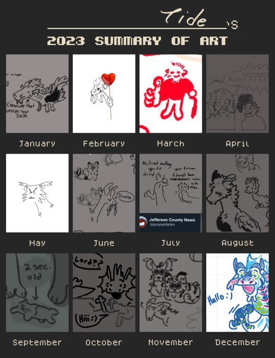
HAPPY NEW YEAR EVERYPONY ! ! Here’s some art summary thangs <3 ! Template is by Mintcokev on DeviantArt !! I did one of full pieces and one of Sillay Doodles
Explanations of every piece & stuff is below read the readmore ! + links to the full work if its posed online !
First Template:
January -> This Sora Piece ! I am honestly still super proud of how it turned out , it was fun to work on and looking at it still gives me that nice vibe I was in while drawing it
February -> This headshot of my OC Elk! I developed and expanded on her story this year and did some headshots for their TH, still super proud of how the shading came out here ,,
March -> lmao nothin , not sure what happened in March but I dont have anything there aside from sillay Doodles
April -> This design of Blaze! One of my fav designs I’ve done recently .. shes just so sillay To Me
May -> This piece of my friend and I’s cat ocs ! Stickpaw & Frostclaw, two silly fellas <3 something possessed me here I’ve never drawn a kibby this well since and Im still super proud of this
June -> This reference of my oc Dee!!!! ITS DEE ! ! EVERYONE SAY HI TO DEE <3 ! ! ! ! ! I was so happy to finally give her a proper ref , shes one of my favorite ocs of all time and this came out so well , it looks so much like her!!!!
July -> This artfight attack! This piece was honestly just a blast to work on, the background and frame design and expression were all fun to illustrate
August -> These refs of my lomp ocs! Lomps are fictional guys made by my good friend and August was just the Month for them. These guys are (bottom to top) Fizz, Roe, and Skipper! They’re . Normal <3
September -> This piece of my fursona Kenny ! ! Just a fun piece to work on again, the colors came together way better than I thought they would
October -> This piece of my oc Houndcall! They’re feeling normal about their leader being possessed! This was like a weird experimental painted piece and ou .. I really loved working on it I wanna do more things with that method
November -> Not posed online! Surprisingly, this is a wip of a self-portrait I’m doing for class! Fathead Minnows and Rainbow Trout !! This canvas is massive (taller than me ,, which aint much but still!!) and I’ve been cracking at it for a while but hammered out the details of the trout in November so! It’s acrylic but I really wish I could’ve done oil instead .. acrylic dont blend well
December -> The final fella ! My idiot son ! Also not posed online , this is a linocut printed on hand-made paper! Fun fact, I make my own paper and my own Lino cuts as my main medium, I just cant afford the proper transfer ink, but I got some from school to use so ! My idiot dragon linocut son was born ! I hate him because he wont print proper but this piece ended up working out. Its lino-ink on handmade paper with red micron pen over it
Second Template:
January -> DNA Helicase
February -> Valentine’s Day Gift <3 !
March -> Not (publicly) posted online doodle of my epic oc Anton Bayheart giving his grandson a thumbs up :)
April -> Not (publicly) posted doodles of my ocs Sebastian (left) and Dee (right) (you saw her ref earlier <33) having a normal convo !
May -> A shot from This video of my friends ocs … the one depicted is Quickpaw <3
June -> Not posted doodle of Breezewhipser giving Rippletooth some good advice (it was not good advice) (ripple just learns hes aro)
July -> Not (publicly) posed doodle of my Oc’s Garret (BALD) and Benny (TIRED) . Also just two normal guys (they’re divorced) (and obsessed with eachother)
August -> This doodle of my ocs Savi & Skipper (Skip’s ref is in August first template <3) . Music taste
September -> a small part of this cat sketch page ! Beetlekit getting bullied by his cousins
October -> This doodle of Skipper . I appreciate him
November -> I dont know where this came from actually. Its my friends oc’s Redstone and Bumblebuzz staring kitty-like at my oc Specklestep (she is married to Red and Bumble is their daughter)
December -> Doodle of Tide from this whiteboard ! !
Have a great new year everyone ! ! ! Thanks for reading through all that if you did lmao
#Its new years in Germany so uh . hiiii ! ! ! happy ‘24 !!! thank you to everyone whos been fallowing me despite the lack of art !! ! im#super greatful to have met and interacted with so many amazing artists and people through this account ! ! ! !! hope everyone has a lovely#new year ! !#HAPPY YEAR OF THE DRAGON RAHHHHH#tideart
6 notes
·
View notes
Text
K-pop Discography Deep Dives: Girls Generation / SNSD (Part TWO)

Here are my credentials: So, I’m absolutely a fan of Girls’ Generation, although I’m in that weird space where I’m more than a casual one yet not quite a SONE (a full fan), but just like with Sunmi, I have a feeling that this deep dive will make me one. I’ve heard almost all of their title tracks, and a decent amount of b-sides, but since they have over 100 songs, I’m sure I’ll find some new ones to love too. I’m also a fan of both Taeyeon and Tiffany’s solo careers.

I’m going to take a quick intermission to discuss some of SNSD’s Japanese releases here, which I don’t normally do. Mr Taxi, with its heavy autotune and electronic background, reminds me of a female version of SHINee’s Ring Ding Dong. One of the things I enjoy the most here (besides the roller disco, of course) is that the chorus is given space to breathe when they could’ve cut it for time. Time Machine is a sadder, slower song, and in lesser hands, it could be a snooze fest, but Girls’ Generation’s great voices turn it into a bonafide power ballad.
Paparazzi, as mentioned before, feels like it arrives on a red carpet rather than simply starts with its “ooh la la la”, which is perhaps fitting for a song about fame that features a snippet from Singing In The Rain. This one is probably my favorite of their songs in Japanese; it definitely takes inspiration from disco in the best way, and had me shaking my shoulders and wanting to get a pair of cat-eye sunglasses. Flower Power too is disco, but with a darker synth spin that feels more distinctly Japanese action movie.
Love & Girls takes after SNSD’s cutesier early discography with its colorful styling, poppy background, free-wheeling anti-drop summer chorus, sharp whistles, and peppy ad libs. Beep Beep too follows this thread, but I was won over, as I often am, with its catchy inclusion of several different languages (Italian, Korean, Chinese, Japanese, and English) and fun comic book style illustrations. I also quite like its bridge and last chorus.

So, back to the Korean releases! Catch Me If You Can follows in the footsteps of The Boys and especially Run Devil Run. It has a surprisingly youthful and bubbly pre-chorus, that’s unfortunately followed by the mother of all anti–drops. Unlike in the other songs of theirs that have used one, though, Catch Me If You Can doesn’t do anything interesting with it, and ends up feeling like a dozen other songs. The post-chorus does help it, but overall the track feels incomplete.
PARTY sees Girls’ Generation dipping their toes into a summer fun track, which is new territory for their singles. It’s a little toothless when compared to such iconic and important tracks like Gee, I’ve Got A Boy, or Oh, but it’s still a fun time and it’s a nice break to see them looking so happy. It’s not ending up on my Top 10 list, but I’m not going to skip it if it comes up on shuffle.
Opposite from Genie, which I assumed was much later in their careers, I’d assumed that Lion Heart had been much earlier than 2015, though I’m not sure why. This time, they draw inspiration from doo wop, and turn it into a satire of midcentury love-at-first-sight rom coms. Besides the (as always) great clothes, the MV got some good chuckles out of me with its ridiculousness, over-the-top sound effects, and 60’s dance moves that look right out of a Get Smart episode.
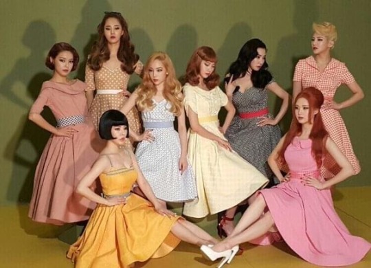
You Think is about as different from Lion Heart as it’s possible to get, with a far more “girl crush” image and a hip-hop beat mixed with synthpop. Funnily enough, I’d actually heard this song’s chorus before (“you think you’re real cool?” “You’re NOT!”), but I didn’t know it was an SNSD song, so that was a nice surprise. It veers a little close to an anti-drop, but thankfully avoids it by the skin of its teeth.
From the Lion Heart album, I really liked the venture into chill bossa nova in One Afternoon, the appropriately vaudeville-style flair and sudden speed-up in Show Girls (which was my hidden gem), the synthy fun of Fire Alarm, and the background guitar in Green Light.
Holiday starts with a guitar riff and an energy that doesn’t slow down to catch its breath until its 3-and-a-half minutes are over. It’s a lot of fun, and immediately makes you want to get up and dance with your closest friends, and besides that, feels like a nice summer vacation for Girls’ Generation too; a new and improved version of Party with a sunny beat straight off a Broadway stage. I enjoyed it much more than I expected to, truth be told, and it went right into my music library.
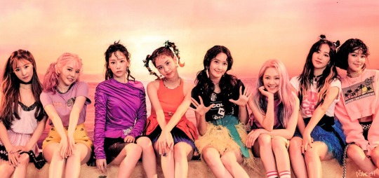
All Night is the second single from the album, and, although it’s also a dancefloor track, it takes a more minimalistic, sleek approach. The chorus, though I did like it, felt a bit out of left field to me with its tempo change, and the rap likewise didn’t quite fit, but overall I liked this one too, especially the bridge. It’s always a pleasure to see drag queens covered in sparkles on my screen, alright?
From Holiday Night, though I did like the dancefloor citypop of Fan, the expert mix of happy and sad in One Last Time, and the jazzy flair of Love Is Bitter, you can’t do much better for a hidden gem than the confident, movie-soundtrack worthy, anthemic Girls Are Back, which I think perfectly captures the magic of SNSD. Can you really beat “we’re gonna break some hearts tonight, we’re gonna make some noise tonight?” Nope.
Lil’ Touch isn’t exactly a Girls’ Generation song, as it was released with only five of the members, but it’s basically considered one, so I included it. As their discography goes, it’s not the most unique, but it’s still quite solid. Part of that is due to the girls’ vocals, of course, which elevate whatever material they have, but the chorus is genuinely catchy and got stuck in my head. I think that if it wasn’t up against such heavy hitters in their other singles, it would be more highly regarded.
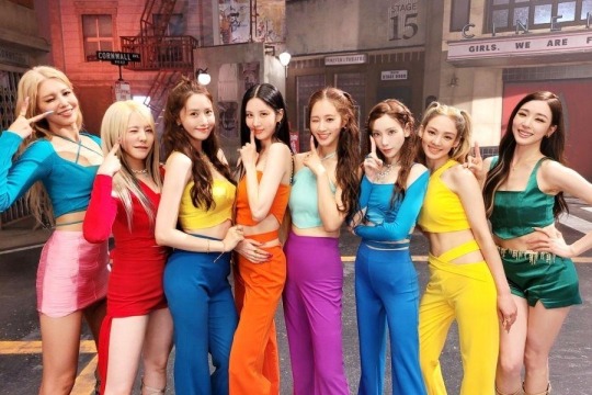
Besides Lil’ Touch, Forever 1 arrives both five years after SNSD’s last comeback and exactly fifteen after their debut with Into The New World, and arrive it does. This was the song that made me a fan of Girls Generation, and for good reason. From the “we’re not stopping!” to the utterly, delightfully sappy profession of love both to their fans and to each other to the “I will love you in my next life”, Forever 1 is a gleeful celebration of friendship and a decade and a half spent in an industry almost impossible to succeed in. Really, it’s everything I love about k-pop in one song, so how could I not love it?
From Forever 1, the album, I wasn’t sure what to choose as a hidden gem. There’s the nostalgic Seventeen, the fast-paced beat of Villain, the chill synths of Paper Plane, and the constant genre shifting of You Better Run (which harkens back to I Got A Boy). It’s a very strong return. Lucky Like That wasn’t technically a single but BTS footage was released as a special video to mark Girls’ Generation’s 16th anniversary. It’s a pretty standard pop song, truth be told, but with the video, it's undeniably charming and made me feel undeniably nostalgic. It was great to see them all smile and have fun performing together, and I wish more groups would have videos like this. I saved it for last, and it was a great place to end.
My Top 5 songs are Into The New World, Hoot, Lion Heart, Top Secret, and Girls Are Back with Show Girls, Love Is Bitter, and Goodbye as honorable mentions. Girls Generation gets a 9.25 out of 10 from me, which I’m not surprised about. There’s a reason I wanted this to be my first review of the new year, and it wasn’t just because they’re a huge group, but also because I had a feeling it would be a lot of fun.

(Please enjoy this photo of the girls celebrating Tiffany’s birthday a couple years ago!) Next time, we’ll be back to our regularly scheduled programming with a one-week boy group. I’m excited about this one, so I’ll see you then! Tchüss!
#k-pop#review#k-pop deep dive#k pop girl groups#yoona#yuri#seohyun#Tiffany young#Tiffany#Taeyeon#Jessica#Jessica Jung#Sooyoung#sunny#hyoyeon#girls generation#snsd#forever 1#into the new world#paparazzi#holiday#all night#party#catch me if you can#Spotify
6 notes
·
View notes
Note
I love seeing more of your traditional work!!! luv ur digital art too, but ur traditional stuff has such nice texture and bite to it. it's got a different flavor to it, it's neat to see :]
just curious, but besides the obvious, do you approach your traditional process differently to digital work? is there anything you prefer doing traditionally vs digitally, or vice versa?
aw thank you! happy to hear so, its been nice to get back into traditional again. knowing theres a different flavor to it thats fun to see for others is a relief too HAHA
to answer your question - yes and no lol. theres definitely aspects of my process that remain somewhat similiar (i like to work on one layer digitally if i can) but the biggest difference are the limitations that come with the traditional one. i dont have all that many materials on me! so it forces me to work with limited palettes etc. my biggest concern is usually settling on, depending on the materials, how to make the illustration pop with just 3-5 colors and ink. also, and i know its something a lot of ppl dont like, but i love how traditional forces you to roll with mistakes. i fuck up a lot lol but making it work in the end is part of the fun, plus it adds character!
overall i prefer digital for full complex illustrations, especially with a background or where id play with perspective. theres a lot of tools that can help streamline the process there. having a full spectrum of colors to work with is nice too
i LOOOOVE lining and inking traditionally. its so fun. its where my art started and i love coming back to that!!! i can never get the same type of lines digitally no matter what i try, which made me gravitate towards digital painting instead
theres times where i combine the two processes too :] traditional x digital combo artworks are also really fun
#thanks for the lovely ask!!!! sorry if i ran my mouth a lil too much lol#I LOVE ART BRO...#;not drawn#;answered#anonymous
5 notes
·
View notes
Text
Director's Commentary:
First of all, THIS HIT 200 NOTES IN LESS THAN 2 DAYS????? 🥺💝🥺💝🥺💝🥺💝 Thank you SO MUCH EVERYBODY, I have never had any of my self ship art get this many notes this quickly!! I've also screenshotted every tag I've gotten and will continue to do so! Thank you so much everyone 🥺💖🥺💖🥺💖🥺💖
Second, I hope that everyone knows I did this 100% original! I have actually had more than one person call this an edit, which makes me very proud of how convincing this apparently is as an imitation of the PPG style! 🥺 But no, I did all of this by hand myself! The screenshots were just referenced :D
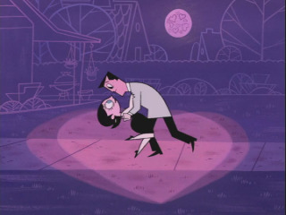
Y'all should also know that I don't have any type of tablet or way to do digital art with a pen, I use Adobe Illustrator and only use my mouse. For the first image I did a sketch of the pose on paper and traced over digitally, but I'm proud to say for the other two I did it entirely originally using just reference images and my own imagination! That's something I'm usually not really able to do so I'm very happy that the final result came out so good
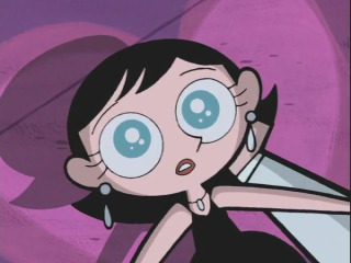
The context of the original scene is that Ms. Keane and Professor Utonium just went on a failed date that was set up by the girls, but ended up sharing a little moment after Ms. Keane accidentally tripped and the Professor ended up catching her. I'd like to think the context here is essentially the same, but I'd consider it an AU scenario because there wouldn't be a time in my ship canon where this setup would happen before Cherry and Mojo are dating.
I came up with Cherry's outfit kind of on the spot, it's basically just a fancy version of their normal outfit, with a low cut white shirt, yellow and orange cardigan, and some nice tan boots. They borrowed the choker with the pendant from their cousin, Ms. Bellum :3
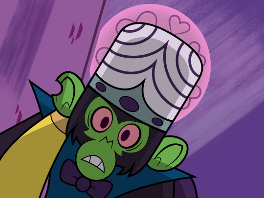
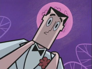
I find it funny to think that Mojo wouldn't really wear an actual outfit out on a date, because in his mind, what fit could possibly be better than the villain outfit he designed for himself? He just put on a bowtie to be slightly more fancy 💖 That's actually a reference to the panel below from a DC PPG comic where he's trying to find a date for Valentine's Day and failing... I would have been there for him 🥺

Also I liked the idea of the moon being bright enough to shine through the back of Mojo's big ears, which is why the shading on them if a bit oddly shaped. No one has mentioned anything about that yet so I'm not sure how obvious that came across 😅
Ngl I struggled a bit on the background of Mojo's panel just because it's a unique perspective that I hadn't tried before, so I went and laid down on the floor in the corner of my room to see how the perspective of that looked 😂
In fact now that I think about it... This is the first time I've ever done a full color background at all, digitally OR traditionally. I'd say for my first time it came out pretty good!
In general I'm very happy with the end results, although there are a few mistakes here and there, like there's a secrion of Cherry's shadow that's not filled in all the way, and I think some of the background colors could be better adjusted so they don't blend together as much (especially the bench, what was I thinking making it so similar to the wall color aaaaaah)
That's all I can think of for now that I'd like to comment on. Once again thank you to everyone who has liked or reblogged and an even bigger thank you if you read this far! 🥺💝💝💝💝💝

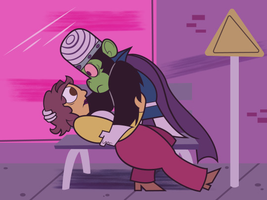
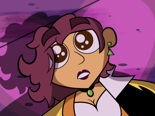

There are benefits to being clumsy... sometimes you get to fall into the arms of a handsome chimpanzee 💜🩷💜🩷💜
Screenshot redraw of a cute scene from what's basically PPG's Valentine Day special! This was so fun to do, I feel like I learn more abt using Illustrator every time I go back to it :3 🩷 Reblogs are all seen and appreciated, click for higher quality!! Tag list + Screenshots referenced will be under the cut 💜
Tag List!! Click here to be added or removed.
@absentmoon, @avas-wonderland, @bee-ships, @beetleboyfriend, @berryshipbasket, @bugthecalmchild, @canongf, @cloudyvoid, @derelictdumbass, @dissonantyote, @edencantstopfallininlove, @final-catboy, @chickenout , @flowering-darkness, @gibles-lovely-selfships, @hoppinkiss, @hyperionshipping, @impulse-exe, @iwishihadfangs, @iyamifucker, @kissingarthurclaus, @lex-n-weegie, @lficanthaveloveiwantpower, @little-miss-selfships, @little-shiny-sharpies, @loogi-selfships, @mandrakebrew, @midoridayz, @mintpecks, @mothfinite, @mrs-kelly, @nameless-self-ships, @nerdstreak, @odysseyyaoi, @oleanderspride, @orbitingaroundyourlove, @paper-carnation, @reds-self-ships, @rotten--cotton , @spacestationstorybook, @squips-ship, @theheroand, @toogayforthistoday, @winterworlds, @yuzuibanagi
#self rb#happy valentine's day!! i just wanted to drop some details about this art and fun facts that y'all might not have known just by looking#the response to this has been just incredible seriously thank you all so much 😭💝😭💝😭💝😭💝😭💝#i still cant believe this is the first time ive done colored backgrounds and it came out this good. yay me! 💝💖💝💖💝💖#once again happy v day everybody hope the day treats you well 🥺💝🥺💝🥺💝🥺💝 mwah mwah love for everyone!!!! 💝💝💝💝💝💝
254 notes
·
View notes
Text
Naughty Girls Get Nice Gifts SVG, Betty Boop Christmas SVG PNG, Cricut File, Instant Download File, Cricut File Silhouette Art, Logo Design, Designs For Shirts. ♥ Welcome to SVG OCEAN DESIGNS Store! ♥ ► PLEASE NOTE: – Since this item is digital, no physical product will be sent to you. – Your files will be ready to download immediately after your purchase. Once payment has been completed, SVG Ocean Designs will send you an email letting you know your File is ready for Download. You may also check your Order/Purchase History on SVG Ocean Designs website and it should be available for download there as well. – Please make sure you have the right software required and knowledge to use this graphic before making your purchase. – Due to monitor differences and your printer settings, the actual colors of your printed product may vary slightly. – Due to the digital nature of this listing, there are “no refunds or exchanges”. – If you have a specific Design you would like made, just message me! I will be more than glad to create a Custom Oder for you. ► YOU RECEIVE: This listing includes a zip file with the following formats: – SVG File (check your software to confirm it is compatible with your machine): Includes wording in both white and black (SVG only). Other files are black wording. – PNG File: PNG High Resolution 300 dpi Clipart (transparent background – resize smaller and slightly larger without loss of quality). – DXF: high resolution, perfect for print and many more. – EPS: high resolution, perfect for print, Design and many more. ► USAGE: – Can be used with Cricut Design Space, Silhouette Cameo, Silhouette Studio, Adobe Illustrator, ...and any other software or machines that work with SVG/PNG files. Please make sDisney Father's Dayure your machine and software are compatible before purchasing. – You can edit, resize and change colors in any vector or cutting software like Inkscape, Adobe illustrator, Cricut design space, etc. SVG cut files are perfect for all your DIY projects or handmade businDisney Father's Dayess Product. You can use them for T-shirts, scrapbooks, wall vinyls, stickers, invitations cards, web and more!!! Perfect for T-shirts, iron-ons, mugs, printables, card making, scrapbooking, etc. ►TERMS OF USE: – NO refunds on digital products. Please contact me if you experience any problems with the purchase. – Watermark and wood background won’t be shown in the downloaded files. – Please DO NOT resell, distribute, share, copy, or reproduce my designs. – Customer service and satisfaction is our top priority. If you have any questions before placing orders, please contact with us via email "[email protected]". – New products and latest trends =>> Click Here . Thank you so much for visiting our store! SVG OCEAN DESIGNS Read the full article
0 notes
Text

Cover Critique — The Boyfriend Candidate, by Ashley Winstead.
Reading Status — Have not read. No interest in reading.
We wanted to go over this one because it's entirely outside our zone of genre preference, but it is technically competent enough to draw some respect.
Story Suitability — I can tell what genre the book is at a glance (contemporary romance,) I can tell that it's wlm, I can feel the "US politics" theming at play here, and I know what the main characters look like. Without reading the book and knowing if the art matches the character descriptions, I can't get a full read on it, but it seems to suit the story fine.
Text Display — The use of fonts is pretty solid here. There are at least two fonts in play here. Firstly, there's the basic serif. A thinner weight of it is used in the quote, and a bolder weight is used for the titling, distinguishing the two. Then we have the display font for "boyfriend," bringing in a nice pop of interest right in the title zone. I like the tilt.
I might(?) move the "the" in the title down a little bit. And I would definitely change the pink behind "boyfriend" from that near barbie-pink to something rosier that would match the red accents everywhere else.
The pink is my biggest gripe here. Why does that color show up only once in the whole cover? The text shadow is a fine point of interest even without deviating from the base palette, and using pink specifically feels a bit too on the nose for a book that obviously has a pinkmarket demographic. If you want the pink to stay, then there should be pink accents in other places too.
Illustration — Decent. The color choice are good, and I like the texture in the details and around the edge of the solid coloring. The downside of this is that the density of detail concentrated in the faces makes the flat coloring feel empty in other parts of the body.
I'm not sure if I like the linelessness around the edge of the characters? It is pretty conventional for its genre though.
As for anatomy, the man's right arm is a little awkward (too short, even for foreshortening), and the woman's left wrist looks a little broken. But it takes some looking to notice that.
Overall, it's not my thing. But it is serviceable!
Layout — I'm not the only one who's noticed a recent trend in contemporary romance covers looking like they were put together in Canva. A lot of books lately are content to space a title out across a monocolor background and paste little sticker-looking pieces of artwork around it. It's a bland trend, if I'm being honest. But that's just how art works under late-stage capitalism baby!
Relievingly, this cover tries a little harder than that. There's an actual structure to the elements.
You're likely to look at the art first, since it takes up the most space and has the most detail. Then the size of the title draws you in. Then you're likely to glance up at the quote, which is right by the title and has a dark color that distinguishes it from the background. Then if you're invested, you'll probably check out the author name.
It's a simple vertical layout, but simple can be effective. And it's certainly more coherent than just dotting elements on like magnets on a fridge.
Personally, I might think about giving the background a subtle gradient to make it feel less flat, and to draw attention down to the couple. But that's a matter of personal taste. It's fine as-is, especially with the star details helpfully adding texture to the blank space around the illustration.
Verdict — Better than a basic Canva cover!
1 note
·
View note
Text
Eeeeeeeeeeeeeeeeeeeeeeeeeeeeeeeeeeeeeeeeeeek! I’m completely blown away by this incredible piece of fanart! It really was such an amazing and unexpected surprise—it totally made my day! I had no idea that the question you asked was a sneaky way to gather info for fanart. 😁 I’ve always loved getting questions in comments because it gives me a chance to dive deeper into the worlds I create and chat about all the little details that don’t always make it into the final story. So, getting to answer a question was a treat in and of itself.
I know I’ve told you before, but knowing that something I shared inspired you to create a piece of art is just the best feeling ever and makes me want to start working on the next chapter ASAP. (Which I will do once I’m done here because I’m bouncing around grinning from ear to ear right now and all excited about the next chapter.) It’s like a creative loop where we’re feeding off each other’s energy and ideas, and I absolutely love it. 🥰
I can't express how much I love all the details you put into it. First off, Dean and Cas look absolutely adorable together. The way you captured their dynamic fits that scene perfectly. It’s the perfect mix of tension, affection, and underlying emotions. I’m always in awe of how you manage to bring that across. It’s spot on. Dean’s confident, almost teasing demeanor contrasts beautifully with Cas’ more uncertain, wide-eyed expression, and it fits the moment from that scene so well.
Dean is all self-assured, the hint of a smirk playing on his lips, leaning in like he knows exactly what he’s doing (even if he might be winging it a little), while Cas has this deer-in-the-headlights expression.
The positions/ body language here is everything. With Dean on top of Cas and their faces just inches apart, the tension between them is palpable. It’s like they’re frozen in that moment right before something big happens, and you can practically feel the anticipation.
Cas’ expression while looking up at Dean is absolutely perfect—he’s so caught off guard and oblivious to Dean’s flirting techniques, and it’s hilarious in the best way. And Dean, leaning down as if they’re about to kiss, an almost cocky look on his face, clearly thinks he’s making the smoothest move ever. It’s such a classic Dean moment, and you’ve captured it beautifully. It’s a subtle but powerful representation of the push-and-pull dynamic here.
And of course, I love the Destiel colors—blue and green really pop here, especially in combination with the out-of-focus effect that gives the setting a dreamy quality of that perfect secret place. Plus, it’s like we’re seeing the world from their perspective, with everything else fading away because all that matters is the two of them in that moment.
The fresh-out-of-the-water look is such a fantastic touch as well. You can almost sense the cool droplets on their skin. That, in addition to the lake in the background, adds a refreshing contrast to the heat of the moment (and of the day).
I genuinely can’t stop smiling every time I look at this. You’ve chosen a nice scene to illustrate, and you’ve brought it to life in a way that’s just so full of emotion and detail. Thank you so much for this incredible gift—I’m absolutely in love with it! 😍
(I warned you about the possibility of surprise art so yeah unable to say I didn't warn you)

had a lot of trouble with posing these bozos so it might look sketchy and therefore like it was done in an hour but yeah I did actually try with this. so here's Dean and Cas 'playing' like in the fic (I'm imagining it being before Cas' flat 'I surrender' and actually nearly put Dean's dialogue in the image but it took up a lot of space and this looks more intimate and stuff)
for the background I whipped out 'pen (soft)' again to make it less in focus but still there. they're on that island place together rolling in the grass and yes it does look suspiciously destiel colored ty for noticing. @trinitylinncaanen helped out a ton with how to actually make it look like they just came out of the lake so hooray for Dean and Cas being soaked 🎉
the fic this is made for is called "Outcast" by @destielshipper4cas
(fic is locked for people who aren't signed into AO3)
(08/13/24)
30 notes
·
View notes
Note
Across all the AUs and random illustrations, which Tsukasas have your favorite outfits? You don't have to rank them all, would just like to hear what ones are your favorite or stand out to you. :3
Hello, Anon.
Overall, Tsukasa's sense of fashion is always on spot and amazing to me, whether it was in the manga itself, other events, AUs, illustrations, etc.
But...
I will try now to put the ones that stand out to me and have in mind at the moment. ^^ (putting aside the Tsukasa we have in canon)
Let's start with... the last 2 Tsukasas we got.

Hmm... what should I even say? Just perfect? The Tsukasa on the left looks to me as if he is the same flower in the background... looking so good in pure white... sacred... so graceful... to the point we have Amane in there to be the bodyguard of all that grace... wow… As for the Idol one... I just love how he is dressed! who can look so good in a combination of a skirt and pants together?! And... can we call it a skirt? it's like it's the whole piece is connected... like a dress opened elegantly from the side... so cool and good looking! I don't mind to have Tsukasa dressed this way all the time. Too good! The belt is also a cool addition! I love that it's there to like... separate between the top and bottom of Tsukasa's outfit.. that long trailing of it is also too cool! And the top half is just perfect! And we have Tsukasa's color in there too... The color scheme overall is eye blessing.
(Not to add that he is making a very cool pose?! A good-looking outfit + a cool pose + a good-looking boy + personality and confidence of that boy… what do we get? Yes! Absolute perfection! Look at that face and tell me that's not pure perfection, confidence... and elegance! Way too cool! I forgot! that little headphone thingy on his ear... or whatever they call it... is also cool. The way he is holding it too... I can't.... *Idol Tsukasa… have some mercy on me... If I were to go to a concert of yours... I don't know what to focus on! How good-looking you are or your good voice/singing... or the song... or even your moves! can I have your signature, please? ><) /forgot to add! the gloves he is wearing in both outfits are too cool, too! we should see him wearing gloves more in the future!
*note: Idol Amane and him are kinda matching there, too?
....... Moving on!!!
Now... I think I will just circle the things I see stand out and say a few things... the first 2 outfits took too much space... We have this one...

Yes, I love to see him wearing shorts (he often does, which is so satisfying) and glasses (the glasses look good on him and their color also suits him well).

School uniforms? They look similar so…
Wizard Tsukasa- I think the color of the shirt suits him better than the one in the other art, he still looks good in both, though. The lossy tie is glorious... I like it every time when I see Tsukasa's clothes look 'lossy'... it makes me feel like they present his relaxed, easygoing and carefree personality... and at the same time make me see how unique and different from the other characters he is... always doing things as he wants and going his own way.. even in something as simple as 'his style'. yeah... the color of his boots is a nice mix of white and purple.. cool, too. (The magical hat he is holding always makes me wonder if he has a wizard form.. like witch Nene or Aoi or even Kou... eh... Tsukasa wearing a purple magical outfit.. with that cool-looking magical thing at hand... I can imagine... )

Cute yet cool at the same time. (He looks super confident and full of himself in there, doesn't he? If it was 'possible', I would surely visit where he works just to see this great hardworking boy)

This... I don't have much to say... It suits him so well. What he is wearing.. the colors.. everything. So elegant! (nice to see him with earrings for a while -and I like it it's just one-. He seems not to only kinda match with Amane with the outfit but also with the earing he is wearing. I think it's in the ear opposite to Amane if I'm not mistaken. A complementary thing kind of deal or something? Well, it's cute.)

So, in here we give a point to Tsukasa for being fashionable and so good-looking (looks like a noble man in here to me) as always. Another for matching with his twin... and can we add another point for the 3 matching in having the same red flower? Like.. all this matching gives a whole new meaning and a greater picture to what he is wearing (and has) to me.
Now, I think I will give 2 outfits that whenever I look at... I go... 'Oh!'

A gentleman.
Ah… the outfit overall is glorious. The top is nice… shorts… the pendant he is wearing… also matching with someone in here…

This Tsukasa... really... if JSHK was like... a normal show and all where Tsukasa is a normal human boy who is living a normal life... I would like to see him wearing exactly like this. It's perfect.
Overall, I think what Tsukasa wears... as in... 'clothes' is nice. His personality, radiance, confidence, coolness etc... add more glory to what he is wearing to result in him looking unbearably gorgeous.
******
On a side note... I would like to add this outfit as well... it's not by AidaIro... it's by an artist (斑马MU on bilibili) ... who made a story where Tsukasa is a vampire and all... I really, really love it. It's perfect.

The details! They are perfect!
It also goes the same way with me in here! gorgeous outfit… Tsukasa's personality… combined… see all the glory!
It looks similar to the one from before. I was really happy when I saw it the first time. It reminded me of this one.
*******
These would do. I think? I hope you'll be satisfied with my answer anon. Have a nice day.
11 notes
·
View notes
Text
My 4444-word review of NEO TWEWY (with personal illustration + heavy spoilers)

My overall critical score for the game is 7.5/10, while my personal enjoyment score is 8.5/10. This review is posted as I have 80% completed the game, got the secret ending and achieved the Angel psychic rank. I’ll first start with the main pros and cons as follows.
PROS:
- Enjoyable as a whole, still upholding the first game’s spirit in world building and sharing the same backbone - which was mostly revealed in the Secret Reports, it’s impossible to grasp the story without reading them.
- The new cast and new game is charming in their own way
- The old cast’s return is one of the biggest highlights for sure, it was fun and impactful. Everyone stays true to themselves and also had their own stories wrapped up nicely.
- Boss designs are cool, new pins are fun to use and collect
- The connection between the old and new cast is well written and executed, including but are not limited to the tension between the old and new protagonist, the weird but fun interaction between the 2 Composers, the new friendships revealed and formed
- Sho being in the main cast is something so uniquely TWEWY and uniquely Sho
- Still good music
- Still many fun side quests, some of them really uphold the same quirky spirit of the old game and some are surprisingly touching
- Many new nice stores and yummy looking foods to explore
- The map is really easy to memorize for me, it’s fun to travel around the “current” Shibuya to see all the differences compared to the past
- The social network is crazy and interesting to read through
- Has an anti-frustration system to help 100% complete the game more easily and earn money faster, so post-game is relatively managable.
- Overall, I really feel the efforts the team poured into making this as their passion project, not just during the development process but for all the last 14 years. They showed the vision of what they wanted to make, at the same time giving something to both the old as well as new fans.
CONS:
- The biggest problem with the game is scenario writing. The story is so heavily back-loaded. The director himself thought it would be better to balance out the tension flow by adding more at the beginning but gave in to the scenario writer in the end, probably due to time pressure. This results in an underwhelming execution of characterization and lots of wasted potentials for the first half of the game.
- I struggle to view it as a stand-alone game, since the backstory and the old cast both play such an important role in the core of the game. If someone plays this game without having played the OG, they can only enjoy it on surface value at best.
- The new cast is nice but most of them aren’t quite as intriguing as the old cast, maybe it’s cuz they’re all too nice deep down that they lack a little bit of an edge, of that batshit craziness that everyone in the OG used to have? I think some characters (Fret, Nagi) ended up weaker in terms of characterization because the writer is too afraid of making them unlikeable – which kind of backlashed cuz they only became likable in the most expectable way to cater for a specific group of fans. I would have wished for the other team leaders to be more crazy too, had they not suffered 30+ loops of the Game…
- The CAMERAWORK IS HELL.
- Gameplay does get tedious at certain points with all the time travels.
- Shiba is so badly written as a villain, some Shinjuku characters should be given more screentime cutting into Shiba’s– like Hishima or Kaie or even, Hazuki (though his limited presence also solidified his importance).
- Some of the main character designs, for example Beat’s hairstyle and his food reactions are hilariously bad. What’s the point of covering up most of his unique facial features?
- Some of the minor/side characters’ design are too cool for them to have such a small role (eg: Ayano, Eiru). Ryoji did get much screentime but is nowhere as fun as Makoto was.
- Overall the scope of this game is made a little too big for the team to handle as perfectly as the last game that was very compact, it felt somewhat rushed in development too so the missing pieces are clearly there in the final picture
The entry fee versus paying for it all in the end
An important difference between the Neo game and the original Shibuya game was that the Shibuya rule asked for an entry fee that is the Player’s most important asset, stated as a chance the Composer gives them to reexamine themselves. Meanwhile, the Shinjuku rule neither encourages nor allows personal growth and ultimately aims to erase as many Players as possible. It’s a pity we were never introduced to the full Shinjuku rulebook, as it seems like the system there focuses more on building up power and a grand government to compare with the individuality-driven system of Shibuya.
When you have to compare the new game and the original game (OG), this is an important factor to consider. Also, the OG has a serious storyline running through and through, locked with a different partner/GM creating unique atmosphere for each week and you don’t get to see your old partners again until the end. NEO’s team system does not allow such deep insight and communication between the Players. All of your teammates are always there throughout, the dynamic does change with each new addition but it is not as prominent as a partner change.
Another important factor is how the OG was built from scratch for a new platform as “something no one has ever seen before”, while Neo recycled a lot of old unused ideas from the previous development (check out this interview for more details). The development team for NEO lacks 2 key members and had a change of writer so the final product is not as strongly bound together as the last game.
The new cast is definitely inspired by today’s teenagers (from the view of creators), compared to the old cast they’re more sociable and always seem to take whatever works for them despite feeling unstable inside. They are all innocent and genuinely nice kids, avoiding to hurt each other to a degree that they end up keeping some sort of distance. They’re also unable to communicate at deeper levels, always stagnant at this half-baked stage of equilibrium without any motivation to get to the core of things. That is the cost of entering the game without an entry fee, without even dying or having a reason to be there/to fight seriously. These kids were stolen from the RG into a Game that was decidedly the worst environment for them to change or develop, just wandering around cluelessly to find a way “out” until tragedies started to unfold one by one and they ended up being charged the total sum of the price for their actions – ultimately losing everything in the end.
That is, I believe, a story arc which can resonate more to the youth of today rather than of my generation. If the message of the old game was to “listen”, enjoy life to the fullest and accept to trust others, the message of the new game is to “speak up” from the inside, trying to understand yourself and take actions instead of just going with the flow and finally, to take responsibility for such actions.
If Neku was handpicked by the Composer for being the special one with an all-dense soul to ensure victory of the game then Rindo was just a normal kid chosen out of random by Kubo to be his back-up plan, who just happened to have a high enough imagination to awaken the incredible power from his pin. Rindo was then officially chosen by the Composer as Josh picked up and handed the pin to him again, this time not as Josh’s personal Proxy – but as the Proxy to represent the normal people of Shibuya and via whom he could gamble if humans can fight for their own fate.
The underworld heroine and the hero with little of his own

Shoka is for me a refreshing and layered heroine. She’s the kind of character that took at least 3 trials of creators to form as a complete individual – that included Nomura who gave her the base design and Reaper background, Gen who gave a more cunning touch and the writers who made her English dialogues more punchy. Dishonesty equals “tsundere” is such a cliché, so the English writers tried really hard to avoid that trope in my opinion, while still letting her good intention come through.
She serves as the character who is informed of everything the players should have known, and there was almost nothing she could do about it. Almost. Until she met Rindo.
They were drawn to each other by sharing a state of “not having anything of their own”. They both started out with not being able to truly know themselves, Shoka even hated her RG life but also managed to mature from that stage before Rindo. She must have vibed with Shiki’s love and passion in the Gatto Nero threads, initiating her connection with Shibuya and understanding herself more. With Shoka as Swallow, they were able to open up to each other and offer mental support… but was still not getting to the centre of their problems because for all this time, Shoka could not tell Rindo the most important things about herself.
How did Shoka feel when she met Rindo at the UG? She probably didn’t want to hope that he would live the day until she witnessed the Twisters’ potentials. From the very beginning, they were both incredibly conscious of each other and also constantly frustrated that the person they happened to “notice” was such a condescending bitch/a clueless loser. The Shinjuku Reapers are overall quite drunk in power and uncompassionate to Players, Shoka included. She is also a master of dissociation, which results in her constant boredom, tone swings, haughtiness and subconsciously distancing herself from the friend – the boy she cares about – from false hope, as she judged from facts that it was a hopeless situation where nothing could ever be. Maybe she is naturally a bit of a chameleon just like her name suggests (Shoka 紫陽花 = hydrangea, the color-changing flower), so putting on an act and always dissociating herself from what’s important was easy, while hiding her contradiction was impossible. It was the ex-Reaper Beat who broke it out to her, that she should decide whether she really cared and wanted to do something for a change. He knew how it felt like to cross that line, and knew she wanted to too.
Shoka is endeared by many of the Shinjuku Reapers and has shown independent acts of kindness (the Shinjuku ghost), proving that her kind and truthful side is as real as her harsh and dishonest side – which makes her a nice mirror to the previous heroine Shiki, who also embraced a dichotomy of self-complex and self-love within her character. In the end, she was the first of the new cast to ultimately accept all that is important to her and independently made the decision to help save Shibuya despite all costs.
She was jealous at Rindo’s interaction with Tsugumi and Kanon but remained silent cuz she wasn’t at a place to have any say about it. She also didn’t reveal about Swallow because that would only add an awkward irrelevance to their current situation, as she was too ready to face erasure at the end of the Game. She only wished to “play a game” with him, be it FanGo or the Reapers’ Game. The tension that the team could only feel at the end, she’s felt it the entire time. The song “DIVIDE” is applicable to not just one bond in the game, but it always makes me think of theirs. There is always a “divide” between her and Rindo throughout the course of their journey, as the living and the dead, as a Player and Reaper, as someone who has a place to return to and someone who doesn’t, someone who knows little but wields too much power and someone who knows a lot despite not being able to do much.
“If only I had the chance to connect with you on the other side
But time goes on, and without us realizing it
The battle is getting heated
Time goes on, and without us realiazing it
Divided again”
To be honest, maybe I didn’t grow any affection for the new main cast from Rindo’s perspective but from Shoka’s. Since I started to sympathize with Shoka, I started to see the boy in a more “real” way. The real Rindo, behind his peaceful façade with others, would lash out on Shoka for her unfairly harsh attitude while none of the others cared. He could also subtly feel that mantle of unspoken secrets from her, her own contradictions, the unresolved chemistry between themselves – and not knowing what to do with it rather than to feel angry with all the unfairness he could not process. (As a Libra too, he’s triggered the most by unfairness!)
It is actually a positive development as he’s at least “reacting” to something strongly now rather than to keep evading his problems. During my replay, I clearly saw the difficult situation Shoka was in, her remaining harshness after the Motoi incident was due to her internal struggle with a mission to save her own life, versus a chance to really be with the team. Her decision was to do both at the risk of losing favour from both sides. Rindo started to accept her layer by layer, as the person who resonated the most to her contradicting nature from the start and knew that via learning her resolve, he has learnt his too.
Later into the game, she even got too much of his attention. Maybe even without knowing she’s Swallow, he’s familiar with her thinking direction and Swallow had always been closer to him than any other friend. It was only after she had to betray her important ones twice that she could start being truly honest. The scene when she died a 2nd time left a strong impression in me, the little reveal let Rindo know that he is also losing Swallow as he’s losing Shoka – and that only death could drive the last secret out of her. Her final “Later, loser” echoed through Rindo as it was the final truth, with only him remaining to hear it: they had actually, already lost everything.
Rindo was the boy who never dared to face all that matters to him until he lost it all, fighting an unfair battle in the faith that they would somehow still win. Shoka was the girl who always knew what was dear to her, but never dared to think she could be together with them ever after and still threw her all into a battle she knew was losing. I think they stir each other on naturally to fill out their gaps, similar to what the Shibuya game partner systerm would have aimed for. The end reward was a little divine intervention to help close up the divide between them once and for all.
During the game there was not enough space to process anything personal so at the ending when they officially became “friends”, it was an important affirmation of their bond. Some people complained it was friendzoning but it’s not, they just have arrived at the perfect place to start something more. “From now on, we will truly be together” – I read it as that kind of message.
The heroine from a lost battle, with her story taken away

After reading the secret reports and playing the game to be surprised of how small a role Tsugumi had in the main game despite being the “Hype-chan” thought to be a major character of the next TWEWY installment, many fans would feel sad at a missed opportunity to see the Shinjuku arc in full depiction.
It was shown clearly that, a Shinjuku arc was very carefully planned out and is a vital part of the whole story, yet it could not be made due to various circumstances behind the development scene. I would assume, that the team were not able to make a TWEWY game that ended on a despairing note, but it already happened in their mind, thus becoming a mental burden that forced them to break away from it and started the game anew with NEO. A significant part of NEO became the healing arc for the Shinjuku characters, especially for Tsugumi though I really wished more emphasis should have been placed on her rather than Shiba. We didn’t even get to see her brother – Shinjuku’s Conductor who had a vital role and instead was given the clueless Shiba, who had absolutely no idea what’s going on all the way until the last day in NEO. It’s as if Tsugumi has had her story stolen away from her, because her own battle ended with a saddening loss.
I think every time the game creators look at Tsugumi, they would feel that sadness too. Maybe to them, she is a bigger character than what is seen by the fans, as despite their failed effort to depict her story, she’s lived in their mind for all these years through periods of destruction, healing and rebuild. Though it is a pity we could not get to experience the full scope of the Shinjuku story, the creators was clear about the place they wished for it to arrive at.
Individuality, connection and the social network

The team system adapted from Shinjuku rulebook does not allow much room for personal development, as the team dynamic is closer to a work relationship forced to bear results, than a spiritual bond to max out all corners of understanding as found in the partnership system. The old Shibuya system allowed only 1 winner and 1 week limit per game, while the new rule declares for a 1 winning team and only the team at last place will be erased – the other teams will enter another loop. Furthermore, whichever team to challenge the unwinnable Ruinbringers will face the risk of ending up dead last followed by erasure. As a result, the longest-standing teams are most likely not the strongest ever recorded, but the ones who have figured out a strategy to simply survive until something changes, enjoying their newly found social constructs while they are at it. Basically, it is a system to hypnotise players into the illusion that they are still “living”.
Therefore, we as players would not get to the core of each Player individually as fast and directly as we did in the last game. The Twisters were able to stand out not because they’re powerful, they only started to have a real chance after growing enough to each form a meaningful and personal connection to another teammate. It did not come as a team, nor did it intiate from the existing friendship between Rindo and Fret. In fact, I did not find much solidity or anything truly note-worthy about the main team and new characters within themselves until they started clashing with other team members, Reapers and new recruits from week 2 onwards. Rindo found his personal development with Shoka (via a clash with Motoi and pretty much a mini dating sim between them), then via the confrontation of his role with Neku; Fret found his with Kanon then Nagi, the team learned about the real Neku via Beat, Neku entered the UG via Coco’s wish to save Tsugumi… it was not the team but their personal links that empowered them to fight and solve each of their problems.
The other team leaders may have failed because they did not form such personal links, after 30+ hopeless loops Fuya’s team all fell apart to pursue their own interest even at the cost of erasure, Motoi quit his KOL façade to work like a dog for the Reapers (probably to save just his own ass not his team), while Kanon dropped her tricks to find changes via honest cooperation in acceptance of a fair loss. The despairing note in that is huge without making much of a scene because their failure didn’t happen at their best effort to “win”, but in their last attempt to find a way “out”. Even Shiba got his way “out” in the end thanked to his personal friendship with Hishima and Tsugumi.
Something has shifted in the mindset of the game creators in the last 14 years, as both games are about “connection vs individuality” but the last game focuses more on connection between just individuals and this one on the overall network that is formed out of those individual connections.
The introduction of Beat into the main cast was truly the bridge between old and new, they helped each other out in several turns before officially recruiting him. Beat is a character whom a lot of fans including myself have felt somewhat concerned about after Neku disappeared from the RG, so when the new kids welcomed Beat with warm and organic interaction and Beat seemed happy, I started to feel like I wanted to help them out too! I think the overall team chemistry is enjoyable enough for new players, but I could warm up to the new kids more from the pov of a returning character – whom I’m glad to be Beat, as the older brother figure who is genuinely kind, fun, serious and upbeat at the same time; who is needed and needs the kids in return.
The social network is a fun and refreshing feature. You can read all of the crazy tidbits about Shibuya and the links each character have formed with the town people, it’s also fun to visualize how the characters act off screen. Characters’ profiles provide extra insight into their background too, like how it reveals Tsugumi has been friend with Coco during her time in the RG. During the game when not all characters have showed up, you can sometimes guess which empty spot will belong to whom. For example there is a 1 character linking to Neky that is not linked to anyone else, so I could guess that was Joshua, and that another character linking only to Joshua was probably Hazuki, hinting that the 2 Composers are related before either of them even showed up.
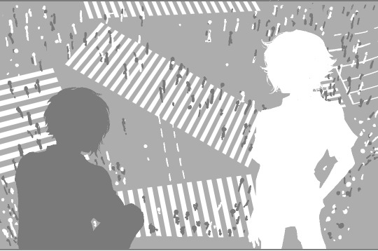
Hazuki only showed up for 5 minutes, but his presence is so vital and true to the game that I think he is the most memorable out of the new cast. The two Composers have such an intriguing bond, with their yin/yang or phoenix/dragon themes, opposite color design, the sempai/kouhai tone and the way they keep some sort of distance/work relationship as if it’s mandatory between Higher beings, yet at the same time they can talk so casually because they are truly equal – and different from one another. I have written a separate meta on them here.
Some people pointed out, that all Shinjuku characters’ names and themes are based off Hanafuda cards and the Phoenix in Hanafuda belongs to the Paulownia suit – which is Joshua’s name flower. This is so interesting because it feels like the creators somehow saw it as a sign to interweave the Shibuya and Shinjuku storylines together. Though it doesn’t come out much on the surface, it’s fascinating nonetheless considering both Josh and Haz had at some point interfered with the other town’s affairs.
“Shibuya tour with Haz” was such a special scene, as it happened between 2 characters who do not/no longer have a reason to care about Shibuya, on the subject of what is worth saving about Shibuya. Hazuki carried out the purification of Shinjuku and stepped in to restore Shibuya just as part of his job and unlike Hanekoma or Joshua who both possess profound understanding of humanity, he really didn’t know humans at all. Rindo’s irrational wish invoked in him a sense of curiosity, to try gambling on something irrationally and learning a bit of what his senior have experienced. With all the pieces put together, it provides an overview on Higher beings as a whole, and that Joshua and Hanekoma are really the odd ones out with Hazuki being somewhere in between them and the rest.
The old friends
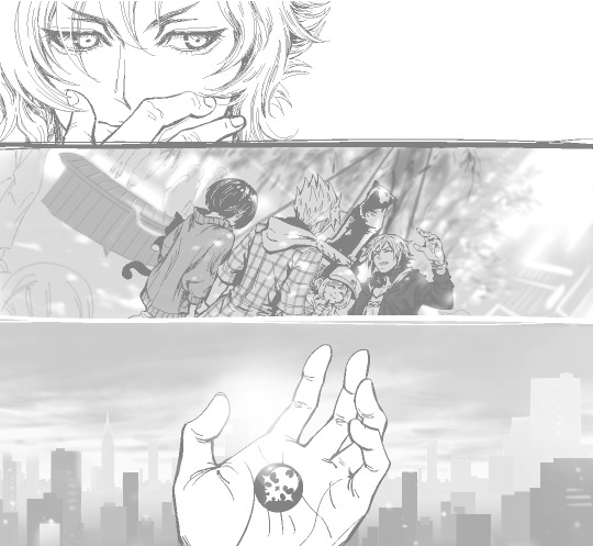
It’s easy to have returning characters overshadow the new cast as they have already matured out of their personal story arc and stayed in our hearts for all this time. In the end, I have managed to enjoy both the old and new cast separately and altogether, and they will both find their own place in our memory of this game for the long term.
Sho is truly as crazy as ever, the game wouldn’t be the same if Sho is any less of what he is. Sometimes it doesn’t feel like Neky or Beat is younger than Nagi at all, with moments when it seems like Neky has aged 14 years instead of 3 years. His friendship with Coco surprised me pleasantly, and their interaction together with Beat was fun to watch. Rhyme’s found a new dream and her friendship with Kaie is precious too, especially considering that she can still talk to him online after the game ended. Josh and Neku’s interaction suggested that they have resolved the past and are on equal terms now, they even parted ways in good spirit and I don’t feel any worry about them like I did before.
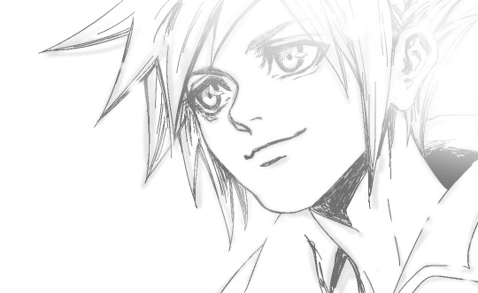
Neku and Shiki’s reunion scene was beautiful, theirs is such a special bond that it has grown and supported them even without being able to see each other. I am so happy to see them all again and that they stay true to who they are, albeit looking more grown up, cooler and happier than ever before.
Overall, NEO can’t become a classic on par with the OG, but is definitely a good sequel and a good game in its own rights. I’m happy with whether or not there will be a 3rd game to complete the 3 monkeys theme, but if there will be – I hope the creators can really find the time to learn from the last 2 games and start over with a fresh mindset and strong core.
#neotwewy#neotwewyspoilers#ntwewy#ntwewy spoilers#neo the world ends with you#twewy#review#meta#neo twewy#shoka sakurane#rindo kanade#tsugumi matsunae
183 notes
·
View notes
Note
Hi, love your blog and your books, they have been good for my knowledge, they had made clear some points that were cover by the mist of ignorance, I mean, when I was at school my teachers didn't know about Alexander so when we saw him in history class there were a lot of incoherences (sorry for my poor grammar, I'm still learning english).
Hephaestion is an interesting character, we don't know much about him but I have always wonder how he was as a husband, in my research it seems that he wasn't so interest in women like others were. I have wonder if that make him a careless or a typical (in the context of the history) husband? Did he marry because Alexander say so or because he wants to ensure his place? Does he felt pity for the girl or he didn't care about her at all? Was a better husband than Alexander?
And talking about Drypetis, we know about the famous beauty of her mother and of Roxanne. But how do you think that beauty was? Certainly, not like my modern view about attractiveness of a female, so I wonder yours.
Sorry for the long post! 🙃
We know nothing about his interest (or lack of it) in women. He did marry in Susa in 324 because Alexander told him to…along with 90 other officers. That doesn’t mean he was against the idea—may have been one of the few fully in favor of it for the politics.
While fictionally I’ll make hay over his lack of recorded lovers (of either gender), from an academic point of view…it’s meaningless.
This is probably a good time to review “arguments from silence,” and why they’re so tricky.
An ARGUMENT FROM SILENCE suggests a lack of evidence is significant. BUT this only works if one can demonstrate that such evidence ought to be there…and isn’t.
That’s hard to do for the ancient world as “a lack of evidence” describes our cursed lot. My modern historian colleagues are regularly astonished by how little we have, and what we can spin out from that little.
I bring this up is because arguments from silence are too common in pop history, which too often does them badly due to a lack of understanding regarding 1) what evidence IS available, 2) what should be available, and 3) what’s absolutely unsurprising not to find.
Sometimes students will ask me, “But didn’t they write stuff like that down?” (‘That’ varying.) The answer is often, “No.” Or more colorfully, “They didn’t give a shit.” Even in the Roman Empire, they lacked bureaucratic record-keeping as we understand it. In Greece, centuries earlier, a few city-states kept some records, but most didn’t, especially prior to the mid-4thCentury BCE. It’s connected to the “epigraphic habit”: the desire to record information (in public) for posterity, and the idea that record-keeping might be a good general idea often merge.
Even so, WHAT they thought worthy of recording isn’t always what we’d like to know. This, in turn, pertains to how they wrote historical texts: what they chose to report (or not).
So, with that background…
The problem with knowing Hephaistion’s sexual interest (or lack of it) in women is how and why our sources relate such information.
In short: they mostly don’t.
This owes to their LASER focus on Alexander. Even then, what each source tells about him varies. I think we can probably be sure we know all Alexander’s wives, although Barsine’s status is not completely clear (imo). I assume she was at least a palakē, which is a formal mistress: less than a wife, but more than a hetaira. Yet given Macedonian marriage practices, perhaps she was a wife in Macedonian eyes? The Greeks regularly “demoted” Macedonian royal wives to mistresses, so I don’t trust our sources on this score.
Whatever the case, we don’t know all Alexander’s female (or male) sexual liaisons outside his wives because the sources mostly don’t care. When they do care (ala Plutarch and Curtius), it’s for some—often Romanized—moral point. Which is a looong-ass way from anything the Macedonians cared about.
And if we don’t even know his, how can we assume we know his officers’? Hell-to-the-no!
We hear about these women only if they matter to the larger (Alexander-driven) narrative. So we know the name of Philotas’s mistress, Antigonē, because she was hired by Krateros to bring pillow talk back to Alexander. We know Harpalus’s mistresses because he spent oodles of treasury funds on them, and got in trouble for it (twice). We recognize the name Laïs because she later became the long-time mistress (palakē) of Ptolemy I, mother of some of his important offspring in the Successor wars.
Ergo, not knowing the names of Hephaistion’s mistresses—or whether he had any—is not significant. Outside of special circumstance, we wouldn’t expect to.
We DO know the name of his wife from the mass-marriages at Susa in the spring of 324 because she was a princess, sister of Alexander’s wife, and her selection for him had distinct political significance. Yet that doesn’t mean he didn’t have a wife already, back in Macedon. Others of Alexander’s officers did–one reason many promptly divorced their Persian brides after Alexander’s death. I note the possibility largely as it illustrates the level of what we don’t know.
My educated hunch is that Hephaistion’s marriage to Drypetis was his first marriage. And I don’t believe he had any children (even by-blows), or we’d have heard about them as a result of Alexander’s extravagant grief. Yet this is far from saying he had no mistresses—or boyfriends, for that matter.
Regarding Drypetis and his relationship with her…it’s a complete blank. We just don’t know how Hephaistion treated her, what she thought of him, or what he thought of her. They weren’t married long enough. The weddings were in early spring, after ATG got back to Susa following the Gedrosian march/rest in Karmania. He spent a while sorting business in Susa before he went on to Opis (and subsequent unrest/mutiny there). I suspect Hephaistion and Drypetis were married no more than 6-7 months. He died in early/mid-October. She wasn’t pregnant by his death, but given how busy that period was, it could be a function of his duties and lack of time.
As for the beauty of Persian royal/elite women, it seems to have been something remarked upon by more than just Alexander historians. We lack images of Achaemenid Persians, alas, but below is a lapis lazuli bust of among the most famous: Atossa, daughter of Cyrus, wife of Darius, and mother of Xerxes (lived second half of the 6th century BCE). Note the large eyes, high eyebrows (apparently plucked), and small mouth. Given the tendency to idealizing in Ancient Near Eastern art, this suggests what would have been considered high beauty.
Beneath her is a Roman copy of Praxiteles’s original Aphrodite of Knidos—considered the ideal of Greek female beauty in the early-mid 4th century BCE (based on the incomparable Phryne, Praxiteles’s mistress).
Both have an oval face with full cheeks, and we can see Aphrodite’s nicely plump. That meant something! She had enough to eat = wealth. The modern starved-skinny model with long face, strong jaw, and stark cheekbones…that’s attractive now partly owing to what photographs well: prominent features and thinness (because the camera adds pounds). Persians and Greeks preferred rounder features, heart-shaped faces, small bow mouths, soft jaws, and fullness in the body (plump, not overweight). About the only hold-over would be large eyes.
What I haven’t really noted is coloring…other than a preference for pale skin as that signified one had slaves (= rich) and didn’t have to work in the fields outside. Hair color and eye color just wasn’t that big of a deal. Sometimes it comes to the fore: gray-eyed Athena. (Although the word is generic for blue/gray/greenish.) Similar for Apollo and Dionysos, in the Homeric hymns. Dionysos had black hair there (as did Apollo). Both “blond-up” only in the Classical era. And Hera was noted for her extraordinarily beautiful “cow-eyes.” E.g., large and dark-dark brown.
BUT, because I love to support the Gingers of the World…RED-blond hair was considered the most desired in Greece. Aphrodite was a strawberry blonde (at least sometimes), as was Helen…when anybody bothered to note it. And (quite probably) Alexander.

#Hephaistion#Hephaestion#arguments from silence#problems of the sources#Alexander the Great#Drypetis#Alexander the Great's wives#standards of beauty#asks#what the sources tell us#Classics#tagamemnon#ancient macedonia#ancient greece#ancient history#Praxiteles#Aphrodite of Cnidus#Atossa
66 notes
·
View notes