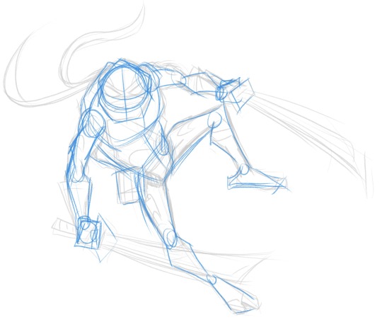
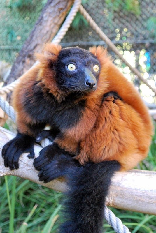
#I’ll probably just use these designs for when i draw them in general
Explore tagged Tumblr posts
Visit Tumblr Blog
Explore Tumblr blogs with no restrictions, modern design and the best experience.
Last Seen Tumblr Blogs


Fun Fact
130K people were victims of a chain letter scam that affected Tumblr in May 2011.
Text

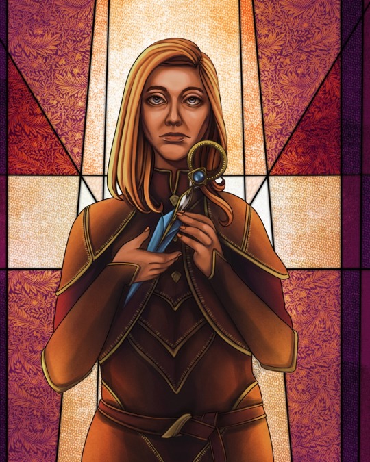
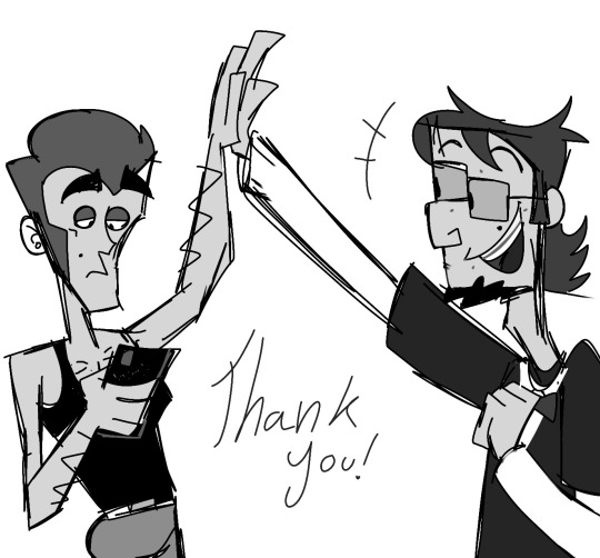
the mike system 😌
#tdart#total drama#td mike#td svetlana#td vito#td manitoba#td mal#td chester#rehab au#<- these are my designs for that too lol#I wanted to make a ref for them for rehab au but it’s canon compliant so#I’ll probably just use these designs for when i draw them in general
825 notes
·
View notes
Text
Creator Spotlight: @mimimar
Hi! I’m Michelle (Mimimar), an illustrator born and raised in Venezuela, currently based in Italy. I enjoy making colorful illustrations that reflect the things I love: fairy tales, fantasy, tenderness and queer (especially sapphic) stories. Occasionally, I also make paper dolls, comics and animatics. I have a lot of interest in book illustration and I’m currently developing my own stories that I hope to share as an author-illustrator someday!
Check out our interview with Michelle below!
Did you originally have a background in art? If not, how did you start?
I always enjoyed drawing when I was a kid, but it only became a hobby that I did almost every day when I was around 11. At first I only used traditional mediums, but I decided to make a serious effort to learn how to draw digitally when I was 15, and once I got the hang of it I never stopped!
I didn’t go to art school so all of my learning was done through studying the tutorials and resources that other artists generously share on the internet and lots of practice / trial and error.
How do you want to evolve as a creator?
I want to do many things but what I want to do the most right now is work on books! I want to make art for other authors’ stories and also my own stories as an author-illustrator. I want to grow as a storyteller and create art and stories that will really resonate with people emotionally. I’m always striving to improve my skills as well.
I also really love dolls, so working on doll box art or as a doll designer is something I would love to do someday. I actually have been designing paper dolls on my Patreon for the past few months, it’s been a fun project that is still ongoing right now!
What is one habit you find yourself doing a lot as an artist?
Probably using a lot of purple! It’s my favorite color so I find myself using it a lot. If I can find a way to sneak a little bit of purple into an illustration or a character design then I will.
Congratulations on finishing your Ivy Comic! Did the outcome turn out like how you expected or were there some unexpected bumps along the way?
Thank you! It’s a project that I worked on very slowly in between other art because I wanted to really take my time with every spread and make each of them a fully detailed illustration. I thumbnailed the full comic before starting but I kept changing the sketch for the final spread until the very end! Overall I’m really proud of the end result. I sprinkled a lot of hidden details in every page that I hope some of the readers will notice. For example: the meanings of the flowers in each page represent what the characters are feeling in that moment, and the colors of their wardrobe become gradually lighter as the story progresses to represent their emotions, as well as the changing of seasons.
We’ve noticed that you have created some amazing cover art for TGCF. Is there another series you would like to do something similar with?
That was another passion project that took some time to complete. Initially, I didn’t intend for them to be specifically covers, it was just a series of illustrations based on the 5 books/main arcs of TGCF. But since they were well-received and I had people telling me they wish they could use them as covers for their books, I decided to rework them into dust jackets for the english translation of TGCF!
I haven’t thought of any other specific series but I love doing cover art so maybe I’ll do something similar again in the future!
What’s your favorite part of your style? Why?
I’ve heard from other people that there’s a delicate quality to my art, this is something that I like a lot! I like pretty things, fairytales and vibrant colors. I think all of these things probably reflect in the art I make as well.
If there is one thing you want your audience to remember about your work, what would it be?
I hope that they remember how it made them feel. Feelings and colors are the two things I give priority to in my work. Most of the time I like depicting tenderness, softness and emotional intimacy. If that could reach the viewer and stay with them it would make me very happy.
I make a lot of art with queer (mainly sapphic) themes because they’re the kind of stories I personally like and want to see more of, so whenever people tell me that my art has helped them in their journey to discover and accept themselves, or that they see themselves and their partner in my art, it is always extremely meaningful to me. When art that I made to give myself comfort can provide comfort for others, no matter how small, it reminds me once again that despite any hardships art is genuinely worth pursuing.
Who on Tumblr inspires you and why?
So many artists! To name a few: I love @sakizo’s amazing eye for fashion and detail, @paneeps’ gorgeous style and striking colors, the sweetness of @bevsi’s art, @vickisigh’s pretty colors and concepts, @idledee’s warm and heartfelt art, @littlestpersimmon’s dreamy wonderful art, and @loish has been an inspiration for as long as I can remember.
Thank you so much for stopping by and sharing, Michelle! Be sure to check out their Tumblr blog over at @mimimar.
2K notes
·
View notes
Text
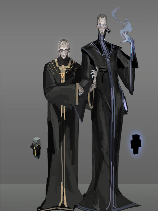
(Post fall) Ancient builder x Illager toxic old man yaoi when
WIP, was planning on doing a ref for every human race but a mutual of mine practically begged me to post these two on their own so you’re probably gonna see this image again. Colors are not yet where I want them to be so I’ll definitely go over it a few more times.
I’d like to take this moment to point out that the way you summon allays in legends, where you play as an ancient builder, is pretty similar to the way evokers summon vexes.
Design / AU rant below cut, as always.
This one’s a little worse written than usual, I’m just rambling.
I practically have an infinite amount of Ancient builder designs because I draw them differently with every piece depending on how I’m feeling, but for this design I got more genuinely speculative and turned on my pattern recognition.
Steve and Alex are canonically 6’2, both of them, and all undead mobs seem to be the same height, if not taller than they are, so I made them average around 6’5. To add to that, all undead builder mobs either don’t have eyes or have solid coloured glowing ones, so I went with the latter.
Minecraft isn’t a stranger to making lifeforms appearances change drastically depending on circumstance, this render is of an Ancient builder post wither attack, around ancient city time, which meant I could adopt the idea the devs mentioned about villagers/illagers, of human skin turning desaturated if they stay out of the sun for long enough, which, if the single generation of Illagers already show signs of I bet the god knows how many decade long underground escapades of the builders probably hit ‘em hard with that trait.
I also for the longest time for some reason forgot cosmetics were very likely a thing, so they’ve got some protection spells and luck enchantments tattooed, both of them do. Doesn’t work very well, as one can probably guess. But they’re superstitious so it felt in character enough.
For the post wither attack Ancient builders I also tend to think of them as more frail, not only because they had no access to their former overworld food supplies and had to rely on the little stuff that did grow in complete lack of sunlight underground, which definitely wasn’t a lot, but also because beyond the military force that did seem to remain from the nether war (ancient city structure name: Barracks, disk 5 marching.) they definitely were no longer strong enough to properly defend themselves against the wither or the warden/mourner on their own accord.
And because they were cowards and skedaddled when the overworld was in danger AND got beat up by the piglin despite being the main kingdom in power which I just find really funny. So think tall and boney but hiding it under a lot of clothing layers to still appear strong. Definitely can’t put on armor anymore though, that back would snap like a twig.
When it comes to the robes I used some of my older armor template designs for reference, made them black and blue to fit the most well known ancient builder sprite as well as vaguely match the one of the evoker. Because, oh well, you caught me, I do believe the cargo cult theory. Got my own interpretation but I’ll leave it at that till the next bestiary entry.
I generally want the villagers to look more varied, and human, while the builders, both neo and ancient, look more unsettling, as if they’re clearly a person, but something just looks, or moves wrong. They’re too symmetrical. Too far removed from what once was flawed but sincerely their own.
A lot of villager beauty standards are inspired by medieval-renaissance era Europe, like for an example having a larger visible forehead and appearing more boxy in shape being seen as more visually appealing, I think despite the illagers trying to subvert that they do still live in a society, so having grown accustomed to it as children they probably still at-least somehow adhere to the beauty standards they know, whether consciously or not.
They perform similar experiments on themselves as the builders, they’re just ever so slightly worse at it, as they haven’t been doing it for as long, so it leaves marks like scarring or visible stitching, though I believe they wear these with pride.
There’s gonna be a dedicated post about them at some point, as I said so I don’t know how much of my design I want to pick apart for now, but I’ll just leave it at that for now.
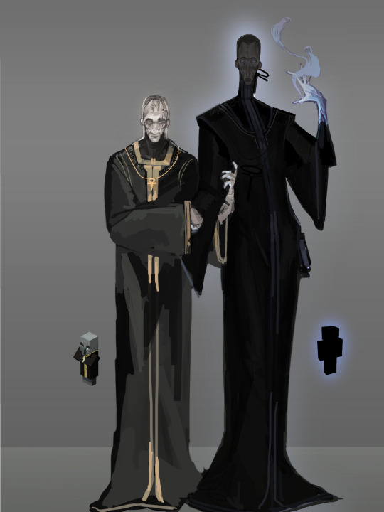
Here’s some alternative versions.


#minecraft#minecraft lore#minecraft theory#minecraft art#artists on tumblr#fanart#mineblr#minecraft au#artwork#concept art#minecraft ancient builders#minecraft illager#minecraft evoker#illager#they’re bad and they make each other worse#dude it’s 3:33am I can’t do this#I wanna see them make out#the Minecraft theory fandom needs a manwhore au#somebody make that#i’m begging
173 notes
·
View notes
Text
Opening up my "grab bag" commissions where you pay what you can and I draw what I want!
Also I'm doing a raffle for one free shaded piece per week :)
See the read more for details and terms of service:
Examples:

TERMS
-DM me on Tumblr with a face reference and an outfit reference (from in game or pinterest, faceclaims accepted; also character creators accepted; THIS IS REQUIRED I will not accept your commission without references so please send them with your inquiry)
-all other elements of the piece are up to me, thus the surprise aspect! You can include references for weapons/jewelry type stuff but backgrounds are my choice
-payment is full due when I “accept” your commission due to low price point (I’ll only accept when I’m about to begin work) and also due to low price point, I can’t offer refunds. Payment via Paypal or Venmo
-TAT once I accept will be under one week
-You’ll receive the full-size image however you want
-OPEN TO ANY OC!! Dragon Age, Baldur's Gate, DnD, Rogue Trader, Fallout, etc. etc. as long as you have a ref I'll draw it
FREE SLOT INFO:
-Please reblog or comment on this post if you want to be entered into the raffle for the free slot I'm doing every week. I'll use a random number generator to pick the winner (only one entry per person)
-You can do a commission AND enter for a free piece
-The free piece will be a black and white halftone style
-You don't have to be following me to enter, just comment and you'll get added to the spreadsheet.
FAQ:
-Why so cheap?: I'm just chasing the art fight high, I have a day job (unfortunately?)
-Can I take multiple slots?: I’m only accepting one at a time bc of low price and TAT but you can inquire again when I’ve finished your first piece and I’ll see what the queue looks like
-Can I request anything other than outlined above e.g. pose, background, style?: we can talk about it if you're really sure you want it but it'll probably be a base increase of $10
-Why $10?: it's a great amount of money to reinvest into my art (e.g. brush packs, texture packs, pose packs). I set a minimum I am comfortable with so please do not stress about paying the minimum.
-How long will these be open?: Idk maybe until I'm getting ready for art fight we'll see.
-do you do furries/mech/etc etc? - probably depends on the design, worth to ask!
#pinned post#commissions open#fanart commissions#mutuals boosts r appreciated!! ty#juneiper draws#looking forward to seeing ur characters xoxo
57 notes
·
View notes
Text
MARCH COMMUNITY POST
This month on a very special Double Helix...
Abe thinks his clone is a closet case; Joan and Cleos clones have surprises of their own, Caesar is introduced to Tumblrs favourite holiday and Scudworth takes in a show.
Now let's take a look at some of the comments the blog received in the merry merry month of March:
General Feedback

What’s better than a callout post? A shoutout post 😎
You better start believin' in the Double Helix fandom, G-Spot- because YER IN ONE!
Kind words from my follower-in-law. Hope you continue to enjoy safely from outside the blast radius!

We are (still) so back.
Thank you! I wanted to find a way to incorporate Lincoln’s legendary cheekbones. I referenced popular skinny boys like Chalamet and Young Pattinson.
In animation, they have to draw the characters so many times over, it makes sense that Abe and JFk’s faces are basically blocks. Low pencil mileage!
Since I only have to draw the original characters once per panel, I was able to give them a little more detail though early on I abandoned too many accessories or patterned clothes. I'll take the easy road every time!
ABE AND GABE FEEDBACK


fun fact: Rainbow Abe was long-game foreshadowing for this comic. Lord and Miller told me so in a dream I had while painting my room with the windows shut.
Hahaha it’s cool that people get the new clones. Gabe reckons if body spray makes you smell good, using more must make you smell even betterer.
And thank you! Like all fans, I’m cherry-picking the parts I like and hopefully adding enough of my own ideas to make for something new-ish. Mmmm, taste the mild originality!
JOAN AND DARCY FEEDBACK


I think she can secretly do this:

Thanks for showing love to Darcy! She didn't mean to trigger Joan...
CLEO AND PATTY FEEDBACK

I'm glad people agree with me that Patty is adorable, in part because was the clone that took the longest to design (I find the original Cleo hard enough to draw). Yay Patty! ❤️️❤️️❤️️

I don't know if 'nice' is how I'd describe Cleos personality but I'm glad people enjoy me characterising her that way. Maintaining the tone of the original season is my whole mission statement.
Cleos vicious streak is very important to me. No joking, this is my favourite Cleo moment of all time:
That said, she could use a stern talking to:

APRIL FOOLS FEEDBACK

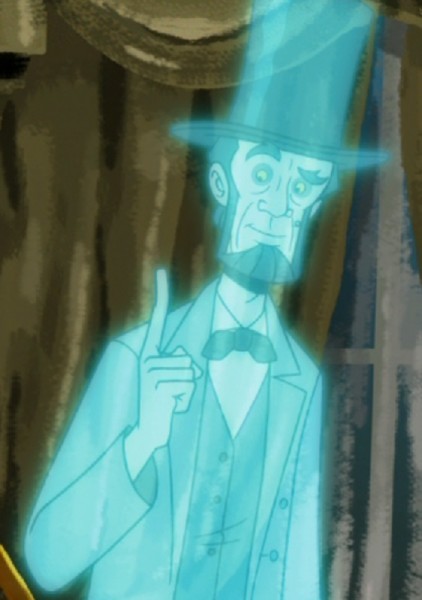
Oh yeah, they totally did! A vision in Obi-Wan blue.
I was really expecting hails of rotten tomatoes for even joking about killing off Gandhi, so I'm I'm relieved everyone liked my little prank!
*waves at Venture Bros fandom from across the hall*
AND MORE FEEDBACK STILL
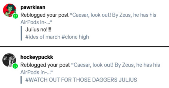
We all tried to save him 😔Another victim of AirPods.
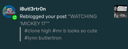
Just a proper gentlemen at the cinema

People are STARVING for more clones. Don't fill up on bread!
When I joke about hype for Sheepman but people actually are:
That’s good because there’s more Sheepman where that came from!


BUT if you want to commission a design through my Ko-Fi, I’ll be more than happy to learn!
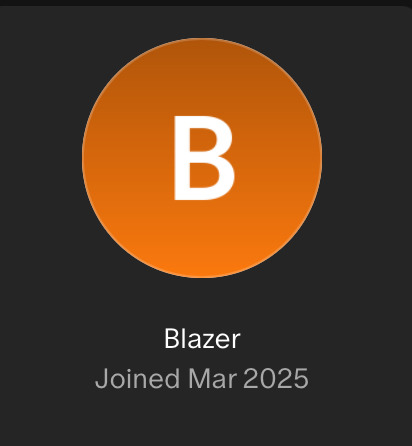
And let’s hear it for the comics newest patron, Blazer! (Any relation to Jolly Gene Jumper?)
Thank you again for so much positive engagement (influencer speak, my beloathed 🤮)
The comments and replies continue to be generous and encouraging and I really enjoyed answering the questions in my inbox, even if I'm a little weisenheimer most of the time.
Oh and we were honoured with our very first fanart featuring Gabe!
These kids today, always looking at their phones smdh.
Thank you much @garbagefirelol! ✨
Next Month on a Very Special Double Helix...
Heading into April, I'll be posting what is probably my favourite chapter so far. I was so excited that I drew it immediately after the 'walking to school' intro. I don't think I've been too coy about which character it features, so I'm really stoked to see the responses.
Stay High everyone!
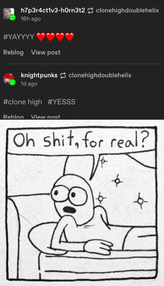
@zanzibarindahouse @theabesimp @gspot-rocks-the-gspot @chromo-strand23 @moondove330 @youdonelostyourmind @iloveevilwomen @cateat @kalisseo @kimtiny @topherbuttz @jfkonfucius @gaybelincoln @tumbleweedsthesecond @ghost-in-my-bed @gandhiclonehighlover @shrimpyfellow @ladyaupair @kittykat1481 @smallpox-juicebox @astro2ndbase @daniel-day-lewis-nemesis @starrysys @galacticstarslove17 @latibulater @pawrklean @hockeypuckk @i8utl3rtr0n @h7p3r4ct1v3-h0rn3t2 @knightpunks @jerseybumpkin @80r1517m8 @sugarbizzy @jayydeng @sammykisser @molqr @hench-thyme @weirdmageddon @neutrallyobsessed @raffa-taff
46 notes
·
View notes
Note
Your comic series is the first Rottmnt comic Iv ever read! It was an amazing first impression to the Rottmnt fandom! Could you teach me how to draw the turtle boys ( rise turtles)?
Also love the new update!
Aw! I’m so glad my comic made on good impression on you! ^v^
Of course! I’d love to help you!
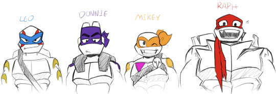
So first thing’s first, here’s the boys the best I can draw them. The most important thing when learning to draw new characters is identifying what makes them look like them. We’ll start with the faces since that’s, in most cases, the point of focus.
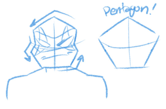
Leo’s face is a pretty tall and vaguely pentagonal. His face is also very angular, the corners of his cheeks and top of his head are very sharp. Leo has the traditional style mask with tails that drop down to about his waist.
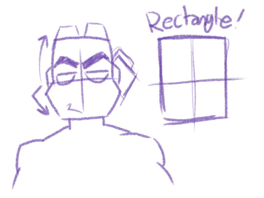
Donnie has that smart boi forehead and majestic eyebrows. His forehead often has a soft curve to it while, similarly to Leo, his cheeks and jaw use sharp angles. Remember too that the top of his head is flat, there’s no curve. His mask is that newer pirate style that wraps over the top of his head, with the tails looking like curvy squares.
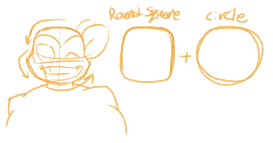
Mikey’s face is a combination of a rounded square and a circle. The top of his head, while much rounder than Donnie’s, is somewhat square. The bottom of his face is a curve. Sometimes I draw the curve in line segments, but it’s not a requirement and won’t impact the way he looks. In general though, Mikey has a very circular face. His mask is the traditional TMNT style with the rounded bouncing tails on the back.
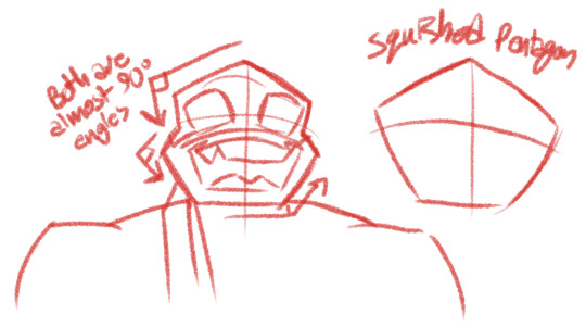
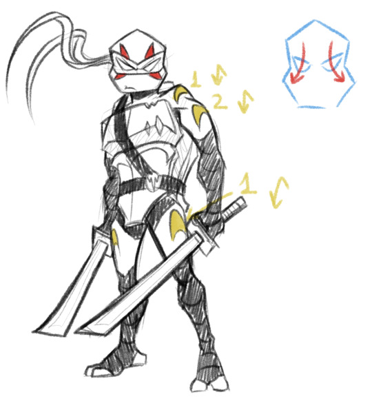
Raph is arguably the hardest to get right for some odd reason. Really though Raph’s face is just a shorter version of Leo’s face with slightly more exaggerated angles. His face is like a fat pentagon. Also tip: Raph’s eyes are always just a little smaller then you think they’re going to be. Trace some scenes from the ROTTMNT movie, you’ll see what I mean. Raph’s mask is the same style as Donnie’s where it covers the whole top of his head. There’s a small nick on the edge above his right cheek and the tails are tattered.
Okay, next are their markings! They play a lot in how easily identifiable they are.
I figured these diagrams should help as a little map as to what spots go where.
Alright, now we’ll look at their shells. There are many amazing diagrams and explanations for drawing their shells on Pinterest I’ve found, but I’ll sum it up here as best I can.
Leo’s shell is very sleek in design making his is profile look the thinnest of his brothers. Many people describe his general body shape as being an inverted triangle.
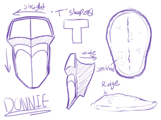
Donnie’s shell is very straight with hardly any curves. I didn’t include his battle shell in this since that qualifies as “gear” in my opinion, so you get to see what Donnie’s shell looks like! You’ll notice that the sides of his shell are very wide, which I’m guessing is because the curve of his carapace is so shallow.
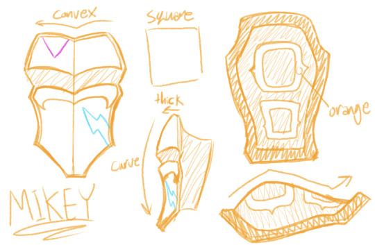
Mikey’s shell is very similar to Leo’s but is a lot thicker and boxier(haha get it? Cause he’s like, a Box Turtle? :D I’m so lame…). He’s also much rounder and the distance between his plastron and carapace is pretty big.
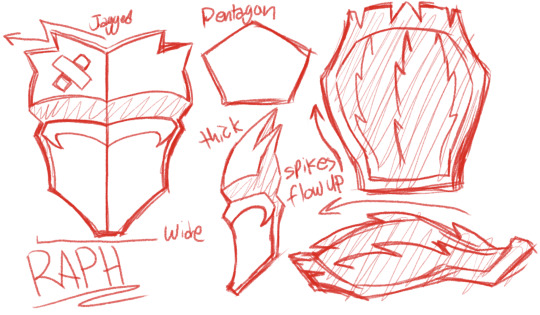
Raph’s shell is probably the most complex of the boys because of all the spikes. Good things to keep in mind are that the spikes on the top of his plastron angle out, and spikes on his carapace flow up. In general think of Raph as a pentagon, he’s got big broad shoulders and arms and almost comically short legs. (And yes, I’m aware that I didn’t include the side of his shell here, it was too big to fit on the diagram. But just to give you an idea of where it should be, around the “w” in “flow” is where it should connect to his carapace.
Okay! So now that we’ve covered what the boys look like, let’s apply it to their bodies!
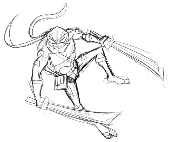
Here’s a quick sketch of Leo. “Oh, but Indie” I hear people say, “I can only draw basic shapes and stick figures!” Well to that I say good because that’s what I’m doing too!

For drawing action, it’s crucial to capture the energy of the character. And in a style like Rise’s energy is an iconic trait. So I’ve re-invented this “shape method” to actually be useful. The number one thing is that these shapes are loose guides as to the positioning of the body. Don’t think of these shapes as “well chests are like cubes and arms are like rectangles.” These shapes are place holders. I could replace those circles with stars and it wouldn’t change anything. I just use circles because they’re faster to scribble and stand out against the hard angles of everything else.
Here’s a picture of the shapes overlayed on the image, as you see, these shapes are guides to help comprehend a complex angle in 3D space. Sadly I don’t have much I can assist with on proportions, since I learned purely by studying total uncreepily real life people and myself (I swear I’m posing in the mirror for purely educational reasons! Okay!?).
But anyway, for this kind of thing, practice is the only remedy. Just draw action pose after action pose. Trace scenes from ROTTMNT and the movie to teach your eye to see what things should look like and to train your brain to recognize patterns of shapes and angles.
I hope you found this at all helpful. I’m not really sure how great of a teacher I am but people keep asking questions like these so I guess I’m okay. Glad you liked ROTP so much and I’m glad it made such a good impression on you! ^v^
Good question! :]
And of course if you have more questions, feel free to ask. Here are some previous asks about drawing I’ve gotten that you might also find interesting:
Tricks for Drawing Extra Expressive Faces
More Tricks for Drawing Expressions
Tips and Tricks to Drawing Non-Graphic Wounds
Basic Guide and Tips for Drawing the 2012 and Rise Turtles
How to Draw 2012 Raph’s Fire Ninpo
Nailing The 2012 TMNT Style in 2D
Important Concepts in Drawing Female Characters
#q&a#tmnt#ninja turtles#teenage mutant ninja turtles#rottmnt#art#art tips#drawing#drawing tips#drawing stuff#rise of the tmnt#rise of the teenage mutant ninja turtles
468 notes
·
View notes
Text


So because I saw someone like my initial post with Overdrive, for whatever reason he stayed in my brain and I was like “okay fine, I’ll attempt to design him again”
To be honest, I think generally he came out a lot better than last time, at least in the face. I’m not so sure on the rest, or more accurately, the arms
Drawing this I was like “oh dear god the TFO style is a pain”. Honestly I think my main issues are that these designs are some of the most 3D reliant with how boxy they are (like they’re some of the most toy-looking Transformers designs to me), and I’m not very experienced in that, and also I have this need to make the designs as simple as possible, even if the design ends up looking kind of plain, as seen here
Like I know generally how the TF One characters are built. They have a basic body of components and gears and stuff that’s all black, alongside a silver head piece (I don’t think there’s any outside of Shockwave or people with masks that have a non-silver face, but correct me if I’m wrong). Then on top of that they have pieces meant to cover that black skeleton, giving their body protection and making them individual. Like they’re thinner pieces of metal meant to go over their basic bodies. I don’t know how fully to describe it but I know how they work
I just don’t know how to draw that well. G1 is blocky but they’re made up of solid blocks, not pieces on top of a basic framework, and I struggle to figure out how it works
What was I saying? I think I got carried away there, sorry. Point is I’m bad at drawing Overdrive in this style and I kind of don’t like drawing it. It’s probably just an issue of me not being able to leave my comfort zone and being spoiled with TFA style yesterday
Unfortunately, Overdrive has to stay in this style because he’s specific to this universe
Anyways, moving on for real this time
So his design is now pretty heavily inspired by some Jetfire toys I found when looking for references to use (but mostly this first one)
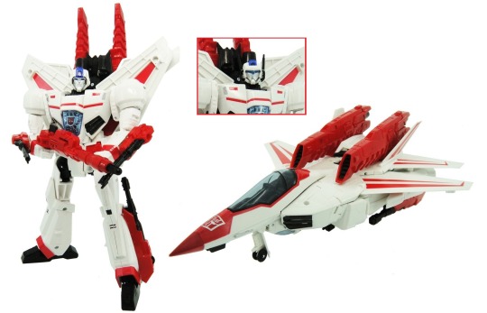
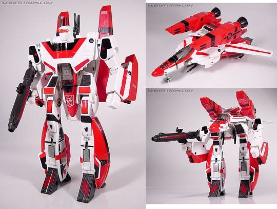
It’s also the main basis for his color scheme this time around. Admittedly I do still think the red and white makes him look oddly similar to Ratchet, but oh well. Admittedly his design is allowed to at least have some blue paint, maybe I should give him some
But also one of the main bases of his head design here was another design I was making on the original, when I planned to expand the canvas and draw more. Unfortunately I got frustrated with posing blocks so I never did more, but I do have that one new addition now

His cockpit is yellow here because while I was testing out blue, I thought that with all the basis on Jetfire, he didn’t look enough like Starscream, so I gave him Starscream’s yellow. I ended up using the blue I was initially using on his eyes, which are the main reason they’re blue now
Not a lot of experimenting with the colors this time around, mostly since I didn’t want to lose the colors I was already using
Maybe I could have made his wing stripes black though? I’m realizing now that outside of his framework and vents, his design’s pretty much all reds and whites
I think his arms could probably do with more detail and refining as well. I just didn’t know how else to draw them
Now, as for other character things, I’ve settled on a few?
Like I think I’m gonna have him working on ground bridge technology. He does still work on going as fast as possible, but it’s more a personal thing. The things on his back are also experimental engines he made to go faster
He’s probably also banned from racing due to his technically illegal self-upgrades, which are at the very least illegal in the sport
But yeah, he’s on the bridge technology team, though admittedly he’s used more for his speed and general size. After the movie when their project can resume production again, he’s mostly used as the guy to scavenge parts and scout out good locations on the surface. Never mind the fact that he’s never really been on the surface before this, but he at least can make a quick getaway if need be
This is probably how he ends up encountering the Decepticons, or most importantly Starscream. They find him doing experiment stuff in the surface. My idea is that his team is trying to build a bridge portal up on the surface, given they know the technology works now. But also they’re kind of doing it in secret and possibly didn’t tell Optimus about it. But they’ve been causing stuff to happen with one of the Energon rivers up there for their portal (like redirecting it or making a dam or something, idk), which caused the Decepticons to take notice
Still not entirely sure on his personality, but I do know he takes great pride in his speed and no one being able to out-fly him. He also takes pride in his work as a scientist, both personal and professional. He may be a little too ambitious and intense on his plans for bridge technology, wanting to one day remote portal to distant galaxies, when they haven’t even tested if it can go to another receptor up on the surface yet. But he’s at least happy rambling about his projects
Honestly I think he currently reads as too Starscream, especially when Starscream has never been in his life, I feel like I need to add a bit more Skyfire in there. Just not sure how
But yeah, I think that’s about it on Overdrive for now. When will I continue? Who knows
#by the way his visor is still retractable#that’s why I have 2 versions of his look bc you’ll see either of them on him#idk if I should change his eye color or not#I also really wish Skyfire had an actual TFO design#it’d make my life so much easier#transformers#transformers one#transformers oc#skystar#overdrive#my art#my OCs#I forgot about that tag of mine tbh#fankid
33 notes
·
View notes
Text

Day 82
Another one that I love!~ Gonna be a lot of those from here on if you couldn’t tell!
Junko’s the Ultimate Fashionista (in the english release at least but hey Ultimate Gyaru has to have a little crossover right??), so of course she handles Mikan’s wardrobe the moment she’s allowed to. So . . . Extremely cute scene of her having Mikan try out clothes to see what she does and doesn’t like.
An opportunity for Junko to pamper Mikan, AND i get to draw Mikan in a sweater???? Heaven. Also like are we all in agreement that sweaters just look fuckin amazing on Mikan?? Like I admit, I think I just like drawing Sweaters on Mikan but they just make her look so much cuter because of how god damn cozy she looks in em.
Unfortunately that’s all I have to talk about for that topic? I think? So instead let’s shift over to a recent development involving Junkan!
I’m in the midst of working on the Junkan Christmas Eve comic, which hopefully will be getting posted on time a few days after this, and during the process of making there’s been something new with my current abilities.
I have officially hit the point of proper freehanding on these two.
Y’see this probably won’t make too much sense but i’ll do my best to explain.
So normally when it comes to sketches I’ve done things a bit less proper compared to more professional artists. I usually get a little start on the anatomy, and then just start sketching all the character details and moving out from there. It isn’t often that I do a full sketch for the basic anatomy of a character, I only do it when I really wanna not fuck up a pose. And as you also know up till now only one piece in this event was drawn normally. Everything else is a sketch that i cleaned up and colored, or just a sketch.
This is because generally speaking I can’t do art using my normal pen tool without a sketch to work off of, it requires a lot more finesse to use the G-Pen both because of the larger shifts that can occur in line width, and the slightly looser feel it has compared to my Pencil Tool.
That’s all to say that I have drawn Junko and Mikan so many fucking times that I can just, draw them without proper sketches now. I’m at a point where I just need to draw the head, torso, and legs for an anatomy sketch, and then with the G-Pen I can just, draw from there. That’s big for me personally, and also fucked up because god how even??? There hasn’t been a drop in quality either so far, i’m still able to refine the expressions and i haven’t fucked up with the arms too much yet, I’d even say it’s resulted in some of my favorite Junkos and Mikans period.
Now, the catch is that again, this is only Junko and Mikan. I could prooooobably get to this point with Mukuro eventually just because her design is much simpler compared to other DR Characters? I struggle with getting her colors right rather than linework, but that’s about it and still not really useful in my main line of work unless I memorize every character that’s ever existed, and it took like 150 fucking times for Junkan I can’t do that for an obscure RPG character that I might get commissioned once and then never again.
It’s also not something that I think i’ll apply to my normal Junkan works, because I am a perfectionist to a fault when it comes to pieces I care about and I want to make sure every detail these is exact. I need to be meticulous for ship art like this, every detail is important. And I can maximize that with sketching.
This new skill is basically useful for one thing. Speed.
I pride myself on my efficiency, even if I have waned over the years due to burnout and overwork, when I get into it I can fuckin move with my art. And so if I need to say, make a 28 page comic in under a month? Being able to mostly skip an entire phase of the art process is very, VERY useful, ESPECIALLY because it’s a comic. Something which generally takes more time than my normal art by nature of it’s format and what it involves. When making the Comic for Day 60 it was all sketches, which was equally fast but could leave small imperfections at the time that either went under my radar or I just let slide because i was trying to be efficient.
This is basically perfect for having to speedrun a Junkan comic, it’s all the speed with the usual amount of visual quality.
So in short . . . I’m turning into a nightmarish hell machine but specifically for drawing Junkan. I am genuinely curious how much farther I can go up from here, like, what the hell else could I be capable of with this???? Am I just gonna learn how to fuckin beam the art onto the canvas with my brain???
Moral of the story is just get mind numbingly obsessed with a ship and I guess you’ll get better at stuff??? I have no idea, i’m still kind of processing the comedic value of what this year has been because I was desperate for these two to make out.
As always, Reblogs, Comments, and Little Notes in the Tags are appreciated!~ They always make my day!~
#danganronpa#junkan#junko enoshima#mikan tsumiki#junko x mikan#tsumiki mikan#enoshima junko#enomiki#shipping#junkomikan
33 notes
·
View notes
Text
My Favorite Cards of 2024: Bloomburrow
The year is pretty close to over, so let’s go back over the sets released this year (with new cards at least), and go through a few of my favorite cards from that release. I’ll group together stuff released together, in this case it’ll be the main Bloomburrow set, and the commander precons. Extra reprints as courageous critters or special guests might also get a mention. I’ll probably go through one set a day for the next week, though I might skip some days for personal reasons.
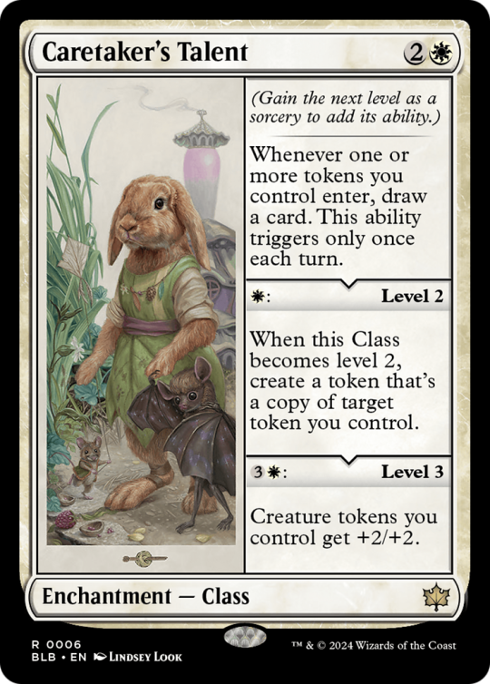
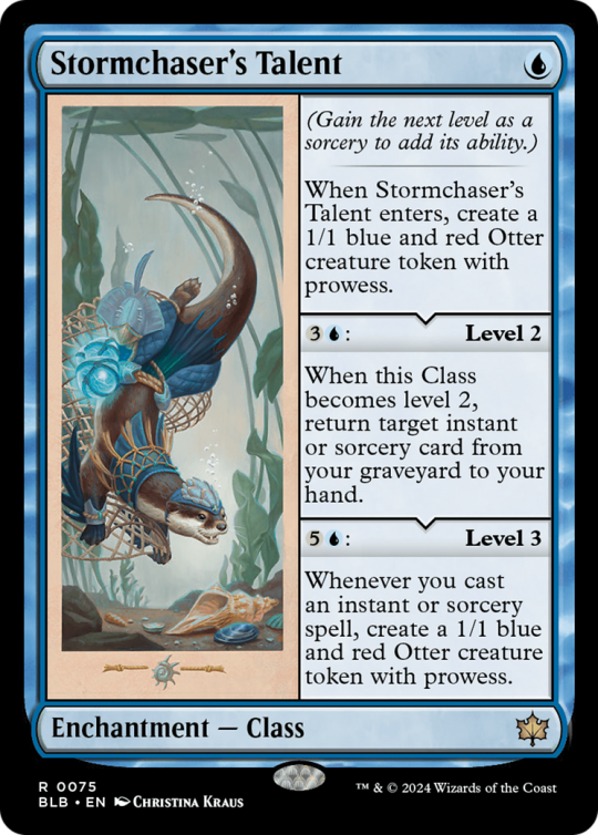
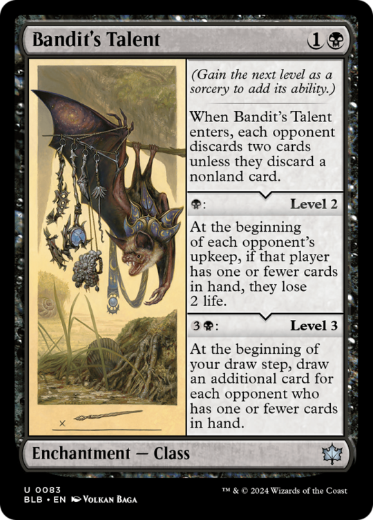
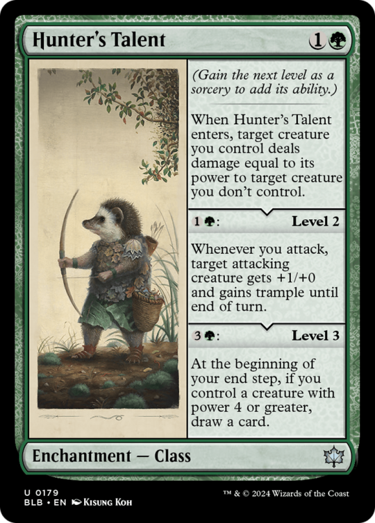
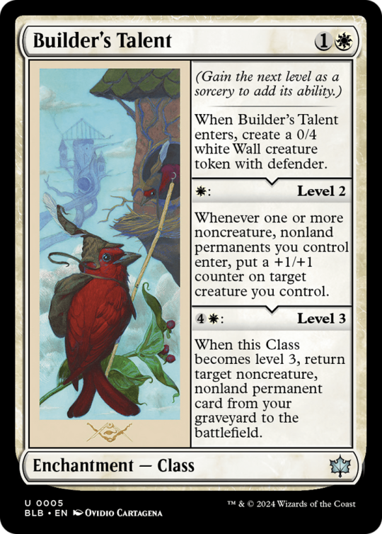

I'll start with a bunch of talents that I like, a stellar second outing of the Class type in this set, outshining even their first appearance in D&D. In constructed, limited and commander, they impress and have a range of different designs, and I like them very much.

Offspring was also a very neat ability, and it's always nice when we get something to extend new abilities in a more open fashion, to older cards and sets. Of course, Zinnia goes infinite with Palinchron, but so does a worn down half-tire. Maybe someday I'll even build a deck around Zinnia, but we'll see, I tend to come back to sets a year or two down the line.
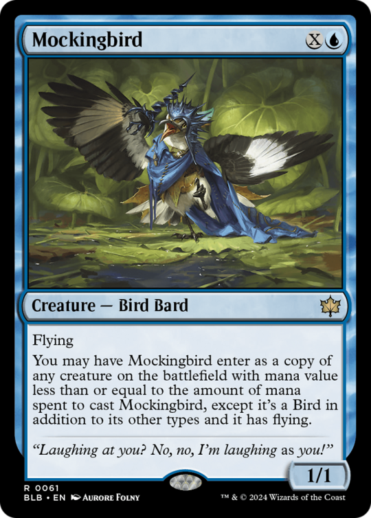
I love creative clones, and Mockingbird delivers! And a one-mana clone that can scale definitely hits the mark, a clone you never overpay for is a really good concept, and this was a good way to execute on it without shirking color.

Staying with birds for a bit, Scrap Trawler is a fun design that unfortunately breaks in half with a look. Adding colored mana certainly helps Jackdaw Savior lot, and restricting to flying creatures also narrows down what can enable it significantly. The dream of combining this with a Broodmoth or Valkyrie's Call to create oodles of value out of dying creatures is also a neat addition.

A new Wood Elves always deserves a mention, and one that can grab nonbasics definitely solidifies its role. Clifftop Lookout will stick around in commander decks of mine for years to come, at least until they print much better cards. Plus, it has sneaky reach, gotta respect the sneaky reach that will save my life at some point.
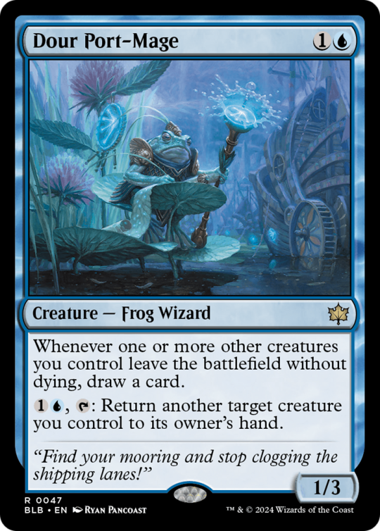
Still on frogs, Dour Port-Mage is here to exemplify the "leave the battlefield without dying" ability that was granted to frogs and was an excellent way to make an ability that's both narrow and a bit open-ended. There is some play in how to achieve that, yet it's pretty unique, and happens to play well in the colors with bouncing, which ties it well with Frogs, but also blinking, exile removal, tucking, and more. Overall, it allowed them to mostly do regular creature things, having ETBs and all, yet still feel like they belonged to the Frogs' synergies.
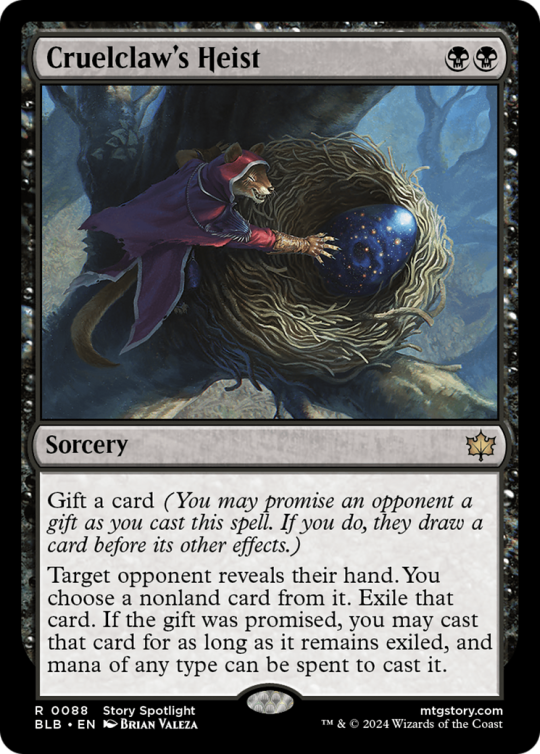
Gift is a fun ability that works well in both 1v1 and takes a new political dimension in multiplayer (mostly commander). Cruelclaw's Heist is a nice version of the two mana hand attack spell with upside, allowing it to be hand attack that isn't dead when the opponent is empty-handed, lowering the downside of its gift, and gift becomes even more fun in multiplayer when you can gift a separate opponent you're targeting.
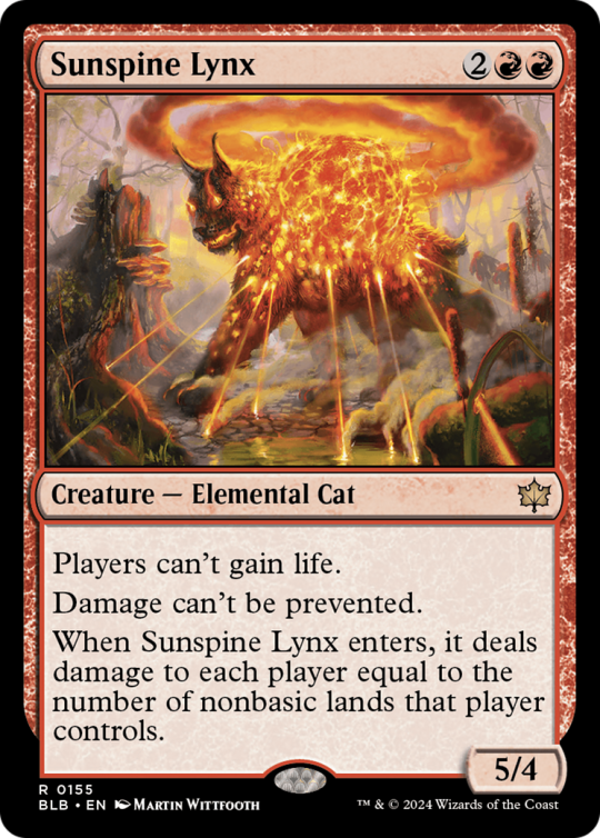
Sunspine Lynx is costed fairly, punishes greedy manabases, and looks incredible in foil. Price of Progress can be a bit too brutal, but stapling half of one on the back of a creature that has a solid rate makes for a fun card in commander and constructed both. I've domed a Domain player for 13 damage with this in Standard, and I can tell you that felt very good and would have earned this cat a spot on this list by itself.
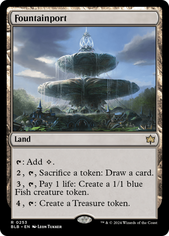
I've already said a few times in the past week that I love to have options, and Fountainport as a pseudo-trading post on a land gives me just that. For sure, I love selling my Offsprings for knowledge, my life for fish or my mana for mana. A lot more tokens around these days for this to incidentally draw cards from, and generally a useful card to spawn surprise blockers.

Catch-up cards that are good enough to be played are generally pretty neat, and Beza being a mythic legend version of that effect delivers on it. Stabilizing with life and bodies against aggressive decks, but not a dead card in grindy games, Beza does stellar work and left me trying to see if a commander deck could be viable with more opponents to compare to to make it more likely to get the full suite of effects.
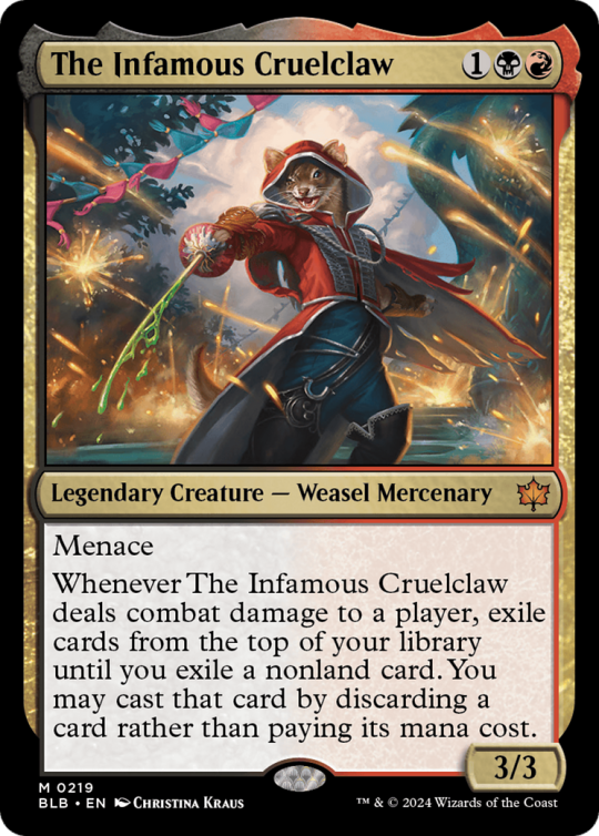
Between the snazzy art and the flashy effect, Cruelclaw makes the list alongside his heist. Look at this guy/weasel! He casts spells for free! My main nitpick about the card is that given his story and flavor, I expected him to be casting those spells for free from the opponents' library, not my own. But I can forgive that, it makes the card stronger, even if slightly less fun imo.

Scavenging Ooze is an excellent design, and Keen-Eyed Curator being a variation on it plays great as well. It was neat to get it right before a delirium set, and the slight differences don't detract from its power much. It was a bit hurt by actual Scavenging Ooze being in Foundations only a couple months later, but it still manages to split the deck time with Scooze in some archetypes in Standard, and that's exactly where it should be.

That Jeskai precon was good enough to get BOTH its commanders on my list. Temporary creatures to get their etbs or other effects early is my jam, as well as attacking for value, and Arthur does both in a nice package. We were missing on neat Jeskai commanders, but with its half dozen of Jeskai precons, the year definitely delivered!
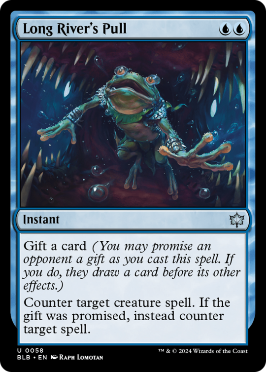
Similar to Cruelclaw's Heist, Long River's Pull makes use of the Gift mechanic. This allows a rate well above what we see in standard, a clean Counterspell, while being an interesting political tool in Commander where actual Counterspell is legal. Giving cards to people can buy an ally very quickly in commander, or make sure a player missing land drops is in the game, and this actually makes me consider this card over the classic counterspell in more than one deck.

The Calamity Beasts have a good hit rate of unique and powerful designs. The Viper has spawned a few decks around it in standard and beyond, and that's impressive considering it's a punisher effect that warps your own deckbuilding to enable. As it turns out, a 6/6 that basically wins the game if you untap with it is pretty good if you can get it for two or three mana, even if it's not on turn 2 and it dies to removal.

Making bats relevant in standard and being a pseudo-sun titan for half the cost, Zoraline handily makes it into my list. When she's around and not asleep, she's a card with a very good rate by herself that does something I like. And then she also enables the main mechanic of bats in the set enough to be one of the best card in their deck too.
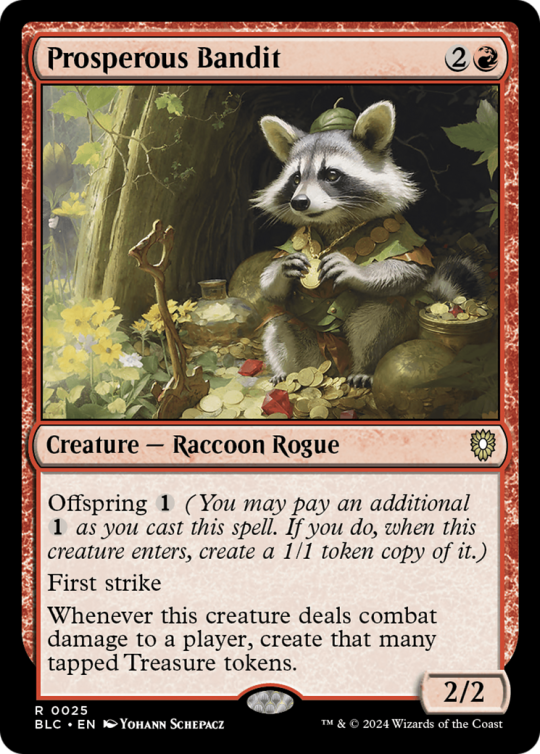
Prosperous Bandit is the kind of unusual ramp I like. Creating that many treasures whenever it deals damage on a three drop captures my attention. Getting through for damage on a 3 mana 2/2 sure ain't easy, but buffing it isn't that difficult and the payoff is definitely there.


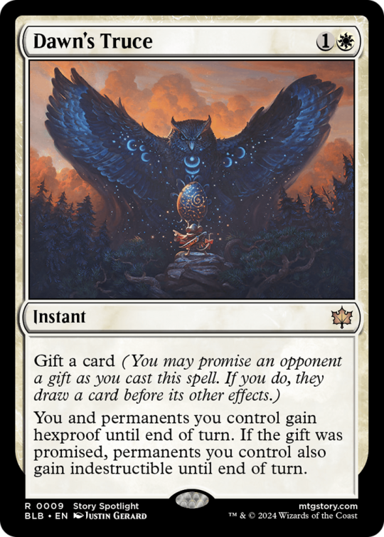

Finally, the art corner, Bloomburrow had some incredible art that struck home for me. Which isn't to say other sets in the year didn't, but these marked me a bit more, particularly as a new setting for Magic that felt richer than the other stuff we got. With art and story, Bloomburrow felt both rich and yet a small part of something bigger that could easily be expanded later on. Plus, there is a bonus category that'll be in a reblog in a few minutes, I'm running out of image slots on tumblr.
28 notes
·
View notes
Text

IntroductiOUUUUGGGGGGGHHHHHH
(all my tags are under that “read more” at the bottom!)
my name is Charidotel or NonsenseChemicals or anything derived from the two. (some people call me Cooker).
#nonsensescribbles is my art tag!
the local Cookie9 enjoyer. follow me so i can spam your dash with Cookie9 on occasion. no, i am not talking about the real people behind the reviews!!!
i have a twitter and bluesky but i never use these
i’ve got a few roleplay sideblogs up but i’ll post them and list ’em here when the time comes. one of them is in use and the others are Developing
Hui 👋anyone can use my art with credit just be normal . like. don’t edit it to be hateful or use it for AI or anything <- just saying it as a precaution i’m sure we all know this


(all tags i use below!!!)
Storage Tags
–#nonsensescribbles (my art)
–#nonsensevideos (self explanatory)
–#memes that grew in a test tube (well.)
–#rotating storage (other people’s art that includes my characters!!)
–#oc (oc tag, only using this for unspecified ocs now)
–#answers (yeah)
Series Tags
–#doodle32 (a series where i draw 432 related things for 32 days)
The Stanley Parable Tags
–#the stanley parable
–#the stanley parable ultra deluxe
(i tag ALL my tsp/tspud posts with both of the above tags so there’s no real difference here)
–#cookie9 (#cookie9 art)
–#buglivia (#buglivia art)
–#spunkymunky2697
–#nudelschaf
–#motoringguy76
–#settings_character
–#employee 432
–#littlething
–#tsp narrator
–#tsp stanley
–#cookie9posting (other people’s posts of my cookie9 design so i can look at it YAUY) (iirc i did tag other people’s general cookie9 posts but i should make another tag for that probably)
–#cookie9 screenshots (yes)
–#cookie9’s blog shenanigans (for when i need to tag all of Cookie9’s blog users in a post)
–#go guy
–#boblin
–#pissorder0999
(adding more chars. when i draw them)
Unoriginal Universe Tags
–#unoriginal universe
–#unouni
–#unouni b.ird
–#unouni thespis
–#unouni meridiem (both Post and Ante)
–#unouni postmeridiem
–#unouni antemeridiem
–#unouni milj dinker
–#unouni p.f.
–#unouni the aviary
–#unouni piechart
(psst. pss. psst. if you ever make fanart for these guys and post em feel free to use any of these tags!!!)
dmb Tags
none yet . wauils. soon. soon
Taffy Dip tags
–#taffy dip (my art of Taffy Dip, or any taffy dip things)
–#taffy dip memes (memes of Taffy Dip)
–#taffy dip tag (unrelated posts that i associate with Taffy Dip)
–#taffy dip stamps (posts that Taffy Dip certifies, denies, or accepts. this is not indicative of my own opinion on the post, but it is possible for me to agree or disagree with her. i only deliver her message)
to anyone wondering who Taffy Dip is, i will let her explain herself:

28 notes
·
View notes
Note
when i say i audibly gasped looking at the new demo design i MEAN it. it's absolutely gorgeous. this is one of the wips i can replay over and over and read it as if it's my first time, instead of skimming through the sentences because i know them already. your writing, the options for characterization, the way you portray the characters and their relationships with one another, the nuances between mother/tutor and MC and just the overall vibe of the game is so immersive and flawless. i am IN love with stygian sun: total eclipse, it haunts me in the most delicious way. also, your art is SO GODDAMN PRETTY your characters all look so individual while maintaining aspects that relate them to one another/create distinction (depending on their culture/nationality/station). and I'm in awe with the way you write grief and emotions in general (also would die and kill for farah and farwah, my baby sister and my baby serval) just CHEF'S KISS thank you so so much for all your hard work
as a question: are you thinking of adding more weapon choices? currently there's spear, sword, battle-axe and bow. i understand short-range weapons like daggers and even a khopesh wouldn't be as useful in battle, but I've seen mentions of scimitar (if I'm not mistaken) and although it's a sword and i know this choice means we've inherited Castor's sword, if we'll be able to later expand on what kind of sword? or even choose other weapons, like an urumi or something else you might think would work. i can only imagine how much more work adding the variables/flavor text for this would be, so this is in no way criticism or a demand, just really curious!!!
🥺🥺❤️💕 Thank you so much—that’s such an incredibly sweet and thoughtful message!! I’m really honored you’ve come to love the story that much and that it has that much replay value for you ❤️ I have a few fave IFs/books like that—ones where I just love the story/characters/writing so much I can reread it word for word and so I’m so flattered that my writing has resonated with you that much! I never expected the reactions/support the demo has gotten when I first decided to start writing my own IF 🥺💕 This story and all the characters are literally constantly on rotation in my head like a microwave and I’m glad I’ve been able to infect you all with the brainrot introduce you to them!! :D ❤�� (and yes!! Farah and Farwah are baby certified 👍👍👍 baby sis and kitty cat for the win)
Also thank you!! I really like doing character designs and I’ve had a lot of fun bringing all the characters to life through drawing! :D Originally when I was in my early brainstorming for this story and making the first character designs, I actually was planning on making a VN but I ended up switching to an IF bc it’d have been way too much work to make all the assets for a VN myself and this story will just be way too big for a VN lol. And I can get kinda wordy :P
As for your question, I thought about other weapon types but I ended up going with just four because I’ll have to write variations for fight/spar scenes that take into account how each weapon would be used in a fight and how it measures up against an opponent’s weapon and adding more options/variations would make things too complicated I think. 🤔 I don’t know that I’ll add much variation in the type of sword/axe/etc that mc used either bc those would also come with their own usage differences and adding variations for each weapon would make for a lot of scene variations lol. It will probably be locked in as the same weapon the siblings used, but you can always headcanon it’s a different weapon! And maybe as I’m writing things and I feel I’d like to make any changes to weapons I can always do that later :) But for now I don’t want to overload myself lol :P
Thank you again for reading and thank you so much for your kind ask!! ❤️❤️💕 I really appreciate you taking the time to write it and share your thoughts/questions! It means a lot to me and makes me happy to hear from you! ❤️❤️❤️
( ˶ˆᗜˆ˵ )
17 notes
·
View notes
Text
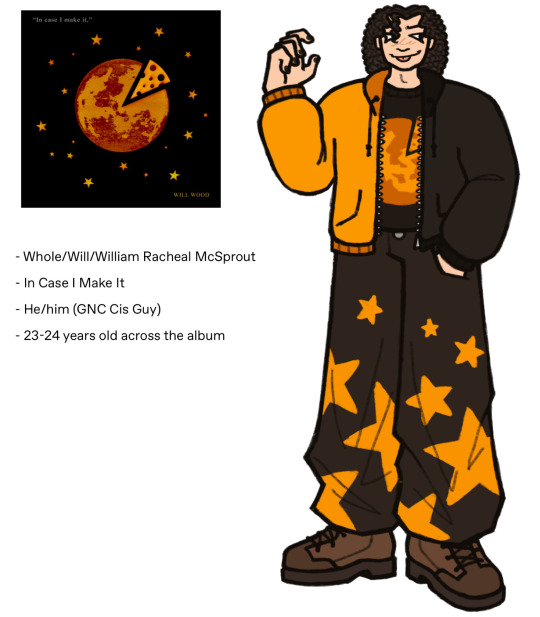
Allow me to re-introduce you to William McSprout of William’s Wanton Weary Wiles!
I wanted to release the full story for this AU, but the old ref sheets have been haunting me since I released them (I’ve just. never been happy with how they turned out) and I finally feel in a place to do them a little more justice. I’ll be posting the other re-draws (there’s minor design tweaks too but not enough to count as full on re-designs) soon too.
Updated character info under the cut:
- Works at a small grocery/general tourist store
- Still does music as a hobby, but pretty much nothing beyond messing around on a piano or uke and singing covers. He's uploaded a couple to youtube that have like 200 views but will probably blow up in a decade when they resurface ^^ /lh
- Likes to do more visual arts in his free time. He can't draw shit, but he's an excellent sculptor and pretty decent at clothes altering (sewing, dyeing, bleaching, etc.) and jewelry making. + makeup of course
- Spends his extra money on video games. Probably sneaks into his friends' colleges to use their arts equipment or smth /lh
- Not aware of HMS, though they’re aware of him. Mostly just feels a general sense of dissonance during splits, rather than Knowing the presence of these Multiple Actual Guys. Can’t interact with Marybell, same as HMS can’t (directly) interact with the “Real World”.
- Mood Swings and very mixed self esteem. He’s simultaneously the worst most lazy rotten thing to ever deface this earth and also extremely talented and cool and strong and the best and anyone who doesn’t like him is simply Wrong and should fuck off [<- all in his eyes. whatever he “actually” is is up to you :]]]
- Not particularly he's actually fairly self aware and emotionally intelligent. Unfortunately knowing and caring/doing something about it are not the same :') He is ultimately a caring guy and he Will [haha] be there for the people he cares about when they need him.
- He doesn’t like to burden other people with his problems and will usually just kinda either A: disappear when things are getting messy for him personally. Or B: try to convince both himself and others that “things are great!!” [<- lies] and distract himself with parties, going out to drink, etc.
- His sleep schedule is fucked and no one can tell if it's affecting him or if he's just Like That
- He’s a solid 6’2 with an intimidating and fairly confident stature. He’s generally high-energy and outgoing when he's not going through a depressive episode.
- His favorite food is American cheese and this is honestly the character trait I think about the most. I need you to understand. He's tasted and enjoys other cheese too. He's extremely knowledgeable and has passed several blind taste-tests while drunk. He just really fucking loves American cheese for some reason idk man
#cj whole#chonny jash#chonny's charming chaos compendium#wwww au#William's Wanton Weary Wiles#William Racheal McSprout#appalling mustelid tornado
16 notes
·
View notes
Note
Hey there, i love your art very much!! Especially the recent BG3 portraits. As someone who's switching to digital art and works with colour for the first time, could i ask: how do you figure out the right colours for your drawings? Do you premake a pallete, or pick one colour and then work from there or something else? Any tips would be welcome, keep drawing ❤️
Hey! Ah, thank you so much, I really appreciate it!
That’s a tough question to be honest. I find myself struggling with colors almost every time.
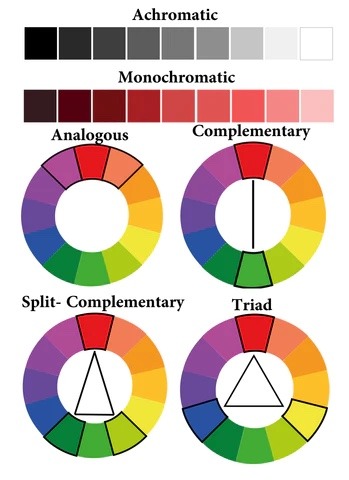
As I start an illustration I mostly have a rough idea what I want it to look like colorwise. Basically there’re two ways for me when it comes to coloring.
1. If it’s something more simple like a portrait or a character design, I tend to pick one base color and paint the whole object. From there I adjust each separate part such as hair, clothes, etc by moving slightly along the color wheel and changing the darkness and saturation depending on whether for example hair should be darker or lighter. For me personally in that case I prefer using analogous (picture below) colors and maybe add some complimentary (on the opposite side of the wheel) colors for highlights or backgrounds.
2. If I get too lost in the color choices, I scroll through illustrations of other artists I like and choose some that would suit the general mood best. Procreate and, I believe, CSP have a function where you can create a color pallet from a picture. I’m sure you could find some similar web or app, if your software doesn’t have the feature. Then I just use the colors from the pallet and build up on them, adjust according to what seems to work best for me.
Although if I had to give some basic tips based on personal preferences:
1. Never use black, avoid using white. I prefer using dark and saturated blue, purple, red instead of black. Light and less saturated base color instead of white.
2. In general I prefer working with more saturated colors, but got to be careful, not to overdo it, not to create crazy colorful mess. But again that’s my personal preference.
3. Avoid using too much different colors. I mostly try to stick to three, max four colors in one illustration and just use their adjusted versions (darker/lighter, more/less saturated) for shadows and highlights.
4. Contrast is more important than colors.
Guess, that’s what comes to mind first, hope it makes sense at least a little. In general I’m really chaotic when it comes to colors, so I’m probably not the best person to give advices. However, if you have any questions, I’ll be happy to try and help as much as I can.
Good luck on your creative journey!
108 notes
·
View notes
Text
Hi…so dragons in my au
Im still thinking what kind of roll I would give to the dragon girlies I’ll have to think abt it carefully. I think more than a year ago I redesigned the dragons for my au, but now that I have a solid design of the Golden Goddesses I decided to go back to my old au designs and revamp them.
So in my LF au but also my GG au the Golden Goddesses in a last ditch effort they become dragons and leave behind the triforce. Their names have been altered and changed by the course of time so that is why their dragon counterparts have different names from their original form.
So Nayru -> Naydra, Farore -> Farosh, Din -> Dinnral
Now to their designs (tee hee <3) if u already have seen my designs of the Golden Girlies u already know I’ll implement their race heavily on to their dragon designs. Along w some other stuff
Let start w Farosh
She’s a Minish! Tbh she would probably be the “closest” one to the canon designs. But I do have a few ref ideas I would like to implement to her dragon design. Red Ruffed Lemurs for head shape and also the eyes ❤️(and maybe fur also) and having a slim reptilian body. She’s the simplest out of the two but that is mostly cause I have a clear idea of her.
Ok now to Dinnral
Me kicking my feet thinking abt drawing a goron dragon tee hee ❤️ Back when I was drawing Din I used pics of tigers and boars for her general design. For her dragon form i decided to go the traditional eastern dragon route. So I’ll stick to that now adding eastern dragons into the mix :]
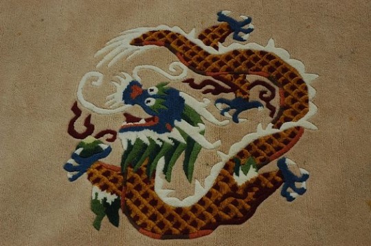
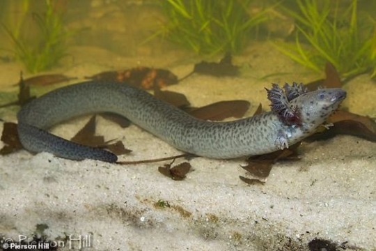
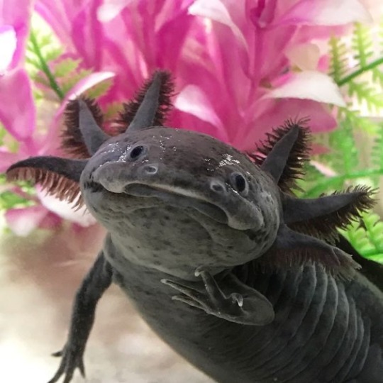
OK FINALLY NAYDRA
She’s going to be the unique one out of the bunch as the other two would fly constantly. Naydra will mostly stick to the water regions of Hyrule and occasionally go on the cold snowy mountains of Lanayru. I’ll go w a salamander/axolotl approach to her design, and just to be freaky w it I’ll give her human-like teeth like those types of fishes in replacement of dragon teeth
96 notes
·
View notes
Text
So, some of you are probably wondering why some characters of The Amazing Digital Guardians have bad teeth. @localcanadiancryptid22 mentioned this in a reblog for one of my posts (not singling you out negatively I’ve really been looking for an excuse to talk about this—) And there was also an Anonymous ask about why Caine’s teeth are so bad. I’ll give a rundown of why I draw teeth the way I do!
Yellow Teeth - Ragatha, Jax, and (eventually) Gangle
A huge pet peeve of mine is that I hate using pure white as a color for my drawings (this is just me though, people can do whatever they want). So, usually, when coloring eyes and teeth, I go for an off-white/cream color or sometimes yellow for things like eyes and teeth, because it looks more natural to me. These characters all have yellow teeth, but that doesn’t necessarily mean that they’re all unhygienic. Ragatha is probably the cleanest member of the circus, and she brushes her teeth! They’re just yellow. The first character I colored for this AU was Jax, and he has yellow eyes and teeth—so I stuck with it for Ragatha too.
Black teeth: Pomni
Pomni has black teeth because she used to smoke when she was a human, and it’s a habit that has carried over into the digital world. I just grossly exaggerated the effect of it on her teeth (because the Circus is a very exaggerated, animated world). I kind of also just wanted to deviate from giving everyone off-white or yellow teeth because I thought it would be a bit boring.
Bad Teeth: Caine
Caine’s horrible looking teeth are just a representation of his poor habits, like smoking and drinking, since they are known to ruin teeth and gums. The reason why Pomni has black teeth and he has brown/dirty teeth is because I just wanted to make them look different!
Tooth gaps: Jax and Pomni
Both of these characters have tooth gaps, with Pomni’s being much wider than Jax’s. I honestly just like imperfections on characters and teeth gaps are my favorite, since they’re easy to draw and can vary in width, so not everyone looks the same.
Metaphor of Teeth:
I guess teeth are kind of a metaphor in this AU. Characters who have obviously bad teeth (like Pomni and Caine) are “sinful” and have done some very bad things in life. Characters with yellow teeth (like Jax and Ragatha) look a bit more natural, but even they haven’t lived completely innocent lives. I believe that Gooseworx said that everyone who’s trapped in TADC is there for a reason (I could be wrong though) and the thought of even nice characters like Ragatha having a dark side intrigues me.
Other than that, a person’s hygiene (which includes brushing teeth) can say a lot about them. Are they clean? Lazy? Forgetful? Depressed? Maybe they can’t afford things like braces? A lot can be said by how they take care of themselves. To me, teeth and the mouth in general can also mean vulnerability. Things can enter the body through the mouth, we kiss with our mouths, etc.
Also, Caine is a huge set of gums and teeth. The other characters having imperfect teeth like him may signify that they’re more similar to him than they think…but bad teeth also look gross, and that’s appealing to me, for some reason.
Thanks for reading all the way to the end, if you did. This is just some insight into how I design characters.
#the amazing digital circus#tadc au#the amazing digital guardians#tadc jax#tadc ragatha#tadc caine#tadc pomni#teeth
27 notes
·
View notes
Text
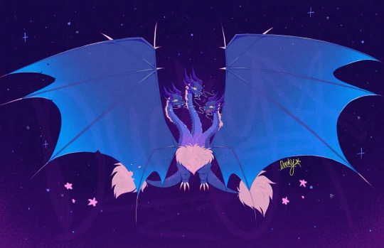
NEW KAIJU OC?!?!
Well, yea technically. Basically i was interested in figuring out how id go with making my own kaiju. At first i wasnt sure where to go for designing one. So i chose to base it off another existing kaiju for inspiration. I kinda wanted to go for a dragon type kaiju (i like dragons) and the only thing i could think of was Ghidorah so i went with that (now that i think about it more, I could’ve maybe used Manda too prob but oh well, Ghidorah was still a good option). I added some different details to mine that make it unique to the og Ghidorah
My idea was that it could potentially be a relative to Ghidorah (being of the same species) but still far apart from one another to the point they arent all that aware of the other existing (theyre in for a shock when & if they do encounter each other lol). This version actually relies on cosmic energy derived from such sources like stars & generally anything that produce some form of energy within the vast universe (basing it off how Ghidorah themselves originally came from space & this variant being much more dependent on that factor). It stores that energy & relatively stays in a dormant stage for an extended period of time until when faced with the challenge to defend itself or fight off those it deems as a danger. Then it would release all that ginormous amount of space energy that manifests itself as a rapidly expanding glow of extremely bright light. Enough to cause extreme damage & bring down the opposition. It can gather energy by using special crystals it can grow (took that also as inspiration but from Space Godzilla) & become as some form of attracting & absorbing the energy. In a way, the energy is like its main source of food & energy to maintain itself (right after releasing a lot of it during its final attack of using that glow, it would be put in a highly vulnerable state if not recovered by regaining some energy back soon enough). For the most part, they mostly sleep (being lazy 24/7 just like me fr lmao) to keep all that energy but can be potentially dangerous if disturbed or provoked in some manner
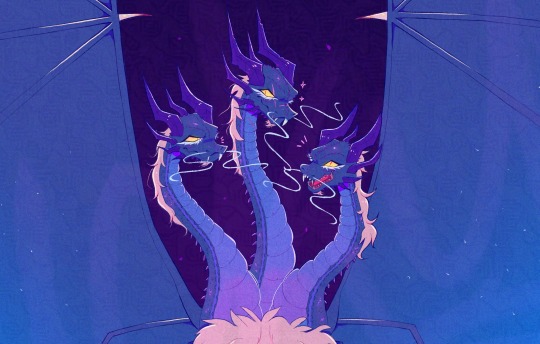
(Here’s a better closer look at their faces. Realized the canvas’ too big to properly see each of them-)
The name of this kaiju you may be wondering???
It’s Ryudorah
(Yea i know im the most creative person out there. I combined another nickname i use for myself and just added the end part of Ghidorah’s name to make it clear it’s related to the other kaiju. I couldn’t think of anything else im sorry😭)
And also each head has its own individual name:
Do, Re & Mi
(Named after intervals in the musical scale (ex: Do, Re, Mi, Fa, So, La, Ti, Do)
Did i mention this kaiju can also technically sing too :)
I did have a lot of fun with coming up with the concept for them (tho it honestly took longer in designing them due to a busy schedule ive been put in as of late & finding the time to finish it) but im glad to finally be able to share this with you all. Hopefully I can share more about them soon (i have a whole google doc’s worth of lore lmao) & probably draw them again (tho maybe a lot more simplified by then). Didn’t wanna overwhelm ppl with the huge amount of info so I’ll prob slowly reveal more over time.
[Another thing too is that i still am new to the fandom (tho with more knowledge from getting to learn more from the source material) & most of this i gathered from already know stuff i knew. Tho im also open to feedback & maybe some ideas to add onto my own kaiju. So id very much appreciate it if there’s any suggestions from you guys ^^⭐️]
(I’ll only be taking constructive criticism btw. Anything hateful will obv be ignored)
#godzilla#kaiju#kaiju oc#my very first kaiju oc!!!#oc artwork#oc#I feel like both this guy & Ghidorah would have a rough first encounter#i love how i also made them the lazy ass who sleeps all day & only wakes up to tell others to shut up when they’re being annoying#i really tried with making this#i think theyre really cool so far#appreciate any feedback on this#i should probably draw a Ryudorah & Ghidorah interaction just for fun some time#youre also free to do fanart of this guy if ya want#i love them very much
39 notes
·
View notes