#I tried to do a color pallet it did not work
Explore tagged Tumblr posts
Text
Honestly I don’t like this much I’m not to good at coloring but more yukio and rin cause da sillays

#ao no exorcist#blue exorcist#okumura brothers#rin okumura#okumura rin#yukio okumura#aoex#aoex fanart#blue excorsist#art#my art#my artwork#my attempt at art#the only ones ever#I tried to do a color pallet it did not work#I’ve never worked with blue#😭😭#PLS LIKE#IM CRYING
832 notes
·
View notes
Text

SAGITTARIUS LETS GOOOOOOOOOOOOOOOOOOOOOOOO
If you want to see the other designs, just look at the tag #gladiator au on my blog <3
Virgo is next, and then Aries! Design rambles under the cut.
So Sagittarius is actually connected to a lot of centaurs in Greek mythology. Ancient Greeks, I love you for giving me SO much to work with. The sign is masculine, so he/him. Sagittarius is primarily associated with Chiron, also known as the trainer of heroes. He trained Achilles, Patroclus, Heracles, Jason, Perseus, and many more. After Chiron was in extreme pain due to a poisonous arrow Heracles shot him with accidentally, Zeus immortalized him in the stars. He is also associated with Crotus, a son of Pan and Eupheme, who was very skilled hunter. The muses had Zeus place him in the sky to demonstrate archery. I gave him a bow heavily inspired off of a model of Odysseus’ bow, which is known to be extremely hard to string and even harder to shoot. I did this because I like to think Sagittarius is literally the only person in the entire universe who knows how to actually use that thing, let alone have the strength to do it and aim precisely enough. I originally tried to do for him what I did for Aquarius and Cancer and color pick from his planet, Jupiter. However it didn't turn out too well so i just settled for an online color pallet, with some additional colors I added myself.
Let me know if you have any feedback!
#sun and moon show#the sun and moon show#lunar and earth show#the lunar and earth show#gladiator au#sagittarius laes#laes sagittarius#astral body laes#laes astral body#character design#astral body designs
58 notes
·
View notes
Note
I really like your Nefero. How about a story where he helps femReader with her look. Like, one day, I'm talking fashion disaster. Reader is going through it and to make things worse it's picture day! And Reader and Nefero planned also do it couples photos! When Nefero gets a call from his girlfriend that in desperation, he comes to recuse with a army of help from his home's staff
Thank you for your time.
Thanks for the request (^v^)
This sounds AMAZING!!
Love our fashion couple,this is gonna be good.
____________________________________________
Male! Nefara x fem!reader
Prompt- reader has a bad makeup & outfit morningd and needs immediate help from her boyfriend and it's senior picture day with also couples pictures in the next few hours! We have code fashion emergency
Using [Name] as substitute for (y/n)
Fluff/ comfort/kisses
Nickname for the reader- my jewel or my queen
(Readers Nickname for nefero in here with I'll probably use from now on for any fics with him hehe)
(H/c) Hair color
(H/t) Hair type
(There's not that much fanart so I'm using what I find so it may repeat sometimes.)
*Art not ime found it on pinterest*
____________________________________________

___________________________________________
It's 6:30 am senior picture day and a ghoul is stressing more than ever before.
We see [Name] in her lush (f/c) bedroom, she is seen frantically rushing back and forth to the mirror and the closet, she holds up different skirts and crop tops in a rush.
"What to wear what to wear"
She tried one look "ugh no" and another "disgusting" and one more out of a hundred she had tried on "this is unmatchable and not what I need for our photo shoot"
She wears shorts and a crop tank top to help her see easier what would work but as she picks up and throws clothes all around it's quickly becoming stuffy in the room.
She curses under her breath and instantly thinks "maybe if I do my makeup first I can pick my picture Day outfit more easier" rushing to her vanity , picking up the essentials she quickly makes a base for her eyeshadow, she looks through her drawer picks up the eyeshadow pallets she recently got from her boyfriend as a in his words "a pallet with reds and greens that show my two favorite thing, money and you since you are my scarlet fire that burns within me"
She smiled as she applied the vibrant and rusty colors on her eyelids. Moments later she looks at herself and frowns
It all looks wrong. The way it looked so smeared like a toddler was the one to help her, the shimmers were all over the place, the blend was outrageously horrid and why did she start with red instead of green to be easier to show up!
"Ughh what is going on with me!" She screeched throwing the makeup brush strongly to the ground, [Name] grabs the makeup remover and reusable rag and dunks a ton of it, she sneers at her reflection. Then vigorously wiped her face in anger.
Stopping for a second looking at herself again she noticed her long (h/c) (h/t) was not as good now as when she started this horror show.
Tears start to sting and drip down from her cheek down to the vanity "w-why now *sob* i- I can't be this bad at doing something so easy...it's second nature to be good at this *snif* *hiccup*"
She looks at the clothes discarded on the floor and walks to them, "i need to call Nefie *sniff* i-i need him" she thought of how they were supposed to be doing a couples photo shoot and she wouldn't disappoint him it was special for him and her
Going through the piles of clothes she finds her phone in the small plush seat she had in front of the mirror that got forgotten at the start of her panic.
She drops to her knees onto the soft lavish rug she got as a gift from him as she makes the call.
RING RING-
it takes only two ring for her loving boyfriend to pick up the phone "my jewel good morni-" he stops as he heard her sniffling "WHO HURT YOU" he demands making her slightly laugh be it breathy between sniffles "N-no one Nefie I'm *sigh**snif* I'm having a terrible time getting ready and- can you come I need you here" her voice was soft yet rigged, tired & honestly done with today even if it hadn't started "I'll be there in five" he states before hanging up
5 minutes exactly [Name] hears the familiar sound of Nefero's limo and another one?
And as fast as she question there where rapid footsteps going up from the stairs and straight to her room "SLAM" the door opens to reveal Nefero dressed as handsome and beautiful as he is with dark green velvet bell bottoms with a matching suit, a dress shirt opens to reveal his chest, adorn with layered golden dainty necklaces with one that had a crimson red diamond to represent his darling.
"My queen" he said with extreme tenderness Nefero gets on his knees and embraces her in his strong gentle arms, caressing her back as she cries new tears not of frustration as she did only moments ago but of happiness that he was here to comfort her and help, truly touching to her ghoulish soul
She hugs him tight her grip strong it seems to dumb but this is just good
"Take deep breaths with me jewel" and she did in and out, holding him and vice versa after a few minutes she lifted he head up and looked at his purple eyes, smiling "thank you for being here" [Name] leaned forward and kissed him, broke the kiss "whatever the cost I'll gamble my way yo see you" he proclaimed "now let's help you up" taking her by one hand and another on her back he pulled her up from the ground.
Nefero looked at her up and down "now let's see what we can do, you up for being my model this morning?" Grinning [Name] replied "always... especially now haha"
Nefero claps his hands and comes in a group of professional fashion artist, makeup artists.
"Now let's get this going for you my queen" he took her hand and lead her to her vanity that was immediately cleaned out except for foundation, pallets and other things, Nefero sat her down went straight to the makeup artist told him the theme, the artist came in front of [Name] and got straight to work.
He did greens & golds with red shimmers and eyeliner that could kill and lashes that fitted on top of the ones you had.
Nefero was seated next to you as the fashion artists worked and got his approval for dresses, skirts, tops all while having one hand on his lap and the other on your thigh,squeezing just right, every once in a while when he found something he definitely approved of being a specific dress or looking at the progress on your gorgeous face but mostly looking at your lips.
"I'm loving this my jewel~" he held a hand to his mouth practically foaming, looking at her made his mad and week at the knees, the overbearing feelings to just worship her as many did when he was alive was a thrilling feeling he liked, to be on his knees for only her~
"Thank you Nefie~ I like anything you put or take off me" She lowered her tone leaning towards his face as the makeup artist was looking for something to the far side of the long vanity
Nefero blushed, his eyes filled with desire. He took a long breath, his chest heaving, hands itchy to touch.
"Alright just the setting spray and we are done" they came back and sprits her face.
"Good now for my favorite part♡" Nefero jumped up from the chair took [Name]'s hand and to the front of the tall mirror, there were three stylists holding different clothes that she hadn't seen before which means Nefero had for sure got for her before the original mess.
They were lined up with one holding short and long dresses, the second holding short skirts and long shirts, the third holding tops cropped and not.
Nefero went up to the first one and said "my jewel this one if most definitely for today" he held up a red velvet short dress with a backless heart and a green velvet bow that tied around her waist, he signed for everyone to leave.
" i thought the green would be a good reminder that you are my crimson fire and I will always be the fool who marchers toward it holding it for warmth" he held her face delicately, [Name] smiled " and I'll for the rest of my being subside my radiant flames to keep you within my embers"
They embrace each other with a kiss soft and warm just the way they liked
~~~~ ~~~~
At the room for the pictures it was empty after everyone had gone, the happy couple liked that it was just them.
And as they held eachother close & intimate, smiling calmy just enough it reach their eyes you could see a glint in them both since they only looked at eachother.
__________________________________________
Nickname for nefero is Nefie
I'll fix some grammar that passed me later but here it is!
@myjerseygirlblog
#fanfiction#male!nefara x reader#monster high x you#monster high x reader#monster high#character x you#character x reader#genderbent#x fem!reader#x female y/n#my fanfiction#request open#x reader#monster high headcanons#monster high imagine#monster!reader#mh x reader#x you#x female reader#x reader fanfiction
174 notes
·
View notes
Note
please how did you come up with her design I've been trying to make a design for my poppy playtime oc but it always ends up looking like rubbish please give tips😭😭
Hello, thank you for asking! Truth be told is that it took me a bit to figure out how to do LoolaLamb in general, she didn't come out too well on the first try xD I had to tweak a couple of things in her like the hair, colors or snout.


Initially, I wasn't quite sure of what animal picking for her, but then I went with the lamb idea for a few reasons:
- When I was little, I used to have a lamb plush I used to love dearly. Sadly I don't have any pictures to show since I no longer have it with me so I tried to look for one that looked similar on the Internet- But that was the main inspiration for her character. And since the Smiling Critters have their own plushies as well, I thought it would be interesting to make one of them after a real toy. I also took reference from other characters in media that were based on sheeps, like in Pokémon (Flaaffy & Whimsicott).
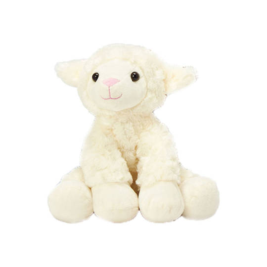
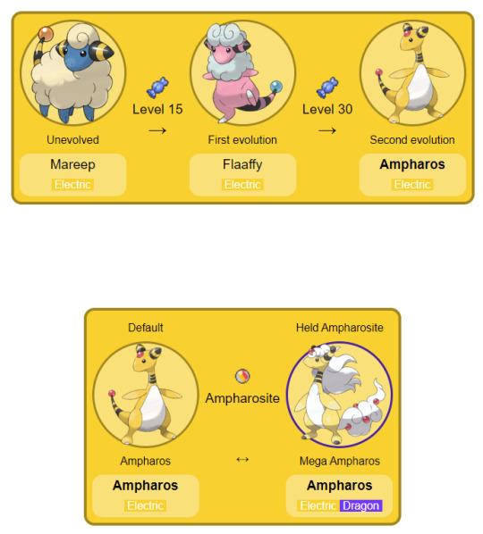
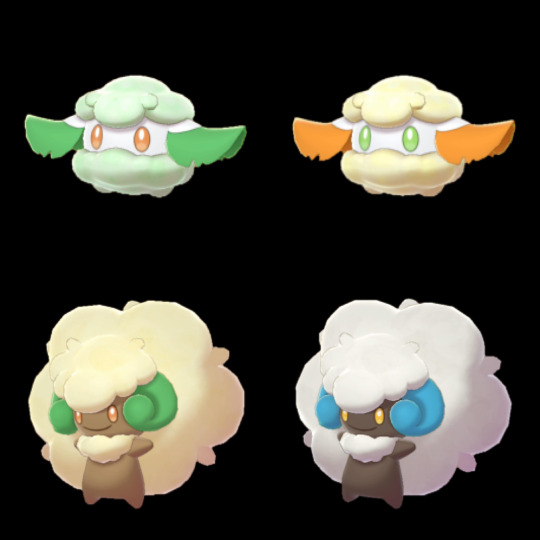
I would always recommend using references if you ever don't know where to start with a design. And in the case of a Poppy Playtime OC, you can look for references if you desire as well, or even turn a beloved toy of yours into a character, anything works!
In many cultures, the lamb is a revered symbol of innocence, purity, and sacrifice. It is often associated with religious connotations, particularly in Christianity, where it symbolizes the embodiment of Christ's innocence and the sacrificial lamb offering redemption and atonement for humanity's sins. I simply liked the symbology of this because I'm always a sucker for that when it comes to creating characters;;
This was mainly due to lore reasons, her association with Catnap, a follower of an entity, the Prototype, whom he workships and would do anything to get its blessing. LoolaLamb "sacrified" her voice for the Prototype (well, it actually was that Catnap took away her voicebox with that excuse).
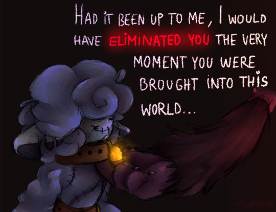

Her name "LoolaLamb" is a word play for "lullaby", given the role she was going to have in the Smiling Critters line, a replacement for Catnap who would have a similar role as his, except that instead of using a gas to make people fall asleep, she would use her voice. Sheeps and lambs are also heavily associated with sleep and dreams, given the advice: if you can't get to sleep, just “count sheep” until you drift off into a peaceful slumber.
Sheep are wanderers. It's their nature. Even in the best and safest of places, places that provide protection, water, and food, sheep are known to wander off, get lost, and sometimes eaten by predators.


Her color pick was mainly because even if the smiling critters have more or less the colors of the rainbow and there are already two blue colored critters (Bubba Bubbaphant being more of a neutral blue or azure and Craftycorn cyan or aquamarine), I noticed that there were no dark blue or indigo colored ones. My first idea for LoolaLamb was to give her more violet colors, given her correlation to Catnap, but at the same time I wanted her to stand out amongst the others, being a little more of her own character, so that´s why I ended up picking a different color pallete for her.

And those are pretty much the basic things I had in mind when creating LoolaLamb! Of course it doesn't always have to be so elaborated with all characters, but I'd always recommend to find references, information, symbolism, anything that might help you with the creation of your character in case you don't know where to start or are simply stuck!
I might not be the best when it comes to explaining things but I hope this has helped you and I wish you the best in your creative process, anon! 🙏🏻💖
#fanart#oc#headcanon#mint speaks#ask#poppy playtime#poppy playtime chapter 3#poppy playtime 3#smiling critters#poppy playtime oc#the smiling critters#smiling critter oc#loolalamb#poppy playtime fanart#comic#catnap#dogday#i would have added more art but I reached the image limit LMAO
161 notes
·
View notes
Note
Hello!!! I love your art and your style. I'd love to hear your inspirations behind how you draw and, in addition, hear a bit about your painting process (I love the impressionistic look your paintings have)
ahh!!! thank you so much ;u;
Ill tried my best to break down my thought process behind my drawing, so i hope this all makes sense aahaha
undercut cause it came out real long
SO Karl Gnass is an instructor that i took an anatomy class with. and who broke down anatomy in a way that really helped me grasp space. like space a figure occupies. and from that i think my characters feel a bit more...grounded? im not sure what the right word would be but tangible is something people sometimes say about my art.
And i do think when youre able to make a figure look like its really wrapping its hands around something it makes character interactions a lot more intimate.
heres a few under sketches i do when i start a drawing (i am trying REALLY hard not to use my nsfw ones tho those are pretty perfect when it comes to showing u anatomy RIP)

after i got the poses done ill turn down the opacity and rough sketch out details on top of these. and once THATS done i move onto lineart. and the most important aspect of this step is NOT TO TRACE YOUR UNDER DRAWING!!!! thats what sucks the life out of your work!!!!
instead you use your undersketch as a guide. ilI actually redraw the simple anatomy underneath very lightly, erase where they over lap and then add line weight variety + darken up the details.
examples of this are gonna look a little messy but. Left is the original pose i drew out with rough details. right is the drawing i do on top of it. you'll see theyre not one to one and theres some lines i didnt fully erase out when redoing the anatomy. i find my clean up has a lot more energy when i do this.


the thing about my style is that you'll notice i never actually do actual clean smooth lineart. and thats because i HATE DOING THAT SHIT. like i did learn how to do it and consistently forced myself to do it for over a year. and while i do think i learned a lot about line weight and drawing clearer. i realized? its just not for me. I like a textured brush and i like being able to see those small lines i didnt get to fully erase out because i think they look cool lol and thats ok!! do what you want forever man!!! its your art!!!
Also before i move onto painting ill show you this neat little trick. you know those more "loose" drawings of mine that feel more gestural? the begining process is exactly the same. the difference is i use a chunkier pen and try to see how much i can simplify details + just feel out the energy of lines

NOW PAINTING.
man. where to even start.
the thing about painting is that its an entire different set of skills that need to each be honed on their own and will slowly build up together. ill break it down like this.
VALUE, COLOR, and TECHNIQUE
I've said this on another ask before but you'll notice ill do a lot of black and white sketches. and i do that to practice choosing how to group values.
like this example. how light is laios' wolf coat compared to his skin? or kabrus skin color compard to laios coat. when do you want to really push the contrast of light and dark and when do you let values be closer to each other when you DONT want attention

the next step from this is adding a light source.
and when you're working in black and white its a lot easier to pay more attention where you want your light/how its gonna look like hitting youre characters and how far youre gonna push your shadows.

and you know if you get good at this you can play with limited color palletes

this is literally just be picking out blues and hitting the bottom with the gradient tool to light it up
NOW COLOR
is a lot harder and also very subjective. I do a ton of impressionist studies where i just color pick the fuck out of a piece to see what colors masters used + knowing the history of paint and what colors were available during that time period. +knowing what colors = what mood + knowing what colors to use when you want to be more realistic vs when you want to lean into more stylized+ what colors YOU specially incline towards + AHHHHHHHHHHHHH
its a lot and im actually still learning myself
But when i do a painting i collect a LOT of refrences of the kind of mood i want my own painting to feeling like. I've show the first example in another ask before but heres one from my latest labru too


WHen i actually start a painting tho they look like this. The top drawings are just flat colors with a simple outline of where i want the light to be hitting. like in my value studies im just trying to get the idea down, seeing what values need to be darker vs what is lighter. and how the light source covers the character.
figuring this out in the begining makes the rest of the painting so much easier because youve essentially made all the big compostion decisions NOW. from here you can start playing with colors.
my second stage, youll see with drawings at the bottom, is when i start using my texture brush to lay in extra shadows and just play with variety.

and then? i start rendering
that would be TECHNIQUE
And well....thats also something thats gonna be very subjective.
With my own style im not interested in rendering everything to perfection. Im trying to figure out how to texture hair/skin/clothes in ways that make them feel like the materials they are while also showing the energy of my brushstrokes.
I dont zoom in while i paint btw. everything i do is zoomed out so i can see the entire drawing. it helps me not tight up my strokes while also letting me build up all areas of the painting equally. the only time i zoom in is when im lining out the eyes/mouth of a character. and yeah. it drives me insane doing this because ITS SOOOOO Tempting to obsess over paint 1 area forever then zoom out and see that nothing matches lol
The other thing about my style of painting. Is that im not gonna use the exact same formula for every piece. like this isnt cell shading. you can have an idea of how to texture skin/clothes/hair and sometimes it looks great and beautiful in one painting and then it looks like shit in another. ive overhauled a lot of paintings multiple times because what i thought would work doesnt and ive had to force myself to explore and play with my brushstrokes. and you know? i wouldnt have it any other way. it means none of my paintings are gonna look alike! and i think thats pretty cool :D
ill leave you with this in the end. a painting im in the middle of doing and debating to overhaul cause im just not feeling the strokes. who knows what ill look like in the end

anyways i hope this helped a little? even if you look at all this and go. IM NEVER GONNA DRAW LIKE THIS BOZO ahahah
BUT I WISH YOU LUCK ON YOUR OWN ARTS :DDDD
39 notes
·
View notes
Text
I finally took the time to try and come up with a design for my Spamton, it will probably change again, but for now, I love it. All sources and what the final result looks like will be listed at the end, as well as what inspired me
The map out (I used the base given but I'm glad it doesn't look like their spammy, wouldn't wanna copy a design!):
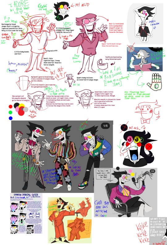
I had so much fun doing this, I worked on this for about.... 3ish hours, using sources and trying to throw them into my style. If you like my design, PLEASE check out the much more talented artists 🧡
The first artist is @colliholly on X and Tumblr
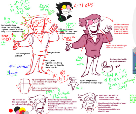
You helped me so so much! The fact that you drew and wrote what you meant is just awesome. I used the base you provided (I hope that's not a big deal, I could not draw his [4.99] body haha) it was a BIG help! I see your Spamton art everywhere and there's a reason why 🧡!
The second is @unikhroma on Tumblr!
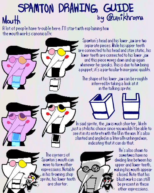
This guide inspired me so much, I kinda forgot his jaw just... Detaches, and I want to eventually replicate it in the future, if you can tell I tried to make the bottom of his jaw look unconnected. This small little detail helped me understand this man's GARGANTUAN maw so thank you!
The third artist of the night is _•bluetea•_ on insta!

The soft warm pallet, his round facial features, and his kinda similar facial features being turned into a statement with his hands and eyebrows is just...WOW! They may be one of my top #10 favorite Spamton artists! They helped me with my Spamtons grey hairs and some of his color pallet.
Fourth is @bug-molars on Tumblr!
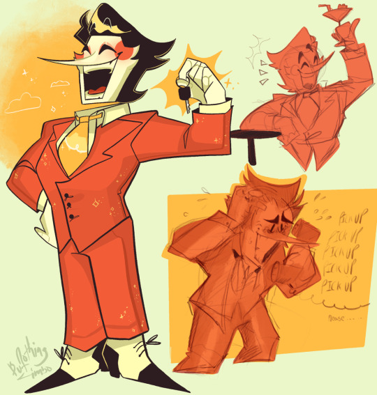
He looks so silly and radiant, you can't really see but I'm gonna make his head float like they did, drawing his neck would be a NIGHTMARE, so thank you for the idea. Again, warm soft pallet! He looks fluffy, snazzy, and middle aged! So like, 10/10 💯💯!!
Fifth! @zarla-s on Tumblr

I love your Spamton comic, if you're seeing this uhhh, I love his silly grey hair and his goofy ass pants!!! The hand wounds reminded me of Gasters hands and being crucified, so I was going wild and rolling with it, thank you for that realization and drawing a based ass comic. Go read it by the way, all y'all, it's based!!!
As for the last one

I can't find the artist, I thought this was really cute but considering how it has that little sticker outline I think this may be pirated art that's lost somewhere, if you find the og artist lemme know! They drew him super cute, I didn't end up using anything with it but I thought it was cute none the less.
OKAY, finally, time to see my spammy, hope the lead up wasn't super exciting and then it was a let down:
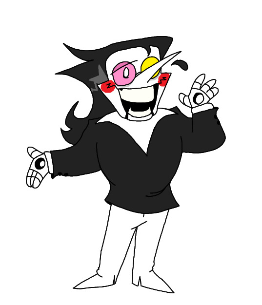
However, I think he's cute and hot haha, I love this IDIOT, and I appreciate every artist that let me get here. Got some silly head canons for y'all too!
1# Spamton's loose hair was a glitch that just kinda stayed... it's in his data model now so it'll be there for the foreseeable future
2# When spamton fell in acid and started going crazy he turned to religious means to cope, one day he got drunk as shit and uhh... Tried to get a group of people to crucify him in an alley way... So that's where the holes came from
3# There is not a single stain on this mother fuckers pants, you wonder how, especially since he sleeps in a garbage can, and honestly, idk how either.
4# like 2 feet tall. He is short as hell. I mean small small. Like it's actually concerning.
#colliholly#unikhroma#bug-molars#zarla s#spamton#g#Spamton#spamton art#deltarune#deltarune art#thanks for the references#really#seriously#this is a long one#excited to draw him more#spammy#spamton deltarune#he calls you toots probably#...#definitely#small ass middle aged man#CHRONIC EYE BAGS#can't escape them even as a puppet#more tags?#sure#silly man#thank all of you again!#reference#fan art#big shot
21 notes
·
View notes
Text
Second character post except it's my main oc you'll see a lot!
Macein Treacymadder‼️
He is Based off the Mad Hatter


Yes ik his purple & the mat Hatter is green😔 his just build different. But actually I did that to make him the "opposite" of the Mad hatters color pallet
The first part of his last name (Treacy) actually comes from an old famous hat maker! Sadly I don't remember her first name 😔. I added madder cause I wanted to :p
His unique magic? Tea time! ~
He is able to summon Any kind of tea in with in a tea pot ofc the pot varies in the size he wants to make. But be warned once the tea is summoned it is BOILING HOT! AND CAN CAUSE BURNS. Just wait for it to cool down before you pour yourself a cup still taste amazing after it cools form its boiling state
You also might have already noticed if you looked at my PFP that he is dancing with riddle well he is dancing with him because


I SHIP THEM! oc x canon there ship name is Roseytophats and they are my sillys and they will get many post together so I'll explain them then ❤
Back to Macein his a very hard working person. To the point he constantly doesn't sleep (longest streak was 4 days) why does he do this? Well he has parties to plan ofc! He actually plans all the unbirthdays in heartslabyul himself. He also plans peoples birthdays & event parties not to forget he gets commission to plan other people's parties since he is so good at it! Do to his perfectionist in him he plans everything down to the exact color of the table cloth like color code number exact. He tends to always carry s planner and is almost always constantly writing plans and stuff for these parties. His actually taught himself how to write with both hands so if one hand gets tried he doesn't have to stop. He often passes out at his desk in his dorm seen in one of the arts above. Other then that his a very cheery guy sticks to the rules of heartslabyul pretty well as his listen to riddle Yap about them so many times his got them memorized too at this point. He has to count to 3 out loud before stating any number. His a great at multitasking. Form all the sketches he does in his party planners he has become a great artist. His very soft and understanding when need be his just overall a great guy
His best friends in twst are Kalim & jade why? Cause of the tea time hang outs ofc they have tea hangouts once in a while Macein obviously makes the tea and they just have a good time
Other then them his pretty good friends with Vil as they both share a liking for beauty products
Here is a relationship chart for all cause I can't give info on all of his friendships

You may notice he doesn't hate anyone just dislikes rook & Floyd as they just both make him uncomfortable in ways.
Rare crowly knows a student moment he only knows him for 2 reasons 1.cause Macein basically plans a lot of events for him & 2 . His family curse
That's right his cursed. With that? The Spiral . It's a curse that only effects the males of the family and the cure to break the curse has be lost threw time. But what is it actually? Well it's a curse that makes someone go insane it can be in a snap or it could be a slow process the only identifier that the curse has started its path to making the person insane is a yellow spiral somewhere in there body. Maceins is in his eye sadly very noticeable.
He was originally meant to go to RSA but they thought his curse was to risky so NRC gladly took him instead.
More info soon ❤ my brain is currently mush form writing sm
#my art#artists on tumblr#art#illustration#twisted wonderland#oc x canon#disney twst#twst wonderland#twst#twst oc#twisted wonderland oc#big old oc info dump
21 notes
·
View notes
Note
Big S is in the house aka.dude who always writes way too long requests🗣️
Happy 2k followers and here is a request
"what're you doing out here at this hour?"
"you're so cute, it hurts"
"to me, you're perfect. i don't care what anyone else says"
With my one and only babyboy Asmodeus, Assmuah, Asmuadelisa, the best boy in universe and my husband i do not accept other opinions 🥰
So Asmo was gone for entire day for work, like majorish stuff where he was working at his new collection of makeup and modeling and other things, and something got him insecure, that new collection is not good enough, or is modeling is not perfect, like someone said that he is not natural enough in his poses or that the pigment of eyeshadow is not bright enough, overall bro stressed out and came late.
"what're you doing out here at this hour?" MC is like "bro ur ok? Where uve been, it's late"
And when he tells them they are like "you're so cute, it hurts to see you so stressed, i wish i could come with you to help you with that, but i can't bro im not a pro at that shi, want a therapy cuddle?"
And they cuddle while watching some Romantic Comedy that Asmo would love even tho MC doesn't really like them. and MC is like "to me, you're perfect. i don't care what anyone else says" and they muah muah and cute fluff of two cute patooties i love my husband give me some cuddle fluff my request making machine(/j)🥰🥰🥰🥰🥰🥰
thank you!! great to see you again :)
i just want to say i absolutely love the way you spun the you're so cute it hurts one??? that's so genius and i would've never thought to use it that way
enjoy <3
prompts 29, 32, and 37 w/ Asmo
“Mr. Asmodeus, ready to head home?” One of Asmo’s dedicated helpers from Majolish poked their head in the door of his studio.
“Are you closing up?” He looked up from the color wheel he was studying in comparison to the proposed and actual eye shadow pallet colors.
“I tried to get you twenty more minutes, but Ms. Ezos is about to fall asleep.” Ezos was the project manager who’d been working with him for his makeup line from Majolish. She’d been very helpful and sweet, and seemed just as invested in the production of the line as he was. The entire thing had been something of a struggle, and it felt like there was an obstacle around each corner. The latest issue was that the colors of his eyeshadow pallet weren’t what he imagined. They were supposed to be lots of different shades of pink with a couple other colors thrown in, but none of the pinks are what he’d imagined or proposed originally. To him, they all looked too similiar.
“It’s alright. What time is it?” He yawned and took a sip of his water in an attempt to wake himself back up.
“Just past midnight.” The helper checked their watch.
“I didn’t realize it was so late. I’ll pack up my things.” With a sigh, he gathered up all this things and packed them away. He grabbed his bag and with one last look at the test pallet, left the room. The helper locked it behind him. He knew he’d be back in that room sometime tomorrow.
“I think you did really great today.” They trailed after him.
“Thank you. It does need some work. I don’t think I’m happy with it yet.” He took some of the samples home with him to compare with items he owned to see if it actually wasn’t the color he wanted, or if he just needed rest. He left the studio without trying to look for Ezos or anyone else he’d worked with. They probably had went home already anyways. His assistant waved him off, promising to let everyone know he’d gone home.
Since Majolish wasn’t far from home, he walked to and from the studio. Most everything was closed, save for a couple shops. None of his favorites were open, so he had no excuse to stop and shop to lift his mood. When he got home, the house was silent. He made his way to his room to put this things down and get ready for bed. He went for a bath and changed into his pajamas. He sat and thought for a little bit before deciding to eat a little something before bed, as he couldn’t recall the last thing he ate.
He made his way downstairs, and purposely avoided looking at all the clocks on his way there. He opened the fridge to look for something to eat, and when he shut it, you were standing there. It scared him a little.
"So, what're you doing out here at this hour?" Mc was holding a bowl full of snacks, which they set down, implying they'd been in the kitchen in the entire time. He had totally missed them.
"Mc! I'm just a little hungry is all. I've been working on my new makeup line all day." His stomach growled at the thought of eating again.
"Asmo, it's almost two am. You left before I even woke up this morning. You need to treat yourself better. You're so cute, it hurts to see you like this." He couldn't meet your eyes, because you looked genuinely upset.
"I know I've been slacking more recently, but it's only because I'm putting everything into developing.
"You look worn down. I can't offer much, but if you want, we can cuddle and watch something of your choosing?" You opened your arms, much to his delight. He rushed in and enthusiastically hugged you.
"You're just delightful! Can we watch a romcom?" He knew you weren't the biggest fan of them, but you did say he could pick.
"Of course. Lert's get you some food, then we can do that. It's important to fuel your body." He was glad he had you. You let him know what the family ate for dinner, which he opted to eat. The two of you went back to his room, where you put on a romcom of his choosing. He leaned heavily into your side while he was eating, and once he finished, he made sure you properly cuddled him. You were only half watching the movie he'd put on. You were mostly looking at him. He looked more relaxed now.
"Asmo," you said.
"Hmm?" He looked up at you.
"I think you needed to hear this, but you can tell me otherwise. To me, you're perfect. I don't care what anyone else says." You gave him a forehead kiss. He didn't respond for once, but he gave you a cheek kiss back that conveyed all the emotions he couldn't put into words. That's all he needed to hear, especially from someone he loved.
#sorry for the rushed ending haha still on my wuthering waves grind#2k followers special#obey me#obey me!#obey me x reader#obey me asmo#obey me! shall we date#obey me! shall we date?#obey me shall we date#omswd#gn reader
43 notes
·
View notes
Note
hi ..! sorry to um bother you but you made a map of your clans territories a few days ago its reallyyy cute your art is so nice by the way <- not flattery just saying things. well you drew the map in a really clear Easy to Understand way and i was wondering if you had any tips on that ? ive always struggled trying to think of how the territories can fit together yknow its hard for me to visualize exactly how they all work ..
I can try to give some advice tho this was the first time I tried drawing a map so it was really just trial and error heh 😅
Layout wise:
It took me VERY long to figure out how I wanted the territories to fit together. What I did was make a rectangle frame and then I sketched a lot of different ideas of the border lines and layouts for a while to figure things out!
The main things I thought about were: which clans need to border eachother for the plot? Ex: i needed Roar, Sing, and Growl to border Whisper! I then planned around that! I also thought about the clan's relationships to eachother and to the land, like I knew I wanted Singing to be friends with Weeping do I put them next to eachother. And I knew I wanted Singing to center around the river so I placed them so the river went right thru their territory!
It takes a lot if trial and error but I got there eventually!
Style and readability wise:
I went through a few different versions of what style I wanted, but I settled on it being more representative rather than super size accurate. I think this helped with giving it some whimsy while also making is easier to read!
For example: I made the mountain really tall and pointed, would that actually make since size wise? Probably not, but it helps show the viewer the vibes of the territory and the difference between it and the other clans' territories!
I also used a lot of simplified items , like the trees are all one blob shape with little sticks on the bottom, this was so the map wasn't too busy and you could see the basic shape of where the forests were.
I also left out small things like extra little shrubs or trees to keep things less busy as well, like there are probably a few more plants in Whisper, Roar, Growl and Echo territory but I left it more flat and plain so things stayed simple and easy to read!
I also used the different color pallets of each clan to color each of the territories, which helped in keeping each separate and showing where each clan border is! Not very realistic but who cares it helps with labeling!
Idk if any of this is helpful, but this is what I got hehe
79 notes
·
View notes
Text

Miracu-class girls are done! It took less time than I initially anticipated, thank goodness. Let's talk re-write's and re-designs shall we?
Sabrina so freaking cute, give the girl her hat. It was probably a gift from Chloe. For her redesign I thought she would be the kind to dress in cute blouses and flowy skirts. She has tennis skirts in every color for every occasion. As for her re-write- anyone who saw how I changed Chloe probably will guess that their dynamic is drastically changes as well.
Sabrina met Chloe when they were in their tween years, Officer Roger having worked security for the Bourgeois on multiple occasions. One day he had to bring his daughter into work and Chloe found her wandering the halls. When a kidnapper tried to abduct Chloe, Sabrina sprayed him with pepper spray her father gave her and then kicked him in the dick for good measure. Chloe then declared that Sabrina should be her full-time body guard, and she technically is being paid to hang out with Chloe. But Sabrina would have done it with or without the money since Chloe is actually very endearing once you figure out how she works.
Alix is next! Alix's violently pink hair could not be ignored, so I kept it (albeit a little less saturated) Also she is in fact still short. Her outfits are probably all variations of sports gear unless she has an event to attend at the museum. I also tanned her up since I imagine she spends a lot of time outside, girl is sunburnt. She is actually a year ahead in history, having gotten too bored with junior level classes. So she's friends with some of the seniors too. I won't get into Bunnix anytime soon but- let's just say it's a lot more tragic than cannon would ever admit. The rabbit's powers are changing, and Alix still has to live with that.
On a lighter note, Juleka, as stunning as ever. Tall queen. She is a year behind since her lack of participation in classes ultimately tanked her grade in several subjects. Her band director was more then happy for her to stay an extra year though, since she is trained classically as well as electrically on the bass. She may not like talking, but she has little fear of performing when the music can do the talking. Her twin brother actually graduated early, and he's working now to help pay for the band the two want to start. Her design doesn't change much from her cannon one other than the fact I switched her ripped leggings for lace ones. I imagine she actually has many outfits in this color pallet, since Chat Noir quickly becomes her favorite hero.
Mylene, okay the change I made here is pretty obvious. I debated for a long time on whether or not I change her skin tone. And when I did the line art? Wasn't planning too. But changed my mind last second, since I thought it helped the color pallet more. This would imply she is mixed, with her dad looking pretty much the same as cannon. it's hard to tell her unless you look closely but I gave her freckles that just cover every inch of her. She is Sunkissed. He character isn't super different, she is still easily startled, but she knows what she believes and will fight for it no matter what.
And finally, Rose! The lovely Rosey! The flower child! Her nonspecific illness still definitely happened, but I like to think she has actually recovered. I do not know enough about most chronic illnesses to make any sort of specification on what she has so nameless headache disease it is! She struggled a lot as a kid, but now she's planning to start a non-profit to help kids who are going through hard times of their own. She definitely still has her down days, the fact that she nearly died so young is not something she is quick to forget. But she will do whatever she can to give other people hope, sinee she knows all too well what it feels like to be hopeless.
As for her design, she had a bucket of pink upturned on her. She did have to have her hair shaved as an affect of her illness but now it's growing back faster than ever. She gets it cut every time it gets past a certain length to donate it.
Luka is next!
#miraculous ladybug#miraculous redesign#miraculous fanart#sabrina raincomprix#alix kubdel#juleka couffaine#mylene haprele#rose lavillant#akuma class#sabrina raincomprix redesign#alix kubdel redesign#juleka couffaine redesign#mylene haprele redesign#rose lavillant redesign
145 notes
·
View notes
Note
Hello!! I just wanted to ask a question! I absolutely ADORE the Esmd sun and moon costume designs you did, it’s such a unique deity concept that just suits them so perfectly! (I’d love to see more of them!!)
I wanted to ask if you would be alright with me writing something for them? I’m a fanfiction writer! I’d love some more information on them if you have any sort of lore or anything!!
It’s perfectly ok if you’re not comfortable with it!!! Thank you!
YESSSSS THATD BE SOOO COOLL!!! Thank u for asking id love to see it!!! Please tell me about it if u do it!
Though on the info bit I don’t have much lol I just wanted to make cool costumes but what I do have is they mostly just kinda float around in space and what not unless needed, which is next to nothing and probably not what u wanted to hear 😖
I did have a simple idea of how it happened kinda, they vowed to become the protectors of the sun and moon and received a blessing from moonlight (I know she’s technically moon cookie but I think she’s also like the celestial god in general)
So espresso watches over moonlight and city of wizards while she sleeps and since there’s no specific sun cookie madeleine is more a protector of its light and fights against any darkness that tries to attack and take over, kinda like what happened in the republic with dark enchantress and the monsters
Sorry I’m not exactly a story writer and don’t have much but here’s some concepts of madeleine before I settled on a specific color palette and weapon for him if ur interested


I was really set on the fire sword but it didn’t go with the pallete I picked unfortunately but I think it worked out well, it probably would’ve been too cluttered had I picked it anyway
#asks#my asks#some art#crk#cookie run#cookie run kingdom#crk fanart#cookierun kingdom#madeleine cookie
16 notes
·
View notes
Text
MH doodles and concepts
First just random fanart
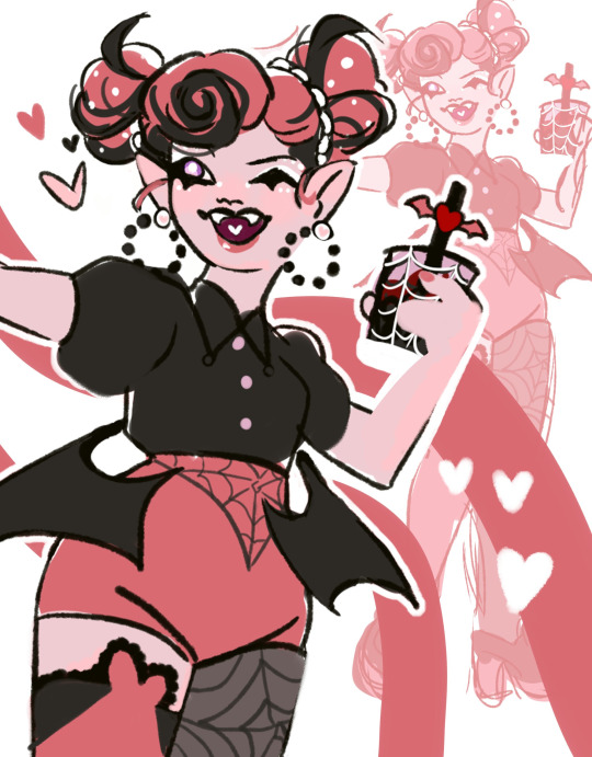
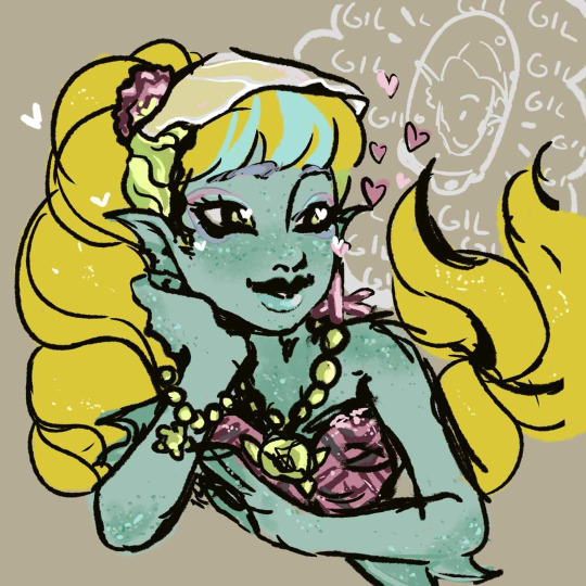
I love sweet water lagoona im sorry shes so cute
Now then those are mostly designs i stopped working on for many reasons and i can barely find good images of them now cause theyre not even on my computer. Maybe i revisit them in the future but who knows
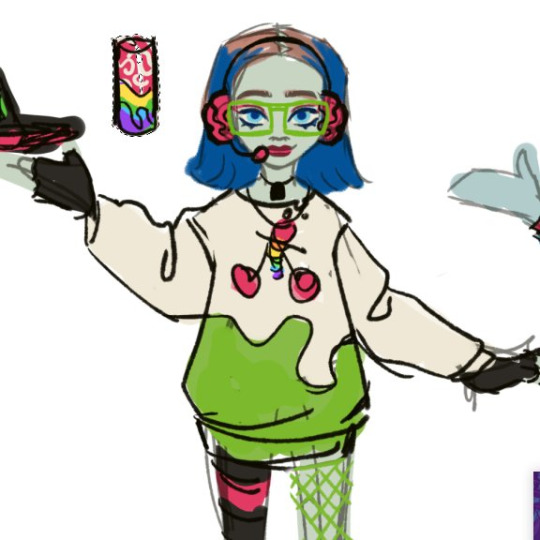
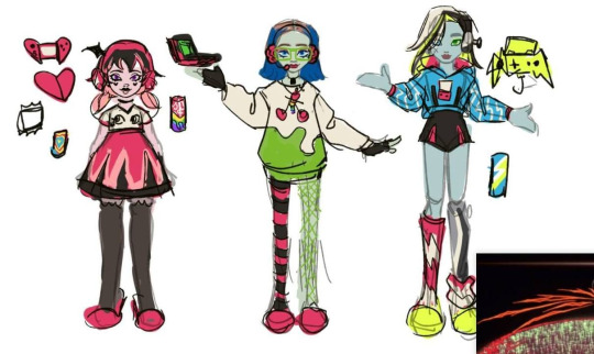
First something i tried together w the beach fan design- literally a gamer inspired line lol called gamer ghouls. i hate how drac turned out but the heart-shaped switch is something cool- i like frankie’s outfit and ghoulia is my fave here. its funny cause something i always think when i make g3 designs is ‘’how can i include drac in this’’ cause realistically my line of thinking is ‘’would these sell’’ and drac sells. i also try to keep in mind materials and how well the items would perform as toys too. drac is hideous here tho. the ghouls drinking monster was super funny in my head
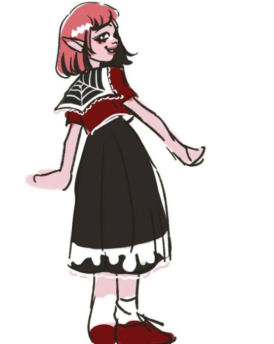
drac in uniform sketch cause why not
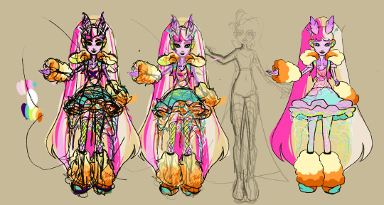
this is a rough one. its for g1, i came up w the concept talking to an old friend, bonita and venus were her favorite dolls and i came up with the concept of a cybergoth inspired Bonita doll and a more slick also cyber inspired figure for venus (shes barely sketched there).
we had LOTS of creative differences (i came with a color pallete much, much different from that since i was inspired by cybergoth, focusing on neon and dark colors) and specially after some personal stuff i just gave up. i still like the concept but i cant really stand working with a concept in mind just to realize the other person isnt interested unless its their way. i wish i can revisit her in the future and apply the stuff i actually envisioned for her- but well, so far thats what we got. cant say im happy aside from the silhouette.
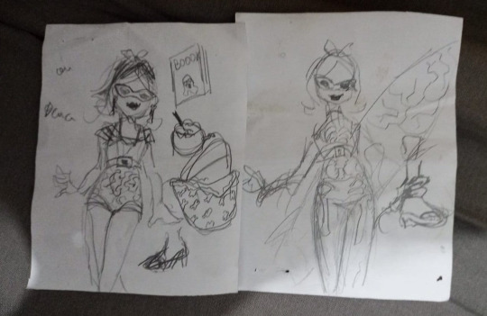
some other reaaally rough ideas for the beach line project for g3. i did most of those during my office work lol. those are for ghoulia. for her i wanted to keep in mind her 50s theme from g1 actually cause i love it so much. thats where the glam chill look came from. then i was like eh its nice but new ghoulia is way more rad and sporty so i tried to think of her doing surf (i also have sketches for deuce in surf attire so they would be fun) i have so many of those all over my house cause when g3 was barely launching i was so excited. and so bored at work. so i just got every paper note i could to sketch random ideas lol Also SILLY OC ALERT!!!
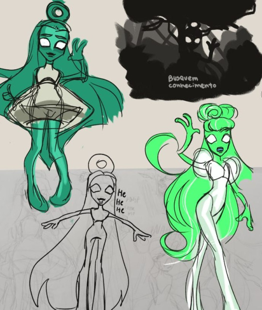
This was mostly a joke but i made her thinking of ET Bilu from a brazilian urban legend lol. thinking of her as a scary skinny legend w stereotypical and hilarious proportions common to old MH dolls was what inspired me at first but then also the whole 2012 pop diva look. Shes just a funny little gal. busquem conhecimento!
#monster high#monster high lagoona#monster high g3#monster high oc#monster high design#monster high fan design#monster high fanart#draculaura#lagoona#doll design#zitro vee sketches#sketch dump
212 notes
·
View notes
Text


I really wanted a project to test my skills, and I chose to do it with the HGUC Zudah. I did extensive seam line removal, removed mold lines, filled in some holes I didn't like with putty, and scribed out some of the shallower seam lines and details. I definitely need to upgrade my equipment on that front. I also didn't like the way that the rifle's scope was deeply recessed, so I used a length of sprue to extend it. I'm pleased with the results.
I used the weapons and parts of the body as a chance to practice quickly switching between colors in my airbrush. I also hand painted a lot of the details. After a couple months mainly doing mini painting, it felt like I had multi-classed or something. I painted the mono-eye and scope lenses with fluorescent enamel paint over a layer of white. It looks super cool in person and I will definitely use that technique again in the future.
The weathering was done starting with a layer of silver drybrushing. Then I used a Tamiya weathering pallet to create some contrast on the larger areas. I then finished with sponging on black. I had tried sponging before, but the sponge I used was way to big. Much happier with the result this time.
I am so so happy with how this kit turned out. It was a lot of work but it's great to see what I can do when I go all in.
12 notes
·
View notes
Note
i wanna know how you learned how to render, it's so yum 😞💔
thank you!!! I'm glad u like it. I can try my best to explain my process but its very much a 'feel it with my heart' experience. This is gonna be long and incomprehensible but I'm gonna try:


If we're talking about the (above) garth & baby arthur jr pic or the bloody pete pic, I'd say i started to actually render like that in maybe high school art class (they were much worse then ofc because i have years more practice now)? Obviously my process now is different than it was back then, but before I actually started physically painting canvases with acrylics I usually just did line art and color without the blending-painting pizzazz.
Thats actually where I get my weird random interspersed colors in my coloring as well. Acrylics dry super fast and a high school art class is like 45 minutes so I'd have to totally mix a new pallet the next day. Not that I couldn't color match, but its annoying and having variations with colors or just mixing something up to fill in gaps looks neat if you get it right. If it looks bad just paint over it, but its worth it to try.
My process with these is almost exactly like my non painterly rendered ones, just with steps after. Also, you can get away with a lot when not fully rendering, but when i do render PHOTO REFERENCE is to die for. Specifically for the lighting. I can't emphasize this enough. By the time i'm done with a drawing my search history should be like "knees. Knees sitting. Knee anatomy. Harsh light photography. Curly hair. baby. J. C. Leyendecker new year baby" + 8 pictures of u doing whatever pose you're trying to do.
Anyway, the process for me is usually: vague sketch > carve out the lines/neater sketch > flat colors > basic shading/rendering > color adjusting sketch lines (usually from black to dark red) > collapse everything into one layer & get to WORK
I know the 1 layer thing is scary, but thats life. Its easiest to adjust things that way (for me). No need to worry about layers and blending modes cause its all right there. I usually duplicate the layer the drawing is in before I start on something crazy just to reassure myself that if I fuck it up I can go back. So a lot of the time my layers in procreate are progressively more rendered stages of the piece lol.
Now that Im here trying to explain this im blanking on how to actually express it. Lets see. I can run through some general stuff:
For both of those artworks (baby & pete) they're 100% made with HB pencil on procreate (a default brush! I've never downloaded any new brushes cause im lazy). I actually made a brush explanation for someone a few months ago I can put that right here:


hopefully those are readable. sometimes tumblr flops lmk if my writing is illegible
the eraser tool is your BEST FRIEND!!!! The way I get my lines and shapes and whatnot is by making big ass strokes and then erasing until whatever I'm looking for reveals itself. Here's a video of that process from the aquababy pic. Ignore the jerky pauses lol. also there's the reference photo!:
rendering itself is really hard to describe. Basically just throw color at it until it works out. (just tried to add a video but tumblr says only 1 video allowed


I hope this is helpful somehow! Just threw a ton of stuff at you. If you want anything more or the actual video or smth just let me know!
#this is A LOOOT#but there's gotta be something here thats maybe helpful#hope it makes any semblance of sense#asks#chooeychoco#feel free to dm me too for anything else lol#that goes for chooey and anyone reading this. id like to say im chill riiight 😋#and if dming isnt ur thing the ask box is right there#this post my self destruct w that video. hopefully tumblr powers through and can post it#sorry if this is crazy im crazy#*MAY self destruct. Lordy
24 notes
·
View notes
Note
Heyyy, what's up with the chameleon? (I'm very subtle, yes yes)
Rubs my hands together
alright boys this one has a lot to unpack.
first off, the background is peeled rusted paint, blueprints, newspapers, as well as grey & cyan paper. Paper is a classic component for a collage and its colors are the same for Mavericks color pallet. Newspapers, however, are not only to add additional texture but they come from urban places. Just like how Maverick is from Nexus city. As for the blueprints, they are for the schematics of his magnification process. This lower layer is to show the outside perception of his. A messy, dull, cluttered environment of Nevada. The chipped metallic pain is to show the wear and tear of the wasteland and its cities.
Above all of that a panther chameleon is there to completely throw the background in all sorts of colorful disarray. This shows the turmoil between Maverick and his S3LF that he struggles with all his life. Chameleons are meant to blend in and yet it makes everything stand out in a dreamlike-state. Above this, there is a silhouette of Maverick himself with the nexus core on his back just as it is as his own tattoo. He is in a red tint as Nevada's primary color is red. It also provides a nice contrast with the blue background.
Moving on, we find brass knuckles, his signature weapon, a transporter box truck, a pair of 1337 agent glasses, and a white sun. Before everything, he remembers the sun. Even in the smokey polluted air of Nexus city. It was a reassuring rock in his early, uneasy life. He always felt some reassurance, that he was doing something right. That his decisions would work out in time. The day-night cycle kept him grounded. When Nexus city fell, so did his world. Everything he knew and worked so hard for was gone. However, he didn't have time to mourn. Because quickly after being discovered by the remaining Nexus agents and AAHW he was quickly loaded up and transferred to an AAHW base in the box truck. During his time at the AAHW he was supervised and handled by his coordinator whom was a 1337 agent himself. The two grew close and became friends in the workplace. However, their goals and morals did not match up. Losing his purpose was earth shattering, and he had a gradual mental descent from there. His cold and quiet demeanor kept his thoughts hidden. He still respected the agency, yes. But not so much the AAHW. He didn't care for Hank or any of that. Without his original purpose he grew solitary, silent, and even violent (as expected from a mag) he went through a slope of compliance. At first, he was still dealing with the shock and felt like he was lost. It made it extremely hard to handle him and sometimes follow orders, especially from an agency he didn't respect. But as time went on he broke himself down and tried to find a new purpose in the AAHW. This failed and soon Mav was so tired that he decided to leave. But not with a resignation note. He left that outpost where he was held in shambles. Mags can't retire, they aren't supposed to. No agent is expected to live long. So having a Mag on the loose was a huge problem in the agency's eyes. But Maverick didn't descent he wasn't going to work against the agency. He was still chasing after his purpose and a break from it all. He's now left in the world with no sun, no semblance of what he knew or who he was. Just a red glow in a grey wasteland and a tired man.
Now, what does 8371 mean? Maverick's id pre-magnification was grunt-8371. Badaboom bam there you go!
next on the list is by the sun; there is a tail. This tail is the same was seen on the little blue grunts in the collage. This belongs to Maverick before his magnification. For reasons he refuses to disclose it was removed. However, I'm the creator so I will tell you anyways. In a fit of manic mantra Maverick himself cut off his own tail to offer it up to his false god. He did this to try and rid his S3LF and be free from anxiety and indecision that plagued his life. Needless to say, it was not pretty.
What is the red chameleon? Maverick is cyan why is it red? The red is there for the piercing eye of phobos. One eye peering out into the very soul that persists even years after his death. The influence is so strong that it cuts through the chaos of everything else. This purpose, this loyalty, this is the only solid ground Maverick can stand on. the chameleon itself is an infant. It shows that even from the beginning, it would effect Maverick in ways he could not imagine.
Lastly, the grunts. There are 3 types of grunt featured. A basic grunt, a cyan tailed grunt, and a yellow fluffy grunt. They are all depicted being active. Whether it be running, looking around, or even dancing, they are all doing something. The basic grunts are just that, basic. The ideal grunt. What one is meant to be. The cyan ones however, is Maverick himself. These grunts wander through the chaos and disarray of his turmoil. They struggle to find where they are and by extent, what he is meant to be. The final grunt we find is Butch. This small fluffy grunt is calling out for the one he hold dear in all this madness. The child is an extremely important part of Mavericks life now. He hopes that protecting and caring for them would help him find his purpose again, as lost as he is. As they both are. Butch is depicted in yellow not only for a striking color, but that despite Maverick's efforts of trying to give the kid a new life away from the madness, Butch will eventually repeat Maverick's mistakes and Become a soldat himself.
Teehee teehee
Here is the art piece again for reference!

#answered asks#Madness combat oc#Deep dive art breakdown#Spinning round in circles#I wrote a lot lol
7 notes
·
View notes
Text

I feel pretty down about my art a lot. The common stuff of 'i'm not skilled enough', 'why can't I make things faster', 'everything i make is bad', and 'my color work should be stronger.' All the stuff I know every artist feels, but is still hard to ignore. Because of that I've been hit with some bad art block, preventing me from working on all the projects and ideas I have.
I think the thing I'm the most self-conscious about is my technical skills. Proportions, color, line work etc. And the only way to get better at those is to keep making art and experimenting, but often I find it hard to break out of my comfort zone.
So in an attempt to focus only on my technical skill and not worsen my anxiety about needing my ideas to be good, I did this panel redraw of Zoro. I had seen some other artists do redraws of this before as well, so I thought it would be a fun place to start.
I tried out some new paper with this one, 100% cotton hot press, and used a limited palette. I wanted the mood of the colors to be dark, so I only used indigo, raw umber, hooker's green, and permanent alizarin crimson. The only color not made from those colors was the pop of yellow on the jewelry. I've wanted to try out limited pallets for a while now, and this was my first attempt at it.
I want to do more of these panel redraws, it was comforting to do and helped me engage more with the one piece manga. I'll probably post the others that I make, but I also want to try to take some time off from social media, sooo who knows.
I hope you like the bloody Zoro lol
31 notes
·
View notes