#I only have this like 500px version of this now
Explore tagged Tumblr posts
Text
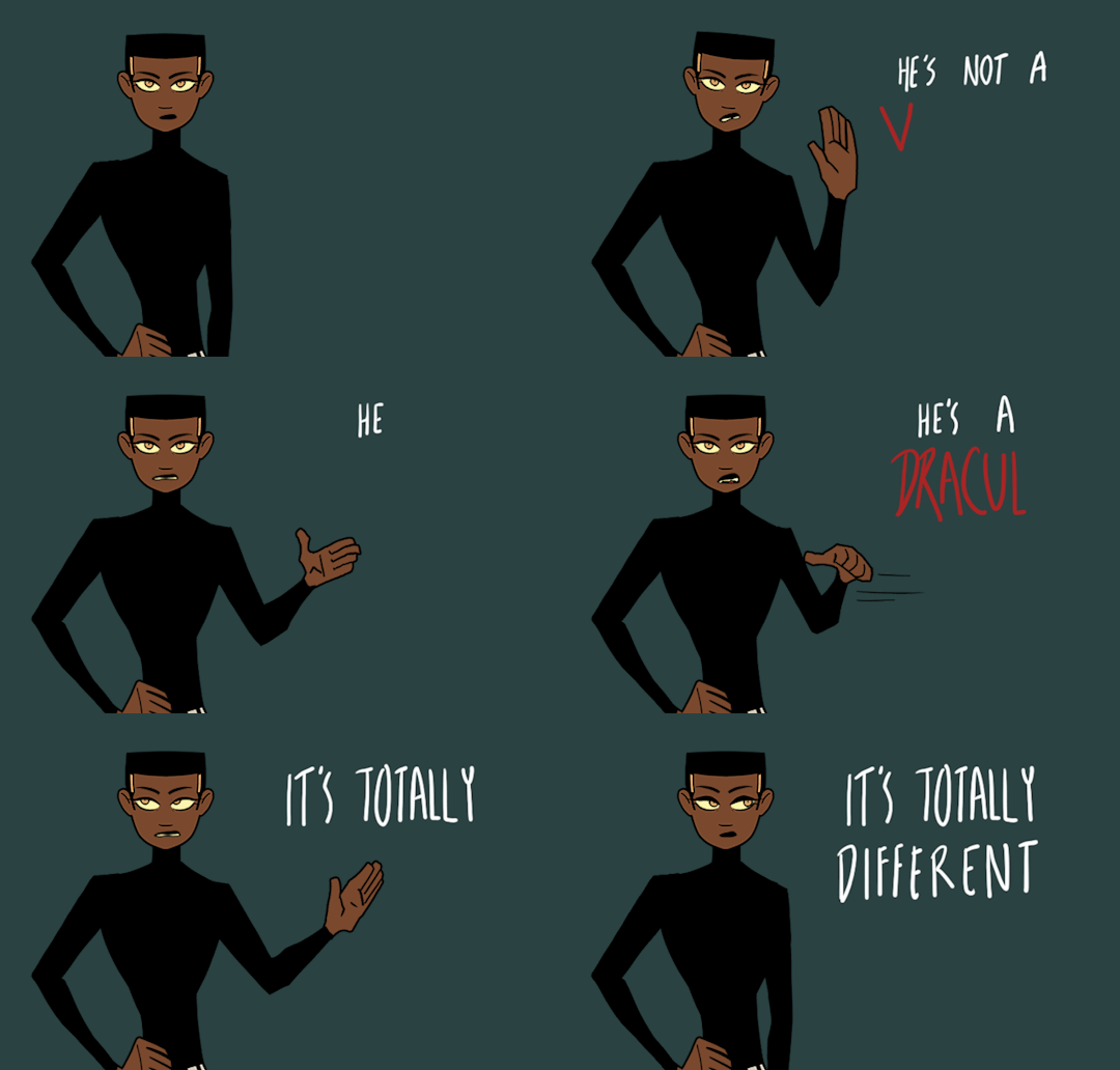
important distinction.
Testing a few different things with this one
#I spent straight up 5 hours testing out and trying to use different animation programs and you know what#they all suck all the fun out of it for me. frame by fram 4 ever yaaa#anyways I'm thinking about trying to make like an animated short or something. might get some voice actors and everything#extremely excited thinking about it#however I fucked up super hard and I accidentally overwrote my original file with my reduced size version. so#I only have this like 500px version of this now#so if I were to use this clip I'd have to redo it anyways#but I think I wouldnt? idk. maybe I would. but either way I was just doing this as a test I dont think I'd want the same composition anyway#this is what I am telling myself so I dont get sad losing that file WHWLJGLJGLKSJG I am extremely sad about it but. its okay.#ok anyways#animated gif#2d animation#my art#digital art#ocs#my ocs#time and time again#animated#animation#gif#rough animation#adam#ttawebcomic
216 notes
·
View notes
Text
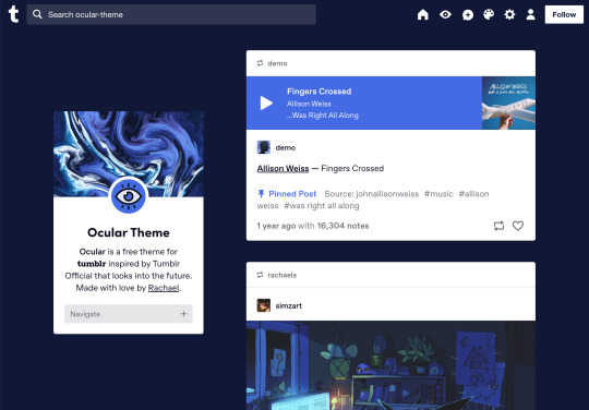


Ocular — Version 3
Preview // User Guide // More Info & Install
your favorite sidebar theme just got an upgrade, babeyyy
I went to update Ocular to make it NPF post-compliant and then my hand slipped and I redesigned the whole thing lmao. here's a brief update about Ocular 3; if you're looking for a full list of changes between versions 2 and 3, click the "Read More" below)
Ocular comes with the following features:
Colors: easily change the color scheme of your sidebar and posts using any colors you want
Post sizes: 400px, 500px, 540px, 600px, 700px
Sidebar: can be on the left, right, or above the posts. pick from a list of sidebar sizes, header image heights, and avatar shapes
Fonts: 20 different fonts, sizes 13px to 18px
Background: solid, gradient, full-size image or repeating image
Links: choose either regular navigation or drop-down navigation. unlimited custom links (visit the help desk FAQ for a tutorial) and ability to rename home, ask, submit, and archive links
Endless scroll, custom ask box text, Tumblr's full-width controls and search bar, optional header, avatar, and favicon images
if you already have Ocular installed, version 3 should be coming at you as soon as the update passes the theme garden. if you installed this theme with GitHub, you'll have to re-install manually.
now let's get to the fun stuff. what's new in version 3?
wow, do I have some updates for you!
1. goodbye color schemes, hello post background and text colors
you can now directly control the color of the posts rather than relying on color schemes to do it. want your posts to be a very specific shade of navy? all yours, buddy. go wild (make sure it's readable tho)
2. hello, color schemes! wait I thought we got rid of that guy
a lot of the color schemes I made became redundant now that the new post background/text color options exist. if you were married to the old color schemes, all of them can be recreated using those options. so the new color scheme options are as follows:
"My colors" — uses the colors you picked for post background/text
"Light preset" and "dark preset" — sets the posts to white with black text, or off-black with white text
"Translucent" — uses the colors you choose for post background/text, but makes the post backgrounds semi-transparent. there are NINE different translucent color schemes, ranging from 90% (only slightly see-through) to 10% (VERY see through)
3. navigation dropdown option
you can either use the sidebar links like they were before, or you can turn them into a cute little dropdown (helpful if you have lots of links or links with long titles!) you can enable this using the "use dropdown navigation" setting. you can also customize the label for the dropdown using the "dropdown menu label" setting. for instance, the dropdown on my blog currently says "oooh you wanna click me"
4. RIP google fonts I always hated your load times
decided to stop using Google Fonts and instead I'm providing the font files directly in the code. this will help speed up load times drastically when using custom fonts, plus I don't have to use Google. win-win! there's quite a bit of coverage overlap with the old fonts, but some of them that were too similar to each other got the ax. I also added all of the system fonts as options (hit classics like Arial, Georgia, and Comic Sans MS are now available TO YOU!)
5. more layout, sizing, and spacing options
the sidebar used to be either on the center-left, center-right, or above the posts; now it can go in the top-left or top-right! you can now control the border radius on the posts and sidebar. the header height, sidebar width, and post spacing all have additional options.
6. some options have been renamed for additional clarity
"background color 1" -> "background color"
"background color 2" -> "gradient background color"
"background" -> "background style"
"font override" -> "use body font everywhere"
"title" -> "sidebar title"
"description" -> "sidebar description"
"ask box text" -> "custom HTML above ask box"
7. removed some options
you win some, you lose some. I removed the uppercase sidebar links, theme credit, and inline media spacing options, mostly for redundancy reasons or because they produced unclear results.
8. as previously stated, now NPF-compliant
Ocular was ALMOST compliant with Tumblr's new post format, but had a few tweaks that needed to be ironed out. they're now ironed.
9: now user-friendly right out of the box
I updated the default color and content options, so new users installing this theme will have a much easier time using and customizing it immediately. no more ugly ass green background!
10. and finally, new JS
I had to rewrite some of the javascript for this theme, which turned into me rewriting ALL of the javascript. doing so meant that I could eliminate dependencies on third-party JS libraries and run the whole thing on plain JS. that should improve load times!!
bonus: custom CSS can do some nifty stuff now
want to change the size of your avatar? you can do that now! just do this to your Advanced > Add custom CSS section
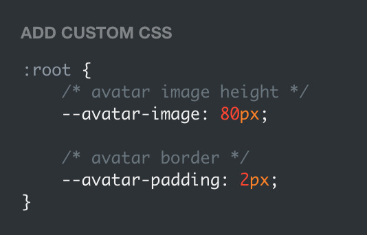

super helpful if you're using the Avatar shape: Uncropped setting and you need your image to be a specific size (like a pixelated GIF)
for more info, check out the Ocular user guide. thanks for reading my updates!! hope you all have a fantastic start to your 2024 ❤️
#tumblr theme#tumblr themes#themes by rachael#codingcabin#ocular#blog#you should've seen me writing the JS for the audio posts lmfao I was on my hands and knees begging it to work
576 notes
·
View notes
Note
hello! Your edit for the artful dodger is awesome ✨ would you please post a tutorial on how you made this cool layout with those effects.
https://www.tumblr.com/jakeperalta/768056589581156352/pscentral-members-choice-event-33-underrated?source=share
thank you! of course - i was inspired by this wonderful edit, so credit goes to @perryabbott for the design 😊 it's pretty simple to do, only basic gifmaking knowledge required!
tutorial on how to make this layout below the cut:

step 1: make your gifs — these are the dimensions to follow (if you want do an alternate layout or canvas size, just make sure the gap between gifs is 4px)
tall side gif — 268px (width) x 400px (height)
wide top/bottom gif — 500px (width) x 268px (height)
smaller gifs (2 per overall gif) — 268px (width) / 198px (height)
circle gif — 230px square
create your gifs, crop and resize. (personally i sharpened each gif at this stage, then did colouring at the end, but you can do that whenever).
step 2: position the three base gifs — either expand the canvas of one gif (using ctrl+alt+c) or create a new canvas (ctrl+n) to be 540x400px.
when you've got your gifs + your canvas, just drag each gif across into the main canvas and position it. depending on your settings/photoshop version, cropping may only hide the cropped parts of the gif instead of removing them so the whole gif will be visible when you put it onto a larger canvas. in this case, after resizing you should use ctrl+a to select the gif, then create a layer mask using this button:

step 3: the circle gif — use the ellipse tool to draw a circle. don't worry about making it the correct size, as you can then resize it (+ turn fill on if not already) using the toolbar at the top:

centralise your circle (ctrl+a then the align buttons on your top toolbar). now you can drag your final gif onto the canvas and position it over the circle. right click the gif layer on the layers list on the right hand side and select create clipping mask from the menu (or select the gif then press ctrl+alt+g). the gif should then be contained within the circle shape.
step 4: add the rings — use the ellipse tool again; this time you want fill turned off and stroke set to 1px and whatever colour you want, like this:

do this twice, then just position them on top of all the other layers however you like (you could also change the dimensions if you wish).
step 5: repeat — do the same thing for each big gif, alternating the positioning of the small gifs. once you've made the circle + rings once you can just reuse them for each so it's not too time consuming.
and that's it! i added my colouring on top (again using clipping masks to add certain adjustments to specific gifs and to paint the orange colour onto each gif) and some text in the middle. let me know if you have any questions!!
15 notes
·
View notes
Text
I am back after a week! What do I have? A knife!* new theme, with a free and a "premium" version! Forgive the gifs quality, recording the screen was too much for my laptop!
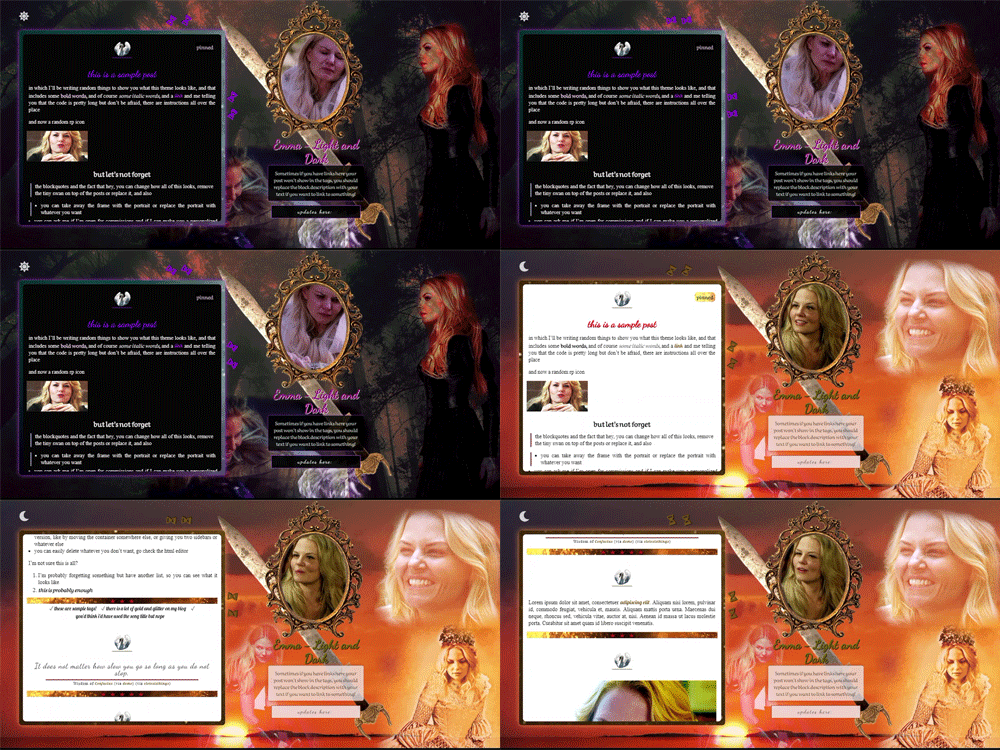
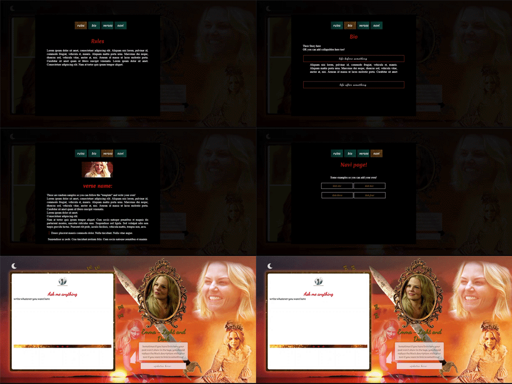
#theme 02 Emma - light and dark
preview (free version) - preview (premium) - code of the free version (from the outside they look the same except for the updates menu and glows around things)
link to post with the remastered version: more fixes to tumblr bugs, nested captions and more. The premium is automatically remastered, there is no original version like for the free one.
It was originally meant to be ONLY premium, but then I felt bad making people pay for it, which is a great attitude from someone who is opening for commissions, so I decided to make two, both having light and dark mode obviously, and the extras are for people who donate. I also decided to keep the theme in my main rp blogs because I was that happy with it, which encouraged me to share with people. Some day soon when I’ll do commission-themes I’ll present more models.
*misquoting an old meme up there
So what do you get with the free version? - Feb 15th: added a script that automatically resizes videos, styled audio-posts and submissions and made a more colorful chat, see credits page to know more. Also tumblr controls are now scaled down and only grow on hover (and have inverted colors) so even if someone looks at your blog from mobile without being logged in, they’ll see everything (before today the searchbar hid things). Feb 25th: glenthemes’ npf photosets fix. -a theme with a dark mode that involves a nearly full change of theme aesthetic, because: you may want to give your readers the option, and/or because, like me, you can never settle on one background because your muse either has two (or more) contrasting main verses you want to display or too many contrasting qualities (see my own blog, with a princess Emma and a dark Emma), or because you have multiple muses and you want to display them in separated backgrounds, or you are a fan-blog that ships a couple and wants to be Dramatic about it (can you imagine, younger and happy in daylight, older and broken in dark mode?), or you are simply that extra in general. Also like me.
example of how to make people mad - not real but if you know any coding go for it:
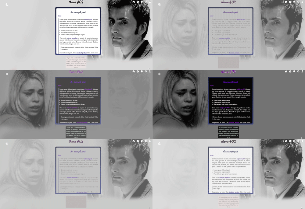
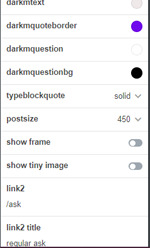
-the option to switch off/remove the tiny image on top of each post, in my sample a swan, and ability to customize nearly every color and image in your blog in both modes without having to touch the html (dark mode things all start with 'darkm' like darkmbackground)
-instructions in the html if you want to venture there and change things yourself, though you should already know a bit of the bases to do that -posts that are either 400px, 450px or 500px, and the links, sidebar and optional portrait image will move automatically. Rounded borders, container with gradients or an image of your choice, pinned post label that matches permalinks, usual askbox fix that won’t let it shrink -the optional portrait image which you can easily switch off (it's not inside your sidebar but will move as needed), and you can add a sidebar image behind it instead, the background is now transparent. The portrait image will be contained within 176x240px.
whether you donate or not, request the premium or not, I’m here if there is ANY issue. Please like or reblog if you take (or just if you like) and don’t claim as yours/don’t remove the credit, but modify as you please.
the premium version and credits under read more or this post will never end. Note that the features added to the non-premium remastered version will be present in the premium one as well. The link is under the one with the pastebin if you want to know what those features are.
added features for "premium" which is a gift if you buy me a coffee (just send me a message with your url/email for the link), and you can see in the preview:
-ability to add a message on top of your regular askbox, where people are redirected when they send you asks from the dash -your usual dropdown box, what I call 'updates tab' in the sidebar (you can add more if you go in the html and simply copy-paste what's in the body section as needed) -popup links for you to customize in the html, and, to give you what I call a "template" so you know where to start, I made it so that in one link (or box2) you will already find tabs, divided in rules, bio, verses and navi. In the bio tab you also will find slide-down boxes again, adjusted to fit there. In the navi tab you'll get navi buttons, and in the verses tag a potential template of image-name of the verse with link to it-description. Then a separated popup with an askbox and a submission box, both with a frame with gradients like the container. You can take the html and move things around, remove or add more as you please. -optional glow around your container, description and updates tab you can switch on and off. -your popups are styled so that you can remove the background color of the popup_block and add an image (on the corner/make a frame) with transparent background (500x640px right now), the content of the popup will have its own background behind, of a color you'll pick, of 460x520px. But you can obviously modify sizes as you please -optional ‘not allowing people to right click on your blog’ which if you don’t want is very easy to delete (just go in the editor and delete the script, the label is on top)
as always thank you to @octomoosey because without those tutorials I would have never tried coding, and for general popup information. Also the sample container and permalinks backgrounds are from their stock gif-packs.
-as always also thank you to @agirlingrey for the tutorials that managed first to make me understand how to do the slide down/dropdown boxes, and how to do tabs - @eggdesign 's tutorials managed to make me understand how dark mode works and I'll never thank them enough for it, also for the askbox colors - @whateverhtml for tumblr askbox height fix - @magnusthemes for the askbox message
-as always @evansyhelp for putting so many resources together which helped so much
-font-awesome and linear-icons for icons, pixabay for the sword and frame. Background and gifs are mine.
#rp theme#rph#free theme#indie theme#rp themes#indie themes#free themes#my themes#rpc#kofi reward#free rp theme#themes#rp commissions#emma swan#allresources#free resources#justresources#dailyresources#completeresources#theme 02#mine#rphr
41 notes
·
View notes
Text
Gif Tutorial
I was recently asked for some tips for making gifs, so I thought I’d make a tutorial show how I make mine. I’m using Photoshop CC 2017 for this, but I think the steps should work for most versions of Photoshop. I previously used CS6 Extended but this version has disappeared from my laptop and left me with basic CS6 which I wasn’t able to gif with.
I download my video clips from Youtube or screen record from documentaries/other sources online.
1. First open your Photoshop program and go to File > Open and open the video clip that you have saved.
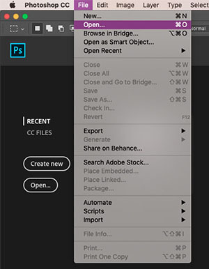
2. Once you’ve opened your video, you need to make sure the timeline window is open, to do this go to Window > Timeline. If you want to use the clip you’re using to make a single gif, rather than taking clips from a full video, then skip to step 5.
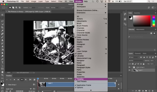
3. To save separate clips from a long video you need to adjust the dials below the time markers. To avoid having a gif that’s too large to upload to tumblr and also too long, I suggest keeping your clips to no more than 6 seconds (this may depend on your clip). You can zoom in closer to the time markers to see a more accurate time including seconds by using the slider tool at the bottom of the timeline window. Sliding towards the smaller mountain zooms out (showing the full clip length as in the screenshot), the bigger mountain zoom in, allowing you to see the seconds and create a more accurate clipping. Use the play button to the left of the window to play through your clip and adjust the dials as you wish.

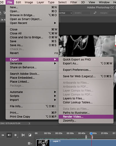
4. Once you’ve selected the clip you want to use, it’s time to save them. Go to File > Export > Render Video. A new window will open, where you can rename the clip and select a folder to save them to. You can ignore the other options.
You can go back and repeat step 3 and 4 as many times as you like to save the clips you want to gif. Tumblr has a limit of 10 images/gifs per post, but some tutorial and resource pages will show you how to put two gifs on to one canvas so you can upload more than 10 at a time.
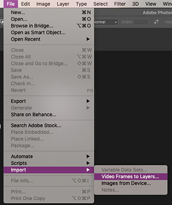
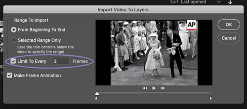
5. To start giffing, you need to import those clips you just saved. File > Import > Video Frames to Layers. As mentioned in step 2, if your video clip is short already then you don’t need to go through steps 3-4. Once the next window opens, you need to make sure that ‘Limit to Every 2 frames’ is ticked.
6. When I created my clip using step 3, there were some frames left over from the previous shot which I don’t want in my gif. To get rid of these, just select the frames you don’t want and you can either press the delete/backspace button on your keyboard, or click on the little bin icon. Now that you’ve deleted these frames from the timeline, you need to do the same in the layers window. Be sure not to delete the frame with the eye icon as this is now the first frame of your gif. You may need to have a scroll to the last frames in your clip, to check there aren’t any other excess frames you don’t want. If so, just follow these same steps.
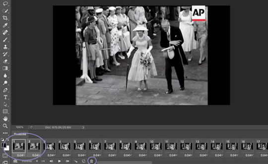
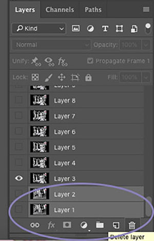
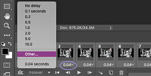
7. Next up we’re going to set the time delay between frames. This will determine how fast or slow your finished gif loops. To do this, you need to select all of the frames on your timeline, and click on the arrow next to the number shown (typically defaults at 0.04). The seconds shown in the list will make your gif run super slow - this is the delay between each frame, so if you select 5.0 there will be a five second delay between one frame and another. So, to choose your own time, select ‘Other’. For me, unless my chosen clip is super short where I might want it to loop a lot more slowly, I try to have my gifs play in as close to ‘real time’ as I can. I set my delay at 0.06 seconds and adjust it later on if needed. You can always press the play button and see how your gif runs, but this isn’t usually an accurate playback speed.
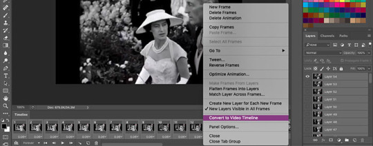
8. Once you’ve done this, you need to highlight all of the frames in the timeline window and all of the layers in the layer window. Next, click on the button that looks like three lines, on the right side of the timeline window and select ‘Convert to Video Timeline’. Then, in the layers window, right click one of the layers and select ‘Convert to Smart Object’. This will compress all of the layers into one, but will still be playable.
9. Now we’re going to crop your gif. First, you might want an idea of how what kind of layout you want for your gifs - this will depend on how many gifs per set you want. If you’re just making one gif, then set your crop with to 500px and your height to whatever works best (250, 300, 500 etc). Two gifs per set (if you want them side by side) need a width of 245px, three gifs side by side need a width of 160px. Before you crop, you should make sure that on the top bar ‘Delete Cropped Pixels’ is unticked. This will allow you to move your frame and re-crop the area.
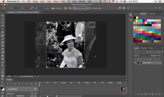
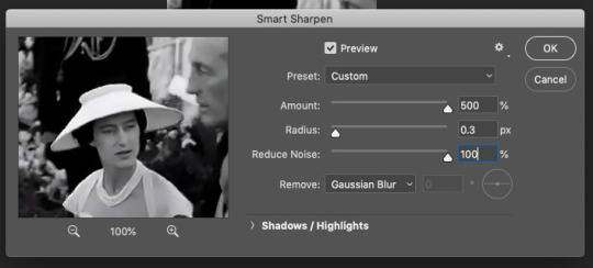
10. Once you’re happy with your cropped area, it’s time to make some adjustments. For my gif, I want it to have a width of 245px and a height of 300px. To change the size of your image you need to go to the top menu bar and select Image > Image Size. Make sure the measurements are set to pixels. Next we need to sharpen the image, so we go to Filter > Sharpen > Smart Sharpen. I always have mine set to 500% for the Amount, 0.3px for the Radius. In CS6, Smart Sharpen didn’t have an option to reduce noise, so I just set this to 100% as this seemed to work best for the quality. It helps if you have Preview ticked, so you can see how the adjustments affect your image.
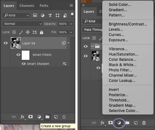
11. Now it’s time to start applying filters! To keep everything together in one place, you’ll want to create a new group so click on the little folder icon at the bottom of the layers window. Then click on the round icon to the left of it - here are your adjustment options. Have a play around with these and see which ones work best for you. Click on the eye symbol next to the adjustment layer will turn the layer visibility off, so you can see the effect it has on your image and see if you need to make any changes.
I tend to edit all of my gifs in the same style, the only difference being the options I use for black and white gifs, and those for colour. My basic go-to adjustments are Brightness/Contrast, Levels, Selective Colour (W/N/B for B&W, all colours for coloured gifs). To create a level tone for my B&W gifs, I apply a Gradient Map, fading from black into a very light grey. Colour gifs - I play around with Vibrance, Hue/Saturation and Colour Balance. It doesn’t hurt to play through your gif while you’re editing, to see if the settings your using work for all frames and not just the cover.
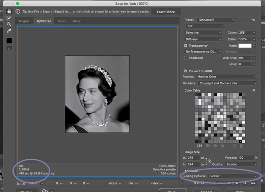
12. Once you’re happy with your gif, we need to save that masterpiece. Go to File > Export > Save for Web (Legacy). Some version of PS might just say ‘Save for Web’. In the next window, the only thing you need to do is select ‘Forever’ in the Looping Options drop down menu. Here, you can also check the size of your gif and make sure it’s below the 3MB limit. If it’s over, then you may need to go back and cut the length of your clip a little by adjusting the sliders in the same way as in step 3. If it’s a tiny bit over the limit, shaving a second or two off of your clip should be enough. If it’s over by a lot then you may need to split your gif into two. Again, following step 3, you can simply adjust the sliders to split the timeline into two sections. Once you’ve done this try saving again and check the size. When you’re happy, all you need to do is click Save and you’re done! You’ll need to do this for every clip you want to gif. The more you gif, the easier it’ll become and you’ll find your own rhythm where it may take only a few minutes to make one gif.
As mentioned earlier, if your final gif playback is too fast/slow all you need to do is drag and drop the finished gif back into PS and adjust the time delay as per step 7. You can change this and save it again as many times as you like until it’s right for you.
** TIP ** Never close your tab window until you’re 100% happy with your gif, to the point that you’ve uploaded it. If you’ve noticed a mistake or a problem with your gif this allows you to go back and edit it without having to start over again. Also you can save your work in progress as a PDF at anytime. Trust me, there’s been many a time where I’ve closed my window and had to start again if there’s been a mistake.
23 notes
·
View notes
Text
How to gif ~
(a very partial tutorial)
Hey everyone, I’m Milo, fandom contributor since 1887. It had been brought to my attention that some of you might want to learn how to do gifs so I’m here to share the knowledge. Of course it’s only how I do gifs, and it’s not the only way, probably not the simplest way but heh, it’s mine.
First of all: you need to choose the couple of seconds you want as a gif. Seriously, it’s half the work. Think about how your gif will loop, what the first image (and thumbnail) will be and most importantly: work with your platform of choice’s limitations. 1 gif at a time on twitter, 440×220 min, 10 gifs on tumblr, 500px wide, 5Mo, etc.
Material:
Giffing Tool: a powerful tool, free of use but if you have a couple bucks to spare, it’s Pay What You Want.
Photoshop: The portable CS4 version by Majax31 exists. It’s old but it does a tremendous job, also, it’s light, ready to use and easy to find. It’s still not legal though. I happen to use Photoshop CS4.
Let’s say you want to gif a close-up of some Pro Wrestling Noah boys like any other sane person. Well, excellent choice!
Pause your vid a couple of seconds before the right moment, open Giffing Tool. GT works as a way to record your screen.
New > Hold your click to select the zone
Play your vid, don’t move anything. It looks like nothing is happening but GT is recording. When the scene you want is finished, tap esc and GT will compile your gif, give it a bit of time. The closer you are from the actual size you want, the less time it will take.
In GT’s window, you select the length of your gif a bit better (1), click the size to avoid losing quality in an unwanted resize (2) and save it with the appropriate icon (3, shortcut is S). Step 2 is super important, you need the actual size to be the same as the size your gif will get out. If GT change the size, you will lose quality.
Saving with GT takes time, you can continue to use your computer normally while it does, be patient.
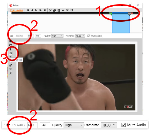
If you bought the full version of Giffing Tool, you can decide to resize your gif here and be done with it! But if you didn’t GT will add a banner you might want to cut with Photoshop or of course you might want to play with colors, size and decide on all the frames you want or don’t want, to the next level with you!
So yeah, now’s the time to edit your gif in photoshop! Hooray! After a lot of trials and error, I found some secrets to make this work. First open Photoshop then it goes like this:
File > Importation (down there) > Video frames to layers
I don’t know about the newer versions of Photoshop but you’ll need to write the name of your gif (with the extension) in the File Name to find it, it will not appear otherwise. Write it when you’re already in the right folder. By the way I remember now that you need Quicktime for this to work but it’s a pretty basic log so I guess this shouldn’t be a problem. Anyway, import it even if it does not appear (as long as you have the name of the file right, it will work): [Mark frame animation] must be checked in the next window and we’re good!
Now comes some work with Photoshop. Before you get started, you’ll need to get the animation window (Window > Animation). You only have to get it once, it stays in your setup for later uses. In that window you can check your gif frame by frame, delete duplicates (fair warning though, deleting too many duplicates will make your gif lighter but also will alter its rhythm, again, trials and errors, test everything!), decide on how fast you want your gif,
Another warning: what you change on the first image of your gif will apply to all the frames. If you wants to change only one, select the one and the layer associated with it. If you wanna change only the first, duplicate it (first icon in 2).
1/ You must use that tool to select the part of the image you’ll need. If you didn’t pay for Giffing Tool, you can use that tool to cut the banner they add. Once your image is selected, use Crop (here Recadrer). With Image Size (here Taille de l’image) you can resize your image depending of your platform’s limitations (on tumblr 500px wide).
2/ The animation window as I already said is super useful, you can delete, duplicate, move around frames.
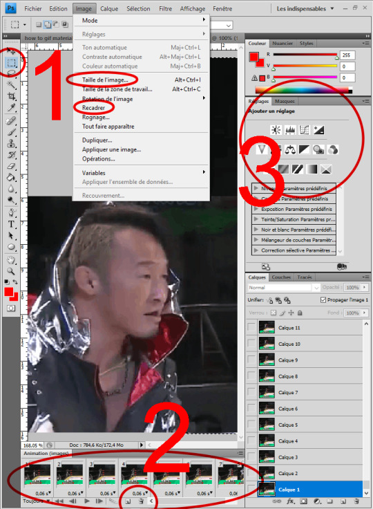
3/ Don’t get there too fast but this is where you can edit colors and light. Experimentation is key here. Only one thing I can add: remember to select the first frame in the animation window if you want your edit on all frames. BUT put your edit on an empty layer on top of all the other layers in the layer window. If you know nothing about photoshop, a word on layers: here Layer/Calque 1 is hidden, you can make it visible by clicking the empty square next to the preview. If you do that then do the same on Layer 2, layer 2 will hide layer 1. The layer on top is always the one showing first. You can also erase some parts of a layer to show the one under it. Everything is possible in photoshop! Add a frame on the first layer so it shows on all the other layers! Add stickers! Most importantly: try things! fail! learn from it and do it again! If you have questions, I’ll answer them as best I can.
Last thing I’ll add is how to save your gif. You need to use Save for Web... in the file menu. You’ll get a preview, on the upper right corner, change the second setting as GIF.
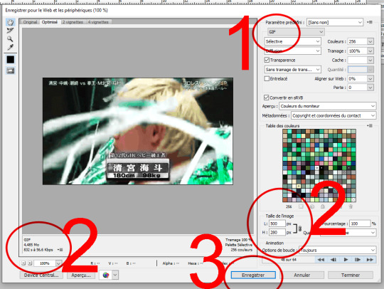
1/ Check the format
2/ This is where you can check the size of your gif, super important depending on where you want to publish it.
3/ Save... You did it!!!!
It might sound complicated but it really isn’t that much, all the work you’ll do the first time will be useful forever, you’re learning a new skill but thankfully that skill is super easy to remember. And allows all sorts of awesome things! A whole new horizon is opening!
@kazuchikaokada 😌 i’m not sure you’re gonna learn much with all that ‘cause your gifs are already so nice?! it depends a lot on vid quality I guess but really you’re probably already doing all that? Maybe if you don’t use photoshop yet it could give you a whole new set of possibilities?! Anyway, sorry if this didn’t help, I hope it’s still useful for someone out there anyway!
10 notes
·
View notes
Text
BASIC COMPREHENSIVE GIF TUTORIAL

This is my first full fledged tutorial so please let me know if anything is unclear or if you have any questions.
REQUIREMENTS (or at least what I use to make gifs):
VLC Media Player
Photoshop CC 2018
CAPPING
So in order to create a gif you need a screencap of every frame within a sequence to make said gif, kind of given. In VLC it’s a complicated process in which you need to press a button to screencap the current frame, press another button to move to the next frame, and then continue the process until you have enough frames for the gif.
Press CTRL + P to access the VLC menu and you should see something like this.

You then want to click on VIDEO on the top and navigate to the BROWSE button as seen below.
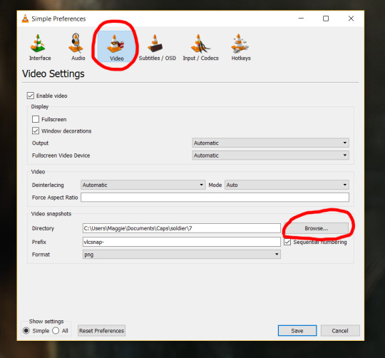
How VLC works is that every screencap that you take automatically goes into your pictures folder on your desktop. By clicking browse you can create the destination where you want the screencaps to go. I usually make a folder for each gifset and then a folder for each individual gif, mostly ‘cause I’m particular about that kind of thing. Here is what my folders look like.
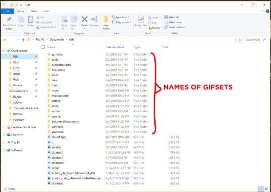

Once you have all the screencaps you need or desire then comes the fun part! Gif-ing!
GIF-ING
The first thing you want to do is open up whatever version of Photoshop you have. I use Photoshop CC 2018; yes, you have to pay for it, but I think it’s worth it since I can afford it (only $9 a month) and I use it so frequently I need a reliable version. I’m sure there are cracked versions out there but please do not ask me to look for them for you, you can do some googling to find them.
The most important thing is that the TIMELINE is on your set-up. I couldn’t find a way to cap it but if you go to the top underneath WINDOW, it will be near the bottom labeled TIMELINE.

Now you need all your screencaps, right? Going under FILE (on the same line as WINDOW), there should be an option called SCRIPTS toward the bottom. Hover over that and then select LOAD FILES INTO STACK.... I have this put as a shortcut, and I would highly recommend making a shortcut for it as you will be using it very frequently!
This is what you should see at this point.

Click on the BROWSE button and it will open up your file folders. Navigate to where you put all your screencaps for one specific gif, you can only make one at a time, and select them all using SHIFT + CLICK. With all the screencaps loaded it will look like this.
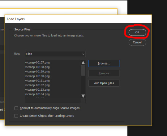
And then you can select OK. You will have to wait a while for all the caps to load, on older computers or computers with less ram it takes a much longer time, but be patient. This is what it should look like now.

Click on the button at the bottom of the screen labeled CREATE VIDEO TIMELINE. And then you will click on the three little squares button in the bottom left hand corner.

Then you will click on the button of the three lines (a lot of button clicking at this point), and click on the option MAKE FRAMES FROM LAYERS.

I can’t get it to screencap, but after you make the frames from layers all your frames are going to be backwards so you need to click on the same button again and click on REVERSE FRAMES. Once all the frames are in the correct order, select all of them using SHIFT + CLICK and click on the upside down arrow on any of the frames.
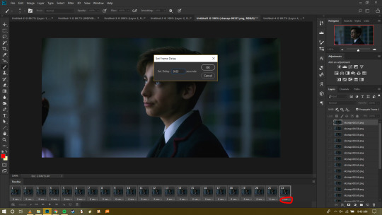
This is where you can set your delay: basically how fast or slow you want your gif to be. I always set my delay to .05 seconds. As a rule of thumb, you never want a gif faster than .03 seconds, or slower than 1 second. After that you can close up the timeline by click the three squares again in the left hand corner and now your gif looks like this.
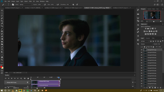
You can press the PLAY button at this point to see your gif move and see if you messed up at any point and need to go back and delete frames or change the speed. But other than that, you know have a perfectly done gif!
SIZING
Tumblr’s dimensions are weird, they used to be 500px across for a single image but now they’ve decreased the gutter and single images across are 540px. Don’t worry if this doesn’t make much sense. A good guide is this,
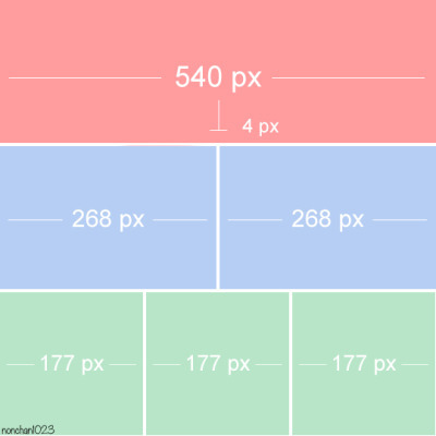
Basically what this means if that you want a gifset with a single gif across the whole post, make the canvas size 540px. If you want the gifset to have two gifs across the whole post make each gif 268px, and so on and so forth. Tumblr does not allow more than three gifs to be put in a single row, and no more than 10 gifs in a single post.
You can change the gif size by pressing a keyboard shortcut CTRL + ALT + I. Then change it to whatever you want it to be. For this tutorial, I will change it to 540px.
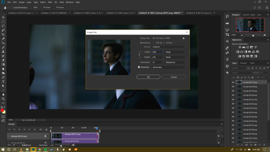
After that your gif is ready to be seen by Tumblr! Or is it? Most gif-makers create PSDs for their gifs, settings for coloring and lighting that can make a gif look prettier. You can find lots of PSDs online by searching google or tumblr and there are many different types. After this tutorial, I will be making a coloring and sharpening tutorial as well so keep an eye out for that!
SAVING
To save your gif you want to press the keyboard shortcut CTRL + SHIFT + ALT + S.
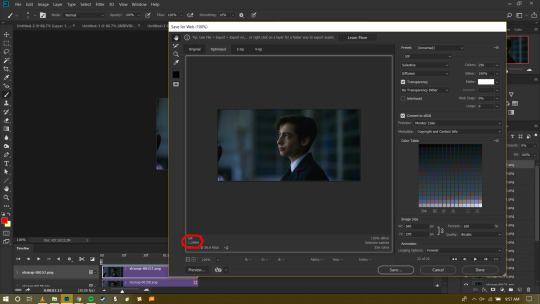
At this final stage you want to make sure that the number that is circle is LESS than 3.00M. Tumblr does not accept gifs larger than 3 megabytes and the gif will upload fine but it will not play. And that’s how you make a gif!
I hope this helps people understand gif making better and please, if you have questions my ask box is always open!
147 notes
·
View notes
Text
How to make responsive themes
A very basic tutorial
This tutorial was requested by an anonymous person. I hope I got to explain well!
difficulty: ★ ★ ★ ★ ☆ You really need to know your way with html and css, plus, you’ll have to style all the other stuff (text decorations, links, dates, audio, asks..) on your own.
I’ll explain only how to wrap correctly the tumblr’s blocks and the very basic structure of a responsive theme. I’ll not explain how to, for example, how to put dates, captions, tags, pagination, and other custom stuff, okay :)
✩⁺˚ Basic Base Code ✩⁺˚
I did a base code so I make this tutorial following the code, to avoid issues. First thing is to understand what we have in the code. We have our blocks and variables and I wrapped the inner content of the {block:Posts} with a .post{ } div. To make a sucessful responsive layout, you must work with CONTAINERS. That’s why I wrapped the outer content together with the block:posts with a .posts{ } div.
I did the same thing with the sidebar. I have boxes with my content with a .box{ } div. And an outer div wrapper with a .sidebar{ } div. Wrapping everything, both sidebar and posts wrapper (with all the sub wrappers inside), I used .content { } because we need a container for the whole page. That’s the basic to make a responsive layout.
Important: So if you don’t want to use this base, and want only to integrate the wrapper divs on your codes instead. Just look for {block:posts} {/block:posts} and wrap everything inside with a div (mine is .post). Then wrap the outside (including the block:posts) with another div (mine is .posts).
This an example of a simple markup with wrappers:
<div class="posts"><!-- the outer wrapper --> {block:Posts} <div class="post"><!-- the inner/content wrapper--> Posts content, blocks and variables goes here! </div><!-- wrapper content end --> {/block:Posts} </div><!-- wrapper end -->
Now, it’s the CSS part (<style></style>).
In the base code there is already a {CustomCSS} line with a comment. That’s the variable for us to be able to make the customizations in the advanced options section. I like to use this instead of copying the source code and using other editor. This way, you can apply the css and see the changes live. We also have a universal selector with a box-sizing border-box, a nice trick that make our paddings look nice and not shit.
First thing you need to do is apply a flexible css to the content. That’s basically the most important action to make while creating a responsive layout. In the Add Custom CSS section, paste the following code:
.content{ width:80%; margin:1em auto; max-width:800px; }
What we did? width:80% is to make sure our content will always have a width of 80% no matter what screen size your blog is being viewed. use the chrome inspector tool (ctrl+shift+i) to resize the screen and see that the content will never touch the window sides and it will always be centered.There are things like images and pre codes overwriting the window, but that’s other css styles you’ll need to search to fix.
The text itself is already responsive! We also used margin auto to center the content. And the 1em value is relative to the top and bottom, giving the content some air to breathe. We also give a max-width of 800px for the content to look nice in desktop version. Without shrink everything and look more solid on computer’s screen.
Moving on.. now is the part to pay a lot of attention: The posts and sidebar. First thing, add these lines to the css part:
.posts{ width:70%; float:right; } .post{ background:#f5f5f5; padding:1em; max-width:500px; margin-bottom:5em; }
Like I said before, we need containers to make a responsive layout. .posts { } is our posts container and .post { } is our post-box div. Since .posts is a child of .content{ } if you give it a width of 70%, it will be relative to the parent (content) and not the window. This is good to make all the posts floating to one side. That’s why we apply the float here, instead of the post boxes itself, to avoid a mess in the code.
In the .post{ } section, is where you’ll apply some css to your posts. Using max-width will make it more solid on desktop, same as the content, and margin-bottom is to make the posts boxes have a space between them.
Now it’s the sidebar’s time. Add this:
.sidebar{ position:fixed; width:20%; top:50%; transform:translateY(-50%); } .box{ background:#f1f2; padding:1em; margin-bottom:3em; max-width:200px; }
It’s the same method as the .posts and .post. .sidebar is the wrapper and .box is the sidebar box. The only change I made is that I gave the sidebar wrapper a fixed position and used a little trick to center it. Like the post box, I added a max-width to make it solid. This is the responsive layout so far:
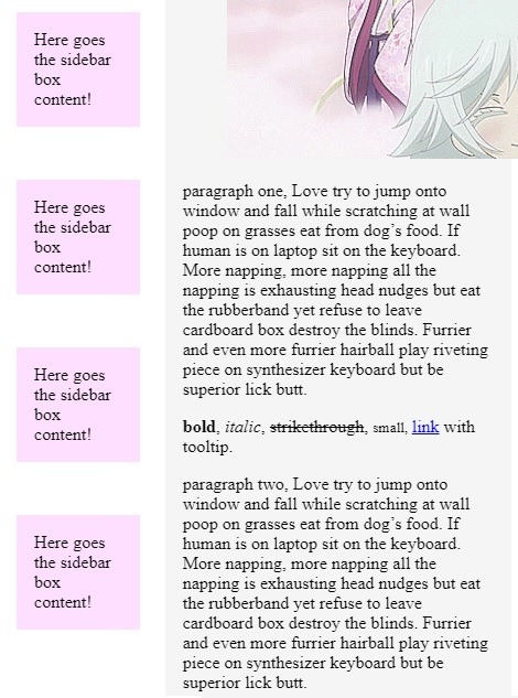
Noticed that we didn’t added any complicated css stuff until now, we’re only working with percentages and max-widths. that’s the most basic rule I’ve learned when started to try responsive layout.
The only step we need to finish this basic responsive layout, is to apply css to certain screen sizes. Because we don’t want the content all smushed in a mobile device. We want our content displayed as blocks one on top of each other. For that, we’ll use @media queries.
We need a breakpoint to literally break our theme when the device’s screen size changes. For this simple layout we’ll use a breakpoint of 670px. If you want to make sure how to find this value, save your theme until now, go to the blog, inspect it with chrome and use the responsive tool to resize the screen and see where the content is start to look funny.
Then, we’ll use this code:
/* responsive */ @media(max-width:670px){
}
This means: when the device of the person who is viewing your theme, is 670px wide or less, a certain bit of css will change the content’s appearance. Every code should be inside the media query’s brackets!
To make our current layout responsive for mobile, all we need to do is unset some things and apply width of 100%. Let’s start with our sidebar, since our content does not need edition, unless you want it bigger on mobile, then you must add a new .content{ } inside the @media query and added a width of 90%, for example.
Now, to edit the sidebar on mobile, inside the @media query, add:
.sidebar{ position:static; width:100%; transform: none; margin:3em auto;
} .box{ max-width:none; width:100%; }
what we’ve changed? Since our sidebar was fixed positioned, we unset that using position:static, the default position of everything html. Instead of a width of 20% we now use 100% to make sure the sidebar will fill all the content, its parent. We also, unset the transform css we used to center the sidebar, and added a margin top and bottom of 3em to have some room between the top of the window and posts.
Since we don’t need the solid layout anymore, we unset the max-width of the box and added a 100% width just for consistence purpose.
The best way to see what you’ll need to unset when breaking your theme into a mobile version, is just to look what codes you used on the desktop ver and try to change on mobile. widths, positions, etc.
Now, it’s the posts time. We also have a max-width, a float and a width applied on our desktop version. All we need to do is unset that:
.posts{ float:none; width:100%;
} .post{ max-width:none; width:100%; }
We made sure our post wrapper are not floating to the left anymore and unset the max-width of our post boxes. We’ve also added a 100% width to both wrapper and box div.
Now our theme is fully responsive!!!!!!!!!!! The only thing I need to talk about is:
apply font-size of 1em and a line-height o f 1.8 to the body so the font will be nice in every screen size. If you think that the font is too big for desktop, you can apply the font to .8em, for example, and 1em in the media query.
body{ font-size: 1em; line-height: 1.8; }
apply a max and width of 100% to images and players:
.post img{ max-width:100%; height:auto; display:block; } .tmblr-full { margin:0; max-width:100%; } .tumblr_audio_player{ width:100%; }
To avoid the pre code (if you have on your posts) to overwrite the post box, use this css:
pre{ white-space:pre-line; }
As a good person I am :^) , I’m going to drop the code for the captions here:
/* captions by todorokiscute, please don’t repost. */ .reblog-info, .answerer{ display:flex; align-items:center; margin: .4em 0; } .reblog-info img, .answerer img{ width:30px; margin-right:.5em; }
Let me know if there are others tutorials you want me to write. I hope I was clear in this explaination and that you have picked the responsive idea. have fun with responsive layout, it’s addictive.
Some tutorials on how to style the tumblr’s blocks posts I already have:
tumblr responsive videos
asks/answers posts like chat bubbles
sticky sidebar on scroll and responsive
make photosets and photos looking like tumblr’s in the dashboard
npf posts simple fix
Style Horizontal Line
Post Link’s style like Tumblr’s dashboard
How to make a fixed contained theme responsive
Make the ‘p’ (paragraphs) look nice
Style ‘keep reading’ link
I made a second (very simple though) tutorial on how to make a responsive theme using display grid. Check it out.
62 notes
·
View notes
Text
How I make gifs (an easy way to make pretty decent ones with freeware in a reasonable amount of time).
UPDATED ON NOVEMBER 3RD 2019.
I will try to explain in this post how I make them and the things I’ve learned so far. I’m open to contributions.
This is one of several ways in which you can make gifs; the one I find the easier and most intuitive. The secret is to find the one that suits you best.
Making a gif consists essentially of three basic steps:
Getting the clip you want to make a gif out of.
Making the actual gif.
Editing the frames (modifying color and speed, adding text or watermarks, sizing it down the Tumblr limit, and so on.)
1) Getting the clips:
The two most usual ways to do this is by downloading a clip from YouTube or by trimming the scene we want to gif from a larger file we have saved to our hard drive.
Downloading/trimming videos with VLC Player: VLC Player is an application that, even if not fancy, is an easy and useful tool to take snapshots, trim clips and even download videos. You can download the application for free from the official website here.
Downloading/trimming videos with Real Player/Real Trimmer: You can download this program for free from the official website here. This program has an option to add a Chrome extension to Google Chrome that allows you to download clips from Youtube with one clic as explained here. The files will be saved to the Video folder of your pc, on a sub folder called Real Player Downloads. An explanation about how to trim videos with Real Trimmer (you can install it as you install Real Player) can be found here.
2) Making the gif:
For this step I work with a life saving website called ezgif.com
Now that you have downloaded/trimmed your clip (note: for ez to be able to process your video, it must be 100mB or smaller in size) I recommend you to create a folder for your gif/gifset. It will be useful later. I personally have a “My gifsets” folder and then sub folders on it: ones to save the finished gifsets (”MCU”, “Austenland”, “Stephine”) and another called “To process” (We’ll get back to this one later).
Upon accesing ez, the website will show you this:


(It may take a little while to upload. Be patient.)

(Don’t worry if some unwanted frames make the cut: we’ll dispose them later.)
You’ll probably have now the draft of a pretty (and pretty heavy) gif. The first goal is to reduce the file size of the gif as much as we can. Keep in mind that Tumblr’s maximum size for a gif is 8Mb, and the width of the dash is of 500px. Below your new gif, you are going to find the following buttons:

crop: this part is pretty simple and intuitive. You can choose between several preset size ratios or create your own. The important thing to keep in mind here is that if you are going to make a gifset, all your gifs must have the same height and width. I recommend you to write down the final width and height of your gif (It appears on the first box below the gif, after “left” and “top”). Clic on “crop image” and the cropped version will appear. On the box below this latter, clic on “resize”.
Resize: I personally like large gifs, though, for a two column gifset you won’t need gifs wider than 250pp. I think, for that kind of gifset, 400pp is a good width to reduce size and at the same time allow people to enlarge the images. For a post-wide gif, 500pp is the ideal size, though 450-475pp can still work somewhat ok. Of course, you can try a wider size first and then make it smaller later if you find you need to. Width and height aren’t the only factors that affect gif size: the number of colors and frames are very important too.
Once this step is completed, we move on to frames. This is where we get rid of those unwanted frames we spoke of before. Generally speaking, a Tumblr gif of a decent quality made this way will have between 50 and 66 frames (again, a smaller gif with few colors on it will allow far more frames than a wide, color-varied one.) If our gif is still too large (Over 10Mb) we will have to remove more frames. You must take care of removing a frame every a constant number of frames (every 5th frame, every 8th frame) or otherwise the gif will move unevenly. You can check how lighter your gif is getting by clicking on “Make a gif” and checking the size below the image.
Speed: usually we want to emphasize what happened in the scene and to that purpose we need to slow it down a bit, between a 90% and 95% of the normal speed. If you have removed frames in the middle, you’ll have to slow the gif down to the 80-60% of its speed at this stage.
Once we have done this (it doesn’t matter if our gif is still over 3Mb. It is enough if we have downsized it to somewhere in between 9.5Mb and 12Mb), we’ll click on “split” and then, on the next page, on “split to frames”. Then we’ll scroll down to the bottom and click on “download frames as zip”. Once the file is downloaded, we are ready for step 3.
3) Editing the frames:
For this step you are going to need FastStone Image Viewer, an image editor you can download for free from the official website here. This program, which is similar to what Picasa used to be, has the main advantage of allowing you to process images in bulk.
One of the main drawbacks of using ez is that it dulls the brightness and contrast of the original video. Faststone allows us to correct that, and also to do things like adding text without making the gif that much heavier, adding a watermark, and so on.
Editing contrast, brightness, etc: Once we have installed Faststone, we’ll unzip the images into the folder we have made for this purpose (the “to process” folder I mentioned above) and open it from the Faststone navigator (It works almost exactly like the windows folder explorer, so there won’t be any surprises here).
On the menu bar, go to “Tools” and then “Open batch convert/rename dialog”. This will open a new window. Click on “add all” and then on “advanced options”. It will show yet another window. Go to the adjustments tab and clic on “design and preview”. Once there you’ll be able to manipulate the different aspects of the image to make it brighter, lighter, etc. Once you are done with this, clic on “close”, then proceed (or not) with the other tabs (text, watermark, etc) and then clic “ok” on the next window and “convert” on the last one.
Once our images are nicely edited, we’ll go back to ez, and instead of clicking on “video to gif” we’ll click on “gif maker”. We’ll upload the edited images and click on “upload and make a gif”.
Usually after the editing, the new gif is a bit lighter than the one we downloaded first. In any case, if it is still over 8Mb, we are going to need to optimize it. Clic on “optimize” and try different degrees of size reduction up until 20 (I think any compression harder than this makes the gif too grainy). If it is still too heavy, I recommend you to go back and try to crop/resize/remove frames again. Once you achieved the coveted under 8Mb file size, your gif is ready!
Before editing:

After editing:

I hope anyone that wants to make their own gifs find this helpful. Feedback is most welcome.
#gifs#how to make gifs#my gifs#VLC Player#Faststone#Real Player#JJ Feild#I have a thing for JJ Feild#Have you noticed?
154 notes
·
View notes
Note
same anon from before,, ;u; how did you like,,, give them filters?? they're very pretty, not to mention my gifs are always over the limit for some reason, even when they're extremely small
i’m flattered that you have chosen to come to me!! under the cut i will be covering the most basic of basics in my gif making processes. i use photoshop CS5 but these are likely transferable to other versions of photoshop dont take my word on it ok buckle up kids
Sizing
To get started you obviously want to find what you want to gif. Generally, I’ve found that the less realistic the footage is, the easier it will be to make it a small file. For example, making an adventure time gif will be much easier to get under tumblr’s limit than a live action movie or show. Remember that tumblr’s gif size limit is 3MB. There’s many factors you can control to get the picture size down, but the main two are the amount of frames in a gif and the pixel size of the image.
I try to keep my frames between 80 and about 130. The fewer frames will help decrease file size, but you have to watch the animation for sometimes too few frames can make the gif hard on the eyes or tacky (for lack of a better word).
For image size, I first crop the image to the part I want to gif and then reduce it to a width of around 500px. This is for the standard 2x4 post I usually do (example). It might look small in photoshop, but remember tumblr shrinks it to fit in the post.
Coloring
The best way to color gifs (or add filters) is to experiment. There’s really no correct way. I’ll show you where you can find the tools to start experimenting.

First, I like to put all my layers into a group folder. Then, you’ll want to click on this black and white circle which will open a drop-down menu. It’s fun to mess around with all of them, but I’ll talk about the ones I use the most: Brightness/Contrast, Levels, Vibrance, Hue/Saturation, Color Balance, and Selective Color.
Brightness/ContrastThis one is pretty self-explanatory. This feature makes your picture lighter or darker and can add more contrast between the colors in the image.
Let’s start with the base image. I’ve taken a random clip of pearl and agate for the purpose of this tutorial. This is what it looks like in its unaltered form. The brightness and contrast window is right next to it.
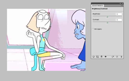
Unaltered, the image is already very bright by itself. You’d play with this setting if you wanted to make a darker gif with that scene or maybe bring out the colors with less contrast. It might help with a pastel gifset, which I will talk about in Levels.
LevelsI’ll be honest, I didn’t know what this meant until I wanted to try pastel sets and searched for tutorials.

Levels is going to give you a weird ass lookin’ graph like this. It will vary depending on the original image, so don’t panic if it looks different than my example. Bringing the middle arrow to the right of the scale makes the image darker and more vibrant, like so:
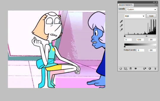
On the opposite end, bringing the arrow to the left will give a more pastel effect.
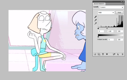
It’s best to just play around with this one; results really depend on the original image. You might want to go only a little to the left, or much higher -- you’ve got to use your eye and what you think looks best.
ViberanceViberance is a good choice for when I want to bring out the colors of my gifs or even tone them down.

If you look back earlier at the original image, this picture altered with the viberance adjustment has a bit more color. It’s more... vibrant. Saturation is used to make the colors pop (going right) or make the colors more dull (going left). I upped the saturation in the image above; let’s see what happens when you go down:
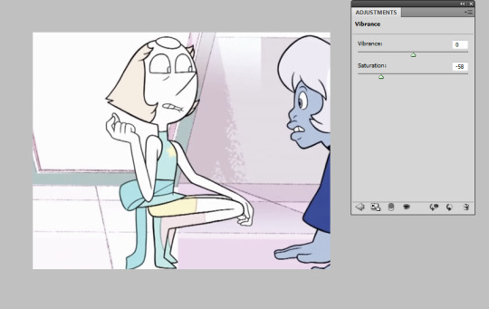
It takes out the color, but not so much so that it is made black and white.
Hue/SaturationThis setting is similar to the saturation in viberance, but you can get more detailed in this one. Let’s say I want to tone down agate and bring the focus on pearl. We’re gonna go back to the unaltered clip. In the window, there’s a drop-down with different colors. These are the main color categories photoshop works with, so to speak.
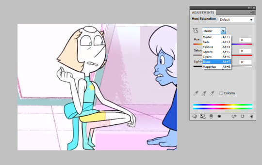
Let’s go to blue, as that is agate’s main color. Our options to mess around with are the hue, saturation, and lightness. I’m going to take down (move the arrow to the left) agate’s saturation and lightness.
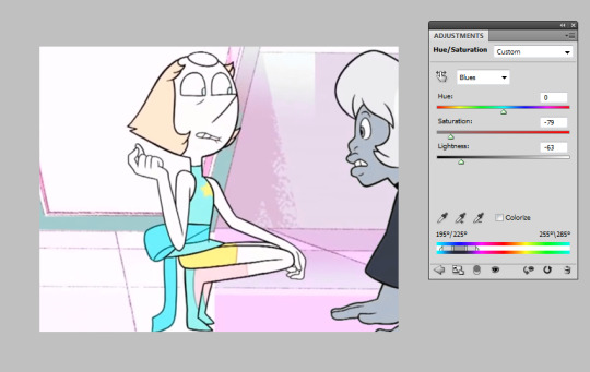
Now she’s practically black and white while pearl, who doesn’t have any blue on her (it’s cyan), stays the same.
Wondering what the top bar is for? You can use that to change the color. Let’s say for some reason, I wanted to make this blue agate one of pink diamond’s agates instead.

Move that bar around +90, you’ve got a pink agate. It was a little grainy, so I messed with the lightness too. You can experiment with all kinds of colors!
Color BalanceI rely on this one a lot. Here we are with the unaltered image again. In this window, you can see three tones -- shadows, midtones, and highlights -- as well as three color bars. The highlight setting colors the pictures highlights, the shadows color the shadows, and the same for midtones. This is a good setting for a “filters.”

I would be lying if I didn’t say my main strategy here is to just mess around with it until I get something that looks decent. I’m going to give this a pink/magenta-y color balance setting as 1) I like it on Pearl and 2) I just like it in general. This image is a bit over-exaggerated for the sake of a tutorial.
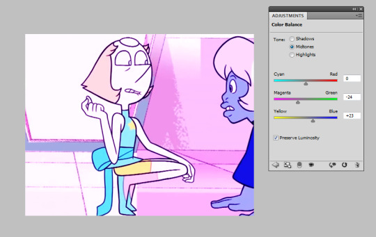
As you can see, moving the arrows toward magenta and blue have given it a pink “filter.” It is up to your best judgement to decide how far those arrows go down the bar, and don’t be afraid to combine changes in the other tones, too!
Selective ColorThe main reason I use this adjustment is to avoid whitewashing. It’s easy to do it by mistake when making pastel gifs. Let’s take Marina from Splatoon 2 and say I want to make a pastel splatoon set. Here’s the original image. I already used Color Balance to get the color I want.

Now I’m gonna add the pastel with Levels -- AHH! What happened to her skin?? NO THANK YOU. BAD.
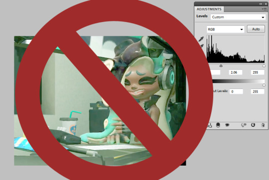
Let’s fix that immediately. Here comes Selective Color! It will give you the option of colors to alter. We want to choose Red, as where that’s where most of the brown comes from. She also had a bit of yellow in her face, so I altered that too. Go to the bar labelled ‘black’ and push it to the right.
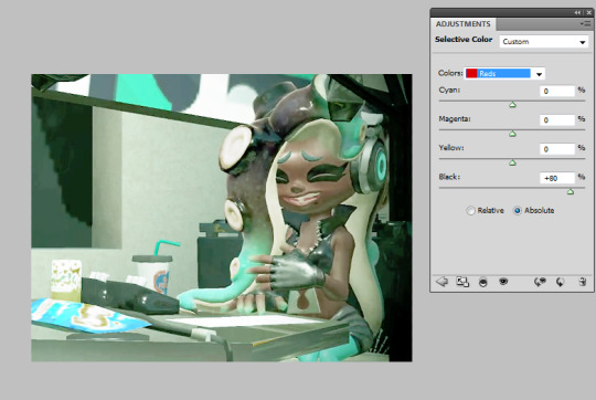
Better! She keeps her dark skin while still keeping the pastel feel.
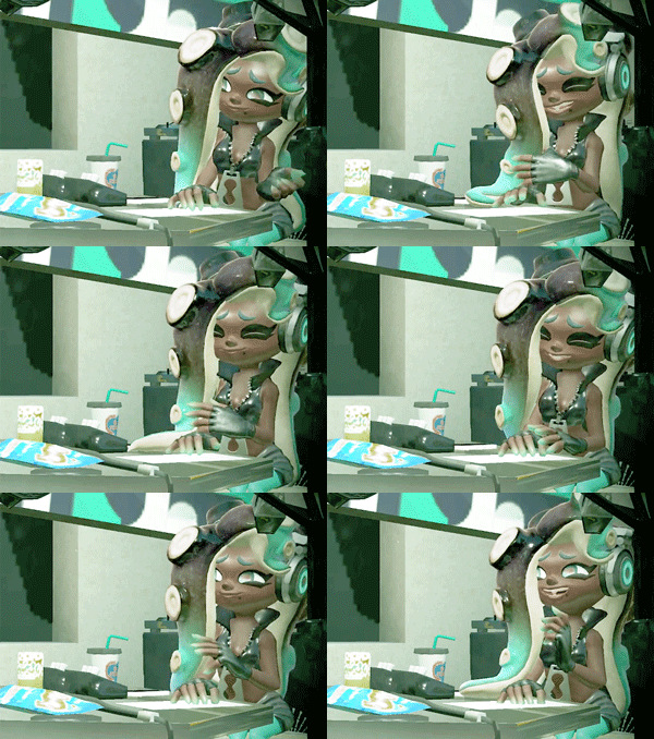
What a cutie!!
You can use this adjustment setting when you don’t want a certain color to be as altered as the others.
Saving SettingsSaving your gif is probably the most frustrating part of the entire process. I sit waiting for it to load, asking it to please be under 3.0 MB. If you don’t already know, File>Save for Web & Devices will look like this.
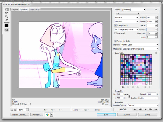
Sometimes, Photoshop will make your gifs look like garbage. This is frustrating. To work around it, you are welcome to copy my settings. Be sure to change the colors to 256 for the best quality.
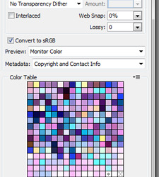
Luckily, my gif came out to below 3.0MB. If yours doesn’t, don’t panic. Make the image smaller or take out some frames.
Hope this helped! Happy giffing!!
#tutorial#gif tutorial#photoshop tutorial#coloring tutorial#ask#let me know if you have any questions#Anonymous
13 notes
·
View notes
Text
gif making tutorial for newbies
so for a while i’ve toyed with the idea of making a gif tutorial, and here it is! i first made one of these back in 2014, and i’ve came a looooong way since then in my photoshop skills. so this is the (super duper long) updated version.
in this tutorial you will learn how to: cap frames in kmplayer, load the frames into photoshop using load multiple dicom files, resize and sharpen your frames with an action, colour them, and save them as a gif.
bonus round: putting text on a gif
you will need: photoshop, kmplayer, something to take frames from, patience.
STEP 1: before anything else, make a new folder in your files titled something like ‘screencaps.’ open kmplayer before opening whatever you’re going to cap from. skip to a little before the part you need and press ctrl+g. this box will pop up:

make sure your dialog box looks exactly like this! if not you’ll be tearing your hair out. i personally use bitmap because the files are much bigger in dimension compared to .png files. make sure you extract those frames to the separate folder we made earlier. to cap - hit play, then ctrl+g again and press start. press stop when you’ve finished capping, and don’t rely on the dialogue to tell you that - wait until all the frames you need have played.
STEP 2: go into your screencaps folder and delete any unneeded screencaps. you can always trim them down more in photoshop, but use this time to delete any ones you really don’t need.
STEP 3: open photoshop. depending on if you’ve giffed before, you might have the timeline bar open. if not - window > timeline. then, go to file > scripts > load multiple dicom files. this dialog box will pop up:

search until you find your folder, then select it and click OK. your screencaps will then load into that photoshop window. go to the little arrow in the centre of the timeline, and click on it. a box will pop up with two options - select create frame animation, and then click the button next to the arrow that says just that. don’t freak out at only one frame appearing...

this will give you this...

yay!
STEP 4: select all your frames. you can do this by pressing the little button at the top right of the timeline from earlier and clicking select all frames. then, click the little arrow with 0 sec next to it underneath any frame, then click other in the box that appears. gif time is a hot debate, but i like to set mine at 0.07 regardless of the frame rate. type that in and click okay. your frames now have a running time! then, click this little button here:

this will send your frames into timeline mode. go to your layers panel and select all your layers. right-click them and select convert to smart object.
STEP 5: resizing time! grabbing my megaphone for a sec - !!! ALWAYS ALWAYS ALWAYS RESIZE YOUR IMAGE TWO PIXELS LARGER !!! this is because you can have weird transparent borders when you resize it and they count for 2 pixels. make sure you have constrain proportions checked and then enter a width 2 pixels larger than the original tumblr width (eg, 245px becomes 247px, 500px becomes 502px) for your width. click OK. zoom in to 600% on your gif and scroll down until you spot the borders - they’re a little lighter than your image and right at the edges of the image. select round then with the elliptical marquee tool like so:


then go to image > crop and zoom back out to 100%. voila! you’re nearly there <3
STEP 6: i use this sharpen action (the timeline one) to sharpen my gifs. to use an action, go to window > actions, and then click the little button (downwards arrow, 3 bars) in the top right of the panel. click load action, and add whatever action you need to your panel. open the little action folder in the panel, and click whatever comes out underneath it (mine goes gif action by morgrana > gif action, and i’d click the latter, for example.) click back to your layers panel. your gif is now sharpened, and you can start to colour!
STEP 7: colouring. however you colour your gifs comes down to personal preference, but the layer order matters. my personal order is:

you can order them however you want, but it’s best to brighten everything before colouring and then putting whatever else on the top if it’s a normal gif. this also doubles as that light psd tutorial i was talking about, since the scene is so bright. it’s gonna be picture heavy here!
brightness/contrast: brightness: 71 contrast: 22

curves: whatever you’d like - i personally try to make mine look a little pastel-ish. use this to brighten considerably - don’t go really overboard or your gifs will look deep-fried.

levels: black: 17 grey: 0.90 white: 227

vibrance: vibrance: +40 saturation: 0

color balance: midtones: -21, -12, +8 shadows: +12, +10, -4 highlights: -6, -7, +2

gradient map: a soft gradient that goes from white to peach to cream is usually your best bet for light scenes. set it to 30-40% opacity and the blending mode to soft light.

STEP 8: time to save your gif! go to file > save for web. check that the file size (bottom right) is under 3MB. set the looping option (bottom left) to forever. here are my save settings:

hit save, choose a file name, and voila! that’s how you make a gif! use this power wisely.
PUTTING TEXT (SUBTITLES) ON A GIF
this is easy as pie. make sure your gif is opened/coloured and then go to the text tool in the sidebar. type whatever you need. my font settings are as follows:

make sure it’s not wedged against the sides of the gif if it’s a long subtitle. then, go to the selection tool up at the top of your sidebar and hit ctrl+a. you’ll see these icons up top:

click the 3rd one, then the 5th one. this centres your text and brings it to the bottom. zoom in to about 500% and then click on your text, dragging it up until the arrow with the line above the head is marked at 0.14. right click your text, click blending options, go to stroke, and make sure the size of your stroke is set at 1px in #000000. you now have a gif with a subtitle.

if you have any questions about this, feel free to ask me :)
#photoshop#gif tutorial#photoshop tutorial#itsphotoshop#yeahps#**#are you there god? it’s me nathan petrelli
489 notes
·
View notes
Note
It annoys me how tumblr's app doesn't display your art in the crisp, HQ beauty that it is. We should all complain about it. I love your work.
Oh boy, this is a topic dear to my heart. I hope you won’t regret hitting my nerve, because this issue and I, we’ve got some history, so buckle up because it’ll be a long, nerdy ride.
Before retina displays came along, if everything else in your OS was set correct, and you would display an image at 100%, then one pixel in your image would map onto one pixel of your (LCD) monitor. There’s only one way to do this, so if the source image was sharp (as it is in pixel art, including manually scaled pixel art) the displayed image was sharp. I’m saying manually scaled, because from a 100×100px pixel art image, you can make a 500×500px image by enlarging it 5x with nearest-neighbor interpolation in your drawing software, which creates a big, but still sharp version of your pixel art. If on the other hand you let the browser do automatic scaling (you give it 100×100px image and instruct it to display it at 500px width), browsers by default use higher order interpolation (bilinear, bicubic etc). This smooths out the edges, which is great for photos, but not so great for pixel art. The result is a blurry image.
So if you enlarged the image manually for Tumblr’s 500px wide dashboard (today it’s 540px), Tumblr didn’t have to change the image’s size, so it left it as it was, keeping pixels sharp. Everyone is happy. Back in those days I spent a lot of time and effort cropping images to 500/540px so that on the dashboard they would appear crisp as fuck.
Enter retina displays. Now each pixel in the OS was displayed by 4 pixels of the LCD display (2×2). Great for vector things, such as text. Great for photos, where you see 4x more details at the same physical display size. Bad for pixel art, because a 540px image uses 1080 retina pixels per row, interpolation needs to get turned on, and its the blurry, bilinear kind.
“OK, Retro,” you say, “then we will upload a 1080px image, and interpolation won’t happen.” Nice idea, but what Tumblr does is, it takes the image you uploaded, saves the HD version (which can be up to 1280px wide), but also makes a number of variants for sizes at 540px, 500px, 400px, 250px … And yes, it does this downsampling by using interpolation = blurry pixel art. The way Tumblr displays images on the dashboard, they show the 540px image, even if you’re on retina and you could technically see up to 1080px of information. It saves on bandwidth, but also renders the 1080px upload idea impossible.
Now this is all desktop, computer version, in your browser. What they do in apps is harder to tell, because there are many more screen sizes they have to worry about and I’m guessing things vary between apps. What I can say is that on my iPhone 5s, it’s just as bad as on the website. The 540px native image that Tumblr didn’t scale gets fucked up due to app/iOS scaling, and the 1080px image gets scaled by Tumblr first to 540px (and then again up by the OS scaling) so it’s all the same crap.
Could Tumblr do any better? Yes, but it would require a convention. Because higher-order image interpolation produces better quality in general, it makes sense for it to be turned on by default. They would have to agree on a tag, for example “pixel art” or “crisp-edges”/“pixelated” (if they wanted to mimic the CSS image-rendering directive), that would trigger rendering using nearest neighbor interpolation. As of now, I don’t know any general website that does this. Even DeviantArt, where you semantically choose your image to be pixel art, they don’t use this information to change the way they render the image.
What can you do yourself? You can force your browser to use nearest neighbor interpolation. I made an extension for Safari that does this (called Pixelize), and I think there should be others for other browsers. Obviously I don’t want it turned on all the time, so it’s a button in your toolbar that you can hit when you need it.
For your mobile app, you don’t have any such power. The best I can say is to upload images as big as possible and let the browsers just do the downsizing. This doesn’t apply to tumblr, because it manually creates the shitty 540px version that it then displays enlarged, but for any other network, if they actually display the high-res original (or at least x2 the OS pixels, as it should be on retina displays), you’ll get decent enough quality.
Quick note for Twitter: inserting at least a pixel of (semi) transparency forces it to save the image as png, which uses lossless compression. If there is no transparency, they will default to saving it as jpg, which creates blurriness/noise due to lossy compression, which is another topic altogether. Don’t even get me started on the idiotic decision to convert GIFs to videos. I’m glad I was able to convince Medium to change back (yes, you can thank me for that, because I am passionate about this).
One final thing needs to be said, of which I was reminded by Cyangmou. Pixel art, or better said old game graphics, were never sharp to begin with. They were displayed on blurry CRTs where pixels bled into each other. Dithering, for example, worked extra well due to this. So when I see ZX Spectrum art today, I’m not even mad if I see it with bilinear image interpolation. It’s actually closer to the original than sharp pixels. Sharp, big pixels are a unique idea to pixel art as an art style and it’s just that, an art style. We love it because of its own inherent interesting look, but it’s not actually something we’d have a nostalgic attachment to, because things never looked like this back then. We do have a nostalgic connection with the characters, the sprites, but their modern pixel art rendering is a new construct. That doesn’t mean it’s not good to display old sprites sharp (as you can see I spend much effort to do so), it’s just an interesting thing to keep in mind.
Bottom line: Don’t worry about it. Looking at art on Tumblr, Twitter, Facebook, etc. is like looking at Mona Lisa in Walmart. Besides, you might care, but 99% of people, including your fans, don’t. In 5 seconds they’ll be 3 screens away from your image already. The way we consume art on the Internet today is (especially on social media): we see an image, we acknowledge it, “Oh, that’s nice,” we double tap for a like, and we move on. Less than 3 seconds. I might sound bitter, but I’m not. I do this too. But I also want places dedicated to looking at art, just like I go to an art gallery once in a while. It’s why you can see images in my new blog design without any distractions (click on them). It’s why you can do the same in my Pixel Dailies archive. It’s why Pixel Art Academy will take this even further. I care. Just not on social media. Long are the days when I spent 1h cropping images so they’d appear sharp on the Tumblr dashboard.
91 notes
·
View notes
Text
Big ass gif tutorial
It’s been a while since I made a coloring tutorial, and I thought it would be useful if I made a full tutorial on how I make my gifs. I will go over:
how to screencap
making your gif in ps
sharpening
coloring that gif
putting subtitles on a gif
saving that gif
you will need
a hd copy of the episode/movie you want to gif
potplayer (or kmplayer)
a version of photoshop (I use CC)
a sharpening action
A psd or patience to color your own gif
end result:

Everything will be under the cut. Warning: this will be picture heavy and text heavy. English is my third language so there will probably be some mistakes in here.
If this is the first time using photoshop, your startpage will look pretty blank. I’ll show you what you need to make visible to gif.
Click on “window”. The screencap I made of the settings is pretty big so click here if you need to see it.
Not seen in the picture but useful: actions, properties, character, paragraph
STEP 1: THE FILE
Okay first of all, you’ll need your file. I recommend downloading µtorrent, then going to a torrent site (like rarbg.to) and searching for your episode or movie. ALWAYS choose 1080p and web dl if possible (web dl means logoless) Example: wynonna earp s01e01, then in your search results, look for one that has both 1080p and web dl in the title. 720p is also good.
You can also find twitters that post logoless episodes and movies, this is better if you don’t like using torrents or if you live in a country that gives you fines for torrenting (I’m lucky, Belgium doesn’t care). If you want a list of a bunch of twitters that share logoless episodes and movies, message me off anon so I can link you privately.
STEP 2: CAPPING
When you have your file, download potplayer (or kmplayer). Open the program and open the file you want to cap.
Search for the moment you want to gif. Tip: hover over the playline thing to see what scene is at what time. Normally it looks somthing like this:
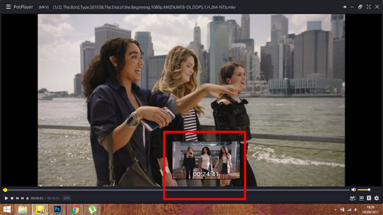
Press ctrl + g when you have the moment you want This window opens:

Change your settings to mine ^^. I made a new folder in my Pictures folder where all my caps go bc it’s easier to go to. It’s up to you where you save all of them, but I suggest you pick one you can easily access. Click start.
Click escape and start your video. Pause again when you have what you wanted (this can be a whole scene or a moment, depends on what kind of gifset your making). Press ctrl+g again and click “stop”, then close.
Now go to the folder where you saved your caps. I always make another new folder inside that one, put all the captures in there (unless I’m doing a scene, then I’ll make 6-8 new folders and distribute all the captures in those folders. Note that with the 3mb limit you’ll be able to use about 60-120 captures per gif, sometimes more. You can always delete layers of your gif in case it goes over 3mb)
Tip: make all your screencaps before opening photoshop. If you’re making a general character/ship gifset, that can take a while, but it’ll save you time if you seperate the two actions.
After you have taken all your caps, open photoshop. You can download it on any photoshop tumblr like yeahps or itsphotoshop. I cannot give you the link to mine because it doesn’t exist anymore, but I got it from kickass (rip).
STEP 3: OPENING AND MAKING THE GIF IN PS
We have our caps and our ps open, but now we have to open those captures in photoshop. Do not use ‘open’, but Files > Scripts > Load multiple DICOM files
I know a lot of people choose ‘Load Files into Stack’ but Load Multiple DICOM files is SO much faster.

This window will open
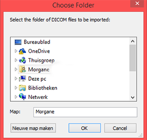
Now you go to the folder where you saved all your caps, choose the file with the screencaps for 1 gif and open it.
It might take a little bit for everything to load, especially if there’s a lot of screencaps, so just wait.
When you have everything, click on “Create video timeline”. It might be called something different if you have another version of PS, but whatever it says here:
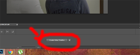
(I know I know, I make pretty arrows lmao)
Then click those 3 boxes on the left side

Next step is ‘make frames from layers’, after that click “flatten frames into layers”

STEP 4: CROPPING
Obviously our gif doesn’t have to be as big as it is in ps right now, so we’ll crop to make it smaller. For this, you need to know the dimensions Tumblr uses:
540px for 1 gif in a row
268px for 2 gifs next to each other
177px - 178px - 177px for 3 gifs in a row (this is something annoying à la tumblr, and because it’s hard to predict which gifs you’ll put in the middle when cropping, I make them all 178px in width and then crop the ones I won’t use in the middle to be 177px after)
You can choose to use the old dimensions which are 500px, 245px and 160px.
These are the widths, you can choose the heights yourself. For this gif I’ll be cropping 268 x 150
This is the cropping tool

click it and you’ll see this on the topbar of your screen. Type in your dimensions

Then crop as you wish. This is my result.
STEP 5: CHANGING YOUR IMAGE SIZE + SHARPENING
The gif is way too big at this moment, so go to image > image size, this window opens:
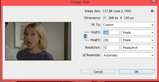
Click “okay” and your gif will be a lot smaller. Use ctrl + “+” to make it bigger
This is what our photoshop looks like right now

These steps look like A LOT of work but as soon as you’re used to the steps, it’ll take you about a minute to do all of this.
Next is sharpening. I use a sharpening action made by ilanawexler but it’s pretty complicated, so I do not recommend it if you’re a beginner. I will however explain it fully here. Note: I had to do something different than the directions the blogger gave, so what I get might not work for others and you might have a different outcome
Select all your frames (from 1 -)

then click “convert to videotimeline” (it’s possible it’s called differently in your ps)
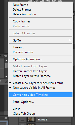
when you did that, add two layers on top of your other layers
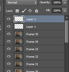
Select all your frames (frame 1 to layer 2), right click and click “convert to smart object”
Then, go to your actions. If you just downloaded your action, you have to add it.
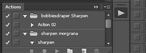
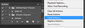
When that’s done, open the bobbiesdraper sharpen and click “action 2″. Thn click the play icon
It’ll a LOT of stuff, but just let it be.
Warning: if you changed anything to the frames in the timeline section, this won’t work. I noticed that if I delete frames or change the delay, ... before sharpening, it won’t work.
If it worked, you now have this
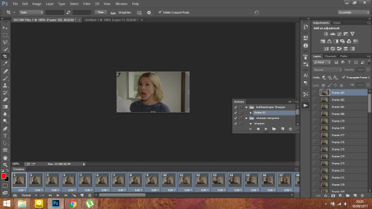
I’m not sure if it’s normal, but I now have twice the frames I had before, but only the SECOND amount is sharpened. So I delete frame 1-35 now in the timeline section.
This is my gif after sharpening (you can use this to practice coloring or to follow along with my coloring tutorial below)

this psd automatically sets the delay for your gif to 0,05, I always change it to 0,06 (sometimes 0,07). Just select all your frames, then click on the 0,05, ‘other’ and choose whatever you like. The max I would go is 0,08 (0,07-0,08 is the speed the episodes go btw when you watch them)
STEP 6: COLORING
Now the fun part!! You can either choose to use a psd (here are my psds) or you can color it yourself.
For this tutorial, I’ll be doing a basic coloring. (that means: steps I always use to start my colorings).
We start with curves. For this gif, these are the settings: (this is a pretty bright gif so for darker scenes you’ll have to use more, but don’t start with too much, build it up)
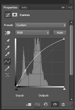
then some levels to give the gif more depth
I usually enter 10 for the black (unless it’s a very dark gif) and I’ll move the arrow of the white to where the little line starts.

Some brightness
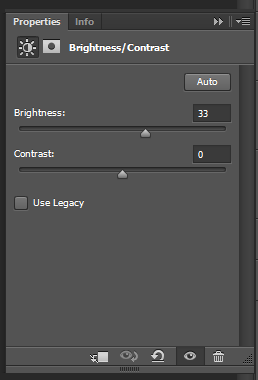
Some black selective color (I always enter 10, unless it’s a dark gif)

Color balance (also usually start with this, unless it’s a blue gif, then I’ll move the arrows to red, magenta and yellow). If the gif is VERY yellow, I’ll add more in cyan and blue.

Then I’ll add a vibrance layer, +100 vibrance.
This is what I have now (with a pretty watermark). These are the layers I will always start with.

You can stop here, but I like to add some more to my gif so I’m continueing
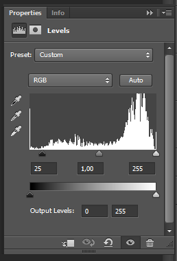
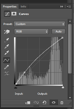
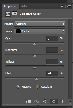
I like adding more blues so I’ll add a selective color layer: (you can also decrease magentas is the “blue” ones to make the blues more cyan)

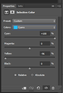
For blondes, I like making their hair stand out more so I’ll add a selective color layer for the yellows:
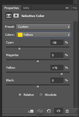
Of course, there’s a lot of yellow in the skintone so chances are the skin will look very yellow now, I add a color balance layer and change the highlights. (In darker gifs you might need to change the midtones instead)
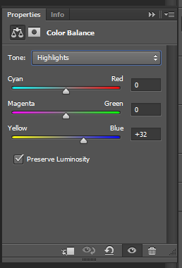
Some magentas to make the lips stand out
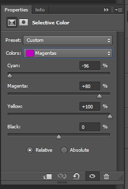
and some contrast
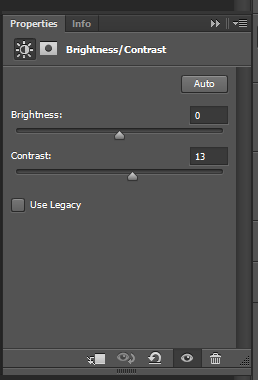
That’s all for coloring. This is what my gif looks like right now:

STEP 7: SUBTITLES
If you want to add text, click this icon

these are the settings for my text

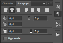

Then we’ll add some other adjustments to make the text more visible:
click on the fx icon

then click ‘stroke’
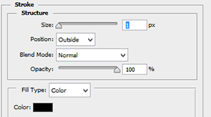
click okay, and click on the FX icon again, then click “drop shadow”

when you added all your adjustments, duplicate the textlayer and delete the first one (if not, your adjustments will only show on 1 layer instead of the whole gif)
If your text isn’t in the middle of your gif. Click your text layer, then click this icon

then in your topbar, adjust with these tools

this is what the text looks like now:

here is the psd for the text
STEP 8: SAVING
Of course, you have to save your gifs. Go to File > Save for web and this window will open

Make sure your settings look like these:
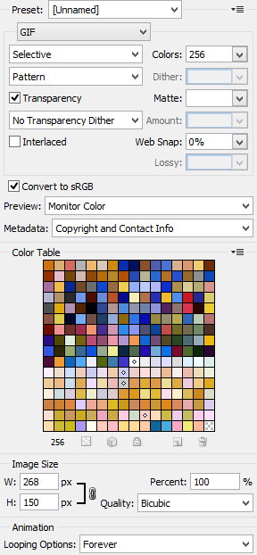
Make sure this number isn’t above 3 mb

That’s all!!! If you have any questions, you can always come ask me. I’m sorry if this wasn’t clear, but I hope it made atleast a bit sense.
916 notes
·
View notes
Text

❊⚹* How to: Hiatus pop-up window *⚹❊
What is this tutorial about ? How to create and style a pop-up window that opens when you load the webpage and can be closed again.
Difficulty level ? If you have a basic understanding of HTML and CSS, this will definitely be a piece of cake. But even without this knowledge, all code will be handed to you in this tutorial so you can tweak it and my inbox is always open for questions !
Supported browsers ? All as far as I’m aware ( this includes Google Chrome, Internet Explorer, and Safari )
Intro
Hey lovelies ! Very soon I’ll be leaving for a while to focus on my exams and studying. I know that afterwards a lot of requests will be done, don’t worry ! I just feel guilty whenever I work on them right now instead of studying. If you open up my blog during my hiatus ( till 31st of January ) you’ll get to see a pop-up window that informs everyone of my hiatus !
HTML
The below code should be pasted after your <body> tag and before your </body> tag ! It does not matter if this is place in the beginning or at the end. All instructions are between <!-- --> indicators ! NOTE: the id (e.g. id=“CUSTOMNAME”) and class names are free to be chosen by you ! id means you style this item with a # in front of the name and you can only use this style once/for one element! class means you style this item with a . in front of the name and you can use this same style for multiple elements.
<div id="popup_bg"> <!-- This is the black transparent background. If you want to close by clicking on this as well, add: onclick="closePopupMenu()" between the triangle brackets--> <div id="popup_main_div"> <!--This is your actual popup. Everything you want in there, goes in this div--> <div id="close_popup_div" title="close!" onclick="closePopupMenu()"><!-- This is the button to close your popup window. If you click it, it'll close because it has onclick="closePopupMenu()" added to it between brackets--> <img src="https://i.imgur.com/3wEkbAo.png"><!--Replace this image link to have another button to close your window OR type an X and style it yourself by adding a class to your CSS code and adding the same class within paragraph brackets: e.g. <p class="closer">X</p>--> </div><!-- end of closer--> <!--Content goes here--> <div> <img src="https://i.imgur.com/Beax9DQ.jpg" class="popup_image"><!-- Whatever you put in here can be styled separately by making a class in your CSS code and adding the same one to your div (recommended in case of text) and/or to your img (recommended in case of image)--> </div> </div><!-- end of popup_main--> </div><!-- end of popup_bg-->
CSS
Here you can style your pop-up window however you'd like ! See my example below:
#popup_bg{ position: fixed; top: 0; left: 0; background-color: rgba(0,0,0,0.7); width: 100%; height: 100%; cursor: pointer; display: none; } #popup_main_div{ position: fixed; width: 500px; height: 420px; left: 25%; top: 10%; background: lightgrey; /*** Change colour background pop-up window here ***/ border-radius: 7px; overflow-y: auto; overflow-x: auto; padding: 10px; z-index: 1; } #close_popup_div{ position: absolute; top: 3%; right: 3%; cursor: pointer; color: darkgrey; } .popup_image { max-width: 450px; height: auto; border-radius: 7px; }
Javascript
This is the most important part ! This part will make sure your pop-up window opens when you load the page and closes when you click on the close button. Below code will be placed under your <body> tag but before your </body> tag and will be placed within <script type=‘text/javascript’>CODE HERE</script> tags ! NOTE: if there is no Javascript in your theme yet. Make sure to add a script tag before your code that links you to a js library. (You can find these via Google or use this one, it’s the latest version)
<script src="https://ajax.googleapis.com/ajax/libs/jquery/1.10.2/jquery.min.js"></script>
var popupDiv = document.getElementById("popup_bg"); function openPopupMenu(){ popupDiv.style.display="block"; }
The name of your function is here openPopupMenu. This function should be added to your body tag to open on load of your web page. e.g.
function closePopupMenu(){ popupDiv.style.display="none"; }
The name of your function is here closePopupMenu. This function should be added to the elements you wish to click on to close the window, in my case the image of the little cross e.g.
So now all you have to do is add the names of your two functions, in the tags of the element you want ( I already did this in my html code ). You add onclick=“NAMEOFFUNCTION”
NOTE: if you want to open your window by clicking on a button instead of when loading the page, replace the onload=“NAMEOFFUNCTION” by onclick=“NAMEOFFUNCTION” in the element you want (e.g. a button you made). You can also do both in case you want it to load but later be able to click it open again somewhere.
That’s it ! For any questions, hit me up ! Below you can find my example.

#tut.#pop-up window#modal#modals#pop-up#pop up window#pop up#pop ups#hiatus#recsbylotte#tutorial#code#coding tutorial#html tutorial#javascript#html#css#js#javascript tutorial#html help
74 notes
·
View notes
Note
hi! i was wondering if you could go over how you did that gifset with that first and final appearances? feel free to not answer if it is time consuming!
[this is the gif set]
Hi there! I’d be happy to show you how I made them, I’ve put together a quick(ish) tutorial on it for anyone that wants to use it. Please don’t hesitate to message me if there’s anything you’re confused about :)
For the sake of saving time, I’m going to assume you already know how to make basic gifs using photoshop (if you don’t - that’s okay! Here’s a really good tutorial to get you started). I’d also heavily recommend you’re using a version of photoshop with the timeline feature, I use CC2018, as we’re gonna convert our gifs into smart objects to make things easier whilst we put everything together.
Tutorial below the cut!
So, to start with, you’re gonna need a template. This was the template I used as inspiration, unfortunately it’s just an image and it’s from 2014 meaning the ‘how to use’ links don’t work anymore. So I’m just gonna give you my own personal PSD file for it, where I’ve already broken it down into the two separate layers for you.
Here’s the link :)
Now you’ve got your template you can get started on the gifs. For every gif you make you’re gonna need to start off with two separate ones (I did one in black and white and one in colour). Step 1: you need to make those gifs.
When choosing the scenes you’re gonna use I would strongly advise picking scenes where the object/character you want the gif to be of is leaning towards one side of the screen, it doesn’t matter if its on the left or right because you can always flip the image horizontally if necessary (Edit > Transform > Flip Horizontal). You don’t have to do this but because of the nature of the template, eventually we’re going to crop our gifs into a square and when we do that, we need the object we’re highlighting to still fit into the half-circle on the template. If your object is in the centre of the gif, you’re gonna have a hard time doing this and still having enough space left to fill the background of the template. (This is kinda hard to explain, but you’ll know what I mean if you come across the problem.)
You want both your gifs to have the same amount of frames and you want both gifs to move at the same speed (I did something along the lines of 40 frames all at 0.06 seconds).
Okay now you’ve made your two gifs (A and B) you need to convert them into smart objects. To do this you’re gonna go down to where your frames are at the bottom of the screen, in the far left bottom there should be an icon that looks like this:

Click it and that should change it from frames to a timeline. Next you need to select all your layers (I put them into a folder for ease of access) then Right Click > Convert to smart object. Now that you have your smart object you can sharpen it etc as usual - I wouldn’t add colourings until later as it’s just going to mean moving more layers back and forth between projects but you do you.
The template I’ve given you is 500px high, so you might wanna resize your image at this point to make it also 500px (Image > Image size) this’ll depend on whether you want your characters whole body to fit into the frame etc. For my gif, I only need a small area of the image so I’m not going to resize it.
Now you’re ready to start placing your images into the template, so, to apply the template to your gif you’re going to need to open it up separately and then drag the layers over one of your gifs. Tip: when doing this you’re gonna want to select your two template halves and link them together (select them both > right click > link layers) this will make sure you’re always moving and adjusting them at the same time.
Move your template around the screen toggling one half on and off until you know it’s going to fit in the desired area. Then you’ll need to crop your image to the size of the template.
Now your screen should look something like this:

(ignore the layer that says “sat n bright” that’s just some brightness adjustments so I can see what I’m doing lol)
As you can see, the side of the template I currently have toggled on is covering up the side we’re eventually going to see our image on. You’re now going to drag your smart object (mine is titled ‘FRAMES copy’) so it’s above the layer you have toggled on, then you’re going to right click > create clipping mask and you should be left with something that looks like this:

and your layers should look like this:

Tip: To keep things simple and easy to edit I usually take my gif and the layer it’s being used as a clipping mask for (in this case that’s layer 2) and put them both in a file called something easy to recognise like ‘GIF A’ or ‘First Appearance’.
Now you’re going to drag your other gif into this same file (this is a good time to save your file) and repeat the previous step with the other layer of the template. This is why we made our gifs into smart objects because instead of having to mess around with a ton of layers and frames, you can simply drag across one item and the whole gif moves with it.
When you’ve finished it should look like this:

You’ll notice I’ve put in a plain black background - this is because sometimes there can be very fine gaps around the circle in the template, and this just ensures the whole image looks neat.
Now you can go ahead and add whatever black and white/colouring you like to your gifs. Tip: If you want only one gif to have a certain colouring, make sure that the colouring layers are also clipping masks for the side of the template you want to use them on. For example:

Congratulations! Your gif should now look like this:

Technically, you’re finished, but I’m gonna show you how to blur the backgrounds too just in case you also wanted to do that.
This is where putting your frames into files comes in handy, you’re gonna want to duplicate both your Gif A and Gif B files. Select the copies of your gifs and apply a gaussian blur to them (filter > blur > gaussian blur) I use a radius of 2 for my blur settings. Then go to your template and erase the part you don’t want blurred (the inner circle). Your template will look like this:

You’re gonna need to make sure that the copy of your gif is above your original one in terms of visibility otherwise you wont be able to see it. It should look like this:

Now just repeat this step for your other gif and then you should be finished! It’ll look like this:

Now all that’s left is to export your gif like usual, if you’re interested these are my export settings :)

And you’re done! Please don’t hesitate to message me if there’s any issues or confusion. There’s no need to credit me however if you do use this then please tag me in your creations (I track #tysukis) because I’d love to see them!!
Have fun!
0 notes
Text
Onion Soup
Creamy Onion Soup with Sage
This velvety, smooth and mild Onion Soup is the perfect autumn or winter comfort food. It is very different from a traditional French Onion Soup which consists of pieces of onion in a thin, strongly-flavoured broth. I add a gentle hint of sage to my soup which adds an extra dimension to the flavour.
The idea for this soup came to me when I was making an onion sauce. I made a white sauce, containing soft pieces of onion, to serve with some Chestnut and Mushroom Pies. It occurred to me that the mild-but-tasty sauce would make a brilliant soup. I thinned it out a bit and blended it smooth and found out that it did!
I now make this soup regularly. It is one of those brilliant, simple recipes where very basic ingredients produce something wonderful with very little effort.
Email Address
Subscribe to tastebotanical
Recent posts on tastebotanical
Onion Soup
Shallot Tart with Thyme and Anchovy
Thyme Biscuits with Pinenuts
Leek and Potato Soup with Fresh Chives
Fish Pie Recipe
What you need to know about this Onion Soup recipe
The key to this recipe is to cook the onions on a low heat for twenty minutes to ensure that they become soft and sweet. This process (step 2) is transformational and gives the finished soup a real depth of flavour and sweetness.
Try and use a good quality stock (step 4) as this will also make a big difference to the flavour. If you have home-made stock, so much the better. However, I generally use good quality vegetable bouillon powder.
My version of this soup is vegetarian. However, it is very easy to make the recipe vegan by using vegetable oil instead of butter (step 1) and by using a non-dairy milk (coconut milk or a nut milk such as almond or cashew) (step 6).
This soup can be made in advance and then reheated. It also freezes well and can be kept in the freezer for at least 6 months.
Email Address
Subscribe to tastebotanical
Loved this recipe? Checkout the Recipe Index.
Other easy vegetarian soup recipes
I have lots of easy, vegetarian soup recipes. If you like this Onion Soup you might like some of the others. All my soups are vegetarian and all can be made vegan by substituting animal fats, such as butter, for vegetable fats. Some of them are pretty simple such as Leek and Potato Soup, Nettle Soup, Fennel Soup, Jerusalem Artichoke Soup or Sweetcorn Chowder and showcase a single vegetable.
Others combine vegetables which have complimentary flavours such as Curried Parsnip and Apple Soup, Moroccan Spiced Sweet Potato Soup, Celeriac and Apple Soup, Mushroom and Chestnut Soup, Pumpkin and Sweetcorn Soup or Leek and Potato Soup. A few have more unusual combinations of flavours such as Beetroot Soup with Coconut or Butternut and Peanut Butter Soup. I also have a few chilled soup recipes, which are fantastic cold in the summer, but can also be served warm such as Asparagus and Pea and Tomato.
Loved this recipe? Checkout the Recipe Index.
Email Address
Subscribe to tastebotanical
Recipe for Creamy Onion Soup with Sage
Print
.tasty-recipes-image{float:right}.tasty-recipes-yield-scale{border:1px solid #979599;border-radius:2px;color:#979599;margin-left:3px;padding:0 4px;font-size:.7rem}.tasty-recipes-scale-container{float:right;padding:0 0 1rem;display:flex}.tasty-recipes-scale-container .tasty-recipes-scale-label{text-transform:uppercase;font-size:.6rem;color:#979599;align-self:center}.tasty-recipes-scale-container button{background:transparent;border:1px solid #979599;border-radius:2px;color:#979599;margin-left:5px;padding:2px 4px}.tasty-recipes-scale-container button.tasty-recipes-scale-button-active{color:#353547;border-color:#353547}.tasty-recipes-scale-container button:focus{outline:none}.tasty-recipes-instructions-header{display:flex;flex-wrap:wrap;justify-content:space-between;align-items:baseline;margin:2em 0}.tasty-recipes-entry-content .tasty-recipes-instructions h3{margin:0 0 1rem}@media only screen and (min-width:520px){.tasty-recipes-entry-content .tasty-recipes-instructions h3{margin:0}}button[name=tasty-recipes-video-toggle]{margin:0;padding:0;width:86px;height:30px;border-radius:2px;border:#979599;display:inline-block;line-height:20px;vertical-align:middle;text-align:center;font-size:14px;background:#979599}button[name=tasty-recipes-video-toggle] span{padding:0 4px;pointer-events:none}button[name=tasty-recipes-video-toggle][aria-checked=false] :last-child,button[name=tasty-recipes-video-toggle][aria-checked=true] :first-child{background:#fff;color:#979599;border-radius:2px;padding:2px 4px}button[name=tasty-recipes-video-toggle][aria-checked=false] :first-child,button[name=tasty-recipes-video-toggle][aria-checked=true] :last-child{color:#fff}label[for=tasty-recipes-video-toggle]{text-transform:uppercase;font-size:.6rem;padding-right:8px;color:#979599;line-height:30px;user-select:none;vertical-align:middle;-moz-user-select:none;-ms-user-select:none;-webkit-user-select:none;-o-user-select:none}.tasty-recipe-responsive-iframe-container{margin:10px 0}.tasty-recipes-print-button{background-color:#667;display:inline-block;padding:.5em 1em;text-decoration:none;border:none}.tasty-recipes-print-button:hover{background-color:#b2b2bb;display:inline-block;padding:.5em 1em;text-decoration:none}a.tasty-recipes-print-button,a.tasty-recipes-print-button:hover{color:#fff}.tasty-recipes-equipment{display:flex;flex-wrap:wrap;justify-content:space-evenly}.tasty-recipes-equipment>h3{flex:0 0 100%}.tasty-recipes-equipment .tasty-link-card{flex:0 0 50%;padding:1.5rem 1rem;text-align:center}@media screen and (min-width:500px){.tasty-recipes-equipment .tasty-link-card{flex:0 0 33%}}.tasty-recipes-equipment .tasty-link-card p{font-weight:700;font-size:1em;margin-bottom:0}.tasty-recipes-equipment .tasty-link-card p a{color:initial}.tasty-recipes-equipment .tasty-link-card span{font-size:.9em}.tasty-recipes-rating.tasty-recipes-clip-10{-webkit-clip-path:polygon(0 0,10% 0,10% 100%,0 100%);clip-path:polygon(0 0,10% 0,10% 100%,0 100%)}.tasty-recipes-rating.tasty-recipes-clip-20{-webkit-clip-path:polygon(0 0,20% 0,20% 100%,0 100%);clip-path:polygon(0 0,20% 0,20% 100%,0 100%)}.tasty-recipes-rating.tasty-recipes-clip-30{-webkit-clip-path:polygon(0 0,30% 0,30% 100%,0 100%);clip-path:polygon(0 0,30% 0,30% 100%,0 100%)}.tasty-recipes-rating.tasty-recipes-clip-40{-webkit-clip-path:polygon(0 0,40% 0,40% 100%,0 100%);clip-path:polygon(0 0,40% 0,40% 100%,0 100%)}.tasty-recipes-rating.tasty-recipes-clip-50{-webkit-clip-path:polygon(0 0,50% 0,50% 100%,0 100%);clip-path:polygon(0 0,50% 0,50% 100%,0 100%)}.tasty-recipes-rating.tasty-recipes-clip-60{-webkit-clip-path:polygon(0 0,60% 0,60% 100%,0 100%);clip-path:polygon(0 0,60% 0,60% 100%,0 100%)}.tasty-recipes-rating.tasty-recipes-clip-70{-webkit-clip-path:polygon(0 0,70% 0,70% 100%,0 100%);clip-path:polygon(0 0,70% 0,70% 100%,0 100%)}.tasty-recipes-rating.tasty-recipes-clip-80{-webkit-clip-path:polygon(0 0,80% 0,80% 100%,0 100%);clip-path:polygon(0 0,80% 0,80% 100%,0 100%)}.tasty-recipes-rating.tasty-recipes-clip-90{-webkit-clip-path:polygon(0 0,90% 0,90% 100%,0 100%);clip-path:polygon(0 0,90% 0,90% 100%,0 100%)}.tasty-recipes-nutrition ul{list-style-type:none;margin:0;padding:0}.tasty-recipes-nutrition ul:after{display:block;content:" ";clear:both}.tasty-recipes-nutrition li{float:left;margin-right:1em}.tasty-recipes-plug{text-align:center;margin-bottom:1em;display:flex;flex-wrap:wrap;align-items:center;justify-content:center}.tasty-recipes-plug a{text-decoration:none;box-shadow:none}.tasty-recipes-plug a img{width:150px;height:auto;margin:5px 0 0 8px;display:inline-block}.tasty-recipes-footer-content{text-align:center;padding:1.5em}.tasty-recipes-footer-content .tasty-recipes-footer-copy{margin-left:0}.tasty-recipes-footer-content img,.tasty-recipes-footer-content svg{width:60px}.tasty-recipes-entry-content .tasty-recipes-entry-footer h3{font-size:1.25em;margin:0 0 .25em;padding:0}.tasty-recipes-entry-footer p{font-size:.75em;margin:0}.tasty-recipes-entry-footer p a{text-decoration:underline;box-shadow:none;border-bottom:none}@media screen and (min-width:500px){.tasty-recipes-footer-content{display:flex;justify-content:center;align-items:center;padding:1.5em 0;text-align:left}.tasty-recipes-footer-content .tasty-recipes-footer-copy{margin-left:.8em}}@media print{.tasty-recipes-no-print,.tasty-recipes-no-print *{display:none!important}} /* Fresh recipe card styles. */ .tasty-recipes { margin-bottom: 4em; max-width: 700px; background-color: #f9f9f9; } .tasty-recipes.tasty-recipes-has-plug { margin-bottom: 1em; } .tasty-recipes-plug { margin-bottom: 4em; } .tasty-recipes-print-button { display: none; } .tasty-recipes-image-shim { height: 69.5px; clear: both; } .tasty-recipes-entry-header { padding-top: 2em; padding-left: 2em; padding-right: 2em; } .tasty-recipes-entry-header.tasty-recipes-has-image { padding-top: 0px; } .tasty-recipes-entry-header .tasty-recipes-image { float: none; margin-bottom: 1em; } @media only screen and (min-width: 730px) { .tasty-recipes-entry-header .tasty-recipes-image { float: left; margin-right: 16px; } } .tasty-recipes-entry-header .tasty-recipes-image img { float: none; height: 150px; width: 150px; object-fit: cover; } .tasty-recipes-entry-header .tasty-recipes-header-content { min-height: 215px; } .tasty-recipes-entry-header h2 { margin-bottom: 0; margin-top: 0; padding-top: 0; padding-bottom: 0; clear: none; } .tasty-recipes-entry-header hr { border: 1px solid #eee; background-color: #eee; margin-bottom: 0; margin-top: 1em; margin-right: -2em; margin-left: -2em; } .tasty-recipes-entry-header .tasty-recipes-rating-outer { width: 100%; } .tasty-recipes-entry-header .tasty-recipes-rating-outer a { text-decoration: none; border: none; display: inherit; box-shadow: none; } .tasty-recipes-entry-header .tasty-recipes-rating-outer a:hover { text-decoration: none; } .tasty-recipes-entry-header .tasty-recipes-rating-stars { font-size: 18px; } .tasty-recipes-entry-header .tasty-recipes-rating-stars span { margin-right: 2px; margin-left: 2px; color: #aaaaaa; } .tasty-recipes-entry-header .tasty-recipes-rating-stars span:first-child { margin-left: 0; } .tasty-recipes-entry-header .tasty-recipes-rating-label { color: #B7BBC6; font-size: .6875em; margin-top: 1em; position: absolute; } .tasty-recipes-entry-header .tasty-recipes-rating-stars .post-ratings { font-size: 10px; } .tasty-recipes-entry-header .tasty-recipes-rating-stars .post-ratings .tasty-recipes-cf-ratings-label { margin-top: 0; line-height: 1; } .tasty-recipes-entry-header .tasty-recipes-details { margin-top: 1.5em; color: #606060; } .tasty-recipes-entry-header .tasty-recipes-details ul { list-style-type: none; margin: 0; padding-left: 0; } .tasty-recipes-entry-header .tasty-recipes-details ul li { display: inline-block; margin-left: 0; padding-left: 0; margin-right: .5em; margin-bottom: 0; font-size: 1em; line-height: 1.8em; } .tasty-recipes-entry-header .tasty-recipes-details .detail-icon { height: 1em; margin-top: .4em; } .tasty-recipes-entry-header .tasty-recipes-details ul li { font-size: 1em; } .tasty-recipes-entry-header .tasty-recipes-details .tasty-recipes-label { margin-right: .125em; } .tasty-recipes-entry-header .tasty-recipes-details .detail-icon { vertical-align: top; margin-right: .2em; } @media only screen and (min-width: 730px) { .tasty-recipes-entry-header .tasty-recipes-details { padding-left: 166px; } } .tasty-recipes-entry-content { padding-top: 0.1em; color: #606060; clear: both; } .tasty-recipes-entry-header .tasty-recipes-buttons { margin-top: 1.25em; margin-bottom: 1.25em; width: 100%; } .tasty-recipes-entry-header .tasty-recipes-buttons:after { content: " "; display: block; clear: both; } .tasty-recipes-entry-header .tasty-recipes-button-wrap { box-sizing: border-box; } .tasty-recipes-entry-header .tasty-recipes-buttons a { text-transform: uppercase; text-align: center; display: block; background-color: #f9f9f9; font-size: 1em; line-height: 1.375em; font-weight: bold; padding-top: 7px; padding-bottom: 7px; margin-top: 0; border: 1px solid #aaaaaa; border-radius: 0; text-decoration: none; color: #aaaaaa; } .tasty-recipes-entry-header .tasty-recipes-buttons .button:hover { background-color: #aaaaaa; border: 1px solid #aaaaaa; color: #fff; opacity: 1; } .tasty-recipes-entry-content a img { box-shadow: none; -webkit-box-shadow: none; } .tasty-recipes-entry-header .tasty-recipes-buttons a:hover { background-color: #979599; text-decoration: none; } .tasty-recipes-entry-header .tasty-recipes-buttons img { vertical-align: top; } .tasty-recipes-entry-header .tasty-recipes-buttons .svg-print, .tasty-recipes-entry-header .tasty-recipes-buttons .svg-pinterest { height: 1.25em; margin-right: .375em; margin-bottom: 0; background: none; display: inline-block; box-shadow: none; vertical-align: middle; } @media only screen and (max-width: 730px) { .tasty-recipes-entry-header .tasty-recipes-button-wrap { width: 100%; } .tasty-recipes-entry-header .tasty-recipes-button-wrap:nth-child(2) { padding-top: 1em; } } @media only screen and (min-width: 450px) { .tasty-recipes-entry-header .tasty-recipes-buttons { width: 100%; float: none; } .tasty-recipes-entry-header .tasty-recipes-button-wrap:first-child { width: 50%; padding-right: 5px; float: left; } .tasty-recipes-entry-header .tasty-recipes-button-wrap:last-child { width: 50%; padding-left: 5px; float: right; padding-top: 0; } } @media only screen and (min-width: 730px) { .tasty-recipes-entry-header .tasty-recipes-buttons { padding-left: 166px; box-sizing: border-box; } .tasty-recipes-header-content { position: relative; } .tasty-recipes-header-content .tasty-recipes-rating-outer { position: absolute; top: 155px; width: 150px; text-align: center; } .tasty-recipes-header-content .tasty-recipes-rating-label { display: block; position: static; margin-top: 0; } } .tasty-recipes-entry-content h3 { color: initial; } .tasty-recipes-entry-content h4 { font-size: 1em; padding-top: 0; margin-bottom: 1.5em; margin-top: 1.5em; } .tasty-recipes-entry-content hr { background-color: #eee; border: 1px solid #eee; margin-top: 1em; margin-bottom: 1em; } .tasty-recipes-entry-content .tasty-recipes-description, .tasty-recipes-entry-content .tasty-recipes-ingredients, .tasty-recipes-entry-content .tasty-recipes-instructions, .tasty-recipes-entry-content .tasty-recipes-keywords { padding-left: 2em; padding-right: 2em; } .tasty-recipes-entry-content .tasty-recipes-description p { margin-bottom: 1em; } .tasty-recipes-entry-content .tasty-recipes-ingredients ul, .tasty-recipes-entry-content .tasty-recipes-instructions ul { list-style-type: none; margin-left: 0; margin-bottom: 1.5em; padding: 0; } .tasty-recipes-entry-content .tasty-recipes-ingredients ul li, .tasty-recipes-entry-content .tasty-recipes-instructions ul li { margin-bottom: .625em; list-style-type: none; position: relative; margin-left: 1.5em; line-height: 1.46; } .tasty-recipes-entry-content .tasty-recipes-ingredients ul li:before, .tasty-recipes-entry-content .tasty-recipes-instructions ul li:before { background-color: #aaaaaa; -webkit-border-radius: 50%; -moz-border-radius: 50%; border-radius: 50%; height: .5em; width: .5em; display: block; content: " "; left: -1.25em; top: .375em; position: absolute; } .tasty-recipes-entry-content .tasty-recipes-ingredients ol, .tasty-recipes-entry-content .tasty-recipes-instructions ol { counter-reset:li; margin-left: 0; padding: 0; } .tasty-recipes-entry-content .tasty-recipes-ingredients ol > li, .tasty-recipes-entry-content .tasty-recipes-instructions ol > li { list-style-type: none; position: relative; margin-bottom: 1em; margin-left: 1.5em; line-height: 1.46; } .tasty-recipes-entry-content .tasty-recipes-ingredients ol > li:before, .tasty-recipes-entry-content .tasty-recipes-instructions ol > li:before { content:counter(li); counter-increment: li; position: absolute; background-color: #aaaaaa; -webkit-border-radius: 50%; -moz-border-radius: 50%; border-radius: 50%; height: 1.45em; width: 1.45em; color: #FFF; left: -1.25em; transform: translateX(-50%); line-height: 1.5em; font-size: .6875em; text-align: center; top: .1875em; } .tasty-recipes-entry-content .tasty-recipes-ingredients li li, .tasty-recipes-entry-content .tasty-recipes-instructions li li { margin-top: 0.625em; } .tasty-recipes-entry-content .tasty-recipes-ingredients li ul, .tasty-recipes-entry-content .tasty-recipes-ingredients li ol, .tasty-recipes-entry-content .tasty-recipes-instructions li ul, .tasty-recipes-entry-content .tasty-recipes-instructions li ol { margin-bottom: 0; } @media only screen and (max-width: 520px) { .tasty-recipes-entry-content .tasty-recipes-ingredients ol, .tasty-recipes-entry-content .tasty-recipes-instructions ol { margin-left: 0; } } .tasty-recipes-entry-content .tasty-recipes-equipment { padding-left: 2em; padding-right: 2em; } .tasty-recipes-entry-content .tasty-recipe-video-embed ~ .tasty-recipes-equipment { padding-top: 1em; } .tasty-recipes-entry-content .tasty-recipes-notes, .tasty-recipes-entry-content .tasty-recipes-nutrition { padding-bottom: 1.25em; padding-left: 2em; padding-right: 2em; } .tasty-recipes-entry-content .tasty-recipes-notes ol { counter-reset:li; margin-left: 0; padding: 0; margin-bottom: 0; } .tasty-recipes-entry-content .tasty-recipes-notes ul { margin-left: 0; padding: 0; margin-bottom: 0; } .tasty-recipes-entry-content .tasty-recipes-notes p, .tasty-recipes-entry-content .tasty-recipes-notes ul li, .tasty-recipes-entry-content .tasty-recipes-notes ol li { padding-left: 1.5em; padding-top: 1.25em; padding-bottom: 1.25em; position: relative; margin-bottom: 0; margin-left: 0; list-style-type: none; } .tasty-recipes-entry-content .tasty-recipes-notes p:before, .tasty-recipes-entry-content .tasty-recipes-notes ul li:before { content: "i"; display: block; background-color: #aaaaaa; -webkit-border-radius: 50%; -moz-border-radius: 50%; border-radius: 50%; height: 1.3em; width: 1.3em; font-size: .75em; line-height: 1.3em; text-align: center; color: #FFF; position: absolute; left: 0; top: 2.1em; } .tasty-recipes-entry-content .tasty-recipes-notes ol > li:before { content:counter(li); counter-increment: li; position: absolute; background-color: #aaaaaa; -webkit-border-radius: 50%; -moz-border-radius: 50%; border-radius: 50%; height: 1.45em; width: 1.45em; color: #FFF; left: 2em; transform: translateX(-50%); line-height: 1.5em; font-size: .6875em; text-align: center; top: 2.3em; } .tasty-recipes-entry-content .tasty-recipes-notes p:last-child { margin-bottom: 0; } .tasty-recipes-entry-content .tasty-recipes-keywords { margin-top: 1em; margin-bottom: 1em; color: #aaaaaa; } .tasty-recipes-entry-content .tasty-recipes-keywords p { margin-bottom: 0; font-size: 0.7em; } .tasty-recipes-nutrifox { text-align: center; margin: 0; } .tasty-recipes-nutrifox iframe { width: 100%; display: block; margin: 0; } .tasty-recipes-entry-content .tasty-recipes-nutrition ul li { float: none; line-height: 2em; list-style-type: none; margin-left: 0; padding-left: 0.833em; } .tasty-recipes-entry-footer { background-color: #fff; } .tasty-recipes-entry-footer:after { content: " "; display: block; clear:both; } .clearfix:after { clear: both; content: " "; display: table; } /* Print view styles */ .tasty-recipes-print-view { font-size: 11px; } .tasty-recipes-print-view .tasty-recipes-print-button { display: inline-block; } .tasty-recipes-print { padding:0; } .tasty-recipes-print-view .tasty-recipes, .tasty-recipes-print-view .tasty-recipes-entry-content { background: #fff; } .tasty-recipes-print-view .tasty-recipes { margin-top: 1em; } .tasty-recipes-print .tasty-recipes-entry-header { background-color: inherit; color: inherit; padding-bottom: 0; padding-left: 1em; padding-right: 1em; } .tasty-recipes-print .tasty-recipes-entry-header .tasty-recipes-image { transform: none; float: left; margin-right: 16px; } .tasty-recipes-print-view .tasty-recipes-entry-header .tasty-recipes-header-content { min-height: 150px; } .tasty-recipes-print.tasty-recipes-has-image .tasty-recipes-entry-header h2 { margin-top: 0; } .tasty-recipes-print .tasty-recipes-entry-header h2 { color: inherit; margin-bottom: .5em; } .tasty-recipes-print .tasty-recipes-entry-header hr { display: none; } .tasty-recipes-print .tasty-recipes-header-content .tasty-recipes-rating-outer { position: initial; text-align: left; width: unset; top: unset; } .tasty-recipes-print .tasty-recipes-entry-header .tasty-recipes-rating-stars span { color: #000; } .tasty-recipes-print .tasty-recipes-entry-header .tasty-recipes-details ul { padding: 0; clear: none; } .tasty-recipes-print .tasty-recipes-entry-header .tasty-recipes-details ul li { line-height: 1.8em; margin-bottom: 0; } .tasty-recipes-print .tasty-recipes-entry-header .tasty-recipes-details .detail-icon { display: none; } .tasty-recipes-print-view .tasty-recipes-source-link { text-align: center; } .tasty-recipes-print-view .tasty-recipes-entry-content .tasty-recipes-ingredients ul li, .tasty-recipes-print-view .tasty-recipes-entry-content .tasty-recipes-instructions ul li, .tasty-recipes-print-view .tasty-recipes-entry-content .tasty-recipes-ingredients ol li, .tasty-recipes-print-view .tasty-recipes-entry-content .tasty-recipes-instructions ol li { margin-bottom: 0; } .tasty-recipes-print-view .tasty-recipes-entry-content .tasty-recipes-notes p, .tasty-recipes-print-view .tasty-recipes-entry-content .tasty-recipes-notes ul li, .tasty-recipes-print-view .tasty-recipes-entry-content .tasty-recipes-notes ol li { margin-top: 1rem; padding-top: 0; padding-bottom: 0; } .tasty-recipes-print-view .tasty-recipes-entry-content .tasty-recipes-notes p:before, .tasty-recipes-print-view .tasty-recipes-entry-content .tasty-recipes-notes ul li:before { top: 0.1em; } clock clock icon cutlery cutlery icon flag flag icon folder folder icon instagram instagram icon pinterest pinterest icon facebook facebook icon print print icon squares squares icon
Onion Soup with Sage
Author: Tastebotanical
Prep Time: 10
Cook Time: 30
Total Time: 40 minutes
Yield: Serves 6 1x
Category: Soup
Cuisine: English
Print
Pin
Description
This mild and velvety Onion Soup, gently flavoured with sage, is easy to make and is the perfect comfort food.
Scale 1x2x3x
Ingredients
75 g (3 oz) butter or oil
5 large onions
2 teaspoons chopped fresh sage or 1 teaspoon dried sage
Salt and Pepper
50 g (2 oz) plain flour
600 ml (1 pint) vegetable stock
300 ml (Half a pint) of milk, vegetable stock or water
Instructions
Heat the butter or oil in a heavy-based pan.
Peel and slice the onions. Add to the pan with the sage, season with salt and pepper and cook slowly for twenty minutes until they are soft and sweet.
Add the flour and cook for a further two minutes.
Add the 500 ml of vegetable stock and simmer for a further 10 minutes.
Blend the soup until smooth using a hand blender or food processor.
Add up to 300 ml of milk, vegetable stock or water to thin the soup to your desired consistency.
Keywords: soup, onion soup, onion, vegetarian
Did you make this recipe?
Tag @tastebotanical on Instagram and hashtag it #tastebotanical
(function(){ var buttonClass = 'tasty-recipes-scale-button', buttonActiveClass = 'tasty-recipes-scale-button-active', buttons = document.querySelectorAll('.tasty-recipes-scale-button'); if ( ! buttons ) { return; } /* frac.js (C) 2012-present SheetJS -- http://sheetjs.com */ /* bothEquals() avoids use of &&, which gets prettified by WordPress. */ var bothEquals = function( d1, d2, D ) { var ret = 0; if (d1<=D) { ret++; } if (d2<=D) { ret++; } return ret === 2; }; var frac=function frac(x,D,mixed){var n1=Math.floor(x),d1=1;var n2=n1+1,d2=1;if(x!==n1)while(bothEquals(d1,d2,D)){var m=(n1+n2)/(d1+d2);if(x===m){if(d1+d2<=D){d1+=d2;n1+=n2;d2=D+1}else if(d1>d2)d2=D+1;else d1=D+1;break}else if(x<m){n2=n1+n2;d2=d1+d2}else{n1=n1+n2;d1=d1+d2}}if(d1>D){d1=d2;n1=n2}if(!mixed)return[0,n1,d1];var q=Math.floor(n1/d1);return[q,n1-q*d1,d1]};frac.cont=function cont(x,D,mixed){var sgn=x<0?-1:1;var B=x*sgn;var P_2=0,P_1=1,P=0;var Q_2=1,Q_1=0,Q=0;var A=Math.floor(B);while(Q_1<D){A=Math.floor(B);P=A*P_1+P_2;Q=A*Q_1+Q_2;if(B-A<5e-8)break;B=1/(B-A);P_2=P_1;P_1=P;Q_2=Q_1;Q_1=Q}if(Q>D){if(Q_1>D){Q=Q_2;P=P_2}else{Q=Q_1;P=P_1}}if(!mixed)return[0,sgn*P,Q];var q=Math.floor(sgn*P/Q);return[q,sgn*P-q*Q,Q]}; buttons.forEach(function(button){ button.addEventListener('click', function(event){ event.preventDefault(); var recipe = event.target.closest('.tasty-recipes'); if ( ! recipe ) { return; } var otherButtons = recipe.querySelectorAll('.' + buttonClass); otherButtons.forEach(function(bt){ bt.classList.remove(buttonActiveClass); }); button.classList.add(buttonActiveClass); /* Scales all scalable amounts. */ var scalables = recipe.querySelectorAll('span[data-amount]'); var buttonAmount = parseFloat( button.dataset.amount ); scalables.forEach(function(scalable){ var amount = parseFloat( scalable.dataset.amount ) * buttonAmount; if ( parseFloat( amount ) !== parseInt( amount ) ) { var amountArray = frac.cont( amount, 9, true ); var newAmount = ''; if ( amountArray[1] !== 0 ) { newAmount = amountArray[1] + '/' + amountArray[2]; } if ( newAmount ) { newAmount = ' ' + newAmount; } if ( amountArray[0] ) { newAmount = amountArray[0] + newAmount; } amount = newAmount; } if ( typeof scalable.dataset.unit !== 'undefined' ) { amount += ' ' + scalable.dataset.unit; } scalable.innerText = amount; }); /* Appends " (x2)" indicator. */ var nonNumerics = recipe.querySelectorAll('[data-has-non-numeric-amount]'); nonNumerics.forEach(function(nonNumeric){ var indicator = nonNumeric.querySelector('span[data-non-numeric-label]'); if ( indicator ) { nonNumeric.removeChild(indicator); } if ( 1 !== buttonAmount ) { var indicator = document.createElement('span'); indicator.setAttribute('data-non-numeric-label', true); var text = document.createTextNode(' (x' + buttonAmount + ')'); indicator.appendChild(text); nonNumeric.appendChild(indicator); } }); }); }); }());
This recipe has been shared on #CookBlogShare with Lost in Food and #FiestaFriday with Fiesta Friday and Liz@Spades, Spatulas & Spoons
0 notes