#Form IN CSS
Explore tagged Tumblr posts
Visit Tumblr Blog
Explore Tumblr blogs with no restrictions, modern design and the best experience.
Last Seen Tumblr Blogs


Fun Fact
Tumblr was acquired by Yahoo for $1.1B in 2013.
Text

As Unspeakable Hermione Granger found out, summoning ghosts is incredibly easy. The difficult part is figuring out what to do with them. If she can ever stop summoning them, that is.
Read on AO3
#my fics#new fic#Unspeakables fest#figments & spectres & ghosts oh my!#this is an epistolary work!#I did a lot of CSS!#and I didn’t cry!#which was very brave of me#sevmione#snamione#snanger#sshg#severus snape x hermione granger#with a scene stealing Ron!#who is modeled off of my frog uncle!#who is just as cute and charming not in fic form!
13 notes
·
View notes
Text
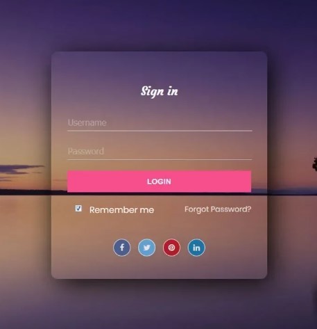
Transparent form design
2 notes
·
View notes
Text
A Few Ways That Cloudways Makes Running This Site a Little Easier
New Post has been published on https://thedigitalinsider.com/a-few-ways-that-cloudways-makes-running-this-site-a-little-easier/
A Few Ways That Cloudways Makes Running This Site a Little Easier
It’s probably no surprise to you that CSS-Tricks is (proudly) hosted on Cloudways, DigitalOcean’s managed hosting arm. Given both CSS-Tricks and Cloudways are part of DigitalOcean, it was just a matter of time before we’d come together this way. And here we are!
We were previously hosted on Flywheel which was a fairly boutique WordPress hosting provider until WP Engine purchased it years back. And, to be very honest and up-front, Flywheel served us extremely well. There reached a point when it became pretty clear that CSS-Tricks was simply too big for Flywheel to scale along. That might’ve led us to try out WP Engine in the absence of Cloudways… but it’s probably good that never came to fruition considering recent events.
Anyway, moving hosts always means at least a smidge of contest-switching. Different server names with different configurations with different user accounts with different controls.
We’re a pretty low-maintenance operation around here, so being on a fully managed host is a benefit because I see very little of the day-to-day nuance that happens on our server. The Cloudways team took care of all the heavy lifting of migrating us and making sure we were set up with everything we needed, from SFTP accounts and database access to a staging environment and deployment points.
Our development flow used to go something like this:
Fire up Local (Flywheel’s local development app)
Futz around with local development
Push to main
Let a CI/CD pipeline publish the changes
I know, ridiculously simple. But it was also riddled with errors because we didn’t always want to publish changes on push. There was a real human margin of error in there, especially when handling WordPress updates. We could have (and should have) had some sort of staging environment rather than blindly trusting what was working locally. But again, we’re kinduva a ragtag team despite the big corporate backing.
The flow now looks like this:
Fire up Local (we still use it!)
Futz around with local development
Push to main
Publish to staging
Publish to production
This is something we could have set up in Flywheel but was trivial with Cloudways. I gave up some automation for quality assurance’s sake. Switching environments in Cloudways is a single click and I like a little manual friction to feel like I have some control in the process. That might not scale well for large teams on an enterprise project, but that’s not really what Cloudways is all about — that’s why we have DigitalOcean!
See that baseline-status-widget branch in the dropdown? That’s a little feature I���m playing with (and will post about later). I like that GitHub is integrated directly into the Cloudways UI so I can experiment with it in whatever environment I want, even before merging it with either the staging or master branches. It makes testing a whole lot easier and way less error-prone than triggering auto-deployments in every which way.
Here’s another nicety: I get a good snapshot of the differences between my environments through Cloudways monitoring. For example, I was attempting to update our copy of the Gravity Forms plugin just this morning. It worked locally but triggered a fatal in staging. I went in and tried to sniff out what was up with the staging environment, so I headed to the Vulnerability Scanner and saw that staging was running an older version of WordPress compared to what was running locally and in production. (We don’t version control WordPress core, so that was an easy miss.)
I hypothesized that the newer version of Gravity Forms had a conflict with the older version of WordPress, and this made it ridiculously easy to test my assertion. Turns out that was correct and I was confident that pushing to production was safe and sound — which it was.
That little incident inspired me to share a little about what I’ve liked about Cloudways so far. You’ll notice that we don’t push our products too hard around here. Anytime you experience something delightful — whatever it is — is a good time to blog about it and this was clearly one of those times.
I’d be remiss if I didn’t mention that Cloudways is ideal for any size or type of WordPress site. It’s one of the few hosts that will let you BOYO cloud, so to speak, where you can hold your work on a cloud server (like a DigitalOcean droplet, for instance) and let Cloudways manage the hosting, giving you all the freedom to scale when needed on top of the benefits of having a managed host. So, if you need a fully managed, autoscaling hosting solution for WordPress like we do here at CSS-Tricks, Cloudways has you covered.
#Accounts#app#arm#automation#Blog#CI/CD#Cloud#cloudways#Conflict#CSS#css-tricks#Database#deployment#development#digitalocean#dropdown#easy#engine#enterprise#Environment#Events#Forms#friction#github#Giving#gravity#Hosting#hosting provider#human#incident
2 notes
·
View notes
Text
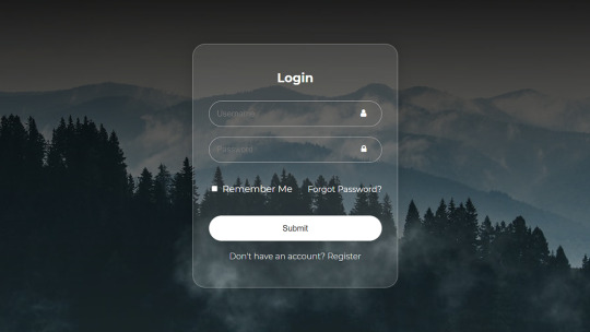
CSS Transparent Login Form
#transparent login form#html css login form#login from css#codingflicks#html css#frontend#css#html#frontenddevelopment#css3#learn to code#webdesign#html css form#css form#html5
3 notes
·
View notes
Text
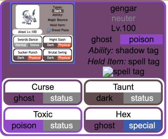
making slow progress toward a (vaguely) dynamic pokémon custom team template that mimics the Bulbapedia team flyout and after ... a ... While ... of essentially redesigning the element hierarchy from scratch with the help of a friend who is MUCH better at programming than me, it is beginning to Look
(the Absol screenshot was just one I had on hand for a stand-in, my final one will probably look a little different since I want to also add Mega / Partner Pokemon indicators if possible, and to also just tweak the info hierarchy a bit)
#from the writer's den#void talks#getting those corners on the moves was ROUGH. initially it was a table structure but after much struggle#my friend found an implementation that just uses css wizardry instead of html#also for anyone curious: the reason I say it's vaguely dynamic is bc it's actually a jinja template and html#with my vague idea being that essentially it prints out pages for any arbitrary team#(though obviously the pages themselves will be static)#also for those familiar with bulbapedia#I wanted to have a proper 'neuter' gender marker so my eventual goal is to write a little if-then in the jinja file#that allows it to convert to arbitrary symbols (to display) in addition to having the custom colors (in the css)#probably in the form of a 'if [m] / elif [f] / else' for the colors#this is solely bc there's enough neutral-gender pokemon on my oc teams that I want it to actually be indicated#where absence actually means unspecified
4 notes
·
View notes
Text
Learn HTML Tags with WebTutor.dev: Your Ultimate Resource for Web Development Tutorials
HTML (Hypertext Markup Language) is the backbone of the web. It is the standard markup language used to create web pages. HTML consists of a series of tags that define the structure and content of a web page. In this blog post, we will dive deeper into HTML tags, what they are, and how they work.

HTML tags are the building blocks of a web page. They are used to define the structure and content of a web page. HTML tags are surrounded by angle brackets (<>) and are written in lowercase. There are two types of HTML tags: opening tags and closing tags. An opening tag is used to start a tag, and a closing tag is used to end it. For example, the opening tag for a paragraph is <p>, and the closing tag is </p>.
HTML tags can also have attributes, which provide additional information about the tag. Attributes are included in the opening tag and are written as name-value pairs. For example, the <img> tag is used to embed an image on a web page. The src attribute is used to specify the URL of the image. The alt attribute is used to provide a description of the image for users who cannot see it.
HTML tags can be used to define headings, paragraphs, links, images, lists, tables, forms, and more. Here are some examples of commonly used HTML tags:
<html>: Defines the document as an HTML document
<head>: Defines the head section of the document, which contains metadata such as the page title and links to external files
<title>: Defines the title of the document, which appears in the browser's title bar
<body>: Defines the body section of the document, which contains the content of the page
<h1> to <h6>: Defines HTML headings of different sizes, with <h1> being the largest and <h6> being the smallest
<p>: Defines a paragraph
<a>: Defines a hyperlink to another web page or a specific location on the same page
<img>: Defines an image to be displayed on the page
<ul> and <ol>: Defines unordered and ordered lists, respectively
<table>: Defines a table
<form>: Defines a form for user input
<br>: Inserts a line break
<hr>: Inserts a horizontal rule
<strong>: Defines text as important or emphasized
<em>: Defines text as emphasized
<blockquote>: Defines a block of quoted text
<cite>: Defines the title of a work, such as a book or movie
<code>: Defines a piece of code
<pre>: Defines preformatted text, which preserves spaces and line breaks
<sup> and <sub>: Defines superscript and subscript text, respectively
<div>: Defines a section of the page for grouping content
<span>: Defines a small section of text within a larger block of text for styling purposes
Learning HTML can seem daunting, but with the right resources, it can be easy and enjoyable. One such resource is WebTutor.dev, an online platform that provides tutorials on web development, including HTML. The tutorials are easy to follow and provide a hands-on learning experience. The platform also offers quizzes to test your knowledge and a community forum to connect with other learners and ask questions.
In conclusion, HTML tags are the building blocks of a web page. They define the structure and content of a web page and can be used to create headings, paragraphs, links, images, lists, tables, forms, and more. If you are interested in learning HTML, check out WebTutor.dev for easy-to-follow tutorials and a supportive community of learners.
#learn code#learn code for free#school of coding#introduction to coding#learn html#learn CSS#learn JavaScript#programming training courses#how to learn coding for free#best way to learn coding#how long does it take to learn coding#HTML tags for headings#HTML tags for paragraphs#HTML tags for images#HTML tags for links#HTML tags for lists#HTML tags for tables#HTML tags for forms#HTML tags for input fields#HTML tags for buttons#HTML tags for divs#HTML tags for spans#HTML tags for anchors#HTML tags for meta data#HTML tags for stylesheets#HTML tags for scripts#HTML tags for iframes#HTML tags for audio#HTML tags for video#HTML tags for semantic markup
2 notes
·
View notes
Text
Glowing Search Box Form Effect using HTML & CSS
youtube
#front end development roadmap#youtube#htmlcss#webdesign#webdevelopment#tutorials#coding#frontend#learn css#css tutorial#csstricks#css effects#glowing#glowing effect#search form#search bar#learn#Youtube
4 notes
·
View notes
Text
a modest proposal
right bar can be adroll (remove interstitials entirely) or just flex middle larger, just give us the unread posts from mutuals tabs + saved search activity i beg of you
Hey @staff just wondering did any of you ever study web design

Just feels like you're intentionally making the desktop interface an inhospitable place in order to drive users toward the app or off the site entirely. Is that what you were going for? If so good job I guess.
#i hate css#tumblr#also obviously vary the repeated SVGs for home/etc but that's more effort than the rest of this took entirely#also needs some form of bg color gutter to show the bar avatars slide along and obv slightly better spacing
36K notes
·
View notes
Text

Get Expert College Admissions Support with The College Coaches
The College Coaches offer a range of services to help students succeed in their college journey. From personalized financial aid advising to mastering the financial aid forms, our expert team provides guidance on every step of the way. Whether you need comprehensive college consulting, essay workshops, or interview preparation, we are here to support your goals.
#financial aid advising#merit financial aid#merit aid advising#financial aid forms#federal student aid application#free application for federal student aid#fafsa student aid#fafsa scholarships#financial aid packages#fafsa css profile
0 notes
Photo

Learn how web developers can mimic the input field's placeholder attribute for select form fields. Compatible with WordPress' Contact Form 7 and jQuery Validate. #WordPressExpert #RepublishedAutomatically Originally published on October 30th, 2023 https://aurisecreative.com/blog/2023/10/how-to-add-a-placeholder-to-a-select-field/?utm_source=tumblr&utm_medium=social&utm_campaign=revive
0 notes
Text
HTML Forms

HTML forms are used to collect user input and send it to a server for processing. Forms are essential in web development for tasks like user registration, login, surveys, and more. Here’s a guide to understanding and creating HTML forms.
1. Basic Structure of an HTML Form
An HTML form is created using the <form> element, which contains various input elements like text fields, checkboxes, radio buttons, and submit buttons.<form action="/submit-form" method="post"> <!-- Form elements go here --> </form>
action: Specifies the URL where the form data will be sent.
method: Defines how the form data will be sent. Common values are GET (data sent in the URL) and POST (data sent in the request body).
2. Text Input Fields
Text input fields allow users to enter text. They are created using the <input> tag with type="text".<form action="/submit-form" method="post"> <label for="name">Name:</label> <input type="text" id="name" name="name"> <label for="email">Email:</label> <input type="email" id="email" name="email"> <input type="submit" value="Submit"> </form>
<label>: Associates a text label with a form control, improving accessibility.
type="text": Creates a single-line text input field.
type="email": Creates a text input field that expects an email address.
3. Password Field
A password field masks the input with dots or asterisks for security.<label for="password">Password:</label> <input type="password" id="password" name="password">
4. Radio Buttons
Radio buttons allow users to select one option from a set.<p>Gender:</p> <label for="male">Male</label> <input type="radio" id="male" name="gender" value="male"> <label for="female">Female</label> <input type="radio" id="female" name="gender" value="female">
type="radio": Creates a radio button. All radio buttons with the same name attribute are grouped together.
5. Checkboxes
Checkboxes allow users to select one or more options.<p>Hobbies:</p> <label for="reading">Reading</label> <input type="checkbox" id="reading" name="hobbies" value="reading"> <label for="traveling">Traveling</label> <input type="checkbox" id="traveling" name="hobbies" value="traveling">
type="checkbox": Creates a checkbox.
6. Dropdown Lists
Dropdown lists (select boxes) allow users to select one option from a dropdown menu.<label for="country">Country:</label> <select id="country" name="country"> <option value="bd">Bangladesh</option> <option value="us">United States</option> <option value="uk">United Kingdom</option> </select>
<select>: Creates a dropdown list.
<option>: Defines the options within the dropdown list.
7. Text Area
A text area allows users to enter multi-line text.<label for="message">Message:</label> <textarea id="message" name="message" rows="4" cols="50"></textarea>
<textarea>: Creates a multi-line text input field. The rows and cols attributes define the visible size.
8. Submit Button
A submit button sends the form data to the server.<input type="submit" value="Submit">
type="submit": Creates a submit button that sends the form data to the server specified in the action attribute of the form.
9. Reset Button
A reset button clears all the form inputs, resetting them to their default values.<input type="reset" value="Reset">
type="reset": Creates a button that resets the form fields to their initial values.
10. Hidden Fields
Hidden fields store data that users cannot see or modify. They are often used to pass additional information when the form is submitted.<input type="hidden" name="userID" value="12345">
11. File Upload
File upload fields allow users to select a file from their computer to be uploaded to the server.<label for="file">Upload a file:</label> <input type="file" id="file" name="file">
type="file": Creates a file upload input.
12. Form Validation
HTML5 introduces several form validation features, like the required attribute, which forces users to fill out a field before submitting the form.<label for="username">Username:</label> <input type="text" id="username" name="username" required>
required: Ensures the field must be filled out before the form can be submitted.
13. Grouping Form Elements
Fieldsets and legends can be used to group related form elements together.<fieldset> <legend>Personal Information</legend> <label for="fname">First Name:</label> <input type="text" id="fname" name="fname"> <label for="lname">Last Name:</label> <input type="text" id="lname" name="lname"> </fieldset>
<fieldset>: Groups related elements together.
<legend>: Provides a caption for the group of elements.
14. Form Action and Method
action: Specifies the URL where the form data should be sent.
method: Specifies how the data is sent. Common methods are GET and POST.
<form action="/submit" method="post"> <!-- Form elements here --> </form>
Key Takeaways
Forms are a crucial part of web development for gathering user input.
HTML provides a wide range of input types and elements to create various kinds of forms.
Properly labeling and grouping form elements enhances accessibility and usability.
Form validation helps ensure that the data submitted by users meets certain criteria before being sent to the server.
With these basics, you can start building functional forms for collecting data on your website!
Read More…
0 notes
Text
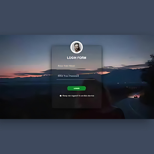
Login Form Design in HTML & CSS
#login form design#html css form#css form#glassmorphism#html css#divinector#css#frontenddevelopment#webdesign#html#css3#form html css#form html#learn to code#html5 css3
4 notes
·
View notes
Text
Organizing Design System Component Patterns With CSS Cascade Layers
New Post has been published on https://thedigitalinsider.com/organizing-design-system-component-patterns-with-css-cascade-layers/
Organizing Design System Component Patterns With CSS Cascade Layers
I’m trying to come up with ways to make components more customizable, more efficient, and easier to use and understand, and I want to describe a pattern I’ve been leaning into using CSS Cascade Layers.
I enjoy organizing code and find cascade layers a fantastic way to organize code explicitly as the cascade looks at it. The neat part is, that as much as it helps with “top-level” organization, cascade layers can be nested, which allows us to author more precise styles based on the cascade.
The only downside here is your imagination, nothing stops us from over-engineering CSS. And to be clear, you may very well consider what I’m about to show you as a form of over-engineering. I think I’ve found a balance though, keeping things simple yet organized, and I’d like to share my findings.
The anatomy of a CSS component pattern
Let’s explore a pattern for writing components in CSS using a button as an example. Buttons are one of the more popular components found in just about every component library. There’s good reason for that popularity because buttons can be used for a variety of use cases, including:
performing actions, like opening a drawer,
navigating to different sections of the UI, and
holding some form of state, such as focus or hover.
And buttons come in several different flavors of markup, like <button>, input[type="button"], and <a class="button">. There are even more ways to make buttons than that, if you can believe it.
On top of that, different buttons perform different functions and are often styled accordingly so that a button for one type of action is distinguished from another. Buttons also respond to state changes, such as when they are hovered, active, and focused. If you have ever written CSS with the BEM syntax, we can sort of think along those lines within the context of cascade layers.
.button .button-primary .button-secondary .button-warning /* etc. */
Okay, now, let’s write some code. Specifically, let’s create a few different types of buttons. We’ll start with a .button class that we can set on any element that we want to be styled as, well, a button! We already know that buttons come in different flavors of markup, so a generic .button class is the most reusable and extensible way to select one or all of them.
.button /* Styles common to all buttons */
Using a cascade layer
This is where we can insert our very first cascade layer! Remember, the reason we want a cascade layer in the first place is that it allows us to set the CSS Cascade’s reading order when evaluating our styles. We can tell CSS to evaluate one layer first, followed by another layer, then another — all according to the order we want. This is an incredible feature that grants us superpower control over which styles “win” when applied by the browser.
We’ll call this layer components because, well, buttons are a type of component. What I like about this naming is that it is generic enough to support other components in the future as we decide to expand our design system. It scales with us while maintaining a nice separation of concerns with other styles we write down the road that maybe aren’t specific to components.
/* Components top-level layer */ @layer components .button /* Styles common to all buttons */
Nesting cascade layers
Here is where things get a little weird. Did you know you can nest cascade layers inside classes? That’s totally a thing. So, check this out, we can introduce a new layer inside the .button class that’s already inside its own layer. Here’s what I mean:
/* Components top-level layer */ @layer components .button /* Component elements layer */ @layer elements /* Styles */
This is how the browser interprets that layer within a layer at the end of the day:
@layer components @layer elements .button /* button styles... */
This isn’t a post just on nesting styles, so I’ll just say that your mileage may vary when you do it. Check out Andy Bell’s recent article about using caution with nested styles.
Structuring styles
So far, we’ve established a .button class inside of a cascade layer that’s designed to hold any type of component in our design system. Inside that .button is another cascade layer, this one for selecting the different types of buttons we might encounter in the markup. We talked earlier about buttons being <button>, <input>, or <a> and this is how we can individually select style each type.
We can use the :is() pseudo-selector function as that is akin to saying, “If this .button is an <a> element, then apply these styles.”
/* Components top-level layer */ @layer components .button /* Component elements layer */ @layer elements /* styles common to all buttons */ &:is(a) /* <a> specific styles */ &:is(button) /* <button> specific styles */ /* etc. */
Defining default button styles
I’m going to fill in our code with the common styles that apply to all buttons. These styles sit at the top of the elements layer so that they are applied to any and all buttons, regardless of the markup. Consider them default button styles, so to speak.
/* Components top-level layer */ @layer components .button /* Component elements layer */ @layer elements background-color: darkslateblue; border: 0; color: white; cursor: pointer; display: grid; font-size: 1rem; font-family: inherit; line-height: 1; margin: 0; padding-block: 0.65rem; padding-inline: 1rem; place-content: center; width: fit-content;
Defining button state styles
What should our default buttons do when they are hovered, clicked, or in focus? These are the different states that the button might take when the user interacts with them, and we need to style those accordingly.
I’m going to create a new cascade sub-layer directly under the elements sub-layer called, creatively, states:
/* Components top-level layer */ @layer components .button /* Component elements layer */ @layer elements /* Styles common to all buttons */ /* Component states layer */ @layer states /* Styles for specific button states */
Pause and reflect here. What states should we target? What do we want to change for each of these states?
Some states may share similar property changes, such as :hover and :focus having the same background color. Luckily, CSS gives us the tools we need to tackle such problems, using the :where() function to group property changes based on the state. Why :where() instead of :is()? :where() comes with zero specificity, meaning it’s a lot easier to override than :is(), which takes the specificity of the element with the highest specificity score in its arguments. Maintaining low specificity is a virtue when it comes to writing scalable, maintainable CSS.
/* Component states layer */ @layer states &:where(:hover, :focus-visible) /* button hover and focus state styles */
But how do we update the button’s styles in a meaningful way? What I mean by that is how do we make sure that the button looks like it’s hovered or in focus? We could just slap a new background color on it, but ideally, the color should be related to the background-color set in the elements layer.
So, let’s refactor things a bit. Earlier, I set the .button element’s background-color to darkslateblue. I want to reuse that color, so it behooves us to make that into a CSS variable so we can update it once and have it apply everywhere. Relying on variables is yet another virtue of writing scalable and maintainable CSS.
I’ll create a new variable called --button-background-color that is initially set to darkslateblue and then set it on the default button styles:
/* Component elements layer */ @layer elements --button-background-color: darkslateblue; background-color: var(--button-background-color); border: 0; color: white; cursor: pointer; display: grid; font-size: 1rem; font-family: inherit; line-height: 1; margin: 0; padding-block: 0.65rem; padding-inline: 1rem; place-content: center; width: fit-content;
Now that we have a color stored in a variable, we can set that same variable on the button’s hovered and focused states in our other layer, using the relatively new color-mix() function to convert darkslateblue to a lighter color when the button is hovered or in focus.
Back to our states layer! We’ll first mix the color in a new CSS variable called --state-background-color:
/* Component states layer */ @layer states &:where(:hover, :focus-visible) /* custom property only used in state */ --state-background-color: color-mix( in srgb, var(--button-background-color), white 10% );
We can then apply that color as the background color by updating the background-color property.
/* Component states layer */ @layer states &:where(:hover, :focus-visible) /* custom property only used in state */ --state-background-color: color-mix( in srgb, var(--button-background-color), white 10% ); /* applying the state background-color */ background-color: var(--state-background-color);
Defining modified button styles
Along with elements and states layers, you may be looking for some sort of variation in your components, such as modifiers. That’s because not all buttons are going to look like your default button. You might want one with a green background color for the user to confirm a decision. Or perhaps you want a red one to indicate danger when clicked. So, we can take our existing default button styles and modify them for those specific use cases
If we think about the order of the cascade — always flowing from top to bottom — we don’t want the modified styles to affect the styles in the states layer we just made. So, let’s add a new modifiers layer in between elements and states:
/* Components top-level layer */ @layer components { .button /* Component elements layer */ @layer elements /* etc. */ /* Component modifiers layer */ @layer modifiers /* new layer! */ /* Component states layer */ @layer states /* etc. */
Similar to how we handled states, we can now update the --button-background-color variable for each button modifier. We could modify the styles further, of course, but we’re keeping things fairly straightforward to demonstrate how this system works.
We’ll create a new class that modifies the background-color of the default button from darkslateblue to darkgreen. Again, we can rely on the :is() selector because we want the added specificity in this case. That way, we override the default button style with the modifier class. We’ll call this class .success (green is a “successful” color) and feed it to :is():
/* Component modifiers layer */ @layer modifiers &:is(.success) --button-background-color: darkgreen;
If we add the .success class to one of our buttons, it becomes darkgreen instead darkslateblue which is exactly what we want. And since we already do some color-mix()-ing in the states layer, we’ll automatically inherit those hover and focus styles, meaning darkgreen is lightened in those states.
/* Components top-level layer */ @layer components { .button /* Component elements layer */ @layer elements --button-background-color: darkslateblue; background-color: var(--button-background-color); /* etc. */ /* Component modifiers layer */ @layer modifiers &:is(.success) --button-background-color: darkgreen; /* Component states layer */ @layer states &:where(:hover, :focus) --state-background-color: color-mix( in srgb, var(--button-background-color), white 10% ); background-color: var(--state-background-color);
Putting it all together
We can refactor any CSS property we need to modify into a CSS custom property, which gives us a lot of room for customization.
/* Components top-level layer */ @layer components .button /* Component elements layer */ @layer elements --button-background-color: darkslateblue; --button-border-width: 1px; --button-border-style: solid; --button-border-color: transparent; --button-border-radius: 0.65rem; --button-text-color: white; --button-padding-inline: 1rem; --button-padding-block: 0.65rem; background-color: var(--button-background-color); border: var(--button-border-width) var(--button-border-style) var(--button-border-color); border-radius: var(--button-border-radius); color: var(--button-text-color); cursor: pointer; display: grid; font-size: 1rem; font-family: inherit; line-height: 1; margin: 0; padding-block: var(--button-padding-block); padding-inline: var(--button-padding-inline); place-content: center; width: fit-content; /* Component modifiers layer */ @layer modifiers &:is(.success) --button-background-color: darkgreen; &:is(.ghost) --button-background-color: transparent; --button-text-color: black; --button-border-color: darkslategray; --button-border-width: 3px; /* Component states layer */ @layer states &:where(:hover, :focus) --state-background-color: color-mix( in srgb, var(--button-background-color), white 10% ); background-color: var(--state-background-color);
P.S. Look closer at that demo and check out how I’m adjusting the button’s background using light-dark() — then go read Sara Joy’s “Come to the light-dark() Side” for a thorough rundown of how that works!
What do you think? Is this something you would use to organize your styles? I can see how creating a system of cascade layers could be overkill for a small project with few components. But even a little toe-dipping into things like we just did illustrates how much power we have when it comes to managing — and even taming — the CSS Cascade. Buttons are deceptively complex but we saw how few styles it takes to handle everything from the default styles to writing the styles for their states and modified versions.
#ADD#amp#Anatomy#Article#Articles#author#background#bem#border-radius#browser#buttons#cascade#cascade layers#change#classes#code#Color#content#course#CSS#Dark#Design#design systems#display#engineering#focus#form#functions#Future#Grants
0 notes
Text
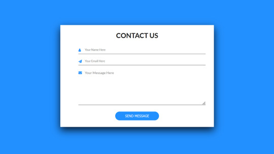
Contact Form Design
#contact form design#html css#frontend#css#html#frontenddevelopment#learn to code#css3#webdesign#html css form#css form#html5 css3 form#html5#login form design
3 notes
·
View notes