#glassmorphism
Explore tagged Tumblr posts
Text

Glassmorphism User Profile Card
#glassmorphism#profile card#css cards#html css#divinectorweb#css#webdesign#html#css3#frontenddevelopment#css snippets#css tricks#code#user profle card
3 notes
·
View notes
Text
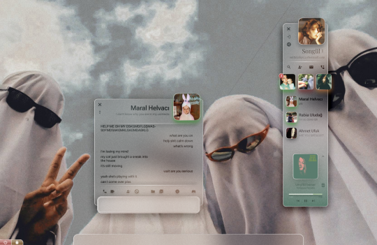
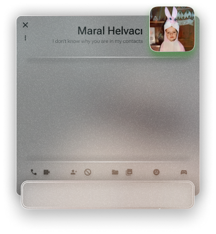
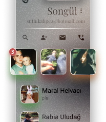
An instant messenger application/program from a personal operating system concept.
#glassmorphism#stained glass#texture#ui ux design#uidesign#frutiger#frutiger aero#frutiger aesthetic#skeumorphism#neumorphism#frkfw#figma#figmadesign#user interface#userexperience#os#operating system#concept
3 notes
·
View notes
Text


currently obsessed
0 notes
Text
6 Glass Icons For Glassmorphism Design
A set of 6 glass icons designed to enhance any project that embraces the popular Glassmorphism style.
0 notes
Text
Responsive Glassmorphism CSS Cards
#responsive css cards#glassmorphism#frosted glass effects#codingflicks#html css#frontend#code#css#html#css3#frontenddevelopment#learn to code#webdesign#responsive web design#css cards design#responsive card design
1 note
·
View note
Text
0 notes
Text
Glassmorphism:The Latest Design Trend in UI Design
In recent years, we've seen a trend in user interface (UI) design moving away from flat designs to more three-dimensional ones. One of the latest design trends is called 'Glassmorphism,'which takes inspiration from the frosted glass effect on Windows Vista and Windows 7. In this Techno-Buzz post, we'll buzz more on Glassmorphism!
What is Glassmorphism?
Glassmorphism is a design style that creates a translucent, frosted glass effect on UI elements, such as buttons, text fields, and cards. The design uses layers of transparency and blurred backgrounds to create the illusion of depth and realism. The result is a modern, sleek, and visually appealing design that provides a sense of transparency and lightness.
How is Glassmorphism created?
To create a Glassmorphism effect, designers use layers of transparency, a background blur, and shadows. The design uses two layers: the foreground layer, which is the element that the user interacts with, and the background layer, which has the frosted glass effect.
The foreground layer is designed with a semi-transparent background, and the background layer is a blurred version of the foreground layer. This creates a depth effect that makes the foreground layer appear to be floating above the background layer. The shadows are added to the edges of the foreground layer to create the illusion of a glass object.
Benefits of Glassmorphism
Glassmorphism offers several benefits in UI design. Here are some of the most significant advantages:
1. Improved user experience: The frosted glass effect creates a sense of transparency and lightness that makes the user experience more enjoyable and engaging.
2. Modern and sleek design: Glassmorphism is a modern and sleek design that looks great on various devices and screen sizes.
3. Visual hierarchy: The design emphasizes the foreground layer, making it stand out from the background, improving visual hierarchy, and making it easier for users to navigate the interface.
4. Easy to customize: Glassmorphism can be easily customized to match the branding and style of the website or application.
Glassmorphism is a visually appealing design trend that creates a sleek and modern look for UI elements. It uses layers of transparency, background blur, and shadows to create the illusion of a frosted glass effect. The design style provides several benefits, such as improved user experience, modern and sleek design, visual hierarchy, and easy customization. As the trend in UI design continues to evolve, Glassmorphism is a design style worth considering for your next project.
We at Honeycombtech are always up for taking up new and innovative design trends like Glassmorphism to deliver a modern and visually appealing user interface for our clients. Our Techno-Bees always keeps a close eye on the latest design trends and incorporates them into our work to provide our clients with cutting-edge solutions. Contact us today to see how we can help you incorporate Glassmorphism or other trending design styles into your project.
0 notes
Text
10 Best Free Graphic Design Resources Roundup #191
This is a hand-picked list of the most popular and free Graphic Design resources we’ve collected from the past week (Oct 08 2023 – Oct 14, 2023). Free Crypto-Blockchain-web3 Glass Icon Set A set of glassmorphism-style icons that add a modern twist to your crypto, blockchain or web3 designs. Abstract Floral Designs A set of elegant abstract floral patterns for your next project. Scribble…
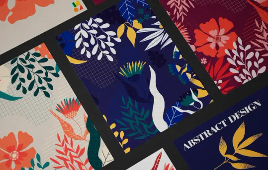
View On WordPress
0 notes
Text
Part 2!
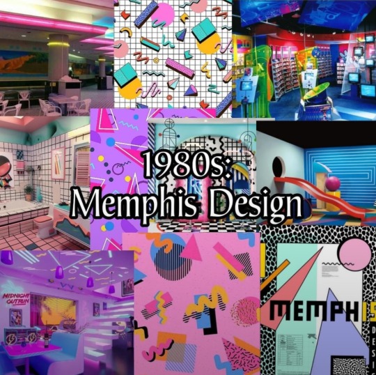
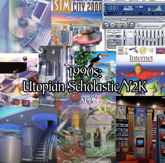
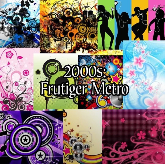
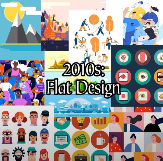
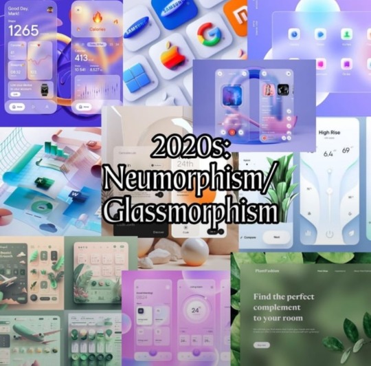
I saw this in r/decadeology:
100 Years of Designs
Which one is your favorite?
Part 1 of 2
(Least favorite?)
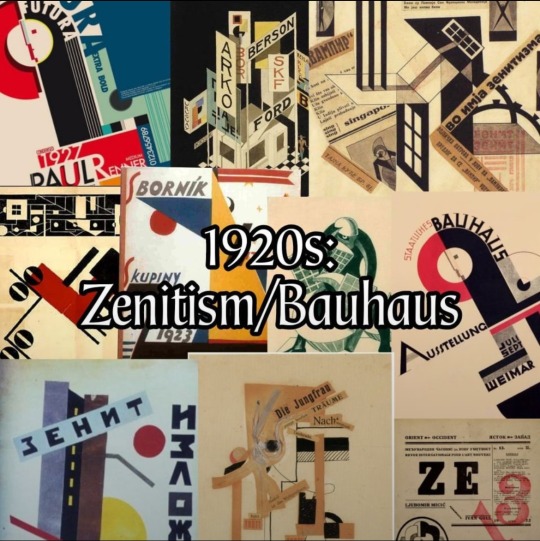
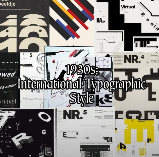
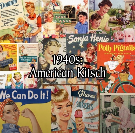
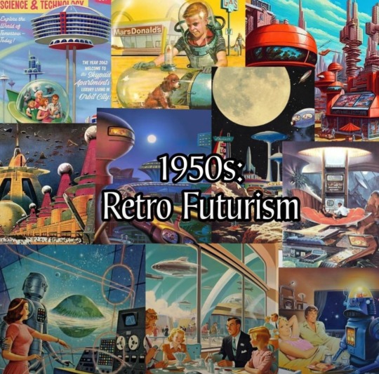
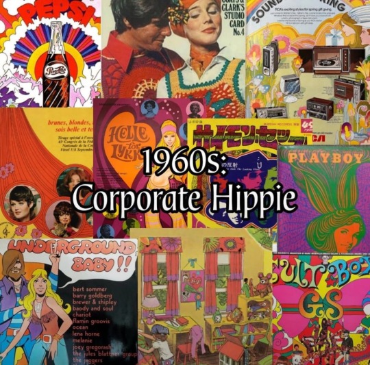
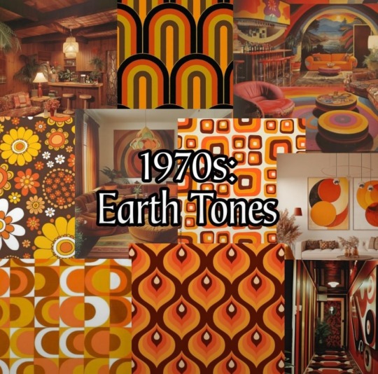
Part 1 of 2

#reddit#decadeology#americana#100 years of designs#neumorphism#glassmorphism#flat design#corporate design#frutiger metro#utopian scholastic#Y2K#y2k aesthetic#Memphis design#1980s#1990s#2000s#2010s#2020s
24 notes
·
View notes
Text

Glassmorphism Profile Card
#glassmorphism card#html css#css cards#css tricks#codenewbies#webdesign#frontenddevelopment#css#html5 css3#code#css effects#learn to code#css profile card
3 notes
·
View notes
Text
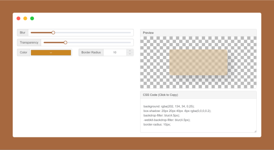
CSS Glassmorphism Generator is a CSS code generate tool designed to simplify the creation of glass-like, see-through effects in web design by adjusting parameters such as background blur, transparency levels, and border finishes.
#CSS Glassmorphism Generator#CSS Glassmorphism Code Generator#CSS Code Generator#free online tools#online tools#web tools#online web tools#online tool#ai tools#a.tools
0 notes
Text
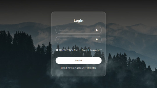
Login Form Design in HTML & CSS
#login form design#html css form#css form#glassmorphism#html css#divinector#css#frontenddevelopment#webdesign#html#css3#form html css#form html#learn to code#html5 css3
4 notes
·
View notes
Text
To my dev friends - is glassmorphism overrated?
#i personally love it#or rather the idea of it#but whenever i try creating sumn using glassmorphism it takes away from the overall cleanliness#would love input on how to make it cleaner!#web development#figma#figmadesign
1 note
·
View note
Text


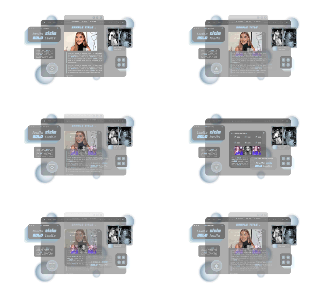

𖥨 ̟⊹♡ wasabi , a theme by gordonramsei
she just might be my favorite creation to date . . . it is my pleasure to drop my newest theme , wasabi . she is a multi - functional contained theme with a navigation tab . i was heavily inspired by the glassmorphism trend in design , this code is practically an ode to that aesthetic . there is a lot of room for customization with this theme and i'm really eager to see all the ways u cuties dress her up ! as always , if u encounter any issue within the code , pls let me know and i will troubleshoot asap !
if u intend on using this theme or just want to be a supportive hottie , please give this post a like and a reblog ! stay hydrated and be sure to pet a cute animal today ! mwuah ! 🤍 🤍 🤍

ⅰ. THEME FEATURES .
x. optional gradient glow orbs x. optional gradient overlay on sidebar img x. optional toggle slider to accomodate darker vs lighter aesthetics x. toggle post size x. accessible font size toggle x. contained post design x. animations throughout x. one extra link for ur use x. navigation tab w / subtle fade in animation x. 6 editable links within the navigation tab x. for a more detailed compilation of credits and features , please see the google doc containing the code

𖥨 ̟⊹♡ this theme is a patreon exclusive : want access ? consider signing up to join the fam - a - lam to get ur hands on this page as well as my entire coding catalogue . click here to learn more !
source link directs to a live preview of wasabi.
#rph#rpt#indie rph#rp theme#indie rp theme#supportcontentcreators#premium theme#theme#mine#rec#for patreons#for patrons
80 notes
·
View notes
Text
Due to issues within AO3's skin system, Eosphorus has been put on a semi-permanent pause. As a skin intended to be glassmorphic, it relies on certain properties that AO3 just doesn't allow. Unless AO3 updates their skin system, Eosphorus is sadly being laid to rest.
BUT WAIT.
After spending time tackling this issue, I drafted up a new skin concept and got to work. It's now much further along than Eosphorus and lends itself far better to customisation and a more universal design.
More to come soon.


29 notes
·
View notes
Text
The History and Meaning of Frutiger Aero
[This is written by me! It's mainly just a re-phrasing of the Frutiger Aero aesthetics wiki- but I had a lot of fun writing it!]
Hello you silly goobers! I am your aesthetic teacher, Kitty! In todays lesson, we're going to be learning all about "Frutiger Aero"! Lets start! [Google slide of moodboards/images of the aesthetics/subgenres: https://docs.google.com/presentation/d/1-Y2IDxaHEcLh0h0uXLEv_-NlgwlX48vh2B2HySMTRBs/edit?usp=sharing ] [Not all aesthetics/subgenres will have a slide, not all of them will have a moodboard]
First of all- what the heck is frutiger aero?! Frutiger Aero is an aesthetic first popularized in the mid 2000s, Frutiger aero is also sometimes called "Web 2.0 Gloss" It's a design style that was often prevalent in advertising, media, stock imagery and technology from around 2004 to 2013. Frutiger Aero uses glossy textures, cloudy skies, tropical fish, water, glass, bubbles, lens flare, and vibrant colors [usually blue and green]. [all images are in the google slide provided]
HOW IT GOT IT'S NAME Now what about that name? Frutiger Aero is quite a funny name isn't it? Well during the aesthetics peak, it didn't really have a name! It wasn't until more recently that the aesthetic was given a proper name. The name "Frutiger Aero" was coined in 2017 by Sofi Lee! The name comes from "Adrian Frutiger", who was the creator of the Frutiger fonts often used in the aesthetic. And Windows Aero, which was the UI theme for the Windows Vista/7.
THE HISTORY AND THE DEATH OF FRUTIGER AERO According to the Aesthetics Wiki "The earliest signs of Frutiger Aero appeared in 2001 with the releases of Microsoft's Windows XP and Apple's Mac OS X 10.0" But Frutiger Aero was at it's true prime during 2007-2012, it was being used in most advertising, media, stock imagery and technology released during this time. But the aesthetics popularity would soon start to decline in the upcoming years. 2012 would be the death of the Frutiger Aero aesthetic, with the Wii U being the last to fully embrace the Frutiger Aero look. But the Wii U was a complete commercial failure, only selling 13.56 million units, which would spell the end for the Frutiger Aero aesthetic...
THE REVIVAL Around late 2022, the aesthetic had seemed to be making a comeback via TikTok videos in the form of nostalgia, with the #frutigeraero being used over 30 million times. In August 2023, a TikTok post about the aesthetic was posted to the official Windows TikTok account. And some people believe Windows 11 is related to Frutiger Aero or contains a successor aesthetic [Glassmorphism], as seen in promotional material.
SUBGENRES Frutiger Aero has many "subgenres", here are some of them [all of them link to their aesthetic wiki page]:
Helvetica Aqua Aero [https://aesthetics.fandom.com/wiki/Helvetica_Aqua_Aero]
Frutiger Aurora [https://aesthetics.fandom.com/wiki/Frutiger_Aurora]
Dark Aero [https://aesthetics.fandom.com/wiki/Dark_Aero]
Technozen [https://aesthetics.fandom.com/wiki/Technozen]
Four Colors [https://aesthetics.fandom.com/wiki/Four_Colors]
Vectorgarden [https://aesthetics.fandom.com/wiki/Vectorflourish#Vectorgarden]
Bright Tertiaries [https://aesthetics.fandom.com/wiki/Bright_Tertiaries]
Frutiger Metro [https://aesthetics.fandom.com/wiki/Frutiger_Metro]
CONCLUSION So in conclusion, Frutiger Aero is an aesthetic loved by many, and has a very interesting history! Thank you so much for joining me on this wonderful journey! I am very passionate about this aesthetic and really enjoyed sharing it with you all! Please check out the Aesthetics Wiki! I got all of my info from there!
#frutiger aero#frutiger metro#technozen#Bright Tertiaries#vectorgarden#writing#history#internet history#frutiger aqua#dark aero
6 notes
·
View notes