#neumorphism
Explore tagged Tumblr posts
Text
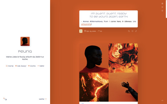
Feurig
Theme 6 by @eossa
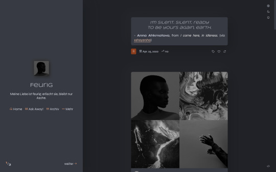
A responsive theme which supports both the old legacy type posts as well as the new NPF posts. Comes with a dark mode and unnested captions, as well as optional features such as an updates tab, custom links, search bar, toggle tabs, and neumorphic design.
This is an updated version of the revamp from 2022.
Preview the theme: live (legacy focus) | static (NPF focus)
Get the code: buymeacoffee | ko-fi | payhip
Read the guide for information on terms of use, utilized resources and customization help.
#eossa#userthmrec#supportcontentcreators#aidpaidcontent#theme maker#tumblr theme#responsive#dark mode#full npf support#sidebar#neumorphism#updates tab#1c#toggle tags#search#custom links#blog#my codes#my themes#t6 feurig#theme 6
31 notes
·
View notes
Text
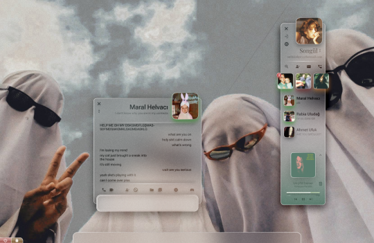
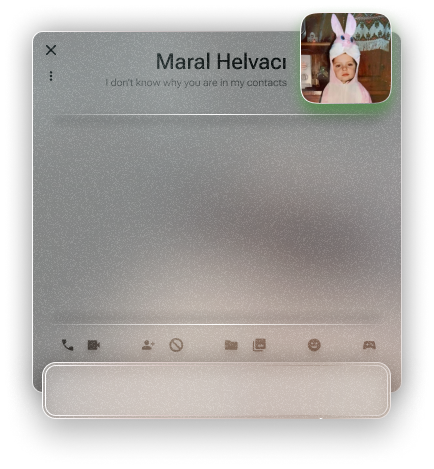
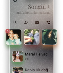
An instant messenger application/program from a personal operating system concept.
#glassmorphism#stained glass#texture#ui ux design#uidesign#frutiger#frutiger aero#frutiger aesthetic#skeumorphism#neumorphism#frkfw#figma#figmadesign#user interface#userexperience#os#operating system#concept
8 notes
·
View notes
Text
Why Neumorphism is kinda sucky
(Take this with a grain of salt, I'm just explaining what this design trend is and the problems it might have, and a tad of me talking about other design trends.)
So... Neumorphism? What the heck is that? And why is it getting trendy or something with companies like Microsoft to a degree?
Well, let's get this out of the way first, it's this design trend that apparently is supposed to be an "in-between" to skeuomorphism and flat design.
And it's more focused on color and barely any contrast.
If I had to compare it to anything, it would be like those fancy rubbery remote things that seem to have bumps over buttons with just the numbers, icons, whatever on the bumps. Kinda what you might expect from the hospital or perhaps an hotel.
Created by indie Figma community designers in 2019 (Almost 6 years ago upon reposting this from my DeviantART page), Neumorphism also was inspired by Glassmorphism which pretty much got more attention thanks to Apple in 2013 with their release of IOS 7.
Now that I got that part explained away, what does one piece of this look like? Well, thanks to the internet, it took me a few seconds to fish you guys an example from the Aesthetics wiki!
(Take a look at the wiki's page about this HERE!)

But, right away I spotted some potential problems with this UI design style. Even the co-designer of this, Michal Malewicz noticed it almost right away.
As you can see, low contrast may sound soft and cute on paper (And soft on the eyes), but it might make it difficult for some people to see what's there, especially with certain colors which would be like a domino effect. A lack of color can make it difficult for somebody to see where a button is.
I'd like you to imagine 3 buttons, one is a neumorphic button with just a shadow to reveal its presence, another is a flat button with a very easy to see color, such as a dapper shade of blue, and the last button is has both that shadow and color, and perhaps a notable gradient in the button just for fun.
And all 3 of them have "I'm a button" on them in a nice simple font.
Now, remove that "I'm a button" part. Now, can you see the problem with the neumorphic button? It almost blends in with the background!
The whole purpose of this design trend is to be soft... Yet, it's too soft. Which for those with visual troubles would be probably no different than wearing a blindfold. And those with low quality screens might not be able to see the light shadows at all, which may give them the wrong impression of nothing being there.
This is what draws me to design trends such as Frutiger Aero/Metro more, not only they look nicer, they also don't have these problems I mentioned here, but they might even help older people, like your grandma get an idea what program does what!
I'm not going to want to admit this, but if I had the choice between either this or flat design, I'd pick flat design. Yes, this last part sounds hypocritical for me to say because I'm not much of a fan of Flat Design myself.
1 note
·
View note
Text

20 Web Design Trends for 2025: Inspiration for Your Next Website
Stay ahead in the digital world with the top 20 web design trends for 2025. From AI-driven personalization to immersive 3D elements and voice UI, discover the latest innovations shaping website development. Whether you're a business or a Website Designing Company in Delhi, these trends will help you create a modern, engaging online presence. Explore cutting-edge design techniques that enhance user experience and boost conversions. Read now to upgrade your website with the latest trends!
#WebDesign2025#WebsiteTrends#UIUXDesign#WebsiteDesigning#WebDevelopment#WebsiteDesigningCompany#WebsiteDevelopmentCompany#DelhiNCR#EcommerceDesign#AIinWebDesign#DarkMode#Neumorphism#VoiceUI#3DWebDesign#ParallaxScrolling#ARIntegration#MobileFirstDesign#SEOOptimized#Cybersecurity#InteractiveWebDesign#ModernWebsites#WebDesignInspiration#DigitalTrends#WebDevelopmentDelhi#CreativeDesign
0 notes
Text

Manejo ambulatorio de la neumonía adquirida en la comunidad
#enfermeria#nurse#enfermero#nursing#enfermedad#dolor#fármacos#signos y síntomas#síndrome#ambulatorio#neumonía#neumorphism
0 notes
Text
10 Best Free Graphic Design Resources Roundup #204
This is a hand-picked list of the most popular and free Graphic Design resources we’ve collected from the past week (Jan 07 – Jan 13, 2024). Valestine Romantic Handwritten Font A handwritten romantic font for your next design project about Valentine’s Day. 3900 Minutes Free Display Font An all-caps condensed display sans-serif font free for personal and commercial use., Casual Wedding Save the…

View On WordPress
0 notes
Text
#neumorphism#soft#ui#ux#css#shadow#generator#free#resource#tool#html#web#software#design#engineering#website
0 notes
Text
Part 2!
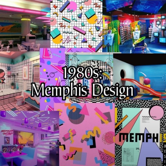
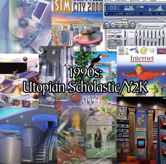
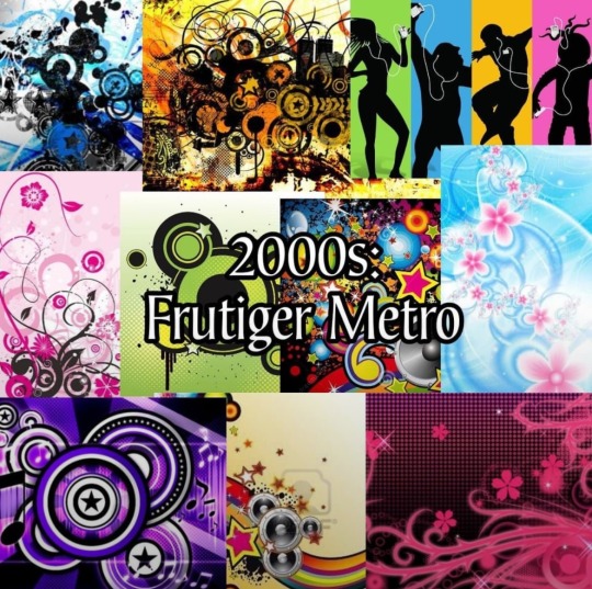
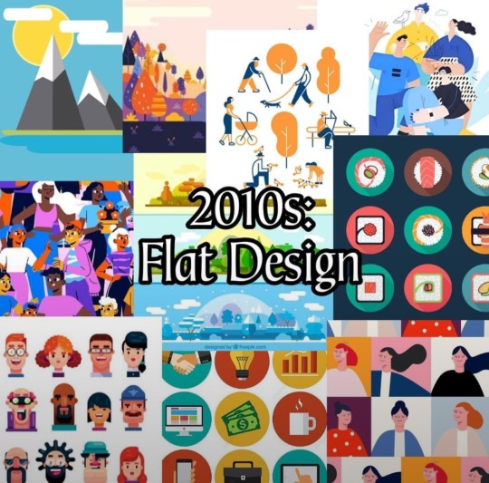
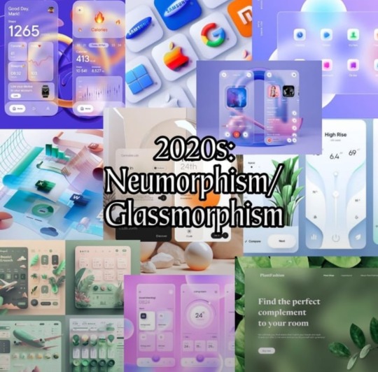
I saw this in r/decadeology:
100 Years of Designs
Which one is your favorite?
Part 1 of 2
(Least favorite?)
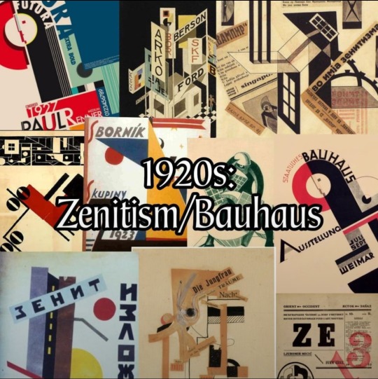
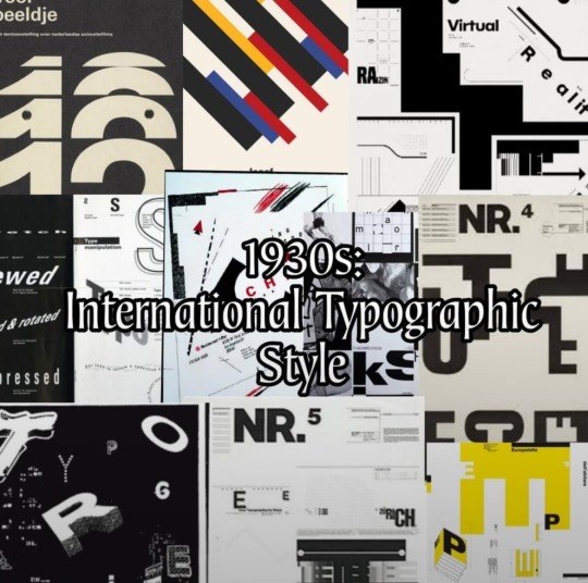

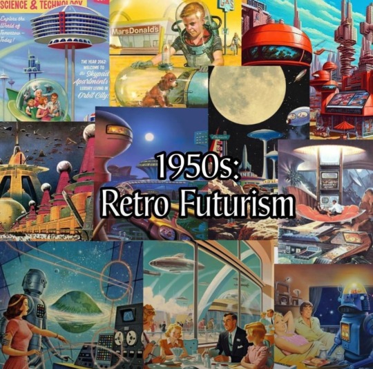
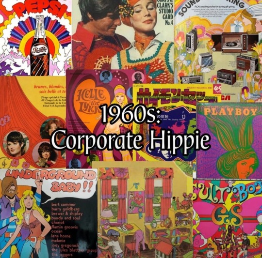
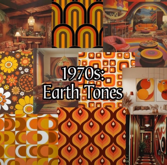
Part 1 of 2

#reddit#decadeology#americana#100 years of designs#neumorphism#glassmorphism#flat design#corporate design#frutiger metro#utopian scholastic#Y2K#y2k aesthetic#Memphis design#1980s#1990s#2000s#2010s#2020s
72 notes
·
View notes
Text
I wanted there to be more options but when I tried to see if there were more styles of UI design in the world it was kind of just these 3...So I kind of can already see how this poll will go without even posting it...It's here anyway though...
#mypost#I kind of can't imagine anyone ever picking neumorphism its sort of like a concept that was proposed and then the world went “Nah...”#but maybe theres a secret neumorphismhead somewhere out there.
2 notes
·
View notes
Text
Responsive Neumorphism Service Section
#service section design#dark neumorphism#css neumorphism#responsive web design#html css#codingflicks#learn to code#code#frontend#html#css#css3#frontenddevelopment#webdesign#css flexbox layout#css flexbox grid
5 notes
·
View notes
Text

Dark Neumorphism Button UI
#codenewbies#html css#html5 css3#frontenddevelopment#webdesign#dark neumorphism ui#neumorphism button css#pure css effects#css#code#html css tutorial#css snippets
1 note
·
View note
Photo

(via The Future of Artificial Intelligence: How Neuromorphic Computing is Revolutionising Computing Systems for Smarter Machines)
Neuromorphic computing, inspired by the human brain’s architecture and functioning, is set to redefine how we design and implement computing systems. As traditional computing architectures struggle to meet the growing demand for artificial intelligence (AI) and machine learning (ML) applications, neuromorphic computing emerges as a promising alternative. This innovative approach to computing, modelled on the brain’s neural networks, offers significant improvements in power efficiency, speed, and scalability.
https://trendingtoday2302.blogspot.com/2024/10/the-future-of-artificial-intelligence.html
0 notes
Text
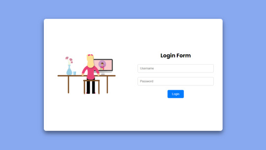
Flexbox Responsive Login Form
#neumorphism login form#login form design#html css#learn to code#code#frontenddevelopment#divinector#css#css3#html#flexbox layout#webdesign#flexbox#flexbox form
1 note
·
View note
