#css flexbox grid
Explore tagged Tumblr posts
Visit Tumblr Blog
Explore Tumblr blogs with no restrictions, modern design and the best experience.
Last Seen Tumblr Blogs


Fun Fact
In Q3 of 2020, 31% of US users access the Tumblr app daily.
Text
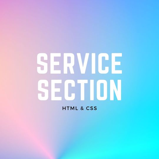
Responsive Neumorphism Service Section
#service section design#dark neumorphism#css neumorphism#responsive web design#html css#codingflicks#learn to code#code#frontend#html#css#css3#frontenddevelopment#webdesign#css flexbox layout#css flexbox grid
5 notes
·
View notes
Text
The Mistakes of CSS
New Post has been published on https://thedigitalinsider.com/the-mistakes-of-css/
The Mistakes of CSS
Surely you have seen a CSS property and thought “Why?” For example:
Why doesn’t z-index work on all elements, and why is it “-index” anyways?
Or:
Why do we need interpolate-size to animate to auto?
You are not alone. CSS was born in 1996 (it can legally order a beer, you know!) and was initially considered a way to style documents; I don’t think anyone imagined everything CSS would be expected to do nearly 30 years later. If we had a time machine, many things would be done differently to match conventions or to make more sense. Heck, even the CSS Working Group admits to wanting a time-traveling contraption… in the specifications!
NOTE: If we had a time machine, this property wouldn’t need to exist.
CSS Values and Units Module Level 5, Section 10.4
If by some stroke of opportunity, I was given free rein to rename some things in CSS, a couple of ideas come to mind, but if you want more, you can find an ongoing list of mistakes made in CSS… by the CSS Working Group! Take, for example, background-repeat:
Not quite a mistake, because it was a reasonable default for the 90s, but it would be more helpful since then if background-repeat defaulted to no-repeat.
Right now, people are questioning if CSS Flexbox and CSS Grid should share more syntax in light of the upcoming CSS Masonry layout specifications.
Why not fix them? Sadly, it isn’t as easy as fixing something. People already built their websites with these quirks in mind, and changing them would break those sites. Consider it technical debt.
This is why I think the CSS Working Group deserves an onslaught of praise. Designing new features that are immutable once shipped has to be a nerve-wracking experience that involves inexact science. It’s not that we haven’t seen the specifications change or evolve in the past — they most certainly have — but the value of getting things right the first time is a beast of burden.
Direct Link →
#background#Born#change#CSS#CSS Flexbox#CSS Grid#css-tricks#csswg#digitalocean#easy#Features#grid#Ideas#immutable#it#layout#Light#Link#links#list#masonry#mind#module#newsletter#Science#specifications#stroke#syntax#technical debt#time
0 notes
Text
La propiedad display en CSS: Desde lo básico a los diseños más avanzados.
La propiedad display determina el tipo de caja que un elemento forma y cómo se comporta dentro del flujo del documento. En otras palabras, indica si un elemento se mostrará como un bloque, una línea o si se ocultará por completo. Valores de la propiedad display La propiedad display admite varios valores, cada uno con un comportamiento específico: Valores básicos: block: Crea un bloque que…
#block#caja#contenedor#CSS#CSS3#desarrollo web frontend#Diseño web#diseño web adaptable#diseño web moderno#elemento#elementos HTML#Flexbox#flujo del documento#Grid#inline#inline-block#layout#maquetación#posicionamiento de elementos#propiedad display#responsive design#tipos de display#valor display
0 notes
Text
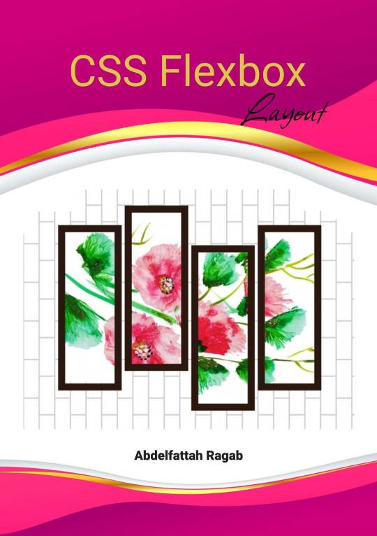
CSS Flexbox Layout by Abdelfattah Ragab
CSS Flexbox Layout by Abdelfattah Ragab
Welcome to "CSS Flexbox Layout". In this book I explain the flexbox layout model. I explain the properties of containers and elements and show you how to use Flexbox to create modern and responsive web designs. By the end of this book, you will know everything about Flexbox, use it to create responsive designs and handle all kinds of scenarios. Let’s get started.
Available on https://shop.tredition.com and https://www.amazon.com
0 notes
Text
CSS Grid vs. Flexbox: Choosing the Right Layout Tool for Full Stack Developers
CSS Grid and Flexbox are both modern CSS layout techniques that make web design more flexible and efficient. Mastering these tools is crucial for Full Stack Developers, as they help create responsive and visually appealing designs. If you want to become a Full Stack Developer and gain top-notch skills, the Best Institute for Full Stack Developer Course in Pune, Mumbai, Nagpur, Delhi, Noida, and other cities in India is the perfect place for you. courses will deepen your understanding of essential tools like CSS Grid and Flexbox. Read on for more insights!
0 notes
Text
knowing the inner workings of css is making me too powerful
#css grid layout my beloved#also flexbox my beloved#<div> i can’t believe i ever feared you#miss twinkleton’s seminary for young ladies
0 notes
Text
the hardest thing abt learning flexbox or grid is constantly having dave matthews band stuck in your head
#[ the space between amirite ]#dave matthews band#css grid#flexbox#web dev#coding humor#kris codes#the odin project
0 notes
Text
I feel you, Feli....I feel you
I wanted to move a headline to the lower right of the header. CSS put it everywhere but where I wanted it to be. My entire flex box broke because I wanted to have my headline on the right instead of the left 🥲
you put in css whose sole purpose is "move button to the left", think it works (you are a fool) and once implimented the move button left code somehow started cannibalizing all headlines directly below it
#css be like that#did you use flexbox/ grid?#maybe moving it moved the whole following layout because of this#idk though I made one website for uni this semester and I am so glad its done
9 notes
·
View notes
Note
it seems like my ask from a few days ago didn’t get sent 😭 argh stupid tumblr
i was basically asking there what resources you would recommend for everything that could be useful for neocities,, like html, css,,(and you mentioned java script i think?) especially beginner-beginner stuff and then maybe for intermediate 👉👈 i know you probably have all those on your blog already but you know me in a bit 😵💫
also yes i’d love to work on ours together, even if we didn’t make them match! cause you know you have millions of brilliant ideas :33 🌻🌻💛
Hiya,
These are the stuff I used / still use, hope it's useful:
W3Schools
Mozilla Developer Network (MDN)
Codecademy
freeCodeCamp
Khan Academy HTML/CSS Course
Shay Howe's HTML and CSS tutorial
HTML Dog
CSS-Tricks
CSS Layout
Flexbox Froggy
Grid Garden
CSS Zen Garden
CSS Animation
Try them out and see what works best for you! 👍🏾
#my asks#resources#coding#codeblr#progblr#programming#studyblr#studying#comp sci#computer science#programmer#html css#html#css
354 notes
·
View notes
Note
how did you learn coding?
I am pretty much entirely self taught as far as front end goes!
I started messing around with HTML and CSS with tumblr themes back in 2016-ish.
For javascript I looked at https://developer.mozilla.org/en-US/ for a lot of documentation + examples. And also used codepen a lot to kinda reverse engineer existing snippets of code.
I also read a lot of https://css-tricks.com/
And for flexbox + css grid there's these:
After I got a good foundation of vanilla JS, I learned Vue for a little while and then moved on to React. The new react documentation is really good in my opinion so I definitely recommend reading that if you're interested in learning.
Most of my learning came from trial and error and working on projects that I was really excited about. I used to be so proud of findtags (the original version) which was in jquery...
The react version is miles ahead of it. And even then, the theme builder is also way ahead of findtags. I learned way more between those two projects than reading documentation alone!
189 notes
·
View notes
Text
widowbase v3 and v4
Whooboi, there is a lot of discourse going on right now about JCINK coders. Perfect time for me to update some base skins!
For those who just want to streamline their coding process, I have updated my widowbase v3 to include a day/night theme toggle and made a few responsive tweaks to the vertical nav and sidebar. For those looking to learn how to use CSS grid and flexbox to create responsive forum designs, I added a new base, widowbase v4. This version includes some HTML templates that have a very ugly, extremely basic, but functional fluid grid layout. These templates also incorporate hidden divs (read as, display: none) that include the PHP variables frequently used inside those respective HTML templates, so you can easily delete everything I've done and start from scratch with your own. Then just delete the hidden div when you've used everything you need. Easy peasy!
For those of you just beginning your coding journey, I wish you the best of luck! It is such a fun and rewarding hobby. You are also free to rip apart any of the codes on my preview site and cobble them back together. These experiments can be a great learning tool! You are more than welcome to use any of my free resources as a base, as long as the finished product remains free. As for my actual skin bases (or template sets specifically labeled as bases), these can be used for free or paid skins. Make money or give it away, whatever works for you, just leave the credits given to resources intact so others can find out how to accomplish the same thing!
36 notes
·
View notes
Text

2 ─ 4/100 days of code, 26 ─ 280523
coding progress —
✓ day 2 : CSS Bootstrap Practice ✓ day 3 : Recap of the full HTML + CSS Lessons ✓ day 4 : Building a responsive Landing page
i'm finally done with HTML and CSS, i found that having experience working with webflow made understanding the grid system and flexbox much easier!
but i can't say i'm good with css yet; my learning process so far has been based a lot on theory and less on practice.
i'm planning to change that.
so before starting the Java script chapter, i prepared some HTML and CSS challenges to help me get more familiar working with these tools.
challenge number one : is to make a responsive landing page
i started working on it this morning, learning bootstrap is really making building anything so easy,
it feels abit like cheating! ꒰・‿・๑꒱
work in progress of the landing page
#coding#codeblr#programming#100daysofcode#studyblr#landing page#technology#css#html#learning#studying#computer science#frontend#learn to code#coding blog#progress#100 Days Of Code Journal
123 notes
·
View notes
Text
8 CSS Snippets for Creating Bento Grid Layouts
New Post has been published on https://thedigitalinsider.com/8-css-snippets-for-creating-bento-grid-layouts/
8 CSS Snippets for Creating Bento Grid Layouts
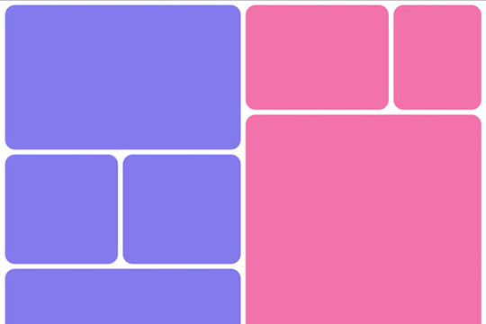
Another day, another design trend! Bento grid layouts are the subject this time around. They’re bold and beautiful. Plus, they satisfy those with a need for symmetry.
So, what exactly is a Bento layout? Think of it as a puzzle. Different-sized containers fit together to create a seamless look. Inspired by Japanese culture, it’s popping up all over the web.
There’s good reason for Bento’s growing popularity. You can use these layouts in a multitude of ways. Everything from listing blog posts to product features is possible. They’re also perfect for dashboard screens.
We should also mention the role that the evolution of CSS has played. Both CSS Grid and Flexbox make these layouts easier to build. No hacks or workarounds are necessary!
With that, here’s a look at 8 beautiful Bento grid layouts.
Complex Bento CSS Grid Layout
CSS Grid packs a lot of power into a tiny bit of code. For example, this complex grid layout requires only 43 lines of CSS. The layout is both efficient and naturally responsive. Therefore, you won’t have to play around with media queries.
See the Pen Complex Bento Layout
Bento-Style Responsive Dashboard
Here’s a gorgeous dashboard layout that benefits from Bento. The layout offers a great way to display relevant content. Everything is neatly organized and easy to follow. The use of photography and color makes this example stand out.
See the Pen Responsive Dashboard | Bento Style by Ecem Gokdogan
Bento Design Concept Layout
This page layout is a different take on the Bento aesthetic. There’s a sidebar featuring in-page navigation. Clicking a button expands it. Meanwhile, the content container maintains a consistent height.
See the Pen bento design concept by Abhishek Bhardwaj
Bento-Box-V1.0.1
Bento layouts also benefit from minimalism. This layout features fewer bells and whistles. Notice the use of white space and legible typography. The animated charts catch your eye without being overwhelming.
See the Pen Bento-Box-V1.0.1 by Gwenaël Guiraud
Sticky Bento on Scroll
This “sticky” presentation adds special effects to the mix. Watch how certain elements stick as you scroll. The idea is that you can go beyond static grids. Bento can be fun, too!
See the Pen Sticky Bento on Scroll ✨ by Jhey
Bento Grid Using CSS Flexbox
Let’s check out another fun example using Flexbox. This grid has a neon look and includes cool hover effects. Bonus points here for maintaining legibility and responsiveness.
See the Pen bento grid – challenge (Chrome +111) by EaterUsr
Card-Based Layout with Gradient Borders
Here’s an example for those wanting to stand out from the crowd. This card-based layout features animated borders, “wipe” effects, and beautiful hover styling. The layout remains clean – even with all those goodies.
See the Pen Cards (gradient border) by Dan
CSS Grid & :has() Grid Layouts
We can achieve a lot with the CSS :has() pseudo-class. This example uses it to adjust the layout as boxes are added and subtracted. Watch as the layout maintains perfect symmetry throughout.
See the Pen Always great grid – CSS grid + :has() + view transitions by Adam Argyle
Use Bento Grids to Keep Your Layout Nice and Tidy
The idea of using Bento aesthetics in web design isn’t new. However, older CSS layout techniques made them difficult to build. That’s no longer the case.
Perhaps the best part is that modern CSS does all the dirty work. We don’t need to compute complex calculations. CSS Grid and Flexbox can do this for us.
That leaves us free to experiment. The examples above demonstrate what is possible. And you can get as creative as you like.
Want to see more Bento grid examples? Check out our CodePen collection!
Related Topics
Top
#amp#Blog#box#challenge#charts#chrome#code#Color#container#Containers#content#CSS#CSS Flexbox#CSS Grid#CSS Layout Snippets#CSS Layouts#CSS Snippets#dashboard#Design#display#easy#effects#Evolution#eye#Features#grid#grids#hover#how#it
1 note
·
View note
Text
Propiedades de las Cajas o Bloques en HTML y su Importancia
En HTML, todos los elementos, desde un simple párrafo hasta una imagen compleja, se representan como cajas. Estas cajas tienen propiedades que nos permiten controlar su tamaño, posición, espaciado y otros aspectos visuales. Comprender estas propiedades es fundamental para crear diseños web personalizados y atractivos. ¿Qué es el Modelo de Caja en CSS? El modelo de caja es una representación…
#CSS#css box model#CSS layout#CSS properties#desarrollo web#diseño responsive#Diseño web#Diseño web personalizado#Flexbox#Grid#Guía CSS#HTML#layout#Modelo de caja CSS#Posicionamiento CSS#propiedades CSS#Tutorial CSS#z-index
1 note
·
View note
Note
how did you go about doing the navigation links on your neocities? it's really neat!
MY NEOCITIES... i really need to add more to that. every so often i remember it exists. anyway
the sidebar and main text, first of all, are two containers in the simplest possible flexbox container (the css for it just has 'display: flex' and nothing else). very useful, i love flexbox. if you haven't used it before, i'd recommend looking into it! loads of examples and guides out there. (there's also css grid, but i've never used it)
the navigation itself in the html is very simple, basically a list of links.. not actually a list, just separate 'paragraphs'. (which i have to update on every page every time i add/rename/remove another page..) additional thought: i think mayyybe if i used a flexbox container for the links themselves it'd be easier to make it so the navigation turns horizontal (and along the top) instead of vertical when the screen is small enough? or something with inline blocks maybe. i haven't gotten around to trying any of that though
back on topic, the symbol before each link and the translucent 'label' on hover is from the css, like this

so basically the 'label' sticking out is, like, an offset background? and also the current page link gets a custom class that gives it the same formatting as the hover text
i think that's everything, i'm not great at actually explaining how i did stuff so i hope this is helpful haha
#honestly when i was making it i... mostly just looked through the mdn web docs#and clicked on whatever interesting selectors/attributes/etc. i thought i might use#that's pretty much the main way i learn html/css.. trying out whatever might look good and learning how to use it lol
5 notes
·
View notes
Video
youtube
CozyGrid layout prototype 1 CozyGrid is the first stage of a layout tool designed in Processing. The next stage will involve trying to recreate effects from CSS FlexBox. I have versions of this that have slicker transitions, but the more important problems I'm trying to solve involve providing more variety in size and positioning of the Title and Image objects while maintaining tight grid use, not so much excess white space. Currently my logic is messing me up when I try to reconcile these two desires. More polished versions of this should be coming soon, with lots of extra features. #Processing #Vlog #layout #creativecoding #generativedesign
2 notes
·
View notes