#Neumorphic design
Explore tagged Tumblr posts
Text
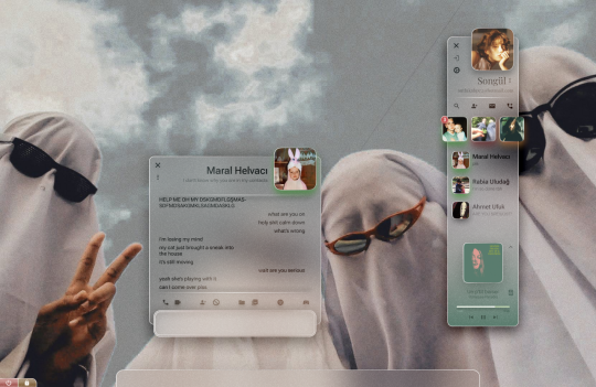
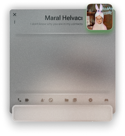
An instant messenger application/program from a personal operating system concept.
#glassmorphism#stained glass#texture#ui ux design#uidesign#frutiger#frutiger aero#frutiger aesthetic#skeumorphism#neumorphism#frkfw#figma#figmadesign#user interface#userexperience#os#operating system#concept
3 notes
·
View notes
Text
Why Neumorphism is kinda sucky
(Take this with a grain of salt, I'm just explaining what this design trend is and the problems it might have, and a tad of me talking about other design trends.)
So... Neumorphism? What the heck is that? And why is it getting trendy or something with companies like Microsoft to a degree?
Well, let's get this out of the way first, it's this design trend that apparently is supposed to be an "in-between" to skeuomorphism and flat design.
And it's more focused on color and barely any contrast.
If I had to compare it to anything, it would be like those fancy rubbery remote things that seem to have bumps over buttons with just the numbers, icons, whatever on the bumps. Kinda what you might expect from the hospital or perhaps an hotel.
Created by indie Figma community designers in 2019 (Almost 6 years ago upon reposting this from my DeviantART page), Neumorphism also was inspired by Glassmorphism which pretty much got more attention thanks to Apple in 2013 with their release of IOS 7.
Now that I got that part explained away, what does one piece of this look like? Well, thanks to the internet, it took me a few seconds to fish you guys an example from the Aesthetics wiki!
(Take a look at the wiki's page about this HERE!)

But, right away I spotted some potential problems with this UI design style. Even the co-designer of this, Michal Malewicz noticed it almost right away.
As you can see, low contrast may sound soft and cute on paper (And soft on the eyes), but it might make it difficult for some people to see what's there, especially with certain colors which would be like a domino effect. A lack of color can make it difficult for somebody to see where a button is.
I'd like you to imagine 3 buttons, one is a neumorphic button with just a shadow to reveal its presence, another is a flat button with a very easy to see color, such as a dapper shade of blue, and the last button is has both that shadow and color, and perhaps a notable gradient in the button just for fun.
And all 3 of them have "I'm a button" on them in a nice simple font.
Now, remove that "I'm a button" part. Now, can you see the problem with the neumorphic button? It almost blends in with the background!
The whole purpose of this design trend is to be soft... Yet, it's too soft. Which for those with visual troubles would be probably no different than wearing a blindfold. And those with low quality screens might not be able to see the light shadows at all, which may give them the wrong impression of nothing being there.
This is what draws me to design trends such as Frutiger Aero/Metro more, not only they look nicer, they also don't have these problems I mentioned here, but they might even help older people, like your grandma get an idea what program does what!
I'm not going to want to admit this, but if I had the choice between either this or flat design, I'd pick flat design. Yes, this last part sounds hypocritical for me to say because I'm not much of a fan of Flat Design myself.
1 note
·
View note
Text
Responsive Neumorphism Service Section
#service section design#dark neumorphism#css neumorphism#responsive web design#html css#codingflicks#learn to code#code#frontend#html#css#css3#frontenddevelopment#webdesign#css flexbox layout#css flexbox grid
5 notes
·
View notes
Text
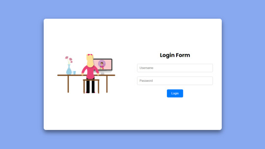
Flexbox Responsive Login Form
#neumorphism login form#login form design#html css#learn to code#code#frontenddevelopment#divinector#css#css3#html#flexbox layout#webdesign#flexbox#flexbox form
1 note
·
View note
Text
#neumorphism#soft#ui#ux#css#shadow#generator#free#resource#tool#html#web#software#design#engineering#website
0 notes
Text
Part 2!
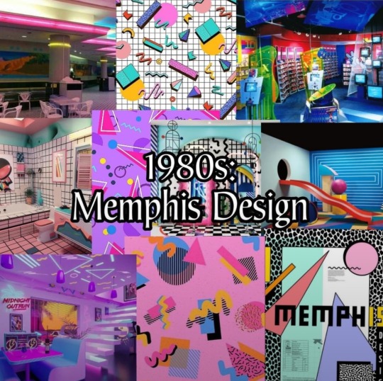
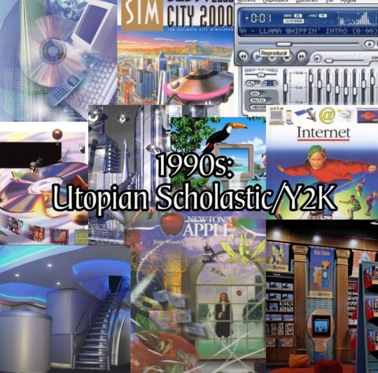
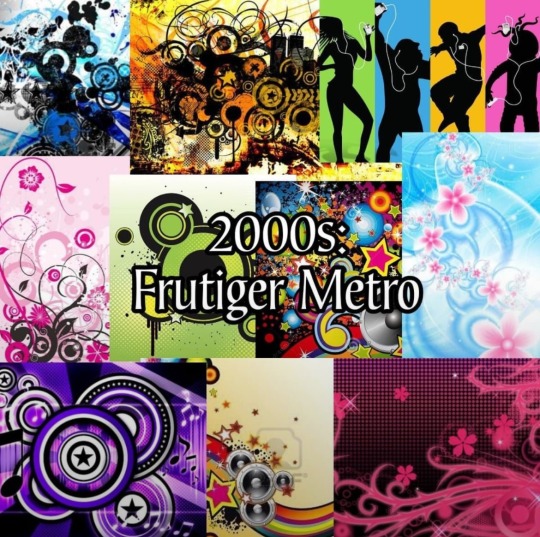
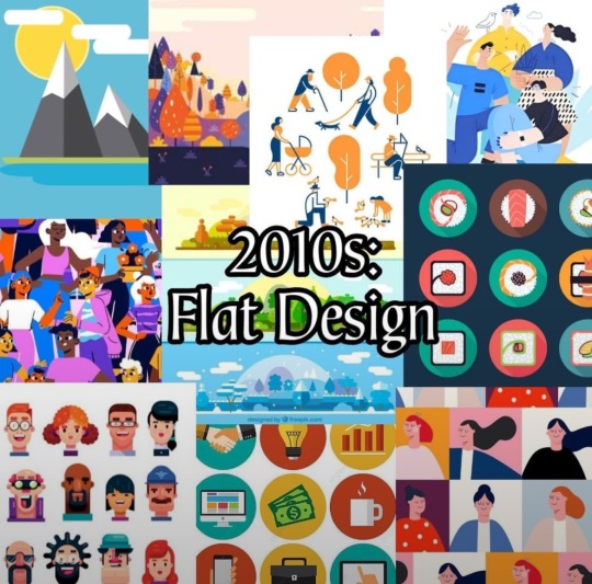
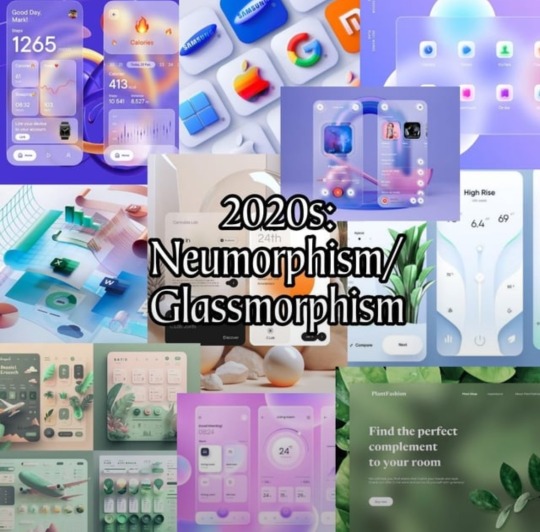
I saw this in r/decadeology:
100 Years of Designs
Which one is your favorite?
Part 1 of 2
(Least favorite?)
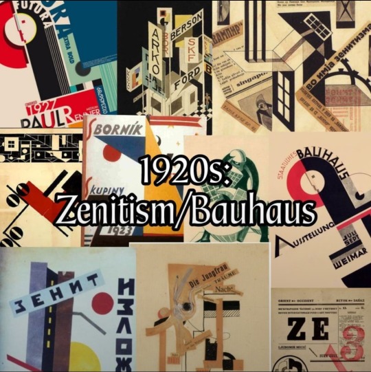
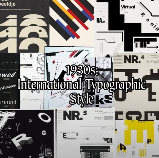

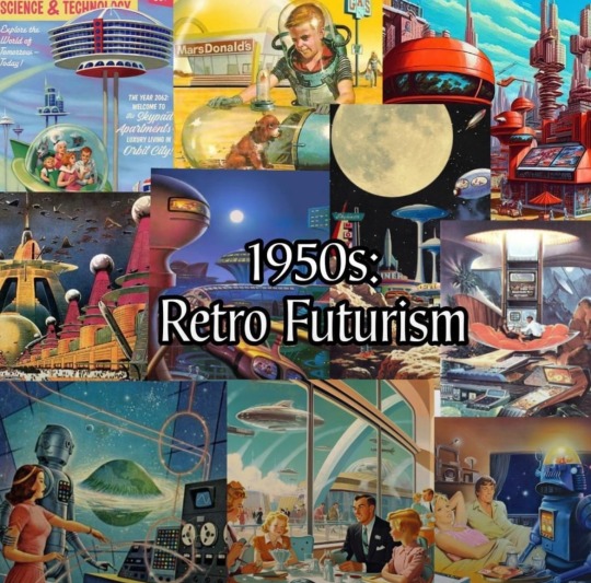
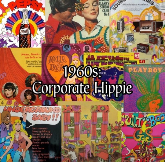
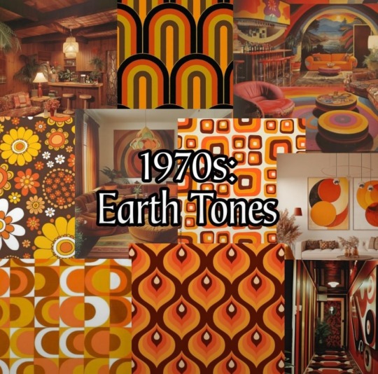
Part 1 of 2

#reddit#decadeology#americana#100 years of designs#neumorphism#glassmorphism#flat design#corporate design#frutiger metro#utopian scholastic#Y2K#y2k aesthetic#Memphis design#1980s#1990s#2000s#2010s#2020s
23 notes
·
View notes
Text
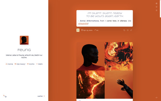
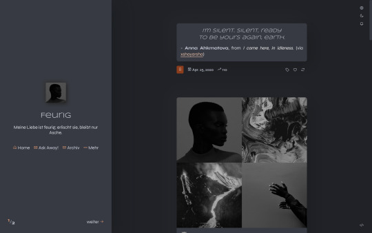
Feurig
Theme 6 by @eossa
A responsive theme which supports both the old legacy type posts as well as the new NPF posts. Comes with a dark mode and unnested captions, as well as optional features such as an updates tab, custom links, search bar, toggle tabs, and neumorphic design.
This is an updated version of the revamp from 2022.
Preview the theme: live (legacy focus) | static (NPF focus)
Get the code: buymeacoffee | ko-fi | payhip
Read the guide for information on terms of use, utilized resources and customization help.
#eossa#userthmrec#supportcontentcreators#aidpaidcontent#theme maker#tumblr theme#responsive#dark mode#full npf support#sidebar#neumorphism#updates tab#1c#toggle tags#search#custom links#blog#my codes#my themes#t6 feurig#theme 6
31 notes
·
View notes
Text
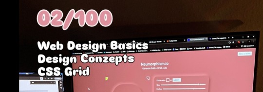
02/100
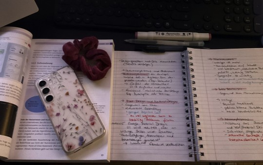
I studied Design Concepts. I suppose I found Neumorphism, which caught my interest.
I'm on a mission to soak up knowledge like a sponge! The whole day I'm buzzing with ideas and no energy, but as soon as the sun sets, my brain flips a switch and I'm suddenly productive. But after short time, I'm too tired. It's a weird struggle, but I'm determined to find a balance!
#learning#brain freeze#codeblr#webdev#programming#100 days of productivity#education#design#books & libraries#studyblr#coding#100dayofcode#100 days of self discipline#discover#balance
10 notes
·
View notes
Text
I wanted there to be more options but when I tried to see if there were more styles of UI design in the world it was kind of just these 3...So I kind of can already see how this poll will go without even posting it...It's here anyway though...
#mypost#I kind of can't imagine anyone ever picking neumorphism its sort of like a concept that was proposed and then the world went “Nah...”#but maybe theres a secret neumorphismhead somewhere out there.
2 notes
·
View notes
Text
A Comprehensive Guide to Mobile App Design in 2024
Table Of Contents
Introduction
What is Mobile App Design?
Importance of Creating a Custom Design
Latest Trends in Mobile App UI Design in 2024
Steps to Build the Most Effective App UI Design Process
How Can Verve Systems Help You with Mobile App Design?
Introduction
Mobile app design is a critical aspect of creating a successful and engaging digital product. As the mobile landscape evolves, it’s crucial for businesses and developers to stay abreast of the latest trends and design principles to deliver exceptional user experiences. In this comprehensive guide, we’ll explore the fundamental concepts of mobile app design, emphasize the importance of creating custom designs, delve into the latest trends in mobile app UI design in 2024, outline the steps to build the most effective app UI design process, and discuss how Verve Systems can assist you with your mobile app design endeavors.
What is Mobile App Design?
Mobile app design involves creating a visual and interactive interface for applications that run on mobile devices. It encompasses not only the aesthetics but also the functionality and user experience (UX). A well-designed mobile app considers user preferences, navigation, and the overall journey from the moment a user launches the app until they complete their desired actions.
Importance of Creating a Custom Design
1. Brand Identity:
A custom app design reflects and reinforces your brand identity. Consistent branding across your digital products helps in building brand recognition and trust among users.
2. User Engagement:
Tailoring the design to your specific audience enhances user engagement. A custom design allows for a user-centric approach, addressing the unique needs and preferences of your target demographic.
3. Competitive Edge:
In a crowded app market, a unique and aesthetically pleasing design can give your app a competitive edge. Users are more likely to choose an app that not only meets their functional needs but also provides an enjoyable and visually appealing experience.
4. Adaptability:
Custom designs can be adapted to the specific requirements of your app, ensuring that the user interface aligns seamlessly with the app’s functionality and purpose. This adaptability is crucial for creating a cohesive and intuitive user experience.
Latest Trends in Mobile App UI Design in 2024
As we step into 2024, several trends are shaping the landscape of mobile app UI design. Staying informed about these trends can help designers and developers create apps that feel modern and relevant:
1. Dark Mode Dominance:
Dark mode has become more than just a trend; it’s now a staple in UI design. Users appreciate the reduced eye strain and enhanced visual aesthetics offered by dark mode interfaces.
2. Microinteractions:
Microinteractions, such as animated buttons and subtle transitions, provide feedback to users, making the app feel responsive and interactive. These small design elements contribute to a more engaging user experience.
3. Immersive 3D Elements:
Leveraging 3D elements in mobile app design adds a layer of realism and immersion. Whether it’s interactive 3D models or depth-enhancing effects, these elements create visually stunning experiences.
4. Neumorphism:
Neumorphism is a design trend that combines elements of skeuomorphism and flat design. It involves using subtle shadows and highlights to create a soft, tactile appearance, giving apps a modern and futuristic feel.
5. Gesture-Based Navigation:
With the rise of edge-to-edge screens, gesture-based navigation is gaining prominence. Apps are increasingly adopting intuitive gestures for actions like swiping, pinching, and tapping, enhancing the overall navigation experience.
Steps to Build the Most Effective App UI Design Process
Creating an effective app UI design process requires careful planning and execution. Here are the key steps to ensure a successful outcome:
1. Define Clear Objectives:
Begin by clearly defining the objectives of your mobile app. Understand the target audience, the app’s purpose, and the desired user journey. This foundation will guide the entire design process.
2. Research and User Persona Development:
Conduct thorough research on your target audience. Develop user personas to understand their needs, preferences, and pain points. This information will inform design decisions that resonate with your users.
3. Wireframing and Prototyping:
Create wireframes to outline the basic structure and layout of your app. Progress to prototyping to visualize the flow and interactions. Prototypes provide a tangible representation of the user experience.
4. Iterative Design Process:
Adopt an iterative approach to design. Gather feedback at each stage, make improvements, and refine the design. This cyclical process ensures that the final product aligns closely with user expectations.
5. Responsive Design for Multiple Platforms:
Consider the diversity of devices and screen sizes. Implement responsive design principles to ensure a seamless and consistent experience across various platforms, be it smartphones, tablets, or wearables.
6. Testing and User Feedback:
Conduct thorough testing of the app’s design, functionality, and performance. Seek feedback from real users through beta testing and make necessary adjustments based on their insights.
7. Implementation and Development Collaboration:
Collaborate closely with developers during the implementation phase. A seamless partnership between designers and developers ensures that the envisioned design is translated into a functional and aesthetically pleasing app.
8. Continuous Improvement:
Post-launch, monitor user interactions and gather analytics. Use this data for continuous improvement, addressing any issues, and incorporating user feedback into future updates.
How Can Verve Systems Help You with Mobile App Design?
Verve Systems is a leading provider of comprehensive mobile app design services, offering expertise in creating tailored and innovative designs. Our team of skilled designers and developers collaborates with clients to deliver solutions that align with their brand identity and user needs.
Our Services Include:
Custom App Design:
We specialize in creating custom designs that reflect your brand and provide a unique user experience.
User-Centric Approach:
Our designs are crafted with a focus on user preferences and behavior, ensuring high levels of engagement.
Incorporating Latest Trends:
Stay ahead in the competitive landscape by leveraging the latest trends in mobile app design, keeping your app modern and appealing.
Collaborative Development:
We work closely with your development team to seamlessly integrate the design into the app development process.
Continuous Support and Improvement:
Our commitment extends beyond the initial design, with continuous support and a dedication to refining the app based on user feedback and evolving industry trends.
In conclusion, mobile app design plays a pivotal role in the success of any digital product. By understanding the fundamentals, staying updated on trends, following a robust design process, and partnering with experienced teams like Verve Systems, you can create mobile apps that not only meet user expectations but also stand out in the competitive app market.
Explore More — https://www.vervesys.com/ Contact Us — +1 (732) 402–6854, +91 79 4000 7881 Enquire Now — [email protected]
#mobile app development company india#mobile app design#mobile app development#mobileapp#web development#coding#business#mobile application development#ios app development#android app development#app developers#mobile app developers#mobile app design bd#mobile app developer company
6 notes
·
View notes
Text
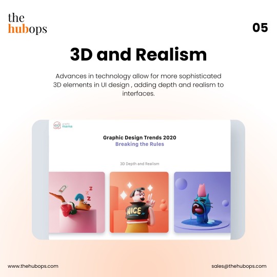
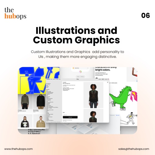
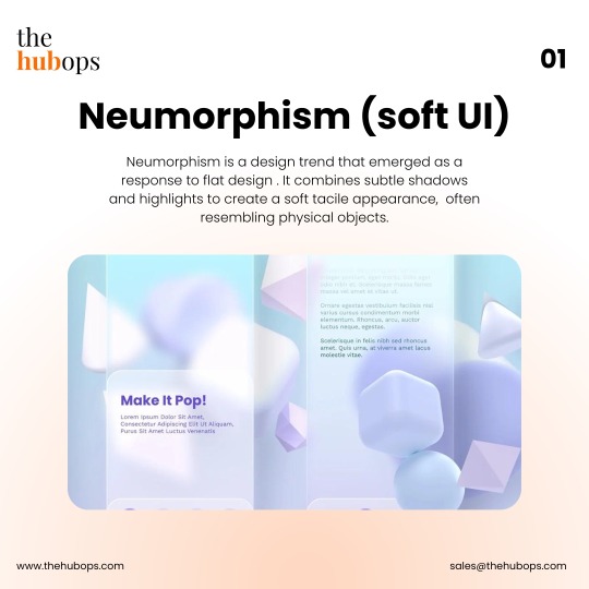
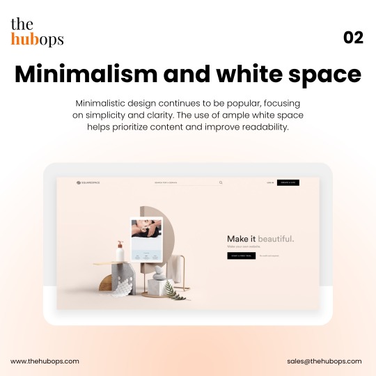
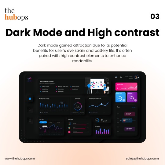
Look at some of the UI design trends.
⚡️Neumorphism (Soft UI) ⚡️Minimalism and White Space ⚡️Dark Mode and High Contrast ⚡️Microinteractions ⚡️3D and Realism. ⚡️Illustrations and Custom Graphics ⚡️Voice User Interfaces (VUI)
Follow, Save and Like for more amazing content. 😏👌
Learn more about our services on www.thehubops.com or thehubops.us
#thehubops#hubops#thehubopslife#uiux#uxui#websitedesign#like#graphic#designideas#graphicportfolio#behance#applicationdesign#marketing#seo#digitalmarketing #onlinemarketing#webdevelopment#grahicdesign#ideas#content#designer#rules#websitedesign#important#onlinedevelopment#onlinedesign#designinspiration
2 notes
·
View notes
Text
Exploring Futuristic Design: Top 10 Web Design Latest Trends and Techniques in 2023
Introduction:
The world of web design is a dynamic and ever-evolving field, constantly pushing boundaries and embracing new technologies. As we step into 2023, it's essential for web designers and developers to stay ahead of the curve and be aware of the latest trends and techniques shaping the industry. In this blog post, we will explore the cutting-edge web design trends that are gaining momentum and the innovative techniques that are revolutionizing the way we create online experiences.
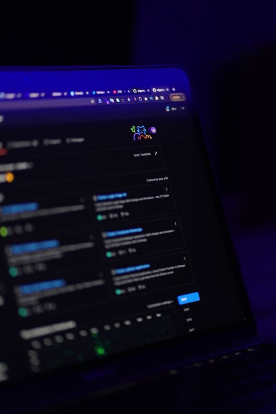
Dark Mode: A Sleek and Modern Aesthetic:
Dark mode has become a beloved trend in recent years and continues to dominate in 2023. With its sleek, elegant appearance and improved readability, dark mode offers a refreshing alternative to traditional light interfaces. The contrast provided by dark backgrounds enhances visual impact and allows key elements to pop, creating an immersive and engaging user experience.
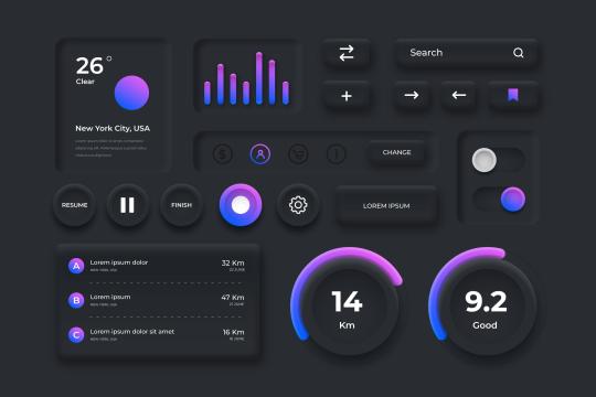
Neumorphism/Soft UI: Merging Realism and Minimalism:
Neumorphism, also known as Soft UI, blends elements of skeuomorphism and flat design to create visually appealing interfaces. This technique utilizes subtle shadows and highlights to generate a soft, three-dimensional appearance. By combining the realistic depth of skeuomorphism with the simplicity of flat design, Neumorphism provides a modern and intuitive user interface.
Asymmetric Layouts: Breaking the Grid:
Web designers are increasingly exploring asymmetric layouts that break away from the traditional grid system. These layouts introduce visual interest through irregular shapes, overlapping elements, and creative positioning. Asymmetric designs convey a sense of uniqueness and captivate users by challenging their expectations, resulting in memorable and engaging experiences.
Microinteractions: Adding Delightful Details:
Microinteractions are discreet animations or interactive elements that enrich user engagement and deliver informative feedback. They can be as simple as a hover effect, a loading spinner, or a button animation. These small details inject personality into websites, making interactions feel intuitive and enjoyable, ultimately elevating the overall user experience.

3D/Immersive Experiences: Stepping into a New Dimension:
Thanks to advancements in web technologies like WebGL and CSS3D, web designers are incorporating more 3D elements into their creations. From interactive 3D product visualizations to scroll-triggered animations and virtual reality experiences, these immersive designs transport users to a whole new dimension, blurring the lines between the digital and physical worlds.
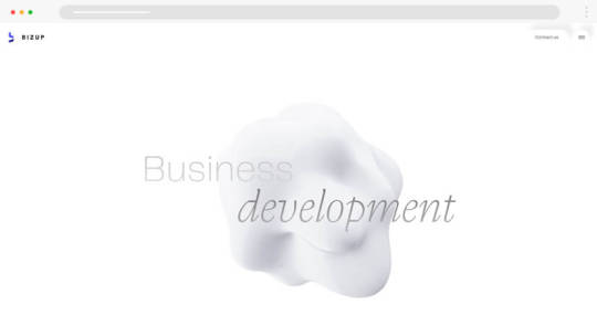
Minimalist and Clean Designs: Less is More:
The minimalist design approach, with its clean aesthetics and ample whitespace, continues to thrive in 2023. Minimalism prioritizes simplicity, legibility, and clear visual hierarchy, allowing essential elements to shine. By removing unnecessary clutter, minimalist designs create a sense of elegance, sophistication, and ease of use.
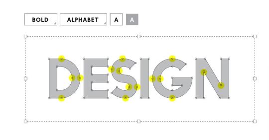
Custom Illustrations and Graphics: Uniqueness and Branding:
To stand out in the digital landscape, brands are increasingly turning to custom-made illustrations and graphics. These bespoke visuals add personality, convey brand stories, and create a distinctive identity. Custom illustrations, icons, and animations help brands connect with their audience on a deeper level, leaving a lasting impression.
Mobile-First and Responsive Design: Prioritizing Mobile Experiences:
With mobile devices driving a significant portion of web traffic, designing for mobile-first has become paramount. The responsive design guarantees a smooth adaptation of websites to varying screen sizes and resolutions, delivering an exceptional user experience across all devices. By prioritizing mobile, web designers can cater to the needs of the ever-growing mobile user base.

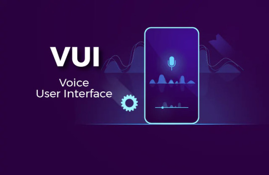
Voice User Interface (VUI): A Voice-Enabled Future:
As voice assistants and smart speakers gain popularity, incorporating voice user interfaces (VUI) into web design becomes essential. Voice search, commands, and interactions offer a hands-free browsing experience and enhance accessibility. Integrating VUI allows users to interact with websites using natural language, creating a more intuitive and user-friendly environment.
Sustainability and Eco-Friendly Design: Designing for a Better Future:
In an era of heightened environmental consciousness, sustainable and eco-friendly design practices are gaining momentum. Optimizing website performance for faster loading times, reducing carbon footprints, and utilizing eco-conscious hosting solutions contribute to a greener web ecosystem. By embracing sustainability, web designers can make a positive impact on the environment.
Conclusion:
As we venture further into 2023, web designers must embrace the latest trends and techniques to create innovative and captivating online experiences. From dark mode and Neumorphism to asymmetric layouts and microinteractions, these trends shape the way we design and engage with websites. By staying at the forefront of these developments, web designers can deliver exceptional user experiences that are both visually stunning and functionally intuitive. So, let's embark on this journey together and embrace the future of web design.
3 notes
·
View notes
Text
oddert reblogged
somecunttookmyurl
3h ago

2d ago
One small but extremely annoying effect of Tech Modernization or w/e is how UI contrast is garbage anymore, especially just, like, application windows in general.
"Ooh our scrollbar expands when you mouse over it! Or does it? Only you can know by sitting there like an idiot for 3 seconds waiting for it to expand, only to move your cursor away just as it does so!" or Discord's even more excellent "scrollbar is 2 shades off of the background color and is one (1) pixel wide" fuck OFF
I tried to move a system window around yesterday and had to click 3 times before I got the half of the upper bar that let me drag it. Why are there two separate bars with absolutely nothing to visually differentiate them on that.
"Well if you look closely-" I should not!! have to squint!!! at the screen for a minute straight to detect basic UI elements!! Not mention how ableist this shit is, and for what? ~✨Aesthetic✨~?
and then every website and app imitates this but in different ways so everything is consistently dogshit to try to use but not always in ways you can immediately grok it's!!!! terrible!!!! just put lines on things again I'm begging you!!!!
#Yesyesyes#We dodged a bullet with Neumorphism but there's so much patently obviously bad design that just isn't challenged#Our work machines are particularly annoying becuase windows 10 doesn't have drop shadows on the edge of windows#Trying to tell which of three file explorers and two terminals I'm clicking on is a massive pain in the ass#Thank goodness we developed guidelines to account for these things but assessibility is a mindset#And it's just not one that many have via @oddert this led me to look up Neumorphism and jfc I am so glad that is not the standard. If they try to make that universal we may need to start taking cartoon mallets to every Tech company
One small but extremely annoying effect of Tech Modernization or w/e is how UI contrast is garbage anymore, especially just, like, application windows in general.
"Ooh our scrollbar expands when you mouse over it! Or does it? Only you can know by sitting there like an idiot for 3 seconds waiting for it to expand, only to move your cursor away just as it does so!" or Discord's even more excellent "scrollbar is 2 shades off of the background color and is one (1) pixel wide" fuck OFF
I tried to move a system window around yesterday and had to click 3 times before I got the half of the upper bar that let me drag it. Why are there two separate bars with absolutely nothing to visually differentiate them on that.
"Well if you look closely-" I should not!! have to squint!!! at the screen for a minute straight to detect basic UI elements!! Not mention how ableist this shit is, and for what? ~✨Aesthetic✨~?
and then every website and app imitates this but in different ways so everything is consistently dogshit to try to use but not always in ways you can immediately grok it's!!!! terrible!!!! just put lines on things again I'm begging you!!!!
#why do they want things to look like... idk how to describe it it almost looks like a pregnancy test ad???#oh no contrast AND soft drop shadows AND rounded edges on absolutely everything#terrible#i remember when windows first started rounding off the boxes in... was it vista?#i HATED it#i still kinda hate it but the modern trend is so bad that it can't keep up#also case study on this post: I legitimately cannot tell#if I'm making this a proper reblog#or somehow editing my own post via reblog#BECAUSE THERE IS NO LINE IN THE POST EDITOR WINDOW SEPARATING THE TWO
21K notes
·
View notes
Text
Animated Responsive Service Section Get Code from divinectorweb Website
#service section design#responsive web design#neumorphism effect#dark neumorphism#css effects#css tricks#responsive design#html css#divinector#learn to code#code#frontenddevelopment#css#css3#html#divinectorweb#webdesign
0 notes
Text
Creating UI/UX Designs for FinTech Applications

In today’s digital economy, financial technology (FinTech) applications have revolutionized how users manage their finances. Whether it’s mobile banking, digital wallets, investment platforms, or cryptocurrency exchanges, the UI/UX design of these applications plays a critical role in enhancing user experience and ensuring security.This blog explores the best practices for creating intuitive, secure, and user-friendly UI/UX designs for FinTech applications.
1. Understanding the FinTech User
User Demographics & Needs
FinTech users range from tech-savvy millennials to elderly individuals who may not be as familiar with digital platforms. Designers must consider various user personas, their financial literacy levels, and preferences to create an inclusive experience.
Common Pain Points
Complex financial jargon
Security concerns
Unintuitive navigation
Slow transaction processes
Lack of real-time financial insights
A well-thought-out UI/UX design should aim to address these pain points effectively.
2. Key UI/UX Principles for FinTech Apps
A. Simplicity & Clarity
Financial applications should be easy to navigate and present information in a digestible format. Use a minimalistic design approach with a clean layout, clear typography, and well-defined sections.
Best Practices:
Use whitespace effectively to reduce cognitive load.
Implement clear call-to-action (CTA) buttons.
Avoid unnecessary clutter and excessive animations.
B. Security & Trustworthiness
Since FinTech applications handle sensitive financial data, security should be a top priority.
Best Practices:
Implement multi-factor authentication (MFA).
Use biometric authentication (fingerprint, facial recognition).
Display security badges and encrypt user data.
Provide transparency in privacy policies and terms.
C. Personalization & Customization
Users appreciate experiences tailored to their financial needs.
Best Practices:
Allow users to set financial goals.
Offer customizable dashboard layouts.
Provide personalized insights and notifications based on spending habits.
3. UI/UX Design Trends in FinTech Applications
A. Neumorphism & Minimalism
Modern FinTech apps favor clean, soft, and futuristic design styles like neumorphism, which creates a sleek user experience.
B. AI-Powered Chatbots & Virtual Assistants
Conversational UI with AI-powered bots helps users get quick financial assistance and manage queries effortlessly.
C. Gamification Elements
Adding reward-based elements, like badges for savings goals, increases user engagement and retention.
4. FinTech Apps with Exceptional UI/UX
1. Revolut
Minimalistic and modern design.
Clear financial insights with customizable analytics.
Secure biometric authentication.
2. Robinhood
Simplified investment platform for beginners.
Gamification elements to keep users engaged.
Real-time stock price updates with interactive charts.
3. PayPal
User-friendly design with seamless payment processing.
Enhanced security features, including fraud detection.
Simple navigation for global transactions.
5. Steps to Design a FinTech Application
Step 1: Research & User Analysis
Conduct market research and user interviews to understand the target audience’s needs and pain points.
Step 2: Wireframing & Prototyping
Create wireframes to outline the app’s structure and develop interactive prototypes for usability testing.
Step 3: UI/UX Design Implementation
Select a color palette that reflects trust (e.g., blue, green).
Use intuitive icons and typography.
Design seamless onboarding flows.
Step 4: Testing & Iteration
Conduct A/B testing and user feedback sessions to refine the app before launch.
Conclusion
Designing UI/UX for FinTech applications requires a deep understanding of user needs, security concerns, and financial behaviors. By following best practices such as simplicity, security, personalization, and accessibility, designers can create seamless financial experiences that empower users.Staying updated with UI/UX trends and continuously optimizing based on feedback will ensure the success of FinTech applications in an ever-evolving digital landscape.
0 notes