#csstricks
Explore tagged Tumblr posts
Text
Responsive Animated Website With HTML & CSS
youtube
#html#tamilitmemes#css3#tamilwebdesign#css animation#web development#web design#website#webdesign#youtube#responsivewebdesign#responsive design#responsive webdesign#responsive web design#webdev#htmlcodes#htmlcss#learn html#html5#html course#css tutorial#html css#html5 css3#css#htmlcoding#frontenddevelopment#javascript#csstricks#websitedesign#website development
5 notes
·
View notes
Text
Glowing Search Box Form Effect using HTML & CSS
youtube
#front end development roadmap#youtube#htmlcss#webdesign#webdevelopment#tutorials#coding#frontend#learn css#css tutorial#csstricks#css effects#glowing#glowing effect#search form#search bar#learn#Youtube
4 notes
·
View notes
Text
CSS Introduce
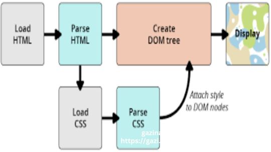
CSS stands for Cascading Style Sheets. It is a programming language used to style HTML elements. It controls the layout, design, and appearance of a web page.
Here are some key points of CSS:
Selects elements: CSS uses selectors to target specific HTML elements.
Applies styles: Once an element is selected, CSS applies various styles to it, such as font, color, size, spacing, and layout.
Cascading: CSS follows a cascading rule, meaning that if multiple styles are applied to the same element, the most specific style takes precedence.
External, internal, and inline styles: CSS can be written in external files, within the HTML document, or directly within HTML elements.
Properties and values: CSS uses properties and values to define styles. For example, the color property can have values like red, blue, or #FF0000.
Units of measurement: CSS uses units of measurement like pixels (px), ems, rems, percentages, and more.
Inheritance: CSS styles can be inherited by child elements, meaning they inherit the styles of their parent elements unless overridden.
By understanding these key points, you can effectively use CSS to create visually appealing and well-structured web pages.
#csscoding#cssintroduce#cssfile#wordpress#woocommerce#webdevelopment#websitedesign#css#csstricks#everyone#followers#highligh
0 notes
Text
Create a CSS Spinner with Just CSS!
🌀 Want to add a stylish spinner to your website without using any JavaScript? Watch our short tutorial to learn how to create a spinner using only CSS! Say goodbye to bulky libraries and hello to sleek, lightweight animations!
#CSS#WebDesign#TechTutorial#CSSSpinner#FrontEndDevelopment#CSSAnimation#WebDevelopment#CodingTutorial#CSS3#Programming#WebDesignTips#CSSTricks#TechEducation
1 note
·
View note
Text
Drawing Vertical Lines with CSS: Creative Design
Introduction
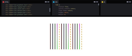
Welcome to a creative journey into the world of CSS, where you'll discover how to draw vertical lines using cascading style sheets. Whether you're a web designer, developer, or just a curious enthusiast, this blog post will unveil the power of CSS to add visually appealing vertical lines to your web projects. We'll explore the basics, techniques, and best practices to help you unlock the artistic potential of CSS in your designs. Let's dive in and uncover the secrets of creating visually stunning vertical lines that will enhance your web content and captivate your audience.
Understanding CSS Basics
Cascading Style Sheets (CSS) are the fundamental building blocks of web design, enabling you to control the visual presentation of web pages. To draw vertical lines with CSS creatively, it's essential to grasp some core concepts: - Selectors: CSS selectors are patterns used to select and style HTML elements. They define what elements on a web page will be affected by the CSS rules. - Properties: CSS properties determine the visual characteristics of selected elements. These properties include attributes like color, font size, and border width, which are crucial for drawing lines. - Values: Values are specific settings applied to CSS properties. For example, you can set a border color to 'red' or '#FF0000', and a border width to '2px' or 'thin'. Understanding how selectors, properties, and values work together is key to using CSS effectively. For drawing vertical lines, we'll focus on properties like 'border' and 'margin' and values that define their characteristics. In the context of vertical lines, it's important to consider the following CSS properties: PropertyDescriptionborder-leftThis property allows you to specify a border on the left side of an element, effectively creating a vertical line.border-rightSimilar to 'border-left,' but for the right side of an element, useful for vertical lines on the right.margin-leftAdjusting the left margin can create space and achieve a vertical line effect by expanding the background color or content on one side.margin-rightSimilar to 'margin-left,' but applied to the right side of an element, useful for spacing and vertical lines on the right. These properties provide the foundation for drawing vertical lines using CSS. In the next sections, we'll delve into different techniques and methods to leverage these properties creatively and enhance your web designs with vertical lines.
Methods for Drawing Vertical Lines
Now that we have a solid understanding of CSS basics, let's explore various methods for drawing eye-catching vertical lines in your web designs. Each of these techniques offers a unique approach to achieve the desired visual effects: See the Pen Drawing Vertical Lines with CSS by CSS Monster (@CSS-Monster) on CodePen. Using the border Property: One of the most straightforward ways to create vertical lines is by applying the border-left or border-right property to an element. This adds a vertical border on the left or right side of the element, effectively creating a line. You can control the thickness, style, and color of the line using the corresponding properties. For example: CSS .vertical-line { border-left: 2px solid #000; } Using Pseudo-Elements: CSS pseudo-elements, such as ::before and ::after, offer an elegant way to insert vertical lines without adding extra HTML elements. By defining content for the pseudo-element and styling it with borders or background colors, you can create vertical lines. Here's an example: CSS .element::before { content: ""; border-left: 1px dashed #333; height: 100px; display: inline-block; } Using CSS Gradients: CSS gradients are versatile and can be employed to generate vertical lines by specifying a gradient that moves from one color to another in a vertical direction. This method allows you to have smooth transitions and gradients as your vertical lines: CSS .gradient-line { background: linear-gradient(to bottom, #00f, #f00); } These methods can be customized further by altering properties like line thickness, color, and positioning to fit your design requirements. You can combine these techniques for more complex and creative results. MethodDescriptionborder PropertyUsing the border property to add vertical lines by styling the left or right borders of an element.Pseudo-ElementsUtilizing CSS pseudo-elements like ::before and ::after to insert vertical lines without additional HTML elements.CSS GradientsCreating vertical lines through CSS gradients, enabling smooth transitions and gradients for a more unique look. These methods are just the beginning of what you can accomplish with CSS when it comes to drawing vertical lines. In the next sections, we'll delve into further customization options, responsive design considerations, and best practices to make your vertical lines truly stand out.
Customizing Vertical Lines
Now that you've learned different methods to create vertical lines with CSS, it's time to explore the exciting world of customization. Customizing vertical lines allows you to add a personal touch to your web design and make your lines visually appealing. Here are some key aspects to consider: Line Thickness: Adjusting the thickness of your vertical lines can significantly impact the visual hierarchy of your content. Use the border-width property to control the line's thickness. For example: CSS .thick-line { border-left: 4px solid #333; } Line Color: Choosing the right color for your vertical lines is crucial. Use the border-color property to define the line's color. You can specify colors using keywords, hex codes, or RGB values. For instance: CSS .colored-line { border-right: 2px solid red; } Line Style: CSS offers various line styles, such as solid, dashed, and dotted. You can apply these styles using the border-style property. Here's an example of a dashed line: CSS .dashed-line { border-left: 2px dashed #00f; } Background and Padding: Surrounding elements can complement your vertical lines. Adjusting the background color and padding of the container elements can create unique visual effects. For example: CSS.container { background-color: #f5f5f5; padding: 20px; } By customizing these properties, you can create vertical lines that match your website's style and enhance its visual appeal. Remember, experimentation is key, and you can combine multiple customizations to achieve the desired effect. Additionally, using CSS pseudo-elements and gradients, as discussed in previous sections, offers even more opportunities for customization. Customization AspectDescriptionLine ThicknessAdjusting the thickness of vertical lines using the border-width property.Line ColorChoosing the color of vertical lines with the border-color property, allowing various color specifications.Line StyleApplying different line styles, such as solid, dashed, and dotted, using the border-style property.Background and PaddingCustomizing the background color and padding of container elements to enhance the visual impact of vertical lines. Once you've customized your vertical lines to your liking, they can become an integral part of your web design, adding elegance and flair to your content. In the next section, we'll explore responsive design considerations to ensure that your vertical lines look great on all devices.
Responsive Design Considerations
As you enhance your web design with vertical lines created using CSS, it's essential to ensure that your lines look great on all devices and screen sizes. Responsive design considerations play a crucial role in achieving this goal. Here are some key factors to keep in mind: Media Queries: Utilize media queries to adjust your vertical lines' properties based on screen width. By defining different CSS rules for various breakpoints, you can ensure that your lines adapt to smaller screens gracefully. For example: CSS@media screen and (max-width: 768px) { .responsive-line { border-left: 2px solid #333; } } Percentage-Based Sizing: Instead of fixed pixel values, use percentage-based sizing for line thickness and positioning. This approach allows your lines to scale proportionally with the screen size. For instance: CSS.percentage-line { border-left: 1%; } Fluid Layouts: Implement fluid layouts that adapt to different screen widths. Design your website to be flexible, with elements that reflow naturally as the screen size changes. This ensures your vertical lines remain harmonious with the overall layout. Responsive design is crucial for providing a seamless user experience, whether visitors access your site on a desktop, tablet, or smartphone. By applying these techniques, you can maintain the integrity of your vertical lines while optimizing their appearance on diverse devices. Responsive Design AspectDescriptionMedia QueriesUsing media queries to adapt vertical line properties based on screen width and ensure a responsive design.Percentage-Based SizingApplying percentage-based sizing for line thickness and positioning, allowing lines to scale proportionally with the screen size.Fluid LayoutsImplementing fluid layouts that adapt to various screen widths, maintaining harmony with the overall design. By implementing these responsive design considerations, you can create a visually consistent and user-friendly experience across a wide range of devices. In the final section, we'll wrap up this exploration of drawing vertical lines with CSS by discussing best practices for optimal results.
Best Practices
As you near the completion of your journey into creating vertical lines with CSS, it's important to embrace some best practices to ensure your designs are both visually appealing and maintainable. Here are some valuable tips to follow: - Use Semantic HTML: Start with a solid HTML foundation. Ensure that your vertical lines are applied to the appropriate HTML elements. Semantic HTML not only enhances accessibility but also makes your CSS more manageable. For example, use elements for decorative lines within a container. - Keep CSS Separate: Avoid inline styles and keep your CSS in external stylesheets. This separation of concerns simplifies maintenance and allows for consistent styling across your website. - Optimize for Performance: Minimize unnecessary complexity in your CSS. Use CSS minification and compression techniques to reduce file sizes for faster loading times. - Test Cross-Browser Compatibility: Ensure that your vertical lines appear consistently across various web browsers. Regularly test your design on different browsers to identify and address any compatibility issues. - Document Your CSS: Add comments and documentation in your CSS code to make it more understandable for you and other developers who may work on the project. This can be especially helpful when dealing with intricate styling rules. - Implement Accessibility: Ensure your designs are accessible to all users, including those with disabilities. Pay attention to contrast, text alternatives, and keyboard navigation when using vertical lines for design elements. - Stay Updated: CSS is continually evolving. Stay informed about the latest CSS features, best practices, and web design trends to keep your designs fresh and relevant. By adhering to these best practices, you'll not only create visually stunning vertical lines but also ensure that your web designs are maintainable, accessible, and performant. Your commitment to quality and attention to detail will result in a positive user experience and a professional web presence. Best PracticeDescriptionUse Semantic HTMLApply vertical lines to appropriate HTML elements and follow semantic HTML practices for improved accessibility and manageability.Keep CSS SeparateAvoid inline styles and maintain your CSS in external stylesheets to ensure consistency and easy maintenance.Optimize for PerformanceReduce file sizes and improve loading times by minimizing unnecessary complexity and using CSS optimization techniques.Test Cross-Browser CompatibilityRegularly test your designs on different web browsers to ensure consistent appearance and functionality.Document Your CSSEnhance code readability and collaboration by adding comments and documentation in your CSS code.Implement AccessibilityMake your designs accessible to all users by addressing contrast, text alternatives, and keyboard navigation for vertical lines.Stay UpdatedStay informed about the latest CSS features and web design trends to keep your designs current and engaging. By following these best practices, you can ensure that your vertical lines not only look great but also contribute to an exceptional user experience on your website. Websites for free HTML & CSS templates:◉ uideck - https://t.co/CwFDNG2tCg◉ free-css - https://t.co/whAWPtPsiR◉ splawr .com - https://t.co/0wGOimKzBD◉ onepagelove - https://t.co/3OoqGpTq2K◉ tooplate - https://t.co/HhPldbSsrd◉ nicepage- https://t.co/gL8CrjVSGc… pic.twitter.com/rMNNdQO5bc— Rizwan (@mdrizwanalam72) November 4, 2023
FAQ
Here are answers to some frequently asked questions about drawing vertical lines with CSS for creative design: Q: Can I draw vertical lines on any HTML element? A: Yes, you can draw vertical lines on most HTML elements, such as , , and . However, it's important to choose elements that make semantic sense and align with your design goals. Q: Which method is best for creating responsive vertical lines? A: Using percentage-based sizing for line thickness and media queries to adapt properties based on screen width is a recommended approach for achieving responsive vertical lines. This ensures that your lines scale proportionally with different screen sizes. Q: How can I ensure cross-browser compatibility for my vertical lines? A: Testing your design on various web browsers and applying CSS resets or normalizations can help ensure cross-browser compatibility. Be aware of browser-specific quirks and use vendor prefixes if needed for specific CSS properties. Q: Are there any performance considerations when using vertical lines? A: Yes, performance is important. Avoid overly complex CSS, minimize file sizes through optimization, and use efficient CSS properties. Additionally, consider using CSS hardware acceleration for smoother rendering of lines, especially in animations. Q: Can I create animated vertical lines with CSS? A: Yes, you can animate vertical lines by applying CSS animations or transitions to their properties, such as height or position. This allows you to create dynamic and engaging visual effects. These frequently asked questions provide valuable insights into the world of drawing vertical lines with CSS for creative design. If you have more questions or need further guidance, feel free to reach out to us for assistance.
Conclusion
Congratulations on completing your journey through the art of drawing vertical lines with CSS for creative design. Throughout this blog post, you've gained a deeper understanding of CSS basics, learned various methods for creating vertical lines, and explored customization techniques. You've also delved into responsive design considerations, embraced best practices, and found answers to common questions about this exciting design element. Vertical lines have the power to transform the visual appeal of your web content, making it more engaging, sophisticated, and memorable. By mastering the techniques and best practices shared in this post, you're well-equipped to take your web design skills to the next level. As you continue to experiment with CSS and explore new design possibilities, remember that the creative potential is limitless. Use your newfound knowledge to innovate, craft stunning web experiences, and stay current with evolving CSS features and trends. Thank you for joining us on this creative journey. We look forward to seeing the remarkable designs you'll create using CSS to draw vertical lines. If you have any more questions or need further assistance, don't hesitate to reach out. Happy designing! Read the full article
0 notes
Video
youtube
Create a Jaw-Dropping Spotlight Hover Effect for Your Divi, WordPress, o...
Unlock the secret to enhancing your Divi Theme site or any WordPress or HTML website with a stunning spotlight on hover effect using CSS and JS code! In this comprehensive tutorial, we guide you through the steps to effortlessly add this eye-catching effect to your web design, ensuring your site stands out and captivates your visitors. Whether you're a seasoned developer or a beginner, our easy-to-follow instructions will help you master this impressive technique in no time.
0 notes
Note
ces, you can say no but is it okay that I look in your codes for reference? I want to learn how to code badly
Sure thing! I also have a credits page (/credits) and you can start to read the articles I cited there. Also: CSStricks flex-box ❣️
0 notes
Text
Ever noticed how a well-placed circle animation can transform the data presentation on your website?
The Infographic Circle #animation is a sleek way to present #data and capture attention.
It’s not just about looks—it enhances user interaction and keeps your audience engaged.
Want to see the code behind it to recreate this effect on your own #website?
Head over to the link to learn the detailed breakdown of the entire coding process behind it: https://marketing.codiant.com/codehub/animation/infographic-circle-animation
#css #html #animation #cssanimation #uiuxdesigns #programming #htmlcss #csstricks #infographic #coding #webdeveloper #webdesigner #web #codiant
0 notes
Text
From [email protected].
Hey hey hey CSS Tricks is actually back!!
@geoff is going through updating the articles that need it and writing great new ones! Yessssssssss
Go check out @csstricks - find the new ones and scroll down past a few strange test posts to find lots of recent links to fabulous older articles that have been updated 🧡
https://css-tricks.com/
0 notes
Text
How to Optimize WordPress Themes by RSTheme
https://rstheme.com/optimize-wordpress-themes
#WordPressOptimization #ThemeCustomization #WebDesignTips #RSTheme #WebDevelopment #CSSTricks #CodingHacks #SEOStrategy #PageSpeedOptimization #WebDesignerSecrets #HTMLBasics #WebsiteOptimization #DigitalMarketingTips #OnlinePresence #ResponsiveDesign #UserExperience #SEOExpertise #MobileOptimization #BoostWebPerformance #FrontEndDevelopment.

#premium wordpress themes#paid wordpress themes#consulting business wordpress theme#wordpress premium themes#premium wordpress theme#app landing wordpress theme#education & online course wordpress theme#education wordpress theme#online learning wordpress theme#wordpress plugins#business website design#website development#website design#website seo#website optimization#website traffic#webdesign#web developers#web development#web designing#wordpress development
0 notes
Photo

Load More Button CSS Only
Check out Divinector YouTube Channel For more
#css#csstricks#css load more button#load more html css#CSS tutorial for beginners#basic html css tutorial#html css#divinector#divinectorweb#learn to code#code
3 notes
·
View notes
Text
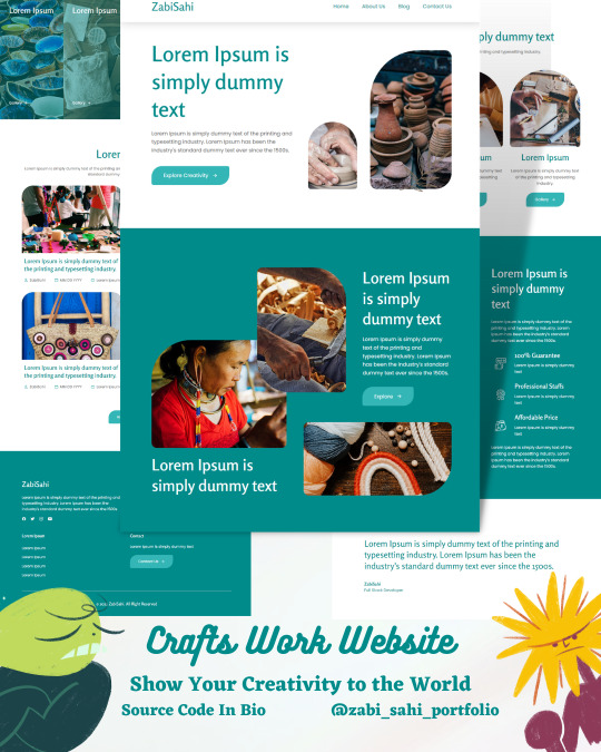
🎭Crafts Work Website 🤔 Creative Work ShowCase Website😉
📥 Don't forget to save it for later use 📥
♥️You are a web developer ? web designer ? Hurray! You are in right hands.♥️
Follow me for latest updates and tips on 💎Creative web Development💎.
express your appreciation by giving it a like♥️!
✍️ Feel free to express your feeling and ask me questions 💎Trust me it motivates me a lot 💎
📲 Also share it with your ✨ Let's help each other grow 👊🏻
Your friends are Coders? ✨ Let's help each other grow 👊🏻 By share it with Your Friends📲
Hey! You forgot to: Like ♥️ | Share 📲 | Save 📥
Follow ➡ @zabi_sahi_portfolio For More ✨and Turn On Your Post Notifications 🔔
#cssanimation#javascript#html#css#webdeveloper#csstricks#frontenddeveloper#login#animated#frontenddev#responsivewebdesign#javascriptdeveloper#javascripts#reactjs#angularjs#vuejs#htmlcss#websitebuilder#devlife#coderlife#webdeveloping#codingtips#htmltemplate#webdeveloperslife#jquery#webdevelopers#html5
3 notes
·
View notes
Text
3D Card Hover & Animation Effect Pure CSS
youtube
#animation#csstricks#tutorials#coding#webdevelopment#youtube#webdesign#htmlcss#frontend#html css#learn css#html#webdev#css effects#card css#3d card#css hover effects#Youtube
0 notes
Photo
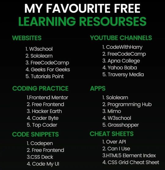
Comment your view and share with your friends.🔥🔥🔥 Follow .. @openprogrammer Follow .. @openprogrammer Follow .. @openprogrammer #html #css #csstricks #webdevelopment #coder #programmingmemes #hacking #javascript #Developers #WebDev #Coders #Software #website #wordpressDeveloper #wordpress #React.js #Angular.js #vue.js #github #git #gfg #geeksforgeeks #cssAnimations #firebase #java #dataStructures #algorithm #informationTechnology #softwareEngineerLife #developerguru (at India) https://www.instagram.com/p/CizaO0Zvfh_/?igshid=NGJjMDIxMWI=
#html#css#csstricks#webdevelopment#coder#programmingmemes#hacking#javascript#developers#webdev#coders#software#website#wordpressdeveloper#wordpress#react#angular#vue#github#git#gfg#geeksforgeeks#cssanimations#firebase#java#datastructures#algorithm#informationtechnology#softwareengineerlife#developerguru
4 notes
·
View notes
Link
Check out my new video guys
I hope you will learn something new from this video
#html5#learn html#PSD to HTML#HTML#HTML Tutorial#Css#css3#csstricks#css animation#htmlcss#css3 tutorial#html css#javascript#Learn Javascript#Javascript Tutorial#javascript project#JavascriptDeveloper#frontend#frontendfriday#frontend development#frontendvsbackend#front end#web design#website#webdesign#web development#web#webdesign tutorial#htmltutorials#online tutoring
7 notes
·
View notes
Text
Moving Buttons to the Bottom with CSS: Handy Techniques
Introduction
When it comes to web design, the placement of buttons is a critical aspect that can significantly impact user experience and the overall aesthetics of a website. Buttons serve as a gateway to various interactions and actions on a web page, making their positioning crucial for user engagement. In this blog post, we will explore a range of handy techniques to move buttons to the bottom of a web page using CSS. Whether you're designing a landing page, a contact form, or an e-commerce site, knowing how to elegantly position buttons at the bottom can improve the flow and functionality of your website. We will delve into CSS Flexbox, positioning properties, CSS Grid layout, and the 'bottom' property to help you master the art of button placement. By the end of this post, you'll have a solid understanding of the various methods available to achieve this and be equipped to make informed design decisions based on your specific project's requirements. So, let's dive into the world of CSS and discover the techniques that can take your button placement skills to the next level.
1. Using CSS Flexbox
CSS Flexbox, or the Flexible Box Layout, is a powerful tool for creating dynamic and responsive layouts. It is particularly handy for moving buttons to the bottom of a container. Let's explore how you can leverage Flexbox for this purpose.

Flexbox works by distributing space within a container, and it's especially well-suited for aligning elements along a single axis. In our case, we'll use it to align buttons vertically at the bottom of a container. Here's a step-by-step guide: - Create a Container: Start by wrapping your buttons in a container element. This could be a or any other suitable HTML element. - Apply Flexbox: To activate Flexbox, set the container's display property to flex. For example: display: flex;. - Define Alignment: To ensure the buttons are at the bottom of the container, you can use the align-items property and set it to flex-end. This will align the items at the end of the cross-axis, which in this case is the bottom of the container. Example: align-items: flex-end;. - Flex Direction: By default, Flexbox works in a row layout. If you want the buttons to stack vertically, you can set the flex-direction property to column. Example: flex-direction: column;. Using CSS Flexbox offers several advantages. It's a clean and elegant solution, and it ensures that your buttons are responsive. As the container size changes, Flexbox will automatically adjust the button placement to keep them at the bottom. This simplifies your design process and ensures a consistent user experience across various devices and screen sizes. However, keep in mind that Flexbox may not be suitable for all scenarios. It works best when you have a single container with buttons that need to be aligned at the bottom. If you have more complex layouts or multiple containers, you may need to consider other techniques, which we'll explore in the following sections. With the power of CSS Flexbox in your toolkit, you can effortlessly move buttons to the bottom of your web page, enhancing the aesthetics and usability of your designs. Let's continue our exploration of CSS techniques in the upcoming sections.
2. Using Positioning
Positioning in CSS allows you to precisely control the placement of elements within a container or the entire viewport. While it's a versatile technique, it can be particularly useful for moving buttons to the bottom of a container. Let's delve into how to achieve this using CSS positioning. See the Pen Moving Buttons to the Bottom with CSS: Handy Techniques by CSS Monster (@CSS-Monster) on CodePen. Understanding 'position' Property: The 'position' property in CSS can take several values, but the two most relevant for button placement are absolute and relative. Using 'position: absolute': To position buttons at the bottom of a container, you can set the button's CSS position property to absolute. This removes the button from the normal document flow, allowing you to specify its position with respect to its nearest positioned ancestor. To ensure it stays at the bottom, set the bottom property to 0. Example: position: absolute; bottom: 0;. Using 'position: relative': Alternatively, you can apply position: relative to the container. This establishes a positioning context for the buttons inside the container. Then, by setting the buttons' position to absolute and bottom to 0, they will be pinned to the bottom of the container. Example: position: relative; position: absolute; bottom: 0;. It's important to note that the 'position' property should be used judiciously. Absolute positioning can lead to overlap and layout issues if not managed properly. Be cautious when using absolute positioning for multiple elements in the same container, as they may stack on top of each other. Also, when using relative positioning, consider how the container's size may affect the button's placement. Responsive Considerations: When using positioning, it's essential to think about responsive design. Ensure that the positioning works well on various screen sizes and orientations. Media queries and other responsive design techniques may be necessary to adapt the button placement to different devices. While CSS positioning provides precise control over button placement, it may require more manual adjustments to ensure a responsive and consistent layout. In some cases, it might not be the ideal choice, especially for complex designs. As we continue exploring techniques, you'll discover alternatives that might better suit your specific project requirements. Next, we'll explore another powerful CSS technique—CSS Grid layout—and how it can be used to move buttons to the bottom of a container. grid-row: 3; /* Places the buttons in the third row (the bottom row) */position: relative;
FAQ
Here, we address some common questions related to moving buttons to the bottom of a container using CSS. These frequently asked questions will help clarify any doubts and provide further insights into the techniques discussed in this post. How do I center buttons at the bottom of a container? Centering buttons at the bottom can be achieved by using CSS Flexbox or the 'position' property. With Flexbox, you set the justify-content property to center for horizontal alignment and the align-items property to center for vertical alignment. For 'position' property, you'd use left: 50% and transform: translateX(-50%) to horizontally center the buttons while keeping them at the bottom. Are there any cross-browser compatibility issues? CSS Flexbox and Grid layout are well-supported in modern browsers. However, when using advanced features, it's essential to test your layout on various browsers to ensure compatibility. Additionally, consider providing fallback layouts for older browsers if necessary. What are best practices for responsive designs? For responsive designs, use media queries to adapt your button placement techniques for different screen sizes. Test your layout on various devices to ensure that buttons remain at the bottom and maintain a user-friendly experience. Additionally, consider mobile-first design principles for a more seamless responsive experience. These FAQs aim to provide answers to some of the common queries you may have when implementing these CSS techniques. By addressing these questions, we hope to assist you in achieving the best results for your web design projects.
Conclusion
In this blog post, we've explored several techniques for moving buttons to the bottom of a container using CSS. Buttons are fundamental elements of web design, and their placement plays a crucial role in user experience and aesthetics. Each technique we discussed offers its unique strengths and considerations, enabling you to choose the best approach for your specific project requirements. CSS Flexbox provides a flexible and responsive method for aligning buttons at the bottom of a container. It's an elegant solution for straightforward layouts, ensuring that buttons remain at the bottom as the container size changes. Positioning with the 'position' property offers precise control over button placement. Whether you use 'position: absolute' or 'position: relative,' it allows you to tailor the button's location to your design's needs. CSS Grid layout, on the other hand, provides a comprehensive approach to layout design. It's a great choice when you have more complex layouts or require a two-dimensional grid structure. With CSS Grid, you can allocate space to the last row to move buttons to the bottom. Lastly, the 'bottom' property in CSS offers a simple and effective way to place buttons at the bottom of a container. It's particularly useful when you need a straightforward solution without intricate layout configurations. When choosing the right technique, it's essential to consider your project's context, the complexity of the layout, and the compatibility with different browsers. Additionally, responsive design is a critical factor in ensuring that your button placement works seamlessly across various devices and screen sizes. We hope this blog post has provided you with valuable insights and a clear understanding of the options available for moving buttons to the bottom with CSS. By applying these techniques, you can enhance the visual appeal and usability of your web designs. Remember to test and refine your approach based on the unique demands of each project, and continue to stay updated with the evolving world of web design and CSS. Read the full article
0 notes