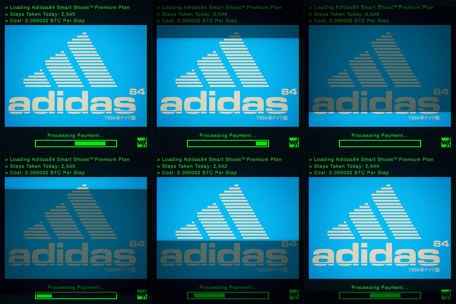
#user-interface
Explore tagged Tumblr posts
Link
Web archives are essential for researchers studying Twitter, offering a historical perspective on ev...
#originaltags#archiving twitter#digital preservation#elon musk#gargkritika#internet archive#kgarg#twitter#twitter ui#user-interface#wayback machine
0 notes
Text
Okay, so: there's a local restaurant whose online ordering process involves various selecting various sauces to be included with one's order – so many units of teriyaki sauce, so many units of hot sauce, so may units of peanut sauce, and so forth.
The idea is supposed to be that you can select any combination of sauces you want, as long as it adds up to no more than four units. However, what the app actually required is that you select exactly four units of sauces; it wouldn't let you submit the ordering form if the total wasn't exactly four.
Just today I discovered that they seem to have fixed it... not by correcting the errant validation rule, but by adding a "no sauce" option, which counts toward the required total of four.
Thus, it's now possible to place an order with, say, two units of teriyaki sauce rather than four by entering 2x "teriyaki sauce" and 2x "no sauce". Similarly, an order with no sauce at all is 4x "no sauce".
This is quite possibly the least intuitive ordering process I've ever encountered, and I've literally worked in e-commerce.
19K notes
·
View notes
Text
Moving Buttons to the Bottom with CSS: Handy Techniques
Introduction
When it comes to web design, the placement of buttons is a critical aspect that can significantly impact user experience and the overall aesthetics of a website. Buttons serve as a gateway to various interactions and actions on a web page, making their positioning crucial for user engagement. In this blog post, we will explore a range of handy techniques to move buttons to the bottom of a web page using CSS. Whether you're designing a landing page, a contact form, or an e-commerce site, knowing how to elegantly position buttons at the bottom can improve the flow and functionality of your website. We will delve into CSS Flexbox, positioning properties, CSS Grid layout, and the 'bottom' property to help you master the art of button placement. By the end of this post, you'll have a solid understanding of the various methods available to achieve this and be equipped to make informed design decisions based on your specific project's requirements. So, let's dive into the world of CSS and discover the techniques that can take your button placement skills to the next level.
1. Using CSS Flexbox
CSS Flexbox, or the Flexible Box Layout, is a powerful tool for creating dynamic and responsive layouts. It is particularly handy for moving buttons to the bottom of a container. Let's explore how you can leverage Flexbox for this purpose.

Flexbox works by distributing space within a container, and it's especially well-suited for aligning elements along a single axis. In our case, we'll use it to align buttons vertically at the bottom of a container. Here's a step-by-step guide: - Create a Container: Start by wrapping your buttons in a container element. This could be a or any other suitable HTML element. - Apply Flexbox: To activate Flexbox, set the container's display property to flex. For example: display: flex;. - Define Alignment: To ensure the buttons are at the bottom of the container, you can use the align-items property and set it to flex-end. This will align the items at the end of the cross-axis, which in this case is the bottom of the container. Example: align-items: flex-end;. - Flex Direction: By default, Flexbox works in a row layout. If you want the buttons to stack vertically, you can set the flex-direction property to column. Example: flex-direction: column;. Using CSS Flexbox offers several advantages. It's a clean and elegant solution, and it ensures that your buttons are responsive. As the container size changes, Flexbox will automatically adjust the button placement to keep them at the bottom. This simplifies your design process and ensures a consistent user experience across various devices and screen sizes. However, keep in mind that Flexbox may not be suitable for all scenarios. It works best when you have a single container with buttons that need to be aligned at the bottom. If you have more complex layouts or multiple containers, you may need to consider other techniques, which we'll explore in the following sections. With the power of CSS Flexbox in your toolkit, you can effortlessly move buttons to the bottom of your web page, enhancing the aesthetics and usability of your designs. Let's continue our exploration of CSS techniques in the upcoming sections.
2. Using Positioning
Positioning in CSS allows you to precisely control the placement of elements within a container or the entire viewport. While it's a versatile technique, it can be particularly useful for moving buttons to the bottom of a container. Let's delve into how to achieve this using CSS positioning. See the Pen Moving Buttons to the Bottom with CSS: Handy Techniques by CSS Monster (@CSS-Monster) on CodePen. Understanding 'position' Property: The 'position' property in CSS can take several values, but the two most relevant for button placement are absolute and relative. Using 'position: absolute': To position buttons at the bottom of a container, you can set the button's CSS position property to absolute. This removes the button from the normal document flow, allowing you to specify its position with respect to its nearest positioned ancestor. To ensure it stays at the bottom, set the bottom property to 0. Example: position: absolute; bottom: 0;. Using 'position: relative': Alternatively, you can apply position: relative to the container. This establishes a positioning context for the buttons inside the container. Then, by setting the buttons' position to absolute and bottom to 0, they will be pinned to the bottom of the container. Example: position: relative; position: absolute; bottom: 0;. It's important to note that the 'position' property should be used judiciously. Absolute positioning can lead to overlap and layout issues if not managed properly. Be cautious when using absolute positioning for multiple elements in the same container, as they may stack on top of each other. Also, when using relative positioning, consider how the container's size may affect the button's placement. Responsive Considerations: When using positioning, it's essential to think about responsive design. Ensure that the positioning works well on various screen sizes and orientations. Media queries and other responsive design techniques may be necessary to adapt the button placement to different devices. While CSS positioning provides precise control over button placement, it may require more manual adjustments to ensure a responsive and consistent layout. In some cases, it might not be the ideal choice, especially for complex designs. As we continue exploring techniques, you'll discover alternatives that might better suit your specific project requirements. Next, we'll explore another powerful CSS technique—CSS Grid layout—and how it can be used to move buttons to the bottom of a container. grid-row: 3; /* Places the buttons in the third row (the bottom row) */position: relative;
FAQ
Here, we address some common questions related to moving buttons to the bottom of a container using CSS. These frequently asked questions will help clarify any doubts and provide further insights into the techniques discussed in this post. How do I center buttons at the bottom of a container? Centering buttons at the bottom can be achieved by using CSS Flexbox or the 'position' property. With Flexbox, you set the justify-content property to center for horizontal alignment and the align-items property to center for vertical alignment. For 'position' property, you'd use left: 50% and transform: translateX(-50%) to horizontally center the buttons while keeping them at the bottom. Are there any cross-browser compatibility issues? CSS Flexbox and Grid layout are well-supported in modern browsers. However, when using advanced features, it's essential to test your layout on various browsers to ensure compatibility. Additionally, consider providing fallback layouts for older browsers if necessary. What are best practices for responsive designs? For responsive designs, use media queries to adapt your button placement techniques for different screen sizes. Test your layout on various devices to ensure that buttons remain at the bottom and maintain a user-friendly experience. Additionally, consider mobile-first design principles for a more seamless responsive experience. These FAQs aim to provide answers to some of the common queries you may have when implementing these CSS techniques. By addressing these questions, we hope to assist you in achieving the best results for your web design projects.
Conclusion
In this blog post, we've explored several techniques for moving buttons to the bottom of a container using CSS. Buttons are fundamental elements of web design, and their placement plays a crucial role in user experience and aesthetics. Each technique we discussed offers its unique strengths and considerations, enabling you to choose the best approach for your specific project requirements. CSS Flexbox provides a flexible and responsive method for aligning buttons at the bottom of a container. It's an elegant solution for straightforward layouts, ensuring that buttons remain at the bottom as the container size changes. Positioning with the 'position' property offers precise control over button placement. Whether you use 'position: absolute' or 'position: relative,' it allows you to tailor the button's location to your design's needs. CSS Grid layout, on the other hand, provides a comprehensive approach to layout design. It's a great choice when you have more complex layouts or require a two-dimensional grid structure. With CSS Grid, you can allocate space to the last row to move buttons to the bottom. Lastly, the 'bottom' property in CSS offers a simple and effective way to place buttons at the bottom of a container. It's particularly useful when you need a straightforward solution without intricate layout configurations. When choosing the right technique, it's essential to consider your project's context, the complexity of the layout, and the compatibility with different browsers. Additionally, responsive design is a critical factor in ensuring that your button placement works seamlessly across various devices and screen sizes. We hope this blog post has provided you with valuable insights and a clear understanding of the options available for moving buttons to the bottom with CSS. By applying these techniques, you can enhance the visual appeal and usability of your web designs. Remember to test and refine your approach based on the unique demands of each project, and continue to stay updated with the evolving world of web design and CSS. Read the full article
0 notes
Text

My favorite new feature on the app is the one that pops one of these notifications up whenever I reblog something with an image in it. I find it especially charming that they stack up and don't go away on their own.
9K notes
·
View notes
Text
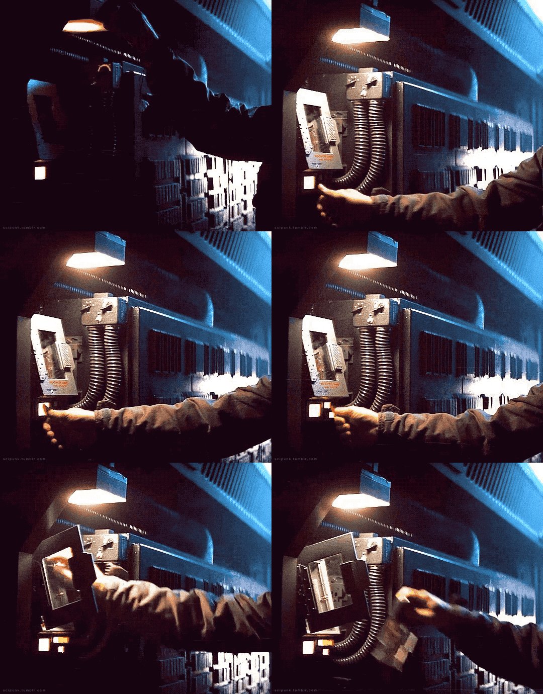

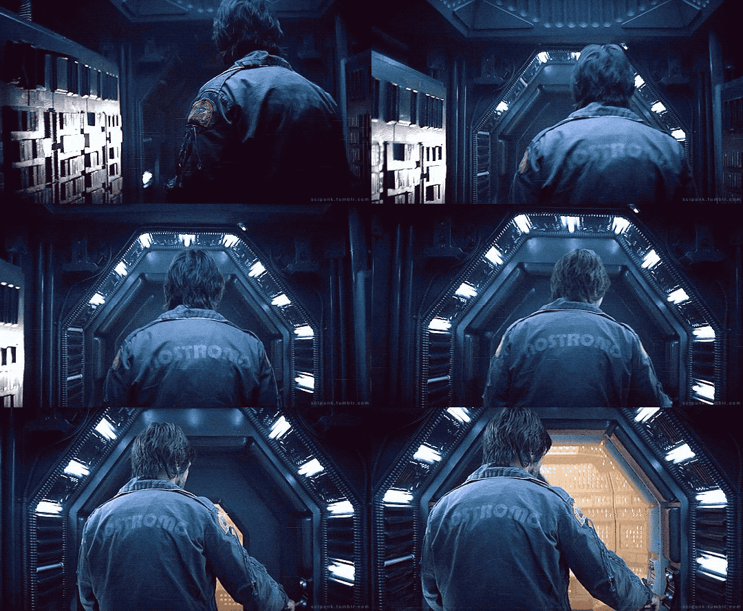





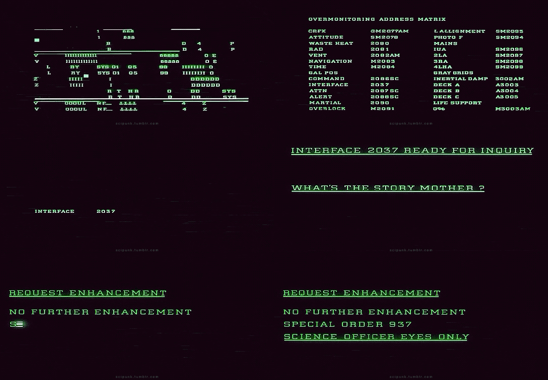
Alien (1979)
#alien movie#scifiedit#science fiction#nostromo#spaceship#interiors#spacecraft#old computers#computing#atmospheric#scifi aesthetic#cyberpunk aesthetic#graphic design#glitch#user interface#user interaction#mother#space ship#gifs#gifset
3K notes
·
View notes
Text
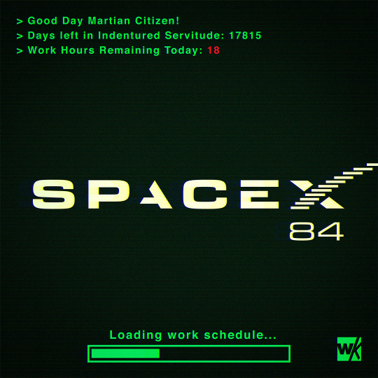
SPACEX84
#spacex#scifi#science fiction#dystopian#retrofuture#retro computing#retro computer#retro#cyberpunk#pop art#technology#scifi art#digital art#user interface#elon musk#space#mars#photoshop#graphic art#1984
232 notes
·
View notes
Text

instagram: cheri.jpg
#Lately I’ve been seeing the light#but I’m also on a handful on meds so who knows hehe#I miss you all#cybercore#y2k#cyber y2k#old internet#old web#00s#2000s#tech#moodboard#cyber core#msn#msn messenger#windows#microsoft#y2k tech#y2k nostalgia#nostalgiacore#nostalgia#tech aesthetic#user interface#techcore#tech blog
310 notes
·
View notes
Text


Fake UIs part 6
318 notes
·
View notes
Text

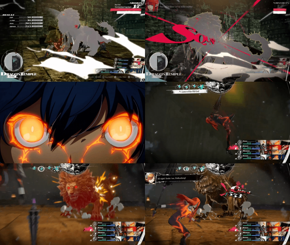
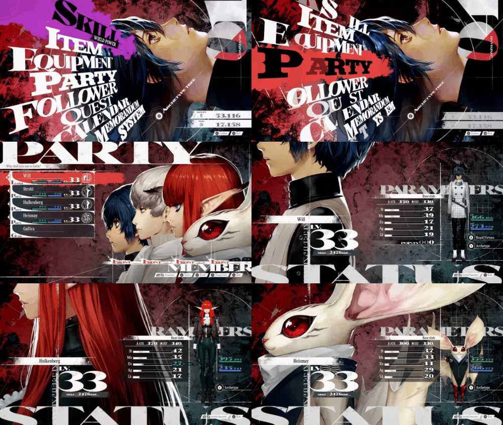
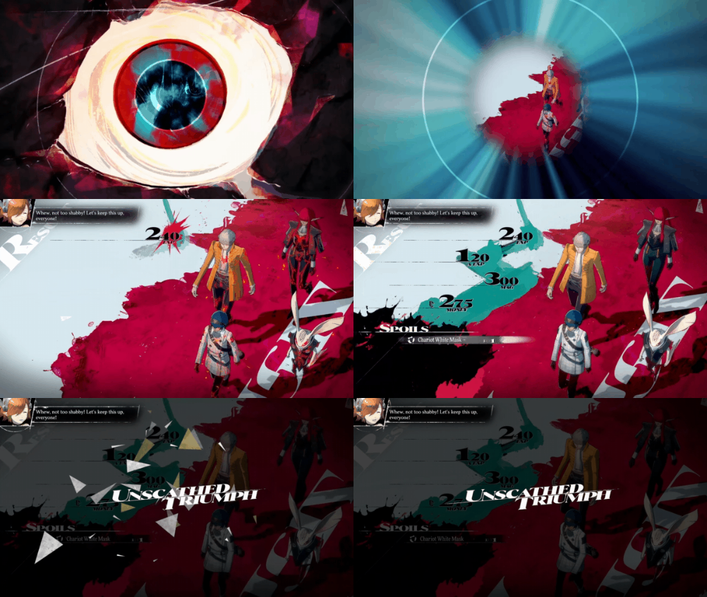
#Metaphor ReFantazio#2024#ATLUS#Metaphor#rpg#design#ui#user interface#character design#jrpg#video games#gaming#gif#my gif#gif set#video game gifs
269 notes
·
View notes
Text

#.hack#dot hack#.hack//infection#dot hack infection#retro games#playstation#y2k gaming#ps2#ps2 nostalgia#ui#user interface#my gifs#infectiongif
416 notes
·
View notes
Text
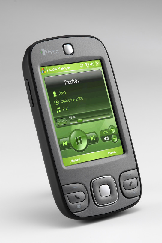

HTC P3400 (2007)
source 1 source 2
#2007#2000s#07#00s#art#cellphone#design#frutiger aero#graphic design#graphics#green#htc#htc p3400#microsoft#mobile#phone#photos#tech#technology#user interface
721 notes
·
View notes
Text
As a twitter/tumblr user since 2010-2011, I believe I have sufficient grounds to say that currently we as a community are living through the scariest, shittiest time yet. This post isn’t trying to fearmonger, no I’m not leaving tumblr until it literally keels over, but I suggest that we don’t put all our eggs in one basket.
If twitter/tumblr stay usable, great! In the worse scenario, you’d have kept posting on a new platform and stayed ahead of the curve.
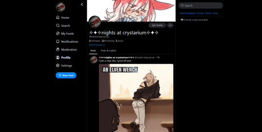
This post shares my personal experience with three potential “new”* fandom places, and is aimed to help fellow content creators. I’m an artist fully depending on internet to survive, my reasoning may not apply to you if you’re a hobbyist. Do your own research, it’s always healthy. * Pillowfort and mastodon have been around for 5+ years, bluesky is ~2 years old.
Discovering new people to follow kinda sucks on all three platforms, twitter and tumblr are eons ahead, but, given the recent chaos and uncertainty, I’m willing to be patient, keep posting on those, and feel safer than I would’ve otherwise been. More baskets good, one basket bad.
All three have poor visual customization, don’t expect custom tumblr themes.
This list starts with the least popular, but most human and easy to join, and what I personally trust the most. All three allow nsfw if labeled properly.
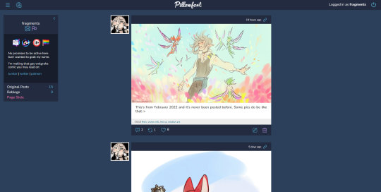
✦ Pillowfort is a barebones tumblr. Intuitive, cozy, but currently very, very small. Be patient with its clunkiness or lack of some features, it’s made by an AO3-like team. I’d personally love if the fandom crowd managed to redirect its attention to it instead of the sus bluesky.
Joining: is free, invite-only, but the waitlist is nearly instant.
Lurk around on their official tumblr: @/pillowfort-social
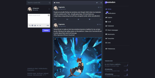
✦ Mastodon, for me personally, is impossible to explain directly. I’ll use several comparisons.
- Discord but all servers can interact. You’re still on a server curated by some human(s) that might tell you what you can and can’t post, BUT, if you don’t like that server’s policy, you can move to a new one while keeping your followers. - Email, users A and B may be registered on different domains, still they can talk. It’s a weird comparison, but fediverse (please I’m not explaining THAT but it’s a good thing) in general looks like another email story: unlike big sites that come and go, it might stand the test of time. - Someone compared mastodon’s structure to xiv’s dc and servers, if you look at its domain names that way, it might be easier to understand.
Depending on user, mastodon may feel gatekeepy/snowflakey. I haven’t spent enough time on there to form a proper opinion yet, but a warning’s due.
An actually good and hopeful thing about mastodon AND tumblr: the two might start interacting in future. Ever lamented that your fav asian artists don’t use tumblr? If they use misskey, or any other place on the fediverse, it might be possible to follow them directly from tumblr in future, and vice versa.
Joining: is free, however some servers close for new members sometimes, and have human moderators reviewing your request.
✦ Bluesky is a twitter without Musk: today’s average internet user reads this, drops everything and already looks to register there. It’s still sus, but people flock to it like crazy. Most likely to become the next big fandom place in my eyes, even if I’m not happy about that.
I personally have no good feelings about bluesky. Same as twitter, which I hated even before the 2018 tumblr exodus, yet the crowd decided to make it The New Fandom Place, and, grudgingly, I had to give up and also join them in 2022. During the year I haven’t stopped despising twitter, yet, I can’t deny that it helped me survive. I estimate half of my patrons, and, hell, even tumblr audience, comes from twitter. So, if bluesky ends up being the next hot shit, I’ll have to keep up because internet pays for my living.
Joining: is free but hell, invite-only, the waitlist is a lie, your best chance to join is a direct invite.
This’s all I’ve got to say for now. If you have a correction or an addition, replies/reblogs are welcome!
Screenshots of the current interfaces under the cut, you may spy on my profiles o/
Pillowfort
Mastodon.art
Bluesky
#i grabbed a name on cohost and inkblot too but those interfaces instantly turned me away#also i'm not covering the mobile apps since i'm a pc-only user#social media#pillowfort#mastodon#bluesky#text post#long post#this already started making rounds but i wanted to add about algorithms#all three seem to have no algorithm atm#only 100% about pillowfort tho
1K notes
·
View notes
Text

About My Flat & Clean Black UI Replacement
I know I don't release content anymore but there isn't a lot of " flat " UI's in general for sims 3 (only flat UI I can think of is the Clean UI by justmiha and the bedrock ui which is unreleased)
I was wondering would you guys be interested in the UI I'm currently making since althought it was 100% purely personal and was just for me I do think it would be nice for me to share it and I will 100% allow people to recolor it. (Poll at the end)
I can also release the UI in parts
Live Mode
CAS
Build & Buy
Misc
Current UI : Showcase
UI base (the UI mod I'm using as an editing base) : Black UI v1.1 by spamaccount UI modification : Font replacement by simstate/redandvidya UI Inspiration : Bedrock UI by simstate/redandvidya CAS background : Light gray by tychosims
Color theme : Black, Grey with white accents
New icons : I will try to re-use already existing icons to replace certain icons (this is so the UI doesn't look too out of place and it follows the artstyle of sims 3)
ex : (possibly for CAS, for the hairstyle icon)
Live Mode
Sim Display (unfinished, remaking icons is hard asf y'all) + Navigation Panel (finished) + Motives (almost finished)

Pie menu (almost finished)

Create-A-Sim
CAS Character Sheet (unfinished) + CAS puck (unfinished)

Build & Buy (haven't started working on it)
No changes yet to the original base : Black UI v1.1 by spamaccount


#ts3#sims 3#the sims 3#wip#sims 3 cc#ts3 cc#sims 3 ui#sims 3 cas#ts3 cas#simblr sims 3#sims 3 simblr#ts3 simblr#sims 3 user interface#sims 3 cas ui#ts3 cas ui#sims 3 screenshots#sims 3 pictures#sims 3 blog#ts3 screenshots#ts3 pictures#simblr#thesims3#black simblr#ts3 ui#sims 3 clean ui#sims 3 black ui#sims 3 clean black ui#ts3 black ui#ts3 black clean ui
58 notes
·
View notes
Text

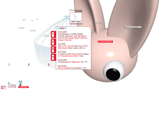

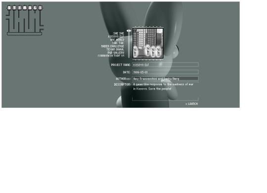
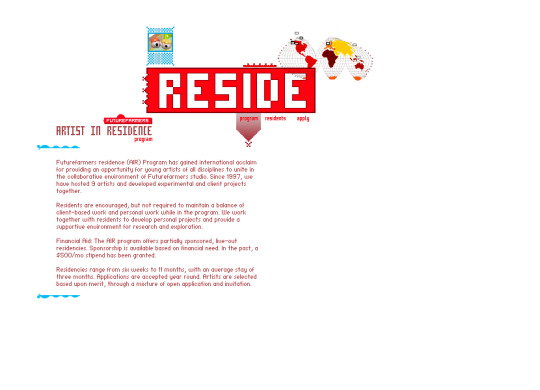

Future Farmers website (2001)
#3d#2001#2000s#01#00s#art#cgi#cybercore#cyber y2k#design#future farmers#graphic design#graphics#internet archive#kaybug#old tech#screenshots#uidesign#ui ux design#user interface#y2kcore#y2kore#y2k aesthetic#y2k core#y2k cyber#y2k design#y2k future#y2k graphics#y2k
268 notes
·
View notes
Text
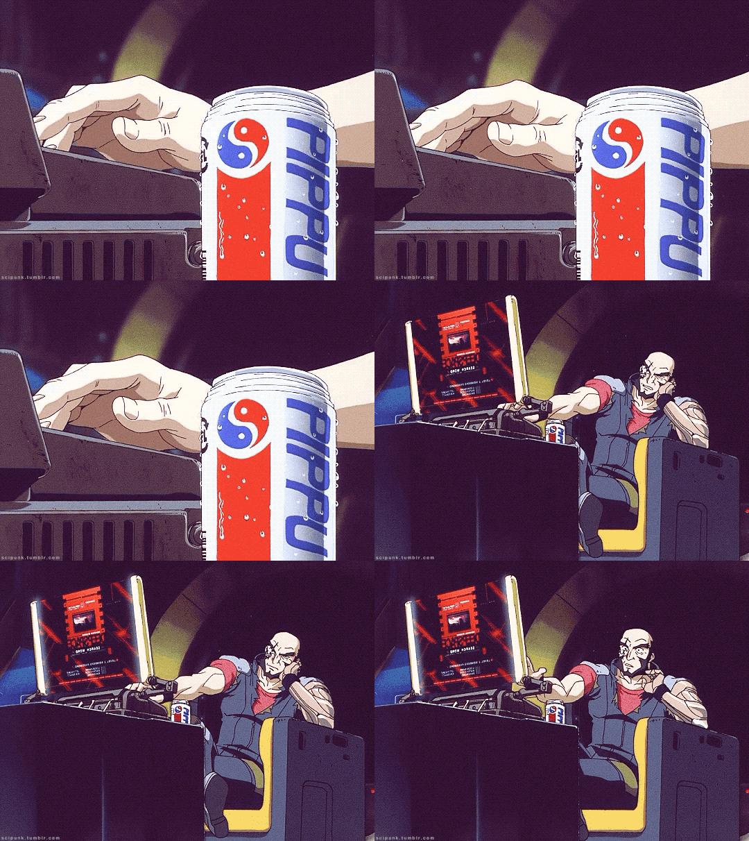
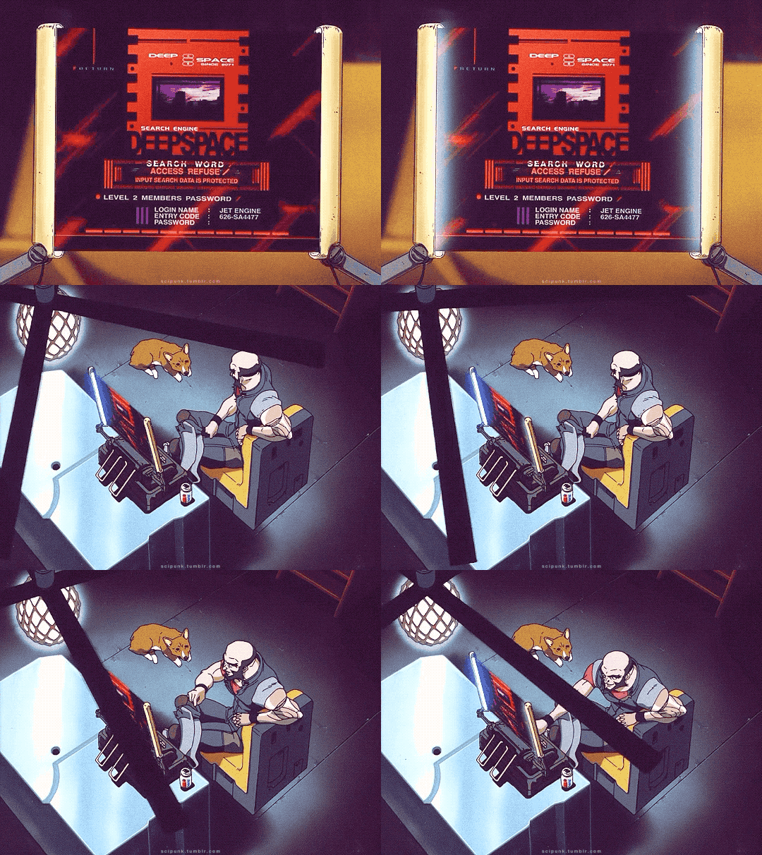
Cowboy Bebop TV Series (1998)
#cowboy bebop#scifi anime#cyberpunk aesthetic#japanese anime#bounty hunter#gifs#gifset#anime edit#cult favorite#cult tv#scifi#cyberpunk#90s#90s anime#90s sci fi#spaceship#spacecraft#user interface#uidesign#remote control#pippu
1K notes
·
View notes
