#BUT its one of the best examples of good character design
Explore tagged Tumblr posts
Text
what is it about avenday that makes me snap and go crazy with my art i wonder
#ive drawn way more in volume in the 10 months ive known them#than i have for FOUR YEARS btw 😭😭😭😭😭#four years of SWITCHING FANDOMS AND SHIPS TOO...#one of which is genshin#scratches head like. the closest to this ship wise is thomato#that ive drawn for an extended period#maybe like a year? on and off? bc sumeru distracted me and we got no content of them for a while so ofc#but no i dont think its the content/lack thereof that is a factor......#bc avenday have only met a few times i will say... and sometimes having a lot of screentime has the opposite effect too#where i feel 'satisfied' with the ship in game and in fanworks (see: kavetham+shuake)#i think its a bunch of factors actually....#for example 1) their designs are both smth fun to learn and i like both equally. uncomplicated or at least easy to pinpoint?#for aforementioned thomato i wish Thoma wore something else at times :3 ayato was always the prettier of the two but all good yknow#and 2) not having to switch voiceovers for avenday to parse them helps#i like aven and sunday's voices in ALL languages. i will never tire of hearing them. over and over.#using thomato as an example again. i constantly have to switch to JP to listen to Ayato bc i dislike his EN voice lowkey ahhhghh 😭#and this coming from a guy who loves dimitri EN voice is crazey i know.. i just think the directing for genshin studio is shit sometimes bc#i KNOW chris hackney can do way better. and he has the range. Dimitri is his best performance and i like him in persona and as Boey sov 😭#so yeah theres that#im in a yapping mood tonight so i'll stop here#but basically#avenday is peak and i dont know why 😭 compared to the other stuff ive shipped before it baffles me how#the obscure HOYO GAME ship is what got me 😭😭😭#like i didnt even play HSR when i started drawing them 😭 its that good 😭 i only started playing in June#ahdjhrhs its just so funny to me. what the hell avenday#well :3 im happy bc i have found something that cured my art block and turned me into a consistent artist.#it rly is just 'find something that turns you into a pervert' bc yeah i am one. for avenday#my fave freaks...#on god one day we'll get u out of hoyo game or fandom guys... aventurine and sunday are too good of characters sometimes to be caught up#in it
19 notes
·
View notes
Note
why do you think indie metroidvanias specifically take so long to make, and is there a solution that you'd like to see them go for? (i know that would likely mean a compromise of some kind, but like, you know)
The reason why is fairly obvious: the classic metroidvania formula makes it very easy to fall prey to unintentional scope creep and is a positive nightmare to QA.
Non-linear progression gating based on precision platforming challenges where the player's basic moveset is constantly changing means every little thing needs to be rigorously tested in every part of the gameworld, carefully checking every room with every combination of abilities the player could conceivably possess for a wide range of failure states.
Is there some combination of abilities that allows the player to get into this room, but not out of it afterwards? Is there some combination of abilities that allows the player to do things in an order you didn't expect? Does that variation in sequencing in turn create situations where the player can end up somewhere without an ability you had assumed was required to get there? And so forth.
Even once you've got everything tested, it's not over. Every tiny change during development, even as small as adding or subtracting a couple of percentage points from the player character's jumping height or walking speed, can potentially have a domino effect that introduces a whole new set of failure states. It's not a pretty picture!
As for solutions, the one most solo or small-team metroidvanias end up adopting is to put a damper on the exponential QA explosion by linearising progression. If you haven't flipped the right switch or visited the right room, the door simply doesn't open, the progression-critical cutscene simply doesn't trigger, and so forth. Even big-name metroidvanias often make judicious use of this one: for example, Super Metroid has certain doors in the early game that just arbitrarily will not open until you've collected a couple of specific items from the game's combat-free introductory area.
The trouble with this approach is that if you use it to the extent that's necessary to keep your QA responsibilities at a manageable level for a small team or solo developer, you functionally end up with a linear, level-based platformer that makes you walk from one level to the next. Whether this disqualifies a given title from the "metroidvania" label is a demarcation problem I'm not interested in litigating, but folks who expected a more open world experience are quite understandably going to be disappointed.
The approach I'd prefer more indie metroidvanias take is to keep things under control by limiting their scope. Not ever damn thing needs to be the next Hollow Knight; many classics of the genre can be completed in well under an hour with good routing even without employing modern speedrun tech. Similarly, some of the best indie metroidvanias are those with the smallest maps; Alruna and the Necro-Industrialists, probably the best example of open-world map design of any metroidvania published in 2024, has a map that's scarcely twenty by twenty screens, and its routing is downright fiendish.
(One of my perennial probably-never-gonna-happen projects is to design a full-featured metroidvania targeting a two to three hour casual playthrough whose entire map can fit on a single screen while remaining at a vaguely playable zoom level, in the style of titles like 1 Screen Platformer.)
586 notes
·
View notes
Text
hey guys andor really is the best star wars story out there because it finally treats star wars like a serious, mature story—one that isn’t just about good vs. evil, but about people, choices, and the crushing weight of oppression. it strips away the mythic grandeur of the jedi and the sith and replaces it with something more real: a rebellion built on fear, desperation, and sacrifice. every moment feels intentional, every conversation matters, and for once, the empire isn’t just a faceless evil—it’s a system that grinds people down until they have no choice but to fight back.
one of the reasons it’s so immersive is its incredible worldbuilding. like this isn’t just another desert planet or a jungle with star wars dressing. every location, from ferrix to coruscant to narkina 5, feels like a fully realized place, with its own culture, politics, and economy. ferrix, for example, isn’t just a background—it’s a community where people rely on each other, where work and tradition matter. the way they mourn their dead, the way the bells signal the rhythm of their day—it all makes it feel real.
then there’s coruscant, which we’ve seen before, but never like this. instead of just being the shiny capital of the galaxy, andor shows us the bureaucracy, the paranoia, the quiet horror of a system designed to crush dissent before it even begins. mon mothma’s storyline is a masterclass in showing just how difficult and terrifying it is to resist the empire from within.
and then there’s narkina 5! the prison arc is one of the most terrifyingly effective depictions of systemic control in star wars. it’s not just that the prisoners are trapped—it’s that they are tricked into thinking they might have some control. the sterile white floors, the quiet threat of electric punishment, the gamified system of labor—it’s chilling. and it makes their eventual uprising feel even more powerful.
most star wars stories tell us about hope, but andor shows us what it costs. it doesn’t rely on nostalgia, it doesn’t lean on familiar characters to carry it—it builds everything from the ground up. there’s no jedi to swoop in and save the day, no grand space battles with triumphant victories. just people trying to survive, trying to resist, trying to make impossible choices.
the dialogue is sharper, the themes are richer, and the stakes feel personal. it’s not about prophecy or destiny—it’s about rebellion as a necessary act of survival. it’s about the slow, grueling process of organizing, of convincing people to fight, of realizing that the enemy isn’t just stormtroopers with blasters—it’s the very structure of control that keeps them in line.
that’s what makes andor so powerful. it’s the first star wars story that feels like it truly understands what rebellion means—not just as a spectacle, but as something painful, terrifying, and absolutely necessary!
#in honor of andor s2 trailer#sorry#im annoying about this#andor#star wars#i aint reading all that#im happy for u though#or sorry that happened#cassian andor
697 notes
·
View notes
Text
I’ve got things to say
That whole brand of post is based less on the vibes of ACVI and more on the vibes of the ACVI story trailer. The dynamic between Walter and 621 in the actual game definitely has him telling you what to do but it’s not like he sees you as something disposable, it becomes apparent that he really does actually respect 621 and cares about them. Beyond that one trailer it’s even really a thing in Armored Core in general, sure there’s usually a handler / operator character but they’re basically just there to offer mission support and deliver exposition that the silent protagonist can’t deliver themselves, basically analogous to the AWACs officers in the various Ace Combat games. Sometimes they do do a bit of manipulation, best example being Lana Nielsen in Master of Arena, but that’s more behind the scenes scheming manipulation and not “you are my dog and you will obey my will” type manipulation.
I will say that those posts aren’t entirely without precedent, the exploited female mecha pilot as a dehumanised tool of war definitely is a reasonably common trope. Fyana from Votoms is the earliest example I’m aware of though I’m sure you could cite some one off character from the robot romance series or one of its contemporaries as an earlier example. Four Murasame in Zeta Gundam is probably the most iconic example.
In particular I think Anemone from Eureka 7 cuts the closest to the vibe that those posts aren’t entirely trying to draw up - she’s violent, emotionally unstable, kept in control with drugs, and seemingly developmentally stunted, with a lot of childishness to the way she acts and even her character design, contrasted against this very unsettling sexual vibe about her, with her basically being strapped into The End’s cockpit like it’s bondage gear. That one even has the “handler” style dynamic though it’s a bit different in that she has two - there’s Dewey, the show’s antagonist, who she pretends to worship but actually fears and despises, and Dominic, who she disdains and abuses but ultimately the one who loves her and ultimately finds the strength and goodness to defy the horrible power structure that made her that way in order to rescue her. Otherwise I think her whole character as portrayed through most of the story does cut quite close to the vibe of tumblr mechsploitation posts so it’s not like they were fabricated entirely from whole cloth (though somehow I doubt that Eureka 7 was the direct inspiration for any of them.)
Coming back round to ACVI, as Downer points out ACVI is actually about how the fucked-up “enhanced” character who is outwardly meant to be a dog on a leash is actually the one who actually has the real agency in the story, which is actually a subversion of how that trope usually goes. It’s pretty much always the case that when you have a character who’s been augmented to pilot a mech it usually renders them lesser or “fake” somehow., and pretty much always a victim of circumstance who’s never the real driver of the plot. Cyber-Newtypes are faulty imitation of natural newtypes. The Perfect Soldiers in Votoms live on borrowed time and are inferior to Chirico’s superhuman abilities. Anemone was the deeply flawed product of an effort to create an artificial Coralian. It’s pretty much always the case that falling into that trope means you’re not the real deal, you exist in the narrative to be pitied, the “natural” protagonist is actually going to be the one to change the world and the odds on you dying tragically are gonna be pretty short.
ACVI is an inversion in that 621 is in a special class of fucked up enhanced human, with the shitty old augmentation that cooks your brain as opposed to the flashy new augmentation without side effects, and it’s that that permits 621 to choose to carry out the most drastic of the three endings, to release the coral and change the universe irrevocably, which by extension makes the choice to not do that and either instead protect the status quo or burn the coral once and for all more meaningful. The newer augmented humans don’t get that meaningful choice. The top pilot according to the Arena rankings is Freud, who is completely unaugmented. In another mecha property he’s hugely important - he’s either the protagonist or the main rival. In ACVI he’s inconsequential- the most impact he has on the story is killing Chatty, who is himself a tertiary character at best. His one character trait is that he likes to fight. People criticised Freud’s implementation into ACVI when the game was new, I think it was all deliberate and kind of genius when you view it as part of the subversion.
ACVI is actually similar to Fromsoft’s other recent games in that respect. In Soulsbourneringekiro you’re pretty much always cursed in some way that means your life is suffering and yet that cursed state means that you’re the only one that can link the fire, slay the nightmare, become Elden Lord etc.
Anyway I got very sidetracked. Long story short I don’t want to get on the back of anyone that’s just trying to get their rocks off, but I guess what I’m trying to say is that it’s kind of annoying when those same people try to make out that those posts are what the genre *is*. Like, it’s not just that you’re reducing a broad genre to one rather specific genre trope, you’re not even using that one trope to its full potential.
Ok, nerd post over.
Like I legit just don’t get it. This fucking mechslop posting, where it’s just like “oooooo woooo I’m a stinky sweaty human weapon in a cramped cockpit of a war machine being told who to fight and kill by my handler” literally has no basis in mecha as a whole beyond maybe squinting your eyes at armored core vi.
119 notes
·
View notes
Text
In the wake of the C3 finale some people have pointed out, correctly, that you can like bad art and dislike good art, and I figured I'd lay some cards on the table and provide some personal examples. I do not like Batman: The Animated Series, nor do I like the Justice League series. Both are highly regarded, BTAS in particular, and remain among the definitive portrayals of many of DC's lineups—they're thoughtful, complicated, and true to the core of the characters. I found them to have plodding pacing, character designs riddled with sameface syndrome, and main casts that feel at best like coworkers. Conversely, Shadow the Hedgehog is one of the worst games in the Sonic franchise; the controls are slippery, the mechanics are poorly implemented, the dialogue is cringey, the tone is legendarily ill-fitting, and the plot is a trainwreck. I completed all 326 possible paths and own a physical copy of the soundtrack of this absolute dogshit game, and the PS2 disc remains on my shelf.
But I don't demand that people stop praising BTAS because I find it overrated. I do not insist that Shadow the Hedgehog was actually a great game and everyone else just doesn't get it, nor do I argue that the critics should just get over it because it's a silly video game for kids. I don't insist that Friends or The Office aged well or always stuck the landing, even though a part of me still likes the escapism of them. I'm not all that interested in watching five grim and dramatic seasons of Breaking Bad, but I respect it as a seminal work of television.
Criticism isn't hate. There is outsized offense being taken over measured criticism in part because that criticism does not hedge or apologize or timidly raise its hand to ask permission, and that is indicative of the real issue. What C3's defenders are outraged by, and what they've been outraged by this whole time, is someone putting an opinion they disagree with in a place where they can see it. And I mean, you do you, but that doesn't sound like a very rewarding, honest, or thoughtful way to live.
#ishkabibble#i also adore fe3h and will shittalk it at the slightest provocation#i contain multitudes and i am at a moment's notice ready to make it everybody's problem
202 notes
·
View notes
Note
Hi, this might be a weird question, but if someone wants to get a proper groundwork of ttrpgs, really understand the medium and what it does, what games do you think they should play? Like which systems would be much checkouts to really GET what kinds of things happen in the space and what kind of games are out there?
I don't think there can be such a thing as a definitive list simply because the medium is so varied, but what I can give is a list of games that have had a massive effect on how I personally look at games. Mind you, I don't think you strictly need to play all of these games, although why not they're hella fun, because even reading them can mindblast you open:
Dungeons & Dragons, multiple editions. Ironically, even though D&D was one of my first games and it for a long time served as a template for what I expected games to be more or less like, coming back to it and exploring the history of the game after delving into a bunch of indie games that were doing completely different things was eye-opening. D&D is not only good to be aware of and keep track of because, for better and for worse, it ends up defining entire design movements (D&D 3e still has an effect on modern trad RPG design), but also because the game itself is a microcosm of how the changing design of a game can end up shaping play culture and the discourse around the game.
RuneQuest and other BRP games: RuneQuest was the first d100-based system but also very much a game clearly in conversation with early D&D, and it's neat to be able to look at two games from that same general period and see how games were already changing at that early a stage. Other BRP games like Call of Cthulhu, Stormbringer, and Pendragon are very useful to look at in the historical context of being some of the very earliest examples of very traditional RPGs incorporating mechanics that tied into character psychology and personality in a way that almost bordered on genre emulation (Sanity, the alignment tracks, personality traits and passions).
Vampire: the Masquerade and other World of Darkness games: these games were revolutionary at the time they came out because while they were still very traditional in structure at least on a discursive level they presented a clear unambiguous break from the hobby's wargaming roots and towards roleplaying games as a form of collaborative storytelling. They also represent a shift in terms of who the game was marketed towards, with these games' success being in no small part due to the fact that they actively catered to women and queer folks at a time when that was still out of the ordinary.
The Shadow of Yesterday and a bunch of other stuff that came out of the Forge: the Forge was a website dedicated to talking about tabletop RPG design and it was basically a gathering ground for people who were really into the promise of RPGs as collaborative storytelling but had grown to see, through play, that Vampire: the Masquerade the System had a completely different idea of what kind of story it wanted to tell than the text implied. TSoY is just one of my favorite games that came out of that design movement and it is a game that really tells you what it's all about, and it is fun to trace its effects on modern game design (it has had a measurable effect on Apocalypse World and Blades in the Dark and thus a significant effect downstream from those two).
Apocalypse World and Monsterhearts. This is my duo of the best PbtA games out there: Apocalypse World for being the first and still almost unparalleled in how it just completely ignored expected ideas of what the act of play should look like and also accidentally became one of the most copied games in the world. Monsterhearts is a fantastic example of a game that builds on the strengths of Apocalypse World's framework while doing a completely different genre and also a great example of a textually queer game.
Dream Askew and Wanderhome. Dream Askew was the first Belonging without Belonging game, a framework of games that very much developed out of a diceless variant of the Powered by the Apocalypse, and the framework is very much defined by its tagline "no dice, no masters." The best I can describe them is as games where the traditional role of the GM is divided across the entire group and while there are game mechanics at play (usually taking the form of using tokens) those are also entirely in the hands of players and not arbitrated by dice rolls. These games thus act both as great examples of what GMless play can look like as well as what diceless play can look like.
Eureka: Investigative Urban Fantasy: with this one I have to admit to being personal friends with the people behind the game, but my friendship with these people actually blossomed out of a shared love for games and talking about them, and Eureka is not only in my opinion the best investigative RPG ever made, it is a fantastic piece of design that clearly tells you what it's about (I like games that are loud about what they expect you to do: the aforementioned TSoY and Apocalypse World are two others). What it also does very well is re-evaluate a lot of what has come before and synthesize them: yes, RPGs are shared stories, but they are also games. We want stories about heroes succeeding, but in games it is possible to fail; and while the game does build into itself a lot of systems to mitigate the chance of failure simply via playing the game (what a lot of games have tried to do inelegantly in the past with "Idea rolls" and other contrivances to force the characters on the path to success if they fail simply due to bad rolls) it also very openly says "hey, a story about the heroes failing is still a story. Not every story will have a happy ending." And I think that is great, because RPGs are games in addition to being little story factories, and some of the best story moments can come from those times when the game itself says "not today" to your perfectly planned narrative moment and instead tells a completely new exciting kind of story. Anyway, check out @anim-ttrpgs for where you can find and download Eureka, and follow along for more exciting stuff they've got cooking :)
This is not by any means an exhaustive list, but just an "off the top of my head" of some games that I think are neat and that have blasted my brain and altered the way I look at the medium. Anyway once you're done with those be sure to check out Rolemaster as well for the best comedy RPG ever made,
150 notes
·
View notes
Text
One of the most recent issues I've realized in ttrpg design I'm seeing when I look into new systems is the idea of Goals. This isn't to say games like Mouse Guard and Shattered Neon aren't good, but moreso that they have a glaring issue with Goals: people do NOT know how to write a goal to save their life. And like, I can't blame anyone for that. We live in a world its hard to think of what you'll eat tomorrow, much less what Leo the Serpenteater is wanting to do.
I'm not sure what solution to this is best. OSR stuff and AD&D tend to map goals to character levels so players know roughly what their character should want to do at any one time, ie "At level 9 a fighter can expect to try to make their own castle or barony". Mouse Guard notes very specifically that Goals are things that you could complete in one session. In Shattered Neon I did the opposite. Goals are instead Ambitions. Things your character strives towards but knows they may never actually achieve.
I don't think any of these approaches are perfect, but it is interesting to see how each approaches "how do you set a goal?" question people will have differently. Yet another example of why you need to play or read multiple games to make a good ttrpg.
#ttrpg design#ttrpg tumblr#indie ttrpg#game dev#mouse guard#shattered neon#adnd#old school renaissance#ttrpg
77 notes
·
View notes
Text
Rise was peak character design for the turtles and I don't think we'll ever get this level of diversity from tmnt again
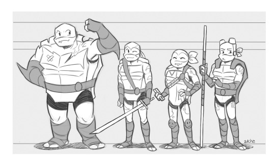
For real, making them all different species and with different height/body types was such a smart decision!
#rise was VERY much animation first toys second#which is honestly probably why it didn't do well financially#BUT its one of the best examples of good character design#mutant mayhem and 2012 are the safe version of this#better than 2003 but still not enough differences#i would mix up leo and donnie in 2012 in certain lighting bc their masks become a similar color#but donnie in rise could be wearing blue and id be like#that's def donnie and not leo#i love mutant mayhem but the character design was def a downgrade#they went back to playing it safe#pixel blurbs#character design#i still find it extremely funny that i considered applying to rise's character design position waaay back while crying over my retail job#I couldve never done this level of character design genius#i also knew nothing about tmnt i just wanted out of working retail HA
1K notes
·
View notes
Text
The Punk-Factor of Punkpunk Genre
So, when I posted my history of Solarpunk, someone (probably not in good faith) asked: “So, what about the punk in all the other punk genres?!” towards my request to put the punk back into Solarpunk. And given that my autistic brain obviously cannot just let that stand… You know what? Let me talk about the other punk genre and in how far they are “punk”. I tried to be as exhaustive as possible, though there is a good chance, that I might have missed some of the punkpunk genre. So feel free to add.
Trying to judge the punkiness I do not assume punk as simple counter culture, but a specific ideology. Quote from Wikipedia:
[Punk ideology] is primarily concerned with concepts such as mutual aid, against selling out, hierarchy, white supremacy, authoritarianism, anti-consumerism, anti-corporatism, anti-war, imperialism, conservatism, anti-globalization, gentrification, anti-racism, anti-sexism, class and classism, gender equality, racial equality, eugenics, animal rights, free-thought and non-conformity
Most of the artwork here has been taken from concept art of either of the examples listed.
Sorted from most futuristic to pre(historic). Yes, the list is long.

Cyberpunk
We start with the OG punk genre, the one after which all other punk genre were named. Yes, you could argue that in fact the two genre following are more futuristic – but Cyberpunk kinda just had to start the list.
As a genre: Given that Cyberpunk had its start completely in literature it is the best defined in this regard. Taking place in a late stage capitalist dystopian world in which most is owned by megacorps who don’t follow anyone’s laws but their own, the protagonists usually are social outcasts fighting against their own oppression, trying to keep themselves alive in a world hostile to them. With cybernetics always being a core of the genre, it also tends to deal with the question of humanity in a “ship of Theseus” sort of way. How much can the human body be altered, before the human vanishes?
As an aesthetic: Cyberpunk is the most punk in terms of aesthetics, really. There is a lot of punk and grunge going on in terms of character design. Neon hair colors, fishnets and thorn up jeans jackets can be found here. As well as of course cybernetics on the characters. The world usually is a megacity with a stark divide between rich and poor, tons of neon signs, a slight Japanese influence, flying cars and somehow a constant downpour of rain.
Punk-Factor: Cyberpunk is the one punk genre, where the “punk” was chosen very knowingly as a name. Usually the protagonists are “punks” fighting for their place in the world against a suppressive capitalist system. (Also, they usually fit the punk aesthetic, if they don’t wear leather dusters.) It should be noted however, that especially in newer western Cyberpunk often the punkiness vanishes more and more – for the same reason we have so little Solarpunk: media that outright confronts the problems of capitalism is just less supported.
Examples: Neuromancer (1984), Mirrorshades: The Cyberpunk Anthology (1986), Snow Crash (1992), The Matrix (1999), Dredd (2012)

Biopunk
As a genre: As a genre biopunk is still fairly ill defined, as it mostly shows up as a subsection of Cyberpunk. Rather than the characters having cybernetic implants (or additionally to it) they are augmented on a genetic level. This can be all sorts of augmentations, changing anything from appearance to giving characters higher strength and agility, giving them claws or night vision, or in some cases even “magic” powers. Usually the genre tends to be set in worlds similar to Cyberpunk. In fact it might well be set in a cyberpunk world, only that characters with bioaugmentations exist parallel to those with cybernetics. Additionally, though, there is a subsection of this genre, that concerns reproductive rights.
As an aesthetic: Ironically biopunk is even less defined as an aesthetic. There is not a lot of biopunk art out there and most that exists can go in different directions. As such it often mixes elements from other punk aesthetics – like Cyberpunk, Steampunk or Dieselpunk – with an assortment of bodyhorror elements.
Punk-Factor: It is hard to define the “punkiness” of a genre, that barely exists for the most part. Usually, when it is set against a Cyberpunk backdrop, it might be very punky, but in other settings those punk elements vanish.
Examples: Ribofunk (1995), Altered Carbon (2002), Bioshock (2007), The Windup Girl (2009)

Nanopunk
As a genre: Like Biopunk Nanopunk mostly exists as a subsubgenre to Cyberpunk, often being set in a mostly Cyberpunk world, only that instead of or additionally to Cybernetics, the technology used to alter the human body is nanites. These serve the same function as the genetic manipulation in Biopunk, giving the human in question more strength and agility and at times more or less magical abilities. There is one common plot that comes up again and again, with an AI or megacorp turning the nanites against the people they inhabit or trying to control them.
As an aesthetic: Aesthetically Nanopunk does not have much in terms of its own identity. Most artworks relating to Nanopunk feature a similar aesthetic to Cyberpunk, with megacities and lots of neon.
Punk-Factor: This genre is so small, that it is kinda hard to judge the exact punkiness.
Examples: The Diamond Age (1995), Prey (2002)

Solarpunk
As a genre: Being another genre, that started as such, Solarpunk is a bit better defined. Solarpunk usually takes place in a world post-strive. It is post-capitalist and decolonial in its settings, usually featuring a world that has either formed against the backdrop of preventing climate collapse or in the aftermath of it. A lot of it features people rebuilding – or alternatively building communities. It always features elements about living in harmony with nature or trying to do so. So far, the genre is mostly defined by short stories, partly because there is still disagreements within the movement, how far a conflict can be taken to still qualify as Solarpunk.
As an aesthetic: Solarpunk has a very strong aesthetic definition, mostly featuring all sorts of cities and urban areas, that incorporate natural elements into the urbanity, with greenery growing on roofs and concrete car-centric streets being replaced with more natural, walkable areas. The character design aesthetic is not quite as clearly defined, but usually features natural materials and patterns usually seen within indigenous art.
Punk-Factor: Contrary to what many say, Solarpunk is fairly punk, as it very much embraces the entire anti-hierarchical, anti-capitalist mentality. With the big difference, that the punk mentality is no longer counter culture, but the mainstream culture.
Examples: The Dispossessed (1974), Nausicaä (1984), Laputa – Castle in the Sky (1986), Princess Mononoke (1997), The Summer Prince (2013)

Lunarpunk
As a genre: Lunarpunk is pretty much a subsubgenre of Solarpunk, just as Nanopunk and Biopunk are sprung off from Cyberpunk. It is so far ill-defined as a genre, but the general consensus is, that it is set in solarpunk-esque worlds, but with a heavier focus on mysticism or spiritualism, at times outright including magic. It also tends to feature a lot darker places, being set in underwater or underground settings – or alternatively at night.
As an aesthetic: Lunarpunk is far more of an aesthetic than a genre so far. It features dark places, often with bioluminescent elements in it. Often featuring a mixture of black and dark blue with lighter blue, violet or light green elements shining in the middle of it. Mushrooms – especially glowing mushrooms – feature repeatedly in artwork.
Punk-Factor: Given that Lunarpunk is barely defined as a genre it is hard to estimate the punkiness in it. If it gets more stories, will those still feature the anti-capitalist and anti-hierarchical messaging we see in Solarpunk? This should be the defining factor. Some of the artworks use little aesthetics from the punk scene, but nothing much more.
Examples: Bioluminescent: A Lunarpunk Anthology (2023)

Hopepunk
Honestly, I had no idea where to put this one, given that it might technically be set at any time and place.
As a genre: Hopepunk is very much a genre, not an aesthetic. It has been defined as the opposite of grimdark by its “inventor/name-giver” Alexandra Rowland. The basic idea is to create fiction that instead of taking a dystopian, defeatist and violent approach, takes one defined by hope and to some degree pacifism. As such the genre can be set in any setting, real or fantastic. It mostly is defined by the protagonists taking opposition to cruelty and violence, fighting for a better world and, crucially, also partly archiving it. Other than in usual Cyberpunk, where the best possible ending, tends to be, that the protagonists get to live a somewhat better life themselves, Hopepunk aims to better the life at least for groups of people.
As an aesthetic: Being fully a genre, Hopepunk has no aesthetic associated with it.
Punk-Factor: Hopepunk is punk less in the sense of the protagonists or things happening within the story, which might or might not be punk, but was named such rather because it is considered counter cultural towards the gross of media at the moment, that often strives for a “realistic, gritty, grimdark” outlook on the world. Basically it is saying: “Hope is punk.” I will not make any judgement on whether or not this is true.
Examples: The Long Way to a Small, Angry Planet (2014), Mad Max: Fury Road (2015), The Good Place (2016)

Mythpunk
As a genre: Another one, that does not really fit into a temporal sorting system, because once again it can be set anywhere between the stone age and the far future. The basic idea is, that the story interweaves postmodern storytelling with elements from mythology or folklore. This can mean mythological, genre-traversing retellings, but it can also mean, that mythology seeps into any given story bit by bit. As such the genre with probably the most media in the subgenre is Urban Fantasy, which often borrows from mythology and incorporates these elements.
As an aesthetic: Mythpunk as an aesthetic is a bit strange. There is definitely a mythpunk aesthetic that exists, often mixing familiar elements with elements from mythology and folklore (at times also including quasi-folkloric works of literature, such as Alice in Wonderland and the Wizard of Oz). Often just a bit dark and twisted.
Punk-Factor: To be perfectly frank, for the most part, there is not a lot of punk to be found in this genre. While there have been definitely punky stories told within the genre, this is more a story decision than something inherent to the genre.
Examples: Pan’s Labyrinth (2006), Over the Garden Wall (2014), Inscryption (2016)

Dustpunk / Rustpunk / Desertpunk
As a genre: Kinda grouping those above all together, because people argue about what they might entail and in some interpretations they kinda are similar: Post-apocalyptic stories set in a world of sand and rust. Often featuring a loner character, having to go up against everyone to ensure his own survival – and at times being forced to learn, that the lonerness might not win him (and most often it is a him) anything.
As an aesthetic: Aesthetically this tends to be very much post-apocalyptic, maybe in some cases with some more classical punk elements added to characters and surroundings.
Punk-Factor: Given that there is neither a system to rage against – nor a new, less hierarchical system – usually there is not that much punk outside of some aesthetic choices. Neither tend those stories go into constructing worlds of mutual aid or working against oppression.
Examples: Anything Mad Max should count for this.

Atompunk
As a genre: Atompunk usually deals with themes connected to the cold war – in some cases directly, in some indirectly. Often it overplays the American ideals that were pushed for during the cold war era and portrays scenarios in which American Exceptionalism slowly reveals itself as the dystopia most punks already know it to be. Outside of this vague idea for the setting, the genre is less described, as there is less of a clear script an Atompunk story might follow. So, little description of who might be the protagonist and what their role is.
As an aesthetic: The aesthetic of Atompunk borrows heavily from the Raygun Gothic aesthetic. So, futurism, as it was imagined in the 1950s and 1960s, with heavy influences from late pulp age science fiction art.
Punk-Factor: The aesthetic in this is definitely not punk. The stories often have some vague punk ideas of recognizing how fucked up the world has become, but given the genre is fairly wide in terms of stories, it is hard to give a definite answer to how “punk” it is. One can definitely tell punk stories within this genre, though.
Examples: Hitchhiker's Guide To The Galaxy (1978), Fallout (1997), Futurama (1999)

Dieselpunk
As a genre: Dieselpunk is once again an example of “strong aesthetic, but no clear genre identity”. Generally, Dieselpunk is concerned with the interwar period, but might cover either of the world wars. In some cases the genre features alternate timelines, in which one war happened and not the other, or in which another faction won, with the technological development being influenced by this as well. But as a genre it is not much defined. A lot of stories building on Lovecraft’s legacy feature Dieselpunk in some regards. And there is definitely a subsection of Dieselpunk stories centered around “what if Nazis won” or “what if Nazis somehow went underground and did their own technological development after the war”. Also, there are a lot of stories about pilots of war planes in this genre.
As an aesthetic: As an aesthetic Dieselpunk is more clearly defined. A lot of bare metal and the sorts of technology you would expect from this era, often with retro-futurist and art noveau elements in between. A lot of the fashion within the genre is defined by pilot and military clothing of the times, but at times also dipping into “roaring 20s” fashion styles.
Punk-Factor: In this genre I would generally say: “If the story involves punching Nazis, you might get a couple punk points – but otherwise this is not really punk.”
Examples: The Iron Dream (1972), Brazil (1985), Dark City (1998), Iron Sky (2012), Bitter Seeds (2010)

Teslapunk
As a genre: Yet another one of these, that exists mostly as a vague idea, with no clear definition. The basic idea is a world, that works on Tesla’s inventions. And as those of you, who watched Doctor Who, might know, Tesla sorta, kinda already invented the internet or had an idea of what it could be and how it could work. So a Teslapunk world is based in an alternate timeline, but might in fact go into light futurism. There is not much in this genre though with a unique thematic identity, as stories that use Teslapunk as a backdrop rarely have coherent themes.
As an aesthetic: The aesthetic of Teslapunk is basically “Steampunk, but with Tesla-coils and electricity”. Which is not a big surprise given that Tesla came from the same era that would also be the inspiration for Steampunk. So, we have a lot of Victorian fashion, maybe some light augmentation, airships, and – again – all the tesla coils you can muster.
Punk-Factor: As, again, I think punk is more about themes than aesthetic, this is once more not really possible to judge, because there do not seem coherent themes within the genre so far.
Examples: The Prestige (2006), Sherlock Holmes: A Game of Shadows (2011), Bioshock Infinite (2013)

Arcanepunk
Another one of those that do not neatly fit into the timeline…
As a genre: Arcanepunk takes place in a world, where both magic and technology have developed. In some cases both developed side by side, in others, we might have a technological world, that suddenly discovers magic by some happenstance. The fact is, though, that both exist parallel to each other or might at times be intertwined, with technology being powered by magic. This can exist at different technological stages, usually featuring settings inspired by the late 19th or early 20th century. But usually futuristic stuff that includes magic might be considered Arcanepunk, just as might stories that mix 18th century technology with magic. While also a vague genre, there is a repeating theme of magic being hoarded by those in powers and the poor and downtrodden finding ways to still use it in their own advantage.
As an aesthetic: Given that Arcanepunk’s setting is defined by the co-existence of magic and technology, rather than a specific technology, Arcanepunk has less of a defined aesthetic. Never the less, we have a part of punk aesthetics that often come up, as a surprising amount of Arcanepunk features characters with neon colored hair.
Punk-Factor: Another genre that is rather thin, yet, there is a surprising amount of stories featuring some punk ideas of fighting against an oppressive system and being counter culture to a main culture build around suppression.
Examples: Too Many Magicians (1966), Shadowrun (1989), Bartimaeus (2003), Arcane (2021) duh

Steampunk
Steampunk was the second genre to pick up the “punk” suffix and hence is as much responsible for the punk-punk as Cyberpunk as the originator.
As a genre: Being named as early as it has been, Steampunk kinda suffers the same issue as Cyberpunk itself. There is a lot of ideas there, but some are only vaguely defined. In general, though Steampunk always takes place in a world where the steam engine became the defining technology and was never replaced with the combustion engine. As such cultural aspects from the steam era, especially Victorian England and the Belle Epoche, still carry over for longer, than they did. So often we will see noble households based around similar values as the puritan Victorian English families, while the very poor are made to work in workhouses. At times we might also see themes of colonialism here. In some cases magic might exist in these worlds, as might electricity for some aspects. There is often a heavy inspiration from Jules Verne and H.G. Wells. Though it is still hard to define the “stereotypical steampunk story”, given that Steampunk offers a wide variety of stories, from adventure stories and romances, over to stories where people rise up against the Victorian-esque society.
As an aesthetic: Steampunk as an aesthetic is very much influenced by Victorian aesthetics and the time period of the late 19th century, mostly in the USA, Great Britain and France. But as all other punk genres it knows very well: “If it is worth doing, it is worth overdoing,” so steam-related elements are added to everything. Could
Punk-Factor: In the original idea for Steampunk was a lot of punk. “What if we took Cyberpunks ‘rage against the unjust system’ and made it 19th century” they asked. But given that the genre branched out so much, it is not necessarily there in all the stories. There is a ton of stories where people rage against that steam powered Victorian machine – but also a ton in which the Victorian world gets idealized and romanticized.
Examples: Thief (1998), The League of Extraordinary Gentlemen (1999), Wild Wild West (1999), Clockwork Century (2008) – also half of all Sherlock Holmes adaption made after 2000 in any medium usually use Steampunk elements

Silkpunk
As a genre: Silkpunk is hard to define, despite there being a clear definition. The reason for this is, that the person who coined the term – Ken Liu – had a very specific idea in mind. He explains that the idea is of a world that has technology as language. In which form is as important as function, is made to speak a language all of its own. Inspired by ideas from W. Brian Arthur and Chinese philosophy. However, what the wider Science Fiction and Fantasy community made from it was “Steampunk but East Asian!” But given he coined the term (and also the alternative feels vaguely racist) I am going to go with Ken Liu for this. While Silkpunk will usually be set in an East Asian inspired world, the central idea is about the duality of technology, which will also be addressed within the stories.
As an aesthetic: As said above, the idea Liu had for it was a world that features some technology, but technology that is as much about form and communication through it, as it is about function. So the technology here has strong visual ideas. At least that was, how Liu intended it. Once again, the wider community made “Steampunk, but East Asian” out of it.
Punk-Factor: There is not a lot of stuff in this genre for now – however so far I do not manage to see a lot of punk ideas in it, even though some of Liu’s stories definitely feature the concept of challenging a higher power.
Examples: Dandelion Dynasty (2015), The Black Tides of Heaven (2018), The Tea Master and the Detective (2019)

Clockpunk
As a genre: Once again storytelling in this genre is not really defined, but the worlds diverge a bit before the wide adaption of steam, instead featuring mechanical devices powered by coils and springs and somehow kept alive, often at least implied through some form of arcane magic that gives “live” to these mechanical inventions. Most examples of Clockpunk, however, tend to show up as settings for parts of fantasy stories. Any fantasy world might have this “Clockpunk” area, where protagonists might travel. Especially games tend to feature this. While there is definitely a trope of the “mad inventor” often going along with this, few other tropes stand out.
As an aesthetic: The aesthetic of Clockpunk tends to take some inspiration from the early 19th century, but tends to add a lot of gears to everything, with even city wide gear constructions keeping things working. We often will find mechatronic characters, such as wind up soldiers or wind up dancers.
Punk-Factor: Once more, there are so few stories told, that it is kinda hard to speak about how punk this is. Most stories told so far, however, do not feature punk elements.
Examples: The Great Mouse Detective (1986), Hugo (2011), Clockwork Planet (2017)

Whalepunk
Please note: This is one of those genre, I would love to see more in, though so far it is barely explored.
As a genre: And you might ask: “Why do you even name those genre, that exist mostly in theory?”, to which I might answer: “Because I am a nerd.” As all these retrofuturists genre, Whalepunk imagines mostly an alternate historical timeline, where the technology that became defining was based around whale oil. This means that in Whalepunk often whalers or harbors play a big role, though as the genre is again very thinly spread, it is hard to say what “THE whalepunk” formular is. It seems there is a tendency, to mix some mysticism or magic into the genre, though, as the idea of hunting sea monsters often plays into it as well. Good chance that it could at some point merge with Cthulupunk (which I did not name separately, because most of it is either covered in Whalepunk or Dieselpunk).
As an aesthetic: The aesthetic of Whalepunk is basically “Steampunk, but with more sailors, ships and sea monsters”. There is definitely a bit of Oceanpunk mixed into it as well, with some aesthetics being somewhere between Steampunk and Dieselpunk. (Which is kinda ironic, because whale oil was mostly used in the early 19th century.)
Punk-Factor: And again. There so far is not a lot of connective thematic tissue within that genre, so exploring themes is kinda hard.
Examples: Dishonored (2012), Dredge (2023)

Oceanpunk / Piratepunk
As a genre: It really is hard to divide the Piratepunk out of the Oceanpunk, though some might call it different. The idea here is that this genre features stories mostly set on the ocean and often more heavily leaning into fantasy, than science fiction. While the worlds might feature technological elements, they will almost certainly feature magical elements of some sort. The characters will usually be seafaring one way or another and stories might involve any sort of adventure. There might be a storyline, though, about one company or nation trying to control the seas – often times through magical means – with the characters often unwillingly being made to oppose them. This genre might also take place in a post-apocalyptic setting with a flooded planet.
As an aesthetic: While the aesthetic is not clearly defined, there is a good chance that it borrows heavily from the late 17th and early 18th century and the golden age of piracy, when it comes to both ships and fashion sensibilities.
Punk-Factor: Pirates, at least as far as modern media imagines them, tend to be very punk, as they tend to inherently oppose any sort of government and what not. While the punk is not there in all of the stories, a lot of the most popular stories from the genre will feature at least lightly punky elements.
Examples: One Piece (1997), Pirates of the Caribbean (2003), Assassin's Creed IV: Black Flag (2013)

Dungeonpunk
As a genre: So, the idea of the genre is basically “What if Cyberpunk, but Dungeons & Dragons?” Usually set in a vaguely medieval world, this world still shows the same corporate corruption as your usual Cyberpunk world. Adventurers are just another resource to be exploited by the system, their day job involving going on yet another dungeon crawl. For this there might be some technology entirely powered by magic, with those magic items taking over the same functions technology might have in a Cyberpunk world. And yes, indeed some brave dwarf, elf or halfling might rise up and challenge the corporate dungeon syndicate. (As you might sense: Yes, this genre tends to be at least partly a bit of a parody of the punkpunk idea. Though it also can be played straight as “Cyberpunk conflicts, just that all technology is somehow magic.”)
As an aesthetic: This is once again one of the examples, where there is a clear idea behind it – but absolutely no clear aesthetic, as this genre might cover anything from medieval settings to a lot more modern stuff.
Punk-Factor: The base idea, being heavily inspired by the base idea of Cyberpunk, just from a very different perspective. But too many people read the genre as “Magic Technology, yay”, in which case, no, it is not punk.
Examples: Dungeons & Dragons can be played this way, also Final Fantasy VI – XIII definitely counts.

Sandalpunk
As a genre: I mostly include this for the sake of it, because this genre tends to boil down to “fantasy set in ancient Greece or Rome, but with vaguely anachronistic elements”. It might also include alternate history stories (even going so far as Science Fiction) based on the idea “What if Ancient Rome/Ancient Greece never fell?” There is no real overarching themes, even though I could imagine some interesting way one could build those up. So far, though, it is mostly a vague gesture towards: “SciFi Fantasy, but with more ancient civilizations.”
As an aesthetic: The aesthetic is usually just Ancient Rome or Ancient Greece, but with more magic or anachronistic elements.
Punk-Factor: Given the super vague nature of the genre and the fact that it seems more like a genre of hindsight (with most media being declared this having been released even before 2000)… Nobody wrote those stories to be punk. The one punk thing I can see about several of these stories is people challenging Gods, but… That’s about it.Examples: Hercules: Legendary Journeys (1995), Xena: Warrior Princess (1995), God of War (2005)

Stonepunk
As a genre: The basic idea of Stonepunk is, that it is set in a stone age world, but with the technology being pressed towards a very anachronistic end, which is often played for laughs. Basically it gives stone age people a modern seeming world, though not really. Often enough this is used to make a point about the modern world and parody it in some regard. An argument can be made for stories, that feature stone age technology people being somehow subjected to modern technology (for example through time travel or space travel) also possibly falling into this genre.
As an aesthetic: Usually the aesthetic of Stonepunk is one of an overplayed stone age setting. The clothing characters might wear are not what we know is historically more accurate but really just “everyone wears a pelt around their shoulders”. Meanwhile stone age tools get spun to be used as all sorts of modern technologies.
Punk-Factor: The genre does usually not feature punk themes. However, the nature of parodying and challenging the modern world tends to be punk in its own merit, I assume?
Examples: The Flintstones (1960), The Croods (2013), Horizon: Zero Dawn (2017)
That's it. That's the list.
Feel free to add to it.
#long ass post#punkpunk#punk genre#definition#cyberpunk#steampunk#biopunk#nanopunk#solarpunk#lunarpunk#hopepunk#mythpunk#dustpunk#desert punk#atompunk#dieselpunk#teslapunk#arcanepunk#silkpunk#clockpunk#whalepunk#oceanpunk#dungeonpunk#sandalpunk#stonepunk
1K notes
·
View notes
Note
did u not like totk?
i LOVED totk. i think it was well-written and did its job as a sequel to botw very well. HOWEVER. i do think it suffered slightly from the commercial success of botw. as i mentioned in my last post, nintendo does this. thing. when one of their games gets popular where every game after it has to be Exactly The Same so they can make all the money in the world via comparison marketing. (and this is a problem with the wider game industry in general but also a very observable pattern in loz specifically.) I know it's been a pretty long time since botw came out, but before (and immediately following) its release there was some pushback from longtime fans who worried that the open-world and lack of traditional dungeons meant that the game had strayed too far from the classic formula that makes a game a "zelda game." this is to say, botw was EXPERIMENTAL. and the devs had no idea if what they were doing was going to be successful or not. the open-world of botw wasn't a gimmick, and it wasn't the devs jumping on the open-world bandwagon. it was what CREATED that bandwagon. the open-world was a deliberate choice made specifically for botw because it reinforced the story that botw was designed to tell. the game is about exploring a desolate world, about making connections, and rebuilding both the broken kingdom and the player character's shattered sense of self by traveling and learning and building relationships. a large open-world map with only minor quest guidelines and lots of collectibles and side quests lends itself perfectly to this specific story, which is specifically about exploration and rebirth.
the problem is, botw was. almost TOO good. it was so good that every other game company on the planet started scrambling to build giant open-world maps into their next release, regardless of how much sense that actually made narratively. and because of that, when it came time to release a sequel to botw, the devs had a lot to think about. they had HUGE shoes to fill in terms of fan reception, but they were ALSO being asked to follow up one of the best-performing games of all time, commercially. totk needed to SELL as well as botw. And, likely because nintendo was worried about that potential commercial value, totk needed to keep people comfortable. I don't know for certain, but I definitely get the feeling playing totk that the devs were specifically told not to stray too far from what made botw marketable and successful--that being the open world and the versatility of gameplay. so in order to follow that up, they made... 2 more huge open maps, and new gimmick gameplay which was explicitly super-versatile.
do i think that the extra maps and ultrahand were BAD choices? no. however, i don't think they necessarily ADDED anything to the game as a narrative whole. one of my favorite things about botw was how everything seemed to be designed AROUND the narrative, with gameplay elements slotting neatly into the story thematically. totk just. didn't really have that, imo. there wasn't a huge narrative benefit to the gigantic, completely unpopulated depths and sky maps. ultrahand was cool, but within the context of the story it meant basically nothing. in some ways, i almost think totk could have benefitted from a much more linear approach to its storytelling, a la skyward sword, because there are a lot of story beats that have to be found in chronological order in order to have the right emotional impact, but because of the nonlinear open-world it kind of became a struggle to hit all the important story points in the right order. an easy example of this is the dragon's tears in comparison to the memories--the dragon tears have a very specific set order in which they happen, and finding them out of order can make the story you're seeing in them feel confusing and disjointed. the order in which they should be found is technically displayed on the temple wall, but most players aren't going to pick up on that or follow it--more likely, they're just going to explore the geoglyphs as they come across them organically, and therefore will likely witness the story in a completely disjointed way. compare this to the botw memories, which ALSO technically have a set order--the order in which they're displayed on the sheikah slate. however, because they're largely just small moments in time, and not one continuous story, finding them out of order has a lot less of an impact on how you as the player experience the narrative, and it's not hugely detrimental to your experience of the story if you find them naturally as you explore rather than explicitly seeking them out in order. If TOTK had been allowed to deviate from the botw formula a bit, i think we may have ended up with a more cohesive game in terms of narrative beats like that. as it is, i just think the game is torn slightly between wanting to be its own new game with new gameplay and needing to be botw, if that makes sense.
#again. love the game. have played it several times in its entirety. story is great. i just think the gameplay itself could have been better#yk?#asks#zelda analysis
248 notes
·
View notes
Text
We are Studying Ramb Again
I am once again putting his design under a microscope because something occurred to me while I was designing an AU. His face is so...strange. Now, we will be heavily discussing plug and outlet anatomy, so here is your last warning to take everything with a grain of salt.
Let's look at regular plugboys first.


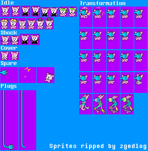
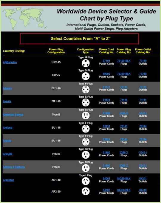
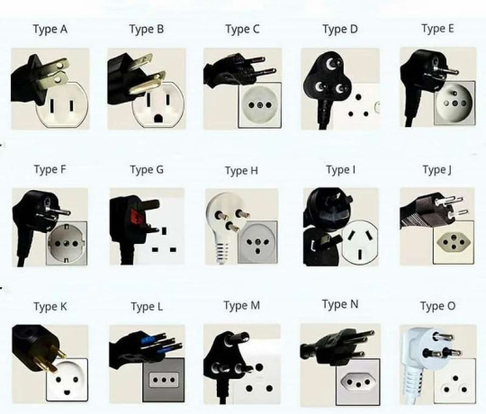
Ignoring the cartoon-ish expression that comes with being spared, their faces generally fall under the shapes D= , =D , and o= . They fall under type B plugs. Fun Fact: these are found in Japan, Canada, Mexico, and USAmerica. Japan's and the latter's plug Type A & B are slightly different, which affects their compatibility.
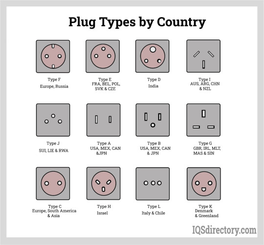
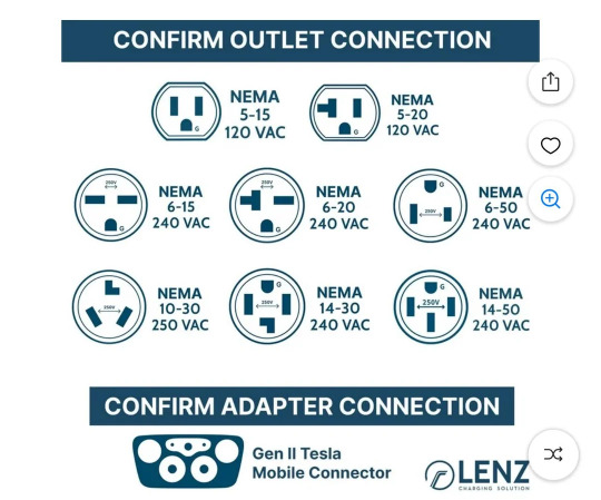
"But the grounding hole (that circle under the lines) is way too round to match!" Well you see, this chart is not a hard and fast rule. They are a type of plug Type B called a NEMA 5-15 120 vac. Also known as a 3-prong 15A, 120 volt outlet. It is the most common type found in the homes of those countries as the grounding hole makes it safer than type A and its compatibility list is longer. Yes, type Bs are compatible with laptops.
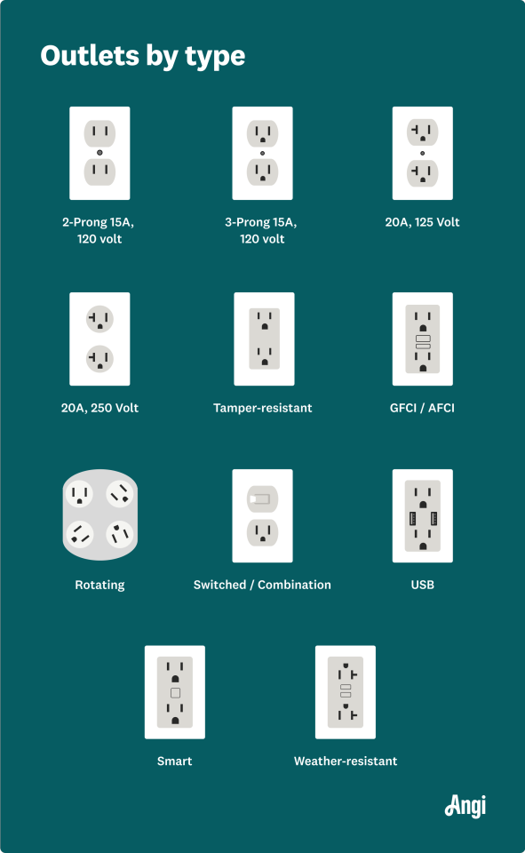
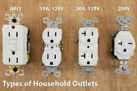
Fun Fact: If Toriel was tech smart she'd have installed tamper-resistant outlets so that the kids didn't stick anything in them. This wouldn't affect any plugboys we know, because none of them are from the house. They're all from the library. Isn't it strange though, that the only plug character who shows up in the TV World, essentially Kris's house, is a power strip? You'd still need to plug Ramb into an outlet in order for him to be of any use.
Ramb... let's slowly ease into Ramb.

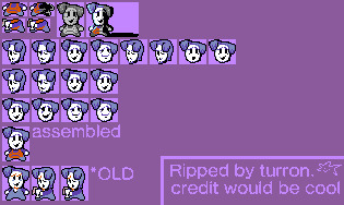
Ramb is a British power strip, which means he should be a Type G. They're found in the UK, Ireland, Cyprus, Malta, Malaysia, Singapore, and Hong Kong. They look like this:
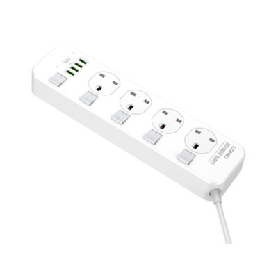
I hope you can see the issue here.
Tye Gs also have over 100 more volts than Type Bs, so Type G plugs are generally considered stronger and the best plug in the world. (I think this is a matter of opinion though. For example, some people like the rotation that Type F provides more.) You'd probably need an adapter to get the most out of a Type G outlet if you don't live there. Same for the other way around.
Back to our boi, Ramb's mouth is. Well. The shape I can best describe it as is the Nike logo, which funny enough is supposed to represent the wings of the Greek goddess Nike. We cannot escape mentions of religion.

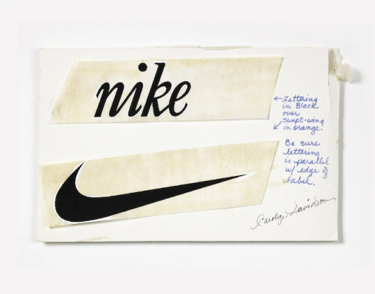
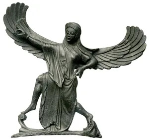
Now, here's the problem chat. If he doesn't look like a Type B or a Type G, what is he?
I don't know.
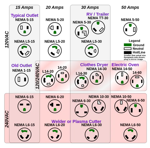
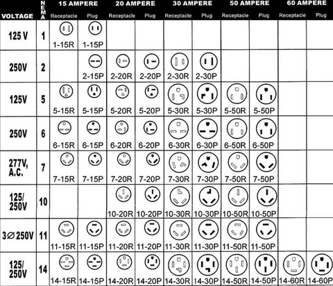
The curve of his mouth is technically possible though. Look at NEMA L6-20, NEMA L6-30, and NEMA L6-50.
Two vertical lines with a curve. That's all we need for a match.
Yet
I just
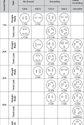
Couldn't
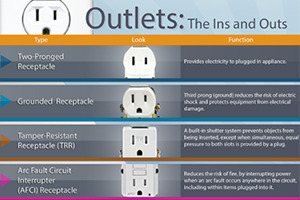
Find

One
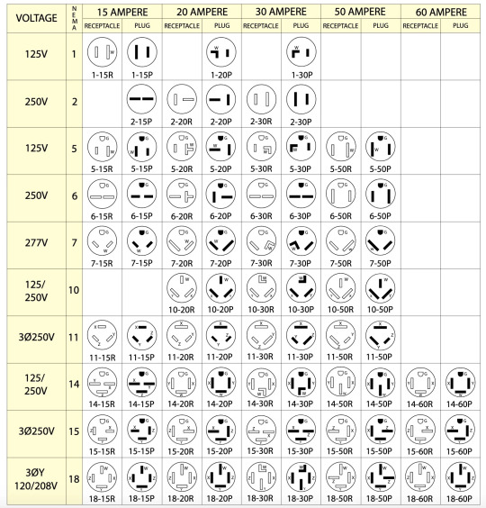
No matter where
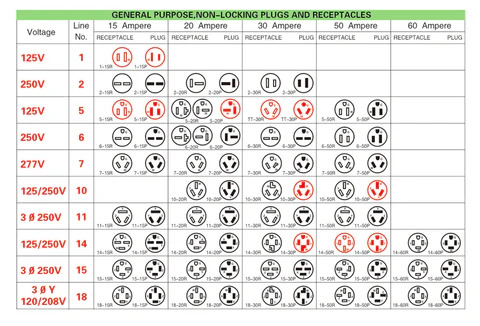
I looked.
We're now on day 2 of writing this. Now that we can all see that he doesn't match any sort of outlet, the next step is to figure out why. Is this some sort of Red Cross copyright issue? Can't find anything that implies it. That leaves me with two options.
Ramb has a construction defect
This idea came from my good friend @kayuripax while I was trying to wrap my head around this situation. It's possible that the machines in the factory messed up and the quality check didn't catch it. Neither did the people running the library. (Maybe it's just the outlet that makes up his face that's defected and the other outlets of the power strip are fine.)
2. Ramb had a malfunction and the plastic melted
Ramb being a British plug and being used in a place incompatible is a bad sign already. Sure, an adapter can be used, but that has never been mentioned yet. It'd be so easy to just misuse Ramb and it all goes wrong. Maybe they're just kept because of nostalgia.
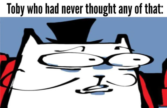
Hold on post canceled what the-
If Eram could have connections to Ramb... And have connections to the amalgamates... Both Dump and Amalgam sound like EarthBound... Ramb's strange mouth... The way his left ear/piece of hair is so mismatched with the right side... Random Access Memory... Memory... Bad Memory... Sword Route shows a lot of that...taps into Kris's violent past (more like the affinity for it) Random Access Memory (Bad)... Listen, I'm spit balling here. I'm not gonna say he's some sort of Amalgamate. But it sure is. Strange.
55 notes
·
View notes
Text
IM FUCKING OBSESSED WITH THIS NEW EPISODE????? THE RULER MAY BE THE BEST EPISODE IN MY EYES OF THE SEASON SO FAR???
I have so many things to say soooo warning for spoilers below
1. Genesis has limits!! We don't see it very clearly but the item's disappearance when Marc makes new ones or when they're knocked out his hands. SO I think the limitation of genesis is focus. You have to be thinking of the item and focused. It gets knocked out your hands and you get surprised? It's gone. Plus it has to be something you can imagine it seems.
2. I'm obsessed with Nath's fighting style. My boy had marker knives. MARKER KNIVES. He used a big paint pallet as a shield!!! A big ass pencil as a javelin!!! And he's so cute doing it! (That being said, I'm still gonna be calling him Caprisun 💙🖤🤍)
3. The most overt queer metaphor I have ever seen, and I watched 'I saw the TV glow' over the weekend. Legitimately. At what point does it stop being subtext and just become the text cause I feel like at this point it's just the text. I'm fucking obsessed with it I adored this episode I will be rewatching it for the rest of time. Nath transforming in a closet, "set him straight", the hand holding, the just straight up gay nights that clearly reflect nathmarc and adrinette??
4. The adrinette subplot. A. peak fanfic vibes I am obsessed. Love me a good sickfic. B. I've seen some posts talking about the adrinette subplot seeming like it was irrelevant (though I haven't see anyone complaining about that and I agree even if it wasn't it was adorable and I love a good character development filler subplot), but I disagree. I think having a subplot for adrinette, legitimately no matter what it was, was a really good call. The parallel between Marc and Nath's story and Adrinette's lives are so obvious, and it leads me to a faint theory.
4.5. (Said theory) I think Mari or Adri are gonna make a wish. I think it might be Adri especially? Or Adri does the miraculous Chat Noir on something serious? Something bad is gonna happen, like real bad, and their gonna loose their powers, but a wish or a big event are gonna fix it while also revealing identity. That's the direct parallel right?
5. Another theory based on The Ruler and El Toro, I think episode 22 is not only gonna be akuma!mari, which I think is a common theory (Seriously 'Lady Chaos' really sounds like akuma!mari). But I also think it's gonna be caused by an issue with her parents, or Natalie. Marinette has been doing her best this season with all the parenting struggles happening for her friends. Ivan's dad being a dick, Jules struggling with her dad being absent her whole life and suddenly giving all the attention and love to her twin, and now Nath's homophobic mum. This season has a really strong theme of parental issues, almost like one of the main character's abusive dad just died and it's up rooted his life hmmmm. Mari's family isnt perfect. Dearest family and Simple Man are good examples of that. And Natalie's now debatable alliances, when Natalie is a very trusted adult for Marinette. I think this is building up to something for Mari family wise, maybe even this causing a reveal of the Gabe secret.
6. I'm obsessed with that reveal. The transformations? I swear I've read that in adrinette fanfics 100 times and that makes it so perfect for marcnath. Them, who bonded over ladybug self insert fanfic when they first met? Its Fucking Perfect. It's so them. Nath has probably read that type of fic 100 times, those fics were probably running through his mind in that moment. It is perfectly beautifully them. Whoever on the writers team thought of that, I would do anything just to get them to give me critique on my scripts because their clearly a genius.
7. I might make season 6 Marc my new pfp. I'm obsessed with him. I am fucking loving this season, and honestly even rose's design is growing on me. Juleka's and Zoe's are still my favorites, but Marc and Alya are getting close to taking over the more I see them.
#miraculous ladybug#miraculous season 6#miraculous ladybug spoilers#ml spoilers#ml season 6#marcnath#adrinette#episode review#or rant take your pick#ml the ruler#miraculous ladybug the ruler#(:#caprikid#goat miraculous
87 notes
·
View notes
Text
Primaries, Secondaries, Structure, and 4e DnD
Talking about Fourth Edition Dungeons & Dragons is challenging at times because I feel like I’m always coming at things from a preemptive crouch. My first draft of this started out describing a problem that people criticized, but realistically speaking, that was 10 years ago and it doesn’t really matter what people think about it now, especially because fundamentally it isn’t an incorrect thing to have noticed.
What I’m going to talk about here is structural form and it’s a thing that 4e has throughout. Honestly, you could make a reasonable model of the development of Dungeons & Dragons throughou
One of the areas where I would say that fourth edition really excels as a tabletop RPG is that its structure is rock solid. It’s not a game with tons of tables in it because most things that needed tables were instead handled by formulas and sometimes those formulas were very simple. This does make it sort of the anti-Rolemaster where, broadly speaking, you are managing a very small amount of information and the game doesn’t do a lot to generate things for you. This structure does mean that there are reliable ways that players can approach information with expectations and assumptions about how the game does work.
To be clear, I like this. It is not necessarily the best way for any game to be, but 4e is an enormous game that relies on its system being modular, familiar, and exclusionary. You know how the game works in a set of fundamental structures, and then you work out from that centre of generalities to your specifics. You don’t need to know how Barbarians work if you’re not playing one, but the fact that Barbarians work like how Wardens work like how Fighters work means that when you do pick up any of the Barbarian pieces, they are pretty familiar. This approach is a form of structuralism, and it’s really useful for making a big complicated thing handleable. Rather than having four or five versions of the same thing (like Spellcasting in 3rd edition), you can have a uniform structure that everyone recognises.
One example of a structural design in 4E is the way the game handles Primary and Secondary Stat needs for each class.
Real quick for anyone not familiar, in most of 4E’s class design, characters were making attack rolls against defenses. There weren’t any saving throws against magical spells being flung around, and for the most part enemies didn’t have a lot of opportunities to avoid things beyond specialized layered defenses like ending stuns or dazes early. You had your Armour Class, your Fortitude Defense, your Reflex Defense, and your Will Defense. This design puts agency on the actor rather than defense posture on the target, and since players are the ones enacting the things the players want, that means the die rolls that matter are the ones they make.
Now, you may not like this, especially if you like fudging die rolls like some kind of a coward I guess, but the point is for now, the fundamental structure of classes in 4E was you were powers were making attack rolls against defenses. Because of that, everyone needed to be good at making attack rolls. This was a break from third edition where it was pretty much expected that attack rolls were only for a very small set of things that were considered attacks (and which were, largely, not very good). If you were a wizard, you could build the whole character as if you never had to make an attack roll. You could, there were spells that did it, but you didn’t have to. There was no inherent assumption wizards would be good at attacking. You would be very likely expecting to meet characters that didn’t have a good attack roll.
A complaint about this design is that because everyone is making attacks, characters all feel the same. This is a reasonable complaint that if you ignore all the things that aren’t making attacks, everyone is only ever making attacks. It is true that this made 4E a game where everyone wanted to be good at connecting and therefore, everyone wanted stats that made you best at hitting. That meant that Wizards all wanted Intelligence, the stat that made you better at hitting with Wizard powers, and Fighters and Barbarians all wanted a good Strength stat because that’s how Fighters and Barbarians hit things more often.
This was, again, a complaint: The system made it so that wizards wanted high Intelligence, and Fighters and Barbarians wanted high Strength. It’s true that if you don’t like this result that this is a reasonable criticism, that this is a thing the game encourages. It’s not a criticism I much care about, mind you.
“Doesn’t this mean every member of a class will have similar stats, and naturally gravitate towards the same best powers?” you might wonder, and no! No, they solved this problem through Secondary stats. Powers came in two flavours; one, powers that only cared about your primary stat, and they were usually pretty decent, solid 8/10 kind of things. But then there were powers that could have some benefit based on your other choices, like a Pact or a Boon or a Style, and those things looked at a stat of yours that was very deliberately not the stat used to make the attack roll. These were commonly referred to as your ‘rider’ abilities, and therefore, that stat effect was the rider on the main ability.
For example, Dishearten was an attack that used Intelligence to hit, dealt damage based on Intelligence, but the penalty it could impose on an enemy’s to-hit was based on your Charisma. To that end, if you did want this power, you might want a good Charisma as well, or, if you already wanted a character with a high Charisma, you might pick this kind of power to reward that build.
There’s another structure that lives parallel here. It’s not as common, but it’s still there; there were some classes that had one secondary stat for their powers, but had two different primary stats for their powers. That meant that the class might approach hitting with stats like Wisdom or Strength, but the followup to that hitting was always going to be (for example) Charisma. This meant that there was a common thread across all members of that class, but it was never their best thing; all Clerics had some people skills, but they might be a holy smiting, mace-swinging Cleric who had people skills, or a laser beam blasting Cleric who had people skills.
4E clerics were so cool.
The other classes that did this in the Player’s Handbook were the Warlock (Charisma and Constitution) and the Paladin (Charisma and Strength). The Warlock was a bit of an orphan child at the best of times, but the Paladin was so well serviced and ate so well that it wound up with multiple fully-fledged ‘standard package’ builds you could pursue with plenty of feat support under the names of Straladin (Strength Paladin), Chaladin (Charisma Paladin) or Baladin (Balanced Paladin). The Ranger also had the opportunity to be a Strength-based or Dexterity-based attacker, though the powers were mostly all the same powers, with ‘Strength or Dexterity vs AC’ kind of attack rolls.
Sometimes for some classes that weren’t super well developed, this meant that you effectively had one primary stat and two secondary stats. There aren’t any I can find that only have one secondary stat, even the most malnourished classes I found like the Vampire have two, and some classes like the Fighter and the Warden seem to have almost every possible stat supported as a secondary stat. Your best stat was probably going to be the one that you used to hit with and your second best stat was going to be the one that gave you secondary effects you liked, which meant that most of the characters in a particular form would have similar stats and probably express a similar-ish character. If you were a wizard who liked moving things around, you probably were very intelligent and pretty wise because those were the two stats you wanted the most.
Now this does create variety within a class, but you can probably just complain it kicks the can down the road. After all, if you’re playing a Bard, are you the Charisma-Intelligence Bard, the Charisma-Wisdom Bard, or the best Bard? It’s still narrowing options.
Thing is, to me, complaining about this seems dumb when I point out the Fighter. Because everyone seems to think it’s okay that all fighters are strong and hit things hard, because that’s what being a Fighter is. Suddenly that is okay when we’re talking about limiting the options of the poor Fighter, who had people back in 4e complaining their builds were too good, too interesting, and they did too much cool stuff, when the players would much rather than two combat options, have one.
Oh and fourh the May be with you or whatever.
Check it out on PRESS.exe to see it with images and links!
71 notes
·
View notes
Note
i saw your shrike headcanons may i ask if ya have some for the big guy Beebs?
[Apologizes that it took me some time to come back to this ask. I been thinking and thinking if I do have any head canons for the beloved cube head. I'm not the best when it comes to thinking about head canons, honestly a lot of my HCs come from others and their HCs that I accepted as a good HC that I enjoy for the character. But let's see what I have thought about for Beebs: 1. A Mechanic. As someone who has cybernetic limbs, I would assume that Beebs have a pretty good understanding of being a mechanic, as well as in robotics. From EP 3, Us & Them, we see that Beebs seems to have an understanding at fixing mechanical, such as the Cat Brothers Ship, and when he mentions while getting a call from Us, "Great, ANOTHER thing to fix." I believe that Beebs does most of the fixing around the ship. I would never trust Shrike to "fix" anything that needs electricity to run...


2. Royalty. A stretch perhaps. From what we know so far about Beebs' species and their culture, I think Beebs comes from a pretty high ranking, or "royal" like house. Although Beebs does not match what is expected from the family, being an "aberrant" to some eyes, such as Ajax. I think Beebs came from a house, even in higher status than Ajax. I been wondering that the reason why Ajax wanted Beebs' as a servant was for his own status. Like "Look at me, I have the son of a higher house, under me, as a servant." That would be a blow to another house, since it seems Walarian take their status in society very seriously (Also I never can spell the species' name correctly, please forgive me on that).

This is also why I believe Beebs also takes on a very simple life, to move away from the complexation of the life he live before. 3. Speaking of simple, I like to think that Beebs is a man who enjoys minimum things. As in, I don't think Beebs enjoys complexity, not just in life, but even in technology as well. Beebs prefers things to be simple such as clothes, music, food, and even when it comes to working on issues that need solutions. Beebs will go all out to solve a problem, but I think he would prefer if the issue was not to be created to be complicated in the first place, it would have save a lot of time... 4. He lost his limbs. I seen some other who HC or theories that Beebs may have been born without his limbs at all, but I think I prefer the idea that he lost them. I think about this part at the dinner with Ajax in EP 4, Plague Walkers:

When Ajax looks at Beebs' cybernetic arm, then to his own, he mentions how he has "employers I know would TAKE the liability" which makes me think that Beebs lost his limbs from an incident that carried risk, a risk that Beebs took and losing his limbs was a consequence from it. 5. Beebs see Himself in Shrike. Not sure if this counts as a head canon, but I think one reason why Beebs has taken Shrike in and sticks to his side is because he see a younger self in Shrike. Someone who has been there and live through his mistakes, and perhaps he doesn't want the same for Shrike. So he takes Shrike as not just a friend, but as a little brother, one that he wants to see improve himself so Shrike does not end up making the same mistakes that Beebs may have made in his own past.
I cannot think of a good example from the show to see where this though comes from, but I think its when Beebs gives Shrike a soft smile that tells me that Beebs see Shrike as a little brother that he trying to take under as someone he can mentor as well.

6. Heavy Weight Drinker. This one may actually be more close to a Head canon than the others, but I like to think that Beebs can handle his alcohol well. Beebs doesn't drink as much compare to Shrike, who is quick to become intoxicated, Beebs can have quite a bit before even showing sides to be a bit tippy. He always the "designated" driver for any gathering. 7. Prefers a Monogamy. If Beebs' kind and society is expected for the males to have a harem of females, I do not think Beebs vibes that same way. Beebs come off to me as someone who has a lot of people in life he cares and love for, but only one he would treat as a partner. As in Beebs is someone I see who would take a LONG time to develop a romantic relationship with just one person. That one partner is his everything and he cannot think to divide that affection to another. Here's an ask from the MW official server about Walarians having a harem of females.

I think that's all I got for now! Hope you enjoy!]
55 notes
·
View notes
Note
Do you think UA is really the so called best school for heroes or they just surf on the fame of their big name former students like am and endy (and others)?
UA is a school written by an author who didn't have much interest in the academia of MHA. MHA is a story about escalation and it puts the story beats of where the author is headed above organic storytelling. Example: UA doesn't like Izuku's habit of hurting himself. Aizawa has seen this multiple times now. -The entrance exam. -The quirk aptitude test. -The battle trials. -The USJ where he saved All Might's life. All of these resulted in the guy breaking something and needing to see Recovery Girl. Organic Storytelling: The teachers don't like this, so they address the problem head on: If Izuku breaks bones in the sports festival he really wants to do well in, he's out. So, he won't break his bones. But, this would go against the author's goal to show Izuku competing and hurting himself. So despite the fact that these people have his education and career in their hands and can dictate any command to him and he has to follow if he wants to remain a student there, they just complain after he does something.
As far as UA being the best school? Let's say...yes. The others aren't relevant. They do nothing. Shiketsu is allegedly as good as UA is and is its rival, but Shiketsu is only a handful of names characters. Where was Shiketsu and it's army of graduates when hero society fell? We saw what UA was doing: saving the country/the world. Shiketsu? They sent some guys to help during the final war arc. So by default, since the rest of the schools are non entities or do nothing, UA is the best. Is UA good? No. UA is a comical failure as an educational institution. It's a school where despite having the alleged best educators around and experts in their fields, the student's growth and development is entirely attributed to themselves. Aizawa repeatedly deflects any credit for his student's growth. He's a hands off teacher. He provides them exercises and training methods and the burden of doing the work and improving is on the students themselves. While this makes the class look more bad ass in the eyes of the audience, it asks the question: what are they here for? I think the principals behind UA's methods are very interesting. WHY do they do this? The answers are fun. So, you know how we get Aizawa and Shinso saying how unfair the entrance exam is and how it favors a certain type of quirk? My take is that this is 100% intentional and this mentality informs most of UA's methodology. They only teach students how to hit harder. Technical quirks or abilities that require effort to master can't easily translate into MORE POWER, so they prioritize people who will be top level heroes. Anyone who has a quirk like Endeavor's could be a top hero. The goal is to find as many people like him as possible, teach them to become stronger and hit harder. And teach them restraint and non lethal capture via sparring matches with their classmates. The constant fighting with their peers shows them how to hold back so they only use the exact amount of force needed in the field. As a factory to produce a very specific kind of hero, UA does a very good job. The school is just calibrated to creating a hero who succeeds in All Might's era of hero society. A self reliant hero who is used to doing things by themselves mirroring the solo and highly competitive nature of heroics. By definition, this strategy will exclude a lot of good eggs. So, we have the back paths: -Rescue points, enabling people who can't beat robots to score enough points to get in. Since the teachers are the ones who score this and they assign the points, Nezu could ensure anyone he finds interesting passes the entrance exam. -The Sports Festival, where those who do well and impress the teachers have a chance to move up to the hero course. This is designed to market those powerful hero students and get their names known even before their debuts. It doesn't matter for powerful heroes if people know their weaknesses and how they fight, because they're so strong that they simply obliterate all obstacles and opposition. Is this the intended reading of UA? That Nezu designed the entire curriculum to cater to people like Bakugo and Shoto and ensure they succeed because people like them are the most reliable and viable heroes you can create? Probably not. The author likely was just focused on escalation and making cool scenes. But when you look at it, this all makes sense. I wouldn't call this "good" but it's crafty and it speaks to the world it exists in. It's a fascinating system that's immensely cynical. A microcosm of the MHA world itself.
58 notes
·
View notes
Text

With the drop of idias board game club design i wanted to draw rose in the club i feel she would be in. If grim can have a club then i feel she should aswell and i feel she would do best in board-game club. Awhile back i was figuring out things that rose would hold close in twist that are reminiscent of her family life in her world and the two main things i picked where 90’s music, and boardgames (and princesses). Then boom, shortly after azuls board game club design was released which was basically a calling that she had to be apart of the club


I also think its really funny how the members are the two people closest resembling to roses parents. It was the cherry on top honestly a shut in scientist genius and capitalist theater kid- same book different page. Cherry cherry on top was that ive already mentioned before i felt idia and rose would have a sibling dynamic which them both being in the same club i think would enhance PLUS rose barely has any interactions with my fav character azul so them being in the same club gives them more interactions. I think theyd be friends with beef, not like how idia and azul are friends with beef but like they are nice to each other but refuses to go easy on the other and will call the other out.
Rose loves games that require extra knowledge to beat like trivia or word games but as long as the game is tactile and is a game she can still play then she is down for anything. Scrabble is her go to game, its the game she carries a copy of. Rose is a yuu so she doesnt get cards but if she where to have a club card it would be her winning scrabble and having a gentle smile while the game board is a horrendous battle field of long and complicated words. Your telling me two geniuses and a know it all arent going to host the longest gut wrenching scrabble game known the mankind?
Unlike idia and azul though, rose is not a sore loser or sore winner. She accepts her loses with a bow and her wins with a smile and laugh at best, she plays for the fun and to connect with others. If someone isnt enjoying the game she is more than willing to change it even if it means she isnt as good at the new game. An example would be something my friend brought up, his sona “luz” was from an isolated island and has a hard time speaking and understanding the common language at times. if they are playing scrabble rose, even if its roses favorite game she would offer for them to play something else. She knows how to be a peoples please and even if she puts on a front of kindness she still has genuine care deep down in there, its more willing to show in bgclub cus she is doing something she is passionate for and doesnt have any real life stakes
Lastly how she would play idia and azuls fav games
I think she would pick rp builds in dnd or builds for whatever the team is lacking, if you need a healer or tank she will craft a really good tank character but if the team is well rounded she will just go for something rp based. She has fun roleplaying but she usually goes for the same character archetype of a nobleman or princess because a girl had preferences
I think rose would be good at monopoly which would piss azul off because she isnt taking it seriously. Him and idia are fighting for their lives here and she just steals his land, THATS FRAUD ROSE!! I think he still wins monopoly the most because its azul ashengrotto playing monopoly but i think those wins come with alot of one sides arguments on how serious we are taking the monopoly economy. Rose still cheers on his wins though which adds more salt to the wound
#twisted wonderland#twisted wonderland fanart#disney twst#twst#twst oc#twst yuu#twst wonderland#azul ashengrotto#idia shroud#rose aurelle#twst azul#twst idia#art
45 notes
·
View notes