#Artist books
Explore tagged Tumblr posts
Text

Mattias Gunnarsson Studio work 2020 - 2024
Instagram: mattiasgunnarsson
#fine liner#drawing#art#artist#riso#risograph#risograph print#collage#artist books#colors#acrylics#painting#ink#graphite
20 notes
·
View notes
Text


I made a few more of these envelope artist books.
60 notes
·
View notes
Text
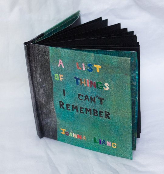
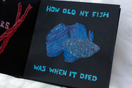
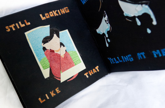
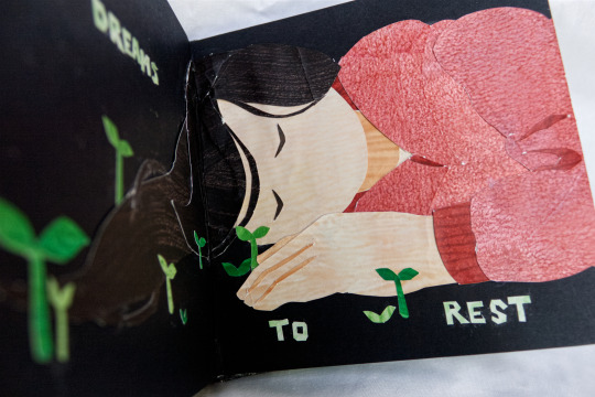
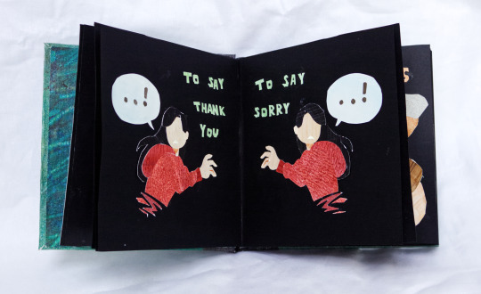
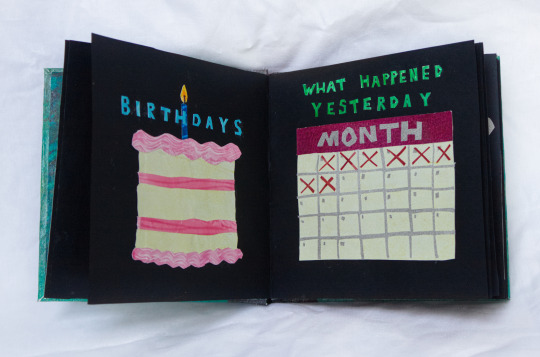
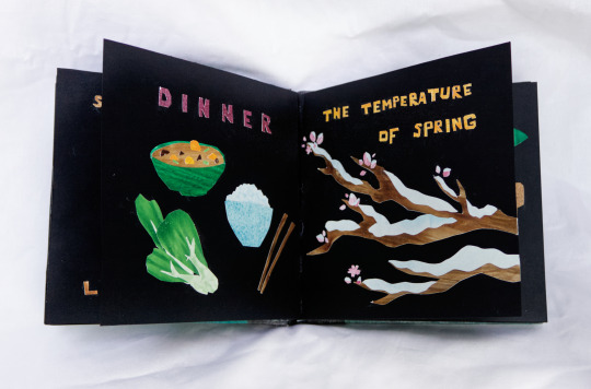
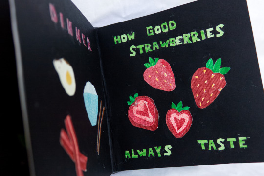
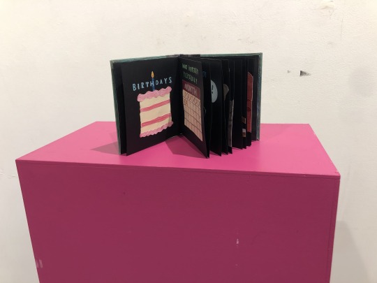
A LIST OF THINGS I CAN’T REMEMBER (2024) 6.5 x 6.4 in 23 page case bound book and handmade pastepaper. Papercut art and poetry
The “list” includes things of the mundane, humorous, and heavy. At its core, this book asks what exactly is worth trying to hold onto in your memory. Whether because of its trivial or traumatizing nature, is it ever better to forget?
---
not sure if this is called papercut art? I'd been referring to it as 'paper art' in my mind but googling that leads to a lot of like, folded/oragami stuff too
final project for my praxis class in 3rd year! Got a good reception towards it during crit which was lovely C:
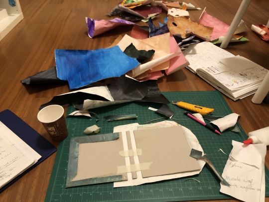
god this project took fucking FOREVER, I'm glad I did it because it turned out almost exactly how I pictured it but my goodness gracious AUGH it was a lil rough. I'd be working on this thing literally ALL day from morning till Very Late into the night for SEVERAL days straight to meet deadline it was kinda crazy. My floor was covered in a fuck ton of pastepaper I'd made and my finger was getting callused from holding the x-acto knife so frequently orz 23 pages of papercut images AND papercut words?? whhooweee
Watching a full playthrough of in stars in time is what kept me company during those long long days and nights haha, tis a very potent memory I have now (which now that the whole project-making ordeal is over is a p fun memory lol; isat is v v good)
some thoughts about this piece I jotted down in preparation for crit day:
A list of things I can’t remember my intention was to gather a list of mundane unimportant things as well as more like sad or poetically troubling things to disrupt it throughout. At the end it says “if I want to remember these things” because that is also something that I don’t remember, and it’s kind of the crux of the whole piece as this book at its core is about what kind of things are worth trying to hold into in your memory.
That last page had black text because it’s the hardest to remember or think about, and as such it’s meant to be hard to read/make out clearly.
The wavy black on the spine area is supposed to be like an encroaching darkness of forgetting lol
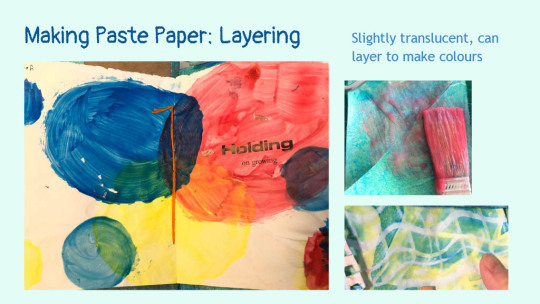
used pastepaper to make paper art trying to take advantage of the textures and colours I can make with pastepaper
+crit day installation! There were no white plinths left just this bright pink one?? But I was like. Actually that might fit the vibe lol and I think it did C: made the whole piece pop
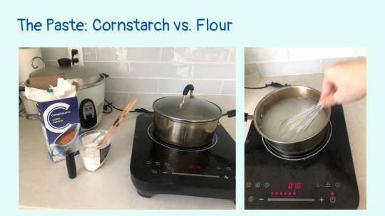
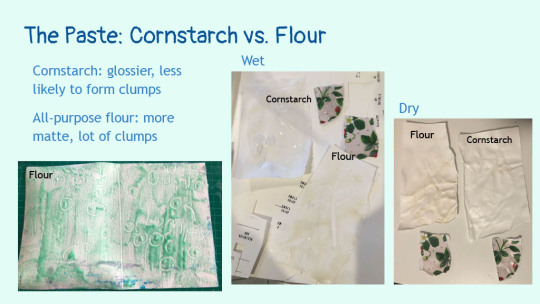
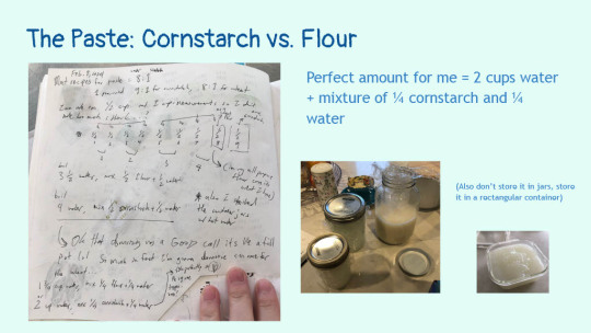
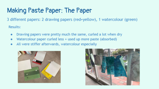
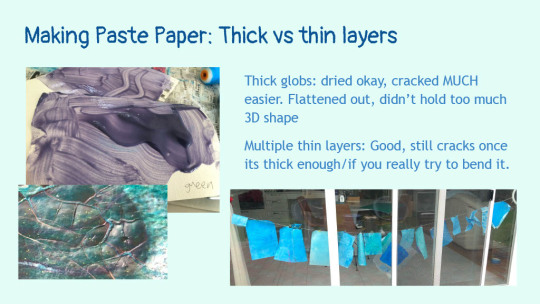
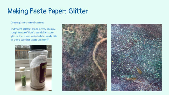
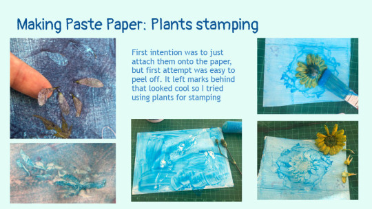
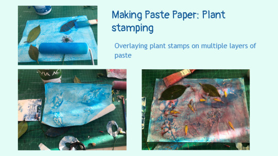
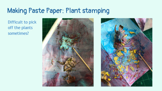
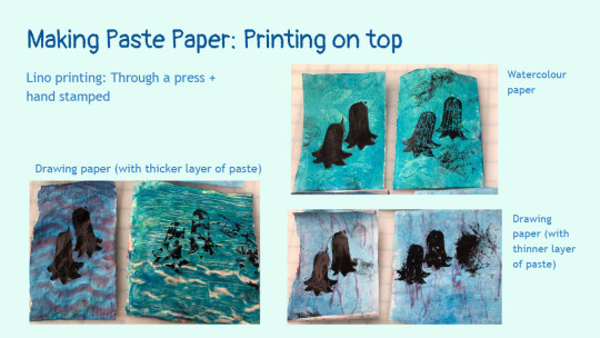
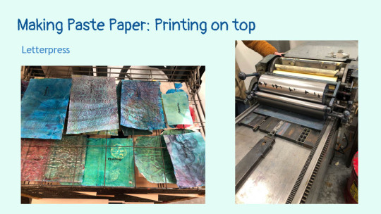
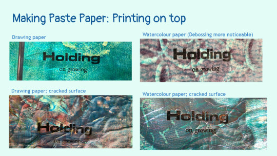
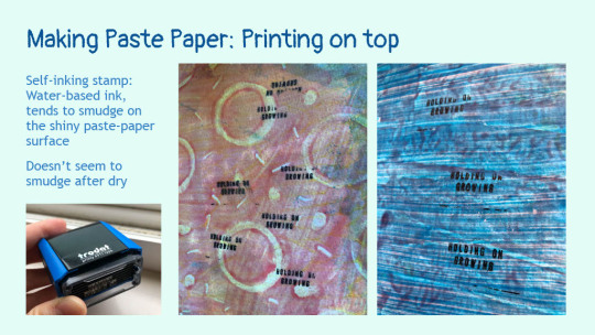
For the assignment requirements we had to choose something from one of the special collections we visited, and I chose Janet Kellett's beautiful Qualicum Blue. And was also sooo grateful that googling it brought me to a whole website of theirs that had info on its creation. It's what got me into the rabbit hole of pastepaper and hoo boy! making it was a wholleee process haha; here's the slides I made for when we had to present our material research:
I did a WHOLE bunch of experiments; I really wanted to know what I could and could not do with pastepaper and I'm glad I pushed the material so much in the amount of time we had to complete this part of the project. My prof was surprised at how many experiments I did haha
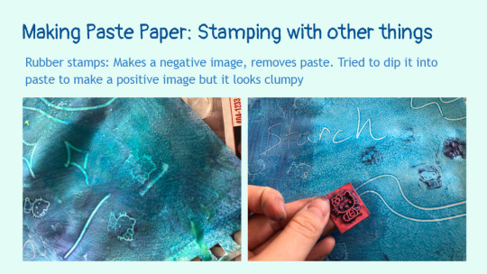
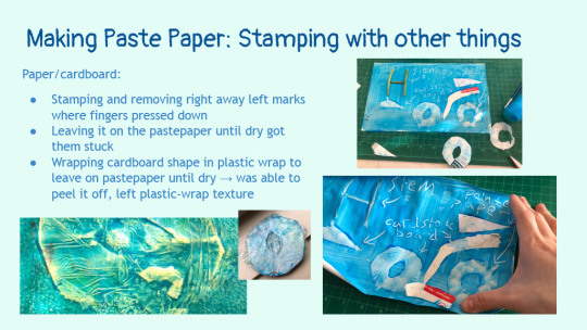
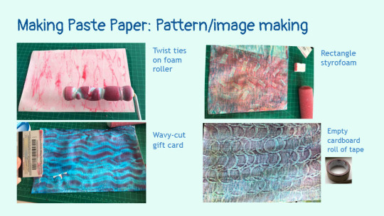
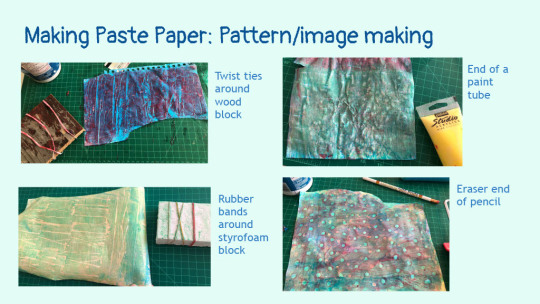
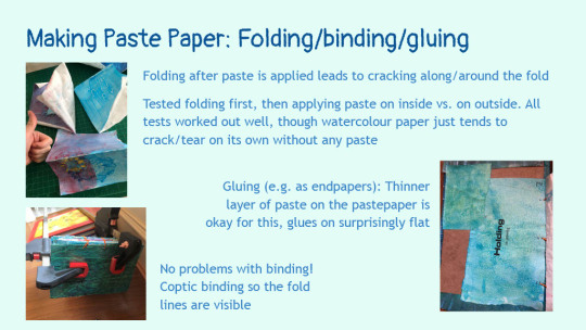
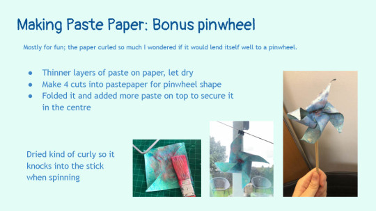
+fun fact: I asked my prof if they could recommend me a place to source black paper for my book, and they sent me to what looked like such a weird sketchy on the edge of town looking place lmao But it was all good they were like a mass producer of paper or smth and they had a lil storefront? in their warehouse selling what I assume were leftover batches in smaller quantities; that was p fun and! Now I know where I can find paper
Also I got some remarks that the papercut art reminded people of The Very Hungry Caterpillar C:
#featured#a list of things I can't remember#process#2024#books#artist books#paper art#poetry#uni#papercut art#paste paper#pastepaper#wip
23 notes
·
View notes
Text
#VoicesFromTheStacks

Image: Self Portrait with cranes from Hope Project (Photo credit: Clarissa Sligh)
The Artist Books of Clarissa Sligh
In honor of Black History Month, we are highlighting artist, writer, and lecturer Clarissa Sligh. Born in Washington, D.C. and raised in Virginia, Sligh is often inspired by cultural, historical, and political events that intersect with moments in her life. Sligh considers these interactions, or “collisions,” between moments in history and events in one’s life to be significant and transformative. One such example of this is detailed in Sligh’s work “It Wasn’t Little Rock,” which discusses desegregation in public schools during the 1960s, a personal topic for Sligh, who was the lead plaintiff at the age of 15 in a school desegregation case.
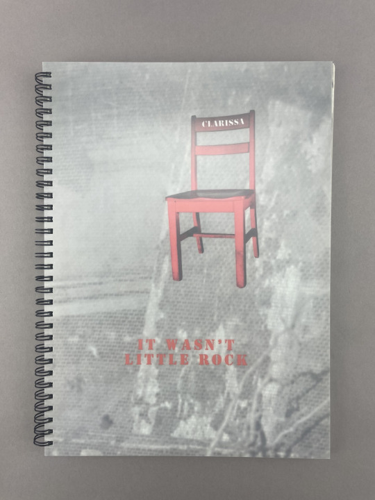
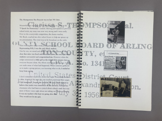
Images: Cover and inside page of "It Wasn't Little Rock" (2005)
A notable example of Sligh’s work and its reference to her personal experiences is her 1988 artist's book titled “What’s Happening with Momma?” Here, the artist engages users to “walk” through rooms of her childhood home, following the steps of accordion-folded strips of paper filled with text detailing memories of her sister’s birth in the home. This is Sligh’s first artist’s book, made through the Women’s Studio Workshop in New York.

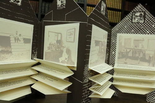
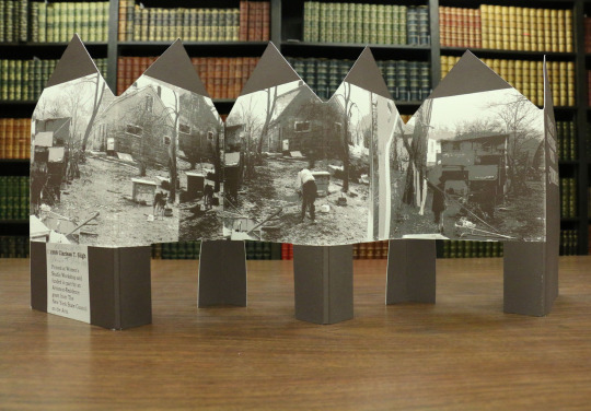
Images: Cover and inside page of "What's Happening with Momma" (1988)
Sligh earned a BS in Mathematics from Hampton Institute in Virginia, a BFA and an MFA in visual arts from Howard University, and an MBA from the University of Pennsylvania. Earlier in her career she had worked at NASA in the manned space flight program, eventually leaving to focus on working as an artist. Her works have been featured all over the world, notably at the Museum of Modern Art in New York, the National Museum of African American History and Culture, and more. To learn more about Sligh and her works, visit the artist’s website.
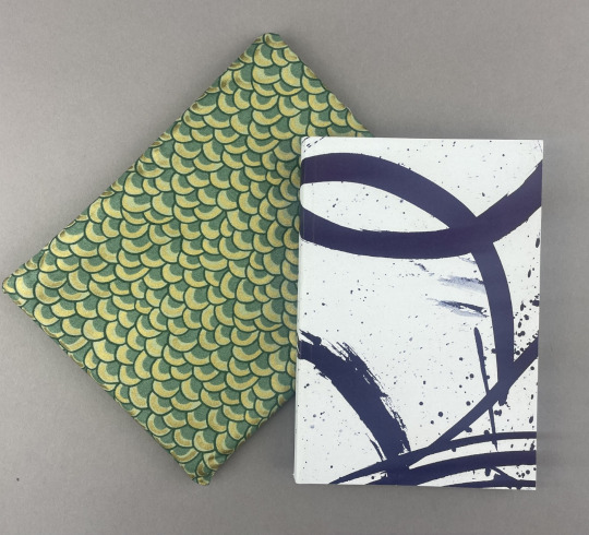

Images: Cloth enclosure, cover and inside page of "Voyage(r): A Tourist Map to Japan" (2000)
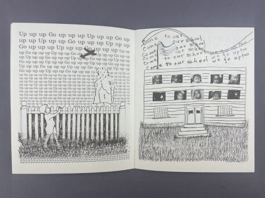

Images: Left: Inside page of "Reading Dick and Jane with Me" (1989). Right: Cover and origami crane for "Transforming Hate" (2016).
– Kaylee S., Special Collections Olson Graduate Assistant
#uiowa#libraries#special collections#uiowaspecialcollections#rare books#voicesfromthestacks#artist books#Clarissa Sligh#black history month
70 notes
·
View notes
Text


Join us at Typographics 2024 in NYC this weekend! Draw Down will be participating in the book fair, which is free and open to the public!
Friday 6/14 through Sunday 6/16, 10AM-5PM every day at 41 Cooper Square (The Cooper Union) in New York City. The fair is between E 6th St & E 7th St (just across the street from the Great Hall where the main Typographics conference will be taking place) We'll be with friends @pioneerworks @letterformarchive @ksmallgallery @leftbankbooks @lubalincenter + more! Ellen Lupton will be on site on Saturday signing her latest book! The fair is right around the corner from Printed Matter's East Village Zine Fair (also free and open to the public), so you can have a full day of zines, books, and typography!
#draw down books#book fair#artist books#type specimens#Typographics#Typographics 2024#Typographics Book Fair#graphic design books#typography books
20 notes
·
View notes
Text

SUMMER COLLAGE READING
The Awakening
Set in New Orleans, Kate Chopin’s 1899 novel, The Awakening, touches on 19th century feminism, identity, and societal themes. Under the art direction and creative leadership of Nancy Bernardo and Christopher Kurts, a dozen international collage artists collaborated to illustrate the book. Working as a group, the artists analyzed the story, discussed themes, uncovered symbols, and asked questions to visually interpret this seminal feminist text for a 21st century audience. Read More
*****************************
Kolaj Magazine, a full color, print magazine, exists to show how the world of collage is rich, layered, and thick with complexity. By remixing history and culture, collage artists forge new thinking. To understand collage is to reshape one's thinking of art history and redefine the canon of visual culture that informs the present.
SUBSCRIBE | CURRENT ISSUE | GET A COPY
SIGN UP TO GET EMAILS
#collage#collage art#collage artist#artist#artists#art history#art project#art show#art books#art education#artistic#contemporary art#artwork#artist residency#artist books#contemporary artist#artist portfolio#artist book#artist profile#artist collective
16 notes
·
View notes
Text

AAP Archive Artist Publications the independent archive project by Hubert Kretschmer (since 1980) https://artistbooks.de/blog/about-the-archive/
5 notes
·
View notes
Text

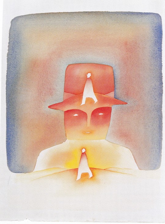
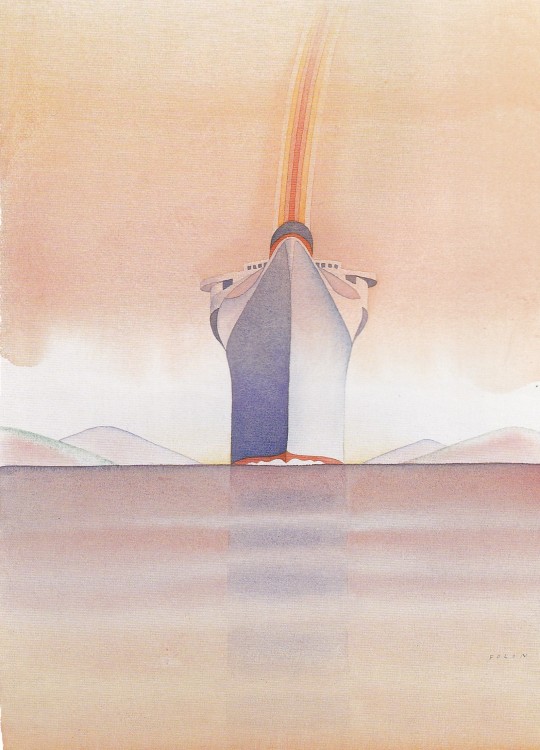

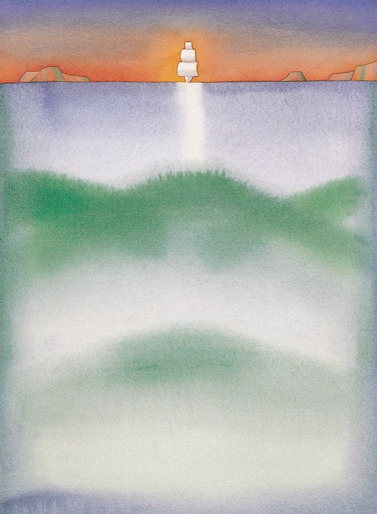


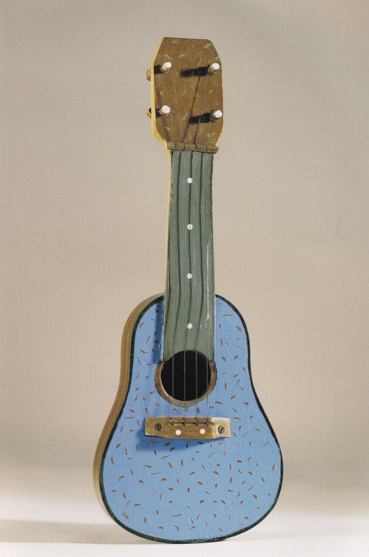
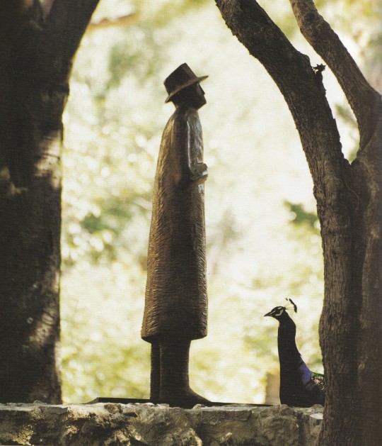


Folon Firenze
Skira, Milano 2005, 270 pagine, 24x30cm, ISBN 9788876243745
a cura di Marilena Pasquali
euro 39,00
email if you want to buy [email protected]
Il catalogo dell’esposizione dedicata all’artista belga presenta circa duecentocinquanta opere comprendenti celebri acquerelli, sculture e serigrafie.
Pubblicata in occasione della più importante mostra antologica mai realizzata in Italia, dedicata all’artista belga Jean-Michel Folon, una completa e aggiornata monografia su questo indiscusso protagonista della scena internazionale dalla straordinaria intensità espressiva e poetica.
Curato da Marilena Pasquali, il volume (catalogo dell’esposizione fiorentina realizzata a quindici anni dalla prima mostra pittorica di Folon al Museo Marino Marini) presenta circa duecentocinquanta opere comprendenti i celebri acquerelli, piccoli objets ricchi di fantasia e di ironia, e, soprattutto, le sculture – monumentali o di dimensioni più ridotte – che costituiscono una vera e propria rivelazione. L’artista noto in tutto il mondo per i suoi acquerelli e per la sua attività grafica, a partire dagli anni Novanta (dalla mostra al Metropolitan di New York, tappa significativa del suo percorso artistico) si è dedicato alla scultura con esiti di altissimo livello pienamente riconosciuti dalla critica e dal pubblico internazionale. A differenza del senso di equilibrio e della luce che emanano dalla sua produzione pittorica, nella scultura emerge il lato oscuro dell’artista, la leggerezza lascia il posto all’inquietudine, l’armonia si tinge dei colori del timore per l’esistenza. In questa trasformazione vengono alla superficie le sue radici nordiche. Ma nelle sculture, tuttavia, rimane quella tensione di Folon alla luce, all’aria, allo spazio. Come egli stesso osserva:” Toutes mes sculptures régardent le ciel, c’est une façon de mettre le ciel dans la sculpture”. La monografia propone un percorso evocativo e tematico in cui trovano spazio i soggetti preferiti da Folon – il Volo, la Mano, il Viaggio, lo Sguardo, la Testa, il Totem, gli Uccelli – illustrati attraverso acquerelli, sculture, objects, serigrafie e affiches. Folon Firenze – titolo che richiama il rapporto di Folon con Firenze e la Toscana, rapporto di elezione iniziato molto tempo fa, già negli anni Cinquanta quando l’artista appena ventenne girava per la regione in autostop – comprende i testi di Federico Fellini, Jean-Michel Folon, Marilena Pasquali, Ray Bradbury, Emilio Tadini, il catalogo degli acquerelli e delle sculture, la biografia dell’artista (a cura di Federica Filippi Gabardi) e i riferimenti bibliografici.
Firenze, Forte di Belvedere e Sala d’Arme di Palazzo Vecchio 13 maggio – 18 settembre 2005
30/04/24
#Folon#mostra Firenze 2005#250 opere#artist books#acquerelli#il Volo#la Mano#il Viaggio#lo Sguardo#la testa#il Totem#gli Uccelli#artnexhibition catalogue#fashionbooksmilano
12 notes
·
View notes
Video
Artist's Book : Flax Field/Paper/Linen Tablecloth by Russell Moreton Via Flickr: russellmoreton.blogspot.com/
#Artist books#russell moreton#book works#art#paper#black and white#photographs#landscapes#local materials#journal#journeys#process#movements#visual fine art#spatial practice#research creation#ecology of experience#useless flickr uploader#flickr
3 notes
·
View notes
Text
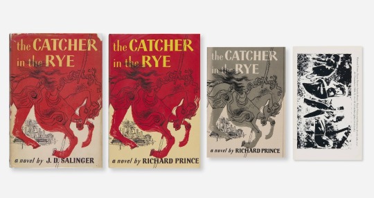
Four books from the collection of the late artist Jason Polan are being sold together as the The Catcher in the Rye Collection, including the Catcher; Richard Prince's perfect repetition of Catcher; Eric Doeringer's bootleg edition of Prince's version; and my book, The Deposition of Richard Prince, which is related because it is about the copyright infringement trial Prince was involved in at the moment he decided to put out his own edition of the most copyrighted book of the 20th century. This Deposition edition from Bookhorse in Zurich is the easiest to read and the hardest to find of my books.
#richard prince#jd salinger#eric doeringer#the deposition of richard prince#appropriation#the catcher in the rye a novel by richard prince#artist books#jason polan rip
3 notes
·
View notes
Text

Mattias Gunnarsson Studio work 2020 - 2024
Instagram: mattiasgunnarsson
#art#artist#artwork#artjournal#artist books#art space#Art Book#collage#drawing#colors#acrylics#painting#ink#graphite#studio#studio work#studio books#zine#zines#art zines
198 notes
·
View notes
Text


Made another one of these envelope artist books.
74 notes
·
View notes
Text


Last Name (2023) 4.5 x 7” 25 page saddle-stitched book. 4-colour risograph cover, laser printed pages. Digital illustration and poetry.
documentation photos above taken by Ashley Cheng (@/0922s9 on instagram) and edited by me.
Last name is an illustrated poem about identity and not knowing what you inherit from blood. The zine centres around a multi-linguistic metaphor, where the disconnect of what "last name" means in Chinese and English represents the disconnect in culture, language, and family. (In Chinese, the surname comes first.)
---
Whoo man. One of the pieces that weighs heavier in my heart than most cause the subject is more of a currently ongoing thing. I always really liked this poem though its one of my favourites despite its subject matter, and I was glad to turn it into a visual art project. twas my final project for a 3rd year illustration class
Might upload all the digital illustrations of the pages someday but I want to make some new editions of the zine first! Tis another piece I'd like to sell n get out there in the world; I have like 18 copies or smth right now but to be so honest most of them are pretty fucked up lmao I did not do a great job binding these orz
Really love how the cover turned out! I was very specific with my paper choice; there's this beautiful paper (I think its name was Stardust White) with lil coloured specks in it that I bought from my school's riso studio specifically for this project and I adoreee how it turned out. My first time doing a 4 colour riso print too! Still feels very ambitious to me haha
A bit of linguistic context (yep I was playin around with the tension/differences between Chinese and English language; how v cool of me):
Chinese names have the surname come first; so while my English name is Joanna Liang, my Chinese name is Liang Shu Ran. So when I say 'last name' in English it refers to my surname, But theres a disconnect/inconsistency when literally translated, because the surname does not come last in Chinese.
This disconnect in what "last name" means serves as the conceptual centrepoint in this zine, representing the disconnect in culture, language, and family. In fact, in the title page, I translate the zine's title to Chinese (the 5 characters on the right of the phone):

Which, to give an accurate connotative translation back to English, would mean something like "final name" or "the very last name". (fitting again, considering I don't want children but that's a whoooooolleee other fuckin can of worms lmao)
In that title page, to the left of the phone is my Chinese name. But I've formatted it the English way, with the surname last: "Shu Ran Liang". And at the bottom, my English name formatted the Chinese way: Liang Joanna, with the title "translated" underneath as "first name" (so it still refers to my surname in this reversed formatting).
It's all kinda convoluted and complicated, which was intentional because that confusing and difficult to navigate path to understanding is precisely my experience with this particular aspect of my life.
+bonus here's this satisfying clean cut stack of pages ooooo *chefs kiss* Big stack cutter my beloved I'm gonna miss it when I leave uni it just so fun to use

+sweet things: when I was showing my mock-up with the roughs in class, one of my classmates said "that's beautiful" and pointed to the spread on page 21-22, with the fireworks exploding out of the panel frames. That was nice, cause I really like that spread too
#process#comics#books#zines#digital#illustration#poetry#2023#last name#riso#risograph#uni#print#artist books#chinese#language#featured#wip#sweet
8 notes
·
View notes
Text
#MiniatureMonday #TinyTuesday!
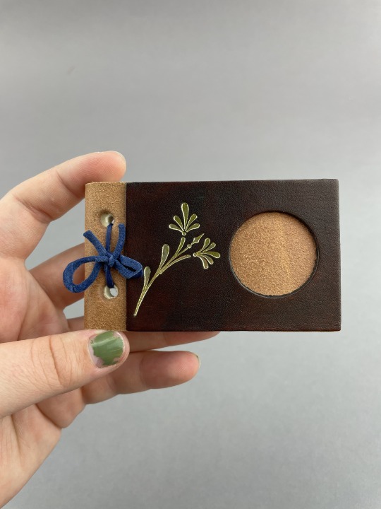
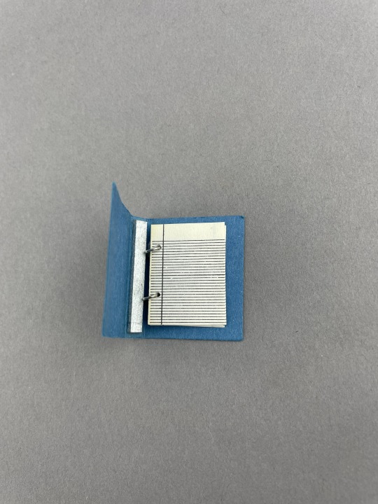
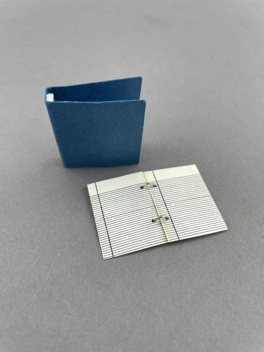
School Supplies
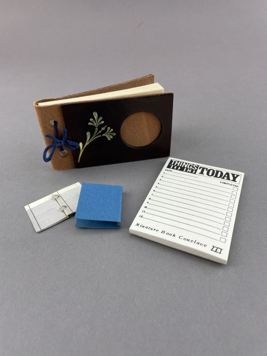
I think we all can agree that one of the best things about going back to school is new supplies! Whether it be notebooks, planners, pencils or pens, there is nothing quite like finding the perfect new things to carry you through the school year. Here are some minis that are perfect for the start of the new school year.
The first miniature is five leaves of blank notebook paper attached to metal rings, perfectly sized to fit inside the blank blue binder. The creator of this binder is not identified, but I like to think they made this little binder to send their mouse friend off to school with.
Next is a beautiful handmade notebook bound in soft brown leather with a gilt flower design stamped into the front cover. With lovely blank cream paper inside, this notebook is the perfect handheld size to carry around and jot down thoughts as they arise.
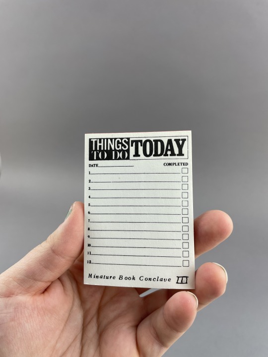
Originally made for the third Miniature Book Society Conclave held in LA in 1985, our third mini is a daily planner. With “Things to do today” printed largely at the top and a numbered checklist on the page, this would be an excellent way to keep your day organized!
-Kaylee S., Olson Graduate Assistant
Charlotte Smith Miniature Collection
TS1250 .T45 1985
TS1250 .M56
TS1250 .B53 1900z
#uiowa#miniaturemonday#history#library#special collections#miniature books#UiowaSpecialCollections#notebook#planner#artist books
74 notes
·
View notes
Text


Transparent Desires
Random Passions is a mesmerizing pas de deux crafted by Chicago book binder and book artist Karen Hanmer. Created in 2008 in Glenview, Illinois, it is an artist’s book comprised of laser prints on vellum paper, printed in an edition of one hundred. The enticing red velvet book cover whispers hints of romance hidden within. As the artist herself describes: “Couples from romance novel covers traced on translucent paper layer together and multiple new combinations emerge.”
This piece celebrates the essence of romance without using any words. It effectively conjures tales of passion, heartache, and love conquering all. The distinguished American book artist Barbara Tetenbaum observes:
Karen Hanmer exploits both materials . . . and format . . . to create her orgy of embracing figures. . . . It thrills me to think of the hot action these couples get being so closely bound between the book’s red covers!
Sizzle!
View more posts with books by Karen Hanmer.
View other posts with artists books.
-Melissa, Special Collections Graduate Intern
#random passions#karen hanmer#artist books#romance#passion#heartache#love conquers all#transparent#vellum#red velvet#romance novels#book binding
26 notes
·
View notes