my name is Joanna (she/her)! I like making artist booksthis blog is an attempt at a holistic catalogue of all my art + sharing my process/thoughts on it🌱 Portfolio Website 🌱 📚 Buy my zines! 📚
Don't wanna be here? Send us removal request.
Text


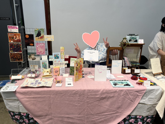
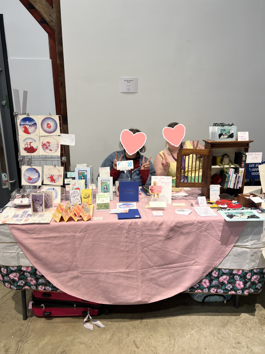
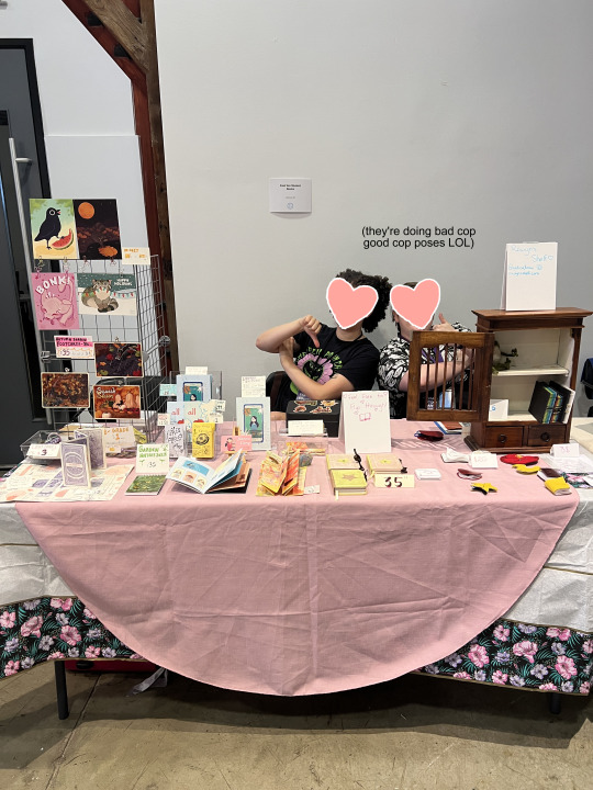

I was at Vancouver Art Book Fair the last 3 days!! tabling with three other ppl i knew from a bookmaking class at ECU (yaay we love saving money on table fees LOL)
sooo nice to be at an event Specifically for bookmakers and book artists :'''] (i love u raincity comicon n other fanart/illustration type artist alleys but ouhhh it's tasty tasty stuff being a book artist at VABF!!)
I actually only rlly met n talked with my tablemates AT this event lol; esp cause the class we met in I was auditing (sort of Ah essentially I wasn't there all the time lol). Was lovely to meet them n get to know them But it was v funny when ppl came up being like 'ooh is "East Van Student Books" like a collective wht do u do' n we're like oh um no we're just uhh all from ECU and we got a table together to save money n we all were in the same class once LOL
my tablemates didn't bring as many items as me + had varying availability due to life things so we had more tablemates in the 2nd/3rd days! they also all sold out of almost all their stuff!! so on the last day last few hours of the fair I had the whole table to myself haha v nice
That meant we had a lotta reorganizing of our table throughout the fair; kinda fun we had a v dynamic table it twas changing forms throughout the day ~
to talk ~businessy~ for a sec: For a 3 day event, I didn't earn that much more than I did at Raincity comic con which is Very interesting insight to me.. My two main theories are that 1. my books stood out much more as different/unique at the majority illustration/prints being sold at raincity, and 2. (which was the opinion of our table neighbour who has been doing this for longer) that multi-day events don't sell as well per day as 1-day events do as there's less feeling of urgency? they said that lotta ppl were like 'i'll come back tmr!' n then most don't haha fair enough
o man the last like 2-3 hours of the fair idk if it was cause i had the whole table so my stuff was able to be more visible/spread out more or if it was just ppl were starting to get like "aaa its almost closing i gotta hurry n look at everything!!" But it got BUSY. it was 5pm before i knew it goddamn!! last hours of fair i've noticed from my time helping my mentor do this last year is i guess the time where fellow book artists start Talkin to each other and connecting; i got suuch helpful advice and got pulled into much longer conversations in that last bit of time haha AH!! i have like 5 things/ppl i need to follow up on now orz a blessing and a curse... it feels like getting homework after class LMAO i wanna nappp
#artist alley#irl#VABF#event#2025#Vancouver Art Book Fair#i know i did not promote VABF 2025 here or that much on my insta at all orz#i'd gotten back from a 3 week long trip in asia only like a week ago so i was waawawaaaghh#sisyphus curse smh i truly every single time im busy im like 'after this big busy thing i will have a rest.' n then its like 'shit#i actually just got more new work after my big busy thing that i have to do. i will rest after this for sures'#like girl. where's ur pattern recognition#omg wait one of my tablemates asked how old i was n i was like uhhhhhhhh (i had to think abt it) n they were like . 'girl.' LMAO#so fuckin funny to me; ppls reactions to me forgetting how old i am are either 'girl same' or 'girl what'#and both reactions are the fuckin BEST to me why am i so delighted by it#ANYWAYS#back to workk
2 notes
·
View notes
Text
STARTING TOMORROW

Scientists in weather and climate are live streaming for 100 hours to make their case to the American public.
They are live streaming, but engagement is necessary for it to work. SHARE THIS WITH PEOPLE, RECORD THE STREAM, POST CLIPS OF IT THAT ARE FUNNY, if you can tune in, PLEASE DO!

This is something that has to be heard by as many people as possible. Put it on in the background! See if you can get other people to watch it! Do whatever you can do support those who are trying to be supported! Anything and everything helps!
TUNE IN HERE
article I posted screenshots of here
#its live right now!! and will be until june 1!!#if youve seen my art on this blog you know i love the earth#you can support just by engaging with this! imma give it a like and keep it running on mute in the bg
71K notes
·
View notes
Text


Solid first time tabling!!! Had the christening of being a table vendor via the square reader not working during my first sale LOL
Also you can see me for a split second here on global news at 0:49 hehe

I’ll be tabling at Raincity Comicon NEXT SATURDAY!! May 24, 10 - 5pm at the Roundhouse Community Centre in Vancouver! You can find me at table F7 selling my zines, pins, and postcard prints 🎉 Come check out the MANY cool artists and panels!
23 notes
·
View notes
Text

I’ll be tabling at Raincity Comicon NEXT SATURDAY!! May 24, 10 - 5pm at the Roundhouse Community Centre in Vancouver! You can find me at table F7 selling my zines, pins, and postcard prints 🎉 Come check out the MANY cool artists and panels!
23 notes
·
View notes
Text

I’ll be tabling at Raincity Comicon NEXT SATURDAY!! May 24, 10 - 5pm at the Roundhouse Community Centre in Vancouver! You can find me at table F7 selling my zines, pins, and postcard prints 🎉 Come check out the MANY cool artists and panels!
23 notes
·
View notes
Text

I’ll be tabling at Raincity Comicon NEXT SATURDAY!! May 24, 10 - 5pm at the Roundhouse Community Centre in Vancouver! You can find me at table F7 selling my zines, pins, and postcard prints 🎉 Come check out the MANY cool artists and panels!
23 notes
·
View notes
Text

I’ll be tabling at Raincity Comicon NEXT SATURDAY!! May 24, 10 - 5pm at the Roundhouse Community Centre in Vancouver! You can find me at table F7 selling my zines, pins, and postcard prints 🎉 Come check out the MANY cool artists and panels!
23 notes
·
View notes
Text

I’ll be tabling at Raincity Comicon NEXT SATURDAY!! May 24, 10 - 5pm at the Roundhouse Community Centre in Vancouver! You can find me at table F7 selling my zines, pins, and postcard prints 🎉 Come check out the MANY cool artists and panels!
#artist alley#raincity comicon#promo#(staring at the mirror repeating to myself) marketing is necessary as an artist. marketing is necessary as an artist#auourgh for some reason these promo type posts take so much energy out of me haha#like they arguably take less time than say an illustration but. i dunno mans#can't yap like this in the tags on instagram glad i have my yap zone here on tumblr
23 notes
·
View notes
Note
thank you for your delightful tags on my posts!!! you do not need to apologize for spam reblogging it made me v happy to read your comments :'''] thank u!!
OMG OF COURSE!!!!!!!! IM GLAD :D <33333 I've been a fan of your warrior cats stuff since like 2021 (hollyleaf sin triangle amv singlehandedly got me into sidney gish that video is phenomenallllll but anyways) and I was so excited to see your other projects they're so wonderful!!!! I've been wanting to make more art recently esp about the natural world and human perceptions of/relations to it and idk your work is just super inspiring to me :') I also really love art about gardening so that's another reason your stuff really struck a chord for me I think. I hope you have such a lovely day and take care of yourself!!!!! 🌱🌱🌱🌱🌱🌻🌻🌻🌻🌻🌻
#omg ur a peppermint-moss watcher too !!!?? 🥺🥺awaaaaawuagh#frames this on my wall frfr....#watch me kickin my feet happily over this for the rest of time hehe👉👈#ask#minecraftpissblock#reblog#sweet
4 notes
·
View notes
Text

I MADE A LINKTREEE YOU CAN BUY MY ZINES!
Currently these are all in-person Vancouver locations BUT once I get my zines ready for the Slice of Life giftshop I think they do shipping as well?? I'll keep updating the linktree as more options become available C:
Last Name and Here; (is the only place) are available at all those places, But Raincity Comicon+VABF will also have smaller zines and postcards/pins!
8 notes
·
View notes
Text
My grad show is today!! The online show is liiveeee check it out!!
#there are good things yet to bury#grad show#here; (is the only place)#sunlight is moonlight#last name#i sight freeze#promo
13 notes
·
View notes
Text


Here; (is the only place) (2025) 2 x 10.5” (closed), 16.5 x 10.5” (fully open), 1.375 x 16.5” (pop-out accordion segment) 16 page accordion-fold book (+23 page pop-out accordion). Risograph-printed, ink and coloured pencil illustrations and poetry.
Here; (is the only place) features riso-printed ink illustrations and poems. The book connects childhood grief with climate grief through their shared experience of losing home and being swept into a future that threatens unbelonging. Depending on how the book is held, the openings cut into the pages become doorways to frame the past (pages) or only empty space— regardless, something has disappeared.
---
My last crit at ECU was for this piece!! im graduating this May my god it still hasn't really sunken in yet
I got a lot of positive feedback for this work and my live reading of it and the colours turned out even better than I could’ve hoped :']
I’ve applied to a few zine fairs including VABF, so hopefully I’ll be able to sell these there! Otherwise I’ll look into maybe an online store or smth like that (spooky but exciting)
Oughh I don't know about new favourite (There Are Good Things Yet To Bury still pops off to me lol) BUT I think it's definitely been one of my favs to work on!! in terms of process n all that C: BECAUSE!! I got to try out my new dip pens and finally use those acrylic inks (that i got in 1st year cause they were on the class materials list and then we never fuckin used em. rip but hey now here we are full circle) and do some traditional illustration!!! New territory for me and it was really fun!!
I usually stick with digital illustration for all my finished illustration work (vs my traditional sketchbook is only rlly for studies or sketches/thumbnails) but oughhh my god this might change me. this might do it LOL
Maquettes / Ideation phase
I knew I wanted to do more cool stuff with windows after TAGTYTB + at the time I recently had a dream about my childhood home again. It's something I noticed a long time ago, and all poetic metaphor aside I do literally just. only really dream about my childhood house lol, or rather do sometimes dream of other imaginary places but I NEVER dream of the current house I live in (maybe like 1-2 times that I can remember in the 8+ years I've been living here). I also wanted to do a long skinny accordion fold guy. No particular reason than it was an idea that kept sticking to me lol; + I hadn't done anything with accordion fold+windows and AH there's so much potential there because of how every single page overlaps each other with that folding method!!!
So! That was the basis for my concept, and I started to fold n scribble on scrap paper to make these maquettes. I also started numbering them which was SO helpful thank god because I think I ended up with TWENTY OR MORE maquettes by the end wagh!! But oh my god these were so helpful to make so many of I really hit on something with this one below, 1 big rectangle and 2 circle windows... It wasn't even intentional, I just cut them into the paper and then started drawing/writing, and once I reached the flipside realized that you could see the words "this is my home" on one page, above the drawing of the house which was on ANOTHER page. WHAT!! literally so cool I'm so happy that happened it literally dazzled me:

Midterm / printed maquettes aka poem writing in affinity publisher
In my final crit, one of my profs asked if 'this is what I saw in my head the whole time' in a 'wow I can't believe it looks this good congrats' kind of way LOL which is like so oof but so fair because this is what my midterm presentation looked like LMAO:

I have a LOT of analysis-type notes I wrote down in my google doc so I can remember in the future all my intentions with the poems and its a pretty LONG list. One of the main ones is how the semicolon ; operates as the symbol of being inbetween a continuation, barrier, threshold, stop, doorway... ALSO it kinda looks like a lock+door handle (!!)
Also this might've been before my midterm, but I went back to my childhood home area and ough. I'm glad I did cause I got inspiration for the illustration imagery when I saw how big the trees had gotten. I literally said out loud "oh!" aough my god. I don't know I just hadn't expected it... I think I had even noticed it a few years ago when I visited but forgot and I just. augh. Included the experience in one of the poems in this book "I looked for my grief / I looked / for disappointment [...] and still i was / startled / by the / bigness of the / trees [...] it's just such a relief / to know that something grew / up with me"

ILLUSTRATION TIME BABEY
this whole process was FULL of stress but like GOOD stress. I was on my fuckin grind dude All my text/poems/windows layout was all formatted in affinity publisher, and then I printed that out (at staples, I was gonna use the library but they couldn't print tabloid size paper rip) and just pencil sketched right on those. I COULD NOT HAVE DONE THIS DIGITALLY I DON'T THINK. Because it involved cutting out the windows so I could PHYSICALLY take the paper and see where the images would line up on other side. which was fun as hell

Then I took to staples again and made photocopies (so I didn't fuck up the original pencil sketch), and then traced the tabloid size + windows onto my nice paper. Also look at my setup !! We have this glass table in my house, and I had the kickass idea to put a bright light underneath as a DIY lightbox yippee!! It is however a very low table and while I had a lil stool it prob wasn't great for my back or legs lol (sidenote why are lightboxes so expensive its just a box with a light in it man)


inking time! dip pens ouh my goodness... Still trying to get used to them but they give such nice results.. I'm surprised at how much I like how the illustrations turned out tbh but I am really enjoying this kind of weaving, vignette/snapshot/overlapping almost collagey kind of vibe it has, especially with the text. Similar to the poems I also have a list of all my illustration symbolism/analysis kind of thoughts. it's a shorter list, but one of the main things on there is how I kinda in the moment ended up creating these visual rhymes: The door hinge = rollerskate wheels = moth (plucked wing) = pine cone scale; representing how things follow you from past to present in different forms, things changing but into what? I did separate layers for lines and colour, main book and pop-out accordion. The colours were fun because the acrylic inks came with a dropper and I'd drip bits of ink from real high up to get a lovely splatter !! and also used a straw to blow wet ink around all around a good time I used a sheet of plastic to protect the paper with the lineart on it from the wet ink/water going onto the colours layer. The lightbox was good but defo less effective with the colours layer because the water would warp the paper and lift it away from the table surface (so I couldn't see the lines below rip) Oh my gosh and I used pencil crayons for more texture!! forgot about that lol but it really really helped, and I did some frottage of my childhood house's key+traced its outline; I really wanted the key to be as "real"/"connected to reality" as possible (+yes once again that is a truth in the poems, I do still have it because before it was sold someone broke in and completely destroyed the door handle/lock. we assume with a crowbar.)


also my cat would sit behind me on the couch while I worked sweet creature... (ouh and I know there's Himi Gouache in that one image but I didn't use gouache lol I was considering it but didn't) I worked on the illustration every day of reading week from morning to night to get it done in time for risograph printing hoowheeee


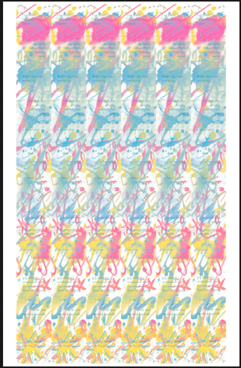
Scanning and Prepping for Risograph Printing
I scanned my lineart and colours with my school's fancy scanner (which I'm gonna miss once i graduate augh it scans soo nicely staples scanners dont do shit for detailed scans)
I knew how to do it in photoshop already, but Managed to figure out how to split my colours so I had files for just blue, just yellow, etc. Ended up with SO MANY FILES!! i love you risograph printer even if I had to prep and print 16 files and redo 2 masters lol

I checked how all the colours looked digitally but you really can't exactly predict how risograph will look until you print it, and I was trying to extrapolate and imagine how the prints would look based on these digital mockups lol.
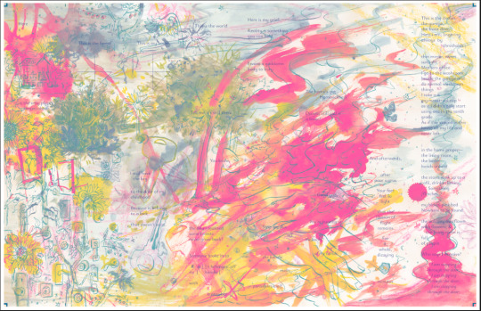
Lucky for me, they actually turned out BETTER and brighter than I was imagining!! Except for pop-out accordion side A, which looked wayy too busy and forest-green for my liking lol. So I had to redo the master and ended up doing NO blue colours, only blue lines which I think turned out ooo yummy tasty speaking of redoing masters, I also had to re-do the teal in the main book too because it was WAY darker than I was expecting and making the text too hard to read waaagh but I'm so very glad I fixed it because it made a world of difference in legibility. In total ended having to buy 4 new masters to redo orz


Trimming folding binding
This was kinda irritating lol .. I didn't realize I guess the stack cutter in the comd studio cuts at a bit of an angle or smth cause the size was slightly smaller than I wanted. which is a problem because I need my windows and folds to line up as precisely as possible and the slight size difference kinda fucked that up :(( but ah well. it doesn't get super in the way of experiencing the work but I'm a little miffed lol I also had to score and trim all the pop-out accordions one by one waghhhh Look at this pile orz

I'm SO glad I scored all the fold lines for these though that was so smart of me thank god because I could not have folded them without those guides holy shit it would've gotten so misaligned. AND it made it soooo satisfying to fold along a score line, like with the gentlest pressure it folds perfectly right where you need ouh chefs kiss cutting the windows is tedious sigh but!! I'm very happy with the circle cutter I bought just for this project (and for future window cutting in future projects ofc). I actually bought 2 circle cutters but the first kinda fuckin sucked when I tested it out rip. You can't see where you're cutting and it's fine for Cutting A Circle but not for when you need to cut a circle in a SPECIFIC spot like I do lol. Olfa Compass Circle Cutter for the win babey (not sponsored. is that even a thing on tumblr posts. lol) also when you grab a handful of the folded pop-out accordions it makes me feel like I'm grabbin a bunch o fun caterpillars C:

Final crit!
I was really strugling with figuring out where or how to install this thing, but thankfully my profs had booked a space that once I took a look (I'd never been in that room before lol there's still so many rooms I probably don't even know exist at ECU) ended up working really well ! I borrowed a blanket/tablecloth from my supervisor at my workplace when I was talking about my project and wanting to find a fitting tablecloth, and the pic they showed me of it was p much perfect very colourful !! yaaay thank goodness I was able to haul a plinth over to the room and set it up by the window C: natural light and near the rooftop garden, very good! And set up a bunch o chairs so people could sit while I did my reading.

The reading went very well!! I actually lol its soo funny I had practiced a bit at home and had always held the book out to my right, but on the day of I held the book to my left n as I started reading realized "oh no. unexpected flip I can't see some of the words as good" LOL but once I got to the pop-out accordion I kinda had an excuse to switch to holding it out to my right haha and it went smooth The class really liked my performance and the work overall which I'm awaughhh :'] like TAGTYTB people were really into the "choreography/architecture" of the windows, as one person described which is SUCH a good word for it o my goodness
And 5 people bought a copy!!!!!! oh my god!! tbh I thought maybe 1 or 2 ppl might but 5!! I'm not particularly close with any of them either, I'd consider like 2-3 I'm more familiar with but even then oh my gosh. awaa ;;w;; was so so lovely and gave me a lot of confidence in the piece I printed 100 copies! don't know if i should print more or not seeing as it was so successful... my energy is pretty spent now and I wanna take a while to recover lol now that the semester is winding down. But I'm gonna lose studio access to the comd risograph printer soon so i dunno... ah sigh
Now the grad show is my next big thing. my application is submitted and the due dates gone n passed, but this crit gave me the confidence n idea to do a reading of the book(s) I'm showing...... I sent an email if there's any way I could add some kind of scheduled event to my application but idk it's been a week since the due date so it might be too late to make changes rip
other fun stuff
It's now in the ECU artist book collection!!! I was so spooked by it but my profs recommended I look into it and the process was way easier and the person I emailed had the vibe like they did this all the time lol???
🎶 Music I was listening to while writing the poems to try and catch the vibes I needed:
Virgina - Boys Go To Jupiter
Claw Machine - Sloppy Jane ft. Phoebe Bridgers
Death Throes Of A Struggling Romance - (formerly Maryknoll)
Copacabana - Harvard Dn & Tonics acapella with Soloists Elio Kennedy-Yoon and Andrew Courtney
No More Birthdays - Sophie May
Anthems For A Seventeen Year-Old Girl - yeule
wish u were here - Boys Go To Jupiter
Lovers Always Lose - Boys Go To Jupiter
Ankles - Lucy Dacus
+like the whole Meet Me After Practice album - Boys Go To Jupiter LOL i love it soooooo fuckin much
4 notes
·
View notes
Text


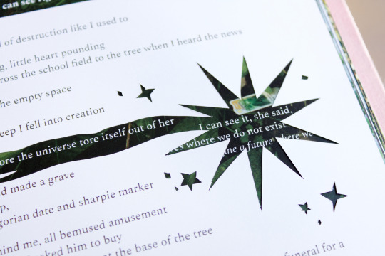


There Are Good Things Yet To Bury (2024) 7.5 x 9 in Case bound book, 84 pages. Photography and poetry.
There Are Good Things Yet To Bury features photos of community gardens and poems on climate grief, gardening, and the purpose of hope. Physically cut into many of the pages are windows, enabling fragments of images and text on the previous and following pages to be reactivated and recontextualized. The book reflects on how gardens nurture during crises, and the futures that hope can bring us.
---
Final project for my VAST class this semester! Agh I really think it’s my new favourite…!!
I was actually struggling with this one for a while, I just couldn’t seem to clarify the concept in my mind clearly enough. I think it was writing the rainbow poem when things really started to pull together, which was tricky as hell making sure it was still coherent through all 7 ‘window’ pages AS WELL AS a full spread! But I truly had SO much fun writing all the poems in this book it was such a joy :’)
This is a project that I would love love love to be made into multiples and distributed in some capacity... I don't know if traditional publishing would ever take something like this on with how many window cuts there are haha, not that I know how complicated or uncomplicated it would be (but certainly more than if 0 windows lol). The profs on my panel review mentioned that I could look into getting a grant to make multiples but hoo that still sounds kinda spooky to me awaaa
But!! Ever since my Sunlight is moonlight book with that one window cut at the end I've wanted to do more with cutting into the page and having whatever is visible through the window be recontextualized with the flip of a page AH it's so fun and so much potential for poetic play!!!
process photos/more thoughts:
These documentation photos were kinda a pain btw lmao (i mean when are they not) i'm struggle so much with themm.. I'm also trying to be more aware of how much of a poem I'm showing in these photos as I recently learned that most literary magazines etc won't accept submissions if that piece of writing is posted (ie published) online already. I think small excerpts might be okay as long as it's not the full piece???? awagh I don't know I'm still learning AND I don't even know how focused I want to be on submitting poems to magazines... But I figured probably better to keep more options open for future-me just in case...
My mid-term presentation of the project! featuring:
wip mid-term artist statement
hastily printed out photos I was thinking of using in the final book
big bunch of poems to potentially use in the final book that I picked from my poem drafts that I keep in my notes app
that red book with a circle window I made for another class (just to practice case bookbinding) as an example of a window cut into the cover
lil white book in the back that was our class' "Seeded Notebook" assignment which was essentially a moodboard for our project
a mockup that had the idea for a hidden accordion fold page (the concept being that it would spill out of the book unexpectedly while you were flipping through it)!! kinda sad I didn't have time to add that into the final but boy o boy did I run out of time lol

Did u know I was gonna put illustrations!! into the final book as well! and while I had some fun making them and using my ipad as a makeshift light table and using my new fountain pen (oough don't get me started I've been on a fountain pen kick lately)... Ultimately I felt I 1. didn't have time to include them in a resolved enough way and 2. they felt kinda outta place from the photos and poems

Some inspirations during my researchy/brainstorming phase that I got from my school's artist's book collection!:
the cover of Water, Gold, Soil by Sayler/Morris, which got me hooked on the idea of putting a photo slightly embedded into the cover (doesn't it look so good on that book!!??)
Aunt Sallie's Lament by Margaret Kaufman, featuring these wild progression of increasingly smaller pages that change how you read the poem; nothing specific I took from this book tbh but was cool to look at lol
And you know I gotta look at Tree of Codes by Jonathan Safran Foer for a book with window cuts!! I soon realized It's only printed one-sided, which meant they didn't have to worry about how it would affect any text on the verso page. Which is like, fair enough for them they had a whole NOVEL of words to deal with lmao


I made my own book cloth for this project!! sort of!! I feel like I was doing something wrong, the interfacing I got wasn't really sticking to the fabric very well at times ????? Was kinda finicky not sure if I was doing something wrong during ironing... But I got to go into the fabric store and find the exact shade of pink I wanted for the cover C:
Did 3 small cover tests too (as per assignment requirements lol but also they were kinda helpful). Takeaway was that I didn't like how test 2 and 3 looked lol


AND HERE'S ME TRYING TO FIGURE OUT AND GET IDEAS FOR WINDOW CUTS. THIS PHASE WAS ACTUALLY EXTREMELY HELFUL because at the time i was SO stuck for ideas I'm not kidding I'm was STRUGGLING throughout this entire project from a conceptual standpoint. For some reason the thesis, the bones just weren't solidified in my head, and it kinda stayed that way until almost the very end when I was formatting the poems esp the rainbow poem. But I think it clarified completely once I thought of the title, which just kinda stepped into my brain after writing one of the poems (which has the line "there are good things yet to come") and then I was like I need a book title... and my brain did a few hops and there it was LOL and I'm so happy with the title :') it captures the main theme with a lot of nuance in a pretty simple phrase which is HOO boy chefs kiss and hard to come by haha I felt very lucky

Printing was also a pain because the print techs at my school misunderstood what I was trying to do (and I'm extra salty because I was right in the first place and they made me second guess myself cause they said they needed it formatted a different way!!! But in the end I was right the first time!!!) Siigh whateevsss the silver lining was that I did notice some things I needed to fix before printing anyways... Anyways I was trying to format it their way and I fucked it all up lol I was printing a b/w mockup on my own and despairing cause I thought I was gonna have to redo all my formatting (which, with WINDOW cuts which makes every page before/after matter a LOT felt like a nightmare)

But again I was right the first time lol so crisis averteddd just a lil spike in stress levels lol
Used the digital stack cutter on my own for the first time and ohh my goodness... I love my old manual big guillotine cutter but this guy. this guy was pretty cool look at his cool line of light that tells you where the blade is gonna hit

After agonizing so much over the concept and content I was sooo happy to just be Physcially Putting The Book Together, a real turn my brain off and just do him activity yaaay
This was my fun lil set up, I was recently given this bright light stand thingy which was actually so helpful lol; I like my dim cozy room light but it's not the best for Seeing what you're doing for art stuff

So much window cutting... Yes I just freehanded all round edges lol verryy carefully.. Some alignement issues but minor enough to not affect readability ^^
For example in these first two images with the star, I just ended up cutting off the misaligned cut-lines which made the star a lil bigger lol; was trickier with a star shape like that vs like a rectangle though because of how many vertices it had, aka more opportunities to fuck up the shape

Binding time!! look at that satisfying stack oouh yummy.. Also featuring my big slab of marble that's very heavy and works great to weigh down during drying lol. Also yes I put ziplog bags between the end pages and book block to protect against glue dampness because I've gotten spooked by how damp my Hazelnuts Grow on Trees book got when clamping it lmao


Some page alignment issues with the windows after binding but nothing major :)

#there are good things yet to bury#process#2024#books#artist books#photography#poetry#uni#wip#print#featured#oh my god i initally put '42 page book' but its actually 84!!!!! I WAS COUNTING THE SPREADS NOT THE PAGES LMAO#i just still have it in my brain from when I was printing the spreads like "yes im printing 42 sheets of paper' GIRLIE that means you have#EIGHTY FOUR PAGES#thats so wild i can't believe i did this#thats so many pages
2 notes
·
View notes
Text
by the way! I redesigned my portfolio website, check it out :) (and let me know if theres any bugs or anything that looks off lol)
8 notes
·
View notes
Text

Apple with ornament (2024) acrylic painting
---
Tried to edit this photo as close to how it looks irl as I could, but I still think it looks better irl haha which I suppose is a good thing in itself anyways
It's been quite a while since I did painting! I quite enjoyed it actually, got the chance to use these square brushes I was given a long time ago but never used. That silver gift bow on the right was actually very fun and satisfying to paint with square brush haha I'm surprised at how well it turned out. And it was actually a good way to study lighting on shiny objects I think i have a little better understanding of how to do that now :>
I might give apple a lil brighter of an eyeshine later but I kinda like just the blue im still undecided
Based off this photo of my cat :') its a fuzzy felt ornament he's grabbin

isn't he so sweet...
and here's some process photos:


+bonus of what apple was up to while i was painting


2 notes
·
View notes
Text
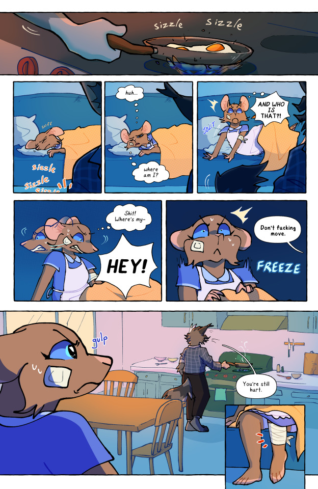

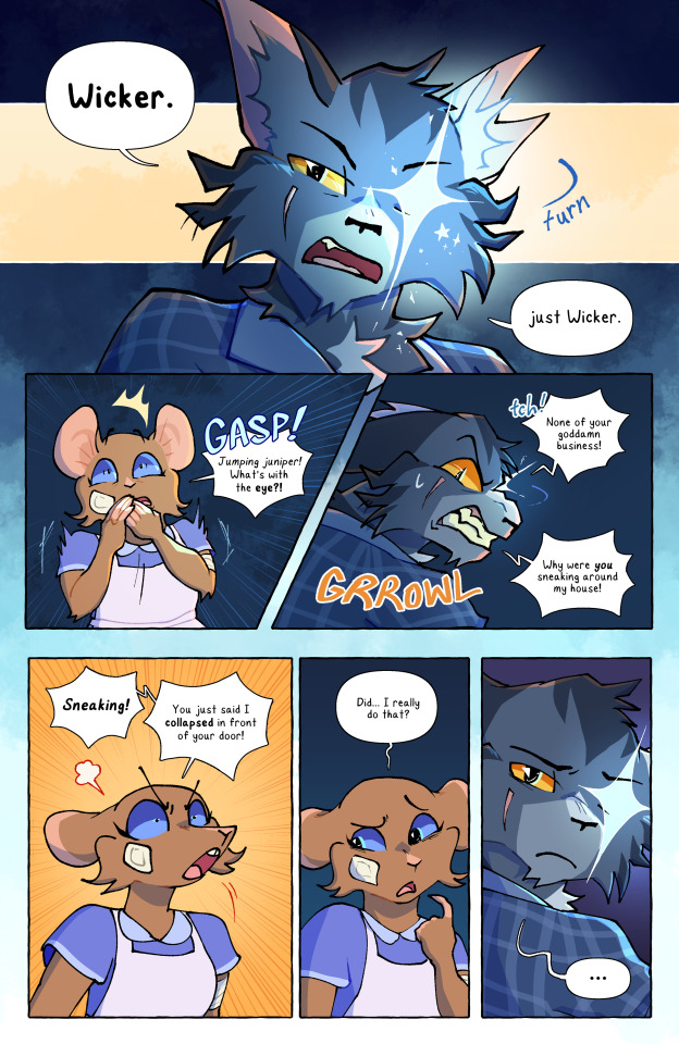
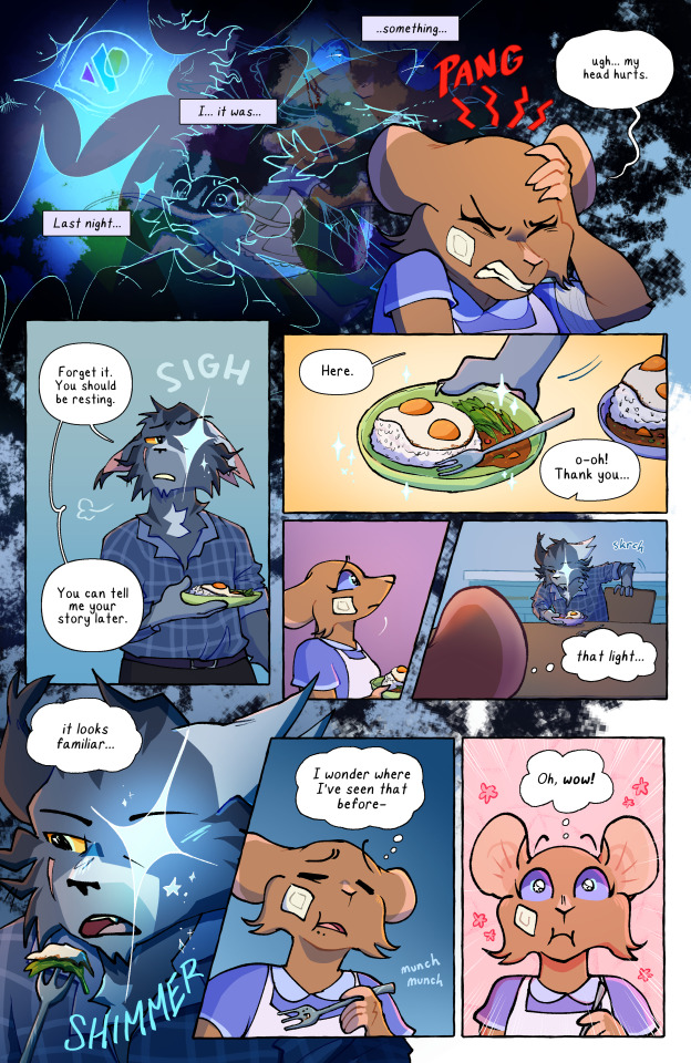

my final for the graphic novel illustration class I took this semester!! feat. Bluebell Littleears' first time meeting Wicker...
I would love to make Bluebell's story a full comic someday!!! So this was a great way to get a feel for how it would be to draw a lotta these comic pages
oh and! I made the font from my own handwriting using calligraphr! I was really struggling with finding a font I like, and tbh while this is p good it'd be nice to find a font I can use that is actually properly designed lol but! i dunno the more time I spend away from it I think the more I'm liking it
commission info || ko-fi (tip jar)
151 notes
·
View notes
Text


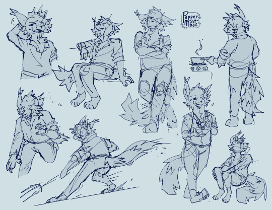
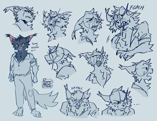
character design assignment for my graphic novel illustration class! Everyone say hi to Wicker!!!! he's gonna be part of the Bluebell Littleears universe!
yall know i LOVE drawing expressions hehe I had a lotta fun with this C:
commission info || ko-fi (tip jar)
151 notes
·
View notes