#type specimens
Explore tagged Tumblr posts
Text


Typography Tuesday
The Overbrook Press was founded in 1934 by American financier turned fine-press publisher Frank Altschul (1887-1981), with Margaret B. Evans (1903-1986) as the designer, compositor, and printer. The press continued operations until 1969. One of the first publications printed at the press was this little keepsake specimen book for friends, The Types, Borders, Rules, & Devices of the Press, printed in Stamford, Connecticut in an edition of 150 copies in 1934.
Our copy, another donation from the estate of our late friend Dennis Bayuzick, bears a signed presentation from Margaret B. Evans to the noted typographer and book designer Abe Lerner (1929-2002) and his wife Kit Currie (d. 2014) in 1980.
View more posts on books from the Overbrook Press.
View our other Typography Tuesday posts.
#Typography Tuesday#typetuesday#Overbrook Press#Frank Altschul#Margaret B. Evans#typefaces#Borders#type specimens#type specimen books#type display books#Abe Lerner#Kit Currie#Dennis Bayuzick
170 notes
·
View notes
Text

Open come in.
#typography#graphic design#design#fonts#typefaces#vintage typography#type specimens#type#type faces#vintage signs#signs#signage
27 notes
·
View notes
Text


Join us at Typographics 2024 in NYC this weekend! Draw Down will be participating in the book fair, which is free and open to the public!
Friday 6/14 through Sunday 6/16, 10AM-5PM every day at 41 Cooper Square (The Cooper Union) in New York City. The fair is between E 6th St & E 7th St (just across the street from the Great Hall where the main Typographics conference will be taking place) We'll be with friends @pioneerworks @letterformarchive @ksmallgallery @leftbankbooks @lubalincenter + more! Ellen Lupton will be on site on Saturday signing her latest book! The fair is right around the corner from Printed Matter's East Village Zine Fair (also free and open to the public), so you can have a full day of zines, books, and typography!
#draw down books#book fair#artist books#type specimens#Typographics#Typographics 2024#Typographics Book Fair#graphic design books#typography books
21 notes
·
View notes
Text
Seems like someone needs reading glasses
From O.I. Leman (Moscow) type specimen book, 1914

View On WordPress
62 notes
·
View notes
Text


Specimens of chromatic wood type, borders, etc. manufactured by Wm. H. Page & Co.
0 notes
Text
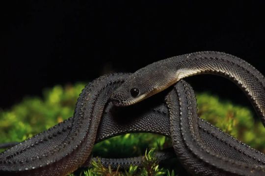
Yes, for those of you unfamiliar with the term, a holotype (or, if multiple individuals, syntypes) is the original reference specimen for a taxonomic name. Not to be considered typical or archetypal in any way, this specimen is simply the anchor of the name (in this case Xenodermus javanicus is the name in question). Anyone wanting to say they have found this species, or thinking they have a different species, must confirm it by checking this specimen. It is the 'name-bearer'. These are the most important specimens in any natural history collection, and some of the most important biological objects in the world.

Dragon Snake aka Javan Mud Snake (Xenodermus javanicus), family Xenodermidae, west Java, Indonesia
photograph by Mark Spence
5K notes
·
View notes
Text
but what if I'm goth and mall goth? the original and the 'poser', the real and the fake, the one with both sides of the coin. the one who's in love with nu metal and goth music, intertwined together. my two demons, dancing and bopping to the beat.
#thoughts#pls i hope no one gets offended#korn and specimen and slipknot and the sisters of mercy and type o and paralysed age and all the other more obscure bands hey i love you#but i realised something#since the two subcultures used to be “enemies” it feels like I'm not supposed to like both nu metal and goth but hey. here we are#gothic#mall goth#goth#nu metal
94 notes
·
View notes
Text


-YTF Garamông https://www.instagram.com/p/C71wXExSke-/?img_index=1
79 notes
·
View notes
Text
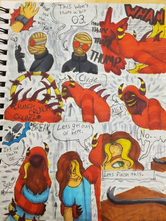
A follow up comic to this
Left -> right

First time I've ever done a full comic page. This is what i planned for the one shot to end with.
I'll probably do this au in different directions. But if the story were to end with this this is where I think it would go.
#doai#dreams of an insomniac#clyde doai#alex williams doai#doai sitcom au#specimen 03#this took so long#but it was a lot of fun#if i took this au another way Alex's suffering would be drawn out by a lot#in this they were going to outright kill them#but if i make it a full au it would deffinately be organ harvesting levels of horror#some cooking palls type shit#funtime speaketh#art#my art
100 notes
·
View notes
Text
to me, Mamizou and Nue are the type specimen for what I call "youkai married". they clearly have their own spheres of influence and places of residence and agendas, but at the same time are willing to drop what they're doing or move across japan to help the other carry out overly complex schemes, fight the ancient hermit that the other's cult dug up, or engage in what even the most freudian topologist to ever ponder orientable surfaces couldn't interpret as human sex
#yukayuyu are another example but they are also very Human Married and thus less suitable as a type specimen#touhou#maminue
200 notes
·
View notes
Text


Typography Tuesday
STEPHENSON BLAKE
Today we're showing a new acquisition from one of the giants of British type founding, Specimens of Printing Types from Stephenson, Blake, the Caslon Letter Foundry, Sheffield, published in Sheffield, England by Stephenson Blake & Co. in 1959. Stephenson Blake claims a lineage directly back to William Caxton, the founder of English type and printing in 1476. We think they stand on firmer ground, however, in also claiming descent from William Caslon, the founder of the first truly British typefaces beginning in 1734.
Silversmith and mechanic William Garnett and toolmaker John Stephenson began foundry operations in 1818 with financial support from James Blake. A year later, they acquired the firm of William Caslon III and IV, an offshoot of the Caslon family business. Garnett left the firm in 1829 and the company was renamed Blake & Stephenson in 1830, but Blake died soon after. Stephenson himself died in 1864 and passed the business onto his son Henry. The company was purchased in 1905 Sir Charles Reed and Sons, but the Stephenson name was retained. In 1937, the company purchased H.W. Caslon & Sons, the other branch of the storied Caslon dynasty, securing its right to claim full Caslon heritage.
Stephenson Blake continued to make some type until 2001, but it finally closed its foundry in 2005, with much of its historical stock going to the Type Archive in London. Because of financial issues, the Type Archive also had to close its doors in 2022, and the Stephenson Blake collection was transferred to the Victoria & Albert Museum as the interim custodian.
Shown here are some shaded typefaces and ornaments from the 1959 catalog.
View more Typography Tuesday posts.
#Typography Tuesday#typetuesday#Stephenson Blake#Stephenson Blake & Co.#John Stephenson#James Blake#William Garnett#Sir Charles Reed and Sons#Type Archive#type specimen books#type display book#type specimens#typefaces#shaded type#type ornaments#20th century type
164 notes
·
View notes
Text

You’ll like our tasty hamburgers!
#typography#graphic design#design#fonts#typefaces#vintage typography#type specimens#type#type faces#vintage signs#signs#signage
10 notes
·
View notes
Text

Cringetober day 8!
212 notes
·
View notes
Text


Cadet type specimen
10 notes
·
View notes
Text
Real artists I think Rockstar/Musician Lestat's music should be written by/influenced by (this is just my opinion don't come for me):
Nine Inch Nails
Korn
Chappell Roan
Lady Gaga
Sleep Token
Type O Negative
My Chemical Romance
Ethel Cain
Maneskin
Hozier
Specimen
Nirvana
#feel free to add more#if I missed any#rockstar lestat#lestat#lestat de lioncourt#the vampire lestat#iwtv#iwtv s3#tvl#nine inch nails#korn#chappell roan#lady gaga#sleep token#type o negative#my chemical romance#mcr#Ethel cain#maneskin#hozier#specimen#nirvana
26 notes
·
View notes
Text

Been thinking abt five after the flux is removed... So here she is on ur screen !
#moth.png#yogscast#specimen five#forgot the scarring on her other arm in the first one. oppsie#sorry her chair is so fucked I am still practicing drawing wheelchairs lmao#it's supposed to be a sport-type chair
160 notes
·
View notes