
Don't wanna be here? Send us removal request.
Statistics
We looked inside some of the posts by fontseeker and here's what we found interesting.
Average Info
Notes Per Post
3K
Likes Per Post
2K
Reblog Per Post
1K
Reply Per Post
4
Time Between Posts
6 hours ago
Number of Posts By Type
Text
14
Photo
2
Note
1
Last Seen Tumblr Blogs


Fun Fact
12.7% of mobile users access Tumblr.
Text
A film created by Carl Schlesinger and David Loeb Weiss documenting the last day of hot metal typesetting at The New York Times. This film shows the entire newspaper production process from hot-metal typesetting to creating stereo moulds to high-speed press operation. At the end of the film, the new typesetting and photographic production process is shown in contrast to the old ways.
There are interviews with workers at NYT that are for and against the new technology. In fact, one typesetter is retiring on this final day as he does not want to learn the new process and technology.
This is the first time the film has ever been available in HD from the original 16mm master film.
See more printing, journalism, and typographic-related films at: www.printingfilms.com
1 note
·
View note
Text
Changeling (2003) is a redesign of the 1970s square font China. It was part of the 90s/2000s trend of futuristic square fonts, though Changeling is relatively traditional compared to Mata (1993) or Lord Haw-Haw (1998).


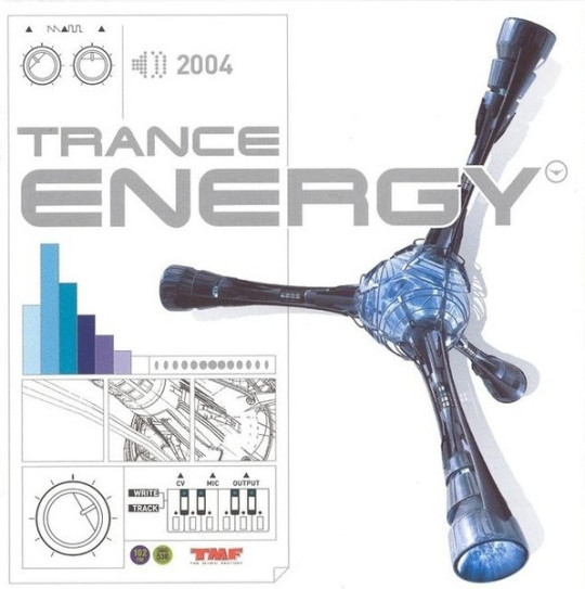

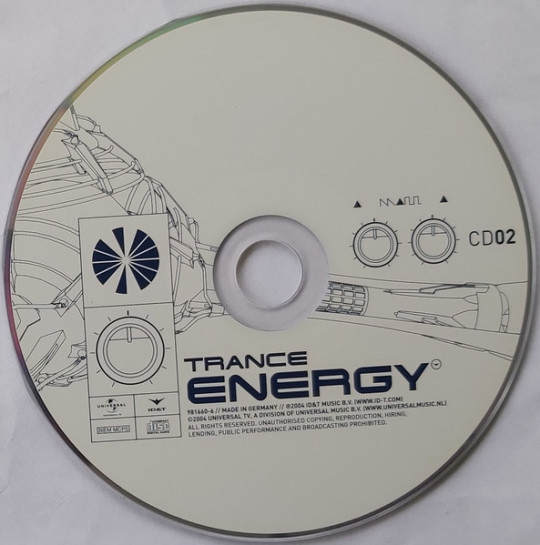

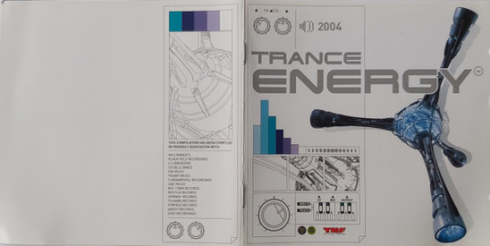
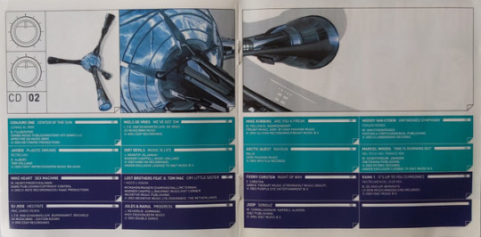
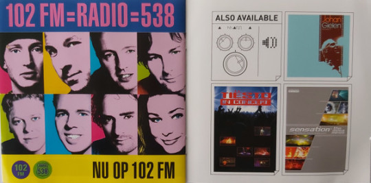
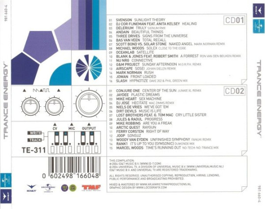

Universal TV - Trance Energy 2004 (2004)
332 notes
·
View notes
Text
The first image does use a thinner version of Remedy. I used the thick version for the sample so that it would be easier to compare to Jokerman.


Remedy (1991):

Jokerman (1995):

6 notes
·
View notes
Text
Remedy (1991):
Jokerman (1995):
6 notes
·
View notes
Text
Raphael (1885) with added swashes


44 notes
·
View notes
Text
I can't read this at all.


Mayhem font by Lewis France
MXM vector pack for this font is available here.
860 notes
·
View notes
Text

Sega CD BIOS Screen Sega CD 1992
208 notes
·
View notes


Photo
University Roman (1972) with some modifications

What you see above is the Japanese cover art for the upcoming Nintendo Switch release of Final Fantasy Crystal Chronicles: Remastered Edition.
It’s so beautiful <3<3<3
Someone *please* tell me Square Enix is releasing this game in North America with the same cover art–or that Japanese copies will include English text.
Also, if you want to see the latest trailer for Final Fantasy Crystal Chronicles: Remastered Edition, go to japanesenintendo.com.
11 notes
·
View notes
Photo
Keedy Sans (1991):

Triplex Italic (1990):

Matrix Script (1992):

Oakland 6 (1985) was renamed Lo-Res 9 Wide Bold Alternate in 2001. But the current version is actually slightly different from the original:

All of these fonts are from Emigre.

Hyper #36, Oct ‘96 - 'Crash Bandicoot’ cover. Support us on Patreon
126 notes
·
View notes
Text
Hobo (1910)
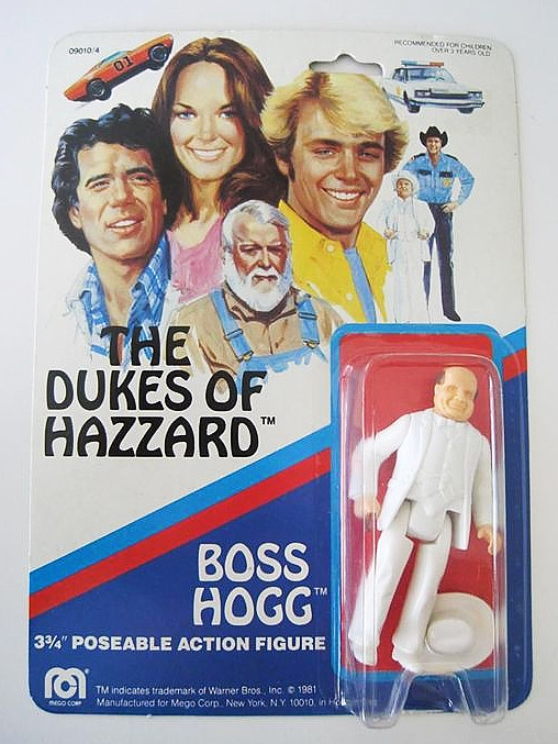
The Dukes Of Hazzard - Boss Hogg Poseable Action Figure (1981)
79 notes
·
View notes

Text
This place is full of Funhouse (1993).

But in the second image, the word "party" is in Variex (1988).

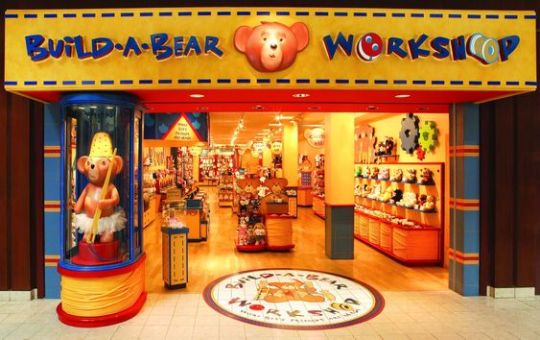
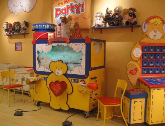

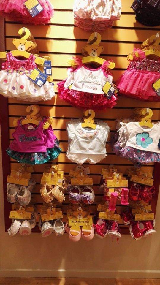


Build a bear 🧸 ~♥
575 notes
·
View notes
Note

What's the font for the English text (if applicable?)
University Roman (1972)

Which is based on a handwritten alphabet from the 1930s called Stunt Roman:

6 notes
·
View notes
Text
"PLAYBOY'S" I think is in a modified version of Robotik (1989), or a font very similar to Robotik.


The rest of the text is in Shelley Script (1972), which is based on calligraphy from the early 1700s by George Shelley.


856 notes
·
View notes
Text
Hobo (1910)

by: barbiemagazinearchive on ig
146 notes
·
View notes
