#And Ctrl is right under Shift.
Explore tagged Tumblr posts
Note
PLEASE show us your Bellsprout Takes omg

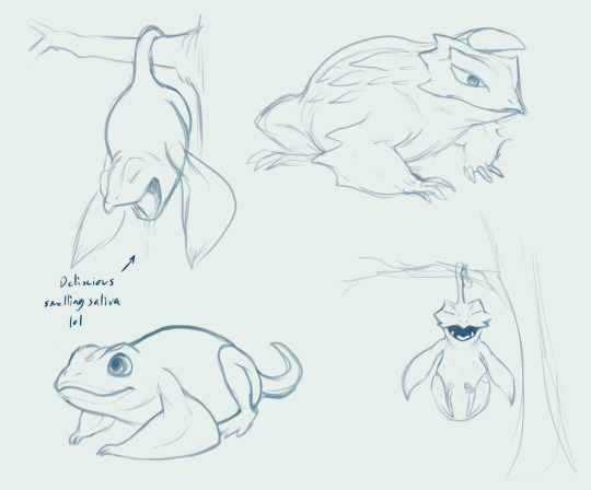

Okay you may see the funky dude now.
This will almost certainly be the last art I post before my gall bladder surgery.
#lynndoublelegacy#haycoat#ask#but unconventional#Accidentally posted before it was ready kfjkfjkslhf#Holding Ctrl and pressing Enter causes the post to do whatever action is selected.#And Ctrl is right under Shift.#F U N.
265 notes
·
View notes
Text
Dumb.
Kim Chaewon x Male Reader | 4k words Tags: cheating, High School AU, light bratty elements, backshots, reckless decisions, tension, guilty pleasure
Cutting class to get a break? Nah. Cutting class to fuck your girlfriends best friend? Yesssssir

Is this dumb?
Skipping class just to fuck your girlfriend’s best friend?
Yes.
But her bed’s soft, your hands are on her hips—so whatever.
Her room is exactly what you’d expect.
All-white sheets, soft and cool beneath your knees, a cream-colored fuzzy blanket pushed to the side. Squishmallows stacked against the headboard, half-toppled over from how she moves. A BTS poster on the wall, vinyls of SZA’s Ctrl and Keshi’s Gabriel mounted near her mirror. A Polaroid collage—blurry concert pictures, and old selfies.
Her dresser is cluttered with skincare products and perfumes. lip masks, toners, a bottle of perfume that lingers in the air—sweet, dark, like vanilla; Her.
A barely-burned Bath & Body Works candle sits untouched, more for aesthetic than actual use. Her makeup is scattered—an open lip gloss, an eyelash curler left out.
On the floor near the bed—Nike slides and a half-finished Starbucks cup. A hoodie tossed lazily on her chair, yours.
Chaewon’s face is buried in her sheets, her messy bun barely hanging on, strands of her blonde dyed hair slipping free. She’s already arching, already gasping, and your fingers dig deeper into her waist, holding her in place as you push your cock into her, her slick folds gripping you, pulling you in. The wet sounds of it mix with the slap of skin against skin, obscene and unrelenting, drowned out only by the breathy little moans she’s trying to muffle into her pillow.
Her back is warm under your hands, skin damp with sweat, a thin sheen catching the dim light. The scent of her perfume emanates from her, the mix of candy-sweet vanilla and something heavier, musky, intoxicating.
Her white tank top is so tight it clings to her body, but the straps won’t stay on her shoulders. You keep pushing it up her back, exposing more of her skin, needing to see more, needing to feel more. Your eyes trace the swell of her hips, the way her body shudders under your grip.
Aggressive. Hungry.
She shudders when you tighten your grip, fingers splayed over her waist, thumbs pressing into dip in her back. Her nails drag against the sheets, hips shifting, trying to match your pace, but you don’t let her. You set the rhythm. She follows. That’s how this works.
Her breath hitches. She feels so fucking good, squeezing around you like she knows exactly what she’s doing. Like she wants to make this harder for you.
Then, your phone lights up.
It’s somewhere on the bed, half-buried in the blankets, screen flashing. You don’t need to look to know who it is.
Eunbi.
Your girlfriend.
Chaewon’s best friend.
She’s not freaking out. She doesn’t know you’re not in school right now. Doesn’t know you’re giving her best friend backshots.
Just a casual text. Maybe asking if you want to meet up for lunch, or something dumb like whether you saw that TikTok she sent last night. Either way, you don’t want to see it.
You flip the phone over, face-down against the sheets. You shouldn’t be here. You should be in class. Or with Eunbi. But Chaewon’s ass is pressing back against you, and that thought doesn’t last long.
Chaewon shifts beneath you, glancing back over her shoulder, breathless, smirking. “You’re just gonna ignore her like that?”
You don’t answer. Instead, you press a hand to the back of her head and push her face down into the bed again.
She moans, muffled, but you hear the smile in it. She’s still teasing, even now.
“Bet she’d cry if she saw you like this.”
That does something to you. Something dark. You grip her harder, fuck her rougher, and whatever smugness she had vanishes.
Chaewon whimpers, her nails clutching at the sheets, legs shaking. She’s trying to keep up, trying to match your pace, but she’s falling apart beneath you. Freaky as she is, she’s never been fucked like this.
She gasps out something—your name, a curse, maybe both—but it breaks off into a moan, and you know you’ve won.
Eunbi’s nice. Beautiful. Hot. She gives good head. She’s the kind of girl you’re supposed to be loyal to.
But Chaewon? Chaewon is freakier, tighter, and knows exactly how to get under your skin.
Eunbi sends cute texts with heart emojis. Chaewon sends risky selfies when she knows her best friend is in the room.
Eunbi kisses you soft and slow. Chaewon drags her nails down your back and bites your lip until it stings.
Eunbi’s the girl you bring home. The girl who trusts you. Who texts you in the morning and kisses you goodbye at school. But Chaewon’s the girl you ruin yourself over.
Chaewon is still smirking, still playing her little game, rolling her hips back against you just to see how far she can push. Testing you. "You're holding back..." she breathes, her voice shaky between gasps, like she’s daring you through the pleasure.
Your jaw clenches. She always does this. Always wants to see how much she can get away with before you snap.
The only answer you give is a sharp thrust, knocking her forward onto the sheets, her blonde hair spilling over her shoulders. She gasps, fingers digging into the mattress, but when she turns her head to look at you, that smirk is still there, teasing, taunting. Like she hasn’t learned her lesson yet.
"Fuck, slow down—" she starts, but you don’t. If she wanted to play, she should’ve known she’d lose.
Your fingers tighten around her hips, dragging her back onto you as you set the pace, unrelenting, deep, watching the way she trembles under your touch. Her smug attitude is gone, replaced with gasping breaths, half-bitten-off moans she’s trying—and failing—to swallow.
She’s squeezing you so fucking tight. Too tight to think about anything else, too tight to think about why you’re here, about who keeps blowing up your phone from the other side of the bed.
Your phone vibrates against the sheets. Again. And again.
Chaewon notices, of course she does. She lets out this breathless little laugh, barely turning her head, voice syrupy and taunting. "Does she even make you feel this good?"
You don’t answer. You push her face into the mattress instead.
She moans, muffled, but you can hear the amusement in it, the way she’s still enjoying this too much.
If she wants it rough, she’s going to get it.
Your hand slides up, fingers wrapping lightly around her throat as you lean down, voice low in her ear. "Take it, take that dick"
She doesn’t answer. Just licks her lips, breath hitching, and pushes her hips back against you again.
That’s all you need.
Your grip tightens, forcing her still, making sure she takes it. She chokes out a gasp, her whole body shuddering as you fuck her deeper, harder, until her teasing completely breaks apart.
At this angle, with your weight pressing her down, you can feel everything—every slick, desperate clench around your length, the obscene wetness that spreads between you each time you push back in. It’s suffocating, consuming, a vice of heat wrapped around you, pulling you deeper into something you shouldn't want this badly.
Her hand reaches back, grabbing blindly for anything to hold onto—your wrist, your thigh—until she finds your arm. She grips it hard, nails dragging over your skin, feeling the way your muscles flex under her fingers. Feeling you as she feels you inside.
Your phone vibrates again. Neither of you look at it.
Chaewon’s breathless now, moaning into the sheets, a mess beneath you, every ounce of her earlier cockiness gone.
If you were a better person, you wouldn’t be here.
But you’re not.
A noise outside the room—soft, but distinct. A floorboard creaking? Wind against the window? Your body tenses, every muscle tight, your breath catching mid-thrust.
Chaewon hears it too. Feels you hesitate.
And then she laughs. Breathless, airy, like this is the funniest thing that’s happened all day.
""Aww, scared someone’s gonna catch you balls deep in me?"" Her voice is teasing, dripping with amusement, even as her legs tremble beneath you.
Your fingers flex around her throat in retaliation, squeezing just enough to make her gasp. She barely has a second to process it before you slam her down, your grip unrelenting, then flip her onto her back so fast she barely has time to catch her breath, her blonde hair slipping free, messy and wild against the sheets.
Your cock slips free in the motion, and you grab it tight, feeling the obscene slickness coating your length, dripping from her. It's wet—wet as fuck—before you slap it against her swollen folds. The sound is loud, filthy, obscene—wet as hell. His cock slides against her, dragging through the mess between them before he shoves it back in. She shudders, her breath hitching, her thighs twitching as you tease her with the weight of it before pressing forward, sinking back inside.
Chaewon’s eyes flutter, her breath catching as you force her legs up, pressing her thighs flush to her chest, pinning her in place, giving her no room to squirm away. The new angle has her gasping, hands flying up to your arms, gripping tight, her nails dig into your arms, clinging tight like she’s bracing for impact, like she needs something to hold onto before she breaks completely.
The bed shifts beneath you, and your phone vibrates once more, the buzz reverberating against her back, against your hips, felt through every grinding thrust. You both feel it. Neither of you care.
Your only focus is on the way she clenches around you, the way she gasps your name between ragged moans, the way she completely melts beneath you.
Chaewon’s hands fly to your shoulders, nails digging into your skin as she pulls you down to her. There’s nothing delicate about it—her kiss is messy, frantic, her lips parted, her breath hot and ragged against yours. She kisses like she’s starving for it, like she wants to taste herself on your tongue, like she doesn’t care how sloppy it gets.
Your tongues tangle, wet and uncoordinated, her mouth opening wider, drool slicking your chin, mixing with the sweat beading along your skin. She moans into it, needy, desperate, hips shifting beneath you, trying to keep up with the way you fuck her.
You pull back just enough to catch her dazed expression, lips swollen, spit-glossed. A strand of saliva still connects you, snapping when she licks her lips, pupils blown wide with something dangerously close to obsession.
“You don’t kiss her like that,” she breathes, and it’s not a question.
No, you don’t.
Eunbi kisses soft, slow, careful. Chaewon kisses like she wants to ruin you. And you let her.
Your response is a sharp thrust, making her yelp, making her arms tighten around your shoulders. Her back arches, and you take the moment to move, dragging yourself out until just the tip remains before shoving back in, hard. Her breath hitches, body tightening, legs shaking.
Then you stop moving.
She whines immediately, brows furrowing, her legs squeezing around you, trying to force you to keep going. But you don’t. You let the frustration build, watching her squirm, watching her writhe beneath you—wet, glistening, flushed deep with arousal. She’s a fucking mess, and you’re not done making her one.
You let the moment hang, let the desperation settle before tilting your head down and spitting—right on her clit. The thick glob lands exactly where you want it, shining against her swollen bud. Before she can even process it, your thumb is there, pressing in, rubbing it in slow, deliberate circles as you start moving again.
She chokes on her breath, body jolting.
“Fuck,” she whimpers, fingers clawing at your forearms, legs shaking with every tight, controlled rub.
You’re still hovering above her, watching her squirm, watching her fall apart beneath you.
“Eunbi wouldn’t let you do that,” she gasps, voice breaking, teasing even as she crumbles.
No, she wouldn’t.
Eunbi wouldn’t moan like this, wouldn’t beg like this, wouldn’t be dripping like this. Eunbi wouldn’t take you like this.
Chaewon does.
And that’s why you fuck her harder.
Your thrusts grow rougher, deeper, driven by something reckless and insatiable. Chaewon’s body rocks beneath you, her moans turning sharper, breathless, spilling into the thick heat of the room. You press down, pinning her fully against the mattress, making sure she takes every inch, making sure she feels all of it.
Her nails scrape against your back, her legs tightening around your waist, pulling you closer, needing you deeper. Her breath stutters between gasps, each one catching higher as you fuck her harder, hungrier, as if there’s no tomorrow—no girlfriend still calling, no consequence waiting outside this room.
Risk of getting caught? Forgotten.
Guilt of cheating on your girlfriend? Forgotten.
Eunbi? Forgotten.
The only thing that matters is the way your cock fits so snug against Chaewon’s walls, the way she clenches down, tight and desperate, squeezing you with every frantic, high-pitched moan as she completely loses all composure.
She’s right there, on the edge, her nails dragging, her hips bucking up, desperate to finish. But you don’t let her have it. Not yet.
You slow—not in pace, but in control. Shift your weight, dragging her with you, rolling her onto her side without ever slipping out. One of her legs hitches over yours, your grip securing it in place as you push in again, deeper, the angle hitting something inside her that makes her whimper, makes her entire body tense up.
Her fingers claw at your arm, nails pressing into taut muscle, her breath breaking apart into sharp little gasps. She’s trying to speak, trying to say something, but it keeps getting swallowed between ragged moans.
"I’m—" she tries, voice cracking, "I—fuck—"
The way she stumbles over it, how she can barely get the words out, makes something snap inside you. Your cock throbs, swelling even harder, stretching her more as her walls squeeze around you in desperation. Your grip tightens—on her thighs, her ass, her waist. You need to feel her, need to hold every part of her as she comes undone.
Your hands roam—palming the curve of her back, gripping her tits, feeling the way they bounce with every thrust. Then up, fingers tangling into her blonde hair, tugging her head back against the pillows, making sure she feels all of it, all of you.
She pulls a pillow close, biting into it, eyes squeezed shut, drowning in the way you fuck her. The room is thick with the sound of skin against skin, her breathless whimpers breaking into something higher, needier. The air is heavy, thick with sweat, with the intoxicating scent of her—her perfume mixing with the raw, musky heat of sex, the sheets carrying the evidence of it. It’s overwhelming, suffocating, consuming, every breath filled with her.
You’re barely holding on yourself, tension winding tight in your spine, in your stomach, but seeing her like this—seeing her break beneath you, seeing her fall apart in your hands—that’s what pushes you closer to the edge.
You grit your teeth, feel your cock twitch inside her, aching, swollen, so fucking close you can taste it. "I'm close," you manage, voice rough, strained, barely holding on.
Chaewon doesn’t answer—not with words. Just a moan, high-pitched and wrecked, a breathless whimper spilling past her swollen lips. She turns her head, eyes hazy, half-lidded, looking at you through the blur of sweat and pleasure. Her gaze drops, trailing down your body, watching the way you’re fucking into her, the way you stretch her open, the way you own her.
Then her hand moves—sliding between her legs, fingers brushing over her swollen, messy clit. She gasps at the contact, whines as she rubs tight, fast circles, her entire body tensing, back arching into you.
The slick, obscene sounds of it mix with her gasps, her slurred curses, her whimpers breaking into desperate, breathless pleas. "Fuck—fuck, fuck, fuck—"
You’re right there. So fucking close.
Chaewon gets there first. Her entire body seizes up, legs trembling, thighs squeezing tight around your waist as she crashes into her orgasm. Her grip turns bruising, hands clawing at you—your back, your arms, your shoulders—grasping for anything, everything as she spirals.
"Oh my fuck!" she screams, head thrown back, voice breaking into something raw and desperate.
That’s it. That’s what fucking wrecks you.
Your body locks up, heat pooling at the base of your spine, surging through you like a live wire, so intense it knocks the breath from your lungs. Your cock twitches violently inside her, pulsing, aching, your entire body seizing up—legs tensing, toes curling, muscles locking in place as the pleasure crashes through you. You bury yourself deep one last time before instinct kicks in, before you yank yourself out, your hands shoving her onto her back.
You stroke yourself fast, frantic, desperate, your abs clenching, hips jerking on instinct, chasing that last pulse of pleasure. The sight of her wrecked beneath you, her skin still flushed, her thighs twitching, sends you over the fucking edge. "Shit—" you groan, voice wrecked, guttural, as your cock throbs violently in your grip. The first thick spurt shoots out, streaking across her stomach, hot and filthy, splashing across the curve of her waist, her navel. The rest follows in messy ropes, dribbling down her skin, pooling between her ribs. It’s everywhere—sticky, raw, a fucking mess. Chaewon shudders at the sensation, her breath hitching, her thighs still twitching from the aftershocks of her own release.
She exhales, still trembling, thighs twitching, completely spent. A fucked-out smile tugs lazily at her lips as she drags a slow, shaky breath in, her chest rising, coated in the evidence of what you just did to her.
You sit back, gasping, running a hand through your sweat-damp hair, trying to catch your breath.
Chaewon stirs, reaching down without hesitation. Her fingers trail over her stomach, gathering the mess you left on her, scooping up a streak from her skin and bringing it to her mouth. Her tongue flicks out, tasting it, humming low in her throat. Then she does it again—this time from her chest, then her waist, dragging her fingers through the sticky warmth, licking it up like it’s second nature.
"Fuck," you breathe, voice wrecked, hand finding her thigh and squeezing it tight.
She moans softly at the contact, smirking as she stretches out beneath you, shameless. "You fucked the shit out of me," she purrs, voice thick, teasing. "Now you gonna think about it the next time you fuck Eunbi, huh?"
Your jaw tightens. The mention of her—your girlfriend—after everything you just did, after the way Chaewon looks right now, smug and satisfied and so fucking filthy, makes something snap.
Your hand flies to her throat, gripping, pinning her back into the sheets. She gasps, but it’s not in protest—it’s in pleasure. Her lips part, her breath hitches, eyes darkening as she tilts her chin up, inviting more.
And then your phone rings.
Not just a vibration this time. A full-blown call.
Loud. Shrill. Eunbi.
A cold weight sinks into your chest, heavy, suffocating.
Post-nut clarity slams into you, cutting through the heat still clinging to your skin. Everything crashes in at once.
You let go of Chaewon’s neck like she burns you, scrambling off of her, off the bed, reaching blindly for your phone. Your hands are still shaky as you grab it, answering as fast as you can, voice rough, breath unsteady.
"Hey."
Eunbi’s voice is light, sweet, unaware. "Hey, why weren’t you replying? It’s class change."
Fuck. You swallow hard, running a hand through your damp hair. Your skin is still hot, sticky, the air thick with the lingering heat and smell of musk.
"Uh—I had to walk home to grab something."
A lie. A weak one. But it makes sense. You live close enough to the school that it’s not impossible. You just hope she buys it.
"Oh," Eunbi hums. "I got worried."
As she talks, you don’t notice Chaewon moving. Not until she’s right there, sliding down the bed, her bare body pressing into your side, her face hovering way too close to your cock.
Your breath hitches. Your grip on the phone tightens.
She’s smirking. Watching you. Waiting.
"You weren’t answering," Eunbi says. "I thought something happened."
"Sorry, babe. Didn’t mean to worry you."
And that’s when Chaewon makes her move.
She doesn’t touch your cock. Not yet. Instead, her mouth goes lower, latching onto your balls, sucking wet and slow, tongue swirling over sensitive skin.
A bolt of heat spikes down your spine. Your muscles go tight, your breath cuts short, your fingers dig into the sheets.
"Shit," you almost say out loud—but bite your tongue last second.
Eunbi’s still talking. You don’t even register what she’s saying.
Chaewon’s fucking grinning, lips stretched around you, her eyes locked onto yours, waiting for you to slip up, to lose control, to moan or gasp or fucking break.
You shove her back, her shoulders hitting the mattress, but all it does is make her giggle—low and sultry, like she’s savoring your panic, like she enjoys watching you squirm. Too loudly.
Panic seizes your whole body. Your eyes go wide. You press a finger to your lips, mouthing, “Shhh.”
Eunbi pauses on the other end. "You okay?"
You force yourself to act normal. To breathe. You push Chaewon away—physically shove her back. She pouts, but she listens, sitting back on her heels, smug and satisfied, before stretching her arms over her head, languid and unbothered. Then, just as easily, she steps off the bed, stretching like a cat, unbothered, like this was nothing more than a game to her.
"Yeah," you say, somehow steady. "I’m fine."
Through the phone, you hear Eunbi giggling, the sound of footsteps, her friends chattering in the background. She’s walking to her next class. Completely unaware.
"Okay," she says. "I’ll see you at lunch then, babe. Love you."
Silence lingers. A pause that stretches too long.
You should say it back. You need to. But then, you look up.
Chaewon’s standing at her closet, slipping on fresh clothes. Her ass is in clear view, the length of her body stretching as she moves, her legs lean and smooth. Her messy tank top clings to her body, damp with sweat, a streak of dried cum still visible on the fabric.
Your mouth feels dry.
"I love you too," you manage to say, through everything weighing on you, and the call ends with a soft beep.
Chaewon turns to face you.
And she gives you a look.
Not smug. Not teasing.
Just dirty. Unreadable. Something dark and lingering in her eyes.
She doesn’t say a word. Just grabs her shorts, turns, and walks out to the bathroom.
The door shuts.
You sit there, still gripping your phone, staring at the space she left behind. Your pulse won’t slow down. Not from the panic. Not from the guilt. Not from the fact that even now, even after all of it—you still want her.
Your skin burns, your body tense, still stuck in it. Still feeling it. What you shouldn’t have done. But you did. And the worst part? Some fucked-up part of you knows that if she pulled you back into that bed, you wouldn’t stop her.
You should feel worse. You should hate yourself.
But Chaewon’s still hot as fuck, and that’s the problem.
AN: This was originally going to be a longer fic, but I ended up with a newer Chaewon idea, and she’s my ult bias so i cut this down to just the sex.
Sorry to all the Eunbi fans, dw she’ll get her own
1K notes
·
View notes
Note
hiiiii :3 idk if ur taking reqs for dc right neow but a thought that tickles my brain rlly good is dick grayson/reader w a praise kink and dick exploits it n uses it to his advantage.... preferably afab reader but gn is fine :P
CTRL + H - Dick Grayson


Pairing: Dick Grayson x fem! best friend! reader (uses fem pronouns + has a pussy)
Genre: smut/NSFW
Word Count: 4.1k
Summary: when your best friend discovers porn in your browser history while fixing your computer, he decides to use it to his advantage
CW: friends to lovers, lots of praise, uses of ‘good/pretty/lovely girl’ dick calls you sweetheart/angel, dick is CORNY I’m sorry, mentions of porn/asmr porn, teasing, gaslighting (but not really), fingering, marking, unprotected sex, lots of sweat (its sexy i swear), dick fucks you over a desk, kinda rough sex, creampie, multiple orgasms, implied to be summer, i think thats it??
hey hi 👽 anon, thanks for the request! im sorry it took so long, it wasn't meant to be this long i swear, i just got caught up in the thought of Dick being all hot and sweaty and praising you while fucking you >~< and yeah this happened. really hope you like it (but if you don't, let me know and ill totally rewrite it!) lots of love yes i took an extra 30 mins to find nightwing #83 to take a picture of the comic book to make this banner lol


As if having Dick Grayson look at your search history wasn’t bad enough, now you have to live with the mortifying ordeal of him knowing you have a praise kink.
When you had first invited him over to take a look at your malfunctioning computer, you’d thought nothing of it. You figured he would turn it on and off again, maybe update some drivers. So when he suddenly clicked into your browser and began scrolling through the long, long list of websites you’ve visited, you weren’t sure how to react.
You noticed it at the same time as him, the glowing screen forcing you to freeze where you stand. There on the screen, from just last night, read: praise nsfw asmr. You swallow hard and lunge for the mouse to click out of your browser history, but breathe a sigh of relief when Dick does it first.
There’s a beat of silence, your racing thoughts deafeningly loud as you try to come up with a reason to kick him out. Fanning your face as if that will help chase away the heat of the day, you swallow once more in an attempt to work some moisture back into your mouth.
“F—find anything?” You say as casually as you can.
It’s ridiculous how embarrassed you are, honestly. He’s just your friend, it’s just porn, it’s not like it’s the end of the world. Still, the rattling of your heart against your rib cage and his cruelly quiet silence make it feel like it is.
He shakes his head. “Not so far, I should keep looking but—“ he flicks his eyes up your body, perfect blues tracing your every curve, “you seemed flustered.”
You raise your hands in denial all too quickly, your sweaty palms stretched out towards him. Dick raises an eyebrow, examining you in the way he does with strangers in coffee shops.
“I just…don’t see how my search history is relevant, I guess. That’s all.”
He grabs your wrists, lowering your arms from the defensive position they’ve taken. Despite the familiarity of his touch, something feels off, different in a way you can’t explain. You shake the thought away.
The world has not shifted on its axis because your best friend suddenly knows what kind of porn you’re into.
His touch lingers on your wrist and he uses the leverage to gently pull you closer to where he sits at your desk. When he finally drops your wrist, a chill circles the space where his hand once was, refreshing your feverish skin.
“I just want to make sure you haven’t accidentally picked up a virus somewhere. If we can find one in your history, it’ll be much easier to get rid of it.”
The explanation only half seeps into the mush your brain has turned into under his gaze and you find yourself nodding without quite understanding.
You were fooling yourself by inviting him here. While asking for his help was cheaper than hiring a professional, having him so close to you almost hurts—especially when lately you’ve been trying to force away the feelings you’ve harboured for him.
“So,” Dick says again, “won’t you be a good girl and let me fix your computer for you?”
His words force you out of your thoughts, purely by short circuiting your brain. You blink at him with wide eyes, your heart pounding in your chest.
“W—what did you say?”
“I just asked if I could fix your computer now.”
You tilt your head in confusion. Did you mishear him, or did he call you ‘good girl’? He flashes you that signature smirk of his, his blue eyes suddenly dark with something you don’t recognize.
Though everything on his face reads innocent, something not-so innocent lurks beneath the surface. Something that stares you down and screams ‘challenge me’.
“Yeah.” You swallow. “I guess that’s fine.” You take a deep breath and try to steady the spinning in your head.
Dick continues his work nonchalantly, hitting a few keys and opening your browser history once more. You turn your eyes away from the screen, instead focusing on the way your fingers grasp the desk until it hurts.
You listen to him scroll for a while and try to pretend like he’s not looking through the most intimate part of your life. The idea of him seeing that part of you excites you as much as it nauseates you—a lethal combination.
“You can relax.” Dick hums.
You lift your head to look at him just to see him focused completely on the screen. You don’t dare glance at what he’s so focused on.
“Why not sit down? This could take a while.” He says calmly. “I’m sure you’ll feel much better if you do.”
You roll your shoulders. “I think I’ll just stand.”
There’s a shift in his eyes as if your words sparked something in them. He finally glances away from your screen, completely focusing on you with a newfound intensity. You want to shrink from his gaze, to run down the hall and hide in your broom closet, but you stay rooted in place.
“It would help me a lot if you sit down. Don’t you want to be a good girl and help me out?”
Holy fuck. “What did you just say?”
It feels like you’re waiting an eternity for him to speak again, your heart beating a mile a minute. He’s going to deny it, or make fun of you even more or worse—tell Wally about it.
He pats his lap. “Come sit with me,” he purrs, “be a good girl, keep me company while I work.”
In your shock, you find yourself shuffling towards him and settling in his lap. Dick helps you adjust, tugging you back to his chest and keeping one arm around you while his other reaches for the mouse once more.
He’s so close to you that you can feel the beating of his heart, his breath on your neck. You close your eyes and pray that he can’t feel the heartbeat that’s suddenly appeared between your legs.
You can’t remember a single time he’s been this close to you, a single time he’s touched you like this. The sudden proximity makes you dizzy, butterflies taking flight in your tummy. You clench the arm rests on either side in an attempt to keep your cool.
Dick shifts behind you, one of his thighs gently brushing your clit in a way that makes you squirm. “Don’t do that!”
His hand slides from your waist to grip your thigh, a shiver running up your spine at the contact. “Don't do what? This?” He repeats the motion.
You squeak, lurching forward in an attempt to get away from the friction. You tilt too far and suddenly you’re falling head over heels towards the mat beneath your chair. Dick is quicker than that, wrapping one arm around your chest and another around your waist to tug you harshly back to him.
“Don’t do that,” you repeat breathlessly, “please.”
He rests his chin on your shoulder, soft strands of black hair tickling your cheek. “Why not? Use your words, angel.”
The nickname reignites something inside of you, rekindling a fire between your legs. You clench them together in the hopes it will do something to muffle the throbbing, but when you feel Dick smirk against the side of your neck, you know you’ve failed.
When you don’t answer him, he grins his knee between your legs once more, an innocent hum prompting you.
“You’re—fuck, you’re kneeing me in the cunt.”
Dick’s not sure if it’s from your brazen words or how entirely ridiculous this whole afternoon has been, but suddenly he’s laughing. A big, open mouthed, creasing at the corners of his eyes, laugh.
His laugh surprises you enough to summon one of your own, sending you both into a fit. You shift on his lap to look at him, wrapping your arms around his neck to support yourself while the two of you laugh. It’s stupid and ridiculous and you’re not quite sure what you’re laughing at—just that you are.
You’re laughing and laughing and suddenly his lips are on yours and his eyes are closed and—fuck, he’s kissing you. And then you’re not laughing anymore, your hands brushing up his neck and tangling in his hair. He’s not laughing anymore either, his hands gripping your waist like he expects you to leave at any moment.
You’re breathless when you pull away, refusing to open your eyes and face the reality in front of you. Because maybe the world didn’t shift on its axis when he learned your porn preferences, but it definitely has because he just kissed you.
He taps your cheek gently, using that terribly calm voice he does whenever you start spiralling. “Y/n.” He coos, “open your eyes, y/n.”
You bite your lip, shaking your head in refusal. You know as soon as you do, you’ll have to confront your feelings for him, and his for you, and all of that is just too much and god, when did it get so hot in here?
You open your eyes one at a time, casting them down to where your thighs rest on his. Your hands come together, fingers twirling in your lap just to give you something to focus on other than the throbbing in your clit and the weight of Dick’s eyes on you.
He drags a finger down your overheating cheeks, tracing the outline of your jaw and tipping your head up to face him. His blue eyes are lined with something new, something darker—a need you’ve never seen before.
“Look at me.” There’s a commanding tone to his voice before it softens, “c’mon, please?”
You finally force yourself to meet his eyes, the familiar ultramarine calming the sudden bite of your nerves. “Only cause you asked so nicely,” you say quietly.
“Good girl,” he smiles and it feels like the sun pushing through rain clouds. He strokes your cheek gently, his thumb landing on your cupid's bow.
You shiver beneath his touch despite the unbearable heat of the day. While his finger on your lips threatens to send you flying away, spiralling into space, his other does the opposite. His grip on your hip is tight, fingers digging in and sure to leave behind bruises.
“Can I kiss you again?” He asks quietly.
It’s only a small mercy that your nod doesn’t prompt another ‘good girl’ from him, or some other horribly delightful variation of it. However, when his lips brush yours and his hand slides to the base of your throat, all of the thoughts melt away. There’s no embarrassment, no overthinking, just raw emotion and the sensation of his skin on yours.
You shift in his lap, sliding one of your thighs over his so you can straddle him. Dick offers a guiding hand while you slide forward, half steadying you, half tugging you closer. You shimmy up the length of his jeans until you’re as close as possible, your stomach pressing into his toned abs.
A gasp leaves your throat when your clit brushes the very edge of the bulge in his jeans, the noise only edging him along. His teeth graze your bottom lip, both gentle and desperate, before his tongue slips into your mouth.
The taste of him is intoxicating, consuming you until you’re grabbing his cheeks with both hands to pull him as close as possible. You whine when his cock grazes your clit again and Dick breaks the kiss to let out a breathy laugh against your lips.
“Someone’s needy,” he teases, but his eyes are rimmed with dark and when he looks at you through his lashes, all you see is need.
“Back at you.”
His palm sticks to your cheek with sweat when he goes to pull it away. “You’ve been so good for me today,” he hums, his other hand trailing up your thigh. “Let me take care of you, yeah?”
You mumble a breathy ‘please’ before his fingers are brushing your clit through your pants, the heat pooling in your panties near insatiable. You tighten your grip on him and bury your face in the tight black fabric of his t-shirt to muffle your heavy breathing.
While one hand rubs intense figure eights up the length of your pussy, his other hand is fiddling with the buttons of your pants. He sighs in triumph at the soft popping noise and then the fabric is pulling away from your skin, Dick somehow managing to tug them down with only one hand.
You shift in his lap and prop yourself up on your knees to give him better access while he drags the fabric down your thighs. He takes advantage of your position to spin you to face your monitor once more, leaning back in the chair so you’re reclined against his muscled chest.
Warm breath fans the overheating skin of your neck just where your shirt meets your skin. Two calloused fingers dip into the waistband of your underwear, skimming the warmth and slick of your cunt. Dick sucks in a breath, his pants suddenly too tight.
“You really are needy,” he swallows hard. “Lovely, needy girl.”
His words only serve as a catalyst to the intense need you feel in your core, amplifying your desire tenfold. The pad of his index finger brushes your clit and you’re suddenly a goner. Your eyes squeeze shut and you throw your head back, imagining the circles of Dick’s fingers in your mind.
He gently kisses at the neckline of your shirt, his lips soft against the sensitive skin. His tongue runs across the sensitive skin there in tandem with the moving of his hand, the duality sending shockwaves through you. You have to bite your lip to keep from crying out his name.
His wrist slides further into your underwear, fingers moving away from your swollen clit to run along the rim of your aching pussy. You suck in a breath, not moving an inch while you anticipate what’s to come.
Dick sucks a dark mark into your neck. “Ready f’me?” He mumbles into your skin.
You eagerly nod, trying to shift your hips into his fingers and shove them inside of you, but Dick moves away. You frown, lazily looking over your shoulder at him.
“You have to use your words.”
You almost roll your eyes but in your desperation, let your head hang in defeat and open your trembling mouth. “I-I’m ready Dick,” you say, quietly adding, “please.”
“Good girl.”
Then he’s suddenly slipping a finger inside of you, travelling the length of your spongy walls to sit deep inside of you. A gasp rips through you, his name tumbling off your lips faster than you can catch it. He grips your hip to steady you, strong fingers bruising the exposed skin.
He curls his finger inside of you, prodding at that sweet fucking sensitive spot. He only stops when you whine, slipping his finger out for only a second before shoving it back in. He repeats the motion, starting a rhythm of thrusting in and out, his hand on your hip tapping along in tandem.
You squirm in his lap, that ball in the centre of your stomach turning white hot and growing until you can barely contain it. One of your hands squeezes his wrist—whether to stop or encourage him, you don’t know.
“Dick,” you whine, your voice taking on a raspy tone you hardly recognize.
He hums in response. “Does that feel good?”
“S-so good.”
He rewards you by slipping his other finger inside of you, the two of them working in unison. His fingers are so long and thick that they reach places inside you that you’ve never been able to touch on your own, stretching your walls just enough to make your eyes roll back.
The impending waves of your orgasm roll over you, that knot in your core so tight that you know it's bound to undo any second. You squeeze his wrist tighter in warning, your fingers pressing into his veins until you can feel the steady thrum of his blood pulsing.
Dick slips his hand from your waist up your shirt, palming your tit. “Cum for me,” he murmurs. “You’ve earned it, sweetheart.”
His words walk you right over the edge, that knot finally coming undone and sending wave after wave of molten pleasure through you. Every muscle in your body contracts, your pussy squeezing his fingers so tightly it almost hurts. Both your hands clench around the wrist currently in your underwear. Holding him steady while you ride out your high on his fingers.
Dick holds you, keeping you stable while you gush and thrash wildly in his lap. He can feel your slick soak through the fabric of his jeans, his thighs warm with your juices, but he can’t bring himself to care.
He trails kisses up your neck to your jaw, your cheeks and finally, tips your head back until he can plant soft, chaste kisses to your lips. His wrist aches from how hard you squeeze him but he doesn’t dare pull away until your muscles are relaxing and you let out your first, panting breath.
“Feel good?” He prompts.
You shake your head vigorously, all sweaty hair and hot skin and aching lungs. Dick almost wishes he had a camera because the sight of you laying in his lap all fucked out is one he would love to savor and put in his wallet.
He shifts behind you, only now remembering his aching cock and how badly it yearns to be free of the denim confining it. “Think you could do one more? For me? It would make me feel so, so good, sweetheart.”
You don’t think twice about his words, lazily trapping his lips in a sloppy needy kiss and mumbling ‘yes’ against him. In your fucked out state, you’re only half sure that you’re even speaking, the world around you fading. Dick slips his hand out of your panties, his palm soaked with your juices, and rests it on your thigh.
“I need you to stand up for me,” he says, only half asking.
He helps you up on shaky knees, your pants that had been resting just above your knees dropping the rest of the way to the floor. You brace yourself against the desk, half bent over while Dick slowly tugs down your panties. The minute the sticky, soaked fabric peels away from your pussy, you gasp.
Dick stares at the mess he’s made of you proudly, your folds glistening with the slick of your last orgasm. He burns the image into his mind while he fumbles with the zipper of his jeans, standing behind you while he drags them to the floor with his boxers. His cock springs free, thick and dripping with pre cum, begging for you.
He strokes it absentmindedly, all of his thoughts only on you and your trembling thighs, bent so perfectly over the desk waiting for him. He lines the head of his cock up with your entrance, rubbing it through your folds and prodding your clit before repeating the process over again.
Each shift of his cock, each rock of his hips, forces shivers of anticipation down your spine. Heavy breaths leave your lips, your arms barely managing to hold your weight over the desk when you dip your head down to stare at him through the crook of your arm.
“Such a pretty pussy. So wet and needy,” he groans when he finally lets his cock rest at your entrance. “So ready for my cock.”
You nod even though he’s mostly talking to himself. You let your arms sag against the desk and rest your face against your forearm, the sweaty skin sticking to your forehead. Dick thrusts forwards and lets the head of his cock push inside of you.
Moans leave him the second he dips into your heat, the tip of his cock stretching you in a way that has both of your eyes rolling back. His fingers resume their earlier position on your hip, digging in so hard it almost hurts.
He stills once his tip is nestled in your walls, listening to the whiny breaths you let out while you adjust to his size. Your clench your hands into fists, slightly shifting from left to right to help him fit better. He’s big, bigger than you expected, but the way he molds your walls to his cock is almost enough to have you cum right then and there.
Dick is so distracted by the sight of his cock dipped inside of you that he doesn’t remember to move. It’s only when you let out a needy whine and shuffle your hips backwards that he realizes you’ve been waiting so patiently for him.
He snaps his hips against yours, the head of his cock barreling so deep inside of you so quickly that it almost hurts. “Sorry, pretty girl,” he pants, “didn’t mean to make you wait.”
You try to tell him that it’s okay but you’re silenced with another hard thrust. You cry out his name into your arm, your teeth grazing at your skin in your attempt to be quiet. Dick grabs the other side of your waist, using his hands to push and pull you as he pleases.
You fall further against the desk, your body lazily resting against it while Dick’s hips snap into yours repeatedly. The room is filled with the sound of skin on skin, a chorus of your combined moans filling the empty space between thrusts. Each shift of his hips, each prod of his cock, only spurs you further along.
You squeeze your eyes shut, completely focused on his cock battering its way through your walls. You’re only vaguely aware of Dick talking to you, his praise sounding incoherent beneath the rush of blood to your ears. Your pussy flutters around him, his cock scraping your cervix with every thrust.
He thrusts particularly hard into you, his cock jamming hard into the very edge of your walls, forcing a loud cry from you. It aches as much as it pleases, and without thinking, you’re suddenly crawling forward across your desk. Dick tightens his grip on you before you can get very far, tugging you back hard against him and slamming your pussy down on his cock.
You nearly squeal from the pleasure, tears forming in the corners of your eyes. That familiar heat builds inside of you once more, spilling over more and more with each intense thrust.
“You’re taking me so well,” he coos. “So tight—god, it’s like your pussy was made for me. Fuck.”
His lewd words add to that growing knot inside of you and suddenly you’re coming undone in his arms. Everything is too hot, too much, too loud. Tears spill from your eyes and you’re barely aware of the half sobs, half moans you let out through your orgasm.
“That’s right, let it all out. Good girl, cumming around my cock like that.”
Dick holds you steady the whole time you cum, thrusts growing sloppy as your pussy sucks him in and tries to keep him inside of you forever. He’s almost as breathless as you while he watches you cum and the way your pussy seizes around him is enough to have him tumbling over the edge after you.
He wraps both arms around your waist, pulling your hips flush to his, before he lets the both of you fall back into the chair behind him. Your new position forces his cock deeper inside of you—as deep as it can go—and then he’s cumming inside of you.
You can barely feel the hot ropes of cum he spills inside of you while you come down from your own high. Your thighs shake where they rest over his and you’re grateful for him holding you.
Dick lets his forehead rest in the crook of your neck, his sweaty hair wetting your t-shirt. Even after he’s done cumming, he holds you tightly against him, the two of you panting in sync.
It’s nearly five minutes later when you can finally bring yourself to speak, your hoarse voice evidence of the pounding you’ve just taken. “I take it you saw my browsing history?” are the first words out of your mouth.
Dick laughs, his voice gravelly and deep and sexy. “Yeah,” he says, kissing your cheek. “I did.”
You awkwardly turn in his lap, twitching at the way it adjusts his half-hard cock inside of you. You look up at his eyes, the blue finally starting to seep back in through the dark. He cups your face, his hand sweaty, and pulls you in for another kiss.
When you pull away, you can’t help but ask, “so, what now?”
“First, I think I should show you how to use Incognito Mode.”

masterlist | dc masterlist
if you enjoy content like this, interactions go a long way! i appreciate every like, comment & reblog i get ^^
#dick Grayson#dick Grayson x reader#dick grayson x you#dick grayson smut#nightwing#nightwing x reader#nightwing x you#nightwing smut#x reader#x you#batfam x reader#👽 anon#alien anon#froggi after dark#froggi requests
1K notes
·
View notes
Note
i might have baby fever rn but i can’t stop thinking abt isagi and reader having a son that’s almost an exact copy of isagi in appearance nd being that one meme that’s like “nine months in my womb making me suffer and you look like your stupid dad!” 😭
Ctrl C + Ctrl V

Yoichi Isagi x Reader
[1,149 words]

There is no way, you thought, as you stared at your few-hours-old newborn, cradled in your arms.
Your baby looked just like your husband. Not just in the usual way that babies sometimes resemble their fathers—no, this was almost uncanny. The way the little human looked up at you with the same big blue eyes, blinking sleepily, and that same slightly clueless but endearing expression made you wonder if you had actually just given birth to a clone.
It was almost comical. The same messy dark blue hair that refused to be tamed, the same pout when something didn’t go their way, the same chubby cheeks you had spent years pinching, the same nose that scrunched up just slightly when they yawned. Even the shape of his tiny ears mirrored Isagi’s.
How? Just—how?
You had spent nine long months carrying this child. Nine months of swollen feet, back pain, cravings at ungodly hours, nausea that never quite left, and nearly ripping Isagi’s arm off during labor. And for what? A miniature version of him. A tiny, living, breathing replica of your husband, complete with his wide, dumb grin.
You squinted at your son, shifting him slightly in your arms as he let out a soft coo, his small fingers wiggling in the air. Then, your gaze flickered over to your husband, who was practically vibrating with excitement beside you, looking like he was about to explode from sheer joy.
You scowled.
Then back to your son.
Then to Isagi.
It was like looking at the before and after of a single person. One with slightly more experience in the world and the other just discovering it.
“Nine months,” you muttered under your breath, your voice laced with disbelief and just a hint of betrayal. “Nine months in my womb making me suffer, and you come out looking exactly like your stupid dad.”
Your baby gurgled happily, the sound strikingly familiar, and you swore you heard Isagi’s idiotic laugh echoing in that tiny giggle. That was the last straw.
Your husband laughed at your deadpan expression, feigning offense. “Hey! You say that like it’s a bad thing.”
You shot him a look before sighing dramatically. “Unbelievable.”
Isagi, who had been eagerly waiting for a chance to hold his son, reached out with grabby hands. “Come on, let me hold him!”
You hesitated for just a second—after all, this was your hard work, your baby, your little bundle of exhaustion and joy. But then, seeing the almost puppy-like expression on your husband’s face, you relented, gently placing your son into his father’s arms.
Isagi’s grin stretched impossibly wide as he carefully cradled the baby, holding him up like he had just won the World Cup.
“He’s so tiny,” Isagi breathed, his voice filled with awe. His hands that were almost broken a few hours ago (courtesy of you) handled the newborn with a tenderness that made your heart melt. He was so good at being a dad.
The baby let out a soft babble, tiny hands reaching out, fingers curling toward Isagi’s face. Your husband immediately leaned in, letting the little fingers brush against his nose before pressing a series of noisy kisses to your son’s chubby cheeks.
“I hate you.” You tell Isagi as he pouts, it looks as if Isagi was the one who gave birth, not you.
“At least someone loves me right now,” he declared proudly as he turned to face the baby in his arms, making exaggerated kissing noises. “Isn’t that right, B/n?”
You scoffed, but the fondness in your gaze betrayed you. “Unfair. He’s supposed to be my baby.”
Isagi turned his wide eyes toward you, feigning shock. “Our baby, you mean.”
You crossed your arms, pretending to think it over. “Debatable.”
Isagi gasped in mock offense. “Hey! What are you insinuating? I thought you loved me.”
“Not right now, I don’t.”
Your husband let out a dramatic sigh, shaking his head, ”Can you believe her, B/n?”
Your son, oblivious to the playful banter between his parents, let out a tiny sneeze. Both you and Isagi immediately snapped your attention back to him.
“Ack, was that a sneeze?” Isagi asked, his voice rising in pitch with alarm.
“It was just a tiny sneeze, calm down,” you reassured him.
“What if he’s cold? Does he need a blanket? Should I hold him closer?”
You groaned. “He’s fine, Ichi. Babies sneeze.”
Isagi narrowed his eyes at you, skeptical, but ultimately sighed in relief when the baby simply yawned and nestled deeper into his arms. A moment of silence settled between you both as you watched your son, his tiny chest rising and falling with each soft breath. The weight of the moment seemed to sink in fully for the first time, this was your family now.
Your husband let out a breathless chuckle, shifting to sit beside you on the hospital bed, his arm wrapping around your shoulders. He gently pressed your son back into your arms, making sure you were comfortable before leaning in close, his chin resting lightly against your shoulder.
“He’s perfect,” Isagi murmured.
You sighed, glancing down at your son, tracing a finger along his soft cheek. “Of course you’d think that when he looks just like you.”
“I don’t hear you disagreeing.”
You rolled your eyes but couldn’t suppress the small, tired smile that tugged at your lips. “Let’s see if you still think that when it’s your turn to wake up for late-night feedings and crying.”
He chuckled, pressing a kiss to your temple. “Anything for my little clone.”
You playfully shoved him. “Your clone? You’re not helping your case.”
Isagi just grinned, unbothered, eyes twinkling with mischief before ever so softly whispering. “Maybe the next one will look like you.”
You froze, your entire body stiffening. Your gaze snapped to him, eyes narrowing. “Next?”
Isagi burst into laughter, clearly amused by your reaction. ��Just saying, we make cute kids.”
You groaned, resting your head against the pillow. “Give me at least a year before you start talking about ‘the next one.’”
Your husband chuckled, leaning over to nuzzle against you and the baby. “Sorry, love, didn’t mean to scare you.”
You sighed in exasperation, but there was no real annoyance behind it. As much as you liked to tease him, you knew, deep down, that there was no one else you would rather be doing this with. There was no one else you’d rather be the father of your child. Your baby let out a soft sigh, snuggling closer against your chest. You wondered if at least he’d get your personality if not looks. You whispered a soft, ‘I love you’ to your baby before tilting your head towards the man you were bound to spend the rest of your life with.
“I love you, Ichi”
“I love you, too,” Isagi replied warmly, “and you too, little one.”

A/N: Made the meme for this fic 😭
#blue lock yoichi isagi#blue lock yoichi#blue lock isagi yoichi x reader#bllk yoichi isagi#bllk isagi yoichi x reader#blue lock isagi yoichi#blue lock#bllk isagi yoichi#bllk#blue lock isagi#isagi x reader#yoichi isagi x reader#yoichi isagi#isagi yoichi#bllk isagi#isagi x you#yoichi x reader
349 notes
·
View notes
Text
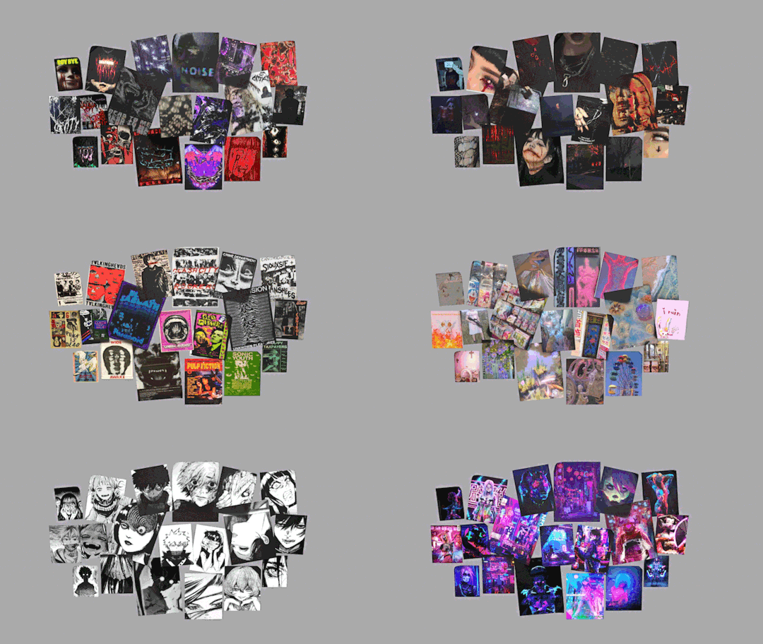
4t3 Conversion of Grouped posters by @cosmiccs4 + Recoloring PSD with tutorial
8 non-recolorable presets
1024 textures
Included PSD for retexturing (tutorial how to use under the cut)
113 poly, all LODs
Shiftable
Price - 5§
BGC
Compressed package
TOU, Ko-Fi

DOWNLOAD | ALT | SIMBLR.CC
Tutorial: How to use my PSD for retexturing
You need:
Photoshop with .dds plugin
My retexture PSD and package file of posters
19 pictures to your liking, preferably vertical
TSRW
Sims3Pack Multi Installer and Compressionizer
Step 1: Open my PSD file, open your images:
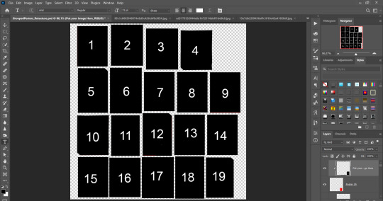
Step 2: Select (Ctrl+A) copy and paste to posters file (Ctrl+C, Ctrl+V) first of your images :
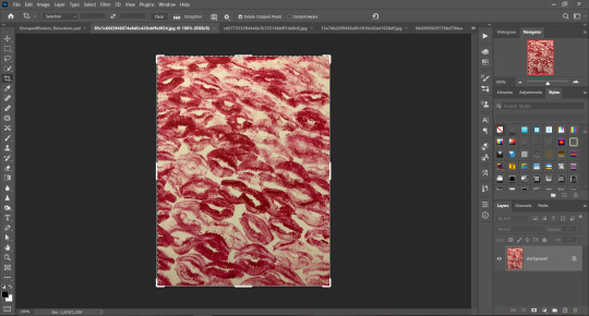
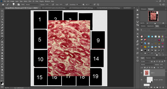
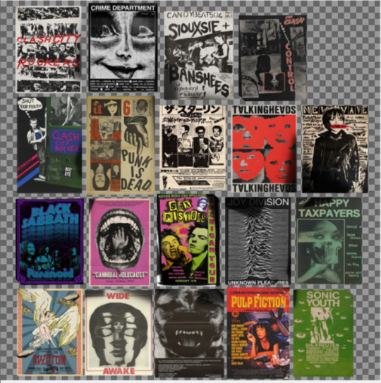
Step 3: Choose where you want to put it, for reference you can use one of the presets:
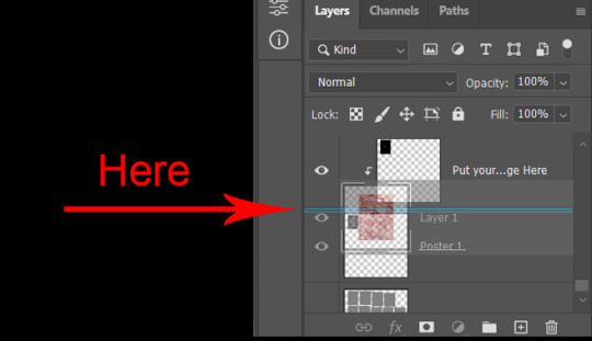
Step 4: After you decided with placement of your image. Move its layer in the Layers tab between "Poster x" and "Put your image here" layers, it will create a clipping mask, which allows the picture to be fit within the poster without cropping. Hide or delete "Put your image here" layer.
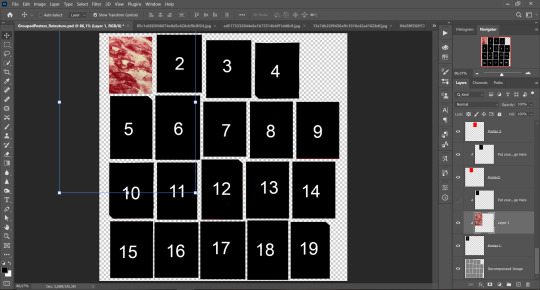
Step 5: Use Transform, Free Transform and Move tools to resize the image by your liking:

Step 6: Repeat the Step 2-5 with other 18 images:
*vibes are totally random, all images from Pinterest*
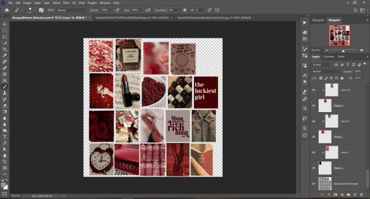
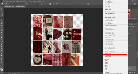
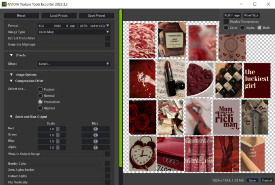
Step 7: After you've done, delete all the "Put your image here" layers, if you didn't it before. Right-click on the Layers tab and press Merge Visible (Shift + Ctrl + E). Now press Save As (Control + Shift + S) and save your image as .DDS with this parameters (2nd picture):
Step 8: Go to TSRW. Press Create New Project > New Import, and select package with my posters. Give for your recolor unique Title and Project name, otherwise it will override original posters:
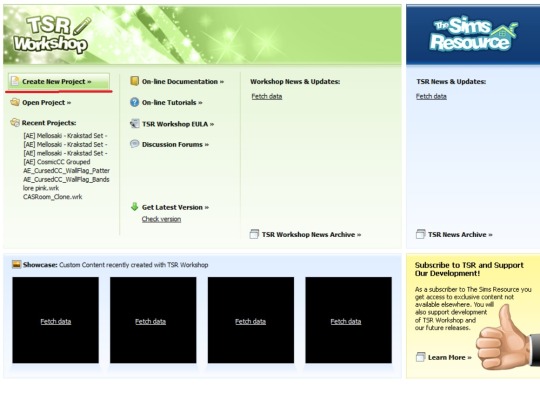
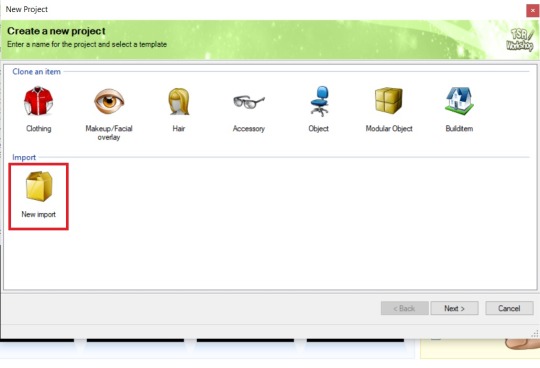
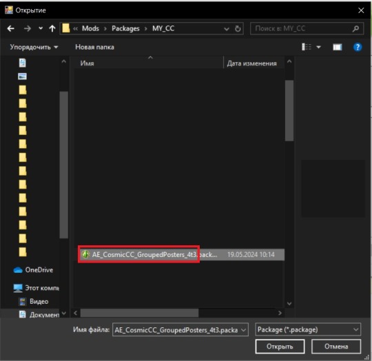
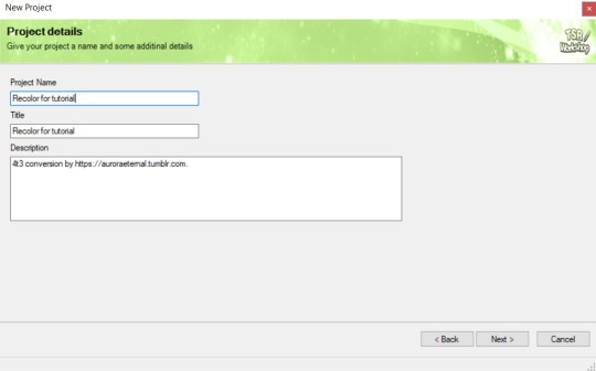
Step 9: In Textures tab go through all the presets except the first one and delete them. Then go to Edit > Project Contents and remove all the textures of removed presets. Its pretty common when someone make retexture of TS3 mesh and leave that unused textures in file, which leads to increasing its size:
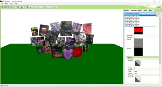
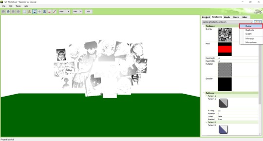
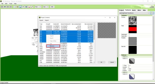
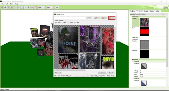
Step 10: Press Edit button next to the Overlay tab. Then press Import button and select your retexture. Press Done and when this pop-up appears, press Yes:
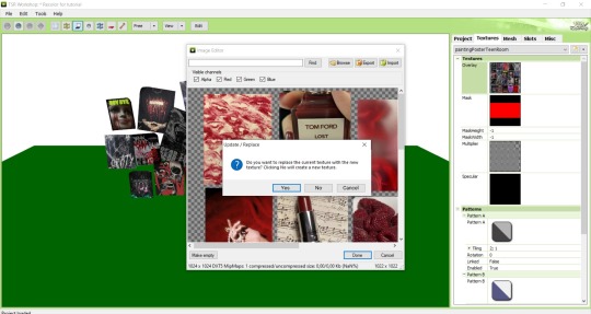
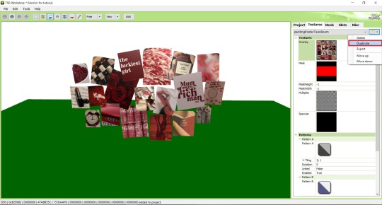
Step 11: If you want to add more presets press Duplicate and reapeat Step 10, but instead, when pop-up about replacing the texture appears, press No.
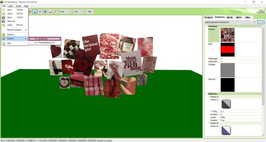
Step 12: After you've done, press File > Export > To Sims3pack or Edit > Project Contents > Export > To .package. If you choose the first method, convert your Sims3pack to Package and in both cases run it through Compressionizer. Test your recolor In-game, make thumbnails (if you want to share it) and have fun!
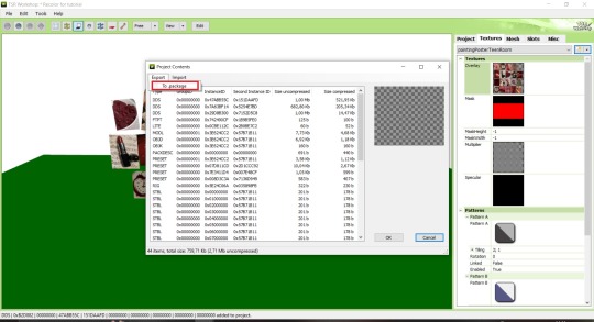
For those who read this tutorial to the end, click HERE to download this recolor.

@pis3update @xto3conversionsfinds @wanderingsimsfinds @kpccfinds @simfluencer-network @sssvitlanz @simblrcc-site
850 notes
·
View notes
Text
Céline Scrying Bowl - DOWNLOAD
If we're going to have a rare white crow, we need a scrying bowl with a white crow statue on it, right?

This item is fully functional; however, it only works at Grim's headquarters (Headlessquarters) in Ravenwood.
The Life and Death EP is required for this item.
1 swatch
custom thumbnail
You can find this item in Build/Buy under Decorations (Misc) or by typing "Céline Scrying Bowl" in the search box in Build/Buy.
HOW TO USE
To be fully functional, this item must be placed inside Grim's headquarters in Ravenwood. To do this, you must first go to Grim's headquarters. Press CTRL-Shift-C to open the cheat box and then enter the cheat bb.enablefreebuild. This will allow you to place objects on the lot. You can place the scrying bowl anywhere in Grim's headquarters.
***NOTE - If you place the Scrying Bowl anywhere other than on the Grim's headquarters lot, it will not function as a scrying bowl. It will be just a decorative fountain.
ADDITIONAL IMAGES


You can do what you want with this item. All I ask is that you don't claim it as your own and that you don't put it behind a paywall of any kind
Céline Scrying Bowl - DOWNLOAD from SFS (free, no ads)
@alwaysfreecc
#made by sapphire#buildenvironment#modobjects#ts4cc#sims 4 cc#ts4mm#sims 4 maxis match#ts4 life and death#sims 4 life and death#functional objects#free cc#stargazersims
114 notes
·
View notes
Text

The Artisul team was kind enough to send me their Artisul D16 display tablet to review! Timelapse and review can be found under the read more.
I have been using the same model of display tablet for over 10 years now (a Wacom Cintiq 22HD) and feel like I might be set in my ways, so getting the chance to try a different brand of display tablet was also a new experience for me!
The Unboxing
The tablet arrived in high-quality packaging with enough protection that none of the components get scratched or banged up in the shipping process. I was pleasantly surprised that additionally to the tablet, pen, stand, cables and nibs it also included a smudge guard glove and a pen case.
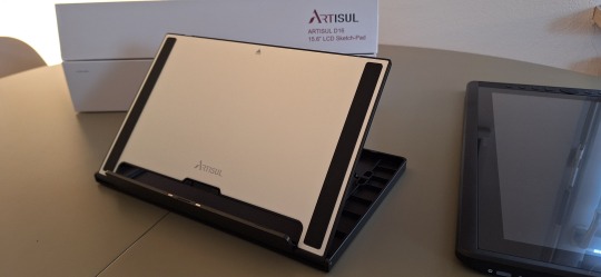
The stand is very light-weight and I was at first worried that it would not be able to hold up the tablet safely, but it held up really well. I appreciated that it offered steeper levels of inclination for the tablet, since I have seen plenty other display tablets who don’t offer that level of ergonomics for artists. My only gripe is that you can’t anchor the tablet to the stand. It will rest on the stand and can be easily taken on or off, but that also means that you can bump into it and dislodge it from the stand if you aren’t careful. It would require significant force, but as a cat owner, I know that a scenario like that is more likely than I’d like.
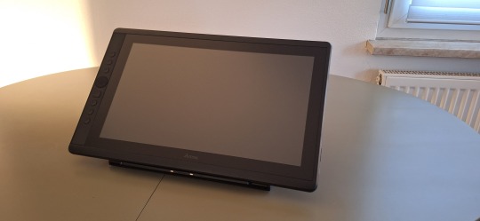
Another thing I noticed is how light the tablet is in comparison to my Cintiq. Granted, my Cintiq is larger (22 inches vs the 15.8 inches of the Artisul D16), but the Artisul D16 comes in at about 1.5kg of weight. While I don’t consider display tablets that require a PC and an outlet to work really portable, it would be a lot easier to move with the Artisul D16 from one space to another. In comparison, my Cintiq weighs in at a proud 8.5kg, making it a chore to move around. I have it hooked up to a monitor stand to be able to move it more easily across my desk.
The Setup
The setup of the tablet was quick as well, with only minor hiccups. The drivers installed quickly and basic setup was done in a matter of minutes. That doesn’t mean it came without issues: the cursor vanished as soon as I hovered over the driver window, making it a guessing game where I would be clicking and the pen calibration refused to work on the tablet screen and instead always defaulted to my regular screen. I ended up using the out of the box pen calibration for my test drawing which worked well enough.
The tablet comes with customizable hot-keys that you can reassign in the driver software. I did not end up using the hot-keys, since I use a Razer Tartarus for all my shortcuts, but I did play around with them to get a feel for them. The zoom wheel had a very satisfying haptic feel to it which I really enjoyed, and as far as I could tell, you can map a lot of shortcuts to the buttons, including with modifier keys like ctrl, shift, alt and the win key. I noticed that there was no option to map numpad keys to these buttons, but I was informed by my stream viewers that very few people have a full size keyboard with a numpad anymore.
The pen comes with two buttons as well. Unlike the hot-keys on the side of the tablet, these are barely customizable. I was only able to assign mouse clicks to them (right, left, scroll wheel click, etc) and no other hotkeys. I have the alt key mapped to my pen button on my Cintiq, enabling me to color pick with a single click of the pen. The other button is mapped to the tablet menu for easy display switches. Not having this level of customization was a bit of a bummer, but I just ended up mapping the alt key to a new button on my Razer Tartarus and moved on.
The pen had a very similar size to my Wacom pen, but was significantly lighter. It also rattled slightly when shook, but after inspection this was just the buttons clicking against the outer case and no internal issues. The pen is made from one material, a smooth plastic finish. I would have liked for there to be a rubber-like material at the grip like on the Wacom pen for better handling, but it still worked fine without it.
Despite not being able to calibrate the pen for the display tablet, the cursor offset was minimal. It took me a while at the beginning to get used to the slight difference to my current tablet, but it was easy to get used to it and I was able to smoothly ink and color with the tablet. The screen surface was very smooth, reminding me more of an iPad surface. The included smudge guard glove helped mitigate any slipping or sliding this might have caused, enabling me to draw smoothly. Like with the cursor offset, it took me a while to get used to the different pressure sensitivity of the tablet, but I adapted quickly.
So what do I think of it?
Overall, drawing felt different on this tablet, but I can easily see myself getting used to the quirks of the tablet with time. Most of the issues I had were QoL things I am used to from my existing tablet.
But I think that’s where the most important argument for the tablet comes in: the price.
I love my Cintiq. I can do professional grade work on it and I rebought the same model after my old one got screen issues, I liked it that much. But it also costs more than a 1000 € still, even after being on the market for over 10 years (I bought it for about 1.500 € refurbished in 2014, for reference). The Artisul D16 on the other hand runs you a bit more than 200€. That is a significant price difference! I often get asked by aspiring artists what tools I use and while I am always honest with them, I also preface it by saying that they should not invest in a Cintiq if they are just starting out. They are high quality professional tools and have a price point that reflects that. You do not need these expensive tools to create art. You can get great results on a lot cheaper alternatives! I do this for a living so I can justify paying extra for the QoL upgrades the Cintiq offers me, but I have no illusion that they are an accessible tool for most people.
I can recommend the Artisul D16 as a beginner screen tablet for people who are just getting into art or want to try a display tablet for once. I wouldn’t give up my Cintiq for it, but I can appreciate the value it offers for the competitive price point. If you want to get an Artisul D16 for yourself, you can click this link to check out their shop!
AMAZON.US: https://www.amazon.com/dp/B07TQLGC81
AMAZON.JP: https://www.amazon.co.jp/dp/B07T6ZT84V
AMAZON.MX: https://www.amazon.com.mx/dp/B07T6ZT84V
Once again thank you to the Artisul team for giving me the opportunity to review their display tablet!
94 notes
·
View notes
Note
hi alie! can i request on how to do this grey-white text? /post/721285784354865152/ thanks!

hiii, sure! it's quite simple actually, here are the steps for the text effect on this gifset (and settings/screenshots under the cut):
type out you text and select white for the color, then set this text layer's blending mode to Difference
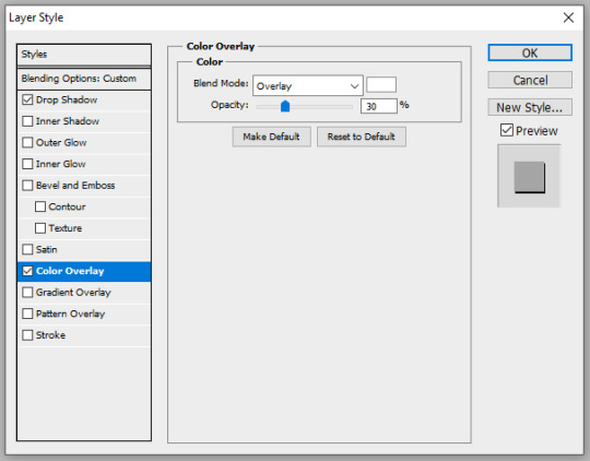
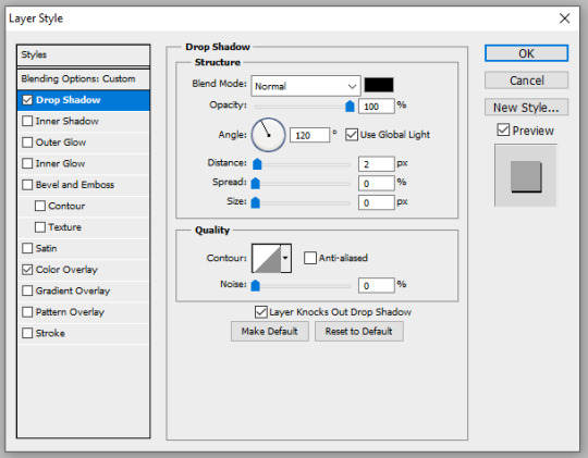
double click on the layer to get to the layer style options and add a Color Overlay. choose the color white (black also works) and set the blending mode to Overlay. play with the opacity slider as you wish, this will brighten your text and it helps for gifs that have a high contrast behind the text.
if you don't need to brighten the text, put the color overlay's blending mode to Hue, you're actually done right here, easy!
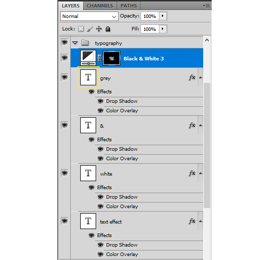
optional: if you're using the color overlay as an overlay like i have for that particular gifset, you need to create a mask of your typography. to do that hold the ctrl key and click on the text layer's icon (the "T", the yellow box on one of my screenshots). this will make a selection of your typography. if you have multiple text layers, hold CTRL + SHIFT to select multiple layers. once your selection is done, go to the top menu and Layer > New Layer > New Adjustment Layer > Black & White > Ok. make sure that layer is on top of the text layers.
add a Drop Shadow if you want, and that's it, the effect is done :)
#alie replies#Anonymous#*ps help#photoshop#resource#tutorial#resources#allresources#typography#completeresources#resourcemarket#userabs#userdahlias#usercats#usersmia
331 notes
·
View notes
Text
Do y'all use the Transmogrifier mod? If not, you really should. I consider it one of the top 10 "can't live without" mods in my game.
This is something I talked about on r/sims3 a lot back when I was insane enough to still post there and I was surprised how few people knew about it despite how useful it is.
Basically what it does is let you copy the functionality of one object to another object in two clicks. Turn your cheap bed into an expensive bed at no extra cost to your Sims. Turn your toilet into a bookcase. Turn a rug into a car. Turn your washing machine into a washing machine-shaped sculpture so your Sims will leave it alone. The possibilities are (almost) endless. Seriously! It looks like it's a super complicated mod and I'm sure under the hood it is, but it's so easy to use.
Open buy mode.
Ctrl shift click the object you want to copy the script of.
Click "copy script" and a little box will pop up at the top right to let you know it was successful.
Ctrl shift click the object you want to copy it to.
Click "change script" and the mod will automatically paste the script you just copied into the box.
Click "accept".


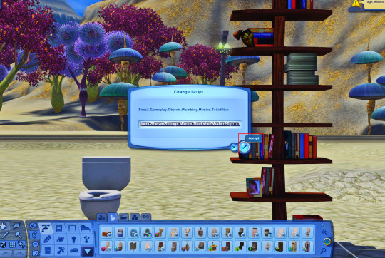

That's it! That's all there is to it! Anyone can do this!
But let me show you what you can do with it as a storyteller. 😏

I have the Pose Player sitting right in the middle of this picture. You know what it looks like by now. Little black movie clapboard with white stripes. Says "Pose Player" on it. Do you see it in this shot?
No.
You don't.
Do you know why?
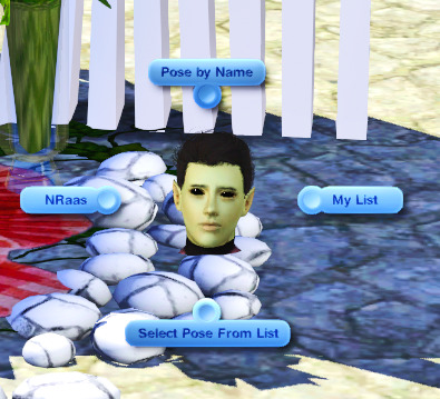
Because it's this random pile of rocks now.
If you don't have this mod, you need to get this mod. I promise you that you will find more uses for it than you ever could have imagined.
241 notes
·
View notes
Text
Flag Making Tutorial
This will be a more technical step-by-step tutorial on how I make my flags (also a long post because I wanted to be thorough, plus I love flags lol).
The program I use is Inkscape, a free vector (.svg) editor program for pc.
I have templates set up, so the actual flag making process is pretty easy/quick.

Hotkeys/Locations/Other Reference
I'll be mentioning these options, so I thought to put them here all in one list. (They list the keyboard shortcuts first)
Snapping: magnet symbol (top right of screen), or under the adjacent arrow ◀️ symbol.
Document properties: shift+ctrl+D, or under the file menu (top left corner of screen). Display (1st tab) Guides (2nd tab) Grids (3rd tab)
Fill and Stroke: shift+ctrl+F, or under object (top of screen).
Layers and Objects: ctrl+shift+L, or under object (top of screen).
Align and Distribute: ctrl+shift+A, or under object (top of screen).
Import (Images): ctrl+i, under the file menu, or by dragging into the Inkscape window.
Save As: ctrl+shift+S, or under the file menu.
Export: shift+ctrl+E, or under the file menu.
Selector Tool: S, or cursor symbol (left side of screen). Click, or click and drag around the objects, to select them.
Locking a selection: lock symbol between the width and height boxes at the top of the screen.
Transform Selections: the width/height and x y position can be changed by typing in the X,Y,W,H boxes (near top middle of screen), or by dragging the corners/edges (resize) and inside the object (move).
Duplicate: ctrl+D.
Delete: delete key, or right click on the object.
Node Tool: N, or below the selector tool (left side of screen).
Rectangle Tool: R, or square symbol (left side of screen).
Pen Tool: B, or pen symbol (left side of screen).
Gradient Tool: G, gradient square symbol (left side of screen).
Mesh Tool: swirly square symbol (left side of screen).
Dropper Tool: D, or dropper symbol (left side of screen).
Undo: ctrl+Z.
Redo: ctrl+Y.

Creating the Template
Download Inkscape and open it, under the Time to Draw tab, click New Document.
First, snapping needs to be enabled, and under advanced mode enable grids and guide lines snapping. (This is crucial for making the stripes equally sized, spaced, and the overall flag in the right ratio.)
I'll be making a template with a 2:3 flag ratio.
Open document properties. (I like to move these types of windows to the right side.)
Under display, set the width to 42px and height to 28px.
Under guides, just click create guides around the current page.
Under grids, make sure rectangular grid is selected, and click new. (Grid units should be in px.) For the major grid line every option, change it to 2. (I also prefer to change the minor grid line color to be transparent.)
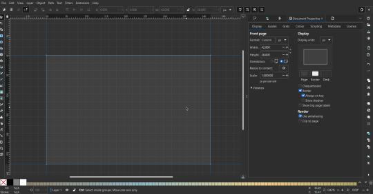
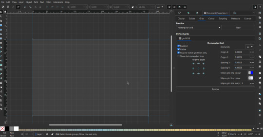
That's pretty much it, your template is done :D ! Just save it wherever you want. I like putting it in an easy-to-access flag folder, as it is needed to open it every time to make new flags.

You can use a different width / height / grid size / flag ratio if you want, these are just the numbers I'm comfortable with / used to.
Also, since this is a vector, the image can be infinitely big or small without any quality loss, so the small dimensions above don't actually translate to a low res image.

Creating the Flag
(I'll be using the rainbow flag to demonstrate.)
Start by having the template open.
You can import images (like .png/.jpg files) to color pick / reference if you want. Said images can be transformed (resized/moved) by selecting and transforming them using the options mentioned in reference. (This is optional, they should just be off to the side so they don't get in the way.)
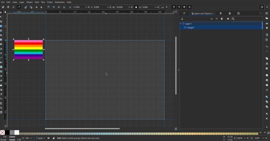
To create the stripes, use the rectangle tool. Click and drag from one grid corner, to a lower grid corner.
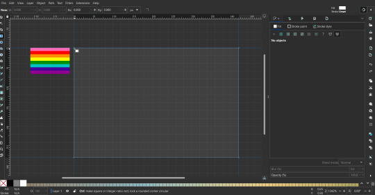
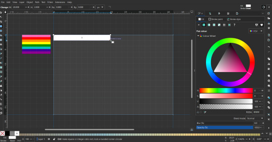
While the rectangle is selected, use the dropper tool to pick a color from a imported image. You can also use the fill and stroke (shown on right) tab to create your own colors / edit colors / etc.
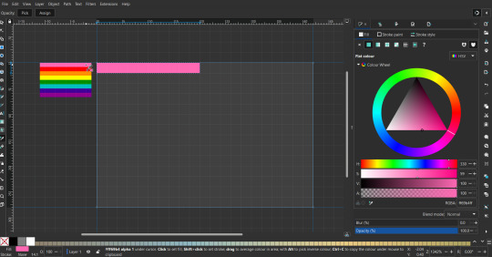
You can make these stripes however you want, they just need to all be equally sized. (They don't have to all have the same height, if you intentionally want that (like the demisexual flag for example).)
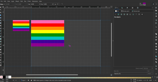
Then select all the stripes and transform them so that they fit the page.
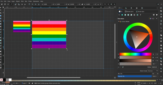
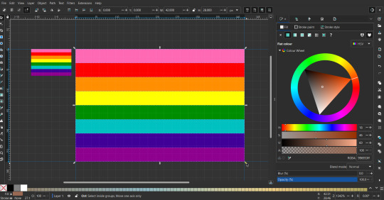
All that's left is to save/export it.
To export it, use the export tab, under single file, page, adjust the width and height (in px) to however high res you want your image to be. (I usually do 3000 by 2000.)
Type in the desired file name in the box next to the folder symbol, use the folder symbol to choose its export location (which can also be used to determine the file name and save/export it), the adjacent drop-down-menu to select what to save it as (,png, .jpg, .svg, etc.), and the gear symbol to adjust other settings (I leave it as default, with antialias turned off (set to 0)).
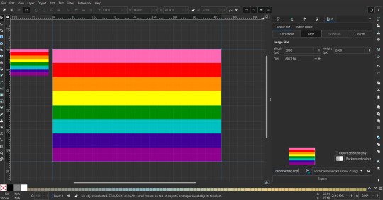
And done, you've made a flag :D 🏳️🌈

Extra Notes
Layers and Objects: a menu that can be used to manage objects. Like their layering position (whether they are above or below another object), and other options can also be done here instead of with keyboard shortcuts.
Vertically striped flags: it's very similar to above. You would just make the rectangles taller rather than wider.
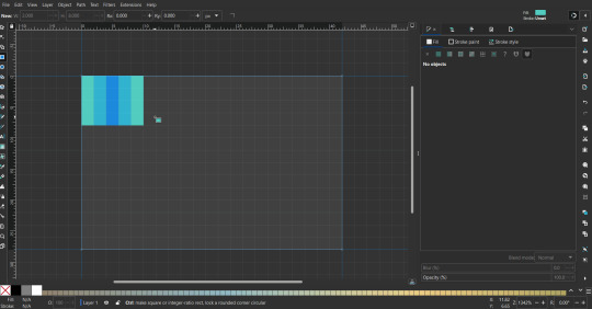
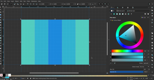
Wavy stripes: first use the pen tool to create zigzags. (The pen tool works like a outline, so just click along the grid corners, and join the line at the end. The fill and stroke menu can be used to make it a solid colored shape, and remove/add outlines). The steepness/frequency of the zigzags is up to personal preference, they just need to extend off the page a bit. To create equally sized wavy stripes, have the all side lengths (highlighted in red) be equal except (depending on how you draw your zigzags) the first or last wave, which should have half the side length of the others.

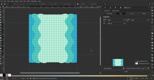
Select everything, and with the node tool, select all the zigzag nodes (the corners don't need to be selected), and click make selected nodes smooth (half circle with point in middle symbol, at top of screen). (It'll likely look like it has weird lines in-between the waves, see glitch section at the end for how to fix that.)
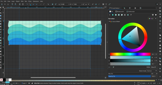
Then resize it all to the height of the canvas. And done :)
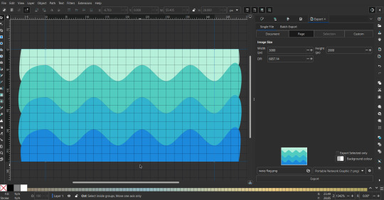
This can of course be vertical too.
Gradients: You can use the fill and stroke dialogue, gradient tool, or mesh tool to do this.
To create the gradient, select the object, click the linear gradient symbol (gradient box) under fill and stroke. Or dragging / double clicking with the gradient/mesh tools. (The mesh tool is what I used to create the square gradient.)
To change the colors, click on the arrows or circles under fill and stroke, or by clicking the points on the shape, to select the nodes. Then use fill and stroke to change the colors.
To create new colors/stops, click on the plus+ symbol under stops (under fill and stroke), or double click on the gradient. Edit the new colors in fill and stroke again.
To change the location of stops, use stop offset under fill and stroke, or drag the nodes on the gradient. You can also move the end points on the object to make the gradient slanted or vertical.

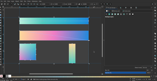
Symbols: I make my own when I can (like the demi- triangle can be drawn with the pen tool, and resized to the correct proportions). When the symbol is too complicated, I import a .svg of it. Wikimedia commons is a great resource, and the popular twemoji comes in .svg format too. You could also edit it on over the .png in a rastor program if need be.
The align and distribute tab can be used to center symbols (or any other selected object). Select page for the relative to option, and use the symbols underneath to center/align it however you want. (You can also use different relative to options, like last selected, if you want to align it to an object instead.)
Deleting imported reference images: you can do this before saving it as a .svg, if you don't want to keep them / want to clean up the .svg file.
Antialiasing: an option that blurs things basically. A image with antialiasing off will be sharp pixels, while a image with antialiasing on will have transition colors between the main colors.
Below is an example. The left side is without antialiasing, and the right side is with antialiasing.

I can see why it might be preferable to have it on (like for diagonal shapes), but antialiasing can make recoloring .png (not .svg) files hard. The extra different colors messes with fill tools. I also think it looks cleaner without, so I prefer it off.
Exporting glitch: sometimes an exported image will have a thin line between the stripes, despite the fact the stripes are perfectly next to each other. (This seems to not just be a problem with Inkscape, but with vectors in general.)
Below is a zoomed in example of what it'd look like. The left side shows the stripes are all next to each other, but the right image has a transparent line in-between the stripes.
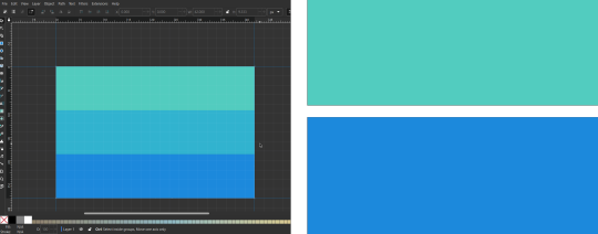
This can be fixed a number of ways.
You could select all the objects, and duplicate them twice.
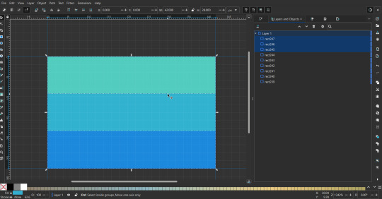
Or overlap them. The stripes will still be the same size when overlapped, but they will technically be behind each other, so there will be no gap.
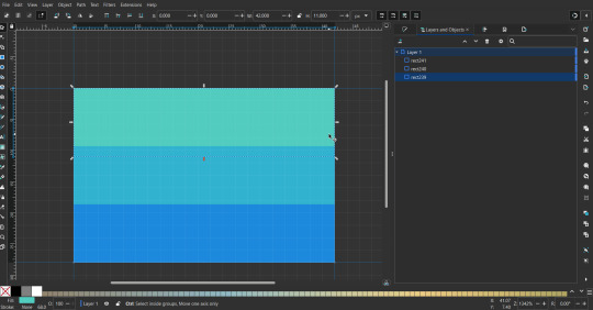

With all the different stuff mentioned, you can basically think of them as building blocks with the grid as reference. They can all be mixed and matched together.
I didn't mention all the options, just because there's that many different things you can do in Inkscape. I'd encourage you to play around with all the different options/tools yourself.
There's also some great Inkscape guides on YouTube, it's where I learned how to do a lot of this from (even if they're not for flags specifically, the concepts in those videos can be applied to flags).

Here's an overly elaborate flag I made, just to demonstrate some (but not all) of the things that can be done.

Anyways what a long post haha. But maybe this will be helpful for anyone interested in making (pride) flags.
209 notes
·
View notes
Text
Important Shortcuts Keys For Computer
CTRL+A. . . . . . . . . . . . . . . . . Select All
CTRL+C. . . . . . . . . . . . . . . . . Copy
CTRL+X. . . . . . . . . . . . . . . . . Cut
CTRL+V. . . . . . . . . . . . . . . . . Paste
CTRL+Z. . . . . . . . . . . . . . . . . Undo
CTRL+B. . . . . . . . . . . . . . . . . Bold
CTRL+U. . . . . . . . . . . . . . . . . Underline
CTRL+I . . . . . . . . . . . . . . . . . Italic
F1 . . . . . . . . . . . . . . . . . . . . . . Help
F2 . . . . . . . . . . . . . . . . . . . . . Rename selected object
F3 . . . . . . . . . . . . . . . . . . . . . Find all files
F4 . . . . . . . . . . . . . . . . . . . . . Opens file list drop-down in dialogs
F5 . . . . . . . . . . . . . . . . . . . . . Refresh current window
F6 . . . . . . . . . . . . . . . . . . . . . Shifts focus in Windows Explorer
F10 . . . . . . . . . . . . . . . . . . . . Activates menu bar options
ALT+TAB . . . . . . . . . . . . . . . . Cycles between open applications
ALT+F4 . . . . . . . . . . . . . . . . . Quit program, close current window
ALT+F6 . . . . . . . . . . . . . . . . . Switch between current program windows
ALT+ENTER. . . . . . . . . . . . . . Opens properties dialog
ALT+SPACE . . . . . . . . . . . . . . System menu for current window
ALT+¢ . . . . . . . . . . . . . . . . . . opens drop-down lists in dialog boxes
BACKSPACE . . . . . . . . . . . . . Switch to parent folder
CTRL+ESC . . . . . . . . . . . . . . Opens Start menu
CTRL+ALT+DEL . . . . . . . . . . Opens task manager, reboots the computer
CTRL+TAB . . . . . . . . . . . . . . Move through property tabs
CTRL+SHIFT+DRAG . . . . . . . Create shortcut (also right-click, drag)
CTRL+DRAG . . . . . . . . . . . . . Copy File
ESC . . . . . . . . . . . . . . . . . . . Cancel last function
SHIFT . . . . . . . . . . . . . . . . . . Press/hold SHIFT, insert CD-ROM to bypass auto-play
SHIFT+DRAG . . . . . . . . . . . . Move file
SHIFT+F10. . . . . . . . . . . . . . . Opens context menu (same as right-click)
SHIFT+DELETE . . . . . . . . . . . Full wipe delete (bypasses Recycle Bin)
ALT+underlined letter . . . . Opens the corresponding menu
PC Keyboard Shortcuts
Document Cursor Controls
HOME . . . . . . . . . . . . . . to beginning of line or far left of field or screen
END . . . . . . . . . . . . . . . . to end of line, or far right of field or screen
CTRL+HOME . . . . . . . . to the top
CTRL+END . . . . . . . . . . to the bottom
PAGE UP . . . . . . . . . . . . moves document or dialog box up one page
PAGE DOWN . . . . . . . . moves document or dialog down one page
ARROW KEYS . . . . . . . move focus in documents, dialogs, etc.
CTRL+ > . . . . . . . . . . . . next word
CTRL+SHIFT+ > . . . . . . selects word
Windows Explorer Tree Control
Numeric Keypad * . . . Expand all under current selection
Numeric Keypad + . . . Expands current selection
Numeric Keypad – . . . Collapses current selection
¦ . . . . . . . . . . . . . . . . . . . Expand current selection or go to first child
‰ . . . . . . . . . . . . . . . . . . Collapse current selection or go to parent
Special Characters
‘ Opening single quote . . . alt 0145
’ Closing single quote . . . . alt 0146
“ Opening double quote . . . alt 0147
“ Closing double quote. . . . alt 0148
– En dash. . . . . . . . . . . . . . . alt 0150
— Em dash . . . . . . . . . . . . . . alt 0151
… Ellipsis. . . . . . . . . . . . . . . . alt 0133
• Bullet . . . . . . . . . . . . . . . . alt 0149
• ®️ Registration Mark . . . . . . . alt 0174
• ©️ Copyright . . . . . . . . . . . . . alt 0169
• ™️ Trademark . . . . . . . . . . . . alt 0153
• ° Degree symbol. . . . . . . . . alt 0176
• ¢ Cent sign . . . . . . . . . . . . . alt 0162
• 1⁄4 . . . . . . . . . . . . . . . . . . . . . alt 0188
• 1⁄2 . . . . . . . . . . . . . . . . . . . . . alt 0189
• 3⁄4 . . . . . . . . . . . . . . . . . . . . . alt 0190
• PC Keyboard Shortcuts
• Creating unique images in a uniform world!
• é . . . . . . . . . . . . . . . alt 0233
• É . . . . . . . . . . . . . . . alt 0201
• ñ . . . . . . . . . . . . . . . alt 0241
• ÷ . . . . . . . . . . . . . . . alt 0247
• File menu options in current program
• Alt + E Edit options in current program
• F1 Universal help (for all programs)
• Ctrl + A Select all text
• Ctrl + X Cut selected item
• Shift + Del Cut selected item
• Ctrl + C Copy selected item
• Ctrl + Ins Copy selected item
• Ctrl + V Paste
• Shift + Ins Paste
• Home Go to beginning of current line
• Ctrl + Home Go to beginning of document
• End Go to end of current line
• Ctrl + End Go to end of document
• Shift + Home Highlight from current position to beginning of line
• Shift + End Highlight from current position to end of line
• Ctrl + f Move one word to the left at a time
• Ctrl + g Move one word to the right at a time
• MICROSOFT®️ WINDOWS® SHORTCUT KEYS
• Alt + Tab Switch between open applications
• Alt +
• Shift + Tab
• Switch backwards between open
• applications
• Alt + Print
• Screen
• Create screen shot for current program
• Ctrl + Alt + Del Reboot/Windows®️ task manager
• Ctrl + Esc Bring up start menu
• Alt + Esc Switch between applications on taskbar
• F2 Rename selected icon
• F3 Start find from desktop
• F4 Open the drive selection when browsing
• F5 Refresh contents
• Alt + F4 Close current open program
• Ctrl + F4 Close window in program
• Ctrl + Plus
• Key
• Automatically adjust widths of all columns
• in Windows Explorer
• Alt + Enter Open properties window of selected icon
• or program
• Shift + F10 Simulate right-click on selected item
• Shift + Del Delete programs/files permanently
• Holding Shift
• During Bootup
• Boot safe mode or bypass system files
• Holding Shift
• During Bootup
• When putting in an audio CD, will prevent
• CD Player from playing
• WINKEY SHORTCUTS
• WINKEY + D Bring desktop to the top of other windows
• WINKEY + M Minimize all windows
• WINKEY +
• SHIFT + M
• Undo the minimize done by WINKEY + M
• and WINKEY + D
• WINKEY + E Open Microsoft Explorer
• WINKEY + Tab Cycle through open programs on taskbar
• WINKEY + F Display the Windows®️ Search/Find feature
• WINKEY +
• CTRL + F
• Display the search for computers window
• WINKEY + F1 Display the Microsoft®️ Windows®️ help
• WINKEY + R Open the run window
• WINKEY +
• Pause /Break
• Open the system properties window
• WINKEY + U Open utility manager
• WINKEY + L Lock the computer (Windows XP®️ & later)
• OUTLOOK®️ SHORTCUT KEYS
• Alt + S Send the email
• Ctrl + C Copy selected text
• Ctrl + X Cut selected text
• Ctrl + P Open print dialog box
• Ctrl + K Complete name/email typed in address bar
• Ctrl + B Bold highlighted selection
• Ctrl + I Italicize highlighted selection
• Ctrl + U Underline highlighted selection
• Ctrl + R Reply to an email
• Ctrl + F Forward an email
• Ctrl + N Create a new email
• Ctrl + Shift + A Create a new appointment to your calendar
• Ctrl + Shift + O Open the outbox
• Ctrl + Shift + I Open the inbox
• Ctrl + Shift + K Add a new task
• Ctrl + Shift + C Create a new contact
• Ctrl + Shift+ J Create a new journal entry
• WORD®️ SHORTCUT KEYS
• Ctrl + A Select all contents of the page
• Ctrl + B Bold highlighted selection
• Ctrl + C Copy selected text
• Ctrl + X Cut selected text
• Ctrl + N Open new/blank document
• Ctrl + O Open options
• Ctrl + P Open the print window
• Ctrl + F Open find box
• Ctrl + I Italicize highlighted selection
• Ctrl + K Insert link
• Ctrl + U Underline highlighted selection
• Ctrl + V Paste
• Ctrl + Y Redo the last action performed
• Ctrl + Z Undo last action
• Ctrl + G Find and replace options
• Ctrl + H Find and replace options
• Ctrl + J Justify paragraph alignment
• Ctrl + L Align selected text or line to the left
• Ctrl + Q Align selected paragraph to the left
• Ctrl + E Align selected
__________The End__________
16 notes
·
View notes
Text
how i make my gifs
recently i had a couple people who were interested in my gif-making process, so i thought i'd share in case anyone else is interested or wants to learn how to make them! tutorial is under the cut!
things you’ll need for this tutorial:
OBS (or some other software to capture your footage, but i find OBS works best for me)
photoshop (i’m using photoshop 2024)
optionally, the otis_inf photomode mod for bg3, which isn’t free but helps for more interesting footage!
after you have your footage recorded, open up photoshop and in the top tabs, select window > timeline to bring up the timeline at the bottom of your screen. this is where you’ll do a lot of editing for your footage. also, make sure you have your layers window open as well, which for me is hotkeyed to f7 by default.

next, we’re going to input the footage into photoshop. my footage is in .mp4 format. in the top tabs, click file > import > video frames to layers. click on the clip you want to make a gif of and hit open.

this window allows you to select the part of the footage you want to import using the sliders beneath the video. basically everything between the two sliders at the bottom is what you’ll be importing. you can change the settings to whatever works best for you, but make sure you have the “make frame animation” checkbox ticked. once you’ve selected the part of the video you want, hit okay. you’re limited to 500 frames, so keep that in mind!

once the footage loads, you should see something like the image above, with your frames in the timeline and reflected as layers in the layers panel on the right hand side. the first thing i do is adjust how quickly the frames play.

if you look closely (red arrow), you’ll see that the frames will play every .02 seconds, which is too fast for me personally. I usually set it to .03 seconds or .04 seconds. you can do this by selecting the three little lines indicated by the green arrow and selecting all frames. then click the little down arrow next to any of the .02 numbers, click other, then you can input your custom frame delay.
now you want to select all the frames in the layers window. to do that, click the first layer, scroll up to the last layer, hold shift, then click that as well to select everything in between. you should now have all your frames and layers selected, which you can see here as they’re all highlighted.

next, click the little icon in the bottom left corner of the timeline.

it’ll take a moment to load, but once it does you should see something like this:

now in the top tabs, select filter > convert to smart filter, and hit okay to convert it into a smart object. once that’s done, you’ll see something like this, with only one layer of animation.

congrats, you’ve made a gif! you could resize/trim it and call it a day there, but i like to do a little more editing. the first thing i’m going to do is resize the gif. pick whatever works for you, but tumblr’s dashboard is still 540 px wide, so that’s usually what i do. keep in mind that the larger your image, the larger the file size - you’re capped out at 10mb, which is always smaller than i think it’s going to be. basically, the smaller the gif, the more frames you can have.
i resize the whole gif with ctrl + alt + i. whatever you want to set it to is your choice, but i usually aim for 50% and below if i want most of the footage to be the gif, but if i'm only using part of the footage i'll obviously keep it a bit larger. i want most of astarion to be in the gif, so i resized to 40%.

from there i’ll resize the canvas with ctrl + alt + c and set the dimensions to 540 px in width and whatever i want for the length, depending on the composition of my image. you can also trim the frames down by dragging the purple bar in from either side to pinpoint the exact footage you want.
once i have the size right, i move on to coloring. there are a lot of ways you can go about doing this! 95% of the time i use adjustment layers because they’re easy and work best for me. the ones i use most frequently are highlighted below, and can be accessed quickly through the little half-shaded circle at the bottom of the layers tab. i also like to add a smart sharpening layer to crisp up some of the finer details.

after coloring and sharpening, this is my before and after result:


once you’re done with that, all that’s left to do is save (unless you want to add text, but we’ll be skipping that this time). my default hotkey for that is ctrl + alt + shift + s. you can also find this under file > export > save for web (legacy), but i find the hotkey faster. a window will pop up showing you information about your gif before you save it.

i honestly don’t know what half of these settings do; the only thing i really pay attention to here is the size, and as long as it’s under 10mb you’re good to go. you can preview the way your gif will play, which i always do just in case there’s something i didn’t catch. hit done to save, and that’s it!
this is the first time i’ve written anything like this, so if there’s anything that doesn’t make sense, feel free to ask!
26 notes
·
View notes
Text

some quick info: ↳ this is specifically for the screencapping method. i use mplayer osx extended to get my caps, but there are a few other programs you can use as well. i’ll specifically be going over mplayer here. ↳ i’m using ps 24.4.1 on a 2020 m1 macbook air
[tysm to @kyubinz for looking this over and adding some things ily]
☆ feel free to send me an ask/message with any questions you have! ☆
「 setup 」
1. finding videos
one big thing to remember is that the overall file size of your video will impact the quality of your gif. the larger, the better. i almost never use anything below 1080p, and try to use 2160p whenever i can. 4k video downloader is the program i use for downloading videos from youtube, it’s free to install and works great! because of how large some files can be, i always store any media on my hard drive. i highly recommend using one if you plan to keep lots of files on hand.
.mkv files are best, but .mp4 works fine as well (.mkv files are usually bigger aka better quality).
2. getting your screencaps
after downloading mplayer, go to the top bar and click file > open. open the video you’ll be screencapping.
you can either drag the little time indicator or using the arrow keys on your keyboard to move to the spot you want to capture. the > key can also be used to move forward frame by frame. to start capping, pause the video and press shift + cmnd (ctrl if you’re on windows) + s to take a screencap. i usually just hold it down until i’ve gotten all the screencaps i need.
by default, screencaps go right to desktop. you can set up a folder for them to go to automatically by going to settings > general and then selecting a spot in the menu under “interface”, but i just let them go to desktop and then sort them into individual folders so they’re easier for me to find while i’m giffing. in general, i try to stay under 80 frames so my gifs fit into tumblr’s 10mb image size limit.
3. importing screencaps into photoshop
to import your caps into ps, go to file > scripts > load files into stack. this window should open:

click browse, and navigate to the folder with your caps in it. select all of the caps you want to import, and then click open.
click ok to create a file with your caps, and then wait until it’s finished loading your caps into the layers tab. once they’re loaded in, this is what your screen should look like:

(if you aren’t seeing the timeline at the bottom of your screen, go up to the top bar and go to window > timeline)
click create frame animation, then go to the hamburger menu at the top right of the timeline and select make frames from layers. once your frames have loaded in, select the same menu again and click reverse frames. play through your gif to make sure everything looks good.
if you were to save your gif at the speed it’s set at now, it would be way too fast. to fix this, you have to set the frame delay. do this by selecting all your frames in the timeline using shift click, and then clicking (on any frame) where it says “0 sec”. select other from the menu that comes up, and you should get this popup:
the general rule of thumb for gif frame delay is 0.05 seconds. there are some cases — certain animated movies or video games, for example — where other delays are best, but for the most part, 0.05 is what you want to use (0.05 can slightly slow gifs, and sometimes using 0.04 better matches the clip's original timing. this is really a "train your eyes" thing, and picking the best delay gets easier as you gif for longer). you can set this by typing the number into the text box and then hitting the ok button or enter on your keyboard.
at this point, i’d go ahead and save your file. you can go to file > save in the top bar, or just hit cmd/ctrl + s on your keyboard.
「 making your gif 」
1. sizing
after your frames are ready, the next thing is to size your gif. to crop your gif, press c on your keyboard to open the cropping tool. white borders will show up around your gif.
before doing anything, i would suggest making sure “delete cropped pixels” is unchecked. this will allow you to drag your gif around later if you want to reposition. you can find this option at the top of your screen. drag the borders on either side until you have the area you want selected. mine looks like this:
once you’re happy with your selection, hit enter on your keyboard to finalize it.
the tumblr image guidelines require gifs to be 540px across (here’s a post detailing this). to change your gif’s image size, go to image > image size in the top bar. you’ll get this popup:

instead of setting the width right to 540, i’ll be setting it to 544, and then trimming down the edges using canvas size. this makes the quality just a little better, and also prevents any weird borders being made around your gif on the off chance photoshop decides to add them. this isn’t necessary at all, you can absolutely size right to 540, but i just like doing this. if you choose to do this, open canvas size right after you set image size (image > canvas size in the top bar), and trim your width down to 540 and your height down a few pixels as well.
2. sharpening & other filters
sharpening is essential for good-quality gifs. the first step to this is converting our timeline from frame animation to a video timeline. select this little icon in the bottom left of your screen:
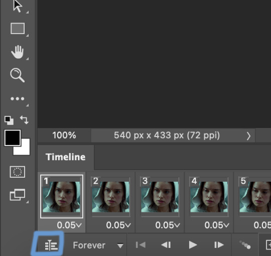
this is what your timeline will look like now:

you can use the little slider with mountains on either side to change the width of your frames in the timeline for easier access when editing. now that we’ve got all this set up, we can sharpen! i use this action pack to sharpen my gifs in addition to a few of my own settings (here is a video on how to install actions into photoshop). go to window > action in the top bar if you aren’t seeing the action tab.
i’ll be using the sharper action from the pack. to use an action, select it from the list and press the little play button at the bottom of the panel to apply it.
in addition to this, i usually also add unsharp mask at 50% amount with a 0.5px radius:


there are a few other filters than can be helpful when giffing:
a. add/reduce noise noise (aka grain) can be added with “add noise”. go to filter > noise > add noise.
these are the settings i usually use, but the amount depends on the gif (i don't ever go over 3.5 for the most part):
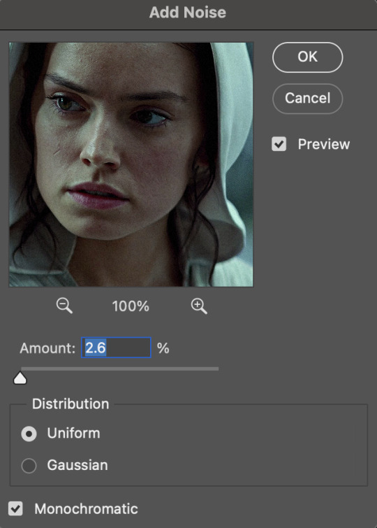
(if you want a grain effect but moving noise doesn't work for the gif, you can also add a grain overlay and then mess with blending mode and layer opacity until it looks how you want)
reduce noise can be used to remove some of the pre-existing grain on a clip. go to filter > noise > reduce noise. here are my settings:

leaving reduce noise on its own at 100% is a bit too much, so double click this icon and change the opacity (i usually do around 45):

b. gaussian blur if your clip is a bit pixelated, gaussian blur can help with smoothing it out a bit. go to filter > blur > gaussian blur. my settings are 1 pixel radius w ~20% opacity (this changes based on the gif).
3. coloring
time to color! i want you to keep in mind during this section that everyone likes different colorings, and this is just my process! please don’t feel pressured to follow exactly what i’m doing, the best way to find what you like is to just mess around and experiment!
i like to start off with lighting adjustments: brightness/contrast, levels, exposure, and curves.
a. brightness/contrast i usually start out with this first, just because brightening the gif right away helps me start thinking about how i want to color! here are my settings:
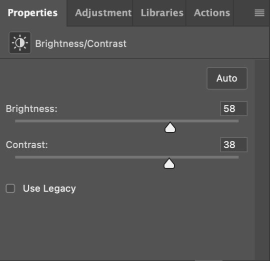
b. levels/curves levels and curves can either be used interchangeably or together. i usually use levels to adjust lighting and curves to adjust color values, but i’ll go over using both for lighting as well as using curves for adjusting color values.
for both of these adjustments, i use the eyedropper tools to pick out white and black points. for levels, the top eyedropper tool to the left of the graph is used to pick out a black point. i do this first. use the tool to pick a spot on your gif that you want to be the base for black values. for me, that’s the shadow inside rey’s hood. the bottom eyedropper tool picks white point. use the tool to pick a spot on your gif that you want to be the base for white values. i chose the outside of rey’s hood. make sure you’re doing this on a new levels adjustment layer.
now, on to curves. you can either use the same eyedropper method or manipulate the graph directly. using the eyedropper is the same as levels, so i’ll just go over graph manipulation.
shade lightens as you move to the right along the x-axis of the graph — black is the far left, white is the far right, middle is the midtones. generally, i don’t work with midtones.
i’m going to use levels for this gif’s lighting, and curves to adjust color values. here’s how to do that:
curves can be used to adjust the amount of a certain color in different lighting areas of a gif. for example, i can specifically decrease the amount of green in the gif’s whites. to edit these values, select the rgb drop-down menu and adjust them one at a time. here are my final graphs:
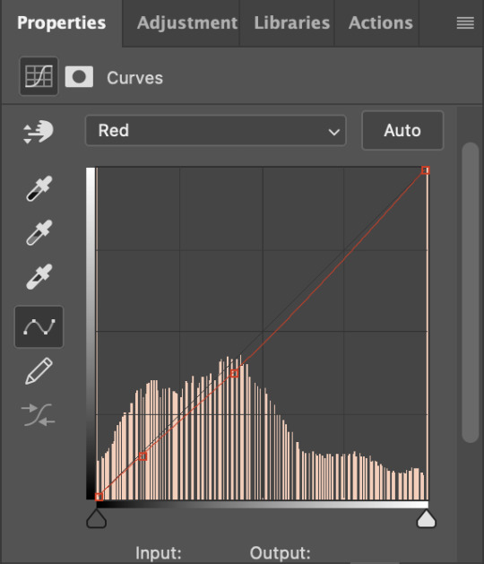


c. exposure this one’s pretty straightforward. the exposure slider adjust general exposure. the offset slider adjusts how dark your dark points are, and gamma correction can be used to lighten/darken scenes as a whole. here’s my settings:

d. color balance color balance is used to adjust overall tint of a clip. this is in general pretty simple, but i do want to point out that using the shadow and highlights tabs in addition to just the midtones can really help. here’s my settings:

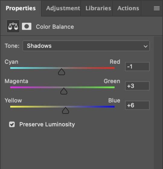
e. channel mixer channel mixer is one of my favorite tools in ps, especially for coloring scenes that are a pain in the ass without it. to avoid taking up too much space, here’s a great tutorial covering channel mixer. here’s my settings:


[at this point, i’m noticing my gif is still a bit darker than i’d like it, so i’m adding just a bit of brightness/contrast to fix it. there’s also a patch of blue over one of rey’s eyes, so i’ve used a hue/saturation layer to get rid of that bit and masked it to her eye. i’m not going to go over masking here, but there are lots of great tutorials out there!]
f. selective color selective color can be used to adjust the amount of specific colors within a color. for example, if i were to go into the red tab and take out cyans, the reds would become more red. if i were to add yellows, the reds would become more orange, etc etc. this can be especially good for color manipulation. for this gif, i’d like to make the background more blue, so i’m going to use selective color to do this. here’s my settings:

g. color lookup color lookup uses 3dlut files to remap gif colors (it’s a preset — think instagram filter or something similar). i don’t always use these, but when i do, i almost never leave them at 100% opacity. color lookup is great for giving gifs a film-type look if you want to do that, it’s got loads of different options. here’s my settings (adjustment layer is set to 20% opacity):

atp i’m pretty much done with coloring! i usually end up doing a few extra little lighting adjustments at the end. for this gif, i added some brightness/contrast at +8. i’ve also noticed that my gif’s looking a bit grainy, so i’ve added some noise to lean into it. this is usually the way i fix it, but you can definitely do reduce noise/gaussian blur as well if you don’t want a grainy look.
here’s my fully colored gif + a process gif (fast images warning):


「 saving gifs 」
1. frame rate
one thing you may have noticed is that my gif is looking a bit choppy. photoshop has a tendency to mess with frame delay after gifs are converted to video timeline. here’s how to fix that.
select all of your layers and convert them to a smart object (right click > convert to smart object). next, click on the hamburger menu in the top right of the timeline and go to convert frames > flatten frames into clips. now we need to change the timeline from video timeline to frame animation. click the little 3 boxes symbol in the bottom left corner of the timeline:

go to the hamburger menu again and select make frames (this is the same one you used earlier), then go through your frames and delete any duplicates. the first frame usually needs to be deleted specifically. once you’ve done that, set the frame delay back to 0.05 the way you did earlier.
2. exporting
once you’re happy with how your gif looks, go to file > export > save for web (legacy).
these are my export settings, but feel free to experiment with the menus where i have selective and diffusion selected, different settings work best for each gif. in general, most gifmakers only use selective/adaptive and diffusion/pattern because they generally work the best for tumblr. before saving, make sure your looping option is set to forever:

gif size for tumblr has a 10mb limit. my gif is under this, so i don’t need to make any changes, but if yours is over, you can either delete some frames from the beginning/end of your gif and/or adjust the height of the gif (width needs to stay 540px so your gif doesn’t get stretched/compressed on tumblr, but height is fair game).
here's my final gif!

happy giffing, and please don’t hesitate to send me any questions you have! ♡
#*mine#gif tutorial#tutorials#allresources#usertheos#userzesty#userzaynab#usershreyu#rogerhealey#userabs#userhekaates#usermaria#userraffa#usermorgan#uservivaldi#tuserheidi
340 notes
·
View notes
Note
a gifmaking tutorial would actually be super appreciated :)
Okay, this is gonna get long and it might not be great but I will do my best to make it understandable.
Put under a read more cause we're not forcing anyone to look at all this.
We're gonna make this gif:

First of all you'll need 3 software programs downloaded.
4k downloader (to download videos)
Gomplayer (to get the frames from the videos)
Photoshop (I pay for it but there are other ways)
Some things to keep in mind
better quality video = better quality gifs
if you want videos in 4k you have to download them in MKV format as MP4s can't be 4k.
gifs can only contain 256 colours so gifs with a lot of different colours might get grainy.
if you use low quality videos or upscaled videos they sometimes have duplicate frames which will make the animations look weird, but you can easily remove those extra frames.
tumblr only accepts gifs under 10mb in size so all gifs have to be less than that (photos less than 20mb)
you can put up to 30 gifs/images in one post
ok here we go
Step 1: Download video
Step 2: Get the frames from the video
You will play the video using Gomplayer
Find the part you want to GIF
Press CTRL + G to bring up this menu

I haven't experimented much with these settings but you'll want to choose the place you want your frames to end up so you can find them later
4. Have the Capture all frames box checked (unless it's 60fps then do 0.03). You can capture up to 999 frames in one go.
5. Press "burst capture" and it will start getting the frames (video has to be playing) it will look like this.

6. Great you have your frames.
Step 3. Making a GIF
Open Photoshop
Load Files Into Stack

This will open the folders on your computer so navigate to where you put your frames and select the frames you want by clicking on the first and holding shift while clicking on the last.
3. Wait for PS to load the frames
4. Once it's all loaded the first thing you'll do is crop it. Press 'C' on your keyboard. There are a couple presets you can use or you can 'clear' that and crop however you wish.

I always crop out at least a little of the top and bottom cause there can be dark lines there.

5. Resize: for optimal quality on tumblr there are three sizes to keep in mind.

For sets like this with 3 gifs next to each other the width should be 177p, height does not matter.

For sets like this with 2 gifs next to each other the width should be 268p

And for a set like we're doing today with just 1 gif it's 540p
You'll want to memorise these numbers for future use.
177p, 268p or 540p will be the width of your gifs.
To open the resize menu you press CTRL + ALT + i

Change the width to in this case 540p (p as in pixels)

It will auto match the height to keep the same proportions.
Click OK and wait until it's done.
6. Make sure you have the 'timeline' window up at the bottom of your photoshop

7. Click 'create frame animation' (button might say video timeline but change that by pressing that little arrow next to it)

8. Press the button with three lines in the top right of the 'timeline' window and press 'make frames from layers'

9. The frames will have loaded in in reverse order so open the same menu and click 'reverse frames'
Step 4. Blurring the logo/text (optional)
Since we have a logo in there I will want to blur it but you might not have one or you don't care if there's a logo or text in your gifs.
First we have to make the gif into a smart object.
Select all layers by pressing CTRL + ALT + A
Convert into a 'video timeline' by pressing the button in the bottom left of the timeline window

3. Right click on your layers and click on 'convert to smart object'

4. Press Z to switch to the zoom and zoom in on your logo/text.
5. Press L to switch to the lasso tool and select your logo/text

there should now be a line where you selected.
6. Open 'Gaussian Blur'

7. Click OK
Now we have to get our GIF back to the frame timeline.
8. Click 'flatten frame into clips' using the timeline menu

9. Press 'delete' once to remove the smart object

10. Convert back to frame animation

11. Make frames from layers

No need to reverse this time. But now your logo/text is blurred, as long as it doesn't move but that's a topic for another day.
Step 5: Sharpening
If you didn't have something to blur let's go over smart objects again.
Select all layers by pressing CTRL + ALT + A
Convert into a 'video timeline' by pressing the button in the bottom left of the timeline window

3. Right click on your layers and click on 'convert to smart object'

5. Camera Raw Filter (Optional)
I use this for base editing of colours and the overall clearness of GIFs, it's not made for that tho it sometimes gets buggy. Works best on photos.
Press CTRL + SHIFT + A to open this.

It's best to do as little as possible in here as it can bug out.
I mostly mess with the effects, light and detail settings in here, don't touch the sharpening though cause we will use smart sharpen for that.
6. Smart Shapening
Most people have a sharpening action they use, including me. But you can also do it manually. You can find my actions in here.
To do it manually and make your own settings. This is how you open smart sharpen.

If you use my sharpening action remember it can be a bit much sometimes, in that case hide the second layer

Use an action or mess around to find a sharpening setting that looks good on your gif, usually don't need much.
Now we have to get our GIF back to the frame timeline.
7. Click 'flatten frame into clips' using the timeline menu (I'm low on images to use check the blur section for images)
It might take a minute since it has to process the new settings.
8. Press 'delete' once to remove the smart object
9. Convert back to frame animation
10. Make frames from layers
11. Select all your frames to set the framerate

You can click on any frame for this. Click 'other' and set it to 0,06.
12. Press CTRL + SHIFT + ALT + S to open 'Save for Web'

these are my save settings.
Click save and name and place it wherever you want it saved.

Congrats you've made a gif.
Step 6: Colouring
Now we have a problem cause there's already 30 images in this post.
For colouring I have a psd I use and adjust to the individual set. It's in my google drive you can find it here along with my actions.
If you're making several gifs from one video you'll want to adjust to the first and then copy that over to keep things matching.
We can go more in depth on this but that would have to be a different post since I can't put more images in this one.
Step 7: Watermark (optional)
A lot of GIF makers have watermarks these days as there's a lot of people who repost GIFs without credit. Make your own so people know the GIFs are yours even when posted elsewhere.
Step 8: Post
Post your hard work on your tumblr, use a bunch of tags so people have a higher chance of seeing it.
I hope this post was understandable and clear, let me know if you have any questions and if you want a proper colouring post.
31 notes
·
View notes
Note
hello! im a newby gimaker and i want to follow your tutorial on sharpening but i dont know how you got to the photoshop page you started from where it looks like a video timeline. can you tell me how you got there? <3
Hey!!
Welcome to the wonderful world of gifmaking <3 yes i can lead you through to that point. I have a mac so this might look different for you, but all the steps stay the same - I just shifted from windows to mac so i know this xD
I'm going to show you how to do this on this gif:
I prefer to use screenshots for my gifs (I also don't know how else to make them), so I use Mplayer for that. I used to use MPV player but that stopped working with my new computer system.
First, you want to make sure that you're using a high-quality file. If 1080p is available to you, use 1080p at the very least. This will make sure your gifs are crisp and sharp.
Open your file with Mplayer. Then find the bit that you want to gif. I sometimes search forward by frame by using the ">" key. Once you're at the start point of your desired gif, pause the video. Then, Cmd/Ctrl + Shift + S to start screenshotting. The video will start to play slowly as the screenshots are captured. (They go to the desktop automatically but you can change that in interface settings).
The rest of the tutorial is under a cut:
Once you get your screenshots, you're going to go Photoshop. File > Scripts > Load Files Into Stack.

You're going to get a dialogue box. Click Browse and load the screenshots that you want. This is what that looks like when you finish:
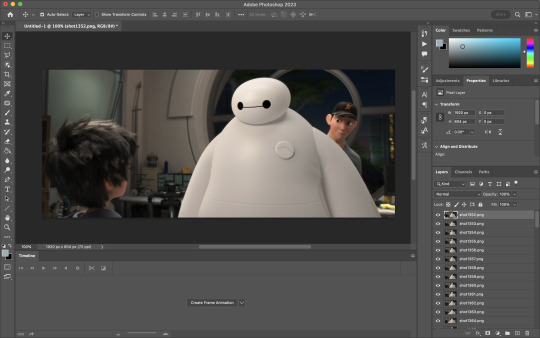
Next, you're going to crop your gif, using the crop tool. You can press C on your keyboard for this or use the tool with this icon in the sidebar.

For this, I'm using an aspect ratio of 540 x 400:

Click that checkmark to crop. Once you do, we're going to resize the image. Use the Cmd/Ctrl + I function to bring up this box. For tumblr gifs, you want to change the width. The height doesn't really matter but if the width doesn't match up, Tumblr is going to fix it for you and it'll look funky. Per row:
1 gif , we use 540px
2 gifs, 268px each
3 gifs, 177, 178, 177 px
We're just doing one, so I'm using 540px.

Now, you want to make sure you can add the timeline. In the top bar, go to Window > Timeline
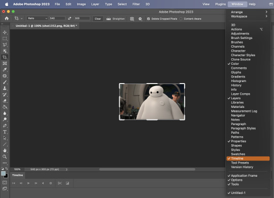
This will bring up the timeline.

From there, click "Create Frame Animation" (you might have to press the arrow in the timeline bar first.)
It's going to look like this:

We're going to use those three lines in the corner of the picture above. The first option we'll select is "Make Frames From Layers"
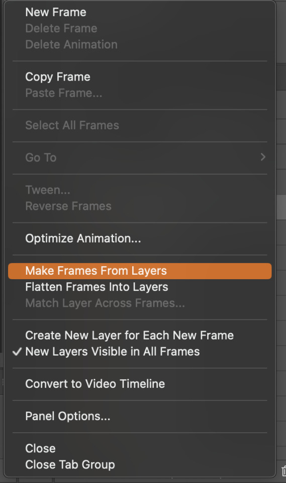
That looks like this:
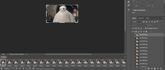
Now, when these load in, you may notice that they're all in reverse. To make them go back in order, we're going to go back to that menu and click "Reverse Frames."
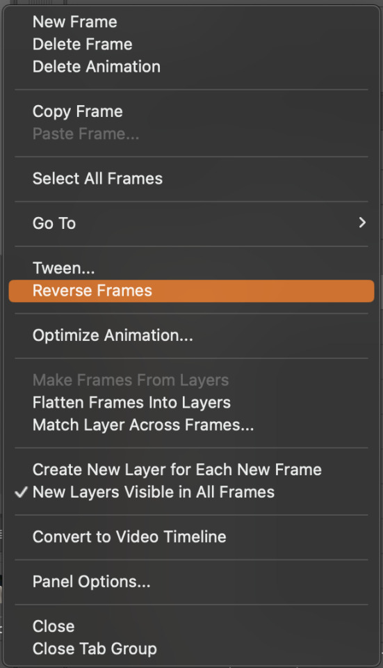
Then, in that same menu, click "Select all Frames." We're going to change the animation speed. You want to make sure you have the first frame selected. We're going to click the arrow next to the "0 sec"
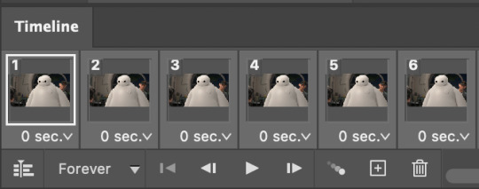
When you click that, it will give you a menu. Click, "other..." You should get a dialogue box that says "Set Frame Delay", just like the one below.
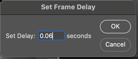
You want to use anywhere between 0.05-0.1 seconds. I find that anymore more is just too slow, so I prefer 0.06. This is fully changeable at the end of my sharpening tutorial, and you can use what you want, but that's what I prefer.
When you do that, it'll change the frame speed of all the gifs.
Now, go back into that little menu, and click, "Convert to Video Timeline."
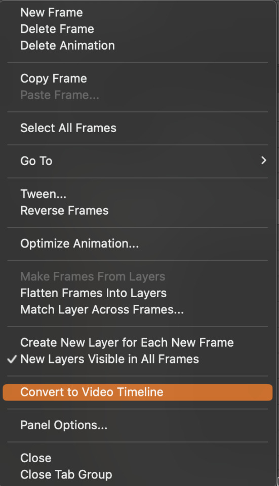
This is what it'll look like:

Now we're going to select all the layers in the right-hand pane. Once we do that, right-click and select, "Convert to Smart Object."
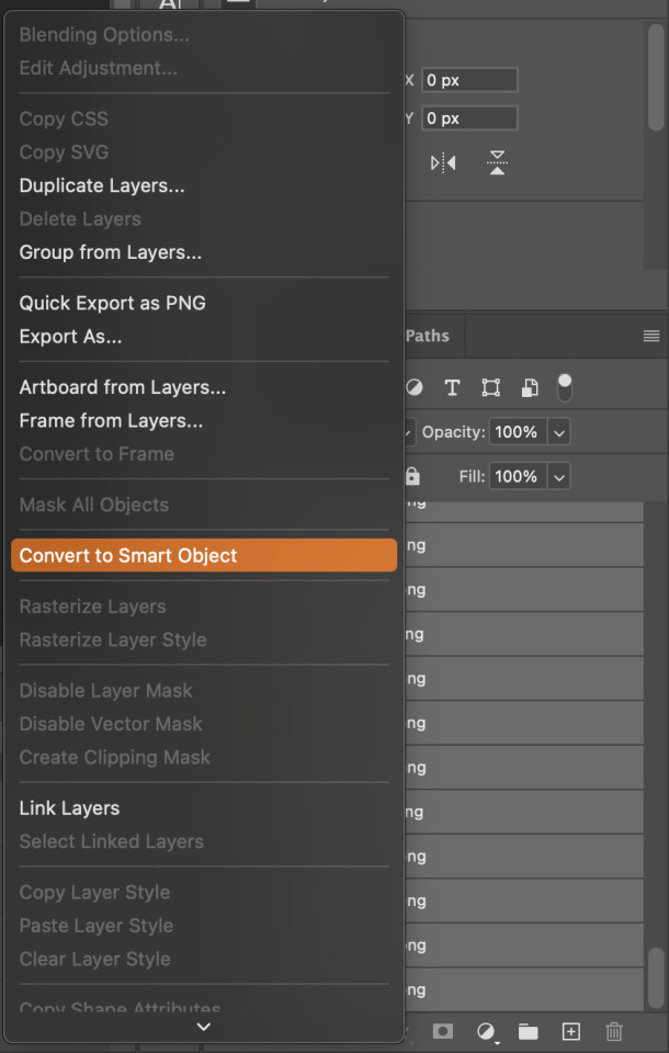
And you're there! Now you can use the sharpening tutorial to your liking.
Pro tip: Make an action with all these steps so you don't have to do them by hand with every single gif you make.
Hope this helps and it wasn't super long winded. Let me know if you have any questions <3 Happy giffing!
#zee answers#zee's tutorials#sharpening#gif creation#tutorials#gif tutorial#photoshop tutorial#resources#ps help#dailyresources#userphotoshop#completeresources
41 notes
·
View notes
Text
Tidbit: Persnickety About Posters
If you want to avoid overly dark or blurry posters in your fan adventures, then follow my lead:
1) Download JPEG off of Google Images.
2) Import, scale down, and skew/shear it. Use an interpolation method such as Bilinear or Bicubic Sharper. Doing both transformations at once is better than repeatedly transforming the image (i.e. resizing it, applying the transform, and then skewing it), as it helps prevent the image and edges from becoming too blurry. This will be important later.
You can hold down Ctrl + Shift to constrain the Move tool along a single axis so it won't go out of alignment as you're skewing it. If you don't see the Transform Controls by default, enable it in the tool options bar at the top, or go to Edit>Free Transform.
3) Desaturate it. Desaturate means to turn color grayer, until it becomes black and white.

4) Adjust the brightness and contrast using the Levels adjustment tool. It's much too dark as it is! In Photoshop, it is located under Image>Adjustments>Levels..., but I recommend creating an adjustment layer from the bottom of the layers tab instead. Doing so will allow you to make edits non-destructively, meaning you can go back and change any parameters until it looks right.

You could use a Brightness/Contrast adjustment with "Use Legacy" enabled instead to achieve a similar effect, but it won't clip the shadows and highlights as easily. You would have to create an additional duplicate adjustment and turn the brightness and contrast way down on the first one to do so. It's somewhat easier to use but less efficient than Levels in this case.
5) Apply a simple sharpen to the image as it is still too blurry for our purposes. In Photoshop, it is located under Filter>Sharpen>Sharpen... Do not use any other filter, such as Unsharp Mask, unless you absolutely have to in lieu of a basic one. If you must, turn down the radius a bit and the threshold all the way to 0.
6) Make a selection around the image. Ctrl + left click on the layer's thumbnail to make a selection around it. Doing it this way makes it inherit the level of transparency any pixels have. If you can't, use the Magic Wand tool with "Anti-alias" enabled to select the transparent area outside, then invert it using Shift + Ctrl + I, or go to Select>Inverse.
Create a new layer above the image, then go to Edit>Stroke... and add a black stroke with a width of 2px located Outside. Leave everything else at the default. Doing it this way will create a stroke with anti-aliasing based on the selection you made. This should generally turn out pretty sharp if you follow my advice from Step 2. If you had used the Stroke Effect available from the Blending Options' layer styles, it will always result in a very smooth outline instead. You do not want this.
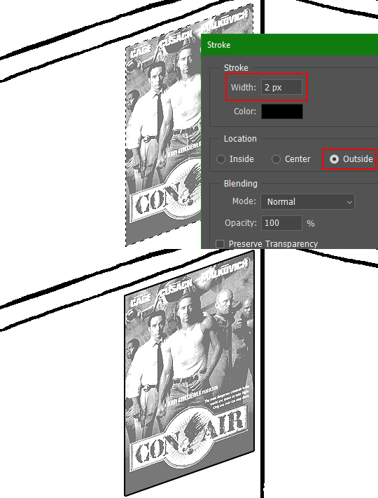
Voila, and Bob's your uncle, you're done!

The instructions above are Photoshop specific, but it should still be pretty software-agnostic. Here is the recreation PSD, and below the read-more link are additional notes, such as transferring the steps to something like GIMP.
ADDENDUM
You may be questioning why I deliberately made the stroke anti-aliased. "Isn't that an MSPArt cardinal sin??", I hear you clamoring. Well, my dear readers, let me briefly elucidate you on why your ass is wrong. Exhibit A:

The clearly semi-opaque pixels that can be found in every poster outline, which is especially pronounced here in the Little Monsters poster. I can also see that Hussie actually created a stroke on the same layer as the poster and merged it down into the white background like a dumbass. I omitted this in step 6 for the sake of convenience (and also the fact that you can't add a stroke to a smart object in Photoshop without rasterizing it first).
He had to use the magic wand tool in order to extract it from the layer for this panel, and then fill it in with the paint bucket tool. I can even tell he had the color tolerance set up very high on the magic wand to grab all those near-black and very light gray pixels, AND he had anti-alias enabled and the tolerance on the bucket tool set to be at least higher than 0 to tint similar colors. Exhibit B:

I also didn't address exactly how to desaturate something in Photoshop. Honestly it was because I was feeling pretty lazy. I would have had to rewrite step 4 to not include redundant information about adjustment layers. You can add either a Black & White adjustment layer or a Hue/Saturation one and turn the saturation all the way down to 0. The resulting tones will be slightly different from each other but I'll explain why that is in another tutorial.
Speaking of another tutorial, read this one if you believe this post is missing the step of using a posterize filter.
Now onto applying some steps to GIMP.
RE: step 2) In GIMP, there is a dedicated Unified Transform tool separate from the Move tool, unlike in Photoshop where both features are combined into one. This is how you scale and skew (AKA shear in GIMP) both at the same time, among other things such as rotating.
You'll also find that instead of any interpolation methods labeled "Bilinear" or "Bicubic", there are only ones named "Linear", "Cubic", "NoHalo", and "LoHalo". Basically, Linear and Bilinear are the same, so are Cubic and Bicubic, naturally. I guess NoHalo would be similar to Bicubic Smoother and LoHalo would be kind of similar to Bicubic Sharper as well. It's not an exact 1:1, though.
Honestly it doesn't really matter what you use to reduce the size as long as it isn't None/Nearest-Neighbor. You're going to have to sharpen it no matter what. This applies to Photoshop as well.
RE: step 3) Go to Colors>Hue-Saturation... and repeat turning the saturation down to 0, or go to Colors>Desaturate>Desaturate... and select the Lightness (HSL) method.
RE: step 4) Go to Colors>Levels... or Colors>Brightness-Contrast... The Brightness-Contrast adjustment tool already functions almost exactly like in Photoshop with "Use Legacy" enabled.
RE: step 5) In GIMP 2.10, the developers squirreled away the basic Sharpen filter, making it inaccessible from the Filters menu. To use it, hit the forward-slash (/) key or go to Help>Search and Run a Command... to bring up the Search Actions window and type in "sharpen". Select the option that just reads "Sharpen..." and has a description of "Make image sharper (less powerful than Unsharp Mask)". I find that using a sharpness value of around 40 to be similar to Photoshop's sharpen filter.
RE: step 6) Instead of holding down Ctrl, you hold down Alt and click on the layer thumbnail to make a selection around it. Make a layer underneath the image this time since there isn't an option to place the stroke outside the selection rather than the middle. Go to Edit>Stroke Selection... and create a stroke using these settings:

I recommend keeping anti-aliasing disabled however, as GIMP produces lines that are a little too smooth for my taste.

With "Antialiasing" enabled
Without
If you're using a program that doesn't have a stroke feature available, you could draw a straight 1px thick line across the top of your poster, duplicate it, and move it down 1px. Merge them together, duplicate it again, and move it all the way down to the bottom of the poster. Then repeat the exact same process for the sides. I used to do this before I even knew of the stroke feature, haha.
Another reason I had to do it this way was because my dumb ass did the thing I said not to in step 2, scaling down the image with the scale tool, and then shearing it separately with the shear tool. This caused the edges to become too blurry to be used for a stroke automatically. Oh well, live and learn.
143 notes
·
View notes