#Also how appropriate is the original art
Explore tagged Tumblr posts
Text

i'm gonna tear myself apart if i can't get myself together- and spread my pieces around like waste
#zeno's art#ocs#reassassination#dr rigor krankenstein#excuse his blurriness i was drawing on a tiddly canvas for no reason#originally i conceptualised this as how he'd dress in the summer#but giving it more thought i don't really see hum ever showing that much skin even in privacy#still a fun exercise at stylising his skinny ass anyway#(btw his scars are healed and i wouldn't really put a tag for healed scars regardless of if they're on a cartoon drawing or a real person)#(but if anyone feels it'd be appropriate to tag just let me know)#also. caption is a chemlab lyric :3
40 notes
·
View notes
Text
thinkin abt how dragons are represented onsite recently vs in the past what with regards to anthropomorphism and
yknow what that's what polls are for innit
*that's counting all moderns + abbys, gaolers, veilspun - simplifying a bit so that i don't have to think abt whether stuff like coatl tail wings technically count. basically i mean those with one pair of forelimbs, hindlimbs, & wings & nothing else that would rly affect locomotion
#my original point is just that i thot it was interested susie got such a bipedal wheelchair#when most ppl ive seen with dragons w/ assistive devices for their hind legs did something yknow quadruped appropriate#like a dog wheelchair#not that either way's wrong it'd just surprise me if a huge portion of people would immediately choose to go the route the site-art did?#ive for sure seen ppl who do go the more anthro direction but im personally very. mlp all-fours with sm slightly nonsensical forelimb usage#i totally see like. wildclaws moving on two legs. i can sorta see higgins walking around with that cane?#but it's not how i'd design a nocturne by default#i can also see like. maybe veils n such flying almost exclusively. like loons i guess#technically if we're going with my 'wildclaws moving like kangaroos' thing they'd b pentapedal
282 notes
·
View notes
Text

whoa guys did you see the new cards i really want alto's full art!!
made with this site! art without the text under the cut :D

#pokemon#pokemon oc#pokemon ranger#pokemon tcg#clai's ocs#oc: alto#clai's art#the thought process during this piece was literally ''NOOO I DONT WANT TO RENDER NOOOOO rendering is fine actually. i dont care anymore''#i tried to come up with a cool card effect? someone more well versed in the tcg please tell me if this is viable or op or sucks ass entirely#i will genuinely change the post if the effect is bad i want my beloved to have ONLY the best#other ideas i considered was smth like. finding a pokemon to play straight away to reference ranger capturing#or an effect that only benefit colorless type pokemon so that alto would pair with flying types that get assigned colorless#but since i wanted the card's name to be alto's Justice it felt more appropriate for the player to gain smth after being damaged#like maybe it depended on the opponents prize cards and how many they'd taken already#the prior effects like the colorless benefit would probably go on a standard ''Alto'' card that doesnt have the extra word appeneded yknow#i put plenty of thought into it haha i was browsing through the bulbapedia articles trying to figure out what a good card effect was#only played like. less than ten matches of tcg i'm still figuring stuff out JDJBFJF#the clouds also!! originally i was drawing generic fluffy clouds#but then it hit me. i named alto after specific clouds. why am i doing generic ones instead of the ones named Alto-Something#so these are meant to be altostratus! i can bearly draw generic clouds though idk how well i pulled off smth more specific HJEHFKF#had a lot to say abt this one i just really liked the idea of an alto card so i made sure it was as perfect as i could get it
24 notes
·
View notes
Text

Happy 33rd Dan!
Hope it’s a good one x
#happy birthday dan#asked my brain to make Dan bday art and it just gave me this so I guess I’ll roll with it#I dithered over whether this was appropriate as bday art but I have nothing else and also I am who I am#maybe he’s basking in the sun or maybe his head is tipped back in pleasure who knows 👀#in unrelated news#this was originally a dnp piece but I didn’t like how Phil turned out#blonde hair is hard#phan#dan and phil#dnp#Dan 33#my art#original content by astra#d33
21 notes
·
View notes
Text
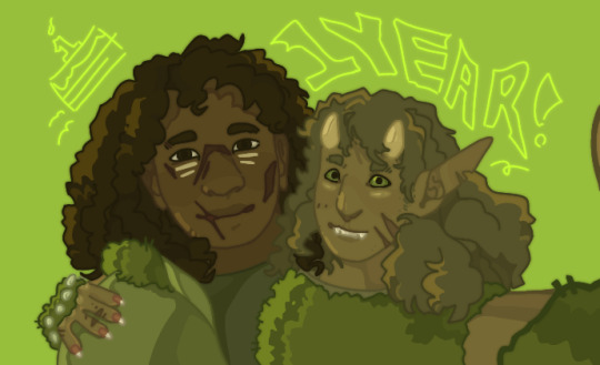
[Start ID. A green-toned drawing of two characters from an original universe, shown from the shoulders up. It's framed as though they're taking a selfie. On the left is Heathrow, a human with dark skin, long hair, a good number of facial scars, and two painted lines below each eye. He wears something akin to a green hoodie, with fluffy plant matter sewn into the back of the hood. On the right is Crassie, a half elf, which in this universe entails long pointed ears, a pair of short pale horns, a slightly rabbit-like nose and markings under her eyes. Her skin is olive-toned, sporting a couple distinct scars on her face and hand, and she's wearing what is essentially a bush and spiked glovelets. Both of them are smiling, Crassie a little bit wide-eyed and Heathrow with a fond expression. The background's a saturated green with the text "1 YEAR!". End ID]
A redraw-in-spirit of the post from last year's Feb 16 that introduced these two to my blog. It's their birthday :]
#peridots-art#heathrow chtn#crassie chtn#chtn#eye contact#peridots-ocs#i've only posted about them three times including this and every single time i manage to go 'hey did you know heath was originally meant as#a stand-in for the hunter from hk? i thought that was neat :)' so. obligatory mention of that i guess#because of their shifting nature i could never pin down the days they/their universe were created but i love an excuse to get emotional#about birthdays/anniversaries and such. so today it is then (it just turned midnight 17th in my timezone... it's the thought that counts)#this is also the first non-fullbody I've posted on Tumblr in a Really long time?? like there's the dragon from nov 5 and daud from oct 26.#looking past that i guess there were quite a few okay but three and a half months is a lot when you draw as much as i#anyway. these guys.#had a little more to say about them but i scrapped it. they're both very ace and aro and while i respect aroaces who don't want Any sort of#intimate relationship (platonic or otherwise!) they are about as far as you can get from it. a qpr sounds appropriate#the nature of their relationship defies description. friends and a little like siblings. life partners? a little like father and daughter.#they've only ever known each other. i may not think about them so often but man do i love them.#for the most part accidental but this was definitely inspired by miecz's art :] the linework was surprisingly fun to do#wasn't gonna address kit directly seeing as i don't know if it always reads these? but if you are your tags were very kind!!#i don't know anyone else who's as lengthy with it as i but i like talking in the tags! so. i'm glad they're appreciated :]#that isn't all i have to say on the subject (i'm never used to people being nice to me) but i'll save it for somewhere it will def. be seen#...idk how to describe their clothing. i designed his a year ago and hers more than that do you think they're supposed to make sense#there were a Lot of particularities with the id that made it. hard to write. this is better than nothing of course but don't know if it's#the most efficient. with that hour-to-thirty-minutes of my day over with (I AM TALKING ABOUT THE IMAGE DESCRIPTION MY ART TAKES 6 HOURS AT#ABSOLUTE BEST apologies for the screaming) i can officially say goodnight to you tag-wanderer and farewell#peridots-described
11 notes
·
View notes
Text
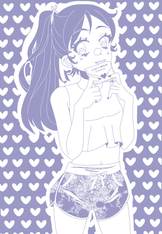
Love letter to my past self <3
I want to tell her that everything is great in 2023 and I love being me
#original art#digital art#my art#happy valentine's day#personal#art challenge#I decided to use the colour I created from the CMY make a colour post for this#but I've waited until valentines to post as this day seems more appropriate#sappiness ahead#if I could go back 10 years into my past and write myself a letter I wouldn't tell her to change anything#bc right now even though I'm not in any romantic relationships#I'm really happy with all my current relationships w/ family and friends#I'd tell myself to quit feeling bad about liking manga/anime and drawing it and to quit feeling bad about my appearance#bc now I slay and I love my art skill improvement and how I look#I hope anyone who sees this and reads my tags also finds something about themselves that they love more than in the past <3
12 notes
·
View notes
Text
My retro video game pet peeves:
No, sprite flicker on consoles like the NES didn't look like that. The NES ran at 60fps (and how it managed this on contemporary televisions which technically didn't support progressive scan is a fascinating piece of technical bugfuckery, if you have an afternoon to kill to read up on it), but YouTube downsamples all videos that are below a certain resolution to 30fps, which makes sprites that are flickering at 60fps look weird. The way that sprites sometimes seem to disappear entirely for long periods in NES gameplay footage on YouTube is also usually an artefact of this process – YouTube just happened to exclusively pick frames where the sprite in question is not visible when converting from 60fps to 30fps.
No, not all old-school pixel art was explicitly designed with "CRT fuzz" in mind. While this was often the case for games originally released for non-portable consoles, portable consoles have always had LCD screens (yes, even the original Game Boy!), so CRT fuzz simply wasn't a thing for them. Conversely, while desktop PCs of the era did use CRT monitors, from the mid 1980s onward, PC monitors typically used a variant CRT technology that had a much higher scan rate than contemporary CRT televisions in order to improve legibility of small text; such monitors had pixel sharpness comparable to that of modern LCD monitors, so CRT fuzz wasn't a thing for most PC games, either.
No, the textures on N64 and PS1 games weren't that bad. While these consoles were technically capable of resolutions up to 480p, this was very demanding for them, and rarely used outside of menus and cutscenes; actual gameplay output for games on these consoles typically ranged from 192p to 240p. The textures were of an appropriate size for the gameplay resolution. The whole "razor-sharp polygons with drab, muddy textures" look that pops up in a lot of retro media inspired by games of this era isn't imitating how such games look on their native hardware – it's imitating how they look when played on desktop PC emulators that have to stretch the textures all to hell in order to render them.
Like, I'm not saying these aren't valid aesthetic choices for modern retro games – particularly those that are trying to capture the experience of playing pirated console games on a janky PC emulator – but it's the spurious assertions of greater authenticity that often go with them that get my goat. If you want to slap a CRT filter on a Game Boy Advance title because you like the look of it, be my guest, but insisting that this is "how it was meant to be played" is simply false.
3K notes
·
View notes
Text


Tintin Tarot, part 2 - the Fool's Journey Continues. Part 1 can be found here! Me and @josephscoat came up with a list of Tintin characters assigned to the major arcana cards in a tarot deck after she realised how well Tintin mapped onto the Fool.
The Hanged Man - Sacrifice, martydom and hesitation. Frank Wolff's death in Explorers on the Moon really stuck with me. I watched the 90s cartoon adaptation of it with a friend recently and even though I knew what was going to happen, it still hit very hard. I replaced the living tree, which represents the potential for growth and knowledge on the original card, with the planet Earth.
Death - New beginnings, metamorphosis, fear of change and decay. Even just for the imagery I had to use Rascar Capac. His use in the narrative seems to demonstrate a fear of the unknown. As the Hierophant and the child from the Sun card appear on the original Death card, I opted to use Rascar Capac as he's in the same story as the Prince of the Sun and Zorrino, who we assigned to the Hierophant and the Sun respectively! Professor Tarragon replaces the dying person on the ground in the original card, and Inti the Incan sun god watches over the scene.
Temperance - Middle path, patience, finding meaning, but also could mean excess and a lack of balance when reversed. Haddock is famous for his tendency to fly off the handle at a moment's notice. But Haddock also has endless patience for Tintin's bullshit. His character arc is one of finding meaning in his life after hitting rock bottom. He is pouring bottles of Loch Lomond, as seen in the Magician card.
The Devil - Addiction, lust, materialism, playfulness. Who else is more devillish than Tintin's arch nemesis, Rastapopoulos? His schemes grow wilder and larger as he pursues wealth and revenge. While sexuality is famously absent from the Tintin series, Rastapopoulos and his associates certainly lust over money and control. Tom and Allan are held in chains, though they are clearly removeable. The choice is theirs if they wish to walk away.
The Tower - Sudden upheaval, disaster, but also an avoidance of disaster in reverse. Calculus' reusable nuclear powered moon rocket was literally ahead of its time, representing a huge shake up in technological advancement in the Tintin universe. However, the moon mission attracted a lot of sabotage and disaster which was narrowly avoided. While the characters had to rely on the rocket for safety, it's not necessarily predictable.
The Star - Hope and rejuvenation, but also discouragement and insecurity in reverse. The phostile meteorite ushered a global wave of panic and speculation initially, but once it landed it became a beacon for competing factions to get to in time. It has a property that allows living things to grow quickly and abnormally large, representing the abundance the Star card is supposed to signal. The Star is supposed to follow the trauma of the Tower. Picking the rocket and meteorite felt thematically appropriate as both have associations with space, a relatively new frontier.
The Moon - Illusions, intuition, fear, confusion, misinterpretation. Professor Phostle jumps to conclusions and makes wild predictions from shaky calculations. He's also conveniently moon shaped.
The Sun - Inner child, joy, truth and liberation from struggle, or sadness and self doubt in reverse. Zorrino escapes the torment and bullying in his village and joins the Inca. Haddock and Tintin are immediately protective over him, with Zorrino being a little younger than Tintin.
Judgement - Releasing baggage, call to action, renewal, moving forward. Ramo Nash breaks free from Rastapopoulos' grasp and saves Tintin's life. I decided to depict the final confrontation scene from Alph Art where he pushes Rastapopoulos off a cliff, to his end.
The World - Culmination, success, completion, but stagnation in reverse. The Fool has seemingly completed his journey - Tintin has it all, a successful fulfilling career, friends who care about him and a manion to live in. But he is, by design, stagnant. Forever a cherub faced boy, stuck in an episodic serial by nature, Hergé wanted to kill him off by sealing him inside a resin statue, freezing him in place for eternity. He will forever be the Boy Reporter.
I dressed him as a Morris dancer because I thought it would be funny
#tintin#adventures of tintin#tarot#illustration#snowy#milou#frank wolff#rascar capac#the prince of the sun#zorrino#professor tarragon#captain haddock#archibald haddock#rastapopoulos#allan thompson#tom#explorers on the moon#the shooting star#professor phostle#ramo nash#photoset
1K notes
·
View notes
Text
SYSTEMPUNK

Systempunk: A term or Subculture surrounding the liberation of plurals and the critique of psychiatry. We're outspoken on how the psych community mistreats us and how we will force the breaking of the chains that continuously fakeclaim or harm us whenever we do something singlets/psychiatrist do not like. We have been silenced and told that if we are open, it is a sign of us lying. We have been forced to follow the strict guidelines of the dsm5 in order to avoid being told that our experiences are false. We have been forced into psychiatric wards and abused because we are not singlet. We have been the face of the liars for too long, plural liberation is something we must push. The future is plural.
ANTI ENDOS AND RADQUEERS DO NOT TOUCH.
Meaning of the flag:
Brown and Black: The POC-bodied systems who are put down by both the community and the society around them. POC-bodied systems who have had their diagnosis's rejected due to their race. POC-bodied systems who have a cultural origin or connection and are hurt because of it. POC-bodied systems who are appropriated by other systems and are not listened to. POC-bodied systems who are hurt by the white dominated psychiatric system. POC-bodied systems who deserve to be heard and understood.
Purple stripe: Endogenic Solidarity, allyship, love, liberation. Endogenic systems are continuously harmed by antis who remain uncritical of psychiatry, are against the liberation of plurals, and deny a plural future in order to push singlethood onto others. Endogenic systems are also used in a lot of fakeclaiming content made by singlets and psychiatrist despite the research that supports their existence. It's because singlet society hates plurals and hates any form of existence we have. Love your endogenic siblings. They are the diverse experiences of plurality, they have helped us through so much.
Yellow Stripe: Disordered and traumagenic system solidarity and liberation. Disordered systems are horribly abused by the psych system, we make up most of those hospitalized and we are put down as too crazy to make our own decisions. Even if our existence is from trauma or a disorder, we shouldn't be forced into a singlet cure, we deserve autonomy.
Pink stripe: Abolition of psychiatric wards used to abuse us, hide us away, and silence us. Our autonomy is stolen from them, we deserve resources that help us instead of force us into a place that fucking hates us.
White stripe: Psych-critical beliefs or Anti-psych beliefs, despite their differences we still stand together against the harms of the psychiatric system. ACAB included in this.
Barbed wire: Anti-fakeclaim culture, systems deserve to be believed. Pro-plural protection. Protect another no matter your beliefs, cops and psych wards fucking hate us and want us dead, protect those you love. protect the closeted, protect all systems.
Fangs: Fight for your existence, be loud about it, write essays, make art, do whatever you can. Force plural liberation down the throats of singlets. Force the future to be plural.
Ampersand: PLURAL PRIDE, PLURAL ACCEPTANCE, PLURAL LIBERATION, PLURAL HISTORY, PLURAL FUTURE
#endo safe#pluralgang#plurality#plural system#actually plural#plural community#traumagenic system#system things#osdd system#system stuff#plural pride#pluralpunk#systempunk#syspunk#endo friendly#endogenic#traumagenic#antipsych#anti psychiatry#psych critical#actually traumagenic#did#did osdd#actually did#cdd system#actually cdd#punk#coining post#flag coining#tw psych abuse
566 notes
·
View notes
Note
you said you think gay sex cats is the new duchamp's fountain. i dont disagree and i kinda see what you mean already but please elaborate
it was a silly and tongue in cheek way to say that a lot of people are getting mad about it in a way that implies reactionary views on art, and that there's no way to say gay sex cats isn't art that wouldn't also imply that the fountain isn't art. a funny meme image is a funny meme image, but it is also funny to overthink and recontextualize them as art.
and the reaction makes the comparison even more apt. neural net generated artworks are anonymized mass produced images, vast majority having no artistic pretension or meaningful content such as a thomas kinkade painting. gay sex cats was made with no intent to be art, but the discourse it has with audience reaction and its appropriation in derivative works make it so. why is gay sex cats not art if people talking about it negatively allow it to be called art? is art only things you find beautiful and valuable? if so, what is value and beauty, and how do you draw the line? if gay sex cats was still ai generated but had more "aesthetic qualities" would it be art? if someone copies the original image by hand with all its ai generated faults where is the value generated? does the original still have no merit of its own, even after appropriation as a digital ready-made?
but the main reason as to why gay sex cats is comparable to the fountain still is because it made a lot of people with bad takes on art really really mad. and that the pissed off tags wouldn't look out of place as reaction to modern art in the 1920s. art is a flat circle
EDIT: well. putting an addendum because in retrospect more people took either or both the op and image in face value and much more self serious than ever intended. a lot of people understood the tone i was getting at, and i still stand by the questionings i added on, but still for clarification. the original comparison is not serious. it's self evidently ridiculous to compare a meme image to a historically significant artwork, the comparison was only drawn because they were both controversial to an audience, who reacted denying their status as respectively as an image and as art, and that it was funny that the negative reaction people had to the original image explicitly denied its status as art, even if the meme never had pretension to be art, so it was funny to draw a comparison and iterate on that.
i did think it was valid to bring in questionings about art and meaning because that's the reaction i saw most and wanted to make people think about the whys, and that also i do not think it's valid to base your dislike on ai art on either grounds of questioning its position and value as artwork, or even as a question of ip theft. regular degular handmade art can be soulless, repetitive, thoughtless, derivative, unethical, open and blatant theft, and much more, and that does not make it any less of an artwork. neural nets are tools that generate images by statistic correlation through human input.
the unambiguous issue with neural nets in art is its use as a tool by capital, to threaten already underpaid and overworked working artists and to keep their labor hostage under threat of total automation. in hindsight i regretted not adding the paragraph above as it was a way in which people could either misinterpret or assume things about me, but hindsight is hindsight and there's no way to predict how posts would blow up. so shrugs. i had written more posts in my blog that elaborated on that because asks would bot stop coming. and i think my takeaway is that people will reblog anything with a funny image without reading the words around it, or even closely looking at the image.
1K notes
·
View notes
Text


my submission for the hermitcraft season 10 fan art gallery: Xisuma Eternal! (actual size on left, embiggened version on right)
there are a ton of little thoughts that went into this and i will now go off about them at length (ramble under the cut)
let's start with the image layout and composition! my first idea was to do an homage to the original doom box art because of X's skin, but ultimately I decided on referencing this Eternal cover (hence the title of the piece) because it sparked some stronger ideas in my brain.
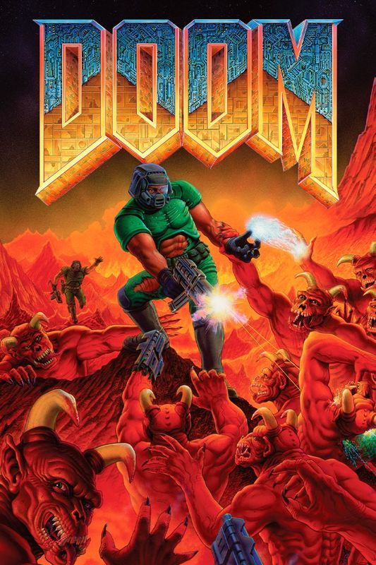
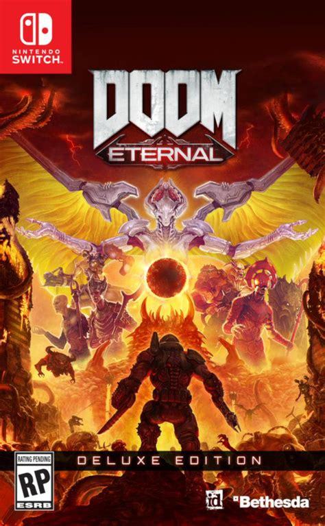
i still wanted to keep that link to the original though, so i did my very best to emulate the original logo with X's name - replacing the original texture with binary as one of many references to X's role supporting the technical side of the server.
(for no reason other than my own amusement, the binary in the letters is translated lyrics from X's verse in the hermit gang song. i don't even know how much of that is still visible after lining the letters, but i liked putting it there)
i've only been watching hermitcraft for a few months, and there's an awful lot of history i don't know about. so i focused on doing my best celebrating builds X has worked on here in season 10! i would have loved to include his base as well, but ultimately i ran out of room.
(there are still a few nods to other seasons based on knowledge i've acquired through osmosis. evil X is the most obvious, but i was also able to sneak in a couple small carvings next to the X in the title text!)
coming back around to xisuma's work on the technical side, that's why Evil X is backed by error windows. it's also why xisuma is holding a toolbox! it was the best visual metaphor i could come up with for the digital job of maintenance and repair.
(and of course he has a lovely cup of tea as well)
the allays (holding redstone) are partially in reference to farms X has been making, partially bringing back in that angelic/demonic vibe of Doom, and mostly because their intended role of supporters and helpers feels very thematically appropriate for X.
the lines in the sky are of course meant to evoke the shapes of mace race, and the black cube is a minecraft-ified version of the Soulside Eclipse logo.
(if you're not familiar, that's xisuma's music! it's good!! give it a listen sometime! it's on youtube!)
the silverfish at the very bottom are visual reference to the demon hordes of Doom - and of course they're also much more directly referencing X's very clever prank in impulse's city.
finally, on the walls of spawn we have the carved symbols - one for every other hermit. i remember X mentioning in a stream once something about fulfillment from supporting others. (i apologise if i'm remembering less than clearly.) it just felt like if i wanted to represent X, it felt important to include them as well.
and of course it made me happy to do something for Every hermit, since all of them
(smallishbeans/joel was actually the one i got most stuck on! there wasn't really a single item or symbol i could think of to narrow him down to. ultimately i decided on a torii gate and a little letter J, but i'm honestly still thinking about it)
ah right, and the Actual last thing: this turner out to be totally unnecessary, but i absolutely did draw this in the minecraft map hex code colours. it's a tricky palette to work with, and i learned a LOT about pixel art while trying to get the sky to look nice!
this piece took about 10 days to complete, maybe the longest i've ever spent on a single illustration like this - and honestly, i'm really happy and pretty proud of how it turned out!!
152 notes
·
View notes
Text
giving my thoughts and ideas on Ratio's character stories
I wouldn't call this much of an analysis but we'll see how it goes
Starting out with his first character story, most of it is Professor Rond's recommendation letter.
I'd like to start by sharing my thoughts about Ratio and Rond first before actually getting into dissecting the letter itself.

So, firstly, I'd like to mention that (to my knowledge) we have never heard of or from Ratio's parents. I find that ironic considering what a big shot he is, I doubt that his parents would ever willingly shut up about their son.
Reading that Rond had a 'significant influence on Ratio's upbringing' particularly stands out to me because, at least at the time of the original letter being written, Ratio was in secondary school (Grade 9-12, though some of the wording in the letter lead me to believe he was likely on the lower end of that range).
Now, a high school teacher having a 'significant influence' on someone's upbringing isn't necessarily uncommon, nor are old teachers proud of their past students becoming extremely successful. However these points, alongside the fact that Ratio's parents are nowhere to be seen in canon, lead me to believe that there was some sort of familial relationship between them, especially seeing Rond's reaction to being asked about Ratio as well as how he had kept the original letter.
Moving on to the actual letter.
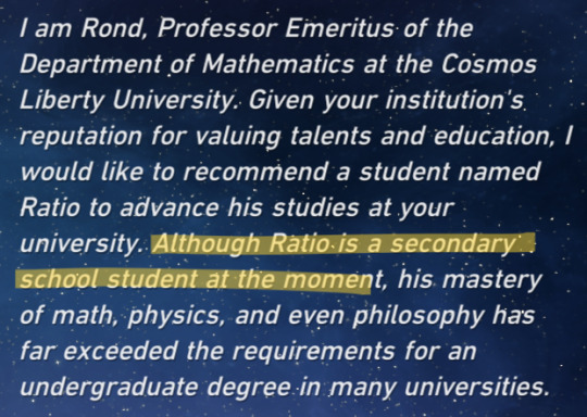
Grade skipping is a pretty common practice where I'm from, as it allows learning at the appropriate/needed level (ignoring the fact that the school system is in shambles).
However, the way this is phrased is as if Rond were trying to convince him to be able to skip grades. If he were in grade 11 or 12 I feel like it would not have been phrased this way, which is what leads me to believe he was likely younger, possibly fresh out of middle school.
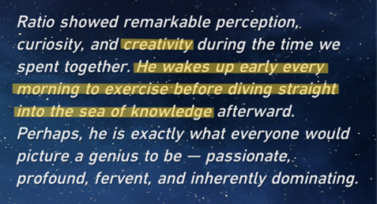
The highlight on creativity is just because it makes me smile honestly, also it ties into one of my earlier posts about how I think Ratio would adore the subject of art.
I would like to return to my point of Rond being a potential parental figure to Ratio, seeing as he seems to know his daily routine well enough to confidently write about it in his letter of recommendation.
On to his second character story, which is mostly online posts in a thread-like format.
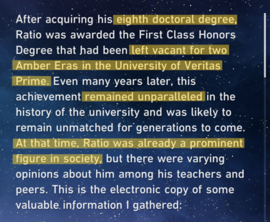
It wasn't until his eighth doctoral degree that he was awarded with First Class Honors, also since he is the first person to receive such in two amber eras it means he was likely the only one on stage at that time.
It also states that at the time he was already a prominent figure in society, which doesn't surprise me given the accomplishments listed by Rond in the letter despite him being in high school at the time it was written. However, he would most likely be an adult by the time he finished his eighth doctorate.

No real comment on this I found it funny that they put etc instead of continuing to list fields.

I also just find these funny and wanted to share them, but the disagreement on the last comment shows how much people admire him. I feel like that's a topic that's rather watered down in the fandom, but people genuinely admire Ratio a lot and there's plenty of reason for them to.

full-time university teachers tend to teach about 5 courses per academic year, meaning Ratio has been teaching for about 10 years.
Moving onto the third story, which is a statement from a former assistant of his about his desire to join the genius society.

I find this to be an interesting point, it seems like joining the Genius Society would be an obvious next step for a man with so many accomplishments but it's stated not once, but twice that he has never spoken about the subject (to the public at least).
I am a believer in the theory that Ratio hasn't been allowed into the Genius Society due to his humanity/compassion and his desire to spread knowledge to everyone, and I feel like this specification that he's never spoken about the topic could add to this theory.

This paragraph never fails to break my heart, but I do want to talk about the mention of an anti-planetary weapon. I feel like this Anti-planetary weapon that he spent years perfecting was a final attempt at proving to Nous that he wasn't too compassionate or too humane to receive their gaze. I remember reading about this idea more in detail elsewhere and if I can find the analyzation then I'll link it here.
Also, I feel like deep down he always knew that he wouldn't be accepted into the Genius Society, but this day, as Margaret states, was the day he finally realized it, or, fully swallowed that pill.
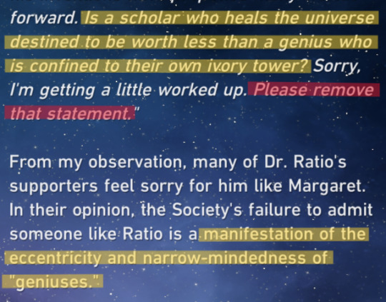
I find these comments to be interesting as well since they specify the narrow-mindedness of the society however, there is this comment from the Data Bank;

This comment I admittedly stumbled across when looking for something else, but I feel like it perfectly encapsulates Ratio's entire dilemma with the Genius Society, maybe not to Ratio himself but it certainly applies to everyone who comments on his achievements being worthy of Nous' approval.
I am also quite curious about who exactly wrote the 'Decoding Dr. Ratio' that we have read from in all of his character stories. They seem to have a lot of connections for someone who would typically be seen as just another paparazzi or media interviewer, I'm surprised the people listed in his stories would agree to an interview.
Onto his final story, which is about his personality and methods of sharing knowledge.
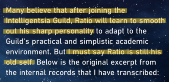
I mentioned this comment in my character notes post but I find it extremely charming that Ratio remains the same and refuses to change himself or his personality to satisfy those around him.
It is also commented in his second character story by a previous professor of his that his honesty and straightforwardness were a 'Breath of fresh air' at the University.
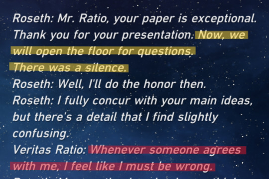
I love the implication that either; nobody in the entire room had any questions (unlikely), or that they were simply too scared to ask them.
I also find the comment that 'Whenever someone agrees with me, I feel like I must be wrong.' Perhaps he's gotten used to being the only one thinking the way he is or the possibility that people only agree with him so they sound intelligent themselves and weren't truly listening or understanding.
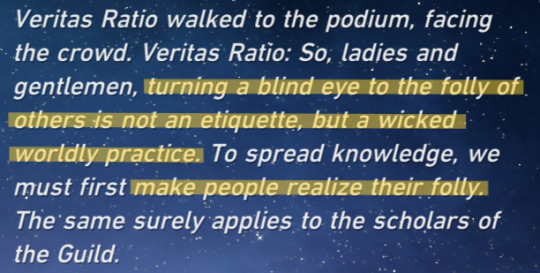

I find these comments interesting as well, a majority of the fandom mischaracterizes Ratio as mean or rude although he literally explains his viewpoints where anyone can access it (which does honestly prove his point about how knowledge is not for everyone.)
#can you tell when i learned how to use the straight line tool with my highlight#guys im going insane#im so normal#dont ask me about my autism diagnosis#please reblog if you have other thoughts or ideas id love to hear#sorry mobile users if the formatting is weird i wrote this on desktop#★ – posts!#★ – analysis!#dr ratio#dr veritas ratio#veritas ratio#hsr ratio#hsr dr ratio#honkai star rail#hsr
189 notes
·
View notes
Text
My fav sns smut
or some of it anyway
If Naruto x Sasuke fking nasty is your ☕️
I tried to find all these beloved authors to tag them, but I couldn’t find them all, if you know who they are, plz tag them! Let’s share the ❤️
In no particular order
Healing the Broken by KizuKatana
When people tell me about smut they read in printed books I’m like
Because it’s fics like these that amaze me with their ingenuity, creativity, originality, and boldness 🔥🔥🔥
AKA
This fic isn’t just PWP (although that’s fine too in my book), it’s so well written with character development, action & romance ❤️🔥 Predators by the same author is also excellent 👌🏽
Thx u @kizukatana 😊
“Chapters: 23/23
Rating: Explicit
Warnings: Underage
Relationships: Uchiha Sasuke/Uzumaki Naruto
Characters: Uzumaki Naruto, Uchiha Sasuke
Additional Tags: Angst, SPOILERS MANGA CHAPTER 693, Drug Use, sex during drug use, Canon-Typical Violence, canon!sasuke, canon!naruto, Addiction, Slash, narusasunaru, Fix-It, my version of how it should have ended, Friends to Lovers, Enemies to Friends to Lovers, Alternate Universe - Canon Divergence, NSFW, Smut
Series: Part 1 of HTB universe
Summary: The war is over, and Sasuke is brought back to the village after his defeat by Naruto. But he is struggling to re-assimilate into the village. As his mental stability continues to erode, Tsunade and Kakashi ask Naruto to try a different treatment method. Naruto x Sasuke (slash - boy x boy). Post manga chapter 693.
Warning: Hard Yaoi (Boy x Boy) language, angst, mental illness, substance abuse, masturbation, eventual sex. Not appropriate for young readers. 18+
Disclaimer - As with everything I write on this site, I don't own the characters (Kishimoto does), and I make no money. My only payment is in reviews.
Spanish Translation by Linme (thank you!) “
[doujinshi] My Lost Himawari by SouthNorthSound
Me, to the artist (and English translator) of this visually stunning and well written doujinshi -
Seriously. It’s amazing. The visual metaphors. The angst. The way the artist can simply draw a single panel of a close-up Uchiha eye that is so outrageously sultry and sexy I don’t understand 🥵 one of the extra chapters unlocked something in me (the dream one). Bonus that it’s also really funny & has a lot of respect/empathy for its women characters too! If anyone knows who this artist plz let me know I would like to follow them until the end of the world ❤️ the ending healed me 💔
EDIT HOLY S*** GUYS I FOUND THE TRANSLATOR & ARTIST ON TUMBLR
Thx u @southnorthsound 😭❤️🫡🙇🏻♀️
Thx u @gigihorseinthehouse 😭 I love you I low key think you’re a genius ok sorry bye 👉🏽👈🏽
"https://archiveofourown.org/works/36581581
[doujinshi] My Lost Himawari by SouthNorthSound
Chapters: 60/60
Fandom: Naruto, Boruto: Naruto Next Generations
Rating: Mature
Relationships: Uchiha Sasuke/Uzumaki Naruto
Characters: Uchiha Sasuke, Uzumaki Naruto, Haruno Sakura, Hyuuga Hinata, Uchiha Sarada, Uzumaki Boruto, Uzumaki Himawari, Hatake Kakashi, Nara Shikamaru, Temari (Naruto), Nara Shikadai, Akimichi Chouchou, Gaara (Naruto)
Additional Tags: Fanart, Fan Comics, Alternate Universe - Canon Divergence, SasuNaru - Freeform, NaruSasu - Freeform, Translation, Doujinshi, Fix-It, how it should have ended, Angst, If you don’t understand how they ended up like that in Boruto READ THIS, Poetic, comedic, Loyal to canon, Angst with a Happy Ending, Fluff and Angst, NSFW Art, Sex
Summary: A love story consists of different perspectives and different memories. It’s about saudade / realization / entanglement / out of control / hope / restart
Chapter700 background
Warning: adult content in extra chapters
Fan comics, doujinshi. It's highly recommended to read it on big screens such as iPad or PC. So you can see details about their facial expressions
One of the best Naruto fanart I’ve ever seen. So I translated it ❤”
Inevitablity by Sanauria_Maldhun

If the answer is
A) Yes
B) Kinda
C) Mind your own business rando internet pervert
Congrats all answers are correct = GO READ IT PLZ
Possessive & desperate 🥵 super gay, delicious angst, really hot 🔥 very enjoyable - fun tropes, everything hits just right, utter perfection ❤️ I’m not saying a lot because I don’t want to give away spoilers 😍
I couldn’t find this author on tumblr, plz tag in the comments if you know who they are!
“Chapters: 4/4
Rating: Explicit
Relationships: Uchiha Sasuke/Uzumaki Naruto, Haruno Sakura/Yamanaka Ino
Characters: Uzumaki Naruto, Uchiha Sasuke, Yamanaka Ino, Haruno Sakura
Additional Tags: Fake/Pretend Relationship, (between Ino and Naruto), Mutual Pining, Angst, Fluff, Fluff and Angst, Banter, Domesticity, Pining, Naruto is so in love, and doesn't know how to handle his Feelings, Jealousy, Jealous Sasuke, Jealous Sakura, Post-Chapter 699 (Naruto), Explicit Sexual Content, Anal Sex, Gay Sex, Angst with a Happy Ending, Hurt/Comfort, Slow Burn, Bottom Uzumaki Naruto, Top Uchiha Sasuke
Summary: Naruto's stressed and pining after a man who views him only as a friend. Deciding to get married to Ino isn't the best decision he's made (ever), given that they had been absolutely drunk while making such a declaration, but it's... a decision. Besides, what does he have to lose?”
You’ve gotten into my bloodstream (a bite of his heart) by lovenmaze
Nom nom nom 😉 kidding! Not literal cannibalism, it’s a metaphor for love, and this fic is beautiful 😍 poetic & sexy. One shot. Love how Naruto talks to Sasuke in this one (and makes him talk, too, hehe…) 🥵 delicious, please go tuck into this feast ❤️ author made an excellent fic playlist too!
Thx u @lovenmaze 😊
“https://archiveofourown.org/works/56430019
Chapters: 1/1
Rating: Not Rated
Relationships: Uchiha Sasuke/Uzumaki Naruto
Characters: Uchiha Sasuke, Uzumaki Naruto
Additional Tags: Cannibalistic Thoughts, Cannibalism imagery, First Time, Top Uzumaki Naruto, Bottom Uchiha Sasuke, Tender Sex, Blank Period (Naruto), Confessions, Idiots in Love, Not Beta Read, Anal Sex, Anal Fingering, Oral Sex, Alternate Universe - Canon Divergence, Emotional Sex, Eventual Fluff, Fluff and Smut, they’re both crazy about each other but thats not new, Poetic, Italicized Oh Moment, cannibalism as a metaphor for love, trust me it works and its SO good, consent is sexy !!!, lowkey vampire sasuke vibes
Summary: Sasuke tries to bite softly, he’s not going to eat him, maybe get a taste. Perhaps it’s stupid, but he wants to make sure, so he does. He opens his mouth, tongue touching the skin. His body shudders, and Naruto tastes warm, like skin or flesh; he tastes alive.
“A kiss is the beginning of cannibalism.”
AKA, The tender, fluffy, first-time, cannibalism (imagery), smut NaruSasu AU. [EDITED.]”
❤️Thx all u amazing authors u make me feel like this❤️
#naruto#naruto fic rec#naruto fic#sns#narusasu#sasunaru#sasunaru fic#a03 author#a03 writer#a03 fanfic#a03 link#a03 fic#read on a03#smut#narusasu smut#my fic recs#lifeafterartsch00l fic recs
138 notes
·
View notes
Text
Interesting post about costume here.
This paragraph in particular caught my attention...
What we think of as “peasant garb” is actually the product of a game of telephone that travels back from Romantic Revival art, and many of those (urban) artists got their idea of what rural peasants wore from opera costumes. The costumers working at the opera were not going out to the country side to take notes on what farmers actually wore, nor did they want to. Opera is show biz, you want it to be evocative, but not ordinary. Their costumes would have been based on what urban folks were wearing, with extra little touches like a shepherds crook to make it look “rural”.
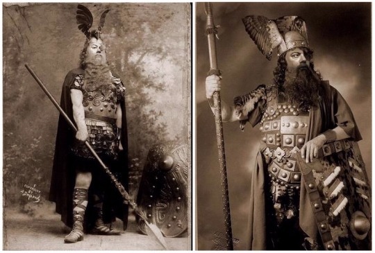
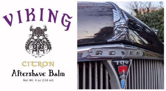
... because it was Wagner's Ring Cycle that gave us horned helmets.
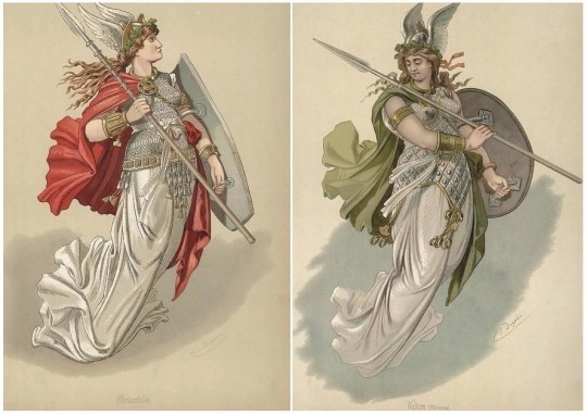
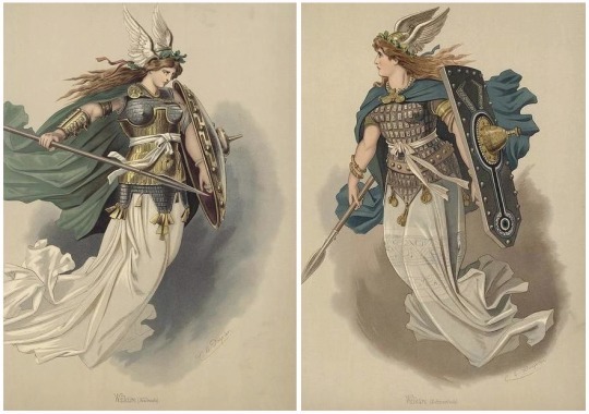
They didn't originate with the Vikings. They originated with the 1876 costume designs for a bunch of operas, and those designs by Carl Emil Doepler still exist.
For reference, all the horny characters are mortals.
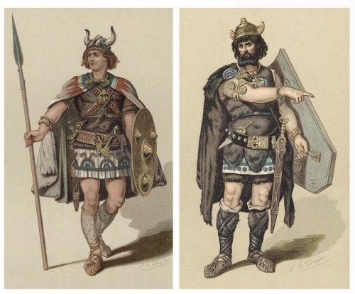
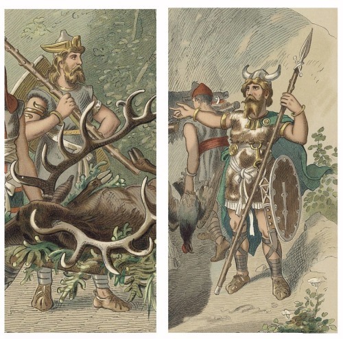
Those helmets were probably based on archaeological finds, even though all Northern European examples are, AFAIK and depending on context, either religious headgear equivalent to a bishop's mitre, or ceremonial headgear equivalent to a crown.
In addition, every single one predates the Viking Age by a period ranging from a couple of centuries to a couple of millennia so - makes vague handwave gesture - they're more appropriate for the sorta-kinda mythic Migration Era setting of the Ring than any Vik who ever inged..
Doepler's designs also feature WINGED helmets, worn by immortals like Wotan...
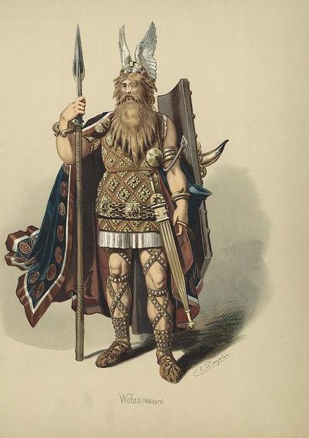
... and the Valkyries.
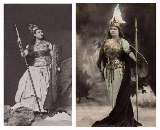
Something else I encountered when looking for pics to illustrate this was that other clichéd armour error, the boob-plate.
Here's dramatic soprano Karin Branzell wearing one...
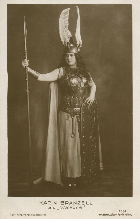
...while here's heroic tenor Fritz Vogelstrom also wearing one.
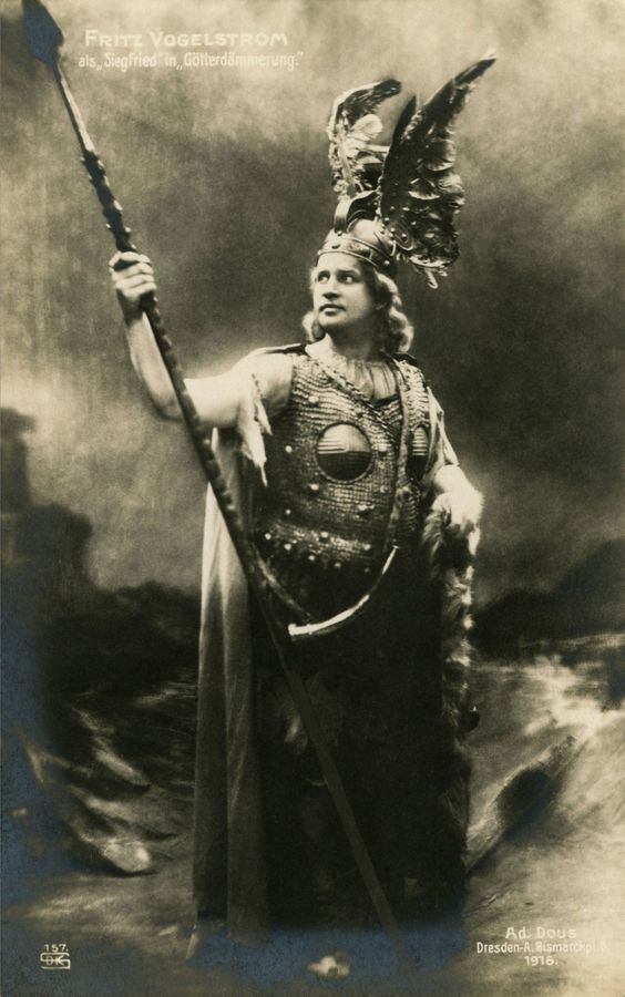
He's singing the role of Siegfried but wearing the costume of Brunnhilde, at least that's how it looks to an operatic Philistine like me.
Anyway...
Winged helmets are even more historically dodgy - no archaeological evidence at all - yet are actually more feasible as working combat helmets.
The difference is that horns, being heavy, need sturdy mountings so a horned helmet both provides catch-points for incoming blows and handles for an enemy to grapple, while a winged helmet does neither. The wings, being light, wouldn't need solid fixtures so would just shear off under a weapon or come off in an enemy's hands.
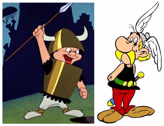
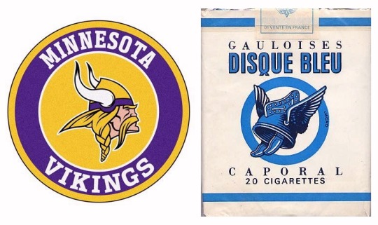
I'm well aware that other times, places and cultures - Indo-Persia, Poland, Japan etc. - had helmets with wings, horns and all sorts of other stuff, but this is about how the popular image of Vikings that headgear came from opera.
And went all over the place... :->
156 notes
·
View notes
Text
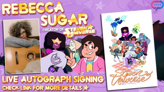
Highlights from the stream:
Here are the anecdotes shared during the epic draw-fest. Nearly all of them have been shared elsewhere at least once, but the new ones for me were about Greg Universe's orientation and the prototypical name for what Steven and Pearl's Fusion was going to be.
Rebecca Sugar loved Peridot's floating fingers and wanted to do all kinds of fun things with them before they would be gone forever. That's why we see her making arrows with them and biting them nervously in the episode right before she loses them.
When selecting clips for promotional use, they tried to be super careful about not picking anything that would show Peridot's real hands before the reveal had been aired. They didn't want a promo to accidentally ruin that surprise.
While doing the show they had an "eye theory" where the three main Gems would always have a different number of eyes showing. Pearl had both her eyes visible; Amethyst usually had one covered; and Garnet had either no eyes showing or three eyes showing.
With Rebecca and Ian's decision to get married and the characters Ruby and Sapphire being based on them, they figured well, of course now they have to get married too. (Though Rebecca and Ian got to do so AFTER their characters did!)
One of Rebecca's "post-Future theories" is that Steven gets a Gibson Hummingbird guitar.
Cookie Cat was originally based off of Cookie Puss, a very strange Carvell ice cream cake. It had a complicated backstory, which was appropriate for working with their own characters' complicated backstory. The branding and packaging of the Cookie Cat is important within the show.
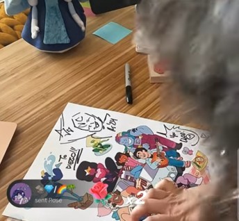
Jeff Liu composed the Cookie Cat theme on a Game Boy and pitched it.
Rebecca has a "theory" regarding how Steven and Connie's faces kind of "fit together" with Connie's face sticking out at the top and Steven's face sticking out at the bottom.
Rebecca used to do a lot of fan comics, and learned a lot about storytelling while practicing with others' worlds and characters. They love when people make things based on these characters.
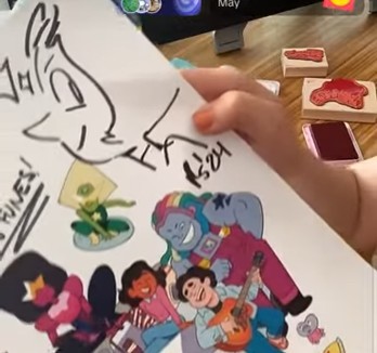
The original appearance of Rainbow Quartz was inspired by a music video from the Cars that Rebecca loved when they were younger. The Cars are referenced a lot throughout the show because their videos were a huge inspiration to Rebecca.
Lapis is very much based on a character from one of Rebecca's comics from the art school days.
Everybody on the Crew had different ideas of how Steven's head connected to his body and how his hair worked; Rebecca felt that they learned from everyone's various ideas.
If you've heard that Rebecca was against Finn being in a relationship while working on Adventure Time, that is not true. Rebecca worked on lots of the Flame Princess episodes. Finn and Flame Princess were still together when Rebecca left the show (last episode "Simon and Marcy").
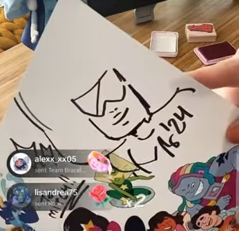
Greg Universe's sexuality was never explicitly stated on the show, but Rebecca thinks of him as sexually fluid. Regarding him as bisexual is also completely valid--and appreciated by Rebecca as a bisexual creator who puts lots of their own personal traits into characters and feels that bisexual characters are pretty rare. Greg's gender on the show is pretty solidly established as male, so Ian says he is probably not gender fluid, but Rebecca is fine with alternate headcanons about that too.
Some of the earliest concept art from "Mr. Greg" was everybody in suits. Getting everyone in a suit was a primary agenda.
Everyone also wanted Connie to have a Space Camp outfit in the earliest concepts for her design in the movie.
Rebecca used to love doing signings while doing the show because it was like a chance to come up for air and go back to work energized by knowing how many people were touched by the show.
Rebecca Sugar wanted Pink Diamond to feel a bit influenced/inspired, design-wise, by the work of Iwao Takamoto. Rebecca loved his work in the Hanna-Barbera Alice in Wonderland and on Sleeping Beauty.
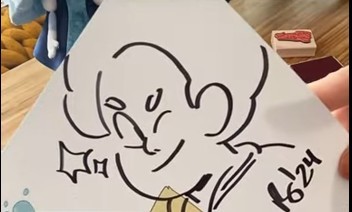
Rebecca drew the rough of the poster's art and Danny Hynes did the colors. Rebecca loves that they got to do this poster because they didn't get to do the final Comic Con with any art depicting Future or beyond (the finale of Future coincided with the emergence of Covid, so everything was closed down), so this is their way of "going rogue" and doing it!
An early prototype of a Steven/Pearl Fusion was called Coral. Rebecca said maybe they could share some drawings of this Fusion sometime. Rebecca shared this factoid with the viewers while drawing Rainbow Quartz 2.0, and mentioned that Ian boarded the scenes including their introduction.
Rebecca would often draw Garnet with a huge smile on her face whenever Garnet was the requested character--even before Garnet had made an expression like that on any aired episode. They had to be careful not to drop any Garnet lore before viewers knew what her center was about. For the short period before "Alone Together" had aired that they were doing conventions, some people were getting mysteriously grinning Garnets and not being familiar with that expression, but once the episodes aired, they understood for sure.
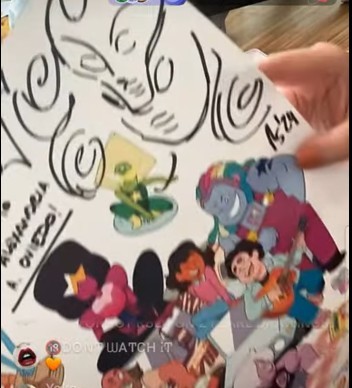
Shelby Rabara, Peridot's voice actor, is a professional dancer, and she choreographed the tap-dancing in "Mr. Greg" as well as provided the foot-taps that you actually hear in the show during the dancing.
Rebecca thinks of art and writing as just two different ways of expressing what you mean--they're not exactly as different from each other as most people think.
Everyone on the Crew was so excited about Steven's neck as an older teen. Mainly because figuring out how Steven's head joins to his body was an issue in original SU.
Unfortunately, while it was also kinda nice to see so many people enjoying Rebecca's drawings and commentary, there was a lot of rudeness and obnoxiousness in the chat. I know, I know, it's expected; I too live on the internet. But I'm disappointed to say the chat was full of people demanding Black Diamond, or repeating their own name and what character they want every 3 seconds (like, literally, pasting it over and over again for a long period of time), or harassing them about "weird Ed Edd and Eddy art," or spamming "REBECCA WHAT WAS IN THE CHEST," or wanting constantly for them to say hi to them personally, or repeatedly asking if Rebecca has read Homestuck. Or even writing snotty things like "maybe you should stop drawing and get up and give us a new season." Holy shit. can u not
(I didn't want to get a live-signed one, but I did get one of these to be sketched later! Mine is supposed to get Lion on it. I love Rebecca and the SU crew for bringing us new art and fun discussions in 2024.)
323 notes
·
View notes
Text
New Commission Page :D


Hello friends! Looking for some fun art of your OC? A ship you can’t get out of your head? Blorbos living rent free in there? Well, you are in luck, because I will draw them!
Here’s how it works: I have three different art types that you can request from me, sketchy monochromatic, and two variations of my fully rendered art, being light show and complex backgrounds. The base price for a monochromatic piece is $15 with an additional $5 for each additional figure/character. The light show pieces have a base price of $70 with an added $30 for each additional figure/character. And finally, the works with complex backgrounds are based at $80 with an additional $30 for each additional figure/character.
Will do: original characters, canon characters, light gore, mild/medium (age appropriate) NSFW…
Won’t do: heavy gore or NSFW, heavy mecha (I can do the silly animatronics, I can’t do, like, transformers)…
If you are unsure if something you want is something I would do or not, just ask!
My primary form of payment is through PayPal, though I am also willing to work through Venmo.
Message me here on tumblr, on discord (amandashow2.0), or on instagram (overlydramaticartist)
All jokes aside, I am saving money so I can attend my grad program in the fall, and I would deeply appreciate being commissioned to make art for you lovely people!
#commissions#art commissions#art commissions open#commission page#art#dca fandom#dca#encanto fandom#encanto#fnaf#mandys drawings
182 notes
·
View notes