#Adobe Caslon
Explore tagged Tumblr posts
Text

Is it? Is it fucking rich, Richard?
#this is an experimental gif btw! of a funny moment i kept rewinding because of the way JAW says FUCKING RICH lol#wanted to try text not sure how to feel about it yet#that said: adobe caslon pro italic is simply That Girl!!!!#carmy berzatto#the bear fx#*edit
58 notes
·
View notes
Text
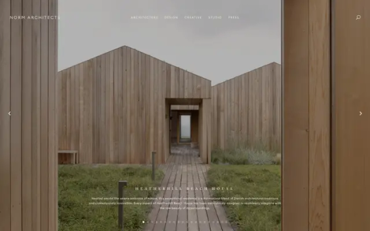
Norm Architects
#Norm Architects#architecture#design#studio#Copenhagen#minimal#minimalist#wood#interiors#products#portfolio#typography#type#typeface#font#Euclid Circular B#Adobe Caslon Pro#2024#Week 11#website#web design#inspire#inspiration#happywebdesign
17 notes
·
View notes
Text
sometimes you just have to accept the kind of person that you are (woman who thought “wow I really like this font! looks like Adobe Caslon Pro!” while reading a book and then specifically looked it up and realized that she was exactly right about what font it was and felt very self-satisfied)
#adobe caslon pro supremacy actually#it’s a peak font#but also I’ve never felt lamer than recognizing my favorite font in a book#and feeling pride that I was right about it#loser font nerd <- me
11 notes
·
View notes
Text

As a thank you for so many new followers, here's a brand new edition of my editing resources masterposts ✨ (you can find the previous editions here). Make sure you like or reblog the posts below if they’re from other blogs to support their creators! A friendly reminder that some of these are free for personal use only, so be sure to read the information attached to each resource to verify how they can be used.
Textures & Things:
Collage Kits from @cruellesummer that I find myself using basically every single day
Taylor Swift Wax Seals from @breakbleheavens that I also use literally every day
Rookie Magazine Collage Kits (1, 2, 3, 4, 5, 6, 7, 8, 9, 10)
Scribble Textures & Cross-Outs (1, 2, 3)
GIF Overlays (1, 2, 3)
Film Grain & Noise Textures (1, 2, 3)
Paper Textures (1, 2, 3, 4, 5, 6, 7, 8)
PNG Overlays (Paper, Flowers, Clouds, Stickers, Lips, Vintage Paper, Misc. Symbols)
Halftone, Scan Line, & VHS Noise Textures (1, 2, 3, 4)
VHS Tape Textures by @cellphonehippie
Misc. Texture Packs (1, 2, 3, 4, 5, 6, 7, 8)
Photoshop Effects (Halftone Text Effect, Chrome Effect, Glitch Effect, Ink Edge Effect, Photo Morph Effect)
Fonts:
Badass Fonts (free fonts designed by womxn 🤍)
Open Foundry Fonts
Free Faces
Uncut Free Typefaces
Some Google Fonts I Like: Instrument Serif, DM Sans, EB Garamond, Forum, Pirata One, Imbue, Amarante
Some Adobe Fonts I Like: New Spirit, Ambroise, Filmotype Yukon, Typeka, Big Caslon CC (TTPD Font!)
Some Pangram Pangram Fonts I Like: Editorial Old, Neue World Collection, Eiko, PP Playground
Fonts In The Wild (font-finding resource)
Tutorials & Resources:
Comprehensive Rotoscoping Tutorial (Photoshop + After Effects, great for beginners!) by @antoniosvivaldi
Rotoscoping & Masking Tutorial (After Effects) by @usergif
Texture Tutorial for GIFs by @antoniosvivaldi
Color Control PSD by @evansyhelp (to enhance, isolate, or lighten specific colors)
Cardigan Music Video PSD by @felicitysmoak
Picspam Tutorial by @kvtnisseverdeen
Moving GIF Overlay Tutorial by @rhaenyratargaryns
GIF Overlay Tutorial (+ downloadable overlays!) by @idsb
Icon & Header Tutorial by @breakbleheavens
GIF Blending Tutorial by @jakeperalta
Split GIF Tutorial by @mithrandirl
Guide to Coloring Yellow-Tinted Shots by @ajusnice
Slow Motion After Effects Tutorial (useful for GIFs!)
Gradient Map Tutorial by me!
Misc:
How to Make Your Own Textures by @sweettasteofbitter
How to Report Tumblr Reposts of Your Work by @fatenumberfor
Tips for Accessible Typography
708 notes
·
View notes
Note
Hey I just gotta say your bind of OTNWAS is GORGEOUS! Do you mind explaining how you formatted the pages? <3
hello, thank u sm <3!! and yes ofc i can :)
i used Adobe InDesign to do all my typesetting! the document i have has a total of 948 pages (475 spreads) which all include: title page, contents page, chapters, and a few customized + blank pages.
starting with document size first — mine is in A5 (so that i can print A4 spreads) you can play around with the margins, i recommend having at least 3mm added on to it if you’re going to trim it (the bleedline basically). my margins are 15mm left, 20mm right, 15mm top, 20mm bottom.
i had 2 chapter templates - one for short titles (i.e. jack flies) and one for long titles (i.e. jack and jamie uncover the hidden dangers of hide and seek). if you look at the pictures i posted, i added a snowflake as part of that template as an indicator of whose pov the chapter starts in. i designed one for hiccup and jamie too so i change it accordingly! i also use it as dinkuses whenever there’s a pov change within the chapter.
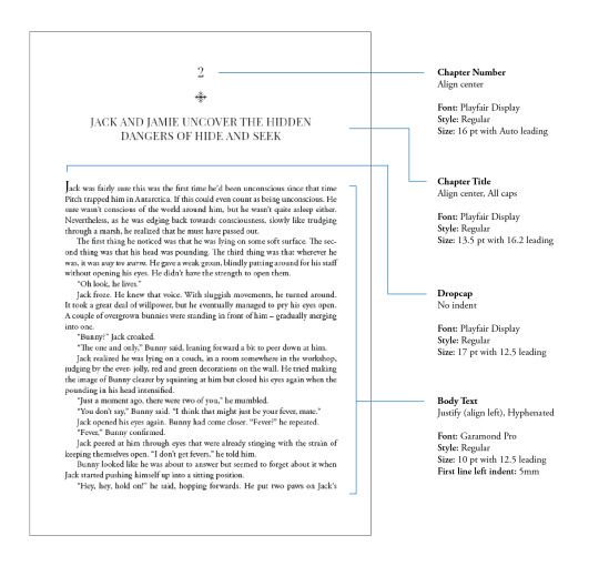
my body text size was 10pt with a 12.5 leading (justified + hyphenated) but honestly that also depends on the font you choose and your personal preference in terms of how spaced out you want your body text to be. i suggest doing test prints so you can adjust !! standard book fonts are: caslon, garamond, minion and palatino.
here’s a silly diagram i made for my friends of my exact settings 📖
in terms of actually formatting the fic— i copy-pasted chapter by chapter from ao3 because for some reason InDesign doesn’t recognize italics automatically so i had to do that manually LOL.
what else .. uhhhh i’m pretty sure i’m forgetting something… i’ll just add on when i remember but crossing my fingers this helps!! i know InDesign isn’t what’s the most accessible to people (i have it bc of my job), but there are lots of tutorials out there on how to do it on microsoft word or even google docs!
hope your binding goes well ⭐️
#local-dragon-haunt#jackshiccup ask#otnwas#IF U NEED ANYTHING CLARIFIED LMK#im pretty bad at explaining#ndbdjsbdd#also if anyone would like to copy my format/typesetting design you can go ahead!#a credit would be nice tho maybe dkdnnddbnxbx#but please design your own book covers !!!#that’s like the most fun part tbh#go crazy go stuuuuupid
40 notes
·
View notes
Text

Étape de la création du header pour Wicked Little Town. Je vais tenter d'expliquer comme je peux mon processus de création. Désolé si c'est un peu bordélique. 😅 Vous pouvez cliquer sur afficher davantage pour voir:
J'ai choisi la première photo avec la fenêtre car j'aimais le reflet sur le parquet et que ça marcherait avec l'extérieur enneigé que j'imaginais. J'aimais aussi les moulures sur le mur, je les ai donc gardé mais moins fan du chandelier, surtout qu'il n'était centré, je l'ai fais disparaitre. Puis voulant une scène plus aérée, j'ai utilisé le "generative fill" de photoshop et le "stamp tool" pour agrandir la pièce. Je suis partie à la recherche d'élément qui pourrait raconter l'histoire des personnes qui vivraient dans cette maison, un canapé, un chien, un chat, un couple qui avait une excellente ombre qui marcherait super bien avec ma fenêtre (parfois, je cherche pas trop loin 😂 ). Le design devant représenter la saint Valentin sans être trop "romantique" et le thème de l'anniversaire sans être trop "anniversaire". J'ai rajouté des petits chapeaux sur le chien et le chat, des fanions, une photo du couple sur la commode et sur l'étagère, la décoration de leur gâteau de mariage. A chaque élément ajouté, il fallait donner une ombre, un reflet dans le parquet si nécessaire et changer le coloring des objets pour qu'ils correspondent à l'ambiance de la pièce. Et puis, j'adore les plantes et les livres, donc il fallait évidemment que j'en rajoute. Je trouve que ça donne un côté plus cosy. Pour l'extérieur, étant donné que la ville où se trouve le forum a un lac et est entouré de forêt, je suis partie sur ça. Pour la version sombre, j'ai changé l'image d'extérieur avec une qui avait des reflets de la maison allumée dans l'eau du lac. Et c'était parfait pour le Corgi, il existe tellement de photos d'eux que j'en ai trouvé un allongé, quant au chat, il est parti à l'aventure. J'ai changé le verre d'eau sur la table pour un verre de vin, l'horloge au mur montre maintenant 1h du matin et puis, j'ai allumé les lumières. C'est des petits détails, mais je trouve que ça continue à raconter un peu l'histoire du couple, peut être qu'ils se sont installés sur le canapé pour boire un verre et le chien s'est endormi alors qu'ils discutaient ? 😊 Pour l'animation, j'ai passé les headers à After effects, j'ai trouvé sur pexels une vidéo d'un chat noir, il a donc été rajouté à l'extérieur et il cherche son amie, la chatte à l'intérieur de la maison. (peut être qu'elle est allée le retrouver la nuit 👀), j'ai rajouté un effet neige qui tombe que j'ai trouvé sur youtube et la nuit, un oiseau qui passe rapidement devant la fenêtre. C'est assez discret, mais on peut voir le reflet de la neige animé sur le parquet, surtout la version sombre. Pour la typographie du titre, j'ai utilisé Scotch Display qui est un fond Adobe, je trouvais que une typographie serif donnait un côté plus cosy et romantique. Et pour la tagline, c'est Caslon, parce que j'aime Caslon. 👀 Je pense que j'ai fais le tour, si vous avez des questions, hésitez pas à les poser dans les commentaires de ce poste et merci d'avoir réussi à lire jusque là. 🫣 liste des images utilisées: pexels-eberhard-grossgasteiger-1624503 pexels-serkan-atay-19730755 pexels_videos_1536279 (1080p) Falling Snow Realistic Overlay Loop pexels-curtis-adams-8583905 pexels-taryn-elliott-4440123 pexels-emma-bauso-2253870 pexels-karolina-grabowska-5726036 pickawood-rwa0Yh38FeA-unsplash samantha-gades-BlIhVfXbi9s-unsplash kari-shea-3_cyj5YkhTs-unsplash jeffery-ho-TIN_Lh9-Y7g-unsplash markus-spiske-UaQ1t-nQHyk-unsplash annie-spratt-JruJFy08KB8-unsplash pexels-maksim-goncharenok-4352247 sunguk-kim-WTKvaChRvBg-unsplash pexels-karolina-grabowska-5726036 nataliia-kvitovska-MYwbqIfccvg-unsplash pickawood-rwa0Yh38FeA-unsplash filipp-romanovski-pDbhjYjrWpk-unsplash content-pixie-6CFCrt-7tHw-unsplash fatty-corgi-EpRAM95thHU-unsplash pexels-serkan-atay-19730755 fatty-corgi-wHgkrmuMFOY-unsplash pexels-anna-shvets-4587992 alexander-london-mJaD10XeD7w-unsplash
35 notes
·
View notes
Text
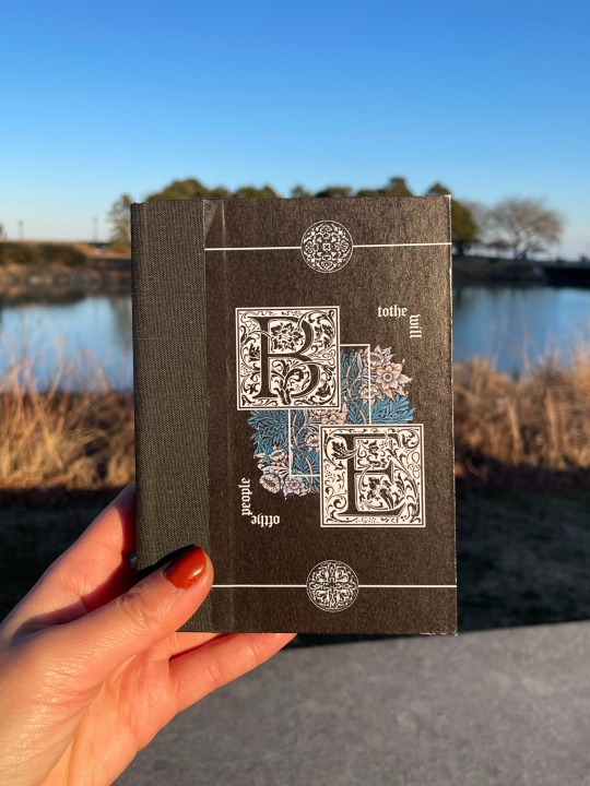
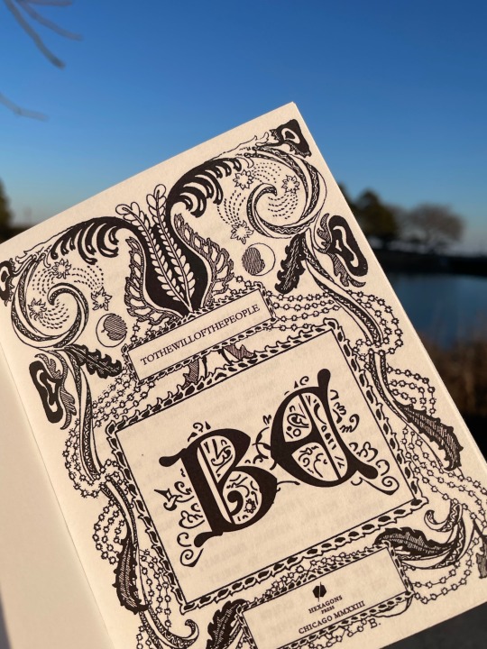
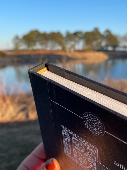
BE by tothewillofthepeople
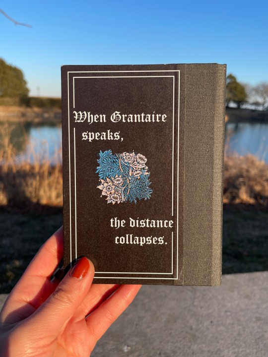
Grantaire is earnest in this, and it’s heartbreaking. Enjolras can’t look away. This is just a rehearsal. Grantaire is still wearing skinny jeans. They have lights and phones and textual analysis and thousands of years of history between now and then and yet– When Grantaire speaks, the distance collapses. (Grantaire as Hamlet.)
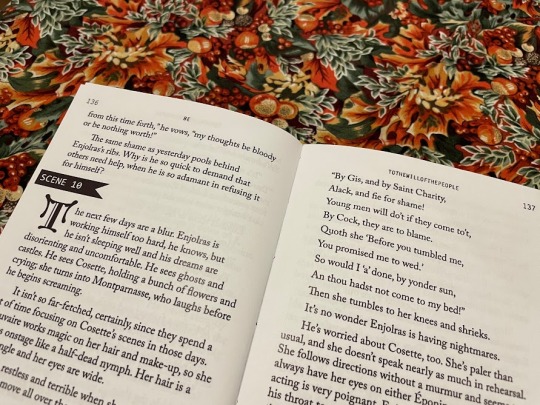
Title: Middle Ages Deco Headers/Accents: Letter Gothic Standard Body text: Adobe Caslon Pro Case title: Goudy Initialen
38,667 words | 224 pages
Binderary book 1: a long-favourite EXR fic. I love wild Les Mis AUs and I love Shakespeare and this is all of that in such a lovely lovely form. Stage manager Enjolras is inspired. Also, I've been frothing at the mouth to use my special blackletter fonts and go suuuper overboard designing and this was Perfect for that purpose.
More pictures/design/process under the cut.
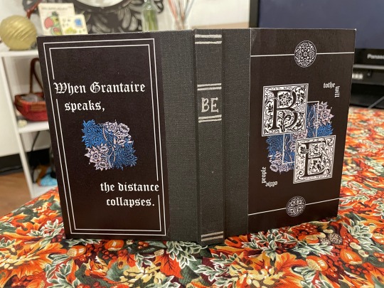
Design and Construction Case: Flat-back case binding with bradel board covers and spine. The spine cloth is Hollander's pearl linen in charcoal grey. The painted titles were done in Amsterdam acrylic ink in silver, with a pair of scissors because I don't own a painting brush and likely never will. The cover papers are printed on 80gsm white printer paper and glued with a regular Elmer's glue stick and PVA on the turn-ins, and the whole case is sprayed with workable fixatif to (hopefully) preserve it longer-term.
Covers: The front and back covers were designed in Photoshop. The centre image is a William Morris pattern, and the top and bottom little circles are Renaissance printer's ornaments (pngs by the lovely @helle-bored of Renegade Bindery) that I vectorized in Illustrator (Illustrator and I were sworn enemies until this month. Now we're forced friends. Like enemies to lovers).
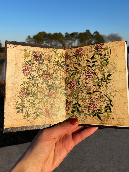
Insides: Endpapers are a William Morris pattern recoloured in Photoshop to be a richer green and red, obv, for EXR. Printed with inkjet on 80gsm printer paper and glued to gold cardstock, and sewn into the textblock. Endbands are pre-sewn from Hollanders, dyed gold with acrylic ink to match the endpapers.
Typesetting Typeset was done in InDesign. This is a one-shot with scene breaks, so to match the theatre theme of the piece I replaced the horizontal line breaks with flagged scene numbers. I tried to strike a balance in the typesetting between classic Shakespearean aesthetic with the blackletter drop caps and cover fonts versus what you might see in a theatre script book with the monospace accents. The title spread uses a transparent decorative frame, again from Helle's collection; the large box in the middle with the title was part of the original frame and then I duplicated and resized it for the author name and my imprint.
We All Do It, or, the Mistakes Section I somehow managed to print the cover papers nine inches tall and didn't see a problem with it until they came off the printer. Truly who knows how that happened. I was working on the case at two in the morning and cut the spine cloth the wrong length three separate times...earned the measure once cut twice badge big time for that one. The endpapers were an ordeal and a half for real. What I learned: print them too big and glue the cardstock to the back, then trim the paper to size, not the other way around otherwise you'll end up with big ugly gaps where the trimming was a few millimeters off. Whoops.
And...more pictures
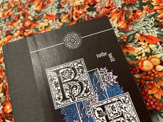
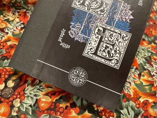
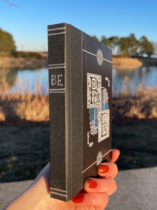
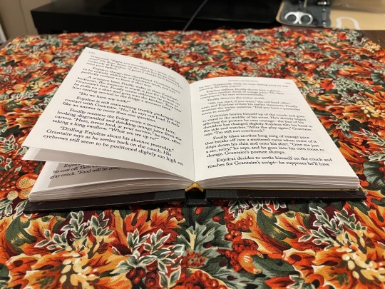
I'm particularly pleased with how the covers here came out so here's closeups. Also, the arc on the spine that you can see in the endband on the last one is really pleasing to me lol I fought a war trying to get the flatback hinge calculations right.
222 notes
·
View notes
Text
A Gallaplacidia Anthology
i had wanted to bind something for the lovely nim of @theonetruenim, also of nimmening fame, and thankfully nimmtro of chaos bindery came through for me and gave me a couple of suggestions of what to bind! the fics have been deleted off AO3, but can be found here.
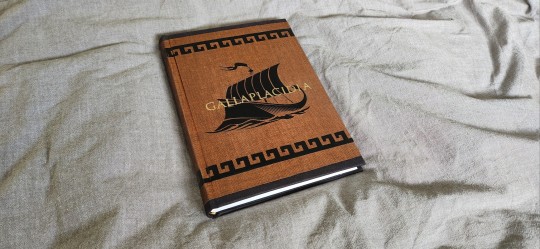
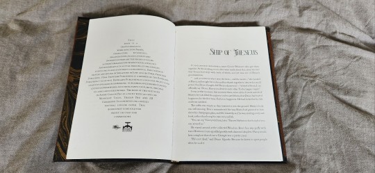
I opted for my two favourite galla fics - ship of theseus and the bucket list and decided i wanted to use greek themes as the design elements for the bind. I also was in the process of picking up Affinity Publisher during this, so I am very grateful to @pleasantboatpress who basically handheld me through most of the typesetting process as i stumbled around fucked around and found out.
some stats if you will:
50633 words || 179 pages
body text: adobe caslon pro
accents: Midnight Tales, Trajan Pro, EB Garamond
see below for more details:

@celestial-sphere-press, @pleasantboatpress and @butterfingersbookbinding also basically gave me a ton of amazing design suggestions and talked me down many ledges as i was making this book because this was my first millimeter binding and OH BOY. i fucked that up from the get go because I SLATHERED THE WHOLE THING WITH GLUE AND WENT OH FUCK CAN I TAKE THAT BACK JESUS NO-
the glue eraser was my best friend for this bind. I have zero regrets.
i had wanted to achieve an ancient greek pottery look to my design and hence i used a black bookcloth (unknown source, probably hollanders) with duo scotch. i hadn't initially planned the greek design trim but because of fuck ups from the layering of the cloth (i have aphantasia so theoretical planning and design is challenging and i simply cannot envision shit until its done and THEN ITS TOO LATE) i had to put a layer of HTV around to hide the unsightly fabric lines which weren't cut straight.

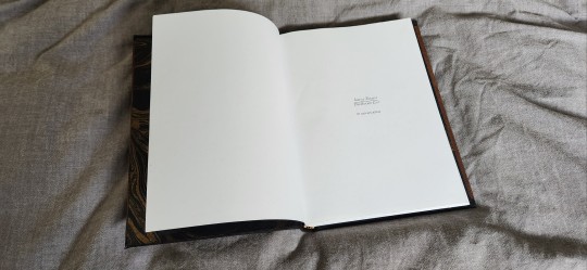

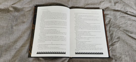
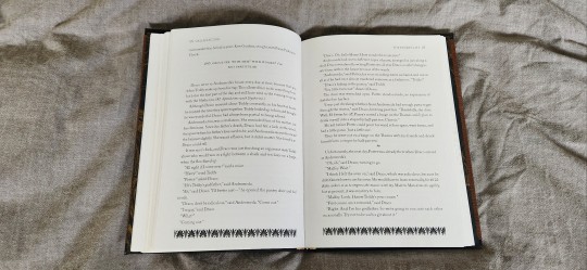
Endpapers are from an etsy shop with black and gold marbled paper and i did the endbands in gold, black and bronze silk.
Ultimately I really like where the design went, and though I over-pressed the HTV a little, i think it came out really well and I was really happy to be able to give this book away, especially to another bookbinder (which is always very nerve wracking, a little like you're unveiling a part of your soul and you're worried you'll be found lacking).
It seemed like a good surprise and thank fuck I gave her a book because she cut me papers as a surprise gift (fuck THANK YOU NIM I LOVE THEM) and it was such a lovely meeting with the cali renegades.
Anyway I'll be slowly revealing the books i've done over the last month - FFWAD is coming up and i am super excited for it! bookbinding has slowed a little but i am hoping to get back into the thick of things soon.
#bookbinding#fanbinding#my books#gallaplacidia#ship of theseus#the bucket list#ficbinding#renegade bindery#drarry#harry potter
119 notes
·
View notes
Text


A Game of High Stakes by In_Dreams
In theory, the task is simple: kill Draco Malfoy. In practice, putting a curse through the Dark Lord's favoured lieutenant will take everything Hermione has―especially since he's trying to kill her, too. Even more so when the lines between them start to blur. Sometimes, the only way out is through.
fic by In_Dreams
1,122 pages / 263,110 words
Title Font: Abandon
Body Fonts: Adobe Caslon Pro, Far From Homecoming, Indie Flower, Headline One, 1782 Thurneysen, Dark Twenty, Kirana Script, Arial
More on the process + video below the cut!
My Exchange book is finally done! What a journey. This was a new fic for me, and a whopper too, at over 263k! I love being exposed to new recs though, one of my favorite parts of Exchanges!
I leaned into the theme of the "game" that's so prevalent in this fic; the characters move like pieces on a chess board, so I incorporated that into my design elements with checkerboard endpapers, dice on both the cover and in the typeset, and the king and queen on the cover of the third volume.
There's a coin in the fic that Hermione and Draco use to communicate with each other; each chapter begins with either heads, tails, or the side of the coin, for a "flipping" type of effect.
Handsewn endbands in the checkerboard white & black, and this was also my first time foiling a cover! I'm really pleased with how it came out; freehand foiling on stencils cut out with my Cricut.
Hope you enjoy, dear giftee! Happy Exchange!
#fanbinding#bookbinding#fanfic binding#fanficbinding#me myself and i#fanfic#ficbinding#harry potter#dramione#draco x hermione#hermione x draco#hermione granger#draco malfoy
48 notes
·
View notes
Note
i do know that this is absolutely not the point, but what font did you use for the "news source" screenshot? it's nice looking
lol so for that "screenshot" I used browser tricks to edit the body of an actual new yorker article, and it looks like they use adobe caslon pro. which I also like a lot. it's easy on the eyes!
13 notes
·
View notes
Text
Dankovsky is the kind of guy who writes his documents exclusively in Adobe Caslon Pro or Garamond. And no, EB Garamond isn't good enough.
16 notes
·
View notes
Text


that our stars should divide and path of primroses by nasri
a cute set of books for a cute little series! i experimented this time with cutting windows in the bookboard before covering with bookcloth - it was a little challenging to get the shapes right but i think they turned out okay.
i made the bookcloth myself with fabric and heat n bond - it didn't turn out as smooth as i would have liked but once the cases were covered i waxed and ironed both books with my beeswax/gamsol mix and that helped settle everything. you can still see a few places where the heat n bond adhesive melted through the fabric onto the front - frustrating! i may be buying my bookcloth outright from now on haha
the endpapers are handpainted - it's a mix of acrylic paint and sakura paint pens on cardstock. they took ages but i'm pretty happy with them - just the right balance of vintagey looking but also cute and playful.
the typeset is 10pt caslon / 14pt line spacing. titles and headings are adobe garamond small caps. margins are 1" top and sides, 1.25" bottom.
77 notes
·
View notes
Text

ISO
#ISO#Industrial#Design#studio#intervention#complex world#collective#experts#London#colors#fluos#typography#type#typeface#font#Adobe Caslon Pro#FT Regola Neue#2024#Week 03#website#web design#inspire#inspiration#happywebdesign
9 notes
·
View notes
Note
Top 5 fonts ✨
ask me my top 5 anything
Oh you asked the person who spends their free time on adobe fonts an opinion on fonts... fun!
First of all, Calibri my beloved body font. Gonna focus on only heading fonts here but I needed to mention it
Acier BAT - she is everything, she is the moment, there is a reason for why she is my go to header font because she is so versatile, no matter the style or combination she is perfect

Thank you Adobe Fonts for your service
2. ITC Avant Garde Gothic - did you know that the bold version of this font was used in the title of the movie Senna? Yeah that's how I originally found it cause I love the slanted A. Simple so it can be bent and is still easy to read, especially awesome in all caps

Thank you Adobe Fonts for your service
3. Sisters - I don't get to use her as often cause there is just too much going on with it but one of these days I will make a graphic where I can use it. Bonus shoutout to Gill Sans Nova Deco here because she is so similar but slightly less busy

Thank you Adobe Fonts for your service
4. Rig Solid - a font that has a drop shadow version built in? Say no more. Wonderful for poster design, I need to use it more often for that. Has been slightly overshadowed by Acier BAT I fear

Thank you Adobe Fonts for your service
5. Neonoir - still lowkey on a hunt for a good handwriting font but so far she is the least finnicky and best I could find. So many handwritten fonts suffer from not lining up properly but I don't need to adjust the kerning here so she's automatically wonderful... mostly

Thank you Adobe Fonts for your service
Quick fire round of faves that have been with me for a long time aka since pre adobe days and did not make the list: MADE Soulmaze, Cinzel, Sue Ellen Francisco, Adobe Caslon Pro, and probably more I am forgetting. Some of these are on Google Fonts, some of these have existed on my ancient laptop when I used to make wattpad covers, some are both
Honorable mention to Gill Sans Nova for quite literally fulfilling every idea under the sun. It's just too versatile and that's why I didn't mention it
6 notes
·
View notes
Text

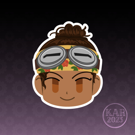
My Stranger, Hope Hawthorne (nee Caslon-- yes, she and the ship have the same name) and my favorite, most specialist girl in the world, Parvati Holcomb.
Make In Adobe Illustrator.
#vector art;#digital art;#vector illustration#vector portrait#vector art#the outer worlds#parvati holcomb#the stranger#captain hawthorne
21 notes
·
View notes
Text
bodoni. didot. okay we're in preschool i guess whats next adobe caslon
11 notes
·
View notes