#3D& 2D Elevation
Explore tagged Tumblr posts
Text
#Architectural Services#Civil Drawings#Floor Plan#3D& 2D Elevation#Structure Drawings#working Drawings#Electrical#plumbing#& Drainage drawings
0 notes
Text
“I think no matter how Luo Yunxi wears it, there is a sense of story…”
©️ 张突然啊
#罗云熙#luo yunxi#really bringing art into life#elevating design into a higher plane#Xixi is the 2D and 3D bridge
4 notes
·
View notes
Text
#Pixel Edge Design Studio#about us#animation studio#multimedia solutions#2D animation#3D animation#visual effects#video production#interactive experiences#creative services#India animation studio#animation experts#design studio#brand elevation
0 notes
Text
youtube

#3d animation#interior design#sunset#plants#nyc#kitchen#interiors#interiordecor#home#3d model#autocad#engineering#2d drawing#elevation#Youtube
0 notes
Text
youtube
Per Aspera Ad Astra (2019) [11 min] by Franck Dion | France
#2D#2D Animation#3D#3D Animation#2019#11 min#Franck Dion#France#Animated Short#AnimatedShortOfTheDay#Animation#Papy3DProductions#Hens#Housekeeper#Fantasy#Town#Elevator#Youtube
0 notes
Text
3D building model & Render
I will do building 2d planning,3d plan,design,rendering,estimation
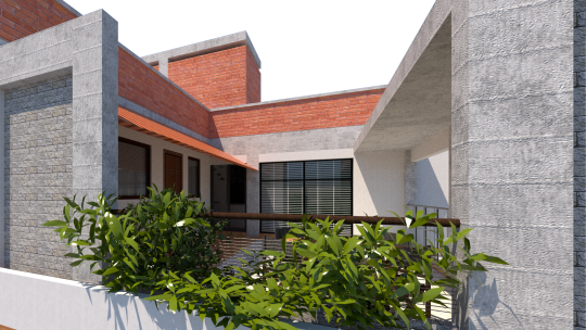
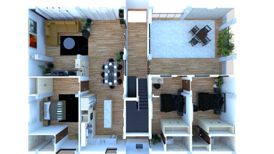
#photo manupulation#architecture#open floor plan#modern house#3d model#3d render#3d house model#3d visualization#sketchup#sketh up model#autocad plan#2d floor plan#section#elevation#photo background removal#photo edit#creative 3d model#3d house render#exterior design#interior design#landscape#rooftop#roofscape#estimation#v ray render#ios 17#apple event#bangladesh#business logo#new york
0 notes
Text

Pretty awesome webbed site for Hermitcraft reference photos

There's an option to view in 2D or 3D isometric view which is like... really good for finding elevations and understanding the relative scale landmarks are in the overworld.


The detail in quality is great too the more you zoom in like this is part of Doc's s9 Perimeter
Will note though, s10 on this site only shows the beginning of the seed as I'm writing this. I assume it'll change when there's a world download
#character concept stufff#aliensssrefs#hermitcraft#hermitblr#mcytblr#contributor credit is on the front page of the site when you open it smiles :]
1K notes
·
View notes
Text
Everyone talks about the tragedy of animated media getting reboots that replace their excellent art direction with uncanny realism —like the Lion King and its “live action” reboot—- but there’s one series that embodies that tragedy better than anything else. And I need to share it with you all because I can’t be the only one Haunted by it day and night. Please let me tell you the Sad, sad story behind this image:

There was an early 2000s video game trilogy called Sly Cooper, whose main appeal was its super unique art direction, style, and atmosphere. The trilogy had a unique tone focused on a cartoon Phantom Thief who did Moody Atmospheric Heists in a comic-book-inspired world.


The trilogy integrated 2D animation into the game for cutscenes, and the characters-- while low-poly-- were designed to look as much like those flat 2D cartoons with cel-shaded outlines as they could within the limitations of the Ps2.


It took heavy influence from comic books and anime, especially Lupin III. The first game even had alternate anime versions of its 2D cutscenes that you could unlock!

Nearly all the levels took place at night, but the designers talked often about how their goal was to create the illusion of night time through vivid color palettes rather than darkness, taking inspiration from the vivid nighttime cityscapes in Baz Luhrman's Moulin Rouge.

As a result of their stylized art direction, the visuals-- primarily in the second one, which is the one that focuses the most tightly on Thieving & Moody Atmospheric Heists-- still hold up today.
And then Sly Cooper started appearing in “brand crossover games” and “reboots” and Oh god. Oh no. so that's why no one talks about it anymore.


I am haunted by this. People talk about their favorite cartoon character getting hit with the Uncanny Hyper-Detailed Beam and I instantly think of the sad fate of poor, poor sly cooper, who I am very nostalgic for, and his now-dead franchise that hasn't had a new installment in over a decade.
But to me this really emphasizes how strong art direction is far more important than polygon count, realism, or level of detail. Because there have been similar franchises rebooted in ways that manage to elevate the old 2D-inspired art styles with more modern graphics. Toys for Bob's new takes on Spyro and Crash Bandicoot both had stellar art direction!


But that kind of thoughtful art direction can be difficult to achieve. It's not even the fault of the artists or developers; these things are often beyond their control. But I am glad we're in an era where stylized 3D animation is becoming more popular. I hope more creators continue to realize that there is actually a big demand for media with interesting, unique art styles! also you should play sly 2: band of thieves
#video games#art#sly cooper#but yes. please weep with me as you read this#im having a mild hyperfixation moment#because being an adult means I can be a Gamer it turns out#the perils of having Cash#you really should play sly 2 band of thieves though.#okay: the first Sly game is a basic platformer game format elevated by stellar art direction and strong storytelling#the second game is focused on Doing Jobs to Prepare for Heists and more about exploring and sneaking around rather than platforming#and even improves on both the art style/storytelling with more explorable parts of the world and a more complex plot#and then the third one is the one they had to throw together in a couple months before the release of the ps3 made ps2 franchises obsolete#and is kind of a hot mess but has a couple cute moments
212 notes
·
View notes
Text
replaying super paper mario, sporadic thoughts post-chapter 2:
very easy so far--& although ttyd was also easy, spm's gameplay is sadly substantially less rich thab ttyd's was
having said that the game design in spm is! unrelentingly charming!! the use of platforming as a framework for a varied stream of stage styles (straightforward levels, dungeons, towns, the entire 2-3 Situation) is creative in a way that imo predicts the sort of things the mario maker community later ended up making. chapter 2's set pieces in particular are extremely quirky (the rooms with traps, the rubee thing, the mazelike basement, the merlee game show lmao)
few platformers have boss fights that feel like genuine Combat, so that's pretty cool
i will confess that as a First Dungeon, yold ruins doesnt have half the sauce of hooktail castle--it's much more linear in layout, with far less of that zelda-y "explore & comprehend the space" principle that made ttyd's dungeons hit
in a similar vein, it's kind of crazy how tippi has like a fraction of the personality that goombella had. it's a bit sad for the character doing the vast majority of the talking to just.... not really have any opinions on anything
the momentum of the chapters likewise means very few npcs ever get to stick out. like, even the "first town crotchety old mayor" character was a total one-and-done, one dialogue and you never have a reason to speak to him again (mostly just speaks to the game structure, which is as mentioned a bold enough exercise that i feel i cant really fault it for that)
bringing up a menu to use items In A Platforming Context is not at all natural to me, so im finding myself just not really using them
this game is a masterclass in visual design imo. the npcs & enemies & pixls being made of primitives that reconfigure themselves into different shapes really elevates the interplay of 2d & 3d, the backgrounds/environments are extremely aesthetically satisfying (the Mathmosphere in lineland, the optical illusion in the sky in gloam valley, all of castle bleck), & i love how the constant "digital/tech" motif (eg the "dragging selection boxes to flip/teleport", the trees & shrubs looking like something youd make in ms paint, etc) is an ingenious progression of paper mario's core aesthetic design
dimentio is so fun
i ADOOOORE nastasia
the inter-chapter dialogue flashbacks are surprisingly earnest? for such a tongue-in-cheek game where almost every line of dialogue contains a joke of some kind, those exchanges feel humourless & sincere. that probably contributes to the Space the game occupies in all of our memories lol
likewise it was really interesting how peach's "escape" sequence after chapter 1 was (while, again, still extremely sardonic) aesthetically & narratively framed with such a sense of Hopelessness. that's not to say like "woahh this mario game is 10x darker than you thought!!!!", more that it's just not a space the series commonly ventures into
the Ancients stuff is being leaned into extremely hard lol. ttyd mostly teases at that kind of "mysterious rpg lore" thing peripherally (the riddle tower inscriptions, grifty, etc) so it's interesting how spm puts it front & centre in contrast, without ever sacrificing the sense of mystique
this game really highlights how interesting the wiimote is as a controller--pressing the A button while holding it sideways (ie removing your left thumb from the direction input to press a button) is something that i cant think of any other controller doing, & it projects onto that button a really interesting sense of, like, Valence
it's the kind of game that seems to beg for one of thsoe posts like "things that ACTUALLY HAPPEN in _____"
120 notes
·
View notes
Text
War of the Rohirrim: My Thoughts
So, I just got back from seeing this movie and I thought I'd write up a little review, I'll give a brief overview first and put spoilers under the cut.
First off, let me get this out of the way: I really, really enjoyed it! Which isn't to say that the movie didn't have problems, just that I was thoroughly entertained throughout and also got way more invested in it than I thought I would! It was a nice, self-contained little story that did service to Tolkien's Legendarium while still allowing for creative changes and I thought it all worked really well the way it was told. The animation was absolutely stunning in a lot of scenes (notably the fight scenes!), though I did have some issues with it in others. Notably with the compositing of the 2D and 3D art together, some of those just did not look right, but they were few and far enough between that they didn't detract overmuch for me.
The cast of characters were vibrant and well-crafted, especially the supporting cast for me, and the voice acting for everyone was on point. I also really liked the general design and portrayal of the whole cast, I thought they all looked very good. Notable standout character for me would be: the princes, Háma and Haleth, the King's nephew, Fréaláf, and the shieldmaiden, Olwyn. And honorable mention to the Dunlanding general, Turgg, too. I can't tell if it was just the nostalgic Howard Shore score returning in some parts or if I just generally liked the whole soundtrack (notably not composed by Shore this time), but I felt like the music was very good as well. Very suitable to the world and Rohan specifically.
And, last but certainly not least, I thought the vibe of the film was just incredible. Even moreso than with the Hobbit movies, The War of the Rohirrim felt like Middle-Earth. The vibes of the movie were impeccable and it actually seemed like a genuine story set in the original trilogy's Rohan. The styles and dialogue and whole atmosphere of the film seemed very in line with Peter Jackson's original trilogy and I think that's what elevated the whole thing for me, enough to overlook its flaws, which I will get into more detail in below the cut.
Overall, I personally would rank this a solid 6.5/10. It certainly didn't match the original trilogy and likely wasn't even as good as my favorite of the Hobbit movies, either. (Which is the first one, of course. 😌) A very solid addition to the Middle-Earth series and enjoyable enough that I'll definitely be watching it again, but nothing particularly groundbreaking. If you are a LotR fan, I feel like you'll like it. If you're an anime fan, you might get a good story and some pretty characters out of it. If you're a more casual movie watcher, it might be a tad hit or miss. But overall, I consider it a very solid movie.
Now, on to spoilers.
So, first off, let's talk about Héra. I've seen a lot of entertainment outlets and reviewers criticizing her character (or lack thereof) and calling her a "Mary Sue" which is, in my opinion, just a very lazy critique of her. The movie sets her up as this free spirit, a warrior king's daughter who grew up learning to fight and ride and adventure alongside her brothers. She is a beloved princess of the realm who the people greet by name, who is kind and compassionate, clever and competent, who dreams of one day being free of her royal duties and be able to travel where she pleases. Oh, and she has an overprotective father who wants to marry her off to try and keep her safe. A textbook Mary Sue, right?
Well, no, I'd very much beg to differ.
Héra is a flawed character. Time and again, her youth and inexperience lead her into situations she can't handle and she is a liability just as often as she's shown to be a hero. And time and again her compassion is taken advantage of, to the detriment of herself and others. The fact that she is clever and headstrong and grows into a deadly warrior by the end does not make her a Mary Sue. But that's also not to say that I found her to be the most compelling, either.
Don't get me wrong, she definitely had some amazing moments (her conversation with Wulf in Orthanc, her wisdom in evacuating Edoras and her traps laid out before its siege, her amazing "I'm no man's bride." "Who are you promised to?" "Death!" line read?) but she was rather generic to me all things told. However, she's shored up by an excellent supporting cast and a great plot, so I didn't feel I really needed a super interesting protagonist to follow. She is excellent in her role as the POV character for the events happening around her and she becomes anchored enough in the main plot by the role her family plays and the obsession the main antagonist has with her.
Which, speaking of...
Another character I really want to call out is Wulf. Because he... was a missed opportunity imo. I get what they were going for with him I guess? Hm, a sort of Maeglin approach to him almost, for those familiar with the Silmarillion, where becomes obsessed with the object of his desire to the point of madness and villainy. However, I personally feel as if his character could've been so much better if they'd taken him in a different direction? These are all my own thought and you don't have to agree, but hear me out: I think they should've tried to humanize Wulf more. We are told early on that he and Héra are childhood friends, but we're only ever given the barest glimpse of a flashback between them to set that up? We have one short conversation between them at the very beginning after his proposal to her and after that he takes a sheer dive into villainy that he double and triples down on as the story goes. But if the movie truly wanted us to feel as if there was a connection between them at all, I feel like they should've emphasized that relationship a lot more. Show more of their time together as children. Give more scenes to Wulf of him experiencing discrimination because of his Dunlanding blood. Give him moments of hesitation and remorse when he's forced into conflict with Héra. Like, I genuinely believed that's where the movie was going at the end? I really thought that, after their big fight where Héra has him on the ground and shows him mercy, I thought he was leaping up at her to die. I thought he intentionally missed her with his blade because he wanted her to kill him after everything he's done and that was the only way he could accept it happening. I thought the movie might come full circle again to showing that, despite everything, there was something genuine to his affections? That he wasn't wholly evil or deranged and that his declaration of love had been true once upon a time, even if he'd since forswore it after his father was killed. I really thought they would give him some glimpse of humanity. But no, he was genuinely just trying to kill her again and she beat his ass and that's that. Honestly much less impactful to me. Like, don't get me wrong, I absolutely did not want him to be redeemed. (Especially not after the absolutely abhorrent way he killed Háma right in front of Héra and Helm, oof.) But just any show of him not just being some black and white villain would've been welcome. Just the tiniest bit of complexity to a truly vile villain makes them stand out all the more for me and I think Wulf would've been truly memorable if he'd had that.
Now, my issues with the two leads out of the way, I just wanna bring it back around to the positives again and say how delightful I found the rest of the supporting cast? For all that they were barely in it, I was just instantly captivated by Haleth and Háma, not even joking. As soon as Héra rode in to Háma singing his little song for her, I knew I had a favorite. Oh, what's this? He's a poet and a bard and a handsome warrior prince?! Well, I'll be. It seems he was specially crafted to be my new blorbo, lol! And then Haleth showed up and my mind just instantly associated the two of them with my two absolute favorite Tolkien character and I knew I was a goner. (Please tell me I'm not the only one to instantly get Maedhros and Maglor vibes from them, eh? Which, in retrospect, Haleth is much more how I picture Celegorm, lol, but still. That initial projection really stuck in my mind. XD)
Héra's servant, Olwyn, was also such a pleasant surprise? I didn't expect much of her at the start, but she really grew on me as the film went on. I love that you just have to piece together her backstory as a shieldmaiden of Rohan and then you can start using that to theorize about Héra and how she idolizes them and it all just clicks together so well? And it's always nice to see an awesome older woman kicking ass!
And then Fréaláf showed up and he was just like the coolest guy ever?! Yooooooo, I loved him so much, even though he got so sidelined in the movie. 😭 But his appearance at the end wearing Helm's armor and blowing that horn was just awesome. I don't even care if his whole arc was a bit derivative of Éomer's from the films, I still just dug his whole vibe and personality. And it's terrible how Haleth and Háma had to die (like oof, both their deaths were just... so brutal 😭😭😭), but it's obvious that Fréaláf will make a fantastic king for Rohan.
Helm Hammerhand was, of course, amazingly badass, they really kept that part intact. And though I wouldn't say he was particularly likeable as a character, he certainly was compelling to watch. And his death scene, of course, just went so hard.
And yes, shoutout again to Turgg, the Dunlander, for being cool and levelheaded throughout the whole movie. Honestly, if that guy became the Dunlanding leader instead of Wulf, things would've gone like 2000x better for everyone. And I do love that he finally just outright refuses to do Wulf's bidding at the end. It is certainly an instance of too little, too late by that point, but still. I appreciate that he at least had some sort of line he wouldn't cross, even if it was purely because he finally saw how mad Wulf had become. Cool character, I liked him a lot.
I already spoke a bit about the music and the animation up top, so I won't rehash all that, but I just want to highlight a few outlying thoughts I had.
What the heck was up with that Watcher in the Water just chilling in the woods there? That seemed so random. And also, it ate that entire mumik like it was nothing, wot?
In general, the scale of things was kind a crazy? It seemed to vary a lot scene by scene and it was hard sometimes to really tell the perspective of anything.
I absolutely loved Miranda Otto coming back to act as the narrator for this film? Not only was it wonderful to hear Éowyn again in a new project, but I loved how they used it as a sort of framing device, like it was Éowyn telling us a story of her people. (And I love the thought of her being inspired by this legend of Héra as a little girl and dreaming of being a shieldmaiden, too.)
I love that Olwyn didn't die?! I was just waiting for it to happen the whole movie, she had so many death flags it was unreal. But then it just... didn't happen! Yes!
What on Middle-Earth was that dang siege tower Wulf built? Omg, that thing was ridiculous. When they were raising it up and it just kept going higher and higher and higher?! It was like a skyscraper there for a minute, what? And then it just crashed down and didn't break? XD I'm pretty sure I audibly said "Yo, wtf?" in the theater when I saw that part, lol. (It's okay, I was literally the only person there. >_>)
I didn't realize Dominic Monaghan and Billy Boyd were the voices of those two orcs until I saw the credits? That was a neat cameo!
Why oh why is there no WotR AO3 tag up yet? 😭 How am I supposed to find fix-it fics about mah boi Háma now? 😭😭😭
That one eagle sure was helpful in this movie, omg. And lol, I like that they established that the eagles and wizards can talk to each other? Lol, Maia to Maia communication. XD
But yeah, those are my initial thoughts. Overall, a very enjoyable experience! I was really glad to be back in Middle-Earth again, especially since my interest in all things Tolkien has been massively reinvigorated lately by my newfound fascination with The Silmarillion. This movie hit at a perfect time for me and I enjoyed it greatly. Thanks for coming to my TED Talk movie review. XD
#war of the rohirrim#lotr#silmarillion#tolkien#movie review#spoilers#war of the rohirrim spoilers#long post#if you don't want to read all that just know that I really enjoyed this movie lol XD#not as good to me as the original three or my favorite of the Hobbit films#but still really good#definitely flawed but still a very enjoyable experience ^_^
33 notes
·
View notes
Text
#Architectural Services#Civil Drawings#Floor Plan#3D& 2D Elevation#Structure Drawings#working Drawings#Electrical#plumbing#& Drainage drawings#Interior Designs - 2D & 3D
0 notes
Text
#Pixel Edge Design Studio#animation#multimedia solutions#2D animation#3D animation#visual effects#website design#video production#interactive experiences#animation studio India#creative services#digital storytelling#brand elevation
0 notes
Text
Pre-alpha Lancer Tactics changelog
(cross-posting the full gif changelog here because folks seemed to like it last time I did)
We're aiming for getting the first public alpha for backers by the end of this month! Carpenter and I scoped out mechanics that can wait until after the alpha (e.g. grappling, hiding) in favor of tying up the hundred loose threads that are needed for something that approaches a playable game. So this is mostly a big ol changelog of an update from doing that.
But I also gave a talent talk at a local Portland Indie Game Squad event about engine architecture! It'll sound familiar if you've been reading these updates; I laid out the basic idea for this talk almost a year ago, back in the June 2023 update.
youtube
We've also signed contracts & had a kickoff meeting with our writers to start on the campaigns. While I've enjoyed like a year of engine-work, it'll be so so nice to start getting to tell stories. Data structures don't mean anything beyond how they affect humans & other life.
New Content
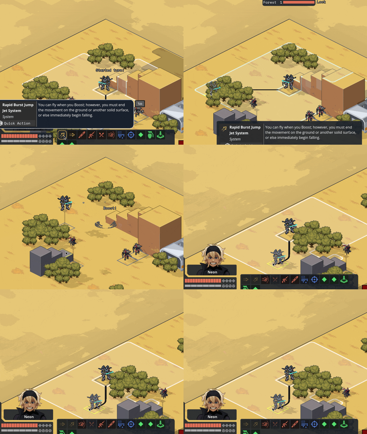
Implemented flying as a status; unit counts as +3 spaces above the current ground level and ignores terrain and elevation extra movement costs. Added hover + takeoff/land animations.

Gave deployables the ability to have 3D meshes instead of 2D sprites; we'll probably use this mostly when the deployable in question is climbable.

Related, I fixed a bug where after terrain destruction, all units recheck the ground height under them so they'll move down if the ground is shot out from under them. When the Jerichos do that, they say "oh heck, the ground is taller! I better move up to stand on it!" — not realizing that the taller ground they're seeing came from themselves.
Fixed by locking some units' rendering to the ground level; this means no stacking climbable things, which is a call I'm comfortable making. We ain't making minecraft here (I whisper to myself, gazing at the bottom of my tea mug).
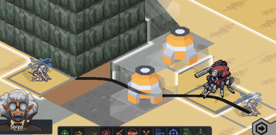
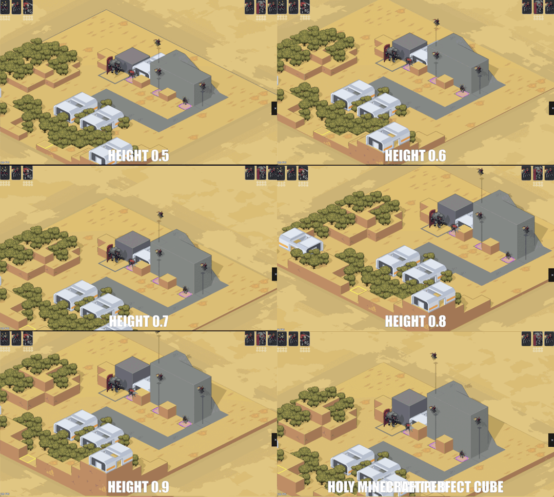
Block sizes are currently 1x1x0.5 — half as tall as they are wide. Since that was a size I pulled out of nowhere for convenience, we did some art tests for different block heights and camera angles. TLDR that size works great and we're leaving it.
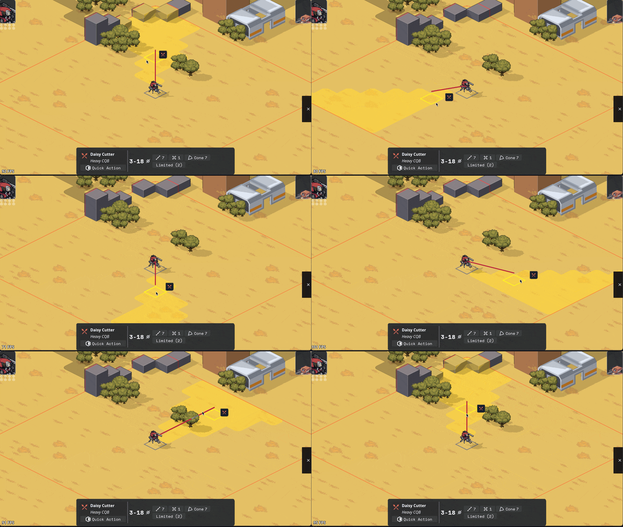
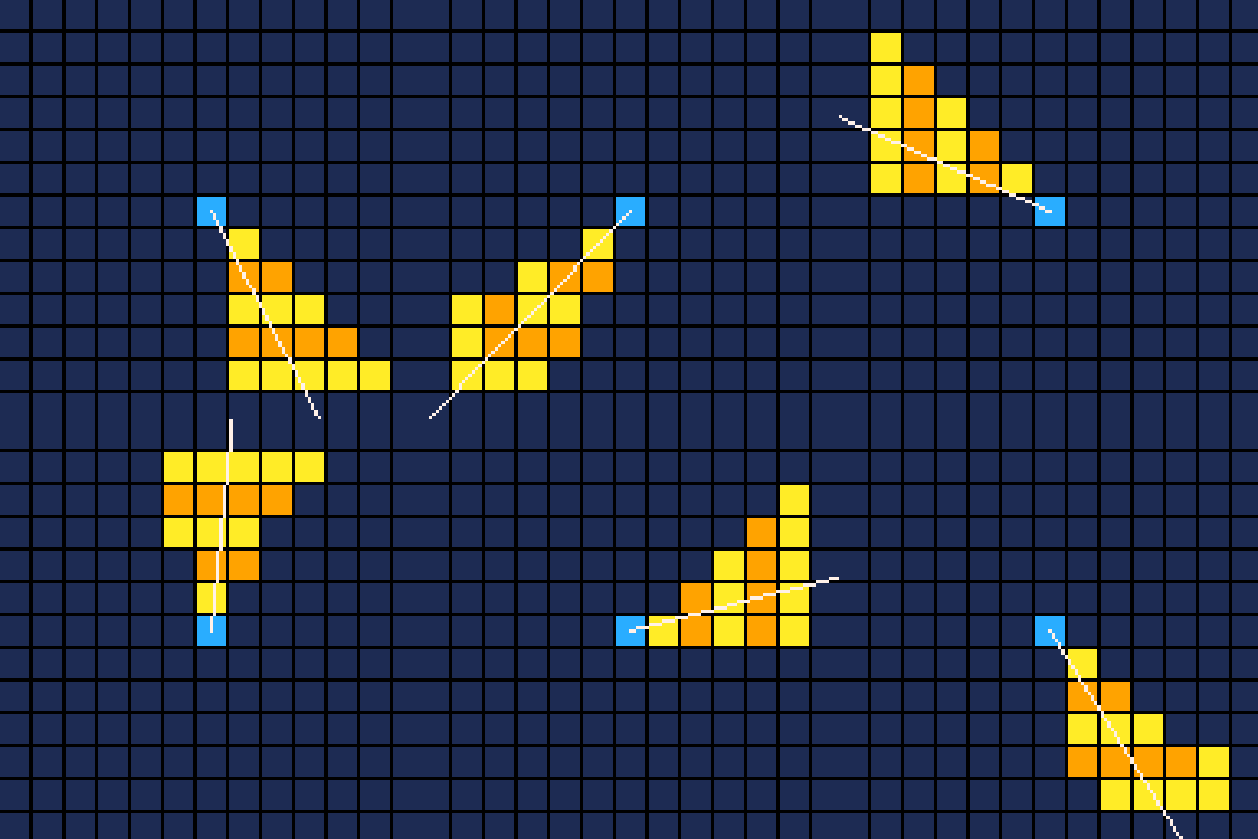
Added Cone AOE pattern, courtesy of an algorithm NMcCoy sent me that guarantees the correct number of tiles are picked at the correct distance from the origin.
pick your aim angle
for each distance step N of your cone, make a list ("ring") of all the cells at that distance from your origin
sort those cells by angular distance from your aim angle, and include the N closest cells in that ring in the cone's area
Here's a gif they made of it in Bitsy:
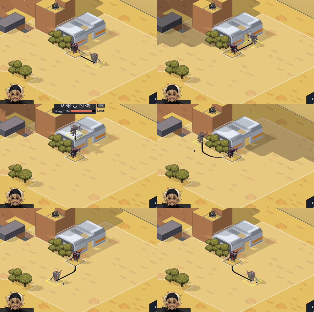
Units face where you're planning on moving/targeting them.
Got Walking Armory's Shock option working. Added subtle (too subtle, now that I look at it) electricity effect.

Other things we've added but I don't have gifs for or failed to upload. You'll have to trust me. :)
disengage action
overcharge action
Improved Armament core bonus
basic mine explosion fx
explosion fx on character dying
Increase map elevation cap to 10. It's nice but definitely is risky with increasing the voxel space, gonna have to keep an eye on performance.
Added Structured + Stress event and the associated popups. Also added meltdown status (and hidden countdown), but there's not animation for this yet so your guy just abruptly disappears and leaves huge crater.
UI Improvements
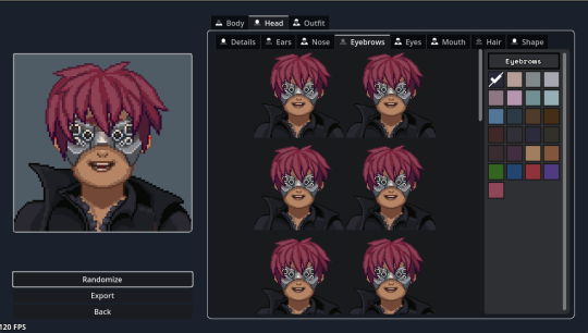
Rearranged the portrait maker. Auto-expand the color picker so you don't have to keep clicking into a submenu.
Added topdown camera mode by pressing R for handling getting mechs out of tight spaces.

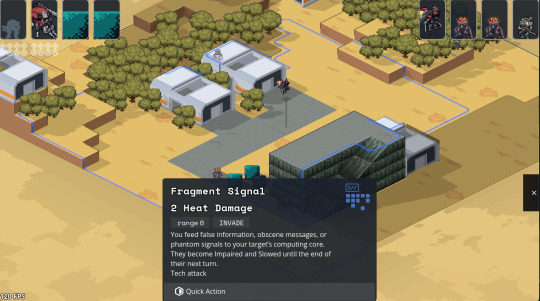
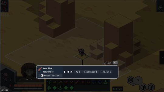
The action tooltips have been bothering me for a while; they extend up and cover prime play-area real estate in the center of the screen. So I redesigned them to be shorter and have a max height by putting long descriptions in a scrollable box. This sounds simple, but the redesign, pulling in all the correct data for the tags, and wiring up the tooltips took like seven hours. Game dev is hard, yo.
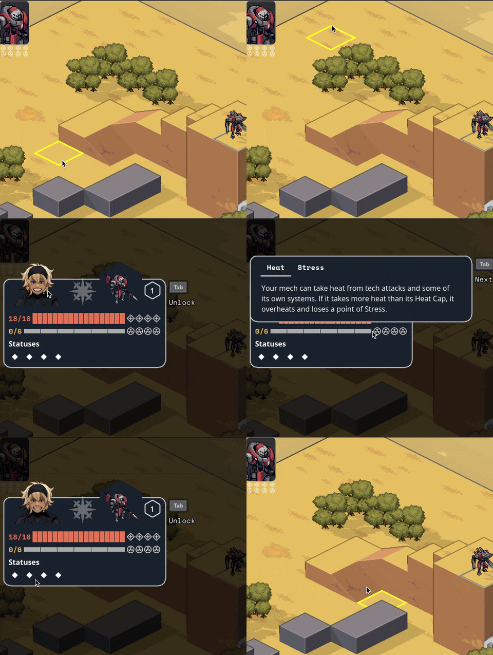
Put the unit inspect popups in lockable tooltips + added a bunch of tooltips to them.
Implemented the rest of Carpenter's cool hex-y action and end turn readout. I'm a big fan of whenever we can make the game look more like a game and less like a website (though he balances out my impulse for that for the sake of legibility).
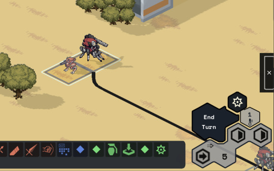
Added a JANKY talent/frame picker. I swear we have designs for a better one, but sometimes you gotta just get it working. Also seen briefly here are basic level up/down and HASE buttons.
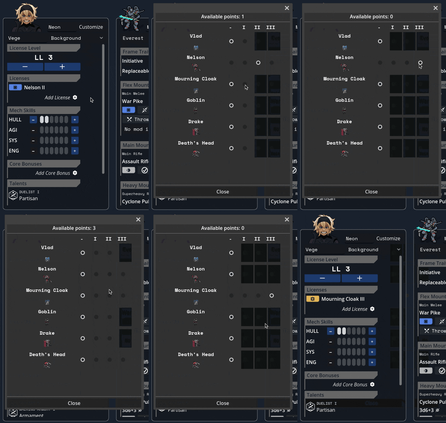
Other no-picture things:
Negated the map-scaling effect that happens when the window resizes to prevent bad pixel scaling of mechs at different resolutions; making the window bigger now just lets you see more play area instead of making things bigger.
WIP Objectives Bullets panel to give the current sitrep info
Wired up a buncha tooltips throughout the character sheet.
Under the Hood
Serialization: can save/load games! This is the payoff for sticking with that engine architecture I've been going on about. I had to add a serialization function to everything in the center layer which took a while, but it was fairly straightforward work with few curveballs.
Finished replacement of the kit/unit/reinforcement group/sitrep pickers with a new standardized system that can pull from stock data and user-saved data.
Updated to Godot 4.2.2; the game (and editor) has been crashing on exit for a LONG time and for the life of me I couldn't track down why, but this minor update in Godot completely fixed the bug. I still have no idea what was happening, but it's so cool to be working in an engine that's this active bugfixing-wise!
Other Bugfixes
Pulled straight from the internal changelog, no edits for public parseability:
calculate cover for fliers correctly
no overwatch when outside of vertical threat
fixed skirmisher triggering for each attack in an AOE
fixed jumpjets boost-available detection
fixed mines not triggering when you step right on top of them // at a different elevation but still adjacent
weapon mods not a valid target for destruction
made camera pan less jumpy and adjust to the terrain height
better Buff name/desc localization
Fixed compcon planner letting you both boost and attack with one quick action.
Fix displayed movement points not updating
Prevent wrecks from going prone
fix berserkers not moving if they were exactly one tile away
hex mine uses deployer's save target instead of 0
restrict weapon mod selection if you don't have the SP to pay
fix deployable previews not going away
fix impaired not showing up in the unit inspector (its status code is 0 so there was a check that was like "looks like there's no status here")
fix skirmisher letting you move to a tile that should cost two movement if it's only one space away
fix hit percent calculation
fix rangefinder grid shader corner issues (this was like a full day to rewrite the shader to be better)
Teleporting costs the max(spaces traveled, elevation change) instead of always 1
So um, yeah, that's my talk, any questions? (I had a professor once tell us to never end a talk like this, so now of course it's the phrase that first comes to mind whenever I end a talk)
116 notes
·
View notes
Note
How is Katabasis game going? It's been a little while and it has me so intrigued.
brain got sad cause i missed my deadline (which is fine and likely for the best for cooking), my breathing got all fucky from allergies, and then Work Is Busy At The Moment. i think i need to like soundboard untangling it in my brain- feels like a lemon all squeezed out rn
there's also a jam i signed up for soon so i might sloppily prototype it? i got pretty far on making a genuine pitch so it might be worth it, the theme's already been announced which is "the more you have, the worse it gets" which feels malleable enough to work with. i have had a few chats with folks about it, but without it being at the point in which i can elevator pitch it it's kind of hard. should probably workshop it cause like it's not the most palatable pitch to just be like "okay imagine with me a timeloop where two monstrous queer metaphors circle the drain of personhood against the concept of entropy, chaos, and death- no i swear this has market potential" (it does, i have the numbers backing me lololol)
i also got WAY into thinking about queer narratives within queernormative worlds so my brain is steeped in that rn; i'm reading through Beyond Personhood: An Essay in Trans Philosophy by Talia Mae Bettcher (it's v good so far!) and The Queer Art of Failure by Jack Halberstam after flipping through Bo Ruberg's Video Games Have Always Been Queer and The Queer Games Avente-Garde. i then downloaded a bunch of stuff because sometimes that's how it is; i was reading through crazy tubby girl/mad fat transman which is a thesis by Tyler Allen Selsor which has also been v interesting. i keep trying to get into Mad studies but play theory sucks me back in. turns out if your hyper fixation is How Do SituationsTM Work it tends to be something you read about WHO KNEW
i'm like 4k words in? but now many new thoughts or at least should be kind of cited thoughts, phenomological writing always feels kind of self-indulgent so i dunno- folks might find it interesting but i dunno where i will put it. i'll be going through and playing a whole bunch of games and reading paper submissions for qgcon soon so i am trying to prep my brain for that, good to try and put myself in a headspace in which i can be like ah yes the things
which all to say- stalled a bit but still being microwaved up in my brain soup

i also need to figure out like... how it plays? 2D/3D, i feel like it would be fun to run around so thinking about how that looks
18 notes
·
View notes
Note
[29/10/2024] [d/m/y]
theory anon here.
I might just retire soon or something. The fixation isn't coming back as strong as it did when I started rambling here, and I'm not really getting any new threads from whats happening recently. Dunno what the hell is happening with STAT, with her home, with this elevator that can somehow bleed both the 2D and 3D worlds together, with any of the NPCs, I've said all that really needs to be said so far.
The REGRETEVATOR is a money scheme owned by James Dixon, who's possibly part of / also the owner of Jon.Co. James is DEAD and his body or remains are apparently being used in generators to fuel a lot of places. Jermbo Factory, all the Mach floors, the Button Competition Floor, Area 51, any place with those Dixon generators are powered by him. They might also be powered by tree parts or mannequin remains, I don't know if that's just the REGRETEVATOR or not.
There's a MR cult running rampant that might also be connected to the REGRETEVATOR since the AxoEye logo apparently is cult iconography. Members likely include the MRManeuverer, Enphonso, Sab, Folly, Poob (dubiously), Jaoba (though unlikely), and probably a good amount of REGRETEVATOR / infinity / Jon.Co staff.
The cult did experiments! Does Crimes! and Blames these crimes on other, innocent people! And there's people who want them dead or exposed in return. Dr RETRO and BIVE for example. Pest I'm not sure, but he'll likely help them out if need be.
I genuinely can't tell if the REGRETEVATOR is working for or against MR anymore. On one hand, Mach calls Dixon 'the founder' and refers to him highly and kills MR when it's on the REGRETEVATOR, but on the other hand a lot of signs point to REGRETEVATOR staff being associated with its following in some way (cult icon, dixon generators on cult grounds, etc etc)
I don't know anymore. Maybe things are just slow, or I don't have the time or the energy to dive as deep as I did anymore, or I just need to let my fixation jump from one to another until I wind back up in this stupid box. Maybe I'll be back soon when they show us what Thanatos looks like or. something.
OH and explain to me what the FUCK a bunch of Aspens are suddenly doing in the forest where the gnarpians are? and what the HELL that cauldron does? That addition specifically makes my head hurt. I don't know why you're all not in the aspen forest or whatever. Mannequin cult / hivemind stuff needs to be touched on too.
.
30 notes
·
View notes
Text
Self-Mastery

Pinp0int
Everything in your life is a result of your greatest thinking.
∞ = 0. It is everything and nothing simultaneously. 0 is a circle-an enclosed space that feeds into itself. Infinity is zero collapsed, where nothing becomes everything. For every action, there is an equal and opposite reaction reducing All to 0. All numbers, all energy, all dimensions. The YOUniverse is infinite. Self-mastery is the application and transcendence of infinity, reaching the 0-dimension. The In. Finite. Point. In everything we do, we seek embodiment and expect to achieve a specific result. Be specific. Become limitless.
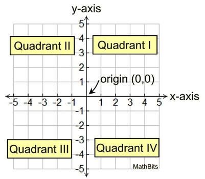
The origin, or starting point, of a graph is also known as the point of intersection. A point where the x-axis, y-axis, and all quadrants meet.
All dimensions exist on the same plane, the first dimension (1D), and within the same point, the 0 dimension (0D), as demonstrated by infinity. Our inability to perceive mystical energy or entities stems from their exist in other dimensions beyond our comprehension. The unforeseeable exists outside of our third dimensional perception. Our minds, thoughts, feelings, spirit, etc. exist on different planes.
When you take a picture or video of the third dimension (3D), it is captured as a flat image observed 2 Dimensionally. Movies, for instance, are shown in 2D. When you turn that image on its side, it is a line or plane. That is the first dimension. Furthermore condensing it to a point, brings us to the 0 dimension. Multidimensionality is inherent; what exists is not absent, it is unseen or inconceivable. If you exist on point (3,2) in the graph that is physically (3D) all you know.
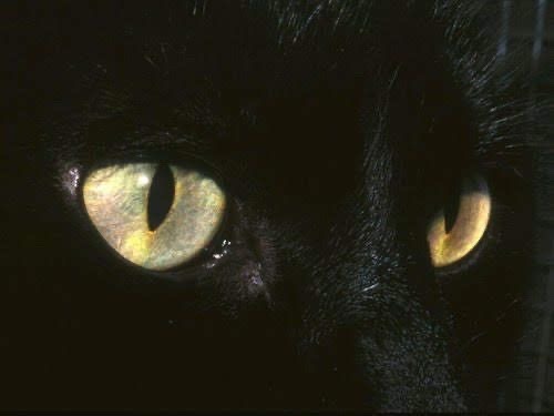
Our minds transverse dimensions. When we close our eyes and see darkness, we are observing 0. Within we can see everything. This is known as astral (a star) traveling. However, opening our eyes reinstalls us into the 3D plane binding us to the laws of physics. It is possible to elevate our perception to see other dimensions with our physical eyes. However, this can lead to psychosis for beings accustomed to the 3D world. Its infinite nature reignites our genetic code(DNA), and we are bombarded with the real Truth. Reality. This rebirth, or revelation, prompts an overwhelming influx of knowledge putting us into a state of infancy where everything feels new, unfamiliar, and challenging to process causing a possible loss in consciousness.
We are creators. Our souls are creating everything we experience in other, alternate dimensions. Our mind is the messenger. Everything our brain’s experience is documented and delivered to the soul as an Instruction Manual. Our 3D vessel is the anchor, or origin point for the rope grounded to the Earth while our being occupies the cosmos. We are tethered to our creations, alternate realities, or dimensions and birth them into the 3D by tugging on, or embodying that energy. Eventually these dimensions, or planes, overlap and generate a 2D image, visualization, and as we experience life we identify them in the 3D as synchronicities or coincidence. We and our subsequent creations are bound to the Universal Laws that govern how our creation manifests in life.

Mind/Matter.
The name of the ‘Game of Life’ is self sufficiency. This includes self-awareness, self-discipline, emotional intelligence, positive, realistic thinking, goal setting, time management, and stress management. To achieve self mastery one must transverse the 7 dimensions, or chakras, within the One by: learning to think; learning to intuit; learning to feel; learning to do; learning to communicate; learning to lead; and learning to be. We evolved from nothing; therefore everything is accessible within. If We have everything we need to succeed, how will you access it?
#black girl aesthetic#multiverse#black woman appreciation#dark skin#self love#black girls of tumblr#business#self care#self healing#self mastery#quantum physics#quantum leap#manifesation#black girl moodboard#glamour magick#my original content#old money#black tumblr#black luxury#wild child#wild woman#blog#spoiled heaux#mental health#tumblr blog#tumblr girls#level up#soft black women#soft life#astrology
38 notes
·
View notes