#aliensssrefs
Explore tagged Tumblr posts
Text

Pretty awesome webbed site for Hermitcraft reference photos

There's an option to view in 2D or 3D isometric view which is like... really good for finding elevations and understanding the relative scale landmarks are in the overworld.


The detail in quality is great too the more you zoom in like this is part of Doc's s9 Perimeter
Will note though, s10 on this site only shows the beginning of the seed as I'm writing this. I assume it'll change when there's a world download
#character concept stufff#aliensssrefs#hermitcraft#hermitblr#mcytblr#contributor credit is on the front page of the site when you open it smiles :]
1K notes
·
View notes
Note
how do u draw clothes???? they’re so stylized and never boring

a lot of the time I use,, literally anything else other than clothes as my reference for inspiration. I use Nonon as an example:
>Studying the shape (eg: shopping basket is boxy, trashbags are puffy) >Identifying what feature of the object I like (eg: shopping basket has grid-like holes, trashbags are black and shiny in texture) >And incorporating that into clothing (eg: shopping basket skirt, trashbag blouse)
Am I saying don't use clothes your reference? Absolutely not please use clothing reference as your basepoint - these motifs are simply add-ons, ways to make your clothes look interesting
UNrelated and about Nonon herself. He's one of the overarching antagonists from THIS original story I made up :]
I designed her to have an angel/devil duality kinda look (silhouette of an angel, colour palette of the devil). Their role is kinda like a contractor to magical girls of the city but with malicious intentions.
His colour values and shapes parallel the protagonist's (Jonah's) which considering their rules and motives I thought was cool lmao


He had a life and a different name before this, the current name NONON doesn't have any proper meaning (it's nononsense!) ... but together it does look like a series of binary 101010s right?
316 notes
·
View notes
Note
do you have any tips for drawing maps?
Breaking down the layout process into smaller, easier tasks rather than tackling scale, perspective and placement all at once

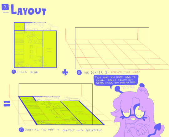
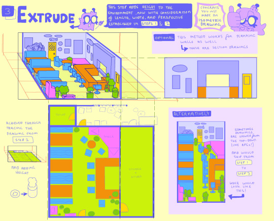
#ask stufff#aliensssrefs#character concept stufff#stufff rambles#it’s a Bar setup. I need to visualise for smth I’m cooking later#sorry it’s a messy- as long as it’s readable#I totally could’ve drawn that plan and section properly but I’d rather be waterboarded than make me use autocad for more than I need to
310 notes
·
View notes
Note
Hiii!! I have been OBSESSED with your art recently and I was wondering how you use colors so well and if you had any tips? I don't know how to word it, but you use such bright and saturated colors and it's SO PRETTYYYY and I'd love to learn how to color like you do
thank you! sometimes the colour choices change depending, but the end process is usually the same

for someone who normally has lotta bright colours in their work, it can be as overpowering if not organised well which is where colouring the lineart is handy.
#ask stufff#aliensssrefs#stufffsart#sona#oc#ik this isnt necessarily the answer ur looking for - my colourpicking at its core is instinctual#but if you eyedrop from my art and check the colour wheel there definitely is a pattern
239 notes
·
View notes
Note
how do you draw buildings and structures like houses and living areas so well????
perspective, depth, and shapes 🤓☝️
And lots of planning. I always like to do a smaller rough thumbnail somewhere (that thang at the top left), and u can still see some of the vector lines faintly on the actual piece
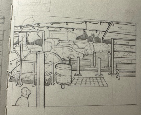
152 notes
·
View notes
Note
i think you honestly have the best use of shapes ever! really enjoy ur explanation for that buildings tutorial cus its a nice way of thinking abt simplification and stuff :D that being said are there any artists you specifically study for their shape design? or did discover ur process through experimentation?
Gotta be SO real with you.
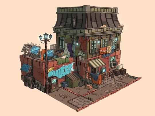
BDoubleO100.
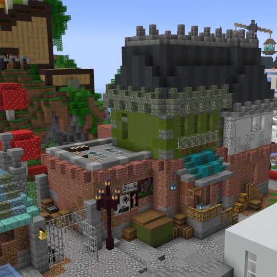
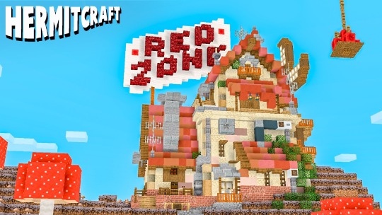
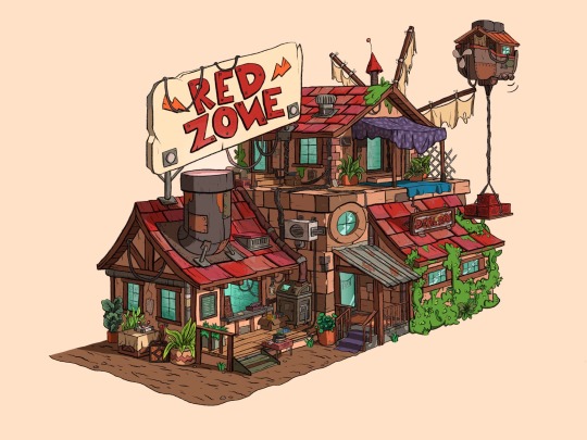
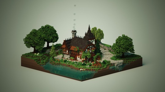
His builds are so fun to study and it travels to his 2D/3D art as well -I feel sick- Bdubs has such a strong read on form and every block/brushstroke has a function his artstyle just has so much PERSONALITY.. I aspire to be as good as him some day ><
If anything I love the Building with Bdubs series loads. A lot of what he says in there comes from literal art and architecture terms - his care for composition and moving around in a space …. He’s so cool
The horticulturalist building I love especially when he shows things like This.
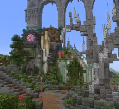

Cuz yes “If the shape is great, you’re going to be fine” he’s right, everything else comes second nature when you have a defined Shape. Would recommend just watching those videos through an artist’s mindset he’s awesome. I love Bdubs :]
#ask stufff#stufff rambles#aliensssrefs#bdoubleo100#Bdubs#hermitblr#mcytblr#a two parter I promise know more artists than just… Bdubs 😭#tagging properly cuz I thinks everyone should see Bdubs’ art for once in their life and forever and ever
502 notes
·
View notes
Note
Hai, love ur art. I’m always checking ur page mostly for art inspo (and ethubs) I’m wondering who/what is your art inspiration? ^^
Ty!
Lately I’ve been combing through Lily’s Illustration yt channel which I highly recommend if ur into concept design. I like her recent series the Nest Egg, few minute videos talking about worldbuilding of that project.
while my Apocalypse AU isn’t at the stage where it’s concepts can be openly explored (lore reasons they are secret atm), I aspire to build an au as intricate as hers :]
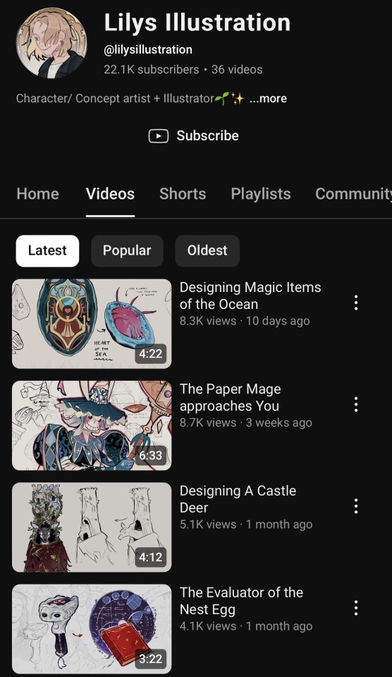
[ Lily’s Portfolio ]
[ Lily’s Channel ]
99 notes
·
View notes
Note
your character designs are wonderful!! i always find my character designs one note and relatively "blank"/not having enough depth (like the concept just being "pirate" instead of "__ pirate thats also __"). i really admire the way you combine concepts in a way that really make sense, and incorporate your inspirations in fun and intresting ways. any advice you have to spare on the topic? thank you!!
I meannn you’re halfway there by knowing it’s more than that!
I explained my thought process in a different post-I find by separating components into differing levels of priority and stages that’s helpful.
This pyramid is me explaining the PLAN part of my character design process:
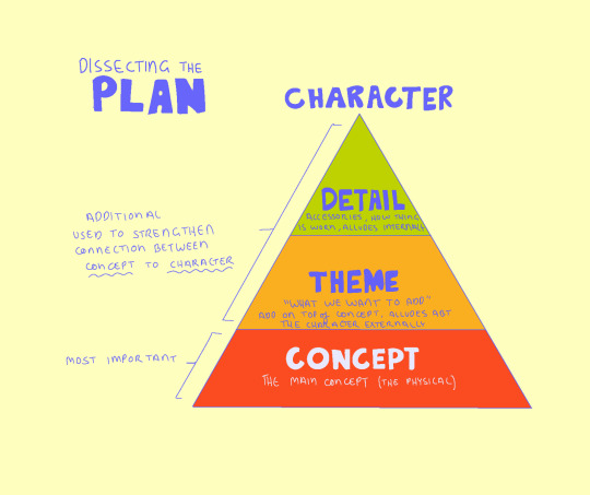
Having Just the Concept figured out isn’t a bad thing either, and sometimes in those cases Theme and character Detail in a design write for themself.
Having a Concept at all is the most important and the baseline for creating a communicative design.
S10!Bdubs as example :]
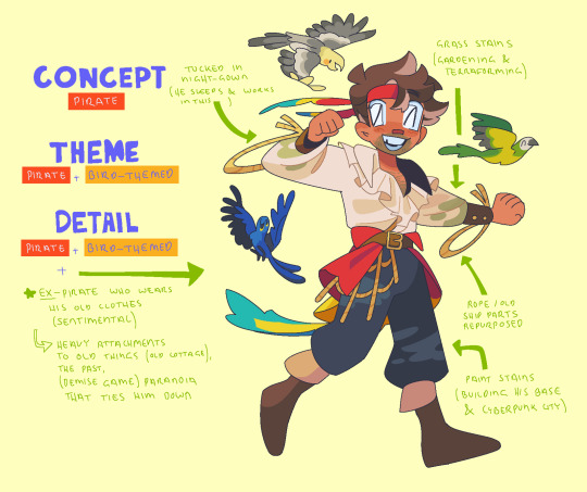
CONCEPT (primary) — Very basic knowledge about the character through their clothes. Their occupation, the time period they live in etc. Eg: Bdubs is a pirate in a world based off 17-18th Century when pirates were abundant.
THEME (secondary) — Tells us a bit more about the concept. What kind of occupation is it, the character’s affiliations, things strangers/bygones would be able to recognise via logos or cultural symbols… the Semiotics. Eg: Bdubs is (was) a member of a bird-themed pirate crew.
DETAILS (tertiary) — More intimate details about the character themselves by how they wear the clothing as well as accessories/habits that make them Them… Is it proper, what does the presence (OR omission) of accessories tell about their situation, how willing they are to present themselves (whether by accident of intentionally)… the Symbolism. Eg: (see annotations)
#ask stufff#aliensssrefs#stufff rambles#Bdubs#always so bad at making good conclusions#do NOT ask me about DemiseS10!Bdubs I love him and will pop a fuse#I have so much and nothing to say
234 notes
·
View notes
Note
do you have any advice on how to draw more body types and break up silhouettes? my characters basically have the same body type and whenever i try to draw varied body types it ends up looking wrong :( i love the shapes and motifs and how unique each design is in your art, and i really want to learn how to make a design more unique, like yours! sorry if this is too much ;v;
I'veee gots to be honest im not the best person for advice/starting point in that regard ToT when the direction i go in is heavily stylized i still trying to figure how to explain that myself wwhwhw If something looks off to you I'd recommend practicing from irl references then stressing over the flair factor later
Tho (contradictory to what i said above) I am going to use this ask to promote this awesome pdf book on character design that just came out! I look up to Ini loads on multiple aspects and would say our thought processes are very similar when it comes to chara design. [ LINK ]

#ask stufff#aliensssrefs#if youve bought the book i recommend PAGE 4 - 10 - and 20 for this answer#if i ever talk abt it again i shall do it in my own terms but this is the best i can provide .. ATM
140 notes
·
View notes
Note
How do you crowd designs without making them feel…. Crowded? It’s so cool, I love all the little details you can add
jsvlssdhvj i'll try TToTT
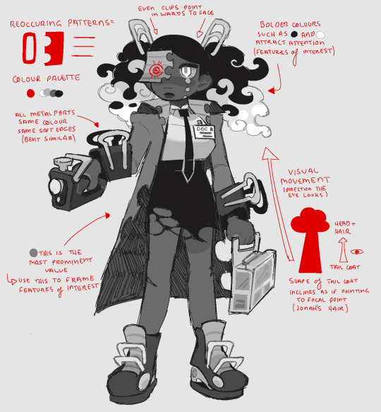
Knowing how to establish focal points (features of interest), and how to utilise elements (MOVEMENT) to reinforce this visual hierarchy. Having consistent theme (colours, patterns and shapes) throughout the body are also what make a design coherent. When a design is 'cluttered' or 'overwhelming' it is often due to having too many clashing themes, or no real focal point to focus on (/be directed to).
#ask stufff#aliensssrefs#character concept stufff#ngl i was called away irl mid-writing this to remember hopefully this is all of it ummm
202 notes
·
View notes
Note
very specific question for advice: how do manage to get your lines like so neat even for quick sketchy stuff it's always so clean?
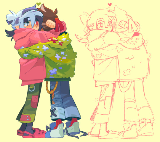

very specific answers for a very specific question:
confession - even for sketchy stuff i go over drafts in a slightly neater sketch. I could clean it it'd be faster sure. but i dont :]
Purposes of my sketch process to be readable for when translating to cleaner lineart and colours etc - more about establishing a form, less worrying about the tinier details (eg pant belts and bdubs' flowers). Even as simpler as a silhouette is ok (see the shoes)

highhh stability settings (30/40 in mediabang) > faster brushstrokes without needing to care about how straight a curve is (im also left-handed 0 stability for a lefty is harddd)
anti-aliasing (the effect that makes the edges of brushes look softer) is turned OFF. Makes colouring easier + sketches look less fuzzier if ever need to Transform to adjust proportions
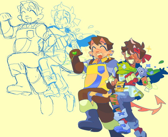
sketching in lighter colours gives the impression of the drawing being much neater than it actually is. Mentally drawing in dark colours, especially if your lines are very sketchy - visually feels boxed in and harder to distinguish what part of the drawing is what. Just drawing brighter, colour coding important parts of a drawing that requires that distinction (eg the impdubs sketch in different shades of blue)
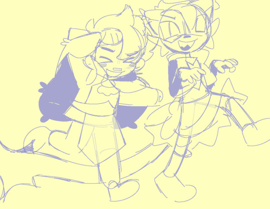
this branches off the last advice - going over parts of a drawing (eg: form covered by clothing) in an eraser with less than 100% opacity to help with sketch readability
TLDR: >Less tells more >High stability, no anti-alias, quick strokes >Colour coding with brighter lines
#ask stufff#aliensssrefs#excuses to show off the rougher sketches i like them :]#hermitshipping#(roman why is bdubs in all of these)
275 notes
·
View notes
Note
I’m shaking you around what kind of sketchbook and pencils do you use to make your lines look so crisp and not have any smears aooouggh
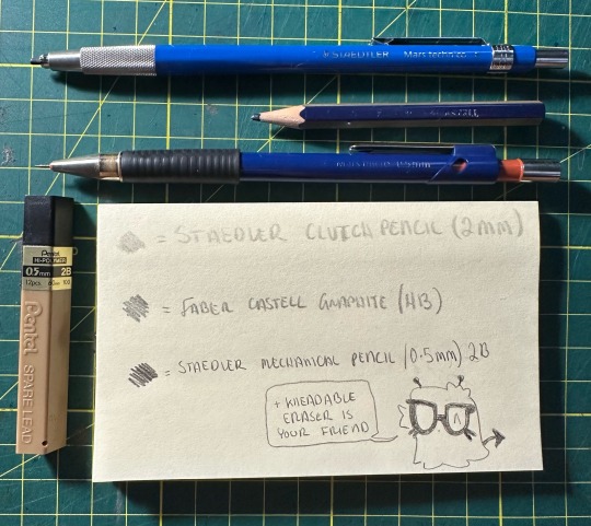
>PAPER - im not picky. this is actually my first ever moleskin sketchbook
>CLUTCH 5mm PENCIL - thumbnailing, very light sketch work and colouring
>FABER CASTEL 2B - the main lineart and darker colours
>MECH 0.5mm PENCIL - contour outlines ONLY
left handed. My hand usually rests on smth like my sleeve or another notepad between me and the paper to avoid smudging
66 notes
·
View notes
Note
howd you get ur pixel art brush to be so smooth and even?? i cannot comprehend
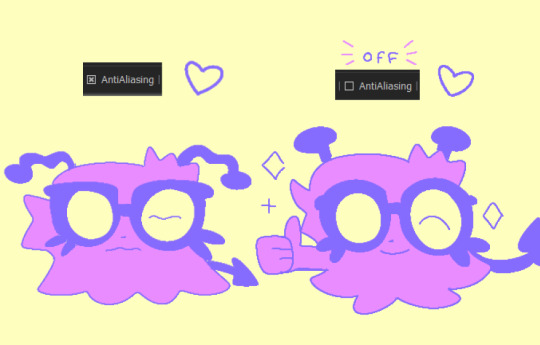
High stability (correction?)+ turning antialias OFF does wonders
—and it’s not a pixel brush , this is the same homemade (bootleg pixel) brush I’ve been using for ~8 years
109 notes
·
View notes
Note
ive been struggling so much for the sketch stages of drawing 😭 (like sketch -> lineart -> color -> line color), any advice? havent been able to finish shit for so long cause the starting part is tripping me up lol
Lower your expectations for the sketch. High likelihood no one else is gonna see that but you anyway - so as long as the sketch is readable (to you) and you know what you’re gonna do next: get it done and get it done ugly 👍
#ask stufff#aliensssrefs#it’s natural that u start liking the piece the more you work on it#so might as well use that valuable time on the more important stages
28 notes
·
View notes
Note
as a fellow artist im always absolutely blown away by what you come up with!!! your art is beautiful, and youre a huge inspiration to me!
If u dont mind sharing, I would absolutely love to learn more about your character designing process and any tips you might have!!!! (also, how did you learn character design and how long have you been practicing it ;u;?)
(sorry if this comes off as rude im not sure how to convey tone of voice in writing T_T im not trying to force anything! just trying to learn :'D)
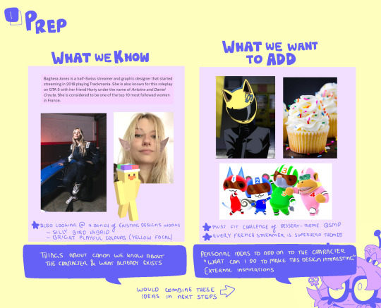
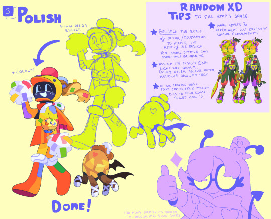
Character Design w/ alienssstufff (ft q!Baghera (and Pomme!)

I get asked this a bit and everytime i do, i do shit at explaining — so what better way than to just Show the actual designing think process myself -w-
This also ties in with the Shape Language tutorial if that helps!

#ask stufff#stufffsart#aliensssrefs#character concept stufff#baghera jones#qsmp#qsmp fanart#qsmpblr#mcytblr#EDIT - i forgor to answer that other question www: MIGHT have started taking chara design srsly in 2022 (?)- not too sure
424 notes
·
View notes
Note
'ello good morning
i was planning of making an apocalypse au of this smp i like, and i saw that you have a life series au like that (which is amazing btw, i love ur work), do you have any tips on how to do worldbuilding & storylines for a story like this?
keep up the great work!! :D
story? I just follow the framework of the Life Series and put zombies innit, if it works for ur SMP too then it does🤷♀️
Stuff for world building apocalypse AUs:
Setting comes FIRST!! Think about the environment, the climate, and the state of it affected by the apocalypse.
IF it’s a zombie apocalypse specifically, think about what the virus does and how the zombies behave. They are part of the setting as well as, characters would need to find ways to respond to the threat to keep themselves safe
The setting for apocalypses (and literally any story ever tbh) — will dictate a lot of the decisions characters make, what they wear, where they go etc.
lol uh that all I can think of best of luck 👍
27 notes
·
View notes