#2000s interior design
Explore tagged Tumblr posts
Text

꧁★꧂
#living room#tv room#old tv#box tv#tv#leather couch#carpet#tv cabinet#mural#trellis#tree#roses#iron fence#2000s interior design#2000s living room#2000s interior#vintage#interior#room#interior design#ronald mcdonald house#flickr#oldweb#old web#2008
407 notes
·
View notes
Text


Mentally I’m cooking in this kitchen playing Norah Jones at max volume <3
#simblr#sims 4#sims 4 screenshots#sims 4 build#aesthetic sims build#sims 4 kitchen#sims 4 cc#tuscan style interior#2000s interior design#tuscan kitchens my beloved
7 notes
·
View notes
Text

0 notes
Text
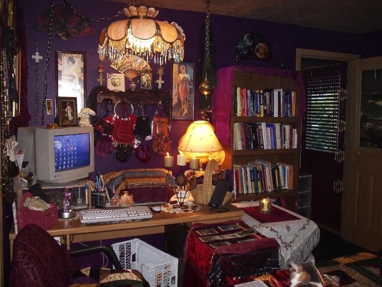
8K notes
·
View notes
Text
2007-core nostalgia extravaganza
Quick PSA: someone on Facebook is apparently impersonating me using an account called "McMansion Hell 2.0" -- If you see it, please report! Thanks!
Howdy folks! I hope if you were born between 1995 and 2001 you're ready for some indelible pre-recession vibes because I think this entire house, including the photos have not been touched since that time.

This Wake County, NC house, built in 2007, currently boasts a price tag of 1.7 million smackaroos. Its buxom 4 bedrooms and 4.5 baths brings the total size to a completely reasonable and not at all housing-bubble-spurred 5,000 square feet.

I know everyone (at least on TikTok) thinks 2007 and goes immediately to the Tuscan theming trend that was super popular at the time (along with lots of other pseudo-euro looks, e.g. "french country" "tudor" etc). In reality, a lot of decor wasn't particularly themed at all but more "transitional" which is to say, neither contemporary nor super traditional. This can be pulled off (in fact, it's where the old-school Joanna Gaines excelled) but it's usually, well, bland. Overwhelmingly neutral. Still, these interiors stir up fond memories of the last few months before mommy was on the phone with the bank crying.

I think I've seen these red/navy/beige rugs in literally every mid-2000s time capsule house. I want to know where they came from first and how they came to be everywhere. My mom got one from Kirkland's Home back in the day. I guess the 2010s equivalent would be those fake distressed overdyed rugs.

I hate the kitchen bench trend. Literally the most uncomfortable seating imaginable for the house's most sociable room. You are not at a 19th century soda fountain!!! You are a salesforce employee in Ohio!!!

You could take every window treatment in this house and create a sampler. A field guide to dust traps.

Before I demanded privacy, my parents had a completely beige spare bedroom. Truly random stuff on the walls. An oversized Monet poster they should have kept tbh. Also putting the rug on the beige carpet here is diabolical.

FYI the term "Global Village Coffeehouse" originates with the design historian Evan Collins whose work with the Consumer Aesthetics Research Institute!!!!

This photo smells like a Yankee Candle.
Ok, now onto the last usable photo in the set:

No but WHY is the house a different COLOR??????? WHAT?????
Alright, I hope you enjoyed this special trip down memory lane! Happy (American) Labor Day Weekend! (Don't forget that labor is entitled to all it creates!)
If you like this post and want more like it, support McMansion Hell on Patreon for as little as $1/month for access to great bonus content including a discord server, extra posts, and livestreams.
Not into recurring payments? Try the tip jar! Student loans just started back up!
#architecture#design#mcmansion#mcmansions#ugly houses#interior design#mcmansion hell#bad architecture#2000s
3K notes
·
View notes
Text
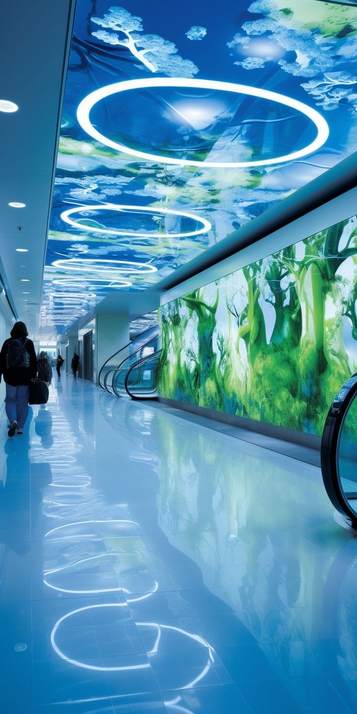
#frutiger aero#frutiger aero aesthetic#y2k#2000s#y2k aesthetic#dreamcore#cybercore#frutiger aero architecture#interior design#mallcore#frutiger#frutiger eco
2K notes
·
View notes
Text


1990s-2000s 'Tuscan' kitchen appreciation long post
Just a note that as I've done a deep dive into this style recently, I've realized it's not really 'Tuscan' in terms of resembling the actual authentic style from Tuscany, and more an eclectic amalgam of various interpretations of older European styles. This included an exaggerated, 'McMansionized' version of Tuscan, mixed with French Norman, Renaissance, Tudor, French Country, Moorish, Baroque, etc. In that sense, I think this style should probably be given a more appropriate name, something like 'Old-World Luxe', since they did use the term 'Old World European' quite a bit back then to refer to this overall style.
Scanned from the book, Design is in the Details - Kitchens by Brad Mee (2003)
#design#interior design#interiors#architecture#2000s#00s#tuscan#kitchen#old world luxe#old world#european#mcmansion#beige#home design#my scans
275 notes
·
View notes
Text
✴️🔸 DORfic 🔸✴️
An underrated Frutiger Aero sub genre!

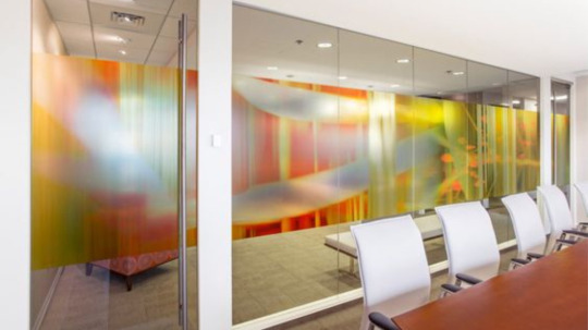

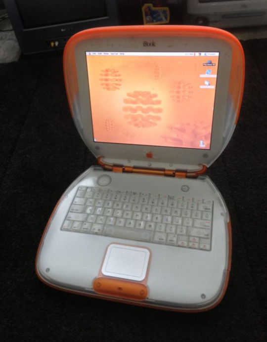
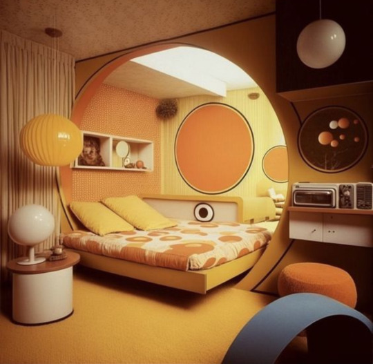

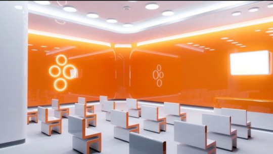

#frutiger aero#sunshine polypunk#dorfic#polysunk#futurism#aesthetic#skeuomorphism#2000s#early 2000s#nostalgia#y2k#orange#interior design
976 notes
·
View notes
Text
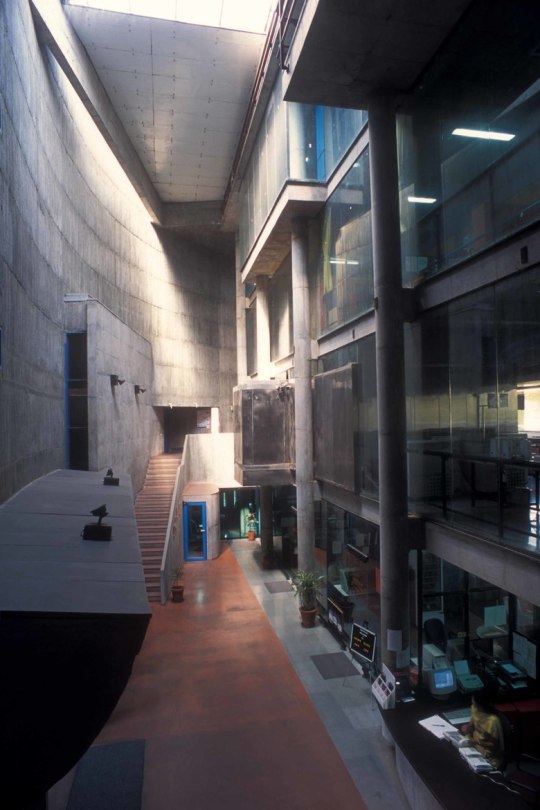
Prathama Blood Centre, Ahmedabad. Matharoo Associates.
#brutalist#brutalism#architecture#interior#interiors#design#ahmedabad#india#matharoo#gurjit singh matharoo#2000
472 notes
·
View notes
Text
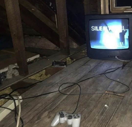
#aesthetic#art#fashion#photography#coquette#grunge#pale#vintage#dollette#angelcore#silent hill#alternative#indie sleaze#2014#2014 tumblr#90s#grungecore#darkcore#dark#dreamcore#nostalgia#ethereal#gothic#horror#interior#design#video games#2000s#y2k#soft
451 notes
·
View notes
Text

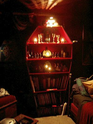
(x)
#u#interior#goth#red#home#decor#gothic#web finds#90s#2000s#early 2000s#whimsigoth#interior design#coffin#vampirecore#vampy#vampire
1K notes
·
View notes
Text
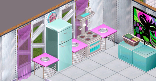
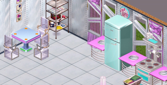
the start of an alien house
#sims 1#the sims 1#sims#the sims#the sims original#mine#ts1#interior#design#alien#retro video games#retro gaming#1990s#2000s#aesthetic#simblr
410 notes
·
View notes
Text

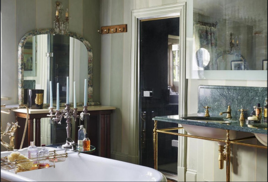


Kate Moss's bathroom in her country home
#kate moss#girlblogging#girlhood#2000s aesthetic#country home#country living#country life#coquette#architecture#it girl#female hysteria#90s supermodels#90s aesthetic#this is what makes us girls#manic pixie dream girl#coquette dollete#dollette#2000s supermodels#vouge beauty secrets#90s#2000s nostalgia#what an icon#house interior design
180 notes
·
View notes
Text

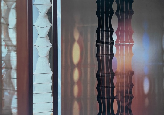
Karina Thomas of salt, 'Creased Totem' (2000)
589 notes
·
View notes
Text

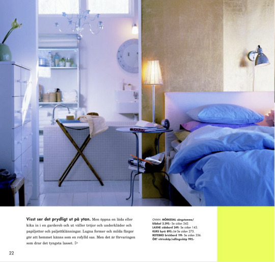

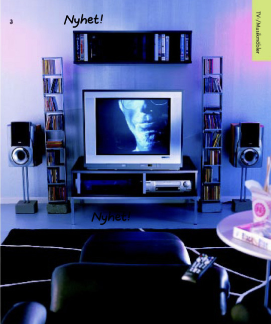
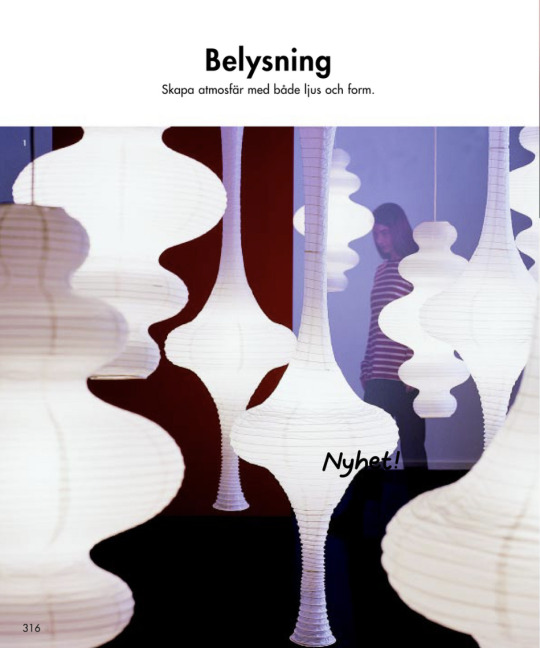
some soothing and subtle futuristic interior design from the 2002 Ikea Catalog.
1K notes
·
View notes
Text

ˑ ֗ ִ ˑ ּ 𖥔 ۫ ּ ֗ ۪ ⊹ ˑ ִ ˑ ּ ּ ֗ ۪dream kitchen! ⊹ ˑ ִ ֗ ִ˖ˑ ֗ ִ ˑ ּ 𖥔 ۫ ּ ֗ ۪ ⊹ ˑ ִ ֗ ִ˖
#frutiger aero#frutiger aero aesthetic#y2k#2000s#y2k aesthetic#dreamcore#frutiger aero architecture#frutiger#tropical#tropical aesthetic#kitchen interior design#interior design#dream house#early 2000s
654 notes
·
View notes