#0 knowledge of character design.
Explore tagged Tumblr posts
Visit Tumblr Blog
Explore Tumblr blogs with no restrictions, modern design and the best experience.
Last Seen Tumblr Blogs


Fun Fact
Tumblr Inc. has $15.1M in annual revenue.
Text
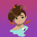
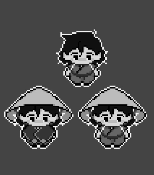
no I did not in fact go to sleep at 4am messing around on picrew wym haha


got distracted gaming with friends so no work got done on chap 20 of DTT last night and then when I grabbed my surface pro to attempt some doodling it was out of juice.... so I turned to picrew. can't believe that second one had a fnaf shirt so obviously had to put ricky in it
some bonus ones:


me irl vs another attempt at making a 'sona' (still not a keeper)
#texts.#I think I might not be grasping the concept of a sona. Idk people have such cool ones but i think it might boil down to me having#0 knowledge of character design.#all my guys look boring and tbf I do like the corporeal version of myself so whenever I think sona i just think. me.#oc: ricky#bcs the first picrews are of him and his uhhhhh.... actually idk what to call Bill in this situation.#situationship?
5 notes
·
View notes
Text
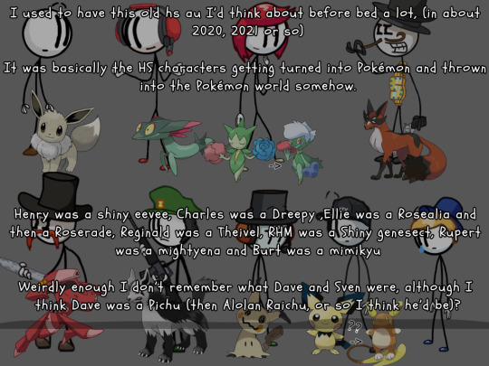
"I used to have this old hs au I’d think about before bed a lot, (in about 2020, 2021 or so)"
"It was basically the HS characters getting turned into Pokémon and thrown into the Pokémon world somehow."
"Henry was a shiny eevee, Charles was a Dreepy ,Ellie was a Rosealia and then a Roserade, Reginald was a Theivel, RHM was a Shiny genesect, Rupert was a mightyena and Burt was a mimikyu"
"Weirdly enough I don’t remember what Dave and Sven were, although I think Dave was a Pichu (then Alolan Raichu, or so I think he’d be)?"
"But yeah won’t get into the story I made for it because, old, and kinda cringe but it was fun lol, and I still like the choices of Pokémon I made." submitted by @loafthecat
#the pokemons kinda fit them ngl :0 (I say having little to no knowledge of pokemon aside from the 3DS and switch games I played in the past)#still from design perspective good choices! 👍#hope I got all of them right😭#I love using that singular tear drop on characters LMAO sorry sven#mod dave#thsc#thsc confession#thsc confessions#henry stickmin#reginald copperbottom#charles calvin#dave panpa#ellie rose#sven svensson#rupert price#thsc rhm#burt curtis#@/loafthecat
31 notes
·
View notes
Text
Speaking of GG stuff! I'm going to try out XX with a friend tomorrow!
It's the same friend I played missing link with, send me your energy so I can beat her ass >:]
(We're equally matched. We both have the same amount of fighting game experience.)
((Which is none))
#I cant play x with her sadly that's a solo mission#because its not on steam and all that#I thinkkk this is the game ABA and bridget were introduced?#excited to meet them! they're two characters I knew even when I had 0 knowledge on the series#I remember when bridget was announced for strive and being floored by the love and care in her design#so heres to seeing her debut!#guilty gear#missing link#guilty gear xx
5 notes
·
View notes
Text
I have gotten a lot of messages saying that they really love the presentation of CURSE/KISS/CUTE. Often the commenter in question can’t say what exactly it is about the formatting that they appreciate, but that it just reads well and looks good. Well!!! Allow me to bare my wealth of secret knowledge for you once and for all:
I sorta just did some research into book typography...?
Here’s something you should know about web development, alright: typography on the web is really, really bad. The tools we have at our disposal—HTML and CSS—are incredibly powerful, but they are set up to fight you every step of the way towards Good Typography. When you know what you’re looking for, you can fix all the common issues quickly and easily. But it’s not easy to know what to look for, because
problematic typography is overwhelmingly the norm on the web, and
good typography is invisible.
Here’s a screenshot from CURSE/KISS/CUTE episode 0:

Now, I don’t want this post to come across as prescriptive. It is not my intention to tell you, “This is what good typography looks like, so follow my lead exactly.” I made a lot of choices with the typography of my web novel: many of those choices would not make sense in other contexts. What I want to convey to you is what those choices are, so that you will know they’re available to be made.
I mentioned that the web “fights you” when it comes to good typography. What do I mean by that? Well, check this out:

This is how that passage of text renders “by default.” In other words, this is how a web browser would render that text without any input from me about what styles to apply. It kind of sucks ass! But it also looks pretty familiar, right? This is not that far off from how a lot of websites—even websites full of prose (looking at you, AO3)—render text.
I think the most illustrative thing to do here would be to walk you through my thought process and show you, step by step, what decisions I made to turn this unstyled text into the styled version you see in the novel.
So, first things first:
1. We have got to shrink that text column.
Computer monitors... are wide. They are wider than they are tall. They are so wide, and they have so many pixels. This means you can fit a lot of characters on them. If you wanted, you could just have a wall of characters from the left side of the screen all the way to the right side. Talk about efficient!!
You should never, ever, ever do this.
This is one choice that I actually will make a prescriptive statement about, because it’s supported by quite a lot of research: fairly narrow text columns are more legible. Specifically, research seems to support the idea that a width in the range of 50 to 70 characters per line is the most comfortable for people to read*. Every font is different, so it takes a little doing to turn that “characters” figure into a pixel measurement; I went with 512 CSS pixels for the maximum width of my text column:

Isn’t that just so much nicer to read already?
*A commenter reminds me that I’d be remiss not to point out that the research on column width legibility isn’t completely conclusive. You do want to limit the width of your text columns, but going over the 70 character-per-line recommendation isn’t necessarily the end of the world, and you might have good reasons to do so. I did not: as mentioned, one of my goals was to mimic book-style typography, and books by nature have fairly restrained column widths, on account of they’re books.
2. Picking a font.
I’m not going to give you the blow-by-blow on how I decided what font to use. The short story is that I asked some designers, and one of the recommendations I got was the free font Crimson Pro, which I took a liking to immediately:

It’s just an all-around attractive serif font, but one thing I really like about it for use in a novel is its highly-visible quotation marks. They’re just kinda jumbo! They’re real big! Easy to see! In a novel, those things aren’t just ornamentation. It makes a great deal of practical sense for them to stand out just a bit. It also has a fairly large x-height, unlike a lot of the more traditional options, which is good for legibility on a computer screen.
3. Adjusting the line-height
Web browsers default to a line-height of about 1.2em, which, as you can probably tell, is quite cramped. If you go and Google “optimal line height for legibility”, you’ll get a number of results right off the bat suggesting 1.5em. Sounds good! Let’s do that:

Well... hmm. That’s definitely an improvement, but between you and me, it actually looks a bit too spacey to my eyes. I wonder why?
I’ll cut to the chase: the 1.5em recommendation makes some assumptions about the font you’re using. In Arial, the letter “A” is about 0.6em tall; in Crimson Pro, it’s about 0.5em. That means that there’s no one-size-fits-all solution to spacing your lines, because different fonts have different amounts of empty space baked in. How annoying!
Let me tell you something about the kind of nerd I am. When I had this realization, I grabbed some books off my shelf and pulled out a literal micrometer. I started measuring the line-heights against various font features to see if there were any patterns I could spot in professional typesetting. Here’s what I found:

Almost every book on my shelf spaces lines such that the distance between one baseline and the next is about three times the x-height. How cool is that? I clapped my hands like a seal when I put this together.
Adjusting the line-height to match what I observed in the wild gives us this:

It’s a subtle difference, but to my eyes it feels just right. It’s almost like magic!
4. Paragraph spacing...
Let’s address the elephant in the room. Probably the most controversial choice I made with CURSE/KISS/CUTE’s typography was to opt for book-style paragraph indentation rather than web-style paragraph spacing—like so:

I did this for a few reasons:
It’s what I’m used to. I’ve read a lot of books, and this is just the way that books are formatted. I think for something aspiring to the title of “novel”, there’s value in making it look the way a reader probably expects a novel to look.
A novel has a lot of paragraph breaks in it. A paragraph in, say, an encyclopedia entry might go on for half a page or more; whereas it is unusual for a paragraph in a modern work of narrative prose to run for more than a handful of sentences, especially in any scene with dialogue. Because paragraph breaks are so common, spacing between paragraphs in a novel results in a lot of wasted space. Also, subjectively speaking, the additional space seems to me to lend an undue amount of weight to paragraph breaks. I’m just starting a new thought; there’s no need for a 21-gun salute, you know?
Having said that, here are some good reasons you might decide not to do paragraph indentation anyway:
Doing it right requires a bit of extra legwork. Notice how the very first paragraph in the image above has no indentation. That’s because it’s the start of a new section, and the first paragraph in a section traditionally goes unindented. This is an easy detail to miss, and it can be difficult to wrangle CSS into doing it for you automatically.
Web users don’t expect it. For the first decade of the web’s existence, there was no good way to do paragraph indentation; by the time CSS rolled around and made it easy, paragraph spacing had already become the norm. And while CURSE/KISS/CUTE may be a novel, it is also, specifically, a web novel!
But it’s my house and I get to make the rules, so I went with indentation. Incidentally, there seems to be a dire lack of research into the question of whether indentation or spacing is more legible for readers—but the data that does exist appears inconclusive at best. So, the choice really does come down to vibes.
5. The tragedy of justification.
You’ll note that one way in which I did not make my web novel look like a paper novel is the text alignment. It’s un-justified: the right margin is ripsaw-ragged.
This is because it is not possible to justify text on the web.
Oh, you can try. Look right here: there’s a CSS property for it and everything. Just turn on “text-align: justify” and...

Nightmare! The interword spacing on that first line is almost as wide as the indentation!
Reader, I’m afraid that your web browser is simply too dumb. That’s not the browser’s fault: robust algorithms for justifying text without creating these distractingly huge gaps between words have existed for many decades, and modern computers are powerful enough to run them in real time with little performance impact. It’s just, uh—nobody has ever bothered to implement them into web browsers. It is the damnedest thing.
I tried, I really did. You can mitigate this problem a bit if you enable automatic hyphenation, but browsers are unfortunately also kind of dumb at hyphenating. Firefox, for example, will refuse to hyphenate any word containing a capital letter, so any sentence with a lot of proper nouns in it is a lost cause. I tried manually inserting soft hyphens with a text preprocessor I wrote myself, but still these overjustified lines plagued me: when the text column narrows, for example on a phone, even hyphens can’t save you. The line-breaking algorithm is simply too naïve to optimize for well-justified text, and that’s not something you can fix as a web developer.
As a result, my heavy-hearted recommendation is to never use text justification. It’s just too distracting.
6. And then some extra stuff just for me
I added drop-caps because it looks neat and I made the ellipses spacier because I think it looks good when it, uh, when they are spacier. I think that looks pretty good that’s just my opinion though.
That’s all! Hope you learned something bye!!!
524 notes
·
View notes
Note
So, uhh, genuine question.
Do you recommend getting into Bleach, and if so how? Anime, Manga, a little bit of both, secret other thing? Your posts about it (and especially about AEIWAM) have definitely piqued my Interest, but I have pretty much 0 knowledge about the topic and heard very contradictory takes & reviews before, so I wanted to ask for your advice on the topic.
Cheers and have a nice day!
So a couple people have asked me this and I'm going to be as honest and fair about it as possible:
Bleach itself is mid.
...which is why the fan works KICK SO MUCH ASS.
My theory is that the ideal habitat for transformative fan work creators is mediocre series. It has to be good enough to be worth engaging with in the first place, but it's the plot holes and dropped developments and intriguing characters that don't get enough time and shoddy-to-unexplained worldbuilding that make nice little holes for fic authors and fan artists to crawl into and built a home, like sponges growing on a dilapidated subway car sunk into the Hudson river.
So yes. Bleach is mid. More under the cut:
It's also really two series: the manga and the anime. There's more anime than manga because bleach suffers from the late oughts horror known as "the filler arc" where the studio would make shit up while waiting for the author to catch up. Not ideal, but better than the current state of "cancelling a fully written five-season show after two because it wasn't making enough money for the oligarchy" but I digress.
To grade both the manga and anime on the Weeb-Ass-Shit scale:
Weeb: how familiar do you have to be with the tropes of anime/Japanese culture in general to be able to enjoy the series? This is one of the things Bleach does REALLY, REALLY WELL, in that you can go in knowing fuck-all about anime and have a good time, but the more you know, the more fun it is. My favorite thing Kubo does is that if you look up the meaning of the characters used in everyone's names, there is a TON of jokes, foreshadowing, themes etc. baked into every name. A+ work.
Ass: how much gratuitous fan service is there and how annoying is it? So. It's not the worst. But it's really, really obvious that Bleach is written and illustrated by a straight man who is hella into tiddies. As a bisexual, I can appreciate The Tiddy (and tbh, the men in Bleach have pretty great tits too), but there are a lot of humor bits about Kon being a perv/author stand-in, orihime has medically alarming knockers for a teenager and gets groped kind of a lot. There's also a predatory lesbian stereotype character in the early episodes, and some pretty awful transphobic caricature characters. The amount of horny isn't that much for a shonen, but it's pretty gross IMHO.
Shit: how well- made is this series?
Mixed. Both the manga and the anime (esp the recent Thousand Year Blood War arc) have some absolutely gorgeous art, banger character designs, and deeply entertainingly choreographed fights. It is really nice to look at.
Unfortunately, both also suffer really badly from pacing issues that are pretty much entirely the fault of the insane demands the industry puts on the artists. If you've ever read/seen a shonen manga/anime from the late aughts through early teens, you're familiar with this bullshit- fight scenes drawn out to absurd lengths, filler arcs while the animation studio waits for the author to catch up, repeated plot arcs, minimal focus on characterization, The Friendship Speech (TM) etc.
Pacing and repetitiveness are Bleach's main quality issues, but the art is pretty baller and the Japanese voice cast is pretty fucking great IMHO. (I have APD and have to consume shows by subtitles, so the sun is usually more legible for me than the dub).
If you are coming into Bleach from AEIWAM... You're likely to be a bit disappointed. I put a shitload of work into the worldbuilding because Bleach does not, I write almost exclusively slice-of-life character moments rather than big battles, and I have made some pretty fucking radical changes to some of the characters. An Elephant Is Warm And Mushy is an entirely different genre than Bleach, and that's ok, because fic usually is radically different than it's source material. But also be prepared.
TL;DR: Bleach is mid and that's ok! My fic is different than it and that is also ok! I still recommend it with the reservations of : it's prototypical of its time period and contains many of the gross tropes from that era. It is also very much a horror shonen, just to be clear. Fucked up shit happens on screen, mostly cannibalism! Which is great IMHO, but you should probably take a stroll through DoesTheDogDie.com for more specific trigger warnings before beginning.
371 notes
·
View notes
Text


◇Metal Sonic design (and the original comic "Born to Fail" from which this is based upon) by @fernsnailz
♡Firstly, thank you fernsailz both for making the comic that inspired me to make my first, full fledged comic after several years of failing to do so, and also allowing me to do what I realize is the MOST self-indulgent and giddy i've ever been.
-----
♧Secondly, I am nervous, to write this. My knowledge of sonic is not vast. My understanding of characters may slip, despite all the research i put into them. My writing & character voice is subpar, but for once I have managed to create something out of love for this franchise and i think I needed this as well.
So even though I'm scared, frightened by the possibilies, every racing future in my mind that says "things will go wrong" "they will hate you" "you will be a failure" i find kinship in this character. Perhaps i too will learn to live. Perhaps i too will learn to love being alive.
So hopefully, this comic isn't too "out of character" or so blastfully horrificly beyond redemption as my anxious ridden brain percieves it be. I know, in my heart its not. But writing this out feels better than keeping the thoughts within me.
----
♤Thirdly, I know Chaos 0 isn't exactly a world-renowed beloved character that everyone does indepth analysis or theory crafting on. Thus, this ship may feel strange, or completely out of left feild to some.
In response, I have created an [ additional blog post ] outlining what I believe Chaos 0's character.
Of course, everyones interpretation of a character (what they represent, themes, and how they are handled) is largely a subjective process. So never take my iteration of him as gospel, and i encourage you (who are curious) to seek out information on him and determine for yourself who Chaos 0 is to you.
(That goes for Metal Sonic as well, but i'm focusing on Chaos because if not, who else will?)
---
☆Lastly, if anyone has tips or critque for me regarding making more belivable character dialouge, i'd be happy to hear. (Also theres a lot of artistic rendering inconsitencies- which is mostly because this took me a few months to make..😓✌️)
------
Bonus Short sketch comic under the cut:


[This is supposed to be a quick exploration on how exacly they mightve met in this particular continuity. It was made after the comic above was finalized, but i didnt want to leave the readers questioning as to what was going on.]
[Also some swearing because i am a chronic swearing sailor, and its funny.]
#metaos#metal sonic x chaos 0#metalchaos#metal sonic#chaos 0#omochao#sonic comics#fernsnails thank you for making the wonderful comic you have#look everyone!! i finished it!! i did it!!#i know both my little paper on Chaos 0 and this comic wont get any attention like 90% of my art does buttt#im proud of myself!! so i dont care!!! im happy!!!! i want to let myself be happy that i created and finished something!!!#🎉🎉🎉🎉🥳🥳🥳🥳🥳✌️🤩🤩🤩#mothrabuuart
391 notes
·
View notes
Text
"𝙲𝚑𝚊𝚗𝚐𝚎"
─── ✱*.。:。✱*.:。✧*.。✰*.:。✧*.。:。*.。✱ ───
-> Platonic! Burning Spice Cookie x reader
-> Warnings: SPOILERS FOR CRK BEAST-YEAST CHAPTER 6!!!, descriptions of violence, major character death.
-> Word Count: 1k
-> This mainly acts as a concept for what Burning Spice Cookie would be like as a father, mainly when he was the Herald of Change, and how his relationship with his child would progress as his insanity grows. Also acts as a Burning Spice character analysis. This also has some of my headcanon designs in there so. Hehe.
─── ✱*.。:。✱*.:。✧*.。✰*.:。✧*.。:。*.。✱ ───
When Burning Spice was the Herald of Change, he... was confused.
Sitting atop his throne, all six arms crossed and three eyes closed in comtemplation; the man was pondering.
Pondering about what, exactly?
Well, it was his role.
You see, being created to watch over change, Burning Spice had wondered:
Was this it? To always be an observer, never partaking in life always changing? Was his role simply reduced to this?
No, that couldn't be... if that were the case, why was he gifted with such power?
With Mystic Flour using her's to grant wishes from people far and wide, Shadow Milk using his to spread his knowledge all over the world... they have a purpose for their power.
Burning Spice should have one, too.
Ah.
That's when the idea hits.
Since he is the Herald of Change, he shall do something for that change to occur.
He doesn’t want to form a civilization, no- or destroy one; as much as he is griping about his predicament, he very much enjoys his observing.
So, he has decided.
He will make a child.
His child.
A being, that he himself has created; something with its own dough, that is meant to grow and change.
How delightful, he thinks, being able to see something change due to one’s own hands. Now, not only does Burning Spice get to witness and protect the thing he was created for, he gets to cause it.
And oh, how fun it is.
He raises you, a being from his dough, forming your own values with the influence of other beings, but at the end of the day, your conclusions are from your own.
Burning Spice would be a great parent.
Mostly, he would be hands-of since he wants you to be your own person, but he is present. He gives you time whenever you ask for it, plays with you, and gives you bunches of gifts.
Whenever you ask a question of him, he answers it, but in a way to make you come up with your own conclusion, just to see you change, and grow.
Overall, good dad.
10/10.
When he becomes corrupt, though?
0/10.
He’s so bored.
Years uncounted, watching civilizations grow and then die, grow and then die, grow and then die, grow and then die-
Even watching over his own child, has become boring.
Even with you, it’ll be the same.
Even if he’s grown you with his own hands, even if he’s caused that change, it’ll all be the same.
These civilizations, those people, you, will come to be old; then, they will provide areas for new things to occur.
Forever an onlooker, forever an observer; omnipotent, to the things that happen.
Everything will grow and die, everything will change and everybody says how it’s so great and amazing and wonderful and natural-
But it’s become so natural, that he’s become bored.
He sits on his throne, he observes, and he’s supposed to be called the Herald of Change.
Burning Spice is only there to tell people that their civilization will die, or a new one will begin.
For eternity.
That is his role.
How mind-numbingly boring.
Seeing people he’s made friends with, servants who knew his every thought, civilizations he once adored, all crumble…
The same cycle, over and over again.
Even his own child, made from his dough, will perish.
So, now, he’ll live up to his purpose- one he will create, instead of those witches.
The Herald of Change, except he will also cause it.
Messages of Change, of crumbling and birthing, will come by his own hands.
Messages of Destruction, caused by him.
Yes…
Yes!
The thought makes Burning Spice excited; laugh with delight, to his own metamorphosis.
He will be the Cause of Change, he will start it-
Yes, change caused by Destruction.
The Herald of Destruction.
And he shall start with his child.
Clawed hands wrapped around your throat, you beg and plead for mercy, but Burning Spice disregards them.
He shall spare himself from that ache of losing you- everything- by crushing you- crushing everything.
Be happy, for you shall be the first step to his change.
The first step, the first clench of somebody’s neck, and your lifeless body drops to the ground, laid to rot at the Beast’s feet.
From then on, he doesn’t look back.
Not even when his creators betray him, sealing him underneath that fork; not even when he comes out of that blasted tree, to a new era; not even when he comes back to a new army, with generals he’s never seen before
He shall never look back at the past.
Until the past is right in front of him.
The beast of flame, of everlasting storm and spice, pauses as if he were frozen over by the guardian of nature herself.
Standing in front of him…
It’s you.
But how? He killed you himself! Your neck was in between his fingers, and he crushed down on it, just as he did everyone else- he saw it with his own eyes.
You shouldn’t be alive!
Yet, it seems you are, because here you stand, in front of him; same eyes, same dough, same body type, even the same soul, as when you were alive.
So similar, that Burning Spice feels that nauseating twist in his stomach coming back, his eyes watching your deceased form look up at him with hide-
It’s not just a look alike.
It’s really you.
So how?
How?!
A descendent he wasn’t made aware of? Or a reincarnation?
He doesn’t know.
Burning Spice doesn’t know, and it makes him curious- but it makes his head hurt.
Pound relentlessly; remind him of the abundance you brought to his life, with your cheery smiles and joyous giggles, the adorable way you’d ask him questions-
GAH!
Throwing his parachu to the floor, barely missing your head…
To be reminded of the past he left behind, his dear child he crushed with his own hands, begging and pleading, hoping your father will somehow change last minute-
How curious.
Despite his aching head, he can’t help but wonder:
Shall he keep you as he once did before, or destroy you to make this aching stop?
#cookie run kingdom#cookie run kingdom x reader#crk#crk x reader#burning spice cookie#burning spice cookie x reader#beast yeast#beast yeast chapter 6
222 notes
·
View notes
Text
youtube
New interview video from TheGamer: 'Exclusive Interview with The Directors of Dragon Age: The Veilguard'
"Will there be returning characters? Will the light prevail against the darkness? Will our comic book and graphic novel knowledge of Dragon Age finally come into play?"
[source]
The video has some footage from the DA:TV booth at SDCC.
Info from this video:
More will be shown of the skill trees over time
"We have 700 new unique characters to talk to"
This may be the biggest game they've ever made
"Rivain, that more tropical feel. Something we've never really been able to do before in Dragon Age is, what does the coast of Rivain look like?"
Lots of love has been poured into how the areas look. They all look and feel different, but also coherent and consistent with the style of the game as a whole
The writers did a good job of finding the light in the darkness of this story
Just after timestamp 5 mins 0 secs, John says Emmrich's surname Volkarin aloud
Emmrich's character design is kind of like the more classical, Hollywood actor type
On returning characters, they're excited for people to see them, especially in the context of how 10 years have passed in-world since the last DA
Each choice in the game, especially the major ones, has significant consequences on gameplay, what content is available to you, and also how characters in the world regard you. "No choice should be easy, we never want to make players feel like there's a right choice. There's always going to be a consequence, some that you don't expect, and some that change the world in real ways"
On casting - Ashley: "Casting is a collaboration. The ensemble that the companions create was basically where we started. We put the character art on the wall, we saw the writing, we auditioned vastly and we assured that the cast was very dynamic and complimenting, and opposing, to each other. We spent a lot of time in getting those companions the juiciest they could possibly be"
The acting talent was cast across 5 years
#dragon age: the veilguard#dragon age: dreadwolf#dragon age 4#the dread wolf rises#da4#dragon age#solas#bioware#video games#dragon age: the missing#dragon age: the missing spoilers#as suspected (see a prev post)- a new round of new interviews with the devs from sdcc :D#this is number 3 that i've seen so far#(ik ppl always wonder about how names are pronounced so ^^)#i wonder if the 700 characters as a figure includes or doesn't include the returning characters?
189 notes
·
View notes
Text
ISAT OCS: character sprites and (quick) introductions!
Part 0 | Introductions | Concept Art Dump | Ornithomancy | Memes | Trivia |
-
Meet the party! And our antagonist!
-
Celest | The Card-Reader (Celestine) (belongs to me, Paper Type, she/they)

A silent card-reader who has an unusual fascination with stars. Her predictions are unnervingly accurate, even if they don’t always happen as expected.
A walking Greek tragedy, shameless Islander insert oc, and the most emotionally dysregulated being in the Universe next to Siffrin or Himawari, but is VASTLY worse hiding it. She's honestly one of my most fleshed out characters, and if I'm being honest I've vastly enjoyed writing her interactions with the party. If you were given a nickel for every time she had a mental breakdown and/or cried during the course of the plot you’d be able to retire even in the United States economy because she may say absolutely nothing but that doesn’t mean that she doesn’t burst into tears like someone watching Bambi’s mom die on repeat. She makes up for it by probably being the Universe’s second favorite mistake of nature next to the Siffrins and having Universe-powered deus ex machina moments, including:
Predicting people’s deaths!
Finding a series of long lost gods, which definitely has no consequences at all! (lie)
Solving Zelda dungeons using the power of playing cards!
Unlocking forbidden knowledge! With no consequences at all! (even bigger lie)
Avoiding asking for help because of a misguided sense of independence and a self-imposed obligation to base the worth of her life off of carrying out the Universe’s will and helping people to make up for the crime of predicting people’s deaths!
Resurrecting the dead!
Predicting people’s deaths and resurrecting them!
Gambling!
She uses tarot cards as a conduit for her craft– all her craft skills are named after specific major arcana cards, and each party mamber has a designated card.
-
Himawari | The Ghost (belongs to @dasnercaret, Rock Scissors Type, he/they
Mysterious and tall, with a eagle-like lacquer mask and unusually traditional wear. They're really a nice person underneath their ominous exterior, and have plenty of interesting stories— even if they occasionally contradict.
Default party leader, Meta Knight gijinka (as coined by @smokin-salmon), and the local Dark Souls boss who can and will beat you into the ground at a moment’s notice. But don’t worry, he’s got a heart of gold– no, don’t look at the body count. Has a tragic backstory befitting of his edginess that boils down to having his dad instilling in him a martyr complex so strong that we’ve lost track of the amount of times he’s probably been in near death experiences because he feels a personal responsibility to protect the party. He proceeded to spend the next nine years disassociating so hard that even Siffrin would be impressed, before being forcefully adopted by a 12 year old who decided that they’re friends now and are having soft tacos later. He dies, but don't worry, he gets better, just. Not fast. A solid 50% of this story's angst is sourced directly from this idiot's siffrin-level repressed mental issues. His plotline essentially drives this entire story to the point that he is literally the final boss. no, i will not elaborate on that.
-
Ori (Orion) | The Wallflower (belongs to @scramblecat, Paper Type, he/him)

A traveler from Vaugarde, able to bring his origami creations to life. His kind and welcoming personality makes him easily likable… but for whatever reason, he has a tendancy to be forgotten.
The consequences of fusing Isabeau and Odile into a person who is the most functional and average human being on earth, except for the fact that he’s got the transgenderism, runs with a gang of trauma-bonded idiots, and accidentally turned himself into SCP 055 Lite by choosing the name of a constellation for his name before the Island got Nuked™. Now everyone who meets him turns into you when you can never remember the name of that coworker you’ve been sitting next to for two years straight and talk to every day. His power is being annoying to any enemy in his vicinity by giving everyone papercuts and buffing the party with the power of paper crafts until they turn into the fantasy RPG equivalent of the Russians in the 2020 Olympics. If it wasn’t for him being the most emotionally stable member of the party the other three would have probably succumbed to the disaster that is a plot with no levity or character development and serves only as the fuel for an AO3 author’s hurt/no comfort addiction.
-
Haruka | The Child (belongs to @aquakirb, Rock Type, she/her)
A cheery runaway kid studying to become a healer. She does her best to help out the party in any way she can, however small.
Literally the purest thing to grace the Universe. A ray of sunshine that knows no bounds. If you even consider making her sad, you will have half of Ka Bue on your heels ready to kill you, including Himawari, who will probably get to you first. She’s the party’s Bonnie, but do NOT get it twisted that she's a Bonnie clone; she doesn’t have a clue how to cook and doesn’t have nearly as much repressed anger. Actually kind of the opposite. She's strangely mature for her age despite being relatively cheerful and coming off as more childish from an external POV. Her mom is a mysterious but well-known healer who's been training her since she was six and has essentially turned her into a pint-sized emergency response team. She has the brand of ADHD that pulls out random information about their interests at the most random times and with zero context. Also she technically killed a god, but that’s not even worth going on her resume.
-
Aega | The Eternal Rest (belongs to @dasnercaret, Scissors/Rock Type, she/it/they)

A broken and corrupted Expression, existence wiped away alongside The Universe and it's guides. She wish is to restore that which has been lost, to be remembered... no matter the cost. Her Craft spreads across the land, warping reality as it attempts to restore her power through the dreams of those who fall under her spell.
This bitch. THIS BITCH. I have never simultaneously hated and loved a character in my LIFE. To pair down an extremely complex and lore-heavy explanation, Aega is what happens when you make a god that has extreme power and then make all of reality forget she exists. She's the Expression of the Moon, and essentially presided over the night in its entirety, including the massive amount of constellations that make up an entire religious sect of the Universe Religion; it takes every white girls obsession with their horoscope and the absolutely astounding level of syncretic dissemination that buddhism had on the world, stuffs it in a blender, and makes a smoothie that tastes like existential loneliness, mommy issues, and almost a decades worth of stored up power that she can and will use to do whatever the fuck she wants. And what she wants is for people to stop ignoring her! she doesn't care if that involves the dismantling of reality or the destruction of entire human race, because when you're a god, your sense of object permanence is so skewed that you may as well be an Elden Ring character. Her entire motive is pretty much a mimic of the King, except instead of freezing people in time she puts them to sleep and freezes them! But it's less freezing and more turning them into a cocoon because the Lady Ethereal butterfly dream symbolism energy is OFF THE CHARTS. Her color is that electric blue that everyone wanted to dye their hair in the 2010s and also her namesake. Bet you can't guess what animal it is. (It's a butterfly.) (The Aega Morpho.)
-
next up! a dump of oc content, misc. notes about the party, and more!
-
Part 0 | Introductions | Concept Art Dump | Ornithomancy | Memes | Trivia |
#isat#in stars and time#wormwood rambles#isat ocs#isat spoilers#kinda?#illustration#isat fanart#concept art#worldbuilding#oh wormwood#isatmoonslayers
66 notes
·
View notes
Note
How did you come up with roleswap Elfilis' design? It's really cool!
Hi! Thank you so much! :D I'd love to share my thought process! Gather round the armchair by the fireplace, friends! It's story time!
I've said before that the Forgotten Land Roleswap started off as a doodle that swapped Dedede and Bandana Dee's roles as Player 2 and the Brainwashed Beast. But when I realized how fun that one little change was, how about EVEN MORE changes? That's how my one-time doodle turned into the full AU story. I swapped Meta Knight and Kirby, Clawroline and Leongar, and Sillydillo and Gorimondo- and because the story is so Waddle-Dee centric, I promoted Dedede to "Player 1" since the stakes would be higher for him as their King.
So now I had a story that had a lot of opposite traits to canon and I wanted to explore that further! When it came to the matter of Elfilin, I thought he would probably behave too similarly towards Dedede and Meta as he did to Kirby and Bandee. He'd be friendly and trusting, communicative, optimistic, knowledgeable, and cooperative. So how about providing them a travel companion who is defensive, has trouble communicating, a little wild, uninformed about themselves and the world around them, and has a bit of a temper?
But working with all these opposite traits didn't feel in-character for Elfilin anymore. So my natural next step was to swap Elfilin with Elfilis and make a new version of the Forgotten Land's lost little pup!
Enough yapping about the context behind my decisions, tho. How'd I come up with Roleswap Elfilis' design?
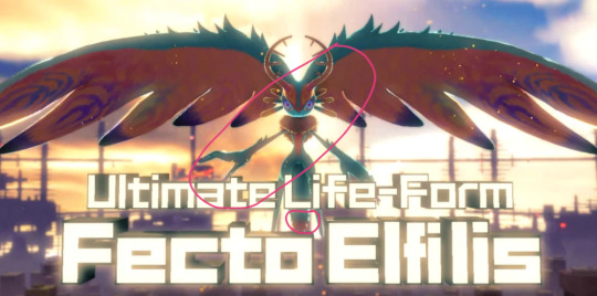
I see you out there, Fecto Forgo fans. Maybe somebody out there's thought, "Roleswap Elfilis does not look like them! Why not? That's what the other 50% of the Ultimate Life Form looks like! I demand justice for the angry glowing rat fetus!"
Maybe nobody has ever thought this. But I wonder sometimes lol
Your feelings are valid, friends. Please lemme explain my reasonings.
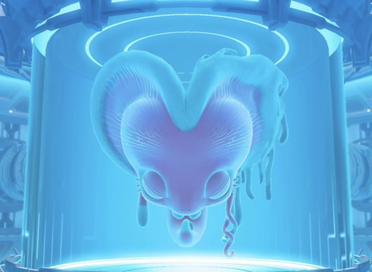
This fella, to me, is the abandoned wet specimen left to float in a jar for who-knows-how-long after a forcible physical and mental separation via spatial teleportation shenanigans. And I think part of their appearance is due to their role as the trapped and forgotten half.
The role of the half that got away fully formed his own body and inherited some traits from the complete being-
For Elfilin in canon, he got ears that are proportionally huge compared to the rest of his body, blue eyes that sparkle with the light of a thousand destroyed planets, a tiny bit of pink fur for his adorable blushies, and a really long fluffy tail. Maybe becoming a being free of chaos gave him those sweet eyes like Kirby and the Waddle Dees have.
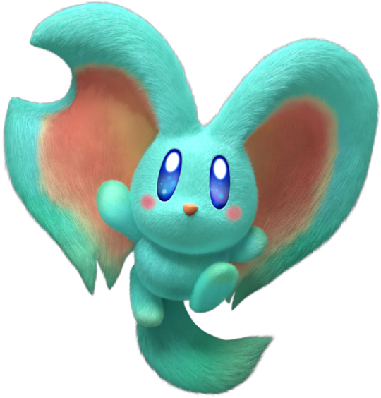
My reasoning is that whichever half ends up escaping the Lab and fully forming their own body, they would carry the major physical traits the other wouldn't inherit.
Anyway, that left Elfilis with the horns, colorful and expressive eyes, whiskers, beige chest fluff, opposable thumbs, and pink tummy fur.
Elfilin gets the long tail in the bodily divorce so Elfilis has a short stubby little cotton tail like a bunny. Like if he ended up with just the very tip of the Ultimate Life Form's tail.
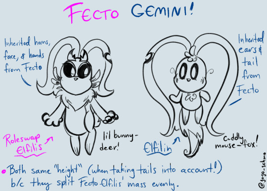
Behold this diagram above I came up with two years ago! Disclaimer: the canon Elfilin is the one in the chart. And I draw him a little differently these days lol. I ain't showing anyone how he ended up in the Roleswap yet tho!!!! >:0
But Roleswap Elfilis is more than just "baby version of the Ultimate Life Form..."
All the differences in the Forgotten Land Roleswap from canon stem from one event in the timeline. One change that I added to the events that were already supposed to take place. It's why the Ultimate Life Form split differently. Why the Beasts have different roles and aesthetics. Even why the portal took Bandana Dee and Kirby before Meta Knight and King Dedede.
How did that saying go again? The flap of wings somewhere can influence a bunch of huge changes somewhere else down the line...? What was the name of that theory again....? Hmm. Not important, I guess.
Anyway, the end!! You sly dog, you got me monologuing!!1! /lighthearted
#roleswap bonus features#Thanks for reading today's episode of Jojo's monologues HEHEHE#I really do put a lot of thought into these things and I can't help spilling whenever I'm asked!#I'm just really happy and excited about all of this building I'm doing!#And of course most of this is my own personal theory and conjecture#in no way am I saying “MY THEORIES ARE THE ONLY RIGHT ONES”#or claim that my roleswap au about the Forgotten Land game can be the only one just because I thought about it a lot#I love seeing different conclusions and interpretations in this series. especially if they're wildly different than mine#it's why the Kirby series feels so special to me. I genuinely just want to have fun and experience others' fun too :3#elfilis#elfilin#forgotten land roleswap#headcanons#ALSO I'M SORRY ANON it's been literal months since this ask.#I'm sorry for the person that I am lol sometimes it just takes a long time for me to get these things out#I love asks and questions and cherish them! I promise <3
81 notes
·
View notes
Text
#0-#21 Card Series Garments predictions

This series of garments is linked to the collector's Jukebox, so I'm assuming all the characters chosen for this series are either 5 or 6 stars. Obviously this series will probably feature characters that have yet to be introduced too, so maybe I'll update this list at some points.
I'm not a tarot expert, nor have I played this game for very long so I fully welcome other opinions!
#0: The fool: Matilda
This is the card of new beginnings and idealism, and also being a little foolish. Seems to suit Matilda well, as one of our youngest amongst the main cast.
Diggers and Regulus are also options.
#1: The Magician : Melania (2.6)

#2: The High Priestess: Druvis III (2.5)

#3: The Empress: Tooth Fairy
A card about "motherhood" and nature. I chose Tooth Fairy because she's the most obvious"mom type" but the card could also fit Vila or Fatutu.
#4: The Emperor: A Knight
I'm not super sure about this one, it's a card about fatherhood and authority and I can't really think of a character that fits the "patriarch" archetype in this game. Maybe M. Duncan if they fully lean on the father figure vibe?
#5: The Hierophant: 6
Faith and enlightenment, education and knowledge. Pretty self-explanatory for 6. He already has two garments but he's pretty popular so I wouldn't be surprised to see more.
Pickles would also be a good choice.
#6: The Lovers : Jessica (2.8)
Great choice can't believe I didn't think of it.

Complicated choice in a game like reverse 1999 that relies on subtext rather than outright pairing. I'm assuming they'll lean in the platonic/complementary angle so I'm expecting Kanjira&Punji, hissabeth and her siblings or maybe Aleph?
(in a just world it would be Vertin and Schneider but Alas...)
#7: The Chariot: Lucy
It's a card about success, ambition and determination, a great match for progress incarnate.
#8: Strength : Ezra
Inner strength and compassion, could fit many characters, I like Ezra for it. Willow could be a cool option too.
#9: The Hermit : Shamane
A card about contemplation, solitude and inner strength Shamane seems like a pretty obvious choice. I would argue that Click could also work in the detached observer way, and Enigma would also fit the slightly more negative aspects of the card (I'm fully convinced he'll be playable sooner rather than later).
#10: The Wheel of Fortune : Kaalaa Baunaa
About fate, cycles and change. Could fits any of our diviners tbh, or maybe Centurion with her connection with luck?
#11: Justice : Dikke
Who else?
#12 : Then Hanged Man : Kakania
A card about martyrdom and self sacrifice, it would fit Kakania who chose to brave the storm for a chance of saving others.
#13: Death: Semmelweis
Death in Tarot means change and the end of a cycle for another. Fits Semmelweis story well in my opinion. They could also go with a more literal choice with Necrologist or a ghost character.
#14: Temperance : Blonney
The card of the middle path between the extremes.
Really not sure about this one... I went with Blonney because her character's arc is about embracing both her arcanist passions and the huma lifestyle.
#15: The Devil: Anjo Nala
Beside the obvious that as a succubus she's a type of devil, the Devil card card can mean materialism and playfulness which works for her.
#16: The Tower: Isolde
Usually seen as the most negative of the major arcana, it's the card of upheaval and disasters.
Could also fit Lopera and Sophia if/when she becomes playable.
#17: The Star : Voyager (2.6)

#18: The Moon: Mercuria
About illusions and intuition, a good fit for Mercuria.
They might give it to Sonetto because of her iconic quote from Amy Lowell's London Thoroughfare, 2 am; but as the designated "tutorial" character her garments have been free until now.
#19: The Sun: Regulus
Positivity and celebration, seems like it would fit the ever hopeful Regulus.
#20: Judgement : 37
Self awareness and revelation, would work well with 37. She has a couple of garments already but as one of the more popular characters we can certainly expect more.
Pickles would also be a great choice.
#21: The World: Barcarola Ulrich (2.8)
Wouldn't have been my first choice but it's a beautiful garment and I love Ulrich so I'm happy with it.

Barcarolla and her musical collection would be a good fit, even if I would love for it to be Vertin and her suitcase but since she doesn't get garments someone else will have to do.
#reverse 1999#tarot#voyager reverse 1999#melania reverse 1999#druvis iii#regulus reverse 1999#37 reverse 1999#6 reverse 1999#blonney reverse 1999#a knight reverse 1999#barcarola#mercuria reverse 1999#kaalaa baunaa#kakania reverse 1999#isolde reverse 1999#dikke reverse 1999#ezra reverse 1999#shamane reverse 1999#lucy reverse 1999#tooth fairy reverse 1999#matilda bouanich
23 notes
·
View notes
Note
O great UTMV lore expert, would you mind explaining the differences between the korean farmtale and the meme farmtale? I find it hard to understand what aspects belong to which AU and would greatly appreciate the help
Oh! 0/////0 Well, I do like being helpful! I do not specialize in Farmtale lore, nor have I gotten around to compiling my thesis on it. I do not have any proper citations on hand, nor can I definitively say what came first.
but I can give you some basics!
Because I dont have any backdates to offer at this time, I'll tell you about "Farmtale" in the order I became aware of it.
That starts with the Japanese Translation.
During the earlier fandom, when the game was being translated, it came out that Sans used the pronoun "oira". (I do not know if this was a fan-spread rumor, a beta concept, or if it made it into the final game -- all I can be sure of is that "sans uses oira" got traction)
In Japanese, to my understanding, "Oira" is a pronoun that has a lot of rustic connotation. To my understanding, it is used (at least in popular culture) by the japanese equivalent of "country folk", being part of a sort of "country accent". (There is a specific demographic/region it is popularly associated with, but I cannot be confident in naming it at this time: i dont want to give you wrong information)
So when it came out that "sans uses oira", a LOT of memes and fanwork came out of Sans in a straw hat, in various kinds of farming clothes.
This started in the eastern side of the fandom and then found its way to the western side of the fandom, where the aesthetic shifted towards the more american-localized "southern rustic".
To start, this kind of AU was aesthetic in nature, and didnt have a concrete singular creator or agreed upon lore. That being said, it was very common at least at one time for the story to be "Post Pacifist", where the skelebros just became farmers after coming to the surface.
That is the "memetic" "Farmtale" and "Oira Sans". It is an aesthetic AU based around the loose idea of the skelebros settling into a rustic lifestyle, with no real solid design other than Sans wearing a straw hat.
This is very different from GuinongTale.
GuinongTale (known as "farmtale" in the english speaking fandom) is a Korean-made AU. It is a surface-AU (meaning the monsters were never underground to begin with). The story takes place in a rural korean farming town, where the main undertale cast reside (including, but not necessarily limited to, Sans, Papyrus, and Undyne).
The characters all have distinct redesigns, as well as Korean-Localized Names.
Sans is called Saejun. On top of the seemingly universal straw hat iconography, he wears flower-print pants and rubber-palmed farming gloves. His gaster blaster is just a cow's head. Instead of bones, he summons little farming tools (a specific kind used often on korean farms, which has a specific name i cannot recall). He also has one-strap sandals instead of slippers.
Papyrus is called Pilsu. He wears a floral-print neck-scarf and overalls with one patch on the left leg. He has been depicted carrying a rake.
Undyne (her korean name is unknown to me, but i know she has one because they all do) has been depicted with a sweater hanging off her shoulders and dog tags around her neck.
The themes of GuinongTale, to my knowledge, center around Nature vs Modernization. I have been told that the "pacifist" route is where the farming community is preserved through Frisk's actions, and the "genocide" route is where the community is driven off their land by the encroaching urbanism/gentrification. However, I have to clarify that I dont at this time understand Korean, so this is secondary information rather than direct knowledge I have gleaned from the source material.
TL;DR:
In the english-speaking fandom, content tagged as Farmtale is usually a rustic-aesthetic post-pacifist AU which is believed to have been inspired by memes from the japanese Oira Sans era. Western creators will often bring their own flair or spin to the worldbuilding, making it a highly variable AU.
However, the Korean Farmtale GuinongTale (which in the english side of fandom is ALSO tagged "Farmtale") also exists separate from that, with a distinct aesthetic and lore all its own, which has its own unique charm deserving of distinction.
Like I said before, Farmtale isnt quite my area of expertise. I unfortunately dont have much concrete data or backdates. I do hope this little bit of info is helpful! (and if i got anything wrong, i am always excited to learn new fun facts)
34 notes
·
View notes
Note
Hewo!! I rlly love your sans, Tear!! He's such a creative and inspirational character! Just curious, what were some of your inspirations, when designing him?
-vibrates in excitement- I will use this chance to yap A LOT about Tear's overall creation, story and visuals. I'm sorry for this essay…
______
I returned to the Undertale fandom super recently. It’s 8-9 years after the game was released I think. I started to joke with a friend how I will make an OC only now. 3 days later it was not a joke anymore and Tear came to be.
I think what influenced the story I created is the fact that I adore isekai, reincarnation and reliving same life kind of stories. I love the feeling of being able to experience what being a specific character is like, be it through my own eyes or another character's. Because a lot of people enjoy superpowers, want to feel cool, want to become important in something/story, want to see characters deal with this type of confusion etc.... Yes, I read Sans variant reincarnation/isekai stories too. I thought, who wouldn't be interested into experiencing an exciting life (minus the stress and trauma that comes with it, but that makes it a fun read).
In the moment of me joking about creating an OC, I was trying to come up with funny scenarios that would make me laugh from how absolutely ridiculous it is. It was only to have a few laughs with a friend. Revisiting the utmv fandom, it is pretty clear it's legit ruled by Sanses and barely anything else. Somehow the idea of using my favorite character, Napstablook, just clicked with my reincarnation/isekai addiction. A character that, just like all the people consuming the same content I liked, wishes to experience what they consider exciting. That is, the life all these Sanses have. They only ever saw Sanses be 'special'. I hoped it would make Tear relatable. That Tear would be a character which is entertaining to follow, because we know what the multiverse is like as viewers, but they do not. Someone who could be cheered on because of it (just like in the game wow -cough cough- sorry). And then the idea with ripping Error's plushies hit me. I was so overly entertained by it, that it was basically the point where the whole thing stopped being a joke.
After I had the basis of the story to work with, I moved to designing their look. I pulled up a picture of every. single. popular. sans. variant. that I could remember from utmv early days. I wanted Tear to be able to legit fit in so well among them, because their wish was to be like them, blend with them in such a way. To be a Sans, a cool traveler to meet many others, be loved etc etc. For this plan, the design had to have not too much detail or too little. Most utmv designs aren't that complex. Napstablook only has a few visually distinctive features, so I tried to keep them in mind. Those being their line between the eyes and the sheet waves/frills at the end of their body. So the only initial plan was... sketch a normal sans, slap the usual shorts and shirt that all these OC variants barely change and figure it out from there. A lot of mainstream characters still wore a kind of a hoodie/jacket, so a hoodie was a must for me. I added the waves at the bottom of it, to resemble Napstablook's body, and that forehead line in the form of stitches. It still didn't feel enough. I wanted it to be extremely obvious who they are visually at first glance, with 0 prior knowledge (Napstablook Sans variant). Headphones were my biggest cherry on the top, because I don't think it gets more clear than that if I shape them to look like Blooky themselves. I later on decided I want some design references to Blooky crying too. So I added a scarf, made it drop it's ends approximately in the center of the character, as well as made the edges rounded slightly. All so it would resemble -drum rolls- a tear. Very, very subtly. The tear heart in the back was also a not so subtle tribute to it too. Because Blooky is fully paper white, Tear had to be mostly in the same colors. I admit I wanted to make their purples blue instead (to match their house colors) but I'm a sucker for the purple color and there is an inside joke with another friend how everything I ever design has some sort of purple tint to it. It's something I stopped fighting long ago and just embraced it as my little art quirk. At this point I adopt it on purpose if I catch myself doing it subconsciously. So my blue became purple instead. This was all inspired by OG Blooky and no one specific directly.
Once the design was already settled, I actually did end up taking inspiration from Dust Sans. This is the only character I directly took inspo from. I loved the idea of dramatic shadows being cast by his hood and it was perfect for what I have in store. So I expanded my ref sheet with such a drawing. I wanted the usual Tear to have a completely different vibe visually from the one that could be fought. I wanted to kill some of Tear's overall softness by making their gaze feel off. Wide eyed stare, with drastic shadows and glowing eyes. Tho they cannot and do not glow for the same reasons as Classic Sans. I recently mentioned it HERE. There is another inspiration I took from Dust, not connected to the design, but as of now I cannot mention it. It will be revealed soon if all works out.
After that, I just started writing the character info on the google doc and polishing it. The story just kept coming and consuming my brain. I never planned to make a comic out of this little idea. I was only gonna post Tear’s info sheet, maybe draw Tear 2-3 more times and move on. It was an impulse decision. All because I couldn’t stop chuckling about the Error bit and the consequences of it. Now Tear became somewhat of a comfort character and gave me a hyperfixation of a truck
38 notes
·
View notes
Text
RWBY TTRPG
You will need 1 six-sided die (1d6). Go on, go get a cube.
Click here to view Team RWBY's example character builds.
Characters. There are 4 characters per team. Your party could be you and your 3 NPC teammates, or your 5 friends and 3 NPC teammates for 2 teams, et cetera. They all use the same layout of character sheet.
Attributes. Each character sheet has 4 attributes: leadership, knowledge, agility, and power. Assign +3, +1, 0, and -1 to each attribute. Each member of a 4-person team will have a different 0 attribute. The character with the highest starting leadership is the leader unless you want to have conflict about it. Faunus can add +1 to one appropriate attribute.
Rolls. Roll your six-sided die and add your modifier to take actions. Roll leadership to convince, lie, or perform. Roll knowledge to notice, inspect, or recall. Roll agility to maneuver, hide, or manipulate. Roll power to force, restrain, or resist. 3 is average, 6 is challenging, 9 and above is unlikely.
Semblance. Each character has either 12 or 4d6 Aura points (AP) plus their leadership modifier. These can be spent to use their Semblance. Design a Semblance around 2 abilities that each cost an action to use, one that has a weaker effect and uses 3 AP, and one that has a stronger effect and uses 6 AP. These abilities can absorb damage, disarm opponents, gain extra attacks, reduce opponents' defenses, increase maneuverability, et cetera. These abilities cannot be stacked within one action.
Weapon. Each character has a weapon with two modes, one melee and one with a range of up to 120 feet/40 meters. One mode rolls 1d6 + your highest attribute to hit a target and deal 1d6 damage, while the other rolls 1d6 + your second highest attribute and deals 2d6 damage.
Dust. Characters can carry 6 cartridges of Dust in their weapon and 8 cartridges of Dust on their person. Each cartridge can be used once, and it costs an action to load more Dust cartridges from your person into your weapon. There are 6 kinds of Dust: fire (2d6 extra damage), ice (creates a barrier 30 feet/10 meters long and 10 feet/3 meters high), wind (pushes entities 30 feet/10 meters away unless they roll 6+ power), electricity (stuns an opponent from taking action for the next round unless they roll 6+ agility), gravity (immobilizes a target for the next round), and hard light (creates a platform no larger that 1x1 meter for the next round). A character can carry any combination of these kinds of Dust, and can spend as many as they want whenever they take an action, but will have to purchase or scavenge for more.
Combat. The order in which teams take actions in a round is decided by the team leaders rolling leadership in descending order. Within each team, each character has 2 actions, which can be taken in any order. Each character can also move 30 feet/10meters + 5 feet x their agility, and can spend AP to move an additional 5 feet per point. Similarly, each character can leap 5 feet + 1 foot x their power, and can spend AP to extend their leap by 1 foot per point.
Attacks. Attacks cost an action. It also costs an action for a weapon to transform between modes. Attacks must roll to meet an entity's ability to dodge, which is 5 + their agility. If multiple characters choose to use an action to do a combo attack at the same time, they all roll attacks and take the highest number for all of them to hit and do damage. When characters take damage, it reduces their AP. They can be healed by using an action to roll leadership to replenish an equivalent number of AP, until they are reduced to 0 AP and their Aura breaks. After this, any hit will incapacitate them such that they cannot move or take actions. They will die after 3 rounds unless another character uses an action to roll knowledge greater than or equal to 6 to stabilize them. It takes a night's rest to recover all AP.
Leveling up. Whenever characters pass a milestone, their maximum AP increases by 3 or 1d6 + their leadership, and they gain 3 points to distribute amongst their attributes to a maximum of +6. Semblance and weapon improvement must occur organically in-game. There is no theoretical maximum level.
Game mastering. Run NPCs as though they are player characters of equal attributes but lower AP. Run Grimm as though they have the number of unique attacks to do an equivalent number of d6 per the party's AP in 3 rounds (e.g. 16d6 in 3 rounds for a level 1 team of 4).
Let me know what you think!
25 notes
·
View notes
Text
i have covid and must sit in my room all day. it's ghost trick posting hours and i am thinking about a gt major arcana set
These are purely based on my vibes from experience and the little pamphlet that came with my Rider-Waite-Smith deck, so feel free to argue with me, i could really use a conversation to get invested in rn
0 - THE FOOL. Obviously this one is going to be Sissel. The Fool represents setting out on a journey that's gonna take you through the rest of the cards, and it's the zero point, the beginning of the deck (sometimes the end, which is how my pamphlet organizes it). I'd draw him in the junkyard, maybe as the ghost flame.
I - THE MAGICIAN. This one gave me the most trouble. I eventually settled on Pigeon Man, partly because I couldn't figure out a 'scene' i liked for this more than a person. He fits the bill of a man hiding some secrets, but one who's a sort of 'magus' (pamphlet's word) or knowledgeable figure. No idea how i'd draw it.
II - THE HIGH PRIESTESS. I picked the park guardian/Dabira. HEAR ME OUT. The description I have says "tenacity", or if reversed, "passion" and "surface knowledge" (hate to say it but Dabira does not know the lore). Normally this would be a woman, but I ran out of female characters before assigning this one. This drawing would highlight the stars in his eyes.
III - THE EMPRESS & IV - THE EMPEROR. Alma and Jowd, respectively. The Empress is "the unknown, doubt" or reversed, "truth, the unraveling...of matters". More her role in the story than her actual personality, but the game devs didn't give her one, so. The emperor represents "conviction" (lol) and "protection", but also reversed can mean "confusion", "obstruction".
I'd draw Alma in a fake foil-card, where it looks like it's being tilted so some of her is visible through the "foil" but the "reflective" parts are her blacked-out flashback silhouette. Jowd would be at the foot of a ruined throne.
V - THE HIEROPHANT. This one's Kamila. "Captivity" is one of the potential meanings, but reversed it can also be "weakness", which I don't mean as an insult, but she's a little girl who gets physically overpowered. It would be Kamila on a thronelike seat in the red trunk, the hierophant's tools (maybe pieces from the contraption) on the floor before her.
VI - THE LOVERS. Yomiel and FianSissel. "Love" and "trials overcome", but reversed "failure" or "foolish designs". I think they as a pair represent the potential meanings pretty well; there's definitely love, but their love leads them to foolish plans down doomed paths. Drawn as each other's reverse, like a face card in a deck of playing cards.
VII - THE CHARIOT. "Triumph", but reversed, "defeat". I'd draw this as squished Jeego rolling away with the wrecking ball—both a triumph and a defeat!
VIII - STRENGTH. Lynne! "energy" and "action" both describe her. The reversed meanings don't really fit, so I'm ignoring them lol. I'd draw her in her determined pose, maybe from in the Yonoa with the pocket watch.
IX - THE HERMIT. Ray! "Prudence" (the other meanings I'm given don't fit as well), but reversed, "concealment", "disguise". I'm drawing that boy wigglin'.
X - WHEEL OF FORTUNE. "Destiny", "luck". No character fits this as well as the clock from the 'rewind time' cutscene.
XI -JUSTICE. Literally just gonna be the Justice Minister, in one of his slumped-on-the-desk poses. "Executive", but reversed, "law in all departments", "excessive severity".
XII - THE HANGED MAN. This one is Cabanela, and you know he's going in the hanged man pose. "Trials", "intuition" "discernment"— reversed, "selfishness", so the regular and reversed readings are the truth v. how he's percieved.
XIII - DEATH: I think this should be a drawing of a detective's pistol. There's the possibility of getting more metaphorical with this card, but here, I don't think you need to.
XIV - TEMPERANCE. I put Rindge for this one because i wanted to include all the people who get their lives saved by Sissel, and I do think it fits. "accomodation" (of lynne); reversed, "competing interests" (his assignment v. helping lynne). I'd draw him seated at the table in the restaurant.
XV - THE DEVIL. This isn't as much a person (I mean, it's Sith), but I want this card to show as its centerpiece the little grabby thing that takes Yomiel's Temsik fragment out. Both Yomiel and Sith would be visible, to either side, but the meaning of "violence" or, reversed, "fatality", "pettiness", seems best suited by this specific scene.
XVI - THE TOWER. It's already been done perfectly and is tbh the reason I'm making this post
XVII - THE STAR. What else? The Temsik meteorite. Carries a meaning of "loss", but alternately (not reversed, but alternately) "hope", "bright prospects for the future". Two very different scenes in that park...I'd draw it in the crater, where it could be showing either future.
XVIII - THE MOON. Beauty and Dandy for this one, idk how i'd draw them. "Hidden enemies", "danger", "deception", "error".
XIX - THE SUN. Missile! Means "material happiness", "contentment", even when reversed. It's what he is and what he brings to people around him! I'm giving that boy a halo effect.
XX - THE LAST JUDGEMENT. A scene of "the last desperate struggle" (to borrow the soundtrack title) in Temsik Park, the last moment of gameplay in the game. Could be either the fountain with the meteor coming down, or missile in the bullet right before it's swapped. could be a lot of moments!
XXI - THE WORLD. I would do a cool thing with the phone lines and traveling through them for this one. luckily no one can make me draw it, so you're just gonna have to picture the coolness yourself
#ghost trick#spoilers#i love doing these things and giving maybe 40% of a serious crap about the real occult meanings of the cards
26 notes
·
View notes
Note
hi! i was reading your pinned post and it made me think - what color(s) are each of the aa main characters' theme songs! :0
Synesthesia question yippee!!!!! Here are all main character themes from the games I’ve played <3 so far I’ve done AA1 through AA4 as well as both Investigations games~
Phoenix Wright (Objection! 2001): G minor—dark green
Phoenix Wright (Objection! 2002): F minor—gray-blue
Phoenix Wright (Objection! 2004): D minor—sea green
Maya Fey (Turnabout Sisters 2001/2002): A♭ major—purple (roughly the same shade as her haori <3)
Miles Edgeworth (Great Revival): F minor—gray-blue
Franziska von Karma (Great Revival): G minor—dark green (though it’s worth noting that the Great Revival themes despite being in minor use a lot of borrowed harmonies from the major mode that end up brightening the overall color a little)
Dick Gumshoe (It’s Detective Gumshoe/I can do it when it counts, pal!): C minor—sea blue
Ema Skye (Turnabout Sisters 2005): C major—yellow
Ema Skye (Scientific Detective): G major—pink
Pearl Fey (Pearly Questioning): F major—cerulean
Godot (The Fragrance of Black Coffee): D major—green
Larry Butz (When Something Smells, It’s Usually Me): G mixolydian—yellow (but some sections sound blue due to borrowed flat harmonies)
Apollo Justice (Objection! 2007): G# minor—dark magenta
Trucy Wright (Child of Magic): D major—green
Klavier Gavin (Guilty Love): E♭ major—royal blue
Kay Faraday (The Great Truth Burglar): A minor—light gray
Shi-Long Lang (Speak Up, Pup!): E minor—gold
Raymond Shields (Joking Motive): A minor—light gray (with additional analysis available here if you’re interested :3)
Justine Courtney (Goddess of Law): F minor—gray-blue
Gregory Edgeworth (A Defense Attorney’s Knowledge): C major -> C minor—yellow -> sea blue
Sebastian Debeste (First-Class Reasoning): C major -> F major -> G major—yellow -> cerulean -> pink
Sebastian Debeste (A First-Class Farewell): G minor—dark green
You'll notice that not all colors necessarily match the character's color schemes. This is because while sometimes a character design can influence my synesthetic experiences (which is a whole other conversation in and of itself), they are still primarily based on the key of the theme itself—so a character theme in C major, for example, will always sound yellow regardless of which character it's meant to represent. This is both a blessing and a curse as sometimes the synesthetic color/mood will match a character perfectly whereas other times it will be completely off the mark. But it is still a very fun thing regardless—thank you for the ask!
#ask#sevenyeargap#phoenix wright#maya fey#miles edgeworth#franziska von karma#dick gumshoe#ema skye#pearl fey#godot#larry butz#apollo justice#trucy wright#klavier gavin#kay faraday#shi long lang#raymond shields#justine courtney#gregory edgeworth#sebastian debeste#aa#music nerd shit#one day i ought to make a ranking list for how well each key choice matches each character. maybe when i've finished all the games#i love being autistic about music it's beautiful here
38 notes
·
View notes