#[file: cyan]
Explore tagged Tumblr posts
Text


THE COLLECTOR (2009) dir. Marcus Dunstan
#the collector#the collector 2009#marcus dunstan#useremory#userboat#horroredit#filmedit#filmgifs#moviegifs#slasheredit#horrortvfilmsource#junkfooddaily#cinemapix#dailyflicks#sdb.gif#sdb:horror#2000s#this scene *is* why i needed a higher quality file 😌#it still gets to be Very Cyan though bc i like it#cw blood
279 notes
·
View notes
Text

161 notes
·
View notes
Text
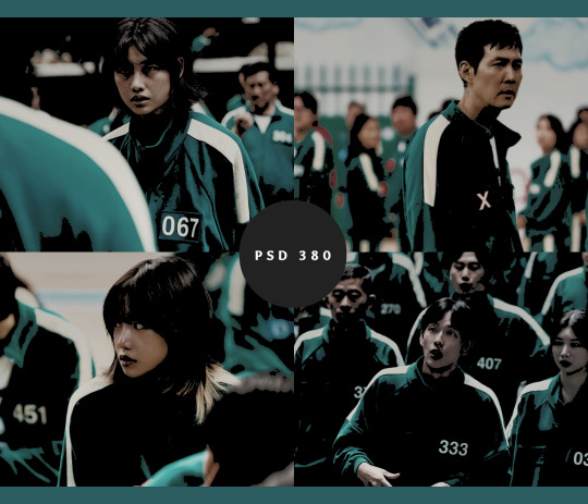
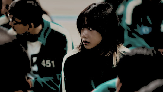
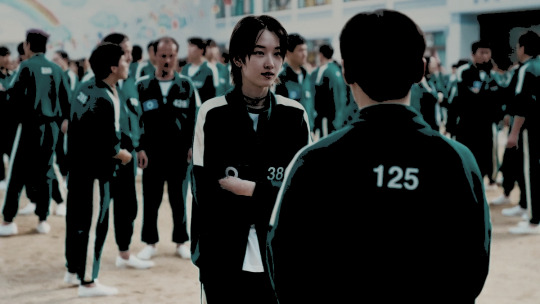
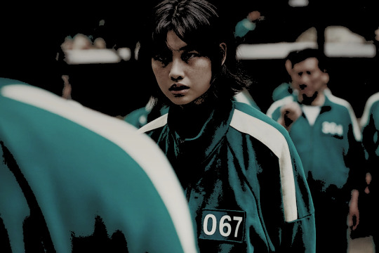
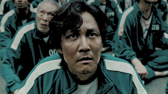
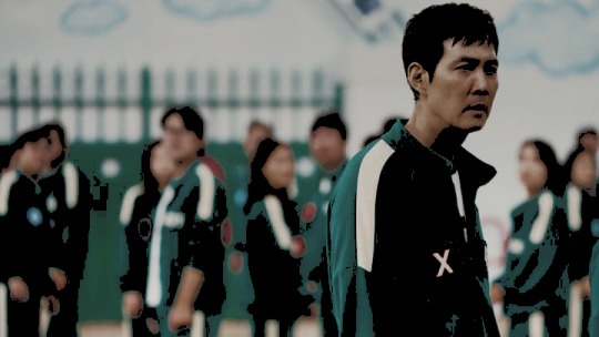
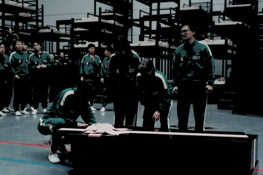
psd coloring : 𝐏𝐒𝐃 𝟑𝟖𝟎 : 𝐒𝐐𝐔𝐈𝐃 𝐆𝐀𝐌𝐄
here is a free psd coloring i made. feel free to adjust layers if you want to. just keep the credit to me still ! it might not work on all colors the same. this psd coloring comes with some adjustments !
PRICE : none. free for watchers only
#psd#psds#psd coloring#psd colorings#free psd#free psds#squid game#squid game psd#icon psd#rp psd#psd files#psd download#colorings#coloring psd#rp resources#roleplay resources#cyan psd#teal psd#photo effects#photoshop resources
15 notes
·
View notes
Text
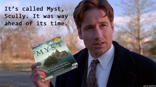
Muldersplaining Myst.
I bet you got stuck on the rocket ship puzzle, right? You know, the one with the piano. Huh, yeah, I bet you did. You probably had to look it up! I can tell! Look at you, you're getting nervous just thinking about it.
#mulder#muldersplains#the x files#x files#david duchovny#mansplaining#scully#the xfiles#fox mulder#muldersplaning#nostalgia#myst#cyan#pc games#90s games
33 notes
·
View notes
Text
AAAAAAAAAGGGGGGGGGHHHHHHHHHHHHH THE KNOCK THRICE X PROTOCOL DROP IS MAKING ME NEED TO WALK IN A CIRCLE IM MAGNUSSING IT RIGHT NOW AUGHHH

I AM GOING TO START SACRIFICING MY SIX EVIL EXES TO THE LOCAL GREGGS IF I CANT GET MY HANDS ON THAT BLACK CARDIE AND SWEATER AND DONT GET ME STARTED ON THE MESSENGER BAG

#IM LOSING MY FUCKING MIND#i cant cope last night videocult released a cyan lizard plush too#and ive bought tickets to mcm and pray to get the case file game#this podcast is bleeding me dry#silas rambles#tmagp#the magnus protocol#knock thrice
15 notes
·
View notes
Text
I've been on chapter 11 of Yakuza Kiwami for 2 days trying to finish Majima everywhere! Can't believe I gotta do the coliseum I hate the actual fighting LMAO (I never play action games)
There's no point if I stop now tho, I gotta get the final Majima ability or else I'll die, also I don't have any other Yakuza games to play so I finish this one is bye bye Majima for a while😔
I knew Kiwami was a remake from the PS2 game but I didn't expect how much better storywise Yakuza 0 is, not that the Kiwami story is bad but Yakuza 0 is much more involved I think, I imagine the other games get better with that part as it goes and if I wasn't busy doing Majima Everywhere I would have finished this one pretty quick (compared to 0) so it's not like the "simpler" story is a downside since it goes by quickly, plus you know, Majima.
I'll probably get Kiwami 2 next time it's on sale but after that I'm not sure if I'll keep playing, I thought "maybe I'll play all the games Majima shows up in" but then I realized that's like... a lot of games.....

My love story with Majima shall wait a while longer
#or maybe I'll just watch playthroughts of the other games after I play kiwami 2 eventually#the next game on my list of games that have been on my library forever but I haven't played yet is the great ace attorney chronicles#I didnt even finish playing the apollo justice games tbh but uhn that can wait#I lost the save file I was playing#cyan talking#Yakuza#Yakuza Kiwami#rgg
11 notes
·
View notes
Text
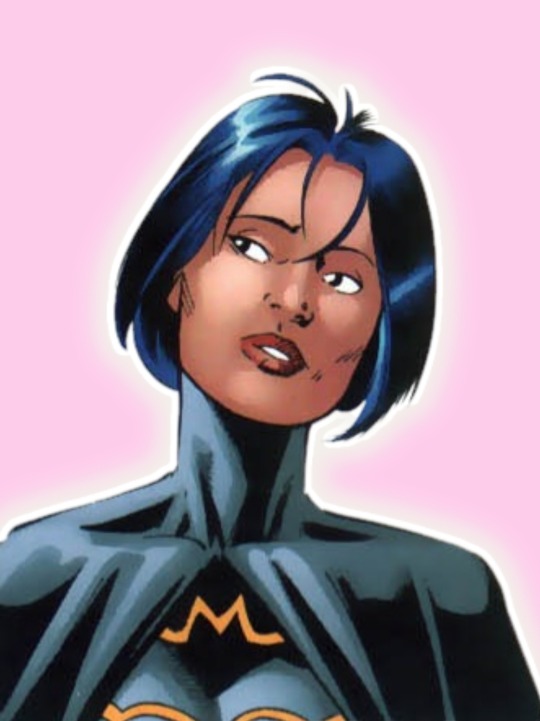
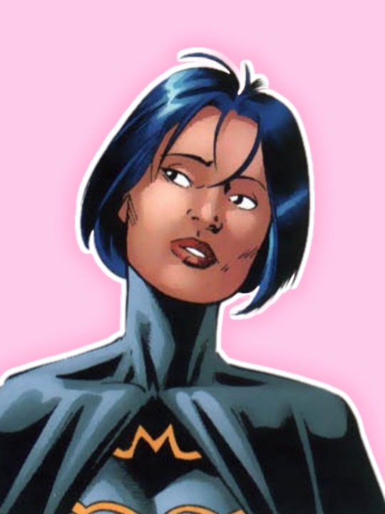
batman: gotham city secret files and origins
[ID: an edit of Cassandra Cain in their Batgirl costume. They're shown from the chest up and has their head tilted to the right. Their gaze is to the left and their lips are parted as they look slightly bemused. They have straight black hair that's cut like a bob and a few stray hairs are on their forehead. In both photos, Cass is in front of a soft pink background. In the first photo, there's a fitted white glow around them and in the second photo, they're outlined in white with a subtle, darker pink glow behind them. END ID]
#CASS !!!!!! YOU AGREE !!!!!!!!!!#LOVE !!! XEM!!!#they should have cyan or pink highlights in their hair....#c: batman: gotham city secret files and origins#crypt's panels#posts from the crypt#cassandra cain#batgirl
55 notes
·
View notes
Text
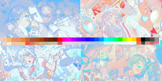
🎶 → 「私は歌うことが大好きなので、あなたも歌うべきです!」
This is a special show for @intersweet !
To download PSD click the 🎶
@ when using!
#psd#psd coloring#free psd#psd download#psd files#cyan psd#Google drive psd#bang dream girls band party#bang dream#bandori#bandori psd
15 notes
·
View notes
Note
I can't wait until you finish the Frozen Wilds arc. The reveals are pretty damn cool and add a lot of context to the main game. :) I'm hoping you went after the Grave-Hoard mission though, just because that makes about the best narrative sense.
Oh, I’ve played before! I know Zero Dawn a little too well tbh 😅 and the remaster is sooo beautiful! I was going to wait until I finished the main story to go to the Frozen Wilds but I can wait no longer, I NEED my icerail back 😭😭😭
#I also played myself by deciding i wanted to play on very hard on a new save file 🙃#but i know an improved icerail would help me a bunch#i also missed aratak ourea and CYAN 🩵
2 notes
·
View notes
Text

workin on a thaaang
#art#my art#artists on tumblr#digital art#wip#not a zip file#hi hey what's up :)#i am the speediest doodler on the planet watch me make a rough background in under 30 minutes:#seriously i forgot i could just. put in the Minimal and have it look fine lol#//when i first started digital art i had a webcomic that. uhhh i don't talk about lmao-#but i used an airbrush a lot like this one on autodesk for All of the backgrounds hfsh#it's bringing back Memories#i ended up dropping that project cuz i just did it to see if i could and also it stressed me out hfvhs#i loved this purple-to-blue-to-cyan blend i would do though :>#//anyway i usually talk with my brother Reed to work out story stuff cuz i guess we have the same kinda brain worms lol#but he was busy the other night so i decided to talk to my Other brother and holy SHIZZ we Spedran EVERYTHING hfbshvfd#he made a LIST. [grabs your face] he made. a LIST#he gets things jumbled very easily so i get it but Man. wish i could do that hfvbshbf#i've had trouble developing the second antagonist for this story and he had me list literally everything + then filled in the blanks while#connecting everything else like. my man. my dude#with this trio we may be mostly unstoppable !! we have the brain(1).png the brain(2).pdf the brain(3).exe hfvshf#/i love files. anyway what was i talking about#mmm i'm going to play a viddy game#i've been having a Day lol - ciaoder :33 !!
12 notes
·
View notes
Text
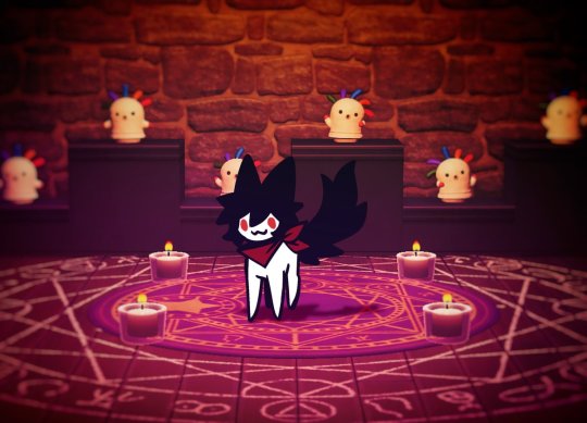
evil summoned
#old art#digging through my files and found this again#i think tumblr would appreciate him#his name is Cyan short for Cyanide#my art#digital art#foxsys.art
13 notes
·
View notes
Text
Me: *bitches bc she has to come up with names for the orange and yellow Tantas*
Also me: What if we had a cyan Tanta, too? What if she's in the cult?
#forspoken#forspoken spoilers#in Tanta we trust#in Tanta we trust spoilers#itwt#itwt spoilers#bobbi's being weird again#*slaps own wrist* BAD BOBBI KNOCK IT OFF D<#anyway aside from the canon Tantas I've also got orange and yellow and indigo#and indigo is quasi-canon in that she's the Rheddig Tanta that showed Frey the Gloaming#(she has time magic and I'm going to go BANANAS playing with that :3 )#Indigo has a name and you can blame CF for diving into the ITWT files#her name is Mira#Orange and Yellow are who I still need to name#AND ALSO APPARENTLY CYAN BC I ADDED HER TO THE NOTES
5 notes
·
View notes
Text

66 notes
·
View notes
Text
is it possible to kill a mommy long legs? like i know they can technically die cus they have a finite health pool but is it practically doable?
#case files#contemplating my next steps as the new top of the food chain#anyway [backflips into the mouth of a cyan lizard that i didn't see]
0 notes
Text

#im running out of file names for gay#again dunno how i feel about it#its like half painted but i gave up#mostly just really like hands theyre great#oc#my art#self indulgence at its finest#cyan#raven
0 notes
Text
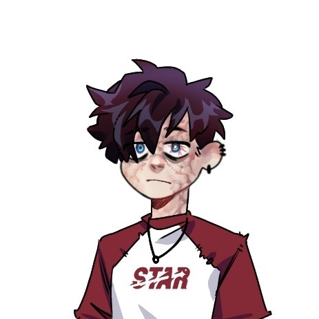
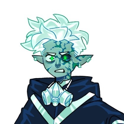
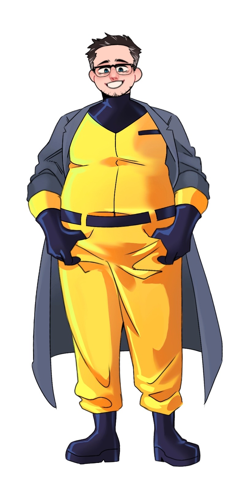
Redesigning the Fentons!!
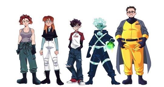
Hi yes this is for yet another Danny Phantom AU of mine it has nothing to do with the Apprenticeship AUs but unlike that batch I actually wanna turn this AU into a fic eventually once I get through a few other big projects I have *sobs*
Anyway individual files for each character under the cut along with my obligatory rambling about all the choices I made ;)
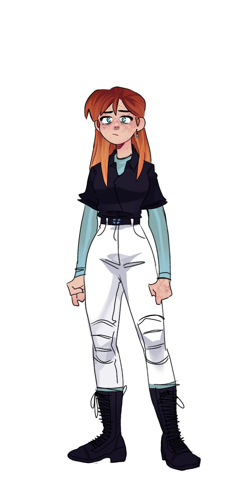
Jazz! Honestly, when I was a kid, I always thought she was 18 not 16 so it was kind of a shock when I started rewatching the show about a yr ago and heard that. Anyway, she's 17 in this AU but already moved out to college on a scholarship bc living in FentonWorks is kind of hell and she has that Older Sibling Guilt for leaving Danny there. For her clothes, I wanted it to be a mix of tactical and preppy.
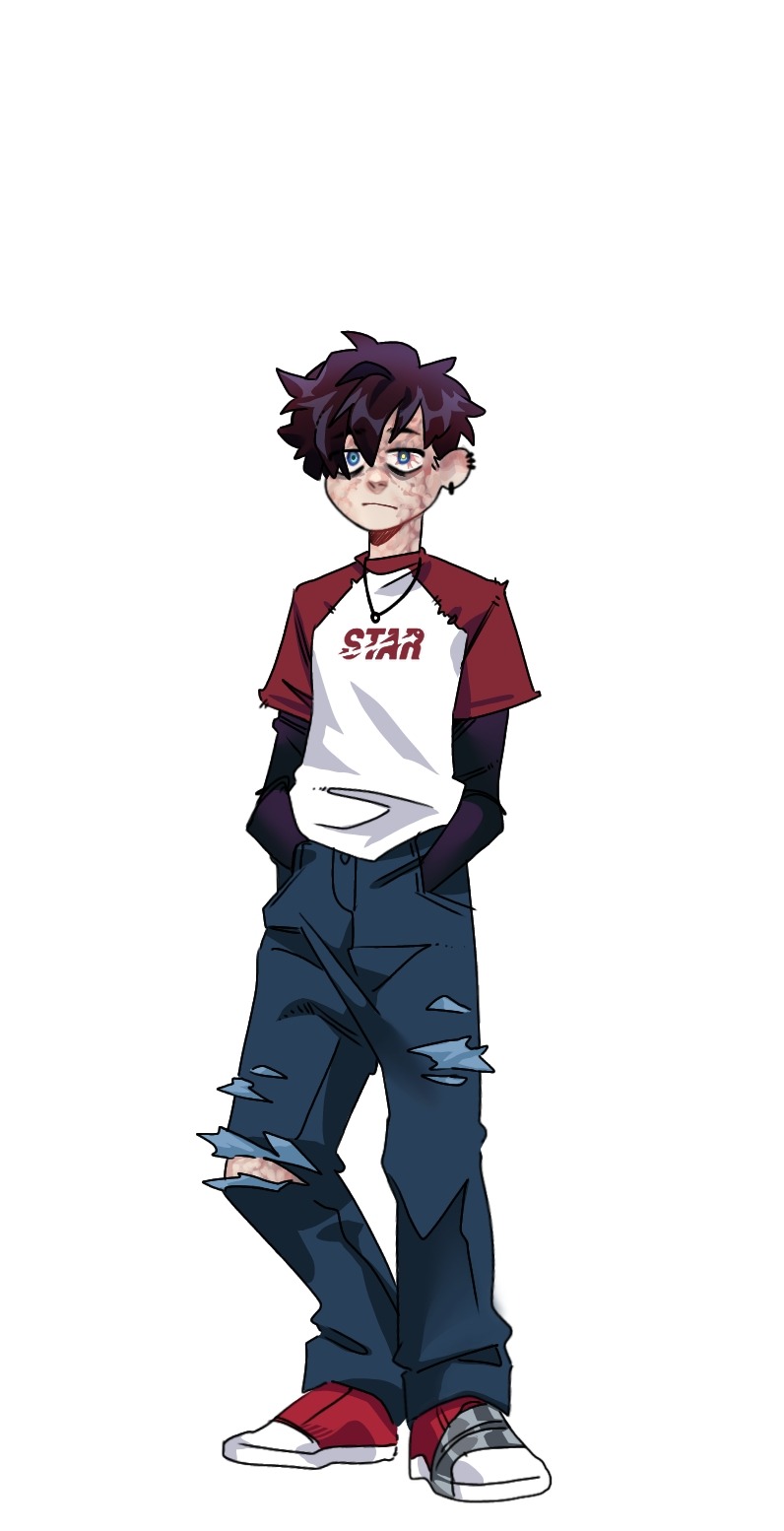
Danny! (Fenton) The effects of FentonWorks hell is much more visible on Danny than Jazz because she got out of there as soon as she could. Because of that though, a lot of the chores in the lab got pushed onto Danny, without passing on many safety tips, like replacing the ecto-filtrator, cleaning contaminated tools, organizing ecto-weapons, etc. And because he doesn't know any better when it comes to safety, he has many symptoms of radiation poisoning: visually, this comes through in the discoloration/scarring on his skin (Jazz has some slight scarring on her face and hands as well), the cataract on his left eye, as well as burst blood vessels in that eye. For his clothes, I wanted them to look a bit ragged and worn through ripped seams, tears in the jeans, & duct tape around his shoe.
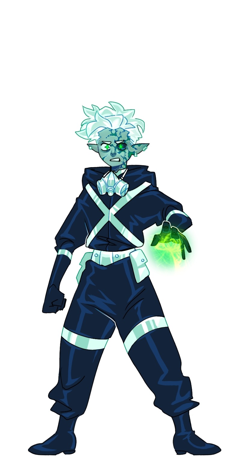
Danny! (Phantom) I don't actually have a lot to SAY about my choics, but I am really happy with it. There are still a few things. I wanted his hair as Fenton & Phantom to be different but still reminiscent of the simplistic rendering of the original show: Fenton is kind of timid so his hair falls over his face, & Phantom is more active/aggressive so his hair is pushed upward. The only other thing I want to comment on is his skin: it's kind of about how I usually stylize Phantom (and I mentioned this when I redesigned Dani a while back) but a "healthy" Phantom in my style would have more bright cyan skin and an unhealthy Phantom has a more dull/zombie green. And lastly, as a ghost, the radiation poisoning kind of cleans up into more neat scarring rather than the muddy/bleeding look as Fenton.
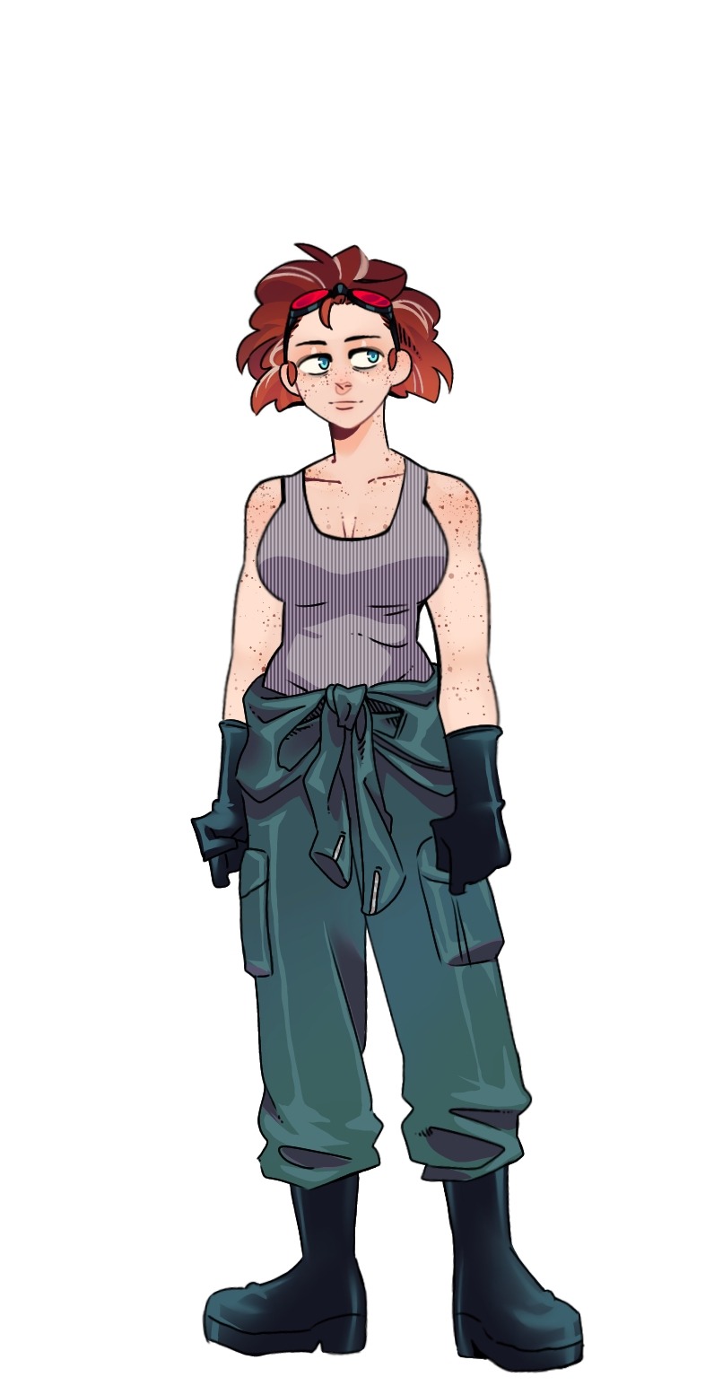
Maddie! Now, I'm gonna be honest, real vulnerable here,... I hate Maddie's canon haircut. It's ugly, I'm not sorry. But I can modify it, so it's fine: now it's curlier, a bit darker, and has a few grey streaks bc she's a genius and constantly pulling long working hours. And, it didn't come across as much as I wanted, but she's got some biceps, strong lady. Now, I'm not really sure why, but I wanted to shift the color of her and Jack's jumpsuit, making hers much more desaturated.
Jack! Big guy. I don't have many thoughts about him either, but I did give him glasses and some stubble for a little bit more dad energy (?) I mainly changed the color of his jumpsuit bc Orange is an extremely hard color for me to render for some reason, so now it's the classic Hazard Yellow. Finally, the most notable difference is the coat I put on him for a bit more scientist energy but my main reasoning for it is the potential visual of him being an absolute tank jumping from overhead with the ghost gauntlets and his coat flapping behind him. Also, I generally like the idea of him presenting himself as a big, dumb teddy-bear, always smiling, but completely unhinged below that facade: dropping the smile or not while towering over you in shadow. Wild imagery.
FINAL THOUGHTS: Do not count on any actual steps towards creating this fic in the near future, it's just on my mind right now, but I NEED to finish my other projects first 🙏🙏🙏 That said, I will (eventually) get around to a handful more character redesigns for this AU including: Vlad, Sam, Tucker, Valerie, Paulina, and maybe Lancer & Dash
#danny phantom#fanart#my art#33xhausted art#character redesign#Radiation!AU#maddie fenton#jack fenton#jazz fenton#danny fenton#bad parenting
2K notes
·
View notes