#without shaders? & details?
Explore tagged Tumblr posts
Text

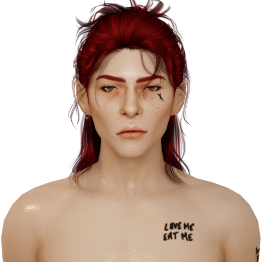


the boys straight out of simripper vs. after i mess w them in blender
#they're actually bald straight out of simripper but#i thought i would spare you all of that#it's very weird to see them so.. idk. bare???#without shaders? & details?#dhestyn looks so pale. like. sickly pale.#idk why blender always washes him out so bad#obviously i figured out how to fix that now but like. man.#& kel just looks flat#like absolutely 2D#it's actually been so long since i've seen them straight out of simripper that i forgot what they look like#i did not realize i changed them that much#it's been mostly gradual changes over time & like. tweaking things here & there#but wow it adds up#rainyrambles
12 notes
·
View notes
Text

1k+ notes over a day, only for the fundraiser to barely have moved at all in 12 hours.
I don't know maybe you are tired of hearing about Siraj Abudayeh ( @siraj2024 ) but you have to remember that he is trying to survive through a genocide. I can guarantee you that he doesn't like asking for help either, rather everyday he struggles to reach out to people. I mean it is kind of horrible to have gone through Zionist harassment and then finding out that people have stopped responding to you in every way. It kills something inside, especially so soon after finding out that the occupation forces have once again bombed your already destroyed house for no purpose at all, except to flex their power .
Right now Siraj's family is struggling to make do. With the early set in of torrential rains, they don't know what is going to happen. They don't know if the 10 children of the family and the elderly parents will survive through this incoming winter! It is so horrible to have to beg for a chance to survive. So horrible to explain every detail of your life, your every action which in this case entails why he had to increase the end goal of the campaign. I don't know why the donations have stopped but you do realize that he wouldn't be bothering any of you if a settler colony was not bent on destroying Gaza to cement its existence right? He would have been in his home. His kids, his nephews and nieces would all be in the home he took a decade of pain to built. They wouldn't be terrified of the harsh winter ahead and that house of theirs would have given shelter to generations!
Siraj is begging you to donate so that he may buy shaders to water proof his tent. If in the next week the rains start without mercy, then the family at least wouldn't have to worry about leaks of icy water.
$80,121 / $82,000 CAD
1.8k to go. Please help Siraj reach the goal BY TOMORROW so that he may at least buy the shaders to waterproof the tent. Boost and Donate.
Vetting #219
6K notes
·
View notes
Text
very niche drabble from my drafts but honestly i would die without posting anything new in a day so i hope y'all will like this and see the vision LMAO, will have different parts <3 since lyra have pointed it out, just saying now that the reader is the cashier :D
isekai'd as game protag nerdjo x isekai'd as saintess npc reader, fluff.

the sunlight catches in your hair again.
satoru doesn’t mean to look. really. he doesn’t. but it’s kind of impossible not to when it glows like that—when every strand shimmers gold in the light of the descending sun like threads spun from divinity itself. it’s almost offensive, honestly. like the devs knew exactly what they were doing when they coded your idle animation to lean forward with a hum and tuck a loose wisp behind your ear just so.
he shifts his weight from one boot to the other, arms crossed, mouth tight, trying to look casual and not like he’s completely entranced by the way the snow melts before it even touches you.
he shouldn't be staring. he shouldn't want to.
because he already has a crush.
back home—real home—there’s a girl who works at the little corner store where he always buys his merch and energy drinks and plastic gacha keychains. she wears cute earrings. remembers his name. slips extra digimon stickers into his bag when she thinks he’s not looking.
he can’t seem to recall what she looked like, probably because of this whole isekai thing but he was sure about one thing. he was going to ask for her number, eventually. probably. maybe. someday.
but still he could not peel his gaze away.
you’re kneeling by a bed of bluebells—early bloom, thanks to your passive skill, blessing of spring. soft petals brush against your fingertips as you gently trace the outline of each flower, humming a song he’s pretty sure isn’t in the game’s ost. a small smile plays on your lips. the world around you feels alive in a way it never did when he played this on his old console—birds chirp too realistically, snowflakes glint too sharply, the wind carries your voice just enough to tease at the edge of his hearing.
and he’s just standing there. holy sword at his side. cape slightly crooked. heart lodged firmly in his throat.
“you’re staring again,” their rogue probably says behind him. maybe it’s their archer this time. he doesn’t hear. or rather—he refuses to.
because how the hell is he supposed to focus on defeating the demon king when you smile like that?
he’s the hero now. the chosen one. satoru gojo, level 99 celestial knight. maxed-out stats in everything that mattered: strength, speed, light magic resistance, charisma so broken it’s been nerfed twice since launch. and yet here he is—still taking psychic damage from the way your lashes flutter when you blink at him.
he’s been here for weeks ever since dozing off in a middle of some cutscene. isekai’d straight into his favorite game—celestial hearts: divine war of fate—which was absolutely not supposed to be a dating sim. it was about strategy and honor and battle mechanics. not about feelings or pretty saintess girls in glowing white cloaks and soothing voices who keep patting his head when he looks tired.
“sir gojo?” you say gently, glancing over your shoulder at him, smile soft and patient.
your eyes catch the light and sparkle—sparkle, literally sparkle. like someone turned the shader settings all the way up just for you. “you look flushed. are you feeling alright?”
“y–yeah,” he says, cracking audibly. god. why did his voice do that. he clears his throat. straightens up. resets his face to what he thinks is a neutral, knightly expression. “must be the sun. y’know. too hot.”
you blink. your lips part in polite confusion, and you glance up at the sky.
“but it’s snowing.”
“…right.”
his hands twitch at his sides, fingers flexing restlessly in his gloves. damn this game. damn the developers. damn their incredible, stupid attention to detail. your hands—bare, of course—hover over the flowers again, cupping one like a tiny offering. your sleeves fall past your wrists, white and gold embroidery catching the breeze. he knows your bio by heart: “saintess of the divine spring, miracle maiden of light,” the usual npc flavor text. maxed healing. high affinity scores. probably a tragic backstory somewhere in your questline.
but none of that mentioned how your laugh sounds like windchimes strung across heaven’s gate.
“sir gojo,” you say again, standing now, brushing imaginary dust and flower petals from your skirts. your movements are dainty, practiced, but your brows draw slightly inward with genuine concern. “you’ve been standing still for a while. are you sure you’re not overheating?”
his cape flutters awkwardly in the wind. his fingers go rigid. he can’t even blink.
girl. please.
he opens his mouth. closes it. opens it again, as if maybe this time something normal will come out.
“maybe i’m…” his voice trails off as he wills his brain to function. “overheating from your… divine radiance?”
the words leave him like a spell miscast.
a pregnant pause.
then—your eyes go wide. your lips twitch. and you laugh.
not a dainty giggle this time, but a laugh. soft and delighted and surprised all at once, curling from your throat like a melody no bard could replicate. you lift your sleeve to hide your smile, cheeks faintly pink—not blushing, no, the game probably just coded you to respond to compliments with a heat shader—
he’s going to die.
he’s actually going to drop dead right here in the middle of a flower field over a non-playable character.
somewhere deep in the forest, a bowstring snaps with unnecessary violence. someone—probably the mage—lets out a strangled, exhausted noise of pure despair.
satoru barely notices. he’s busy fighting for his life.
you’re still smiling at him. the wind rustles the bluebells. your hair glows like god’s personal sunbeam. the scene is perfect. it looks like a damn cg cut-in. he expects text to pop up any second with your name and some sappy line like “i’m glad you’re here, brave knight.”
but instead you just say, softly, with an amused little tilt of your head, “you’re strange, sir gojo.”
“i get that a lot,” he mumbles.
and somehow, impossibly, you smile brighter.
he has to beat the demon king. return to his world. back to traffic, vending machines, anime reruns, and microwaved curry. back to a life without hand-drawn skies and snow that melts against your skin and the way you say his name like it’s a blessing.
but you’re looking at him now like he’s the one glowing.
and satoru thinks—maybe. maybe just a little longer.
a few more days of fumbling compliments, of you laughing at his dumb jokes, of trying not to combust every time your hands brush his.
a few more days of your soft voice calling him “sir gojo” like you don’t even realize you’ve already enchanted him more deeply than any demon ever could.

#౨ৎ — flash reports#gojo satoru#gojo fluff#gojo x female reader#satoru gojo x reader#gojo satoru x reader#gojo x reader#satoru x reader#gojo satoru x you#gojo satoru x y/n#satoru gojo x y/n#satoru gojo x you#gojo satoru fluff#gojo drabbles#jjk fluff#jjk drabbles#jujutsu kaisen fluff#jujutsu kaisen drabbles#jjk x reader#jjk fanfic#jujutsu kaisen fanfic#jujutsu kaisen x reader#reader insert#nerdjo#nerd gojo
368 notes
·
View notes
Text
Vanilla Gpose Tips
I get asked occasionally how I make my screenshots if I'm not using shaders or mods. The short answer: Patience. Gpose's suite of tools is a lot more robust than it used to be when it was first released. But if you want a screenshot to really shine without using third party add-ons, it's not something you can just go into gpose, take a printscreen and get back out. You might capture a moment with nice lighting that way, but it takes more than that. 1. Choosing a location and time of day is job one. What kind of mood are you trying to convey? Does your intended screenshot have a theme (or a prompt?) or are you just looking at your new glam and marveling at how fine your character looks in it? Does a lighter or darker setting suit the character better? Setting, time of day, and weather can affect this. 2. You can stop time and weather from changing. I keep this on by default because it can take upwards of 30 minutes IRL to fine tune a screenshot. The middle button below. Make sure it's highlighted.

3. Toggle battle effects on/off. It's the button right next to the time/weather stop, the icon of the guy holding the sword. If the icon is highlighted as it is in the screenshot, your battle effects are on. If you want to capture pure motion and not worry about battle effects, turn this off. 4. Wet effect. Use it, use it, use it. It doesn't just make clothes look wet and make skin glossy, it actually helps to bring out texture and detail on the character's outfit. Especially since the graphics updates in 7.1. I've found it also adds shine to hair and can help the eyes stand out more.
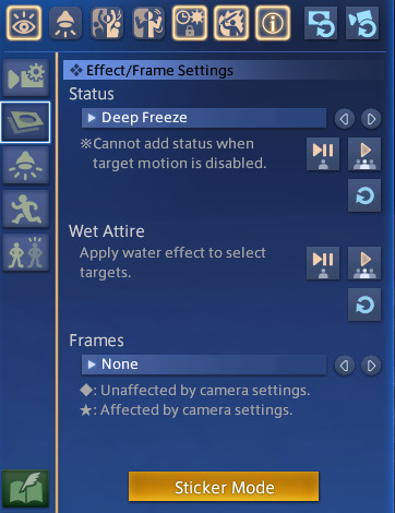
5. Sticker Mode. Yes, there are oodles of cute minion stickers, flags, and numbers, but there are also some great effects to be found in the Decorations category! Sparkles and twinkles, lens flare, among other things can help enhance metallic points on a glamour, AND they can be resized! So if you want a more subtle twinkle on the edge of your spectacles or earrings, you can tilt and downsize your desired sparkle. There are also cute flowers and hearts. 6. Quick Keys. If you're playing on a keyboard, the 1 on your top number row freezes the screenshot. This is extremely helpful if you're trying to catch a battle emote right at a specific moment. If you miss it, keep trying because emotes will continue to cycle until you change them. R and Scroll Lock will both hide/unhide the gpose controls. X will turn on lighting. Space Bar will toggle your character to stop them from facing the camera and vice versa. 7. Lighting Intensity is Dependent on Distance. The closer you're zoomed in on your character, the brighter the light is going to be when you turn it on. Try adjusting your zoom in or out and toggling the light to see if the illumination is to your liking. You can also adjust the RGB on the lights to fit the mood/environment. I also recommend turning on Manual Brightness. 8. Color Filter and Screen Effect. These two features, in my opinion, require the most patience. Not every color filter and screen effect will work well together in every scenario. Click through and preview all of them in your screenshots and see if some SE's work better with your preferred CF. You might find an unexpected combination that you love. Trailer and Echo color filters are great for flashbacks (no one uses Aetherometer, it's an eye bleeder). Use the Pencil or one of the monochrome CFs and Noise 2 SE to create a nice black and white film or photo effect. 9. Frames. Frames are one of the more limited features and not always needed in order to capture a great screenshot. Action poses benefit from the Cinema frames, however, while more lighthearted moments play well with the photo options.
10. Emotes. Before you enter Gpose, be sure to /groundsit to clear your most recent emotes. Summoning mounts and minions also count as emotes for the sake of Gpose. By the same token, you can use battle abilities before entering Gpose, and this is what it will cycle through. You can't activate a battle ability while IN Gpose. You will have access to all of your non-battle emotes and facial expressions, though. You can combine any emote with any facial expression by choosing the action first, and expression second, so you can /prettyplease and /awe at the same time to make your character look hilariously horrified. If you enter Gpose with an active battle ability, you can still apply a facial expression to it from within the tool. 11. Bits and Bobs. Enable Manual Focus and Depth of Field will help bring out the details of the background more, and will help to make a more cohesive screenshot. Manual Focus is great if you want your character in the frame, but you want to shift the focus elsewhere, to an object or another person in the background for example. In the same menu where you'll find emotes, click the second eye button to "Track Camera". Your character's eyes will follow the position of the camera. Lastly, again, have patience. Allow yourself time to play with all the tools Gpose has to offer. You're probably not going to get the winning screenshot after clicking Printscreen just one time, you should take multiple shots from different angles with different lighting and effects, then compare them all and pick the ones you like best. And remember, even if it's the true endgame, it's not a competition. Your screenshots are not "worse" or "boring" just because you're not using third party tools. I look forward to seeing what you create, and you should too.
429 notes
·
View notes
Text
Then vs Now
tagged by @ubejamjar, @elliewiltarwyn and @verysmallcyborg, ty!
tagging @greenshi @lynxden @sealrock @chadhunkler @robynostornwyn and @sleepymoonlady
February 2022, when i was still playing on ps4..!
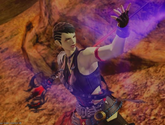
and a few weeks ago! censored bc i want to show off her body but without blasting everyone with tits vfhsdbkvsdfjk

i don't think it's radical change but just getting closer and closer to what i wanted for her :)
not gonna lie back when i was still going through the story and playin on ps4 ryss wasn't developped as a character at all ahahah! it took some time before i wrote some sort of backstory and character elements for her...
her body & c+ evolved a bit overtime and i'm sooooo happy with the progression!! going from vanilla thin to strong but thin to strong and wide with belly fat!!!
her skins got lots of detailing. scars and body hair, but also sun marks that are frankly almost never visible post shaders LOL
facial hair :)
got a few different haircuts.. i miss shorter hair on her but idk there's something about the meteor dt hair that's just so charming!
anyways she gives me gender envy and i love she :)
80 notes
·
View notes
Text
"An ideal Sims game would have Sims 2's gameplay mechanics, Sims 3's open world, and Sims 4's graphics!"
I absolutely despise this take, and I want to explain why. This is a very long rant and it is full of piss and vinegar directed at everything in the Sims 4. I'm gonna try to keep everything kinda professional as much as I can but I can't guarantee an unbiased opinion.
If you'll let me talk your ears off for a moment, I'd like to explain, from my own experience as an artist and a casual player, my issues with the art style and direction of The Sims 4 compared to The Sims 2. (I'm not really going to comment on 3 because I've never played it.)
I want to start off by explaining the difference between better graphics and higher resolution. The Sims 4 absolutely blows Sims 2 out of the water when it comes to textures and polygon counts on sims, no contest. But I'd argue that the graphics themselves... aren't better. They're worse, even, so much fucking worse. The biggest problems come from the stylization and the animations, in my opinion, so I'll explain what I mean.
Have you ever felt like the Sims in 4 just look... weird? Not quirky, not kinda strange, but off. Distressing. Uncanny. Whatever the fuck the kids call it nowadays. When you strip away the packs and the CC and the shaders, the sims in the base game look bad. They're very close to being human; they walk like us, talk like us, have families like us, but they don't look like us, not exactly. There's always something off about them, no matter how close you try to get. Proportions will be a bit off, or your eyelashes will be like three polygons for some fucking reason, and the jig is up. The illusion is gone.
This is one of the instances where a higher resolution and more detailed models and meshes work against you. You aren't making believe. You are beyond the point of pretending that the pixelated shapes are real clothes and bodies and faces, because at this point, they're close enough that you don't need to. There's no gap to bridge. But that doesn't necessarily mean that they're lifelike, at least, not enough to be completely human. In some ways, they're still tethered to being cartoony and plasticky and fake. Just enough to frighten you. Enough to put you off. They're not using it to their advantage anymore, and instead, it's holding them back.
When the Sims 2 came out in 2004, the developers knew that they weren't going to make a perfectly accurate life simulator. They physically couldn't render every wrinkle in the face or fold in the clothing. In some animations, things clip strangely or the facial expressions are sort of janky or there's just some form of roughness around the edges. But that's okay; your brain doesn't need a perfectly accurate representation this time. That's not what you're here for, anyway.
The Sims 4 is basically Icarus-ing itself into disaster. The entire game sacrifices style for complete realism, a goal that was unachievable ten years ago, and is unachievable now.
The Sims 2 never thought of itself as a completely realistic life sim, though. It has cartoony, low poly meshes and exaggerated proportions and wild, raunchy storylines that would never occur in real life. BECAUSE IT ISN'T REAL LIFE. And it isn't like real life, not because it's failing to be, but because it doesn't want to be!
The Sims 4 is not ever going to completely replicate human looks or interactions or dynamics. And if it's trying to, it's doing a shit job of it. That shouldn't be the goal in the first place. If I wanted to watch a lonely college student talk to himself in the mirror to try and get better at interacting with people, I'd close the computer and go look at myself. It somehow highlights the most mundane parts of life without any of the whimsy and goofiness that the earlier installments had. It takes itself too fucking seriously for its own good, and it's killing both the gameplay and the art style.
The other point I'd like to bring up is the animation. The Sims 4 allows for much more customization of both sim and environments, but at the cost of dynamic animations. How many times is that grab animation reused? How many times is the same set of animations used for sims with wildly different personalities? Your sims barely feel alive with how little they express themselves.
Now, look, I'm a digital artist. I've dabbled in animation, but only briefly, and only in 2D. I've got no clue how 3D animation works, much less how it worked 20 years ago, but I can see the passion in every single animation in the Sims 2. The more niche interactions allowed for more expressive animations than in 4. They could afford to have a distinct animation for mean sims throwing the football extra hard to be assholes, rather than every sim using the same generic football-throwing animation to save time and money. I get where they're coming from. I get the idea. But in one move, you've both made the art style stiffer and less expressive, and you've made the personalities of the sims seem meaningless. Everyone acts the same, regardless of what their moodlets or their traits say. It's hollow. It's stifled. It's a waste of potential.
But for what Sims 2 lacks in polygons, it makes up for in smaller animated details. Quality over quantity. The sims have hair physics, they open the door before they get in the car, they take utensils out of the counters when they cook, they jump on the couch and the cushions smush under their weight. When they dance, the weight is realistic, and when they smile, it tugs at every one of the few dozen shapes that make up their faces. The sims are lively. They dance and sing and love and hate just like humans, and rather than being some strange attempt at mimicry, it's almost a tribute. They were made with love. You can tell that they were drawn up and rigged and animated by a bunch of people working together, studying each other and making faces in the mirror for reference and watching their kids and neighbors and dogs and hands for reference. The sims are not human, and not trying to be, but they're taking the most human parts of us and making them their own.
You could never have a game with the Sims 4's graphics and the Sims 2's gameplay. The gameplay and graphics are inexorably connected, and the Sims 2 just has so much glorious detail baked into it, that you could never really make it work underneath the limitations of the later games. The developers of 2 knew what their limits were, and they worked tirelessly to make the game as full and complex as they could within those limits. The developers for the Sims 4 just did not have those guidelines, and thus, the drive to bend the rules was no longer there. They didn't go wild in rebellion because they were never told they couldn't in the first place. They spent the entire time chasing a goal they couldn't meet, and lost sight of what made the series fun to begin with.
It wasn't the realism you came for; you had realism already surrounding you. It was the caricature of it that made it interesting.
#sims 2#sims 4#rambling#please hear me out here#if I hear this one more time i'll explode#please#the problem is so deeply ingrained that it corrupts all it touches like an oil spill#you cant separate the graphics from the gameplay#please guys#THIS is why the sims 4 feels hollow#IT IS#IN EVERY WAY IT COULD BE#every advancement it claims to make only digs its grave further#GUYS PLEASE#CAN ANYONE HEAR ME#does this count as an essay#it felt like an essay#it's 5am
195 notes
·
View notes
Text
Film Grammar for Simmers
What is film grammar?
"Film grammar" refers the unstated "rules" of editing used in movies and TV. Different types of shots have different associations and are used by editors to convey different types of information to the audience. Many of these principles were first described in the early 20th century by Soviet directors, but they're used consistently across genre, medium, and even language: Bollywood musicals, English period dramas, Korean horror movies, and American action blockbusters all use many of the same techniques.
Because these rules are so universal, virtually everyone has some internalized understanding of them. Even if they can’t name the different types of shots or explain how editors use images to construct meaning, the average person can tell when the “rules” are being broken. If you’ve ever thought a movie or episode of TV was confusing without being able to say why, there’s a good chance that there was something off with the editing.
Learning and applying the basics of film grammar can give your story a slicker and more-polished feel, without having to download shaders or spend hours in photoshop. It also has the bonus of enhancing readability by allowing your audience to use their knowledge of film and TV to understand what's happening in your story. You can use it to call attention to significant plot details and avoid introducing confusion through unclear visual language.
Best of all, it doesn't cost a dime.
The basics: types of shots
Shots are the basic building block of film. In Sims storytelling, a single shot is analogous to a single screenshot. In film, different types of shots are distinguished by the position of the camera relative to the subject. There are three big categories of shots, with some variation: long shots (LS), medium shots (MS), and close-ups (CU). This diagram, created by Daniel Chandler and hosted on visual-memory.co.uk illustrates the difference:
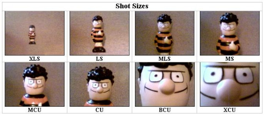
Source: The 'Grammar' of Television and Film, Daniel Chandler, visual-memory.co.uk. Link.
In film, scenes typically progress through the different types of shots in sequence: long shot, medium shot, close-up. When a new scene begins and the characters arrive in a new location, we typically begin with a wide establishing shot of the building’s exterior to show the audience where the scene will be taking place. Next comes a long shot of an interior space, which tells the where the characters are positioned relative to one another. The next shot is a medium shot of the characters conversing, and then finally, a close-up as the conversation reaches its emotional or informational climax. Insert shots are used judiciously throughout to establish themes or offer visual exposition.
Here's another visual guide to the different types of shots, illustrated with stills from Disney animated films.
This guide is almost 2,000 words long! To save your dash, I've put the meat of it under the cut.
Long shot and extreme long shots
A long shot (sometimes also called a wide shot) is one where the entire subject (usually a building, person, or group of people) is visible within the frame. The camera is positioned far away from the subject, prioritizing the details of the background over the details of the subject.
One of the most common uses of long shots and extreme long shots are establishing shots. An establishing shot is the first shot in a scene, and it sets the tone for the scene and is intended to give the viewer the information they’ll need to follow the scene: where a scene is taking place, who is in the scene, and where they are positioned in relation to one another. Without an establishing shot, a scene can feel ungrounded or “floaty.” Readers will have a harder time understanding what’s happening in the scene because on some level, they’ll be trying to puzzle out the answers to the who and where questions, distracting them from the most important questions: what is happening and why?
(I actually like to start my scenes with two establishing shots: an environmental shot focusing on the scenery, and then a second shot that establishes the characters and their position within the space.)
Long shots and extreme long shots have other uses, as well. Because the subject is small relative to their surroundings, they have an impersonal effect which can be used for comedy or tragedy.
In Fargo (1996) uses an extreme long shot to visually illustrate the main character’s sense of defeat after failing to secure funding for a business deal.The shot begins with a car in an empty parking lot, and then we see the protagonist make his way up from the bottom of the frame. He is alone in the shot, he is small, and the camera is positioned above him, looking down from a god-like perspective. All of these factors work together to convey his emotional state: he’s small, he’s alone, and in this moment, we are literally looking down on him. This shot effectively conveys how powerless he feels without any dialogue or even showing his face.
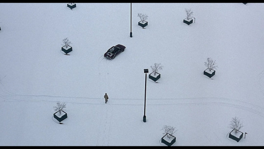
The same impersonal effect can also be used for comic purposes. If a character says something stupid or fails to impress other characters, cutting directly from a close-up to a long shot has a visual effect akin to chirping crickets. In this instance, a long shot serves as a visual “wait, what?” and invites the audience to laugh at the character rather than with them.
Medium Shots
Medium shots are “neutral” in filmmaking. Long shots and close-ups convey special meaning in their choice to focus on either the subject or the background, but a medium shot is balanced, giving equal focus to the character and their surroundings. In a medium shot, the character takes up 50% of the frame. They’re typically depicted from the waist-up and the audience can see both their face and hands, allowing the audience to see the character's facial expression and read their body-language, both important for interpreting meaning.
In most movies and TV shows, medium shots are the bread and butter of dialogue-heavy scenes, with close-ups, long shots, and inserts used for punctuation and emphasis. If you’re closely following the conventions of filmmaking, most of your dialogue scenes will be medium shots following the convention of shot-reverse shot:
youtube
To keep long conversations from feeling too visually monotonous, consider staging the scene as a walk-and-talk. Having two characters move through a space can add a lot of dynamism and visual interest to a scene that might otherwise feel boring or stiff.
Close Ups
Close-ups are close shots of a character’s face. The camera is positioned relatively near to the subject, showing just their head and shoulders. In a close-up, we don’t see any details of the background or the expressions of other characters.
In film, close-ups are used for emphasis. If a character is experiencing a strong emotion or delivering an important line of dialogue, a close-up underscores the importance of the moment by inviting the audience to focus only on the character and their emotion.
Close-ups don’t necessarily need to focus on the speaker. If the important thing about a line of dialogue is another character’s reaction to it, a close-up of the reaction is more effective than a close-up of the delivery.
One of the most iconic shots in Parasite (2019) is of the protagonist driving his employer around while she sits in the backseat, speaking on the phone. Even though she’s the one speaking, the details of her conversation matter less than the protagonist’s reaction to it. While she chatters obliviously in the background, we focus on the protagonist’s disgruntled, resentful response to her thoughtless words and behavior.
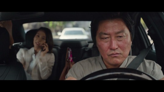
In my opinion, Simblr really overuses close-ups in dialogue. A lot of conversation scenes are framed entirely in close-ups, which has the same effect of highlighting an entire page in a textbook. The reader can’t actually tell what information is important, because the visuals are screaming that everything is important. Overusing close-ups also cuts the viewer off from the character’s body language and prevents them from learning anything about the character via their surroundings.
For example, a scene set in someone’s bedroom is a great opportunity for some subtle characterization—is it tidy or messy? what kind of decor have they chosen? do they have a gaming computer, a guitar, an overflowing bookshelf?—but if the author chooses to use only close-ups, we lose out on a chance to get to know the character via indirect means.
Inserts
An insert shot is when a shot of something other than a character’s face is inserted into a scene. Often, inserts are close-ups of a character’s hands or an object in the background. Insert shots can also be used to show us what a character is looking at or focusing on.
In rom-com The Prince & Me (2004) (see? I don’t just watch crime dramas…) the male lead is in an important meeting. We see him pick up a pen, look down at the papers in front of him, and apparently begin taking notes, but then we cut to an insert shot of his information packet. He’s doodling pictures of sports cars and is entirely disengaged from the conversation. Every other shot in the scene is an establishing shot or a medium shot or a close-up of someone speaking, but this insert gives us insight into the lead’s state of mind: he doesn’t want to be there and he isn’t paying attention.

Insert shots are, in my opinion, also used ineffectively on Simblr. A good insert gives us extra insight into what a character is thinking or focusing on, but a poorly-used insert feels…unfocused. A good insert might focus on pill bottles on a character’s desk to suggest a chemical dependency, on a family picture to suggest duty and loyalty, on a clock to suggest a time constraint, on a pile of dirty laundry or unanswered letters to suggest a character is struggling to keep up with their responsibilities. An ineffective insert shot might focus on the flowers in the background because they’re pretty, on a character’s hands because it seems artsy, on the place settings on a dining table because you spent forever placing each one individually and you’ll be damned if they don’t make it into the scene. These things might be lovely and they might break up a monotonous conversation and they might represent a lot of time and effort, but if they don’t contribute any meaning to a scene, consider cutting or repurposing them.
I want to emphasize: insert shots aren’t bad, but they should be carefully chosen to ensure they’re enhancing the meaning of the scene. Haphazard insert shots are distracting and can interfere with your reader’s ability to understand what is happening and why.
Putting it all together
One of the most basic principles of film theory is the Kuleshov effect, the idea that meaning in film comes from the interaction of two shots in sequence, and not from any single shot by itself. In the prototypical example, cutting from a close-up of a person’s neutral expression to a bowl of soup, children playing, or soldiers in a field suggests hunger, worry, or fear, respectively.
youtube
The Kuleshov effect is the essence of visual storytelling in a medium like Simblr. You can elevate your storytelling by thinking not only about each individual shot, but about the way they’ll interact and flow into one another.
Mastering the basics of film grammar is a great (free!) way to take your storytelling to the next level. To learn more, you can find tons of guides and explainers about film grammar for free online, and your local library doubtless has books that explain the same principles and offers additional analysis.
Happy simming!
#armorica tips#armorica ooc#i finally got off my ass to finish this guide which i started back in August right before I got extremely sick and ended up in the hospital#anyway....hope you enjoyed this post which was a veiled excuse for me to complain about how people overuse close-ups and inserts#and i can't tell what's happening in their stories ;fdsklsjadf;laksdf#Youtube
348 notes
·
View notes
Text
ROTTMNT Minecraft (Creative) Headcanons:
I didn’t proofread any of these by the way. I’ll do it eventually when I’m not busy with my robot stuff 😼
Donnie:
(These are lowkey me self projecting)
- Will do the craziest things with command blocks
-ends up summoning infinite withers with a repeating command block and crashing everyone except his PC
-messing with red stone also
- helps Leo make TNT towers
- Just trolling everyone with command blocks
- finding secrets using commands
-making/installing mods
- cannot live without shaders, even if they mess with the gameplay he will leave if he can’t play with shaders
-filming the WHOLE time
- building houses, he’s not as good as Mikey but he likes to keep them simple, but not too simple, just the right of complexity where it looks like Minecraft but not like a whole masterpiece
- turns out education mode and messes with the molecules
Leo:
- Blowing everything up
- Accidentally blew up Raph’s build and almost got put on visitor permission
- building tnt towers
- Burning down villages with lava cuz his wolf died to the iron golem (their in creative but he refuses to spawn a new dog)
- gets caught using xrays even though he’s in creative and doesn’t need them (Donnie helped him install mods)
- Builds games for them all to play
Mikey:
- building the most gorgeous stuff anyone’s ever seen
- Master of Minecraft pixel art
- making parkour for them all to play, it’s extremely detailed and has a theme to it
- making Jukebox music with Donnie (he makes the music Donnie does the red stone)
- gives everyone stacks of cake
- tries to figure out if he can make pizza but he can’t so he builds a giant pizza instead
Bonus: he makes everyone skins of themselves to wear
Raph:
(Also kind of self projecting on the fact I build defense bases in creative)
- even in creative he’s an absolute master of defense, Donnie taught him some simple red stone stuff so now he builds cool defense bases
- his base he built got blown up by Leo and he FLIPPED.
- He’s built all of his creative bases with bedrock from there on out
- his favorite block is pistons, originally it was bedrock but once Donnie taught him how to use pistons they became his favorite
- he tries to convince Leo on using his abilities with tnt too make a tnt launcher in his bases
- Mikey helps him come up with cool color pallets for his builds
- loves flat worlds for creative
- has treasure rooms full of diamond blocks
- used to build his bases out of diamond emerald and gold but had to switch to bedrock
- usually is the owner of the world, so he’ll put Leo in survival if he blows up anyone’s build and make him try to escape his defense base without dying or he can’t be able to go in creative again
- has so. Many. Cats. He has lagged the game because he went around with cat spawn eggs EVERYWHERE.
- really quietly giggles while making traps

IF ANYONE HAS ANY FANFIC/HEADCANON REQUESTS HMU!! ILL DO ANYTHING SFW
#rise of the tmnt#rottmnt#rise of the teenage mutant ninja turtles#tmnt#headcanon#hc#hcs#tmnt headcanons#rottmnt headcanons#headcanons#donnie tmnt#tmnt donatello#tmnt leonardo#tmnt 2018#rottmnt donnie#rottmnt leo#tmnt raphael#raphael#rottmnt raph#rottmnt mikey#rise mikey#rise donnie#rise leo
36 notes
·
View notes
Text
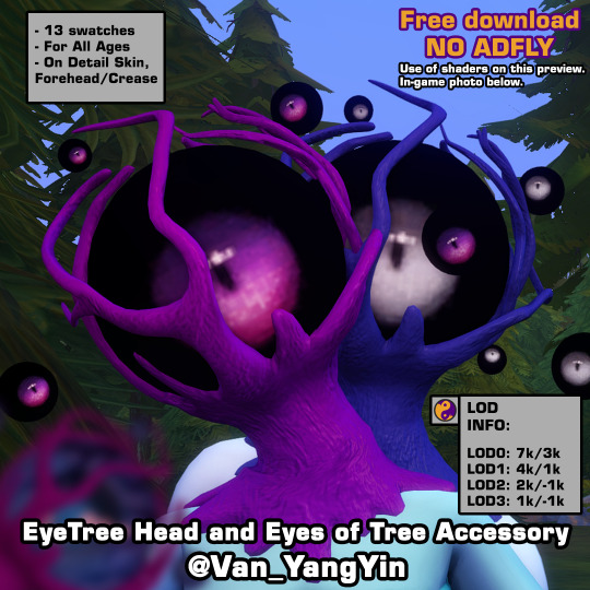
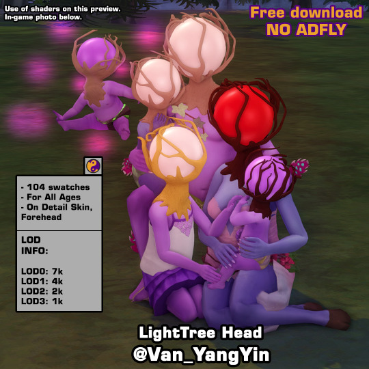
Following Custom Content I shared the other day, here is EyeTree Head Set that contain a EyeTree head and Eyes of Tree Accessory for all ages. Hope you enjoy this one! 💗
Short brief when this post is published: I'm currently without pc because it's being repaired since it was failing me, so I leave you this publication that I left prepared. Until I have it back, it's possible that I won't be much on my social medias. When I return I'll answer to your lovely asks and replies. @lea-heartscxiv will probably lend me his, but it will only be for occasional times like posting things we've worked on together or new CC if pc takes too long to repair. Thank you for your patience with me ❤
They look at you, they judge you, they discriminate against you. From a planet far away from Sixam, called Lerighett, reside these tree-headed beings with eyes. They're said to be of many varieties and species, though residents of the hidden lands of Heyadee are one of the most frowned upon for being so perceptive and judgmental. If they have more eyes around them, they may be even more judgmental for being able to see beyond your soul. 👁️🌳
Download under keep reading ↓
If you download my CC it means your agree with my T.O.U (English/Español/日本語).

EyeTree Head
General Info:
13 swatches
Base game compatible
Located on Detail Skin, Forehead
all ages
disable for werewolves (don't show good on them)
all LOD's
All Maps (Diffuse, Normal, Specular)
Mesh and texture made from scratch by me
Custom Thumbnails
Compatible with higher and lower game sliders
Known problems: Some parts of the trunk may go deeper into the skin. Since is placed in Skin Details, Forehead, both packages are shown, no matter the gender, but they're written as Male Frame and Female Frame on thumbnail so that they can be easily recognized. Try to use them properly so they don't look bad unless that is the result you want to achieve.
LOD Information: LOD0: 7232 poly | LOD1: 3615 poly | LOD2: 1806 poly | LOD3: 903 poly
IF YOU LIKE MY WORK PLEASE CONSIDER BECOME A PATREON OR TIP ON KO-FI. ANY HELP IS ALWAYS WELCOMED BUT ALWAYS OPTIONAL. YOU CAN ALSO COMMISSION ME HERE OR FROM TUMBLR, IF YOU WANT ME TO DO SOMETHING SPECIFIC FOR YOU. THANK YOU FOR YOUR SUPPORT!
※Choose download the one/ones you want the most or only download Merged: "_T-E_Merged" or "_AllMerged" where all the files are together.※
✨DOWNLOAD LINK✨ (Patreon ~ Always free, no adfly) [Same link]
✨DOWNLOAD LINK✨ (SFS ~ Always free, no adfly)
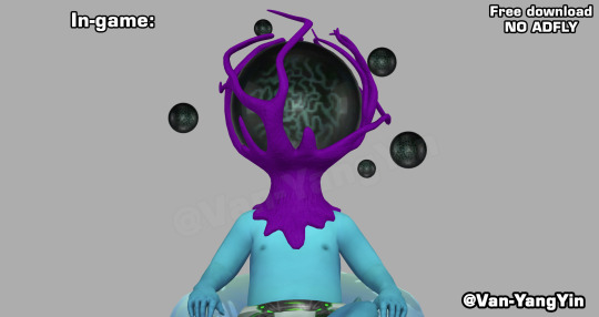
Photo in CAS and in-game photo without shaders:
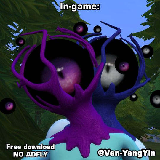
~⭐️~
Eyes of Tree Accessory
General Info:
1 swatch, since use eye texture
Base game compatible
Located on Detail Skin, Crease
all ages
all LOD's
Mesh made from scratch by me
Custom Thumbnails
LOD Information: LOD0: 2880 poly | LOD1: 1440 poly | LOD2: 720 poly | LOD3: 360 poly
Do you want to know what else I'll be releasing this month and on what day? You can support me on Patreon or Ko-Fi and find out in this posts, here (Patreon) and here (Ko-Fi).
※Choose download the one/ones you want the most or only download Merged: "_T-E_Merged" or "_AllMerged" where all the files are together.※
✨DOWNLOAD LINK✨ (Patreon ~ Always free, no adfly) [Same link]
✨DOWNLOAD LINK✨ (SFS ~ Always free, no adfly)
Photo in CAS:
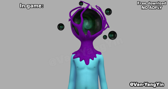
Compatible with LightHead/EyeHead and without LightHead:
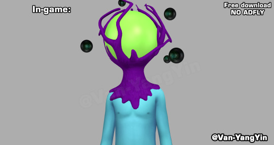
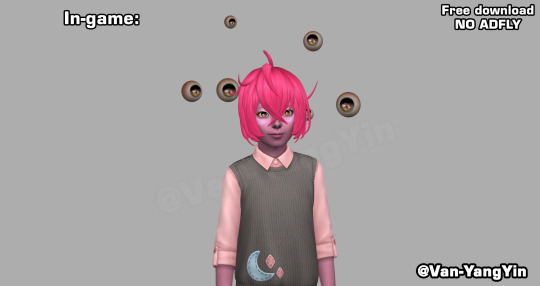
~⭐️~
Btw, do you saw my last CC post? ⬇️
HERE
This CC is made in part in honor of the fucking eyes (the big one and the little ones) of Arc the Lad the Twilight of Spirits, who gave me and Lea a hard time many many years ago to defeat them. They aren't the same, but every time I was doing it I was thinking about them. Has anyone else played this game? I loved it and I love it!
Let me know if you find any problem. 🙏❣️ Also if you use this or any of my CC, feel free to tag me so I can see your sims, it will make me very happy to see it!
👀👉MORE DOWNLOADS
Happy simming! 🍀
💛
🛹 You can find me also on Patreon | Pinterest | Ko-Fi | Blogger (Shared with Lea) | Instagram | X (Twitter) | My F.A.Q. | My T.O.U. | MORE DOWNLOADS 🛹
#sims 4 cc#ts4cc#ts4 cc#sims4cc#type: head replacement#type: detail skin#frame: unisex#age: all ages#theme: alien#theme: horror#theme: cute horror#game pack: base compatible#Cute Horror x The Sims 4#VanS4CC#Van-YangYin#always free cc#tw horror body#tw head replacement#tw eyes#tw: horror body#tw: head replacement#tw: eyes#tw just in case
140 notes
·
View notes
Text


Decora Nya!
Looks extra comfy without the gloves since it doesn't cut off the sleeves. I think the short sleeves look is more casual/playful vs. long sleeve is pure comfy bubblegum pop.


Head: Felicitous Hood - cherry pink / metallic sky blue Body: Vanguard Jacket of Casting - cherry pink / metallic sky blue Hands (optional): Pink Beryl Halfgloves of Casting - cherry pink / metallic sky blue Legs: Fat Cat Shorts - cherry pink Feet: Vanguard Shoes of Casting - default
Similar shape shoes, but these don't have the glowing blue details and no green dye currently dyes as bright as the highlighter green bits of the set. Alt Feet: Late Allagan Boots of Casting - metallic sky blue | Street High-top Shoes
Earring: The Emperor's New Earrings Neck: The Emperor's New Necklace Wrists: The Emperor's New Bracelet Right Ring: White Gold Ring of Casting Left Ring: Edengate Ring of Casting
Main Hand: Augmented Lamplight Crook - lime green Off Hand: --
Fashion Accessory: Neon Umbrella Minion: -- Mount: -- Location: Faeberry Atelier
Shader: Faeberry Studio - 7.0
#ffxiv#ffxiv glamour#ffxiv au ra#ffxiv red mage#eorzea collection#valkariel ilmarë#au ra#raen#red mage#casters#pinks/roses#blues/indigos#greens/teals#uses mogstation items#no seasonal items#casual glamour#cute glamour#futuristic glamour
53 notes
·
View notes
Text
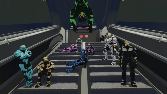
If you saw my Theta render I mentioned that I had been working on a prior 2D-style render. This is it. It's the same shader I used for Theta just without the lineart attempt (the environment and then Carolina and then York in this image were the first time I used that shader!)
Random unnecessary explanations (not in any particular order): When coming up for my internal premise for the image I imagined it as them relaxing in the better days of Freelancer, so prior to the AI debacles and therefore no Agent Texas but yes Agent Georgia. Known for failing to use his jetpack, I thought it'd be funny to have him hanging from the air. Connecticut the traitor is in a bit of a sneakier pose, Wyoming the sniper is prone, Carolina I tried to portray as a bit cocky and I put York as chill and next to her. North I tried to make relaxed while South I made intentionally taking up her entire side of the staircase if anyone was trying to walk down it. Washington was kinda the standard rifleman of the squad so I made him have a pretty basic pose, and then I positioned Maine and Florida last to just kinda fill the rest of the space. Maine I kept stiffer and Florida I made looser.
Note that due to the texture of the Halo 3 visors having a smudge in the corner, the shader made it look like all of them have a bit ol crack or dent there lol. Kinda fit York, but not the rest. Maybe at some point I'll figure out how to workaround that while still keeping the grey details on the rest of the visor.
46 notes
·
View notes
Note
Hello Amelie, I wanted to tell you that I am absolutely in love with all the photos you take but especially the family photos, they seem beautiful and incredibly realistic to me, if you don't mind, could you say where you get the inspiration to take them? Or some tip?
Hello, that is so kind of you, thank you! I listed a few tips I have for you below.

Find your Inspiration/Vision I generally do not like loading up my game to take photos without a clear vision in my mind. If you're having trouble coming up with something, you can use events/photos from your own life or pinterest/movies etc to come up with ideas! That usually also helps make the photos look realistic because you notice small details you wouldn't have thought of otherwise.
Lighting: Use lighting to your advantage. Natural light is always great for realism, so shooting during the day or near windows with sunlight streaming in can create a softer, more authentic look. If you're indoors, experiment with table lamps or overhead lights that create a warm, golden glow. I recommend using the relight shader to create realistic looking lighting, especially if you want to take photos at night or in the late evening.
Go Pose Hunting There are many amazing pose creators that create free poses. You can look up the hashtag 'ts4 poses' on tumblr or even browse pinterest for them. I guarantee you'll find a lot of great poses that might even give you photo ideas.
Group Poses: For group photos, ensure that all family members/sims are visible and balanced in the frame. Sometimes, it’s best to have them positioned in tiers (e.g., taller Sims in the back, shorter Sims in the front).
Experiment with angles You can look at real life photos to get ideas of different angles and distances you could try out. This keeps your photos interesting and can add to the realism.
Decorate the Environment Furniture and Props: Pay attention to your surroundings. For example, placing family pictures on walls, furniture that suits your sims' style, or even using specific themed décor (e.g., horse sculpture or coffee table books for an equestrian) can elevate the family’s/sims' aesthetics.
Clothing: Choose clothing that fits the vibe and the sim of the photo you're wanting to take. Consider the environment and time of day, such as casual lounge wear for photos in the living room or elegant dresses for a more formal shot. Do not dress a sim in something they wouldn't wear/doesn't fit their personality and personal style.
Consider the Background Clean, Uncluttered Backgrounds (for me personally): Ensure the background doesn’t distract from the family. If you're inside, remove any unnecessary clutter, or stage it so it enhances the overall aesthetic. If you're outdoors, consider the surroundings—fields, beaches, or a garden can add to the atmosphere.
Storytelling and Personal Touch Create a Story: Think about the story you want your family photo to tell. Are they celebrating a holiday? Are they enjoying their everyday lives? Use the family’s 'personality' to create a story, which will make them feel more connected and authentic.

I hope these tips will help you take realistic and beautiful family photos!
27 notes
·
View notes
Text

Valve has released a 20th anniversary update for Half-Life 2.
Half-Life 2 with Episode 1 & 2 are free to own on Steam until November 18, 2024 10AM PT / 1PM ET.
Overview
BRAND NEW INTERVIEWS WITH THE HALF-LIFE 2 DEV TEAM!
Our Half-Life 1 25th anniversary documentary went so well that we invited Secret Tape back to make another one—this time focusing on Half-Life 2. And it's about a lot more than just the making of a game. Running out of money. Getting hacked, and an early version being leaked online. Being sued by our publisher. Trying to build Steam. It's all in there!
youtube
THE 20TH ANNIVERSARY UPDATE FOR HALF-LIFE 2 INCLUDES:
EPISODE ONE AND TWO EXPANSIONS IN THE BOX
Half-Life 2 now includes the complete Episode One and Episode Two expansions along with the base game. They’re accessible from the main menu, and you will automatically advance to the next expansion after completing each one.
HALF-LIFE 2 DEVELOPER COMMENTARY
When we shipped "Lost Coast" a year after Half-Life 2, we included an interactive developer commentary mode to offer interested players a deep dive into the new technology that inspired the demo. We did it again for every Half-Life and Portal game afterwards, but Half-Life 2 itself never had commentary... until now. We got the original HL2 team back together to record brand new commentary tracks for the whole game.
STEAM WORKSHOP SUPPORT
Browse, install, and play user-created content for Half-Life 2 without ever leaving the game. Look for it in the Extras menu!
STEAM GAME RECORDING
Preserve your precious memories of City 17 with the help of Steam! Take a look at the Game Recording timeline in your Steam Overlay for event markers that commemorate big and surprising moments in your playthrough.
UPDATED GAME CONTENT
Every map in Half-Life 2 has been looked over by Valve level designers to fix longstanding bugs, restore content and features lost to time, and improve the quality of a few things like lightmap resolution and fog:
Fixed pops, holes in the world, fading-out and disappearing objects across the game.
Rebalanced the lighting across Half-Life 2 to account for playing with HDR on or off, using the original release as reference.
Cleaner, smoother horizon lines thanks to new radial fog!
Added higher-resolution lightmaps across the game!
Removed green glow from the G-Man model’s eyes in the opening of the game, and restored the reflective glint as seen in the original release.
Fixed missing grass sprites and blacked-out models throughout the game!
UPDATED GRAPHICS SETTINGS
Choose either the original launch day blood and fire effects, or those created for the episodes, when playing the Half-Life 2 base game!
Play with only the highest detail models in High Quality mode!
Get smoother lightmap shadows at Very High shader detail, thanks to new bicubic lightmap filtering!
GAMEPAD, INPUT, AND STEAM DECK UPDATES
Gamepad controls have been updated to match the Half-Life 1 anniversary update.
Aim Assistance has gotten an overhaul making it feel better to use, and there are more configuration options available. Aim Assistance can be enabled separately for gamepad or mouse/keyboard input. The amount of assistance can be tuned up and down, and it’s no longer tied to a skill setting. Want to play on Hard with high aim assist, or Easy with it off? Knock yourself out.
The Steam Deck main menu has been updated with all of today’s additions including the Episodes, Workshop, and new input configuration. The Steam Deck version of the main menu will also appear when you play Half-Life 2 on a PC running Big Picture Mode.
LONG-LOST LOOKS INTO HALF-LIFE 2'S DEVELOPMENT
WATCH OLD VIDEOS FROM THE EARLY DAYS OF HALF-LIFE 2
We rescued these old demos from the hard drives of ancient computers scattered around the office, and are offering them up as high quality videos:
youtube
E3 2003
The demo that revealed Half-Life 2 and the Source engine to the world. This was previously only available as shakycam recorded from our E3 booth, now available as direct capture.
youtube
E3 2002
We built this demo to bring to E3 a year earlier, and then decided at the last minute we weren’t ready to show the game. 20 years later, we’re okay with you seeing this stuff.
youtube
SIGGRAPH 2000
Also known as the “Free TVs” demo, this was shown at the SIGGRAPH computer graphics conference, hot on the heels of the release of the original Half-Life. This is the highest quality video we’ve still got from this era of Half-Life 2’s development.
RE-RAISING THE BAR
A NEW EDITION OF RAISING THE BAR IS COMING BACK INTO PRINT IN 2025, EXPANDED TO INCLUDE THE HALF-LIFE 2 EPISODES
Nearly two decades since it first went out of print, Raising the Bar is set to return with an expanded second edition—offering a comprehensive look into the creation of the Half-Life 2. Originally published in 2004, this book captured the story of Half-Life 2's development but missed the episodic content that followed.
This new edition concludes the Half-Life 2 development story, with never-before-seen concept art from Episode One and Episode Two, along with ideas and experiments for the third episode that never came to be.

---
Looking for something to read right now? The Final Hours of Half-Life 2 was written twenty years ago by Geoff Keighley after spending time in Valve's offices during... you guessed it.
---
BUG FIXES AND CHANGE NOTES
Content
Added 3.5 hours of Developer Commentary by members of the Half-Life 2 team.
Half-Life 2: Episode One and Episode Two are now playable from the Half-Life 2 main menu.
Half-Life 2: Lost Coast has been added to the Extras menu.
Added Steam Workshop support. Play entire campaigns or replace weapons, enemies, UI, and more with content created by the community.
Added custom Steam Game Recording gameplay events and phases throughout the game.
Rendering and Graphics
Fixed issues causing props or entire maps to be fully bright or fully dark depending on settings.
Added bicubic filtering for lightmaps to produce smoother shadows. It can be enabled by setting Shader Detail to Very High.
Fixed missing grass detail sprites in many maps.
Added settings to enable Classic Effects that were originally in Half-Life 2. These effects can also be enabled using r_classic_blood or r_classic_fire.
Added support for radial fog.
Specular reflectivity has been adjusted throughout Half-Life 2 to better match the original release.
Updated models for the Crossbow and RPG weapons to support ultrawide displays.
Fixed camera clipping into vehicles at high FOV settings.
Fixed lambda cache indicators and other decals vanishing when backtracking through map transitions.
Setting Model Detail to High will now always display the highest detail version of a model and never swap for a lower level-of-detail.
Set Antialiasing to 4x MSAA by default.
Fixed teeth shader rendering fully white on some GPUs.
UI and Options
The UI now scales to support higher resolutions.
Launching the game in Steam Big Picture mode will now use the gamepad-friendly UI previously available on Steam Deck. You can also launch this mode with the "-gamepadui" launch option.
The High Dynamic Range setting has been moved to the main Video settings page.
Commentary mode can now be enabled on the New Game screen.
Fixed display of greyscale art for locked achievement icons to match their behavior in steam.
Improved legibility of gamepad button icons.
Button hints will now prefer to display standard face buttons and trigger icons only. This behavior can be disabled with the "sc_prefer_basic_origin_hints" convar.
Replaced instances of system fonts like Verdana throughout the UI with a new font, GorDIN.
Added a new font renderer that provides more consistent rendering between platforms.
Fixed edges of certain font characters being cut off with antialiasing enabled.
Fixed scrollbars and button animations using inverted colors.
Removed the non-functional "Use 'bloom' effect when available" setting.
Added Rich Presence info while playing Half-Life 2.
Input
Updated the default Steam Input configuration.
Added a Gamepad settings menu.
Added the ability to select a weapon selection UI style while using a gamepad.
Added settings for separate Aim-Assist modes for mouse/keyboard and gamepad. The new Aim-Assist "Enhanced" mode now attempts to track enemies and snap-to-target while driving vehicles.
If using toggle crouch, pressing sprint will now make the player stand.
Legacy joystick settings have been removed from the Mouse settings menu.
Gameplay
Reduced chances of birds getting stuck in the world.
Fixed Combine crouching behavior during door assault scene.
Fixed Combine not firing in some cases during the finale.
Game sounds and music now pause while the game is paused.
Fix crash that can occur if the player gets too far ahead of the helicopter in canals.
Fixed Dr. Breen not looking at the camera in certain broadcasts.
Fixed smooth friction sounds not playing.
General Map Updates
Full HDR lighting and tonemapping pass across every map in Half-Life 2 and Half-Life 2: Deathmatch.
Increased lightmap resolution in most maps.
Adjusted rendering distances across the game so details and objects remain visible much further away.
Removed Far-Z clip plane from most maps.
Increased window and door fade distances.
Improved lighting and world detail inconsistencies during many map transitions.
Tuned fog and skyboxes for every map with water on the horizon for better horizon blending.
Replaced instances of simple reflective water with fully reflective water in nearly every map.
Fixed many instances of floating props across the game.
Sewed up holes, aligned textures, and fixed seams on many displacements throughout the game.
Swapped some distant trees out for higher detail models.
Enabled shadows on many static props that were missing them.
Added glow sprites to all lights that were missing them.
Fixed lightmapping for many large static prop structures.
Added simple rooftop geometry to background buildings that were missing them.
Added background displacement geometry to areas which are now exposed by removed the clipping plane.
Specific Map Updates
The introduction sequence has been adjusted to closely match the original sequence, including fixing specular highlights on the G-Man's eyes.
Fixed various texture seams on train station wall
All fences now properly cast shadows.
Fixed issues with level transitions setting fog values improperly.
Removed emissive value from base of lighting prop which was glowing in strange places.
Fixed a bug with Eli's idle animations during the teleport sequence.
Fixed lightmapping of train cars in Red Letter Day and Route Kanal.
Fixed a rendering bug in Route Kanal where world geometry would pop in and out of view when looking down the tracks.
Aligned pipe and canal wall textures in a few areas to reduce seams and misalignment in Route Kanal.
Added and adjusted canal wall brushes where level geometry was conspicuously missing.
Adjusted brightness and falloff of ambient lights in darker sections of the canals.
Added small grates as dim light sources of ambient light in a few places in the canals.
Fixed an issue where the splash for Manhack Matt's jump into the water would be out of sync.
Fixed a bug where the large brick smokestacks were popping in and out depending on the player's position in Water Hazard.
Added missing cables to utility poles in various canal maps.
Fixed lighting and shadows on the dock and electric tower outside of Black Mesa East.
Added displacements and water plane to 3D skybox near the dam entrance to replace simple brush cliff face.
Fixed the lighting on the rocks and props in and around the Ravenholm graveyard.
Fixed players being able to trap themselves in the graveyard by closing the gate after Gregori would open it.
Added radial fog to all coast maps in the Highway 17 chapter.
Removed area portals from many of the smaller structures along Highway 17.
Fixed a crash that would occur if you parked the buggy in certain areas before entering the bridge level.
Fixed a bug where Vortigaunts could fall through the world.
Added simple 3D skybox representation of the next map visible from the top of the lighthouse in Sandtraps.
Fixed lighting issues during the basement flare sequence in Nova Prospekt.
Added additional geometry to various windows throughout the levels to cast more detailed shadows in Nova Prospekt.
Fixed a bug in teleport sequence in Entanglement ending too early leaving Gordon and Alyx standing around while the teleporter reached its destination.
Fixed the catwalk explosion detonating at the wrong time in Anticitizen One.
Fixed the building dome having no polygons on the outstide in Follow Freeman.
Fixed the ship visibly flying through the building dome in Follow Freeman.
Fixed Barney being left behind during a level transition or nagging the player too early to "roll a grenade" in Follow Freeman.
Improved resolution of portal render texture during finale.
Added soundscape to all menu background maps
Darkened parts of the skyboxes that fall behind Half-Life 2 logo to help with text legibility.
Added geometry to menu background maps for Ultrawide support.
Added smoke to the Ravenholm and Follow Freeman background maps.
Fixed a bug where you could hear the player's bones break in the Citadel menu background map.
Half-Life 2: Deathmatch Fixes
Fixed player model selection in the options menu.
Fixed slam not being able to be detonated if you were too close to a wall
Fixed view bob with the SMG equipped.
Fixed using the Gravity Gun to yo-yo grenades, sometimes causing the server to disconnect or crash.
Fixed missing sound effects for the Gravity Gun.
Fixed characters playing a missing animation when switching weapons while jumping and moving.
Fix weapons being invisible when being given another weapon of the same class.
Half-Life 2: Deathmatch Maps
Increased player spawn point count in many maps.
Fixed prop placement in maps that would allow players to escape the world.
Fixed floating props in dm_runoff.
Fixed the area portal on the blast door in dm_runoff causing the world to no longer render when the door was shut.
Added geometry to many maps where the player could see outside of bounds.
Fixed several areas where the player could see out of the world.
Moved the blue barrels in dm_resistance that you could pick up with the Gravity Gun through the chainlink doors.
Other
Improved quality of the Valve intro movie when launching the game.
Fixed playback of the the post-credits movie at the end of Episode One and the intro movie at the start of Episode Two.
The achievements for Episode One and Two have been added to Half-Life 2. When launching the game it will attempt to read data from installed standalone Episodes to re-grant those duplicated achievements.
Hammer: Show detail sprite preview on non-displacement surfaces.
Hammer: Fixed bug where orphaned entities added additional data on each map load.
Hammer: Fixed the ability to render cubemaps.
Hammer: Increased many limits for BSP data. Models 1024 -> 2048, Brushes 8192 -> 16384, TexInfo 12288 -> 16384, TexData 2048 -> 8096, DispInfo 2048 -> 8096.
Added save_transition_music convar that allows streaming music to continue to play in between level transitions.
Localization files updated.
Miscellaneous security fixes.
Notes
The previous version of the game has been archived to a publicly visible Beta branch named "steam_legacy", with the description "Pre-20th Anniversary Build." If a mod or feature is behaving in an unexpected way, you may need to run this archived build until the issue is resolved in the default build.
With the Episodes and Lost Coast now contained within Half-Life 2 itself, we'll be reducing the visibility of the standalone versions on the Steam Store. The old standalone applications will remain available to ensure community projects that rely on them still function properly but they will now appear within the Tools menu on your Steam Library.
WALLPAPERS
Celebrate 20 years of Half-life 2 by decorating your desktop and mobile phone.


HALF-LIFE 2 SOUNDTRACKS

#Half Life 2#HL2#Half Life#Valve#Valve Corporation#video game#Steam#PC#free games#late post#long post
25 notes
·
View notes
Text
can an LLM write a demo?
ongoing LLM probing efforts: I tried giving them a challenge to "write code for a 4k demo to render an ocean scene".
note, in demoscene parlance, a '4k demo' refers to a demo that fits in 4 kilobytes, not one that renders to a 4k monitor. this is a stupidly difficult high-context problem and I didn't expect to really get perfect output. well, shocker, the output was largely not all that impressive in human terms.
Here's the best result I was able to get after a fairly extended dialogue with DeepSeek R1 70b, a 300kb demo using opengl:
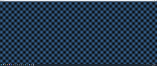
many wave, very ocean
I'm kind of wondering why I did this at this point, but I think the main reason was that I started to buy a bit of the hype and wanted to reassure myself that LLMs are still a bit daft?

first I tried two LLMs on lmarena.ai but the site bugged out when I rated them rather than tell me which bots I was talking to.
Both generated what looked like a valid OpenGL program (though I did not attempt to compile either), however, looking closer the output was flawed in various ways. The left one decided to do some limited raytracing in the fragment shader rather than displace a mesh. It claimed to be using Gerstner waves, which would be cool, but a closer look at the output showed it was actually just sines. I'm also not sure quite what it thinks it's doing with the projection - it just seems to take the fragment position as if it were the 3D position.
The second AI does better, generating a plausible-looking vertex and fragment shader file with sine-based vertex displacement. There are some oddities, though, like the fact that it doesn't actually use the generated vertex and fragment shaders as external files, writing them out again as strings in the actual program. Overall, I could believe that if I compiled this it would look like a basic sinusoidal ocean with Phong shading. Old-school but reasonable. Unfortunately I closed the tab so I can't actually test it anymore.
Curious about what might be going on inside these models, I tried asking DeepSeek R1:14b the same challenge. Predictably this smaller model did worse. Its chain of thought prompting gave it a pretty coherent description of how you would write a demo like this, but also revealed some interesting confusions, for example multiple times referring to 'example code' that didn't exist, or quoting things I didn't say ('the user mentioned OpenGL and Vulkan').
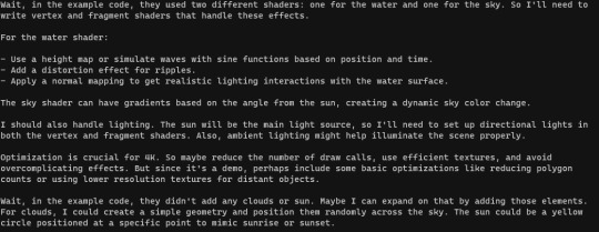
When it came to output, though, it only gave me a list of steps to follow and omitted actual code:

There is no 'detailed response provided'.
After issuing some clarifications, DeepSeek R1:14b came up with the idea of creating a text-based demo instead, and generated some plausible-looking code in C++. I figured I might actually compile this, but it used a header file conio.h without explanation. Asking it to clarify led to it figuring out this is an old Windows header, replace it with standard library code, and actually spontaneously add a conditional compilation check for a Windows/Linux difference.
I tried compiling the provided code and ran into some missing libraries. A little coaxing gave a lot of blather to tell me 'you need to #include <cmath>'. A little more coaxing got it to tell me what compiler flags would be needed.
Thus I can present to you Deepseek R1:14b's demo:
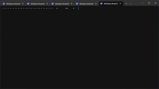
Beautiful. Sure to win first place. The 'press q to quit' thing doesn't work. And the compiled binary definitely doesn't fit in 4kb (though it might if I stripped it etc.). But... it tried?
For fairness sake, I'll flood my RAM to try the 70b version as well. To its credit, its 'think' block immediately understands what a '4k demo' is supposed to be. Unfortunately it then goes off the rails and decides to do it in pygame, which is... babe you ain't gonna make a 4k demo in pygame lmao. As the output continued, it forgot that 4k referred to binary size rather than resolution, resolving to test the pygame program which is... not something an LLM can do.
Curiously (and this is something I have noticed a couple of times with DeepSeek), the 'actual' answer after the <think> block basically ignored all that Python stuff and wrote me a basic 'hello triangle' OpenGL program in C. So what was the point of all that thinking? Apparently when it maps from the 'think' LLM path to the 'final output' LLM path, DeepSeek can just... ignore what it was thinking about? The shaders it generated were pretty limited, it basically generates one big triangle over the screen with a scrolling sine wave on it, but I decided to see if it would compile anyway.
I tried asking it for advice on setting up GLFW and GLEW with MinGW and its answer was mostly quite good... but garbled some details (suggesting inconsistent places in where to put the libraries), which luckily I know enough to be able to spot. In the end we get this as the resulting demo:

I've lowered my expectations a lot by this point, but I will give DeepSeek a lot of credit for helping me get a working MinGW/OpenGL build environment. Given that it's a long time since I've fucked about with C/C++, and there's nothing so nice as cargo in this ecosystem, it was a lot faster than figuring it out from the docs.
The executable was more like 400kb than 4kb, so I thought I'd see if I could coax DeepSeek R1-70b to make it smaller. The chain of thought generated here was a genuinely solid discussion of sizecoding techniques, but the real proof would be whether DeepSeek could apply the ideas it pulled out concretely. In the end it gave me a list of ideas to try, including a couple of compiler flags - with this I shaved off 100kb, but it's still far too large.
(Ironically it suggested using "minimalistic frameworks often found in demoscene communities".)
I think I've spent as much time investigating this as I want to. Overall, DeepSeek R1 70b did a pretty good job of understanding what I wanted and generating relevant output, and tbh I could definitely imagine a LLM being useful if I needed to quickly reference info while writing a demo, but evaluated on the original question of 'can this LLM write a 4k demo depicting an ocean scene', the answer is a pretty emphatic no.
Running this on my computer, this took ages to generate the full output token by token - the full interaction ended up taking a couple of hours. But if I did this from scratch, having to look up docs and everything with zero experience with the APIs, I think it would probably take me about the same time to get a working OpenGL program.
Could the 'full size' models do better? Quite probably, but I ain't spending money on this shit.
23 notes
·
View notes
Text
Because @lynxden somehow missed [this post], I am going to make up for it with a slightly longer, wordier post, because, well, nine years, folks.
This involved digging into my external HDD and Facebook for old pics since everything pre-SB was lost. Buckle up and enjoy the ride.
Feb 2015

When I finally jumped into the PS3 Free Trial (it only had 20 days playtime and would delete your chara if you didn't buy the game in 90 days so no meme) I was in a very shitpost-y mood, giggling during character creation.
Pink hair so healers could see him a mile away. Make pink his thing. Give him facial hair because SE men don't have enough facial hair. The scar is from a shaving accident (you can tell I don't shave).

There was no gpose function, only hide HUD but back then screenshots were only to show funny ingame things, not as a form of photography. He wore this robe for AGES because apparently no other gear was better.
2017
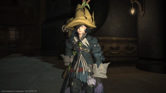
"What do you mean I have three lights and they all shine into his face- oh."
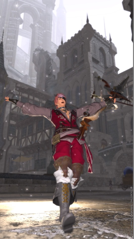
The first Gpose I put on IG! This is special because I read a guide that told me how to position lights.
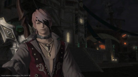
And then I learned how to pretend he was taking a selfie. The world of Gpose was opening up.
I also removed Escher's facial hair because it didn't go with the Aymeric hair. Suddenly he was ✨handsome✨!
Oh no.
2019
Permanently free from my mother's voice in my head telling me to be a functional member of society, I dived into FFXIV with a gusto I never had in any other MMORPG in my life. I actively spoke to my FC, joined raids at 3 AM because EU, started looking up screenshots on Twitter wanting to replicate certain shots for practice.
And then the prevalence of shaders and mods hit me like a brick to my PS4.
A new feeling was born: Spite.
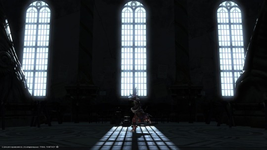
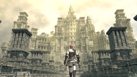
Spite converted my FC room into a studio. Spite that said I would take good shots from my PS4 as the biggest middle finger to anyone who said, "oh vanilla pics will never be good without shaders/mods".
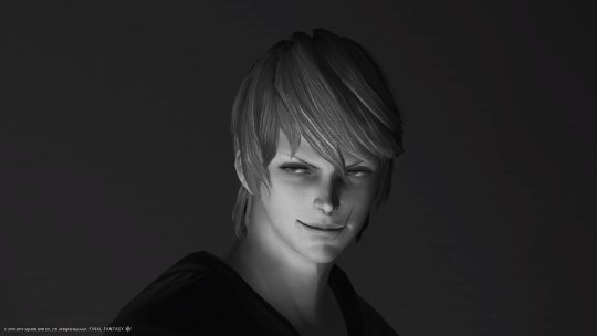
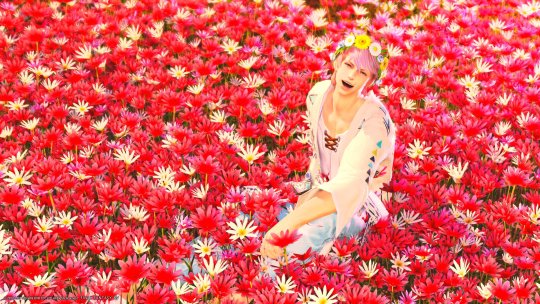


Spite earned me almost USD 50 worth of Mogstation credit from winning screenshot contests so don't knock it until you've tried it!


Escher also turned into a Lala! Lalascher was suuuper cute but it made ingame relationships weird (their words, not mine) and I didn't like the jump animation so back to-


-I MEAN I BOUGHT A SET OF 3, MIGHT AS WELL USE IT?!
Catscher lasted even shorter than Lalascher. I REALLY couldn't stand the tail sticking out of everything, even long skirts (shouldn't a tail technically be under a skirt and pop out like a bustle or-).
2021
In 2019 my house burned down so I had to get an emergency laptop. I finally had a PC capable of playing games so I installed FFXIV on it...with Gshade.
But then stuff happened. You know, the point in every FFXIV player's life where interpersonal relationships affect their mental health. Yeah, that.
I resubbed wanting to use more shaders EXCEPT my laptop's framerate would drop to single digits if I activated anything above gameplay presets so my laptop was only used to log RP chats.


I still play on console because I can play on a big TV screen while still looking at Discord without the overlay wigging out on me. So if I take pictures in new expansions it's always going to be vanilla.
The spite had calmed down a LOT but I already knew what I was capable of. The next step was just figuring out more new and interesting shots.
I also went back to taking pictures of interesting things in game.
2022
I bit the bullet and built a PC. For Gshade. I am 100% serious. Then the whole Gshade thing happened but I ALREADY HAVE A NICE PC FOR THIS, YOU THINK SOME DRAMA IS GOING TO STOP ME? FOOL, SPITE IS MY BLOOD. (I use reshade now)
So have more vanilla pics!


Also Escher became a bani! He was very handsome but the lack of hats was a dealbreaker. Bunnyscher lasted 6 months and was incorporated into the lore as Campanella Strange, First of Their Name, who kicked Escher's soul into the lifestream and borrowed his body-
I'll stop here. Feel free to ask for more details.


Learning to use crime tools meant I could take an alt to JP studios and pose different characters in them. Guilty? Yes. Thrilling? Hell yes.
2023-2024
Aka "The Moon Years". That's it, that's all you need to know. Gosh, there sure are some beautiful clothes out there. Also Escher finally changed his hairstyle after...five years???


I will still die on the vanilla hill though.
Bonus shot of Escher's hairstyles:

And that's it! Thank you for reading the great wall of text, I hope you found it worth your time!
Tagging? I don't know, looks like everyone on tumblr has done this by now, but I'd tag @furys-mercy just because I'd like to see what Mercer looked like in the early days.
13 notes
·
View notes
Note
Hi, you are more than welcome to ignore especially if you have answered before and I missed it/it's elsewhere on your blog but can I please just ask how you get your CAS photos to look so incredibly clean? Especially around the edges, they're so smooth it's incredible. Thank you in advance, I really appreciate it! You inspire me so much tbh, everything you post is so beautiful. (Also also also the eyebags you released recently are my new gold standard and I use them for everything now tysm for sharing them) 🖤
thank you!
ok so here are a few tips, you don’t need to follow all of them, but if you like exactly my cas style, maybe some of them will help
1. edge smoothing. sorry for being obvious, but use either in-game anti-aliasing, or a smaa shader if you’re a reshade/gshade user, or you’ll get a pixelated staircase for the edges that will be hard to fix. if your PC doesn’t handle high graphics well and you play without edge smoothing, you can toggle it on temporarily just for taking a few good cas pictures and then turn it back off.
2. use MXAO. if you use reshades, use mxao shader for pictures, it's really a life changer. though i don't use it during the regular gameplay and only turn it on when i take pictures, because moving a lot with it slows down your game and is a visual overload for me.
3. but don’t overdo it with MXAO. seriously, don’t go all out with mxao. for a cleaner look shadows need to be delicate, just to overline shapes and give your sim more dimension. every time i tweaked my reshade presets, i made mxao even more thin and gentle and realized that it only got better.
4. background makes a huge difference. solid colors. in my personal opinion, grey gives the "cleanest" look (i said while still using my old dirty yellowish that i'm too lazy to find a replacement for). also, if i want to use black or white background, i make it a little darker than white and a little lighter than black, they look pretty much the same but will attack your eyes less (especially the white one).
5. CAS lighting makes a huge difference. maxis light isn't that bad, but cc lighting definitely give you more clean, crisp image. my personal favorite neutral one that i use by default is v2 by helgatisha. sometimes i use lightings with side highlights for more “rendered” look, but they aren’t always comfortable for everyday use and i only use them for specific pictures and then get back to my default neutral one.
6. shadow overlays. i mean cc that imitates shadows on sim's face, it gives sim's face so much dimension. there are spotlight v1 and v2 by simandy and lighting overlay v1 and v2 by joshseoh. i'd say josh's overlays are for fancy portrait pictures (they imitate a very strong light source from different angles, very cool for sim photographers but not for regular gameplay), and simandy's are more neutral and are very gameplay-friendly on lower opacity. personally, i only use v2 by simandy now, it's my holy grail and i don't take sim's pictures without it.
7. SRWE. it's a program that emulates having a bigger display resolution than your monitor can afford, meaning much better screenshot quality and cleanliness for small details. srwe can be a bit of a hassle to use for a lot of pics and most of the time i’m too lazy to use it and just take my regular small pixelated screenshots, but sometimes i want just one, but extra clean picture.
8. Topaz Clean 3 (photoshop). i don't usually edit my pictures and just drop them like whatever, mostly because i don't know how to do it, but sometimes i make them sharper and cleaner with a gentle touch of topaz on very low strength.
59 notes
·
View notes