#will edit it when on my pc and not mobile!!!
Explore tagged Tumblr posts
Text
⭐ So you want to learn pixel art? ⭐
🔹 Part 1 of ??? - The Basics!
Edit: Now available in Google Doc format if you don't have a Tumblr account 🥰
Hello, my name is Tofu and I'm a professional pixel artist. I have been supporting myself with freelance pixel art since 2020, when I was let go from my job during the pandemic.


My progress, from 2017 to 2024. IMO the only thing that really matters is time and effort, not some kind of natural talent for art.
This guide will not be comprehensive, as nobody should be expected to read allat. Instead I will lean heavily on my own experience, and share what worked for me, so take everything with a grain of salt. This is a guide, not a tutorial. Cheers!
🔹 Do I need money?
NO!!! Pixel art is one of the most accessible mediums out there.
I still use a mouse because I prefer it to a tablet! You won't be at any disadvantage here if you can't afford the best hardware or software.
Because our canvases are typically very small, you don't need a good PC to run a good brush engine or anything like that.
✨Did you know? One of the most skilled and beloved pixel artists uses MS PAINT! Wow!!
🔹 What software should I use?
Here are some of the most popular programs I see my friends and peers using. Stars show how much I recommend the software for beginners! ⭐
💰 Paid options:
⭐⭐⭐ Aseprite (for PC) - $19.99
This is what I and many other pixel artists use. You may find when applying to jobs that they require some knowledge of Aseprite. Since it has become so popular, companies like that you can swap raw files between artists.
Aseprite is amazingly customizable, with custom skins, scripts and extensions on Itch.io, both free and paid.
If you have ever used any art software before, it has most of the same features and should feel fairly familiar to use. It features a robust animation suite and a tilemap feature, which have saved me thousands of hours of labour in my work. The software is also being updated all the time, and the developers listen to the users. I really recommend Aseprite!
⭐ Photoshop (for PC) - Monthly $$
A decent option for those who already are used to the PS interface. Requires some setup to get it ready for pixel-perfect art, but there are plenty of tutorials for doing so.
Animation is also much more tedious on PS which you may want to consider before investing time!
⭐⭐ ProMotion NG (for PC) - $19.00
An advanced and powerful software which has many features Aseprite does not, including Colour Cycling and animated tiles.
⭐⭐⭐ Pixquare (for iOS) - $7.99 - $19.99 (30% off with code 'tofu'!!)
Probably the best app available for iPad users, in active development, with new features added all the time.

Look! My buddy Jon recommends it highly, and uses it often.
One cool thing about Pixquare is that it takes Aseprite raw files! Many of my friends use it to work on the same project, both in their office and on the go.
⭐ Procreate (for iOS) - $12.99
If you have access to Procreate already, it's a decent option to get used to doing pixel art. It does however require some setup. Artist Pixebo is famously using Procreate, and they have tutorials of their own if you want to learn.
⭐⭐ ReSprite iOS and Android. (free trial, but:) $19.99 premium or $$ monthly
ReSprite is VERY similar in terms of UI to Aseprite, so I can recommend it. They just launched their Android release!
🆓 Free options:
⭐⭐⭐ Libresprite (for PC)
Libresprite is an alternative to Aseprite. It is very, very similar, to the point where documentation for Aseprite will be helpful to Libresprite users.
⭐⭐ Pixilart (for PC and mobile)
A free in-browser app, and also a mobile app! It is tied to the website Pixilart, where artists upload and share their work. A good option for those also looking to get involved in a community.
⭐⭐ Dotpict (for mobile)
Dotpict is similar to Pixilart, with a mobile app tied to a website, but it's a Japanese service. Did you know that in Japanese, pixel art is called 'Dot Art'? Dotpict can be a great way to connect with a different community of pixel artists! They also have prompts and challenges often.
🔹 So I got my software, now what?
◽Nice! Now it's time for the basics of pixel art.
❗ WAIT ❗ Before this section, I want to add a little disclaimer. All of these rules/guidelines can be broken at will, and some 'no-nos' can look amazing when done intentionally.
The pixel-art fundamentals can be exceedingly helpful to new artists, who may feel lost or overwhelmed by choice. But if you feel they restrict you too harshly, don't force yourself! At the end of the day it's your art, and you shouldn't try to contort yourself into what people think a pixel artist 'should be'. What matters is your own artistic expression. 💕👍
◽Phew! With that out of the way...
🔸"The Rules"
There are few hard 'rules' of pixel art, mostly about scaling and exporting. Some of these things will frequently trip up newbies if they aren't aware, and are easy to overlook.
���Scaling method
There are a couple ways of scaling your art. The default in most art programs, and the entire internet, is Bi-linear scaling, which usually works out fine for most purposes. But as pixel artists, we need a different method.


Both are scaled up x10. See the difference?
On the left is scaled using Bilinear, and on the right is using Nearest-Neighbor. We love seeing those pixels stay crisp and clean, so we use nearest-neighbor.
(Most pixel-art programs have nearest-neighbor enabled by default! So this may not apply to you, but it's important to know.)
🔹Mixels
Mixels are when there are different (mixed) pixel sizes in the same image.


Here I have scaled up my art- the left is 200%, and the right is 150%. Yuck!
As we can see, the "pixel" sizes end up different. We generally try to scale our work by multiples of 100 - 200%, 300% etc. rather than 150%. At larger scales however, the minute differences in pixel sizes are hardly noticeable!
Mixels are also sometimes seen when an artist scales up their work, then continues drawing on it with a 1 pixel brush.

Many would say that this is not great looking! This type of pixels can be indicative of a beginner artist. But there are plenty of creative pixel artists out there who mixels intentionally, making something modern and cool.
🔹Saving Your Files
We usually save our still images as .PNGs as they don’t create any JPEG artifacts or loss of quality. It's a little hard to see here, but there are some artifacts, and it looks a little blurry. It also makes the art very hard to work with if we are importing a JPEG.

For animations .GIF is good, but be careful of the 256 colour limit. Try to avoid using too many blending mode layers or gradients when working with animations. If you aren’t careful, your animation could flash afterwards, as the .GIF tries to reduce colours wherever it can. It doesn’t look great!

Here's an old piece from 2021 where I experienced .GIF lossiness, because I used gradients and transparency, resulting in way too many colours.
🔹Pixel Art Fundamentals - Techniques and Jargon
❗❗Confused about Jaggies? Anti-Aliasing? Banding? Dithering? THIS THREAD is for you❗❗ << it's a link, click it!!
As far as I'm concerned, this is THE tutorial of all time for understanding pixel art. These are techniques created and named by the community of people who actually put the list together, some of the best pixel artists alive currently. Please read it!!
🔸How To Learn
Okay, so you have your software, and you're all ready to start. But maybe you need some more guidance? Try these tutorials and resources! It can be helpful to work along with a tutorial until you build your confidence up.
⭐⭐ Pixel Logic (A Digital Book) - $10 A very comprehensive visual guide book by a very skilled and established artist in the industry. I own a copy myself.
⭐⭐⭐ StudioMiniBoss - free A collection of visual tutorials, by the artist that worked on Celeste! When starting out, if I got stuck, I would go and scour his tutorials and see how he did it.
⭐ Lospec Tutorials - free A very large collection of various tutorials from all over the internet. There is a lot to sift through here if you have the time.
⭐⭐⭐ Cyangmou's Tutorials - free (tipping optional) Cyangmou is one of the most respected and accomplished modern pixel artists, and he has amassed a HUGE collection of free and incredibly well-educated visual tutorials. He also hosts an educational stream every week on Twitch called 'pixelart for beginners'.
⭐⭐⭐ Youtube Tutorials - free There are hundreds, if not thousands of tutorials on YouTube, but it can be tricky to find the good ones. My personal recommendations are MortMort, Brandon, and AdamCYounis- these guys really know what they're talking about!
🔸 How to choose a canvas size
When looking at pixel art turorials, we may see people suggest things like 16x16, 32x32 and 64x64. These are standard sizes for pixel art games with tiles. However, if you're just making a drawing, you don't necessarily need to use a standard canvas size like that.
What I like to think about when choosing a canvas size for my illustrations is 'what features do I think it is important to represent?' And make my canvas as small as possible, while still leaving room for my most important elements.
Imagine I have characters in a scene like this:
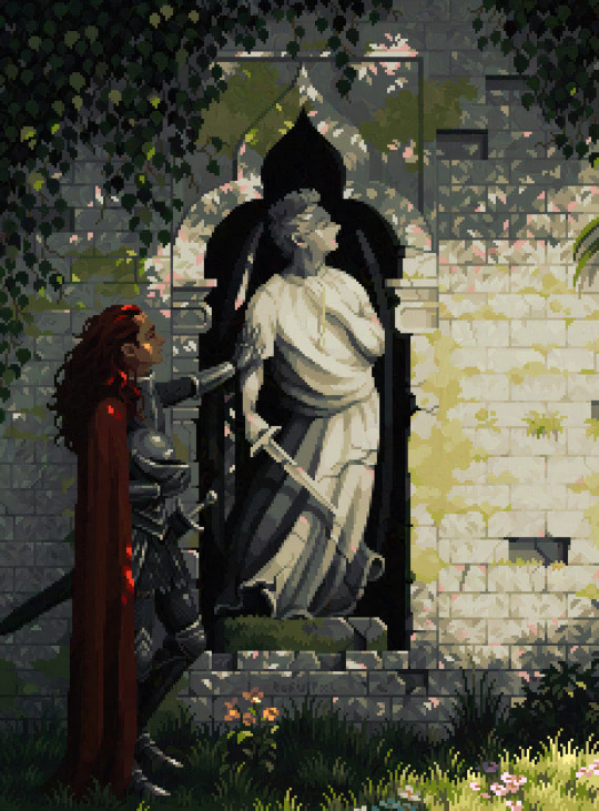
I made my canvas as small as possible (232 x 314), but just big enough to represent the features and have them be recognizable (it's Good Omens fanart 😤)!! If I had made it any bigger, I would be working on it for ever, due to how much more foliage I would have to render.
If you want to do an illustration and you're not sure, just start at somewhere around 100x100 - 200x200 and go from there.
It's perfectly okay to crop your canvas, or scale it up, or crunch your art down at any point if you think you need a different size. I do it all the time! It only takes a bit of cleanup to get you back to where you were.
🔸Where To Post
Outside of just regular socials, Twitter, Tumblr, Deviantart, Instagram etc, there are a few places that lean more towards pixel art that you might not have heard of.
⭐ Lospec Lospec is a low-res focused art website. Some pieces get given a 'monthly masterpiece' award. Not incredibly active, but I believe there are more features being added often.
⭐⭐ Pixilart Pixilart is a very popular pixel art community, with an app tied to it. The community tends to lean on the young side, so this is a low-pressure place to post with an relaxed vibe.
⭐⭐ Pixeljoint Pixeljoint is one of the big, old-school pixel art websites. You can only upload your art unscaled (1x) because there is a built-in zoom viewer. It has a bit of a reputation for being elitist (back in the 00s it was), but in my experience it's not like that any more. This is a fine place for a pixel artist to post if they are really interested in learning, and the history. The Hall of Fame has some of the most famous / impressive pixel art pieces that paved the way for the work we are doing today.
⭐⭐⭐ Cafe Dot Cafe Dot is my art server so I'm a little biased here. 🍵 It was created during the recent social media turbulence. We wanted a place to post art with no algorithms, and no NFT or AI chuds. We have a heavy no-self-promotion rule, and are more interested in community than skill or exclusivity. The other thing is that we have some kind of verification system- you must apply to be a Creator before you can post in the Art feed, or use voice. This helps combat the people who just want to self-promo and dip, or cause trouble, as well as weed out AI/NFT people. Until then, you are still welcome to post in any of the threads or channels. There is a lot to do in Cafe Dot. I host events weekly, so check the threads!
⭐⭐/r/pixelart The pixel art subreddit is pretty active! I've also heard some of my friends found work through posting here, so it's worth a try if you're looking. However, it is still Reddit- so if you're sensitive to rude people, or criticism you didn't ask for, you may want to avoid this one. Lol
🔸 Where To Find Work
You need money? I got you! As someone who mostly gets scouted on social media, I can share a few tips with you:
Put your email / portfolio in your bio Recruiters don't have all that much time to find artists, make it as easy as possible for someone to find your important information!
Clean up your profile If your profile feed is all full of memes, most people will just tab out rather than sift through. Doesn't apply as much to Tumblr if you have an art tag people can look at.
Post regularly, and repost Activity beats everything in the social media game. It's like rolling the dice, and the more you post the more chances you have. You have to have no shame, it's all business baby
Outside of just posting regularly and hoping people reach out to you, it can be hard to know where to look. Here are a few places you can sign up to and post around on.
/r/INAT INAT (I Need A Team) is a subreddit for finding a team to work with. You can post your portfolio here, or browse for people who need artists.
/r/GameDevClassifieds Same as above, but specifically for game-related projects.
Remote Game Jobs / Work With Indies Like Indeed but for game jobs. Browse them often, or get email notifications.
VGen VGen is a website specifically for commissions. You need a code from another verified artist before you can upgrade your account and sell, so ask around on social media or ask your friends. Once your account is upgraded, you can make a 'menu' of services people can purchase, and they send you an offer which you are able to accept, decline, or counter.
The evil websites of doom: Fiverr and Upwork I don't recommend them!! They take a big cut of your profit, and the sites are teeming with NFT and AI people hoping to make a quick buck. The site is also extremely oversaturated and competitive, resulting in a race to the bottom (the cheapest, the fastest, doing the most for the least). Imagine the kind of clients who go to these websites, looking for the cheapest option. But if you're really desperate...
🔸 Community
I do really recommend getting involved in a community. Finding like-minded friends can help you stay motivated to keep drawing. One day, those friends you met when you were just starting out may become your peers in the industry. Making friends is a game changer!
Discord servers Nowadays, the forums of old are mostly abandoned, and people split off into many different servers. Cafe Dot, Pixel Art Discord (PAD), and if you can stomach scrolling past all the AI slop, you can browse Discord servers here.
Twitch Streams Twitch has kind of a bad reputation for being home to some of the more edgy gamers online, but the pixel art community is extremely welcoming and inclusive. Some of the people I met on Twitch are my friends to this day, and we've even worked together on different projects! Browse pixel art streams here, or follow some I recommend: NickWoz, JDZombi, CupOhJoe, GrayLure, LumpyTouch, FrankiePixelShow, MortMort, Sodor, NateyCakes, NyuraKim, ShinySeabass, I could go on for ever really... There are a lot of good eggs on Pixel Art Twitch.
🔸 Other Helpful Websites
Palettes Lospec has a huge collection of user-made palettes, for any artist who has trouble choosing their colours, or just wants to try something fun. Rejected Palettes is full of palettes that didn't quite make it onto Lospec, ran by people who believe there are no bad colours.
The Spriters Resource TSR is an incredible website where users can upload spritesheets and tilesets from games. You can browse for your favourite childhood game, and see how they made it! This website has helped me so much in understanding how game assets come together in a scene.
VGMaps Similar to the above, except there are entire maps laid out how they would be played. This is incredible if you have to do level design, or for mocking up a scene for fun.
Game UI Database Not pixel-art specific, but UI is a very challenging part of graphics, so this site can be a game-changer for finding good references!
Retronator A digital newspaper for pixel-art lovers! New game releases, tutorials, and artworks!
Itch.io A website where people can upload, games, assets, tools... An amazing hub for game devs and game fans alike. A few of my favourite tools: Tiled, PICO-8, Pixel Composer, Juice FX, Magic Pencil for Aseprite
🔸 The End?
This is just part 1 for now, so please drop me a follow to see any more guides I release in the future. I plan on doing some writeups on how I choose colours, how to practise, and more!
I'm not an expert by any means, but everything I did to get to where I am is outlined in this guide. Pixel art is my passion, my job and my hobby! I want pixel art to be recognized everywhere as an art-form, a medium of its own outside of game-art or computer graphics!

This guide took me a long time, and took a lot of research and experience. Consider following me or supporting me if you are feeling generous.
And good luck to all the fledgling pixel artists, I hope you'll continue and have fun. I hope my guide helped you, and don't hesitate to send me an ask if you have any questions! 💕
My other tutorials (so far): How to draw Simple Grass for a game Hue Shifting
27K notes
·
View notes
Text
A quick tutorial on how to Download Fics from AO3
After making this poll about the panic that comes when Archive of Our Own goes down, there seems to be a chunk of folks who didn't know they could download fics for offline use, or don't know how to go about it. Here's a quick tutorial for that.
You do not need an AO3 account (unless the fic you are trying to download is restricted to AO3 users only) you only need an internet connection and a device to download to, whether it's PC or a phone.
These instructions work for both desktop and mobile. At the top of the fic, where the chapter index is, there will be the download option on the right side, and an 'Entire Work' button the left side.

For One-Shots: Go ahead and click the download button.
For multiple chapter fics: In order to have the fic download all together instead of downloading each chapter individually, make sure you select the 'Entire Work' button. Like the names says, it displays the entire work on the webpage, and will download the entire fic with all it's chapters in the correct order when you go to download.
Archive of our Own will automatically download the entire fic work now instead of chapters.
Click the download button. You've got a couple of options:
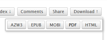
What these options mean:
AZW3 - Amazon-developed ebook format that is designed for Kindles and Amazon's systems. Good if you want to read off of a kindle.
EPUB - Standard file format for Ebooks and is basically used as the default for pretty much most ebook readers. This is what I prefer to use when downloading to my phone.
MOBI - An older version of the AZW3. Older but standard as well.
PDF - Downloads the fics as a PDF. Can be read anywhere you can open a PDF.
HTML - Downloads an offline version of the exact webpage you are looking at. Fine if you want to keep the 'look' of AO3 but you can't change the text size or reading style like you can with ebook formats.
Not sure which one to download? Use EPUB since it's standard and readable by pretty much everything, retains images too.
You now have your fic downloaded to your device and can read it on whatever reading app you have. YAY!
Do keep in mind that these are offline files that do not synch with Archive. So if you download an ongoing fic that updates or is edited since you last downloaded, you will need to download it again to have the updated version.
I highly encourage you download your fics if you are able. Worst case scenario, if AO3 goes down for an indefinite amount of time or the author deletes or hides it, you still have it. (Only download, not distribute.) Best case scenario, you have saved yourself an inconvenience for later.
Happy Reading!
#ao3#archive of our own#download fics tutorial#fandom culture#idk what else to tag this as whoops#i download my own fic a lot so when im out i can reread and check for errors without actually having to be at my pc#edit: they might have changed the download to automatically download the whole fic#but im still downloading single chapters on pc in some formats so cant say for all of them
3K notes
·
View notes
Text
as of 8/3, the most recently updated version of this post is here (it's a reblog of this exact post with more info added)
as a lot of you know, limbus company recently fired its CG illustrator for being a feminist, at 11 pm, via phone call, after a bunch of misogynists walked into the office earlier that day and demanded she be fired. on top of this, as per korean fans, her firing went against labor laws---in korea, you must have your dismissal in writing.
the korean fandom on twitter is, understandably, going scorched earth on project moon due to this. there's a lot currently going on to protest the decision, so i'm posting a list here of what's going on for those who want to limit their time on elon musk's $44 billion midlife crisis impulse purchase website (if you are on twitter, domuk is a good person to follow, as they translate important updates to english). a lot of the links are in korean, but generally they play nicely with machine translators. this should be current as of 8/2.
Statements condemning the decision have been issued by The Gyeonggi Youth Union and IT Union.
A press conference at the Gyeonggido Assembly will occur on 8/3, with lawmakers of the Gyeonggi province (where Project Moon is based) in attendance. This appears driven by the leader of the Gyeonggi Youth Union.
The vice chairman of the IT union--who has a good amount of experience with labor negotiations like these--has expressed strong support for the artist and is working to get media coverage due to the ongoing feminist witch hunts in the gaming industry. Project Moon isn't union to my knowledge, but he's noted that he's taken on nonunion companies such as Netmarble (largest mobile game dev in South Korea) by getting the issue in front of the National Assembly (Korea's congress).
Articles on the incident published in The Daily Labor News, Korean Daily, multiple articles on Hankyoreh (one of which made it to the print edition), and other news outlets.
Segments about the termination on the MBN 7 o' clock news and MBC's morning news
Comments by Youth Union leaders about looking into a loan made to Project Moon via Devsisters Ventures, a venture capital firm. Tax money from Gyeonggi province was invested in Devsisters in 2017, and in 2021, Devsisters gave money to Project Moon. The Gyeonggi Youth Union is asking why hard-earned tax money was indirectly given to a company who violates ESG (environmental, social and governance) principles.
Almost nonstop signage truck protests outside Project Moon's physical office during business hours until 8/22 or the company makes a statement. This occurs alongside a coordinated hashtag campaign to get the issue trending on Twitter in Korea. The signage campaign was crowd-funded in about 3 hours.
A full boycott of the Limbus Company app, on both mobile and PC (steam) platforms. Overseas fans are highly encouraged to participate, regardless if whether they're F2P or not. Not opening the app at all is arguably the biggest thing any one person can do to protest the decision, as the app logs the number of accounts that log on daily. For a new gacha such as Limbus, a high number of F2P daily active users, but a small number of paying users is often preferable to having a smaller userbase but more paying users. If the company sees the number of daily users remain stable, they will likely decide to wait out any backlash rather than apologize.
Digging up verified reviews from previous employees regarding the company's poor management practices
Due to the firing, the Leviathan artist has posted about poor working conditions when making the story. As per a bilingual speaker, they were working on a storyboard revision, and thought 'if I ran into the street right now and got hit by a car and died, I wouldn't have to keep working.' They contacted Project Moon because they didn't want their work to be like that, and proposed changes to serialization/reduction in amount of work per picture/to build up a buffer of finished images (they did not have any buffer while working on Leviathan to my knowledge). They were shut out, and had to suck it up and accept the situation.
Hamhampangpang has a 'shrine' section of the restaurant for fans to leave fan-created merch and other items. They also allow the fans to take this merch back if they can prove it's theirs. Fans are now doing just that.
To boost all of the above, a large number of Korean fanartists with thousands of followers have deleted their works and/or converted their accounts from fanart accounts to accounts supporting the protests. Many of them are bilingual, and they're where I got the majority of this information.
[note 1: there's a targeted english-language disinformation campaign by the website that started the hate mob. i have read the artist's tweets with machine translation, and they're talked about in the second hankyoreh article linked above: nowhere does she express any transphobic or similarly awful beliefs. likewise, be wary of any claims that she supported anything whose description makes you raise eyebrows--those claims are likely in reference to megalia, a korean feminist movement. for information on that, i'd recommend the NPR/BBC articles below and this google drive link of english-language scholarly papers on them. for the love of god don't get your information about a feminist movement from guys going on witch hunts for feminists.]
[note 2: i've seen a couple people argue that the firing was for the physical safety of the employees, citing the kyoani incident in japan. as per this korean fan, most fans there strongly do not believe this was the case. we have english-translated transcripts of the meeting between the mob and project moon; the threats the mob was making were to......brand project moon as a feminist company online. yes, really. male korean gamers aren't normal about feminism, and there's been an ongoing witch hunt for feminists in the industry since about 2016, something you see noted in both the labor union statements. both NPR and the BBC this phenomenon to gamergate, and i'd say it's a pretty apt comparison.]
let me know if anything needs correction or if anything should be added.
#project moon#limbus company#obligatory text post tag#that's all i've got for now. highly encourage y'all to not open limbus until they make a statement
4K notes
·
View notes
Note
Can you show us how you do the coloring on your titles I couldn’t find it when I searched your acc😭😭
YEAH YEAH. sorry for the late reply sweetheart, but i'll walk u through it !!!! 🙇♀️🙇♀️🙇♀️🙇♀️
example:
TOJI FAT C★CK NO CLICKBAIT ?!
so to start, there’s multiple websites to do this but the main one i use is stuffbydavid.com
once you get there, you’ll see something like this
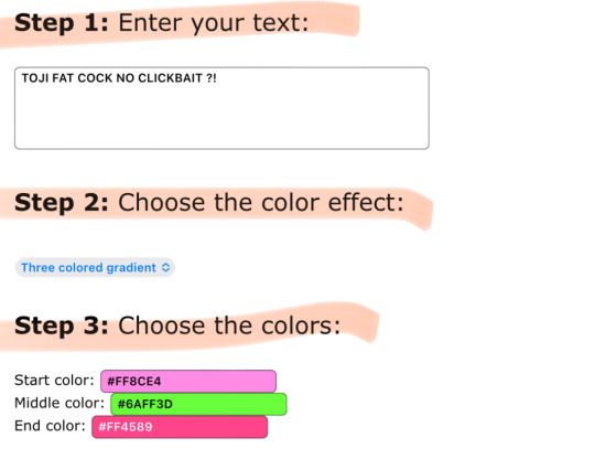

it’s simple !! just follow the steps as they go, so for step one — enter your desired text. you can see that i already did that. so for step two, you’re allowed to choose whatever color effect you want.
all of the gradient effects are: horizontal (mixture of two colors), middle (kinda like horizontal), three colored, (three colors mixed), solid (just one color), random (picks any color for you), and colors of the rainbow (basically a default rainbow color for all)
the one i’m currently using for the example is three colored gradient !! my personal go to for my fics is always middle gradient tho.
anywho, back on the site — ignore step four.
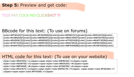
as you can see for step five and the final step, it shows you the preview of your desired colors for your text. listen to this part because if you screw up, it won’t paste onto tumblr. you’re gonna wanna copy the HTML code from top to bottom. copy the entire code that’s shown, you might have to scroll a bit bc it’s pretty long (pause)
after this, you’re gonna wanna log into tumblr via the mobile browser. i forgot to mention, i’m doing this on the app version but it works for pc / laptop as well !! more complicated though but it all works the same.
so first, you’re gonna wanna make a new seperate draft — then press the little pencil icon to make edits.

look near the top right and click the settings icon
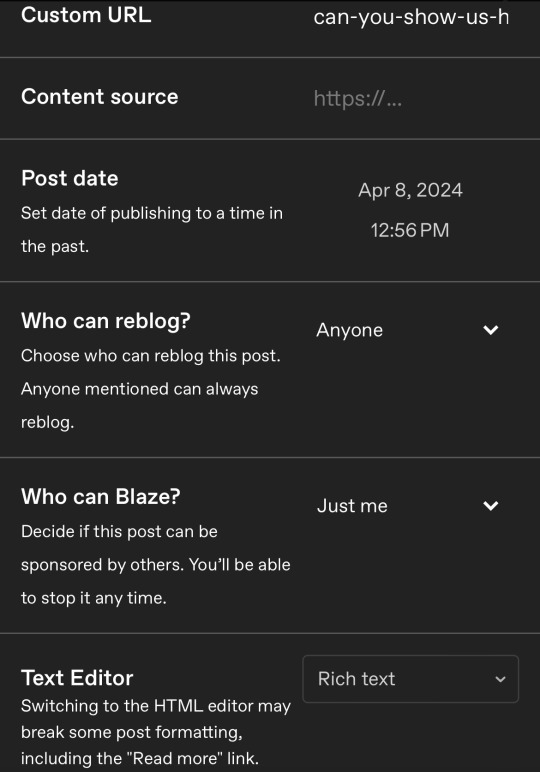

look where it says Text Editor and click near the right where it says 'Rich Text' bc ur gonna change that
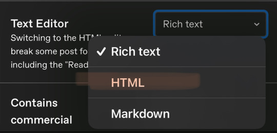
after you click it, change it to HTML
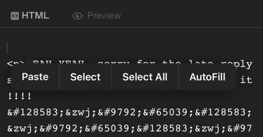
it’s gonna send you here, make you’re you’re on HTML and not Preview yet. create a space above all the text that has like <p> and so on. paste your code, then that should be all !! save it and you can press preview afterwards to see the final results.
hope this helps :3
696 notes
·
View notes
Note
how do you get your text that soft pink shade? tutorial?
BABY PINK TEXT TUTORIAL !
hi babe!! here's a short and hopefully easy to understand tutorial for the text i use in my posts ᥫ᭡
also, just a little disclaimer: the images on this post might not be visible because they exceed the limit of 10 images per post on mobile app. should be fine on a laptop or pc though!!

okay firstly, make sure you're using a laptop and open your post in one tab and in a seperate tab open jsfiddle.
you should be able to see this coding somewhere on your screen:
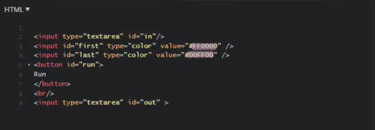
you're gonna replace the two hex-codes (highlighted text) with whichever colours you'd like. to do a gradient, like this, the two codes will be different, but i like to do a solid colour like this so my codes will be the same.
the hex code i use for the baby pink is D2A3BE, or you can use your own. if you don't have a hex code you like yet, you can use the colour picker on this site to find one!
just copy and paste the hex codes into the code so it looks like this:

make sure it looks exactly like this. you still need all the spaces, quotations and other code. only change the hex codes.
in the top left of your screen, there should be a "run" button, and when you press it, the colours in the bottom right should change from the default ones to the ones you chose.
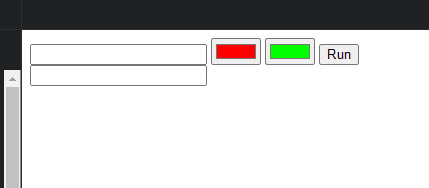
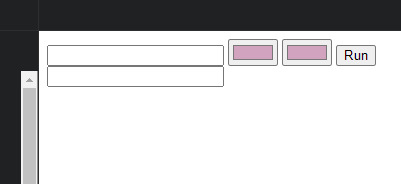
next, you're going to open your tumblr post in your first tab.
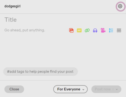
your post will start like this. you'll go to the settings button in the top right (circled) and change the post from rich text to HTML

this will enable coding on the post. you'll still have 'preview' where it will look normal and you can still type and edit the post as you usually would.
once you've typed something it will show it in the HTML option just in a different way:

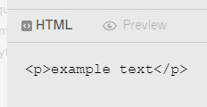
you want to go to the preview page and make sure you've got the text looking exactly as you want it (bold, italic, small, etc.). also note that colours look especially good and show up well when the text is bold. i set mine to bold as an example.
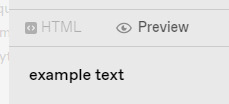
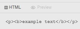
when you switch to HTML it will look something like it does above.
next, you'll copy the text between all the coding prompts (e.g. <p><b> and <b><p>). only copy the text you want to be pink or another colour!! don't highlight any of the coding. then paste it this top box on jsfiddle so it looks like this:


press "run" on the right, and it will spit out a line of code in the second box that will look something like this:

you're gonna copy that line of code and switch over to your tumblr tab. on your HTML version of your post, find the text you're changing and highlight it. then paste the code into that spot. make sure not to highlight any of the surrounding code - only the text you've written and want to change.
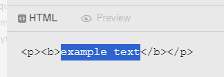
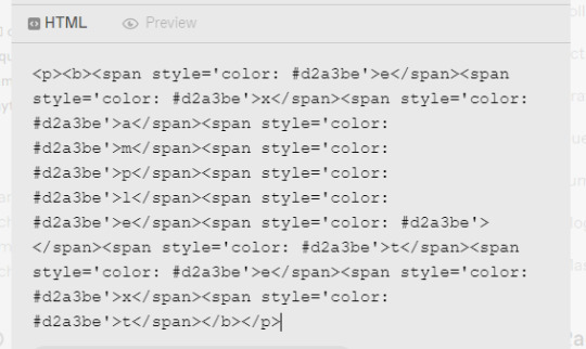
it will look super weird and long because it's colouring each symbol and letter, if you look closely, each letter of "example text" is separated and surrounded by code. when you switch to preview it will look like this:
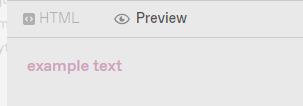
for gradient, the process is the exact same, but on jsfiddle, when you're replacing the default hex codes with yours, the second hex code you plug in will be different to the one you start with. for example:


this second colour is C45494 btw!!
to do specific text in a paragraph as if bolding it (which i do in a lot of my posts), you just want to find that text in your HTML post, and copy and paste the specific word/s into your top box on jsfiddle, and then proceed as normal. example:


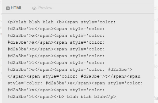

hopefully this helped!! let me know if you have any questions or need me to go over anything ( ˘³˘)
#coloured text tutorial#colored text tutorial#tumblr tutor#text tutorial#text tut#coloured text tut#colored text tut#colored text#coloured text#aesthetic#theme#aesthetic theme#pinterest#pink#hex codes#coding#jsfiddle#dodgesgirl helps#dodgesgirl answers#art donaldson#challengers#mike faist#challengers 2024#challengers movie#mike faist imagines#art donaldson fic#art donaldson smut#challengers smut#mike faist renaissance
161 notes
·
View notes
Text
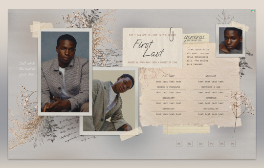
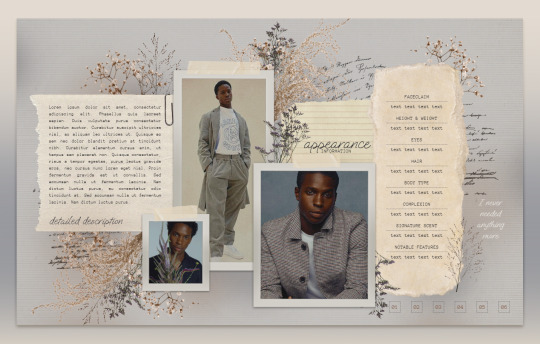
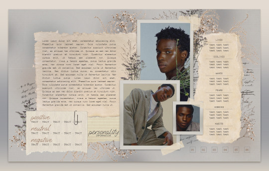
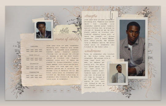
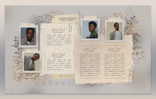
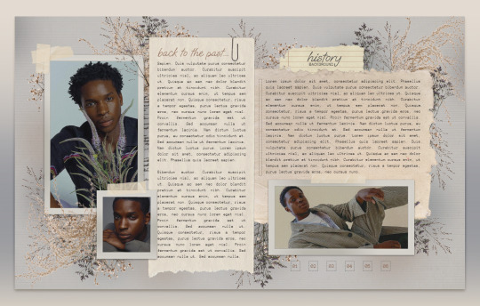

013 . CLEMENTINE — [ 𝚕𝚎𝚖𝚘𝚗 𝚍𝚊𝚢𝚍𝚛𝚎𝚊𝚖 ] ...... DOWNLOAD NOW
Just in time for spring, CLEMENTINE is that sort of melancholic, soft, scrapbook feel. Took forever to place each one of those florals but I know so many of you have wanted something like this for a long time. Edit it in any way, shape, or form just please don’t remove my credit and link to lemondaydream.
These are meant to be only used by one person per purchase. Allowing others to make copies off of your copy is stealing. Please read the instructions on how to prevent this.
how to use
The link on the PDF you receive after purchase will take you directly to your copy when you click "make a copy"
Do not remove the credit from the top and bottom of the template
how to edit
All images on this doc are in "Drawings." To edit "drawings" simply right-click on where the image is, click "select image," and the box that pops up underneath has a button that says "edit." Edit will bring you to a pop-up window that will allow you to change the images by clicking "replace image" at the top right of the toolbar when clicking the picture.
Do not resize or paste any images into the doc, only use the method above.
The pictures on this doc are of Kedar Williams-Stirling, beautiful avatars made by ultra-violences, please go support this fantastic creator. The png images are found on pngtree, pngwing, and marginpar, edited in photoshop.
Changing the fonts may cause tables to shift and resize, be careful in doing this, and remember, ctrl+z is your friend, if something messes up, immediately undo. I do not recommend doing this.
The tables are structured in a way that will move pages and elements if their limit is exceeded, if you need more space, I highly recommend linking to a continuation at the end of that space.
May take a second to load on older pcs or poor wi-fi connections. On mobile, give it a second or close it and reopen it to have it load faster in print layout mode.
Thank you so, so much for your support! Likes and reblogs are super appreciated always!
#google docs template#google doc template#Google Docs#rp template#rp resources#character template#docs template#rp docs template#rp doc template#rp resource#google#docs#template#character#character sheet#character sheets#OC template#discord rp#discord#gdoc template#discord oc#muse template#discord template#discord rp template#doc template#[ 𝚕𝚍 ] templates
1K notes
·
View notes
Text
Okay so I was readibng the PC Gamer article, when suddenly it hit me: ZA/UM (haãvel husk edition) have cancelled every Elysium project that can't reasonably be shat out in under a year.
Why would they do that? They took the effort of (allegedly, vernacularly) stealing the fuckin IP why not use it? BECAUSE they think they're gonna lose rights to it. In my opinion. They do not want to pour 3 years into building an Elysium game they won't be able to release if Kurvitz got custody of Elysium back off them. They can shit out a quick mobile game, cash in fast, those things die like mayflies anyway. But a true sequel or spin off? that's work they don't wanna do it for nothing.
I feel like now, IDK if Kurvitz really wants Elysium back, he'd doing his own thing and it feels tainted now, but the ZAUM bag-men, they are running scared and that makes me smile.
[eta: forgot the fucking link]
142 notes
·
View notes
Note
How old does your blog have to be to see the desktop blog view thing?
You can just make it happen whenever you want!
In your browser, set it to desktop mode (available in the dropdown dots menu) and then just type in a user's name first, then tumblr.com
Example:
Fangirltothefullest.tumblr.com
If they have set up a desktop version it'll show
Users older than when mobile became a thing will have desktop versions as they are more customizable. You could even add music if you had the html code for a player.
If you wsnt one yourself, you have to enable custom themes.
Log into tumblr on your browser either on desktop or on mobile. I suggest logging in through desktop mode on your phone's web browser and opening the log in in a new tab so it stops trying to pop up the app.
Once logged in you can disable desktop mode in your browsers drop down to see things easier.
It'll probably up like this otherwise and be a formating nightmare.
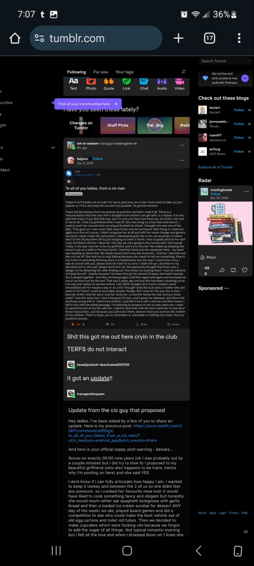
Now.... once it's OFF desktop mode,
Go to the blog you want and hit blog settings in the drop down.
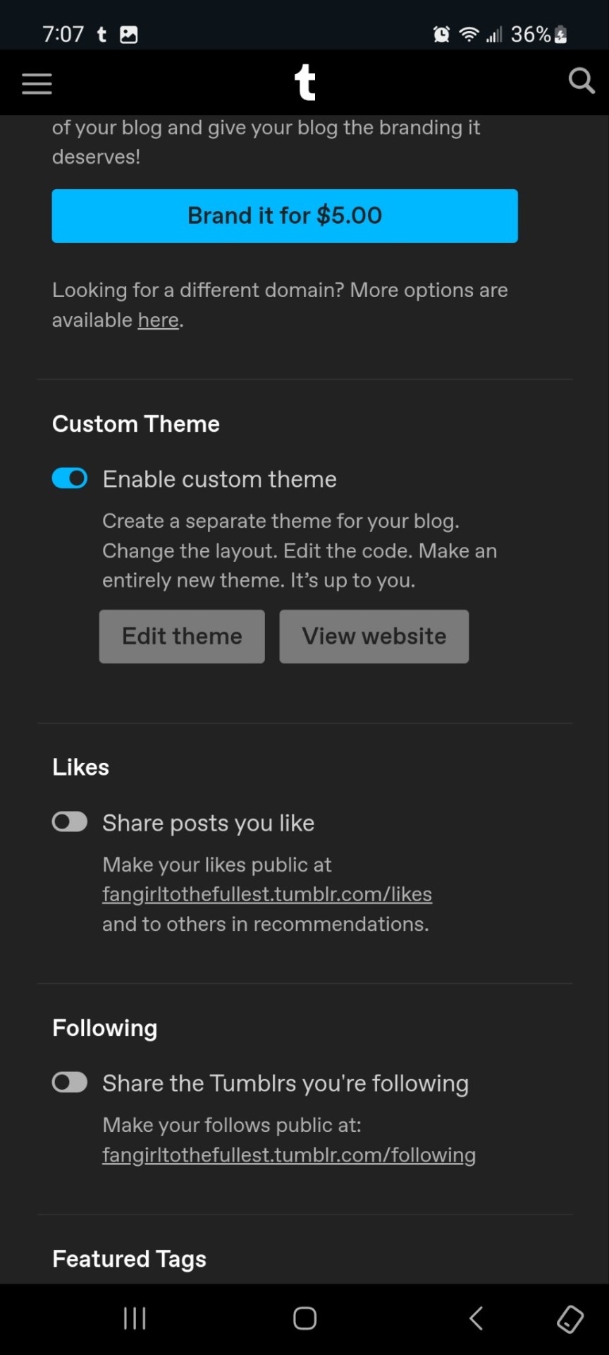
Enable the custom theme and hit the edit theme button. You'll be taken to a place that looks likethis:
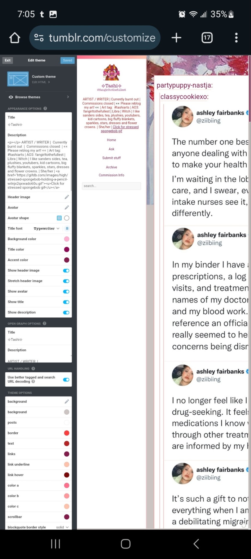
You can zoom in to hit the browse themes button:
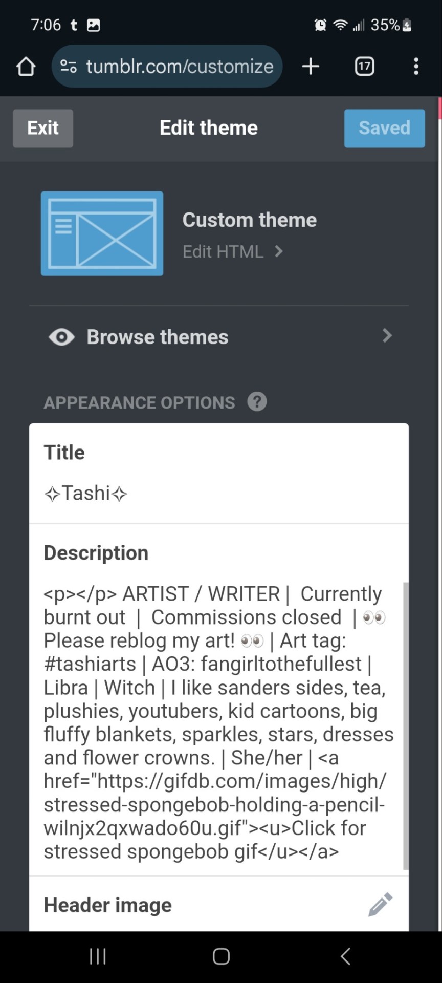
It'll bring you here:
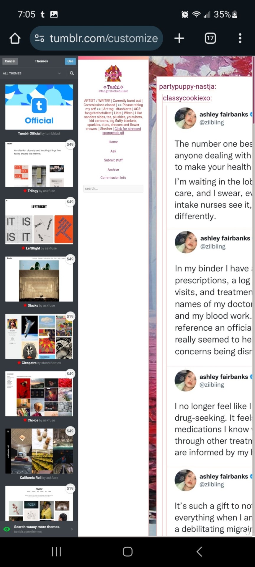
And you can choose what style you want! Hit save and you'll notice it gives you options to play around- choose a background, colour scheme. Fonts etc. Play with the html!
On a regular desktop this is easier to see so I suggest doing this on a laptop or pc.
Also fun fact you can hide secret messages in the html coding and if someone pops open the page source they'll see the surprise message in the code. XD just a fun thing if anyone wants to... say... make their own arg or send out secrets etc.
You CAN create whole pages with this feature too but they are unreliable and after this long it might be broken? So... yeah.
NOW REMEMBER: TO ACCESS THE DESKTOP PAGES YOU HAVE TO CHANGE THE LINK!
Forfeature. As a said above, my desktop link is fangirltothefullest.tumblr.com
I believe the mobile version has it as tumblr.com/fangirltothefullest.
Only people who have made a desktop version will have their blog show up if you'd like to test this festure.
Also this is how you access everyone's blog archive! Because blog archives exist!
Mine would be:
Fangirltothefullest.tumblr.com/archive and you can't open it in mobile or it'll just pop up the mobile version which doesn't exist.
You wsnt this page which let's you find the earliest things a blog has posted. So I created this blog in june 2012 lol.
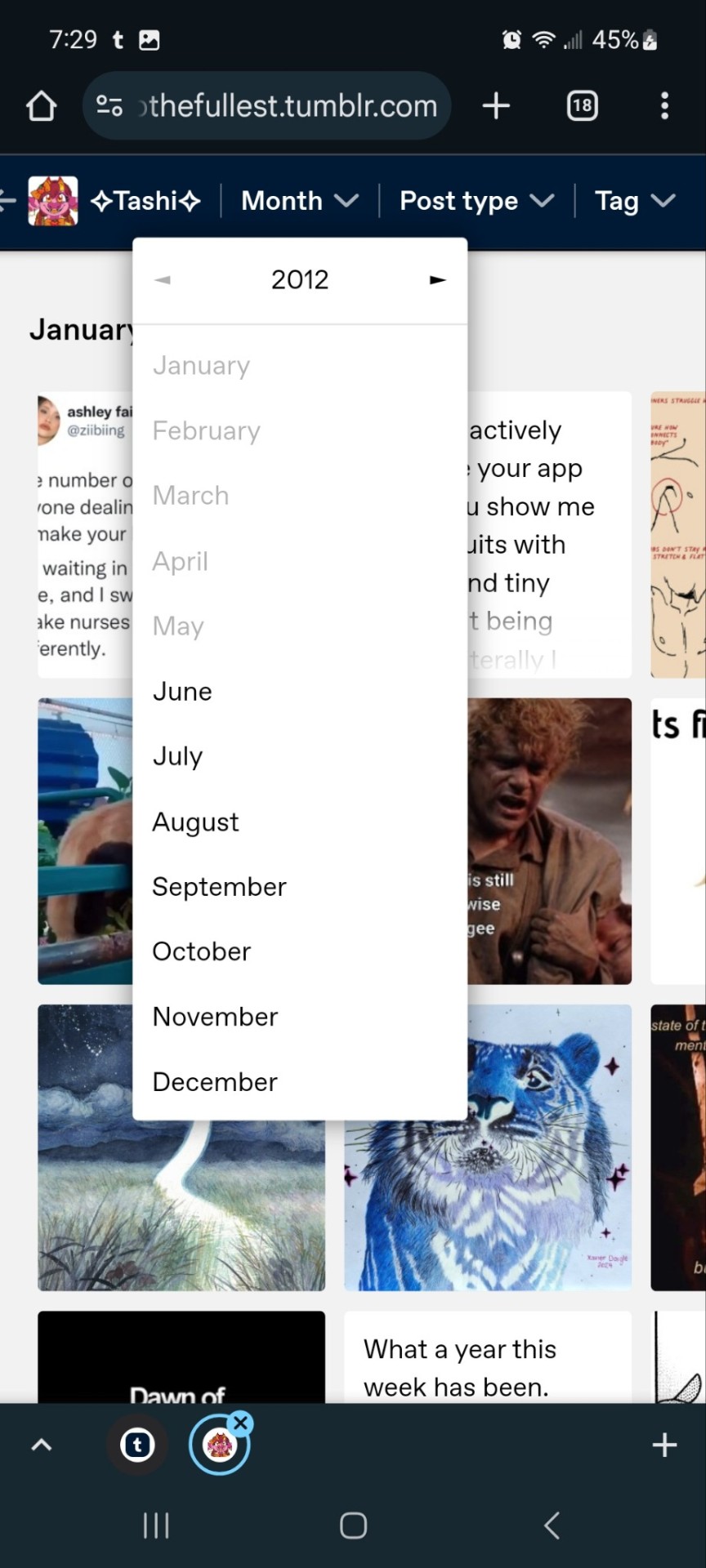
It works for tags too to show you ONLY the contents of that specific tag
Fangirltothefullest.tumblr.com/tagged/tashiarts/
And if you want a tag in order you add /chrono to the end to get it chronologically sorted from the earliest posts in the tag.
Fangirltothefullest.tumblr.com/tagged/tashiarts/chrono
I hope this helps!
NOW EVERYOE GO HAVE FUN MAKING COOL DESKTOP VERSIONS OF YOUR BLOGS!
30 notes
·
View notes
Note
What would quackity do if reader would just start to grind on his leg because she is needy and he is busy with editing his new video?😳 he would be soo shyy 🤩
Let him work ~ Quackity
Story g: sfw (?)
Language: English/Inglés
⚠️: a little suggestive
CC's: Quackity
Reader g: Female reader
📝: All the content is fictitious and an attempt is made to adapt the PUBLIC personality of the cc's, that is, the personality that is shown in front of cameras, I do not know the true personality and any resemblance to reality is mere coincidence.
🍒: Hello, writing requests are always open, if you want something in particular, ask without fear. I clarify that English is not my main language, I apologize for any error and accept corrections to improve the quality of the content
Master List

You were at Quackity's house, you were together early but apparently his editor called and it was urgent that Quackity get to work right now
"Just let me fix this problem and I'll get back to you"
He had said that it was a small problem, but you saw him opening a thousand editing programs, opening his discord and even sending messages from his mobile, and you knew that this would take longer than you thought.
You were in your ovulation days, and at some point in the day you started to need any physical contact. From his island in the kitchen, you only heard the 'click' of his mouse, when you looked in his direction you could only notice the shape of his back, how his black hair fell from that hat.
Tired of waiting, you approached him, leaning on the back of his chair, "interested" to see what he was working on.
Quackity always smelled good, apart from the expensive perfumes on him, you could tell the natural scent of him. He had a smell impossible to describe but very addictive.
You put your arms on his shoulders from behind him, when he notice your presence he take your hand and kiss it to continue with his work. You ended up pulling up a chair next to him, sitting to his right with your head resting on his shoulder and watching him work. His shirt smelled of detergent, his forearm gave off his natural scent, you wrapped your hand around his bicep, it wasn't muscular but it did contain meat to squeeze. His touch was so addictive that you started playing with his knee, caressing his hair.
Quackity realized how much you needed his contact, and that made him a little nervous because you were being so demanding, wanting to put his hands on him.
He shut down his PC once he finished, and took you to the couch so he could snuggle with you, hugging you tight around the waist and giving you long, hot kisses.
#quackity#qsmp quackity#qsmp#quackity x you#quackity fluff#quackity soft#quackity x reader#dsmp quackity#mcyt x y/n#mcytblr#mcyt#x y/n smut#x reader#sfw blog#suggestive
261 notes
·
View notes
Note
Hi! so sorry to bother u lol and i’m sorry if you’ve already answered but what app do you use to draw? I finally saved up and have an i pad and pencil and i was gonna get procreate and i saw it was 13$… i dont mind getting it if it’s worth it but is it? Do you use it? If not then what app would you recommend? This is my first time digitally drawing btw i’ve drawn on paper before! Also honestly any tips on general on drawing digital would mean a lot! :) thank you and i hope you fave a fabulous day! 🫶🫶🫶
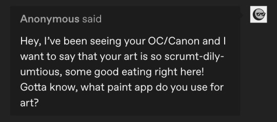
My such high praise 🫣 thank you so much!!
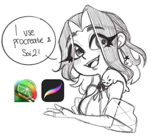
I’d say procreate is very much worth it! Though I do have some qualms about it such as it’s limited layers (depending on your canvas size) and the fact that you can’t select/edit a group (you have to do it individually, but there are workarounds)
Another one you can try is ClipStudioPaint, I don’t personally use it but my friend does and what’s cool is that if you have it on pc, from what I’m told you can connect your account on mobile and pc for a cross platform situation
Aside from procreate I also use PaintToolSai2 for pc when I’m streaming and I usually have like 50+ layers per artwork, so it was definitely a huge adjustment when I first started using procreate 😂
As for tips, definitely find references if you can! I usually use a 3D app called poseit (mobile) or posemyart (web) and it has helped me significantly! (My 3D animator ass can’t live without them now 🥲) though I don’t always follow the pose I make to a T, it’s there to help me visualize the bits and pieces I can see in my brain 😂
My process usually goes like this:
vague Shitty thumbnail —> reference/3D posing —> art
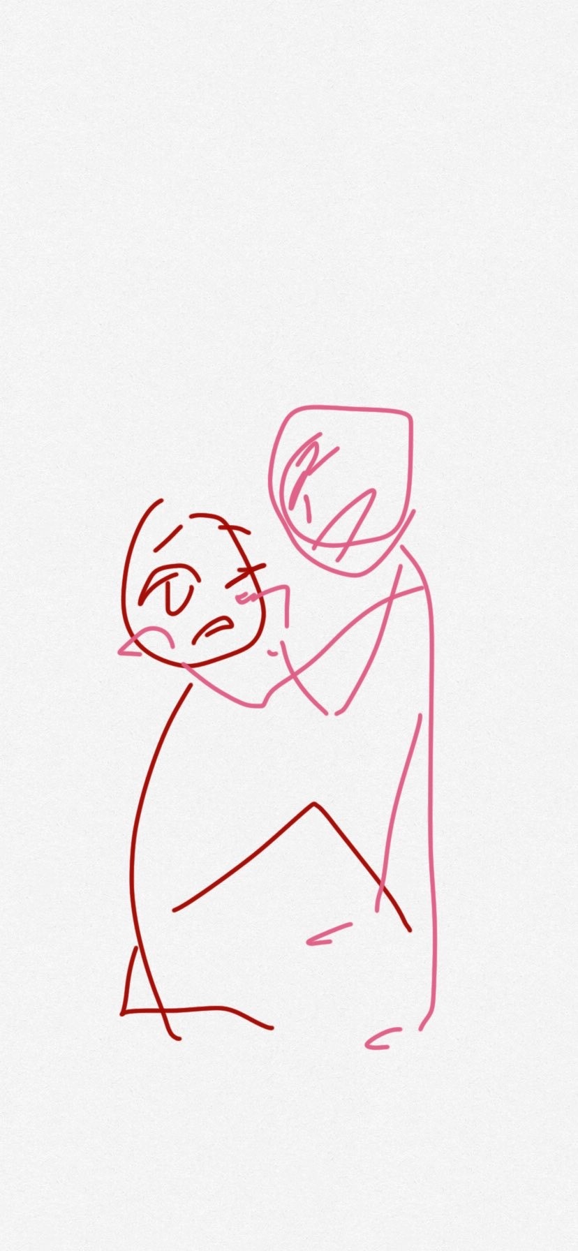
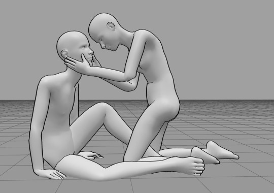
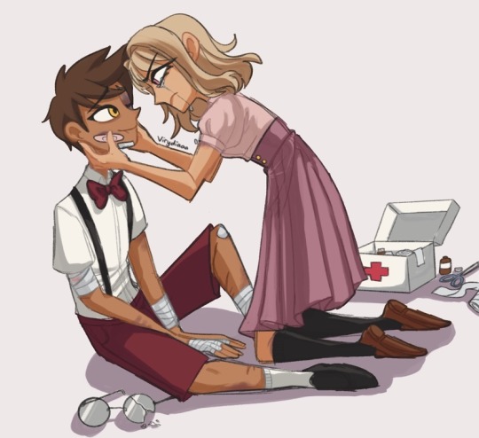
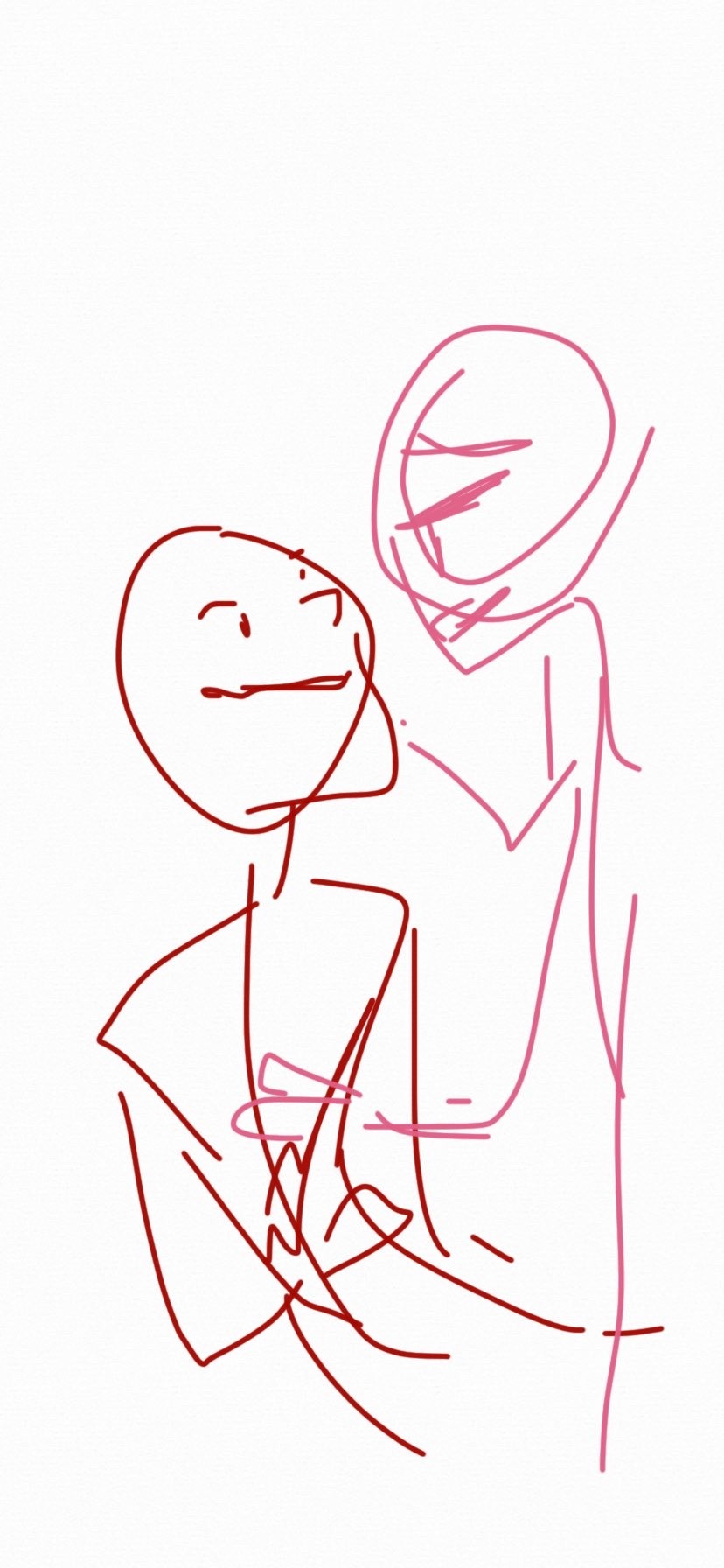
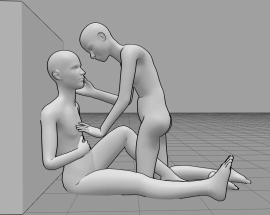
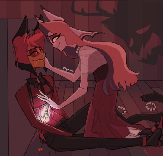

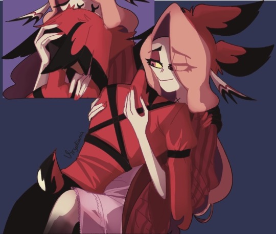
But honestly my best advice is just keep drawing and have fun with it, no need to think too much, never stop learning new things and if you have a hyper fixation that’s even better 😂
43 notes
·
View notes
Note
sorry to bother but I was wondering how you make your gifs so smooth and get rid of pixelation?
Hi, anon! Sorry for the late reply! And no worries, you're not being a bother at all. ^^
Regarding your question, these are some of the tips I can give which I typically do on my GIFs:
Use video sources with higher resolution
In all honesty, I am not doing that much to make my edits look smooth and HD. I just always make sure to download videos that are not less than 720p. I typically download 1080p but 720p would suffice since the suggested width for images here on Tumblr is 540p.
Use good editing apps
I use Photoshop which is a good app but if you're not using this, you may use Photopea (this is like an online version of PS). There was a time when I didn't have a PC and I tried making GIFs on my mobile phone but even when I'm using high-resolution videos, the output was not as good when making it on PS. I also used Photoscape before. This was my first app when I was still starting making GIFs and oh boy, the quality is just... XD Anyway, PS is good with the compression of images when you're saving the frames as GIFs even when resizing the file to a smaller scale.
Maintain the original size until the export
I've seen tutorials where they are already adjusting the size at the beginning of their edit. I personally don't do this because this contributes to the reduction of the quality of your GIFs. And if I want to crop (because I want a different width and height compared to the original), I will see to it that the height is the same with the original (only the width will change).
Take a look at this example:
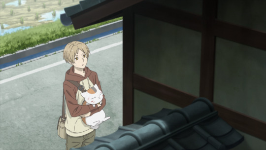
This is a 1920p x 1080p image but I wanted to crop it to a 400 x 540 aspect ratio. What I would do is after cropping the image, I would resize the image to make the height 1080p again.
After cropping, this is now the dimensions of the image:
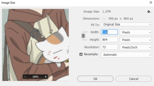
Then I will revert the height back to 1080p (the value of the width doesn't matter):
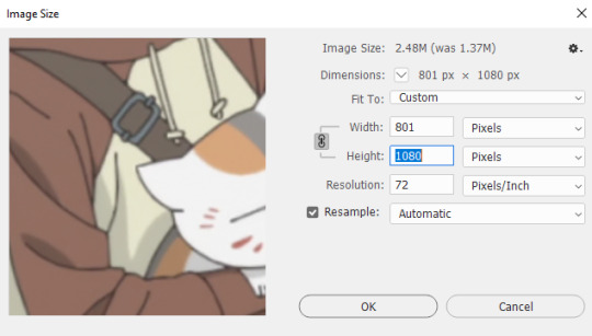
Of course, 1080p is just my preferred resolution. You can select a lower resolution but not lower than the original image or the final size of your GIF.

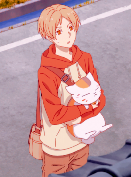
As you can see, even without further editing, the image already looks good and does not appear to be pixilated. Then after cropping, I will apply my coloring. If I save this as it is using 540p width, this is how the GIF's gonna look like.

As you can see, there is almost no difference between the 540p (width) gif and the 1080p (height) image. That's because I only resized the image during export and not in the middle of editing.
Use sharpening tools to make your GIFs look HD
The key to fooling the eyes is to make them look in a different direction. XD So what do I mean by this? Like I said, I'm not doing that much to remove pixelations from my edits. I just make it so people will focus on other stuff. If you don't want them to focus on the pixels, let them focus on the line art.
Just a reminder that this last tip is only applicable to anime GIFs.
In my case, I always start with frame animations, then later on convert to a video timeline. And then I will convert the frames to a single smart object so I can apply filters to all the frames at the same time.
These are the steps I do when I sharpen my GIFs.
Apply SMART SHARPEN. (Filter > Sharpen > Smart Sharpen)
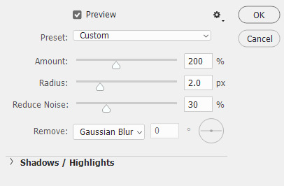
These are my preferred settings but you can also explore your own.

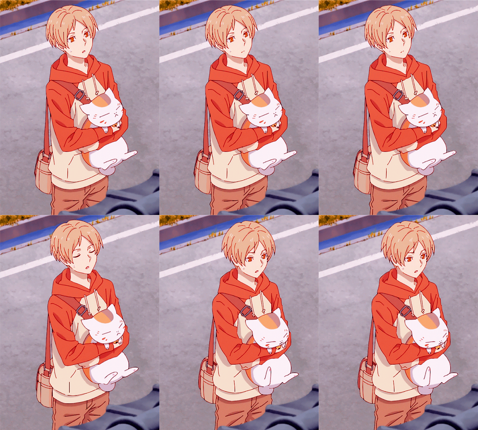
[Comparison of GIF without sharpening filter and with sharpening filter]
2. Apply POSTER EDGES filter. (Filter > Filter Gallery > Artistic > Poster Edges)
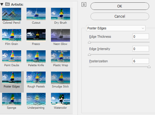
These are my settings. You can adjust the Edge Thickness if you want to have thicker art lines. As for Edge Intensity, it's better to set it to zero to avoid adding unnecessary details to the shadows of your image.

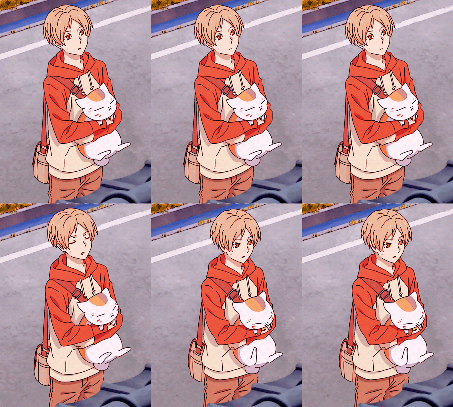
[Comparison of GIF without sharpening filter and with sharpening filter]
3. Apply POSTER EDGES again.
This is an optional step. I typically use this whenever I want the art lines to be thicker. I use the same settings in the second step.


[Comparison of GIF without sharpening filter and with sharpening filter]
And that's about it! I hope this helps! By the way, this is just my own way of sharpening my GIFs. If you're not using PS or Photopea, you might want to check other tutorials that are specific to the app that you are using.
26 notes
·
View notes
Note
Mantis… gif making tutorial when? I beg
Here you go, love! I recorded a quick video for how I record my gifs, as well as how I edit them. I don’t really do anything special, and I also don’t know the best way to actually make gifs with photoshop still since it confuses me a lot still haha... but hopefully this is a bit helpful! There may be a better way though, so the way I do it may be a bit outdated lol. Gifs will also look different on pc compared to mobile on tumblr due to how they compress the gif on each platform.
GIF RECORDING + EDITING TUTORIAL (youtube w/timestamps)
CAM TOOLS + other info
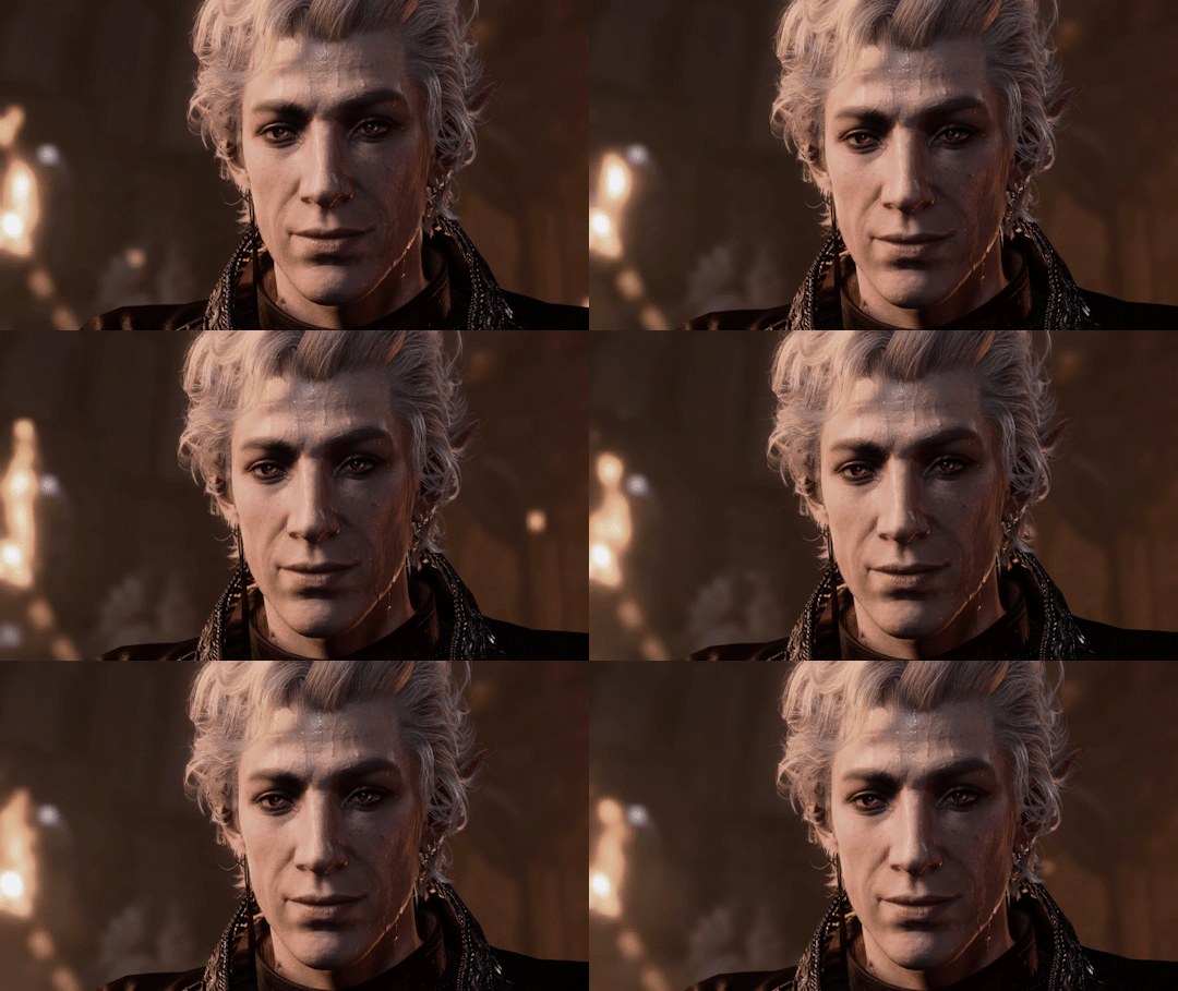
my in-game settings and PC specs available here
ALSO FORGOT TO NOTE IN THE VIDEO, my exporting settings Image size and percent will always vary depending on the original resolution and file size of your clip. I have tried transparency on//off and it doesn't seem to make a huge difference, turning it off will increase file size.

background audio (+ my own recorded in-game ambience)
80 notes
·
View notes
Text
youtube
Lost Soul Aside - Pre-Order Trailer | PS5 & PC Games
Lost Soul Aside will launch for PlayStation 5 and PC (Steam, Epic Games Store) on May 30, 2025.
■ About
The wait is finally over. This is Yang Bing, as the creator of Lost Soul Aside, I couldn’t be more excited to share some big news—our action RPG will officially launch on PlayStation 5 and PC on May 30, 2025! What started as a one-person dream (me, a computer, and endless late nights) has evolved into a sprawling adventure full of breathtaking visuals and adrenaline-pumping combat.
Let me take you behind the scenes to explore the heart, soul, and sweat poured into this game. Whether you’re here for the stylish combat or the gripping story, there’s plenty to dive into. Let’s get started!
A World That Lives and Breathes
Creating the world of Lost Soul Aside was like painting with imagination on a sci-fi fantasy canvas. You’ll traverse landscapes that feel alive: sunlit plains, mysterious ancient ruins, and alternate dimensions that buzz with energy. This world isn’t just eye candy—it’s filled with secrets, monsters, and unpredictable events that keep you interested.
But let’s talk about what really defines the experience—combat.
Combat That Packs a Punch
My goal was simple: make combat so fluid, fast, and stylish that you never want to put the controller down. Kaser’s shape-shifting weapon adapts to your combat style. Are you a precise swordsman? A fan of devastating ranged attacks? Maybe you like high-speed mobility? Whatever your preference, the different type of weapons will serve you well.
One standout moment during development was designing the boss battles. The fight with a towering dragon remains one of my personal favorites. It challenges you to juggle aerial dodges, perfectly timed counters, and relentless strikes. Not to mention, it’s a visual feast that feels like being part of your own epic action movie.
Beneath the flashy moves, there’s depth for players who love to experiment. You can customize loadouts, chain synergistic combos, and strategize with Arena, Kaser’s dragon-like companion. His abilities aren’t just support—they’re game-changers, turning tough battles in your favor when used wisely.
From moment-to-moment clashes with enemies to massive set-piece battles, combat in Lost Soul Aside is designed to keep you on the edge of your seat, pushing your skills to the limit while rewarding creativity and precision.
A Story Close to My Heart
While combat takes center stage, Lost Soul Aside also weaves in a narrative about Kaser’s journey of redemption and discovery. As he uncovers the truth about Arena and their shared power, players will encounter a mix of personal challenges and high-stakes conflicts. The story focuses on creating memorable moments and connections, offering surprises without overwhelming the gameplay experience. And yes, there’s plenty of drama, because who doesn’t love a good gasp-worthy moment?
Made for PlayStation
Lost Soul Aside was built with PlayStation in mind, and I’m thrilled about the enhancements we’ve implemented:
Lightning-fast load times – With the PS5 SSD, you’ll transition seamlessly between exploration and combat.
DualSense controller magic – Feel the tension of every blade swing with adaptive triggers and haptic feedback.
4K eye candy – The world comes alive in stunning detail with dynamic lighting and meticulously crafted environments.
PC players, don’t worry—the game is fully optimized to deliver smooth performance and retains all the core gameplay features.
■ Pre-Order Bonuses and Deluxe Edition
We’re excited to reveal the exclusive rewards for those who jump in early:
Pre-Order Bonuses
Kaser’s original outfit from the game’s earliest reveal, giving players a nostalgic look back at how it all began.
A starter pack of in-game currency to help you kick off your adventure.
A bundle of healing potions, perfect for those challenging early game battles.
Get your hands on the standard edition of Lost Soul Aside for $59.99 / £59.99/ €69.99/ ¥7,980 MSRP. There will also be a Digital Deluxe Edition of the game.
The Digital Deluxe edition of Lost Soul Aside ($69.99 / £69.99/ €79.99/ ¥8,980 MSRP) will include the game, all the preorder incentives, as well as Arena’s exclusive golden outfit, three unique weapon fragment skins, two in-game accessories that provide useful boosts for your journey, a Digital Soundtrack and Artbook.
Embark on an epic odyssey to save your sister and the whole of humankind from dimensional invaders in Lost Soul Aside—a stylish single player action adventure RPG.
Chain lightning-fast combos, learn new abilities, and upgrade your weapons as you take on formidable enemies and colossal bosses in fast, dynamic combat.
#Lost Soul Aside#LSA#UltiZeroGames#Sony Interactive Entertainment#video game#PS5#PC#Steam#Epic Games Store
10 notes
·
View notes
Text
Gamer Tokyo Revengers Headcanons
A/N: This is mostly Toman with some cameos from Shinichiro & Hanma LMAO. I hope you enjoy! Shout out to my amazing boyfriend who participated in this conversation with me. <3 I love you. -----
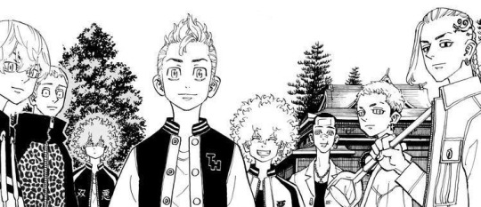
-Kazutora one time scammed Baji in Meep City by offering a “legendary for legendary'' trust trade and Baji ended up getting temporarily banned from ROblox text and voice chat for the things he was screeching.
-Mikey and Draken don’t play Roblox (Draken will if Emma wants him to though). They’re probably on Val or something. Mikey blows up team/party voice chat literally the entire match while Draken only says one thing; “gg” at the end of the game LMAO
-Kazutora, Baji, and Chifuyu have a Minecraft server and the stuff that goes on in that server should not be spoken of, but can be summed up with one event; the piston dungeon.
-one time, Mikey spent the night at Baji’s house and had access to his PC. Mikey got on the BajiTrio server and blew up Kazutora’s house and that’s when all the beef started. (Shinichiro is alive and well in this universe!!)
-Mitsuya doesn’t game much, but when he does it’s because Luna and Mana want to play. Accordingly, he’s goated at games like Fashion Famous (pro model) and is pretty popular in any Royale High server he joins LMAO
-Hanma plays CSGO. And he’s reaaaal toxic on the game LMAO. Can see him 100% being one of those “drama” YouTubers who talk shit online while playing various video games. (Think Old Leafy or some shit.)
-Smiley and Angry are an inseparable Fortnite duo. Angry is overly nice and courteous, often handing off his really good weapons to his teammates when they ask for them, while Smiley is literally being toxic the ENTIRE time. Think of him saying stuff like, “Dude, you’re so ass.”, “Imagine whiffing every shot LMAOOOO”, and “BROOOOOOOOOO we lost because you suck!” at every given moment of a match. Accordingly, not a lot of people play with them so they usually fuck around in duos.
-Shinichiro grew up on OG Nintendo and struggles to really understand newer games because he stopped playing when school + work got busy for him so he didn’t have much time. He tries his best though when Mikey wants to play games with him, even if his best is pretty mid.
-Yuzuha and Hakkai play a lot of open-world RPGs, like Zelda, Genshin, and Star Rail. They especially like Genshin because they can play together. Hakkai mains Yelan and freezes up literally every time she says one of her voice lines. But Yuzuha is really into Yae Miko (or really any electro woman.)
-Emma mainly plays cute mobile games like Love:nikki, Hello Kitty World, or Happy Camper. She likes being able to make cute outfits/sets. She got a Switch so she could play Minecraft and ACNH, but she got into these games because of the PE edition and Happy Camper.
-Emma actually recommended ACNH to Mikey, who ended up getting addicted during COVID and literally could not peel himself away from his Switch for the entirety of Quarantine. But was he simply docile while playing? No, of course not. He was insanely aggressive with Tom Nook.
-Mikey actually forced Mitsuya to make Toman jackets in Animal Crossing. (Mitsuya also made all the boys’ MC skins.)
#tokyo revengers#tokyo revengers headcanons#manjiro sano#draken#mitsuya takashi#kazutora hanemiya#hakkai shiba#yuzuha shiba#hanma shuji#baji keisuke#matsuno chifuyu#shinichiro sano#emma sano#nahoya kawata#souya kawata#fanfic
133 notes
·
View notes
Note
why are you actually so talented.
like how drop a tutorial pal
or I WILL personally place several ants inside of your pants
okay but seriously like how do you do all the roblox animating, the undertake things, and just all that cool stuff you do? I’d love to learn!!
bro is NOT subpar
I just was inspired by my friend burger to do some of the stuff he does
If you ever get to see some of the stuff he does its essentially the exact same but far better! A lot of my actual work I do is just me finding ways to avoid showing the glaring flaws in my competency to make it look presentable as nice
Although I know a lot of stuff, I'm not actually super good at anything I do truly, so I call myself subpar overall because I feel like that's the best way to describe everything I do, even if I can do a lot.
The animating stuff I tried learning more of in a day just so I could give Daisy a present, which is why it looked choppy because I stayed up super long trying to make it look nice for them, I wanted to do something kind. But some of those skills were when I tried developing games in the past on Roblox. Its only really worth animating on roblox if you can obtain moon animator for free though, otherwise itd just be better to animate in blender The sprite creation/pixel art i picked up when I wanted to make a character for rivals of aether with burger and eventually got to make a terraria resource pack which lead to me getting to speak to the creator a bit. Really most of it looks special at a glance until you get aseprite, which made everything really nice to get into and is one of the only media software I know that doesn't try to oversimplify things for a general audience but in return makes it simpler to be creative The little undertale dialog sprites I drew out of boredom and decided to use sometimes, theres a website for generating them but its only really useful for getting text the dialog stuff is better to just manually edit in aseprite https://www.demirramon.com/generators/undertale_text_box_generator its hard to explain but once you start developing skills in basic programs other completely different programs start becoming easier too, so you can always explore multiple different forms of media creation at once and it could open up being able to understand software easier. Programs tend to have some familiarities even if they do drastically different things like being a drawing application or creating 3D models. Sorry though I should talk about myself less lol
I like making stuff with a purpose, like a profile picture or something for a game or a gift for someone else instead of creating stuff just for the love of creation, which isn't that good of a mindset but it can make you far more proud of your work, even if you aren't at a level you see as good yet.
Really I'm only at a base-decent level at everything I've shown off on this profile, so if you want to go ahead and try it'd be quick to learn.
...if you have a pc
I wouldn't do any of this on a mobile phone nearly as efficient
(besides full art, I'd probably be better at that on a tablet)
Mobile creators have to put like 3-15 times the effort just for the same product sometimes due to its inefficiency and I deeply respect their efforts
The one thing I have 0 talent at though is anything social related, I should work on being a better person hehehe
Angel is really talented at being a cool person and I am inspired by them to be cooler too, same with chip and asa and a lot of other people who are helpers and above
wait this is derailing fast uhhhh bye guys!!!!!
10 notes
·
View notes
Text


I post jack shit of the things I like. Yippee!!
Multifandom art accont
-> @chessboredom
Hamsteak accont
-> @disguisedcheezed
World of Edd accont
-> @cheezeweezer
Stimbored accont
-> @chessboreds



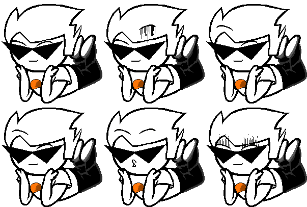
Dirk Strider.
��� ♡ ♤ ♡ ♤ ♡ ♤ ♡ ♤ ♡ ♤ ♡ ♤ ♡ ♤
Fun Facts about me and more jack shit! Bluh!
I made those BTW/TBH creature comic posts. :3
> 1 2 3 4 <
Spam liking/reblogging is okay and is highly encouraged! Go crazy!
I have no DNI. Don't send me discourse/drama and such. U_U
If you followed me for my non-homestuck, here's a thing:
I LOVE dirkjohn. I am So Normal about them <-(warning) I will go into a weekly dirkjohn spam reblog hunt into the depths of this hell site, whether it either contains them both or individually #john #dirk. I also tag them in cat posts with #cat john and #cat dirk. I've been reblogging dirkjohn posts over a year. Current number of #dirkjohn tagged posts is 3155.
( Shout out to those who still followed me. I love seeing you guys in my notifs. )
I have other hyperfixations, but DirkJohn occupies almost all of my thoughts so I don't really care about them right now. /copypasta
More of which that is listed here in my listography.
《 Welceom to my really shitty tagging system navigation for myself 》
Tip! Click on the hashtags if your on pc/browser, or the words if your on mobile.
#chrambles - Me talking about what ever.
#mine - Tag for all of my art from across my blogs posted/reblogged here.
#chess ocs - My hell spawns that I love and hate dearly.
#asks stuff - Tag for answered asks.
I tag warnings such as #blood , #gore , #self harm , #decapitation , #noncon #sucide mention. just as they are. <- applies in all across my fandom blogs
I only tag bugs when I like the post.
#so cool - My inspo tag. It's because of this 13 second yt video that did irreversible effects to my brain.
#this is nice. - Like it said, it has nice things. The posts where it hits so close to home, and other positive things I'd like to remind myself that the world a wonderful place to be in. :)
#mecore - Posts that are LITERALLY me.
#more for the collection - Genres of posts that I find funny and so common and I like seeing them every where.
#cat :3 , #doggy :3 , #honse , #borb - Creatures I like. :3
《My Other Homosuck Related tags》
#so sadstuck , #dirkapitation , #hs meta , #hs gifs , #hs sprite edits ,
#striders , #lalondes , #strilondes , #egberts , #harleyberts , #crockerberts , #harlenglish ,
Other favorite ships that I'll just put here because yes
#nuzi , #tomtord , #krusie , #davejake , #batterie , #2bhank , #sasunaru , #sonadow , #kawoshin , #charlastor
#mine#editing this from time to time maybe#hamsteak means homestuck yall#i added eddsworld in now. no shame#SoundCloud#homestuck#dirk strider#john egbert#dirkjohn#eddsworld#mage of breath#musique#blinkies#john#dirk#chrambles
148 notes
·
View notes