#what colour should i use???
Explore tagged Tumblr posts
Visit Tumblr Blog
Explore Tumblr blogs with no restrictions, modern design and the best experience.
Last Seen Tumblr Blogs


Fun Fact
Tumblr was named as a finalist in Lead411’s New York City Hot 125 in Aug 2010.
Text

he wants to feel included!!!
#persona#art tag#renren loves his brothers a lot#he wants to be part of the gang too!#i just wanted to make the joke but there wasnt good setup#makoto is like yeah he's so dumb what a precious baby brother#yu is the mean middle brother but he doesnt want to hurt renren's feelings THAT badly ok#i cannot figure out how to do backgrounds for the life of me#what colour should i use???#white hurts my eyes too much#but this one looks different on every single screen#i am posting this just before i go out#i hope there are no mistakes
26 notes
·
View notes
Text

Kabru has a secret admirer in the castle!
#running from my responsibilities (drawing armour) by imagining post canon Kabru fashion#minor spoilers in the tags!#royal advisor Kabru’s office is probably overflowing with gifts from foreign dignitaries eyeing him up for marriage#and sacks of perfumed letters from Melini citizens#Marcille would be so sick of it#Laios also has his fair share of proposals#Yaad is like … boys spare us all and pick a suitable candidate already#well Yaad there’s a saying that goes two birds one stone#anyway lol#someone might have suggested to Laios ‘hey Kabru works so hard. you should show your appreciation.’#Laios (blushing sweating): uuuh how do i do that#Marcille probably: i hear it’s customary to give your royal advisor flowers the same colour as their beautiful blue eyes#Laios: well if you say so#but he starts having second thoughts bcs what if the gift is too romantic#so then Laios is like oh i know i just won’t sign it (:#fool proof plan Laios good job#totally not taking into account that Kabru can recognize his penmanship at a first glance#so at their next meeting Kabru is like ‘i wonder who my secret admirer in the castle is 😉’#and Laios sweats so hard he falls out of his throne#doesn’t Kabru of Melini have a nice ring to it#better yet …. Kabru Touden#much to consider#dungeon meshi#dungeon meshi spoilers#kabru#kabru of utaya#labru#if you squint#wasabi doodles
3K notes
·
View notes
Text


The Wizard Cowboy War (Wizboys VS Cowards) continues on.
#Wizard#Fourfold soul#fitch#nobody#Digital art#Well! Kind of! This one is actually mixed media -the lines are traditionally done with ink#then scanned and coloured digitally. I like the look and the feel of this method a lot.#In case anyone out there was wondering what the original doodle the Cowboy Wizard Jousting comic was - it was this!#I had indended it to stay a sketchbook doodle but I kept thinking about it - and figured 'why not also use it to do an art experiment?'#The funny thing about using existing characters for this is that this isn't even that far off from what they actually are.#The original pitch for the setting of FFS was 'Cowboy Exorcists'. Which sort of just makes them Cowboy Wizards in a way.#Design wise all I really did here was give them sillier hats.#Fitch isn't boy enough for the boy to be more than a carry over from 'cowboy'#But our Nameless Nobody? Yeah. They earned that Coward Badge good and true.#I have a few more doodles from this (AU? I guess?) That I may post if I'm low energy this week.#I missed drawing these little fellas. I should budget my art time to draw them more often...
999 notes
·
View notes
Text

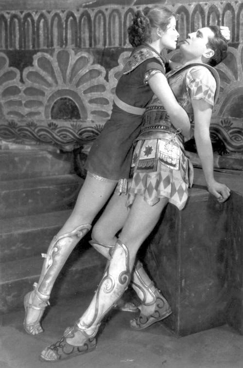
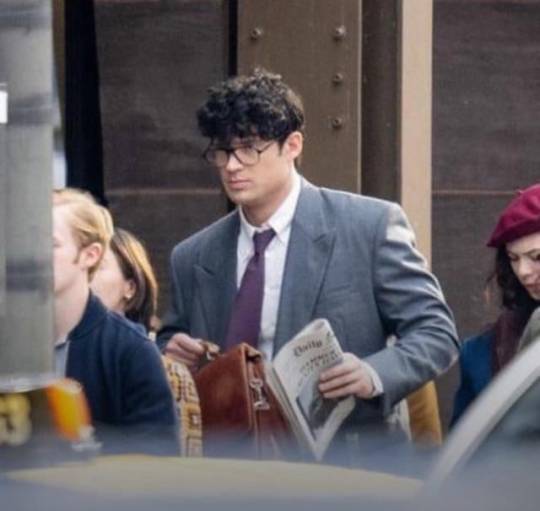
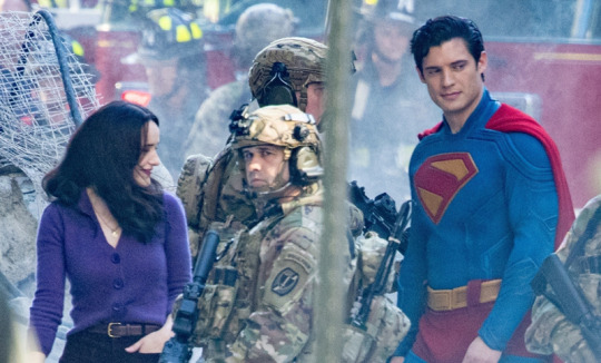
I've had this pose ref saved for a while and the Superman set photos just gave off the same energy 👉🏻👈🏻
The reference is this photo of Katharine Hepburn as Antiope and Colin Keith-Johnston as Theseus in the 1932 play 'The Warrior's Husband' (and I'd love for people to turn into a draw your otp meme pls pls pls this pose is so good)
And also, of course, the Superman (2025) set photos
#superfamilyweek#superman#dcu#clois#lois lane#clark kent#i was actually gonna post this a few days ago but then i found out about the superfamily week#it wasn't made for it but i hope you can accept this humble offering even if it doesn't really fit the prompts#art#digital#fanart#live-action#dc#regular#final#colour#this actually from june when the set photos came out and i just got completely obsessed and went into a clois haze#it all looks so good though!! the whole thing!!!! i'm vibrating with excitement just thinking about it!!!!!!!#if this film isn't good i'm gonna be sooo disappointed you guys have no idea how much i'm looking forward to it#but anyway. ART RAMBLES: as i mentioned on the tags of my last drawing this piece gave me SUCH a headache#i think it's probably cos it was just supposed to be a quick sketch so i used a more stable pencil brush#but then i really liked it so i decided to properly colour it instead of just doing the watercolour thing i usually do for sketches#but with finished pieces i like the lineart to be kinda messy and the sketch to even show through bit#and since i used the more stable brush for the sketch it ended up looking WAY too clean. not like my stuff at all.#so i just started throwing stuff at the wall to see what could make it more interesting. full background! actual lineart! texture layers!#and this here is what i was the happiest with. i don't... love it though. it should be looking way more interesting given the pose#and then i also did the purge girl halfway through this and it looked SO good right out of the bat (pun intended)#so i went a bit into a spiral. did some realistic stuff i'll post soon. and now am trying out a thick black lineart style.#(i'll definitely still use the coloured lines for the sketchy watercolour stuff though. it just looks way too cute)
446 notes
·
View notes
Text
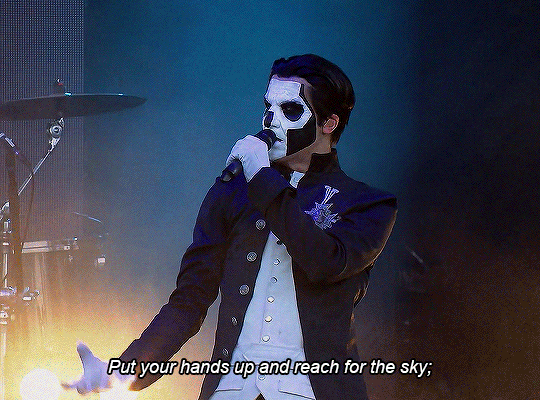
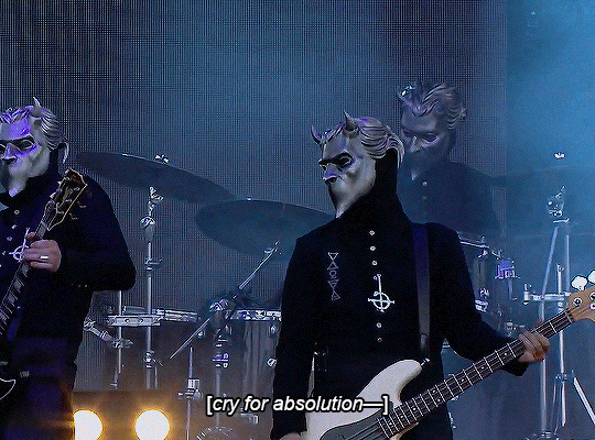
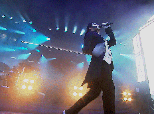
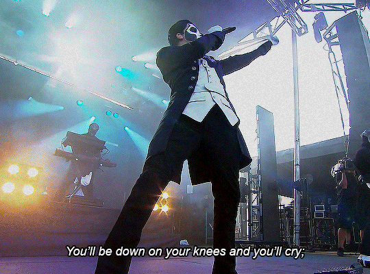
endless ghifs 17/? ⛧ source — Absolution at Carolina Rebellion 07/05/2016
#what is coherent colouring ....#these became less serious with every extra frame of him screaming so i made it more unserious sorry ksdhbjh#yeeaargh am i right#deleted so much of that scream otherwise it would have been 4 gifs in a row. highly recommend watching the footage#eg_series#user copia all tag#papa emeritus iii#the band ghost#flashing gifs#nameless ghouls#terzo#<- do people use that tag? may as well#maybe i should have done 4 straight gifs actually that would have been funny#user copia edits
483 notes
·
View notes
Text
Smth smth Fortnite had a silly update and I just had to draw it
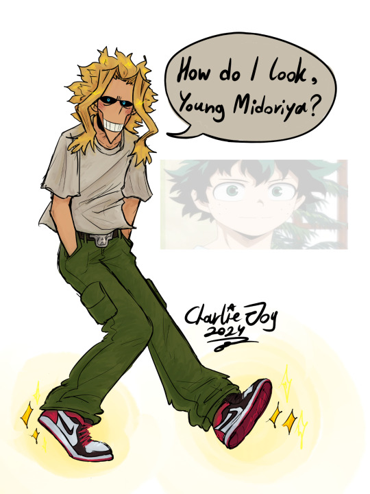
Refs that I used!


Btw I don't really play Fortnite but my brother is obsessed with it and he also has Toshi's skin because of me muheheh 😼
I think we all should draw our fav skins with those new shoes 🙏 (I like the shark slippers too)
#cj 24#art#shitpost#doodles#my hero academia#mha#boku no hero academia#bnha#all might#izuku midoriya#deku#toshinori yagi#fortnite#fortnite update#I hate Fortnite btw#but the idea was silly plus I used it as an opportunity to practice colouring :p#chat do we like the colours?#also damn I really like how his pants turned out I should do that more xD#but yeah you had to see my face when I saw that you can put those shoes on gucking ninja turtles#SPLINTER can wear those damn shoes#what's fortnite is even about at this point....#I'm just like Midoriya rn#I spend 3 hours on this and I didn't even polish it#wtf
343 notes
·
View notes
Text
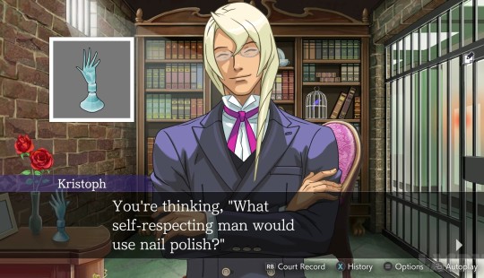
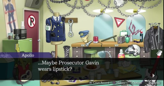
not enough discussion about the gavins' complicated relationship with feminine-coded/beauty products, i don't think.
#for klavier because it's not as direct it's about how we never see him actually wearing lipstick? even though apollo literally attends#a concert of his which is where you'd most expect him to wear makeup. but apparently he just doesnt. or at least not in public#klavier gavin#kristoph gavin#i feel like there are several ways you can read into it. the misogyny/toxic masculinity one is really obvious clearly with kristoph's#singling out of men specifically and klavier's (probably accidental?) condescending manner of calling women 'fraulein' plus his general#mildly patronising attitude towards many of the women in the game (also probably unintentional)#(i think he's trying to be charming and it's coming off wrong to some of them. like ema. and me.)#but i feel like there's also maybe an element of... inherent perfecfionism to it? like both of these products are conventionally beautifyin#products and kristoph while he is open to showing people he uses nail polish specifically chooses one that's clear and missable unless you#see him apply it. he also feels the need to justify his use of it and specifically spell it out as something he chooses to do rather than#needs to do even though duh. that should be obvious.#idk there's just something about his seeming need to take control of that narrative that i find interesting. his need to spin it into a#'there's nothing wrong with my nails but I had the foresight to see that even the smallest parts of my appearance should be kept immaculate#and it's a choice i'm making to refine an already adequate part of my personage /not/ to cover some unsightly defect.' the need to emphasis#that specifically is so. hm. and with klavier i could see it being a case of him liking makeup liking the pops of colour yet being unwillin#to admit to it because he's afraid that other people might see it as him being dissatisfied with his own appearance regardless of if he is#or isn't. or even just perceiving colourful makeup as being unseemly because it's so overt and unnatural.#like i can see this as them both viewing 'real' beauty to be that which is inherent to a person and seemingly effortless#thus somehow negating the beauty which one achieves through cosmetics or other external means.#and if you want to use external means to achieve beauty or neatness or whatever then your only valid options are those which blend into you#natural state. like clear nail polish. or really awful spray tan.#i feel like klavier's less confined by these ideas (if they hold merit at all) considering he actually owns coloured lipstick and he wears#jewellery (admittedly quite 'masculine' jewellery no gems or pearls or anything like that but jewellery nonetheless) but i think it just#makes it more interesting that he doesnt seem quite able to cross the line anyway. like it's that ingrained into his system.#anyway that's all i've got. you guys should tell me what you think too#annotations
264 notes
·
View notes
Text
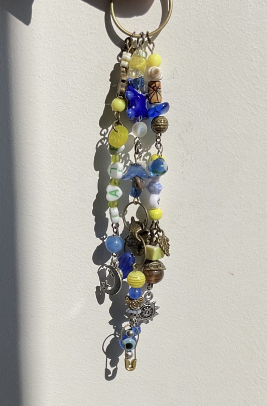
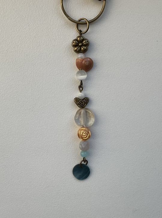
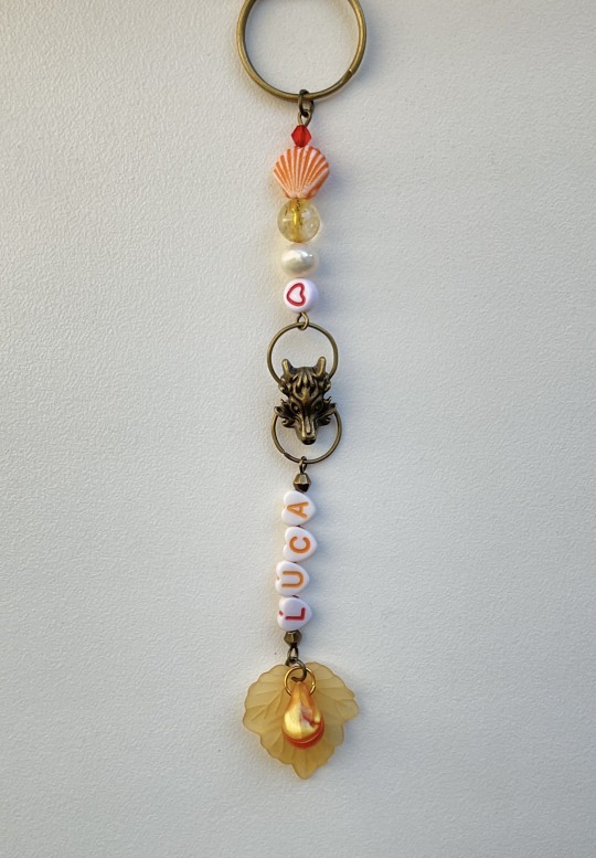
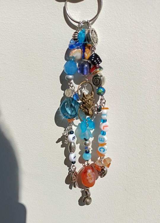
Vr46 academy keychains
Set of five charms that all match in different ways
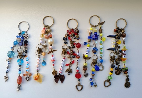
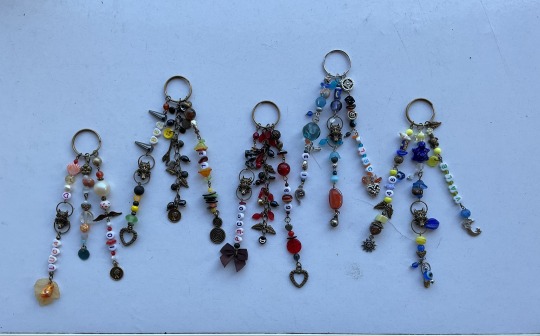
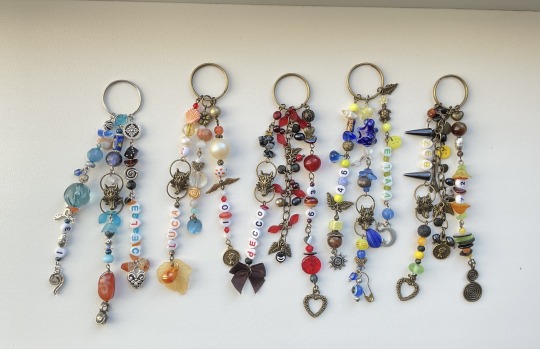
˚ ✦ . . ˚ . . ✦ ˚
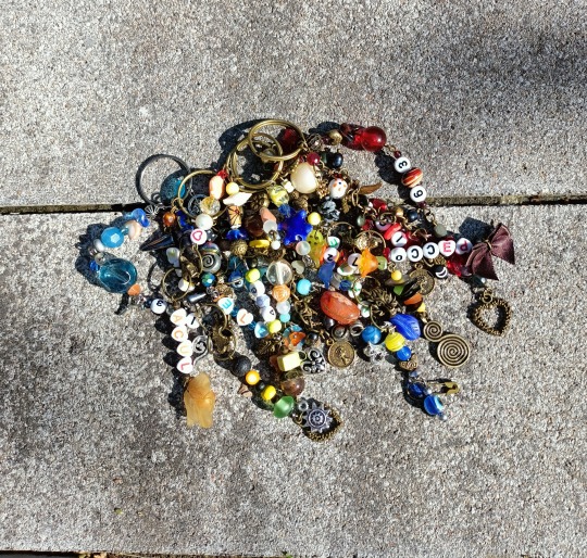
Open for detailed pictures of each one
✩₊˚.⋆☾⋆⁺₊✧ *ੈ✩‧₊˚
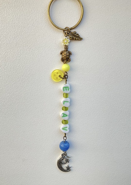
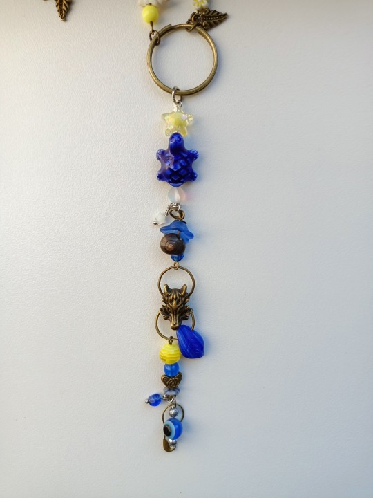
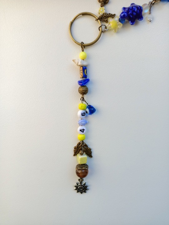
ִֶָ 𓂃˖˳·˖ ִֶָ ⋆★⋆ ִֶָ˖·˳˖𓂃 ִֶָ
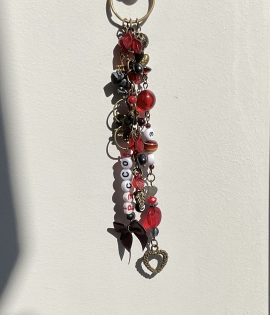
:・゚✧:・.☽˚。・゚✧:・.:
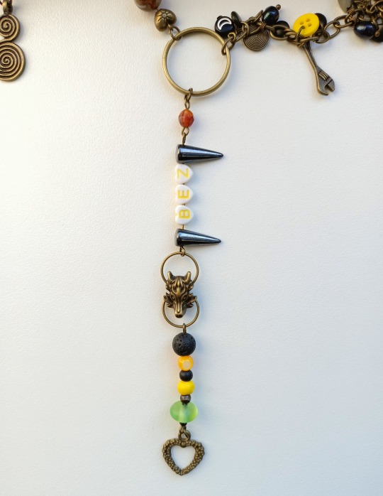
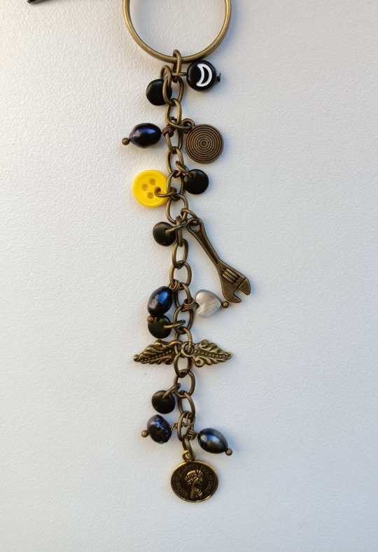
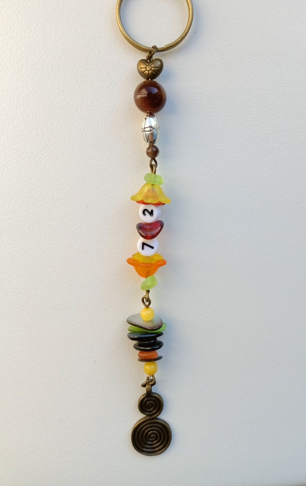
˖⁺‧₊˚⭒✮⭒˚₊‧⁺˖
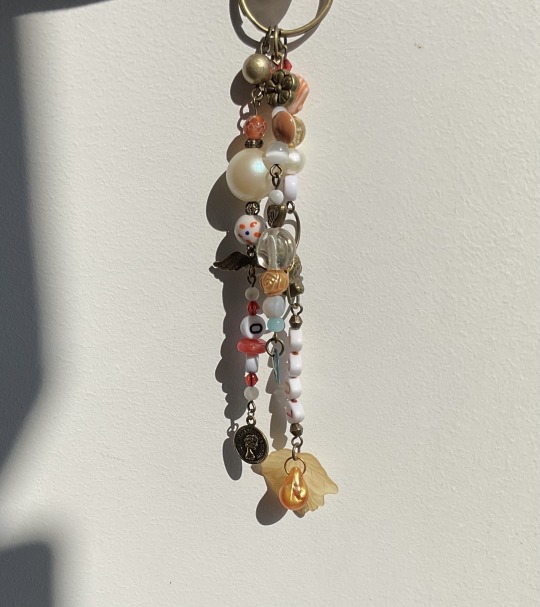
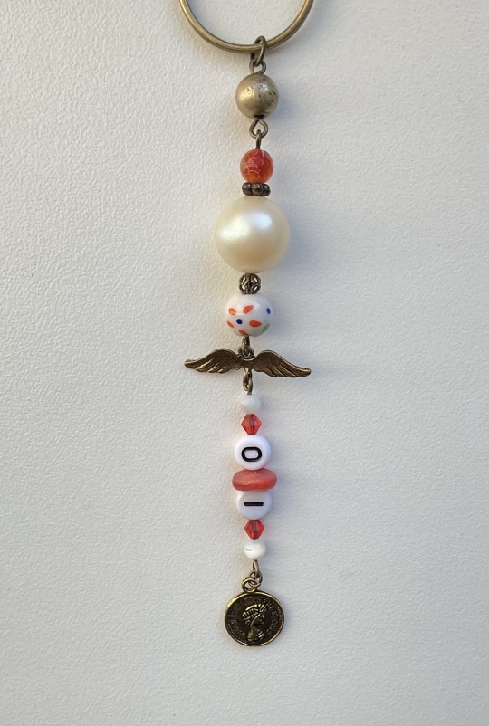
. ݁₊ ✶. ݁ ˖ˎˊ˗
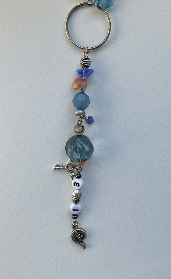
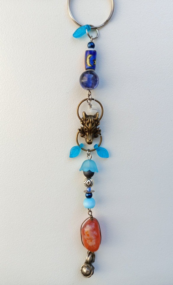
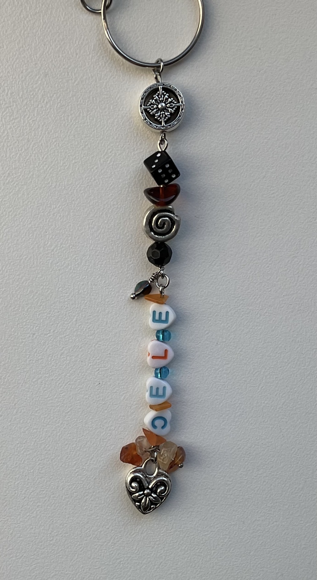
I ran out of tags so I'll say it here but i would greatly appreciate a reblog, especially if you share your thoughts on these pieces in tags (。•̀���-)✧
(Also i forgot that bez have matching part with luca so I didn’t add that to tags sorry
#motogp#marco bezzecchi#pecco bagnaia#valentino rossi#celestino vietti#luca marini#mb72#fb63#vr46#cv13#lm10#vr46 academy#okay so i fear tags won't be enough for me this time but I'll try tell everything anyway#firstly i used nicknames (should have used maro but didn't think at the time) for everyone because it brings more of a family feeling than#when i do initials and that's exactly what i wanted with them. on the same note the wolves#the wolves were tge first thing that started this idea because i wanted to make bez charm and picked one up and then it expanded very fast#because let's all face it - they are basically a wolf pack and it's extremely fitting. also after taking these pictures i found mettalic on#for cele. and it's a huge slay because i really don't like mismatching colours of metal#probably the only one that i did mismatch is vale but amazingly it looks pretty neat. i also put as many turtles as i physically could#also except for wolves he also has matching beads with cele and luca if you can spot them#while cele matches luca and bez#bez matches cele and pecco while pecco matches only bez. it was quite a challenge to find beads that would suit their different#colour schemes while looking organic in keychains#also for bez i used a wrench bc of his family and i think that's pretty neat detail#it was absolute mindfuck to find beads for five different keychains at the same time because of how different they all are but i tried#also put a lot of effort into not repeating myself as much as j could in structures so they all have their own personalities outside of set#also i love that “bez” part looks like fangs icl#if you see bead that stands out by colour from all others in keychain it's probably for their eye colour because i love to add that too#also used old bez livery because what we had this year was horrible#actually i made it some time ago just never had time to post
84 notes
·
View notes
Text

LOOK AT THE AMOUNT OF NOTES ON THIS POST
I GUARANTEE YOU THERES LESS THAN 5 NOTES
PROVE ME WRONG
PLEASE I LOVE MY FANTROLLS MORE THAT THE REAL ONES
[edit: okay maybe i was wrong o_o]
#I LOVE THEM AND YOU SHOULD TOO#SKITCH LITERALLY HAS LIGHT UP SHOES WHATS NOT TO LOVE ABOUT THEM#im not used to seeing them in colour lmao#homestuck#homestuck fantroll#oc#oc art#js paint#drawn with a mouse
300 notes
·
View notes
Text
i've been thinking about how irrigo and violant work recently. so of course i had to make diagrams about it

i don't think the plaque is like a literal tangible thing like it is on your tooth or in your blood vessels, but it's more of a residue that either snaps the synapses immediately and makes it impossible to reconnect the memory or builds up over time on the synapse and makes it harder to access a memory
"with resistance" in this case refers to someone who uses or has been exposed to irrigo frequently over an extended period of time. it works in the same way as drug/antibiotic resistance does in the sense that your synapses grow more resilient to the effects of the plaque and don't just immediately break. think of it like going from dental floss to rope

i also think violant can provide resistance too - in this way it would more likely cancel out the effects of the plaque and it's like placing a casing over your synapse, but at the same time now you have both a violant casing (with violant being impossible to erase so the casing is there basically forever whether it's effective or not) and irrigo plaque on your synapses so it's not something you can do repeatedly without eventually damaging the synapse and doing something fucked up to your memory
there's also potential for the buildup of irrigo and violant causing toxic shock in the brain in the same way foreign objects do - it's only in a long-term sense and if left unchecked the body will start attacking itself and engaging an immune response to remove the buildup, which will in turn inevitably damage, weaken or break the synapse entirely
the way to treat violant+irrigo buildup is with exposure to apocyan. in essence this has the ability to remove the plaque buildup and the casing, essentially breaking it off your synapses, and can help to heal any damage caused by an immune response or the synapse being freed from the casing and plaque. in this it would return the neuron to its natural, unaffected state, and the pathway would neither have the benefits or drawbacks of using violant or irrigo
#this was really interesting to think about#if anyone has any suggestions on how the other colours of the neathbow#(or even other items/experiences!)#should interact with this concept#or if you agree or if you think it should work differently!#to be fair i don't know if colours would interact on this micro-biological scale with neurons#but you know what? neathly fuckery says i can do what i want#this is also kind of a precursor to me talking about marie's irrigo fate. and the point about resistance is important to that#fallen london#yeah we're using the official tag for this one#tposts
86 notes
·
View notes
Text
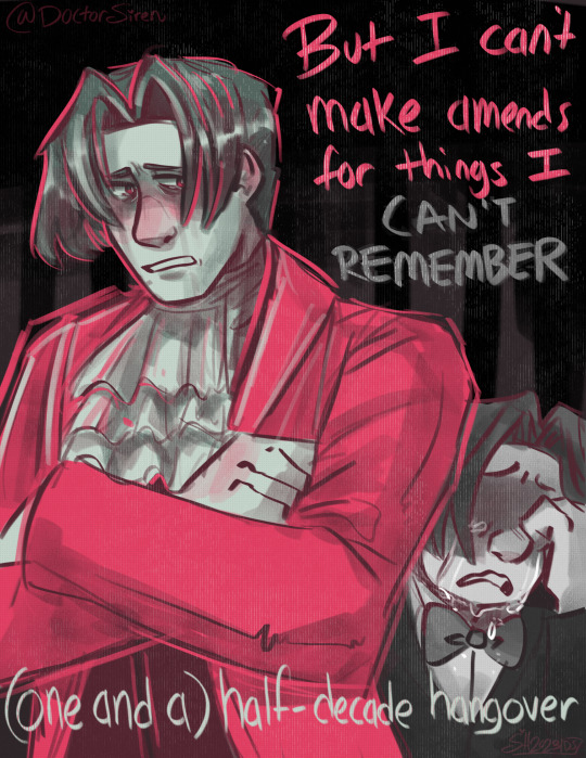
“Guess you’ll just have to take my word that I’ve changed”
#doctorsiren#ace attorney#miles edgeworth#dl 6 incident#will wood#half decade hangover#ace attorney fanart#Will Wood Ace Attorney#art#digital art#my art#fanart#procreate#OKAY BUT GET IT??!?!#the song’s called Half-Decade Hangover#and the DL-6 incident happened 15 years before the Hammond case#so it’s a (one and a) half-decade hangover#💥💥💥 HEHE#I’m learning that the venn diagram of will wood fans and ace attorney fans is a circle#also I used a number generator to tell me what colour palette I should use and the one I got was literally perfect for Edgeworth 💥#ALSO!!!! HE’S FOLDING HIS ARMS AND CLUTCHING ONTO HIS SLEEVE LIKE VON KARMA DOES#I am so evil >:)
660 notes
·
View notes
Text


Hey long time no prev hero au
#lemondoodlrr#prev hero au#hi#i think!!!! zelda should have fire powers#i also dont know what the back of kevin's body suit thingy looks like yet. i'll figure that out some other time LMAO#been trying to use more like ink/watercolor in my sketchbook. other means of adding colour besides markers yknoowwwww
150 notes
·
View notes
Text

found a baby yaku amidst the Sketchbook-glitch-corruption wreckage..... wondering if he flipped skin tones between black and red and everything in between until he saw his to-be-grandparents (and started mimicking THEIR skin tone....... )
#thinking about yakumo having weird lil homunculus proportions or other such variations#what if he just always had massive hands compared to body size. yaoi hands from birth-transformation#he was so anti-snake that he looked at hands and said YES. THIS IS THE LEAST SNAKEY I CAN BE. I WILL GO 600% ON THIS FEATURE SPECIFICALLY#changing forms from entirely obsidian... or red in patches.... or striped... or other combinations...#because he only had murals to base his human form off of? at least at first?#were the murals in colour? shaded with gradients and lighting oh so conveniently?#then how was he to know what skin tone humans are supposed to have???#imagining the first few times he encountered his grandparents in his cave#maybe they only saw a shadow with eyes darting back into the darkness#just a really long black noodle with semisnake semihuman eyes (just a hint of sclera)#and every time they visited#yakumo observed more of their features#and took on something similar to their proportions...? or hair colour? or skin colour?#and maybe even when he's first adopted into the family and leaves the cave#he's still a vibrant pink and everyone thinks he somehow got sunburnt inside a cave or smth#but then he starts seeing all the other people in the village#including diff age groups and kids who are supposedly around his age#so he starts to slowly morph his body toward those characteristics#his skin gets beige-r. reshapes his eyes a bit.... grows a bit of nose.....lengthens his limbs a bit...#(the big humans seem to treat me the same as that speCIFIC group of smaller humans... so maybe i should use them as a Model)#like... how do you even age in a human body when you have no reference for how humans age?!??!#did yakumo stare at several children in the village and watch their growth year by year#and match his body to their changes just to fit in?#did nature just know what to do?? and he just naturally grew like a human without manual manipulation?#I DEMAND ANSWERS#nu carnival yakumo
103 notes
·
View notes
Text


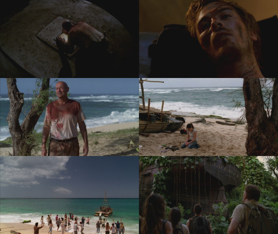
LOST: Season One
#lost#abc lost#lost one cap per ep#this was a project i was gonna do anyways but the timing worked out that i could post the first one on the 20th anniversary!#this is one cap per ep every season. from left to right. and this is important: its not a cap that sums up each ep#its a cap that REPRESENTS each ep. the way i choose them varies every episode#sometimes its an utterly iconic moment. sometimes it reps the theme of the ep. or it hits with a theme of the character themselves#sometimes the cap i use won't even involve the character whose centric episode it is. trust me. this makes sense#anyways i'll give a good example: for outlaws i was so tempted to use a shot of the judgemental soulful gaze of the boar#or perhaps sawyer in the rain after he shot that man#but! i used that shot of sawyer's dads legs as sawyer is hiding under the bed. i feel it worthy because this moment. this scene#is literally a core part of sawyer. it's a defining moment of his backstory. of his character. so yeah. makes sense yeah?#anyways some eps had Too Much going on (lord i could make one of these for exodus part 1 alone) and some not enough#or well they DID but like lacked in caps that Hit in the way im thinking. thank heavens charlie shot ethan cuz i was worried about that ep#i was like ''aw shit what am i gonna use'' and then an iconic lost moment happened kjhfdsjkhfd#anyways. there are 25 eps in season one. so im really glad that the last ep contains one of the moment iconic visuals/moments in all of los#oh i should add that these caps are unedited. i did not fuck with the colours or saturation in any way#i found 'em and i pieced them together. this is harder than it sounds. i browsed through all the screencaps of every ep of season one#and i will do so the remaining five seasons#some of these were super easy like i knew what cap i'd be using before i even started (eg. do no harm. the moth. in translation)#but some took some real Thinking. and some eps even had several caps that would have worked. this has all been quite interesting#also yeah. y'all already know damn well what cap i'm using for the very last episode
73 notes
·
View notes
Text

i occasionally say that bat’s colours are an off shade from other characters’ colours and this is what i mean by that lol
#this is vee speaking#the colour for bat might be a little off lol i used an old post i made about the characters colours to do this#but i probably should have picked from hypdream tbh lol#BUT SEE WHAT I MEAN LMAO#and like you can do this for all the characters tbh gentaro’s purple is a brighter purple than jakurai’s lavender#saburo rei and hifumi are yellows rio is the only orange i believe etc etc#and you could probably group them by the division colours that we have#it’s neat as shit idk how much thought went into choosing the colours for everyone lol#not in the sense that i think it’s arbitrary but idk how pointed it’s supposed to be lol#like jakurai and gentaro are parallels that’s why their bright/pastel versions of that purple and the same can be said for doppo dice#i don’t shut up about ichiro and kuukou walking the same path lol there’s probably something to jyushi and ramuda being pinks#how far does it go is the question lol 🤔#like tbh i think there’s a decent argument that bat’s colours have a little bit of purple in them#maybe implying similar goals to these divisions but with a bat twist (which again makes me wonder about jyushi and chuuoku lmao)
27 notes
·
View notes
Note
Hi!! I just wanted to say that the way you draw characters/use colors in your art is an absolute dream, I've never seen anything prettier. Do you have a specific way you pick/use colors, or any advice for coloring? You inspire my art so much, and I'd love to learn how to color like you someday :)

@braventheninth gonna reply to both of you here hope that's cool!
aaaah thank you so much I'm really honoured to hear you both like it and that it inspires you anon !! ;v; I don't actually know much about art theory-wise, aside from very basic colour theory that I always forget so most of my choices are pretty instinctual and based on my own preferences!
i can do my best to explain my thought process though! uuh it is. lots of text though just as a warning.
one thing I tend to do with almost everything is pick what kind of colour mood I'm going for! usually, since I love orange and also warm feelings, I'll aim for some kind of warm tone and when doing that I try to slide every colour I pick towards the warm end of the colour wheel. Blacks and whites are especially good for this! As a general thing I almost fully avoid picking any colours along those edges of the colour picker

instead I'll move all my colour choices a nudge into the square for the colours towards the tone I want (in this case warm) (the white is there be warm too I just forgor to type it).

and since I wanted warm colours for this drawing I desaturated the blue of Brain's pants so it would fit in better. I once heard someone say you should always pick one main colour and saturate fully and the further away from it on the colour wheel you got, the more desaturated your colours should be. I don't really do that bc I like my colours to stay bright but I do keep it in mind to mess around with sometimes.
I'm not always great at keeping this consistent, but I think it usually makes for pretty decent results... Other things I keep in mind are that when I pick the colour for my shadows I always make a little slide on the colour wheel towards the opposite tone of what I based my main colours on. oh and picking the right base colours ?? no clue tbh I always put every colour on it's own layer and then I spend a couple minutes adjusting them all seperately until I feel like they go well enough together. I usually avoid the bottom to right section of the square fully, bc I find they often get oversaturated and muddy, but that's just a personal preference I guess.
also since I enjoy the way coloured lineart works for my stuff I tend to mess around with layer settings for my lineart! usually the end results will look something like this:

where the clipped layer is clipped on to my colours folder. lineart is the only place where I just use plain black since I'm gonna change it with these layer settings later. it often still shows up as black for darker colours (and especially blues?) but it keeps a slightly coloured edge that I enjoy. if the blacks of the end result don't look good, messing around with the layer opacity usually changes stuff up. sometimes I'll also erase part of the lineart from one of the layers as a way to adjust.
I think what might be more relevant though, is the way I've been picking my colours for most of my recent posts though, which is. very differently. and also quite dependant on the fact I've been drawing on Tegaki! Tegaki has a limited colour palette that looks like this

only the 6 colour slots next to the bottom greyscale can be replaced by your own colours. As shown here I only bothered to add something to half of them; mainly the beige-ish colour I like to use for whites, a brown that I never use bc it's ugly with everything else here and a purple? that I only Think I added. both the brown and purple suffer from being too desaturated for the rest of the palette, which makes them stand out in a pretty bad way when used tbh.
I have. absolutely no idea what I'm doing with colours on this site though ngl. I think it just automatically pushes you to be a little more chaotic with the choices? a simple example is the green I picked for Link's tunic here doesn't really have any good, easy choice for shading imo. most of the "darker" green tones just feel more saturated, and it sticks out pretty bad as a shading colour for the more muted green I picked for the tunic. Removing those, the choice was either a mossy green or a blue.

and while the mossy green is still green, it feels far too dark a shading colour compared to what I picked as shading for the rest of the drawing. The blue has the added bonus of being closer to the purple I used for the black-ish parts.
I think my point is that it's really easy to push yourself to make some fun new choices when the tools you're using limit you a bit in a way? Looking at it now, I'm also seeing that the hands were lined with very different colours. I remember just thinking that I couldn't be bothered to find the exact same purple I used for the first hand so I just went with the first thing I landed on, that being a pink. But now I think it works pretty well since the one hand is lifted a bit more into the light and that goes well for a bright colour like pink. happy accidents and all that right ?
I am fully just yapping at this point 🧍 but the point still goes for most things drawn on this site.

like there was no reason to add the blues or reds or pinks to the heather here but I only had so many purple shades to work with. it might be less realistic but I don't think it would've come out as well if I had stuck to only the purple shades from my reference photo.
This ended up way way too long and I have no idea if any of it made sense or was helpful at all, but it was surprisingly fun to reflect on my own choices a bit more! especially since I often just do whatever I feel like I think it's helpful to sit back and consider what instinct actually tells me it's the right thing to do.
in an attempt to do something actually helpful uuh I recommend messing around with 2 specific things and switching around with them a bit; namely limited colour palettes (like 1 or 2 main tones imo) and then just going absolutely ham and just using whatever colour for everything (make them orange! put some blue and purple on the bark! leaves can be blue if they want to! (go more ham than I did tbh))

I think just messing around does so much for making some kind of sense of colours even without Knowing how they work. it's easy to say we should all study, but personally I'm pretty bad at it and it's more fun to just trial and error it... errors do happen a lot though omg do they happen, but that's helpful for figuring stuff out too!
#ask#when I called myself Yappinator 2000 on bsky this is exactly what I meant shfdiuhsdf#feeling a little sick and should've probably slept early instead of figuring this out but it was rly fun and relaxing actully!#considering how bad I've slept recently ending the day with lots of quiet pondering might be just what I need haha#I should probably get the triangle colour wheel so I can lessen all those colours I don't like to use but I'm too used to it being like thi#too tired to have imposter syndrome too tired to overthink whether I make sense. it's quite nice actually#I hope at least some of it will be helpful or fun :)#almost started overthinking anyway I am pulling myself back by the scruff and off to bed#sleep well everyone whenever you do <3#also. totally no secret tegaki agenda here totally 👀 it's totally not like I think everyone should at least try that site haha no waay#it's only full of cool and nice people just like here and you can draw silly comments to each other#and also runs better on chrome than firefox wink wink......... spleepy time..........
26 notes
·
View notes