#website UX design
Explore tagged Tumblr posts
Text
The Impact of Interactive Web Design on User Engagement
An interacting website amuses viewers and visitors. How? Interactivity can be a game changer. In the digital age of hyperactivity and cut-throat competition, businesses are looking for ways to engage their audience by any possible means.
Nowadays, websites have become a gateway to becoming aware of any brand or business for its every little detail. With millions of websites competing for more attention, how would you stand out in this fierce competition?
Designing interactive pages and content can be a masterstroke to significantly increase engagement. Integrating elements that users can interact with and have amazing experiences, makes them come back again and again to you. Complexity can kill the vibe. So when you opt to have a website, be certain about interactivity as interactive website design can create a memorable experience. Encourage visitors to stay longer with you through your intriguing website.
What is interactive website design?
Interactivity is beyond just having a website with creatives and content. Examples of interactive elements include videos, quizzes, games, animations, etc. The purpose of such websites is to give people a reason to stay longer. If users stay for a longer period of time, it can reduce the bounce rate, and increase conversion rates.
A simple transformation of a click turning into animation can be a fun way to hold users’ attention. The best interactive website with elements that give a memorable experience can be the reason for more traffic and engagement.
There are around 2 billion websites in the world. So, your website needs to be competitive and unique in this world wide web. Another benefit you’ll have by designing an interactive website is it allows you to monitor what elements work best for efficiency and getting more users.
What are the interactive elements you can use to attract attention?
Make your website memorable with various interactive elements to engage users with more interesting content.
Infographics & charts -
Interactive infographics and charts can help convey a message and simply provide complex information. These elements make content more easy to understand. This is one of the ways you can transfer obscure information with detailed and engaging content.
Videos -
People nowadays prefer videos to get information about anything. Videos are the new communication tool to keep in touch with your audience. An interactive and interesting video can have the potential to hold people’s attention.
Quiz & game -
One of the best and most interesting ways to keep people busy and engaged is to add quizzes and games. This way you will get to know about their preferences, interests, and behaviors to gather valuable information about them.
Chatbot & live chat option -
To make the user experience better, you need to have a good website UX design. Adding a chatbot and live chat option can help people solve their queries. If your site has these elements, they have a reason to trust you.
There are things that you must remember when making websites for businesses.
Avoid cluttering as much as possible. A simple and clean design can attract most visitors, not because of the simplicity, but a clean design lets them understand your website easily. To find what they are looking for, they can search without any difficulty.
When you are providing website interactive elements, you have to give clear instructions for how to use such things. So, that it will be easy for them to get engaged with your website without any confusion.
While shaping informative website design, always use relevant and interesting content covering the needs of an audience. This will help users engage with your business.
Don’t forget to have a fast-loading website as no one will wait for your site to load for more than 3 seconds.
Responsive websites are a must. Nowadays, people prefer to use mobile phones for their shopping, searching, or any other purpose.
Also, test your website across different browsers to ensure how it looks, its loading time, appearance, etc.
Balance the content and creatives that you are going to add to the website design, as you have to make sure that content cannot be compromised for designs.
Interactive website design is one of the ways you can boost a good user experience. A website design process takes a good amount of time and brainstorming as every website owner wants to give their users the best experience.
If you want to improve your website with upgraded features and elements, contact us. We have designed 250+ websites and provide top-notch website designing services. Our team of website designers and developers has experience in designing the best websites with up-to-date features and tools.
#interactive website design#website UX design#websites for businesses#website interactive elements#informative website design#website design process
0 notes
Text
User Experience & Website Design
How User Experience Impacts Website Design?

User experience or UX, plays a pivotal role in shaping the effectiveness of a website. Through a carefully planned UX design, a website can create a strong influence on how visitors perceive, interact with, and derive value from a website.
An optimized UX can be the difference between engagement and abandonment. A well-planned UX is designed to make the user's journey through a website easy and value-adding, and in the process, guiding the users to take desired actions such as signing up for a webinar. Intuitive navigation, responsive design, and seamless functionality are the must-have components of a good UX design, and will determine how users navigate and access information on your website.
The visual aesthetics of a website play an equally important part in shaping user perceptions. Visual elements like colour schemes, typography, and layout choices will have a huge impact on the overall look and feel of your website. UX design includes these crucial visual factors while maintaining consistency in design elements across pages. Consistency is essential for cultivating a sense of familiarity and comfort, which further enhances the overall experience.
A user-centered approach in website design involves:
Understanding the target users
Tailoring the website to user preferences and behaviours
User research and feedback-driven iterations
Deeper understanding of user expectations and pain points
Relevant and engaging content that addresses user expectation and pain points
The impact of UX on website design extends beyond user satisfaction. Search engines like Google favour websites with excellent UX, thereby influencing the website's search rankings and visibility. Positive user experiences also lead to increased conversions and high website performance.
Prioritizing UX contributes to meaningful connections with visitors, elevating a website from being merely informative to becoming an immersive and valuable digital destination.
0 notes
Text
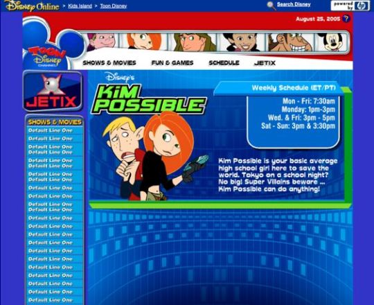
Kim Possible Webcore Y2K
#2000s#00s#art#blue#cartoon#childhood#cybercore#cyber y2k#design#disney#graphic design#graphics#illustration#kaybug#kim possible#old internet#old web#tech#screenshot#technology#uidesign#ui#ui ux design#webcore#website#y2kcore#y2kore#y2k aesthetic#y2k core#y2k cyber
208 notes
·
View notes
Text
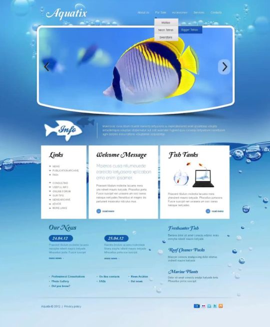
"Aquatix" website template
#art#blue#design#fish#frutiger aero#graphic design#graphics#helvetica aqua aero#internet#template#uidesign#ui#ui ux design#water#webcore#website
53 notes
·
View notes
Text
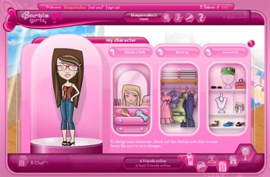
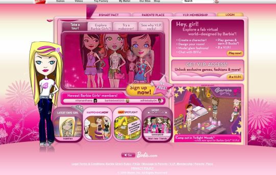
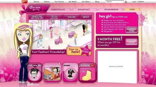
BarbieGirls Website
#2000s#00s#art#barbie#fashion#girly#graphic design#graphics#internet#old internet#old web#pink#screenshots#ui ux design#webcore#website#vectorbloom
109 notes
·
View notes
Text
JavaScript Fundamentals
I have recently completed a course that extensively covered the foundational principles of JavaScript, and I'm here to provide you with a concise overview. This post will enable you to grasp the fundamental concepts without the need to enroll in the course.
Prerequisites: Fundamental HTML Comprehension
Before delving into JavaScript, it is imperative to possess a basic understanding of HTML. Knowledge of CSS, while beneficial, is not mandatory, as it primarily pertains to the visual aspects of web pages.
Manipulating HTML Text with JavaScript
When it comes to modifying text using JavaScript, the innerHTML function is the go-to tool. Let's break down the process step by step:
Initiate the process by selecting the HTML element whose text you intend to modify. This selection can be accomplished by employing various DOM (Document Object Model) element selection methods offered by JavaScript ( I'll talk about them in a second )
Optionally, you can store the selected element in a variable (we'll get into variables shortly).
Employ the innerHTML function to substitute the existing text with your desired content.
Element Selection: IDs or Classes
You have the opportunity to enhance your element selection by assigning either an ID or a class:
Assigning an ID:
To uniquely identify an element, the .getElementById() function is your go-to choice. Here's an example in HTML and JavaScript:
HTML:
<button id="btnSearch">Search</button>
JavaScript:
document.getElementById("btnSearch").innerHTML = "Not working";
This code snippet will alter the text within the button from "Search" to "Not working."
Assigning a Class:
For broader selections of elements, you can assign a class and use the .querySelector() function. Keep in mind that this method can select multiple elements, in contrast to .getElementById(), which typically focuses on a single element and is more commonly used.
Variables
Let's keep it simple: What's a variable? Well, think of it as a container where you can put different things—these things could be numbers, words, characters, or even true/false values. These various types of stuff that you can store in a variable are called DATA TYPES.
Now, some programming languages are pretty strict about mentioning these data types. Take C and C++, for instance; they're what we call "Typed" languages, and they really care about knowing the data type.
But here's where JavaScript stands out: When you create a variable in JavaScript, you don't have to specify its data type or anything like that. JavaScript is pretty laid-back when it comes to data types.
So, how do you make a variable in JavaScript?
There are three main keywords you need to know: var, let, and const.
But if you're just starting out, here's what you need to know :
const: Use this when you want your variable to stay the same, not change. It's like a constant, as the name suggests.
var and let: These are the ones you use when you're planning to change the value stored in the variable as your program runs.
Note that var is rarely used nowadays
Check this out:
let Variable1 = 3; var Variable2 = "This is a string"; const Variable3 = true;
Notice how we can store all sorts of stuff without worrying about declaring their types in JavaScript. It's one of the reasons JavaScript is a popular choice for beginners.
Arrays
Arrays are a basically just a group of variables stored in one container ( A container is what ? a variable , So an array is also just a variable ) , now again since JavaScript is easy with datatypes it is not considered an error to store variables of different datatypeslet
for example :
myArray = [1 , 2, 4 , "Name"];
Objects in JavaScript
Objects play a significant role, especially in the world of OOP : object-oriented programming (which we'll talk about in another post). For now, let's focus on understanding what objects are and how they mirror real-world objects.
In our everyday world, objects possess characteristics or properties. Take a car, for instance; it boasts attributes like its color, speed rate, and make.
So, how do we represent a car in JavaScript? A regular variable won't quite cut it, and neither will an array. The answer lies in using an object.
const Car = { color: "red", speedRate: "200km", make: "Range Rover" };
In this example, we've encapsulated the car's properties within an object called Car. This structure is not only intuitive but also aligns with how real-world objects are conceptualized and represented in JavaScript.
Variable Scope
There are three variable scopes : global scope, local scope, and function scope. Let's break it down in plain terms.
Global Scope: Think of global scope as the wild west of variables. When you declare a variable here, it's like planting a flag that says, "I'm available everywhere in the code!" No need for any special enclosures or curly braces.
Local Scope: Picture local scope as a cozy room with its own rules. When you create a variable inside a pair of curly braces, like this:
//Not here { const Variable1 = true; //Variable1 can only be used here } //Neither here
Variable1 becomes a room-bound secret. You can't use it anywhere else in the code
Function Scope: When you declare a variable inside a function (don't worry, we'll cover functions soon), it's a member of an exclusive group. This means you can only name-drop it within that function. .
So, variable scope is all about where you place your variables and where they're allowed to be used.
Adding in user input
To capture user input in JavaScript, you can use various methods and techniques depending on the context, such as web forms, text fields, or command-line interfaces.We’ll only talk for now about HTML forms
HTML Forms:
You can create HTML forms using the <;form> element and capture user input using various input elements like text fields, radio buttons, checkboxes, and more.
JavaScript can then be used to access and process the user's input.
Functions in JavaScript
Think of a function as a helpful individual with a specific task. Whenever you need that task performed in your code, you simply call upon this capable "person" to get the job done.
Declaring a Function: Declaring a function is straightforward. You define it like this:
function functionName() { // The code that defines what the function does goes here }
Then, when you need the function to carry out its task, you call it by name:
functionName();
Using Functions in HTML: Functions are often used in HTML to handle events. But what exactly is an event? It's when a user interacts with something on a web page, like clicking a button, following a link, or interacting with an image.
Event Handling: JavaScript helps us determine what should happen when a user interacts with elements on a webpage. Here's how you might use it:
HTML:
<button onclick="FunctionName()" id="btnEvent">Click me</button>
JavaScript:
function FunctionName() { var toHandle = document.getElementById("btnEvent"); // Once I've identified my button, I can specify how to handle the click event here }
In this example, when the user clicks the "Click me" button, the JavaScript function FunctionName() is called, and you can specify how to handle that event within the function.
Arrow functions : is a type of functions that was introduced in ES6, you can read more about it in the link below
If Statements
These simple constructs come into play in your code, no matter how advanced your projects become.
If Statements Demystified: Let's break it down. "If" is precisely what it sounds like: if something holds true, then do something. You define a condition within parentheses, and if that condition evaluates to true, the code enclosed in curly braces executes.
If statements are your go-to tool for handling various scenarios, including error management, addressing specific cases, and more.
Writing an If Statement:
if (Variable === "help") { console.log("Send help"); // The console.log() function outputs information to the console }
In this example, if the condition inside the parentheses (in this case, checking if the Variable is equal to "help") is true, the code within the curly braces gets executed.
Else and Else If Statements
Else: When the "if" condition is not met, the "else" part kicks in. It serves as a safety net, ensuring your program doesn't break and allowing you to specify what should happen in such cases.
Else If: Now, what if you need to check for a particular condition within a series of possibilities? That's where "else if" steps in. It allows you to examine and handle specific cases that require unique treatment.
Styling Elements with JavaScript
This is the beginner-friendly approach to changing the style of elements in JavaScript. It involves selecting an element using its ID or class, then making use of the .style.property method to set the desired styling property.
Example:
Let's say you have an HTML button with the ID "myButton," and you want to change its background color to red using JavaScript. Here's how you can do it:
HTML: <button id="myButton">Click me</button>
JavaScript:
// Select the button element by its ID const buttonElement = document.getElementById("myButton"); // Change the background color property buttonElement.style.backgroundColor = "red";
In this example, we first select the button element by its ID using document.getElementById("myButton"). Then, we use .style.backgroundColor to set the background color property of the button to "red." This straightforward approach allows you to dynamically change the style of HTML elements using JavaScript.
#studyblr#code#codeblr#css#html#javascript#java development company#python#study#progblr#programming#studying#comp sci#web design#web developers#web development#website design#ui ux design#reactjs#webdev#website#tech
391 notes
·
View notes
Text
Having loud thoughts again, but you know what would be an absolutely baller idea for tumblr's layout? Everything being a full widget system, especially on the dashboard. I'm just using this as an example, but the old UI for deviantart, dated as it is now by website standards visually, worked off a widget like system where you had so much control over how your profile page was displayed. Certain elements/boxes could be dragged and placed on your page and then adjusted via preset options or through a bit of light coding shenanigans. Imagine that, but with the tumblr dashboard. Instead of being stuck in just one format, you could drag your navigation bar to the left or right or if you don't like that you could pull it up top instead. Or you could have a widget on the side bar like xkit does for tag tracking, or trending tags or just not have any of that on the dashboard. Or how about a widget purely to keep track of recent mutuals that will take you directly to a full list in one click or a widget listing your current que ect ect. All of these being movable pieces yeah? The main point being the ability for a user to rearrange their dashboard to their liking for the best personal navigation with the least amount of clicks. I think the idea of drag and dropping UI elements is taken for granted on most current social media sites even though it's extremely intuitive once you understand it's a feature that exists and how clunky things feel when you don't have it or it's taken away. There's personal website builders that already use widgets pretty frequently, so why not extend that to bigger websites that rely on plenty of consistent user navigation daily? Like imagine updates that could be about adding in highly requested new widgets or adjusting functionality of current widgets to perform better based on user feedback. I am not a coder so I don't know how difficult it would be to implement a robust widget system for a large scale social media website, but it's been on my mind for years now with trying out all kinds of beta art sites before. I really think something like that would be worth the investment for a place like tumblr and potentially cut down on a lot of discontent over layout changes.
#tumblr#tumblr layout#tumblr dashboard#dashboard#tumblr ui#ui design#ux desgin#personal#personal ramblings#long post#I think about this A LOT in some of my friend groups#talking about failed or struggling art websites mostly#widgets are so dope and they should be the standard for desktop layouts
121 notes
·
View notes
Text
youtube
Is your website accessible? (Beginners Guide)
Making your website as accessible as possible is not just a legal or ethical requirement, it’s also a practical concern—allowing everyone to benefit from your content. Here are four areas to review.
#beginners guide#ui ux design#ui design#youtube#ux and ui design#web design#education#free education#How to Design Accessible UX#web accessibility#ui design inspiration#ux design process#ux research#ux designer#ux ui design#breaking barriers#accessibility#accessibleliving#accessible design#accessibility for all#website accessible#app developers#Youtube
4 notes
·
View notes
Text
Working on the final project for class which is re designing my website. The goal is to have this up by September so I’m working on hi fidelity prototypes
Wish me luck!
#cosmic funnies#astronomy#space#cute#science#kawaii#reblog#blog update#stars#educational#college#re design#sketching#website#ux desgin#ui design#ui development
89 notes
·
View notes
Text
Diseño web
¡Hola! Les dejo mi servicio de diseñadora web, si me ayudan a compartirlo les agradecería. <3
#web designer#design#designer ux/ui#ux/ui#figma#figmadesign#uxdesign#ui ux development services#web development#mobile app development#mobile games#desktop#website#graphic design#creative
7 notes
·
View notes
Text
processos zzzz / process zzzz
[ br / eng ]
[um pequeno processo criativo/meu primeiro projeto oficial] lição mágica aprendida hoje: contraste.
˚✧ antiseptic ݁ ੭
BR :
⎯⎯ o processo criativo é a parte mais divertida de um design, as cores, fontes, formas, texturas, tudo é tão bom que me derreto por essa área ♥︎ fico extasiada em como os embasamentos realmente funcionam na prática.
meu PRIMEIRO projeto consistia em fazer um site de refrigeração nas cores azuladas, confesso que odeio não poder encher de símbolos e formas (tirem o figma de mim), mas trabalhar com estilos diferentes me fez refletir como os clientes veem o mundo, então decidi tentar! 𓆩♱𓆪
e o meu primeiro cliente foi meu pai! 🖤

pequenas explicações é apenas a teoria do que pensei, não é necessário ler~
/⠀ ⠀TIPOGRAFIA ⠀⠀ 〜 ♱
𓏲 pesquisei diversas fontes, precisava de algo que não fosse retangular, mas não fosse tão redondo, apesar do aspecto profissional que eu quis passar. a psicologia por trás da forma redonda é bem simples: círculos são associados a suavidade, absoluto, movimento e facilidade, mas não exagere. nenhuma forma deve ser exagerada, isso causa a impressão de mal feito e afastamento, é necessário equilibrar para uma fórmula bem feita. ⛧
/⠀ ⠀CORES ⠀⠀ 〜 ♱
de fato, essa foi a parte mais fácil. a paleta de cores predominante é o azul, o que traz uma sensação de frieza, frio, gelo, tudo o que queremos, certo? (sim.) por se tratar de uma marca de refrigeração, não escolhi o preto como a cor das fontes, mas sim uma cor acinzentada, fugindo do padrão. o laranja foi escolhida por conta do círculo cromático das cores, ou, a velha teoria das cores.

fonte: sla peguei no google / https://blog.adobe.com/br/publish/2022/03/30/como-usar-o-circulo-cromatico-com-o-adobe-color-super-facil
─ é nítido que o azul e o laranja são cores contrárias, então, por que elas parecem tão harmonicas juntas? porque são cores complementares. um pequeno resumo: as cores complementares são aquelas que dão contraste uma a outra, um exemplo interessante é a rapunzel de enrolados, você percebe que a paleta de cor predominante nela é o roxo e o amarelo, pois são cores que se contrastam, ficando assim de forma harmonica.
,⠀cinza e branco: são cores análogas, estão presentes lado a lado no círculo cromático, o resultado é uma cor básica. (imagine aquele seu amigo que fala, aff isso não é roxo, é violeta! entao, é isso...) (eu sou essa chata, ok?) (voce nao pode falar que rosa choque é igual rosa ou eu irei atrás da sua familia) ☆
/⠀ ⠀CONCLUSÃO, uau ⠀⠀ 〜 ♱
é necessário durante a criação pensar no contraste das cores e dos elementos, as formas arrendondadas precisam ser equilibradas com formas retangulares de forma positiva, elementos que normalmente se dão bem juntos são aqueles que se contrastam, é muito interessante pensar em como é necessário dar atenção aos mínimos detalhes. o contraste é uma das ferramentas mais poderosas do design, se utilizada corretamente.
errr, sobre o site? ele continua na fase de programação, mas caso o post tenha uma repercussão boa, eu trarei ele com seu resultado. obrigada a todos que leram até aqui, um comentário e corações me deixariam muito feliz ♡
dúvidas, sugestões ou críticas? me mande um ask, ele está aberto para qualquer tipo de coisa que tenha surgido durante o post. ♥︎
ENG :
[a small creative process/my first official project] magical lesson learned today: contrast.
⎯⎯ creative process is the most enjoyable part of design, the colors, fonts, shapes, textures, everything is so good that I melt for this area ♥︎ i am ecstatic about how the foundations really work in practice.
my FIRST project consisted of creating a cooling website in shades of blue, i confess that i hate not being able to fill it with symbols and shapes (take figma away from me), but working with different styles made me reflect on how clients see the world, so I decided to try! 𓆩♱𓆪
and my first client was my dad! 🖤
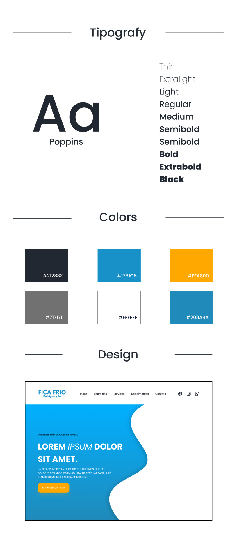
small explanations it's just the theory of what I thought, no need to read~
/⠀ ⠀COLORS ⠀⠀ 〜 ♱
indeed, this was the easiest part. the predominant color palette is blue, which brings a sensation of coolness, cold, ice, everything we want, right? (yes.) as it's a cooling brand, I didn't choose black as the font color, but rather a grayish color, deviating from the norm. orange was chosen due to the color wheel theory, or, the old theory of colors.

font: idk, got it from google / https://blog.adobe.com/br/publish/2022/03/30/como-usar-o-circulo-cromatico-com-o-adobe-color-super-facil
─ it's clear that blue and orange are opposite colors, so why do they look so harmonious together? because they are complementary colors. a brief summary: complementary colors are those that contrast with each other, an interesting example is rapunzel from tangled, you notice that the predominant color palette on her is purple and yellow, because they are contrasting colors, thus appearing harmonious.
,⠀gray and white: they are analogous colors, present side by side on the color wheel, resulting in a basic color. (imagine that friend of yours who says, ugh, this isn't purple, it's violet! so, that's it...) (i'm that annoying person, okay?) (you can't say that hot pink is the same as pink or I'll go after your family) ☆
/⠀ ⠀CONCLUSION, wow ⠀⠀ 〜 ♱
it's necessary during creation to think about the contrast of colors and elements, rounded shapes need to be balanced with rectangular shapes positively, elements that usually work well together are those that contrast, it's very interesting to think about how attention to the smallest details is necessary. contrast is one of the most powerful tools in design, if used correctly.
uhh, about the website? it's still in the programming phase, but if the post has a good reception, i'll bring it with its result. thank you to everyone who read this far, a comment and hearts would make me very happy ♡
questions, suggestions, or criticisms? send me an ask, it's open to anything that came up during the post. ♥︎
#designgraphic#design#design ux#design ui#designinspiration#website#web design#art process#colors#theory#disscussion#brasil#english#creative#art#digital art#my art#aesthetic#figma#figmadesign#figma figure
10 notes
·
View notes
Text
How UX/UI Design Impacts User Engagement: Strategies for Success

In today’s digital landscape, a seamless and engaging user experience is crucial for any business looking to succeed online. The Best UX/UI Design Agency in the Middle East plays a vital role in crafting interfaces that captivate users and enhance their journey through websites and applications. Exceptional UX/UI design not only improves user satisfaction but also boosts conversion rates, customer loyalty, and brand reputation.
Understanding UX/UI Design
User Experience (UX) and User Interface (UI) design are two interdependent aspects of digital product design. While UX design focuses on the overall experience a user has with a product, UI design deals with the look and feel, ensuring an aesthetically pleasing and functional interface.
A well-designed UX/UI framework allows businesses to create intuitive, accessible, and engaging digital platforms, fostering stronger connections with their audience. The Best UX/UI Design Agency in the Middle East leverages these principles to enhance user engagement and drive business success.
The Role of UX/UI in User Engagement
User engagement is a key metric that determines how effectively a digital platform retains its visitors and converts them into loyal customers. Poor design can lead to frustration, higher bounce rates, and a decline in customer trust. Here are some ways in which UX/UI design impacts user engagement:
1. Enhancing User Experience Through Simplicity
Simplicity is the golden rule in UX/UI design. A clutter-free interface, intuitive navigation, and clear call-to-action (CTA) buttons improve user experience. The Best UX/UI Design Agency in the Middle East ensures that digital platforms prioritize usability, making it easy for visitors to find what they need without unnecessary complexities.
2. Improving Accessibility and Inclusivity
Accessibility is an essential component of UX design. Websites and applications must be designed to accommodate users with different needs, including those with disabilities. Implementing features such as voice search, screen reader compatibility, and adjustable text sizes ensures inclusivity, allowing all users to interact seamlessly with a digital platform.
3. Optimizing Load Speed for Better Engagement
Slow-loading websites are a major deterrent for users. Studies show that a one-second delay in page load time can result in a significant drop in user retention. UX/UI designers optimize images, use efficient coding, and implement caching techniques to enhance speed and performance, keeping users engaged for longer periods.
4. Responsive Design for Multi-Device Compatibility
With mobile usage surpassing desktop, responsive design is no longer an option but a necessity. The Best UX/UI Design Agency in the Middle East ensures that websites and applications function seamlessly across different screen sizes, from desktops to smartphones and tablets. A well-optimized responsive design enhances user satisfaction and encourages continued interaction.
5. Enhancing Visual Appeal with UI Design
A visually appealing interface captures users' attention and keeps them engaged. Strategic use of colours, typography, and animations enhances the overall experience. A professional UX/UI design agency integrates these elements effectively, ensuring a balance between aesthetics and functionality.
6. Streamlining the Navigation Process
A well-structured navigation system helps users find what they are looking for quickly and effortlessly. Clear menus, well-defined categories, and a logical layout contribute to a positive experience, reducing frustration and increasing time spent on the platform.
7. Leveraging Data-Driven Design Decisions
Data analytics and user behaviour tracking play a crucial role in UX/UI design. Heatmaps, A/B testing, and user feedback help designers understand pain points and optimize interfaces accordingly. The Best UX/UI Design Agency in the Middle East incorporates data-driven insights to refine design strategies and maximize engagement.
Strategies for UX/UI Design Success
To create an effective UX/UI design strategy, businesses must consider several key factors. Here are some best practices to ensure success:
1. Conduct Comprehensive User Research
Understanding the target audience is fundamental to designing an engaging platform. Conducting surveys, interviews, and usability tests helps in gathering valuable insights into user preferences and expectations.
2. Prioritize Mobile-First Design
With a significant portion of users accessing websites via mobile devices, a mobile-first approach ensures optimal performance. Mobile-friendly layouts, touch-friendly elements, and fast-loading pages contribute to a seamless experience.
3. Focus on Microinteractions
Small interactive elements, such as hover effects, loading animations, and subtle transitions, enhance user engagement. These micro-interactions provide feedback and guide users through the platform smoothly.
4. Ensure Consistency Across All Elements
Consistency in design elements, including buttons, fonts, colours, and icons, creates a cohesive brand identity. Users feel more comfortable navigating a platform with a unified and familiar design.
5. Optimize for Voice Search and AI Integration
With the rise of voice search and AI-powered interactions, integrating voice-activated commands and chatbots can enhance user engagement. Personalized experiences driven by AI improve retention and satisfaction.
Conclusion
A well-executed UX/UI design is the cornerstone of successful digital platforms. The Best UX/UI Design Agency in the Middle East focuses on user-centric design strategies to optimize engagement, retention, and conversions. By embracing simplicity, accessibility, responsive design, and data-driven insights, businesses can create digital experiences that captivate users and drive long-term success.
Investing in top-tier UX/UI design is no longer optional—it is a necessity for businesses aiming to stay ahead in today’s competitive market. Partnering with experts in the field ensures that digital platforms are not only visually appealing but also highly functional, leading to enhanced user satisfaction and business growth.
#Best UX/UI Design Agency Middle East#Kuwait#Oman#Bahrain#Qatar#Saudi Arabia#Turkey#United Arab Emirates#Outsource Web Design & Development Oman#Outsource Web Design & Development Middle East#web design and development company Oman#web design and development company Middle East#website design and development#Web Designing Agency Oman#Web Designing Agency Middle East#best web design company Oman#best web design company Middle East#SEO Services Oman#SEO Services Middle East#App Development Company Oman#App Development Company Middle East#UI/UX Designers#1 Web Design Company Oman#1 Web Design Company Middle East#E-Commerce Website Design Oman#E-Commerce Website Design Middle East#web app design and development#Web & Mobile Apps Development Oman#Web & Mobile Apps Development Middle East#Web Design Works
4 notes
·
View notes
Text
Is it just me or does my government website have really bad UI (Costco's will forever be the worst)

3 notes
·
View notes
Text
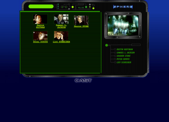

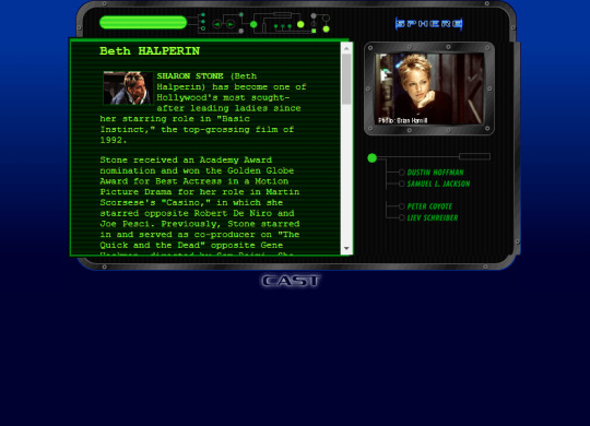
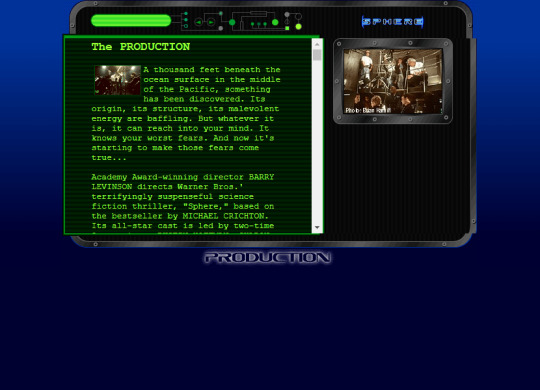

Website for the movie Sphere (1998)
#98#90s#1998#1990s#art#blue#cybercore#cyber y2k#design#film#future#futuristic#futurism#graphic design#graphics#green#internet#kaybug#movies#old internet#old web#screenshot#sphere#uidesign#ui#ui ux design#webcore#website#y2kcore#y2kore
35 notes
·
View notes
Text

The 2nd Web Design I made in my previous company. This had a theme of clouds and galaxy, for a childcare.
#artists on tumblr#my art#web design#web development#website#site#web series#old web#ui#ui ux design#uidesign#ux#design#user interface#accessibility#blue#space#outer space#little space#astronomy#galaxy#stars#childcare#template#cute
2 notes
·
View notes
Text
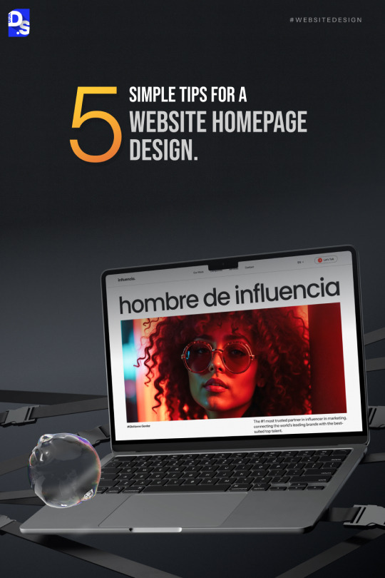
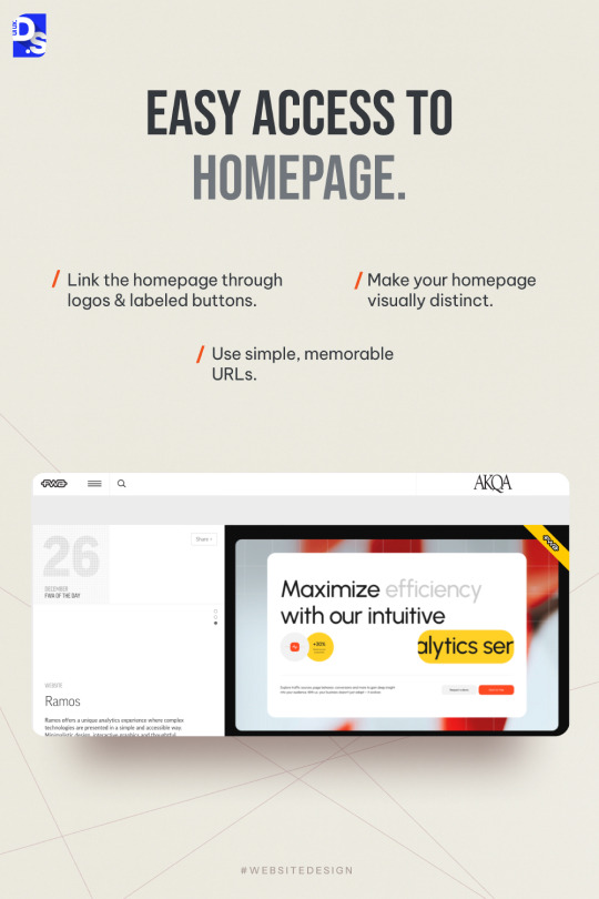
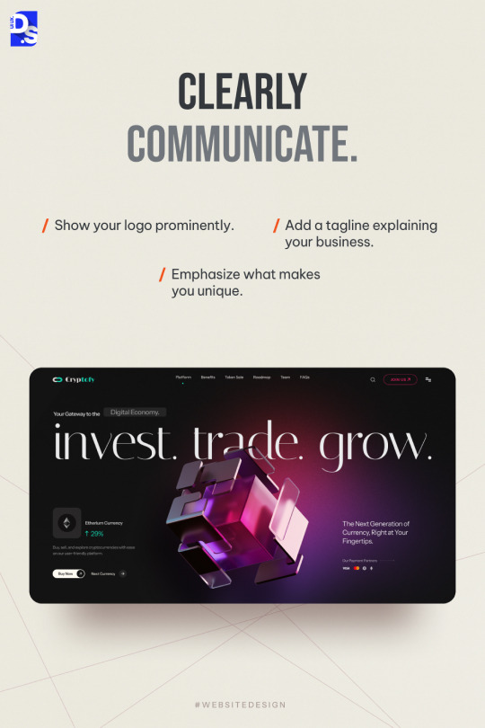
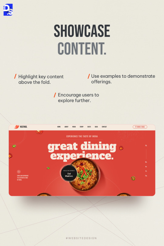
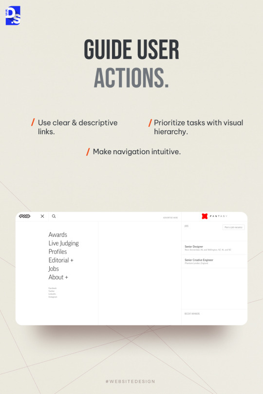
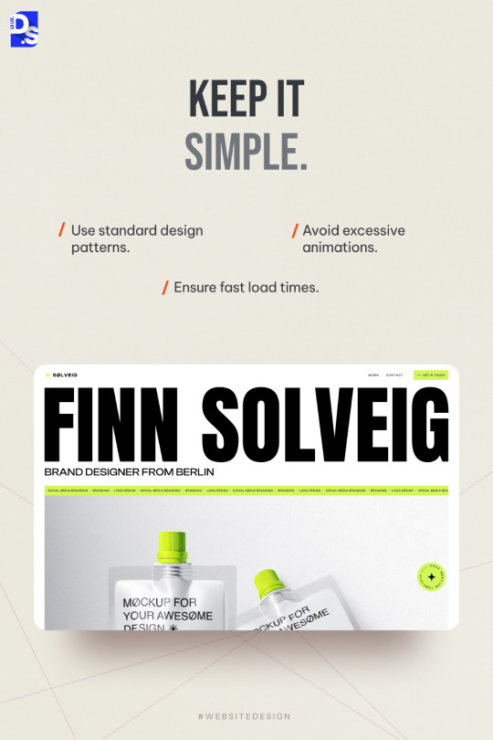
Your homepage is the first impression of your website – let’s make it count! 🏡✨
Here are 5 easy-to-follow tips to make your homepage more user-friendly, engaging, and impactful.
From clear navigation to showcasing what makes you unique, we’ve covered it all! 🌟
Which tip will you try first? Drop your thoughts in the comments! 💬
2 notes
·
View notes