#was definitely inspired by some of the outfit concept art for him
Explore tagged Tumblr posts
Text


THIS JUST IN: WORLDS SNAZZIEST 10 YEAR OLD
.
Please do not use or repost my works anywhere without explicit permission from me first, thank you <3)
#deersart#my art#psychonauts#psychonauts 2#razputin aquato#psychonauts razputin#psychonauts raz#my son he means the world to me#technically some of these are a year later so he would actually be 11 but shhh#i like dressing him up in little outfits#he’s still figuring out his own fashion sense#but now they atleast fit#was definitely inspired by some of the outfit concept art for him#took free liberties with some of them though#yes the flower and bracelet are from lili
1K notes
·
View notes
Text
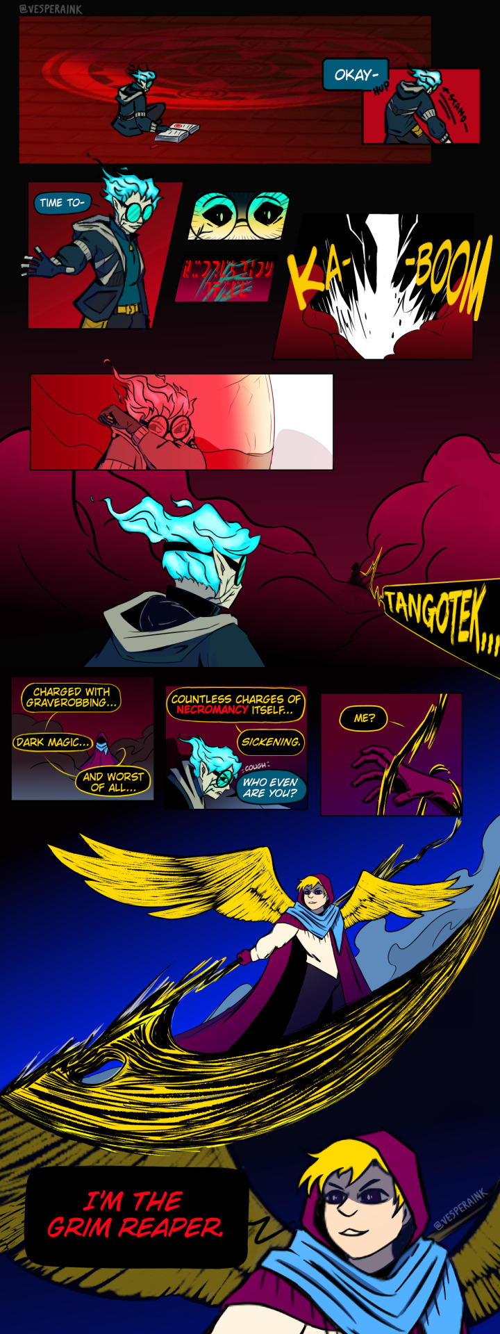
Friends, my necromancer!Tango/grimreaper!Jimmy, Team Rancher modern with magic apocalypse AU, Graveyard Shift, for @mcytblraufest's Reverse Big Bang is here!
But wait there's more--go read chasing crimson written by @aliferous-ly, beta'd by @dibs2win, my fantastic team for aufest. If you love enemies to lovers, unlikely partnerships, and the power of soul-bound magic weapon contracts, this hilarious + dramatic 22.9k fic kicks off from this comic!
chasing crimson
Jimmy Solidarity works for the esteemed god of Death, reaping lost souls and taking care of unsavory characters. He's recently finished his training, and is determined to do well on his first solo mission. Perhaps this "Tango" would be a good start. Only, the god of Death disappeared years ago, and Necromancer Tango Tek's long since discovered a way around dying. He can't say he enjoys Jimmy swinging through and killing him where he stands, though.
Thank you to my team for being as feral about this AU as I am, and kicking everything about it up to 110. I had so much developing this world with them!
Thanks to @onawhimsicot for helping me with the comic's dialogue, fixing my composition woes with "just add more smoke," and encouraging me to complete it in full color! Check out Cadence's aufest fic, I take it back (ill follow till I fly or till im dead), a Cult of the Lamb AU about follower!Tango and Lamb!Zedaph, the meaning of devotion, silly experiments, eldritch transformations, and...the most platonic slowburn ever?
Lastly, thank you to the aufest team for another wonderful event! I had a blast again, and was giggling kicking my feet at everyone's reactions during claims, I loved every single one of them. Graveyard Shift is definitely an AU I'm coming back to. As always, my askbox is open if you'd like to chat, and I'd love to be tagged if anyone makes anything <3
Timelapse / AU art chatter under the cut!
While Graveyard Shift is the amalgamation of many of my interests, the main premise for this AU is loosely inspired by the webcomic, I'm the Grim Reaper, in both its apocalypse themes and its aesthetics! Not a required read, but highly recommend if you enjoy this au, as well as the anime and manga, Soul Eater!
I came up with a lot of AUs for this event but necromancer!Tango and reaper!Jimmy have been rattling around in my brain in separate AUs since before I started brainstorming for aufest. So I smashed them together, naturally.
(Unfortunately I didn't record all of my process, but most of it is here! CW for flashing; song is Angel of Small Death and the Codeine Scene by Hozier)
youtube
I could go on forever about concept art and character design if anyone's curious but here's some fun bonus details about this comic:
Originally, Tango's outfit was going to be more like his Dungeon Master outfit but I wanted the setting to be more modern and Jimmy stole the fantasy cloak vibe from him already lol
Jimmy's entrance of lightning is my nod to the Life Series final death sound
The scarf Jimmy's wearing is designed to be a boneyard shawl
The panel of strange text reads "Protection Three" in Galactic :)
+ The name "Graveyard Shift" was thrown at me by Cadence in like 3 seconds flat after i spent 2 days agonizing over a name for this au LOL
#mcytblraufest2024#team rancher#solidaritek#trafficshipping#graveyard shift au#gsau#<- if you'd like to keep up with this au if we make more#cw eyestrain#cw bright colors#YIPPEEE RELEASED FROM MY NDA!!!!!! yall have no idea how much ive wanted to talk about this au since may#solidaritygaming#tangotek#life series au#hermitcraft au#vesperinks#my art
269 notes
·
View notes
Text
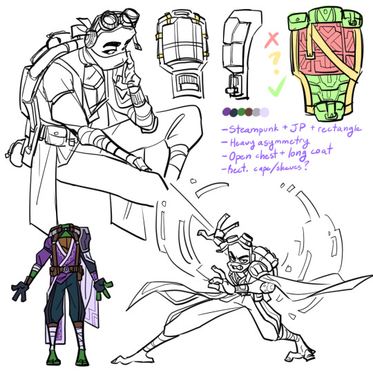

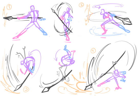
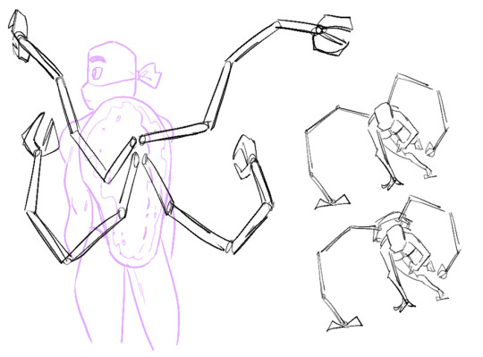
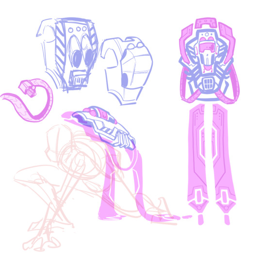


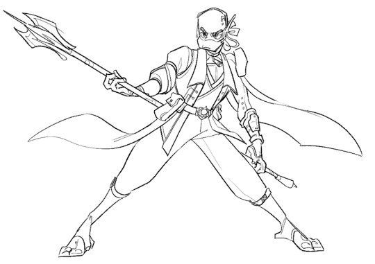
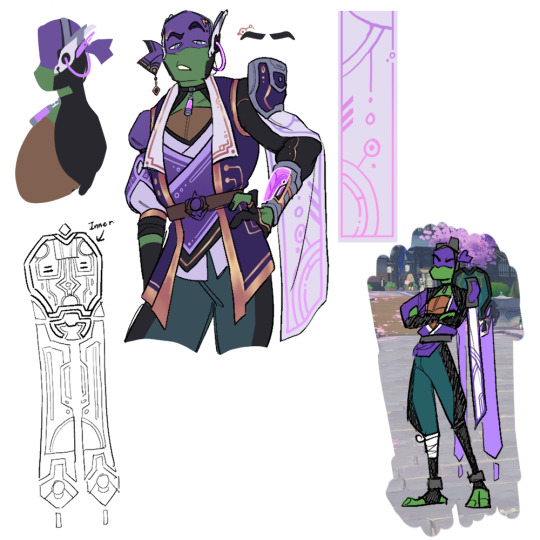
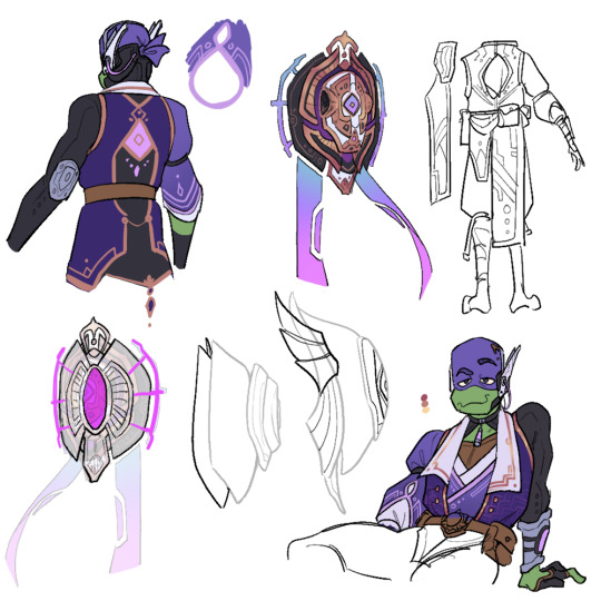

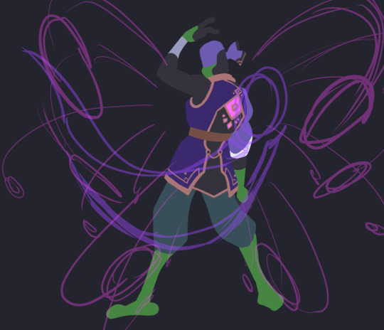
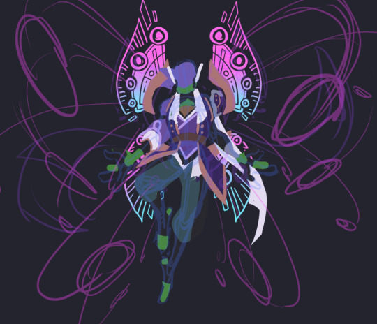
donnie had. SO. much concept art lol. i really enjoyed the whole design process though. his base design is very difficult to work with because of the battleshell, but it gave me a lot of chances to get creative and i'm happy with the results :)
(also as a disclaimer so i don't get asked about this: i don't have motivation to finish raph or the wish art for donnie, so i'm just posting what i've got)
i didn't annotate these as much since there'd be a lot to write, but i'll write out some of my thought processes and go into some detail about his final design below the cut if you're interested! (it's long. i'm talkative 😔)
1st row - first iteration; much more literal 1:1 translation of his design into a fantasy setting. very steampunk-y. ended up completely scrapping it because, simply put, he looked more like an npc than a playable character. obviously, several features did still carry over throughout the design process :3 also wanted to imagine his attack pattern cuz i thought it'd be fun to incorporate his spider arms.
this was actually the first design of any of them i'd come up with! i've definitely learned a lot about genshin's character design style since then and i think it shows 😂
2nd row - playing around with the idea of a floating battleshell (rather than a backpack-like one in the the show & first version), inspired by nahida's cape. also hard light constructs/attachments. was leaning too into the sci-fi and rectangular motifs with the design, but i liked the idea.
3rd/4rth rows - concepts for his final outfit and shell designs (the colored/more-detailed pics are the more finalized ones). took a lot of inspiration from sumeru this time around. it's a lot sharper, shinier, and less rectangular than his og aesthetic, but i think it's more in-line with genshin's design philosophies.
5th row - not entirely sure why i went through all the trouble of making a 3d model for this. i mostly just thought it'd be fun and good for reference. i was right, but i don't know what to do with it now lol. can't be bothered to be a perfectionist about it though, so don't look too closely at it 😭
6th row - incomplete thumbnails of his burst/wish art. not super sold on that "wing" design in particular, but i do like the idea of his shell splitting and deploying hard light weapons/rocket launchers/etc sort of like in canon.
battleshell/misc notes - i'm thinking his battleshell is controlled using the pink sensor on the back of his coat, possibly in combination with his headset. it floats behind him by default and is sturdy enough to protect his back, but he can also freely fly it around like a drone if he wants. the holes on the side are mainly for the spider arms and the banners(?) and handles(?) with the blue/pink gradient are made of hard light and only appear when the shell is in use.
i imagine like in the series, his tech here isn't necessarily very reliant on his vision/powers; much of it he likely made himself long before he received a vision and he just uses his vision to enhance it.
his burst is a barrage of missiles from his shell that lock onto an enemy and deal a large burst of electro damage in an AOE. not sure if i want his skill to be a deployable or some sort of electro-infusion/boost 🤔 maybe something that involves deploying his shell to boost his damage while leaving him vulnerable, like a glass canon? though i'm not sure he'd be that sort of risk-taker... 😅 dunno! his signature weapon would totally be his tech bo though.
that's about all i can think of. thanks for reading!
#rise of the teenage mutant ninja turtles#rottmnt donnie#rottmnt au#rise genshin au#rottmnt art#my art#mangastudio#3d#art#process#character design
2K notes
·
View notes
Text
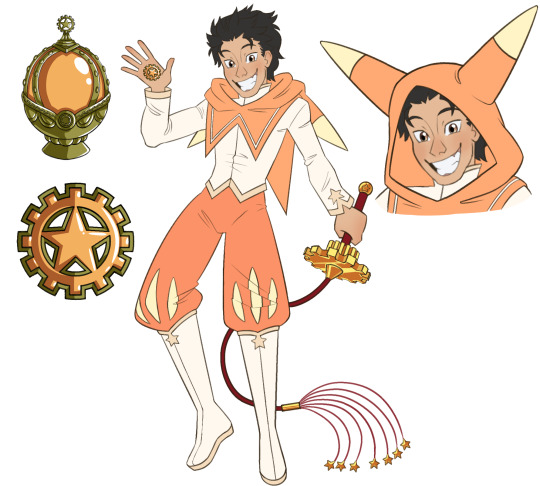
"No matter what happens... I'm.. gonna.. save you!"
And finally, last but certainly not least, our favorite loser cringefail time-traveler-by-dying-a-lot, Subaru!
Unsure how obvious it is, but a majority of the details in Subaru’s outfit are directly related to Homura’s outfit for what should be obvious reasons. Even his boots are based off of concept art from Homura’s outfit. I also wanted to give him almost a jester theme, which is most prominent in his pants, inspired by the fact that his tarot card from some of the special addition novels (iirc) is the fool card (I also gave him this theme, along with the design of his hood, to resemble a certain mega witch :) this is also the reasoning behind the prominent ‘gears’ motif in his weapon and soul gem design).
His weapon is a cat of nine tails whip based on the one he has in the novels and apparently season three according to the new trailer (hype!!!). Though it’s a cat of nine tails, it only has seven tails with stars at the end to represent his namesake. Stars are not only prominent in his weapon and soul gem design, but all of his design. In fact, I put several star motifs in all of the magi designs that I have done! If you have a keen eye you may have noticed that already! :)
And with Subaru’s design finished, I’m done with all of the magi designs I’m going to do! Finally! I may do aspects of the seven witches of sin’s designs in this au and definitely the characters’ individual witches at a later, more appropriate date, for the sake of not spoiling this au’s plot for anyone. And yes, I have decided to make this an official au after all! I will announce more information on this later on with a surprise for y’all, but for now this is the end of the magi design line up. But as a whole this is just the beginning… :)
I’ll say what I said in the Emilia design post again, but it really makes me happy even a few people love my ideas and designs so much, as cliché as it is to say. Really, thank you, it means the world to me :) I’m also excited and eagerly awaiting the upcoming results for the Re:Zero zine contributors, I can’t wait!
#re zero#re zero kara hajimeru isekai seikatsu#re zero starting life in another world#re zero fan art#pmmm#puella magi madoka magica#madoka magica#pmmm fanart#puella magi madoka magica fanart#madoka magica fanart#subaru natsuki#re zero subaru natsuki#re zero subaru
105 notes
·
View notes
Note
That'd be helpful, I wanna draw fanart


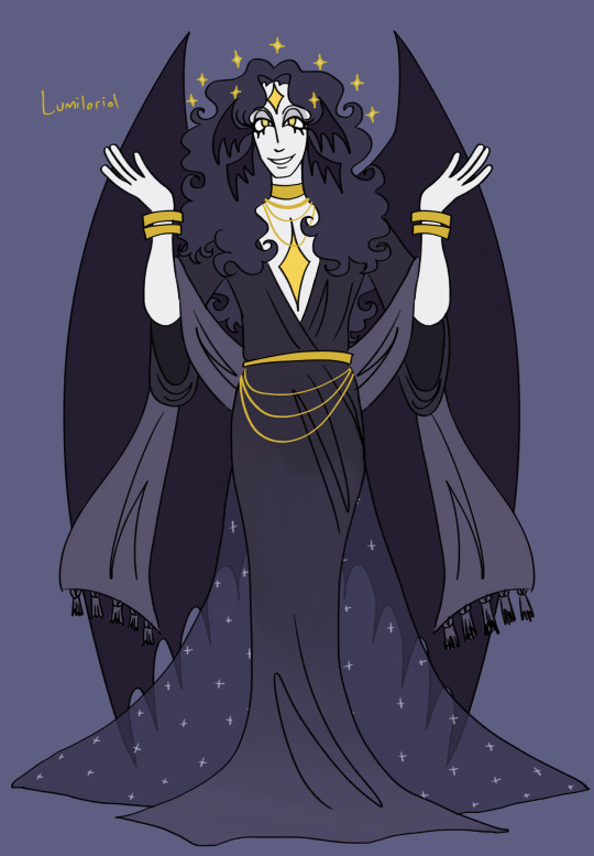


after many grueling hours they are finally done! ofc their outfits change but these ones give a good idea of how they dress. some design notes and inspiration underneath. im gonna redo their bio sheets at some point soon too so look out for that
in order of the height chart:
dumois: i wanted to make her look kind of like a little kids nursery and also incorporate her astrology interest into her design more so i gave her more charms in her hair and a cute quilt-inspired victorian nightgown. oughh shes so cute i love her sm <3 i think her colors turned out a lot more comprehensive compared to her old design where i threw a bunch of different purples at the wall and they kind of looked bad. now shes so prettyyy and i think the naptime sleepy cowsheepgirl aesthetic has definitely been captured
zubi: their fashion is usually the hardest for me to conceptualize because its like a weird mix of beachy clothes and emo rave... i think this outfit turned out good though, and i really like that the pops of coral/salmon evoke the beach while the dark fishnets evoke deeper dark water. i also almost gave them longer ponytails (think like miku has) bc i thought it would look pretty in water but i decided not to bc everyone else besides gaglug has long hair and i think the weird hair they have now has a good unique silhouette. i also turned their fins the other way so that they would actually be helpful in water
paezel: hes finally buff!!!! the crowd goes wiiiiiiild. he also has his pact tattoo on his arm (its supposed to look like a plant bc thats maeves thing) i feel like the tail kind of went from bovine to almost dragonlike but i actually really like that. i dress him like in the second spongebob movie when theyre in the apocalypse and i love it. not much else to say but i think he definitely looks a lot better
aureus: ok so her design turned out so elaborate that i had to go back and redo the designs i did before hers (dumois, lumiloriol + zubi) so that they wouldnt look lame asf which overally definitely helped their concepts. aureus is supposed to be way more over the top than everyone else but still i mean i cant let the others be flops. shes soooo pretty though i used a reference for her rococo style and it definitely helped a lot. my princess my darling i love youuu
lumiloriol: i usually try to keep their clothes kind of simplistic to highlight their own natural beauty, but i did give them the scarf kind of thing and the train for some layers. for lumiloriol i usually take a lot of inspiration from gothic art especially john martins paradise lost art (because of course) and i definitely feel like i was able to incorporate it. i also think they look super androgynous which i loveee bc angels usually are... they really do look like a fallen angel even if they technically are a step removed
concupiscence: connie i luv uuuuuuuu <3 concupiscence has gone through a lot of different inspirations over the years but ive settled into a britney spears/paris hilton smashup for him and so i based his outfit on various outfits both wore in the early 2000s. shes also got the striped tongue now which i decided to give her a while back bc i think its a fun addition to her design, reminds you that shes a creature. my girly <33333
gaglug: yeah um i got rid of four of its arms... they were making the design wayyy too busy and hard to draw. now it has funny little weird grubby arm thingies though so its okay its still buggy. umm not too much to say here since it doesnt wear clothes but i do love its bug hooves so much :)
anyways i love you my silly 400 year old 20 year olds
22 notes
·
View notes
Note
hi im trying to keep it professional here but may i request you to talk about your thought process/design inspirations behind your Tango? I don't think I've ever loved a Tango more than i love yours
i'm so glad you like him so much!!! he's definitely one of my favourites to draw :D
most of my mcyt designs follow a similar pipeline, where i create a first design that is simple; based on the skin, my impression, and common fanon ideas. then later down the line i throw all of that out the window and shoot them with my patented Creature Gun.
so originally, tango was just A Guy. (see this post for an idea of how he looked) until i woke up one day and decided that he needed to become an absolute fucking critter.
i went into my very first draft of a new design with a few basic ideas that i wanted to follow:
Generally small, but have his clothing/accessories be big
Have the red glasses be a major design element
Be some form of lil critter with a tail, paws, and big ears
Be as shape as possible (this was the most important aspect to me)
Here was my very first pass with those concepts in mind:
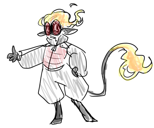
More under the cut:
the first thing i realised was that i accidentally inverted the red and black on his outfit, the second thing was that he had come out looking somewhat rodent-like, so i decided to build upon that idea in my second draft, as well as further exaggerating his glasses and proportions:
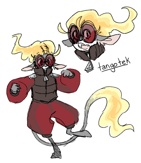
i liked this much better, but decided he still wasn't shape enough, so after even more stylization, i eventually got to a point where i was happy, and we ended up with the critter of all time!
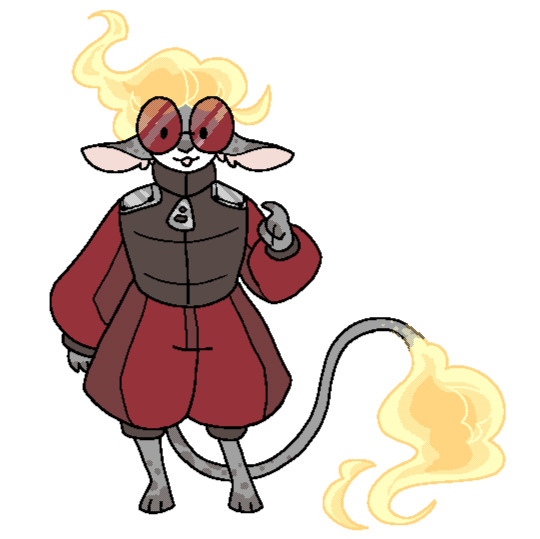
along the way, i also ended up with a rough idea for what he even was, that being a hybrid of my own made up rodent-adjacent mob that would live in the nether. which i ended up sharing an idea for in this post, thought i'll probably expand further upon the idea in the future.
overall i am insanely happy with how his design turned out, and i'm overjoyed that other people feel the same!
please never hesitate to ask me about my designs/my design process! i have so many thoughts that i'd love to share and a lot of the more fully fleshed out designs have a good amount of concept art that likely won't be seen outside of these sorts of asks.
#art#mcyt#hermitcraft#tangotek#character design#answer#galaxyinacup#rat rambles#<- new tag for these posts where i share ideas/concepts/etc.#might change it if i think of a better one though#thank you so much for asking me this actually#longpost#posts like these talking about character designs and such won't all be this long#it really depends on who you're asking about. tango was just the character concept equivalent of a landmine lmao
69 notes
·
View notes
Text
ON-LYNE headcanons based on concept art, songs, and the miniscule info we have on them with a little bit of self projecting and mental illness mixed in

because im techrotted brainrotting over the boys and i love them dearly and im so excited for the technocyte codas i cant take it i need to yell about them (also partially inspired by this post! go check it out its so cool, i love the theories and based a lot of the personality traits off it)
also quick note that we're going under several assumptions here: Gregory V is and has been a shit manager for a while, they know they're being replaced, they live together and are hiding in some corner of Hollvania that's uninfected, and most importantly of all that they're alive and (barely) kicking
(concept art was snatched from the warframe fandom wiki, technocyte coda page)
~5-7min read, long ass text wall warning
ZEKE

he's giving he/they bisexual
definitely has a history of dealing with peer pressure. "never set the trend, follow your own" he is sooo against that go with the crowd shit... which is really funny when you take the infestation into account
chronic depression that's been stuck with him for a while now, but it's spiraled beyond anything he can reasonably manage ("Zeke hungers to unmake himself" can be taken a plethora of ways)
wants to get an eyebrow piercing but Gregory never let him "for his image" (still soooo fucking salty about that)
^ speaking of, he's so salty actually. not to a point of being petty exactly and it's 90% directed at Gregory because he's just so sick of the guy but WOOH can he throw shade
anyway he's giving grunge fashion enjoyer
i know this is semi canon but im leaning into it HE IS 1000% AN AVID FASHIONISTA. and he has some STRONG OPINIONS on fashion trends
if he's not bedrotting, he's trying on different outfit combos. always getting the boy's opinions on them
they don't hire anybody to do their outfits for their shows because Zeke is always on it. he knows everybody's style, what they're comfortable in, and what looks good on them like the back of his hand he frankly doesn't trust anybody else cuz they always fuck it up (see "Zeke has some STRONG OPINIONS on fashion trends")
Zeke SWOONS for Drillbit's fashion sense. when they first met, that was what grabbed his attention: he's so unapologetically himself and the expression through fashion hooked him. (take it platonically or romantically idc)
he loved loved loved being famous at first, but with everything going on he's losing that spark. and it terrifies him because this was his dream for so long
his actual problem (shit manager aside) is that he can't deal with the pressure of being the face of the band. like yeah, everybody plays their part, but he's the leader. if he wasn't the one fully in the limelight, he'd be better off, but he doesn't realise that yet <3
and he desperately needs a break
he's gonna snap soon and it isn't gonna be pretty
whether that ends up in somebody dead, himself dead, him in a mental hospital, or something less extreme, that's a future problem for a future Zeke
DRILLBIT

PUNK KING
there's a running joke he has psychic powers. it's like he just reads everybody's mind. he just KNOWS??? it creeps the other boys out sometimes
would be an awesome therapist
studied psychology in university for 2 years before dropping out because he didn't have the time needed to really dedicate to it
(plus i mean, he's already living the life as a singer, no point in getting a degree he might never use)
had really bad scoliosis as a kid, uses a brace to try fixing it
^ his posture is awful
^ ^ he hates chairs, especially ones without cushions/padding. most uncomfortable shit ever
^ ^ ^ unfortunately Gregory never fuckin listens to him so he has to suffer almost every event
shorter than Harddrive (6'1) & Zeke (5'11), but wears platforms so he looks like he's the tallest
DJ is always stealing his spiked bracelets. it used to annoy him but he gave up after figuring out they'd always magically reappear on his dresser a couple days later tops.
he's always going after Packet for his posture. "buddy you don't want to end up like me, trust"
definitely an astrology fan. not like full on believing in it, he's not an astrology girlie, but he finds it cool. has tarot card sets
i feel like he'd be interested in witchcraft too, but it's something he keeps very, very close to his chest. not even the boys know
deliberately pushes his luck with Gregory. as the 'token alt' he gets away with more, and he's trying to see how far he can go with it before Gregory shuts him down. it started after the whole Zeke eyebrow piercing shitshow.
listen, Zeke is his best friend and he's happy for him, but man, does he want to be in the spotlight. i mean, face of the band, the 'leader'. if Zeke were to step down or something happened, Drillbit would snatch the opportunity SO fast.
he knows Zeke's problems better than Zeke himself does lol, he's been trying to subtly convey that for months now. Zeke isn't the only one, though
Drillbit always had this sixth sense when it came to everybody else's feelings, he always felt them stronger than his own like the shore of the peaceful beach swept over with a tsunami.
sometimes it makes him physically ill.
empathy. but it's something more than that
right now, emotions are high, overwhelming, suffocating from all corners and he's drowning in the tides.
HARDDRIVE

this might be a little heavier sorry in advance
contrary to the implications of "he really knows how to treat a girl and make her feel like she’s the only one in the world!", he has actually never had a girlfriend last more than 3 weeks
not because of anything he's doing. he just has a knack for getting really shit partners
he's gay, but extremely in denial for the LONGEST time and trying to come to terms with it
so emotionally intelligent? if you're going to have a late night deep talks, it's going to be with him. guaranteed. he thinks a lot about things
maybe a little overprotective of the boys? just a smidge.
he's a cuddly teddybear yes, but he could still 100% kick your ass if deserved (but would feel guilty for weeks)
used to have stagefright. Zeke and Drillbit helped him come out of his shell in that regard, but he still does freeze up sometimes when he remembers he's on stage. in front of millions of eyes.
cottagecore energy. enough said.
shares rings with Drillbit all the time (insert marriage joke here)
he can carry all of the members around easy peasy and has done it to all of them at least once on camera. there's sooo many memes about it all over the internet
never escaping the perfect husband material allegations (truth)
he doesn't really mind the fame... but he's also not entirely sure about it. he preferred being a smaller band, when he didn't have to hide his face and deal with fans every time he went out.
part of him wants to leave, but he's torn between his loyalty to on-lyne, more specifically his friends and memories in it, and freedom. but with being such a well known figure, he knows it isn't that simple.
there is no freedom. he hit the scene, there's no turning back.
he'll always be Harddrive, wherever he goes.
PACKET

aroacespec. demiaroace maybe. havent quite decided
not gonna lie i do not have many ideas for him, but that is the most demiboy to ever demiboy. i mean come on, PACKET as a stage name?
im sorry the name Packet had to come from an inside joke or something
has had like 50 different hair colors over the course of his life. this is his natural hair color though because he needs to give his poor hair a break (SAME BUDDY)
inattentive ADHD. nothing else to add there
UNGODLY SLEEP SCHEDULE. stays up to stupid o' clock gaming. you need to talk at 3:08am? he's awake!
might be biased from this post but he's giving "cute unsuspecting guy knows a lot of really concerning things" (how to hide a body, all kinds of manipulation tactics, how to kill a person in various ways, how fast bodies decay, must i go on)
^ hes a writer. he writes fanfics and posts them under another name, i dont make the rules
you'll hear him cackling at 2:47AM and i can almost guarantee it's because he's laughing at terrible reader x on-lyne fanfics
sorry but my king here looks like his mom dressed him and i think Quincy would have a heart attack if he saw him. Zeke sure did when they first met (Zeke is singlehandedly carrying his fashion on live performances)
(OK THIS WAS A LITTLE MEAN BUT THERES WAYS I WOULD PERSONALLY DEFINITELY FIX IT)
Zeke probably gave him a whole ass makeover. took one look at him and was like hell No you need to learn how to style your outfits or i will die (exaggerated but as a fashion enjoyer i feel u Zeke)
he's 70% of the reason Zeke doesn't trust anybody else to do their outfits because of how awful his sensory issues are. everybody else fucks it up and he can never make the full show without a meltdown
people seem to think he's a lot younger than he is and it drives him fucking crazy because nobody listens to him (the boys do though <3).
there used to be a serious infantilizing problem in the fanbase but on lyne managed to nip it in the bud for the most part.
he has dissociating problems, running on autopilot sooo much. forgets he's a person. so easily lost in conversations. you know how it is!
listen this might just be my love for horror, inspo from this post again and (probably 80% of it) an au i've been writing recently... but he's giving uncanny valley. unintentionally freaks people out.
like he has problems. everybody has their problems but there might actually be something Severely Wrong with his mental, but whatever the hell it is, nobody really knows??
he's still an awesome guy; smart, friendly, incredible mediator, there's zero doubt in anyone's mind he loves the boys
but its not just what he knows and has researched that's strange.
it's the way he switches up so fast when somebody walks up to him. the wildly different traits he shows for different people. the way common morals dont seem to be something natural to him, but he makes an effort to look like it is even with a lack of passion. it's the fact that despite being a mediator and being so 'empathetic' with the boys, he's very... emotionally cold in other departments. his behavior like a lightswitch, two completely wildly different modes
with everything going on, i don't think they ever will really know what's up with him. just gotta hope it doesn't get worse, whatever it is, and that he's okay
"don't hate the hacker, hate the code", amiright
(as a small a/n i have actually not decided what is up with him. because in the au i wrote---and what led me to get attached to these boys---hes a fanatic cult follower who's barely clinging to the ropes of sanity because shit just got that bad. will be doing research so i dont stereotype whatever i end up attributing to him :thumbsup:)
DJ RoM

first of all.
🏳️⚧️ . i know what you are DJ. they/he user spotted
does not gaf about Gregory's whole "hide all this stuff about yourself for your image" shtick, they're always making trans jokes
i know their fan site page says he's "soft spoken and quiet" but i look at them and can't help but think they'd say the most unhinged things.
and you think he's bad on camera? they're worse off camera <3 Zeke may be the one flirting with everybody but this guy? THIS GUY is a different level if you know what i mean
naturally blond but started getting grey hair from stress and just ran with it. eh they stand out more who cares
definitely has busted hearing
they have tinnitus. it drives them crazy. usually they just tune it out, but there's times where it seriously gets under their skin and you can TELL
very sound sensitive. misophonia moment
out of everybody they NEED to have a good 10 hours of sleep or they will NOT be able to function. (unfortunately i imagine considering the circumstances, he probably hasn't had enough sleep in a good few months at least)
he has so many different kinds of sunglasses. the regular ones in their art, but also heart shaped, star shaped, probably more fun shapes too
horror enjoyer, especially analogue/psychological. stuff that messes with your head.
super fast learner, especially musically
probably multilingual but as for what languages they know i'm not sure lmao
you know all that advice that's like "when somebodys making fun of you take it really well and laugh with them, and the bully will move on because youre not a fun target"? yeah this guy. living proof it works (for the record i dont actually know if it works, he just has this vibe)
i have a feeling he's gone through some really traumatic things. like, before the techrot takeover and maybe even before meeting the boys
he's seen shit and at this point it's really, really hard to make him flinch.
but theyre so chill about it that youd literally never guess
Drillbit's been trying to get them to open up and talk for years now it feels like, because he's not just seeing a mental decline, he's seeing a physical one. they all are seeing it
and it scares them
... i think thats my longest post yet lmao. anyway they're hot and they better not die in an upcoming update and we better be able to KIM message them or i'll wail. my favorite band of introverts that look like extroverts and accidentally got famous and dont know wtf to do with themselves because theyre BEYOND 6 feet deep in this shit now
k peace im going to bed... feel free to throw out thoughts on these guys bc i need more content of them (and i need more harddrive headcanons)
#to be safe ->#tw dissociation#tw sui implied#tw depression#tw abuse#let me know if anything else should be tagged#✛ posts#warframe#warframe 1999#wf 1999#warframe community#warframe headcanon#warframe 1999 spoilers#wf 1999 spoilers#wf1999#wf1999 spoilers#warframe drillbit#warframe zeke#warframe packet#warframe harddrive#warframe dj rom#warframe on-lyne#on-lyne#on lyne#warframe on lyne
12 notes
·
View notes
Text
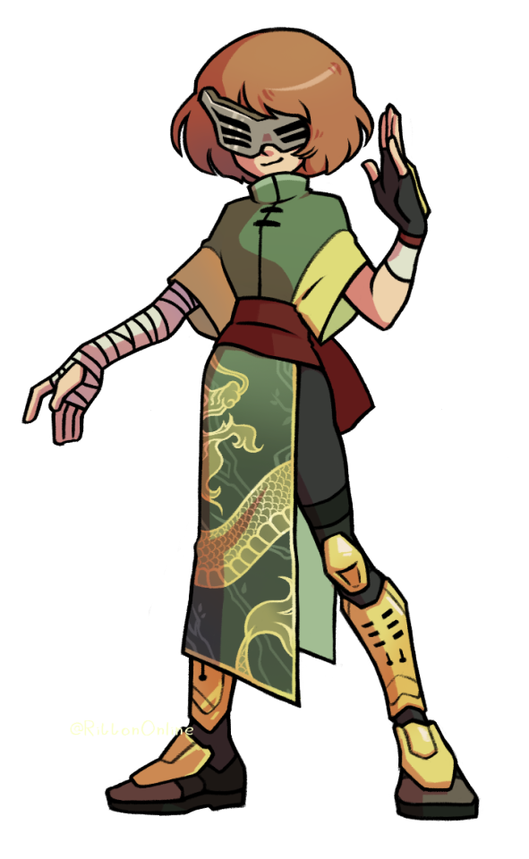
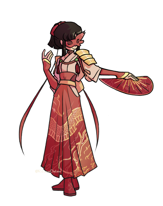
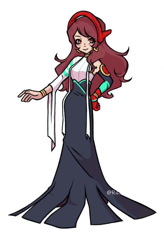

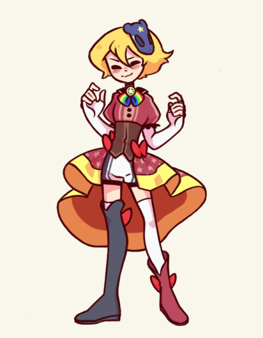
Oh yeah! Since I have no clue if/when I'm ever finishing these and I've had them laying around for forever by now- here's the adult IT metaverse outfits I've made! They're all based on their ultimate personas and the concept of heros! Since these were made for an aged up p4 cast, these aren't quite what I'd put their during p4 time selves in- some changing more then others- but if you wanna follow me into design details, that'll all be under the cut!
First off to get em out of the way- Teddie is very largely the same as his p4 time metaverse outfit I made for him back here . The design is still meant to be inspired by magical girls, but the biggest change is that while the old one was meant to look like a magical girl protagonists outfit, this one I tried to lean a bit more into the older/more experienced cast member of the magical girl group type design. Overall a pretty minor change (and I will admit, largely because I'm still incredibly happy with that old design) but it felt fitting!
Chie and Yukiko were, as always when I work on them, designed to match. Their masks specifically mirror eachother with the opposites sides sticking out, and they both have a golden dragon pattern on their clothes as a reference to the twin dragons move! Chie was... honestly one where I had to sacrifice my goals a bit. Like mentioned before, these were meant specifically for an aged up cast. And while p4 era Chie I would absolutely imagine in a kung fu Chung-Li type outfit, we know what a more mature version of her action hero dreams look like; the police! And I.... really did not want to put her in a cop outfit, Ill be real. Instead I just tried focusing on making the outfit look more mature. Also tried to combine a practical and strong look with a more feminine aesthetic, since she struggles pretty badly with her femininity in p4 and I like to think she'd grow more comfortable with her own brand of it over time!
Yukiko is perhaps one of the most drastic one for changes compared to her younger self- if you asked me to design a p4 era outfit for her, it would look nothing like this, hah. Anyways, she's definitely inspired by onna-musha! Compared to Tomoe who was a full on commander of an army going out there, for Yukiko the idea was more the women taking up arms to protect their home when the battle comes their way. Fully having embraced the role she has as the next owner of the Amagi Inn and the responsibility and want to protect it, it's meant to be somewhat of an outing of that!
Fun fact: She has two color schemes! Because uhh I did not know what to go for at all. Her ultimate persona is like a single solid color and I kind of panicked and just ended up winging the colorscheme. One is more red since, y'know, thats her color! The other is more white gold to match her actual persona better. Included at the end of this post for the curious
Rise was based on a greek goddess- though not any particular one, moreso how they're commonly depicteed in art and old statues. Pretty, holy, someone you'd go to for advice and help (someone just out of reach from the general public) It just felt like a good combination of something she'd like to be seen as and percieved as as well. She gets two outfits- for scan and fight mode! Kouzeon has no canon fight mode, thats just for Himiko, but man it exists in my heart. The transistion between the two is literally just her throwing off the long overskirt, hah.
How does her mask work? Excellent question. The p5 idea of having it there when vibing but gone when the persona is out feels a little awkward when her persona's whole thing is putting a visor over her face. Quite frankly I have no idea. Sorry folks. Have all concept sketches for the outfits I've done as compensation with a bonus Noot in there that I never continued on and finished.

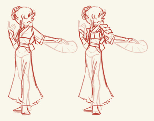
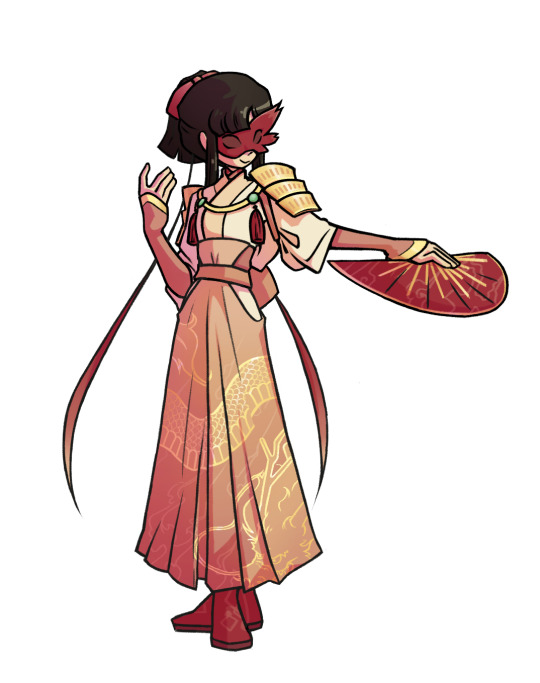
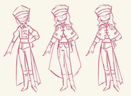
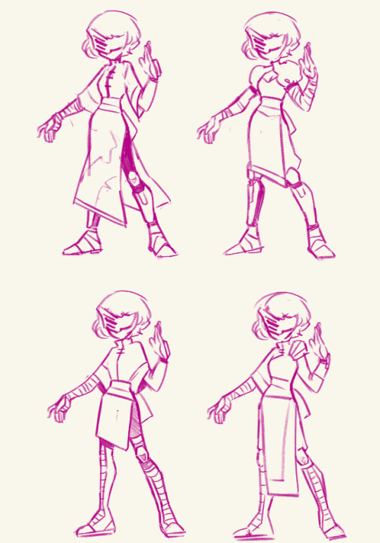

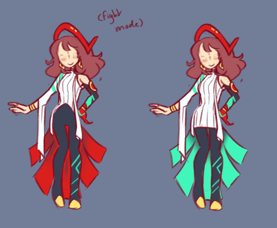

#persona 4#persona 4 golden#p4g#rise kujikawa#chie satonaka#yukiko amagi#teddie hanamura#naoto cameos in the concept sketches but dont percieve them too hard#they were in the very early stages of being made before i got distracted by new projects#i feel like i explained the concepts kind of badly above here i have a really hard time putting into words what i think about#when i make outfits designs#sorry if it sounds awkward or slapped together. i promise each of these took an embarrassing amount of time to think out#also on a note not disclosed in the text above here. teds adult outfit is also meant to be a combination of the girl and boy seperate#outfits he has for p4 era. this is headcanon galore land however so dont worry about it. shh. it is a treat for me
324 notes
·
View notes
Text
Costuming Strahd: Art Addendum
I didn't include any mention of the official Dungeons & Dragons art for Strahd von Zarovich in my previous post, because I had dismissed it outright. There, I said it.
I shall strive to amend my folly in this addendum.
Let's start with that 5e cover:
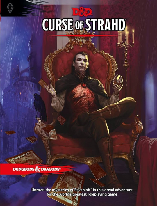
I generally approve of this representation. No doubt it colored my concept of Strahd's silhouette, since this is the first image of Strahd I came into contact with, some two or three years ago.
The shape of this garb is much like what I was aiming for in my previous post. Strahd is sporting a crisp shirt with stiffened, buttoned cuffs, much like our modern button-downs or blouses spanning back into the mid-1800s. His torso is trim in a fitted vest with standing collar, which easily fits into the category of fantasy-Renaissance. Speculation on from where/when exactly the inspiration comes might be a futile effort; it would find itself at home among the elves in The Lord of the Rings, and I'm not about to dig into that concept work just now.
Actually, what his vest reminds me of most is 15th century brigandine [or tabard (see below), which would cover brigandine or a breastplate, which is why] it's the right length, if nothing else.


Reconstructing History, He's literally Elrond, and some brigandine
I believe I said it's easy to fake good pants, especially when sitting down. This example reinforces my point. His legs are indeed covered, and the result is not garish. Not particularly exciting, but nonetheless successful. You could probably even call them hose if you really wanted to.
His boots are literal extant riding boots, from "early 20th c." England, and honestly I'm so proud of this one-to-one reference.
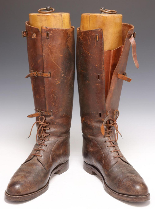


[Fig. 1] and [Fig. 2], although my first thought had been Victorian cycling boots.
The cape draped around his shoulders appears to be quite thin and probably only falls to about his fingertips, since it doesn't drape over the chair cushion and he's not sitting on it. It could look like some kind of military cape. Or maybe even, to drag him back a few centuries again, something Elizabethan.

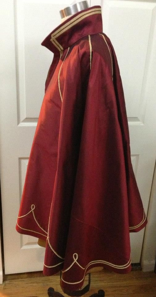
I'll do a whole thing on capes later.

Moving on...
Early Strahd von Zarovich was definitely Dracula by another name, but later art has been pretty consistently (from what I can see) this other red/blue outfit, with baffling ruby clasps instead of a single pendant around his neck.

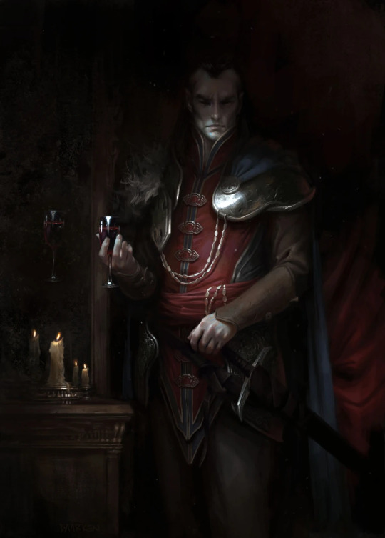

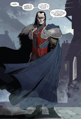

That last one has me. To be fair, it's the only one gazing back at the observer... >.>
Look. This garb is sexy. It cannot be understated. While it's not what I'm going for in my own costume foray, this is a fantastic design. Here's why:
The line where blue meets red along his ribcage accentuates his chest. That same red draws the eye down over his crotch, subtly curving to accomodate his thighs. Those chains on his cloak and the sash around his waist are positively drippy, like the source of the Ivlis pouring down to the Tser Pool. The asymmetry of that and his mismatched shoulders gives him such a dynamic slant, something to visually climb back up like handholds on the face of a cliff. And the sash is supple, in direct contrast to his armored hips, solid and stalwart. His limbs are clad in slim nondescript brown, making it all the easier to focus in on his center, in high contrast dotted with solid rubies. The red and blue both, especially together, are blood colors, indicative of veins hidden beneath the skin.
He might be covered from toe to jaw, but this is an intimate costume.
Despite my appreciation for it, though, again, I personally am trying to make something a little less Lord of the Rings. For reasons.
So, let's see what I can come up with in terms of historical inspiration... if anything, lol.
This is going to be fairly stream-of-consciousness. (Not that it wasn't already, I suppose.)
The first thing that came to mind was a kaftan (or zupan?), because they can be fitted through the torso and feature a standing collar and embellished closures up the front. But, kaftans from Russia, the Ottoman Empire, and other areas touched by those cultures usually also have sleeves. I finally found the two illustrations below without sleeves, but they were difficult to track down and I'm not sure how much of what they depict is imaginary. (Although the sword, pouch, and helmet from the first one are definitely from an extant burial site.)
There's also the Polish kontusz, where the arms can be worn out of the sleeves, with the sleeves flipped back, and that can give the illusion of sleevelessness... A lot of examples I found of this particular garment are also open to the waist, which is delightfully provocative, but doesn't resemble the Strahd ensemble.
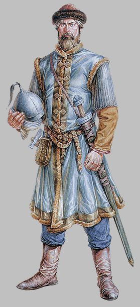

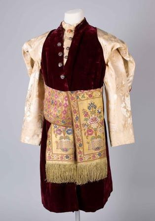
Examples from Chernigov (Ukraine) and apparently Moldova; a Polish kontusz
I can think of little source material for that long, pointed fantasy hemline, but allow me to grasp at some straws.
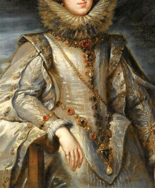


The straws in question.
Actually, this brings up a really good point of inquiry. Where does this drapery-between-the-legs situation that modern fantasy seems to be so enamoured with come from?
Tabards would seem the obious answer, but even that, in modern parlance, is used as an umbrella term for a wide range of garments that may or may not have any true basis in reality.
There's also just... loin cloths, I suppose, which can look like a piece of fabric just draped over the crotch and hanging between the legs, but there's usually more to it than that.
At last, after some digging around, I came across the video below. Bless Shad for his contribution to society.
It goes over all the the differences between those various styles of garment usually bearing symbols of allegiance all lumped together as "tabards", and presented me one more vocabulary word with which I was not yet familiar: the scapular.
youtube
Alas, monastic garb is my blind spot. Silly that I've played at least five clerics so far.
To summarize, I think the that the shape of the lower part of Strahd's... whatever-it-is... is inspired by a mix of these garments described in the video. It's short like a tabard should be, and has that dip between the legs reminiscent of a scapular.
But, ultimately, this thing is a waistcoat. Not a waistcoat in the Victorian sense; a waistcoat in the mid-18th century sense.
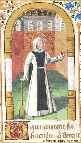
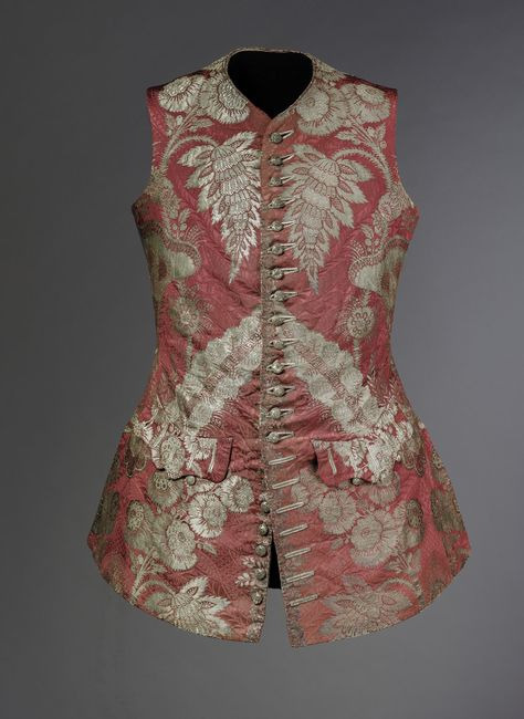

Monk wearing a scapular, and some fancy waistcoats.
Finally, the very-high standing collar on Strahd's waistcoat smacks of a couple things: Russia (again), or the Regency era. Although, in the Regency years, waistcoats became much shorter (ending at the waist) and lengthened up the other way with high standing collars. But, if you were to combine the two waistcoats above and throw in some suggestive high-hip cutouts like a 1980's leotard, you might come out with something that resembles what Strahd is wearing in all that sumtuous art.

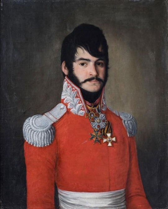
The one with the sash really drives the comparison home.
With the initial kaftan comparison and this guy with the funny hair (a Count Vasili, coincidentally) above, Strahd von Zarovich's red/blue fantasy garb is also giving the Motherland, and folks, I already said that I was trying to keep blatant Russia out of Barovia (as much as that garb clearly slaps). But I also recently remembered due to this post that I am a total sucker for Russian pet names, so... who knows.
In the end... do I know what I'm doing? Absolutely not. I'm not sure which of these elements will filter into further consideration for my own Strahd von Zarovich costume, but I'm definitely glad I gave all this a look. Absolutely worth it. Learned a lot. ♡
#costume things#costuming barovia#strahd von zarovich#costume design#fashion history#costume history#curse of strahd#lamour dms cos#art analysis#art appreciation#ravenloft
44 notes
·
View notes
Note
HEY ELLIE :D I wanted to stop by and say how much you really mean to me and how thankful I am to have gotten to meet someone who is very arguably inspiring to me in several ways. I've been thinking about your AU so much lately it's during my weird moments I'm thinking of Ron and Lucid "What would they do in this scenario" PLEASE. I don't think you realize how much you matter to me in general even if it sounds super cliche and corny 😭 Sort of taking the opportunity to ask you now if there's ANYTHING you'd like to share with me? It can be art, oc lore, dhmis related content.. EVEN OTHER FANDOMS!! FEEL FREE TO JUST TAKE THE TIME TO RAMBLE IF YOU REALLY WANT TO... I DON'T MIND HOW MUCH YOU SHARE EITHER I love you!!!! /p Keep your chin up! I'll always be here if you need me (SORRY THIS INBOX CAME OUT OF NOWHERE SOBS)

DOLL HELLO DOLL OMGGODNJSMISFJJ HIHIHI SINCE YOURE HERE I MIGHT AS WELL GIVE YOU A BIG RAMBLE BC I DO HAVE ALOT TO SAY ACTUALLY… ESSAY INCOMING !!!!
YOUVE GOT ME THINKING ABT DHMIS AGAIN THO N I DO HAVE A BIG DEVELOPMENT THING COMING UP PRETTY SOON FOR LOCKED UP!!! Lennon is still being designed + I’ve been making tons of different versions of him w different outfits n hair n loads of fun stuff but my most recent stuffs is on whiteboard… im revisiting most of the whiteboard concepts from forever ago n basing my designs on that :D plus Aaron is getting a minor little redesign (giving him some more intricate details and going more in-depth with some of his already existing details) IM ACTUALLY TRYING TO PUT MORE SYMBOLISM INTO SOME OF THESE GUYS. AARONS NECK CLAMP THING IS GONNA COME BACK INTO PLAY FULL SWING GAHHH (speaking of Aaron’s neck clamp thing! I made a Kandi version of it. Wearing it as I type this hhhhhhhhh) I have a base for everyone (mostly everyone) doodled up on whiteboard.i just need to put it to use !! Which reminds me all of the teachers canonically have like.. Barbie doll bodies hee haw
More on Lennon though!! I’m basing him mostly on the interaction he had with Yellow in the Death episode! He’s very soft-spoken and doesn’t know what the fuck is going on most of the time, he is one of the most mindless puppets out of the teachers (is it even SURPRISING that Ron would like him.) but most of his fucked-up-ness is because he started glitching out after Red messed with the machine 😔


ALSO LUCID HAS BEEN ON THE MIND SM FOR ME? Aaron n Lucid interactions need to happen hello!!!! (They would try to kill eachother) as far as I can tell the average conversation between them would be mostly insults and annoyed scoffs!! They hate eachother and I love that for them ❤️ (their dynamic would certainly be something strange? Aaron is EXTREMELY cocky and I doubt he would give a single fuck whether Lucid is mentally OK or not? Although Lucid seems to want for nobody to gaf sooo?????) (And while I'm on the topic Lucid and Lennon would also not get along bc Len acts really fucking stupid and I kind of doubt Lucid would be able to stand him 💀)
EITHER WAY MORE LUCID IN LOCKED UP STUFF IS DEFINITELY HAPPENING SOON <3 I REALLY LIKED HOW I RENDERED MY ELLIE IN THE REAL DRAWING SO I HAVE TONS OF MOTIVATION TO DOODLE

I'm also really into Dandys world? (LIKE I HAVENT TALKED ABOUT THIS ENOUGH) and besides from my dhmis designs n such I'm also redesigning all of the toons. (Cough cough rn working on Vee) GAME-WISE IVE ALSO JUST SAVED UP ENOUGH ICHOR (Ichor is the in-game currency) TO GET ASTRO WHICH IM INSANELY HAPPY ABOUT (me and a friend play literally every night AND WE HAVE THE LONG AWAITED PEBBLE AND ASTRO COMBO...) and after I get Shelly me and them are gonna get Razzle&Dazzle mastery together <3 (r&d has a very weird play style so I keep joking about getting their mastery) IM TRYING NOT TO MAKE THIS CONFUSING SO YOU UNDERSTAND? THERES ALSO A COMICON WE R GOING TO IN LIKE A MONTH AND IM WORKING ON MAKING AN ASTRO COSPLAY!!! EXPLODES IMMEDIATELY
Ohh… also music…. There are a few PARTICULAR songs I’ve had on loop for a while (nervous sweating…) I had actually kind of based my Ellie in the real drawing on the cover art for Good Enough by Kittensneeze… but mostly on Beautiful Princess Disorder? Bpd gives me some really cool imagery (js like $oulbomb) neons in particular I feel are literally the exact vibe of that song (although for calmer music it would either be grays or muted colors I love color language) the Distortionist has also been on repeat and IT.REMINDS ME OF AARON AND LUCID GET THEM OUT OF MY HEADNDUCNJDANSJS (OFF TOPIC BUT FLOWERS BY SACRISTUFF? GO LISTEN TO IT I BEG) THEY MAKE ME SO ILLLLLLL……. I HAVE A LUCID PLAYLIST IN THE MAKING HELLO IVE BEEN ADDING MUSIC TO IT FOR MONTHS NOW I JS NEED TO MAKE A COVER. WKMDJENDIAMAKAMDNEH


#OUT OF YAPPING TIME !#I think I covered everything that’s happened here tho#HOPE YOU ARE WELL DOLL !#SORRY IM LIKE THE LAST PERSON TK GET TO YOUR ASK#I TRIED TO BREAK UP SOME OF THE TEXT WITH PICTURES#PLUS SOME NEW ART STUFFS… LONG SIGH
5 notes
·
View notes
Text
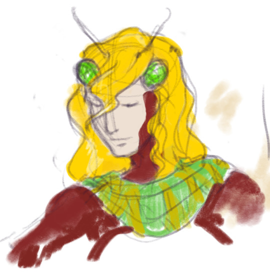


hoo boy OK
didn't want to dump this in the fan week tag because it's TECHNICALLY not FFIV but "crossover" did make me think of it.
this also isn't technically a "crossover" given that its entirely in-universe and just happens to be directly RELATED to FFIV but i wanted to talk about it and i figured out how to use my 6yo chromebook as a drawing tablet last night so here goes
i have this FFXIV OC who is quite literally "Edward but an evil bug demon" and i got so attached to him i'm making a whole-ass doll, with some help from my friend for some of the more complex engineering parts. here's some of my design sketches and color tests and what will eventually be his torso (he's being made out of a kind of butterfly-skeleton lookin BJD). It's mostly head shots because i was clearly struggling a lot with how to do the hair and the placement of the eyes, though i think i've sorta figured it out. the final outfit will have a diadem that kind of incorporates the eyes and antennae.
the strings-between-arms idea was from before i was offered the doll with the hollow torso, and i ended up abandoning it for structural reasons anyway. he still has four arms, though, two with human hands and two that are more mantis adjacent, which will have those white-and-blue stripes found on the Antlion's mandibles in Amano's concept art. It will be a bit difficult to rig on the torso, given it's just a ribcage held up by a spine, but i think it's doable as long as the additional arms are smaller
i'm not sure on the actual SHAPE of the antennae -- was kind of thinking something feather-like, but that might be too far into moth territory.
i was like "oh i definitely need the hairstyle to resemble Edward's so it's obvious who he's supposed to be riffing off of!" but as it turns out: Edward does not have an "iconic" haircut. Most every image of him has something different.
the character's name is Prince Orfeo of the Heartless Harp, once the sovereign of the Golden Principate of Damcyan before the world fell into darkness, now a voidsent whose beautiful face and enchanting voice mask the rapaciousness of a predatory insect.
He has a heart of gold, they say, but when has gold ever loved anyone back?
FFXIV lore and how it relates to FFIV lore under the cut but the short version is: i saw the words "damcyan antlion" in a dungeon and went fully insane
OK SO the 13th/the Void ended up with a lot of FFIV inspiration. That's perfect for me as the Void has been kind of my Thing since i started playing
the basic concept of the Void is kind of like, it's a world where the heroes failed -- one way or another, by deception or hubris or simply dying and being reborn as twisted monsters, they all became the villains. to this end we get the hero version of Golbez, of course, but like...
in the Lunar Subterrane dungeon, you delve into the hero Golbez's memories of his final moments, in which he and Durante are struggling to repel an invasion of Baron. the environment is a little...desert-y to be a one-to-one match for the FFIV Baron, which i already thought was interesting, but then Durante laments "nothing is exempt from their avarice" right before we get to the second boss fight of the dungeon: Damcyan Antlion
i thought it was really interesting that it was specifically a DAMCYAN antlion, because that immediately made me think -- wait, if this is effectively the "opposite" of FFIV, is Damcyan the invading force here? the antlion's boss mechanics involve dragging you into sand pits and crashing into pillars to bring them down, so it sure does make an effective siege weapon... hey, didn't they mention "avarice"? Some supplemental FFIV stuff mentions that Damcyan is extremely wealthy, to the extent that money is literally named after their ruling dynasty...
oh my god is there an evil version of Edward on the 13th
given the lack of permanent death once the laws of physics were broken enough over there, does that mean there's specifically a DEMON version of Edward that exists in the Void right now
so i immediately mapped out a basic concept for Bugward, gave him an Italian mythological name to go with all the Dante's Inferno stuff, and somehow got so fixated on it that now i'm balls deep in an expensive doll project.
transcription of the COOL BUG FACTS i scribbled on one of the earlier sketches
That is not his face
palace full of shed skins [was imagining like a cicada here]
don't listen to his words, he is incapable of love
not because he's a voidsent though, he was like that before
originally prince of the world's wealthiest nation
corrupted by Durante after his invasion of Baron, an act which fused Golbez's armor to Durante's body permanently [direct revenge for the death of Golbez obviously]
favorite methods of execution: quicksand, carnivorous worm pit
known to disguise himself as a commoner, seduce peasant girls, then feed them to his pet antlion when he gets bored of them
"i'd die for you" "then perish"
summoning method -- murder your lover and allow the corpse to be consumed by blowflies
6 notes
·
View notes
Note
I love your art style so much and all the extra details you add to the characters are so cute! Like Raph and Cassandra’s scars and how Mickey has a more pronounced beak! I really like how you drew Mickey with a bit bonier body shape and the drawing you made of him with Casey when he is much older is just so bitter sweet! And I love all the adorable bandaids you put on Leo and Raph their so cute! Raph’s expressions when interacting with baby Casey are so precious and I love the designs you have to Raph and Cassandra. Cassandra’s out fit really give me roller derby vibes which I feel like she would get banned from participating in because she’d be too violent. Also having most of the drawings be in black and white with just some splash of colors here and their really makes everything stand out so much more, it looks awesome! Also I love, love, love April’s outfit and how you designed her top to look similar to the boys plastron and how allot of pieces of her outfit seem to be inspired by the boys like her knee pads and goggles and of course her very own mask. Iv never seen anyone do that before and I love it! Mickeys interactions with baby Casey are so sweet and precious, he finally gets to know what it’s like to have a younger sibling/nephew! Mickey using his mystic powers to entertain Casey is such a cute concept. Oh, I just noticed you did the same thing for Cassandra, giving her top a similar design to Aprils but in black so it fits her aesthetic more that’s so cool! Also the extra cracks along Raphs shell and broken off spikes are so cool, along with the scars on his tail! Also I love being able to see the line-art in your finished drawings, it’s just a really cool detail that I love to see in peoples art.
(Sorry that this is sort of an incoherent ramble, I just kept looking through your art and noticing more and more details. Anyways I hope you have a great day and thank you for sharing your awesome art! 💜)
I have tried finding reaction images to react to this with bc I don't have words, thank you ain't enough, this is so sweet and was so fun to read and I just
Yeah Cassandra and April get plastron armor, Casey does too but his is a different design since he's just a kid. I like to headcanon the plastron armor was army wide! It's Donnie's personal design, so the battle armor is definitely sturdy
#oh my god i really was speechless i had to answer other asks first bc i just couldnt think of what to say to this!!#i hope you understand how much i melted over seeing such a huge message kfkdjdjanejak#the sweetest people on earth
36 notes
·
View notes
Text


played around in CAS today, made a redesign of Rin from the game Catherine.
(spoilers for that game, i'm gonna ramble about it)
the game catherine holds a special place in my heart, i really like it, though i haven't played it in years. i actually had a dream recently that they made a third installment (or second installment depending on how you view catherine: full body) and it was awesome. i wish my dream was real. i think i'm gonna replay the game soon, since i miss it, but playing it will probably stir up mixed feelings.
catherine: full body and i have a complicated relationship. when i played it i had a blast, but i also think it negates the unique themes and atmosphere of the original. likewise, i have conflicting feelings on rin. on one hand, i love him, and i eagerly did his route, but also, he's a poorly written character in my opinion.
anyway, redesign. why did i change rin's design? well, his original design is one of the worst things about him. he sticks out like a sore thumb in the game, he looks way too short and girly (yes i know that's the point but it's dumb), and i hate it. his concept art was better though still not perfect. not that my redesign is perfect, obviously, but it's an improvement according to my personal tastes.
for his redesign, i had one name in my mind, and that name is Song Liling. the character from the cronenberg film M. Butterfly. spoilers for that, btw. anyway, song liling, in my mind, is the perfect epitome of what they were going for with rin, in terms of that plotline. therefore, inspired by liling, i leaned into making rin look more elegant and mature, while retaining his youthfulness and colorfulness. i think this way, he looks less out of place. i also made an effort to keep rin's androgyny, but more... actual androgyny instead of what we got in the game.
i know the outfit is a far cry from rin's original aesthetic, but i honestly had no idea what to do with the kawaii look. it's nice, and i wanted to keep it, i just had no inspiration. i was hoping to do something decora-like, similar to his concept art, but it just didn't work, so i went with the more elegant look instead. well, i like it, at least.
i also wish rin's personality was just a touch different. he's great, but kinda moe for catherine, i think? i think he'd be better if his "cuteness" was turned down a bit in favor of him being more of vincent's friend, like actual friend, if that makes sense? atlus was going for friends to lovers, i think, but rin being so "helpless" and "adorable" kinda made him more of this stereotypical perfect love interest. if he was genuinely someone vincent became friends with through being neighbors and hanging out at the bar, rather than vincent liking rin because he's just so perfect, i think rin would be better, and the romance would be better. rin can definitely stay sweet and gentle, i think the alternative to Cat and Kat being a gentle person is perfect, but i wish rin was less childish and cutesy.
i don't know if any of that made sense, but it makes sense in my head.
lastly, "lore redesign". simply: rin is some kind of heavenly being, and i mean an actual heavenly being, not what they did in the game. he's a heavenly being whose mission was to stop catherine and the torture of the men. iirc that's the canon lore already, but i hate the space stuff, i'm sorry. the whole "catherine takes place on a space colony" thing was cute and fun when it was just an easter egg, but making catherine into a sci-fi game is horrible. just horrible to me. i can't stand it. so yeah, rin is an angel. it may be obvious and predictable but it just makes sense and makes the game flow better. catherine is a demon, katherine is a human, and rin is an angel. there. no aliens.
is that everything? yeah, that's my redesign of rin. i know the overlap of sims and catherine fans must be very small, so probably no one will like this, but i like it, and that's enough for me.
my game was crashing today and it was horrible. i think the cause was the venue change mod but i'm not sure. but regardless i didn't need the venue change mod anymore so taking it out was fine. hopefully my game is fine. i'm getting bored with sims 4 now though. my sim climbed the mountain so now it just feels blah. i have other goals of course but with that out of the way i'm just bored. i'm thinking i might boot up the sims 2 soon. i still don't really feel like going back to 3 yet, though i know i will in time. i go through phases with the sims, sometimes its 4, then 3, then 2. not necessarily in that order.
#sims 4#blog post#sims 4 blogging#catherine blogging#other games#catherine atlus#catherine game#qatherine#sims
3 notes
·
View notes
Text
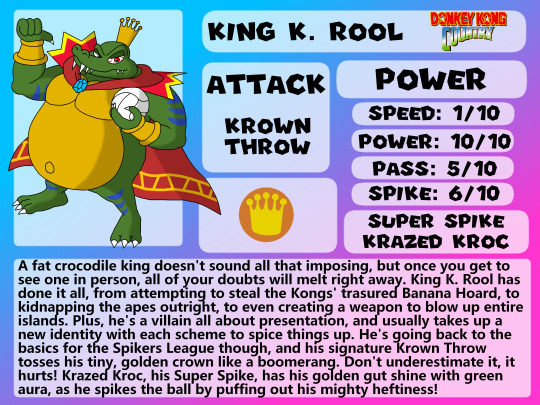
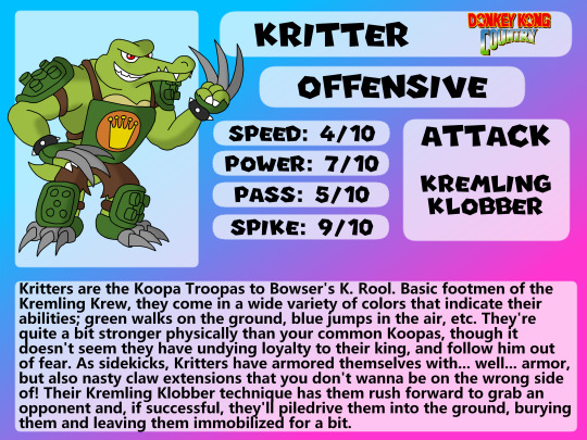
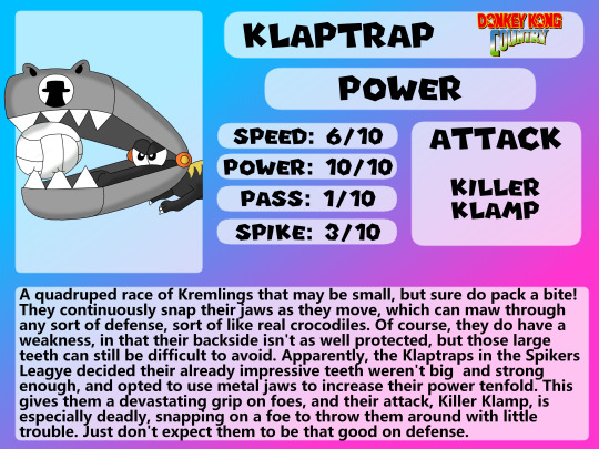

King K. Rool and his crazy croc army are setting sail, and charting a course for Super Mario Spikers! I thought it would be cool to do a breakdown on all the Kremlings in the roster (so far), including their king. Their designs and personality are a bit grungy compared to the typical Mario fare, so their representation here leans a bit more into the "hardcore" territory, having real dangerous and painful armor and weapons. These are crocodiles you don't wanna mess with!
The king himself is who we'll cover first, of course! Design-wise, he's heavily inspired by his look in Smash Ultimate, which has always been my favorite design of his as it blends everything good about his Rare and "modern" designs seamlessly. For his outfit, he's got body paint and a nice monarch-like collar around his neck. His belly already makes him quite armored, so he doesn't need much protection; he can take on everyone just how he is.
Krown Throw is based on, what else, his boomerang crown move from the first Donkey Kong Country. It's arguably his most iconic move, so why wouldn't it be here? Krazed Kroc, on the other hand, is mostly original, although his stomach glowing green was based on his Gut Check counter in Ultimate.
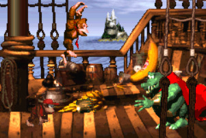
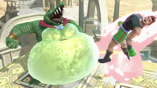
If there's one thing I'm not 100% on it's the posing. I think it fits him well, but he was made pretty early on in this project, and it looks a little stiff. Plus he's at a weird angle that no other character is, which makes it a little off when put next to them. Maybe if I ever go back and redo some of my older characters I can make him better. Aside from that though, I'm pretty happy with how he turned out.
-
Kritter takes what I said earlier about "hardcore" designs and amps it to 11. He's covered from head to toe in armor, and those claw extensions look fierce! There was actually an origin for this armor - concept art for Mario Strikers Charged of all things! I took inspiration mostly from the first design, but I made it a little more "exposed" - both to give this outfit more its own identity, and to fit the Kremlings' aesthetic a bit better. I also took the bigger claws on the feet and put it on the hands, which also looks like Bowser's armor in Charged.
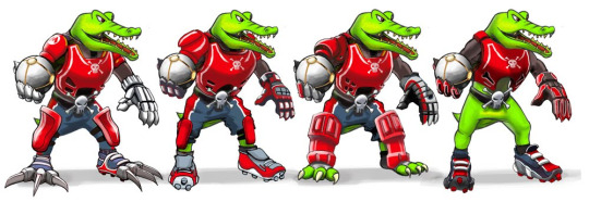
Outside of that though, there's not a ton I sourced from Kritter's game appearances. Kremling Klobber is a fully original move where he piledrives opponents he's close to, it's not from anything, but it's definitely something Kritters would do in a competition like this. Their stats also give them "mobile powerhouse" vibes, which I think suits them well.
-
Next is Klaptrap, probably the second most recognizable Kremling outside of Kritter. The idea behind its design here is obvious - maximize it's biting power! Klaptraps already have strong jaws, so making them much bigger and much more sharp makes them way more dangerous. Killer Klamp makes them bite down on enemies and swing them like a dog - Klaptraps seem a lot more like feral animals than the other Kremlings that walk on two legs, so making them animalistic works out pretty well for them.
It's hard to tell with the metal jaws blocking it, but the design was based on Klaptrap's Assist Trophy in Ultimate, which in turn is pretty much just its Rare design in HD.
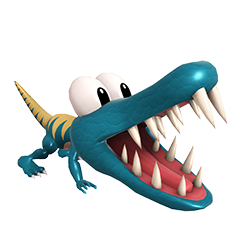
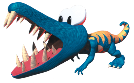
And... that's it. Not a lot to talk about Klaptrap. Just a really cool design with some cool abilities. Nice and simple.
-
Klinger stands out among these guys as having the funniest design. Mainly being that he's hitching a ride on those weird blue machines that move on rails from Super Mario World. This wasn't something I initially planned for, because Klingers in DKC2 always move on ropes, so I wanted to find a way to make a moving rope work. At first I thought they could be carried by some unseen flying Kremling and the rope just extends off-screen, but then I thought of these things from SMW and thought these would be a perfect fit.
Kind of goes against the whole "emphasize the Kremlings' badass-ery and hardcore-ness" thing I had going on with them but I don't really care, it's funny lol
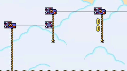
That doesn't mean Klinger isn't threatening even with this silly rope though. For one, he still has that big sword of his. I'm pretty sure Klingers carry them in their mouths as they climb, but this time they're slashing enemies with it. Swinging Slasher, like most of the other moves thus far, is pretty much original, but imagine how cool it'd be if a Klinger swung from its ropes and tried to slice the apes in half?
-
And that's about all I have to say about these guys. Kremlings are one of the most unique characters among the extended Mario-verse, and I really wanted to do them justice. I definitely have ideas for more Kremlings, but that's for another day. Overall, I'm really happy with how they turned out.
#kremlings#kremling krew#king k. rool#k. rool#kritter#klinger#klaptrap#kremling fanart#kremling krew fanart#donkey kong#dk#donkey kong country#dkc#donkey kong country fanart#dkc fanart#donkey kong country 2#dkc2#Super Mario Spikers#rare#rareware
17 notes
·
View notes
Note
Go OFF I wanna hear about this au 👀👀👀
HI ANON. um this is gonna be a long one.
so basically its a dnd inspired fantasy au, with the party as their dnd characters, classes pulled from this post , definitely didn't have to scrounge through my save blog for that, by @/elekinetic, if they didn't already have them. because it's real and true.
basest plot outline i can possibly give you is as follows; as young children all of the members of the party were Marked somehow for Evil and Villainous purposes, or perhaps Good and Benevolent purposes, but it stands that they marked. (by whom? well. tch. heh.) this mark comes with this innate.. pull? i guess? to the other members, but not strong enough to be noticeable, more of a seeing the others and thinking "oh! there you are! i've been looking for you!" despite never meeting before. the group starts as mike and will finding each other, before it all kinda spirals and they form a little adventuring party, led to their next destination by their faithful cleric, who alongside the original pull, feels another drawing them all to wherever the universe decides they Need To Be.
that's like. the concept i guess? i really don't want this to run too long so i'm putting more ideas and villainy and art and such under the cut :-D be warned i hate most punctuation and i love to ramble.
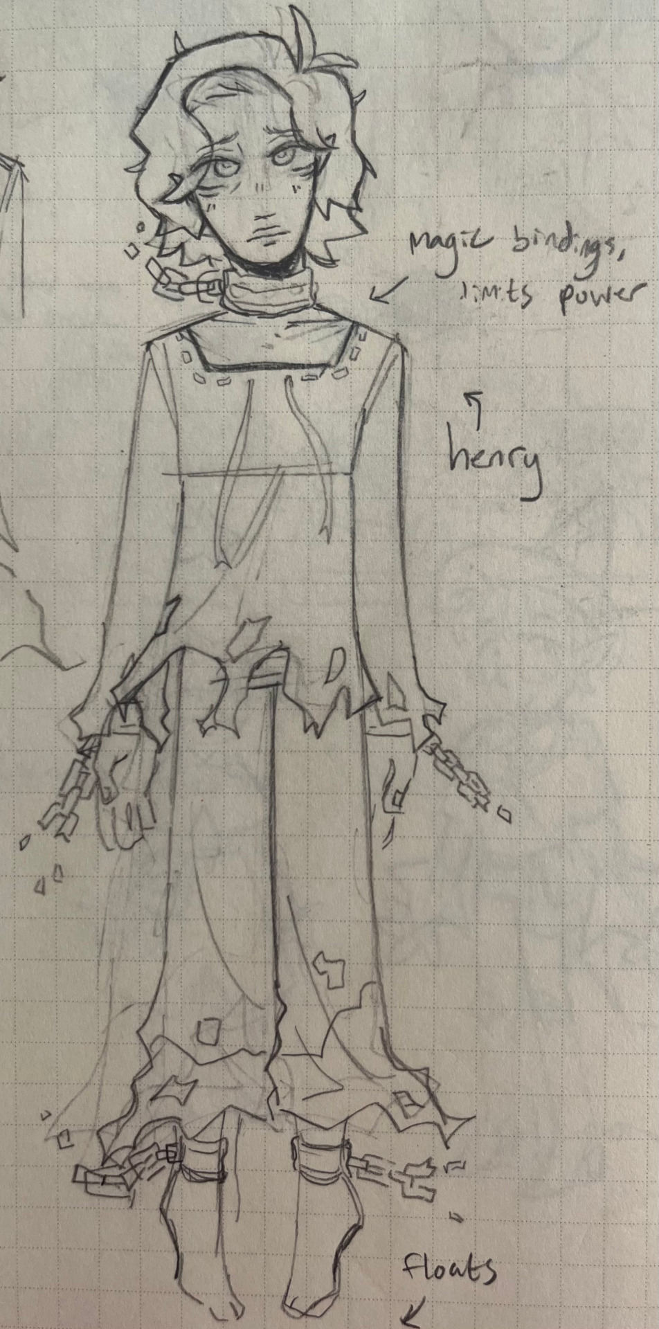
OK SO. first of all edward and henry are twins so jot that down. something Terrible and Unspeakable happens to the rest of their family when they're like 12ish and they run for the hills, eventually stumbling upon the mansion dwelling of a reclusive and moderately to severely insane mad... scientist? not entirely sure what brenners fantasy world equivalent profession would be. anyway yeah its brenner the twins are tricked duped swindled and had until theyre locked in his basement and become his newest experiments.
brenner is basically training them to be his guard dogs/weapons of mass destruction and is doing. canon typical things to them. until henry's like hey maybe you're right the world kinda does suck but id be sad if it all burned to the ground :-( i don't see how that's helping. (this is possibly spurred on by a spot of creelarke and scott chilling in gardens and teaching him that not all science is bad and mean and also that brenner is kinda full of shit) and for this grave crime he is locked in the attic.
vague handwavy magic plot bullshit (motives? where were going we dont need motives) blah blah edward has Marked/Cursed the party members woah oh noo!!!
this is mostly a vehicle to think really hard about fantasy byler and lumax and pre-UD-esque henry interacting with the party through their dreams to aid their Great Quest so try not to breath on it too hard. it may or may not fall apart.
OK ART YIPPEE YAHOO LETS GO
side note i know jack shit about dnd races and quite frankly do not care. i said dnd inspired not dnd were going TYPICAL FANTASY RACES ONLY I'M TALKIN ELVES HUMANS DWARVES AND SHIT ELSE.


they all have a more casual outfit for downtime and one for traveling and/or battling etc etc. you get the gist. dustin and lucas aren't done yet and you'd have to take drastic measures to get me to do anything other than type rn.
also have some doodles bc i like you :-) ft. a henry and miwi's first meeting.
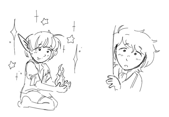
i have way more thoughts (particularly regarding max and mikes backstories and mikes oath and 8 thousand other things). but i don't wanna be annoying.
final thing is that for extra credit you are welcome to listen to the moon will sing by the crane wives and think about this au's henry okay byyyyyeeeeeeeeeeeeeeee (slowly fading away)
5 notes
·
View notes
Note
hey i see you reblog a lot of stuff about asking about ur ocs, so here goes! pick one of your faves, and i'd love to hear about how they went from initial design concept to where they're at now, and why you made the changes you did along the way! it's real cool to me to see why and how other artists make the design decisions they do :)
(I went OFF sorry I started kinda talking about lore as well ;w; )
OK!! Hi, thank you for the question. So, I don't know how familiar you are with them, so while Liam has had the most redesigns, it still stayed in the same park.
Let me then talk about my beloved man, the blorbo, my one and only husband, Ignis Azario. UNFORTUNATELY I lost all the old art and made this some time ago, so the outfits are less accurate than to what they were before, but:

This, Nicholas Nazet, was later "replaced" by Ignis. I am putting it in quotes because while I lack the art, they're still the same concept to me. Since I was more just thinking about them and had little time for art, most of the evolution in terms of visuals happened off-screen.
(I know this is boring, but I'm just thinking about him right now and also this will be shorter than, like, Liam, who has been making me rot on the inside since fucking 2020. Who are you, sir.)
First the evolution went via text only, because, well, I was writing about these two. I don't remember which story it was, but I think it was the one the beginning of which I later reused for "what does it take" (as I don't know who you are I don't know if you know what I'm referring to - I very closely guard with whom I share my stories). Anyway. He was still a magician. This was actually around 2020 I think? There are some doodles of Actual Percy in my 2020 - 2021 sketchbook and there is a mention of Ignis/Nicholas and also a doodle of Already Ignis? It gets a little scattered because it clearly is BEFORE Ignis became who he is but the second page has and actual doodle of Actual Ignis with his broken horn so I'm assuming there must have been a few months between those pages.

(this sketchbook page says: Elite hunter, along with Ignis (which is written over "Nicholas") Azario (also his lover)) --> PRE-HUSBANDS ERA HERE
this is on the page next to it: already Ignis as he is now, so there was quite the TIME between those

Anyway, yes, Nicholas' surname was at some point changed first to "Nazario" actually and then to "Azario". The actual inspiration for Nicholas was from some random visual novel about ghost/demon hunters.
I think I've them just let Ignis sit for a while, until one fateful day in 2021 when I was playing around with color palette challenges. That was when this hot thing was born - around 20th of September, to be specific. I just wanted to draw a hot and evil guy. That's it.

You can see that this is very out of character, and actually not even canon now. It used to be - the moment I made this design, I knew I needed to keep him, I knew I needed him in my life. I also wanted some actual character that started out forced-evil and little fucked up but ended up good. So initially Ignis was still with his terrible mother and acting as a killing machine way until his adulthood.
As you can see, I liked this so much I have not changed the colors since.
And then I added more marks, because I wanted to. As lovely of a body as is the one above, theeeeere was just some lack (: also I wanted more of the lighter color in general. (you can see that he doesn't actually have a mark here on his chest - that came later as well when I was developing the general concept of Hunters more)

Latest change came last year, where I added a scar to his back from an exorcism (:

And... Yeah, that's it. I probably have more interesting timelines in terms of purely design evolution, but Ignis definitely changed the most? Just not gradually.
Also the others (Liam and Rein for example), feel free to ask for more, but you asked for a favorite and that's 100% Iggy, my beloved <3
1 note
·
View note