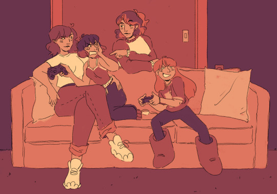
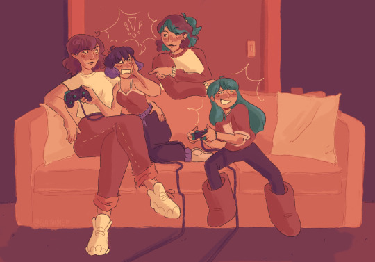
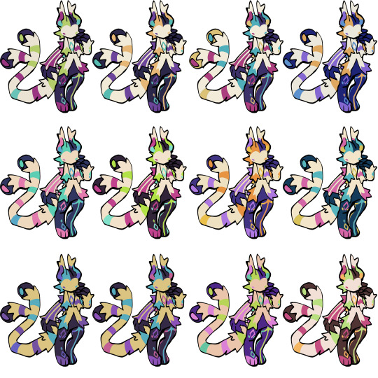
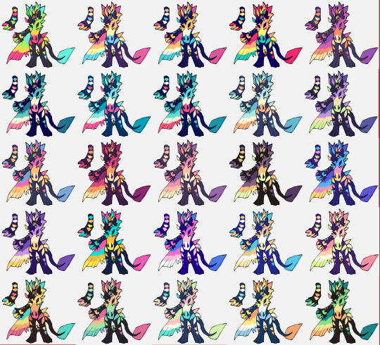
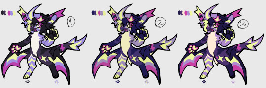
#wanted to play around with gradient mapping with this one
Explore tagged Tumblr posts
Visit Tumblr Blog
Explore Tumblr blogs with no restrictions, modern design and the best experience.
Last Seen Tumblr Blogs


Fun Fact
Tumblr was named as a finalist in Lead411’s New York City Hot 125 in Aug 2010.
Text

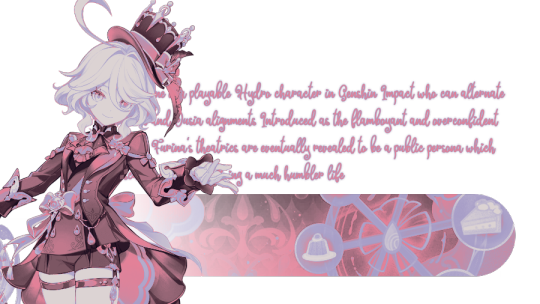
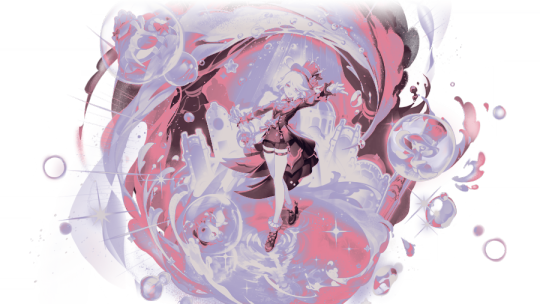
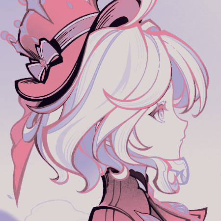
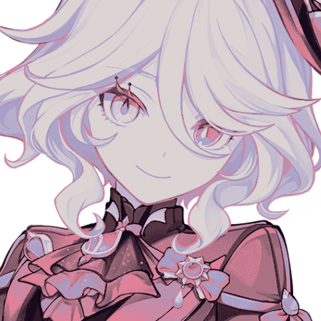


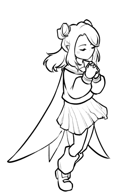
FURINA DE FONTAINE !
like / rb & credit if using
#wanted to play around with gradient mapping with this one#furina#furina layouts#genshin impact#gi#genshin layouts#genshin icons#pink#purple#furina de fontaine
179 notes
·
View notes
Note
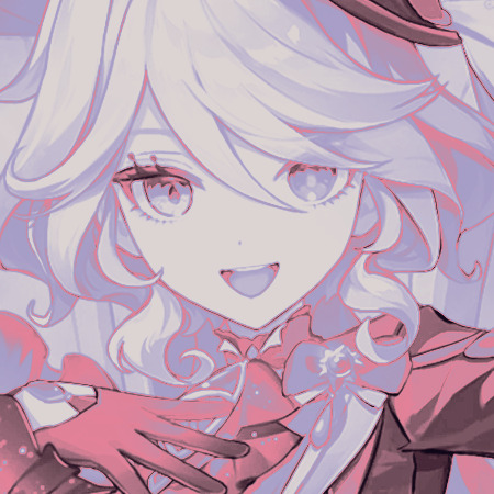
If I may, how do you typically approach choosing colors in your art? It always has just a lovely feel to it, so I was a bit curious; don't feel pressured to answer ofc :]
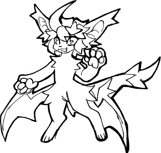
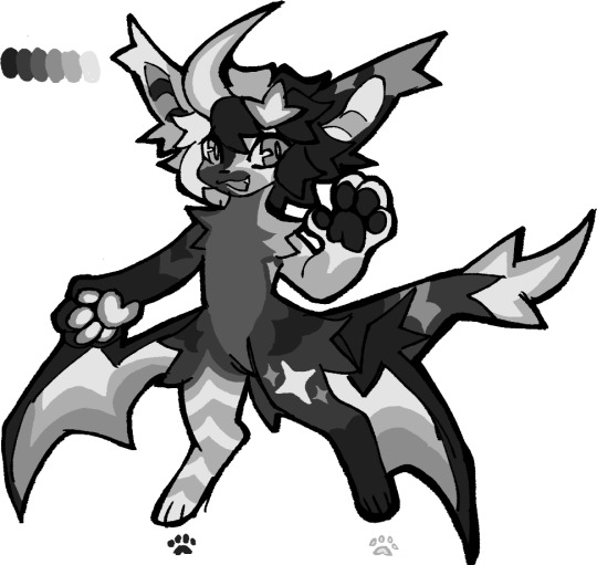
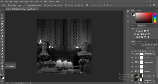
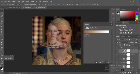
I’ve been using a lot of gradient maps lately, they work by switching the greys in your piece with a corresponding colour according to its value. Basically, I colour in black and white, grab a gradient map, and then I adjust the colours by hand until I’m happy with it. This isn’t the only kind of colouring I do, but it works great if you’re in a rush or you’re struggling to find a good starting point for your colours. I’ve been operating under a time crunch for these Sketchbook Week drawings and the Plenism promo stuff I made, so for all except one I used gradient maps. I’m actually in a bit of a funk with my colours right now soooo I’ll come back and do a proper colouring tutorial for my style once I’m happier with how my non gradient mapped colours are looking !
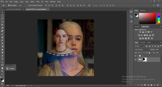
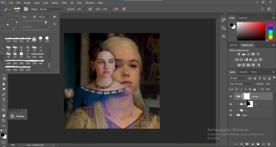
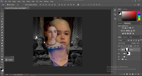
#after sketchbook weeks over I wanna sit and do some colour studies to find palettes I’m more happy with#even these gradient map ones I’m not thrilled with#they’re fine! but I could do better#in terms of other tricks I use I’ll often adjust the hues and saturations if the whole piece to give things more unity if I’m struggling#and/or add a new layer on top of everything and fill it with one base colour#and play around with different layer settings and opacities on top#I���ve found a luminosity layer on a low 5-10% setting is quite nice#basicslly I fuck around and find out#and if I’m in a rush I use a gradient map#they’re not neccesarily a quick fix! if you’re like me you’ll still want to do some tweaking after it’s been applied#and you need to pay attention to your values when you’re colouring in black and white#but that’s another good thing about gradient maps - they force you to focus on value over hue which is an important skill to build#so yeah I’ll come back to this and make an actual colouring tutorial once I feel like I have actual good advice to give#cause rn I’m just very meh in my colouring and I don’t think I have anything very helpful to add#need to find some tutorials myself first !#ty for the ask!#ask#art#my art#bpcol-reblogs#textpost#blethering#for this piece the adjustments were minimal in comparison to what I usually do btw#because I was rushinggggg lol#I did more for my Plenism posters n such#but I can’t really show good comparisons because I. didn’t save them like that#I usually smush all my layers together when I’m drawing sooo yeah makes it hard to go back my bad whoops#but I saved as I was going whilst drawing this so I could provide examples yipee!#if I’d been smarter and remembered more I could’ve had more process screenshots butttt oh well lmao
17 notes
·
View notes
Text

hello and welcome to my tutorial on how to create gifs like this one! full explanation under the cut, but if you wanted to take a little peek at the gifset attached to this tutorial, here ya go!
for the purposes of this tutorial i am assuming you know
how to make a gif
what vhs footage looks like
STEP ONE: MAKING YOUR GIF
choose your footage and plug it into your desired software of choice! i use photoshop for this so i can only attest to the efficacy of these methods in that context
as for shot selection, you could feasibly choose anything. however, i prefer shots without too much movement in them - makes it look more like a home video.
because of the heavy amount of colors and filters, i'd recommend a gif somewhere around the 40-50 frames! but of course you can play around.
oh i also set the frame delay to 0.08 seconds. this is slower than most gifmakers tend to set theirs, but it makes it run buttery smooth imo.
STEP TWO: MAKING THE COLORING
here's where we get vhs specific. if you're unfamiliar with vhs footage, i recommend clicking through this youtube playlist! if you're not interested in the coloring, skip to step three (smart object fuckery + filters)
now while making a set i tend to choose some primary colors for my gifs. in the gifset i linked above, i chose to work with blue and orange-y yellow. in some of the other gifs i'll be using as examples (from an unfinished set) i chose green and yellow.


to create the above coloring i generally use these steps:
1) curves
i'm a maniac so i use the same curves layer to initially edit the luminosity AND colors of my gifs. the purpose of this layer is to edit brightness/contrast like i normally would and already start the process of changing the colors a little bit. this is my curves layer for the blue house gif:

to make the gif go from the left image to the right image:


as you can see i used the brightening curves to make the footage a whole lot lighter. i also increased the reds to get rid of the cyan tint a lot of blue footage has, slightly increased the blues, and once again decreased the greens to get rid of any cyan. this does make the blue hue a bit more purple, which is a nice bonus!
as for the gif of the boy, that one's a little harder to show a before and after for, but i'lls how the curves for good measure:

the original shot was already quite bright so i only edited the brightness a litttle bit. because i knew i wanted the gif to be green and yellow, i increased the greens, decreased the reds (except in the shadows), and decreased the blues (to get yellow)
2) channel mixer
now the channel mixer layer takes a little getting used to so i recommend experimenting. ALWAYS USE THIS LAYER ON THE COLOR BLENDING MODE for a more even result.
i use channel mixers to sort of... unify the colors a bit more. for the house gif, for example, i increased the blue channel to +110% blue, but decreased the blue in the red (-12%) to retain the yellow in the window.
if you want me to explain this more in depth, send an ask! it'll be kinda longwinded though


before / after of the boy gif with curves/channel mixer.
3) levels
this is where it starts looking more vhs-y! vhs footage has light shadows and dark highlights.
first, set your levels layer to luminosity blending mode to retain your beautiful colors.
then, crunch the hell out of your gif to make it very... mid.


this may feel a little wrong at first but i prommy it'll look okay at the end. a before/after for the boy:


now that's starting to look familiar right?
4) color fill/gradient map
because i want to unify my colors/make sure my gif is saturated, i usually add either a color fill or gradient map layer. in the case of the house, i chose to go with a dark blue color fill:


because the coloring of the boy gif was a little more complex, i decided to go with a brown to green gradient map.

this will make the shadows yellow, and the highlights green.


BOTH THESE LAYERS ARE SET TO OVERLAY. i usually fiddle with the opacity of them until i like it, but it's anywhere from 7% - 17% depending on what i feel like that day
5) curves (again)
this layer is probably useless but i do it anyway to make myself feel better. this is just a regular curse layer to up the brightness a tiiiiny bit and amke sure everything's clear. also it helps counteract the darkness your overlay color will add in.
6) color balance
this is my most subtle layer so i won't be able to show before and after but i fiddle with the color distribution a little until i'm satisfied. set this layer to color blending 'cause that's what you wanna affect!
i decided i wanted the house gif shadows to be a little more purple, for example, so i added in red (+3), magenta (-1) and blue (+1). etc etc. do what feels good!
STEP THREE: SMART OBJECT FUCKERY AND FILTERS
OKAY that was a lot. sorry or you're welcome. but good news: now's the fun part. convert your animation to a timeline, then select both your coloring and gif layers, right click, and select convert to smart object.
now that your gif's a smart object, i usually crop it. i tend make vhs aes gifs a 4:3 ratio (so 540 x 405 px) because that's what vhs footage was usually recorded as! crop your gif, resize, and then we can continue.
1) color bleeding
vhs footage usually bleeds its colors - this manifests as a short of... weird subtle halo around any object. the way to recreate this in photoshop is to duplicate your smart object.
set your copied smart object to color blending. now move it to the side a couple of pixels (i usually do around 5px, but you do you!)


as you can see, the tree and chimney (and everything else but less prominently) have a yellow shadow to them. this is exactly what we want!
2) filters
now's the time to add your filters and make it look like shit (but on purpose!) first, select both smart objects and convert to smart object again. this will ensure the filters apply to all layers evenly.
i use the following filters:
unsharp mask (amt 35%, radius 4px) - this will subtly add some sharpening but only on the edges of objects
add noise (amt 7.5%, distr. uniform, not monochromatic) - this will add the signature vhs grain.
box blur (2px) - i edit this to be 75% opacity with the little arrows to the right, just to make sure you can still make SOMETHING out when you're looking at the gif. MAKE SURE THIS FILTER IS ON TOP OF YOUR NOISE FILTER. tumblr will kill your gif otherwise
4) ONE LAST THING
usually at this point i'm not happy with either the saturation or levels. (usually the levels). so on top of your smart object, add another saturation or levels layer and fuck around!
in the case of the house gif, i thought it was too bright still so i set my output levels to 13 and 216. for the boy, i thought the shadows were too dark, so i set my shadow output to 11.
BEFORE & AFTER:


aaaand that's it! thanks for reading! if you have any questions, feel free to come to my askbox, i'm always happy to explain my process. happy giffing 🥰
#gif tutorial#ps tutorial#photoshop#completeresources#allresources#giffing tutorial#vhs gif tutorial#idfk. what do you even tag for tutorials lmao
275 notes
·
View notes
Text
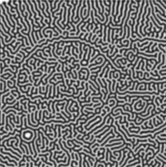
how to make cool blobby turing patterns in photoshop
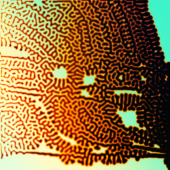
i'll preface with i learned the basic loop from skimming a tutorial on youtube, but as someone who prefers written tutorials i'm sure many would appreciate one! also, the second part of this is some of the visual effects i figured out on my own using blending modes and stuff.
i'm using photoshop CS4 on a mac so some buttons and stuff might be in different places on windows and newer photoshop versions but all the actions are the same. my canvas is 1000x1000 pixels.
UPDATES (i'm hoping these'll show up whenever you open the readmore?)
it's possible to do something similar in krita using this plugin, made by the love @arcaedex
it's also possible to do this in photopea, a free browser alternative to photoshop! the results are pretty much identical.
FIRST off you wanna get or make a black and white image of some kind. it has to be one layer. can be noise, a photo, a bunch of lines, whatever. here's mine, just some quick airbrush lines:

now find the actions tab. idk what it looks like in newer versions of photoshop but you probably won't need to dig!
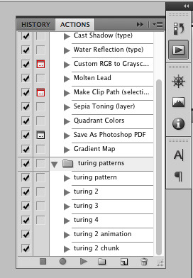
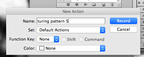
hit the little page thingy to make a new pattern. once you hit 'record', it'll record everything you do. the little square 'stop' icon will end it.
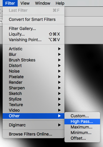
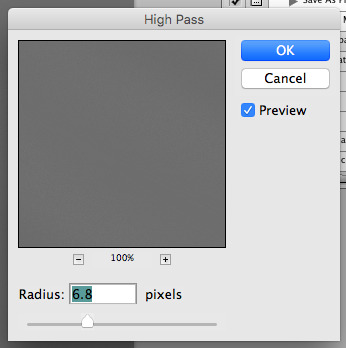
now you want to do a high pass filter. you can mess around with the radius to change the size of your squiggles, but the tutorial had it set to 6. experiment!
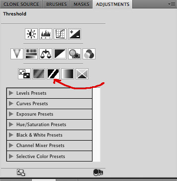
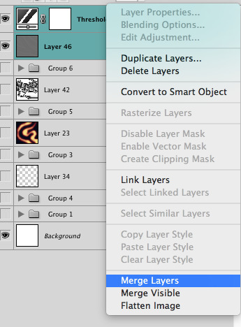
now add the 'threshold' adjustment layer. i use the adjustments tab but i think there's also a dropdown menu somewhere. keep it at the default, 128. merge it down. (control or command + E or you can right click it like some kind of weirdo)
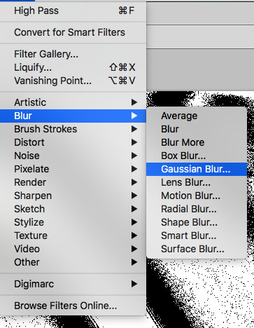
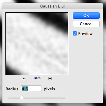
and finally, the gaussian blur! the radius of this affects the shape and size of your squiggles as well. i like to keep it around 4.5 but you can mess around with that too.
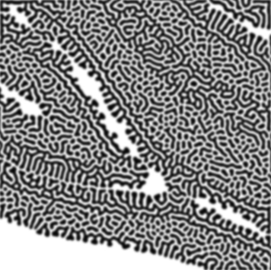
after that, hit 'stop' on the action you're recording, and then repeat it a bunch of times using the 'play' button, until you have something you like, like this:
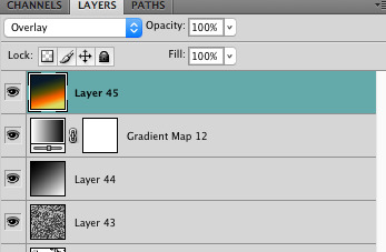
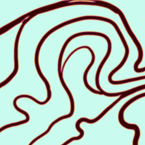
WOW!! that was fun!! and only a little tedious thanks to the power of macros. anyway, here's some fun layer blending stuff i like to do. it's with a different pattern cause i made this bit first.
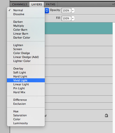
anyway, using a black and white gradient (or a grey base that you do black and white airbrush on), make a layer with the vivid light. this will make the blobs look thicker or thinner.


then, for cool colors, do a gradient map adjustment layer over that:

and finally, my best friend, the overlay layer. just using a gradient here bc i'm lazy, but feel free to experiment with brushes, colors, and blending modes!

NOW GO. MAKE COOL SHIT WITH THE POWER OF MATH. AND SEND IT TO ME
also these are not hard and fast rules PLEASE mess around with them to see what kind of weird shit you can make. here's a gif. as you can see i added some random airblush blobs in the middle of it, for fun.
933 notes
·
View notes
Text
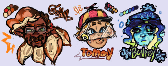

been meaning to post my designs for these little guys forever. insane splatoon rambling under cut to explain design choices and lore related things ... read my autism boy
btw this is a repost from our art side blog this was written and drawn like months ago <- minorly rewrote some things tho
thx splatoon users drfreeman & drcoolatta for fueling my splatvrai autism brainrot ... i hate u /J

GORDON
idk how to explain this but Theoretical Physicist is inkling coded . maybe its cuz splatoon species social hierarchy
Native ink color is Orange, but he has Dark Brown tentacle roots.
Uses custom weapons to attach in place of his prosthetic; It works best with Splatlings but can be adjusted to attach other weapons.
If the thing above didn't make it obvious, he's a Splatling main. He switches out depending on his mood though.
sighhhhh technically an Agent... stares at the ceiling...Main character...
His arm loss is like pretty much the same as in-canon but it's with the octarian army shrugs. don't ask me why he doesn't just regenerate it cuz hes a squid thats for me to know and you to find out. (get partially sanitized loser)
Born & Raised in Inkopolis pre-splashtags; He wasn't informed of the switch to Splashtags being expected when participating in most activities around Inkadia.
TOMMY
I forgot why i made him an inkling why did i do that. I think it was bc i didnt wanna make them all octolings but i was wrong srry we all make mistakes /hj I ALREADY REDREW HIM ONCE IM NTO DOING IT AGAINNN
Native ink color is orange-brown.
His hat has an eye guard for sensory reasons; He covers up as much of his skin as possible because he doesn't like the feeling of foreign ink on him.
He isn't a specific weapon main, he just uses any long-range weapon to minimize the possibility of getting ink on himself. If he has enough guarding, he prefers to use N-ZAP '89.
Makes his own gear for sensory reasons as well :) It's legal when ur dad's the G-Man.
Exclusively plays in Turf Wars, Anarchy Battles, etc with friends. He hates playing with people he doesn't know.
Born in Splatsville !! He feels like a Splatsville resident. His occupation is resident I cannot imagine him doing Anything
His dad is that creepy curtain in one of flounder heights windows /j
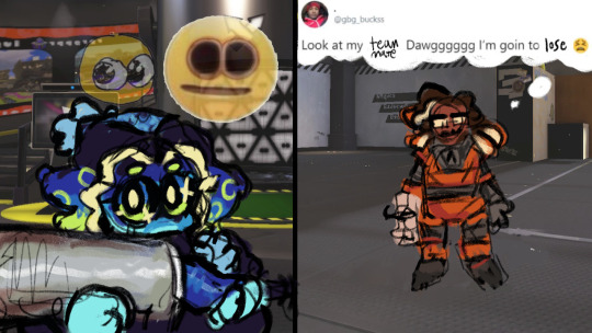
BENR(E)Y
Octoling bc I wanted him to be sanitized :) Other than the visual part of being sanitized, I thought him being clinically dead fits /hj also lore reasons below
Pre-sanitization, his native ink color was blue.
Great Turf War veteran; He didn't do anything in the war itself, he was just enlisted lol. He was primarily security for the Octarian Domes in the years after the war. Yes, that also means he is over 100 years old.
"Raised" (debatably) in Octo Canyon.
E-liter main (4-star Base + 5-star Scope) and avid squidbagger. He also uses any heavyweight weapons (dynamo, tenta, etc)
Absolutely hates working at Grizzco, he only does Turf Wars and Anarchy Battles. He only works at Grizzco during Big Runs. The type of guy that does X battles.
Professional Anarchy / Ranked / X Battler btw. That's literally 90% of what he does.
Got on Gordon's azz over him not having a Splashtag; i wonder what that parallels.
BUBBY
Genuinely don't have a lot to say about his design. He gives off Splatoon 2 Octoling vibes (showoff /hj) also i wanted to make his hair wispy like it should be.
Native ink color is a light blue-gray gradient.
The drawing doesn't give it credit but I swear those are glasses not goggles .. they're opaque-colored slanted oval glasses !! ^_^ u can interpret them as spiked or just eyelashes, both are right.
oh also the text under bubby says "Is Best" in some splatoon font we downloaded awhile ago . i think it was ripped from splatnet
Blaster main. I don't know how to explain this one but it feels right.
helps with the practical Map props (ie ink rails) and with some weapon gear manufacturing ^_^ tech guy
COOMER
Was going to make him an Octoling for the convenience of making his hair curly but i didn't want to make all of them octolings + i think his personality generally fits Inklings more.
Native ink color is an off white gradient.
Slosher main cuz he likes moving his arms. this makes sense to me. Also is a fan of Splatlings and other Shooters.
i felt ill trying to design coomer without making his eyes two lines with eyelids
War Veteran...Stole some octarian tech and got fucked up super limbs. Cyber Inkling stealing from octos !! [inkadia crowd goes wild] /j
anyways outside of the war™ he's a data researcher. just generally. he does shit with splatfests and eggstra work.
If you splashed him with ink he would stand unmoving. He would not shake it off.
DARNOLD
Ok i'll be honest the Octoling choice is primarily bc Octolings have the afro style & inklings have no textured hair styles (i didnt have the energy to design smth that could work) . His personality fits octoling too though :3
Native ink color is red-orange.
The fucked up guy that makes those drink effects people never use ( i use them ... )
He doesn't participate in Turf Wars or Anarchy Battles, but he works some gigs at Grizzco for extra cash every once in awhile !
the type of guy that goes after flyfish cuz no one else will . god bles !!!
not a lot to say about his design & his place in inkadia , it kinda speak for itself . he just wants to get by and make his drinks in peace . #autism ... he is pretty much exactly the same as his canon self
#my art#hlvrai#half life vr ai#half life but the ai is self aware#i dont usually tag things this hard but ur GOING 2 read my autism /j#benry#benrey#gordon hlvrai#gordon feetman#hlvrai benrey#hlvrai gordon#hlvrai tommy#hlvrai fanart#dr coomer#hlvrai coomer#hlvrai benry#hlvrai bubby#dr bubby#hlvrai darnold#darnold pepper#<- I FUCKIN FORGOT DARNOLDS TAGS
212 notes
·
View notes
Note
im curious, how do you color your lines? they always look so pretty!!!
Thank you! I pretty much just use a bunch of layers lol I start with something like this in just one color (I used a soft round brush on like 70% opacity for lining this)

Then on a new layer in multiply I go over all the parts I want to stand out more in a different + darker color. I also make a clipping layer to lighten certain parts of the lines from the first step. Explaining which lines I color is difficult to describe but I'm mainly thinking about defining the edges of distinct objects and the light source
You can stop there but I like to add some kind of color filter top of that. My favorite way is make a solid color layer on exclusion mode above the lines > merge all visible layers on a new layer > set this to "color" layer mode so it colors all the lines underneath, but there's a lot of ways you can do similar stuff. I think a gradient map would probably be easier and give you more control for a similar effect
Then I add flats on a multiply layer above all that. TLDR I like to have variation in value of the lines and then vary the hue depending on the value. I don't have a method for how I pick the filters or line colors really I just play around with what I think looks nice with the colors of the piece 🫶

#my process basically involves redrawing over the same thing a billion times so if that's not what you're into this is probably not#the method for you LOL#ask#anonymous#long post
235 notes
·
View notes
Text
how i make color palettes of my ocs before i pick one, an art tutorial?
hello, whenever i made a new design for myself i found a way to make lots of color palettes and pick one! i see this method more in paintings and rendering but not much on character designs? here are some examples i used that on.
it helps me so much when i feel experimental with colors. here are what you need
a wip character design. sketchy or pixel art works better since the colors can have some anti aliasing issues
a program with gradient maps. i'm using clip studio paint but ik photoshop also has it. like i said this is used more on photos or paintings
and here's what you do!
draw your character. i'm making a new fursona for myself but anything should work.
2. decide on their markings/color placement in grayscale. i recommend doing grayscale so you can easily see the values. split your grays into however colors you want. i like doing 5-6 the most. i reccomend duplicating the color layer if you wanna try multiple palettes.
3. this part is program dependent but in csp's case go to edit > tonal correction > gradient map.
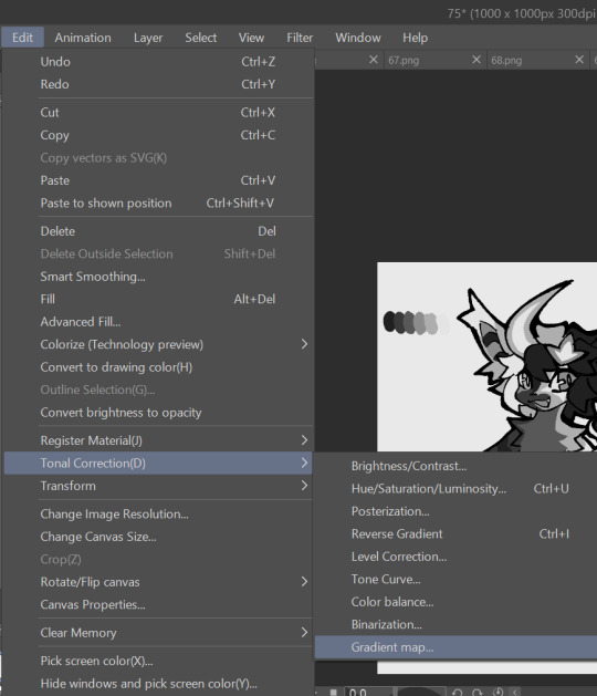
4. i made a few default 5 color gradient maps but if don't use gradients like me i reccomend making the graph like this so they become solid color. split the map into however many colors you used. i'll add a color to the red-orange one bc my character has 6 grays.
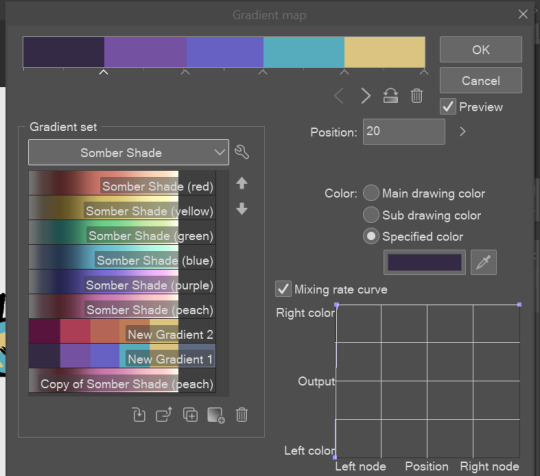
5. replace the colors by clicking below specified color. it all depends on your creativity and what you want. experiment til you like it.
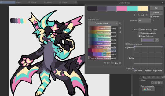
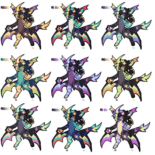
6. fuck around, try stuff, put them together to see if you like any of em. i made 9 to see if i can focus on one of them and i actually ended up loving the bottom right. it really makes them shiny
7. (optional) if you like a palette you can further and play with colors while keeping the palette. you can use color balance (in the same menu as gradient map in csp) or layers to mess around, have fun!
also a color tip because people seem to compliment that a lot in my art: digital art has millions of colors! don't be afraid of using wacky tones unless you're going pantone. if you want to get something physical i recommend being open to alternative colors as they tend to be more limited. i know whoever is doing it will try their best to keep the colors close.
color theory is something i don't...care much about mostly because this is something i'm doing for fun. i'll consider it in professional work.
#artists on tumblr#digital art#ika's showtime#ikarnival#art tutorial#art tips#drawing tips#art resources#clip studio paint
412 notes
·
View notes
Text


[lip smack]
I wanted to do another fully-fledged piece, but I couldn't decide on subject matter, so it just ended up being Benrey. One day I'll draw something that isn't just a character standing around.
Bonus: these alternate color versions that I stumbled upon while playing with gradient maps


#hlvrai#half life vr but the ai is self aware#benrey hlvrai#benrey#hlvrai fanart#digital art#traditional lineart#fanart#my art#artists on tumblr#i'm in my blue and orange era i guess
188 notes
·
View notes
Text
youtube
"Okay, yeah. If you kill a red name, killed a red name-" "I'll give you a life for that. That's the deal." "We'll be back together like buddies again, Bdubs."
In participation of Extreme Timed Challenge Gift Exchange hosted by @extremetimedchallengeexchange!
[gifs, full storyboard, behind-the-scene rambles under cut]
past 48h animatics: MCYTETC2023, ETC2023
[Red Lives-Suspicion; Prayer-Determination; Fireworks]
Fiddled with gradient maps this time for some additional colors :D I would have colored in the eyes as well, but I didn't have enough energy left when the event hit the 47th hour xD
Also played around with camera movements. Respect to people who do fan edits and other forms of video/ assets editing 'cause keyframes are so 😭
13 hours to draft storyboard this time! Last year I used 16 but with waaay more frames idk how I accomplished that. Probably bc this year I'm drawing more than three(3) characters lmao
Progress Timeline:
[13th hour] finished storyboard/ draft (plany off time...) [25th hour] lineart for the first 10 seconds (wuh oh) [36th hour] lineart for the first 25 seconds (oh shit oh fuck gotta shorten it) [45th hour] finished Bdubs' part (NOOO I DONT HAVE TIME FOR ETHO)
ngl kinda glad i cut it in half rn 'cause i'd have to spend time figuring out shadowDog's design /lh
Designs I used for Lizzie and Joel (old art from 2022 and 2021 respectively) (holy shit i've been here for 3 years???)
Joel *shakes fist* i hate u and ur stupid beard
[Lyrics vibe/scene planning; hours before disaster]
I think most of the drawn parts didn't deviate from the initial idea. Mostly timing adjustments and building upon the vibes. The parts that were changed the most was the "And you caused it (×3 combo)".
Went from "vague flashbacks" to "following Etho and co. out of the cave and back to Scott's base while implying who Etho blames with single character focus shots".
The first one is Scott because he suggested the idea. Like, obviously he's to blame. It's not like Etho went along and cemented the deal himself. Scott totally peer-pressured him into it.
The second one is Etho because... well the scene ends up kind of being like. The sight of the Snow Fortress triggering a flashback. (EthosLab the content creator deliberately turned his camera towards the Snow Fortress and holds it there for a second instead of looking at the huge lava pillar right in front of him. What is WRONG with him.)
But also like. Clocks are kind of special to Bdubs right. Whoever gave him a clock basically has his (temporary) loyalty or at the least earned a favor from him. So like. If he hadn't gifted Bdubs the clock, which signifies a closer(?) bond, maybe Bdubs wouldn't be so devoted to him (wrong). Also serves as a call-back/ reference to the "Prayer-Determination" shot ("pray with clock" in the scene planning screenshot). I like to think that Bdubs weighted his options and thought about "if he will kill/ who to kill" a lot while following the other Red Names. And in that scene he's like, convincing/ motivating himself. Remembering who/ what he's doing this for.
(It is also meant to be part of my giftee's other prompt: "an exploration of the doubt one or both of them felt during the heart transfer that didn’t happen after Bdubs killed Lizzie, and the following guilt Etho felt." The Etho section starting from "we're setting fire to our inside for fun" til the end of the animatic is based on that prompt.)
After a brief period of self-blame, it's time to shift it onto someone else! Because you're in denial! If Bdubs hadn't gone red, then Etho wouldn't have to offer the deal. If Bdubs hadn't want to stay as teammates, then he wouldn't agree to the deal. If Bdubs wasn't so devoted to Etho, then he wouldn't have attacked Lizzie and gotten himself killed.
Then the animatic ends with the end of the session :D
...That's longer than I expected but also not that long. If you read through all that, tysm :] Tell me your thoughts! Have a good day/ evening/ night :D
#bdoubleo100#ethoslab#ethubs#bdoubleo100 fanart#ethoslab fanart#last life smp#last life spoilers#traffic smp#trafficblr#Extreme Timed Challenge Exchange#48 Hour Exchange#events#my art#animatic#i sound like i didnt sleep but i DID DO NOT WORRY
93 notes
·
View notes
Note
if you ever have time/feel so inclined, i would love to see a tutorial or some tips from you about how to do color isolation sets!! they are absolutely incredible and I love them so much! <3
absolutely! thank you so much 💙
here are a few examples of my color isolation sets:
the substance (yellow) || beetlejuice (red) || us (red) || conclave (blue) || sleeping beauty (cyan/blue) || crimson peak (yellow) || smosh (purple) || conclave (red)
beneath the cut, i'll walk you through my coloring process!
notes: tutorial assumes basic gifmaking knowledge & i'm using adobe photoshop 2023 (though afaik, your version shouldn't matter much)
i don't color my gifs until they're sharpened and i'll give you a quick overview of my process: file -> import -> video frames to layers -> trim any extra frames -> crop to desired dimensions -> run sharpening action (i used this tutorial and just made it into an action) which also converts to timeline
once i'm in timeline, i go through my normal coloring process. unless i'm giffing similarly colored scenes that i've already colored and saved a psd for, i usually color from scratch every time. obviously, some adjustment layers vary depending on the source material, but these are almost always my main adjustments, just with differing values
a brightness/contrast layer set to screen - this is a gamechanger for especially dark scenes. note: i do not adjust the values, i leave them both at 0 and just change the blending mode
a curves layer utilizing the black & white eyedropper tools. first, i select the black eyedropper and then click on the blackest area of the gif. i do the same with the white one, using it to select the brightest/whitest spot. this can help a lot if you're dealing with heavily tinted scenes!
a selective color layer (set to absolute, not relative) where i adjust the blacks usually anywhere from 1-5 notches higher and the neutrals either up or down the same amount depending on the scene. be careful with the neutrals when giffing poc as lightening them can result in whitewashing. if need be, i will also adjust the whites, making them slightly whiter with the black slider. selective color is by far my fave adjustment layer and i use it in every single coloring.
after this, i sometimes add a black & white gradient map adjustment layer set to soft light. i'll play around with the opacity, leaving it anywhere between 5-100% depending on the scene. i think this adds depth to your colors and adds some contrast, but i don't use it in every psd.
occasionally, i'll mess around with vibrance/saturation, and that'll be my final layer, but oftentimes i won't actually add this layer until i've finished the rest of the coloring. this is just where the layer will go.
these are the main 5 layers i almost always start every single coloring with and they act mostly as a base and to color-correct any weirdly tinted or exceptionally dark scenes.
now, let's talk about scene selection. i try to set myself up for success by choosing scenes that either already have a very noticeable pop of color or have a color i know can easily be manipulated. you'll want to pick scenes that aren't drenched with the color you want to isolate though, or you won't have the contrast of the black & white.
here are a few examples of good scenes:

the only red here is the covered bridge and it will be easy to adjust only that and not the blue, green, or yellow.

same as above, apart from ralph fiennes's face, which obviously contains red undertones. i'll go more in-depth on this in a bit, but because this scene doesn't have a lot of movement, this will be able to be fixed with layer masks.

again, here we have one bright occurrence of yellow surrounded by blue that we'll easily be able to neutralize.
and a few of bad/less than ideal scenes:

while this scene is an absolute dream for making super vibrant sets or color palettes, it's no good for color isolation. this yellow covers basically everything, leaving no other colors to cancel out.

while i definitely did try this one out, the scene is ultimately too dark and too cyan-tinted to properly isolate the red of the blood or the cyan in her eyes and on the walls.

just like the first one, this scene is fully just. color drenched. would make a great base for a vibrant or color palette set but not useful for color isolation.

bad and wrong!! coloring this movie, however beloved, was a test of my sanity. you have this yellow/green filter over everything and so much of it that isolating or changing one or the other is pretty much impossible.
with all that being said, play around! the best way to learn what does what is to try it out yourself. selective color, though there are other ways of getting the same or similar effects, will be your best friend. it's how i'm able to make sets like this & this!
let's look at this adjustment layer using a scene from conclave:

truthfully, you could either isolate the orange of the wall or the blue of her outfit. i'm going for the latter at the moment.
add a selective color layer by clicking this button:

i like to really emphasize the color i'm going to isolate, make sure it's as consistent with the other scenes i'm using and that it pops. from the dropdown in the layer properties, i select blue.

each color from the dropdown will look like this. you have adjustable sliders for cyan, magenta, yellow, and black. the more to the right, the more you're emphasizing that color in any blues in your image. the further to the left, the more of that color's opposite you'll adjust. each opposite pairing is as follows:
cyan + red magenta + green yellow + blue black + white
if you're struggling with this (i did at first), visualize it. pull up one of those "bad" examples. say we take the yellow scene from the gorge. add a selective color layer to it and select yellow from the dropdown. play with the sliders to see how AND how much each adjustment changes the coloring. decreasing the yellow slider all the way to -100% is adding blue to anything ps identifies as yellow. because yellow and blue are opposites, it pretty much neutralizes the scene. instead, if you use the magenta slider and push it all the way to the left, you make any yellows become green. if you move the magenta slider all the way to the right, you'll add magenta to any yellows, making the scene orange. it's all about knowing the color wheel and experimenting!
back to the conclave gif! i want to bring out the blue as much as possible, under the blue dropdown, i crank the cyan slider all the way up and bring the yellow all the way down.

is it a massive difference? no, but you can definitely see the difference between the left (with the adjustment) and the right (without).
depending on the scene and color i'm working with, i'll play around with other layers from the dropdown. but i prefer to do each color in a different layer and i right-click on the box with the eye in the layers panel and change it to the applicable color. that way, it's easier to adjust something later on. you can also rename your layers, but this is quicker and easier imo.

with this particular scene, this is the only adjustment i want to make to the blue for the time being. now, it's all about getting rid of any other colors. to do this, add a hue/saturation layer and select every color, one at a time, EXCEPT the color(s) you're isolating and bring the saturation all the way down to -100. in this case, it's everything but the cyans & blues.

and this is what i'm left with:

from here, you can leave it, but a lot of the time, i'll add a vibrance layer or even another blue/cyan selective color layer and crank that shit up.

this is after adding a vibrance layer (increasing both vibrance & saturation to 100) AND a selective color layer (decreasing the yellows to -100 in the blues).
i would consider this finished, but this can also be super fun to mess around with, again, using selective color:


and if the way her hair changed colors is bugging you, toggle your layers on and off until you find which one(s) changed it and add a layer mask, coloring over her hair with a soft black brush:

once you're happy with everything, save your gif in your preferred way. these are my save settings just for shiggles:


et voilà!
overall, the best advice i can give is to try. experiment! if you're not sure a scene will work, give it a shot. even if it doesn't, you've still learned something. i know it can seem confusing at first, especially if you're not super familiar with these layers or the color wheel, but please feel free to ask any questions. also, let me know if anyone wants another tutorial(s) where i go more in-depth on other colors. i'm happy to do it!
#answered#daynascullys#my tutorials#gif tutorial#gifmakerresource#completeresources#dailyresources#emilyblr#usercats#userholloway#tuseruta#usertina#userrobin#uservivaldi#userchibi#userbunneis#userbambie#useraljoscha#tusermira#userelio#userscourt#userishh#angelblr#heymaur#elwintersoldado#tuserhol#usermaguire#useraashna
70 notes
·
View notes
Note
could you please do a tutorial of your game of thrones 'so much for stardust' gifs where it has the ripped paper textures? it's so pretty, and i'd like to learn how to do one with just the texture in the middle and two gifs on either side, like half and half and just having a rip in the middle. it's so cool how you did a gif in the middle though so i wanted to ask as well! all of them are so cool looking. you are extremely talented. if you don't want to though i understand :) thank you
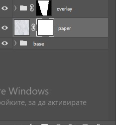
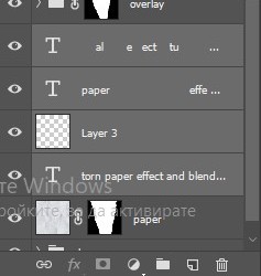
TORN PAPER EFFECT + BLENDING TUTORIAL
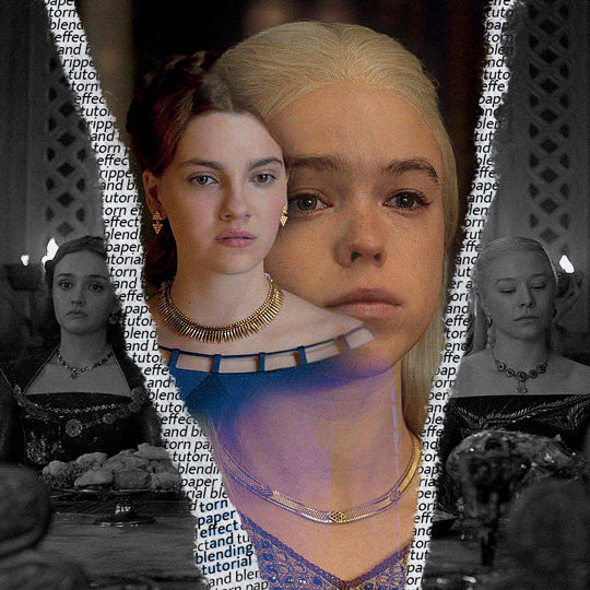
thank you so much for your sweet words, dearest anon and i'm sorry it took so long to answer but it's here now so i'll try my best to explain <3 disclamer: this is the first tutorial i ever made, it's very screenshot heavy and it assumes the basic knowledge of ps and gifmaking. if there's something you don't understand, don't hesitate to ask <3 so, let's get to it!
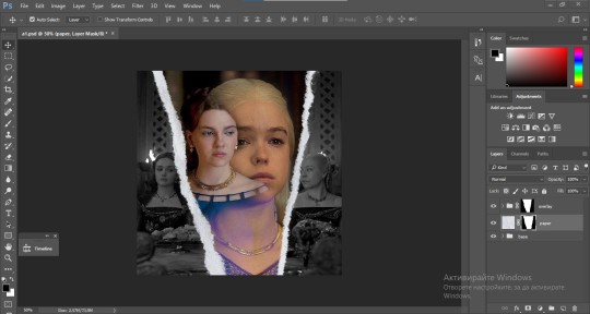
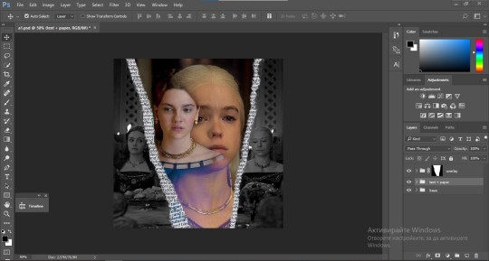
1. PREPARING THE BASE As you can see in this shot there's a lot of space between Rhaenyra and Alicent and that makes it perfect for the ripped paper overlay without hiding much of the base gif. So the first thing i did was to crop it like this:
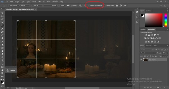
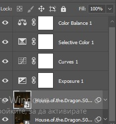
Also you want to make sure that the highlighted box (delete cropped pixels) is unchecked! After taking the usual steps for the animation (creating frames from layers, reversing the frames, setting frame delay) you continue with the video timeline and convert your frames into a smart object. psa: if you don't have the motivation or the time to play around with coloring here are some psds i recommend: 1, 2; as for the sharpening i think this one is the best.
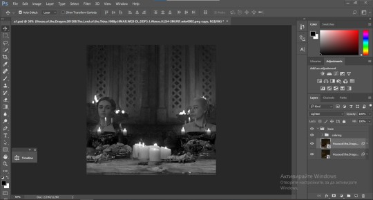
now that you have your smart object sharpened and colored what you want to do next is drag it to the end of the canvas and duplicate it. after that you move the copy on the other end like the original and make sure it's under the coloring layers, like this:
After that you have to create layer masks (the highlighted icon above) for both smart object and the copy and change the blending option of the copy to screen or lighten (whatever looks best!). So this is how it looks now:
pls ignore that there are no layer masks on the smart objects i just added them after changing the blending rip </3 Now, as you see both gifs are like fighting eachother for their rightful place on the canvas. (fgfgfdf) To fix that you have to use a soft round brush to delete the parts you don't want. (feel free to play around with the brush however you want to get the result you want!) Here's my result:
2. THE OVERLAY
Now for the both gifs you want to use for the ripped paper effect you pretty much apply the same steps as the ones you did with the gifs for the base. Here are the two gifs i chose:
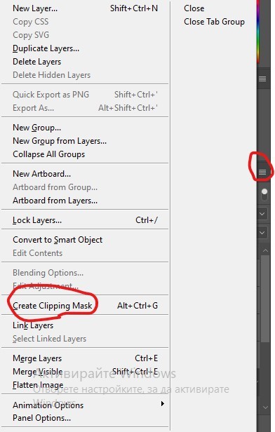
Before blending both gifs however you want to create a clipping mask for each of the smart objects coloring layers, like this:
And now you're ready to blend both gifs together! You choose the group with one of the gifs and change the blending again to screen or lighten and place the said group on top of the other. So this is how it looks now:
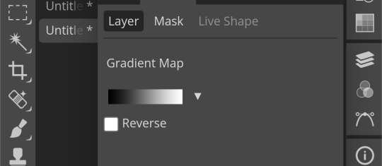
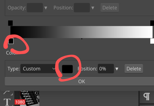
optional: if you feel like the base gif doesn't pop out enough you can always add a gradient map on one of both gifs and play around with the opacity and the color you think fits best.
Then you add a layer mask on the overlay gif group and again play around with the brush to delete what you don't want. So this is the final result:
ps - don't repeat my mistake by placing the group with the layer mask under the other group. it should be on top and the blending option should be lighten or screen.
After blending both gifs together, you're ready to place them on the base. So first thing you want to do first is place both groups of each gif in one single group together. Then you duplicate the said group in the psd of the base gif and create a layer mask. This is how it should looks:
Now, in order to create the ripped paper effect, you'll have to download a ripped paper brush pack. This is the one i use. After loading the brushes in ps (if you don't know how here is explained) you're ready to begin! Change the size and angle however you'd like to make it look how you want. And if you want you can move the overlay gif by choosing both groups in case you aren't happy with the adjustment. This is how it looks like so far:
We're almost done! Now you have to find a paper texture, (i got mine from google) place it between both groups of your gifs and create a layer mask, like so:
What you have to do here is pretty much the same thing you did with the overlay gifs. Still, make sure there's enough space for the text you want to write in. However, if you think that the space isn't enough you can just delete a bit more of the overlay gifs. Here's mine:
3. THE TEXT
You're finally ready to type out the text you want! If you're having troubles with choosing the right font and size, here are my text settings:
You can always play around with the angle and if your text is too small, zoom in so you can place it just how you like it. And since i'm a bit lazy to deal with it later, i choose to add the highlight color while it's still zoomed. You just have to add an layer above the text and use a soft round brush with opacity from 70-75% and flow from 15-18%.
For the repeated text you want to make sure you create a big space for writing so it can contain the whole space of the torn paper. Also, write where the text will be seen only and use the tab button to skip the space where the gif is. This is how it looks:
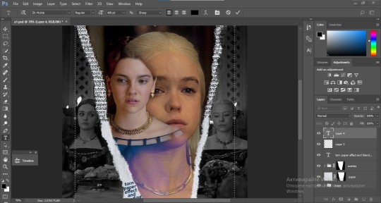
Once you're done with writing the repeated text, you want to select all the character layers and the highlight layer and move them under the overlay gif and on top of the paper, like this:
With the layers still selected and in order to contain the text within the paper the last thing you want to do is create a clipping mask. And that's It. You're done! This is the final result:
#allresources#dailyresources#usergif#chaoticresources#gifmakerresource#hisources#onlyresources#alielook#usermaguire#userrobin#usernik#userpat#userbells#gif tutorial#ps help
171 notes
·
View notes
Text

(Click the image for better quality)
Yipeeee that Keiki and Mayumi fanart I posted the WIP of is finally done woooo- This piece was a very experimental one that I'm kind of OK on. Maybe because I've just gone insane looking at it for so long and I'm my own worst critic lol.
Artist's Notes;
So I've once again been playing around with my rendering style, mainly because I have been wanting to improve my lighting for a while now and as I was just scrolling through Tumblr, I saw some of the official art for that one webcomic-turned-animated-TV-Show Lackadaisy and was immediately inspired. I also have seen a technique a few times in the past where the lineart and shading are merged together, so I've been meaning to try that for a little while.

I did some experimentation on this one sketch of Keiki I posted in my sketch dump and I really liked the results of it, so I carried those over to this piece.
I ended up scaling up Keiki and Mayumi from the original WIP because I felt like they were both getting lost in the composition, and I'm glad for that because I think it works a lot better. I'm not a fan of how Mayumi's sword turned out at all, but it's not really meant to be the focus of the piece so eh. Overall, I think I could do better with my colours, probably because with Keiki and Mayumi's colours, I did them flat in greyscale and then used a brush on the overlay blend mode to colour all of them over, after which I changed the base layer for their colours from white to yellow and then lowered the opacity so it all went together better. I also decided to use gradient maps for a lot of the background elements, mainly to experiment with getting in my values first to make them pop out more. I ended up finding a really nice sky gradient on Clip Studio Paint that I really liked, and that kinda helped to establish the colour scheme of the background a lot. I think the whole "start in greyscale then colour" thing really works better with painterly styles rather than more illustrative ones, and while it is good at making sure your values are more readable, I honestly don't think I have the skill level to pull that off yet. Honestly, I think I've been looking at this drawing too long or maybe I added too much to it, but I wish I could've made the colours less monochromatic, but I'll just save that for the next piece I do.
I do love how the flame (...well it's more of a weird space rift than anything in this piece) and the lighting turned out, those were fun to do. I was initially struggling with the flame and how Mayumi is positioned in front of it before realizing "Oh wait! This is a weird abstraction of a weird creature! I don't have to follow the laws of anatomy!" and just dislocated it's flamey bottom jaw from the main body. I also changed the colours of it since I was really not liking how incredibly bright it was when it had lighter colours. Again, the gradient maps served the more painterly style of the flames well.
I also love how Mayumi turned out. I could do her sleeves better but that's more of just me needing to study how those types of sleeves fold in that position more. I'm also very happy with the posing, the technique I used for that was taking photos of myself in the positions I wanted, blocking in the silhouette and then modifying that by adjusting it to my lines of action that I drew on top of the original photos, and then sketching over the silhouettes and drawing in the shapes of the hands overtop of the photo if I needed to get the fine details right. As for what I do to take the pictures myself, I use a tall chair I have, prop up my phone with a phone stand, put on a ten second timer and scramble to get in position. Yes, I did have to use a bunch of thin markers I had to try and get the hand positioning on Keiki's pose right, yes I do have a fake sword that I used to get the positioning of Mayumi's arms and hand right, the sword was for an old Halloween costume from several years ago. I really like how both Keiki and Mayumi turned out in this drawing, I'll have to play around with these designs for them more in future drawings.
Also, if you wanna know why I draw buildings like that, when I watched Fantasia 2000 as a kid (One of the Disney movies where they make really beautiful animations to classical music) the way they drew the buildings in the first few sections Rhapsody in Blue segment (the jazz one with the cities) changed my brain chemistry and now whenever I need to draw buildings really quickly, I refer back to that. Since the buildings aren't really the main subject, I didn't put much thought into them.
As you can tell I am very tired of this piece, mainly because I made things harder for myself by overcomplicating the process compared to what I usually do, mainly with the whole "starting in grayscale then adding colour." I'd honestly just prefer having a black layer set to colour that I can just toggle on and off when I need to see the values, but it was good to experiment. And that was mainly the point of this whole drawing, to experiment. I'm definitely going to have to play around with this new style I'm going for, mainly because I liked how it turned out a lot in the augmented Keiki sketch, and also because I want to find ways of making it suit my style more. I also really want to keep experimenting with my lighting like this, it's very fun. Last but not least I am never starting in greyscale again because dear god I do not like the workflow it forced me into. I don't have a problem with the method itself it's mainly just a skill issue lol.
If you wanna read my headcanons for these two, I put them in my WIP post, so you can read them there if you want to. The more I look at this the more I prefer the simplicity of my WIP. I might go back to this and just take away the fancy colours and effects to see what it looks like without all of that stuff and reblog this post with that drawing, but for now, I don't think I can look at this drawing again for a while.
#touhou project#art#fanart#touhou fanart#touhou 17#wily beast and weakest creature#keiki haniyasushin#mayumi joutougu#haniyasushin keiki
116 notes
·
View notes
Note
What is your secret image processing formula?👀
What website do you find such cool VHS effects on? Are these brushes and special textures?
A magician never reveals his secrets >:) ..... okay, I'm just kidding, I can tell how I do the effect myself! :3
These first steps I do in my drawing program after drawing and finishing my doodle (program being Clip Studio Paint in my case, though it doesn't matter much tbh what drawing program to use, jfkjklhlj):
A little bit of unsharpen mask to add some sharpness on the finished image, then a little bit of gaussian blur to soften that sharpness. Sounds silly, but somehow it works, lol
After that, slight chromatic aberration. Doesn't have to be too much, it can reduce the retro look imo if it's applied too much.
Then I add some (either monochromatic OR rainbow) noise as an overlay on top of all, which then I put to like around 10-15% opacity depending on how much noise I want on the image itself. I sometimes blur the noise a little too in the end.
Totally optional and this is just something that I like to do, but I also like to play around with different wacky colorful gradient maps, trying out different blending layer-styles and trying out different effects overall. I tend to experiment a lot sometimes, lol. Sometimes I lower the saturation a bit too.
Basically unsharp mask, light blur, noise and chromatic aberration will be your best friends whenever making the VHS effect, lol.
Then after doing all that previously told; I flatten the image, save it as a heavily compressed JPEG-file (anything below 50-60% compression is good imo), and then I open it in another program, this being a free open-source program called "ntsc-rs". It's the program I use for nearly all of my arts nowadays, since I can add the authentic VHS-look with it and it's really easy to use!
If I wanna add a CRT-look then to my arts (like eg. those PS1-styled arts I've done or models etc.), I use another free cool program called "ShaderGlass"; it's originally meant for emulating the CRT look and such for PC video games, or when emulating/playing old retro games on PC. But you can open images in it too, apply shaders to them and then save the result as PNG-files!
Of course, alongside that program, I've also used few other programs and methods of making the VHS-effect: Signal-effect for Adobe After Effects (though that one costs money). Then there's also been ntsc-qt, another free program which iirc is an older version of ntsc-rs, I used to use it but it's no longer being worked on/supported so I stopped. And then also a VHS-plugin for Blender etc.
There's a lot of ways for doing the effect, but the ntsc-rs program has been one of the best and easiest one to me so far!
Hope this helped at least a little bit! <3
26 notes
·
View notes
Text
Astarion x Tav OC

Cat and dog energy. These lovebirds roam in my daydreams! Insight about this drawing in the Read More.
Draft - Sketch & Lining - Coloring


The draft was revamped a few times, especially with my Tav’s body angle. I forced myself to be quick with it as my goal for this drawing was something “quick” and simple…ish. Since it was only headshots, I was curious to see what I would prioritize considering I lifted off most stress from full body anatomy.
Sketch and lining are together because I basically did my final sketch then sculpted in the lines, meaning I cleaned and erased the edges to my liking. You can tell Astarion got a HUGE improvement! Liquify tool is a life saver! I allowed myself to be a bit messy, or at least forgiving about line quirks. Technically, I didn’t line the pupils and hair, as I’ve learned to work off its silhouette. I block in the shape, Alpha Lock, then render/color. It’s an awkward in between but for the sake of nice images, I adjusted them to fit the line art, otherwise I’d have to leave them bald.
Coloring, I work through sections, so here I jump around a lot! I had a lot of fun figuring out how to mimic traditional art, and kept swooning at how cute this was LOL. I had a lot of fun with my new brushes and the setup inspired me to keep working. Although, that could also be the 8 hour sessions of BG3 talking. Astarion was very scary to color, so you can imagine how HAPPY I was to have pulled this off! He took the most time. Goes to show just how comfortable I was with this style of drawing that I didn’t feel super drained!
Finalizing


I was going to call it done at that first one, but decided I could do more. Here is where I just messed around with different ideas, adding layers and color adjustments. In this case, I wanted something to compliment the traditional feel and really send the message across. I did a white border just as I would’ve years ago, when I did traditional art. It felt right to write in my signature instead as well. I used to love using gel pens. The final image has a little gradient map color filter, just to tie the colors together. I like giving my drawings a nice dreamy warmth to them.
Conclusion
I need to draw these two more. Astarion is a painful muse. Bury me with this drawing. I should do a proper character study on my Tav. He’s a sweet little redeemed Durge, I like to think of him as Astarion’s bloody droplet. Also I need to actually play Durge.
I’m so happy with this drawing. ;)
#character illustration#digital art#male character#rendered#clip studio paint#artwork#drawing#original character#illustration#bg3 art#bg3 fanart#bg3 tav#bg3 astarion#bg3 durge#bg3 oc#baldurs gate tav#baldurs gate 3#baldurs gate astarion#baldur's gate oc#digitalart#digital aritst#dbh fanart#artists on tumblr#small artist#my art
24 notes
·
View notes
Note
please please please ive always wanted to be a a part of editblr but idk how to even start like with the coloring and the editing so a tutorial or any tips would be greatly appreciated i really want to start making grahlpgics and rentrys but i just don't know how 😞
also i love your stuff !
Heyyyya! So, first of all, I unfortunately don't use PSDs which is most likely what you've been seein everywhere. I'd suggest askin someone else about those bc I dunno 😭
BUT! I can show you how I color mine using photopea.
There's a search (magnifying glass) icon, and you search up "gradient map." For me there are two options, the correct one will gateway to this:
Then, just for practice, here's a color pallette to practice with. For me, it's easier to copy the lightest color first then the darkest one last because you start off with the darkest usually when putting them into the gradient map.

Hex codes for this: 400E2B A61439 018868 FE5C43 FEB17D
(Note: you can find lots of great color pallettes on Pinterest, and add as many colors as you want. It will just be easier with less!)
So now that you have your colors, you press on the gradient map. These two things circles are what you press, the square part of the gradient comes first and then the second thing circled will be accessible.
Once you press it, you can paste your hex code in here:
Then repeat this with the other colors, going down the gradient line as you do!
Here's what the gradient map should look like:
Ofc, when you aren't just practicing, you can order or however you want.
Again, I would ask someone abt PSDs because this isn't the most efficient 😔
Now, for tips on editing. I've gotten asked for a lotta tutorials but they're too hard for me to manage so I'll squeeze some answers into here.
1. For resources, there are a lot on Tumblr. However! You can search up "rentry resources" on Pinterest, and there will be pins that you can click that will take you to plenty of resources. However, if it says to credit when using a resource, obviously do that lmao 😭
2. When it comes to gif graphics, ezgif.com is a go-to. When it comes to putting already moving gifs into a frame and not wanting a background, I usually use the "remove background" feature that can be located after pressing "effects" on the home screen. Now, I wanna make this VERY clear before we continue: color in the background/around your frame before putting the gif behind it. Make sure!!! Make sure that the background is a UNIQUE color compared to the actual graphic. If it isn't, the background remover will remove parts of the actual graphic.
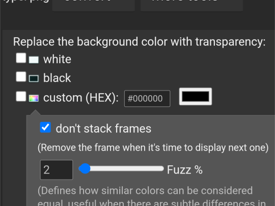
This is where you'll put the color of what you want to be REMOVED from the graphic. You might have to play around with it for a bit though.
As for making the gif graphic that goes into this, I use inshot personally. Since the canvas won't always fit and inshots default background is black, I say try to aim for a black background to remove. If not, make sure that the graphic will fit so that it covers the entire canvas.
Example/walkthrough:
4. You can always make differences if you dislike your graphic. It's okay to take a while and go back, and even restart. You'll see a lotta people here talk about how some ways are easier than others, but honestly just play around because you might find things better for yourself compared to others.
5. When starting out on Editblr, I'd suggest NOT immediately beginning with having requests open. It can make it start out as stressful and drive you away from it. Begin with just making graphics for yourself or of things YOU'RE passionate about. Editing should be more about your enjoyment than having something shiny to show off, y'know? (That was cheesy asf)
ANYWAYS! I HAAAATE EXPLAINING THINGS! (Because I'm bad at it lmao, not in general, you're all good dw❤ /p.) Even I can't decipher what I've said here, but to be fair I wrote this during a meltdown so I get an A for effort.
Also, if you make a promo post, PLEASE TAG ME!!! /NF!!! I'll be more than happy to follow you 😮
#“dont use the same color for the removable background” *PROCEEDS TO DO JUST THAT IN THE EXAMPLE*#im a bad example kids. dont do what i did😭#⛓️┈┈┈•༶ talking
26 notes
·
View notes
Text
Alrighty, here is a part two!
So you curious as to how I used shading and lighting? All secrets will be revealed…
So, the first step is clip a new layer above the prime. Color-drop any mid or dark color then set it to multiply. Adjust opacity to your liking:

Next, add another layer (this is a common theme), and use a soft airbrush using any mid color you want, then set it to multiply again. You can also adjust the opacity, too:

There. The shading section is done. Not so hard, right?
Now, add another clipped layer above the two multiply layers. Use the airbrush again, this time with a lighter color. Then set it to either add or screen:

This time, add another clipped layer, but place it under the add/screen layer.
Set it in overlay, and draw in areas of the character where the light touches, using a bright color and a technical pen brush:

Once you’re satisfied, blur the overlay layer with the Gaussian blur effect, about 4-6%. Adjust the opacity to your liking:

Then you merge all layers together, bottom to the top in that order.
And that’s the lighting section! But there’s still more.
So, this is where things get tricky. Duplicate your layer, and lower your top duplicate at least halfway. Then, use Gaussian blur on the bottom duplicate at about 5%:

Go back to the top layer, and adjust it with the gradient map. Choose one that works with you, play with the opacity:

Next, find a filter for the top layer. It could be whatever, as long as it’s not too bright or too dark. Then merge the layers again:

With the merged layer, use the sharpen tool and set it all the way to 100%. Finally, add in small details and any other filters:

Ta-Da!! Tutorial complete.
Hopefully this all makes sense in some way. Thanks for sticking around! 😁
12 notes
·
View notes