#and/or add a new layer on top of everything and fill it with one base colour
Explore tagged Tumblr posts
Note
If I may, how do you typically approach choosing colors in your art? It always has just a lovely feel to it, so I was a bit curious; don't feel pressured to answer ofc :]
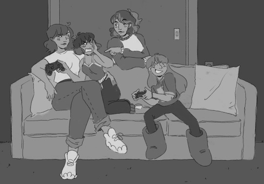
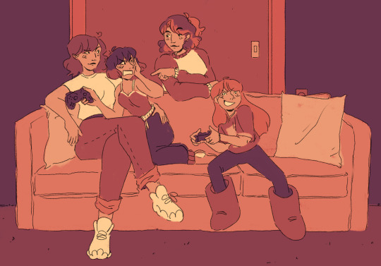
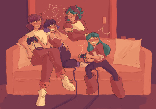
I’ve been using a lot of gradient maps lately, they work by switching the greys in your piece with a corresponding colour according to its value. Basically, I colour in black and white, grab a gradient map, and then I adjust the colours by hand until I’m happy with it. This isn’t the only kind of colouring I do, but it works great if you’re in a rush or you’re struggling to find a good starting point for your colours. I’ve been operating under a time crunch for these Sketchbook Week drawings and the Plenism promo stuff I made, so for all except one I used gradient maps. I’m actually in a bit of a funk with my colours right now soooo I’ll come back and do a proper colouring tutorial for my style once I’m happier with how my non gradient mapped colours are looking !
#after sketchbook weeks over I wanna sit and do some colour studies to find palettes I’m more happy with#even these gradient map ones I’m not thrilled with#they’re fine! but I could do better#in terms of other tricks I use I’ll often adjust the hues and saturations if the whole piece to give things more unity if I’m struggling#and/or add a new layer on top of everything and fill it with one base colour#and play around with different layer settings and opacities on top#I’ve found a luminosity layer on a low 5-10% setting is quite nice#basicslly I fuck around and find out#and if I’m in a rush I use a gradient map#they’re not neccesarily a quick fix! if you’re like me you’ll still want to do some tweaking after it’s been applied#and you need to pay attention to your values when you’re colouring in black and white#but that’s another good thing about gradient maps - they force you to focus on value over hue which is an important skill to build#so yeah I’ll come back to this and make an actual colouring tutorial once I feel like I have actual good advice to give#cause rn I’m just very meh in my colouring and I don’t think I have anything very helpful to add#need to find some tutorials myself first !#ty for the ask!#ask#art#my art#bpcol-reblogs#textpost#blethering#for this piece the adjustments were minimal in comparison to what I usually do btw#because I was rushinggggg lol#I did more for my Plenism posters n such#but I can’t really show good comparisons because I. didn’t save them like that#I usually smush all my layers together when I’m drawing sooo yeah makes it hard to go back my bad whoops#but I saved as I was going whilst drawing this so I could provide examples yipee!#if I’d been smarter and remembered more I could’ve had more process screenshots butttt oh well lmao
17 notes
·
View notes
Text
no one asked for this, but I've seen enough people mention the way I render that I figured I'd give some of my trade secrets away
prefacing this with i am entirely self taught and everything i draw has been improvised bullshit LMAO
i havent made a tutorial since i made icons on livejournal so give me a min here. firstly, I use procreate, so I don't know how universal this will be. secondly, this is the brush set I swear by. literally almost exclusively use it.
these specifically are the ones I use a lot:
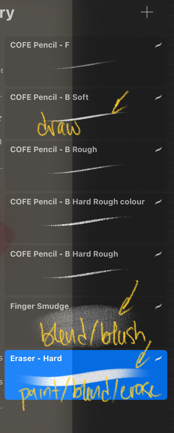
soft is for drawing, eraser is for everything (painting, blending, and erasing. have used it to draw sometimes but it's not the best for it), and finger smudge is for blending and (sometimes) blush or generally very big soft colour application. the "hard rough - colour" was one I duplicated when I was using rough and hard rough more. I don't use it any longer.
here's a bel(f) drawing I did earlier this month that I sort of cleaned up a bit (barely) and his colour palette with the flats laid down:

when I start laying down the shading, everything goes on various multiply clipping mask layers. opacity varies. usually I drop the layer to about 40-60%, then adjust as necessary.
with my first shadow colour, I block out where I want the shadows to go. this layer is set to multiply at 50%:

at this point idc about blending, I'm really just looking to get the placement down here. once i Do That, then I'll go in and blend out some areas. I like some hard lines, as that really defines the soft ones, so while blending, I also use the eraser to carve out highlight areas:

I can't tell u nothing about over blending because I'm 99% I over blend anyway lol but just use ur best judgement. when I'm happy with that, I'll make a new clipping mask layer set to multiply above the first one and go over areas where I want to emphasize the shadows with my second shadow colour. this multiply layer is always at a lower opacity than the first one. I have it set to 30% here:

any sins can be hidden when I'm done. I put another multiply layer above these layers and set the opacity very low, usually ab 20-25%, and start laying down blush. tbh the opacity really depends on the colours being used. for ric, his gets set much lower and is blended a lot more. here i have this layer set to 25%.

I put blush in the same places: over the nose bridge, around the cheeks, up over the temples, the ears, sometimes a little on the neck, and on the knuckles and shoulders.
will smoth poses there u have it.
for the eyes, I don't use multiply layers. on the flats layer, I lay the base colour, then I go in with the darkest colour. personally, I like to keep the lines for the eyes very light, fill in the base, go erase the line, then use the darkest colour to ring the iris:
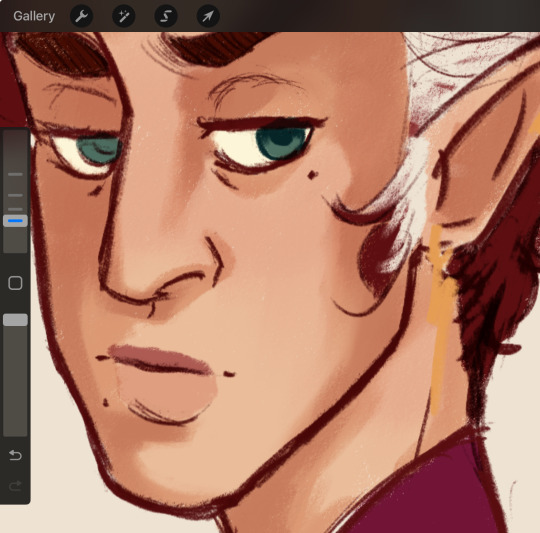
obviously you don't have to do that. I use the darkest colour near the top of the iris also and very lightly brush it downwards, then I take the highlight and put it where I want the light to hit:
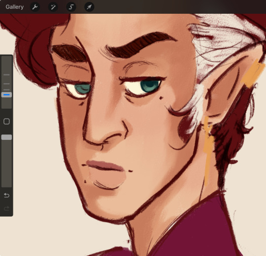
hair is ez. because I use such a dark colour for bel in particular, that gets set to a lower multiply layer, usually ab 30-40%. this one is set to 40. if I really want to go for more shadow emphasis, I similarly will put another layer over top and make it much lower, then go and add extra shading. et voila:

I'll go in and add highlights in places I want to emphasize, and then finish the image in my usual way (chromatic aberration and a layer of noise hides most sins):

I usually adjust the colour with curves and some overlay layers but that's 2 ur tastes really.
that's really all it is. I also studied the painting style of a friend bc I love the way he lays down colours, and watched a ton of marco bucci videos. this one in particular helped a lot.
anyway that's my secret
#literally no one asked but here u have it#rendering tut by an idiot 👍#i have a nonexistent understanding of light and shadow and just slap them down where i want to
17 notes
·
View notes
Note
hi alie! how are you? i was wondering if you could explain, or link a tutorial that does, how you did the first gif and the checkmarks on this (/post/713604672591659008/pscentral-event-14-your-url-insp) beautiful gifset please?
hello!! i'm good, thank youuuu ♡ and yeah, sure i can! i didn't follow any tutorial for this gifset, so i'm gonna try to explain my process as best as i can.
the first gif is fairly easy, it's just a bit time consuming. the second one for the animated checkmark uses some keyframes. i use photoshop cs5, which is rather old, so hopefully my directions still work for more recent ps versions!
tutorial for these two gifs under the cut:

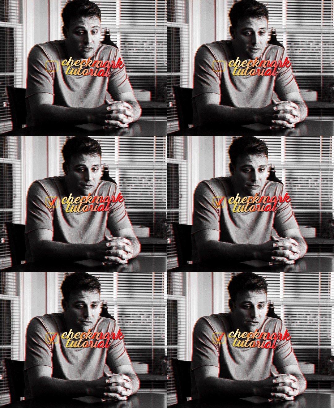
gifs in text
i'm gonna assume you already have basic gifmaking knowledge, so i'm gonna start from this base gif already colored:

i started by finding a big and very thick font that i liked. for this gifset i used a font called barle. i placed my text the way i wanted it, but i used one text layer per letter, because i wanted one different gif per letter. once i had my 9 text layers placed, it looked like this:

then, you need to create a group with a layer mask for each letter. for this, i simply hold the ctrl/command key and click on the letter layer's thumbnail. it will create a selection of the letter.
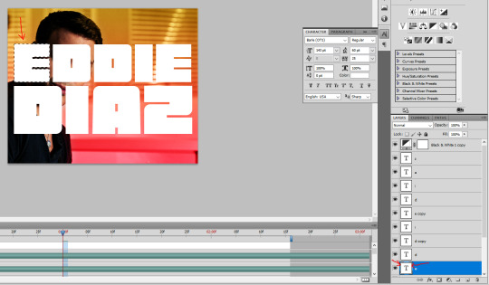
with this selection on, i click on the folder button to create a new group, then on the add layer mask button. it will create a group with your letter where you can put anothet gif in.
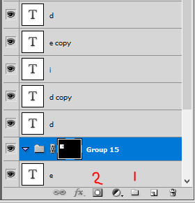
then you just need to rinse and repeat for every letter.
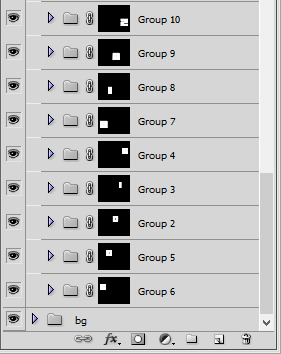
once you have all of your letter groups done, you can select all of the text layers and put them in another group. we'll use these layers again later.
then you just need to bring your second gif onto this canvas and put it in the right group/folder. i usually just bring a smart object gif onto my main canva, slide it in the right folder, then resize, sharpen, and color the second gif in there.
you can just drag this layer once it's inside the group to position it the way you need it. and also use ctrl+T to resize it (drag the corners while holding shift to keep the right propertions). once the gif is positioned, you can go ahead and disable the E text layer you used to create the mask (but don't delete it!). i kept the coloring very minimal since it's a black and white gif, and the layers should look like that:

and this is the gif so far with the first E done:

then you just need to do the same for all other letters, pretty straight forward! for the first D letter, i wanted eddie's face to show instead of using a different gif, so i simply put a black and white layer in that D group. my gif looks like that at this point:
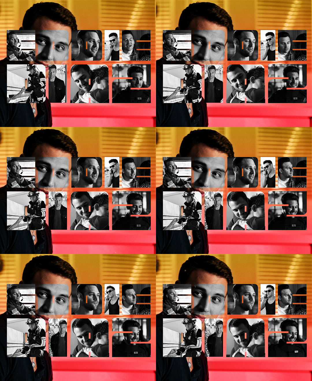
then what's missing is the outline, and it's pretty easy to make. go back to the text layers you created at the beginning. enable them all, and make sure they are on top of everything else. double click on that first text layer to bring in the layer style options, and add a 1px stroke with the color and blending mode you want. I went with yellow and the hard light blending mode. these are my settings:
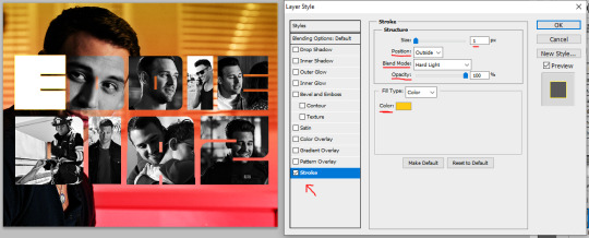
back to the layers panel, keep the text layer's opacity at 100%, but bring the fill to 0%. this will make online the online show up on the gif.
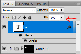
to apply this setting to other text layers, you can right click the first text layer and select "copy layer style". then select all of the other layers and right click one of them and go "paste layer style". once all the text layers have their outline it should look like that:

to move the outline a bit, make sure they are in a group and select this group (i renamed mine "outline"), then just nudge it by a few pixels with the arrows on your keyboard. i transformed the outline group by about 4px left and up on mine. i also duplicated the whole group because i wanted a deeper color for the outline.
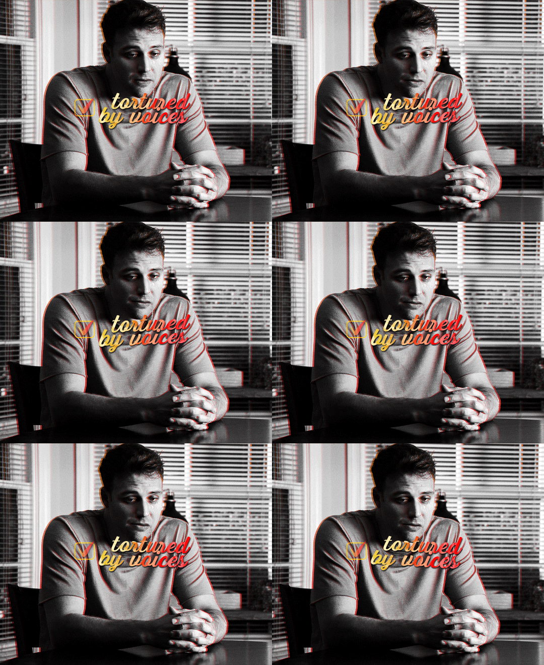
and this is my final result!

animated checkmark
starting with my base gif, i added some animated text and a little box for the checkmark to go in (drew a shape with the rectangle tool and gave it a stroke, the same way i did it for the previous gif):
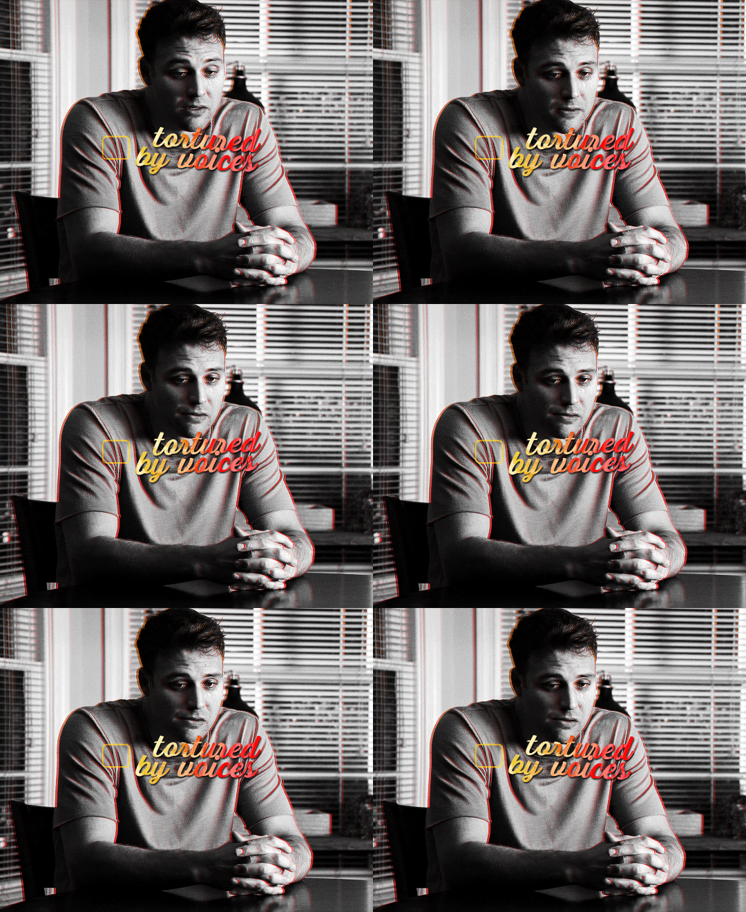
for the actual checkmark, you can try to find a brush or shapes to download, but i didn't feel like looking it up lol, so i drew the shape myself with a regular brush that comes baked in with photoshop. the best way to draw a custom shape, in my opinion, is to draw the shape as a layer mask on a color fill layer. that way you can always change the color or add layer styles later (like i did).
so on my canvas, on top of everything, i created a color fill layer (layer > new fill layer > solid color) with whatever color i wanted (you can change this later if you need). you will get a new color fill layer, with a layer mask already attached to it. i put this layer at 75% opacity so i can see the gif under it and it's easier to draw the shape in the right spot:

i then selected the layer mask thumbnail and the brush i wanted to use, one of them (not sure i remember which one, sorry haha!):
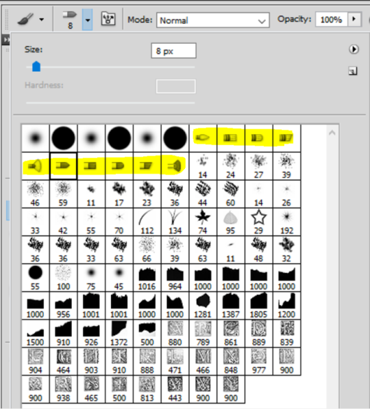
with the black color selected, just go ahead and draw a checkmark where you want it on the canva. you can always use the brush in white to erase it and start over with the black color if you're not happy with it. but once you have a checkmark you like, it should look like this:

now you just gotta invert the mask so the checkmark is colored, to do this just click on the color fill layer mask you just drew on and hit ctrl/command + i. the mask will get inverted and it will look like this:
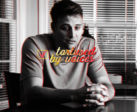
then you can add whatever layer style you'd like to the checkmark (and put the layer opacity back to 100% if you want). i added a gradient and a drop shadow to mine, and changed the blending mode from normal to difference to make it match with the text, so now it looks like that:
animation time! this is where you need to use a bit of keyframes, but i promise it's not complicated.
for this animation i wanted to mimick a checkmark being drawned. when you draw a checkmark, you usually do it in 3 steps right? your startung point, then a line down, and then another line up to the end point. it's what i tried to mimick here.
to animate it that way, you need to draw a shape that will hide the checkmark and then move it around to mimick the drawing animation. to do so, create a new group (i've named mine "checkmark") and add a layer mask to this group. you also need to unlink the mask by clicking on the little chain icon next to the mask thumbnail:

now the next steps are a bit of trial and error until you get what you want, i'm gonna try to explain it as best as i can (bear with me haha):
1- go to where you want the animation to start, aka where you want the checkmark to start appearing. for me it was a few frames after the start of the gif.
2- then, with a black brush that wasn't too big nor too soft, i brushed a bit over the checkmark to erase it for now (you may have to go back and edit this after the animation is done). no need to do a huge shape, just big enough to cover the checkmark. if you go back to the move tool and click on the mask thumbnail you have just created and click and drag in the canva, you should be able to move the mask around. this is what you want for steps 5 and 7. basically, on your mask thumbnail on the checkmark group, what is brushed in black will erase what's in the group, and the white part will reveal what's in the group. for now just make sure the shape you just drew is covering the checkmark.
3- once the checkmark is hidden, click on the stopwatch icon next to layer mask postion to start the animation. this will automatically create a keyframe where your cursor is on the timeline (the yellow diamond)

4- once your starting point is done, you want to go a bit further on the timeline with your cursor.
5- then move the mask shape so it reveals just the smallest part of the checkmark (make sure you click the checkmark group mask thumbnail first before moving the mask). once you move the mask with the move tool, a new keyframe will automatically appear where your cursor is on the timeline (another diamond). make sure you drag the shape down the checkmark to mimick it being drawn.
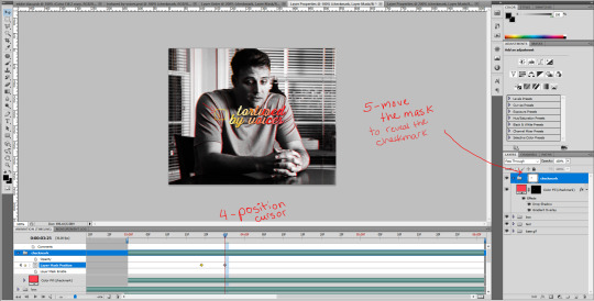
6- go a bit further again on the timeline, where you want the animation to end.
7- and move the shape again to reveal the checkmark (make sure you click the group mask thumbnail first before moving the shape). again, a third keyframe will be automatically created. i dragged the shape up from the bottom of the checkmark to mimick the drawing of the checkmark.
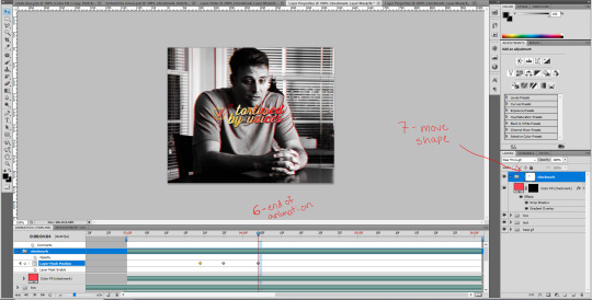
your animation should be done here after these 2 movements, so play it in a loop and see if you are satisfied with the animation you have created. if you don't like it you have options:
you can go back to the group layer mask and edit it with the black or white brush;
you can also go back to each keyframe by positiong your cursor over it and move the mask around in a different way;
and you can select the keyframes (yellow diamonds) and move them around on the timeline. if you push the keyframes closer together, the animation will be faster, and if you space them out more, the animation will take longer. it's up to you!
this animation thing is really just trial and error. you could probably do the same animation with a checkmark you find online, as long as the image file is in a group and the animated mask is applied to the group. and don't forget to unlink the mask before animating a movement or it won't work properly!
and this is what my animation looks like:

that's about it, i hope that was clear enough omg. never realized how hard it is to explain these things in english lol. let me know if you have any questions! ♡
#alie replies#*ps help#photoshop#tutorial#resource#completeresource#uservivaldi#usersmia#userkarolina#userrobin#user.tee#userkosmos#thingschanged#usermaria#userraffa#userjaelyn#userhallie#userk8#userdean
302 notes
·
View notes
Note
Your pirates of the Caribbean fanart is so beautiful! Please, please share tips for how to do that beautiful painting technique you used! <3
Hi, anon! Thank you so much, both for the compliment, and for the question💗✨
Edit: I've reached the 30 pics per post limit and will have to make a part 2, oopsie daisies. But I'm sure it won't be as long as this :"D
In terms of technique, I guess it depends which part exactly you're talking about, because most of it is just oil painting+pencil drawing made digital, where I sort of block my colours first, then blend as I see fit (or in some parts don't blend at all, which is what some classical painters do; it's really just habits and preferences from years of experience) and add details using a pencil brush.
If you're interested, stay tuned as I try and give some tips while showing my whole process using this lovely photo of Commodore as an example:
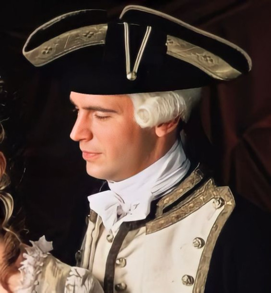
Part 1. The basics
I usually only use these 2 brushes, just because I like them a lot, rarely more than that; and I've changed the settings on the second one so it rotates in the direction of a stroke instead of being at a fixed angle.


SO, firstly I just make a sketch of course, then make a very rough base colour layer underneath it, not too dark, not too light, and fill in the background with a solid colour.

(don't be fooled, I don't actually name my layers cause I'm way too lazy for that)
Since we're talking about digital painting here, my biggest tip would be to make a habit of picking the right colours manually, like you would an for an actual oil painting, instead of using the eyedropper tool on the source. Colour matching is an insanely useful skill, it's like relative pitch in music, or an accurate eye in architecture; while it's not absolutely necessary to have it, you'll want it if you want less burden on your brain and more freedom of expression. "Learn the rules to learn to break them" kind of thing (and you'll be able to match the colours to the picture in your head as well, how cool is that? Hehe) I've done this so much that at this point I just do it for the hell of it. It's very fun :D And, as you might've guessed, I do it for the entirety of the process, with some rare exceptions. While I used to do so in the past, I don't like to use blending modes (eg. soft light, overlay, multiply, etc.) for shading anymore. I find it takes all the excitement out of the whole process for the sake of cheap dopamine, and it used to hinder my skill development because I wasn't learning to "speak the language" of art, I just "used google translate", so to speak.
Anyways... A sketch, then a rough midtone colour layer underneath + background:
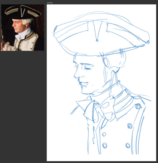
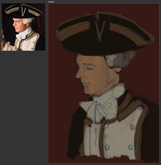
Another great tip: I learned it from a video on good costume design in fantasy, which is so unrelated to painting that you're probably like "wha- what..?", BUT... the tip was "the costumes don't have to be historically accurate, they just have to make sense in the story". Your colours don't have to match your reference perfectly, they just have to make sense inside the painting, and that's what will make your art feel alive (along with other things ofc).
Next I create another layer on top of all that and get to actually paint, and this is where the blocking part comes in.
There is a really good video on this subject if you want to learn this kind of technique, and an Instagram page of a different artist that I've been immensely admiring for some time now. Although now that I think about it, neither of them use midtones as a base... Anyway,
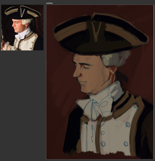
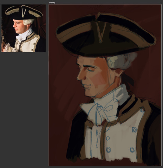

I start with the darkest shadows, moving on towards lighter ones, noting some places where the they reflect more blueish/grayish tones of his uniform on his neck and jawline, and where they reflect the reddish environment on his nose, temple, cheek, ear, and neck.
Another great artist to help improve lighting skills.
I frequently make new layers on top of everything as I go, just so that I have some room for error and can delete them later if I'm not satisfied, and then merge them down if I am, because I hate being indecisive with too many changes, and having unnecessary clutter.
Sometimes if I don't like how a certain colour looks on the painting, I undo the stroke (or paint on top, if it's too late to undo) and just tweak it on the wheel until it looks right to my eye and move on. Eg. on the next screenshot, I didn't like how that blue from the sketch looked one the screenshot before, so I adjusted it a little with Hue/Saturation.
I also like to slightly exaggerate the palette so that it looks a bit more interesting:
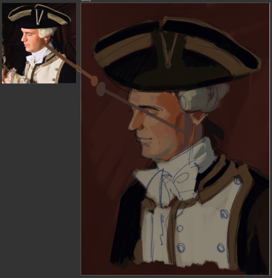
The last thing I usually do is light, with tiny highlights being the absolute last, because both are very easy to overdo. I manually pick the colour from the colour wheel, make a few strokes where it's supposed to be the brightest, and then use eyedropper tool to sample different spots from the freshly-painted areas to make it easier to blend.
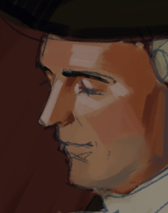

Now while that colour might look pretty light, it isn't light at all. To be fair, the difference between light and shadow isn't even that big sometimes. I used to overshoot with either of them in the past, picking either too light or too dark, and was frustrated and baffled why my painting was looking as shit as it was.
So I guess another tip: for lights, pick the colour much closer to your midtone than you think you need, and then adjust accordingly. The reason being: your eyes and brain are partners in crime and are constantly lying to you.

The (I guess second) base is done, and at this point, it's just a matter of staring at his face for 2, or however long, hours and adding more and more strokes, sampling different spots between them, until I like how it looks.
Sometimes, if I realize that either the proportions are a bit off or some lines don't look the way they're supposed to, I use some Photoshop tools to my advantage. I merge everything together (cause at this point I really don't plan on changing the sketch itself or the background), and use Liquify to move things around. So now it's a one-layer painting, just like the real deal lol
And then I continue doing the same thing I'd done before with all the other parts.
Liquify on his face:
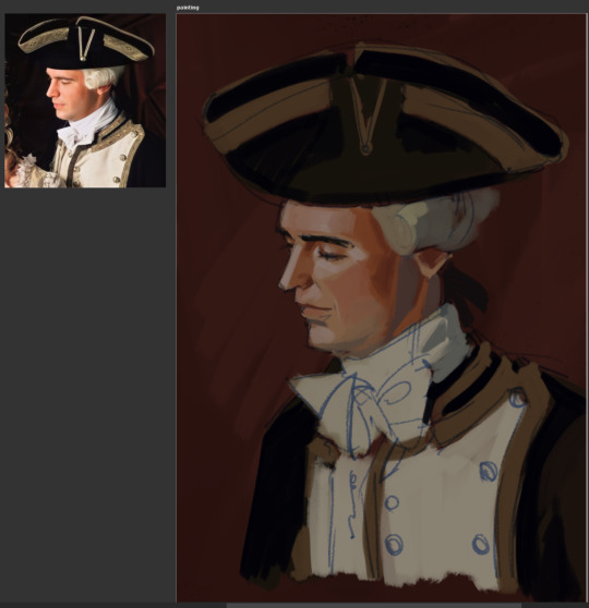

I only lightly paint over most sketch lines because I'm really not that concerned about some of them peeking out, especially at this stage, nor am I very pedantic.
Don't forget about subsurface scattering in areas where light meets shadow, of course:

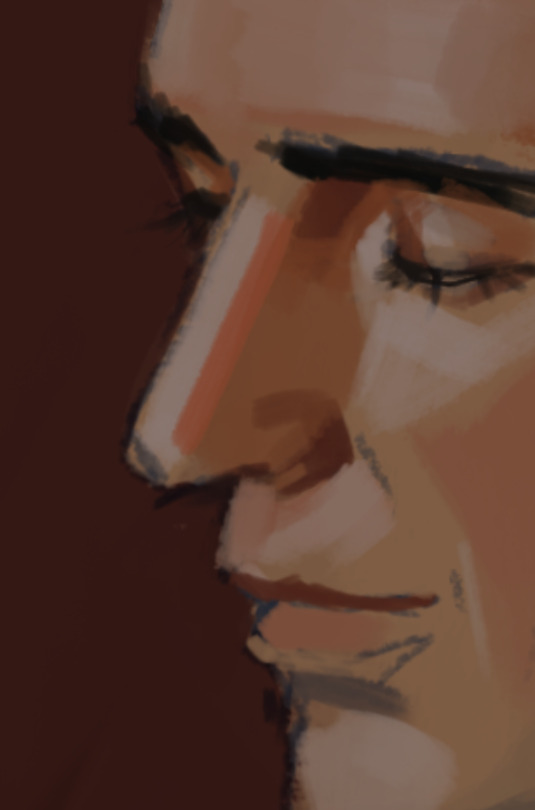
If I see a place like this where I need a smooth gradient but don't feel like actually doing it cause it'll ruin the ~vibe~, and really, I just wanna add more a bit more pizzazz, I just take the pencil brush and hatch over it instead, alternating the darker and the lighter tones.
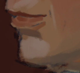
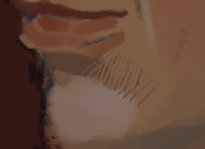
The caravat:
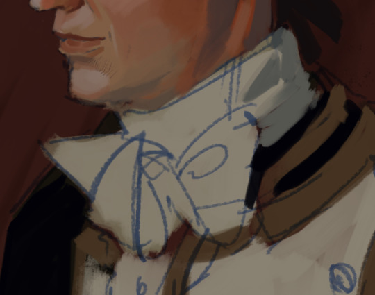
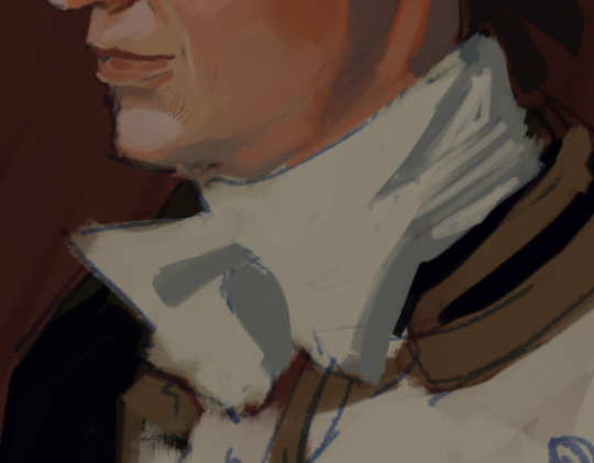

A lot of the time professional artists will advise you to look for simple shapes in things - squares, circles, triangles, rhombuses, etc. I'm no exception. Simple shapes will let you see patterns and some sort of order. It's easier to understand complex shapes that way, whether it be fabric, faces/bodies, or inanimate objects.
As you can see here, my brain mostly likes to look for triangles, or half-circles. It just feels right 👌

The wig:
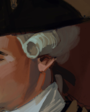

I learned to use translucency, with hair and light fabrics fading into background, from watching and doing watercolour. Here's one of my all-time favourite watercolour artists that does that sometimes, and it looks absolutely stunning: 미술부화실 misulbu
The waistcoat and the jacket:


The hat:
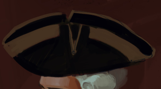
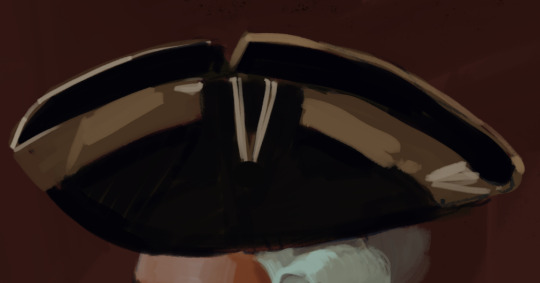
Another thing to point out, if you haven't noticed already, I really like my stokes straight unlike myself, with exceptions, of course. It's another habit I picked up from watching other people draw, as well as my years of studying art professionally. Teachers taught me to use straight criss-crossing hatches to indicate form, instead of curved ones (there was a really cool tiktok showing that kind of technique, but I can't find it :(). Not that I follow their advice in its intended way majority of the time lololol but um... yeah...
So anyway, this is the end of part 1, I'll try to finish the second part tomorrow. It will be about smaller details, texture, and an tiiiny bit of 🔥grime🔥
#art tutorial#my inbox#potc#pirates of the caribbean#potc fanart#james norrington#art#fanart#digital art
27 notes
·
View notes
Text
Tidbit: Persnickety About Posters
If you want to avoid overly dark or blurry posters in your fan adventures, then follow my lead:
1) Download JPEG off of Google Images.
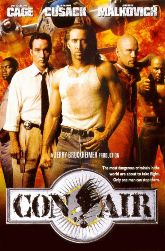
2) Import, scale down, and skew/shear it. Use an interpolation method such as Bilinear or Bicubic Sharper. Doing both transformations at once is better than repeatedly transforming the image (i.e. resizing it, applying the transform, and then skewing it), as it helps prevent the image and edges from becoming too blurry. This will be important later.
You can hold down Ctrl + Shift to constrain the Move tool along a single axis so it won't go out of alignment as you're skewing it. If you don't see the Transform Controls by default, enable it in the tool options bar at the top, or go to Edit>Free Transform.
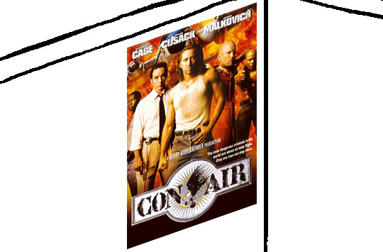
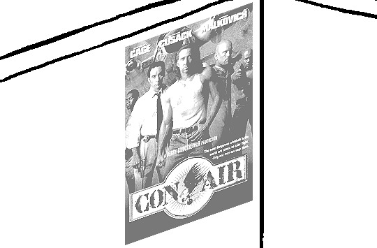
3) Desaturate it. Desaturate means to turn color grayer, until it becomes black and white.

4) Adjust the brightness and contrast using the Levels adjustment tool. It's much too dark as it is! In Photoshop, it is located under Image>Adjustments>Levels..., but I recommend creating an adjustment layer from the bottom of the layers tab instead. Doing so will allow you to make edits non-destructively, meaning you can go back and change any parameters until it looks right.

You could use a Brightness/Contrast adjustment with "Use Legacy" enabled instead to achieve a similar effect, but it won't clip the shadows and highlights as easily. You would have to create an additional duplicate adjustment and turn the brightness and contrast way down on the first one to do so. It's somewhat easier to use but less efficient than Levels in this case.
5) Apply a simple sharpen to the image as it is still too blurry for our purposes. In Photoshop, it is located under Filter>Sharpen>Sharpen... Do not use any other filter, such as Unsharp Mask, unless you absolutely have to in lieu of a basic one. If you must, turn down the radius a bit and the threshold all the way to 0.
6) Make a selection around the image. Ctrl + left click on the layer's thumbnail to make a selection around it. Doing it this way makes it inherit the level of transparency any pixels have. If you can't, use the Magic Wand tool with "Anti-alias" enabled to select the transparent area outside, then invert it using Shift + Ctrl + I, or go to Select>Inverse.
Create a new layer above the image, then go to Edit>Stroke... and add a black stroke with a width of 2px located Outside. Leave everything else at the default. Doing it this way will create a stroke with anti-aliasing based on the selection you made. This should generally turn out pretty sharp if you follow my advice from Step 2. If you had used the Stroke Effect available from the Blending Options' layer styles, it will always result in a very smooth outline instead. You do not want this.
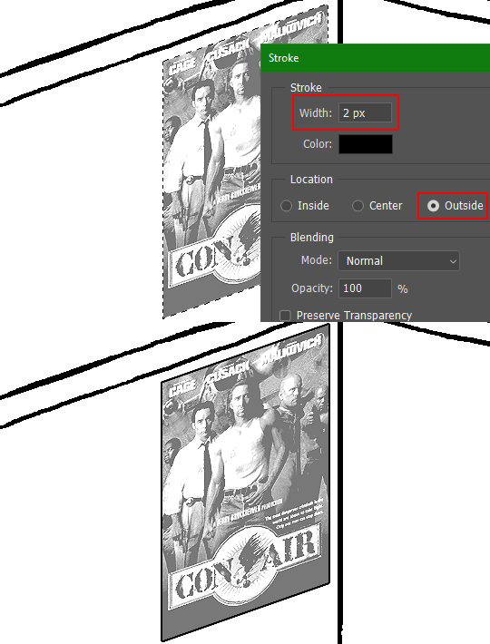
Voila, and Bob's your uncle, you're done!

The instructions above are Photoshop specific, but it should still be pretty software-agnostic. Here is the recreation PSD, and below the read-more link are additional notes, such as transferring the steps to something like GIMP.
ADDENDUM
You may be questioning why I deliberately made the stroke anti-aliased. "Isn't that an MSPArt cardinal sin??", I hear you clamoring. Well, my dear readers, let me briefly elucidate you on why your ass is wrong. Exhibit A:
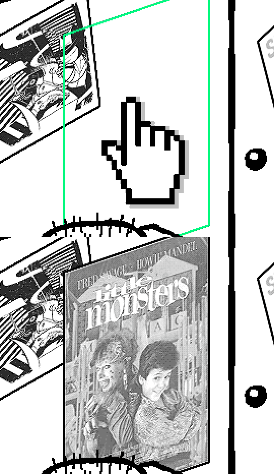
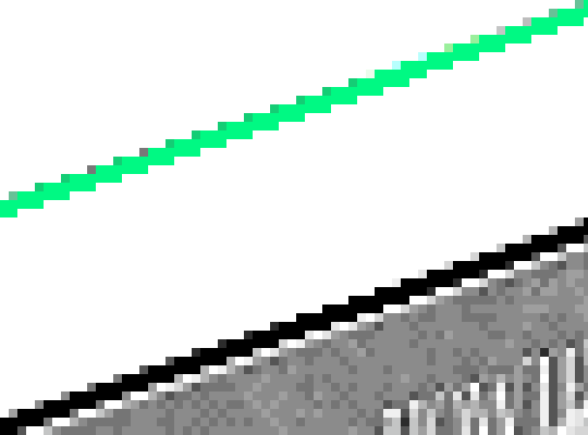
The clearly semi-opaque pixels that can be found in every poster outline, which is especially pronounced here in the Little Monsters poster. I can also see that Hussie actually created a stroke on the same layer as the poster and merged it down into the white background like a dumbass. I omitted this in step 6 for the sake of convenience (and also the fact that you can't add a stroke to a smart object in Photoshop without rasterizing it first).
He had to use the magic wand tool in order to extract it from the layer for this panel, and then fill it in with the paint bucket tool. I can even tell he had the color tolerance set up very high on the magic wand to grab all those near-black and very light gray pixels, AND he had anti-alias enabled and the tolerance on the bucket tool set to be at least higher than 0 to tint similar colors. Exhibit B:

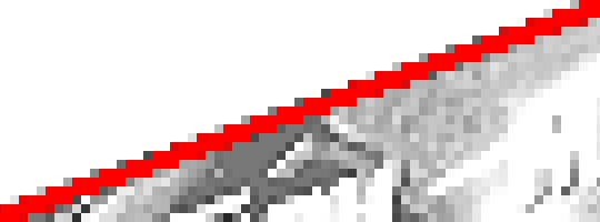
I also didn't address exactly how to desaturate something in Photoshop. Honestly it was because I was feeling pretty lazy. I would have had to rewrite step 4 to not include redundant information about adjustment layers. You can add either a Black & White adjustment layer or a Hue/Saturation one and turn the saturation all the way down to 0. The resulting tones will be slightly different from each other but I'll explain why that is in another tutorial.
Speaking of another tutorial, read this one if you believe this post is missing the step of using a posterize filter.
Now onto applying some steps to GIMP.
RE: step 2) In GIMP, there is a dedicated Unified Transform tool separate from the Move tool, unlike in Photoshop where both features are combined into one. This is how you scale and skew (AKA shear in GIMP) both at the same time, among other things such as rotating.
You'll also find that instead of any interpolation methods labeled "Bilinear" or "Bicubic", there are only ones named "Linear", "Cubic", "NoHalo", and "LoHalo". Basically, Linear and Bilinear are the same, so are Cubic and Bicubic, naturally. I guess NoHalo would be similar to Bicubic Smoother and LoHalo would be kind of similar to Bicubic Sharper as well. It's not an exact 1:1, though.
Honestly it doesn't really matter what you use to reduce the size as long as it isn't None/Nearest-Neighbor. You're going to have to sharpen it no matter what. This applies to Photoshop as well.
RE: step 3) Go to Colors>Hue-Saturation... and repeat turning the saturation down to 0, or go to Colors>Desaturate>Desaturate... and select the Lightness (HSL) method.
RE: step 4) Go to Colors>Levels... or Colors>Brightness-Contrast... The Brightness-Contrast adjustment tool already functions almost exactly like in Photoshop with "Use Legacy" enabled.
RE: step 5) In GIMP 2.10, the developers squirreled away the basic Sharpen filter, making it inaccessible from the Filters menu. To use it, hit the forward-slash (/) key or go to Help>Search and Run a Command... to bring up the Search Actions window and type in "sharpen". Select the option that just reads "Sharpen..." and has a description of "Make image sharper (less powerful than Unsharp Mask)". I find that using a sharpness value of around 40 to be similar to Photoshop's sharpen filter.
RE: step 6) Instead of holding down Ctrl, you hold down Alt and click on the layer thumbnail to make a selection around it. Make a layer underneath the image this time since there isn't an option to place the stroke outside the selection rather than the middle. Go to Edit>Stroke Selection... and create a stroke using these settings:

I recommend keeping anti-aliasing disabled however, as GIMP produces lines that are a little too smooth for my taste.

With "Antialiasing" enabled
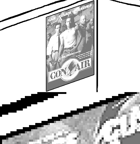
Without
If you're using a program that doesn't have a stroke feature available, you could draw a straight 1px thick line across the top of your poster, duplicate it, and move it down 1px. Merge them together, duplicate it again, and move it all the way down to the bottom of the poster. Then repeat the exact same process for the sides. I used to do this before I even knew of the stroke feature, haha.
Another reason I had to do it this way was because my dumb ass did the thing I said not to in step 2, scaling down the image with the scale tool, and then shearing it separately with the shear tool. This caused the edges to become too blurry to be used for a stroke automatically. Oh well, live and learn.
144 notes
·
View notes
Text
youtube
Millie’s garden is ambitious, in a relatively small space she is trying to grow food and flowers, create a multi-use functional outdoor space for people and offer habitat to the wild visitors. One of the simplest ways to do this is to add water. Just like we include a diversity of plant species, offering a diversity of water points will cater for different visitors.
WATER POINT ONE:
In a small garden bed near the backdoor, Millie wants to set up a simple water pot. I am using an old copper pot, which in my experience works well as a low-maintenance pond. A small amount of copper dissolves in the water, preventing algae growth and disrupting the lifecycle of mosquito larvae. The copper means it is not suitable for fish or frogs but works well as a bath and drinking point for birds. It also offers a great little microclimate for a range of water plants.
To set up a water pot:
- Pick a position that gets at least 6 hours of sun and ensure it I relatively level
- Put a shallow layer of gravel in the base
- Place a few bricks and rocks to act as planting shelves and landing perches
- Fill with water.
NOTE If you are planning to add fish, wait at least 24 hours to ensure contained chemicals such as chlorine can evaporate, or add a water conditioner.
When it comes to plants, those that like water are as diverse as those on land, with some preferring to be fully submerged, and others just liking wet feet. In many cases, aquatic plants grow well in small pots, as they can access water and nutrients from the water around them.
All can be potted in a similar manner –
- Use a heavy sandy loam, not lightweight, bark-based potting mix. You don’t want loads of nutrients in the mix either, as they will just dissolve into the water.
- Position the plant quite low in the container and cover the mix with a layer of clean sand and a layer of gravel. This holds everything in place when plants are submerged.
- Add a stick to ensure safe passage in and out of the water for any small birds.
WATER POINT TWO:
As well as the ground-level water pot, Millie is keen to take her habitat game to new heights! The boundary fence is made of ironbark posts and steel mesh, and from the window, she has observed stacks of birds use it to stop and survey the surrounding garden. That indicates it will also be a great spot to safely provide water for them, out of reach of predators.
- She attaches 2 galvanised steel brackets to a post and sits a large terracotta saucer on top. Some silicone is used to hold the saucer lightly in position, and rocks are added to balance the bath and offer a route in and out of the bath.
- As a shallow elevated bath, this will need constant filling, so to ensure a consistent supply she installs some dripper to an irrigation timer.
- This runs 1-2 times a day to flush the bath with clean water and ensure the birds can set their watch to it.
The fence line is already heavily planted, with climbing native and exotic clematis, espaliered feijoas and even a callistemon. But there is always space for more! Under the drip of the baths Millie plants a native groundcover, austral bugle.
WATER POINT THREE :
The last water point offer is down low, a saucer of water placed on the ground near a habitat pipe installed for reptiles. To make the offering even more enticing, Millie plants some ruby saltbush.
We all spend a lot of spend a lot of time thinking about the garden. Carefully planning plantings and displays, timing vegie sowing for each season, and even planning garden parties! But the moments that fill the garden heart with joy are when those unexpected wild visitors pop in. And there are so many ways you can ensure they have an open invitation.
Featured Plants:
NARDOO - Marsilea drummondii
SWAMP GOODENIA - Goodenia humilis
AUSTRAL BUGLE - Ajuga australis
RUBY SALTBUSH - Enchylaena tomentosa
#Gardening Australia#solarpunk#australia#gardening#garden#water points#bird bath#barrel pond#water dish#water pot#birds#lizard#Youtube
11 notes
·
View notes
Text
my coloring process!! a couple people did say they want to see the process soo. also for reference i do use procreate, but i know all these functions are available on photoshop and (presumably) other programs as well.
far too many visuals + explanation below :3 + silly speed coloring
SO…. i’ll try to organize it step by step? i’m gonna use visuals from my roope piece so. basically early TLDR: grayscale -> flatten + duplicate layers so you have two layers of the gray scale -> put a gradient map on one -> make the other a luminosity layer -> ??? profit maybe
BUT FOR A MORE IN DEPTH EXPLANATION
1. after finishing ur sketch or lineart, fill in the figure a medium gray! just a solid fill .. straightforward
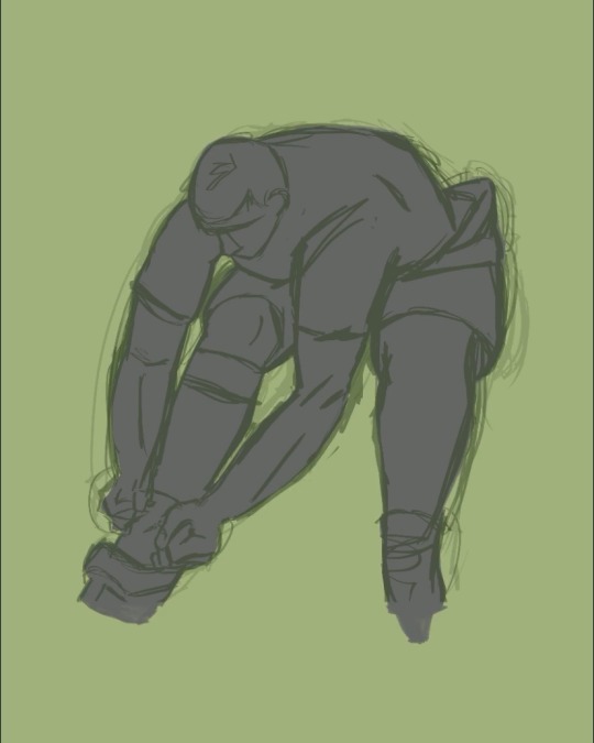
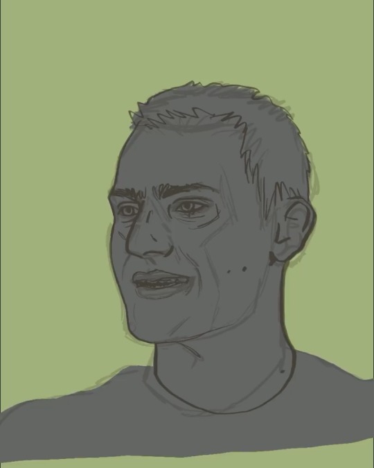
2. start applying shadows and highlights! i do these as clipping layers over top of the filled in shape we just did (i used reference photos, if you do that imo it’s easier to lower exposure on the photos and even up the contrast slightly to see the lighting differences better. but ymmv)
i use three shades of gray that are darker than the color i put down to fill the shape, i layer those so the darkest is on the top. i then use three shades of gray that are lighter than the filled color, i put these on top of the darker shades and layer them so the lightest is on the top. again, just personal preference, that’s how i layer shade/light usually so
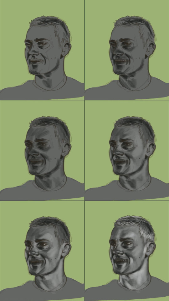
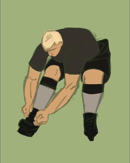
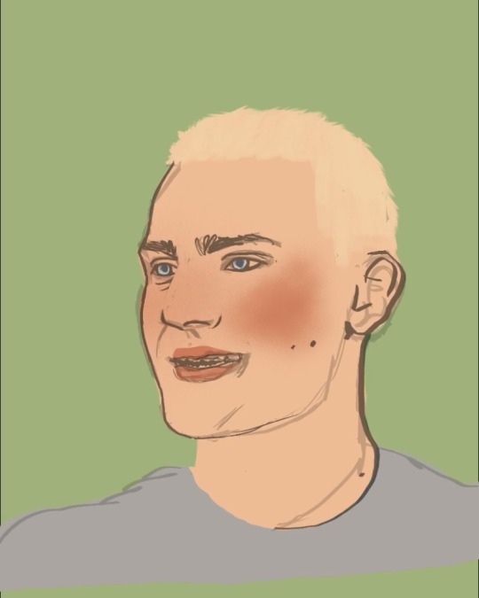
3. this is when things get ugly . for me at least. you can also do this step before doing two… really it can go wherever but i do it here. i hide the above grayscale colored layers, i move my sketch layer above the filled in shape (FOR REFERENCE … don’t color on ur sketch layer. unless you want to i guess), i then apply the base colors on a new layer of the drawing . literally just simple skin/hair/clothes. it looks odd to not add any depth or lines but we have to move
4. youre gonna wanna flatten and duplicate the grayscale painting layers you did before. there should be two grayscale drawings in your layers that are so stunning and gray and beautiful.
5. hide the grayscale drawing highest in the layers for now. take the bottom one and then we use gradient maps!!! my best friend!!!! this is all gonna be very personal choice on what you want YOUR palette to be. i wanted green/pink so i adjusted the colors in the gradient map to be green/pink
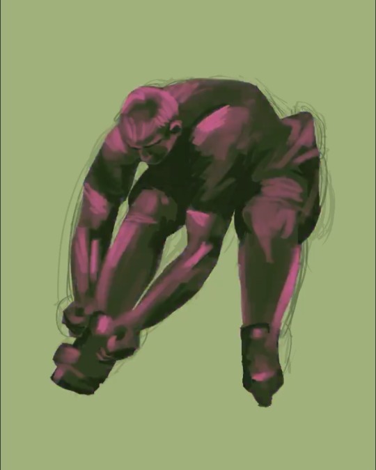

6. i then take these pretty color layers and mess around with layer settings. for this particular piece, i set the layer to linear light at about 30% opacity. i usually keep my opacity around there, but i’ll jump around between linear light, vivid light, color burn, etc etc. literally just experiment and have fun!!! it should just be adding more color/whimsy to your base colors
7. i then unhide the other grayscale layer. it’s gonna make everything gray again, believe it or not. i turn that layer to LUMINOSITY….. i’ve played around with other layer types but because it’s a shade/light thing i really think luminosity looks best. but again, you play and have fun and figure out your own preferences!
your layers should look, more or less, like this
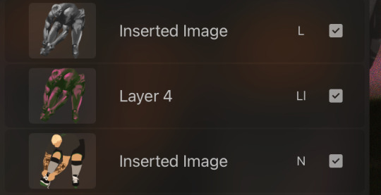
AND THATS REALLY TRULY IT …. it’s pretty simple and diverse and allows you to be more explorative with colors if you’re someone who tends to stick to basic ones or only palettes you’re familiar with.. i like it because it’s simple and intuitive for me (i started out doing mainly charcoal so grayscale is my friend) and just fun!! non stressful!! except when you’re fighting layer limits!!!
and for shits and gigs…. coloring speed drawing be upon ye
(song: baby i’m yours - cass elliot)
#basically … clipping masks + confidence in contrast with ur darks/lights + GRADIENT MAPS!! are ur best friends#also this was just to show my process but it did turn tutorial esque because . well#future teachers of america curse#enjoy!!#art stuff
3 notes
·
View notes
Note
hi putting ur art in my mouth. howdo you do COLORS ur pieces look so good. share ur knowledge
thank you!!!!! :D ill try to do a breakdown of my process here (warning, its kinda long and fiddley/complicated lol)
for most of my pieces i like to start by having 1-3 main colours that i want the rest of the colours in the art to skew towards to help make it all feel cohesive! these colours usually tend to be some combination of blue/purple/pink/yellow simply because theyre my favourite colours, but its very dependant on the mood of the piece. when all else fails, you can't go wrong with complimentary colour combos!

for example, the key colours for this piece were yellow for light values, a salmon-y pink for mid tones, and purple for darks!
after i have my key colours picked out, i lay out all the base colours just normally with no skewing so i can get a feel for how the values will look. I make whatever value/colour adjustments i need to there, and then its the fun part! in clip studio paint, you can use a tool called "gradient maps" to skew colours to different hues based on their value. i'll make a new gradient map to correspond to the colours i picked out (or use a previous one if it works), and lay it out over top of everything in the image, including line art because i like how it makes the lines feel like they're glowing. If a colour looks too intense or skews too heavily under the gradient map, I erase part of the mask over the gradient map (usually at a low opacity but sometimes at full) to return it closer to the original colour. I also may put a secondary gradient map over top set to overlay to make certain colours more vibrant because i prefer saturated colours in my art :]

this is usually what my gradient map layers look like
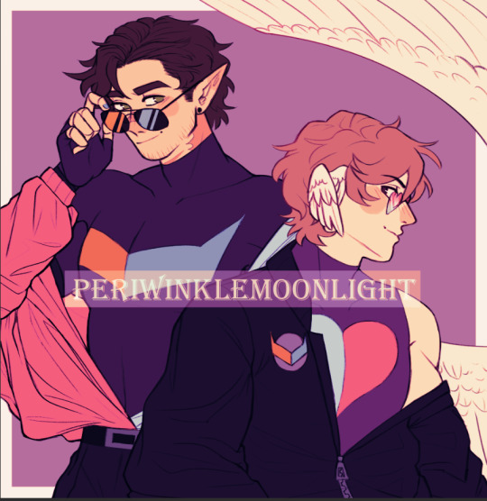
and this is usually what my base colours look like with the gradient map(s) over top! if your art program doesn't have gradient maps, a similar way to get this effect would be to simply create an overlay layer over the base layers and select each colour to fill with the key hue you assigned it!
next, for shading i start with a multiply layer with colour complimentary to most of the key colours (if the piece is mainly warm i use a cooler colour and vice versa) and shade accordingly to where the light source will be. for instance, the light in this one is coming from somewhere beyond the characters in the top left and i shaded using a greenish colour.

in a typical piece, afterwards ill add a soft yellow orange light with the airbrush tool coming from the light source
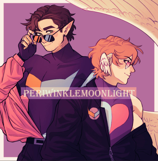
and then go in with harsher highlights for metals or hair

and at this stage i like to add some reflective/bounce light in the darker areas and start to colour the line art

so in here i used a blue-purple hard light layer to lighten the shadows and a saturated red on low opacity to colour the lighter parts of line art. In cases like the wing i will clip an overlay layer onto the multiply shading layer and airbrush a lighter colour on the edge to make the shading softer.
then i do my finishing details and its done!

15 notes
·
View notes
Note
hiii!! your artstyle is SO COOL to me- as in sometimes i'll just stare at some of your pieces because theyre all so great. i was wondering if you were comfortable sharing your process when it comes to art?? i'd love to see how you do things!
Hi!! I'm sorry this took so long to answer, I hope you still find it useful. It means a ton to me that you enjoy my art so much! <3 It's easy to feel discouraged by the Invisible Hand of Internet Engagement, so I really appreciate your ask.
General thoughts (NOT rules, just things I consider or do a lot):
Things that appear one solid color irl can be broken down into multiple colors through artistic interpretation. I see a lot of beginner artists paint trees as solid green, when there's a lot of yellows, blues, and browns in there! A FANTASTIC example of this is jadenvargen, whose color use is masterful and I can only aspire to emulate one day.
Base colors are not saturated; saturation is reserved for pops of color and details
Shadows are purples, blues, and greens
Reference is your best friend!!!
So the nitty gritty for those who want to see: with digital art there's two main avenues I take. The first one is lineart, and the second is painterly. All IDs are in alt text.
My process for lineart pieces:
I always start off with a sketch; for this example I'm using one of my pieces from @/mylittlefusions (that isn't actually posted yet but will be later today) - a Grogar and Trixie MLP G4 fusion. I like to fiddle with brush selections until I get the effect I want, and then go slow on the lineart to make sure it's how I want it, so this can be time consuming!
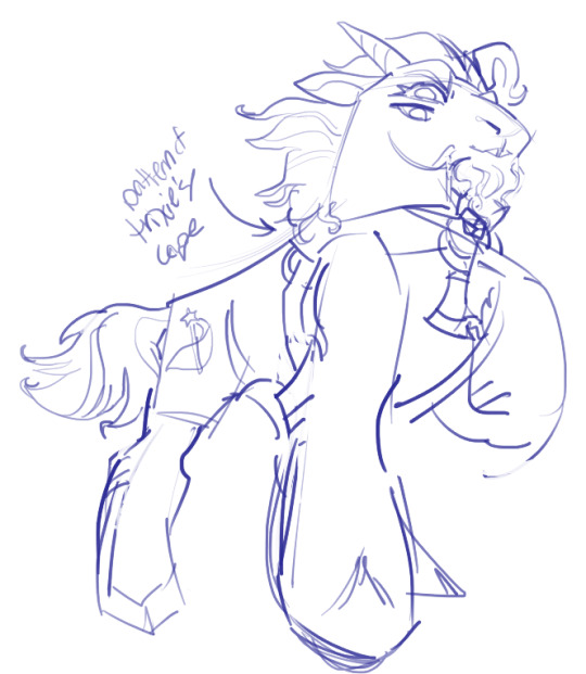
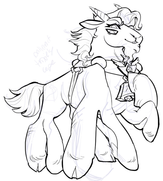
I've been trying for distinct shapes; I hate when my art gets muddled, I feel like the end piece is less impactful when I don't put in the right amount of contrast and distinctive silhouettes. Just something I've been thinking about and trying to improve.
Then I add base colors, going for slightly desaturated colors. I like to use saturated/bright tones to contrast or draw attention to something. I put the base-base colors down in one layer and then add details as a mask layer:
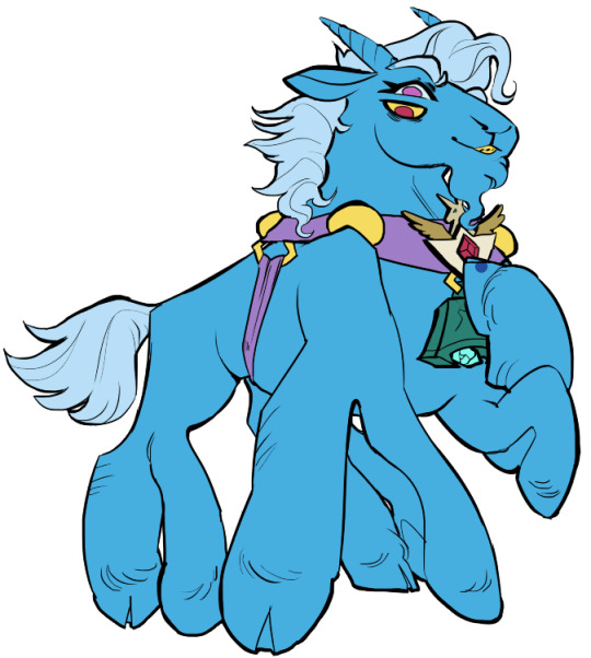
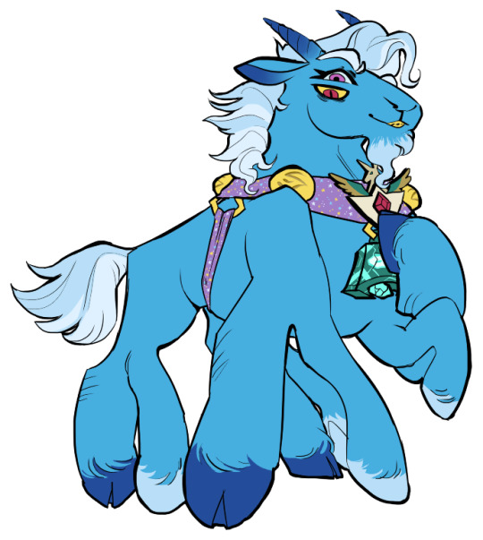
Then comes shading!! I'm a big fan of a multiply layer set to cool tones like blue, so I usually start there. If I think it needs to be different I can change it later. In this instance, I filled the whole canvas in the shading color as a mask over the base colors, and then erased where needed. Now that the shading is done, I often go back and color the lineart :)
Last but not least is my favorite part, painting on top! The extent to which I do this depends on what I think is needed, but I usually at least paint on top of the multiply shading to add some nuance, i.e. the greener bits on the background limbs. Here I added bright magic outlines to pop from the more desaturated character.
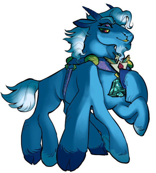
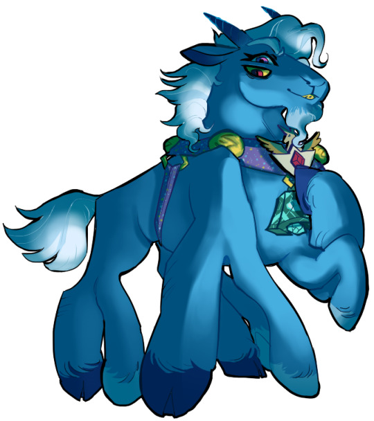
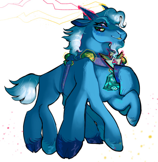
My more painterly style is a different story though! I use the same thoughts about color and shading, but I usually forgo multiply layers entirely and just do colors by eye. I still do a sketch, usually. Here is an example using my Lae'zel / Shadowheart piece.
The sketch is a disaster zone lol - but I painted below it using base tones, again desaturated. Once I feel I don't need the sketch anymore, I keep painting, making a new layer when I feel like being cautious about a change I'm making.

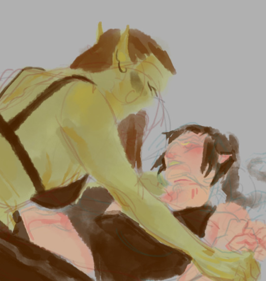
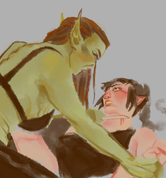
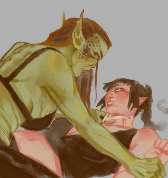
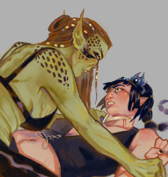
After I feel that I've got base colors down, it's time to get more contrast in using darker and/or more saturated colors! Then, like with my lineart process, I paint more details on top of everything else - reflections, jewelry, body hair, etc. I try to communicate shadow and distance with purples and blues, but I'm still working on it.

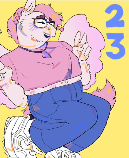
Another example real quick, where i did my typical lineart process base work and then painted on top of the shadow layer and the entire piece as a whole:
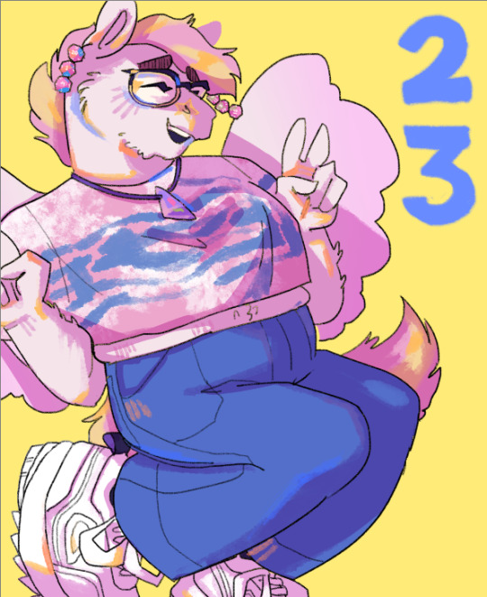
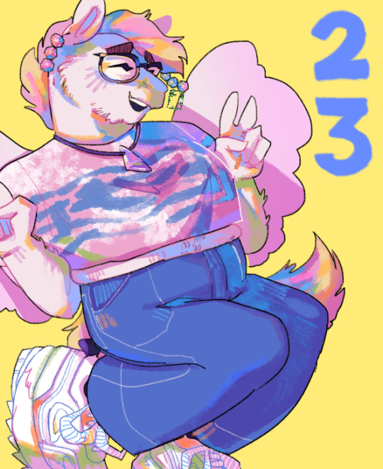
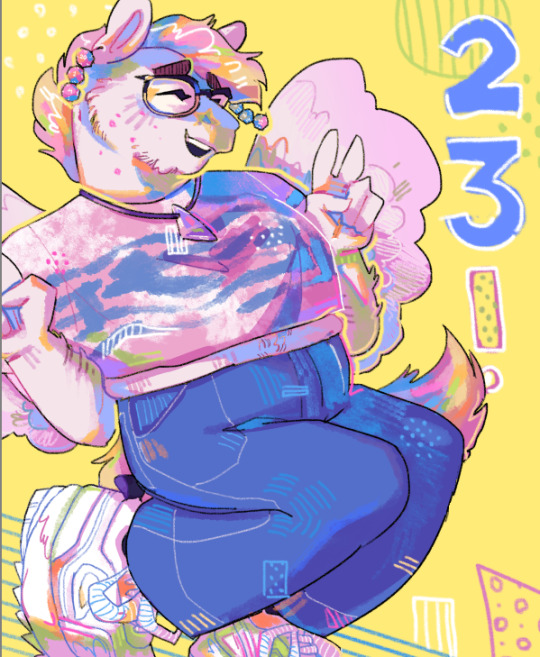
Thanks for reading if you stuck around, and thank you for the ask, friend! ^^
6 notes
·
View notes
Note
Hi, may I ask how you edit your edits that you publish, such as the house of the dragon? I would greatly appreciate a tutorial ♡
hi there! thank you so much for you ask! 🤍 i already answered a similar question last year so i'm gonna go ahead and just copy-paste part of that reply here, because the process is pretty much the same ✨ 3, 2, 1... here we go!
i do all of my edits/graphics on photoshop. i have a base coloring already done that i usually use and then i’ll just play with the adjustments for each screencap that i choose. it’s all very trial and error, really! but, in this ‘first coloring’, i just try to make the image as 'even’ as possible, using tools like: brightness, curves, selective color or even a few gradient layers, to make it a solid base to work on.
there are 3 things that i do pretty much everytime:
i use a 'color fill’ layer with a dark red color with the 'luminosity’ blending mode (and then adjust the opacity to my liking, usually between 50% and 70%);
a 'photo filter’ adjustment with an orange color (to give the final image a bit more of a warm tone; then also adjust the opacity to my liking);
and, after doing all this (meaning: after i finish ALL the editing i need) and saving as PNG, i open this new image on photohsop, go to the 'filter’ tab and select 'noise’ and then 'add noise’. i think it ties everything together and i really like how it looks in the end (i select around 2.5/3).

now, for the house of the dragon edits you mention (and to add some more info to that previous reply i gave): i use pretty much the same steps above but i also play around more with 'symmetries', overlays/transparencies, different blending modes and opacities, and also different gradients too!
for example, i like to duplicate the same screencap i chose and then 'invert it' to create a 'mirror effect' on top of the base. after that, i play with the blending modes until i find something i like. sometimes i do this same process, but instead of duplicating the same screencap, i chose another one that works (usually it's a screencap from the same scene that is only slightly different). there are also times where i don't 'invert' the image, but i simply move it to a different space of the frame depending on what i'm trying to achieve. again… there's A LOT of trial and error when i do these edits/graphics! to me, that's also part of the fun when i create! 🤗

experimenting with different blending modes is also fun! we get really cool effects by trying different modes and opacities. i usually do this like i mentioned above (in actual screencaps/images) or… with gradient layers! using gradient layers and playing around with the colors and these blending settings, gets you really intersting results too! i really like trying this 'negative effect' kind of thing, where i have a gradient layer with two colors and i then 'reverse' it to create this effect (but it doesn't work with all types of images). these gradient layers also help me get a more 'even' look to the whole edit. i usually try to stick to a certain 'color palette', so that all of the pieces actually work together when i post them here!

sooo... yeah! i don’t know if this is a bit vague, like i said, it really is about trying different settings and adjustments and finding something to your liking. that is literally how i came across this coloring and this 'editing style' and i’m always tweeking here and there! but i really hope this was somewhat helpful! 🤍✨
#thank you again for sending this ask and i really hope this was helpful <3#i hope it's clear and easy to understand to at least give you an idea of how i do these edits/graphics#also i apologize for any possible mistakes in my english i'm a bit tired at the moment 🫣#ask#anonymous#mine
2 notes
·
View notes
Text
🎯 Spinjo: A Playground of Excitement and Rewards! 🏆

Are you ready to step into a world where excitement never ends and rewards are just a spin away? Spinjo is the ultimate playground for anyone looking to experience the thrill of gaming at its finest! Whether you're a newbie or a seasoned pro, Spinjocasino offers an unmatched environment filled with endless opportunities for fun and fantastic rewards. Let's take a closer look at why Spinjo is your next favorite gaming destination. 🎉
🌟 A World of Non-Stop Thrills
Spinjo isn’t your typical gaming platform—it’s a playground where adventure meets excitement at every turn. The variety of games offered ensures that there’s something for everyone. Whether you’re into fast-paced action, immersive storylines, or classic gameplay, Spinjo has it all. The sleek interface and dynamic gameplay bring your gaming experience to life, offering a combination of stunning visuals, smooth animations, and interactive features.
Each game has been carefully designed to keep players engaged, making sure there’s never a dull moment. With new challenges, surprises, and rewards waiting around every corner, Spinjo ensures that every time you spin, the excitement is cranked up to the next level! 🔥
🏆 Play for Big Rewards
What sets Spinjo apart from other platforms is its amazing reward system. Every game comes with the chance to unlock hidden treasures, power-ups, and multipliers. And if you're lucky, a bonus round could be the key to unlocking huge payouts! 💸 Whether you’re chasing free spins or aiming for a massive jackpot, Spinjo offers multiple ways to score big and make every spin worth it.
The platform offers regular promotions and offers that ensure players are always in the running for something exciting. Whether you’re a new player or a loyal member, Spinjo makes sure everyone has a shot at winning big! 🎁
🎮 A Game for Every Type of Player
Spinjo isn’t just for one kind of player—it’s a playground that caters to everyone! From beginners to expert players, Spinjo’s diverse range of games makes sure that no matter your experience level, you’ll always find something that suits your taste.
The platform offers everything from classic spins to highly interactive, theme-based games that take you on thrilling adventures. Want to explore ancient treasures or take a journey through space? Spinjo offers a variety of worlds to explore. 🚀
🎯 Compete and Win with Tournaments
For players who enjoy a little competition, Spinjo has regular tournaments where you can go head-to-head with others for top rewards! 🏅 Whether it's weekly competitions or special events, Spinjo’s tournaments offer players a chance to showcase their skills and climb the leaderboard. Competing for big prizes adds an extra layer of excitement, making every spin feel like a step toward greatness.
With new tournaments frequently introduced, you’ll always have an opportunity to challenge yourself and win big. Don’t miss out on your chance to be a part of Spinjo’s competitive scene! 🎯
💥 Unlock Surprises with Every Spin
One of the best features of Spinjo is the constant thrill of unlocking surprises. You never know what each spin might bring—whether it's a bonus feature, a multipler, or even a secret round that boosts your rewards! Each game offers unique features that add an element of surprise, keeping you engaged and excited about what’s coming next.
It’s not just about winning—it’s about enjoying the thrill of discovery as you unlock exciting bonuses, multipliers, and special features! 🌟
🎁 Special Bonuses and Promotions
Spinjo ensures that your gaming experience is filled with rewards from start to finish. New players can enjoy a warm welcome with exciting bonuses, while loyal players are treated to exclusive offers that enhance their experience. 🌈
The best part? Spinjo regularly updates its promotions, ensuring that players always have something fresh to look forward to. From daily bonuses to special events, there’s no shortage of opportunities to boost your rewards. 🎉
🕹️ A Social Playground
Beyond the games, Spinjo is a social experience. It’s not just about playing solo—it’s about connecting with fellow players and sharing the excitement. Whether it’s through live leaderboards, friendly competitions, or community events, Spinjo creates a space where players can celebrate their wins and bond over their shared love for gaming.
Being part of a community of like-minded players makes every moment feel even more rewarding. It’s not just about what you win—it’s about enjoying the journey with others! 🗣️
🎯 Why Spinjo is the Ultimate Playground
Spinjo truly offers the best of both worlds—thrilling gameplay and amazing rewards. With a massive variety of games, ongoing promotions, and a competitive atmosphere, it's the perfect place for both casual players and those who are looking to compete for big wins. Whether you’re playing for fun or aiming for the jackpot, Spinjo guarantees an adventure every time you spin. 🚀
So, what are you waiting for? The playground is open, and big rewards are just a spin away. Join Spinjo today and experience the excitement for yourself! 🎉
0 notes
Text
A Culinary Passport: Dishes From Around the World to Try at Home
One of the best ways to experience different cultures is through their food. Exploring global cuisines can be both a fun and educational way to expand your palate while learning about the history and traditions of various countries. From savory street foods to traditional family meals, many international dishes are easy to recreate in your kitchen. Here are some must-try dishes from around the world that will bring bold flavors and new cooking techniques to your home.
Tacos – A Mexican Street Food Favorite
Tacos are a beloved staple in Mexican cuisine, and they’re incredibly versatile, making them a great dish to try at home. The traditional taco consists of a soft tortilla filled with various meats, fish, or vegetables and topped with fresh ingredients like salsa, avocado, cilantro, and a squeeze of lime. The beauty of tacos lies in their flexibility, allowing you to mix and match your fillings and toppings to create a dish that’s uniquely yours.
Choose your protein – seasoned ground beef, grilled chicken, or shrimp – and prepare it with your favorite spices. Don’t forget to heat your tortillas and set up a toppings bar with ingredients like diced tomatoes, lettuce, sour cream, and hot sauce. With just a few ingredients, tacos are a quick, customizable, and flavorful dish perfect for any occasion.
Sushi – Japan’s Artful and Delicate Dish
Sushi is a globally adored Japanese dish that pairs vinegared rice with fresh fish, vegetables, or tropical fruits. While sushi is often associated with raw fish, plenty of variations use cooked ingredients or vegetables, making it accessible to everyone. Whether you enjoy it as a simple roll or a more intricate nigiri, sushi is an elegant and fun dish to prepare at home.
Making sushi at home begins with preparing rice seasoned with vinegar, sugar, and salt. Afterward, you can experiment with fillings such as tuna, salmon, cucumber, or avocado. If you're new to sushi, you can start with maki rolls, which are easy to assemble and can be made with various ingredients. For an authentic touch, remember to serve your sushi with wasabi, soy sauce, and pickled ginger.
Paella – A Flavorful Feast from Spain
Paella is a quintessential Spanish dish rich in flavor and tradition. Originating in the Valencian region, this rice-based dish is traditionally cooked with saffron, which gives it a distinct golden color and aromatic flavor. Paella can be made with various proteins, including chicken, seafood, and rabbit, making it a versatile dish customized to suit any taste.
To make paella at home, begin by sautéing garlic, onions, and tomatoes to create a flavorful base. Then, add your proteins (chicken, shrimp, mussels, etc.) and cook until tender. The key to a successful paella is allowing the rice to cook evenly and absorb the full depth of flavor from the broth and spices. For an authentic touch, serve your paella with lemon wedges and enjoy the crispy socarrat layer at the bottom of the pan that adds a delightful crunch.
Biryani – A Spiced Rice Dish From India
Biryani is a fragrant and flavorful rice dish that has become popular across the globe, particularly in India and South Asia. This dish is known for its rich spices, tender meat, and aromatic rice. Traditionally made with chicken, lamb, or beef, biryani is a one-pot dish that layers marinated meat with partially cooked rice and then finishes cooking together to allow the flavors to meld.
To create your biryani, marinate your meat in yogurt and spices for a few hours to ensure the meat is tender and flavorful. Cook your rice with aromatic spices like cinnamon, cloves, and cardamom before layering it with the marinated meat and cooking everything together. The result is a mouthwatering, fragrant dish perfect for a special occasion or a family dinner.
Dim Sum – A Chinese Culinary Tradition
Dim sum is a staple of Chinese cuisine, offering a variety of bite-sized dishes, often served as part of a communal meal. The dishes are typically steamed or fried, including dumplings, buns, rolls, and other small snacks. Dim sum is traditionally enjoyed with tea, making it the perfect choice for a weekend brunch or a leisurely gathering with friends and family.
To prepare dim sum at home, start with dumplings, which can be filled with shrimp, pork, or vegetables. You can steam them in a bamboo steamer or pan-fry them for a crispy finish. Additionally, you can experiment with different fillings for buns and rolls. Dim sum offers endless possibiliFaties for creating a fun and interactive meal that everyone can enjoy. Don’t forget to serve your dim sum with dipping sauces like soy sauce or chili oil for added flavor.
Exploring international dishes is a great way to learn about different cultures while enjoying new and exciting flavors. Whether you're making tacos, sushi, paella, or biryani, these dishes are simple to prepare at home and transport you to a different part of the world with every bite. So gather your ingredients, get creative, and embark on a culinary journey without leaving your kitchen.
0 notes
Text
Butter Chicken Pizza: A Bold Twist on Classic Comfort Food

By creating a butter chicken pizza, fusion has just popped itself in the open and is crazily dominating the hearts of foodies everywhere. This very unique dish celebrates the richness of butter chicken-an exceptionally celebrated Indian favorite-combined with the crispy perfection of cheese and Italian pizza. Perfect for new-eaters and experimental tongues, one slice of this pizza offers best of both worlds together.
Why butter chicken pizza will change everything
A Rich Creamy Sauce Rather than the usual tomato-based sauce, butter chicken pizza has its soft but intoxicating sauce made with tomatoes, cream, and sensational Indian spices. The silky, flavorful sauce is, again, familiar and yet exotic at the same time. Such a creamy sauce in the crispy pizza base just takes what comfort food can be to a whole new level.
Tender Spiced Chicken Marinated with a handful of Indian spices, butter chicken pizza sees chicken driven by great flavor from marinades; once it's cooked in the buttery sauce, it's mind-bogglingly tender and allows for a juicy bite of every piece of pizza. Each mouthful is equally balanced with creaminess and spice.
Melted to Perfection Cheese No pizza is complete without cheese, but on butter chicken pizza, we generously layer delicious melted mozzarella on top of the creamy sauce. The gooey cheese adds such a luxuriously satisfying mouthfeel that it is simply irresistible and complements the spice from the chicken perfectly.
Tailor to the Max Want to make your butter chicken pizza even better? Customize it with extra toppings such as fresh cilantro, crispy onions, or if you’re up for it, some kick from a drizzle of hot sauce. Adapt and customize whichever way you want to-go mild or spicy.
Ultimate Comfort Food Combination
Butter Chicken Pizza offers the ultimate comfort food. Heart, sweet, and with all the warmth of a hug, it is basically the butter chicken sauce, with tender chicken and melt-in-your-mouth cheese combined. This fusion pizza is a lavish delight that will hit all the spots both for a hearty dinner or for a meal that will please a crowd.
Pairs Really Well with Butter Chicken Pizza
Beverages Pair your pizza with cocktails that take the edge off the pizza's richness-a chilled beer or a sweet mango lassi or some tangy lemonade all do very nicely to cut through the richness while offsetting the spices too. If you are a little light-headed, crisp iced tea would still prove worthy.
Burst of All Flavors Butter Chicken Pizza merges Indian food and Italian cuisine like never before. This combination takes bold spices and creamy sauce and stuffs them in a perfectly crispy pizza crust, a flavor explosion that will satisfy your taste buds.
Comfort Food Both butter chicken and pizza are comfort foods that fill you up without skimping on taste. Combined together, they make for a hearty, indulgent meal perfect for everything from casual dinners to family gatherings.
Customizable Be it cheesy, spicy, or extra-saucy, Butter Chicken Pizza is a blank canvas and customizable to your heart's content. Add or subtract any toppings you like and create a pizza that’s really your own.
0 notes
Text
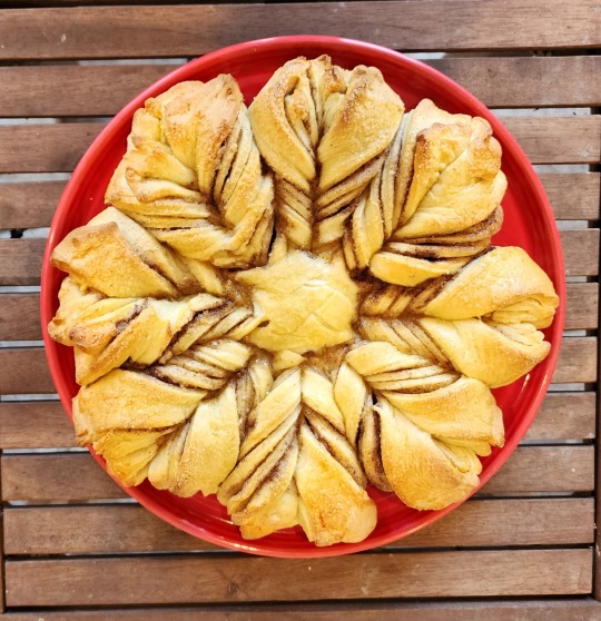
Snowflake Cinnamon Bread
One of my favorite shows is the Great British Baking Show. Not only is the show fun to watch, it is full of great ideas for my own next baking project. This year the Christmas special technical challenge was Snowflake Bread, also known as Star Bread. It is a simple cinnamon bread with a much more interesting shape as compared to your normal cinnamon rolls.
The following recipe is mine based upon things I have done before. It produces a dough that holds together well and is easy to roll out.
Start by weighing out 540 grams of flour and 60 grams of sugar and dumping them into the bowl of your stand mixer. Add a teaspoon of salt and a couple teaspoons of yeast. With the mixer running, pour in 280 ml of warm milk and one egg. Let the mixer to its job until everything comes together, then add six tablespoons of softened butter one table spoon at a time.
Let the mixer knead the dough for about six minutes then transfer the dough to a large clean bowl. Cover the bowl with plastic wrap and place it into your (brand new!) proofing oven for about an hour.
Make up a cinnamon sugar mixture for the filling, using a half cup of sugar and two tablespoons of cinnamon. Also melt a half stick of butter in a small bowl.
At the end of the hour divide the dough into four equal portions, forming each into a nice ball. They should weigh about 250 grams each. Take the first ball and roll it out into a circle about 11 inches in diameter. I used an upside down Fiesta dinner plate as a guide.
Transfer the dough round to a parchment covered half sheet pan. Brush the top with melted butter then cover it with one third of the cinnamon sugar. Leave about a half inch clear border around the perimeter.
Roll out dough ball two in a similar manner. Place it on top of the first round then cover it with melted butter and another third of the cinnamon sugar. Pull and stretch the two rounds to try to maintain the circular shape. Do the same with round three, again stretching the edge to maintain the shape.
Finally roll out the fourth dough ball and use it to top the third. At this point go around the circle pinching the four layers together perfecting the circle as well as you can.
Now comes the fun part. Take a standard ball jar with a two and half inch opening and invert it at the center of your bread to be. Press it in just enough to make a clear impression, a round mark. This mark serves as the starting point for your radial cuts.
Starting at the circular mark use a sharp knife to make four radial cuts at the points of a compass. Make four more cuts to cut each quarter into two eights, then eight more cuts to cut each eight into sixteenths.
At this point you should have a bread with an uncut round center with sixteen triangular pieces pointing outward. Take the ends of two adjacent triangles and twist them outward two times. When you have completed the two full twists then twist them again just a quarter of a turn and pinch the two ends together.
Complete twisting by repeating this process seven more times. When you finish go back around the pastry poking and pulling to make everything as neat as you can. Make sure the ends of each twisted pair are firmly pinched together.
Put the completed snowflake back into the proofing oven for another forty minutes or so. When it is fully proofed give the top of bread a egg wash followed by a thorough covering of turbinado sugar.
Bake the bread in a 375 degree oven for just 25 minutes. Let it cool on a wire rack. Take a picture quickly or you will never have a chance.
Then let everyone grab a arm of the snowflake and watch it disappear.
If you are lucky you will get to eat the center round.
0 notes
Link
0 notes
Text
Expert Australian Tutors for Accounting Assignment Help

As accounting students in Australia, the academic journey can often feel like a rollercoaster ride filled with complex numbers, detailed financial reports, and a never-ending stream of assignments. From balancing ledgers to understanding intricate taxation laws, accounting students face challenges that are unique to their field. However, the good news is that students don’t have to tackle these obstacles alone. Tailored Accounting Assignment Help In Australia is available, specifically designed for Aussies, offering students customized assistance that matches their individual needs.
In this article, we will explore why personalized accounting assignment help is a game-changer for Australian students, how it caters to specific academic requirements, and the unique advantages it offers to students trying to excel in their accounting studies.
Why Accounting Assignments Can Be So Challenging
Before diving into how tailored help can ease the burden, it’s essential to understand why accounting assignments are notoriously challenging.
Complex and Technical Nature of Accounting
Accounting is a technical field that requires precision and attention to detail. Whether you’re preparing balance sheets, calculating tax liabilities, or performing cost-benefit analyses, even the smallest mistake can lead to significant errors. Many students struggle to grasp the concepts or apply them correctly, especially when they are new to the field.
Time-Consuming Workload
Accounting students often face a heavy workload. On top of lectures, studying for exams, and other academic responsibilities, they are frequently tasked with preparing detailed and time-consuming assignments. These projects often require substantial research, application of theory, and meticulous attention to numerical data, making it difficult to manage everything simultaneously.
Understanding Australian Accounting Standards
Accounting in Australia is governed by specific regulations and standards, including the Australian Accounting Standards Board (AASB) guidelines, International Financial Reporting Standards (IFRS), and local tax laws. Students must not only understand these standards but also be able to apply them accurately in their assignments. This adds another layer of complexity to their work, especially for international students unfamiliar with Australian laws.
Given these challenges, it’s easy to see why students seek professional assistance. But the real advantage comes when that help is tailored specifically to their needs.
What Does Tailored Accounting Assignment Help Mean?
When we talk about tailored accounting assignment help, we’re referring to a service that isn’t one-size-fits-all. Instead, it’s a personalized approach designed to meet the unique academic needs of each student. This type of assistance focuses on providing targeted help, ensuring that students get exactly what they need based on their specific circumstances. Here’s how it works.
Personalized Assistance Based on Academic Level
Accounting students in Australia come from different educational backgrounds and are at various stages in their academic journey. Some may be pursuing a bachelor’s degree, while others are working on postgraduate degrees like an MBA in finance or a master’s in accounting. Tailored assignment help takes into account the student’s academic level, providing guidance that matches their current understanding and course requirements.
For instance, undergraduate students might need more foundational help with basic accounting principles like journal entries and trial balances. In contrast, postgraduate students may require more advanced assistance with topics such as corporate finance, auditing, or advanced taxation.
Meeting Specific University Guidelines
Different Australian universities have their own specific guidelines for assignments, ranging from formatting and citation styles to word count requirements and rubrics. Tailored assignment help ensures that all work aligns with the specific instructions provided by the student’s institution. Whether it’s adhering to a particular referencing style (such as APA, Harvard, or Chicago) or meeting the expectations outlined by a professor, customized assistance ensures that assignments are compliant with university standards.
Addressing Individual Strengths and Weaknesses
Every student has their strengths and weaknesses. Some students might excel in the financial aspects of accounting but struggle with the analytical side, such as interpreting financial statements or understanding auditing procedures. Tailored help takes these individual differences into account, focusing on the areas where students need the most support.
For example, if a student has difficulty understanding cost accounting, the expert providing the help can focus on breaking down the concepts related to cost behavior, budgeting, or variance analysis. This personalized attention allows students to address their problem areas without feeling overwhelmed by the broader scope of the subject.
Customized Research and Resources
When assignments require research, tailored help ensures that students have access to the most relevant and up-to-date information. Experts in the field often provide students with high-quality academic resources, case studies, and examples that are specifically related to the assignment topic. This customized research approach allows students to present well-researched and detailed assignments, which improves their chances of getting higher grades.
Benefits of Tailored Accounting Assignment Help for Aussie Students
Now that we’ve explored what tailored help entails, let’s look at the specific benefits it offers Australian accounting students.
Enhanced Understanding of Australian Tax Laws and Regulations
Accounting students in Australia need to be well-versed in the country’s unique tax laws and financial regulations. Tailored assignment help often comes from experts who have extensive knowledge of the Australian taxation system, including GST, income tax, and corporate tax laws. This ensures that the guidance provided is relevant and accurate, helping students not only complete their assignments but also gain a better understanding of Australian financial regulations that they can apply in real-life scenarios.
Improved Grades and Academic Performance
One of the most significant benefits of personalized help is the potential for improved grades. When students receive tailored support, they are more likely to submit assignments that are well-structured, thoroughly researched, and free from errors. This attention to detail leads to better academic outcomes. Over time, consistently submitting high-quality work can improve a student’s overall academic performance, helping them achieve their long-term educational goals.
Reduced Stress and Time Management
The academic demands placed on accounting students can be overwhelming, leading to stress, anxiety, and burnout. Tailored assignment help can significantly reduce this burden by taking some of the workload off students’ shoulders. By delegating complex assignments to professionals, students can focus on other aspects of their studies or personal lives, leading to better time management and reduced stress.
Opportunities for Learning and Growth
Tailored help isn’t just about completing assignments—it’s about learning. The one-on-one attention that students receive helps them better understand the subject matter. In many cases, students use the completed assignment as a study guide, gaining insights into how to approach similar problems in the future. Over time, this personalized learning approach builds confidence and improves overall academic skills.
Flexibility and Convenience
Tailored accounting assignment help is designed to fit into the busy lives of students. Whether they need assistance at the beginning of the semester or during exam crunch time, personalized help is available when it’s needed most. Many services offer flexible delivery times, allowing students to choose when they receive help, which can be crucial for meeting tight deadlines.
How to Choose the Right Tailored Accounting Assignment Help
With the growing number of assignment help services available, it’s important to choose the right provider that offers genuine tailored assistance. Here are some tips for selecting the best service:
Look for Experienced Experts
Make sure the service employs qualified accounting professionals with real-world experience in the Australian market. Whether they are Chartered Accountants (CAs) or Certified Public Accountants (CPAs), the experts should have the necessary credentials to provide high-quality guidance.
Check for Plagiarism-Free Guarantees
Plagiarism is a serious offense in academic settings, and it’s essential to choose a service that guarantees 100% original content. Look for a provider that uses plagiarism detection tools and offers a plagiarism report upon request.
Review Testimonials and Feedback
Examine comments and endorsements left by other students who have made use of the service. Positive feedback is a strong indicator of the quality of the service. You can also check whether the service has a good track record of delivering assignments on time and meeting customer expectations.
Ask About Customization and Revisions
A top-tier tailored service should offer free revisions if the assignment doesn’t meet your expectations or requires adjustments. This ensures that you get the quality and content you need to succeed academically.
Conclusion: Unlock Your Academic Potential
In today’s competitive academic environment, accounting students in Australia need every advantage they can get. Tailored Accounting Assignment help offers a personalized solution that addresses individual needs, helping students overcome the challenges of their coursework while enhancing their understanding of the subject.
By providing customized support, from aligning with university standards to offering in-depth guidance on complex topics, this type of assistance can be the key to not only excelling in assignments but also building a strong foundation for future career success. So, if you’re an Aussie student feeling the pressure of accounting assignments, consider seeking out tailored help—it just might be the boost you need to unlock your full academic potential.
FAQs
Will the assignment help improve my understanding of accounting concepts?
Yes, in addition to completing your assignment, tailored help is focused on improving your understanding. Professionals often explain complex concepts in simple terms, provide relevant examples, and give you detailed feedback to help enhance your grasp of the subject matter.
How can I ensure that the work I receive is plagiarism-free?
Reputable tailored assignment help services guarantee 100% original content. They use plagiarism detection tools and provide a report to verify the originality of your assignment. This ensures that the work submitted is unique and compliant with academic integrity guidelines.
Can I request help with urgent accounting assignments?
Yes, most services offer tailored help for urgent assignments. However, the cost may increase depending on how close the deadline is. It’s always best to reach out early to allow sufficient time for high-quality work.
What qualifications do the experts providing help have?
The experts who provide tailored assignment help are usually highly qualified professionals with degrees in accounting or related fields. Many are Chartered Accountants (CA), Certified Public Accountants (CPA), or have significant experience in the accounting industry in Australia
0 notes