#volumetric drawing
Explore tagged Tumblr posts
Visit Tumblr Blog
Explore Tumblr blogs with no restrictions, modern design and the best experience.
Last Seen Tumblr Blogs


Fun Fact
Kazakhstan’s Minister of Communications and Informatics has blocked the Tumblr site because it contained 60 sites of terrorism, extremism, and pornography in 2015.
Note
It's may be an odd question but do you think you could maybe post a couple tips of anatomy and/or proportion that helped you sometime? I notice I have a hard time learning from videos or guides, but sometimes when I learn on my own or hear someone else's personal experience it just clicks and it's nice.
I know this may sound strange, but for me it was a class I took with Matt Faulkner, who had a very refreshing approach to mark making and drawing from life. We did have a live model, and drawing people from life teaches you two important things that books cannot: textbook anatomy is idealized, not everybody will look like that and foreshortening and perspective are things that are easier to see in person (at least, for me they were).
As you draw things like that over and over, you will build a mental library that will help you draw those tougher perspectives from imagination. I still use a reference, because the human body can bend and distort in a lot of ways and I am nowhere near having all of that memorized, and WE DON’T HAVE TO! If it gets committed to memory, great! But artists should never feel shame from using a reference because that is how we learn and that is how we improve. Even professionals use a reference.
The mark making that Matt taught us was a little different than some of the other classes I had been through in the past. I typically would draw a human with basic shapes and a “wire-frame” skeleton for my foundational rough sketch, but Matt would have us start drawing our figures with different lines. Contour lines, is just drawing the outside of what you’re observing, while periodically flashing your eyes at the paper. Blind contour would have us looking only at our subject and drawing what we were seeing without ever picking up the pencil (some of these actually turn out pretty cool).
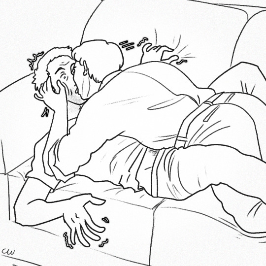
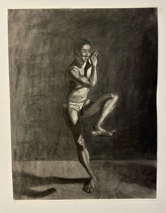
Volumetric drawing was the one that I had never come across before. Matt uses a lot of crosshatching and volume lines in his work. See the below example:
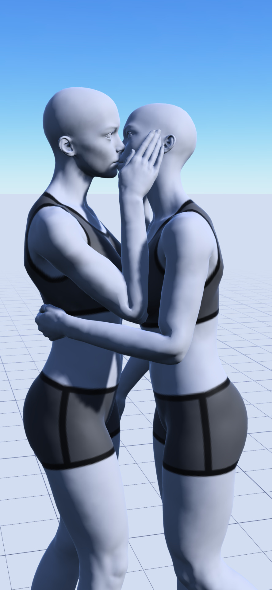
The way this applies to anatomy is that his way of volumetric drawing is helpful in finding the space that your figure takes up. Sometimes Matt would have us draw our figure with ONLY volumetric lines. It would look like a tornado person, but this practice wasn’t to make something visually appealing, it was to help us train our brain and our eyes to see the volume. In that volumetric study we would be wrapping lines in a width and curvature that followed the subject. Here is a visual example of a volumetric drawing by Monika Zagrobelna that shows what I mean:
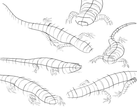
The volumetric drawing helps to grasp how much space something takes up, whereas the wire-frame doesn’t really convey that kind of information. A lot of people reference the Andrew Loomis books and Figure Drawing For All It’s Worth [ISBN: 978-0857680983] is a good resource to learn from. But Loomis does idealize the standard figures in his works and books. I am not saying don’t draw like him! There is nothing wrong with his style! Just don’t fall into the assumption that every body type will align exactly with the proportions and measurements that he covers. For example, he usually has a standard height that male and female figures are drawn at and certain points where knees are expected to reach and other body part milestones:
It is a guideline, and it is useful, but I found that the best exercise that you can do is to do a study on separate pages. No one taught me this, I just did it out of curiosity to see how it would go. Set one aside for male and one for female. First, draw your standard Loomis figure, then get five other male/female reference photos (or drawn from life if you can) of people with different body types. Try drawing them from observation and see how much of the Loomis concept applies to them. You’ll find that you can bend a lot of the Loomis ideas to fit, but you have to throw out some things entirely in order to accurately portray your subject (like the number of heads tall something has to be, or posture, for example).
Hopefully, despite that being a little long-winded of me, you found this experience helpful? Everyone learns differently, so I feel your struggle. I am a big visual learner and need to see what is happening with something to understand it. I also learn best by struggling. So what were the “aha” moments for me, may not necessarily work for another, but it is here if you can find any value or use in it.
#art#anatomy#perspective#draw from life#use a reference#Matt Faulkner#Andrew Loomis#Monika Zagrobelna#volumetric lines#drawing volumetrically#volumetric drawing#figure drawing#art advice#art help#art asks
41 notes
·
View notes
Text
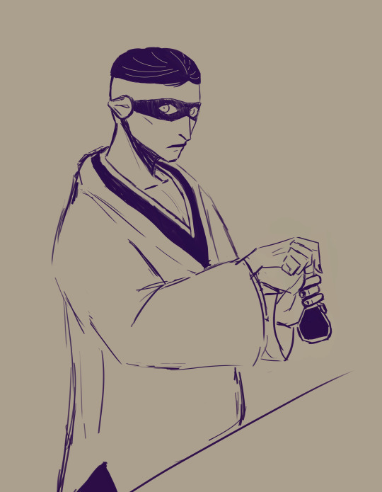
#mayuri holding a boring volumetric flask#but I wanted to draw it#I make up for my dirty lineart by painting#this time it's just a sketch#mayuri kurotsuchi#ah the hands xdxd#a sketch that will stay like this#nor signed#my illustration
51 notes
·
View notes
Note
Sometimes Mumbo looks like Markiplier, and that's ok (I swear this is meant to be lighthearted I swear)
I dropped everything and tried my hand at drawing markiplier and honestly? I really like his current hair

#curly and volumetric#i should bring a picture of him the next time i get a haircut#and an extra mumbö#also i guess because I'm the one drawing him but i can't see mark in my mumbö lol
7 notes
·
View notes
Text
This is going to be the most organized ref sheet Ive ever made alksalksdjal
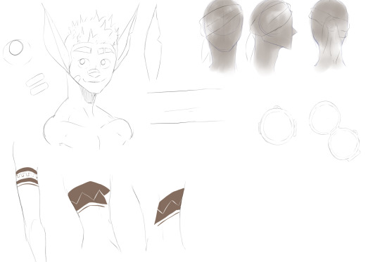
#FULL BREAKDOWNS OF EVERY PIECE OF CLOTHING AT EVERY ANGLE#VOLUMETRIC DRAWINGS OF THINGS#i keep forgetting what things go where so im just gonna#make some of these for the main 4 in arma 15 for now and go from there#my art
11 notes
·
View notes
Text
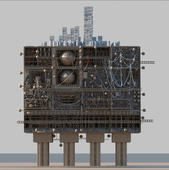
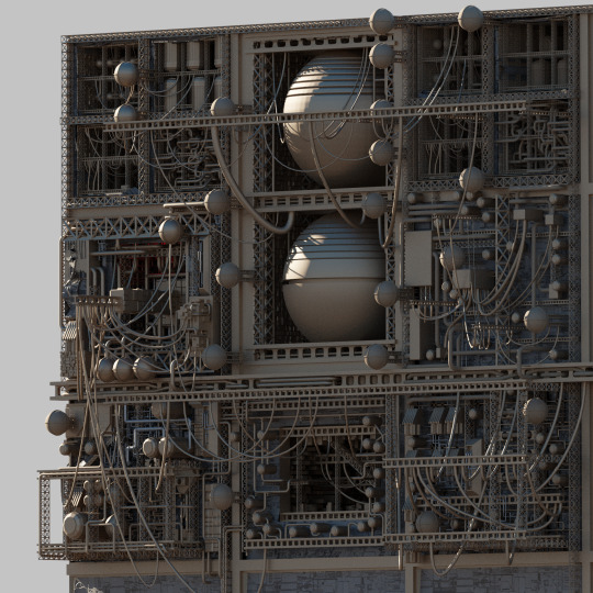
So I finished MODELING the iterator cube. All detailed, all pretty inside. The problem however
That's a lot of everything
My computer DOESN'T love volumetrics that are needed for clouds, or textures for that matter. Wich I will have to do eventually
I'll see myself out
Maybe I'll ask five pebbles to render me the image, who knows
An extra angle from before I was done just cus I have it
Edit: WHY THE FUCK DOES EVERYONE WANT TO EAT IT ? THERE ARE AT LEAST 5 PEOPLE WHO WANT TO EAT IT. (now that i think about it i to want a bite)
Edit 2, the electric boogalo: it's done!!!
2K notes
·
View notes
Note
I loveee how you draw iterator antennae,, please tell how do you design them?? Personally for me one of the hardest parts of designing iterators
Also - Love you art! Have a good day/night :)
Tysm <3
This one's tough, I don't really think too hard about how I design antennae. I just go with whatever looks right and fits the character lol but I'll try to talk about it anyways.
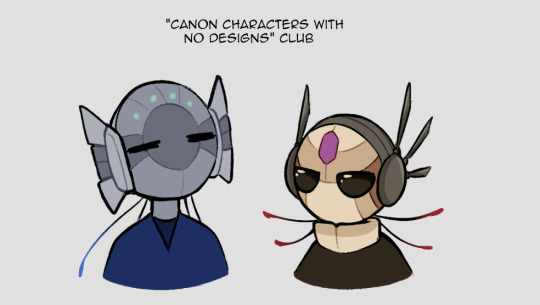
Moon and Pebbles are based off their in-game appearances. They have changes between depictions though so there's some wiggle room. Pebbles' is based off his sprite and Moon's off of one of her art pieces. (Her dull blue color is pulled from her sprite.) This seems to be popular in fan depictions too.
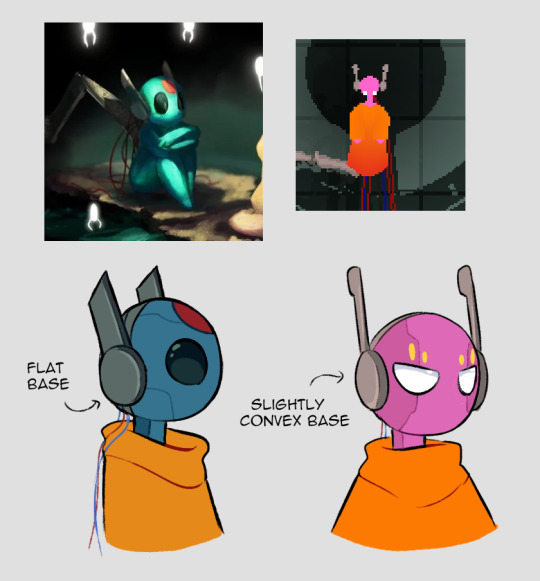
Sig and Suns are also based off official depictions. Sig I took some more liberties with - he really should have rounder, more protruding headphone bases. But I wanted some variety in headphone bases and he kind of just... ended up with a geometric shape theme to match his diamond mark. This is their only official image, so I just shrugged and gave them some broad small antennae that would be hidden at the back from this front angle, because I wanted to. (Bald Sig is valid but I like what I did hah)
Suns is a mix between the in-game art and the concept art by (I'm never sure what name to use here, but the art listed on the wiki is by-) Minkimaro. Mine's gotten more blocky/volumetric antennae over time, and every time I draw them their collar gets bigger. It's an addiction. They have to be comfy.

Wind and Innocence both have more unique antenna, and multiple segments. I wanted to balance them out with the others design-wise, but I wanted them to be distinct from each other too. So Wind gets these wide fan antenna and Innocence get triple thin antenna on joints.
And here's some OCs for variety.
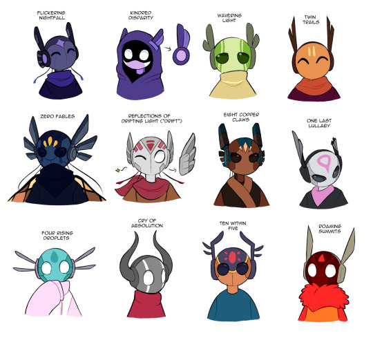
I guess here's some stuff to chew on-
Shape, width, size of the base headphone parts
Shape, width, size of the antennae
How many antennae? Are the antennae all the same size/shape?
Embellishments (such as the extra details on Flicker's)
Does the design suit the character's look? If they can emote with the antennae, how does that fit their personality?
If it matters to you, how do your antenna work, mechanically speaking? If they can move, do they have ranges? For example - Suns' antennae have great horizontal range, but they can't fold them down past their headphone bases.
#sure this one can go in the main tag. why not#look at my ocs boy#rain world#rw spoilers#dp spoilers#flickerdoodles#art#text#ask#anon#group pic#long post#i guess?
427 notes
·
View notes
Text
The Valar and their glow - visual HCs
Ok. So the Valar canonically all glow in their usual forms and it's like they glow from the inside. I like to draw it, but I also loved a fanart of Nienna with glowing tears, and I like making lists, so I decided to assign to each Vala a body part (loosely interpreted) that is their brightest.
Manwë: his breath. Imagine that you're outside in the cold and your breath is doing this cloud thing and you shine a flashlight on it. Something like this. The light fades as it dissipates.
Varda: all of her, but centered on the face, like a smooth transition from a very very bright have to a bright body. It's canon-inspired. The light is white, and very stable (doesn't flicker).
Aulë: his fingers, with an uneven gradient to hands and arms.
Yavanna: her arteries glow white and her veins gold under her skin. In her plant forms, the flowers and fruit glow too.
Námo: his eyes when open (even under a veil)
Vairë: her hair and her threads. Her fingers are often stained with light from all the weaving.
Nienna: her tears. This is from a fanart, sadly I don't remember who made it.
Irmo: his eyes when closed.
Este: she isn't bright to look on, but there are no shadows near her. If you ever did 3d graphics: imagine an invisible light source. She emits light that illuminates, but is not hard on the eyes and she's not hard to look at.
Ulmo: he's always somewhat translucent, even if not water-like, it's something like porcelain. And he just glows volumetrically. It's not very even or static, more as if glowing speckles were swimming inside him.
Oromë: tattoos made of light, (because "his teeth and nails glow" would be too goofy. It would be, right?). And if he has antlers, they do glow too.
Vána: freckles made of light, not only on the face, but on her back and shoulders too.
Tulkas: his muscles glow when they contact. For example: he glows when he flexes.
Nessa: her footprints glow, the glow fades in time.
Melkor back when he was bright: an uneven, pulsating radial gradient centered on his heart. (I can't get over the fact that the word for "heart" and for "rising" (in his name) is the same, it feels like more than just elvish idiosyncracy, like his name being ambiguous fits so well. And he chose the second meaning. )
#silm#silmarillion#tolkien legendarium#the silm#the silmarillion#silm headcanons#silm hc#valar#all of them#melkor#him too
41 notes
·
View notes
Note
We got the earth and the sky, but has anyone asked about what you think of Abzu?

i love abzu!!! another one i have watched the gdc talk for which you can watch here!!
the two big things in abzu are the fish animations and the overall environment lighting - lets start with fish!! there are a lot of them. and when you want to animate a lot of things, your computer will explode. this is specifically when you animate things with bones, how a lot of computer things are animated
luckily one thing that gpus can be really good at is drawing a tonnnn of the same object really fast, using something called instancing. as long as its the same mesh and material, it can be rendered a ton with just a single draw call (like i am talking hundreds of thousands). so lets make 10 thousand fish. unluckily this doesnt work with skeleton animations. luckily you dont need them! especially with fish
even though all the objects need to be the same mesh and material, doesnt mean they cant have different input. not only that but shaders let you modify individual vertexes, so, what if you just take all 10000 fish and wiggle them along an axis, like this

and give them all slightly different inputs so they arent all doing the exact same animation, maybe by giving them each their own unique number. now you have 10 thousand fish swimming around, wiggling, at almost zero rendering cost

these are all individual 3d models and all their animations are running in the shader !
the other way they animated fish without giving them bones was through something called blendshapes - these are usually used for stuff like facial animations, where you move vertices around to your desired "shape" (so like maybe your default face is :| but you edit the vertices so your character goes :> etc), and keep track of the difference between each vertex's position and its original position so you can move it whenever you want
that doesnt need any bones so they used this for things like fish going CHOMP and fish making sharp turns
for the actual environment, they experimented with a bunch of things like using actual volumetric lighting, but in the end they found that just using fog worked best!! they did tweak it a bit though - they had a "zone" between where the fog started to get thick and when the fog just ended up being a solid color where they dimmed any lighting - this really helped the background geometry stick out and give that underwater feel (left is without dimming the lights, right is with dimming the lights!! fun to think about how firewatch did something similar but changing the fog color based on depth rather than literally dimming the lighting)


they also let different volumes have their own fog value, so if there was say a cave off in the distance, it could have less fog than the surrounding area for clarity & also made the fog look a bit more volumetric
and the other huge thing that helped was "portal cards" - not an official term but its what they called them, basically just quads they could stick in any place where they needed to make something "stick out", like a cave, or a hilltop that blended with the background too much. the card sampled the depth of objects behind it, and used that 0 to 1 value to map a color to it. and then the closer youd get to these cards, the more transparent theyd get, until youre right on top of it and you dont need the objects to stick out of the background anymore!! here you can see a Me, but very dark, and then i slide the card over it. the black and white is the camera depth of all objects behind the card, minus the depth of the card. and mapping that to a color makes me stick out way more than i was initially!! then as you swim closer to me, the card fades away, until you pass the card completely
these portal cards were also used to make the light beams poking out from the surface, theyre just animated a bit!! you can see how the portal cards affect the look of things in this frame breakdown
and one other thing thats pretty prominent that wasnt touched on in the talk is all the caustics on the ground, those little wobbly light things you see underwater. but those were probably? just added to every shader as a "add this caustics texture on top based on the with the texture mapped to the world x and z position and only if the object is facing up"
like this !
anyways thats all from me on abzu..!! really pretty game
#anonymous#ask#potion of answers your question#gamedev stuff#long post#i optimize every gif for you guys even if its already under 10mb
294 notes
·
View notes
Note
HIII you have wonderful art!! can I ask you a question? I want tp become better at art but Anatomy is holding me back. I do gesture drawings every day and I use shapes but cannot draw different poses. How did you learn to do that? how did you study?
tysm for your answer <33 you're the best, keep up the great work!
Hi!
Omg thank you so much!!
I think mileage is super important, but don’t worry about taking a few days off every once in a while. Burnout can definitely be a factor in feeling like you’re plateauing (I don’t want to make assumptions, so please know this is all based on my personal experience). I’ve experienced periods where I feel like all my art looks too same-y? Like where I keep falling back on the same design solutions or shape language.
The best solution I’ve found to that is to approach each life drawing and gesture session with a strong intent. For example, today I’m gonna really practice my graphic shape design and place anatomy on the back burner. I’m still gonna keep the anatomy in mind, but I’m primarily going to be drawing and designing the negative and positive shapes to be as interesting and specific as possible for these poses. OR another day, I might decide to focus more on storytelling and acting, so my goal will then be to make sure every pose I draw that day clearly communicates an action (ex: the model is leaning their elbow on a table. Maybe I’ll really push the laziness of that pose and turn it into a scenario where they’re bored in a classroom and daydreaming). OR if I really want to hammer out some anatomy fundamentals, then I’ll go in with those more volumetric exercises where I’m reviewing my landmarks, proportions, skeletal structures, perspective, etc. And so on and so forth depending on what aspect of your drawing you want to train (there are tons more; some I like to practice are designing curves, minimal silhouettes, action/movement, straights/angular shapes) Basically, I find that swapping between strategic approaches to drawing helps change the way I draw, and it offers a lot of alternative solutions to different or challenging poses. (ie. A pose that is hard to draw volumetrically might be easier to draw with just graphic shapes)
Hope that helps! Sorry I went on so long
47 notes
·
View notes
Text
You know what I realized? Drawing in a volumetric style is hard for me.

The drawing process under 'keep reading':
✨✨✨
39 notes
·
View notes
Note
Could you show your sketching process? Like what base skeletons you use for the characters to make it so dynamic? Maybe using cuddy x cameron or hilson :)
Of course!! This is going to be long winded so Ill put this under the cut hahah
Im gonna follow my process chronologically with a few of my works to explain my different approaches!
HILSON
So especially for poses including two people i often use an app on my phone called "Magic Poser". This helps me understand the perspective and scale of the characters a bit better since this is something I struggle with. So ill take the models and pose them how I want them. What this app REALLY helps me with light sources since that is customizable too^^
So then I enter a phase where I am studying the pose. For this drawing I did it traditionally. first thing i do is break down the figures volumetrically, which is a figure drawing method where you break down the figure into simple box like forms. This helps me gain an understanding of how the shapes are interacting with space.
After that, I draw over the forms adding things like hair and clothes and building the specific face/body shapes of the character.
I do also use the little "circles" to mark joints when im drawing fast!
After that I scan the pencil sketch I do into Krita, and follow my work to get some lineart!.
CAMCUDDY
This one was a similar process, but i ported the reference image straight into my drawing program.
After that i do a volumetric sketch over the reference to break it down.
And then i do a more creative pass where i make these boxy dolls look more like the characters im trying to draw!
from there i do a final line art pass, and then i sit back..... and stare at it..... because even though model references SEEM fool-proof there are often things that just dont look right! Its really important to remember to not use those kinds of references as gospel, it should be a convenience and assistance rather than a crutch. So ill often go in and change things, either outright erasing and redrawing or using the warp tool to move stuff around! These models are only so helpful if once ur done you look at the drawing and it just looks straight doo doo lol.
FREESTYLE
While I do use models alot for something i want to draw really fast, its important to not rely on them! That can make your art become super rigid if you don't push yourself.
For drawings I approach without, i kinda go buck wild! Here on this one you'll see i kind of blend my volumetric phase with my detailing phase:
With these looser drawings i focus on shape and gesture. Then ill just do a final cleaning up pass for the line art.
I have a really fast and dirty drawing style that doesnt always lend itself to "perfect anatomy", but im far more concerned with visual appeal rather than realism.
Alot of the confidence I have with anatomy comes from yearssssss of drawing casually, and my classical study in college!
RESOURCES
I do really recommend some level of classical study when it comes to drawing the figure! Here are some video's on it I have watched and studied during my time in college that I really recommend:
youtube
youtube
youtube
I hope this was helpful!! haha sorry i get really nerdy about drawing process :))) If you have any additional questions let me know!
15 notes
·
View notes
Text

Here's how i made it:
My idea was to make something similiar to this:
First, i created a Minecraft world and looked for a place that looked similar, made some changes so the composition would be better and imported it to mine-imator.
After that, its just getting the lighting right and adding a few more elements. The key is to use the subsurface scattering thingy as much as you can. Also, there's a lot of cheating to the camera.
Here you have the full scene viewed from different angles:
Here's the final render:
The last step is to import the image to ibispaint and add the cool volumetric light, fix a bit the shading in the sketelon by hand, and a few other things to make the main focus the skeleton
Yeah i know this feels like a "draw the rest of the owl" but damn i am too lazy to make an actual tutorial
#art#digital art#mineimator#minecraft#digital artist#small artist#artists on tumblr#3d render#my art#ibispaintx#ibispaint art
36 notes
·
View notes
Text
Overcome with envy for people who can draw volumetric style Wednesday morning
5 notes
·
View notes
Note
Your art is gorgeous, I was wondering, have you drawn any of the angels yet? :0
The exterminators are plaguing my Mind and Lute's design is really sick.
Your art scratches my brain just right especially because you keep it volumetric and I'm a sucker for volumetric cartoony styles.
I havn't drawn the angels yet but I will these coming weeks for sure! I love lute's design so I really want to draw her!
And thanks! I always love to hear what other people think of my art and what stands out to them, it's really interesting to hear!
40 notes
·
View notes
Text
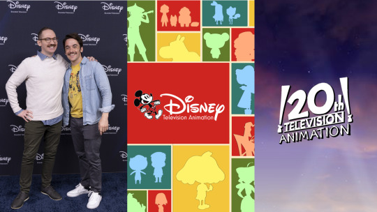
Chris Houghton and Shane Houghton Extended Overall Development Deal With Disney Television Animation, Ink Overall Development Deal With 20th Television Animation And Disney Branded Television In Multi-Year Agreement With Disney.
Chris Houghton and Shane Houghton, creators of “Big City Greens,” have struck a wide-ranging deal with Disney Branded Television and Disney Television Studios, it was announced today by Ayo Davis, president, Disney Branded Television, during the 2024 Television Critics Association winter press tour in Pasadena, California.
Under the deal The Houghton Brothers will also have full access to legacy and modern Disney IP to develop potential new animated series for Disney Channel and Disney+ based on heritage and modern Disney IP


“Big City Greens,” which debuted in June 2018, has been making kids laugh for four seasons and nearly 100 episodes. It was the No. 2 most-watched kids animated series of 2023, with more than 2 billion hours watched across linear and streaming since it debuted in 2018. The “Big City Greens” franchise will soon expand with a movie, set to premiere this summer. Additionally, “Big City Greens” recently collaborated with ESPN for the “NHL Big City Greens Classic” — a live, animated NHL game telecast, powered by volumetric and motion capture technologies — which is returning for a second iteration this year. The franchise's content also extends into many of Disney Television Animation's hit animated short-form series, including “How NOT to Draw,” “Chibi Tiny Tales”, "Theme Song Takeover" and “Broken Karaoke.”
Under this multiyear producing deal, the Houghtons will produce animated series,films and speciales with Disney Television Animation studio while also providing opportunities to develop live-action projects within Disney Branded Television across linear and streaming platforms like It's A Laugh Productions. Additionally, the deal includes development opportunities for adult animation projects with 20th Television Animation for ABC Network, FX Networks, Freeform and Hulu.
youtube
The Houghton Brothers and Big City Greens have trained the next generation of storytellers at Disney Television Animation with upcoming shows on development like chicano-lead comedy Primos created by Natasha Kline slated for a summer release on Disney Channel, other creators with shows in development include Monica Ray with an original show and potential buyout of Magic Children Doing Things, Hannah Ayoubi with a original show and a potential buyout of Monsters Abroad, both projects originally with pilots at Nickelodeon (Both pilots buyouts have been on freeze at Disney Legal department due Bob Iger's cost cutting and content overhaul at Disney), Raj Brueggemann and Amy Hudkins are also other Big City Greens artists and alumnis with a chance to get their own animated series for Disney Channel.
The brothers also collaborated on “Harvey Beaks,” with Chris serving as a storyboard director and Shane as a staff writer, "Harvey Beaks" creator C.H. Greenblatt has been developing a Disney Channel animated series since 2023.
youtube
#Chris Houghton#Shane Houghton#Disney Television Animation#Disney TVA#Disney TV Animation#Big City Greens#BCG#Primos#Disney Primos#Magic Children Doing Things#Monsters Abroad#Monica Ray#Hannah Ayoubi#Raj Brueggemann#Amy Hudkins#Harvey Beaks#Jellystone#Chowder#C.H. Greenblatt#20th Television Animation#Disney Branded Television#It's A Laugh Productions#Youtube
18 notes
·
View notes
Note
Hi! Hope you're having a good day
Sorry to be a bother, I wanted to ask how do you make sure that the character design remains consistant while drawing/animating different perspectives..?
Hello Anon! You're not a bother at all! Hmmm, to be honest maintaining consistency is a result of developing solid drawing skills over time (like since high school). There are tricks you can use like flipping (flipping back and forth between key frames while drawing) or arcs (using curved arcs at certain anchor points to maintain line of motion and volume). But if I'm being honest, having solid draftsmanship skills in animation is super important whether the designs are complex or simple. It's hard to explain but I just visualize the character and motion in a 3D space in my head and try my best to translate that onto a 2D plane. And that was a skill I developed while improving my draftsmanship skills during college and when I started working in animation professionally. Also, I studied a lot of Kihyun Ryu and Ilkwang Kim (famously known for their work on Legend of Korra and Voltron) which has a heavy emphasis on solid volumetric drawing when it comes to the human body. There are other artists I study like Yoshiyuki Sadamoto (Evangelion Rebuild movies), Tadashi Hiramatsu (Parastye), Mamoru Hosoda (The Girl Who Leapt through Time) who also have that same core of strong volumetric drawing (but I would argue for those they are very skilled at simplifying their line work and shape language to fit that anime aesthetic). So it's really a combination of things but I'd say solid drawing skills can carry you a very long way if you're able to look at a design and break down everything into simple shapes and develop the ability to visualize those shapes in a 3D space. At this point in my career, it's become second hand nature to me but I still think I have much more to improve. I hope that answered your question!
16 notes
·
View notes