#visual effects practice
Explore tagged Tumblr posts
Photo

Retro PC Games #21: Rebel Assault II: The Hidden Empire
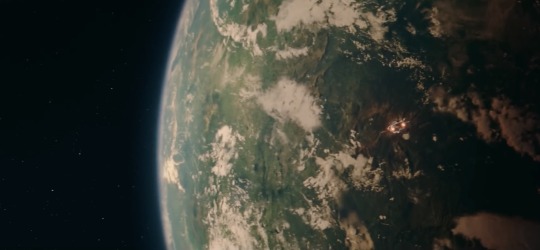
Recently replayed Rebel Assault II on stream, so I drew the Tie Phantom: One of my favorite craft in the verse. Imagine my surprise when it popped up in Empire at War! 🌕🌌⚡️
Still a lot of fun. Sometimes you just want to play a rail shooter, y'know?
Posted using PostyBirb
#star wars#rebel assault#tie phantom#planet#space#moon#stars#fanart#visual effects practice#gameart#retro gaming#90s
1 note
·
View note
Note
I came here for the silly haha doodles, but I've stayed for the absolutely blazing commentary in the tags. Your analysis of this story is so so so good! Thanks for all the work and thought you put into this!

I am just a silly little comics blog. I am not hiding anything in the tags, no way. Never.
#ask#digital art#I truly am grateful for the amount of people that not only read my journal-essay-thoughts on my comics#but also take the time to respond and/or write their own thoughts on the themes and scenes.#I really love taking apart stories and seeing how the threads weave together. Like flipping over an embroidered tapestry!#Some people thinks it ruins the illusion of what a story is - to me it *elevates* the experience to see the seams.#It's like knowing how they did the practical effects and stunts in a movie. It give you a deeper appreciation for the work that went into i#Thank you for acknowledging the work I put into every part of this project!#When I started drawing I....well...wasn't really the strongest with my visuals.#Humorously recapping scenes played off of my strengths (silly billying) and also just made the project *fun*.#But right from the start I also wanted to take my time and marinate on the themes and journal my thoughts.#I never really expected people to read them!#What might seem like a quick comic takes me several hours and I often spend a good bit of time with my tag essays too.#I owe so much to everyone who's dropped by to cheer me on and make this blog into part of the community.#to those who just lurk or drop by once in a blue moon - I thank you as well for coming along for the journey.#So even though it adds extra time; these little essays are a treat for you B*)
394 notes
·
View notes
Text


you're in the walls that I made with crosses and frames hanging upside down for granted, in vain, I took everything I ever cared about
BAD OMENS - The Death of Peace of Mind [2021]
dir. Orie McGinness
#bad omens#noah sebastian#nicholas ruffilo#nick folio#joakim jolly karlsson#kiran.gif#bandedit#musicedit#metalcore#flashing#eyestrain#the visuals in this music video are insane#the car on fire one turned out a bit staticy but that comes with being a gimp gifmaker i guess#i admire orie's combination of practical effects and cgi so much#i think gifmaking has made me appreciate music video cinematography as an art form a lot more than i used to
60 notes
·
View notes
Text
Painting with light for the Pearl Jam Dark Matter tour visuals, one of the many ways we used practical film techniques to bring analog humanity to the show.
Get a closer look at my visual work for Pearl Jam, and some rare photography prints for a good cause, at The Art Of Dark Matter exhibit at the Cove Gallery, Ohana Festival, Sep 26-29.
“Crown of Light” Directed by Rob Sheridan Produced by Stephanie Sheridan Post production, animation, and compositing by Joybird Studios Camera Operator: Donovon O'Neil PA: Ilana Rahaman Filmed at Rob Sheridan Productions, Tacoma, WA. Based on the Dark Matter album art light painting photography by Alexandr Gnezdilov
Tour production design by Spike Brandt / Nimblist Tour lighting director: Kille Knobel Tour video programming: Grant McDonald
#pearl jam#practical effects#video art#tour visuals#concert visuals#production design#stage production#tour production#dark matter#dark matter tour#art direction
47 notes
·
View notes
Text
writhing on the floor because i thought about art for a second too long
#.kitschy klatter#AuUgH#live action does something different than animation 3d does something different than claymation does something different than stop motion#does something different than puppetry does something different than practical effects does something different than cgi does something dif#fferent than movies does something different than episodic does something different than frame by frame does something different than riggi#g film does something different than comics does different then visual art does different than graphical art does different than#sIGNS POSTERS ADVERTISING INFORMATIONAL TECHNICAL PHOTOGRAPHY FROTHING AT THE MOUTH#NOT EVEN TOUCHING ON MUSIC......#any time i linger too long on art and how much i just wanna See It and Understand i start feeling insane#im like. trapped on the tippity top of an iceberg. theres so little time on this baka world#i understand an iota of what being attacked by c.hainsaw man's cosmos devil must feel like#i should be in a dark dusty archive studying every known bit of art history and then clock out and go home after a reasonable time#and use the knowledge to draw my ocs more.
14 notes
·
View notes
Text

Kiss Art Challenge 01 - First
#this is how i spent my weekend#trying to practice visual storytelling more#no clue if it's like. effective or not. but i tried.#jotawife#jotaros wife#jotaro kujo#jolynes mom#jjba
21 notes
·
View notes
Text

my 2024 in art!
can't help but feel sentimental looking at this because i've grown so much with my art this year. going from drawing once a month to branching out into digital art has been a really cool experience and i'm really happy with how i've progressed! here's hoping that in 2025 i learn even more and am able to create more art that i love :]
-
july - primrose baskerville | @destructix
august - hayes highwater & b | @arcadechan
november - oksana | @lionwheat
#🦔#goals for 2025: play around more with line weight -- especially overexaggerating it because that can give a really cool visual effect#also continuing to practice drawing with references#honing my skills of observation and such#finally also getting silly with textures effects and filters. i want to throw stuff at the canvas until it sticks yk. try out lots of#different options until i find what i like most#anywayssss heres to next year :]#my art
8 notes
·
View notes
Text


La Belle et la Bête / Beauty and the Beast (1946)
#la belle et la bête#jean cocteau#la belle et la bete#beauty and the beast 1946#beauty and the beast#jean marais#1946#40s movies#1940s film#smoke#visual effects#practical effects#fantasy movie#claws#b&w
14 notes
·
View notes
Text
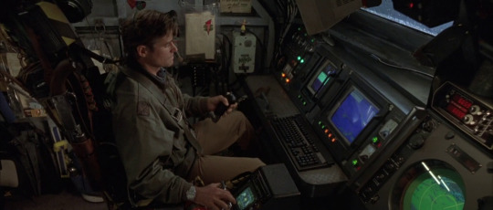
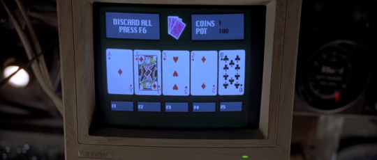

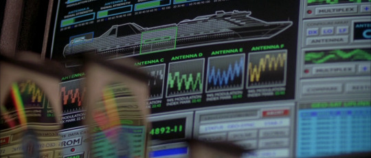

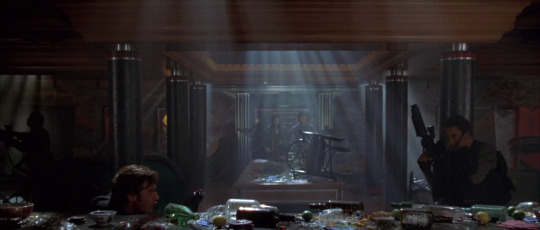

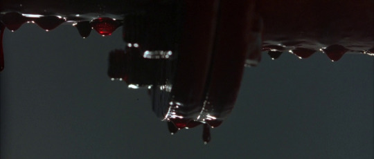
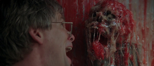

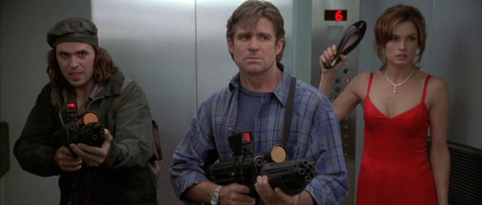
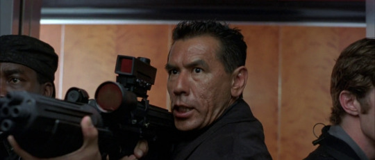

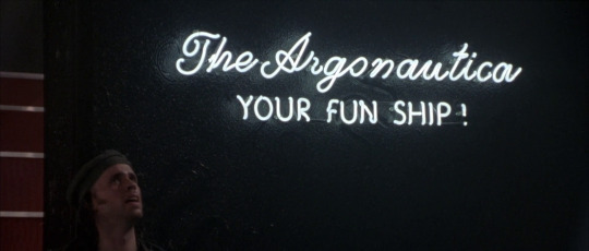
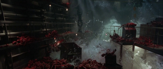
Deep Rising (1998)
#deep rising#deep rising 1998#stephen sommers#horror#action#treat williams#famke janssen#wes studi#kevin j o'connor#monster#gore#practical effects#visual effects#anthony heald
30 notes
·
View notes
Text
Ẇ̸̨̪̰̳͚̱̦̚͝E̸͉̖̰̖̺̫̼͉͗͊͜͠L̷̨̞͍̲̺̋͑̀̓͝͝͠C̸̝̔̋̉͜O̸̦̠̰͔̻̻̽͒̃̌́̋̈́̌͘M̸͔̯̎͐͆̿̇̈́̀͘̚͝Ȩ̶͎̻͚̠̝̉̀̿̆͋͗̑̋̒͜ͅ ̵̨̨̩̩͇̦̯́̓͗̅T̴̛̮̘͚̬̠̝̹͚̩̞O̶̪̪̤̫͙̞̻͛̈́̒́̓͝ ̶̢̡̡̼͕̯̤̿̔͆̽̈́̅T̵͚̊̾͛H̸̙̮͓̣̠̊̆̃͌̒͂͝͝͝͝ͅE̸̤̰̫͊̚̕ ̴̧͍̭͇̙̣̘̓̇̎̕͜͝H̵̦͖̻̤̖͖̩̊͆̍̂̆̆̈́́̍̄Ä̶̫̫̞̦͒́̈̐̎̏L̸̬͔̳̩̄̽͑͒Ļ̷̰̮͈̤̭̋̀̀,̷̻͆͛͂͐̈̉͂́͘͝ ̵̡̪͖̳̳̣͊̈̓̇͘͠C̸͇̱̯̍̎̑͆͊́͘͝Ȁ̶̲͖̼͕̬̻̰͛͊̇̂̀̇͘Ĩ̴̢̹̯͔͓͆̎̋̈͂̉͜N̵̛̹͓̪̽́̈́́͘E̴̛̼̩̺͂̾͐̿̔͠.̸̨̬̮̋

#moom makes bullshit#art#digital art#the amazing digital circus#tadc caine#hall of tortured souls#tw eyestrain#tw eye contact#I had too much fun with this one#I was blasting a song that's practically just noise for two hours straight#and I was going ham on the visual effects#I know he doesn't have his hat but#eh he probably dropped it somewhere in the Hall of Tortured Souls whoops#reblogs appreciated#likes appreciated too!#all in all this one was very fun to make#and has scared the shit out of two different people already#tadc fanart#< before I forget lol
45 notes
·
View notes
Text
i don’t remember halloweeentown being so creepy??? the makeup is SO good and spooky in a cute and fun way and the costumes are so adorable
#it’s very much like the old goosebumps shows i wonder if the person who did that makeup had anything to do with this#or if that was just 90s practical/visual effects#knight rambles
7 notes
·
View notes
Text
Watched a review of Smile (2022) and was thrown into the most violent rage. The review, 35 minutes in, while playing a cool shot of the monster: "…Believe it or not, this thing is 100% practical!"
From a Polygon interview with the writer and director Parker Finn:
“I grew up on practical effects,” he says. “It’s one of the reasons I wanted to become a filmmaker. I think that when something is practical, it just has more gravity to it. It has real weight and physics, and an actor can actually interact with it on set. It makes a big difference. Of course you can use VFX as a tool to help bring certain things to life, but the practical nature makes it real. And not only while you’re physically doing it in production, but I think for the audience as well. Unless you have a giant Marvel budget, I think people can always sniff out CGI. But hopefully instead, when they get to that moment in Smile, they’ll be asking themselves, What in the hell am I even looking at here? How is this possible?” The physical creature was a 9-foot-tall monstrosity that required a performer inside it and puppeteers to operate the gangly limbs, Finn says.
Now, from an interview by postPerspective with the visual effects studio The-Artery (founder Vico Sharabani and VFX supervisor Yuval Levy), which is not mentioned in the Polygon interview in any way:
"The most difficult part is near the climax, when the monster of Rose’s mom catches on fire. We did shoot a reference of a stunt double doing the same movements, but it required extensive match-moving and difficult simulation to make sure that the monster moved correctly and the flmes felt natural. Not only that, but Parker and I wanted to feel the monster burning so the monster changes throughout the sequence, slowly burning each layer of her skin until the scene ends. In this scene, we also had a smashed lantern on fire. To make this happen, Rose reached for a practical lantern on-set, so we had to recreate Rose’s hand and the lantern (including the cracked glass) and then simulate fire on top of that. This allowed us to have fire naturally reacting with Rose’s hand and with the lantern. Another difficult shot in this scene was the monster face rip, when Rose’s mom’s giant demon rips off her own face to reveal a grotesque, monstrous face underneath. The prosthetics team built an incredible practical. VFX then had to blend the different shots so the actor’s face would perfectly transition to the monster prosthetic. We then recreated the prosthetic in CGI and brought it to life, with skin peeling away and enhancements to the eyes. It was extremely satisfying to see all the parts come together on the big screen."
100% practical creature? Even the fucking lantern wasn't!!!
Here's a breakdown of the "100% practical" VFX on The-Artery's website.
everyone say "sorry VFX artists" aloud right now (or whenever you aren't around other people i guess) or block me ahshsghsbsfv and if your favorite movie is 100% practical, no it isn't, and go look up the credits and write down the name of every VFX artist that helped bring it to life asjdhdghdhhsd
#Practical effects#CGI#VFX#Smile 2022#Filmmaking#Visual effects#Horror#3D#body horror#my own posts#Special effects
11 notes
·
View notes
Text
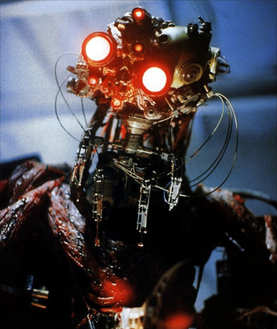

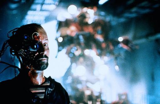

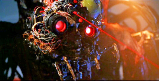


WHEN COMIC BOOK MOVIES GO DARK IN THE SCI-FI/BODY HORROR VEIN -- IT'S A.I. BUTCHERING HUMANKIND IN 1999.
NOTE: My best friend included this movie in a stack of DVD's he lent me earlier this week, and I thought it was a really brutal/gruesome take on the sci-fi/horror/action movie genre. The fact that it's based on a Dark Horse Comics property only enhances its appeal, personally.
FILM: "Virus" (1999)
DIRECTOR: John Bruno
SCREENPLAY: Dennis Feldman & Chuck Pfarrer (adapted from Pfarrer's Dark Horse comic book limited series)
CINEMATOGRAPHY: David Eggby
PRODUCER: Gale Ann Hurd
DISTRIBUTOR: Universal Pictures
PLOT SYNOPSIS: "A powerful electrical-based life form takes control of a Russian research vessel and kills the crew.
Finding itself trapped at sea with no escape available for it to spread through worldwide electrical systems. The creature desperately begins seeking escape.
An American tugboat boards the abandoned Russian research vessel hoping to plunder it and make a fortune.
The life form quickly seeks to eliminate the intruders whom it has come to see as a virus and utilise them at the same time to allow it to reach the mainland."
-- BLOOD-SOAKED HORROR REVIEWS (blogspot), c. March 2014
Sources: Mutant Reviewers, IMDb, Moria Reviews, X (formerly known as Twitter), Movies Films, & Flix, Pinterest, http://blood-soaked-horror-reviews.blogspot.com/2014/03/virus-1999.html, various, etc...
#VIRUS#VIRUS 1999#VIRUS 1999 Movie#Science Fiction#Horror#Chuck Pfarrer#Techno horror#Scifi/horror#Dark Horse#Dark Horse Movies#Comic Book Movies#Cult Films#Practical Effects#Visual FX#Sci-fi/horror#Artificial Intelligence#Techno-horror#Body horror#1990s#Practical FX#90s#Sci-fi#Sci-fi horror#1999#A.I.#Horror Movies#Sci-fi Fri#Cult Movies#Dark Horse Films#Robots
29 notes
·
View notes
Text
Electric waves crafted with light for Pearl Jam's “Got to Give” stage visuals on their current Dark Matter world tour. Light refracted off of Mylar sheets onto a projection screen, which we filmed at 1000fps while I crinkled and shook the Mylar in various ways. In ultra slow motion, the resulting textures move in a uniquely alien way, filled with rapidly twitching and shifting details that feel like something between liquid and electricity. By finding a good rhythm of shaking the Mylar with the light hitting at just the right angle, I was able to capture iridescent waves that moved slowly and elegantly while also crackling with small frenetic movements. Those two layers of motion were something I was always looking for in our experiments as I sought to create slow, gradually-evolving long-form visuals that also carried in them a palpable energy to match the intensity of Pearl Jam’s live performance.
The warm glow of the electric waves came from our unique light source: incandescent light bent through the lens of a vintage overhead projector. The projector was a great find by producer Stephanie Sheridan at Tinkertopia here in Tacoma, and we used it for quite a few other visuals in the show, inspired by the Joshua Light Show & other pioneering analog psychedelic visuals of the 1960s/70s.
For the song’s climax, multiple layers of the electric waves overlap, filling the stage’s projection screen with a rainbow of psychedelic light, and lighting director Kille Knobel adds another layer of real refraction patterns using three physical mirror balls that rotate at the base of the screen. The mirror ball light spills out across the entire arena, as if the light has been released from the screen, uniting the band and audience for a celebratory conclusion.
I’ll be back out on the Dark Matter tour in a couple weeks as it continues in the US! Come check it out if you can find tix!
“Got to Give” / Electric Waves: Director: Rob Sheridan Producer: @stephanie_sheridan_ Editor/Post: Rob Sheridan Camera Operator: @donovonmedia Production Assistant: @ilanarahaman Camera: Freefly Ember by @freeflysystems
Filmed at Rob Sheridan Productions, Tacoma, WA.
#pearl jam#practical effects#production design#tour production#video art#eddie vedder#Rob Sheridan#Rob Sheridan productions#dark matter#dark matter tour#concert visuals#tour visuals#behind the scenes
20 notes
·
View notes
Text

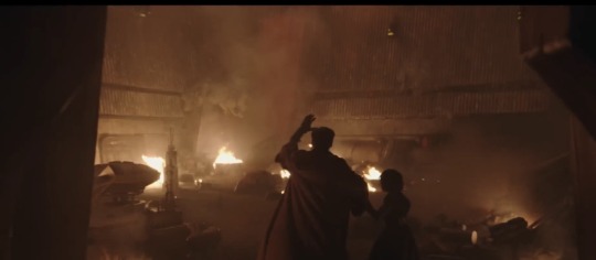
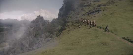

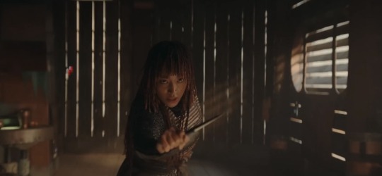


Certain losers are really still lying with their whole chest and trying to convince others The Acolyte looks “cheap and dull” lmfao. Like even in these lq screenshots from the trailer, this show is already the most visually stunning series I’ve seen from SW since The Mandalorian s1
#the acolyte#star wars#sw fans are always fed incredible work in visual and practical effects that to this day continue to revolutionize the industry#and then they shit all over it and swear its the worst thing ever seen#i think the quality of some shows or seasons have slipped from time#but these are tv shows and yall know damn well almost all of the visuals from this disneyplus hera have been movie level#i still think its funny when someone will say a scene looks terrible and blame the use of the volume#but those volume scenes theyre complaining about arent even shot using the volume 💀#people think theyre experts when in reality they dont know shit lmao
11 notes
·
View notes
Text
Behind The Sceens Barbarian (2022)


Barbarian, 2022
Dir. Zach Cregger
#barbarian#justin long#behind the scenes#set photos#prostetics#visual effects#practical effects#sfx#vfx#bill skarsgård#horror aesthetic#horror#movie#film#horror movies#horror film#reblog#barbarian 2022#follow for follow#follow for more#share#like for like#like for real#follow me#follow#like this#october#halloween#spooktober#likeforlikes
25 notes
·
View notes