#typestyle
Explore tagged Tumblr posts
Photo
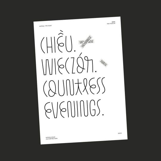
Pasto version 1.1 ⬤ The most recent update of the font family Pasto includes coverage for Vietnamese diacritics, redesigned 'Lslash' and 'lslash', localized forms for Polish kreska accent, Stylistic Alternates glyphs for 'I' and 'i' characters and their ligatures, plus some minor updates on glyph support :)) ⬤ demo fonts available — antipixel.com.ar ⬤ made with Glyphs @glyphsapp ⬤ designed by Julia Martinez Diana ⬤ published by Antipixel type studio ⬤ www.antipixel.com.ar — link in bio #glyphs #glyphsapp #typeprogress #antipixeltype #typography #thetypist #typefont #typecollect #fontinspo #typeinspo #typehype #typographyart #creativewomen #contemporarytype #designfeed #typefeed #365typefaces #typestyle #youaretypography #thedesignblacklist #customfont #typetopia #typeyeah #strengthinletters #aigaeyeondesign #generaleclectics #typegoodness #fkndesign https://www.instagram.com/p/CqF-YZAOW39/?igshid=NGJjMDIxMWI=
#glyphs#glyphsapp#typeprogress#antipixeltype#typography#thetypist#typefont#typecollect#fontinspo#typeinspo#typehype#typographyart#creativewomen#contemporarytype#designfeed#typefeed#365typefaces#typestyle#youaretypography#thedesignblacklist#customfont#typetopia#typeyeah#strengthinletters#aigaeyeondesign#generaleclectics#typegoodness#fkndesign
2 notes
·
View notes
Text
20+ Free Pixel Fonts for Creatives – Speckyboy
New Post has been published on https://thedigitalinsider.com/20-free-pixel-fonts-for-creatives-speckyboy/
20+ Free Pixel Fonts for Creatives – Speckyboy
Everyone loves a retro aesthetic. Pixel fonts offer a great way to add this old-school techno look to your projects. They prompt memories of classic video games, computer systems, and plenty of pop culture references.
They’re also more flexible than you might imagine. App development is a natural fit. Or use them as a headline font for your gaming blog. They also add a touch of fun to print materials, digital artwork, and video presentations.
Pixel fonts also feature a wide range of styles. Like other fonts, you’ll find both serif and sans-serif options. However, there are also different levels of thickness and character spacing. Each brings a unique personality to the table.
In this article, we’ve rounded up over twenty free pixel fonts available for download. Find your favorites, add them to your collection, and bring on the retro vibes!
Enjoy the fun look of this video game-inspired pixel font. Look closely, and you’ll find a delightful mix of squares and rectangles – just like the arcades and consoles of old. The relatively thin weight also keeps things legible.
Here’s a familiar font for fans of a certain classic game series. The package includes a full slate of characters, including punctuation. It’s an excellent choice for adding a bit of nostalgia to your project.
Inspired by old-school fighting games, this typeface features an action-packed look. Its bold and italicized text would be great for headlines and banners. Just don’t get too carried away with your street-fighting and knock over a lamp!
Bitroad is a mashup of styles representing the 1980s and 2000s. The font makes a bold statement while staying easy to read. It includes multiple typestyles and is available in several popular file formats.
Bold retro stylings are a hallmark of Sheko. Use it in places where you want to make the most impact. It features tight kerning that’s perfect for headlines and titles.
This all-caps pixel font will do wonders for your retro-themed designs. Each character features a variable outline that adds authenticity. It looks great in any size, and its low-contrast style offers a unique touch.
Add some slanted perspective to your project with this 8-bit typeface. Dotemp is a serif font that faithfully recreates the look of classic computing apps. It’s a variable font with regular and pixel styles.
Here’s a font that mixes elements of the old and new. It’s a pixelated font, for sure. However, it’s highly legible and includes some anti-aliasing. This one is a great fit when a more subtle approach to retro is in order.
Talk about unique, here’s a hand-drawn pixel font. The result is a fun typeface with classic looks and a decidedly modern charm. It also includes plenty of special characters to make it a versatile pick.
Travel back to the days when arcades ruled with this classic typeface. You won’t find any fancy effects here. The look is simple – a good representation of what once was. Sometimes, that’s all you need to make a statement.
Here’s a font with a twist on the pixelated style. It features a rounded look to soften those sharp edges. It’s a nice alternative to the more brutalist options on this list.
Tiny5 goes all out when it comes to pixelation. The characters are chunky, and the shapes are free of anti-aliasing. There’s simply no compromise. Therefore, reserve this one for use on headlines and banners.
Silver was built with game developers (and gamers) in mind. The multi-language font includes gamepad buttons with full keyboard and mouse prompts. Use it in your apps to give users an authentic experience.
Be bold and tell a story with this thick pixel font. It’s aimed at game developers but is also a natural fit for website hero areas. It’s another handy choice for your typography toolbox.
Pixelify Sans is a no-nonsense typeface that comes in four distinct font weights. That provides more flexibility than your average pixel font. It can be used in both large and small sizes and maintain readability.
You may notice that Dogica is easier on the eyes than most pixel fonts. It offers monospaced and kerned versions. Either way, you’re getting a legible font that can be used at the tiniest sizes. That makes it an all-purpose winner.
Silkscreen is a cross-platform pixel font built for websites and online apps. It’s an all-caps font with extra spacing between characters. It would work beautifully for the text headers on your tech blog.
Need a pixel font fit for smaller sizes? This one fits the bill with the ability to stay legible no matter how low you go. You might use it for those little design accents on websites and print documents.
Give your projects a subtly pixelated look with this display font. It features a distorted style that will help your designs stand out. It’s proof that pixel fonts don’t have to be harsh.
Here’s a style that looks like it comes from another galaxy. Pigxel brings a lot of curves to the pixel font playbook. Use it to create titles meant to send users far, far away.
This minimalistic font’s origins can be traced to an iOS pixel art app. Thus, you can be confident in displaying it on any screen. It also includes plenty of symbols for added flexibility.
PICO-8 is available in several flavors, including monospaced, all-caps, and wide. That makes it a good option for niche use cases. Beyond that, this True-Type font is a fun way to spice up your designs.
This pixel font adds extra pizzaz with blocky glyphs and thick sizing. It’s reminiscent of the systems we saw in sci-fi movies from the 1970s and 80s. Perfect for transporting your designs into hyperspace.
Write code the way our ancestors did – with a pixel font! Pixel Code is a monospaced font designed for use in code editors. It aims to maximize readability and includes a complete set of programming ligatures.
Here’s a collection of 20 pixel fonts – all with a public domain license. You’ll find a variety of styles to choose from. There are great options for fantasy gamers, along with more conventional typefaces.
The Power of Pixelation
Pixel fonts are one of the more fun typographic categories. You’ll find basic similarities. But the details are often what separates them. The font’s weight, shape, and letter spacing are defining factors. You can use them to create different moods and aesthetics.
So, choose your favorites and create something awesome!
More Free Fonts
From clean sans-serifs to elegant serifs and everything in between, there’s something here for every project type. Whether you need something simple and minimal or more striking, like bold or stencil fonts, you’ll find fonts ready to improve your typography.
More Free Fonts
Related Topics
#1980s#ADD#app#app development#approach#apps#Art#Article#Blog#buttons#code#compromise#computer#computing#Design#designers#details#developers#development#display#Display Fonts#easy#effects#eyes#Features#fonts#free fonts#Full#Galaxy#game
2 notes
·
View notes
Text
howdy folks! just a few polite etiquette notes from a rp veteran for those who are just joining the d2 rpc scene, or are bystanders.
do not reblog threads you’re not apart of!! esp if you’re a personal blog!! sometimes roleplayers won’t care if you’re a rp blog, but most of the time it’s preferred that y’all are mutuals beforehand. if you’re not sure, check the rules, and if there isn’t a rules page, ask the mun 👍
always read the rules page, even if you’re just observing. sometimes writers have specific boundaries that are in place (such as age limits and/or needing people to not reblog headcanon posts), as well as faqs. if you wanna ask questions about the character, first read the about/hc pages. if you’re still uncertain about stuff, again, ask the mun, but remember to always be polite.
DO NOT SPAM THE MUN/CHARACTER WITH UNSOLICITED NSFW. It doesn’t matter if the mun is 18+, not everyone is comfortable with that sort of thing and they don’t need to be!! Plus fetish mining someone’s characters without the consent of the writer is gross and can definitely be considered sexual harassment if not already so.
don’t rush people to reply or acknowledge something. be patient and understanding. sometimes threads will get dropped, it can suck but it’s not worth being an asshole over. it’s okay to remind your partner(s) about a thread, or just asking if they’re still up for continuing, but again, don’t be pushy or rude.
TRIM UR THREADS AND MAKE UR RP BLOG/TYPESTYLE ACCESSIBLE AND READABLE!!!
8 notes
·
View notes
Note
If u 3 could do something like avatar typestyle what bending you think you'll have?
Kumatora: I think fire'd be pretty cool.
Paula: ...Air?
Ana: Water.
3 notes
·
View notes
Text

APP 3: PASSAGE
For this design I worked with the manifesto Think different by Apple. I used hierarchy to bring emphasis to the most important parts, by using a bolder typestyle and making some words bigger. I algo played with the alignment to balance the weight of the bold words. Adjusting the tracking and the kerning made the text look different, so I also adjusted the tracking in some words to make them look longer, without having to make them bigger. I learned that the way you stylize the words can give a whole new perspective to a text.
Manifesto:
Apple: think different Here’s to the crazy ones. The misfits. The rebels. The troublemakers. The round pegs in the square holes. The ones who see things differently. They’re not fond of rules, and they have no respect for the status quo. You can quote them, disagree with them, glorify, or vilify them. About the only thing you can’t do is ignore them. Because they change things. They push the human race forward. And while some see them as the crazy ones, we see genius. Because the people who are crazy enough to think they can change the world, are the ones who do.
Keywords:
Hierarchy
Bold
Different sizes
Alignment
Left align
Right align
Important
Important words
Leading
Kerning
Tracking
2 notes
·
View notes
Note
Hey, I was wondering if you could tell me about your canon typestar 10 ii? I'm looking into a thermal typewriter (specifically for writing on, not for any interface needs) and it's one of the only ones that seems to show up round here. Specifically do you know if it comes with extra typestyles as standard, or are they side loaded via cartridge like the typestar 7?
apologies if this was a weird question to get from a stranger. Alex dueppen mentioned your machine on his blog, and cannot for the life of me find the answer anywhere else so far.
oh wow, i had no idea someone mentioned my specific machine in their blog! i think i posted about it on my twitter, which is sadly now completely lost to a permanent suspension.


like he mentions in comparison to his model 7, the 10-II is *extremely* cost cut. it has no computer interface and no cartridge interface, you can see inside the cavernous gap where such features would usually live. everything it has is built-in only (canon used this as a selling point!) and there are no extra typefaces, only a few features such as bold, underline, double width etc.
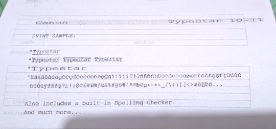
unfortunately the quality of this sample kinda sucks because i used the back of a piece of scrap paper and i rewound the only cartridge that i had, which is single-use, which meant that whatever on the carbon tape that had already been typed translates to gaps in the "ink" on the paper (and i had a record of everything that had been previously typed with that cartridge!)
here's a demo of it printing onto thermal fax paper:
youtube
4 notes
·
View notes
Text
Katolang Gaming Desk,Computer Table,100 x 60 cm Sturdy PC Workstation Ergonomic Gamer Desk with X-shaped Steel Legs and Cable Holes for Home and Office 60x100cm
Price: Buy Now Last Updated: Descriptions:Item Name: Gaming DeskMaterial: Plate TypeStyle: ModernShape: RectangleAssembly Type: Assembly RequiredTable Leg Structure: K-shapedTable Height: 75cmFeatures: Ergonomic Design, Spacious Desktop, Strong Load-bearingSize Details:L: 100cm/39.37″, W: 60cm/23.62″, H: 75cm/29.53″ (Approx.)Notes:Due to the light and screen setting difference, the item’s color…

View On WordPress
0 notes
Text
Serif week 3
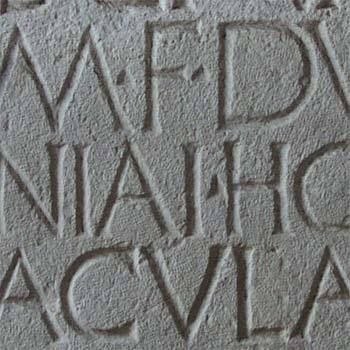
When were serifs originally created? While the creation of serifs is quite obscure many believe that serifs were used to neaten the ends of lines when chiseling stone. The creation of serifs is almost as recent as the type style. PrintWiki defines typestyle as “the distinguishing characteristic of a typeface, which can refer to Roman, italic, bold, condensed, expanded, etc.” Overall, we know that serifs were probably created during the creation of the typestyle.
0 notes
Text
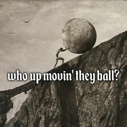
This is such a mix of image, typestyle, and text.
3K notes
·
View notes
Text
Essential tools / Book review / Brand Identity Essentials by Kevin Budelmann and Yang Kim
This book is split into sections: essential tools, decisions and strategies. In this post I want to touch on essential tools that include factors like image, colour, typography, shape, contrast, dimension, symbols, voice, consistency, story and time.
Image
the more literal and illustrative logo is, the less work a potential customer needs to put in to interpret it. Some brands keep their logos metaphoric and open for interpretation, like apple's logo, where it isn't for a fruit store, but for knowledge/forbidden fruit or gravity.
Colour
brands go beyond placing logos on everything, a sophisticated image can really enhance the messaging
make sure you find a visual niche for your brand rather than focusing on cliche images that will only add noise to your branding.
colour can give an immediate emotional quality to a brand
some colours are associated with certain brands, so when choosing a shade keep in mind what interpretation it can trigger in your target audience

Typography
typography always has strong personality - serifs are associated with tradition, whereas sans serifs with modernity and technology; what is the period in which my brand exists?
typestyles often carry their own identities
Shape
shapes can become a memorable component of a graphic identity
graphic patterns can help with maintaining consistency
shapes can suggest the use of a product or the promises a brand gives
Contrast
'the less contrast a mark has, the harder it is to be noticed'
customers asking questions can create a personal connection to your brand
the mark must contrast from its surroundings to make an impact
sometimes the solutions isn't to make a logo bigger but to increase the contrast
contrast isn't only in looks, but in how brands behave and how they speak

Dimension
taking logo marks out in real world can be a great promotional and memorable element
when a brand moves into a three dimensional space, digital concepts can be translated in unexpected and refreshing ways
when making a physical space, consider bringing in actual objects that are associated with the brand or can increase its impact, like placing anchors and fishing nets in a seafood restaurant.

Symbols
be cautious about the interpretation of symbols you use, as many have cultural, historical and personal meaning
many brands integrate a systematic use of symbols, if a logo mark is a circle, brands can use footage of round objects that relate to the brand
Voice
consider how the words would sound in the mouth of a brand spokesperson; personalise your brand, turn it into a character: how do they speak? how do they behave and what do they say?
Consistency
it starts with identifying core elements
structure brings restraint, order, and comfort
consistent foundation allows for effective highlight, clever uses and creativity
flexible systems allow to expand on the visuals, however you need to define rules and boundaries to keep them consistent
brands are promises and keeping them means being consistent
Story
the logo is only the beginning of the story, which you can expand throughout your branding
if a graphic identity is a book cover, program elements are its chapters - consider where and how its being seen and used
stories can be rocky with challenges, heroes and purpose, make your story interesting and keep coming back to it through out your promotional materials
Time
each brand moment is an investment and an opportunity, so every aspect matters - consider each interaction as a specific exchange of value with your customer
people want to feel in control
if customers feel like they waste their time, how can you change their mindset and make your brand worthy?
This chapter of the book provided me with valuable knowledge and aspects I need to follow when developing my brand and understanding how my target audience can relate to it. It also provides a lot of insights into the power of visual language.
0 notes
Text
New video - Create A Visually Consistent Design (Ep 5) | Foundations of Graphic Design | Adobe Creative Cloud on @YouTube
Via Adobe Creative Cloud Discover the magic of repetition! Use consistent shapes, typestyles, and colors to unify your designs and create a visually harmonious layout. Content of this video: 00:00 Intro 00:10 Repetition in graphic design 01:45 Avoid mediocrity! 02:28 Outro: Unify the design in the practice file using repetition Subscribe to Adobe Creative Cloud:…

View On WordPress
0 notes
Text
Marketing terms starting with the letter S
Sales promotion Marketing activities that stimulate consumer purchasing and dealer effectiveness through a combination of personal selling, advertising, and all supplementary selling activities. Sales-response function Refers to the effect of advertising on sales. Sans-serif type A typestyle of lettering with no serifs, or cross strokes at the end of main strokes. Scanners An optical…

View On WordPress
0 notes
Link
SPECIFICATIONSType version: Loose typeStyle: CasualSleeve Length(cm): FullSize: S,M,L,XL,XXLSeason: Autumn/WinterPattern Type: GeometricOuterwear Type: Wool & BlendsOrigin: Mainland ChinaMaterial Composition: polyester fiberMaterial: PolyesterGender: WOMENDecoration: vintageCollar: Turn-down CollarClothing Length:
1 note
·
View note
Text
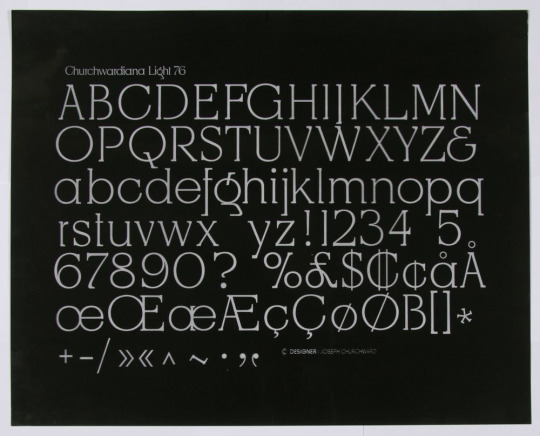
Week 1 - Joseph Churchward Research

- Samoan-born graphic designer
-an internationally renowned typeface designer whose work graced record covers, billboards, newspapers and popular literature such as posters and brochures around the world
-He hand-created around 700 typefaces, drawing upon influences from his Pacific heritage and family.
-His work was well known to the international design community from the 1960s but was not prominent in New Zealand until Te Papa Tongarewa acquired his archive and held an exhibition of his work in 2009.
https://teara.govt.nz/en/biographies/6c10/churchward-joseph
His typefaces:
Churchward Design (30)
Churchward Marianna (10)
Churchward Design Sparkly & Modern (2)
Churchward 69 (1)
Churchward Brush (1)
Churchward Design Lines (1)
Churchward Montezuma (1)
BN Beverly
Churchward Alien
Churchward Asia
Churchward Blackbeauty 72
Churchward Chinatype
Churchward Conserif
Churchward Crossbred
Churchward Freedom
Churchward Georgina
Churchward Heading
Churchward Isabella
Churchward Legible
Churchward Lorina
Churchward Maori
Churchward Maricia
Churchward Newstype
Churchward Roundsquare
Churchward Samoa
Churchward Supascript
Churchward Swinger Bold
Churchward Ta Tiki
Churchward Tua
Churchward Typestyle
Churchwardiana
Josephs Brush
https://fontsinuse.com/type_designers/649/joseph-churchward


0 notes
Text
cadciehe Gaming Desk, Ergonomic Computer Game Table with X-shaped Steel Legs Sturdy PC Workstation Desk for Home Office with Cable Holes Black
Price: Buy Now Last Updated: Item Name: Gaming DeskMaterial: Plate TypeStyle: ModernShape: RectangleAssembly Type: Assembly RequiredTable Leg Structure: K-shapedTable Height: 75cmFeatures: Ergonomic Design, Spacious Desktop, Strong Load-bearingSize Details:L: 100cm/39.37″, W: 60cm/23.62″, H: 75cm/29.53″ (Approx.)Notes:Due to the light and screen setting difference, the item’s color may be…

View On WordPress
0 notes
Text
Why Should You Buy a Facsimile of Bible KJV
When you consider buying a rare Bible, KJV could be the first thing that pops into your mind. However, its steep price may deter you, like many other enthusiasts. But there’s nothing to feel disheartened about as you can always get a facsimile of the original KJV. Whether it’s for your personal library, to gift a loved one, or satisfy the strong desire of owning a piece of history, buying this Bible is worth every dime.
The King James Bible has been loved and read by people for more than 400 years and attracts your eyes for its splendid cadences and grand phrasing. The influence this Bible has on our language and theology can perhaps be compared to no other book.
If you are considering buying a facsimile of the original 1611 King James Bible but aren’t yet sure why you should, here are a few things to know that can help you decide.
Features of the Original 1611 King James Bible (KJV)
You need to know the features of the original 1611 KJV Bible to ensure your facsimile has them. Also, knowing what to look for will make you come across as an informed buyer, thus decreasing your chances of being taken for a ride.
To begin with, Early Modern English is used for the text of the King James Version. Thus, the King James Bible (KJV) shows you the language’s close link with its Latin origin. This Bible had Jacobean-style spelling that wasn’t fully standardized but enabled its readers to read it phonetically.
An authentic replica of the 1611 Bible (KJV) should have the original typeface that was in Gothic style. But since many modern readers may find it difficult to read, your facsimile – like many others – could have a modern typestyle.
Wrapping Up
Among facsimiles of rare Bibles, KJV still stands tall and is recognized for its poetic feel, rhythm, and splendor. To ensure you buy an authentic facsimile of this 1611 version and not the 1769 Baskerville Birmingham revision, it will be wise to select a reputed dealer of antique Bibles. So, do your homework well and buy your facsimile of the King James Bible (KJV) with confidence.
Original Sources:
http://1611-king-james-bible.com/facsimile-kjv-bible.html
0 notes