#Display Fonts
Explore tagged Tumblr posts
Visit Tumblr Blog
Explore Tumblr blogs with no restrictions, modern design and the best experience.
Last Seen Tumblr Blogs


Fun Fact
In 2020, 27% of US Tumblr users had an annual household income of over $100,000.
Text

TanType Typefaces
TanType is a unique type foundry specializing in vintage-inspired display fonts that blend elegant curves with bold strokes, creating eye-catching and playful designs. Their fonts are crafted for standout headlines and posters, ensuring they command attention rather than fade into the background. With multilingual support, TanType offers versatility for global projects. Drawing inspiration from retro advertising and postcards, their typefaces balance nostalgic charm with a modern sensibility, resulting in fonts that feel both timeless and refreshingly new.
More here.
Subscribe to the podcast on Spotify, Apple Podcasts, or Amazon Music.
#tantype#typography#font#fonts#typeface#typefaces#font design#type foundry#display fonts#design#graphic design
13 notes
·
View notes
Text


Bionix - Bold Inktrap Font
https://www.behance.net/gallery/193146761/Bionix-Bold-Font
Bionix is a sans display font made with a bold and modern impression, equipped with inktrap which adds personality to this font. This font is suitable for designs that require a strong and clear impression when used in media but is still modern and fun. Bionix is suitable for headlines, posters, banners, logos, etc
#strong font#Fat font#headline font#typography#font#sans serif font#display fonts#futuristic font#poster font#bold font#Free font#display font#Graphic Design#Design Inspiration#Typography#Font Design#Logo Design#Creative Design#Visual Design#Graphic Art#Web Design#Poster Design#Minimal Design#Modern Design#Illustration#User Interface Design#User Experience Design#Digital Art#Branding Design#Magazine Design
8 notes
·
View notes
Text
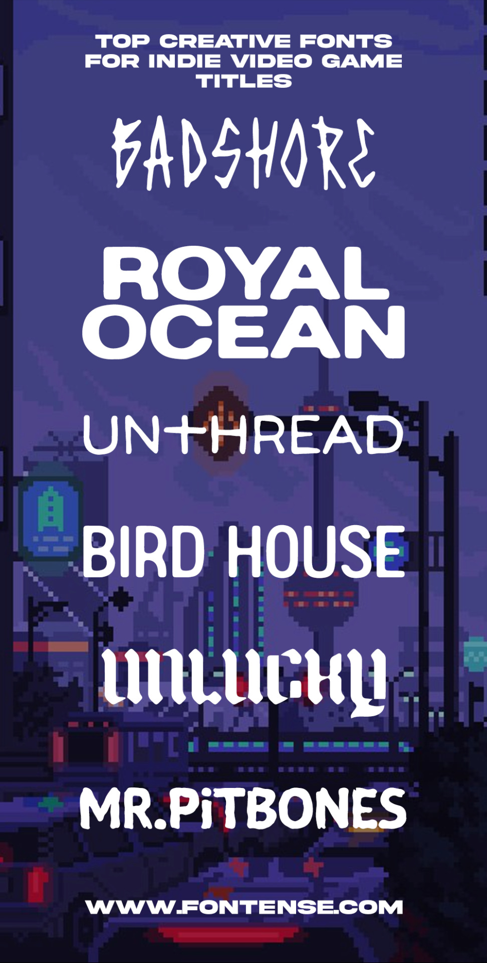
Looking for your indie video game title's logo? Look no more! We gathered the best creative fonts you need to make the best looking project! DOWNLOAD NOW!
#video game fonts#font bundle#decorative fonts#display fonts#blackletter fonts#vintage fonts#retro fonts#title fonts#bold fonts#grunge fonts#handmade fonts#indie fonts#spooky fonts#creepy fonts
3 notes
·
View notes
Link

A free public domain licensed vintage, decorative, Biting My Nails – designed by Typodermic Fonts of Japan between 1996 and 2001. The font would be suitable for use on headlines, titles, displays, flyers & posters, creative and artistic works. The font is free to use for most use cases, (see the license for exact details) including; commercial, non-commercial, and personal works under the CC0 Public Domain license.
https://www.apaintingfortheartist.com/2023/09/17/a-free-public-domain-vintage-decorative-font-biting-my-nails-typeface/
#fonts#free fonts#free#public domain#creative commons#typography#typefaces#decorative font#commerical fonts#free commerical fonts#free personal use fonts#vintage fonts#vintage#cc0 fonts#otf fonts#poster fonts#headline fonts#display fonts
4 notes
·
View notes
Text
Display Font | Koplexs Studio

ELASTRO Display Font
google fonts, google typography, free fonts google, display fonts, fonts for display, font display, font-display, best google fonts, google fonts best, best fonts google, best of google fonts, fonts display, font displays, font for display, display font free, font display free, display free font, free display font, display fonts free, display free fonts, instagram fonts, a cursive font, cursive a font, cursive fonts, cursive i font, font cursive, font for cursive, fonts cursive, i in cursive font, instagram font, cursive generator, cursive maker, cursive script generator, font generator cursive, cursive font generator, font cursive generator, fonts cursive generator, fonts for instagram, instagram bio fonts, cursive font in word,
0 notes
Text

early morning reading scientific journals or whatever
#jayvik#jayce talis#viktor arcane#arcane viktor#jayce arcane#display fonts are: Volt Deco | Monterio Modern | Serendior
663 notes
·
View notes
Text
Since the semifinalists are all basic serifs, let's do a showcase of some honorable mentions.


And one for me.

#i almost want to do another tournament of only display fonts#but that might be too much work for me
183 notes
·
View notes
Note
They turned my boy into Gary...
tbh it was kind of liberating because if the devs themselves can fall to the ol' gary keytrap, then i, too, can sometimes let my mortal follicles flow downward, and allow myself to lettersmash about gary and/or kary in my accidental overenthusiasm
#feesh answer#sleepless fun fair#i feel like the whole english speaking fandom saw that typo and pointed with :O#me too devs. me too.....#we are but foolish mortals. subject not only to terms and conditions#but occasionally even typos#for some reason i imagine a translator aggressively typing on their phone#working remotely on a train somewhere because the deadline for the event transcription is coming up#but they'r ein a bit of a pickle. a rush? an unfortunate schedule of events and mishaps?#maybe they would normally be flanked by 3 giant screens displaying their text in different fonts#so they could catch mistakes as they proofread#but this time there are demands at inopportune moments#and now they're typing up a game dialogue on a tiny ancient phone#and of course your stupid fat fingers are gonna mash the tiny on-screen keyboard inaccurately when you're in Circumstances#so they accidentally let a Gary go through (cursed autocorrect) when they submitted their work#and every other translator was also perishing. or they were responsible for separate segments#so anyway this Gary makes it to us. The Masses.#and we collectively go :O!!!!!#and the translator is slapping their forehead somewhere like. omg. why didn't anyone catch that#did they seriously not have anyone proofread my work?? are we that shortstaffed???? do i have to do everything around here?!#how could i have let a Gary slip through.... orz#it's ok... we all let a gary slip through sometimes...
28 notes
·
View notes
Text

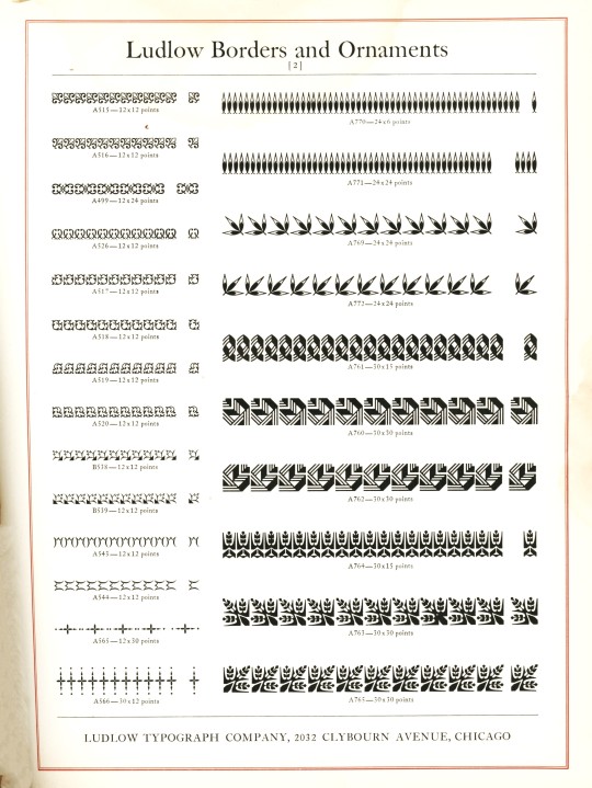


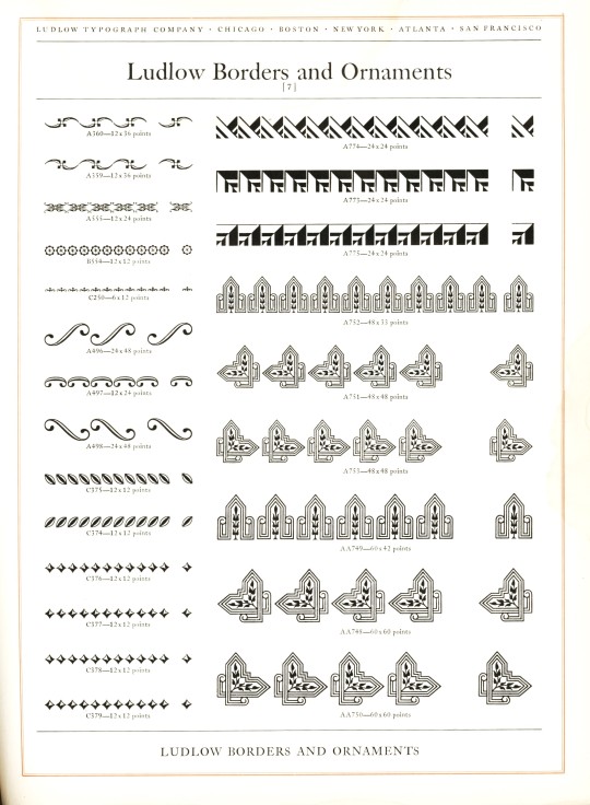

Typography Tuesday
LUDLOW ORNAMENTS
Today we present some Ludlow ornaments and borders from Ludlow Typefaces: A Specimen Book of Matrix Fonts, circa 1940. The Ludlow Typograph Company was founded in 1906 by William I. Ludlow and William A. Reade to manufacture and distribute a typecasting and composing system to compete against Linotype. You can read much more about the Ludlow Typograph and its composing system in our previous post from this specimen book.
View our other Typography Tuesday posts.
#Typography Tuesday#typetuesday#Ludlow Typograph Company#Ludlow ornaments#Ludlow Typefaces: A Specimen Book of Matrix Fonts#type ornaments#Type specimen books#type display books#type specimens#specimen books#20th century type
70 notes
·
View notes
Text


Echo Ethnic font designed by HIRO std
#decorative#fonts#typography#design#webdesign#display#font#type#typeface#lettering#brand#branding#branddesign#brandingdesign#bookcover#bookcoverdesign#magazinecover#magazinecoverdesign#gamedesign#gamedev#gamedevelopment#tshirt#tshirtdesign#logodesign#ttf#otf
19 notes
·
View notes
Text
My design teacher basically told me that my final mock-up looked too emo 😔💔
#SHE SAID THE TEXT FONT ON MY DESIGN WAS TOO 'DARK' AND THAT MY SCHOOL WON'T LET ME DISPLAY IT IF I DON'T CHANGE IT#grrr I'm gonna have to spend more time designing a new logo 🥲#JUST TO CLARIFY I found this really funny when she told me#yapping
27 notes
·
View notes
Text


Wosker - Bold Font 🔥
https://www.behance.net/gallery/192478591/Wosker-Bold-Font
Wosker is a display font with bold and modern characteristics, suitable for your designs that require a strong, firm, clear design but still look modern, friendly and not stiff. Wosker font is ready to support your amazing designs
#bold font#futuristic font#strong font#Fat font#headline font#typography#font#sans serif font#display fonts#poster font#Graphic Design#Design Inspiration#Typography#Font Design#Logo Design#Creative Design#Visual Design#Graphic Art#Web Design#Poster Design#Minimal Design#Modern Design#Illustration#User Interface Design#User Experience Design#Digital Art#Branding Design#Magazine Design#Book Design#3D Design
6 notes
·
View notes
Text

Adorable cute font! Purchasable HERE!
2 notes
·
View notes
Text


Hello everyone! One of my primary love languages is gifts, so I’d like to give a gift to all of you to thank you for enjoying my random art and writing enough to follow me! I wish I could make something for everyone, but 800 is a lot. The entry period is one week and like six hours, and I’ll pick someone at random from the entries. Reblog this post with your favorite era of fashion in the tags to enter! :)
Have a lovely Christmas week!!
EDIT: now closed :)
#my art#sorta#you haven’t seen two of those animations yet#they were gifts this week! I just haven’t posted them yet#I’ve been having so much fun with procreate dreams you have no idea#that display font is called Authentic Romantic for those curious!
46 notes
·
View notes
Text
I spent the entire day formatting my ebook and all I can say is that I'm upset it's not showing up properly on my Kobo 😭
#i already contacted support to see if this is an issue with the file or an issue with ME#i'm kidding but it displays well with the books app on my mac#but when i try to open it on kobo using bookfunnel#it just… doesn't have the images centred and the fonts are gone 😭#at least the text messages and song lyrics display correctly!#yes this book has text messages AND made-up song lyrics#i think what upsets me the most is the images not being centred#but i'll figure it out tomorrow because right now i cannot see atticus in front of me#tari rambles
8 notes
·
View notes
Text


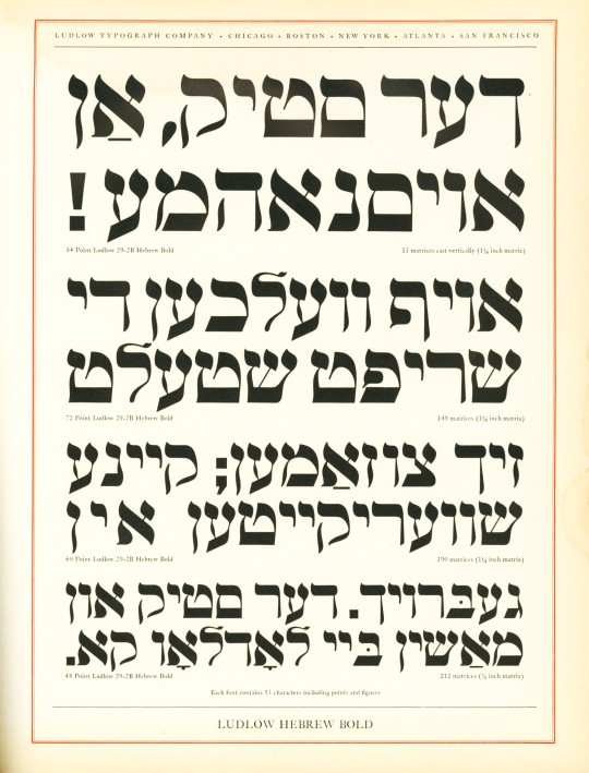

Typography Tuesday
Ludlow Fraktur and Hebrew
The Ludlow Typograph was one of the four major type composing systems that survived through the 20th century (the others were Monotype, Linotype, and Intertype), and numerous typefaces were designed specifically for its system. Today we show some Fraktur and Hebrew typefaces designed for the Ludlow Typograph.
German-reading peoples were the last group to relinquish the use of Gothic typefaces like Fraktur in the mid-20th century, and since, in our post-WWII imaginations, this kind of letterform is often associated with the Nazis (even though the Nazis themselves abolished it in 1941 after associating it with Jewish influences), it seems odd and even wrong to have it displayed along with Hebrew typefaces.
These specimens are displayed side by side in Ludlow Typefaces: A Specimen Book of Matrix Fonts, produced in Chicago around 1940, just before the Nazis jettisoned the use of Fraktur. The letterform itself has its roots in the late 12th century, and so has nothing to do with the National Socialist Party, except that the Nazis and all German-reading peoples used it until the 1940s because it was a letterform long associated with German national identity. And, of course, German Jews comfortably used Fraktur to read and write in German.
Read more about the Ludlow Typograph and its composing system in this post.
View some Ludlow ornaments and borders from this specimen book.
View our other Typography Tuesday posts.
#Typography Tuesday#typetuesday#Ludlow Typograph Company#Ludlow Typograph#Ludlow Typefaces: A Specimen Book of Matrix Fonts#Fraktur type#Hebrew type#Type specimen books#type display books#type specimens#specimen books#20th century type
38 notes
·
View notes