#type designers
Explore tagged Tumblr posts
Visit Tumblr Blog
Explore Tumblr blogs with no restrictions, modern design and the best experience.
Last Seen Tumblr Blogs


Fun Fact
In 2020, Tumblr had 29.4 million users in the US.
Text


Here are some typeface and monogram designs from the type specimen book Modern Lettering Design and Application edited by Herbert Hoffmann and translated from the German and printed in Germany for New York publisher William Helburn Inc. sometime in the 1930s. Shown here is the work of several noted German type designers and calligraphers, including Heinrich Jost, Rudolf Koch, Ernst Schneidler, Arthur Schulze, Anna Simons, and Emil Rudolf Weiss.
Our copy once belonged to the “Reference Section” of the General Society of Mechanics and Tradesmen of the City of New York, and and you can see its ownership stamp on the last image. This copy also bears the ownership stamp of Hayward Cirker the founder of Dover Publications.
View another post from this publication.
View our other Typography Tuesday posts.
#Typography Tuesday#typetuesday#Herbert Hoffmann#Modern Lettering Design and Application#Anna Simons#Rudolf Koch#Heinrich Jost#Ernst Schneidler#Arthur Schulze#Emil Rudolf Weiss#William Helburn Inc#General Society of Mechanics and Tradesmen of the City of New York#Hayward Cirker#type designers#20th century type
73 notes
·
View notes
Text
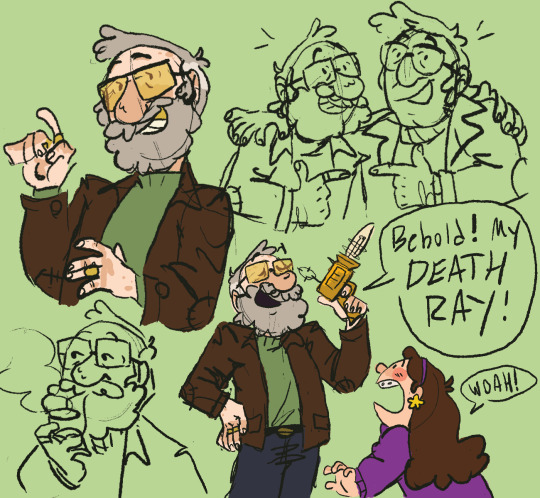
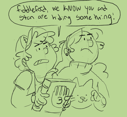

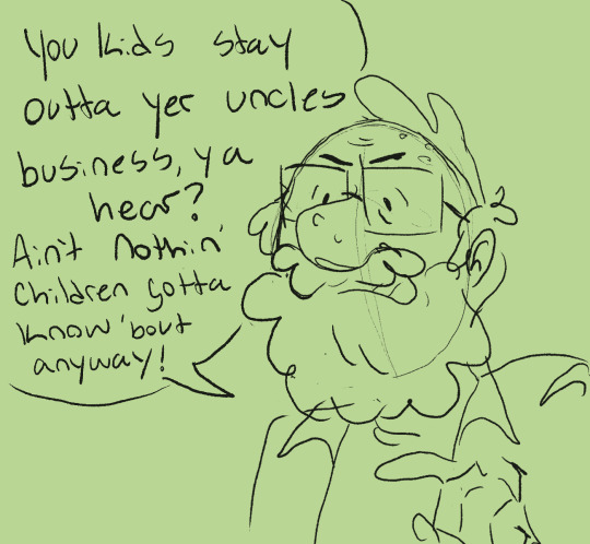
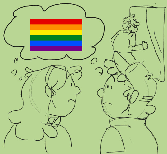
au where fiddleford decided to start forgiving and stop forgetting way earlier in his life and is just a cool guy that is bad at hiding the fact that he knows things
#i saw some people doing this and wanted to insert my own thing#because i like it a lot#like he's still a cooky mad scientist type#but he has memories and is less insane#gravity falls#fiddleford mcgucket#fiddleford hadron mcgucket#ford pines#stanford pines#dipper pines#mabel pines#gravity falls au#myart#character design#grunkle fidds
11K notes
·
View notes
Note
Okkkkkk so where is Chicken Miku?
Anon the way i dropped everything when i saw this

HATSUNE BEAK-U
(based on the Onagadori chicken breed)
#makenna made a thing#hatsune miku#chicken miku#onagadori#the roosters are the ones with the tails but that just opens this up for even more possibilities#is she trans? is she assigned hen at birth but went through spontaneous sex reversal like can happen to poultry if a hens ovary goes wonky?#it's up to you follow your heart miku can be anything#chickens#tiny fluffy dinosaurs#the BEST animals#artists on tumblr#birdblr#chickenblr#birds#this breed doesn't typically have this comb type but shhhh#vocaloid#yes i WILL chickenify your fictional celebrities!!#anon#ngl this was actually a really good character design exercise lol#does she dye her feathers? she'll never tell this is anime logic
9K notes
·
View notes
Text

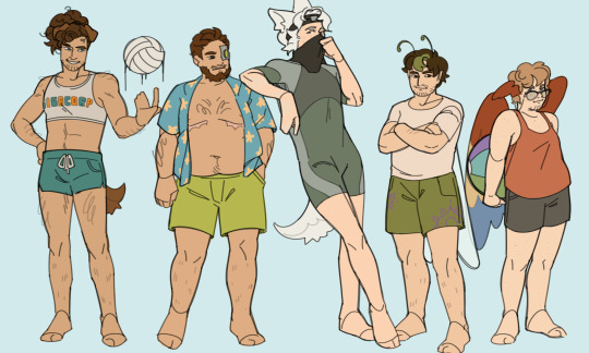
who do we think is winning the volleyball match
( the holiday sequel )
#needed to practice more body types so hermit beach day it is#it was fun designing the swimsuits tho (mostly for the gals. and ren)#hermitcraft#hermitcraft fanart#oh boy here we go#falsesymmetry fanart#stressmonster fanart#zombiecleo fanart#geminitay fanart#pearlescentmoon fanart#rendog fanart#iskall85 fanart#etho fanart#smallishbeans fanart#grian fanart#digital art#my art
3K notes
·
View notes
Text
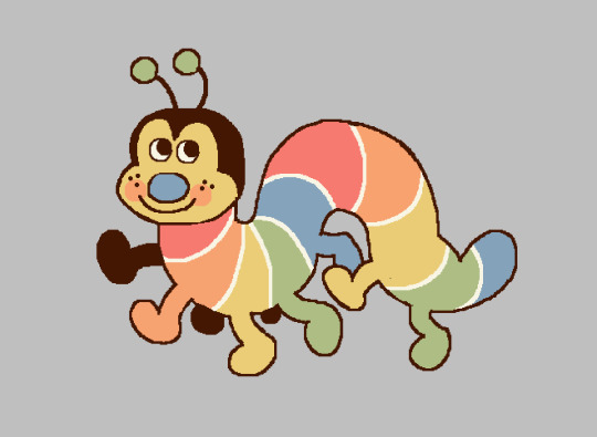
drawing with my mouse in ms paint during a zoom call earlier
#original#bugs#*the color scheme was picked from a grainy photo of a rainbow brite bed sheet set that enchanted me#i love more ''realistic'' cartoon bugs of course but this type of design is growing on me lately
3K notes
·
View notes
Text
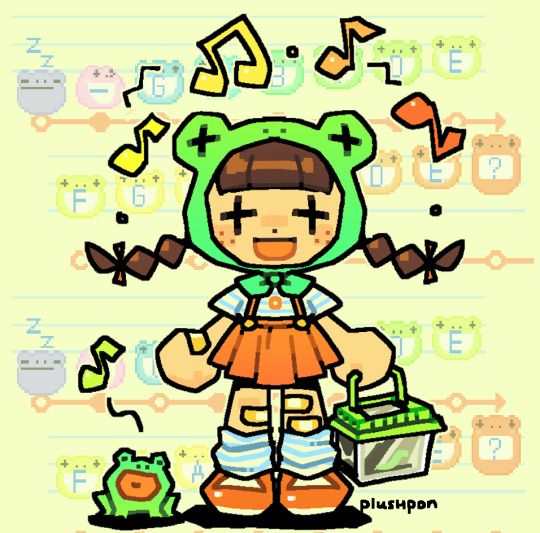
town tune! 🎵
#animal crossing#wild world#animal crossing wild world#acww#town tune#my art#art#our art#i like making gijinka type designs#summer always makes me think of animal crossing#so i wanted to capture that#character design#plushpon
4K notes
·
View notes
Text

ride the carousel!
#HES SOOOOOO CUTE CUTE CUTE!!!!! THE CUTEST PATOOTEST!!!!#i love drawing silver on trinkety objects. snow globes music boxes carousels ougghh i want him little and tiny in a big magical world. sigh#my brain chemistry goes NUTS for that type stuff its my favorite. its the customization the way they can be decorated for the char#SIGHS LOVINGLY. anyways. the bat and crocodile seats apparently do exist on some carosels! YAY! i ref'd them theyre so cyute#also wanted to give some simple riso vibes here#they go SO HARD!!!! robin owns a riso machine#id love to learn how to design for more elaborate ones someday i think itd be rly cool#twstファンアート#twst#twisted wonderland#twst silver#do the seats count. i dont quite think id get away w that here#suntails
2K notes
·
View notes
Text
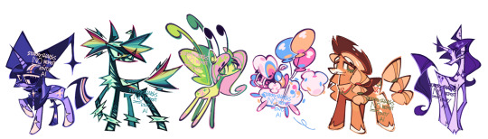
friendship is magic
closeups:
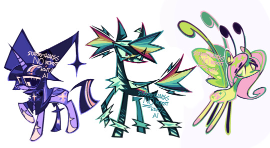
#zeno's art#my little pony#my litte pony friendship is magic#mlp#mlp fim#twilight sparkle#rainbow dash#fluttershy#pinkie pie#applejack#rarity#this was a fun redesign practice#tried to be diverse with body type and species as the og show is pretty limited (i understand why tho)#my personal favorites are rainbow dash and rarity#and twilight. i cooked tbh#i feel like a lot of redesigns just add accessories which is fine but i really wanted to change a lot#some more than others#also dashie is a half zebra and pegasus and fluttershy is half pegasus half those little bug ponies that showed up in one ep#pinkie is a sheep#i might do equestria girl designs and slash or some background pony redesigns#idk#enough ramble
6K notes
·
View notes
Text
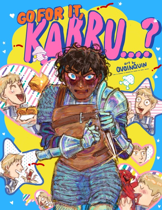
kabru has cute aggression but he refuses to acknowledge laios is cute so it might just be aggression
has this been done yet
#dungeon Meshi#dunmeshi#kabru#kabru dungeon meshi#labru#laios touden#laios dungeon meshi#avq art#hand drew the type because graphic design is not my passion and I could not b bothered
6K notes
·
View notes
Text
one of the best character types i think is insane man in a long fur coat
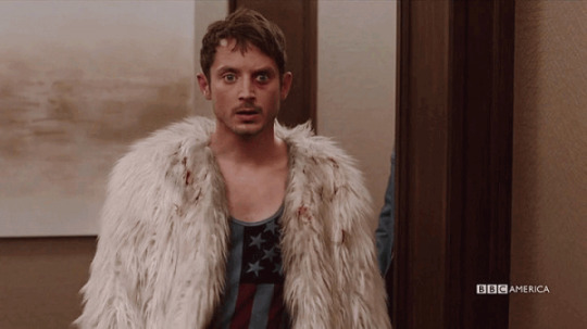
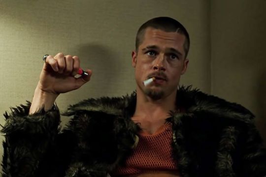

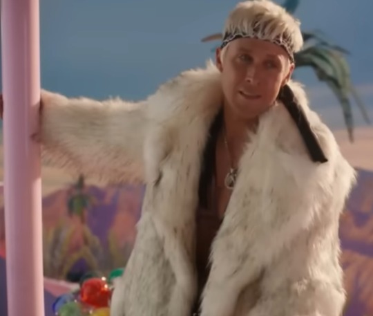
#character types#character design#character archtypes#dirk gently#dirk gently's holistic detective agency#dghda#todd brotzman#fight club#tyler durden#brad pitt#candyman#candyman 1992#candyman 2021#tony todd#barbie#barbie 2023#ken#ken barbie#ryan gosling#insane man#insane men
21K notes
·
View notes
Text


Arcanegifs' Arcane Season 2 (2024) Character Poll: Lest ↳ “If my mother gets what she wants, the whole city will suffer. And right now, you're the only one who can stand in her way.”
#i love her design so much most minor chars like scar finn etc they all got great designs UGHHH GORG (i'll also gif her ep4 scenes next time#arcane#arcaneedit#arcane season 2#arcane s2#lest#lest arcane#arcane lest#arcane league of legends#league of legends arcane#league of legends#type: gif#media: arcane#s2 ep3
1K notes
·
View notes
Text
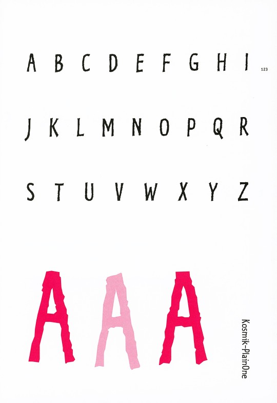
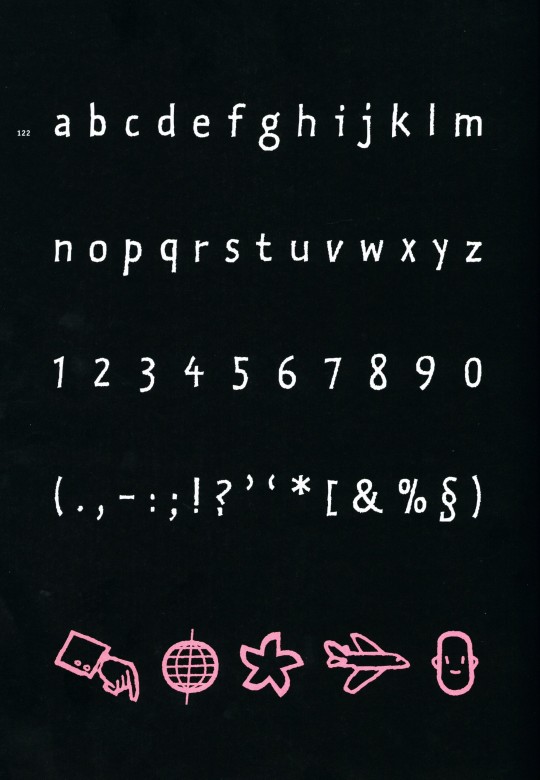
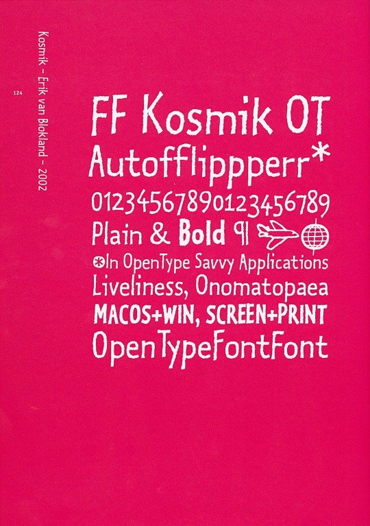
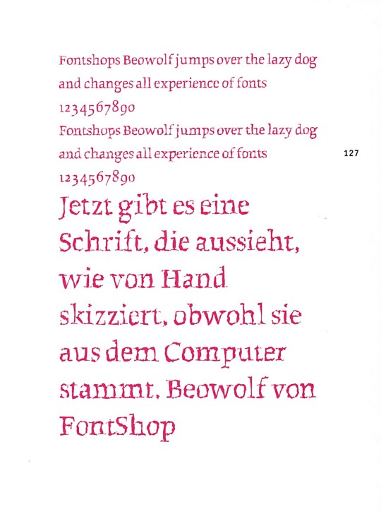
Typography Tuesday
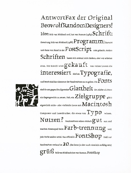
ERIC VAN BLOKLAND & JUST VAN ROSSUM
This week we present two typefaces by Dutch designers Eric van Blokland (b. 1967) and Just van Rossum (b. 1966), co-founders of the design firm, LettError. Both studied at The Hague Royal Academy (KABK) and were influenced by Dutch typeface designer Gerrit Noordzij. After graduation, they worked in Berlin at Erik Spiekermann's MetaDesign. They founded LettError in 1989.
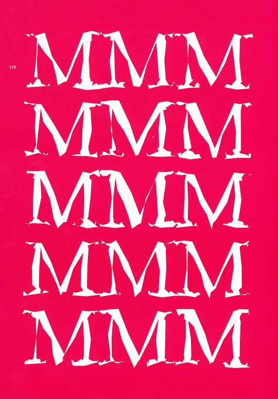
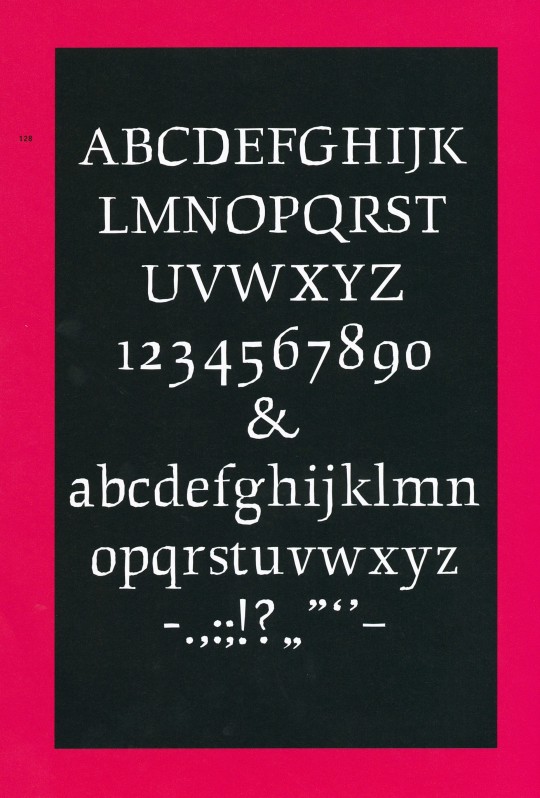
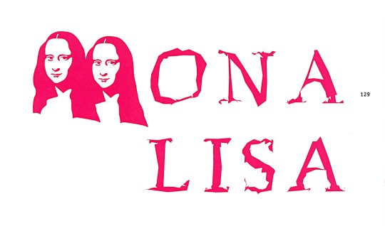
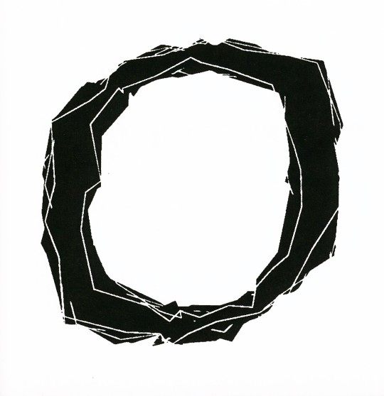
Both eschew traditional design approaches and rely on computer models and digital expression. As they say, "a font is a software instruction to a printer to perform a task." Together they designed the typeface Beowolf in 1990 and in 2002 van Blokland designed Kosmik, both of which are shown here. For Beowolf, they hacked Adobe's PostScript by adding a new function named "freakto," and the result was Times New Random, later renamed Beowolf, a typeface that changes while it is being printed. No two shapes are identical.
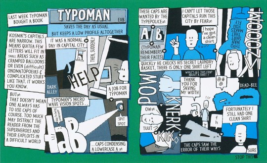
Kosmik is based on the hand-drawn letters van Blokland used in his comic strips. For this typeface, the designer used a new digital invention, the "flipperfont," a tiny program embedded in the font that ensures the printer randomly selects one of three available versions of each character.
These images come from our 2005 book Creative Type: A Sourcebook of Classic and Contemporary Letterforms by Cees W. de Jong, Alston W. Purvis, and Friedrich Friedl, and published by Thames & Hudson.
View another post from Creative Type.
View our other Typography Tuesday posts.
#Typography Tuesday#typetuesday#type designers#Dutch type designers#type design#Eric van Blokland#Just van Rossum#LettError#Beowolf type#Kosmik type#Creative Type#Thames & Hudson
17 notes
·
View notes
Text
fic idea: because of the circumstances around Clark’s birth, he’s hardwired into a lot of Kryptonian instincts that have been dormant in the previous generations of Krypton. namely, those aligned toward the protection of children (bred out long ago because it was too “distracting” and “painful” on Krypton, where fewer and fewer children were being born).
Superman always saves children first because of this, but he never fully recognizes the instinct until he watches Batman protect and calm down a child after a fight. Kryptonian instincts flare fully into life, as a mature adult with a prospective mate within the vicinity.
cue Clark following Bruce around starry-eyed, unable to help himself around a man with 8+ children he clearly, quietly, adores and a penchant for encountering injured and scared kids in his line of work. and as Bruce Wayne, who seems to have a kind of magnetism to him that leads kids at galas to him and sullen pre teens dragged along to cocktail hours to his side during networking.
#is this just a/b/o with extra steps? shhhhhh#batman#bruce wayne#dc#fic ideas#krypton#kryptonian#Kal-el#batfamily#clark kent#superman#look the man is crack cocaine to Clark’s instincts#krypton wired those out but Clark wasn’t a designer baby#he’s all of krypton concentrated into one imperfect perfect legacy#and that legacy#loves a single father working hard#superbat#treadmill thoughts#sorry yall I get bad ideas on the treadmill my brain gets too excited but I forget how to type or speak
1K notes
·
View notes
Photo
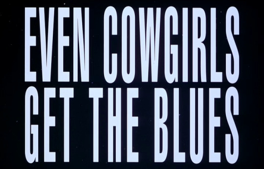
Gus Van Sant Even Cowgirls Get The Blues (1993)
3K notes
·
View notes
Text

Toshiba Magazine Ad, Adphic Co. Ltd Studio (1987).
IG
#editorial#design#graphic design#designer#graphic designer#typography#print design#typographic#type#graphics#editorial design#magazine#magazine layout design#editorial layout design#magazine design#poster design#visual design#design studio#illustration#flyer design#poster art#art#visual art#retro design#magazine layout
1K notes
·
View notes