#LettError
Explore tagged Tumblr posts
Visit Tumblr Blog
Explore Tumblr blogs with no restrictions, modern design and the best experience.
Last Seen Tumblr Blogs


Fun Fact
12.7% of mobile users access Tumblr.
Text
Typography Tuesday
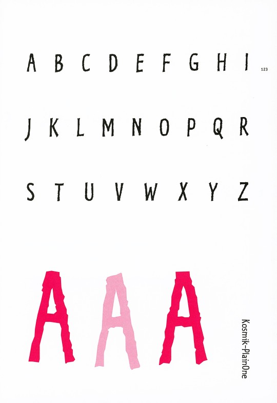
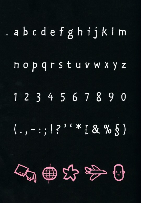
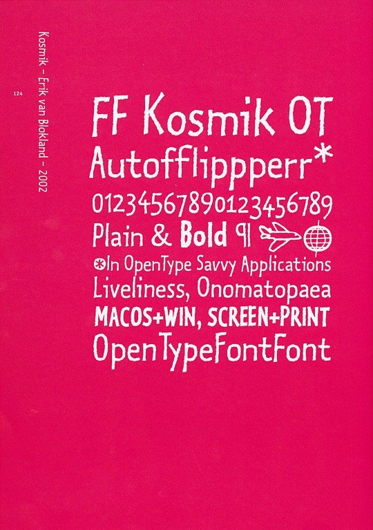
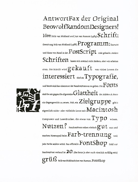
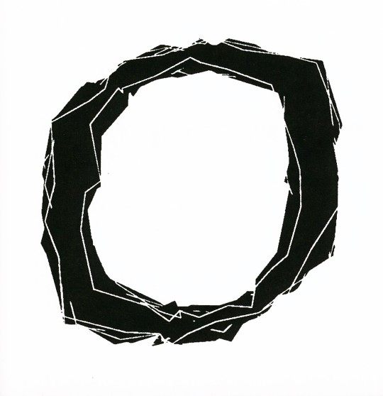
ERIC VAN BLOKLAND & JUST VAN ROSSUM
This week we present two typefaces by Dutch designers Eric van Blokland (b. 1967) and Just van Rossum (b. 1966), co-founders of the design firm, LettError. Both studied at The Hague Royal Academy (KABK) and were influenced by Dutch typeface designer Gerrit Noordzij. After graduation, they worked in Berlin at Erik Spiekermann's MetaDesign. They founded LettError in 1989.
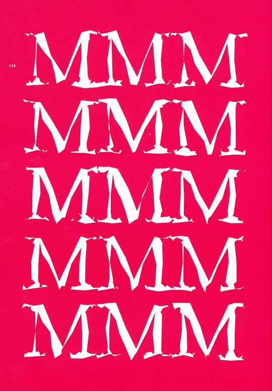
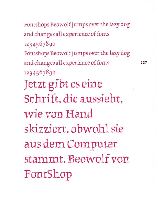
Both eschew traditional design approaches and rely on computer models and digital expression. As they say, "a font is a software instruction to a printer to perform a task." Together they designed the typeface Beowolf in 1990 and in 2002 van Blokland designed Kosmik, both of which are shown here. For Beowolf, they hacked Adobe's PostScript by adding a new function named "freakto," and the result was Times New Random, later renamed Beowolf, a typeface that changes while it is being printed. No two shapes are identical.
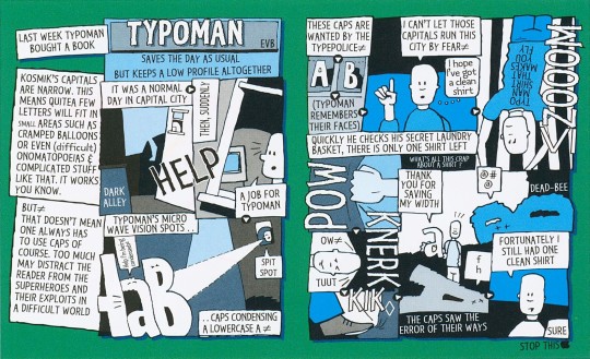
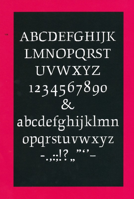
Kosmik is based on the hand-drawn letters van Blokland used in his comic strips. For this typeface, the designer used a new digital invention, the "flipperfont," a tiny program embedded in the font that ensures the printer randomly selects one of three available versions of each character.
These images come from our 2005 book Creative Type: A Sourcebook of Classic and Contemporary Letterforms by Cees W. de Jong, Alston W. Purvis, and Friedrich Friedl, and published by Thames & Hudson.
View another post from Creative Type.
View our other Typography Tuesday posts.
#Typography Tuesday#typetuesday#type designers#Dutch type designers#type design#Eric van Blokland#Just van Rossum#LettError#Beowolf type#Kosmik type#Creative Type#Thames & Hudson
18 notes
·
View notes
Photo

Y como dice la canción: "All you need is drugs" o como era? #letterror #lettering #letter #letra #caligrafía #calligrashit #calligraphy #calligrapher #calligang
26 notes
·
View notes


Photo

NBA typeface - The typeface used on the updated identity is Commercial Type’s Action Condensed designed by LettError, replacing a previous variety of sans serifs.
0 notes
Photo

Bitfonts by Letterror (Erik van Blokland, Just van Rossum): Their project involves computer codes that take the structure of a bitmap font and interpret it in multiple ways. By deciding to design the process rather than controlling the end result, Letterror embraces the possibilities of unexpected results.
0 notes
Text
New Post has been published on Lets Talk Social Media
New Post has been published on http://letstalksocialmedia.co/graphic-design-a-concise-history-second-edition-world-of-art/
Graphic Design: A Concise History, Second Edition (World of Art)


Buy Now!
$13.64
From its roots in the development of printing, graphic design has evolved as a means of identification, information, and promotion to become a profession and discipline in its own right.
This authoritative documentary history begins with the poster and goes on to chart the development of word and image in brochures and magazines, advertising, corporate identity, television, and electronic media, and the impact of technical innovations such as photography and the computer. For the revised edition, a new final chapter covers all the recent international developments in graphic design, including the role of the computer and the Internet in design innovation and globalization. In the last years of the twentieth century, at a time when “designer products” and the use of logos grew in importance, the role of graphic designers became more complex, subversive, and sometimes more political―witness Oliviero Toscani’s notorious advertisements for Benetton. Digital technology cleared the way for an astonishing proliferation of new typefaces, and words began to take second place to typography in a whole range of magazines and books as designers asserted the primacy of their medium. Designers and companies discussed here include Neville Brody, David Carson, Design Writing Research, Edward Fella, Tibor Kalman, Jeffery Keedy, LettError, Pierre di Sciullo, Tomato, Gerard Unger, Cornel Windlin, and a host of others. Over 800 illustrations, 30 in colorUsed Book in Good Condition
0 notes
Link
Some notes on the new 🤘ActionText https://t.co/yIhkNayhvd @commercialtype pic.twitter.com/zxpqIrqNqg
— LettError 😷 (@letterror) September 8, 2020
0 notes
Video
vimeo
Math, Logic, Design? with Just van Rossum from Type@Cooper on Vimeo.
This talk took place on July 10, 2017 in the Rose Auditorium at The Cooper Union as part of Type@Cooper's Herb Lubalin Lecture Series. The recording of this event was generously supported by Hoefler & Co.
In which Just van Rossum talks about code, letters, math, logic, design.
Just van Rossum graduated in 1989 at the Royal Academy of Fine Arts in The Hague, where he studied with Gerrit Noordzij. After stints at Monotype in the UK and MetaDesign in Berlin he became an independent type designer, focussing on software design for type. His collaborations with Erik van Blokland under the name LettError became well known and their FF Beowolf typeface has been included in the permanent collection of the MoMa in New York. His FF Lefthand typeface is as ubiquitous now as it was when it came out in 1991. He co-wrote RoboFog with Petr van Blokland in the mid-ninetees, which can be seen as a prerunner of RoboFont, and has been a very influential type design tool due to its groundbreaking scriptability with the Python programming language. His TTX/FontTools library is a crucial building block for lots of font software. He also wrote the original version of the DrawBot application. Lately, his “Daily DrawBot” project drew some attention with its mesmerizing animated gifs.
Just teaches type design and programming at the Royal Academy of Fine Arts (KABK) in The Hague, both in the regular graphic design course as well as in the Type & Media master program.
1 note
·
View note
Text
[letterror] So excited to see this! Congratulations @ThunderNixon and @googlefonts and the team that worked on this! @typemedia https://t.co/9Il4TV4zML
L T T R R R @letterror So excited to see this! Congratulations @ThunderNixon and @googlefonts and the team that worked on this! @typemedia twitter.com/GoogleDesign/s… from Twitter favorites feed for typemytype https://twitter.com/letterror/statuses/1194325716403400704
0 notes
Text
RT https://t.co/cGuidz5Hkc RT https://t.co/E67aPeie6k RT @letterror: How about adding pinball style flippers to the goals in a football table? Room for two more players! #pinball… https://t.co/jXTfPJxhqQ
RT https://t.co/cGuidz5Hkc RT https://t.co/E67aPeie6k RT @letterror: How about adding pinball style flippers to the goals in a football table? Room for two more players! #foosball #pinball… pic.twitter.com/jXTfPJxhqQ
— Mace Marquardt (@mace_marquardt) December 21, 2018
Source: @mace_marquardt December 21, 2018 at 02:11PM More info Best Foosball
0 notes
Text
[GET] Top 100 Best Fonts of All Time
http://www.tradingprotoolsnews.com/2018/02/18/get-top-100-best-fonts-of-all-time/
1. Helvetica [1957 - Max Miedinger] 2. Garamond [1530 - Claude Garamond] 3. Frutiger [1977 - Adrian Frutiger] 4. Bodoni [1970 - Giambattista Bodoni] 5. Futura [1927 - Paul Renner] 6. Times [1931 - Stanley Morison] 7. Akzidenz Grotesk [1966 - Günter Gerhard Lange] 8. Officina [1990 - Erik Spiekermann] 9. Gill Sans [1930 - Eric Gill] 10. Univers [1954 - Adrian Frutiger] 11. Optima [1954 - Hermann Zapf] 12. Franklin Gothic [1903 - Morris Fuller Benton] 13. Bembo [1496 - Francesco Griffo] 14. Interstate [1993 - Tobias Frere-Jones] 15. Thesis [1994 - Lucas de Groot] 16. Rockwell [1934 - Frank H. Pierpont] 17. Walbaum [1800 - Justus Walbaum] 18. Meta [1991 - Erik Spiekermann] 19. Trinité [1982 - Bram De Does] 20. Din [1926 - Ludwig Goller] 21. Matrix [1986 - Zuzana Licko] 22. OCR [1965 - American Type Founders] 23. Avant Garde [1968 - Herb Lubalin] 24. Lucida [1985 - Chris Holmes / Charles Bigelow] 25. Sabon [1964 - Jan Tschichold] 26. Zapfino [1998 - Hermann Zapf] 27. Letter Gothic [1956 - Roger Roberson] 28. Stone [1987 - Summer Stone] 29. Arnhem [1998 - Fred Smeijers] 30. Minion [1990 - Robert Slimbach] 31. Myriad [1992 - Twombly & Slimbach] 32. Rotis [1988 - Olt Aicher] 33. Eurostile [1962 - Aldo Novarese] 34. Scala [1991 - Martin Majoor] 35. Syntax [1968 - Hans Eduard Meier] 36. Joanna [1930 - Eric Gill] 37. Fleishmann [1997 - Erhard Kaiser] 38. Palatino [1950 - Hermann Zapf] 39. Baskerville [1754 - John Baskerville] 40. Fedra [2002 - Peter Bil'ak] 41. Gotham [2000 - Tobias Frere-Jones] 42. Lexicon [1992 - Bram De Does] 43. Hands [1991 - Letterror] 44. Metro [1929 - W. A. Dwiggins] 45. Didot [1799 - Firmin Didot] 46. Formata [1984 - Bernd Möllenstädt] 47. Caslon [1725 - William Caslon] 48. Cooper Black [1920 - Oswald B. Cooper] 49. Peignot [1937 - A. M. Cassandre] 50. Bell Gothic [1938 - Chauncey H. Griffith] 51. Antique Olive [1962 - Roger Excoffon] 52. Wilhelm Klngspor Gotisch [1926 - Rudolf Koch] 53. Info [1996 - Erik Spiekermann] 54. Dax [1995 - Hans Reichel] 55. Proforma [1988 - Petr van Blokland] 56. Today Sans [1988 - Volker Küster] 57. Prokyon [2002 - Erhard Kaiser] 58. Trade Gothic [1948 - Jackson Burke] 59. Swift [1987 - Gerald Unger] 60. Copperplate Gothic [1901 - Frederic W. Goudy] 61. Blur [1992 - Neville Brody] 62. Base [1995 - Zuzana Licko] 63. Bell Centennial [1978 - Matthew Carter] 64. News Gothic [1908 - Morris Fuller Benton] 65. Avenir [1988 - Adrian Frutiger] 66. Bernhard Modern [1937 - Lucian Bernhard] 67. Amplitude [2003 - Christian Schwartz] 68. Trixie [1991 - Erik van Blokland] 69. Quadraat [1992 - Fred Smeijers] 70. Neutraface [2002 - Christian Schwartz] 71. Nobel [1929 - Sjoerd de Roos] 72. Industria [1990 - Neville Brody] 73. Bickham Script [1997 - Richard Lipton] 74. Bank Gothic [1930 - Morris Fuller Benton] 75. Corporate ASE [1989 - Kurt Weidemann] 76. Fago [2000 - Ole Schafer] 77. Trajan [1989 - Carol Twombly] 78. Kabel [1927 - Rudolf Koch] 79. House Gothic 23 [1995 - Tal Leming] 80. Kosmik [1993 - Letterror] 81. Caecilia [1990 - Peter Matthias Noordzij] 82. Mrs Eaves [1996 - Zuzana Licko] 83. Corpid [1997 - Lucas de Groot] 84. Miller [1997 - Matthew Carter] 85. Souvenir [1914 - Morris Fuller Benton] 86. Instant Types [1992 - Just van Rossum] 87. Clarendon [1845 - Benjamin Fox] 88. Triplex [1989 - Zuzana Licko] 89. Benguiat [1989 - Ed Benguiat] 90. Zapf Renaissance [1984 - Hermann Zapf] 91. Filosofia [1996 - Zuzana Licko] 92. Chalet [1996 - House Industries] 93. Quay Sans [1990 - David Quay] 94. Cézanne [1995 - Michael Want, James Grieshaber] 95. Reporter [1938 - Carlos Winkow] 96. Legacy [1992 - Ronald Arnholm] 97. Agenda [1993 - Greg Thompson] 98. Bello [2004 - Underware] 99. Dalliance [2000 - Frank Heine] 100. Mistral [1953 - Roger Excoffon]
1 note
·
View note
Photo

Ejercicio rápido aplicando los parámetros de #typecooker de @letterror . Esto ayuda a quitar el estrés
0 notes
Photo

Mister Serckas Fontsek! Caligrafía. #caligrafía #calligang #caligraphy #calligraphy #calligrapher #letra #letter #lettering #letterror (en Oaxaca, Mexico)
0 notes
Photo


0 notes
Photo

La NBA y su leve rediseño
Sin cambios desde 1969, año de su creación, la marca NBA retoca ligeramente identidad corporativa.
El estudio neoyorquino OCD | The Original Champions of Design se ha encargado de la imagen de la NBA, diseñada en 1969. Para hacerlo contaron con la fundición Commercial Type y Erik van Blokland, que adaptaron Action, una tipografía creada originalmente para la web de Letterror.

Para que los nuevos identificadores gráficos se vean mejor en pantalla se ha buscado una nueva tipografía con la misma taxonomía y morfología de la original. Action, una familia tipográfica cuya peculiaridad más llamativa es que todos los caracteres, en todos los pesos de la familia, ocupan el mismo espacio.


0 notes
Link
Hey @apple please fix this in your materials and engineering. Thanks, everyone. pic.twitter.com/rTKc0MLVfS
— L T T R R R (@letterror) September 9, 2018
0 notes