#tutorials: all.
Explore tagged Tumblr posts
Text
A quick tutorial on how to Download Fics from AO3
After making this poll about the panic that comes when Archive of Our Own goes down, there seems to be a chunk of folks who didn't know they could download fics for offline use, or don't know how to go about it. Here's a quick tutorial for that.
You do not need an AO3 account (unless the fic you are trying to download is restricted to AO3 users only) you only need an internet connection and a device to download to, whether it's PC or a phone.
These instructions work for both desktop and mobile. At the top of the fic, where the chapter index is, there will be the download option on the right side, and an 'Entire Work' button the left side.

For One-Shots: Go ahead and click the download button.
For multiple chapter fics: In order to have the fic download all together instead of downloading each chapter individually, make sure you select the 'Entire Work' button. Like the names says, it displays the entire work on the webpage, and will download the entire fic with all it's chapters in the correct order when you go to download.
Archive of our Own will automatically download the entire fic work now instead of chapters.
Click the download button. You've got a couple of options:
What these options mean:
AZW3 - Amazon-developed ebook format that is designed for Kindles and Amazon's systems. Good if you want to read off of a kindle.
EPUB - Standard file format for Ebooks and is basically used as the default for pretty much most ebook readers. This is what I prefer to use when downloading to my phone.
MOBI - An older version of the AZW3. Older but standard as well.
PDF - Downloads the fics as a PDF. Can be read anywhere you can open a PDF.
HTML - Downloads an offline version of the exact webpage you are looking at. Fine if you want to keep the 'look' of AO3 but you can't change the text size or reading style like you can with ebook formats.
Not sure which one to download? Use EPUB since it's standard and readable by pretty much everything, retains images too.
You now have your fic downloaded to your device and can read it on whatever reading app you have. YAY!
Do keep in mind that these are offline files that do not synch with Archive. So if you download an ongoing fic that updates or is edited since you last downloaded, you will need to download it again to have the updated version.
I highly encourage you download your fics if you are able. Worst case scenario, if AO3 goes down for an indefinite amount of time or the author deletes or hides it, you still have it. (Only download, not distribute.) Best case scenario, you have saved yourself an inconvenience for later.
Happy Reading!
#ao3#archive of our own#download fics tutorial#fandom culture#idk what else to tag this as whoops#i download my own fic a lot so when im out i can reread and check for errors without actually having to be at my pc#edit: they might have changed the download to automatically download the whole fic#but im still downloading single chapters on pc in some formats so cant say for all of them
3K notes
·
View notes
Text
In the past, people in the Animal Crossing community would make fun of Tom Nook as a sleazy landlord. Since then, he's really rehabilitated his image as this 'heart of gold' businessman (he's the one who puts bells and furniture in trees for you to find! he adopted orphans! he donates to charity!), but New Horizons genuinely paints the most devious version of him.
He's successfully privatized settler colonialism: you pay HIM to move to a "deserted island" (which apparently the oceans in the AC world are just full of) and start a colony that he is directly invested in. At best he's running a weird vacation package scam (you arrive on the island with no money and in debt for "using his services"). At worst, he's using you to set up company towns. For god's sake, he literally has his own fake currency that he forces you to use to pay off your debt. But don't worry, he's repackaged it in a way that definitely doesn't sound like an MLM scam: the Nook Mileage Program!
You're no longer just his tenant or his temporary part-timer, you're his business lackey. The entire tutorial section of the game has you spending actual weeks running around completing tasks and doing hard labor to set up his colony. You're even tasked with preparing his properties and finding buyers for them. No, you aren't a tenant anymore. You work for the landlord. You are directly responsible for finding tenants for him. And he doesn't even fucking pay you. Not for setting up town hall and museum, or his nephew's shop –– which is the ONLY store on the entire island that sells necessities –– or bringing KK Slider to town, or helping populate his town. Not a single cent. No, actually, you have to pay HIM to BUY infrastructure like bridges and stairs and park benches. And all the while, he's telling you're the "resident representative"; you get to call the shots! That the reward is the community's progress. That what you're doing is in everyone's best interest (but most importantly, his).
Since NH's release, people have done a lot of legwork to say that Tom Nook isn't a capitalist while the game shows him at his very worst. He owns the only general store in town. You're forced to use a phone that he modified and branded as his own. Buy Nook-branded furniture and merchandise at the self-serve kiosk in the town hall, a governmental building! There's no conflict of interest here!
But hey, if you're tired of being the landlord/business mogul's goon, you can also find work as a deluxe resort home designer for a company that also pays you in their special company currency that can only be used to buy their products instead of a real salary! Because that's what the Animal Crossing franchise needs! More vacation homes!!!
#this is a really long winded way to say i really really really really hate new horizon's storyline and player role#i really hate that not only your house but the entire TOWN. the whole COMMUNITY you're a part of is owed to tom nook's business#i really hate the “vacation getaway package” angle because it shows just how commercialized the entire premise of nh is#and how lost the game is in its original core concept#animal crossing is about the experience of moving to a new town and becoming a part of that community#just to compare: all past ac games have a similar opening#you're on a bus or train or taxi to someplace new. a stranger strikes up a conversation and you get to know them before arriving#new horizons opens with you at customer service desk filling out an client application before a flight.#in prev games working for nook in the tutorial is meant to be demeaning. you want it to be over with so you can actually start living life#but in new horizons working for tom nook IS your life. and it's so rewarding! don't you feel rewarded?#you aren't a person. you aren't a new neighbor. you're tom nook's client. and then his unpaid employee. and the game insists it's fun to be#that's how void the game is#because it's bad enough that a rpg life sim got turned into a sandbox game where you have to build the town yourself#but the only reason why you're building it is because the landlord who you're in debt to TOLD you to build it.#everything is a rewards program! everything is a tour service! be sure to do your daily tasks to earn nook bucks to spend on nook merch!#that really sucks imo.#i mean. the entire game is based around the vacationing industry. of course it all feels fake and temporary. it's only a vacation.#long post#rant#not art#god the fact that your starter villagers can't even decide where to live you have to decide for them#i've never played a game that does the opposite of handholding#where instead it's the PLAYER who has to handhold the npcs through everything. and newsflash!! it's really exhausting and boring
3K notes
·
View notes
Text


i got it!
(og panels below!!)
HAPPY BIRTHDAY SIFFRIN!!! <- i say, scheduling this to post at midnight september 2nd. it’s his birthday somewhere!! and also loops birthday but look i had a deadline here. don’t ask why This of all things is their birthday art. i make normal choices!!!
also. somehow this entire thing only took 4 and a half hours??? insanity. i literally started this Today. thats how it Gets Me i suppose. anyways!!!! here’s the og panels!! no colored version this time, i didn’t think it’d fit the scene. also i didn’t want to render 3 colored panels.


#marshdoodles#isat#in stars and time#isat spoilers#shoutout to the 2 people on discord who immediately wished to be the tutorial sadness when i posted this#honestly . i get it.#we were out all day today and i STILL managed to get this done somehow#i dont think i can call myself a slow artist anymore#part of me wanted to make a happy birthday edit of this in the same vein as the merry christmas edit but#it is. 10pm. and i am sleepy#no cake for him
2K notes
·
View notes
Text
SONIC POSING NOTES!!!!! !!
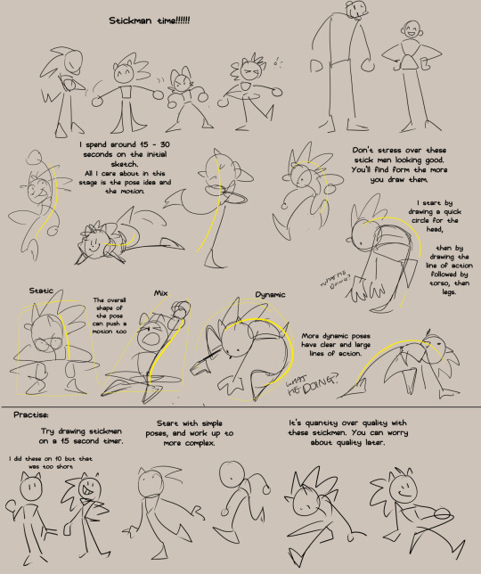
Just gonna repost this image because it is relevent. Once you got your stick man pose you can add those shapes on top.

Anyways, more notes, this time on the base shapes.

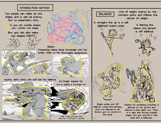

And that's all that came to mind. I'm working on an expession one too, they've been pretty fun to make.
#tutorial#pose tutorial#sonic the hedgehog#my doodles#don't believe for a second i implent all of this into every pose#my brain would explode
5K notes
·
View notes
Note
If you don't mind my asking, how do you go about drawing fat? :3
JUST THE EXCUSE I WAS LOOKING FOR
So, for me personally, a lot of the time when I draw fat characters, I'm not looking to specifically capture the specifics of fat as much as the feel of fat. Bulkier, rounder shapes in the right places that has a feeling of weight to em! A lot of that is intuition and simplification at this point, but it all works on the same frame as just any ol' person. Like take this-

For example. This is the basis for any body shape, not just the more average one that it may imply. Sure- it can be that average body shape:
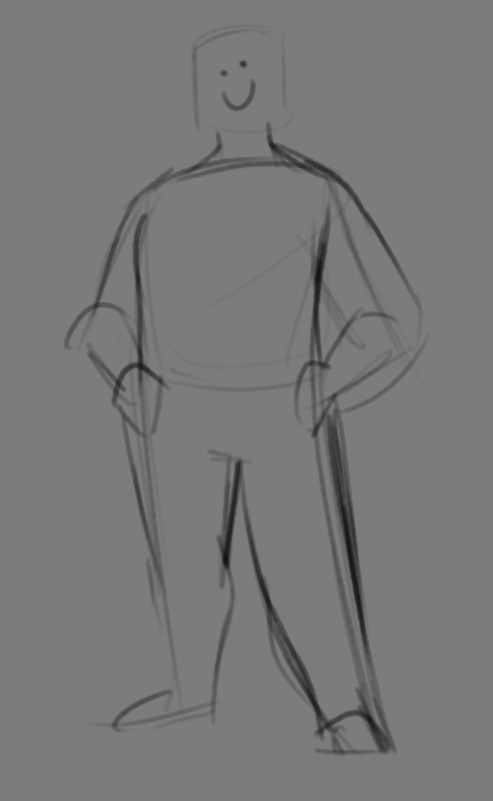
But also a fat one too!

And a big part of that is knowing where fat usually tends to bunch up on the body, so lets take a look piece by piece! (Please keep in mind this is very simplified, and not completely precise in some parts)
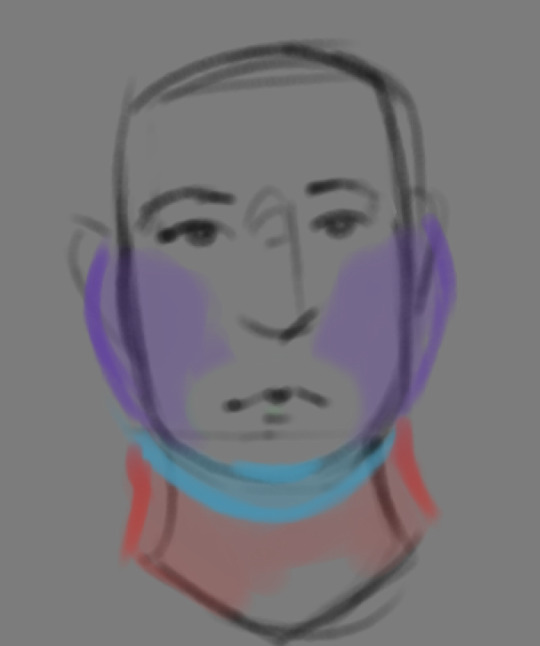

THE FACE: Cheeks (in purple) and especially the chin (in light blue) are the places where a lot of the fat is gonna wanna gather and round out on your face! Additionally, theres a small pocket of fat beneath the cranium on the backside of your head. It's small, but it is there. I believe fat can build up elsewhere like the bridge of your nose and forehead, but generally speaking, you're gonna have a whole lot more buildup in other places first.
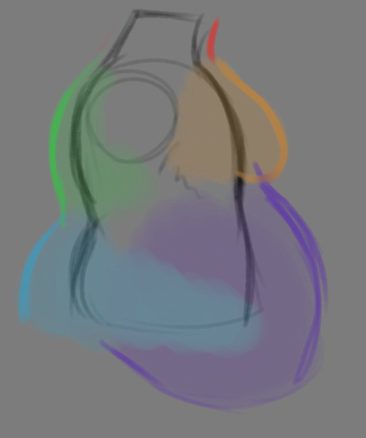
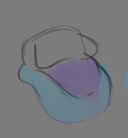
THE TORSO: A lot of the fat built up on the torso is gonna be sent to your tummy. More cushioning for vital organs, mostly out of the way, it just makes sense. Additionally, the lower backs fat builds up and joins with a patch of fat on your sides that forms what is typically referred to as the love handles to make that double belly look. Along with this, the immediate next target for the torso is the breasts, followed by the upper back!
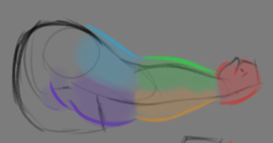
THE ARMS: For this limb, a VERY notable amount of the fat present builds up on the tricep and bicep areas, lessening once you get towards the flexor and extensor areas. You can almost think of the arm as a sort of triangular shape, wide side starting from the shoulder and tapering towards the hand, which itself mostly builds up fat around the back of the hand and the fingers. The shoulders themselves don't build up too much fat unless you got a lot
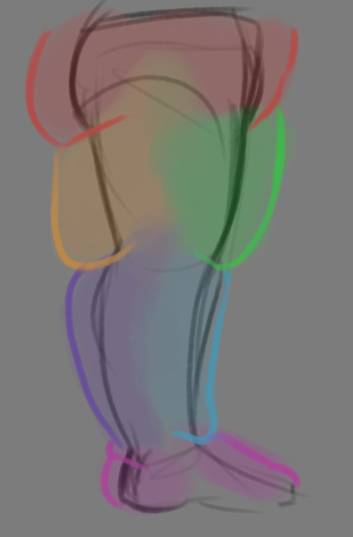
THE LEGS: And finally, you can think of the legs having pretty similar curves to what you're probably already used to thinking. The front of the thighs getting a big buildup, along with the back of the calves, the other parts being flatter in turn. As far as the feet go- similarly to the hands, the top of the feet, along with the heels get most of the buildup, as fat on your soles would impede mobility. The glute, hip and crotch area will also especially build up fat, lending to the same triangular shape that you can see in the arm!
A big thing to note with fat is that it tends to taper off towards joints. Your knees, elbows, shoulders, hips, and all the other places are gonna have significantly less fat so that you remain mobile and flexible, as that's important!
Now that we have an idea of where fat builds up on the body, you might have something that looks kinda like this
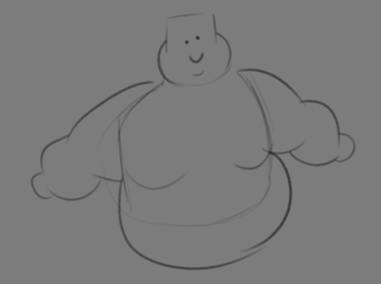
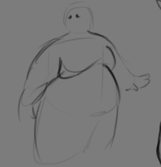
Which yes, does demonstrate a solid understanding of the places fat builds up, lacks the weight you're probably trying to convey, which brings us to out next point! Fat is well... heavy! Gravity is what gives fat much of it's shape, especially as you tread towards larger and larger bodies.
This is demonstrated really well on the arms especially-


Those big ol' bits of fat'll really start to sag when left hanging, and they will squish like hell if they run into something. I like to think of these bits of fat as big ol' ovals that squash and stretch depending on if there's an obstacle in their way or not


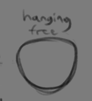
These are the important shapes to remember when it comes to the weightiness of fat! If you take all of this into mind, you should be getting something a lot closer to that shape you've been after!

Oh, and always remember that fat bodies come in all variety of shapes and sizes! Play around with a whole lot, and seek out all the resources you can! it'll really lend to your knowledge when it comes to this kinda stuff!
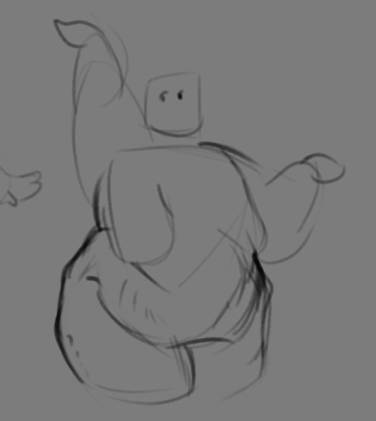
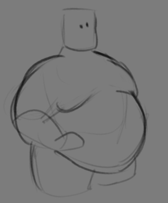
And as I always recommend when it comes to learning art- look at what your favorite artists do with fat bodies. See what you really like about the fat bodies they draw and try to replicate it in your own work, I promise you it's one of the most helpful things ever.
This is like the most basic of basics when it comes to drawing fat bodies though. If there's any additional thing about fat bodies, or maybe you want clarification on something, don't be afraid to ask! If there's enough to cover, I'll make an addition to this post!
#hat answers#my art#design talk#tutorials#yeah im unfortunately pretty tired so this gets a liiiitle rambly at the end but i think this covers like the basic basics#i hope this was helpful at all#and again dont be afraid to ask questions and stuff#if theres enough traction/questions on this i will most definitely try to clear up as much as i can in an addition to the post#whoops this took a bit!
3K notes
·
View notes
Text
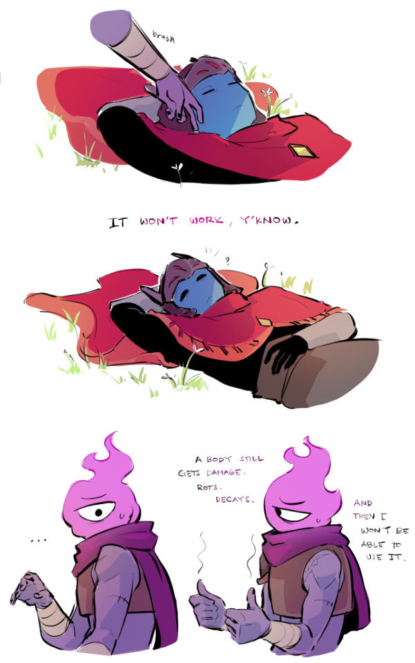
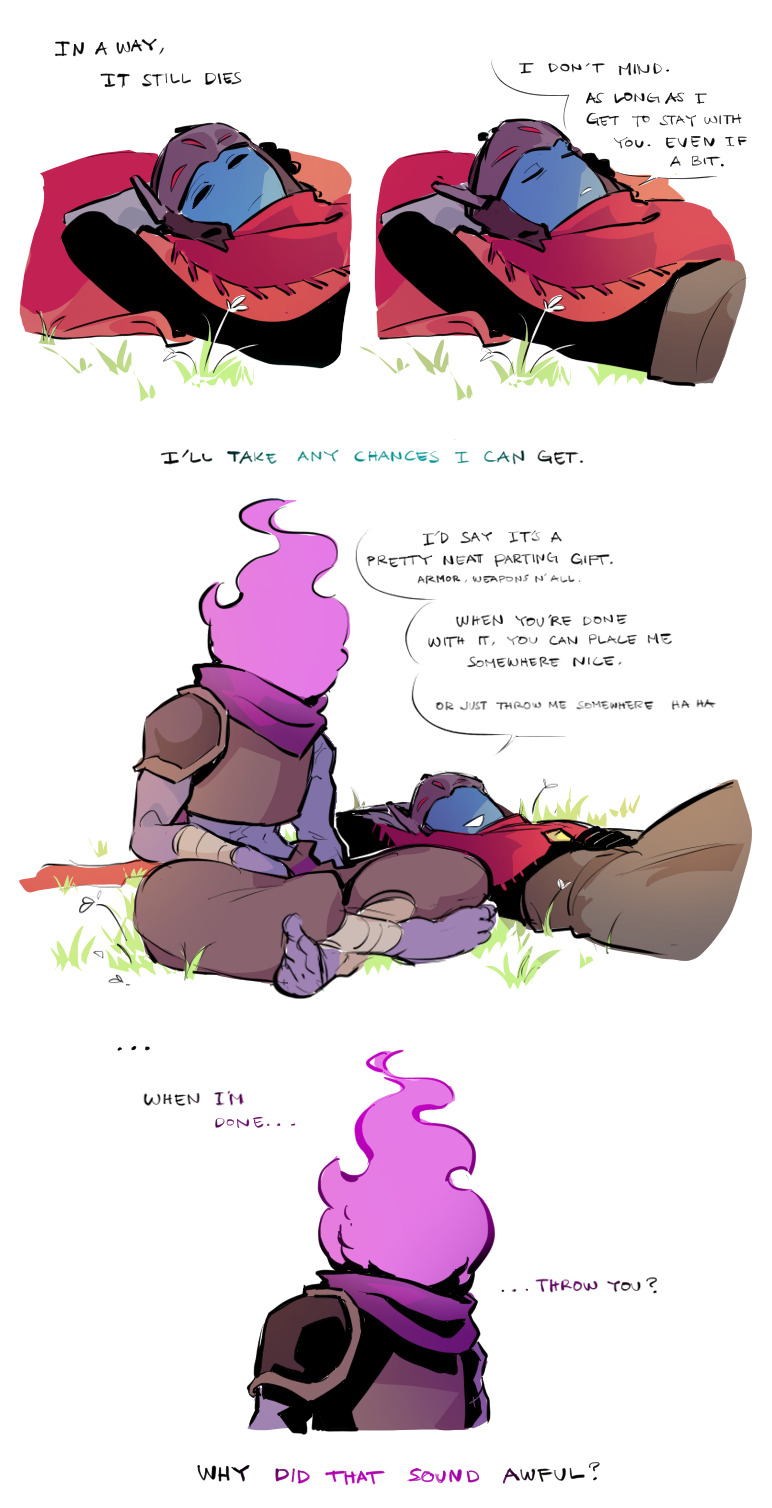
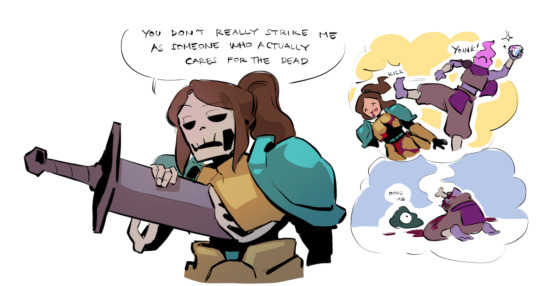
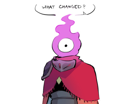
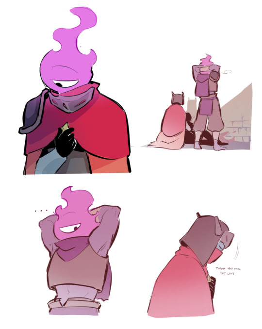
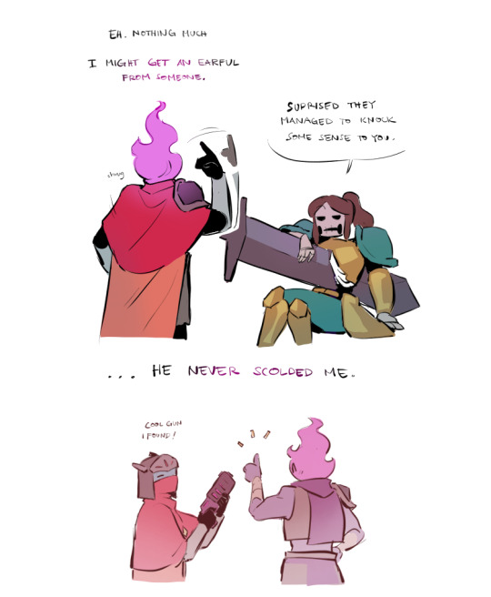
You've done this before...
Countless of times...
Why now?
Bonus :)
#dead cells#hyper light drifter#driftcells#the beheaded#bobby#tutorial knight#its angst time.. and i angst all over the place..#also sorry if there are mistakes in asl#thinking about drifter being his reason he started caring for both dead and the living...#he knows of his time being so limited. yet as he continue to fell for him...#that dawning fear slowly catches up..knowing that all of their experience will be nothing more than a memory#im ok :)#im not#my art
2K notes
·
View notes
Text
How I save time on backgrounds as a full-time webcomic artist
Hi! I make webcomics for a living, and I have to be able to draw a panel extremely fast to keep up with my deadlines. I draw about 50 panels a week, which gives me about 45 minutes per panel if I want any semblance of a healthy work-life balance.
Most webtoon artists save time on backgrounds by using 3d models, which works for them and is great! but personally I hate working in 3d... I went to school for it for a year and hated it so much I completely changed career paths and vowed never to do it again! So, this is how I save time without using any 3d, for those of you out there who don't like it either!
This tactic has also saved me money (3d models are expensive) and it has helped me converting my comic from scroll format into page format for print, because I have much more art to work with than what's actually in the panels. (I'll touch on this later)
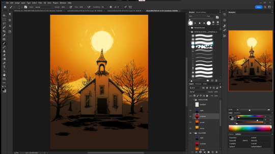

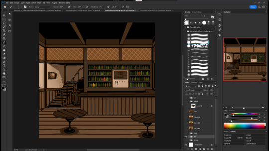
So, first, I make my backgrounds huge. my default starting size is 10,000 x 10,000 pixels. My panels are 2,500 pixels wide, so my backgrounds are 4x that, minimum. Because of this, I make them less detailed than I could or that you might expect so it doesn't look weird against my character art when I shrink portions of it down.
I personally find it much easier to add in detail than to make "removing" details look natural at smaller sizes, but you might have different preferences than I do.
I also make sure to keep all of my elements on separate layers so that I can easily remove or replace them, I can move them to simulate different camera angles more easily, and it's simple to adjust the lighting to imply different times of day.
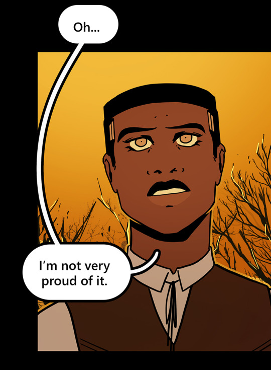

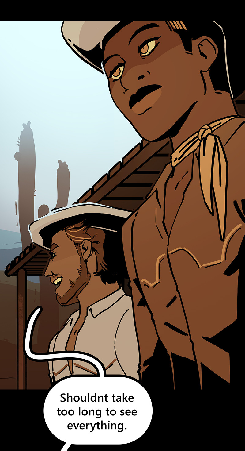
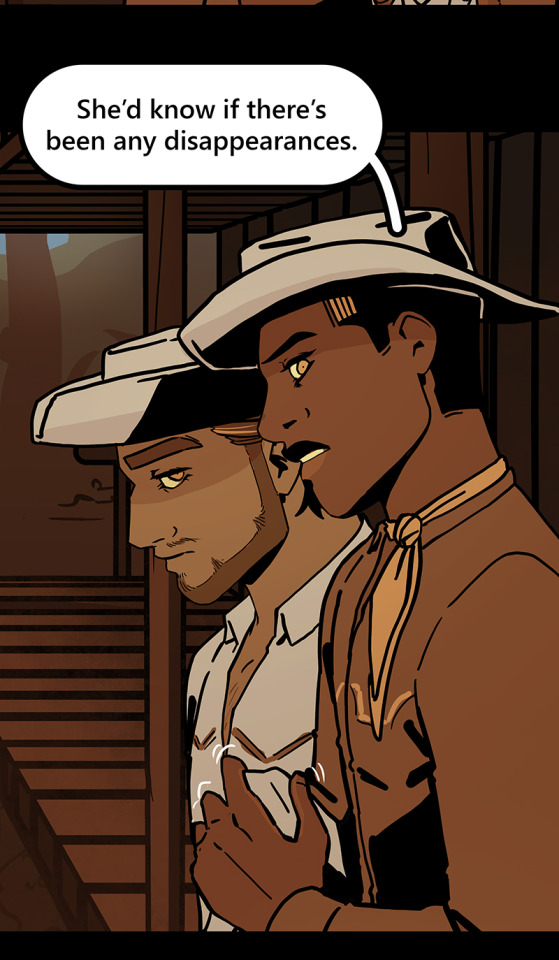

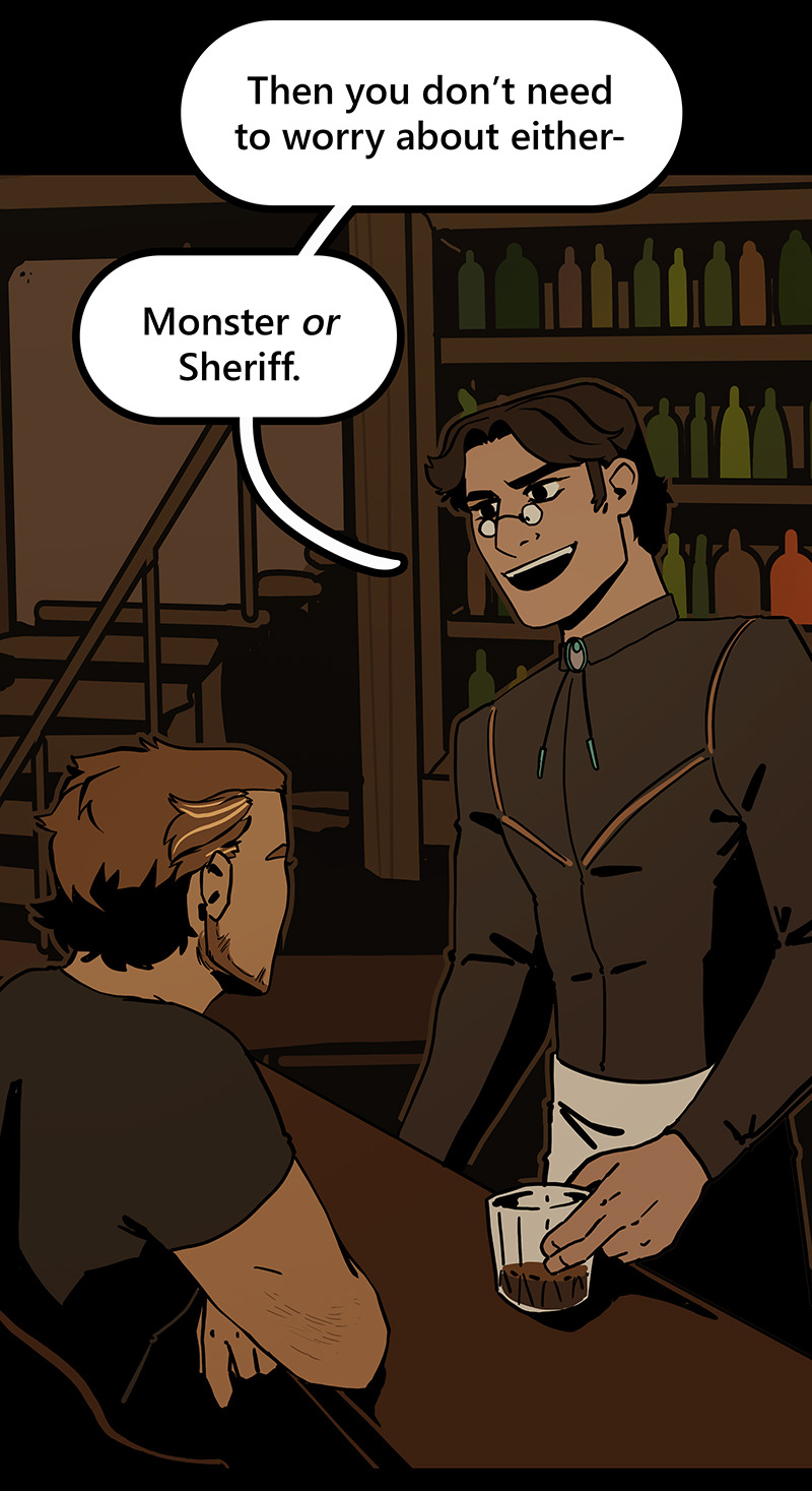
Then I can go ahead and copy/paste them into my episodes. I move the background around until it feels like it's properly fitting how I want.
Once I've done that in every panel, I'll go back through the episode and clean up anything that looks weird, and add in solid blacks (for my art style) Here's a quick before and after of what that looks like!
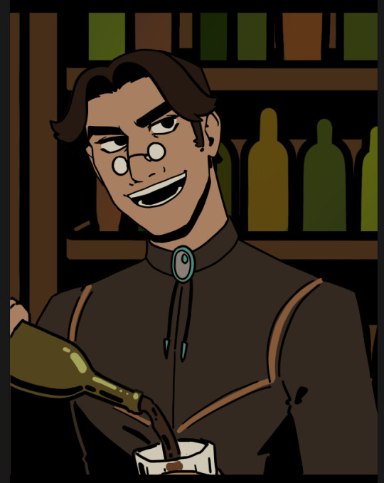
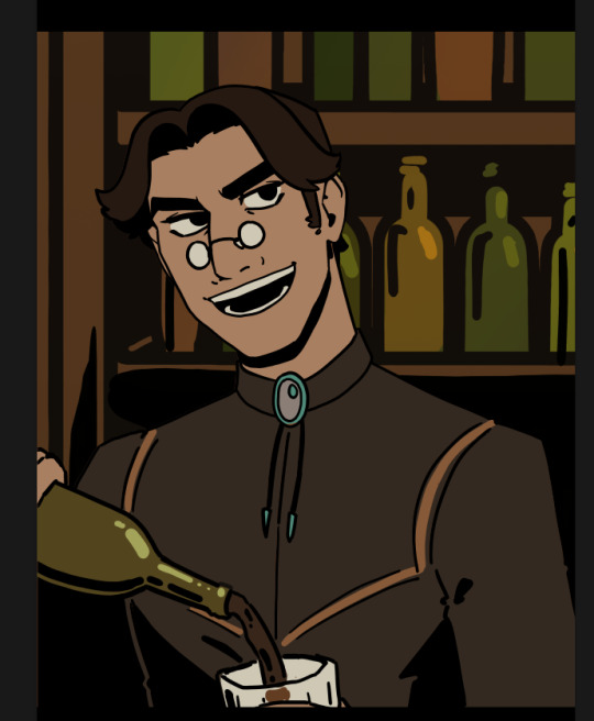
This makes 90% of my backgrounds take me just a few hours. This is my tactic when I'm working in an environment that an entire scene, or multiple scenes, will take place.
But many panels will inevitably have a location that's used exactly once, and it would waste time and effort to draw a massive background for those. So in 10% of cases, I just draw the single panel background in the episode. I save all of these, just in case I can re-use it later (this happens more often with outdoor locations, but I save them all nonetheless!)
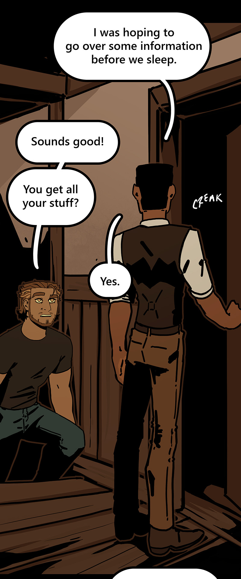
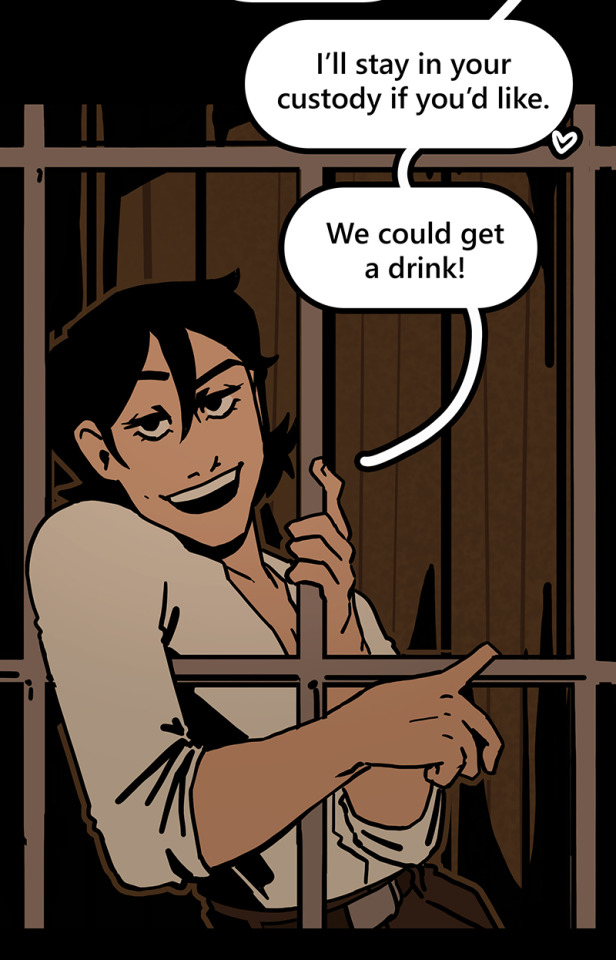
I generally have to draw about 2 big backgrounds per episode, and 3-5 single-panel backgrounds per episode! At the beginning of an arc/book the number is higher, but as the series is continuing and I'm building up an asset library of indoor and outdoor elements to re-use for the book, the number generally goes down and I save more time.
My series involves time travel and mysteries, so there's a lot of new locations in it and we're constantly moving around. If I were working on a series that was more consistent in this aspect, this process would save me even more time!
Like I said earlier, this also saves me a lot of pain and gives me a lot more options as I'm converting from scroll format to print format!
panels that look like this in scroll format...

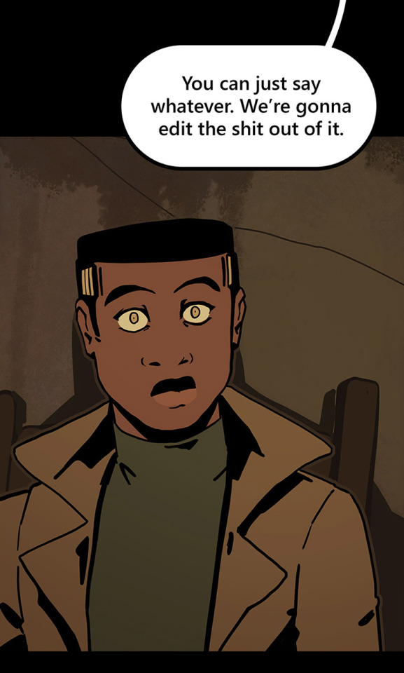
can look like this in print!

because I drew the background like this, so I didn't need to go through the additional effort to add in the extra detail to expand it outwards at all.
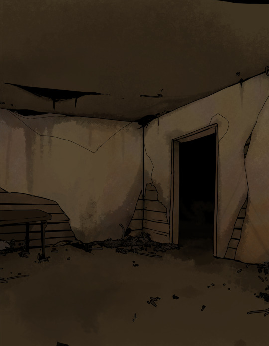
Anyways, I hope this helps someone! As always if it doesn't help, just go ahead and disregard. This is what I do and what works for me, and I feel like I only ever see time-saving tips for comics that involve 3d models and workflows, which don't work for me at all! I know there's more people like me out there, so this is for you!
Enjoy!
Also obligatory "my webcomic" if you want to see this in action or check it out!
#webcomic tips#webcomic making#comic tips#comic tutorial#art tutorial#art tips#time and time again#my ocs#digital art#ttawebcomic#hmmmm....#longpost#yeah it's a long post#I'll claim this one#lots of images#I hope this helps#I'm always worried when I make some kind of guide or tutorial people are gonna get mad at me lmao#I'm not saying 3d models are bad to use!!!#I just dont like them!#my brain doesnt work like that and it feels SO so so so tedious to me#TO ME PERSONALLY!!!#plenty of people see 3d models as a total lifesaver#and that's perfectly fine!#but yeah I don't see tutorials about saving time in comics that like... dont... mention 3d models...#like what about me and the other extremely particular girlies who hate 3d#anyways#yeah#just hoping this helps#nothing against 3d at all#I mean. ok personally yes against it cause it sucks for me to use
1K notes
·
View notes
Photo
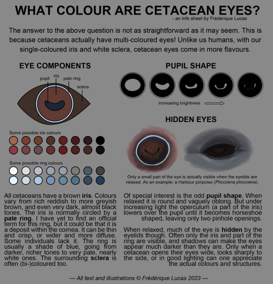


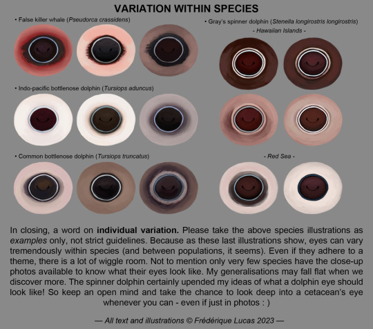
Here it finally is, the full cetacean eye colour info sheet! A long time coming, and an even longer time in the making. I hope that all you cetacean eye curious people will find this one as fascinating as the killer whale eye colour post. It’s a wild world out there!
#illustrations#namtalk#info sheet#infographic#tutorial#cetacean eye colour#eyes#dolphin eye#whale eye#anatomy#bottlenose dolphin#spinner dolphin#humpback whale#killer whale#orca#false killer whale#gray whale#AT LONG LAST#THE CETACEAN EYE THING IS HERE#I really hope you all enjoy!!#and that it was worth the wait#i started this almost 2 years ago rofl
9K notes
·
View notes
Text


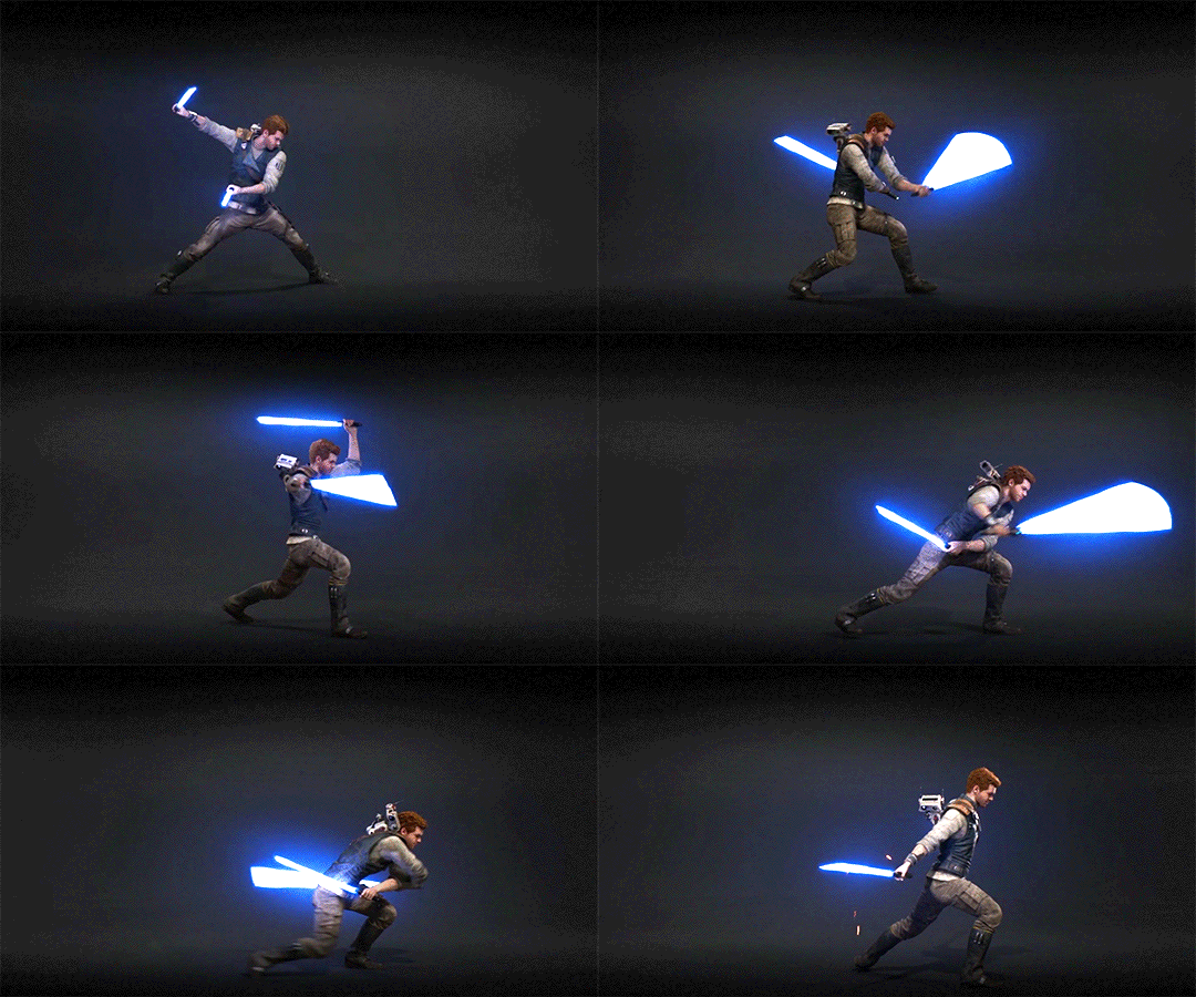
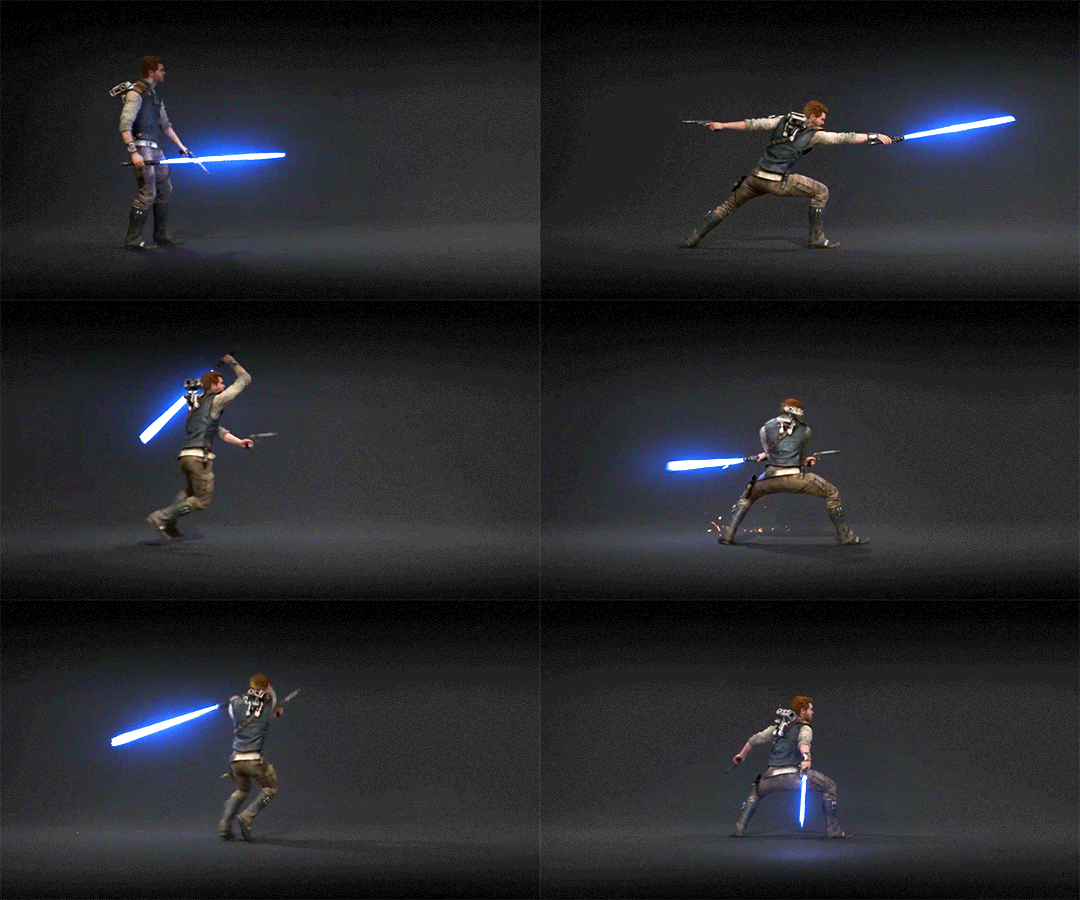

Jedi Survivor Stances Single - Double - Dual - Blaster - Crossguard
#shoutout to all the animators who created these combat sequences!#thank you for making Cal look really cool#these are from the tutorials that pop up when you unlock a new stance#i stole them from the game files mwhahaha#star wars jedi survivor#jedi survivor#cal kestis#star wars#lightsaber forms#lightsaber combat
900 notes
·
View notes
Text


Are you intending to talk all the way through this?
#my lady jane#myladyjaneedit#jane x guildford#janeford#myladyjanecentral#janefordarchive#userninz#chrissiewatts#usertina#userelliee#tusermira#mine*#yeah. YEAH!#like. she got with the programme QUICK#its all about the hands#she had multiple opportunities to shut him up and took them#her hair is so good i need a tutorial asap#took a creative license with the caption but y'all get the idea
688 notes
·
View notes
Text


Don't Call Us Dead / Yellowjackets for @jackienatist
#i dont know WHAT yall put in your gifs that prevents text from being fuzzy i did everything all the bougie tutorials told me to do lol#i like this one! i tried like three different typography options and clicked that font by accident but ended up loving it the most#requests are still open#my gifs#lottielee#yellowjackets#laura lee#lottie matthews#usermiles#userbecca#tusercj#yellowjacketsnetwork#yellowjacketsedit#userlindsay#wlwsource#yj
562 notes
·
View notes
Text


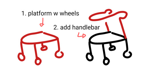
wheelchair, cane + forearm crutches, walker 90% chance if you're hesitant to draw mobility aids you're overthinking it. start somewhere. obviously these are not detailed references.
wheelchairs and walkers should be proportioned like chairs. in most cases canes are held on the opposite side of the painful leg because you want to put weight on the cane instead of the leg (dr house lied to you) but depending on the reason for the cane this can change!
[ image id: a title image that reads "learn how to draw mobility aids very fast" followed by three simplified drawings of different mobility aids broken down into two steps each. the changes made in each step are colored red.
the second image shows a wheelchair, with the steps "1. seat with footrest", showing a simple chair shape, and "2. wheels", which adds two large wheels to the back and two small wheels to the front.
the third image shows both a cane and forearm crutches, with the steps "1. stick", showing a single line of color, and "2. add handle", which shows a hand grip and a forearm rest on two different sticks. and additional label below this step reads "handheld stick height is where the hand rests at the hip" and "forearm stick height is the forearm".
the fourth image shows a walker, with the steps "1. platform with wheels", showing a backless chair shape with a wheel on each leg, and "2. add handlebar", which shows a handle raised above the seat. end id ]
✨ edited to remove italics for screen readers + also pointing out that I missed the handle on the forearm crutches! always use real reference photos when you can, this is just a starting point to help you understand the basics if you're not familiar :3
#are they perfect renditions? no. but first attempts at drawing anything rarely are#and tbf id rather people start drawing them and draw them badly than never draw them at all#art ref#tutorials#mobility aids#wheelchairs#canes#forearm crutches#walkers#sorry if there are typos blame the blindness#patch me through to palaven command
7K notes
·
View notes
Text
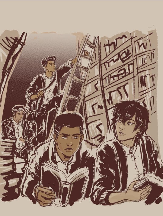
'Dead Poets Society' gang
Headcanon that these four drop poetry and literature quotes on their conversations unprompted.
Jason 'English-major-I-only-visit-the-manor-for-the-library' Todd-Wayne
Damian 'I-master-liberal-arts-unlike-you-plebs-PHD-holder' al Ghul-Wayne
Cassandra 'I-learn-English-thru-Shakespeare-as-god-intended' Cain-Wayne
Duke 'only-title-holder-of-vigilante-poet-and-will-cuss-you-just-as-poetically' Thomas-(future) Wayne
#My background is ass#I promise to practice but omg i am losing motivation coz its too ugly#started putting some on coloring that i started being happy about it#But my background is level toddler i hate it#the patience and discipline to make my lines straight and clean is nonexistent gdi...why did past me choose library gdi#Just writing some Duke in my fics and this image of them all just made me wanna do art...Duke is a poet and writes stories u kno?#Duke is not a wayne yet...and is not dead yet...but with how comics goes then its just a matter of time lol#They're all in school here...Cass and Jason are college watching over their juniors in high school#everyone use cardigans but Jason like his leather so no thanks lol#Duke and Cass in outsiders are cute#jason todd#dc comics#damian wayne#fanart#robin#cassandra cain#duke thomas#inking & background study#Damian is now 14!!!! He's getting old...he's like a baby yesterday omg#I need to stop obsessing over this so i posted a WIP so i can continue writing my fic!!! argh#Im gonna watch youtube tutorials again on drawing bookshelves coz i cannot do this without guidance
615 notes
·
View notes
Text
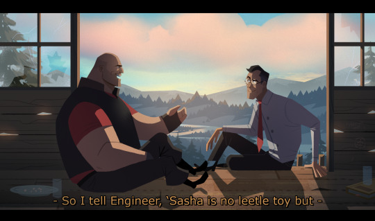
#tf2 heavy#tf2 medic#tf2#tf2 fanart#text is just flavour to make it look more screenshotty idk#there's so much wrong with this image but im moving onto other stuff fkjgjkfds#i'll draw other characters soon i promise#ty for the sweet tags on this!!#i'll do a tutorial at some point as this sort of lighting is NOT complicated at ALL im telling you. it's literally just a multiply layer#and a bloom
4K notes
·
View notes
Text
My GIF Making process: Screen capturing using MPV player, Organizing files, 3 Sharpening settings, Basic Coloring PSD + Actions set

This is a very long post so heads up.
I’ll try to be as thorough and true as much as possible to the way I make my gifs (I already use Photoshop Actions which I’ve long since set up but now for this tutorial I’m reviewing them to show you the exact steps I’ve learned to create my gifs 😃) and present them to you in a semi-coherent way. Also, please bear with me since English is my second language.
First things first. Below are the things and tools we need to do this:
Downloaded 4K or 1080p quality videos (let’s all assume we know where to get these—especially for high definition movies and tv series—so this post doesn’t get removed, okay? 😛)
Adobe Photoshop CC or the CS versions can work as well, but full disclosure I haven’t created gifs using the CS versions since 2020. I’m currently using Adobe Photoshop 2024.
mpv player. Use mpv player to get those frames/screenshots or any other video player that has a screen grabber feature. I’ve used adapter for the longest time but I’ve switched to mpv because the press to screenshot feature while the video is playing has been a game changer not to mention ultimate time saver for me. For adapter you need to play it in another video player (like VLC player), to get the start and end timestamps of the scene you want to gif which takes me ages before I can even open Photoshop.
Anyway! Please stop reading this post for a moment and head over to this amazing tutorial by kylos. She perfectly tells you how to install and use mpv player, both for Mac and Windows users.
One thing I have to share though, I had a tough time when I updated my MacOS to Sonoma since MPV is suddenly either duplicating frames or when I delete the duplicates the player seems to be skipping frames :/ I searched and found a solution here, though it didn’t work for me lol. My workaround for this in the meantime is decreasing the speed down to 0.70 then start screenshotting—it’s not the same pre Sonoma update but it works so I’ll have to accept it rather than have jumpy looking gifs.
Now, after this part of kylos’ tutorial:

you can continue reading the following sections of my gif tutorial below.
I want to share this little tip (sorry, this will only cater to Mac users) that I hope will be helpful for organizing the screenshots that MPV saved to the folder you have selected. Because believe me you don’t want to go through 1k+ of screenshots to select just 42-50 frames for your gif.
The Control + Command + N shortcut
This shortcut allows you to create a new folder from files you have pre-selected. As you can see below I have already created a couple of folders, and inside each folder I have selected screenshots that I want to include in one single gif. It's up to you how you want to divide yours, assuming you intend to create and post a Tumblr gifset rather than just one gif.

Another tip is making use of tags. Most of, if not all the time, I make supercorp gifs so I tag blue for Kara and red (or green) for Lena—just being ridiculously on brand and all that.
Before we finally open Photoshop, there's one more thing I want to say—I know, please bear with me for the third? fourth? time 😅
It's helpful to organize everything into their respective folders so you know the total number of items/frames you have. This way, you can add or delete excess or unnecessary shots before uploading them in Photoshop.
For example below there are 80 screenshots of Kara inside this folder and for a 1:1 (540 x 540 px) Tumblr gif, Photoshop can just work around with 42-50 max number of frames with color adjustments applied before it exceeds the 10 MB file size limit of Tumblr.

Sometimes I skip this step because it can be exhausting (haha) and include everything so I can decide visually which frames to keep later on. You'll understand what I mean later on. But it's important to keep the Tumblr 10 MB file size limit in mind. Fewer frames, or just the right amount of frames, is better.
So, with the screenshot organization out of the way, let's finally head over to Photoshop.
Giffing in Photoshop, yay!
Let’s begin by navigating to File > Scripts > Load Files into Stack…

The Load Layers window will appear. Click the Browse button next.
Find your chosen screenshots folder, press Command + A to select all files from that folder then click Open. Then click OK.
After importing and stacking your files, Photoshop should display the following view:

By the way, I'll be providing the clip I've used in this tutorial so if want to use them to follow along be my guest :)
If you haven't already opened your Timeline panel, navigate to Windows > Timeline.
Now, let's focus on the Timeline panel for the next couple of steps.
Click Create Video Timeline, then you’ll have this:

Now click the menu icon on the top right corner then go to Convert Frames > Make Frames from Clips

Still working on the Timeline panel, click the bottom left icon this time—the icon with the three tiny boxes—to Convert to Frame Animation
Select Make Frames From Layers from the top right corner menu button.
So now you have this:

Go and click the top right menu icon again to Select All Frames
Then click the small dropdown icon to set another value for Frame Delay. Select Other…

The best for me and for most is 0.05 but you can always play around and see what you think works for you.
Click the top right menu icon again to Reverse Frames.
I think Photoshop has long since fixed this issue but usually the first animation frame is empty so I just delete it but now going through all these steps there seems to be none of that but anyways, the delete icon is the last one among the line of feature buttons at the bottom part of the Timeline panel.
Yay, now we can have our first proper GIF preview of a thirsty Lena 😜

Press spacebar to watch your gif play for the very first time! After an hour and half of selecting and cutting off screenshots! 😛 Play it some more. No really, I’m serious. I do this so even as early (lol) as this part in the gif making process, I can see which frames I can/should delete to be within the 10 MB file size limit. You can also do it at the end of course 🙂
Now, let’s go to the next important steps of this tutorial post which I’ve numbered below.
Crop and resize to meet Tumblr's required dimensions. The width value should be either 540px, 268px, or 177px.
Convert the gif to a Smart Object for sharpening.
Apply lighting and basic color adjustments before the heavy coloring. I will be sharing the base adjustments layers I use for my gifs 😃.
1. Crop and Resize
Click on the Crop tool (shortcut: the C key)

I like my GIFs big so I always set this to 1:1 ratio if the scene allows it. Press the Enter key after selecting the area of the frame that you want to keep.
Side note: If you find that after cropping, you want to adjust the image to the left or another direction, simply unselect the Delete Cropped Pixels option. This way, you will still have the whole frame area available to crop again as needed and as you prefer.
Now we need to resize our gif and the shortcut for that is Command + Opt + I. Type in 540 as the width measurement, then the height will automatically change to follow the ratio you’ve set while cropping.
540 x 540 px for 1:1
540 x 405 px for 4:3
540 x 304 px for 16:9
For the Resample value I prefer Bilinear—but you can always select the other options to see what you like best.
Click OK. Then Command + 0 and Command + - to properly view the those 540 pixels.

Now we get to the exciting part :) the sharpen settings!
2. Sharpen
First we need to have all these layers “compressed” intro a single smart object from which we can apply filters to.
Select this little button on the the bottom left corner of the Timeline panel.


Select > All Layers
Then go to Filter > Convert for Smart Filters
Just click OK when a pop-up shows up.
Now you should have this view on the Layers panel:

Now I have 3 sharpen settings to share but I’ll have download links to the Action packs at the end of this long ass tutorial so if you want to skip ahead, feel free to do so.
Sharpen v1
Go to Filter > Sharpen > Smart Sharpen…
Below are my settings. I don’t adjust anything under Shadows/Highlights.
Amount: 500
Radius: 0.4
Click OK then do another Smart Sharpen but this time with the below adjustments.
Amount: 12
Radius: 10.0

As you can see Lena’s beautiful eyes are “popping out” now with these filters applied. Click OK.
Now we need to Convert to Frame Animation. Follow the steps below.
Click on the menu icon at the top right corner of the Timeline panel, then click Convert Frames > Flatten Frames into Clips
Then Convert Frames > Convert to Frame Animation
One more click to Make Frames From Layers
Delete the first frame then Select All then Set Frame Delay to 0.05

and there you have it! Play your GIF and make sure it’s just around 42-50 frames. This is the time to select and delete.
To preview and save your GIF go to File > Export > Save for Web (Legacy)…
Below are my Export settings. Make sure to have the file size around 9.2 MB to 9.4 MB max and not exactly 10 MB.

This time I got away with 55 frames but this is because I haven’t applied lighting and color adjustments yet and not to mention the smart sharpen settings aren't to heavy so let’s take that into consideration.
Sharpen v1 preview:

Sharpen v2
Go back to this part of the tutorial and apply the v2 settings.

Smart Sharpen 1:
Amount: 500
Radius: 0.3
Smart Sharpen 2:
Amount: 20
Radius: 0.5
We’re adding a new type of Filter which is Reduce Noise (Filter > Noise > Reduce Noise...) with the below settings.

Then one last Smart Sharpen:
Amount: 500
Radius: 0.3
Your Layers panel should look like this:

Then do the Convert to Frames Animation section again and see below preview.
Sharpen v2 preview:

Sharpen v3:
Smart Sharpen 1:
Amount: 500
Radius: 0.4
Smart Sharpen 2:
Amount: 12
Radius: 10.0
Reduce Noise:
Strength: 5
Preserve Details: 50%
Reduce Color Noise: 0%
Sharpen Details: 50%
Sharpen v3 preview:

And here they are next to each other with coloring applied:
v1

v2

v3

Congratulations, you've made it to the end of the post 😂
As promised, here is the download link to all the files I used in this tutorial which include:
supercorp 2.05 Crossfire clip
3 PSD files with sharpen settings and basic coloring PSD
Actions set
As always, if you're feeling generous here's my Ko-fi link :) Thank you guys and I hope this tutorial will help you and make you love gif making.
P.S. In the next post I'll be sharing more references I found helpful especially with coloring. I just have to search and gather them all.
-Jill
#tutorial#gif tutorial#photoshop tutorial#gif making#sharpening#sharpening tutorial#photoshop#photoshop resources#psd#psd coloring#gif coloring#supercorp#supercorpedit#lena luthor#supergirl#my tutorial#this has been a long time coming#guys. i'm BEGGING you. use the actions set - it was a pain doing all this manually again ngl LMAO#i've been so used to just playing the actions#so this has been a wild refresher course for me too 😆
477 notes
·
View notes