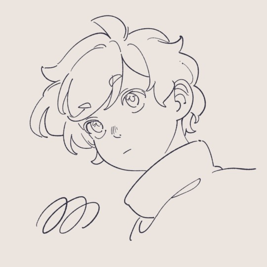
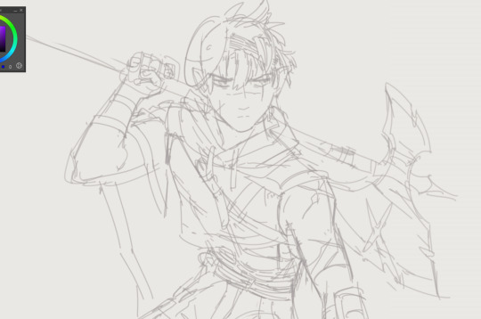
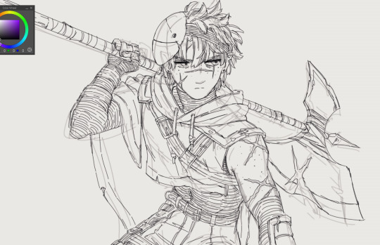
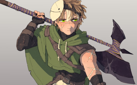
#trying to use the thicker lineart
Explore tagged Tumblr posts
Visit Tumblr Blog
Explore Tumblr blogs with no restrictions, modern design and the best experience.
Last Seen Tumblr Blogs


Fun Fact
There were a total of 171.5 billion posts on Tumblr in 2019.
Note
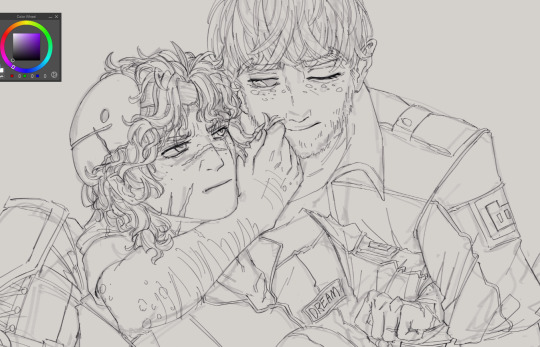
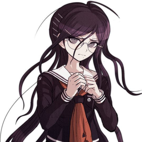
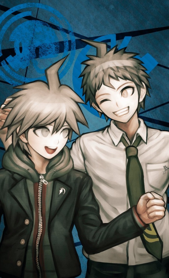
Can you draw Chara?Pls...
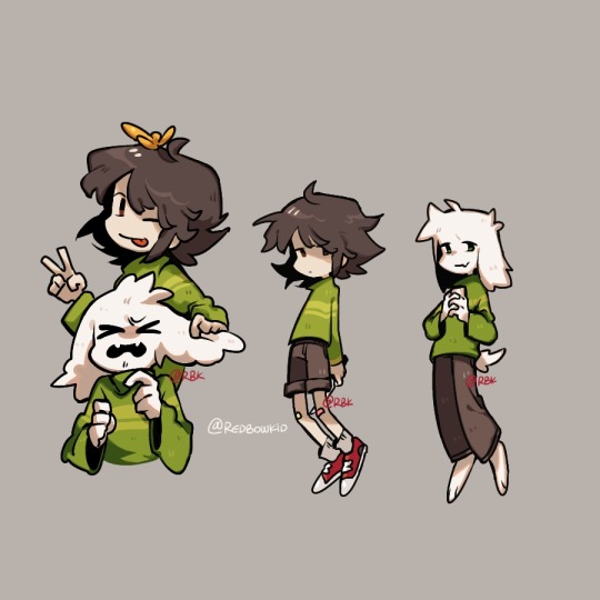
I have no idea what to draw too
Here you go
#thanks for the recommendation#Undertale#undertale chara#asriel undertale#asriel dreemurr#chara dreemurr#rbkart#trying to use the thicker lineart
459 notes
·
View notes
Text
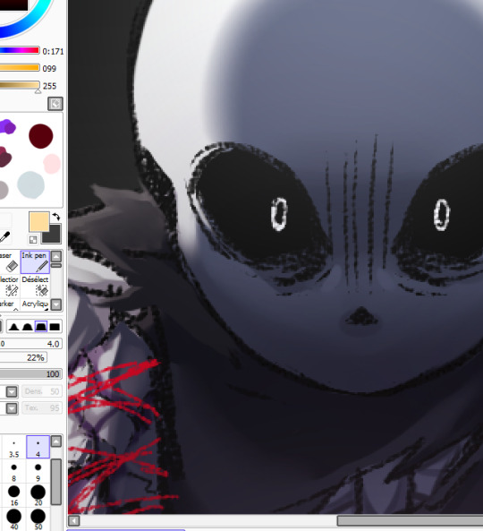
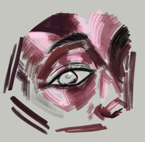
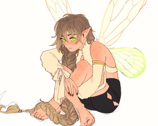
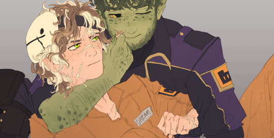
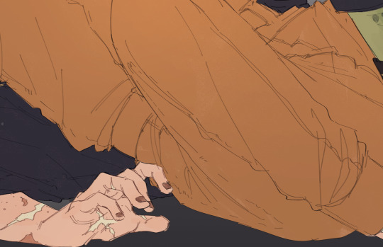
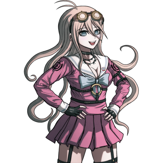
okay but studying can wait a little second until i finish this redraw HGHGHGH 😔<3333
#my art#wip#this is like. one of my favorite scenes LOL#he just has NO chill whatsoever omgg i wanna eat the animation it's so NEAT#trying something out with the lineart- i used to draw with a thicker brush back in 2021 too but i stuck with a smaller one ever since#it's fun to see the varying pen strokes and paint over them waa shading is looking awesome so far >B)#anyways uhh it's almost 4am better edit his bad boy up soon and get in bed HGHGHHH
22 notes
·
View notes
Text
I spent like 2 hours on a drawing and as soon as I finished it I hated it!! Like okay I suppose this is all just a part of improving but god. Annoying. I could've done something else with those two hours.
#rambling#I was trying to draw something without using references because I am so dependent on them#and I was also trying to do thicker lineart because it takes me a million years to do thin lines#I will not be doing either of those things again
5 notes
·
View notes
Text
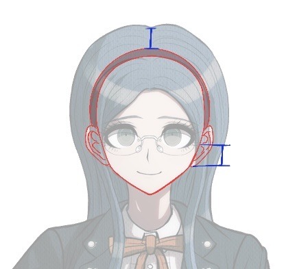
i never really intended for this to be an art blog or anything but i might have to draw tybalt again teehee
#the lil mercutio portrait was kind of a way to experiment w different art styles#i loved the way i drew his eyes and used the thicker lineart so i gotta try that
6 notes
·
View notes
Text
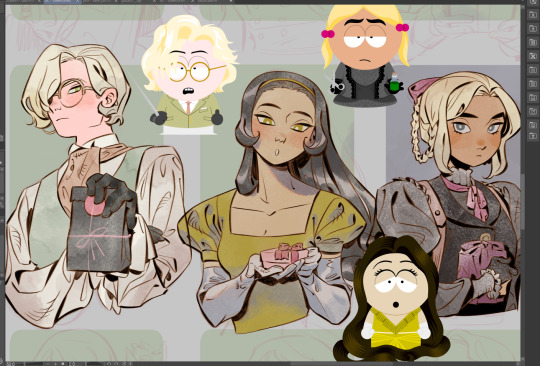
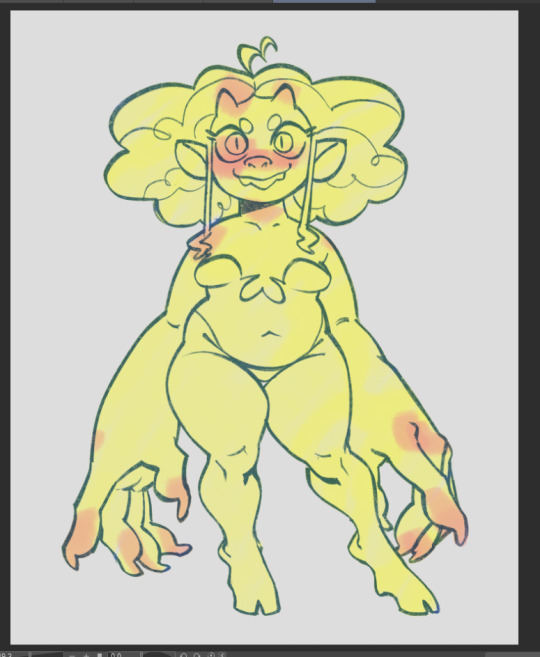
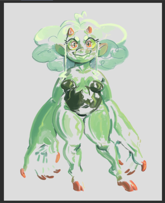
of course i start lining the morally-grey-at-first characters. yeah this is. definitely not gonna be done today! i guess ill take my time. please peer upon this cursed canvas (little sp character thingies are from here !!)
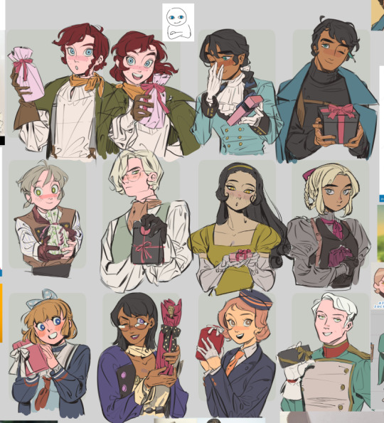
about to clean up 12 characters wish me luck JDJHDJHDGDGF
#the cursed sp character creator thingies are there to keep me company haha#recently ive just been pasting references into the gutters of my canvases#and it feels less intimidating to see all of my fave charas + inspirations on the side. than just drawing into a blank space.#idk if it's the adhd brain and it's weird but it helps me focus better#i also have to ink further zoomed out + ink w a lighter hand + go over lines w thicker brush in certain areas + use more black areas freely#trying to find a balance between lineart and sketch is hard#i think what i lose when i go from sketch -> lineart is that the sketch has these juicy thick meaty lines and the lineart gets thinner#and it's hard to see from afar#my art#my ocs
167 notes
·
View notes
Text
The depression that I know is leading up to the Cycle is ughhhh especially bc it’s trying to convince me my art is shit. Like my brother in Christ I’m redrawing old Pop! Tart! Refs. There is no way you’re saying Vivian’s old art is objectively better than her updated art .
#tbf as I analyze it I’m p sure it’s bc the old art was draw on a huge canvas#so the characters are bigger and the lineart is also thinner#meanwhile the updated art I’m using a smaller canvas with a thicker brush (tho I’m not losing any detail bc of it)#so I guess my brain is trying to say this is different enough to make it seem like the old art is SOOO much better when. dude it was not.#LOOK AT FRIO’S HAND @ MY BRAIN I AM COOKING SO MUCH BETTER THAN THAT I PROMISE 😭#for the love of god do not take this as fishing for compliments or smth I know I have improved my hormones r just imbalanced lol#And I wanna complain abt it‼️‼️‼️
1 note
·
View note
Note
Hey I love your art and how it's very stylised but feels 3D! So I was wondering if you had any tips on how to do line art and shading well as I find most tutorials on this stuff/effects don't really suit stylised works.
Oh yeah with Hazbin/Helluva I had a hard time trying to figure out how to draw the characters but I also don't limit myself to how I draw them, or try to at least. I feel like I am always changing how I draw them, some characters more than others.
The way I do it is after I finish the lineart I go ahead with my flat colors. Then add a second layer of lineart where I just make certain areas thicker/darker for where I want some weight and variation. The biggest thing for me is at the very end I paint on top of the drawing. Blocking out colors into definitive shapes.

Here is a small example of what I mean. After I finish the drawing I am always going back and adding on top of it. For colors I pick them from what the show has but then dull them down to a more muted tone and that helps with adding weight as well since it makes the bright tones I do use pop out even more.
I'm not the best at explaining stuff but here is just a bit of my chaotic process that I hope can explain some things at least ^^;; Let me know if there is anything more I can answer!
312 notes
·
View notes
Note
do you have any tips for thin (anime-style) lineart? I always tend to end up with much thicker lines unintentionally X-x
It depends a lot on what exactly you’d like to achieve, but my biggest recommendation would be to change brushes if your lines are naturally coming out too thick. Not just because of brush size, but because the kind of brush you use will change how you line things, technique-wise.
As an example I’ve tried lining a sketch using two different brushes here:
Though they’re both from the same sketch, in the first I used a thin brush with high stablization and almost no pressure sensitivity. As a result, I’m forced to line slightly slower, and it looks slightly stiff but achieves the sort of clean anime look you usually expect to see— almost no line breaks! This is the standard for anime I think because you have to have clean and closed line boundaries so that coloring and shading can go quickly.
On the other hand, on the right, I’ve used one I’m a bit more accustomed to, a round textured brush with a lot of pressure sensitivity. It’s also got lower stabilization, meaning I work quicker, my strokes are a lot more spontaneous, and you see a lot more natural variation in line width. That’s what I mean also by it depends on what you want to achieve— though this is also an anime style you wouldn’t find it as a screenshot anywhere because that line width variance would probably look really inconsistent in animation.
I als only switched to this round brush relatively recently, about half a year ago now??? Previously most of my lineart was done with a rectangular brush which also tended to yield thicker lineart than expected.
I would suggest playing around with different brush shapes and settings, especially in stabilization and pressure sensitivity, since I think those are often what affects my drawing style the most! You can do a similar exercise to this and try lining the same sketch multiple times with different brushes to test which feels best for you. Hope this helps!
101 notes
·
View notes
Note
Hii, I saw your latest post and your art style is so pretty?? What?? I have a question though. How do you do the paint one? Or rendering in general. Like genuinely, I have a problem with rendering and I can't seem to quite understand it on my own. Do you just start with flat colors? Do you do lineart or colors right after the sketch? Is the "lineart" just added later? Painted over? Erased to give thinner and thicker lines?? I'm really curious!!
hi! im not the best painter tbh! though i do have a background in painting but ill try my best to explain
diff artists have different approaches to how they paint but generally yes, you would start out with big shapes first and then go into the details - work big picture first. like, if you squint and the drawing makes sense in terms of value and colour and shape, youre on the right path.
i can kinda show this with a warmup in-class speedpaint exercise we did a couple weeks ago where we were tasked with painting an eye in about 30 minutes (i was late and only had 20 lol)

luckily ive got the layers for this. i start of with a base layer, kind of like a underpaint layer since that's how i personally learned to paint traditionally. i did have a sketch before laying down this base layer under it but i ended up using it for final rendering details lol
after that i started laying down the big blocks of colour. i wasn't necessarily aiming for complete colour accuracy here, i just wanted to match the value. i chose a pink underlayer to influence my colour choices because the underlayer will peak through the blocks of colour i paint over it
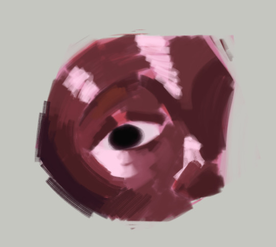
and then (forgive me if this seems like "draw the rest of the owl" in terms of progression) but this is where i started going in with finer detail. i did the rest of the render on the sketch layer i had so you can see some of the lines from the sketch here
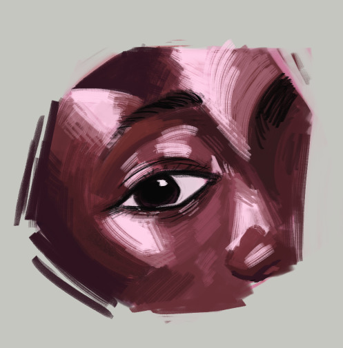
here's the layers completely seperate from each other


even for the flat colour version of my character, i had an underpaint layer! i used yellow and orange since i wanted her colours to be warm and used a semi-opaque brush to put her colours in rather than using a completely opaque brush
when i wanted to do the painted version, i put the lineart on multiply and reduced the opacity and brushed in some some quick shadows on seperate layer on hard light mode to give me a good base to start painting with

and then i did all the rendering and details on a new layer ontop of everything. i keep the lineart light so i can paint over it easily and also colour pick from it when i want a more distinct line to seperate certain shapes. i unfortunately dont know how to explain this part because a lot of this is intuitive to me and i'm still learning. but you gotta make use of different types of "edges" in painting, and you would generally have more contrast in the focal point of your painting than in other places to draw the eye to that point. i suggest researching the use of edges in painting if you really wanna learn more - because im a terrible teacher haha
for fun here's what the rendering layer for this one looks like on its own and the finished thing for comparison

there's other things you need to learn too, like bounce light, atmospheric perspective, ambient occlusion... and colour theory is always important! i could go on for a long time. there's a lot of pieces to the puzzle and it may seem overwhelming but there's tons of resources online and it will all become second nature to you as you keep practicing
uhh hope that helps!
62 notes
·
View notes
Note
Your AweSamDream art has given me so many brain worms how do you make your lines so thin and smooth??? Any time I try ultra thin lineart it always looks very... first time digital artist.
For me it was first i found a brush i liked and then I slowly just kept making it smaller or the canvas bigger. It's a gradual thing and I honestly don't really know what I do or don't do to make the lineart look good. I think maybe part of it is me doing alot of detailing?
I'll put some examples under the cut!
I don't know if these examples will help because I have no idea what im actually doing and can only guess based on what i think i might be doing æsldkjfælksd I colour my lineart which kinda hides(?) the mess a bit sometimes, smooths it out.
I think its important to note that my lineart isn't actually that smooth, it's kinda messy and sketchy alot because i don't put alot of details on my sketches (comparatively) and i dont follow the sketch perfectly when i line. my lineart would probably count as a detailed sketch for many. (the colouring helps alot!)
For an example c!dreams leather armour! in sketches or older arts its more flat where i draw more dimension to it now which also lets me add damage to the leather which i like doing because otherwise i end up feeling the lineart is "empty?" if theres too much space with no lines

I also paint on top of lineart when i don't like how it looked! (link to timelapse of this art)

In the second example i used a round brush for a new way i like with drawing hair! which is why as i wanted to use my favourite brush in this art, i made the lines so small so i could have more lines in the hair! as my favourite bush is fixed in a flat 20 degrees!
My sketches are generally pretty thick lined compared to what i end up lining so many times one line in the sketch becomes two lines in the lineart! i also draw pretty quickly which I'm happy with for the loser energy it gives the lineart (even tho colouring in the lineart can be a pain when i cant just select it all because of so many goddamn holes) But ultimately when you zoom in you can tell its not that smooth, its just smooth-sketchy but throughout it all which makes it conhesive! (i think) (maybe)
the fact c!dream is my own design i know basically on the back of my hand also helps! it means i can just slap it out without really thinking that hard about it because im so practiced ! (which is why i draw him alot lmaoooo) when i dont know a character as well i stuggle more with thinner lineart because i keep refrencing back instead of just doing what i want. when i draw new characters i usually start thicker and then slowly get thinner lines as i figure out how i want them to be drawn.
50 notes
·
View notes
Text
Okay so last night I was having an "art style panic"? I guess you could call it that? But I was feeling really bad, so i started drawing other peoples art styles and picking points and peaces out of it!
I did this last night when I was really tired and i used a pen so the drawings may not be how i usually do my drawings haha
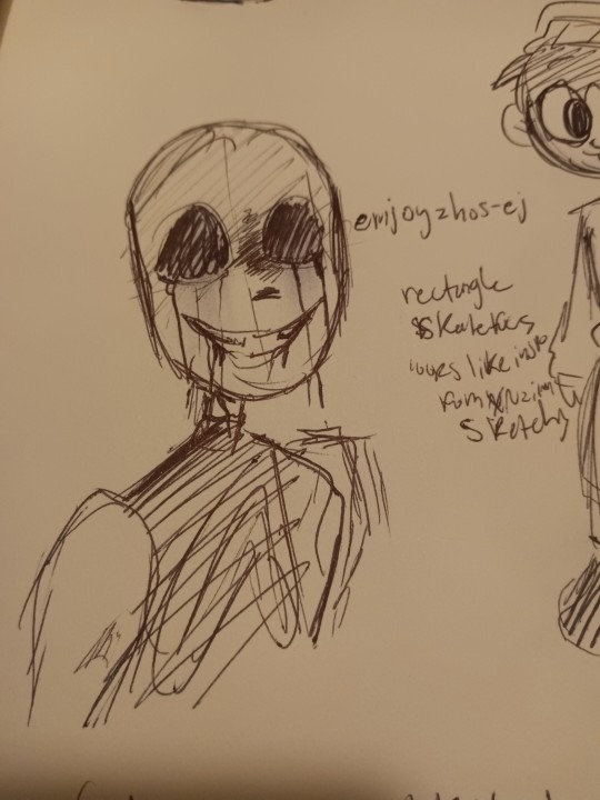
Ok so first up we have @emjoyzhos-ej !! I recently just found your account but you have a very cool style!!
•Your skull shape is very unique, very rectangle
•your lines are very sketchy (most people I follow have this trait in their art..)
•when you color it looks like you mayy have rook inspiration from itsxroxannex? Idk i wrote that down, maybe it's not true but I guess i thought that last night
But I love your style! Your art is so cool and I had fun trying to replicate it!
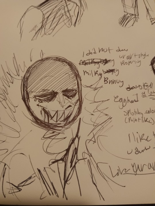
Next we have @milkybnnuy ! Omg so I really like you!! Your art is sooo good
•You draw a lot of fell, so i made the drawing of killer like how you made that one fell killer drawing
•when you color you have a very paintly-style and that's cool!!
•your skull shape reminds me of an egg (i guess thats why i said "egg head" last night)
Up in the top I wrote "I did not replicate your art properly enough," and that's true! Your art is so unique and different from what i usually drew so i had a hard time replicating it! But nonetheless, i had a fun time trying and hope you ain't disappointed lol
Btw- I really like the way you draw your fuzz on hoods!! So satisfying to look at!
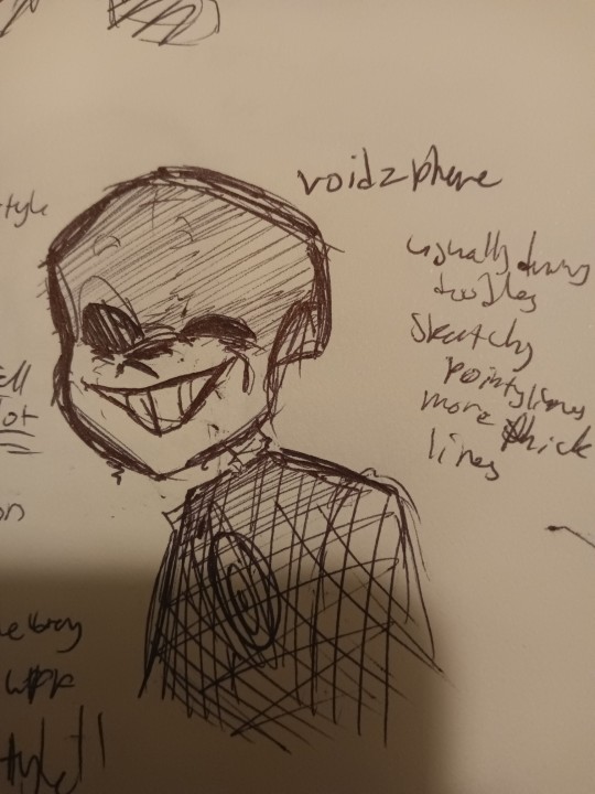
And now we go onto @voidzphere !
I've followed you for a while, and you're cool to be around and I like when you post! Though i had a hard time finding the art hidden around, I still was able to replicate it (luckily i chose to draw killer for this haha)
•so I see that you usually draw/post doodles, unless i just didn't scroll down far enough haha (plz tell me if you have drawn something big i wanna see)
•I noticed you have more pointy and thicker lines
•you have a certain way you draw your Skulls, I can't really put a shape or object here to describe it
Even though I couldn't find more drawings, I still tried! I hope you like it, friend, cause u cool
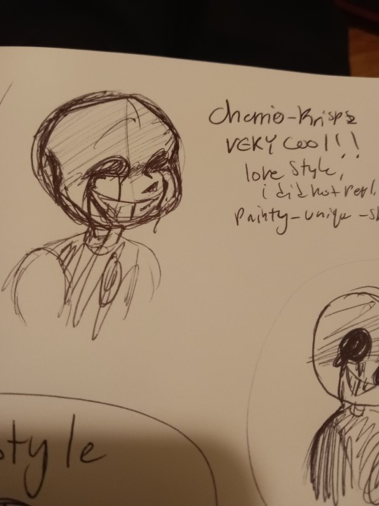
Here is @cherrio-krispz ! I just started following you last night, like seriously I had to search you up just now to figure out who you were cuz I forgot, but when i saw your art I immediately recognized you
•you have a very recognizable style!
•again, i did not replicate well.
•very painty-like when color
•sketchy lines, seems like you don't do line art?
•I like ur skulls, they look like skulls
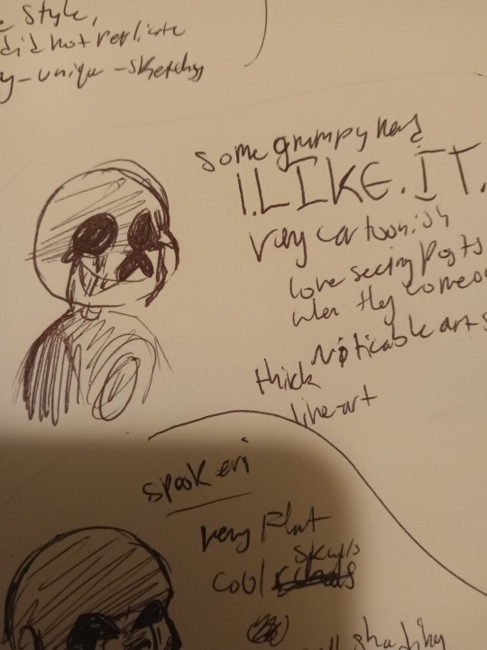
OMG I'VE BEEN WAITING TO TALK ABOUT YOU. YOU. YOUUU. @somegrumpynerd OMG YOUUUUUU. I REALLY LIKE YOUR ARTTT.
•I LIKE IT
•very cartoonish
• noticable art style
•thick lineart
I LOVE seeing posts when they come out!!! They're really really cool and make me feel so happy when I see them! Keep going because you're so cool!
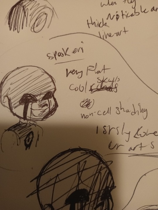
@spookeri haiiii
You're here tooo
i like ur art :)))))) a LOT . Same as the last guy, I get very excited when you post. Your DTIYS were fun, and yeye... Yeah
•Very flat colors
•flat lines
•cool looking skulls
•you have an "air-brush" shading style (i guess you could call it), which isn't a bad thing! Do what you want to do! But maybe try out cell-shading? Idk you don't have to, but idk i feel like cell-shading fits your art style
Also if you look in the bottom you can see a scratched out drawing, that was my first attempt haha
You can see it in the drawing below

@wyllaztopia !! I like your art :)) you have a very noticeable style and when you post I get excited as well!
•clean lines
•you make skulls longer than how other people make their skulls in this last
•I liked replicating it
Idk what else to say ... Its just all really cool!!
And last but not the worst
My art style!
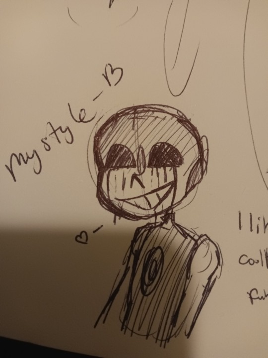
My art style is
•cool
•easy to draw
•and funny lookin'
What did i learn from this whole thing i did? That everyone has a unique style, that even if they try to change it it still stays theirs and it's still unique
I also found out that everyone, small artists and big artists, has flaws! It's comforting to know that everyone has flaws so I know I'm just learning and getting better everyday
Another thing I got from this is that everyone's styles are always changing and warping. But thats fine! Because everyone's moving and changing, and the worlds always moving and changing!
So, don't be so hard on yourself if you're struggling to draw or find an art style, how you draw is unique to you and you'll like it one day
Just keep drawing everyday and you'll get there.
I suggest doing this challenge, on paper or digital, wether you color it or not, or post ot or not!
It's great to try out.
228 notes
·
View notes
Note
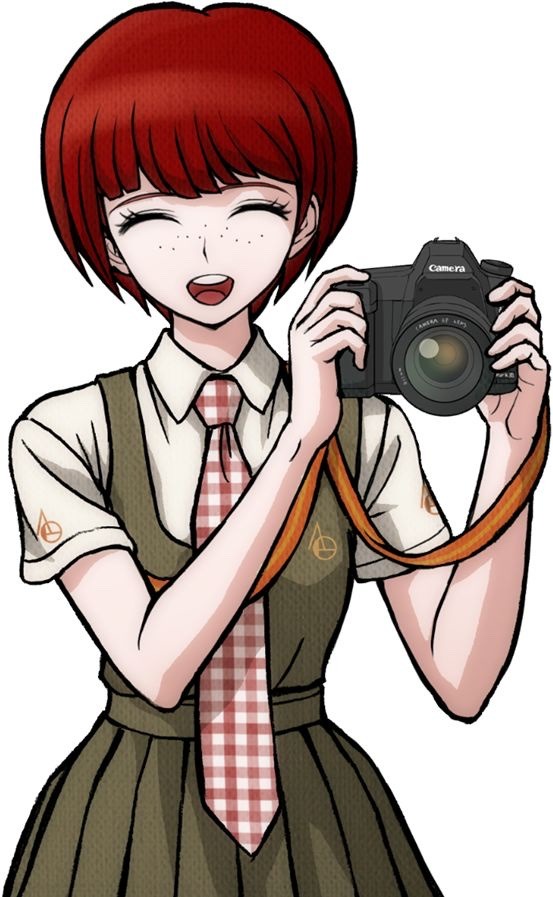
how do you imitate the danganronpa style so well?? it's always so good!!
Great Question!
First, having a somewhat decent grasp on anatomy (which is something I still need to practice lol) or “the basics” of character art is always a must imo. Having a good understanding of forms is our starting grounds for further stylization. Think of it as the “skeleton” of any style. Moreover, the Danganronpa style comes in various forms, all with different characteristics/visual characteristics.
However, and I think this is a very important distinction, I try to study Rui Komatsuzaki’s overall style as opposed to just Danganronpa. In other words, Rui Komatsuzaki, like any other creative, has his own personal stylization and artistic evolution throughout his career as an illustrator.
In DR1, Komatsuzaki’s style included much thinner lineart, bigger heads, and more gradients with the softer shading. The vibe is very much more “grounded” compared to later titles. (Example: Toko!)
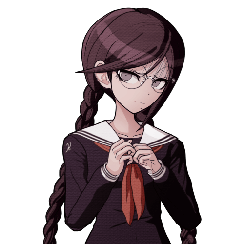
In contrast, DR2 has slightly modified proportions (like bigger hands), simplified shading, and much more vibrant color palettes. The line art during this time was also streamlined with less lines and thicker pen pressure. It makes the sprites pop out a bunch! (Example: Mahiru!)
Of course, with UDG, we see these two styles somewhat overlap, resembling his later stylization. Here we see the modified proportions and color preferences from DR2 with the thinner linework and detail of DR1. (See Toko Again!)
Finally, we see this similar style philosophy continued in V3, only with even more contrasting colors, reflecting the hyper bright/attention grabbing palettes of serialized work. The shading is much darker than previous titles, and somewhat colder too. (See Miu this time.)
Of course, with all of this in mind, taking notes is imperative! Especially if you want to replicated a specific entry’s stylization. You can draw over some of the dr sprites just to get a general feel of the proportions. I can probably post more latter down the line, but this was the most recent thing I’ve done. See below! (I was trying to get a sense of how “high” the hair sits on top of dr)
Now, for his splash art work, Komatsuzaki’s began his process by blocking out his pieces in bluish hues before the polishing phase. he most likely applied a mix of “color”, “multiply”, or “color dodge” once we finishes rendering for finalizing colors. (As depicted below.)
You can also see how Komatsuzaki simplifies clothing and the like. He very much uses thicker brush work for these types of illustrations as opposed to the lines of his 2D work during this point in his career. Future points show how he plans his stuff with more thin line work. From here he most likely did the same thing. Focusing on the forms before getting to the hues and values
Sorry for going on a bit of a tangent, I have A LOT of thoughts on DR and Komatsuzaki’s artwork in general. I really love seeing his process, so I hope this brief overview can provide as a decent introduction! If more people want me to go over specific aspects of the style, I’d be more than happy to share my own thoughts! Thank you for reading!
#Danganronpa#danganronpa 2#danganronpa v3#Rui Komatsuzaki#danganronpa sprite#r0sie rambles#r0sie asks
28 notes
·
View notes
Note
Hello! I have a question, how do you draw lineart weight? that is, how do you understand where to make the line wider and where narrower? I've been trying to figure this out for about 2 years now lol. (Sorry for bad english)
hiya!!!
I touched on this in a previous ask here !
I am...not an expert and am very much still learning ;; I ocassionally have little revelations but as I go to write them down or share them I then realise that it fundamentally breaks another 'rule'...so in order to explain one little revelation you need to explain the rule. I tie myself in knots over this Saying that, lineart weight TO ME is fundamentally all about 'rhythm'. human eyes love contrast...lines being thick in one area and then thin in another area is very 'stimulating' (or has high levels of 'appeal', to use the proper term). there are a few rules or guidelines you can use to help you determine where to place your thick and thin such as: - thick lines represent shadow or occlussion...therefore place them on the underside of objects or planes - by an extension of that logic...thick lines can represent gravity or weight or contact between objects (ie: if someone is sitting on the chair...make their bum line thick to represent the 'gravity' of their arse against the chair**). Likewise it feels more natural to render a feather in delicate thin lineart vs super chunky thick lineart - thick lines can represent movement / action / force - thin lines can represent something distant....almost blinking out of the capabiltiy of your eyesight. this means you can use thicker lines to make the object feel closer to the camera **this is actually the rule i've learnt most recently you can really break. if you're drawing a heavy rock on the ground...it makes sense to go 'okay the underside of the rock is shadowed and the rock itself is heavy so i'll draw a nice thick line on the bottom of the rock against the thin lineart of the ground'. BUT maybe....the rock is SO heavy that it is literally compressing its own lineart meaning that you get a thin line between the rock and the ground??? maybe...the THINNEST line?? as it's so heavy that the rock and the ground are almost becoming one? bah sorry i should really be providing images with these concepts Even in consistant-width lineart styles there's still a respect for the concept of 'rhythm' although it becomes the rhythm and harmony between high density and low density areas of detail. Moebius and other 'ligne claire' style artist are often really great examples of this :) learning by studying is always the best though! i spend a lot of time just looking at art i like and trying to understand what is providing the appeal / rhythm within the image and why. my favourites at the moment are: Grant Alexander, Esther Morales, Kerascoet, Hergé and a lot of mid- -century-modern illustrators haha hopefully...this vaguely helps...it's a long path that we're both on but we can do it!
#asks#tutorial#bah tagging this as tutorial just in case anyone ever goes through my blog#i hate spelling rhythm!#everytime i write it i have to whisper 'rhythm has your two hips moving'....little mnemonic for you all there
115 notes
·
View notes
Note
On your chibi drawings or drawings with thicker "lineart", you seem to vary the color of the lines a lot. How do you decide where to place the different line colors? Do you have a system, or do you just kind of feel it out?
I apologize for such a delayed response!
I really had to think about this ask, as the easiest response is to say that it's "vibes" based. I don't think I have a particular system but I will try my best to use words to describe the vibes based process haha.
The most important thing I think is to use colours that create a harmonious palette in the end, like complimentary or analogus colours, which is actually almost all colours if used in appropriate spaces (also appropriate hue/shades)


For example this chibi drawing I'm working on, the primary colour I used is green and pink. I could either use green (darker saturation less hue) or purple (dark hue high saturation) for the shoe.

if I used a really light blue here it would be a bit more confusing-- breaking up the shape of the shoe. And it also because it's on such a dark colour it clashes with what's meant to be the lightest colour of the overall piece.
It's similar to when you first learn to colour lineart because it adds dimension to the figure/object you're portraying opening a whole new world of possibilities...!
37 notes
·
View notes
Text
Revelio!

Here’s a funny little comic I did awhile back about how Revelio is so different in Hogwarts Mystery versus Hogwarts Legacy! I found it really amusing that Hogwarts Mystery made learning Revelio seem like it was this really complicated spell for the students to learn while Meredydd mastered it first try and still can’t find what she’s looking for! 😂
I tried something different with my lineart this time and even though it was fun using thicker lines, I really do prefer my thin line style. Also comics are really hard. I need to find a better way to do speech bubbles because I feel like they look a little wonky. Other than that I really like how it turned out, even if I did draw this a few months ago. Anyways I hope you guys find this as amusing as I do! 💜
#also my Hogwarts Mystery MCs name is Autumn and she’s a very chaotic but sweet Slytherin girly!#I might post about her too at some point but I haven’t gotten too far in the game yet#hogwarts legacy#hogwarts legacy mc#hogwarts legacy fandom#meredydd morrow (oc)#autumn reingold (oc)#rowan khanna#original character#art#my art#hogwarts mystery#hogwarts legacy fmc
21 notes
·
View notes
Note
Hi! I wanted to ask for advice on finding an artstyle, I've been drawing for sometime but I still dislike my style.
Thank you in advance :D.
Hi hiii
Whenever my artstyle gets kinda boring to me, I try asking myself questions to figure out what exactly is it about my artstyle that I don’t like. Things like what is it about my art that feels boring to me while this other’s artist’s work excites me? What makes me most insecure about this piece? What do my favorite artists do in their artworks that I don’t do?
This isn’t to put yourself or your work down, make sure to go out of your way to still note anything you like or are particularly proud of in any of your artworks, you work hard on your art and that deserves to be appreciated, even if your artstyle isn’t quite at where you want it to be yet! But this is mainly what I do to try to address reasons my artstyle isn’t giving me as much joy, and what changes I can make that might make me happier. Most of the time I can’t really put my finger on what it is that I dislike about my art, so I keep these questions in the back of my mind while I try experimenting through doodles and messing around with my style in each one. Have some doodles dedicated to things you dont normally try in your artstyle. Varying eye sizes and distance from each other, some doodles with different ways of stylizing noses, trying varying levels of realism vs cartoonishness when drawing characters, and trying different brushes if doing this in digital art. If any specific doodles jump out to you as kinda neat, take note of whatever you did in that doodle and try it more often!
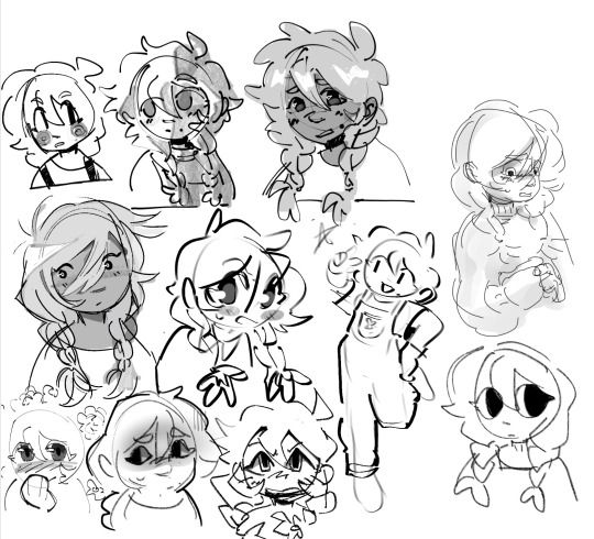
(Sorry i was doing this in a hurry but definitely couldve utilized more full body shots, varying poses, face at more side angles, coloring styles, would 100% reccomend experimenting with that too. But this is mostly what those batches of experiment doodles usually look like for me)
As always, it doesn’t hurt to also study other artists’s whos stuff makes you so happy and figure out what it is about their art style that excites you so much. Whatever that may be, think about if its something you want in your own art style and try replicating and practice doing it if you do want to take your art in that direction.
Quick example from me but november 2023 i remember starting to feel super uninspired with my artstyle. I asked myself what felt like the most unrewarding part of the process for drawing and realized the answer was my lineart. At the time I was seeing a lot of @/bixels ‘s artwork of drawing mlp characters as humans from the 1920’s americana and was so delighted by their lineart. I kept experimenting with brushes in my doodles and realized that using the gel pen reminded me somewhat of bixels’ art, so I took that and ran. It was a neat change after a while of having thicker lineart and actually having fun with pressure sensitivity and how the brush is able to taper.
This is what i found works for myself so im not sure how well it applies to other people or if i worded everything well, but I hope its at least a bit helpful in some way!
#tldr main tactic for is asking myself questions on how i feel about my art and why i think i feel the way that i do#asks#moth talk#love u abi. she is one of my oldest oc’s and usually the one i draw for art experiments
46 notes
·
View notes