#trying something out with the lineart- i used to draw with a thicker brush back in 2021 too but i stuck with a smaller one ever since
Explore tagged Tumblr posts
Text
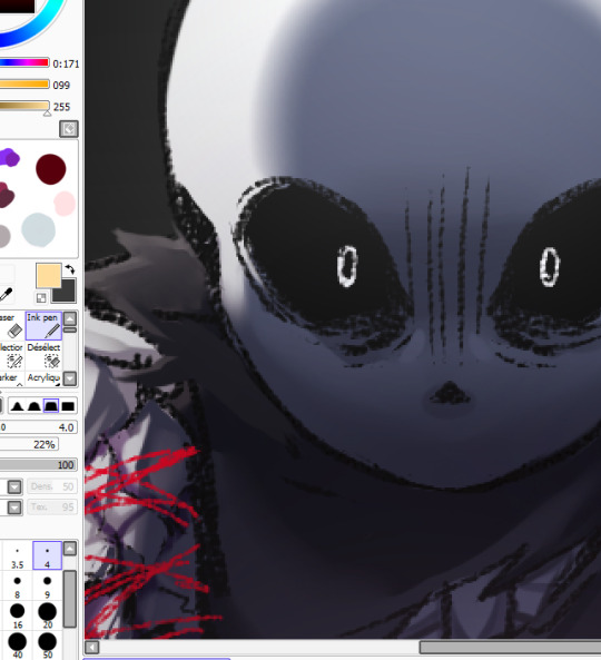
okay but studying can wait a little second until i finish this redraw HGHGHGH 😔<3333
#my art#wip#this is like. one of my favorite scenes LOL#he just has NO chill whatsoever omgg i wanna eat the animation it's so NEAT#trying something out with the lineart- i used to draw with a thicker brush back in 2021 too but i stuck with a smaller one ever since#it's fun to see the varying pen strokes and paint over them waa shading is looking awesome so far >B)#anyways uhh it's almost 4am better edit his bad boy up soon and get in bed HGHGHHH
22 notes
·
View notes
Note
Hi! I wanted to ask for advice on finding an artstyle, I've been drawing for sometime but I still dislike my style.
Thank you in advance :D.
Hi hiii
Whenever my artstyle gets kinda boring to me, I try asking myself questions to figure out what exactly is it about my artstyle that I don’t like. Things like what is it about my art that feels boring to me while this other’s artist’s work excites me? What makes me most insecure about this piece? What do my favorite artists do in their artworks that I don’t do?
This isn’t to put yourself or your work down, make sure to go out of your way to still note anything you like or are particularly proud of in any of your artworks, you work hard on your art and that deserves to be appreciated, even if your artstyle isn’t quite at where you want it to be yet! But this is mainly what I do to try to address reasons my artstyle isn’t giving me as much joy, and what changes I can make that might make me happier. Most of the time I can’t really put my finger on what it is that I dislike about my art, so I keep these questions in the back of my mind while I try experimenting through doodles and messing around with my style in each one. Have some doodles dedicated to things you dont normally try in your artstyle. Varying eye sizes and distance from each other, some doodles with different ways of stylizing noses, trying varying levels of realism vs cartoonishness when drawing characters, and trying different brushes if doing this in digital art. If any specific doodles jump out to you as kinda neat, take note of whatever you did in that doodle and try it more often!
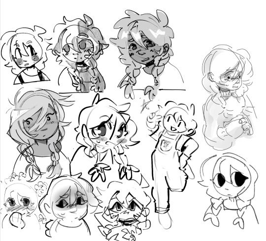
(Sorry i was doing this in a hurry but definitely couldve utilized more full body shots, varying poses, face at more side angles, coloring styles, would 100% reccomend experimenting with that too. But this is mostly what those batches of experiment doodles usually look like for me)
As always, it doesn’t hurt to also study other artists’s whos stuff makes you so happy and figure out what it is about their art style that excites you so much. Whatever that may be, think about if its something you want in your own art style and try replicating and practice doing it if you do want to take your art in that direction.
Quick example from me but november 2023 i remember starting to feel super uninspired with my artstyle. I asked myself what felt like the most unrewarding part of the process for drawing and realized the answer was my lineart. At the time I was seeing a lot of @/bixels ‘s artwork of drawing mlp characters as humans from the 1920’s americana and was so delighted by their lineart. I kept experimenting with brushes in my doodles and realized that using the gel pen reminded me somewhat of bixels’ art, so I took that and ran. It was a neat change after a while of having thicker lineart and actually having fun with pressure sensitivity and how the brush is able to taper.
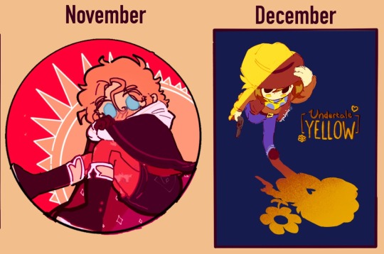
This is what i found works for myself so im not sure how well it applies to other people or if i worded everything well, but I hope its at least a bit helpful in some way!
#tldr main tactic for is asking myself questions on how i feel about my art and why i think i feel the way that i do#asks#moth talk#love u abi. she is one of my oldest oc’s and usually the one i draw for art experiments
46 notes
·
View notes
Note
Hello!! I'm trying to get back into digital art but basically starting from scratch again (like I think my last serious work was in 2016 lol orz). I really, really love the way you do lineart - from the brush settings, to the way they're colored, to the line weight...! I was wondering if you have any tips, tutorials, tools you recommend? (Especially about lineart but for anything and everything is cool too! Again, your art and aesthetic are very <3)
Oh you're too sweet, thank you for the kind words!! And that's so great to hear, it's never too late to start drawing again! You'll have so much fun ^_^
And hmmm lineart tips...I just use the default G pen in medibang paint for my lines, it's just a basic brush with a little bit of texture which I like! I'm not sure which program you're using but i definitely recommend medibang or firealpaca if you're just starting out because they're really simple free programs! super beginner friendly!
When I color in the lineart I rarely use just plain black for the colors, I usually go for a darker shade of an existing color in the palette(I color in the lineart after I lay down the flats for the piece! and sometimes make little edits if I choose to add shading) As for line weight, it definitely helps to study from life! like in areas where you'd imagine a lot of shadows I like to use thicker lines if that makes sense?? I'm not super good at explaining this LOL but i just like to keep it varied with both thin and thick lines!
hope I was able to help a little bit!! I know you'll create something great!! <3
7 notes
·
View notes
Text
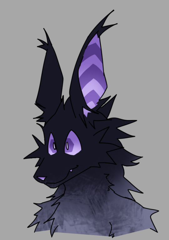
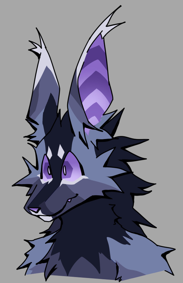
more Guy 👍 sketch to test out a different way of drawing lineart where i start with a brush with no size pressure and add in thicker pieces based on lighting position since i lack the proper training to manually get this sort of control via brush pressure. it feels weird to me though bc its practically if i had a multiply layer set to black instead of actual lineart.. like im faking it in some way? i cant decide if i like it more, to me its just black shading instead of proper lineart
i also, as i often do with any blank sona drawing, used it to test some more patterns.. i dee kay i feel like its not daron without the dark stripe that comes from the back to the nose. and the eyebrows make a lot of difference.. it feels like hes always ready for something
i also recently noticed how the lower jaw in real life muzzles baaarely even appears in angles like this, which is why i often had difficulty drawing his 'beard' marking

because realistically it'd look like his entire lower jaw was white bc of the angle. which is one of those design choices i hate (making the upper jaw and lower jaw separate areas) but i loooove the marking.. yet another conundrum for me to solve. maybe ill keep it. who knows
i also dont know how - if i try to properly redesign daron's true design - im gonna deal with how his neck is entirely dark. in the sketch it just looks like his head got transplanted there, like a mask. its always gonna feel off because his neck has different fur lengths all around, so because of that the delineation between different areas ends up giving it even more of a transplanted look.
i also dont like how the dark stripe that runs along the middle of his face creates this sort of mask pattern where it looks like the side of the head is connected to the ears. i dont want the ears to be separate but its like unavoidable because of the stripe. i thought of making the ear ridges another color so only the back of the ear looks connected, but i need it to be light color on top and mid color on bottom, but the upper head also has to be a mid color so. they und up connected. eugh
#even though its just a sketch the blue daron looks so much better in comparison to the silver one bc its so simple#of course the silver alt is Meant to be simple but theres no denying the blue one is objectively better bc of the detail#myart#ch:sona
6 notes
·
View notes
Note
I also do art, and have been trying to figure out how to soften my style a bit, and then I saw your Howe and went "Oh?" Your use of line art in the details of the face specifically is where I'm going "Hmm hmm Yes"
Also I think I just need to use a thinner brush than I currently do
I love these "Oh?" moments, had them a couple of times with other artists and I'm INCREDIBLY flattered you had yours looking at my art!! Nate's portrait is a relatively old piece, my style probably evolved a lot and in the meantime I have changed both hardware and software I am using 😅 But! I think i have some thoughts about lineart and details: 1. I abandoned the way many artists draw, which is sketching and then drawing clean lineart on top. It never really worked for me and i think using (cleaned up) sketch as the lineart layer adds a bit of crispiness :D dont get me wrong i absolutely admire people who can do pretty, clean lineart layers. I cant, so Im working around 😆 this is certainly something that softened my style 2. Indeed many people say that lineart can always be thinner... But many artists use thicker lines and make them look soft and ethereal! Still, i prefer starting from the thinner lines and then bolding them in the most important spots. 3. My fav advice considering sketching (and so, lineart in my case haha) is to simply make a mess! Quick longer or shorter brush strokes always make the piece look less stiff. and everything can be cleaned up later, thats the wonder of digital drawing after all. @kallielef is absolutely my inspiration in terms of this soft and messy (in the best way) type of sketching technique. 4. Experiment with lineart colour! Back then i was clearly in my black lines era, but now i am being a bit creative about it 😆 5. Brushes are not the most important thing, but finding a nice sketchy one is always cool. Currently im using this one for CSP. 6. 'Thicker outer lines, thinner inner lines/details' is the rule I live by :D That being said Im still an amateur and maybe in a year i will look at it and think - what kind of crap you were telling this poor person 😂 but that's what works for me at the moment! Thank you for the ask!
4 notes
·
View notes
Note
Ooo I totally get the lineart thing!!
The most important part I've noticed is line weight.
The easy version of this is when you line your work be mindful of where you want to place shadows later and thicken those lines either with pressure sensitivity but that's quite hard at first (I still struggle after so many years) so I typically just go over them again to thicken them up just a bit. Then parts you want to stand out should also be slightly thicker, along with possibly the outside of the person/ object you're drawing. Where lines meet, so for example where the neck meets the jawline I thicken the corner up slightly too towards the inside of the person.
It's hard to explain in words ah
Also be mindful of how many details you add, meaning, if you have to zoom in suuuuuper far an add a bunch of little things with a tiny brush things can end up a bit cluttered and in return make parts where there isn't that level of detail look flat and unfinished, so be sure to zoom out a lot or keep a little reference window (under canvas in settings for procreate i think)
Something that I do for personal art a lot too is just skip the lineart and simply clean up my sketch and essentially turn it into lineart!
Another tip is to make use of the liquify tool! It's my savior and one of my fav features tbh, especially with lineart.
The blurriness could just come down to how big your canvas is. I have a past in graphic design so I'm quite familiar with it but I totally understand how the technicalities could get confusing. I usually just stick to either a 3000 x 3000 px canvas or 3000×4000 px for personal sketches and somewhere around A4 or A3 for work related things and then export in either jpg or png. It's good that you're using 300 dpi though!
Sometimes different apps mess with it too, so depending on where you post/ transfer stuff that could be the reason for the blurriness.
With layers just stick to the basics at first, my layer sandwich normally looks like this:
Lineart
Shading on a clipping mask layer (with multiply on)
Flat colors
Sketch (normally hidden)
But the biggest tip I can give is to just have fun. In the end the art is for you and it should be a fun progress, everything else comes along eventually :>
- art anon
hey art anon,
sorry for the late reply I was studying 😭
Thank you for all the tips I will definitely try them out and see how they work. I haven’t drawn much recently (bc of the studying) but I think for now I will stick to just cleaning up my sketches and go from there. It’s all a lot to process honestly and I’m just giving myself some time to try things out and see how they work.
Eventually I will get better but I’m not pressure myself rn (and I can always go back to traditional drawing which I haven’t perfect either but at least I know how that works for me personally)
0 notes
Note
hello Virgil when you have the time you should explain your coloring and lining process
they way i do both lines and ESPECIALLY color changes basically every time i draw but yeah sure! im also p bad at explaining myself so idk if this is gonna make sense to anyone but me!
(first off dont draw on pure white canvases!! itll psyche you out and intimidate you because of the blank canvas, also its fucking eye bleeding!! i like going with a medium/light grey but ive seen people use a beige or light brown too just anything but pure white. also helps to just get SOMETHING onto the page if your having trouble w/ artblock, doesnt matter if its good it just has to be something u can work with. trust the process 100% and if it doesnt turn out good theres no shame in restarting from scratch, at least the idea is out of your head and easier to work through what was wrong)
my sketches are usually super messy and i go through like two to four different layers of refining it before starting lineart, and with lineart i usually use either a simple hard round brush or a sketchier one if im doing painting? my go-to ones are the default G-Pen in clip studio edited a bit to fit how i like pen pressure and 1834113 and 1761353 in the asset store but i like messing w/ whatever i can find on there and whatever feels fun at the time lmao so its not very consistent
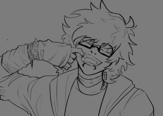
i try and keep my lines pretty thin on the inside and thicker on the outer edge? as well as adding bits of cross-hatching and hatching both in the lines and when i go in with shading!
i keep my lineart brushes pretty minimal with the pen pressure as im not the best with my pen control and just change the size of pen as i go lmao. More prevalent when i'm doing super clean lines for comics and not sketchy ones like this for painting but its generally the same, i'm not the neatest person when it comes to lines
I draw a lot of the individual parts (head, facial features, hair, clothes, hands, etc.) on separate layers so if something looks wrong i can either wipe the layer entirely or go in with the transform tool and not mess with the rest of the lineart in the process lol
(also i saw someone keep the eyes and facial features visible under the hair but erase where they meet the lines for the hair? and just yoinked it for myself because it looks super nice lmao.)
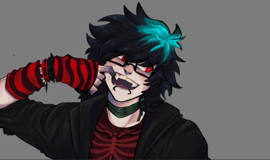
starting colors is almost always the same, where i just go in and block in the base color for each part (skin, hair, clothes, etc.) on a separate layer to make going back and editing colors a lot easier. with painting like here i also go in and add basic shading, mostly around the skin! usually i add a darker & warmer color around the cheeks, nose, eyes, fingertips and joints as well as in places where theres shading like under the head and under the nose.

also in the darkest parts of the shading like under the head/neck and under the nose i like to add a light bluish/purpleish color very lightly as a bounce light! it doesnt always fit with the piece but it does look very nice when i can make it fit so i try to remember to do that lol.
(I dont take many progress shots or timelapses so i apologize for not having the best reference images lmao)
if im doing painting, after finishing the base colors & light shading i put everything ive done into one folder and make a clipping mask over top of it and paint over it!


i usually add more detailed shading + heavier highlights on places like the nose and edges of the skin showing to make it look nice and shiny lol
(i dont have any recent drawings i can show progress pics of but just trust me on this) if im doing cell shading though i do the same thing with putting the lineart and colors into a layer, but add a multiply layer on top of it and pick a pretty saturated color to go in with the shading. if i have a background i try and keep in mind what colors are in the background and what the lighting situation is to make sure the characters blend into the background more realistically. also airbrush tool and the add glow layer is your best friend in this situation

usually after that i go back and color the line art! I pick the darkest color in a part of the drawing like the clothes or hair, make it warmer and darker and go in on the innermost parts of the lineart with it and keep a lot of the outer lines black for contrast
then i just go completely fucking ham with overlay layers and gradient maps lmao, they ARE the fucking best and are usually what i use to finish off a drawing lol.
usually i use a combination of just fucking with the default "sky" graidents in clip studio or one set i got from the asset store (1814319) on a soft light layer at like, 10-30 opacity because it gives it a REALLY nice look. again just keep in mind the lighting situation (darker night? daylight? funky bright colors?) and just go until it looks good lol.
that's basically it? though tbh i tend to just grab onto whatever technique or tip i saw on tiktok or someone on youtube do and use that, as well as changing how i color hair/skin depending on what i think looks nice at the time. none of my shit is consistent what so ever so i just kinda change things or try new brushes/coloring styles on the fly if i think it looks nice lmao. pure essence of fuck around and find out every time i open clip studio
really hope this makes sense to anyone but me and hope this was helpful!
#virgil arts#virgil asks#long post#(?)#honestly best tip is just browse the clip studio asset shop and try as many brushes as u can#and just watch every coloring tutorial u can find on yt or tiktok or wherever#just try shit!#eventually youll find stuff you really like and wanna go with#my entire style is a mish mash of my favorite shows or comics or artists styles that ive yoinked and blended together#(((((specifically stole the way abd illustrates draws faces if u want to know how i draw faces just binge his yt channel)))))))#((((also i go tt the way i draw hair 100% from ikimaru and the general homestuck fandom back in the day))))#also one of the best bits of advice ive gotten is to not worry about finding a style#eventually if u just start adding cool shit u see other artists do itll just come naturally to u#pure trial and error motherfucker!#tho tbf i learn mostly via the 'trial by fire' method#where i just throw myself into something im not remotely qualified to make and figure it out as i go#because eventually if i do that enough i do in fact get really good at the thing im trying to learn!#thats how i learned background stuff!#(also. if u dont have clip studio. u can do most of this shit sans gradient maps in any program)#(ALSO CLIP STUDIO IS BABY EASY TO PIRATE BUT YOU DIDNT HEAR THAT FROM ME)#(I FOR SURE OWN A COMPLETELY LEGAL COPY OF CSP)
7 notes
·
View notes
Text
How I Digitally Paint like a Scenic Artist/Designer
Aka: how I did this and put my degree to good use.
LONG POST WARNING
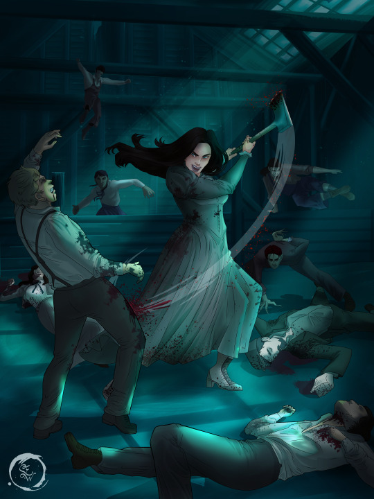
Step 1: Research.
First off, get to your image search. If you are going to be using Google, you may want to type “-pinterest” in the search to eliminate the countless boards.
I had to figure out clothing that is vaguely late 1800s. I found a multitude of reference images that were fancier clothes- but I wanted to find images of clothing for kindred across all social classes. Photographs from the era and paintings are your friend. They will more accurately showcase what was worn.
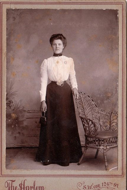
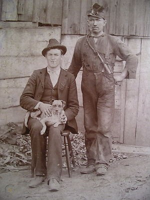
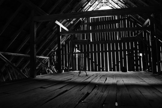
After Fashion research comes location research. The 1890s in America is known for the rapid industrialization. Factories were getting bigger and work days were getting longer. But, I wanted the moonlight to be cascading into the place, illuminating the scene. This means I needed to find a structure that had skylights or let sunlight in. And the best images I found? Slaughterhouses. Fitting, huh?
The same rule for fashion still stands- if you can find photographs or paintings from the era- they’re better. There are tons of places still standing today from the 1800s. But today, they look WAY different. Ya know, Abandoned! So just be sure to take this into consideration if you search “abandoned slaughterhouses” or go trespassing like I did.
Lastly, pose research. Finding the poses for a fight scene can be tedious. So, I enlisted some help from a few fight choreographers and stunt men. You can record their fights and play them back at quarter or half speed. You can also get a mirror and flop on the floor a bunch. I did both. This lets you see the action/motion lines you are going to replicate in the drawing. Heres how we initially did fina’s pose:
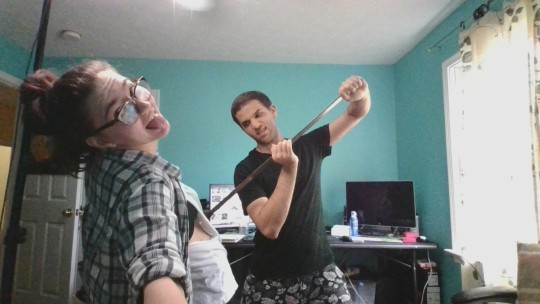

And sometimes you have to go back and get a clean shot. I ended up using this pose for the axe.
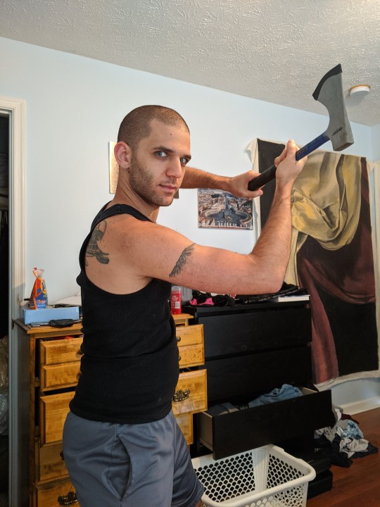
Step 2: Set up and Background!
When you open a new file, set it to the dimensions and resolution you want. I was working at 600. Usually, I’m working at 300-350. You can always reduce resolution. Its hard to prevent fuzzy lines if you increase it later.
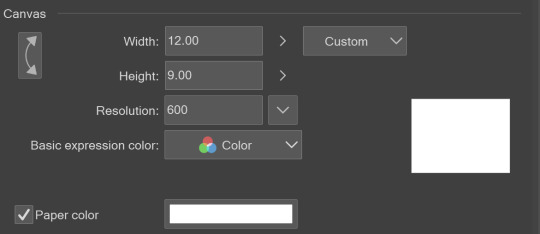
I cannot stress the following enough:
You work background to foreground. Big Shapes and areas to little shapes. Work your way forward. What this means is you need to fill in as much space as possible first. Then build your details. I prefer working as follows: Big Solid tones, Soft shadows, Dark Shadows, Highlights, then final blend. Once you finish this, put an overlay on top. This knocks everything back and helps create the illusion of depth. See this at work with the video below or here
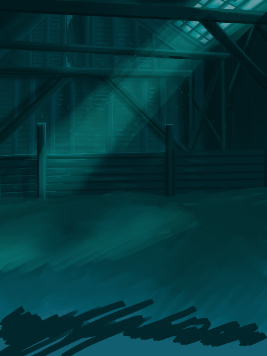
Step 3: Figure Drawings + Composition
Utilize that research and images you collected to pose your characters. I create subfolders for each set of figures. Organization is important here. This will help keep you on the right layer and prevent the eternal digital artist struggle of “Fuck that was on the wrong layer!”
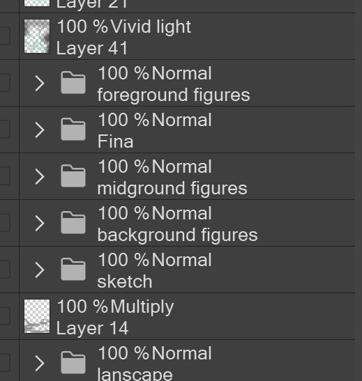
Even after you move on to lineart and shading, Keep the sketch layer as a reference. You may need to see what youre original notes/ figures looked like as you do the lineart and shade. Don’t be afraid to move them around and alter the composition rn. You want to be able to make changes. Make notes! Detail light sources!
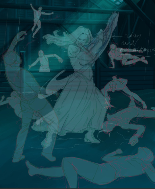
I’m about to through out some art jargon:
You want to think about asymmetric balance. The easiest way to achieve this in an eye-pleasing manner is to use the Fibonacci spiral. Yeah. This boi:

Place your figures and actions in a similar sequence to the spiral and the viewer’s eye tends to naturally follow it. This is sometimes called the Golden Ratio in the art world.
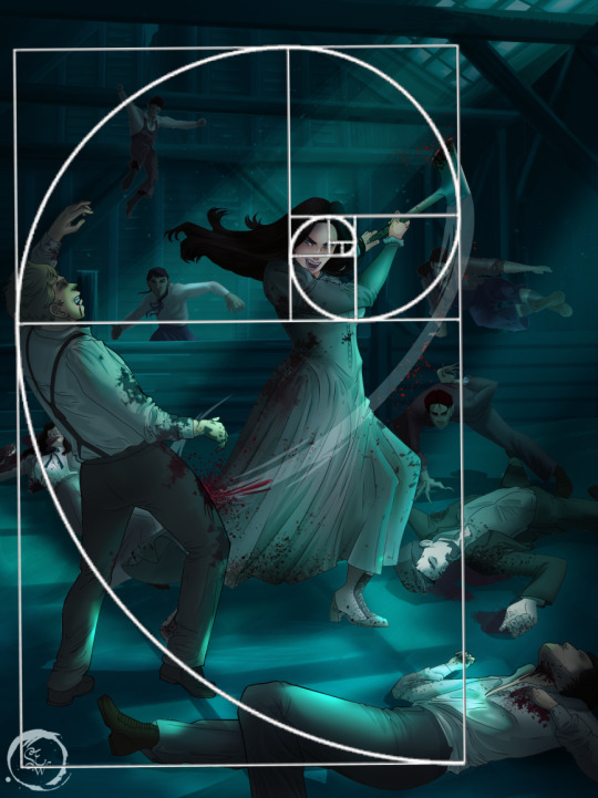
Doesn’t need to be perfectly on the spiral. You can break it- but its an excellent tool to plan how things move in the piece.
Step 4: Lineart
Once you got things sketched- its time to do the lineart. I’m using clip studio paint’s standard brushes. Nothing fancy. I often switch between the G-pen and the For Effect Liner. Mapping and Turnip are for thicker lines.

Usually I set these pens to a specific thickness depending on where I’m drawing.
My background figures are lined at 0.05 thickness, the midground is .1 to .2, Fina is .3 and the foreground is .4. I set my stabilization high to help keep my lines smooth. Stabilization 100 means there’s a significant delay between where the pen is and the cursor. I like the stabilization to be at 20 for freehanding and at 50 ish for outlining. Dont become completely reliant on the stabilization though. Good and smooth lineart is drawn from the arm not the wrist. Your range of motion is severely limited if you only move your wrist. Practice moving from your elbow and you’ll be surprised how much smoother your lines get.

Once I finish lining the figures, I usually go around it with an outline. This does three things:
1. Solidifies the figure and cleans lineart for paint bucket tool. More on that in the next step.
2. Its a stylistic choice. Helps give it that comic book feel with a heavy outline.
3. Pushes figures forward or back in the composition. Thicker outline helps denote that a figure is farther forward than another. My background figures have no outline to push them away
Step 5: Digitally coloring
For each figure you are going to select outside the lineart.
Create a new layer under the lineart
Invert the selection. Paint bucket. You should now have a solid shape of the figure under the lineart. Do not deselect.
Create a new layer above the one color. Title it solid colors. Paint in thick, solid tones. I like to use the mapping pen and turnip pen to color in my solid tones: skin, clothing, hair, etc.
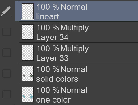
After that, deselect. Create a multiply layer if you can. If your program does not have a multiplier function, Pick a tone you want to use for shadows and lower the opacity (usually 30-40% I like to use lavenders or blue tones). It will not be as vibrant, but you can edit it in post. Select off of the solid colors layer. I like to start with skin tones. Use the airbrush tool to create soft shadows. You don’t want to create harsh lines on this layer.
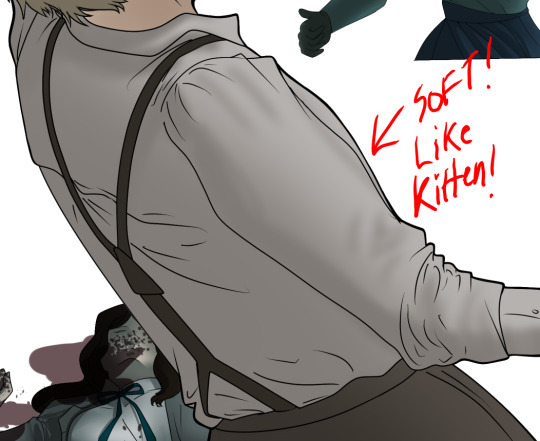
Then repeat this process with harsh lines.
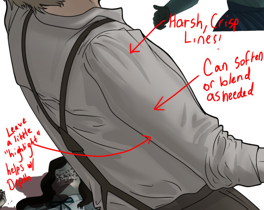
Then knock it all back with an overlay. If you dont have the ability to create an overlay, you can again drop a solid color and lower the opacity, but you’ll have to mess with the color balance/ brightness/contrast to let all the hard work come through.
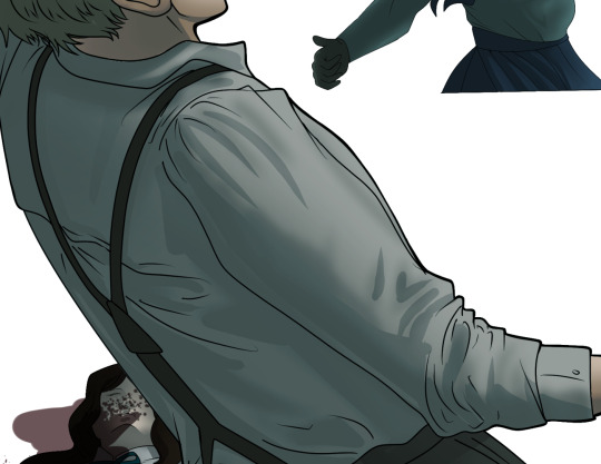
You’re going to repeat this for every single figure. Here’s a few color theory tips though.
Your overlay colors should be darker (not more vibrant) in the foreground and lighter (avoid using pure white) in the background. This helps with the depth of the piece. Things closer tend to be darker (not always true, depends on lighting)
You can choose to use color theory to aid your shadows. Instead of choosing black or grey for shadows, choose a complimentary color. I used a lot of green for this piece, I used red for really dark shadows. Its not that black drains color- its just loses some depth if not used carefully.
Keep your colors consistent. Helps unify the piece. You can strategically break the consistency to draw focus. For example, Fina is the only figure with a true blue overlay. This helps her stand out from the other figures who have reds and greens.
Step 6: Touch Ups and Final Renderings
Now comes the most tedious part. If you’re like me, your computer fans have been whirring for the last few hours trying to render this monster of a file. If you havent already, SAVE FOR THE LOVE OF ALL THINGS GOOD

These are the last four layers I have for the entire piece. Here, I am trying to create effective and believable lighting. This kind of work I have only been able to achieve in clip studio or photoshop. You can do it with normal layers, but choose your colors CAREFULLY. Stay away from pure white. Carefully utilize your knowledge of light and shadow to create soft highlights. Harsh lines tend to be a stylistic choice for me. The final layer, subtract, dulls out harsh red tones. I used this as a final overlay to help put everyone and everything in the scene. Without it, things are a little too green and skin tones are a little too blushed for vampires.
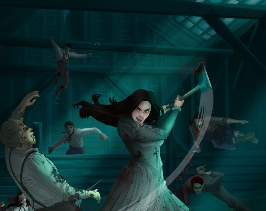
The challenge here is I want to tone down the red, but not lose the vibrancy of the blood. So, shift it to a blue. This also helped reinforce the “nighttime” effect. Its only a slight change.
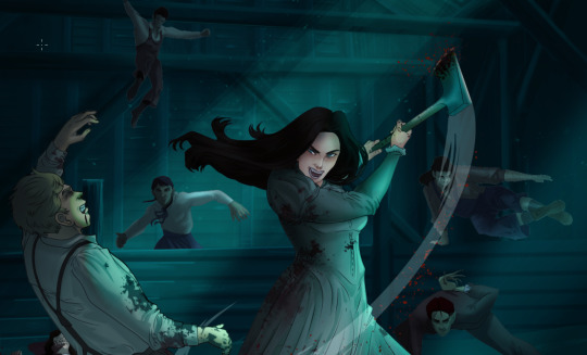
Final thoughts:
Whenever you finish something, its important to reflect.
1. I am so FUCKING PROUD OF MYSELF. This is easily one of the most complicated pieces I’ve done in a while- and I’ve made 16′ tall faux stained glass. Brag. Let yourself feel awesome cuz you just made something awesome.
2. I timed myself on the piece. I could have easily spent another 7 hours on it. But its important to know when to stop messing with it. Partially for budget reasons but also when you get down to the details you can make yourself go insane. Theres also a ton of detail work I lost cuz of overlays or its just too small to notice. Fina’s face? hard to see cuz its not close enough.
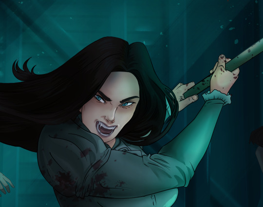
3. I needed to take frequent breaks for this piece. That was good. Resting and stretching was very important. That is one of the reasons why I was able to work so fast.
4. I started doing more digital art in April 2020. I have to say, practice makes perfect. I practice drawing and digital painting for at least 3 hours a day.
That discipline has allowed me to improve so rapidly. So- I don’t wanna hear shit about I can’t possibly get this good! Or I couldn’t even draw a stick figure! BULLSHIT. You can. Get yourself some free software like Krita or Autodesk sketchbook and start playing!
And thats what I got! Thanks for coming with me on this long post!
27 notes
·
View notes
Note
Hey, I wanted to ask if you had any tips for line art? Yours always looks so dope and I’d like to improve on mine! No pressure to answer this though, take care!
this isn’t a tutorial bc to be completely honest my method has always been just to make shit up until i figured out a way to do it that looked okay so here’s like... what i do i guess.
when i learned traditional inking i used like, felt tip microns & later taught myself how to use fine sharpie pens instead... so what i did was go over my sketch without worrying about it looking finished and then going back & thickening the outlines/varying line weight. generally what i like to see in lineart is heavy spot blacks/brush stroke like lines so now that i do digital inking i lean really heavily on how pressure sensitivity effects the line weight. here’s a page of random lines so you can see the quality of lines i like to use or something???

i don’t have a technique i just fuck around. i guess it’s good to generally make outlines thicker than minute details and use some different weights n thicknesses for emphasis in general since it looks nice... i also like looking at comic book lineart and trying to incorporate that look into my drawings. jeff smith’s bone was definitely one i’ve been trying to rip off for years LOL
14 notes
·
View notes
Photo


Hey! i’m going for a more realistic or semi-realistic style and i’m wondering if I could get help on general shading, mainly around the hair and eyes, as well as something seems off about how I made her eyes?
youtube
Hello! First of all thank you for your submission (and for letting me record this one) I have a lot for us to cover here both in and out of the video so lets get started with this!
I know you asked the main focus of this redline to be shading (and we’ll get to that next) but when doing realism or semi-realism your main focus should be to work on your anatomy FIRST, no amount of shading can save bad form! A lot of your shading mistakes actually lead back to this point – its hard for you to figure out to shade the nose and the cheeks if you don’t have the basic structure for them down, I have a lot to cover so I’m putting it under the cut.
The first thing I did was roughly block out the shapes / planes that make up the face. Reducing your subject to its basic shapes helps a lot with building up structure in your drawings. Some artists recommend using construction lines where they ‘measure’ out the distance between features on the face, but I’ve found that method can be difficult to translate shading into semi-realism and realism when painting. Using basic shapes and planes can help lay down the building blocks for where your shadows should go, treating a complicated shape as a simple one!


Source: https://thevirtualinstructor.com/facialproportions.html You can find many examples of this to work from here https://www.pinterest.co.uk/pin/861735709929507690/ As well as a super useful tutorial “Painting like a sculptor” https://www.youtube.com/watch?v=zC3OxonJcXQ Understanding the planes of the face https://www.youtube.com/watch?v=j-NEa0UNCNk How to draw face shading and planes https://www.youtube.com/watch?v=c6QMGcB-Htk With the eyes, the irises themselves are perfect circles – when drawing them looking towards the viewer a great idea is to draw a circle or use the circle tool and then erase the parts of the circle that overlap the eyelids. That will help you keep the eyes consistently round! I’ve also found you some great youtube videos on how to draw and stylise eyes, https://www.youtube.com/watch?v=LIykey9umVk https://www.youtube.com/watch?v=j77fZ7UAPv8 Shading and drawing hair in a more realistic style can be tricky, especially because hair in real life is made up of so many individual strands – often people who are starting with realism will try to show as many of these strands as possible or use brushes that are have a ‘hair’ texture to them. These brushes can be very useful however it is not the place to start from when drawing hair! A great way to start with hair is to get a reference and ‘blur’ it or squint while looking at it. Notice how hair clumps together to form thicker lines. If you want to add lots of little details, remember to start with these clumps first and then build up to the finer details with hair texture and brushes.

Secondly, the top of the hair always comes down from a singular point or parting line – find this point and draw down from it! A lot of heavily stylized drawings tend to ignore this rule but when aiming for realistic or semi-realistic hair it is important to keep this in mind – always know where your hair is coming down from and follow it!
A good thing to keep in mind when it comes to Semi-realism is to use lineart sparingly if at all (and never with pure realism). Lineart is used in place to represent the darkest points on a figure and to hint at form, when doing realism or semi-realism the form is represented by the shading. If you want to get into semi/realism its a great idea to start learning how to do lineless drawings and paintings! You see early on in my video I actually combine my sketch/lines into the painting and then begin working them into the painting process. I find this helpful compared to trying to paint from the start without lines as it helps keep the form together and fits nicely into the darkest points in my paintings. Its also very important to know where your light source is coming from, I made a bit of a guess based on your picture thinking its somewhere front facing. Remember different lighting directions can change the feel of a picture entirely and knowing where your light source is can help make it easier on you to know where to place shadows. Secondary light sources (like backlight/rimlight and specular/reflective light) can also add incredible depth to your work and give character to your drawings. Flat light sources like in your picture are easier to draw, but generally a little uninteresting – pushing yourself a little out of your comfort zone with the lighting can be very rewarding!
Here’s some more great tutorials that I think will help you a lot! Mouths: https://www.youtube.com/watch?v=EdLBGJ4wjFA
Noses: https://www.youtube.com/watch?v=_HDyk4dy7kc
Lastly, your colour choices are great and its really good to see what you’ve put into your art! I’ve looked at your other realism pictures too and its great to see how you’re expanding on your art and trying out new styles, I hope this helps you! Good luck with your art!
- Mod Pixielart (My Ko-fi!)
#submission#shading#mod pixielart#anatomy#face anatomy#original art by:#count-lucios-titties#theredlinestation
100 notes
·
View notes
Text
Sans Tutorial?
Last year someone sent an ask for a tutorial about how I draw Sans, but I have been pretty busy and not gotten around to making it! I don’t know how helpful this will be, because it turns out my technique is basically:
1. draw a circle
2. draw the rest of the skeleton
But anyway, I’ll post the steps for this picture here :3
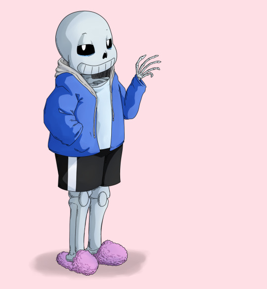
I have picked up some good tips from tutorials but I don’t use them very much because some are too basic, some are too advanced, some are written too proscriptively, and usually the example art looks way better than what I’m doing if I follow along. So my tips may be a mix of too-obvious and not-adequately-explained, but perhaps a few beginner or intermediate level artists will find something useful here :3 I will assume you know what layers are and have software that can do layers. I use Paint Tool SAI, which is pretty affordable, and there are other programs that are free.
First I draw a circle where I want the skull to be. I don’t necessarily stick with this circle as I continue sketching. And one of the advantages of drawing digitally is that I can move parts around if it’s not working. If I’m planning out a complex picture, Sans will be a circle with two more circles for eyes and a vague cylinder/blob as a body, at first.
Then sketch in more detail. Fingers are important, and I often have to go back and refine the sketch of the hands in the middle of doing the lineart.
There are many different and valid styles for drawing Sans. I always draw his eyes as this sort of arch-like shape, like a half circle that’s stretched out vertically. Even if they’re half-lidded, I start with the whole eye shape (and if they’re half closed they tend to end up pretty rectangular).
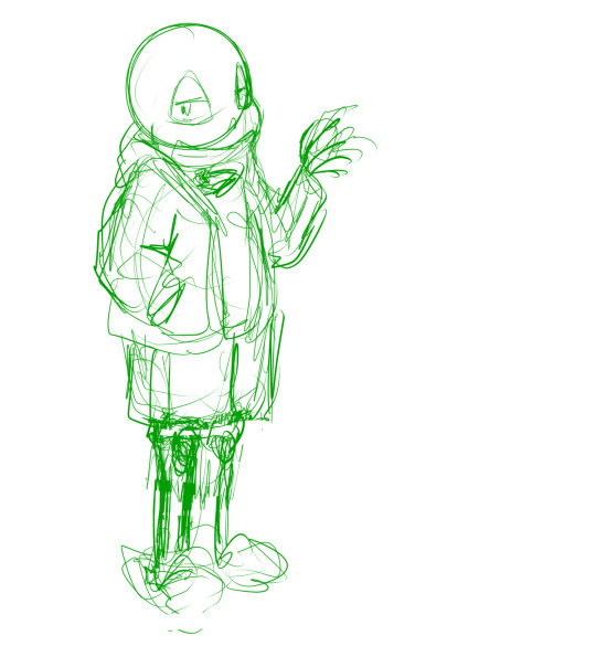
In this picture, I made his legs too short, then too long, and you can see some artifacts of how they got moved around and adjusted. (I pretty much never draw him just standing there in full-body, I guess owo) It’s much easier to adjust things in a sketch than after it’s been lined, so take your time. If I wasn’t feeling confident, or if I wanted to make the linework easier, or if I wanted someone to approve the picture before I did lines, I would do another, more-refined sketch on top of this one. But I’ve been drawing a lot of Sanses over the past few years so I didn’t :3 I do have a brush for sketches that is not totally opaque.
(Beginner tip: If you’re using a serious art program, you can reduce the opacity of the sketch layer and draw the next sketch in a new layer on top. This is how you’ll do the linework too. I also put Sans’s legs on a separate layer when I was adjusting them in this pic. This is also a good time to adjust the framing of the picture; I usually drew it too small and off-center. This pic is a bit off-center because I thought I might add text on the right side about the steps. But then I didn’t.)
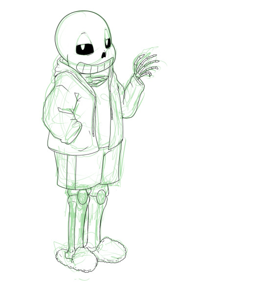
Next is lines. In Paint Tool SAI, I can have multiple layers in a folder and select the whole folder as “selection source” (so I can fill in the colors later). This makes it easy to use a Lineart layer for the smooth curve of Sans’s skull, and a regular Raster layer for the rest of the lines. Of course, make sure the line width is similar. (Being able to choose a selection source other than “current layer” or “whole image” is one of the advantages of SAI in my experience.)
I used thin lines here. I don’t always, but sometimes I try to use thin lines and add plenty of detail and I’m pretty pleased with it. (Often if I want to save some energy I use thicker, rough-textured lines, so that you won’t be able to tell so much where I got the curve of the skull wrong and then adjusted it.) When I first started drawing Sans, I gave him too many teeth. Then I overcompensated and gave him too few teeth. Now I’ve settled on about this many teeth. I like to draw bony, skeletal hands. For any bones, Google image search is your friend. You don’t need to know the proper name of the bone; just search for the body area + bones. I usually draw the nose hole a bit more simplified. I don’t always bother with the drawstring. Sometimes I give him a turtleneck sweater so I don’t have to draw a glimpse of collarbone, ribs, spine inside his shirt. Idk why his tibiae are so thick today owo

Flat colors and cel shading. I like to put a bright color that contrasts with the colors I’m using in the background, so I can easily see corners that got missed by the fill tool. Usually, I do multiple layers of the base colors, so that I won’t have to worry about the edges when shading. (All the color layers are collected in a folder. Not the bg though; if it’s complex it will have its own folder.) Here, I used a shading layer for each base color layer (the shading layer is a clipping layer, so the shade color won’t be visible unless it’s overlapping its correct base color). I don’t like to be organized and label my layers, so I do the shading right after the base color, while I still remember what layer it’s on :3 You can also do the flat colors on one layer (or just in one folder) and then put a multiply or shading layer as a clipping layer over that for the shading (many fewer layers to deal with but you must pay more attention to the staying inside the lines). Aside from the sketches, I still haven’t used any brush other than the default pen. You can of course use more layers and more colors for fancier cel shading. I have used a few extra darker shades on Sans’s neck.

More shading. I usually choose between cel-shading and more shading, but I tried adding a little bit more here since it’s a tutorial. It doesn’t make a huge difference though; if I hadn’t done cel-shading, I would have made the blendy shading stand out more. You can do each color individually (here’s a tutorial about that), but you can also make a clipping layer over all the colors (flat colors on one layer or all the color layers in a folder) and make it a multiply or shade layer, and shading for all the colors there. I like to fill in this shading layer with white so it blends more between the light and dark. This is also a great technique for adding shading to something that has a pattern on its surface (e.g. you can add fur texture to your rainbow cat without painting the texture in every color of the rainbow). This is where I use brushes I adapted myself or stole from other artists :3 and another place where SAI has an advantage because it’s specifically designed to be good at painting. I lightened the background and added a little shadow (blurred with the watercolor brush).

Extra cross-hatchy lines. When I do thin lines, I like to add these lines as a little extra shading/detail. I usually do them before color, and on a separate layer so I can keep them out of the “selection source” when filling in flat colors. This time I did them at the end. They add a little texture to everything and I think they work well on the hand bones.
22 notes
·
View notes
Text
Art Growth Compilation

I really enjoy doing posts about improvement in art.
It makes me feel better about my work, especially with how busy I am these days.
I wanted to compile all the comparisons I’ve made over the years and kinda discuss the posts, for myself or others.
I thought it’d be funny to start with comparing how I first drew on a tablet, using dodge and burn tools, to how I do now which is using layers and actually painting. It’s funny to look back on that, you know?
I linked the post I made, compiling all the month to month memes from 2003-2017 that I try and do yearly. And everything else is under a cut ;w;’‘/

Most artists have done a drawing of themselves and a few Pokemon, or their team. I did that in 2010, and was dissatisfied with my work...
I took a crack again in 2013 after I’d learned to draw more animals and not be so Edgy(tm) I really liked the results. I still didn’t use references though, because I was lazy. I just didn’t want to. I still was on that boat feeling like I was CHEATING. I wasn’t being CREATIVE if I looked at references.
Artists get stuck on using reference and it’s AWFUL. USE THEM. USE TWENTY. LEARN!! It’s so HELPFUL, I wish I had started sooner.
In 2014 though -

I tried again.
I had gotten better at anatomy, but most of all, I started to work off references more. I started to really focus on not stylizing so much, but to work on actually making things look like things. I started to work on caring about COMPARISON sizes. Composition!!
While Pokemon reference sizes are -wiggle hands- and while my team changed up, I was satisfied that I could draw Arbok ACTUALLY like a cobra now, Meowth is easy given it’s just a noseless cat so to speak, Haunter is literally a triangle cloud - I was satisfied having drawn that team.
My secondary team in the new games? I was excited to draw them. It was fresh and new and FUN and it turned out PRECIOUS.
I learned better how to proportion things in an image for layout, and just... making characters feel COHESIVE in the same space.
It was a nice thing to keep visiting. I have a sketch in the works for an update even hopefully.
These pieces are kind of interesting to me too, because they’re towards the end of my era of THIN lineart?
My lineart has gone from this, and THIS, to this.
Literally I use to not believe in line weight, I can still do thin work of course, but I’m not a fan of trying to FORCE it like I use to? Even the second link, I went from the SMALLEST brush in Sai, to using a marker brush that had barely ANY give, to a custom brush on Sai that acts like a Paint Chat brush I use to use with friends online!
That’s what I mean about style too, like you may reserve yourself about things - like not coloring black in and outlining with white, or certain ways you do things. But the growth and changing and figuring FUN ways to color that black etc is where the fun of art comes in, to me??
Learn. EXPERIMENT. PUSH!
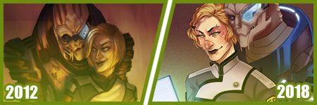
A few months ago, I did my first redraw. Of this piece from 2012.
Six years difference.
This was interesting for a number of reasons. There’s aspects I like more in the old one, but not many. I really like the pose a bit better, but I like the casual closeness that I did in the new one because that’s more my Shepard.
But technically speaking, it’s worlds better because I took time. I paid attention to details. I did fun things instead of rushing. I took time with my coloring and didn’t SMEAR it around. I had a friend who use to complain I drew so fast and they felt so SLOW, but I love what that taught me. I started taking more time on my art, and enjoying it more since I caught more mistakes and vastly improved. By leaps and bounds.
It’s amazing what a difference six years makes in not only style, which is often a FOCUS of these things? My style has come awkwardly and naturally to me over the years of critically picking certain things apart? but I really love where it’s gotten.
I have things I want to get back to, but I love... where it is, and CAN be?
But it’s wild to me how much change happens in technical handling? It’s a hand in hand thing, you can’t focus on one or the other only, or the other suffers.
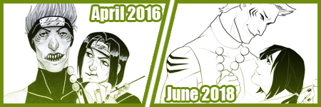
Honestly this has been my favorite improvement to notice though?
Kisame was a character I felt I should be able to draw EASILY? Not so much. Itachi? ALSO EASY. Not so much??
Kisame has weird eyes to grasp how to draw? Thus focusing on them kept making them wonky to me!! On top of that, he’s everything I’ve been use to drawing for AGES because he has a muscular body, with a smaller waist? ... that was something I was use to drawing? I still was awkward getting back into the swing of that... Drawing HIS HAIR though? NOT SO EASY....
But like, Itachi should have been easy, but I have a thing about him appearing too feminine as he gets drawn because his eyelashes, and I’ve really found a nice... medium at this point?
But even still like my face styles and eye styles are finally to a comfortable point for me? I have stopped focusing on some weird things with Itachi’s hair and just... DO IT? But even still like...
The improvement here is literally just if I don’t know how to do something, or I’m not satisfied with how I do it? I just keep at it.
It’s a theme of this post honestly... repetition, persistence.
Keep drawing it. Keep trying to figure out what it is that’s catching you off about how you do it. Don’t like how you do eyes or how they fit on the face? Look at facial structures and references and figure it out. Draw them separate and figure out how to apply them to what you are.
Remember there’s a skull in there. I draw the holes in the skull like the eye sockets, and the nose area to help my proportions for SURE.
I’ve also gotten to a nice marriage in my lineart? The piece before the recent one, those lines feel HARDER or HEAVIER? The newest piece seems...softer? Like I’m lighter handed again?
I really like critiquing my own growth on what is good or working better for me? Older pieces it looks like I’m putting lineweight for SAKE of it versus where it goes now?
INTERESTING.
Like this lineup -

My style shifts so RAPIDLY, it still is noticeably MY style to people, but parts shift so VIOLENTLY because I’m constantly picking at what I don’t LIKE.
It’s funny too in the case of Kisame and Itachi because consistently I’m drawing the SAME character over and over - can make you REALIZE how you’re doing something wrong?
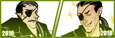
Like, here’s a difference of eight years, and it’s all the brush I use now, and it REALLY shows how my style has changed - in the aspect of one point of reference?
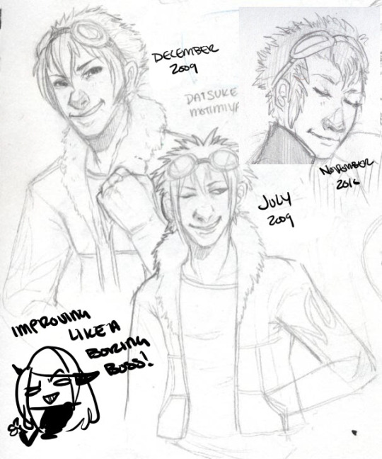
I have a childhood favorite character too, of Daisuke, and I use to be bad at drawing boys, and I use to be SUPER bad at drawing fluffy hair?
It was something I specifically started to learn to do? And I started to draw Daisuke every few months or years for a while. Especially when I started to first REALIZE I didn’t like my style that much?
But the middle one was July 2009, top left is less than 6 months later, and the last one is about a year later. DRASTIC DIFFERENCE. But next -
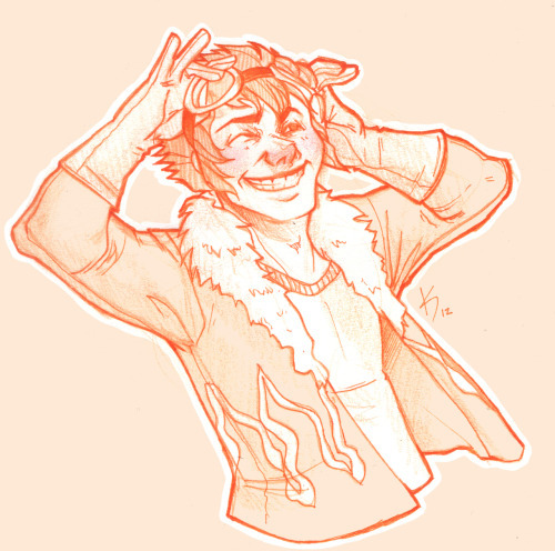
This one was in 2012, when I started to do more with teeth, or first dipping my toes into anatomy. I started to focus more on HANDS too, I was super bad at them. Overall I started to focus more on making my art have...ages? Like a boy versus a man. Facial features being DIFFERENT.
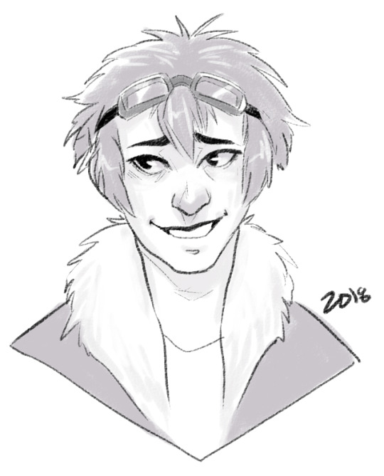
I can look at this boring little bust and see that he comes off more of a teenage boy to me now. I need to work more on figuring how to draw asian features especially the eyes. Sometimes I hit the mark, other times I don’t.
but between this and 2012? Not too much has changed. I do hair fluffier now, and I angle the eyes better. The teeth not being outlined doesn’t give that weird effect where I might give him TOO MANY TEETH....
People do that and it’s easy but whoof.
So there’s still learning and adapting to do in QUICK drawings, you know? but I can still see there’s good things. That took me like 5 minutes to draw? Not bad honestly.

In it’s own bracket is original characters though too?? But also divergent of STYLE shifts because like...
OKAY. Nightmare Syndicate’s story.. started for me in 7th or 8th grade, that was when I was...14? 15? I’ve been fleshing it out for like 13 years, that’s wild haha!! I love my kids and all.
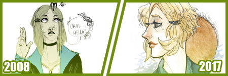
But okay so SIALI. She’s still fairly similar but I restructured her face for SURE. She’s gotten less edgy, she’s.... a teenage girl.

FELIX?? CHRIST. He’s been such a long journey!! More on that later?
Rot and even Cor?? Rot and Cor are a shorter span of development, but Rot started in Highschool so almost 10 years ago, and Cor has been fairly solid - but even just DRAWING him over three years? Go look at how much he changes.. I’m not married to concepts easily. haha!
People act like making a character you’re STUCK with it. Like Oh boy, I better make this character good, from the get go!!
I only worry about that with small potatoes like my Pillar(Gods) designs I just made for the comic?? Even still, small things will change with them I’m sure.
But not only has Felix and Siali changed, but they’ve GROWN with my style and DEFINED it even. I’ve had to adjust my style to support Felix’s look honestly a LOT. Bend my rules. Break my anatomy stickler attitude - and honestly, that’s the thing.
You have to learn the rules and anatomy BEFORE you can break them. A style built upon broken anatomy will fail you down the road if you just excuse everything with style.
Learn to draw the hands. Learn to draw the feet. Figure out the face. Bones exist. You can break the FUCK out of it once you learn how to do it, you know? Like I’ve seen so many styles I LOVE who are cartoony and BROKEN AS FUCK, but there’s still some STRUCTURE to it. Most of those people can still structure a face just fine, and the reason exaggeration works so well is because there’s like unwritten rules for what works and doesn’t based on that?
Idk.
Felix has a very elongated torso, he’s like 7′ or 8′ tall so I mean?? He’s... broken anatomy, but he’s... lanky - but his muscle is LITHE and stretched. It makes contextual sense. That’s the important part.
But even designs, it’s important to understand designs YOU make, or like... to understand they’ll CHANGE and that’s growth within your art too?
Like okay, example. Felix has a millipede inspired monster form. But with designing that? I still have to know how millipedes and SNAKES work because there's bones and vertebrae in there??

But there’s also the difference of like... CONCEPT, versus execution. You can design a fucking badass character, but understanding your own concept is SOMETHING.
I had no idea how this would play out, until I was mapping out his ‘midsection’ spikes? and man. MY STYLE WAS MADE FOR THIS CHALLENGE NOW. Which is so interesting how smooth my style has always been? Felix has defined ANGLES in it, and it’s hilarious tbh?
But even too, I’ve had to work with Felix’s monster form FACE, to break the rules to make it WORK the way I need it too?
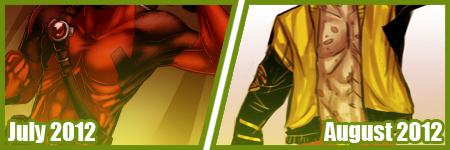
On the anatomy subject too, like when I first got into Marvel comics 6 years ago or so? I had no idea how to do muscle structures?? I was so BAD at it.
I can look at this left image and CRINGE so badly at how NONE of those are muscles?? THOSE ARE THINGS I PERCEIVE AS MUSCLES. Like...
A course I took taught me to draw what I see, not what I know. That’s the whole point of that post that goes around about drawing a shrimp. Look it up. It’s hilarious and cute.
But it’s like, asking an artist to draw a bike, you can tell who uses reference and who WINGS it. It’s funny, but like it’s what you know versus what you see.
I started to study anatomy like crazy and was seeing improvements days at a time. The right image was done like... a month later? already I can see the muscles under the pectorals? those look normal now. the abs aren’t dough lumps under the skin in a perfect 6 pack, they’re the actual plane shapes.
I was trying to find a good reference for myself of learning to make men ‘thicker’ too in terms of the waist etc since the left is really...thin.... but...

A bit better, but even still, comparing these two - they’re 2 months apart? and I can see understanding more about arms and how they connect to the body, where the planes ACTUALLY lay for the chest and obliques and such?
I can see improvements from July 2012 up there, to - WHOOPS. I FORGOT TO CHANGE THE YEAR LMAO... TO FEBRUARY 2013...omg
I mean, I could go on and on about improvements I see, when I go through my art though? Gosh.
Like I’m seeing so SO many bad hands and feet in my old stuff, and just CRINGING because tricks I learned for myself by now?
I give so many pointers and streams and screenshares on discord still to help people with art and it cracks me up?? Like...
I dunno. I’m pretty mediocre tbh, but god damn.
21 notes
·
View notes