#trying to get better at stylizing realistic looking characters
Explore tagged Tumblr posts
Visit Tumblr Blog
Explore Tumblr blogs with no restrictions, modern design and the best experience.
Last Seen Tumblr Blogs


Fun Fact
25% of US internet users with an annual income of $80-100K use Tumblr.
Text
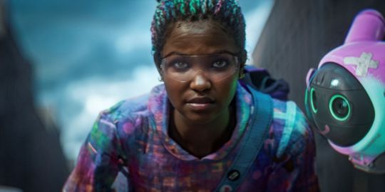
Everyone who said Elio was "mid" needs to apologize rn. I almost didn't bother seeing it because I kept hearing it was mediocre, only for it to end up being one of the best animated films I have seen in a while! Spoiler-free thoughts below the cut:
I loved the character designs, the aliens were absolutely adorable! The textures and lighting were phenomenal, and despite being very realistic, it still worked very well with the overall cartoony style. That's another thing, I've seen a lot of people piss on Elio over its art style that Pixar has been using for their more recent films, but repetition doesn't equal bad!! It's really cool to see animated films with unique, stylized animation. However, remember that this very "bean mouth" style that people hate in Elio was praised in films like Luca and Turning Red because it was unique and stylized at the time. It hasn't even been a decade of this style being used, and people are already complaining about it getting old. Even if it was, not every animated film needs to try something new visually. The point is, Elio still looks great, even if it's art style has been used before. Animated films should not be expected to try something new, even if it is cool when they do.
Outside of the visuals, the writing and pacing were excellent! The latter of the two are especially important to me, since I feel like pacing is something films in general recently have been struggling with. (e.x. The Wild Robot, as good as the visuals, story, and themes were, the pacing was so atrocious it was almost unwatchable for me.) The themes surrounding loneliness, belonging, and parenthood were wonderfully executed as well. I loved how they tied in the question all alien enthusiasts ask, "Are we alone in the universe?" to a much more personal level. Especially amidst the current loneliness epidemic, presenting the theme that "even if we feel alone, we are never alone" is really important. I also loved how parenthood is tied into this, that your parents/caretakers know you better than you think. Even if they don't necessarily understand you, they love you and want you to be happy, which is another great theme for a children's movie.
Anyways, long story short, Elio is a fantastic film, and if you are financially able, go see it in theaters!! I hate seeing these pointless live action remakes outperform an original, remarkable animated film.
#pixar elio#elio 2025#elio#pixar#disney#elio pixar#elio movie#no spoilers#disney elio#disney pixar#pixar animation studios
41 notes
·
View notes
Text
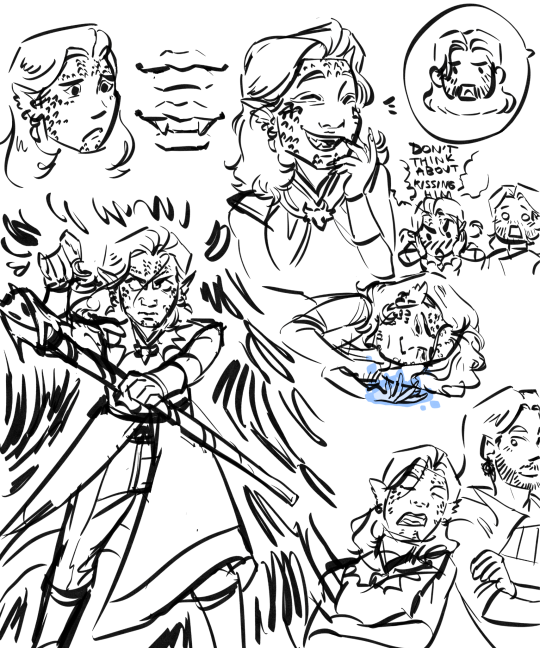
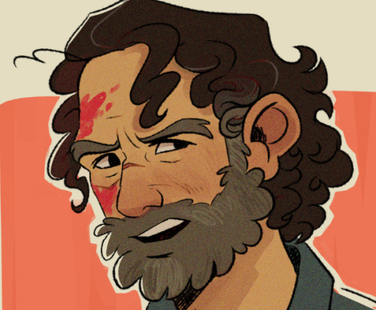
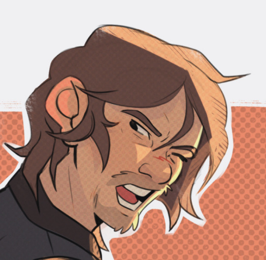
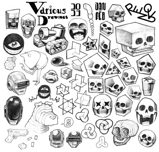
Take an old set of Baldur's Gate 3 doodles.
#i really like how these turned out actually#they look a lot like my Tav in a stylized way#trying to get better at stylizing realistic looking characters#tav x gale#gale#bg3 tav#tavara wrelkin#art#my art
10 notes
·
View notes
Note
do you have any thoughts on super-hero comic muscles and physiques? not a judgement, i just see that you tend to not do the exaggerated bodies that you normally see in comic heroes
I tend to not draw out the exaggerated superhero muscles because my middle-grade-cartoon style lends better to smoothening and softening the shape language of the more "realistic" style of cape comics, but a part of it is also just trying to normalize different body types!


For a character as conventionally strong man looking as Superman, I borrow a lot of my version of Superman from the way Gurihiru stylized him. Even then, I don't draw the exaggerated tapered in waist or shoulders as broad as they, and many cape artists, do. Because that body type isn't actually strong! It's all aesthetic Mr Universe Hollywood man body type you get from dehydrating and starving yourself that people wrongly associate with healthy strength by conflating it with beauty standards.


(Form vs Function graphic by coelasquid)
So I wanted to draw Clark with an actual strongman physique! I think it just makes sense for a boy who grew up on a farm to naturally buff out into a strongman body.
I understand that it's all stylization and escapism at the end of the day- but when I think about that comic artist who made fun of the MCU Namor actor for not being as buff as he is- it's a reminder that depicting different bodies in our escapism matters! I know Robert Pattison was joking when he said that he skipped out on doing a routine to get into shape for playing Batman, but the guy was onto something.
#askjesncin#jesncin dc meta#same with when god of war fans thought “fat” thor in the latest game was diversity pandering or whatevs like no strongmen be like that#some of them got a gut that hangs out- it's what peak performance looks like actually#ppl talk about barbies or disney princesses giving unrealistic body expectations but like. cape media is doing similar stuff for boys
132 notes
·
View notes
Note
Hi!!!!!!
I really love your art and I was wondering if you had any art tips?
I'm pretty good at drawing realistically, but I struggle with more stylized or cartoon-y stuff...
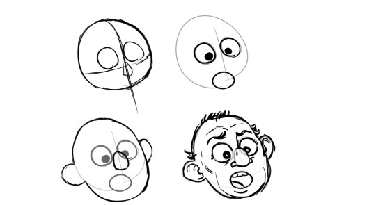
Here I’m going to talk about the two, in my opinion, the most important aspects of stylization is: ‘Simplification’ and ‘Exaggeration’
First, simplification,
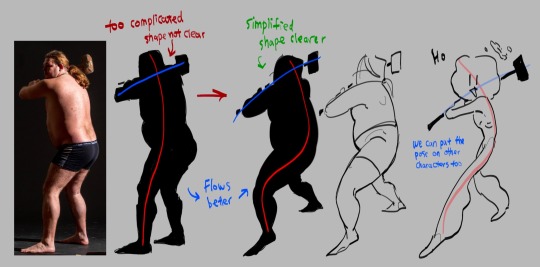
I took this picture of a man holding a hammer, if you just look the silhouette, it is very complicated the pose is stiff
Try summarize the pose with only two simple lines, one representing the head, torso and the leg, the other representing the arms. This is the line of action. Now you got the two lines, play around with it try make it flow better. (Google ‘line of action’ you can find a lot more better examples)
The next step is to simplify the previous drawing throw away all the bumps and little details, take what you think is the most important and draw it based off the line of action you just acquired. this step might take a lot of practices so look at tutorials and draw a lot you’ll get there (Go on YouTube and search ‘life drawing tutorial’ they teach this step really well)
This is how you simplify a complicated pose! I’ll talk about how to simplify character after the next point
Second is exaggeration
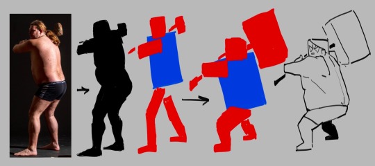
I’m using the same photo here again blocking the person black so we can see the silhouette clear. This time we’re not finding the line of action, we’re reducing this person into a simple shape, to me, he looks like a rectangle.
great, now we try drawing this man with only rectangles
After blocking out the simple rectangles, exaggerate them, make the big ones even bigger, the small ones even tinnier.
Make the main focus of the drawing clear and easy to see, the audience needs to be immediately on that thing the moment this drawing shows up! What’s the focus point of the drawing? The hammer, it’s too small for one to find so let’s exaggerate it make it huge.
Tada, now you have a clear and cartoony silhouette, the rest you can fill in however you like
To cartoonify a character is easy, similar to how you cartoonify poses, you take out the little details and leave what you think is the most important, the things that makes the character unique, and exaggerate them
((Here I’m using a genshin character because their character designs are known for being a hell to animate (genshin fans don’t come for my ass this is only for educational purposes))))
I’m… not the best at explaining things so if you can’t understand any of these please let me know!!!!!!!!!!
706 notes
·
View notes
Text
I haven't seen any posts about this yet but l've seen some fan art that makes me feel this needs to be said:
Don't forget Leah Sava Jeffries has darker skin when making Annabeth Chase fan art!
She is much closer to Lupita Nyong'o than Zoe Kravitz when it comes to shading, reflection, and complementary color usage :).
Lighting for dark skin is different on light skin. Light skin gets changed by lighting, and dark skin reflects the lighting. Below is a lovely shot of Nyong'o's character from Wakanda Forever in mourning. The filmmakers emphasize the umber qualities of her skin in contrast to the funereal white and (arguably harsh) light across her shoulder below.
Try to pick spots that aren't directly in or near the light, and try mixing 3 or more! You can put it into a color mixer online, or even color pick, lower the opacity, and lay the shades over each other until you find one that fits. And of course, the more 'realistic' you want to go with shading and lighting, the more shades you're going to want to be able to explore vivaciously :D.
Let's take a look at the same 3 beautiful actresses I mentioned at the beginning, with a bad color picked area and a better-ish color picked area. (Please keep in mind, these are not perfect comparisons, as I was not able to find pictures of all 3 actresses under the same kind of lighting.)
Kravitz's has a clear difference between the two, but they aren't too far apart, in comparison to Nyong’o’s and Jeffries’s. Note the dullness in the poorly picked shades as opposed to the better ones. Also keep in mind that while Kravitz has a rosy undertone (at least in that picture - it’s from The Batman, which has stylized coloring) Nyong’o has a slight cool undertone (I can’t pin down quite what, but the picture is definitely not stylized like Kravitz’s).
Jeffries runs more ochre or russet, but neither of those are pink. They are more red than terracotta or umber, but to call Jeffries’s face rosy would be wrong. Err more towards the golden when drawing her.
^^saved an image from a writing tutorial long ago, but can’t seem to find it. If someone recognizes it, I’ll link it. EDIT: it’s from this post. Thanks @autumnrowancollector ! <3
And also, the darker skin gets, the less likely warm undertones are going to appear. Don't be afraid to use blue or purple or even green on occasion!
Additionally, cool lighting on dark skin is always a win imo.
(I was going to use that picture of Jeffries as Annabeth by the lightning bolt, but then I realized the lighting on her face doesn’t quite match up with where it should hit from that angle, and I realized they kind of just turned everything bluer, so screenshot time!)
(Also if you want another really great live action example, check out anything Aldis Hodge is in, like Leverage and Black Adam)(and of course there’s Spiderverse <3 but I want to post pictures of Hodge)
Now, to here’s a list of more experienced people’s advice:
Black facial features & hair
Shading digitally for a (somewhat) monotone Black character
Stylistic choices and places to start looking for inspiration (besides a search engine).
Coloring Black people’s lips
A better coloration tutorial
Also a nice tutorial for Indigenous skin tones, just in case yall want to draw Piper or use this information for other dark skinned characters :).
EDIT: Some actresses who are closer in skintone to use for Annabeth, provided by the lovely @blackfemmecharacterdependency ! If you can’t find a reference for Jeffries in a specific lighting, maybe check out these ladies’ pictures! It’s a reblog, so scroll down.
TLDR: Don’t make Annabeth pink and pale, make her dark and golden.
#Annabeth chase#Percy Jackson#percabeth#leah sava jeffries#pjo#leah jeffries#art tutorial#percy jackon and the olympians#I love superheroes and so of course all of the actors I thought of were from superhero movies lmao#also for the record my advice is mostly from reading others’ tutorials and observation#and I don’t really use it a lot because I stick to lineart a lot lol#like down to mentioning Hodge (love himmmm) as a reference for good lighting on dark skin#there’s another post floating around here that specifically mentions him and Leverage for that#I’m tagging this as an art tutorial but really i want it to be more of a master post#master post so yall can see the tutorials I usually use#but then I ended up writing about Jeffries specifically because I’m dumb#I wanted to go to sleep four hours ago I’m dumb#I really want to draw her and ginger Percy but#irl it’s starting to get busy at school again :/
380 notes
·
View notes
Note
hey, long time admirer of your stuff! ive just been wondering, though, how exactly do you do your eyes? like.. obviously they're different from character to character, but how do you usually form them and whatnot?
thank you ! - 💥
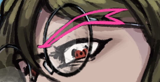
heya thank you :) it's been a while since i answered one of these in depth but for you good anon i will try my best..... Here's the simple answer:
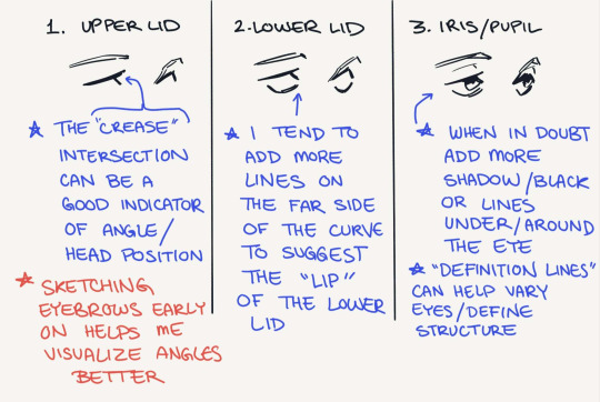
Here is some more thought-process/behind the scenes stuff:

Obviously head angle determines many things about drawing eyes; I've been trying harder to keep it in mind when I'm putting lines down, and it'll generally make them look more grounded/offer better depth. The main takeaway from head angle is how are the eye sockets oriented. Doing drawovers of photographs is a cheap+easy way to get a feel for this, but I wouldn't worry about 100% anatomical accuracy; what I'm trying to get a feel for is the placement of eyes versus the brow/nose bridges.
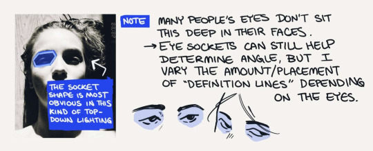
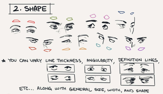
The amount of detail I put into eyes is wildly inconsistent haha it rly depends on the piece and art style, but the (for lack of a better word) "definition lines" and spots of black in deep shadow make up most of the detailed stuff. I'm still not great at drawing massively distinctive eye shapes but I try to maintain a general sense of one for different faces (ex. Rectangular, narrow, round, angled up or down). I'll also be the first to admit it takes a lot of conscious thought to reproduce the same line variation/angles in someone's eyes each time you draw them, but if you're looking for advice on consistency those are examples of traits I'd keep in mind.
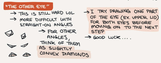
That's it for the most part.... I don't think the way I draw eyes is particularly unique lol so here are a few things that have gotten me where I am:
other people's art, a lot of which is manga. when I say naruto taught me to draw im only half joking hwheeze. my art tastes lean towards manga/comic stylization so none of this is hugely realistic overall....
that being said, I do like the more realistic side of manga/comic art so photo studies/anatomy tips have still been useful to me
this tutorial by sinix is one of my favorite things ever, because it explicitly discusses both anatomical knowledge AND how to translate that into shorthand
thanks for the ask!
#asks#anonymous#art asks#i've had zero time to draw hence the no posting ...... i miss her...#making this was a very nice break from the everything else :')
466 notes
·
View notes
Note
How do you (personally) balance designs looking cool and practical/realistic? I feel like I get stuck on my spec bio that I lose the fun in designing. Or I can't find anything neat from the animals I use for inspiration to add and don't know where to look for other ideas.
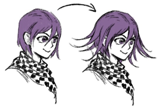
you gotta add life and whimsy. sounds kinda weird and maybe doesn't make sense, but it's true. you can spend all sorts of time making a perfected realistic looking design and if there's no life and whimsy in it, it feels flat. you can practice this by drawing very fast gestural poses, putting your character/creature designs in Situations and drawing how they'd react, and just practicing expressive faces.
Make a whole character out of your creation. doesn't have to be a character you give a name to and keep around forever as a new story protagonist or dnd character or whatever. you just have to breathe some individuality and life into it for a bit.
I'll try to illustrate what I mean.
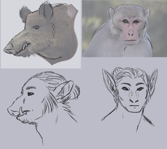
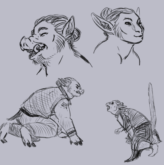
(image description: two sketch pages of an orc and an elf. on the first page, they are drawn beneath reference images of a wild boar head and a macaque. here, the orc and elf have more realistic facial proportions and match their reference animals better, but they look a little dull. on the second page, the orc and elf have been redrawn. at the top of the page are sketches of each of them laughing. the orc's mouth is wide open, making their snout wrinkle a lot as they lift it in their laugh. the elf's mouth is only a little open, with the lips pushed forward in an O shape, and they are squinting happily. below this are full body sketches of the orc and elf, fully dressed in casual outfits, crouching to snarl at each other. the orc is baring their tusks but keeping their mouth closed, while the elf has their mouth wide open, putting their long canine teeth on display and also holding their tail straight up. end description.)
body language and facial expression are so important! you gotta be loose with it to learn how to create more dynamic and lively designs. and for characters, it's also important to explore things like culture and personality so you can individualize them.
I don't know exactly what your art style looks like or what it means for you to be hitting roadblocks in the design process as you try to find that balance between looking both cool and realistic. My art style is semi-realism, and I do think stylization plays a key role in crating interesting designs. the closer you get to photorealism, the more difficult it is to create dynamic designs, in my experience. it's not impossible! but getting to that skill level in realism is harder than i think some people assume it is.
I have seen a lot of photorealism art that was clearly done by skilled artists who know all the technical things about making art, but couldn't bring out the life in their subjects. it's easy to get stuck on the technical skills, to fuss over making the shadows of a portrait match the photo reference, to get so skilled at texture that you forget about gestural posing. maybe getting so invested in realistic and practical design you neglect the whimsy. fantasy is inherently whimsical! I know this blog is all about making fantasy anatomy more believable, which often means curtailing the whimsy if it gets out of hand. but the whimsy is essential! it just needs to be cultivated and pruned occasionally if it's getting in the way of your goals. and on the other hand, so does the realism! perfect realism can't really exist in fantasy, or it would already be reality, you know what I mean? if the realism is a roadblock to designs you truly enjoy, prune it back. cut the realism down to size and make room for some whimsy. that's the balance.
61 notes
·
View notes
Note
Hello! Do you have any tips on stylizing/drawing real people?? recently ive been trying to draw from my favorite shows but they either look too realistic or just not like the person at all. I love all your twd art and its really inspiring!
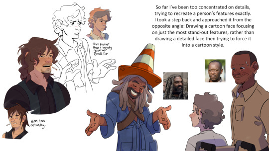
Omg thank you so much, it’s actually so funny you should ask this because this is exactly what I’ve been struggling with/researching for like 6 months. In fact I had an independent research project at uni that I told my prof was gonna be all about learning how to make background art for my final film project. But I got SO into learning how to stylize real people that I forgot to do the project at all and just submitted all of my walking dead fanart and stylization research and somehow got a B+
So strap in, you are about to get blasted with a hyperfixation that was so strong it almost lost me my bachelors degree but instead (somehow!!) got me one of the highest grades this prof gave out this semester
I’m still learning and trying to get better, this hyperfixation isn’t over it just has to be on pause because I WILL fail my final year of university if I let it take me lmao
First of all, here are my project slides (PLEASE ignore my cringe-ass writing, most of that shit was done in a panic at 5am)

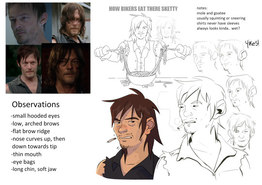
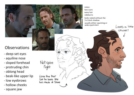
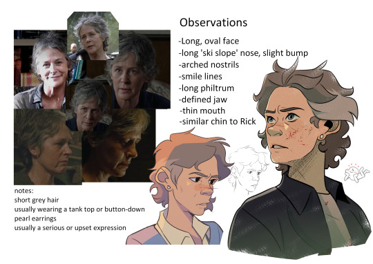
this was a good leaping off point and now I know their features like the back of my hand, but they're missing a lot of character imo
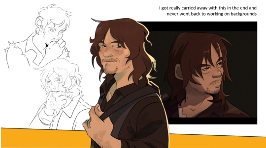
"I thought highlighting his eyelashes and freckles would bring out-" blahblabla, truth is I just think he is very Eyes and his freckles are cute but I can't just be saying ''it's about the VIBES sir''
I highly recommend looking at an artist called @geitonas. They were actually my biggest inspiration in this project because personally I think they’ve mastered stylizing real people and their art is how I want my walking dead fanart to be. They know exactly which features to push and which to downplay, so if you’re familiar with the subjects you can recognize them immediately.
But the biggest thing to note is that their features aren’t replicated exactly, they just have the right energy.
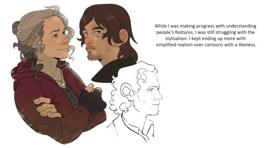
I guess my biggest advice is pick a focus feature. For Carol I think her most defining feature is her nose. It's an odd thing to say but she has very distinctive nostrils. So no matter how stylized I draw her I try to keep this feature in mind, even if everything else goes out the window
Keeping an eye on someone's unique mannerisms and facial expressions can go a long way too. Rick's squint, Michonne's stare, Daryl's scrunch...
This turned into a ramble. My thoughts were more coherent but too many of them wanted to come out all at once. Hope this was helpful anyway!
#asks#twd#the walking dead#scribbles#edit: these images were aranged better but I guess the ask format forces them into one long line sorry
92 notes
·
View notes
Note
I love your art style! How did you develop it?
hello! this is very kind, thank you <3
i'm someone who gets pretty bad art block if i don't change art styles semi-regularly, so i end up with a new style for every situation -- though i think i still have kind of a 'base style' that bleeds through.


drawing for vip is the first time i've been in deep on a piece of media where the characters have canonical faces; i've been in the podcast/book/oc zone for basically my whole life, and on top of that i've spent the last couple of years not really drawing humans at all (it was all domestic cats all the time in my brain for a hot second). so uhh. yeah. it took some work to get myself in a place where i felt good about making art for this fandom. luckily, i've also been in a realism phase for going on a year, so it was just a question of finding a way to bridge the gap between, like..,.. portraiture and meme comics. easy, right?
for vip, i had two primary objectives for what i wanted the style to accomplish:
i wanted a style that's relatively fast. i'm prone to intense detail work, which means i have a tendency to slip into styles that require a big time commitment, but for this fandom i'm more interested in conveying ideas and jokes than spending hours embellishing one image. (i'm backsliding further on this by the day)
i wanted something that fits the energy of vip, in some way or another. what i settled on is a slightly 'comic book' look -- based in realistic shapes and proportions, but with exaggerated shadows, bright colors, and dark, thick lines. the scratchiness adds to this i think?
it took a lot of playing to get settled in with drawing people, let alone stylizing them; i did some studies of vic's face to get back in the groove (most of these are posted in my art tag), as well as some studies of other peoples' human styles to try and pick up some little tricks and details, and to ease me back into the shapes involved.
the thing that ended up being the key for me was. uhhh. taking away my access to pen pressure. it's just been me and the most basic brush tool on the planet. i'm honestly thriving. something about it makes me feel so uninhibited.

hell yeah baby
. i haven't gone to art school can you tell (everyone can tell)
anyway --
my current process is basically:
get a bunch of reference images, especially for the face
sketch with the goal of vague likeness (though now that i'm getting more comfortable i sometimes like to sketch without references and then only use refs as i'm lining, to force a little more flexibility/stylization while not drifting too far away from the actual faces involved)
make the sketch smaller . we love a tiny canvas. now throw a lining layer at it with an eye for the places of deepest shadow, and, loosely, the directionality of the materials involved. now throw more lines in there. (i've always loved crosshatching, but it's been a while since i've really used it outside my sketchbook/digital sketch layers)
flat colors because i have no time for shading. except the skin. the skin can have some cell shading. i Guess.
run away really fast so the backgrounds can't find us. hide. hide. hide.


in terms of style development, i do think that a decent portion of my vip style does come from the bleed-in of my most "natural" style -- which might be what the question was about? i think as i've gotten more comfortable in this process and i've come to understand better the Look that i'm aiming for, i've started letting more of my old ways come through. which also means . more detail and more timesink. curses. i have once again played myself.
uhhhhh and my natural style i developed through a hell of a lot of ballpoint pen sketches, Drawing Fur, studies of art nouveau shapework, still lifes of plants, human portraiture, gesture drawings, studies of various animals, all that nonsense. i think it comes through most strongly in the way i draw hair. i can and will make everyone more fluffy than they are in real life and that's a Promise.
i'm.. not sure exactly what this question was Looking for, but i hope this addressed it in some way!
10 notes
·
View notes
Note
I think SVSSS as a 2D cartoon would be the best moving medium for it imo.
I mean, personally, yeah, that's how I'd enjoy seeing it as well! My ideal slightly pretentiously artsy SVSSS screen adaptation would probably look only a little more detailed than linograph prints (2D or shaded 3D?) (someone hit me up in like two weeks to draw an example of what I mean, if I don't remember on my own, I don't have access to art stuff right now), very stylized and vibrantly colorful, because that's one of the art styles that I particularly enjoy.
I'm not a personally a fan of the 3D SVSSS show because I find the characters a little too doll-like and same-facey for my tastes? It's fine! It works! It's serviceable! It's just all, backgrounds included, a little... safe? I tend to like over-the-top bright colors and intricate details and impractically weird shapes and yet also coherent world production design in my fantasy, which is a lot to demand of any production, perhaps especially with animation productions, which are always squeezed for time and money.
(EDIT: I know the SVSSS show was under heavy constraints and the results are impressive considering their resources; it doesn't change the fact that I just don't like the art style and nevertheless find the results underwhelming. I don't like a lot of "realistic" modeling / rendering styles, not just "anime" ones, even if they are extremely technically impressive. Believe me when I say that I know the vast majority of the entertainment industry is overworked and underpaid and creatively restrained.)
Slightly tangential general note: I don't think 2D is inherently superior to 3D (EDIT: NOT trying to imply asker is saying this, just having some general thoughts), especially because, with the realities of production, each have their advantages. 2D has a lot of stylistic advantages still, but 3D shaders are catching up and doing some incredible things these days! More advanced puppet controls and particle effects and such are doing some beautiful things for 2D shows as well these days. A lot of stuff has been subtly mixed media as soon as 3D became possible. It is potentially possible (note: not saying any studio would actually greenlight this) to do an equally slightly weird and artistically stunning 3D SVSSS show, given the freedom to work. (Good boarding and writing is also sooooo important in both mediums, obviously, it's not just about the art design. You can get away with incredibly limited animation with good boarding, writing, and art design.)
Another slightly tangential ramble: both 2D and 3D have the potential for stiff animation and poor character acting, which also comes down to production limits and animator skills? (I often think of character animators as a type of actor!) There are a lot of 2D shows that I don't really like because I find the animation incredibly stiff, both puppet and handdrawn (there's great 2D puppet stuff out there these days), which pretty much always comes down to production limits (deadlines and budget and software, saving up their animation for the coolest scenes). One of my favorite things about Studio Ghibli films (which as features get a lot more space to focus on art compared to the demands and restraint of television) has always been the squash and stretch in otherwise relatively realistic action, making things like hugs look SO nice for example. But 3D stuff is getting better at that these days! The ways characters slumped into each other in "Nimona" for example was great. And it's just fascinating to look at the elasticity / stylized sculpt of expressions in "Puss in Boots: The Last Wish" compared to the technical limits of the models / rigs in "Shrek" or "Shrek 2".
Adding these side notes because I want to be clear about my respect for both 2D and 3D artistically! A lot of video games are doing cool stuff in 3D that looks very close to 2D with stylized shaders, which you can sometimes spot by the large or small rotations in character action / acting, which is difficult (and therefore often expensive) to do in 2D with all of those extra drawings / angle poses. Also, I think the current push towards funky shaders in 3D is so cool and it's hard not to gush about them!!!
77 notes
·
View notes
Note
Question abt drawing: been trying to attempt learning how to draw forever but I always have trouble getting over the obstacle of having to learn/study things like anatomy and shading, which then causes me to stop drawing and have a harder time picking it back up. I know it's important for improving your art and yourself as an artist but I can't help but see it as tedious and overwhelming, especially the anatomy since it's more on the science side of things and science is not my thing lol. Do you have any advice on how to get over it or work thru it?
i think there's a couple facets to this question. firstly i'd recommend you consider what exactly your end goal is in learning how to draw: do you specifically want to be able to produce anatomically accurate figures and true-to-life shading, or do you just want to be able to make something for fun that looks good to you? one of the most helpful things I ever learned at art school was that accuracy doesn't matter if it looks good. 99% of my art isn't strictly anatomically accurate, and part of that is stylization, but even when i'm doing realistic figure drawings i like to lengthen limbs and exaggerate curves in order to make my drawings look better. So if your only real goal with art is to make something that looks good and enjoy the process, my first piece of advice would be to stop worrying so much about stuff like perfect accuracy! if you use references and keep pushing yourself, the skill and understanding you're looking for will come naturally with time. before I was ever classically trained, I got pretty far just by drawing my favorite characters in different poses and situations over and over again, and that experience laid the groundwork for when classical training did become available to me. Just because you're not necessarily doing serious figure studies doesn't mean you're not getting valuable practice--what it means is that you're having FUN while you're practicing, and having fun with your art is the most important thing!!!
Secondly, you mentioned anatomy being on the science side of things, which suggests to me that you may be looking in the wrong places when trying to do more serious anatomical study. if you look up 'anatomy' or anything similar on a web search engine, you're likely going to get a lot of very complex scientific illustrations. and while those aren't necessarily devoid of artistic value (I took a class all about scientific anatomy for artists last semester and it was GREAT) for a beginner who's just trying to learn how to make a body look like a body, they're not what you're looking for. what is going to be much more helpful for you are sites like line of action or quickposes. these sites are basically repositories of figure drawing images, and you can set them to automatically switch to a new image after a certain interval of time. if you really, desperately want to improve your anatomy specifically, what I recommend is going to one of these sites, setting it to the shortest interval possible, and trying to copy the pose as closely as you can before time is up. this might sound crazy, since the shortest interval is usually somewhere between 30-60 seconds, which obviously isn't enough to get much down. but what this will do is force you to look at how these models' bodies are constructed and translate it onto the page quickly and without overthinking it. be warned, your first maybe hundred of these are going to look like shit. but if you do this enough, you're eventually going to gain an intrinsic sense for 1. how a body works and 2. the easiest way for you personally to construct a body when drawing it. even without knowing the scientific names and anatomical rules, you're going to get a FEEL for how things work, which is much more important and useful to you as a character artist.
Finally, i think the most important thing to remember is that no art is bad art, even if you're not satisfied with the end product. when you're first starting out as an artist, you're going to make things that don't look right and you're going to be frustrated with yourself because of it. i vividly remember crying over a sketchbook at maybe age 11 or 12 because I was so upset i couldn't put exactly what was in my head on the page. Skill comes with time and practice and that is a frustrating fact of life, but no time spent doing something you enjoy and are passionate about is wasted. It might look bad now but you are laying the groundwork for your future success, and someday you're probably going to look back on your past work and say "I can't believe I thought this looked bad back then. for my age and my skill level i was doing AMAZING." And as previously mentioned, it's a lot less discouraging when something looks bad if you had fun making it, so try to have FUN with your art. draw things you enjoy and are passionate about and don't worry if it looks bad. focus on the experience, the skill will come in time. you've got this!!
#i've had this account since i was 15 years old. you can literally go back and see my ass did NOT know what i was doing#but i was having fun and the weird stuff that i was trying that maybe didn't always look right was what laid the groundwork#for my current skills!#i know this advice is basically just 'practice' which is what everyone says but it's important to me that you know#that practice should be FUN too. practice isn't drawing boring shit over and over again before you get to draw the fun stuff#practice is drawing the fun stuff that is maybe a little out of your comfort zone and maybe it looks a little wonky but you did it#and you had fun doing it! and now you'll be a little more prepared to do it again in the future!#asks
65 notes
·
View notes
Note
not a question but basically any time i remember your art exists im looking it up and down and trying to take inspiration from it. your expression work is always top notch, and the way you depict faces is the perfect balance between cartoony and well defined
oh my god this is such an amazing compliment! thank you so much!
you know, i think this has been a long time coming. im going to take this as a chance to go in depth about how my style works, why i do what i do and how i do it. do keep in mind that none of this is me saying "this is the objectively correct way of doing art" but rather just how my own process works, what I like to see in my own art.
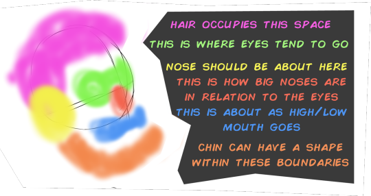
that balance that you speak of comes from a commitment to underlying structures. what im going to call the stylization sandwich
i start with a clear, well defined solid structure, i add whatever wacky cartoony features i want on top of it (none the less strongly tied and guided by the underlying structure) and then i refine by adding as many more realistic, grounding details i want, although you can go too far with it so i gotta be careful or ill end up with those shitty "cartoon character IRL would look scary!" clickbait drawings.

(quick aside, this trend fucking sucks, its obvious the artist went out of their way to make the drawing creepy, this pretension that "actually the character would look scary irl" deliberatly misundertands the principles of stylization, its as creatively bankrupt as jokes about mario eating mushrooms)
getting back on topic, the point is that, as long as the underlying structures are solid you can build whatever you want on top of them and it will make sense

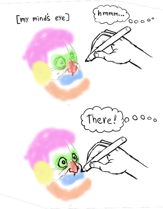
a key tool here is internalizing the way the proportions on the face work. and i say internalize because obviously i dont actually have the golden ratio memorized inside my head nor do i stop and measure and calculate all the proportions in the features. i just read a lot about drawing, i drew a lot, i tried to always keep a critical eye to what im drawing and see if it "feels" disproportionate. once you get an eye for it then you know how far you can push things before they complitely break
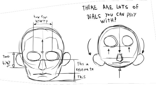
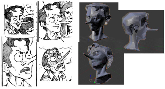
let me give you another example of what i feel is a botched execution of this.
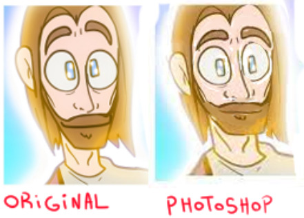
if you look closely at the face on the left there are a lot of things that dont make sense. the corners of the eyebrows dip down into the eyes when usually the eyes are enveloped by the eyebrows, the way the beard grows around the nose is just not how facial hair is distributed, the mouth is too big, etc. on the left i used photoshop to reorganize the factions into something that makes a bit more sense to me
(another quick aside, the real big problem at the heart of the original drawing were not so much the proportions but the tangents, when different lines touch each other like this that is usually a big no no but that is a topic for another day)
also a lot of it is just me cheating. yeah i cheat. you ever heard how people say there is no innate talent and its all practisce and hard work. well, yeah, that is mostly true, but is also true that some people are born with inherent advantages. either taller or more predisposed to being thin or with better facial structures or better innate hand-eye coordination. i was born with an uncanny capacity to visualize stuff. i have whatever the opposite of aphantasia is. i can borderline hallucinate things if i want to. and that goes coupled with the visual intuitions i developed through practisce and training.
so first come the learned wisdom, and then comes the innate talent that helps me exploit that learned wisdom to its full potential
on top of that is corporeality, i try to draw in such a way that it conveys depth and weight to the things im drawing, certain kinds of stylizations dont care about that and choose instead to have their drawing look flat, a classic one is the UPA style

is a very fun style! very cute, very dynamic, very expressive in its simplicity. it became very popular in the 60's and 70's. personally i choose to go in a different direction. i draw in such a way that if one were to turn my drawings into 3d models not a lot would get lost in the process.
whereas other artists....

...not so much
but yeah, ultimatly it all goes back to underlying structure. any drawing can work
as long as you have a strong foundation underneath.
PS: if you like my style i cannot reccomend enough the art of @rezuaq i feel they follow a lot of the same principles i talked about here but i could be wrong.

they have been my biggest inspiration as of the last 4 years, i shamelssly stole the design of one of their characters for jennyffer. go to their blog and give them a like
69 notes
·
View notes
Text
Secret Level part 2
The second half is out now, and like before I had completely forgotten to watch them. Well, I'm done now. There were some highs, some lows, but let's take the good with the bad and go through them.
The Outer Worlds: The Company We Keep
Like the game it's based on, this short is very bleak and kinda hard to stomach at times. The anti-capitalist message is front and center and just as horrible as the game wished it to be, but the message becomes muddled when you look at this main character, Amos. Not a smart man by any measure, the ending is ostensibly positive, with Amos working for Auntie Cleo as a gardener, and all of us watching knowing the company is going to hurt a lot of people to help their bottom line. That hidden horrible reality may be the point, in this case, but I feel like this short could've done with a bleaker, harsher ending, to reinforce the message from the rest of the short: it doesn't matter who you are or what you can do, you will be gristle in capitalism's meat grinder eventually. As it stands, it feels weak on the satire and unmemorable as a whole.
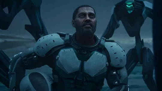
Mega Man: Start
Aah! This short was apparently made deep in the uncanny valley. It was here that you could really see the limits of the almost-realistic CGI most of the shorts use, and it would have benefited from either being less realistic (and allowing for a more cartoony, closer-to-the-games look) or more (making the original games an inspiration rather than a direct comparison, like how they designed Bomb Man).
Having said all that, it's quick, powerful and very cool. I didn't play any Mega Man games, and my only connection is the fan music by The Megas, although I love that a lot. Even without that nostalgic connection, I found this short to be a lot of fun.
Exodus: Odyssey
I found this one to be a slight mixed bag. On the one hand: a strong central thesis and conceit, with an emotional connection between the main character and his daughter that pulls you through the rest of the episode.
On the other hand: eh. I can see the narration is necessary to set up some things for later, but even so some of it is unnecessary. Honestly leaving some emotions and plot points more ambiguous would've made this episode a lot more memorable.
Spelunky: Tally
Finally, some stylized fucking animation. I found this short to be amusing, charming, but ultimately shallow. There's an earnest message about trying again and doing your best even in bad circumstances, but with little emotional weight behind it.
Concord: Tale of the Implacable
Why the hell did they try to make this game a $40 hero shooter?! The world is perfect for a single-player experience, something like the more-recent Star Wars games, Outer Wilds or even (a better version of) Starfield. Obviously these deals and animations were made way in advance so this was supposed to come out and grow the player-base for the game, but alas, it is the last gasp of a corporately-ordered failure.
And it's so fucking good. Oh my God why is it so good?!
I recognized the voice talents of Laura Bailey and Darin De Paul, both bringing their at-least B-Game to this short, but recognized nobody else. But the actors featured here were all up to the task and played their part to the hilt, and for that I must give props.
For most of the episode, you're dealing with your standard Han Solo types, only in it for the money and trying to get away with a stash. But there's a turn later in the story, and the fact whoever made this had the utter gall to give it not only an unflinching ending, but somehow managed to wrangle something beautiful and wonderful from that? I teared up watching this. And it's about fucking Concord! What the fuck?!
But let me not say that corporate slop cannot be an inspiration for art. Great art can come from anywhere, spurred by anything. So may it be for this.
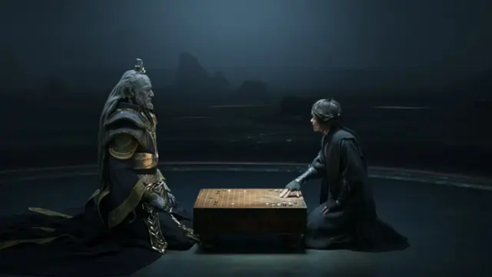
Honor of Kings: The Way of All Things
I didn't like the art style very much. There's an inconsistency in the models, from the madman who looks very realistic to the bishounen (or its Chinese equivalent) Yi Xing to the strange-looking Tiangong, none of the characters quite look like they belong on-screen together, and not to the point of something like Kingdom Hearts where that's the point and it becomes its own art style.
It's not distracting for long, however.
I liked this setup, and the themes played with throughout this short. Tiangong claims to be a computer that can calculate and predict everything, calling the actions from one to the other "cause and effect" and comparing itself to the moon pulling water. Yi Xing is a boy who wants revenge, and Tiangong, the computer that is a city, would try to convince him revenge is pointless and his defeat has already been preordained.
This one benefited greatly from being a philosophical game between its two named characters. The interplay between the two, both in their game of Go and over the idea of free will was made extra fascinating to watch by stunning animation and artistic flourishes which fed back into the story. Setup and payoff, cause and effect, past and future, all of these things were wrapped up into this episode.
It also benefits immensely from a final twist ending that I found astonishing and a tough nut to crack for a bit. Even if the ending isn't a chestnut like Inception, It's still a bit of something sticky and tough, like fruit leather, that makes everything seen before take on a different light, and you question the conclusion of both the game and the argument. And I like that; I like that this ending asks you to question everything you saw, from beginning to end. It forced me to go back through and re-watch some scenes so I had a greater context; there's a confidence to this execution that is as underplayed as Tiangong's introduction and character, and I'll be thinking about this one for a long time.
Playtime: Fulfillment
Let me start with the positives. Kevin Hart, though he is still annoying in this short, is supposed to be, and in that respect he does a good job. Heaven Hart, his daughter, does a passable job as the main character, though she could use a little extra practice. And the central message against microtransactions and meager rewards in favor of a more pure competitive gaming experience is one I can respect.
But with God as my witness I will not be tricked into liking any fucking version of Ready Player One!
This episode is the only one in the season that wasn't based on an original video game, instead being about PlayStation's exclusives and IPs and about how fun they are, how better they are. Maybe you can see my disdain? Even Astro Bot got flack from people who didn't like the corporate crossovers in it, and that game had the benefit of being fun and engaging (according to Jacob Geller and the good people at Overly Sarcastic Productions; I don't own a PlayStation). How much more should they righteously hate this short that peddles more of that slop?
I am not against crossovers. I think there's a lot of fun to be had from throwing characters together in an oddball setting. Fortnite, for all its flaws, provides a lot of fun from having recognized characters going at each other in a game that's at least a little fun. So having Kratos from God of War, Gauis from Shadow of the Colossus, Helldivers (from Helldivers 2) and Sackboy from Little Big Planet all crossing over with one another could be fun.
But my annoyance at watching an ad in my free time turns to outrage when it offers little artistic merit. All of these IPs are only here to remind you to play PlayStation games, and they are thrown in your face to force you to remember the better times you spent with other medias and games. Kratos was a big draw for most audiences and the fact he's on-screen for a couple seconds and Christopher Judge even reprises the role only to yell and then be discarded tells you the priorities of this short.
I hate it. It's not bad, not completely, barely even mediocre, but its core premise is rotted from corporate oversight. All these other shorts were about something, even at their worst they were trying to tell a story or provide a message. This is nothing; it is solely an advertisement to play other, better games, from studios shuttered by the company that bought them. It's Sony congratulating itself for projects it wasn't involved with, and to that I say: fuck 'em. They don't deserve the accolades.
I've taken the liberty of including a tier list of all these episodes. Please note letter grades are only approximations; this order is how much I enjoyed or think these shorts were of quality.
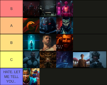
S: something new, something surprising or intriguing. Unreal Tournament: Xan (a surprisingly-powerful origin for the game's main villain) Honor of Kings: The Way of All Things (a strange, compelling argument with a great twist) Concord: Tale of the Implacable (honor among thieves, even in dire straits)
A: something I enjoyed without reinventing the wheel. PAC-MAN: Circle (a delightfully fucked-up reinterpretation) Warhammer 40,000: And They Shall Know No Fear (I mean… come on… I love these space marine guys) Sifu: It Takes a Life (exactly as artistic as I was expecting)
B: it's alright, maybe even fun, but the flaws are stark. Mega Man: Start (quite cool, but that's about it) New World: The Once and Future King (moderately amusing with a good emotional core) Armored Core: Asset Management (a good ending on a bland episode)
C: cracks start to form. Enjoyment lessens. Exodus: Odyssey (forgettable, feelings of wonder fall flat, lack of emotional tether) Dungeons & Dragons: The Queen's Cradle (uncanny at best and punchy-fighty without any emotional stakes) Spelunky: Tally (earnest but clumsy) The Outer Worlds: The Company We Keep (lacks the strong bite that made the games so good, ending fell flat) Crossfire: Good Conflict (things happened, I suppose)
Pure, visceral hatred: lack of artistic qualities drive me to madness. Playtime: Fulfillment (...HOW MUCH I'VE COME TO HATE YOU...)
So, that is Secret Level in total. Despite everything I'm still glad I went through it. It's not something you see too much of, and everyone who worked on the animation gave it their all. Even still I'm almost certainly going to watch season 2, but I've no idea what the final product will look like. And isn't that exciting?
17 notes
·
View notes
Note
Do you have any thoughts on DC & Marvel comics?
I've not properly read any, I shan't lie. I find the art styles commonly found in them repulsive (*) and most of them being superhero based is a no from me. I don't get the appeal of superheroes as a concept like, at all, and never have, and likely never will.
Getting into these comics is also...pretty hard? Each character has a bunch of different issues with different lore and story and whatnot. If you wanna pick up a manga, you go to the store/library and pick up volume 1. If you wanna pick up most BD, and random volume is likely standalone and will do the trick. DC and Marvel have dug themselves into a miles deep dollar sign shaped hole based on milking the same concepts over and over which by itself is of no interest to someone who doesn't care about the characters such as I. I've been told of issues I might like, but they tend to always fall in that "alternative take on XYZ" hole I don't care about.
This might sound deeply pretentious but I've had a sort of awareness for the commercial since I was a child that made me cringe at the Mickey segments of Fantasia and whatnot. And to my eyes DC&Marvel are the peak of this. Everything they make is a product filtered through endless exec meeting rooms to make as much dosh as possible and I can feel it in the end results. While I love derivative art (I spend an embarrassing amount of my free time looking at fanart online...) the way these companies derive the same things over and over lowkey disgusts me in a way I've not been able to overcome yet. It might be why I struggle to get into fandom proper too - AUs and crossovers and ships and that sort of stuff based on making "content" repeating the same characters and ideas with slight declinations is something of no interest to me and who's inescapability can even piss me off.
The only one of these sort of hero comics I've been tempted to try reading is Hellboy because I adore Mignola's art and...it's not DC or Marvel that I know of. I've also seen some live action adaptations of stuff like Xmen and the Avengers and hated all of them, and found them bland and juvenile, even as a kid. The best I get from them are elements that make me think of better executed media that share them. Admittedly this birthed an incredible moment last year of remarking "this is like metal gear if it sucked ass" to the friend making me watch an Xmen movie only to be hit by the "directed by: David Hayter" end screen. Oops...
(*) there's hundreds of artists working on these so there's no given "art style" proper, but what I'm referring to as those cleanly lined styles with realistic proportions and characters stylized to be handsome. On top of just not liking that style at all, I find that what could otherwise have been nice lines are constantly demolished by layers upon layers of fuckass digital coloring and FX that not only obscure the linework but look extremely cheap and ugly to my eyes. I grew up on 70s comics who were only made of flat colors if any and struggle to like anything else in terms of colored comics.
TLDR: no & im a hater
#been reading the guy who literally invented the concept of multiverse lately.#boy does it make me wanna close the book and walk off into the sunset each time#ask#yes arguably the commercial aspect also exists for stuff like jump and spirou magazines and I hate it there too#the endless derivation is smth ive only seen in us made stuff though. it certainly is something....
7 notes
·
View notes
Note
i'm glad to see the positive asks coming up at great timing ;w; i hope you're doing okay! please take breaks whenever you need, and take your time. it's a strange question, but i was wondering if drawing gonta and kokichi has ever given you any practice at drawing a certain aspect of their character (anatomy, clothes, nature...?) i'm really curious!
Thank you, I'm trying my best (• 7 • ) Thought current issue is that I want to draw SO badly but caaaan't, because I'm too busy grrrrrrrrr wr I missedGonta'sbirthdayAGAIN. Oh well, maybe next time but ghhhh *frustrated cat noises*...
Regarding your question, it's not weird at all. I do hope though I understood it correctly, because the way I see it, drawing anything is always simultaneously practicing it, whether it's a warm-up sketch, or finished drawing... But perhaps "Did you have to practice/learn stuff to properly draw these characters or things symbolic to them" is more in line of what you wanted to know?
Then yes, absolutely, there was quite a bit of that!... So this is going to be a very long one.
When it comes to Gonta... oh boy. I'm not underestimating by saying pretty much every single aspect of his design is something I struggle with. Long and slightly wavy hair is the most difficult kind for me to draw, and I keep forgetting the exact shape of his quadruple ahoge. I've difficulty with narrow faces (and his wide neck doesn't make things easier in that regard xD), and I didn't draw that many muscular characters like him in the past (I did draw a lot of over-exaggerated, blockier fantasy characters, but somehow this wasn't helpful for my brain because ????? ...Well, they often have disproportionately massive joints and way different skeletal structure that doesn't exactly make sense tbh).
Drawing suits is my bane, especially lapels; if it looks good, it's because due to my stubbornness I redrew it 5-15 times. I generally struggle with kimonos, suits and certain types of uniforms - anything that's formal wear made of relatively stiff fabric that creates little to no folds and has to fit well and relatively snug, but still obscures anatomy...
Gonta's glasses gave me trouble, too: I didn't know I was drawing their perspective wrong until I studied photos, videos, or 3D models of people who happened to wear similar models...
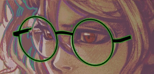
(How I instinctively drew glasses vs how they're apparently supposed to look at specific angles. It feels so unintuitive and surprising for me to see the farther lens stick out so much... kinda funny, considering I wear glasses myself, albeit rectangular ones.)
Even his eyebrows turned out to be a challenge, because they start thin in inner corners, then get thicker as they spread outwards - this made me realize that I tend to draw my own characters with an exact opposite shape xD... It took a while to get a hang of how they'd look while expressing different emotions (but I think they are cool the way they split at the end!)
I pretty much had to actively practice all of the above. It was difficult but rewarding, and especially at the beginning of my brainrot I really dove into the research, studying details, collecting all sorts of references both realistic and stylized, and working on how to translate Gonta into "my style" (which imo ended up more like a hybrid between my own style and DR one) to represent him and his vibe as accurately as possible (it's generally my philosophy with fanart).
On a side note, imo Gonta has a great design. He combines simple elements and colour palette - wild long hair, brown suit, glasses, barefoot - and not too many small ornaments (bug box, lapel pin), but they result in something unique and distinct. I find that school of character design really clever, and oddly more difficult than designing overly elaborate ones.
Going back to the topic of the practice, it was beneficial even for subjects besides Gonta himself. For example, getting a hang of how to draw beefier, more pronounced anatomy helped me understand it better in general, and be able to draw more lean characters as well. (I do have trouble with subtle things like how a ribcage connects to the waist, then hips, or how shoulders look at specific angles etc.)
Or when I had to research bugs for some of the fanarts, it made me realize how much more complex their anatomy is, and how despite the infinite variety of species there is always a certain consistency to it. I started appreciating them so much more... my previous default was rather neutral leaning on slightly positive, but I was scared stiff of mantises when I was a kid. Now I find them genuinely beautiful, endearingly dramatic with their patterns and behaviour... And see bugs as so cute overall. I guess Gonta would be happy to know that?
Thanks to him I managed to return to more painterly and sketchy techniques, too (For a few years before playing V3, I used to draw a lot more lineart heavy works with anime-like shading, and I was worried if I'll be able to stray away from that).
In the end, every fanart is always an exercise in something, like "oh let's try those golden/metallic digital paints, let's try dark colours/hair underwater study, or high contrast, etc., etc..
Gonta was tough to draw, still is, and I'm definitely not done learning and making mistakes, but I don't mind... and I think it's a good thing to feel about something, when you want to keep doing it even if it isn't always a walk in the park. He's definitely a FUN variety of challenging. I only hope I will be able to keep finding time and energy to keep on going.
---
Kokichi on the other hand isn't particularly difficult to draw, even if it wasn't the case at first, though for mostly emotional reasons. On a technical level, he's nicely effortless, though there are some tricky aspects to his design, like how his hair works in a 3D space.
I even made myself a little "guide" in the beginning, to help me understand just that. I'd draw his "base" hair and add these signature strands.
Funny how... casual he looks without them? Fandom usually depicts all of his hair curled outwards, even I do that quite a bit, while in canon, oddly enough, it's just a few strands that seem longer than the rest of his hair. His hair is also simply black with purple tips, not all purple like he's often depicted.
(Behold, a wet cat Kokichi doodle from the depths of my fanart folder. YES, those are hair rollers.)
It's interesting how characters are often drawn the way they "feel", rather than by strictly adhering to their design, and how it leads to accentuating some design elements...
Oh right, I also had no clue how to draw Kokichi's face at first, how to interpret it into something more realistic; this character named Doa from Blade of the Immortal by Samura has served me as an accidental inspiration in translating his features into something closer to my own style. The checkered hat and big guy companion may or may not have contributed to grabbing my attention.
(panels from Hiroaki Samura's manga)
The way I draw Kokichi has changed since, getting closer to his original style, but it's thanks to her that things clicked into place, and I managed to finally draw the fanart that I was actually satisfied with, this one specifically. (Also it may or may not have inspired me to muse about BotI ougoku AU for like 54 seconds.)
But all in all, Kokichi is really pleasant to illustrate, and what I enjoy practicing the most is his baggy shirt and, again, his hair.
Also the scarf. I really enjoy drawing drapery and baggy clothes, but I specifically like to draw this checkerboard pattern by hand and merge it directly with the lineart and shadows - so it's more like a bunch of abstract shapes creating an object, rather than clearly separated lines, shadows and colours. It helps with accentuating the dimensionality of his scarf (which I always felt like is some sort of infinity scarf, since there aren't any ties visible on his concept design...). I know using a pattern would be much faster and easier work, but I just like drawing it, so I don't mind putting in that little extra work in there.
(I really love hatching, too. I actually don't like linearting all that much lol, unless I merge and structurally "support" it with hand-drawn textures or thicker brushtrokes - it's nice to test out different brushes just for that purpose.)
To sum it up: yep, I was given an opportunity to practice a ton of things thanks to those two lovely messes. I still am, and certainly still will - even if some of those might be simply re-learning stuff I got rusty at, bc no art skill is ever a static one, for better or for worse.
#turbo-tsun reply#long post#thank you for your patience#see when I wrote in my last reply that I struggle with talking freely I didn't only meant I struggle with talking#but also with keeping things brief whenever I let go of my self imposed restrictions and then not feeling self-consciouss about it#not to mention I barely had time to turn on pc last week and mostly drafted this on my phone but that's beside the point#I legit wish I could speak like english gonta he packs all the meaning he needs into few short borked lines lol#master of compression dhsggasfh I dislike how I either need 10000 words or 1000 hours to convey anything#but I really hope this was at least interesting to read and worth the wait...#edit: wtf isn't the image grid working here i arranged those images side by side grrrr tuuuuummmmbbllllrrrrr
10 notes
·
View notes
Text
HELLO i make dolls sometimes
heres all my horror/thriller ooak dolls >:)


plus a lil retrospective for each under the cut :)
scroll all the way down for 2025 edits !!
ordered most to least favorite:
Peter Graham (Hereditary)- my fave of all of them :3 hes so cutie patootie i love him the hair and the faceup just came together so well eugh (5/2024)
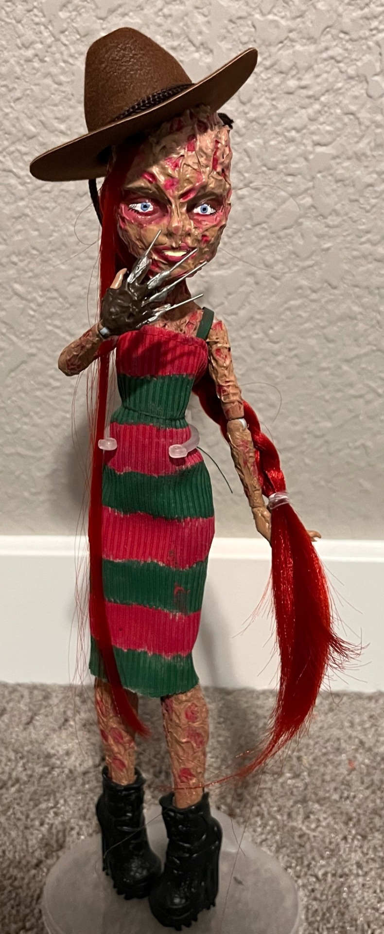
Freddy Kreuger (Nightmare on Elm Street)- LOVE HER i was kinda iffy on the dress when making it BUT I LOVE HOW IT TURNED OUT, and not to toot my own horn BUT the skin !! turned out so fucking so good. my mom says it makes her uncomfortable to look at so MISSION ACCOMPLISHED i guess (9/2024)
Adam Stanheight (Saw)- first one i actually tried at HAHA i love the mullet (it used to look better idk what happened to it lmfao) and the pants and the shirt and the accessories, theyre my wet lil cat. also (hard to tell from this pic) i really love the underwear waist line i gave the pants lmao movie adam’s boxers were always just hanging out HAHA (4/2024)
Stu Macher (Scream)- redid their face like 3 times and it still doesnt look like matthew lillard so it makes me angry to look at HAHA id probably like it better if i did better on the robe but oh well lmao. UPDATE i completely redid it bc i hated how the face n hair turned out and i LOVE it now FINALLY. looks nothing like matthew but oh well. i kinda went for a character-inspired approach bc mr lillard was Not working out lol (5/2024, 1/2025)
Grace Le Domas (Ready or Not)- the dress is just a clusterfuck of materials but it keeps the vibe. u cant tell from the pic but the hair actually looks rlly close to her hair in the movie if i do say so myself. her eyes are way too white tho i need to muddy them bc theyre so piercing when my light is off HAHA. also i literally color stained her dress with dirty paint water HAHA. (9/2024)
Amanda Young (Saw)- kinda skimpy on details but i think it looks like her pretty well idk. if i was good at crafting i would actually make a rbt but alas (6/2024)
Red (Us)- first doll outfit i tried to make from scratch and u can tell HAHA i think i redid the face like 3 times lmfao. also i colored the hair with copious amounts of eyeshadow and hairspray bc i didnt own curly doll hair. the coolest part imo are the scissors im actually surprised i found that online (2/2024)
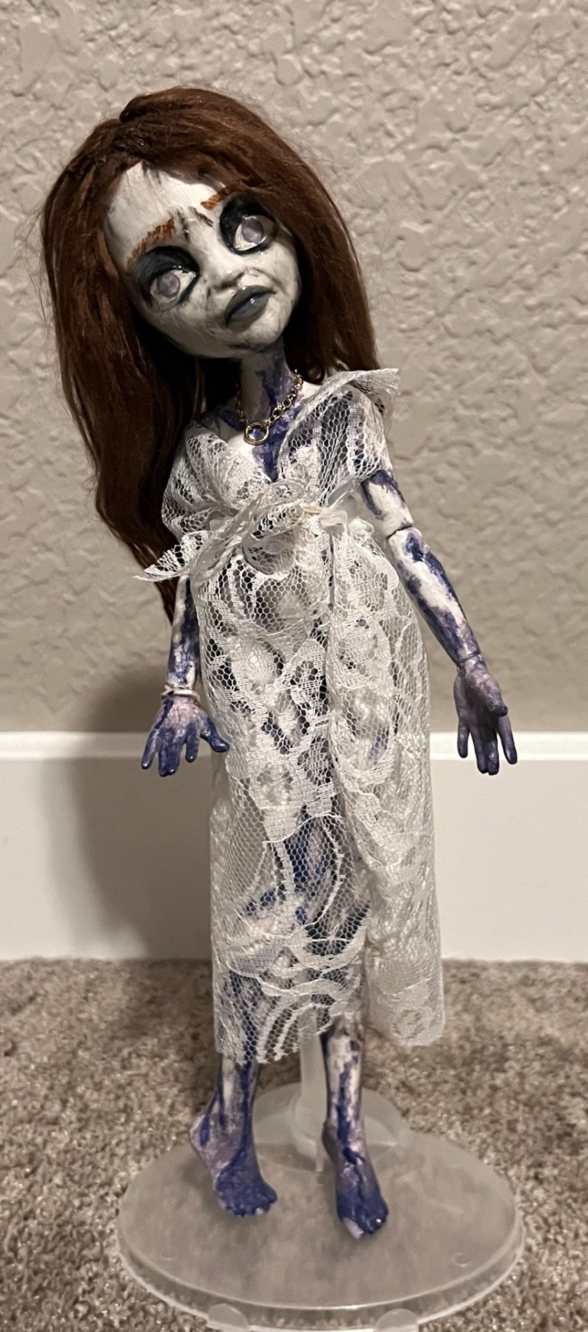
Bent Neck Lady (Haunting of Hill House)- u cant tell but the body details are so cool to me it kinda follows the moldy and torn pattern of all the hill house ghosts, not a fan of the face but it was when i was still doing more stylized faceups as opposed to trying to stick to more realistic lol, might redo it in the future idk (3/2024)
Patrick Bateman (American Psycho)- kinda hate her i think its the hair but u can only make so many mullets before losing ur mind so its wtvr. the clothes were so frustrating. i just (march ’25) ordered an actuall doll raincoat so at least itll finally all come together (hopefully). i plan on completely redoing the face and hair so that i dont hate looking at her anymore HAHA (9/2024)
extra add ons//plus non thriller dolls (post 10/2024)
ordered least to most recent:
Crowley and Aziraphale (Good Omens) FIRST ever customs i made. i started to dislike the faceups bc they were so crunchy so i redid it and the hair and i still dislike it LMAO i have to take a break from it. probably the most expensive ones in terms of supplies bc i bought every single element of their clothes BUT i love how the outfits turned out. tried to match their head sculpts to michael and davids the best i could, dunno about azi but i think crowleys is spot on. also crowleys head is held on with a paper clip and a dream LMFAO (8/2023, 4/2024)
Dream the Endless (The Sandman)- u can probably tell but this doll was so rushed (his feet are still Not painted LMAO) i was in a sandman phase and needed to get it out before the fixation left me, ive been wanting to do one for forever HAHA. the hair turned out immaculate imo probably my favorite yarn restyle ive done next to adam and peter. clothes are so messy but its fine bc theyre black and blend in HAHA. i like the eyes the most bc i used silver paint so it really stand out :3 (9/2024)
Wendy Torrance (The Shining)- :3 tried so hard to make her tooth gap look natural but alas. really love the blushing i did to make her look like shes been crying for a week lmao. not a fan of the eyes but i spent an absurd amount of time aswell trying to match shelley duvals eyes and i kept making them too big. :) love how the outfit turned out tho she looks so cozy (11/2024)
Justin Foley (13 Reasons Why)- controversial show ik BUT hes my absolute favorite character i love him and i love brandon flynn so ive been wanting to make him for SO long. JUST made him so i havent decided on if i like it or not. idk how i managed to make a perfect crying face for peter bc i havent been able to replicate it since then LMAO i tried to capture his perpetual puffy sleep deprived kicked-dog eyes idk if it came out that well tho. first time using actual powder pastels instead of strickly paint to add color and i think it went well? also turns out its almost impossible to find a fucking MH doll-sized letterman jacket i searched for maybe 2 hours on etsy good lord (3/2025)

#hyperlinks are to my insta posts lol#realizing i never made a Red post like anywhere HAHA OOPS#kar dolls#ooak#monster high#monster high ooak#monster high repaint#doll custom#my art😩🤚🏻
18 notes
·
View notes