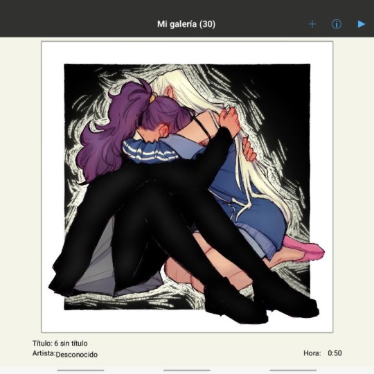
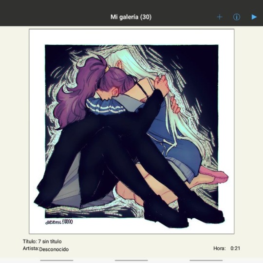
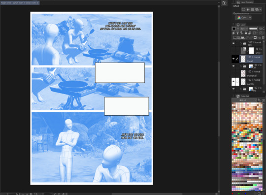
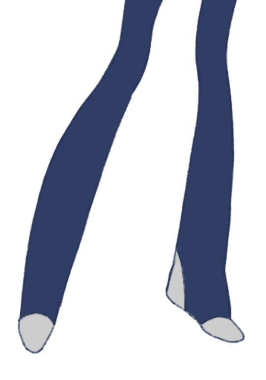
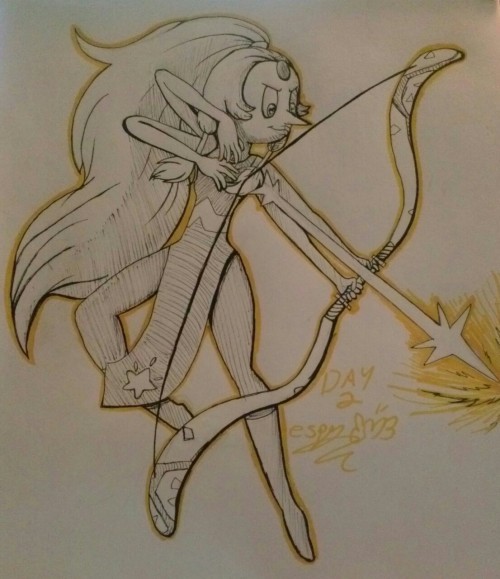
#trying out new lineart vibe with this and i like how it turned out!!
Explore tagged Tumblr posts
Visit Tumblr Blog
Explore Tumblr blogs with no restrictions, modern design and the best experience.
Last Seen Tumblr Blogs


Fun Fact
Tumblr has been providing a Korean-language service since 2013.
Text
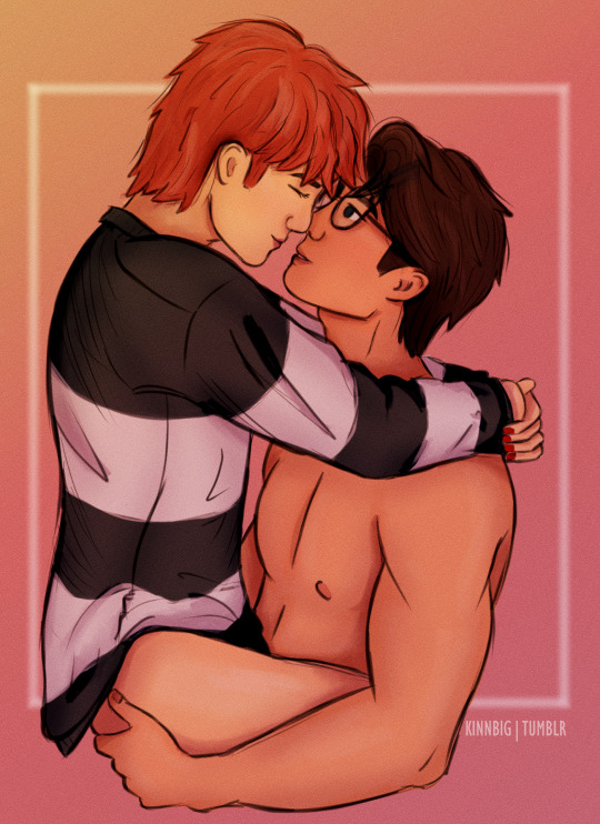
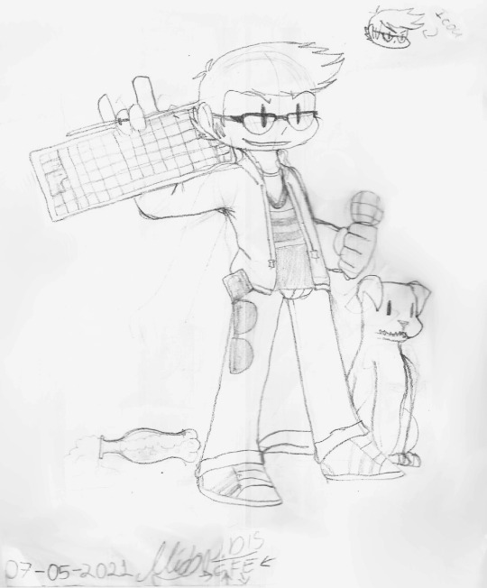
no thoughts only Tankhun in Arm’s shirt 😵💫
#hey. hi.#…is this actually a memorable shirt of arm's or have i just rewatched kinnporsche too many times?#unclear. whoops. well. here they are!#trying out new lineart vibe with this and i like how it turned out!!#even though drawing clothes (and also hair) is my nemesis they never look the way i want them to rip#learning to draw tag#kinnporsche#armtankhun#armkhun#kinnporsche fanart#kp fanart#arm kinnporsche#tankhun kinnporsche#tong thanayut#bas asavapatr#darcey.txt#my drawings#tankhun kp#arm kp
135 notes
·
View notes
Text
…Okay, you may end up seeing these drawings yet again on a later date
I finished the page, which was small at 500x500 px, but I wanted to make the page bigger. I did that, and I drew one new thing, but now I don’t know what else to draw on there. So for now, I figured I might as well post the original full page right now
Yeah, sorry for the laziness
This is the other sketch I finished on there, for those curious
Anyways, so yeah, this new style practice I’m trying
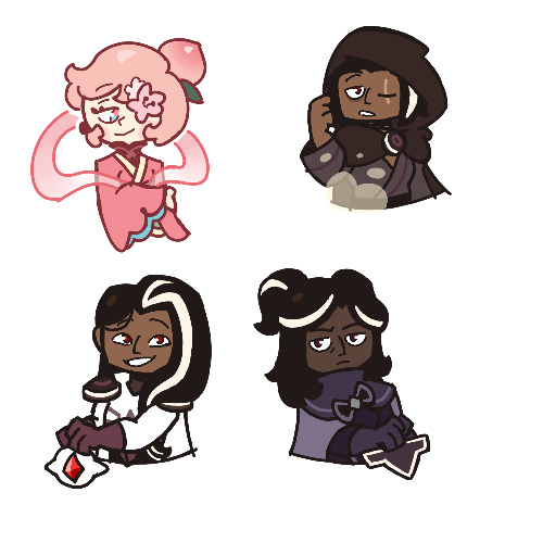
The original page I tried these out on is this, which also isn’t full, but I thought trying it out with actual characters instead of just random poses and shapes would be better, so I switched over to Cookie Run characters
The method is still a work in progress when it comes to all the shapes and the red sketch layer
I suppose what I should do now is try drawing a bunch of different Cookies that have different body shapes, so that I have practice with that. As well as maybe attempt some full body ones
I suppose you can suggest some if you want, considering I don’t know who to draw other than like, Hollyberry or Avocado, since I should try drawing large but not buff characters here. But I should also probably draw more skinny, and also chubby
But on to what I actually drew
So I already talked about Peach Blossom and the top Dark Choco drawing prior, so no real need to elaborate
The Dark Choco and Dark Cacao one was me drawing them in their younger forms to see how they compare. Not for any sort of study thing, but just in a symbolic sort of way. Since they’re so similar looking
I think I had a lot more fun with Choco, especially his hair. I remember Cacao being mostly annoying for his weird cloak thing that I don’t understand
The hand pose was ass though. I knew the general idea of what I wanted, that being them with their hands over their swords, but I was struggling to figure out how to draw the hands. Not to mention I had to change the pose from the red sketch because the swords were further down than I put them. I still don’t think I did the pose exactly correct, but screw it, it’s good enough
I’m also noticing that Choco looks way lighter in skin tone compared to Cacao. Like yeah, I know he’s normally slightly lighter, but it’s far more noticeable here. I’m pretty sure it’s because I used Dark Choco’s ToA colors here (bc they work better with my black lineart), which are slightly lighter, as well as just that Dark Choco is wearing much lighter colors while Dark Cacao’s are relatively darker. So maybe it just makes them contrast more
I liked drawing them, but I also did basically do the same body type 3 in a row, so I should probably draw different characters
Anyways, let’s talk about that extra sketch
So for those who likely don’t remember, that there is an OC of mine called Prickly Pear Cookie
I made her entirely on a whim one day, and she doesn’t really have any character or story, just vibes, but I really like her design and wanted to draw it again
I probably should give her some sort of bra though. The shirtless chest looks cool but in my opinion sounds really uncomfortable without at least that
I did originally draw her with the green skin, but it looked weird so I shifted it to more of a yellow so it looks more human
Honestly I really like how she turned out
But yeah, I think that’s about it for now. Just wanted to show this
#I need to tweak and perfect it more#but it’s turning out relatively nice#I just need to stop falling back on old drawing habits#I need to relearn hands a new way#I have a reference that I found later on so I might use that#anyways#cookie run#dark choco cookie#dark cacao cookie#peach blossom cookie#art stuff#art style#cookie run oc#prickly pear cookie#my art
169 notes
·
View notes
Text
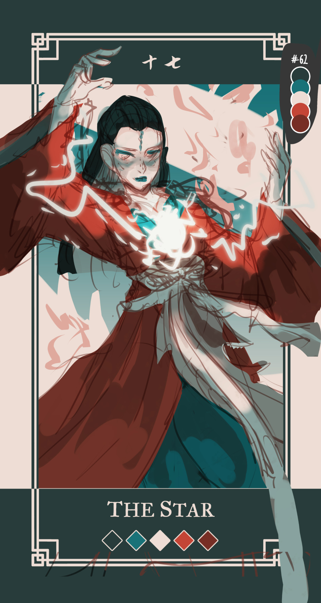
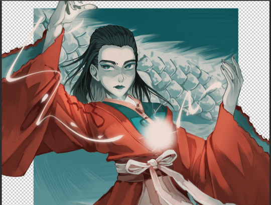
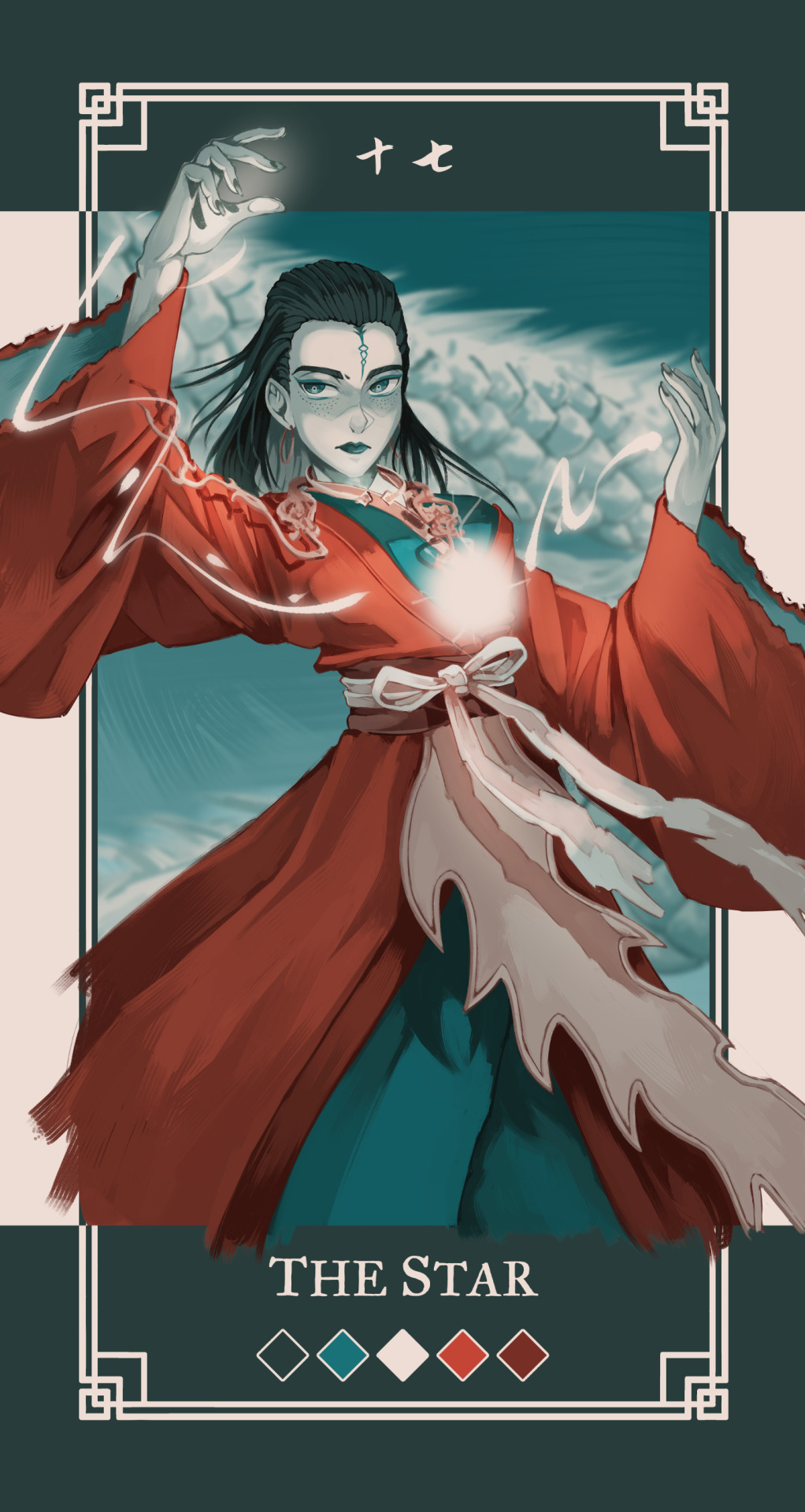
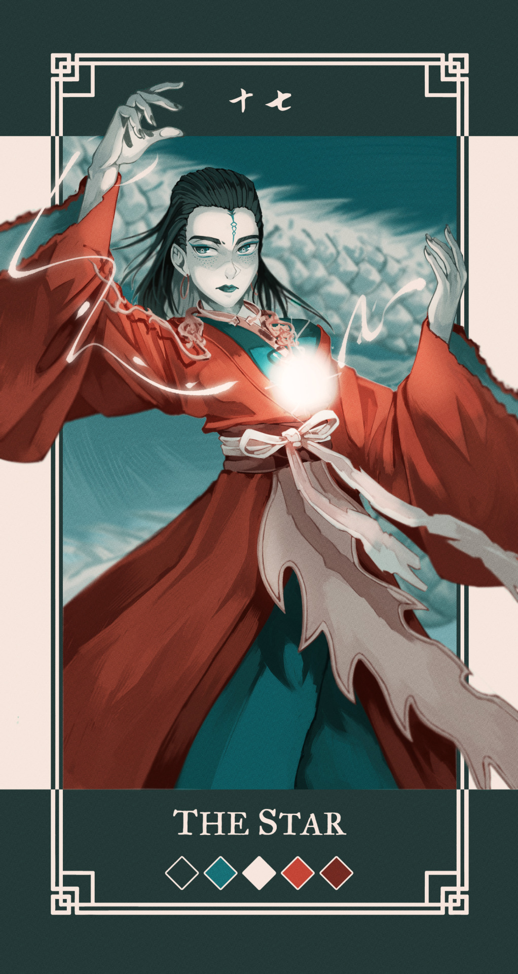
Had few people reach out on instagram to me about my art process and how tf I work with a 5 color palette, so I decided to make a post with each step explained.
Please note that this is just my workflow and what works the best for me - doesn't necessary mean it will work for you! Only advice I can give is to fuck around and find out what feels right for you 🫵🫵🫵
Step by step explanation + screenshots under read more. I use Clip Studio Paint for everything, most of the tools and functions are available in other drawing programs too, you may just have to spend some time googling to figure out where is what.
Every card you see is completely illustrated with five colors, using various layer modes and low opacity to mix and get different colors for me to use
Since I decided to work with limited color palettes for this project, I look at the card, character and then pick a color palette that I think suits the vibe the most from my color palette sheet. Color in the card frame and then start a messy sketch of how I want the pose to look like.
I used a 3D model to get the perspective of the pose right to use as reference. You can find the poses under Material -> 3D -> Body type and then click and drag the body you want from material into your canvas
You can change the body shape and height by going to the wrench tool in the tool bar and then "3D drawing figure" - play around with it and see what works the best for you!

I place the model and play with the camera around until I have the pose I want

I trace over the pose and add the character details and adjust some things until I'm happy with the second sketch.
Then I lock the opacity of the sketch layer, and use a darker color from the palette to change the lineart colors. Change the sketch layer mode to "Multiply" and set the opacity to 80%. When you set a layer to multipy + lower opacity, the lineart color will turn darker depending on the color layer put under the multiply layer.
Here is how it looks like in Normal layer mode + 80% opacity
and here is the sketch layer in Multiply mode + 80% opacity
4. I start laying down rough colors and shading colors to get an idea of how I want it to look later. To get various shades, I either color pick shades from the multiply lineart shade or lower my brush opacity and blend in two colors to get the result I want.
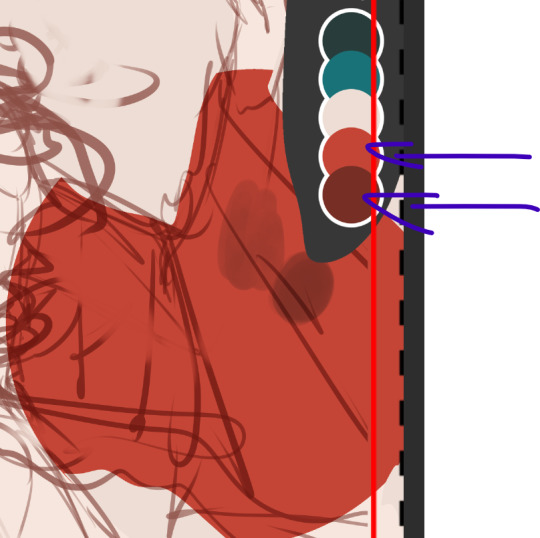
here for example, I use the bright red as my base color, and then lowered the opacity of my brush and lightly paint over the base red with the darker shade of red to get in total 3 different shades of rade. If you want to check the color value of the three shades, you can create a New layer -> correction layer -> hue/saturation/luminosity -> and set the saturation to the far left

I'm happy with the shades of gray and will keep using them. If I want to add another darker shade of red, I will pick the color created by the dark red + multiply layer

and I keep working like this, playing around with different layer modes until I have a rough colored sketch. I ONLY use colors from the color palette
I make a rough background but tbh my background drawing skills is non-existing so they usually exist on a simpler side LOL

I clean up the background, then clean up the sketch to a more clean sketch layer. I used to lineart everything but stopped doing it since I usually end up painting over the lineart and render it anyway so might as well save myself the extra step. I try to keep the sketch clean, but also not super clean, and change the color once again and set it to multiply + 80% opacity. don't shy away from using many layers for this clean sketch part, whatever works the best for you!
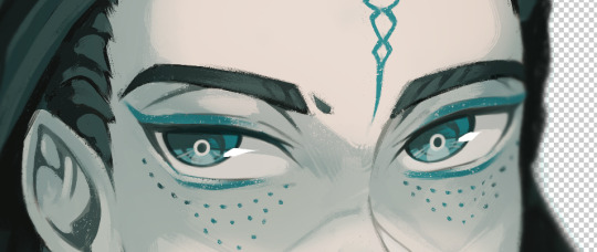
I tend to keep most of the lineart in one layer, EXCEPT for the eyes, which I will explain later why.
I use different layers to put down the colors, that way if I change my mind and want to change the colors entires for a certain part, I can just lock the opacity on my layer and change it there without getting in the way of the other colors. I group the clean sketch + colors into one folder: They usually look like this

I roughly put down the colors to get an idea how I want the folds and shading to look like. The only part where I do spend time properly coloring things is the face. After I'm done with it, I copy the entire folder and rename it to backup, lock it and untoggle the eye icon so it is not visible anymore, and then drag it down to the very bottom of the layers so I will not be touching it anymore. This is a back up in case something goes wrong and you want to be able to access separate layers again.
You can also save the file as a new file and keep the old ones with the layers intact as a back up. I don't like doing it bc I don't like having 3402 files lying around
and then I merge the sketch and color layers together EXCEPT for the eye lineart, I still keep that separate. This the part where I will be abusing my color picker (alt) a lot. I like to render with all the background toggled off, that way I can color pick directly from the transparent background and use that to erase colors as opposed to switching to the eraser tool:

the reason I do this is because I like to use a textured brush for rendering, and i don't know how to create a new eraser with the same texture, so I just use the transparency to erase things. The top right corner is me using the same brush to erase the color
when I render on one layer, I start with the things that are in the "back" and where I know it might get painted over a bit later. I think if you have done gouache/oil/acrylic paintings before, this step won't be too hard to understand :) for example:
I would start with the back of the hair and sleeve (everything marked as 1), and then move to the hand, because the hand is "on top" of the inner sleeve, and then move to the whole sleeve, since the sleeve is covering the inner sleeve area + hand
Sometimes, I will also select certain parts and copy paste it into a separate layer to work with because I know that during the rendering process this part will get painted over a lot and having it on a separate layer makes it easier for me to keep the shape of things and then render it later:

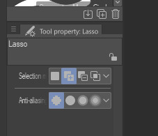
for example, the rubbon on her belt I selected and copy pasted it into a new layer, because when I render the sleeve it will get painted over a lot. Make sure your selection tool is set to "add to selection". This way, when you are selecting a new area, it will add to your existing selection, as oppossed to remove the old selection and start a new one
This is why I keep the eye lineart as a separate lineart, because I I don't want to have to draw the eyes again when I'm painting over it, so instead I will clean up the face, add eye colors and details AND THEM marge it with the rest to clean up the lineart

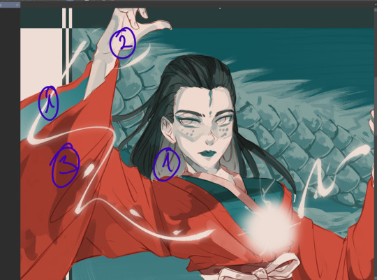
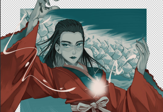
this is how she looks like after rendering, and now it is time to add the details such as dramatic lightning and the lightning ball. I create a new layer above the rendered image, fill it with dark color and then toggle the "Clip to alayer below"
This means that the colors will only fill up according to what is in the layer below. Then i set the clipped layer with the solid color to multiply, and lower the opacity. Play around and see what feels the best for you. For this one, I'm keeping it at 40%


Then I draw the electric ball on a new layer

in order to get a glow effect, I duplicate the layer of the electro ball, and then we will apply Gaussian blur to the layer underneath the "normal" layer.
Go to filter -> blur -> gaussian blur and play around with the slidr and see what works for you
once that is done, I go back to my darker shade multiply layer and use the soft eraser opacity to 50-60% to erase parts for the dramatic lightning. I don't really know how light works so I usually just eyeball and gauge what looks right 🫠🫠🫠
I'm happy with this, but I want to add more glow, so I will create a new layer above the character, but below the electro ball and set it to "overlay mode", and then use the soft airbrush tool to lightl add some more lights to the parts I have erased

Then I make another copy of the folder, lock it and put it away, and merge all the layers into one again. I keep the background and electro ball as a separate layers, and start using the blur tool to add some depth into my art:

I blur out the entire background, and then some bits of the art that are more in the back or in the front - play around and see what looks the best for you
After aaaall of this is done, as the few last steps, I create a new Level correction layer that goes on top of everyyythiing to correct the colors a bit, make the dark bits pop out a bit more and the lighter bit pop out more too.
As the final last step, I like to add a noise filter to give my art some texture.
Create a new layer, and put it above the Level correction layer, and set it to Overlay. Make sure that both level correction and Noise overlay layer are NOT in a folder, otherwise it will only affect the images within said folder
to create noise, go to filter -> render -> Perlin noise. Set Scale to 1.0 and then play around with Amplitude and Attenuation to see what looks good to you
You can see the differences here, left is without any level correction and noise filter, and right is the final product :)
I hope this was helpful in some way, if anything is not clear let me know!
#szynkART#tutorial#art tutorial#step by step#clip studio paint#seriously when is clip studio paint gonna sponsor me LOL#kang jin star#black myth wukong
31 notes
·
View notes
Note
When i first started digital i would make a layer for everything basically for the face clipping make several layers to it and same for the hair/ background/ every piece of clothing...etc
I did take it down a notch recently and all but i just saw a video from samdoesart and noticed he LITERALLY JUST USES ONE LAYER FOR THE WHOLE PAINTING!!!??
sorry was wondering if you'd recommend a certain number of layers
the amount of layers you use is highly dependent on the style you're going for, the complexity of a piece, your personal drawing style and preference etc so i really don't believe there should be a certain amount of layers you should use. I myself fluctuate between using many layers or just painting everything on one so there really isn't a correct way or number to go for.
Howeverrrr, i think there is a certain threshold where layers become too excessive and turn into more of a burden than an aid, something that you probably noticed as well. If you find yourself becoming frustrated with the constant switching between layers for every single part you've singled out, then it's better to take notice of that and just tone down the number a bit. Samdoesarts, despite his guynextdoor vibes, is a professional and so of course he doesn't feel the need for many layers because he knows what he's doing and has a very clear workflow and style in mind. To some extent, i believe that using a minimal amount of layers does also stem from a place of confidence in your skills and/or process.
Me personally, I tone down the layer amount moreso out of laziness and because i don't like to have my flow interrupted by some "technical" errors as in "whoopsie i painted on the wrong layer again" so i just., really try to keep it as low as possible; sometimes it works sometimes it doesn't and i suffer
I add new layers every time i want to " try something new" or fix something whenever i'm still unsure of how it will turn out. New layers are for experimentation. I treat them like some sort of backup or checkpoint of some kind- that's their primary function for me. If the new thing i tried painting over doesn't work out i can just hide the layer i painted on and either try again or give up on that idea as i concluded it doesn't look good. A safety net, if u will.
One rule i do follow however no matter what is to always always have a separate layer for the hair- both color and lineart. that is the only thing i make a conscious decision to keep separate (because of previous struggles and failed attempts) For everything else, I just paint it on one layer with those aforementioned experimentation layers on top. Same for rendering. And i always merge them together once i think it looks good
I really don't like having too many layers cause it becomes annoying and messy. The only time I deliberately use a shiton of layers is for commissions, really.
i know i didn't really answer your question, but i really don't think i can recommend a certain number, so i just shared my experience with layers instead. Bottom line is, as long as you find them helpful, use as many layers as you want but don't overdo it
#i have a lot of pieces that i gave up on exactly bc there were too many layers and it was too overwhelming#so yeah less is more#tbh i have more hidden layers than active ones#my so-called “backups”#that i never refer to and refuse to delete “just in case”#i have maybe 2 or 3 active layers so to speak#i'd recommend being very loose with drawing and not very strict#but what do i know it's just personal preference#ask iztea
27 notes
·
View notes
Note
Hi hi, hope you're doing well!! Wanted to ask if you could explain how you pick colours! They're always so appealing to look at... (If you could also explain how you pick blush colours it'd be great! I never manage to pick good ones, no matter how hard I try :'))
hi anon, i'm doing fine!! it's summer right now where i live and that's healing all my problems (◡ ω ◡)
i have recorded the process of some of my drawings and everything is posted in my youtube channel (in twitter too), so i'll drop the link here and try my best to explain the coloring part to you. the short answer is that none of the colors you see in my drawings are similar to those i initially picked.
i try to keep my lineart loose but i pay attention to the outlines so i can quickly select the outer parts, invert the selection and fill it with the bucket tool. my base colors are all 100% opaque and i don't use any fancy brushes here.
as to how i pick colors, i never use the color picker tool, i eyeball everything. that's important for me because i tend to make all of them warmer: the greens are dark yellows, the pinks are light reds, and everything that's close to blue is very desaturated. i do this even for drawings that turn out much different later, unless i have a very specific vibe in mind from the beginning. i also never use pure whites for anything, and if something is black i make it part of the lineart.
then i always color my lineart!! there's no trick to that, the layer is in normal mode and i just paint it with a darker color than what's below it. i usually add the shadows and highlights at this stage of the drawing too. you're going to kill me for this but shade with gray set in color burn or linear burn (never multiply). i just don't want to think about color variety at this stage because it makes things more difficult for later. sometimes i add textures and some basic color correction here (curves, color balance, layers set in overlay, etc.) but i mostly leave that for the next part.
as to how i choose blush colors, i usually pick the base color and move it towards the saturated end of the color wheel, and a bit more pink. sometimes i add a multiply layer and airbrush hot red over the base colors at low opacity. coloring the lineart with hot colors surrounding the blush areas helps a lot too :)
i also almost always duplicate the lineart, blur it and set it in linear burn (i paint this layer in a light gray). this adds a lot of depth to the drawing, especially if later combined with the bloom effect.
the key to why the colors in my art pop so much is that i don't enjoy drawing as much as i enjoy postprocessing pictures 😂🤣😅👌✌️👍 once i'm satisfied with the "base" colors i merge everything except the background, open a new canvas and go crazy with filters and textures. that's why i use ibispaint X even if i do the lineart elsewhere (krita), and even if it works a bit wonky with big canvases.
i do something different for each drawing here, so first i'm going to explain my reasoning so that you understand my process: i used to have a problem of using very strong colors that overshadowed my beloved lineart into which i had put a lot of effort, so my goal nowadays is to make everything look less contrasted without losing the visual impact of saturated colors. that way the lineart remains a strong point and not just a way to separate one color from another.
what i usually do is duplicate the new merged layer, set it to exclusion mode, add a gradient map and play with the opacity. then i duplicate that and do the same thing with another gradient or another blending mode. i tend to add like 3-6 layers of bullshit over my drawings, including textures and other filters like "bloom" or "sharpen". i understand everything that's going on there but i don't think too deeply about it, i just pick whatever looks best.
for the final touches i always pull up the saturation and contrast (since a lot of it gets lost in the process), and i usually have to manually change some colors (ibispaint X has a filter to do that) or tweak the curves. then i add chromatic aberration, noise set to overlay and little polka dots set to linear dodge.
here are some comparisons of the before and after of recent drawings. the 1st one is very subtle, but you can clearly see how much warmth and depth it gains it gets after all the postprocessing. the 2nd one is so different that i understand why you're curious about how i pick colors. i don't think i can replicate that look just from picking nice colors, there's a lot more going on!! the 3rd one personally feels like it had potential lost (i liked the yellow highlights), but the colors were too strong and all over the place, so the finished result looks more intimate and calm and i like it a lot more.

thank you for the interest anon, i'm very happy that you like the way i color things and i hope i have explained myself. good luck with your own journey!!
24 notes
·
View notes
Text
From Script to Comic Page
I thought it would be fun to show how my process tends to go, in some minor detail. (this is not a tutorial)
This is page nr 7 (page 5 if you do not count the cover and warning page) of Night one: Sleep? What even is sleep?
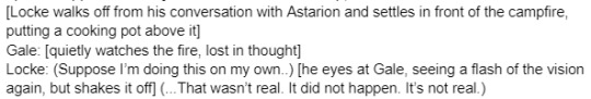
This is an excerpt from the script, when I am making thumbnails and eventually working on what dialogue comes on the page, I tend to change it. The script is never the final result, sometimes all the things inside the script won't fit on the page, the dialogue is too long.. Or it just isn't vibing well enough, so It ends up different on the page.

The ''not a chef'' line ends up on the page before it, so the dialogue got adjusted for this to an inner monologue, to increase Locke's sense of denial. Gale is aloof, lost in thought.. Processing the day while Locke can't make up his mind about the vision of death.
After the thumbnail phase is done, I do page layouts, which requires me to go into the game and take screenshots inspired by the thumbnail's angles. Since a 3D environment works different, the thumbnails don't always reflect the end result.

I don't enjoy drawing backgrounds, so using ingame screenshots is my way of cutting corners. I have very limited energy to work with, so investing it in learning a new skill would just take the fun out of it for me. Needless to say, it might make the environment feel ''off'' for the average person or skilled artists who are much more perfectionistic than me. I don't add shadows beneath characters or extra rendering detail for this work.

3D posing can be time consuming the more I have to adjust poses. If something very dynamic is happening (physical interaction, or combat scenes) it can become very time consuming. Easy poses take about 20 minutes or more to set up, while a large render can take 1 hour or much more if I'm nitpicking on tiny details or angles. If characters are close to each other I am not posing them separately. Gale's model and Locke's model are posed on different 3D layers here.
I go directly to lineart from here, (sometimes I sketch first, but not for comic pages.) Color coding my layers, bg layers and 3d layers are in folders. I'm using color layer mode(blue), multiply and lowered layer opacity to make it easier to work.

Now it'll be easier to draw on with black, mapping pen on 5.0
(this canvas size would be 4093 x 5787 px 350 dpi.)
And from there after all the linework is done, comes flatting- eventually I merge all flat layers.

I have a specific fill color for this comic's setting since I'm trying to simulate this ''its getting late'' vibe- therefore multiply on the flatcolors.. It will make it look like it's darker, then there's this gradient filter on the top that's on overlay mode, so that the backgrounds and everything blends better as well.


So, afterwards the final touches for the comic include.. Adding light effect (reflective feel from the fire) gives characters a lil sense of depth, gives the page more of a vibe. Highlights- (motions and lil lights in the eyes) Lastly I put all the character layers in a folder, copy the folder, merge the copy folder- turn the copy folder in a gaussian blur layer and lower its opacity.

It makes it feel glossy! I like it. Real camping out with the dudes vibes.
Full work will be up on @ohnoestherestadpoles by the time this post comes out.
#wip#behind the scenes#comic work#comic wip#oh noes there's tadpoles#bg3#baldurs gate 3#gale#tav#comics#fan comic#work in progress#friendly reminder i make art for fun and am a disabled person not a fulltime career artist#queue#queued post
1 note
·
View note
Text
.
#despite my art block or whatever it thats going on with me i really like the drawing i posted a few days ago#i actually colored the lineart which is something i should have started doing a lot sooner#it just makes all my stuff inherently better#but the new blurred (gradient?) shading and highlighting is rly appealing...#also the white/near white uh..cell highlighting?? like along the line art#thats nice. i over did it tho cuz of the nature of the piece but. bdhdh#also! i really like how their expressions turned out. they are Actually Expressing. wow#i feel like the majority of my art has like three expressions which are :) :D and >:/#im seriously lacking in the expression department so. i like their expressions they give the exact vibe i was going for there#also congrats to klara for growing her 9th and 10th fingers.#might start to finally do 5 fingers on hands lol..#i did 4 bc it looks better on paws than 5. but some of them dont have paws so 4 looks weird on them.#idk. i will have to test it out more#so ya just.. trying to appreciate something ive made. maybe get my motivation back#bc tbh i was expecting to hate the drawing the day after#it makes me wanna! post more of them but </3#110% sure there isnt an audience for the ship so </3#i mean there wasnt an audience for dragonheart either but theyre from unova and fit my blog theme so at least i had an excuse#i dont have an excuse this time#</3
1 note
·
View note
Note
hey kels i was scrolling through my dash and then i caught a glimpse of your new fallon drawing and i want you to know that i went absolutely buckwild and then i scrolled further to see the whole drawing and i'm pretty sure i squealed. kels ever since ive started following you and your art and fallon have slowly nestled yourself inside my brain its amazing how excited i get whenever u upload a new drawing. also ive noticed that i'm slowly but surely starting to sound more and more unhinged and wild like you. how the fuck do you have so much influence on me.
ALSO i love the new fallon drawing!! you are so right blue gold and white are just her colours they fit her v well!! and i love how much texture you used throughout the whole drawing and her shoes are AWESOME!! also love the whole winter fairy-ish vibe <3
ALSO i was wondering if you could like sort of,, idk explain your drawing process on this drawing? like if you did the colouring first or the lineart and stuff bc i just love how it turned out and id love to try something similar!!
AW!!! i am so hype for my awful girl to be Enjoyed so much!! she is my favorite dressup doll i love to play barbies with her most of all heheh. also i am THRILLED that my Unhinged and Unwell nature have rubbed off on u. i know i am a Strong personality and it makes me V POLARIZING (i am either LOVED or LOATHED i havent met many ppl who are just like meh abt me. i am an Experience) and its always a DELIGHT when someone finds my feral animal traits endearing or positive and kind of picks up on them. i think because life is short that we should all be as bananas as we please at any point in time. PURE ID HERE BABY
AND TY TY!! my girl has a strong aesthetic and this piece kind of went a liiiiittle against some of that (its a lot of hard angles vs i normally give her a lot of ovals and rounded edges) but for the setting its appropriate bc im trying to give her a bit more of a """"harsh"""" or """"severe"""" vibe (like as harsh and severe as she can possibly look which isnt very). i LOVE to use texture brushes they are such an easy way to get out of drawing details myself because i am SO lazy!!
okay i “”answered”” this i GUESS technically because i typed words in response but its a whole lot of jack shit so like. here ya go. SORRY PAL.
here are some more shoes as u can see i basically draw her in the same ones always except when i draw her in a plugsuit

OKAY THE DRAW IN QUESTION i kind of cheated on bc i literally just traced over one of my older draws i did for a very obscure au i made of who made me a princess (i am always doing such ridiculously niche shit i love to sit in my little sandbox and have no one else understand my barbie rps) BUT the process is the same as basically every draw i do like this. it is very simple so dont worry (or do, maybe)
i use 1-3 layers at a time and then immediately merge when i feel like im done and LIVE W MY MISTAKES if not!! anyway prepare to be massively underwhelmed heh
this is so funny i cant believe i literally traced my own drawing im a fuckin FRAUD im the laziest bitch i know. anyway. my sketches are way messier than this but it always starts out either scratch ass lines or color blocking w this bright ass magenta bc thats what feels right!!!!!!
HERES THE LAYERS I USED LOL i do all textures n shit as a clipping mask so actually i used 4 layers for this bc id set down one texture or pattern that was gonna overlap on a diff layer so i wouldnt have to work harder to erase and then BLINDLY MERGED to make things more difficult if actually i fucked up before that!!! work smarter not harder except when it is absolutely braindead to do otherwise is my motto
IF IM DOIN SMTH NICER like this then i usually make sure all my lines connect (this is also why i do a lot of angles and simple clear shapes when i draw) so i can set that layer as reference and USE THE FUCKING FILL TOOL BAYBEEEEE!!!!! this also makes it easier to fuck around with COLOR imho bc you can just rapidly swatch with zero efforts. i Love to take shortcuts. i Love to be lazy. i HIGHLY rec this, if i have colored smth that stays in the lines then its bc i connected the lineart and used the bucket fill underneath. if my lines dont connect sometimes ill make a temp line and erase after i filled. im dedicated. ALSO u can see here that my patterns layer is all overlapping and fucked up bc i didnt check and erase fully but i use p limited palettes in general so... IT DIDNT MATTER THIS TIME!!!!!!!!.
anyway after all that i lock the lineart layer if i havent already and color some of the lines for some PIZAZZ. easy way to immediately fake effort i do love to do that
HERES AN ACTUALLY MESSY SKETCH:
i do all of my fucking draws on the same canvas bc im a horrible little beast, so the only reason i didnt erase the sketch and use it for the colors layer was bc there were others on that layer already and i didnt wanna scoot them so i could cap the finished draw. i did NOT connect my lines for this one i colored like a toddler. who gives a shit we all die in the end anyway!!!
YOU DIDNT ASK FOR THIS BUT LINELESS MY LOVE... i just color blocked for this one alas i do not have process caps, i will do that next time i draw i guess if anyone wants that!!? i typically only use a single layer for lineless- block out the shape, alpha lock, then color and carve from there. EASY PEASY!! ive shown it before but i spent all my formative draw years on v limited feature programs (mspaint, oekaki, TEGAKI MOST OF ALL) so i dont explore tools much and do what seems easiest and most intuitive to me... im sorry i dont have any sick tricks or real process i am but a feral little clown drawing in the DIRT. also here is the tegaki overlay i use whenever i am Blocked or fatigued w procreate layout. it makes me feel NOSTALGIC and INSPIRED so i do this instead of like, actually getting on tegs2
this ended up long as fuck and FOR WHAT?? its just 10 images and several paragraphs of “sorry im the laziest fucker ALIVE”
#idk what to say here every time i type anything i thnk it makes me seem just completely detached from reality#its not untrue i GUESS. im Unwell but in a stable SUCCESSFULLY COMPLETED THERAPY AND HAVING FUN WITH IT kind of way#kels talks#damn sorry anon this was a whole lot of not answering you at all
23 notes
·
View notes
Text
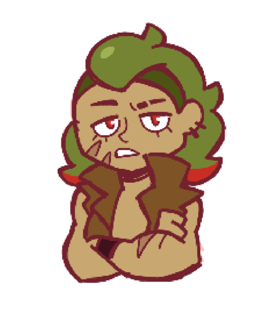
Hey look I did my take on a concept idea for a possible FNF AGK mod because why not lol
**WARNING!!**
This concept is actually based off of a real person and their backstory as well, not to mention it slightly contains strong topics such as school shooting allusions along with mental issues, yet I’m not meaning to glorify or romanticize these with this as I’m aware of how actually serious the matter is.
Viewed discretion is advised.
So yeah, I’m stuck on this whole FNF now and well…I’m trying to get out a little from it
Welp, let’s just get this rolling right round over here
Although my first idea for this was to make it a 5-6 phased level, each one referring to a façade of the Echter Gangster videos along with Norman’s actual rapper persona ‘Hercules Beatz’, after digging around the music he made surrounding his life during the hype of his satirical persona, and remembering that one video-documental covering it, I decided to make it a little more into his actual real-life story for the sake of making it more ‘true’ to the character (and cuz I think it’s truly inspiring as many would say)
Yet I’m still a little dum dum around the whole FNF stuff, so if there is something I might be lacking on over here, let me pretty please know
Aaand yes I accidentallydrew the sprites facing leftways (on Boyfriend’s position instead of the boss’), so beware for any technical mistakes in the drawings that I just gave up on fixing while editing the scans for the sake of better quality and lineart neatness (such as a weird-looking keyboard and stuff)
Anyway, these are my designs for the phases along with the environment’s characteristics:
Phase I – Der Echte Gangster kind
‘Yo homie! It’s the one and only, Leopold Slikk!’
Song suggestions:
WAS WILLST DU TUN
By Hercules Beatz
I’m a Real Gangster
By QPHX ft. Hercules Beatz
Scenario:
“Leopold’s” Neighbourhood (Monochrome Blue)
Author’s commentary: His design was kinda hard but real fun to make, and as you might guess, each item he has resembles a façade on his videos, such as the striped- puffy jacket referring to Das Murderische Jagd and that one video with him wearing a long white coat and stuff (also has to do with the fancy cigarette on his other hand) and the metal sign on his hand referring to Metaler, etc.
Also, I held myself from giving him the CV:C’R’ hairdo since Leroy is more like in a character ‘neutral point’ between Leopold and Norman (a fusion basically) and because it doesn’t match exactly with the original so ye
He still cute tho
Cute edgy bad boi...though he just acting but still

Phase II – The Angry German Shooter
‘…’
Song suggestion:
ANGRY GERMAN KID
By Hercules Beatz
Possible scenarios:
-School resemblance (Distorted Mind Perspective)
-Distressed Subsconcious Mind side
Author’s commentary: Okay, now I’m getting serious here I based this one off of the song’s cover in the (official?) video it got uploaded in, as you can tell by the black-dyed hair and markings on his face. The bottle and cans behind him, along with the Kalashnikov (or AK-47 to be more clear) he’s holding and the shattered keyboard below/broken glasses next to his foot, are an allusion not only to the ‘shooting threat’ event where he was drunk and stuff, but also his darkest years because of you know what. But aside from that, just fyi no the Kalashnikov wasn’t the hardest thing for me to draw but the pose of the mic-holding arm, I originally wanted it to be forwards, maybe holding one or two alcohol bottles, but I just gave up long after a few more attempts. And please don’t ask me why I picked these clothes for him specifically, I just wanted to think out a simple yet concordant outfit for his ‘broken self’
Still, yikes about those guys in the news and the comments on his PC spielen video in the old days of the net They clearly couldn’t distinguish between real and satire And yeah I might have had my silly thoughts while watching the parodies and stuff, but even I would leave the benefit of doubt and not be so scummy/cold like these guys, jesus christ

Phase II – H E R C U L E S B E A T Z
‘Yo, remember me?’
Song suggestions:
KING LIFE (Sunshine Remix)
MASSAKER [Secret extra boss?]
By Hercules Beatz
Possible scenarios:
-The Gym (outfit change possibility)
-The Night Club
-Norman’s (new?) Neighbourhood
Author’s commentary: Oml yess the man of steel on all his glory
I’m aro ik(?) but I can still say he’s quite handsome IRL, props to the man for taking care of himself, clap clap
Back to the topic, I honestly first though this one would be a pain to do…but surprisingly it came out really soft and fun, who could’ve thought? Guess the practice with buff characters, along with some new anatomy techniques I’ve been trying out did pay off after all
Also yeah the girl next to him is a recreation (my recreation mostly) of his gal, though the clothing I chose for her was mostly to match Norman’s outfit but in a softie-raddie style because reasons…and yes she also has a turn on the mic, a two-turns-me-two-turns-you dynamic to be more specific
And whoops I forgot the little back-down hair below his ears…oh well, not like it’s that much of a deal
The ‘bright’ eye on the other was just a silly detail I left there to give him a ‘savage’ vibe, nothing else. And as a little plus, if I were to make the sprites for when they have to rap, I’d do a particular one for each where there’s a little cuddle between them just to make it wholesome and stuff y’know- (left arrow for Norman, right arrow for his bae)
As for that ‘secret boss’ thing I put before, it’d think it like a ‘day-date-unlocked easter egg’ with a more ‘hardcore’ design and gameplay (if it ever goes to that point which I doubt but ok) where he goes entirely in solo and ‘full blast’ while his bae shares a seat in the boombox (a bigger one possibly) with Girlfriend and they both follow the rhythm as their boys get ready to 1v1 each other on the stage
So yea, that’s basically it
Imma head out now, bye
#angry german kid#leopold slikk#norman kochanowski#hercules beatz#keyboard crasher#friday night funkin'#fnf#friday night funkin mod idea#rap#hip hop#this guy is a real chad
7 notes
·
View notes
Note
2, 27, 30 for the ask ^^
2. How long have you been drawing?
I've been drawing since... forever, I guess? I've loved drawing ever since I was a kid. My mom has some ancient My First Fanart™ of the Asterix characters, from when I was in grade two xD I got into art more "seriously" when I was in middle school and Got Deeply Into Manga, as is the origin story for many a young artist. So for seriously drawing, over a decade I guess.
27. For digital artists: how many layers does a typical piece require?
Ha. Just trying to scalp me right here in public, eh? My bare minimum for a small piece is four (blocking layer, cleaned sketch layer, lineart layer, colour layer) but that doesn't happen often.
I just opened up a handful of my most recent pieces and I was pretty solidly between about 15-20 layers, because I am a monster.
30. What inspires you to not just make art, but to be a better artist?
Uhh, this one is actually kinda hard for me to answer because I'm just sort of... vibing? I don't care much about being A Serious Proper Artist, I'm just kinda here to have fun and indulge my fandoms.
Mostly it's just the general desire to improve an area I see lacking or try out a new skill? I decide I like how this artist does hands, I try practising that style. I like this method of colouring, I start experimenting with that, I wanna challenge myself to do interesting expressions, or stretch bodies, or build more realistic anatomy or whatever whatever whatever, then that's just kinda what I focus on for a bit.
But it's all pretty casual. I want my art to be fun so I don't want to turn it into something where I'm punishing or shaming myself, I guess?
2 notes
·
View notes
Text


I’ve recently gained a number of new followers across my socials, so I decided to do a meet the artist meme! Image descriptions to follow for visually impaired and for people who can’t read my writing 😅
I draw on my iPad, mainly using Procreate, a little bit of CSP (still figuring it out), and Affinity Designer if I’m working with vectors. My fave Procreate brushes are th 6B pencil for sketching, Gesinki Ink, Stumpy Pencil, and Jing Sketch Round* brush for lineart, depending on what look I want. Then I block in colours either with the selection tool or a modified technical pen with hard edges, and fill/shade with Jing Paint Sharp Render* or Max U Shader Clean* (* = paid brushes).
I draw on my iPad, mainly using Procreate, a little bit of CSP (still figuring it out), and Affinity Designer if I’m working with vectors. My fave Procreate brushes are th 6B pencil for sketching, Gesinki Ink, Stumpy Pencil, and Jing Sketch Round* brush for lineart, depending on what look I want. Then I block in colours either with the selection tool or a modified technical pen with hard edges, and fill/shade with Jing Paint Sharp Render* or Max U Shader Clean* (* = paid brushes).
My fave colours wre my faves before I got into superheroes! So it’s not just because they’re Superman colours 😅 But I love me a good fire/ice aesthetic. I have a major sweet tooth, and my fave snacks are bubble tea (I’m traditional, I like the plain milk or fruit flavours), Crunch chocolate bars, or any sort of chewy candy like Skittles or sour straws. I try not to snack much while working though!
Music is big when I work, and some songs get me into a vibe and really influence how the final piece turns out! Some musicians I really enjoy and my fave tracks:
- “Pompeii” by Bastille
- “Howl” by Florence and the Machine
-“breezeblocks” by alt-j
- “An Evening I Will Not Forget” by Dermott Kennedy
- “Space Ghost Coast to Coast” by Glass Animals
- “Oft gefragt” by AnnenMayKantereit
- “Wild Stare” by Giant Rooks
- “Welly Boots” by The Amazing Devil
- “Put It on Me” by Matt Maeson
My least favourite part of making art: colouring, backgrounds, armour (anything mechanical and intricate, really), and having to scroll through my 36476 layers to find that ONE stray pixel!!! My favourite parts of doing art: inking, faces, clipping masks (a LIFESAVER), and effects layers!
6 notes
·
View notes
Photo
A little self reminder
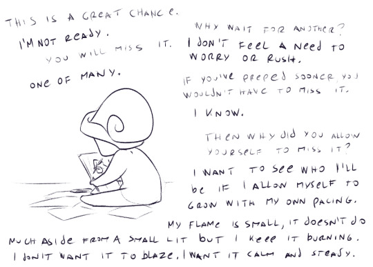
I just realized how snail is a very fitting sona after writing the text. XD
But I’d like to add on to this.
Don’t take this as a great example of what you should do. Please do things your own way and under pacing you think is right.
I’m just very very slow. I learned during the quarantine a bit more about myself. When something bad happens, it hits me days, weeks even months or years later. I don’t react momentarily. I don’t learn things that quickly (unless it’s manual labor, apparently). I don’t memorize things until few attempts and some way to connect the scene to it.
This unusual slow pace affected my growth. I didn’t experience things some people do as early teens until after my (late) 20ties. I didn’t experience bad people (or it flew over my head that I did because I would just not interact with people that put me off and not think of them any further). I wasn’t abused. I’ve grown in a healthy, loving family with no pressure other than social one such as school and adulthood, the norms of it all.
When ever I try to pace myself to things around me, I start to make even slower progress, surprisingly. Or rather, it’s a quick but not good progress.
I can’t grasp some social ideas such as picking sides and without taking the understanding of why someone does something bad the same way majority of people do and this is a genuine issue for me I’ll try to resolve in the future with a therapist.
I don’t have high goals. I just want to do things I think I’m just okay doing. I don’t want to shoot for high if I’m improving. If I’m improving I don’t want to rush it. Same with learning.
Basically... I don’t mind being mediocre and if I progress further than that’s cool but this is just fine.
I know the world doesn’t work that way. I’m adapting it to my own ways. But I’m also starting to draw the lines a little different from before. I am setting the kind of priorities that some perusing a legit career in art wouldn’t. Unfortunately, when asked, I have no clear idea of what I want to do with myself regarding putting myself out there. I don’t want to be famous, rich or make an amazing, creative breakthrough in history of art. I just want to do the kind of art I think I can pull the best out of this tiny flame of mine, earn enough for a living, maybe learn some new interest if I take them on and that’s it.
And then... there are small things that make me happy. Something about freelance work is that commissioners appreciate the effort and making a person smile for that day alone stands out to me better than satisfying the need of a group like in school or work environment. Or when I talk about ideas or interests and others pick up on that vibe and it’s nice. Something about simple creativity and small satisfactions.
I like the feeling of accomplishment when deciding to do something on my own, even if decisions are as simple as “I’m putting this set of milk products to look like a pyramid even if shoppers don’t care as long as it’s a valid expiration date printed on them”. Stuff like that in art too. Try this type of coloring? Scene? How someone does this or that part of the face or body? Lineart? Wanting to learn more about animation? Do a very weeby 4min storyboard animatic no one would care about even if it’s a final project for uni? Because I wanted to do it, I can push it through. Again, as my tiny candle flame, with time, taking it easy...
I’m happy for artists that can blaze it, they really should! Burn like a phoenix or a dragon if they want to! It’s just not for me, though. Selfish as it is and understanding the world just doesn’t work like that, I want to put my health and happiness as top priority. I’m tired of having anxiety over other people’s expectations, or rather, expectations I LEGIT THINK others have for me even it can turn out not to be the case... I will try satisfy them IF I can satisfy myself with my work first. Which doesn’t hold water much because I’m simple and tolerable lol, I can have myself be happy for a simple doodle of two characters just being happy and snugly together, despite the quality of it. (can you guess now why I’d like to try do storyboarding?)
I won’t say my decisions aren’t faulty or bad, though. Heck, I could be missing out on greatest things in my entire life, something one would regret about later (but most often I don’t find myself doing that). Even so, reaching them with the struggles I have no energy within me would just burn me out too quickly and too painfully to put any passion in...
Time passes, people and things change, how things work and adapt as well... it’s not a giant puzzle for me. It’s a walk through the woods. I lose sight of things I passed before. I will keep passing by the things that seem cool from afar. I’ll make turns and detours depending on my own will.
There are so many paths. I want to enjoy the scenery and moment more than I want to see what’s so far ahead...
24 notes
·
View notes
Text
So it’s half sketches, but instead of that being because I was too lazy to color the rest, it’s instead because I kind of got carried away doing only sketches. And then I figured I should probably line and color at least some of them, so here we are
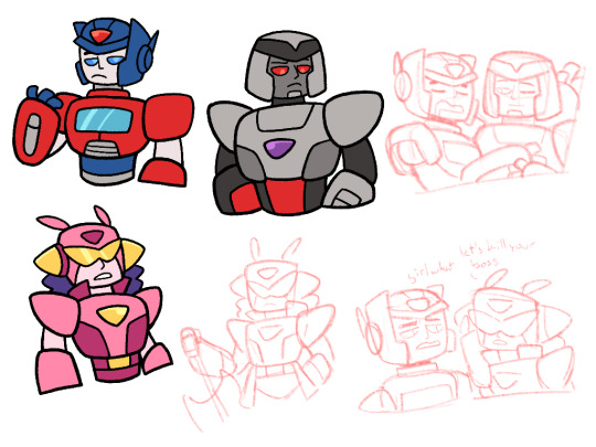
So this is more from that sort of Mega Man AU I made up yesterday, with some updated designs for Optimus and Megatron, and a new one for Elita
I decided to use my marker pen again for lineart, since I haven’t used it in a fair bit, but admittedly the lines may have been too thick, which I think you can especially see with the faces. But oh well
Elita’s design is still a bit of a work in progress. I thought it looked fine in sketch form, but looking at it now, she might need more reworking, particularly with her head. It kind of looks like she’s wearing a wrestler’s mask, which personally I’m not a big fan of
Also she has hair, because a lot of Mega Man, or at least Mega Man X designs, have hair, so I figured might as well try it out here. I couldn’t settle on a hair color though, or at least one that fit while not blending in with her other colors. I may just scrap it in all honesty, but I think she may need more around her head regardless
But as for Elita in this AU? I’m thinking she’s more a loner, or she has her own team rather than working with this duo. She’s friendly, at least to Optimus, but she’d rather work by her own rules. And as stated before, she’s very over the top anime
She also has a double sided axe here as opposed to Optimus’ single sided, but that might change later if I feel like it
She kind of gives me Protoman vibes? It’s probably because of the glasses, and also because my head’s been rattling around with this one Elita idea for a bit. Namely of her and Optimus being rebuilt by Alpha Trion like in g1, but instead of being rebuilt at the same time, Elita-1 was built some time before Optimus, being Alpha’s first attempt while Optimus was the second. Which kind of fits with Protoman’s origin
It might be her origin here too? I’m not sure how much I want to deal with creators in this story, since in Mega Man the robots very much have creators, while in Transformers that’s not so much the case
She might just be like, Optimus’ cool older sister
On to other things in this AU, so I decided to look up videos on Mega Man X lore to get more knowledge, considering it’s the basis for this AU. So the Maverick Virus is what makes Reploids go crazy and cause issues. So I might incorporate some sort of virus into this story as well?
Like either the Decepticons are basically like Mavericks, infected by the virus and gone crazy, or this is after the war and a virus outbreak has been making bots crazy, possibly targeting Decepticons for some reason. Maybe the former
But also I learned that apparently it was the Maverick Virus was what made Zero chill, because it changed programming and he was evil before that. And I’m considering having this also be the case for Megatron here
Originally it was just as a joke, like I thought it’d be funny if he was crazy and then the crazy virus made him chill instead. But I’ve thought about it a bit more, and I kind of want it legitimately
Like okay, here Optimus and Megatron are the top bots in dealing with the infected bots. Not just because of their strength, but because neither can get infected themselves. Optimus has the Matrix, which gives him protection, but Megatron is just seemingly immune to the virus
Unbeknownst to anyone else however, he isn’t immune at all, and he’s been infected with it for years. However, instead of turning him mad, it cleared his mind and instead made him far more calm, and he ended up instead working with Optimus and his group to stop these other violent bots
He knows this, but he hasn’t told anyone else about his situation, because of several reservations. For starters, his team is meant to take out infected bots, which means they might turn on him, or misunderstand that it doesn’t affect him the way it’s supposed to and think he’s going to turn rogue. He’s also been working with them for a while, so the fact that he’s been keeping this secret might be seen as a betrayal, and he doesn’t want to lose these people he considers friends
There’s also been work towards finding a cure, and he doesn’t want to be cured. He was violent and full of nothing but rage before, he doesn’t want to go back to that. He isn’t fully sure if that’s what would happen if he was cured, but he doesn’t want to take that chance. It’s also a reason why he doesn’t tell Optimus, because the Matrix makes him immune and is considered the best bet for a cure, and Optimus might unintentionally do so, or with good intentions (Megatron tries to generally avoid the Matrix on missions for the same reasons)
But also it gives him questions he doesn’t like having, like why is he seemingly the only person affected differently? And/or if the virus is meant to disrupt and alter intended programming, does that mean he was always intended to be a violent maniac? Why? Why was he made this way? And is he wrong to be the way he is now?
But yeah, Megatron’s got stuff going on. Will probably come up for conflict later
Also megop’s probably a thing here? I have it that they live together, as you can see in the top right. Also while Optimus may not be the gremlin TFO Orion is, he does not sleep gracefully whatsoever. It’s a bit annoying to Megatron but he ultimately doesn’t mind. It was just supposed to be a funny thing, but yeah there’s probably megop here
And I think that’s it for now. I have a couple ideas for Arcee and maybe some for Bumblebee, so I’ll probably do more of this. Also I’m planning on trying out the Mega Man games too, since I saw they’re on the eShop
I also need a name for this AU probably
#also I had Elita say “let’s kill you boss” bc I needed a reason for OP to say “girl what”#but I’m also figuring there’s more going on with the virus that’ll be discovered#like there’s probably some mastermind who created the virus#and possibly also Megatron but I don’t know if I’m going full Zero on his backstory#a thing I’ve personally noted is that while OP is more based on Zero and Megs X design wise#role and story wise it’s probably more the opposite#but yeah this has been fun#I may have missed some things bc I was writing this on and off my entire Latin class#but I think I covered everything#transformers#transformers au#optimus prime#Megatron#elita one#my art
33 notes
·
View notes
Text
ive been drawing for quite a while. and looking through my old art, i found ive been drawing online for a whole flippin decade. wow.
so here’s 10 drawings ive done over the last 10 years, with commentary. it’s a long one, though, so be careful.
2010:
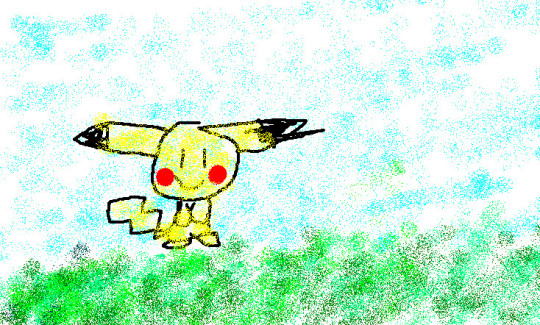
I had to dig through my deviantart for these first two. This pikachu is the first thing i ever posted online! i remember drawing this in ms paint with a mouse. i remember being very proud of this, and in a way, i still think it’s cute. it has a “drawing my kid done that i hung on a fridge’ vibe.
i didn’t do much around this time. i barely knew how the internet worked, and i mainly read instead of drawing. i did some pokemon sprite edits though, for some reason. i remember really liking doing that.
2011:
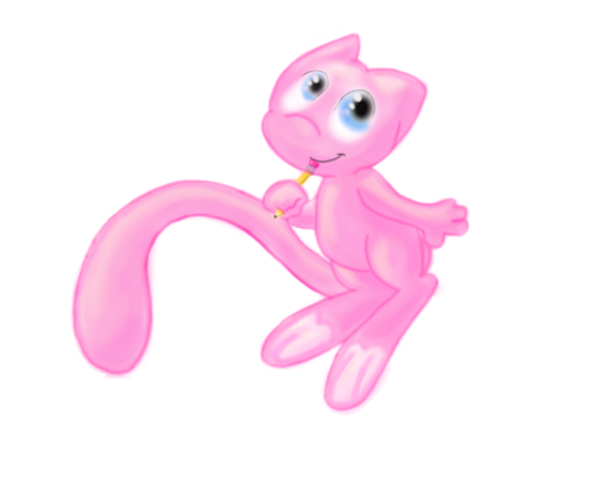
i’m pretty sure i drew this mew in gimp. also with a mouse, because i had no idea tablets existed. ive always been super into pokemon, and around this time i think i was watching a lot of mickey mouse cartoons? it’d explain the weird style.
i’m impressed with the shading, though. i did the best with what i knew, and what i could figure out on my own. not pictured is the hundreds of mickey sketches i did around this time, or the self insert oc i made lol.
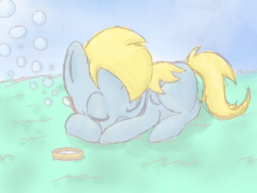
2012: oh no it’s pony time. i spent about 5 years drawing primarily these things. kinda wish i hadn’t in hindsight, but ah well.
i had this program on my ds that i could draw and post my art on, and i was using it a lot around this time. a lot of my art has this sketchy look to it, because of that. i remember i had quite a few followers on it, or at least i think i did. i dunno if that website still exists, or if anyone even uses it anymore.
but anyways, this drawing is super cute. ya can’t go wrong with a sleeping pone. i forgot the cutie mark, tho. i always forget minor important details like that. either that or i drew her as a filly. can’t remember.
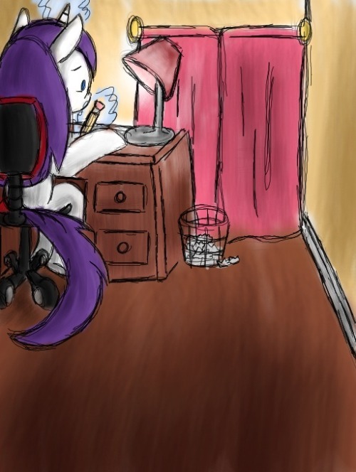
2013: yeah, i think this as vent art? can’t remember, but i drew it on that same program. i put a lot of effort into the perspective. this was based on my room at the time, btw.

2014: i believe this was for a new artist’s training grounds on eqd. i must’ve had a tablet by now, cause i can see tapering in the lineart. it was a big deal for me, and it sucks that i can’t remember what the first ting i drew with it was. i think it was some sketches.
but you can definitely see some improvement by now. i was really getting used to drawing this one thing. but a lot of people following me seemed to like my art back then. it was called cute, and expressive and cartoony.
i think this was around the time i was at my best, as far as notes and interaction goes.
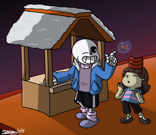
2015: *megalovania intensifies*
i was super into undertale at the time. and 2014-15 was when i started to try and draw other things aside from ponies. you cal tell my poses and anatomy is mega awkward and kinda bad here, but this was a major improvement for me.
2016: i was a fan of steven universe since it first aired, but i very rarely drew fanart for it. but as i was getting more comfortable with drawing peole, i got more ambitious with the characters i tried to draw.
i also from around this point on tried to get better at traditional art. and i think this was the first inktober i tried, but i don’t think it was the first i finished.
i really liked this drawing. and i may or may not have a wip redraw of this going on right now. wish me luck!
2017: KNOOOOOXXXXX I LOVE YOU, YOU PRECIOUS BOI
this is my favorite drawing. i peaked here and i will never be as good and pure as this single icon i did. it’s purple, he’s happy, it’s PASTEL AND SPARKES!!!!
i also got super into bendy and the ink machine this year, which sparked a renewed interest in trying to improve in drawing, and also led me to create my favorite oc ever.
i think i improved a lot around this time. my shapes and anatomy became cleaner and more consistent. on a technical level, i think this is where i started getting really good as an artist.

2018: i don’t think i improved a lot this year. i honestly feel like ive stagnated since then, and depression hasn’t helped.
it’s a tough choice between this and the hollow knight drawing for best drawing of the year, but this is my personal favorite. sorry, mm, but mickey will always win out in my opinion. i know ya liked the other one though, and it’s also really good.
i like how this turned out, and i’m so glad it’s got the most notes of anything else ive drawn. it’s pretty, and i love the style. this is how i wish i drew all the time.
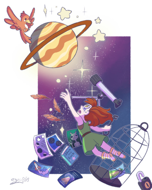
2019: and finally we have this.
i don’t care how poorly this did. i was proud of myself for doing this. it’s cute and pretty and i like it. I created a vague story where she’s a little astronomer who’s like, caged for some reason, but now she’s free.
in hindsight, i think i coulda done a lot better, but i still like it. it’s one of my favorites that ive done this year. i wish i drew more this year, but the last few months ive been super depressed. it’s been hard to want to draw anything, and i feel so uncreative and mediocre.
i’m hoping next year i’ll be better, and i’ll have stuff in my personal life more sorted out, and i won’t feel as bad.
this was nice, though. i’m glad i looked through my old art. maybe i’ll figure out what i’m missing, and get back on track. and maybe i’ll finish these wips i have going on lol. we’ll see.
happy new year, everyone. and may this next decade be even better for us all as creators, and as people.
5 notes
·
View notes
Text
[Working title: a-z || cendent]
Hello! It’s me, i’ve been asleep for—maybe not the most of my day. I’m still fortunate that I’m able to sneak in some wip updates, and quite a bit on linearts, edits. One thing is for sure, my cold is sorta worse now. More sneezing, my throat feels dry (pls I’m almost about to finish the throat lozenges), and just now, a runny nose.
So, what’s happened with this so far?
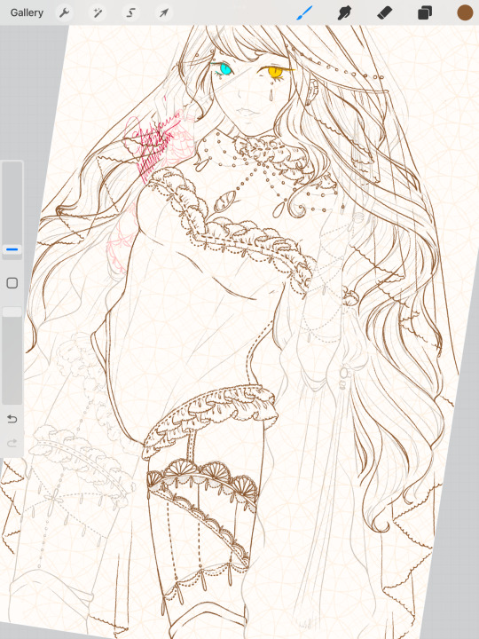
Clothing details—better ruffle details, a bit of change to some of the details, yadda yadda please refer to the attached photo (above). The left leg, I am very tempted to add fishnet stocking details. But I tried a little bit and it looks a bit cheap? So I might leave it as a sheer white color layer, or just skin. I’d agree it’s a strange stocking design but I’m happy with it. Sort of. I’m working as fast as I can but in moderation since I’m also trying to stay not too sick.
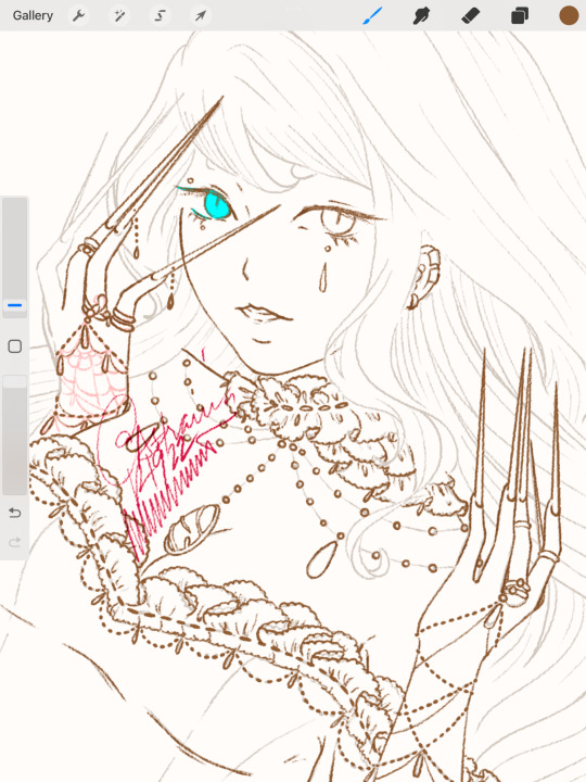
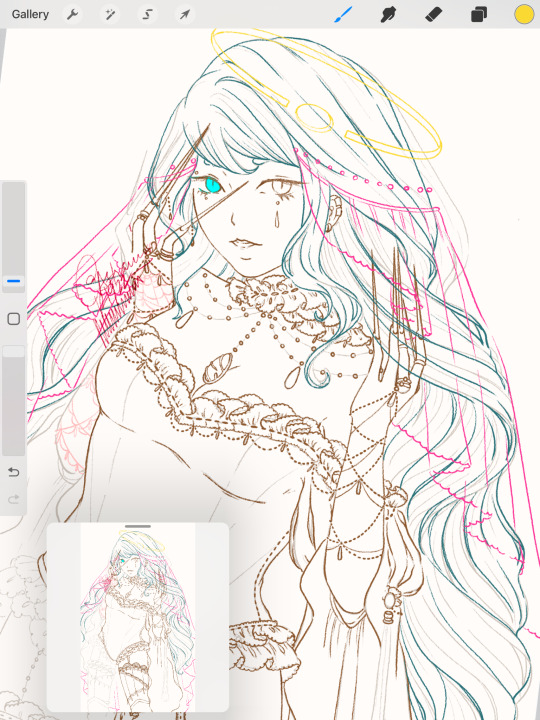
Elongated nails of death—I wear the shortest nails irl (longer ones interrupt with concentration) and some details of this chara (long nails, the funky eyebrows) are vestiges of the past chara designs. I also think it gives her a sort of menacing vibe?? Pretty but don’t mess with me sort of mysterious lady. But very much a softie. I just—like to dress her up okay? The dangly bits are inspired from the MV for [Honey], by Solar. Any sort of dangly bits on nails look cute imo, function-wise I think it’s a nightmare.
The overlap of nails + veil + hair is going to mess with me in the coloring stages, especially that veil. I’ve temporarily put color overlays on them so I don’t get too confused when I start cleaning layers before coloring.
I also need to start putting down the details on the—torso, what do you call this? I’ve also began to think the logistics of how the thing should stay up if the sleeves are that low—I might add a few supports. As sexy as she looks right now it would be quite unfortunate if we run into wardrobe malfunctions. I also think of dumb shit like this when I draw.
The arms are sort of inspired by those Henna details on hands, but these are definitely made of silver or gold material—I like that kind of simple design with jewelry. Just long strands of metal, we all good.
There’s also an abundance of teardrop gem pieces. But I am not about to go into a meta discussion about tears becoming blah blah blah blah blah—
Imagine coming here for an art breakdown just to walk into a sob story. Which it is not, by the way, I just don’t have the strength to go into that detail right now. I’ve turned this part into a bulleted format because neither you, nor I am very fond of big blocks of text.
[In other rambling news]
I’m still quite disappointed with a new book I’ve gotten recently. It was supposed to help me figure out my coloring dilemma but all I got was a bunch of instructions that showed really okay photos. But you don’t really get much out of, “add shading,” without showing you where or how—I’m stupid. I really don’t understand how or like putting shadows on my art. I’m not a fan of the gloomy look it sometimes gives. Even if I use something like a brighter color—it just reminds me of how I shade my other art style [see: “Wounded” series a few posts below, makes the shit look cute, but for this art styles I don’t really want it to look cute…]
I’ve since tried to reach out to people if they are interested in taking it off of my hands. I don’t see it as a waste—the book really just wasn’t for what I needed it for.
0 notes
Text
Blog 5
Due to Tom being ill I wasn’t able to get my feedback until a later date than scheduled, but Gethyn had emailed to assure that he would discuss with Tom about applying for an extension on the deadline due to the missing days. But once I had received feedback I was able to start working on my key image. Tom had mentioned that he really liked the one on the bottom right so I decided to go ahead and finalise that one. and if I’m being honest it was my favourite one too so I was happy to go along with it.

to start off I worked on adding in a few more details like branches coming out of the bushes, Pele holding onto a torch, some gems sticking out of the ground and some lava balls along her belt, as well as some trees in the very background. I liked the composition these little details added to the key image and felt like it gave the piece a bit more depth.

Next, I started focusing on the lineart for the foreground, so for the cave opening and the vines hanging across it, the skull on the bottom right corner, the signs and then the plants and flowers which would be behind the characters but are placed in front of the background itself.

the next step for me was to colour in the characters but using only the flats for the time being since I didn’t want to add too much detail to them without doing the background and foreground, as I didn’t want them to stand out against the lighting and other details of the background. ideally, I wanted everything to blend in evenly so that anything didn’t clash and look tacky.

next, I coloured in the flats for the foreground (Cave, signs, vines, skull)

after the foreground was done I began focusing entirely on the background and applied different colours to different focus points so that I didn’t accidentally mix anything together or paint over a layer.

while working on the rendering I decided to remove some of the flowers in the background because looking at the piece it just seemed a bit overcrowded and looked like there was too much going on, they were a bit of an eyesore since they didn’t seem to blend well with the other flowers or plants. But other than that I was extremely happy with the way this piece was coming together, and despite my inexperience of working with backgrounds I really felt like this one turned out amazing!

then it was time to add my characters in and complete the rendering process with them, so for them, I just added in some highlights and shadows in certain areas, as well as giving the flame some needed detail to make it seem like it was glowing.

the final step was to work on the lighting, I wanted the forest to seem dark enough so that the flame would illuminate the centre of the image and give off that slightly eerie vibe from the cave.

once i was happy with it i compiled everyhting into a PDF file and sent it off to Gethyn for a final feedback.
overall I’m extremely happy with how my key image turned out! and I am especially pleased with the background, I never thought I could pull a piece like this together and throughout the process, I was worried about how it would look but needless to say I surpassed my expectations. I feel like the live brief really taught me how to compose a piece and to have more confidence in myself when it comes to trying new things since I tend to be scared of trying something and it not working out or not liking the results. But not only that I can really see how I was able to apply my art style towards it and develop it accordingly over time to fit the theme, I believe that the cartoon-like style really gives my characters, a lot of character! I especially like how I was able to simplify it down from being overly perfect and strict, it feels very fluid and dynamic and is exactly what I was trying to go for! I think my biggest achievement on this is the detail I was able to put into the background since the biggest reason I avoid them is that I had no idea how I would render or how I would fill in the empty spaces. But needless to say, the more I worked on this brief the more I was loving the idea and the work and I would definitely take on more opportunities like this one again!
0 notes