#this was more painterly than usual and it was a lot of fun!!!!
Explore tagged Tumblr posts
Text
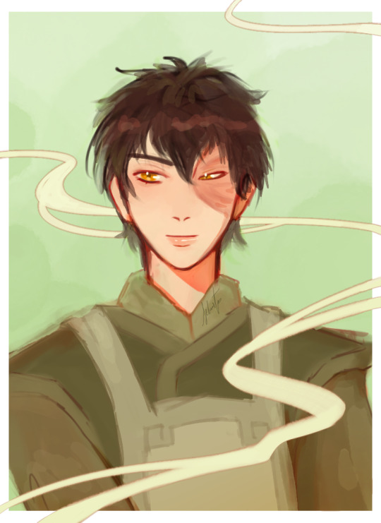
🍵 teashop zuko
#2 zuko doodles in a row? more likely than u'd think 🫂🫂#my art#this was more painterly than usual and it was a lot of fun!!!!#this took about an hour and a half! whilst i was watching gilmore girls (im on season 7. am feeling a lot).#atla#zuko#rkgk#avatar: the last airbender#atla fanart#zuko fanart#netflix avatar#avatar art#digital art#illustration#avatar the last airbender fanart#avatar#avatar fanart#avatar the last airbender#gaang#gaang fanart#prince zuko fanart#art#artwork#artists on tumblr
455 notes
·
View notes
Text
Art style breakdown /tutorial(??)

Some friends asked so here we go : disclaimer im bad at explaining (so feel free to send an ask or smth)
Final art (long read so theres a timelapse at the end)


If its not for something important (commissions), i dont usually make a lineart for a drawing but just clean up the sketch , it wont be used anyway

I usually separate them by colors , mostly so i can Alpha lock them and not worry about coloring over parts
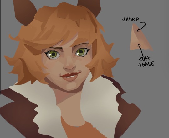
When coloring i use a soft airbrush to have gradients within the shading , so its not one solid color . How i shade is very blocky , lots of triangles lol (if im using CSP i love using the lasso fill tool ) but there are parts especially in the skin where I keep it smooth and blended, usually nose and cheek area . Using an asaro head is usually a good start to learning how to shade faces with planes in mind

Depends on the character, but I like adding shadows on the lashes/brows itself , make it look solid and 3d , it makes the eyes pop more imo

Using multiply layer to make the shadows darker for more contrast
At some point I’d merge everything together so i can just paint in one layer, easier to fix things with liquify too ; if im in CSP i keep the separate layers in one folder just in case i need em later but i cant really do that in Procreate cos of layer limits

This is the part where i make the shading more painterly .,To make the shading look sharper , i like adding lines on the edges .
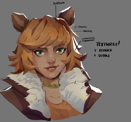
The fun part : adding the ✨
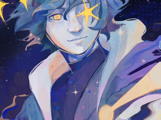
This is the part where I add textures , either from texture images or with screentone/hatching brushes. This is also around the part where i add the character’s accessories and stuff like scars and freckles (its just easier to add smaller things near the end than having them accidentally painted over at the start)
Whenever I feel like the drawing looks too much of a similar shade / temperature , I use a gradient map+layer effects (masked) on parts to give it variety . Technically you can do this by just having a layer effect on and manually adding colors but gradient maps make me go “ooooh didnt think of that color there “
CSP also has a posterization filter that i like using when i feel like some part looks too smooth to me.
I sometimes add in sketchy lines , and seeing how cool it looks in Marvel Rivals art ive been adding it more lol
Artists that influenced me are : Nesskain, Toni Infante , Valorant’s 2d art(their main artist is Suke) ,Arcane , Spiderverse and the most recent one ive been obsessing over is Marvel Rivals ( its got everything i want my art to be when it grows older lmao )
516 notes
·
View notes
Note
Hi!! I was wondering if its okay to ask what brushes u normally use in krita? I love your art!!
Thank you so much!!! I only use the ones available in Krita by default and I tend to jump around based on what I think will work best for each piece, but I can give a little rundown on which ones I use the most and what I use them for :)
Here's an image guide with each of the brushes I've used and that I recommend checking out:
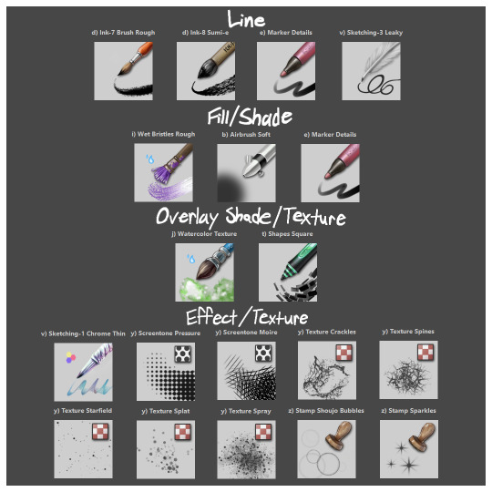
I'll highlight my favorites as well with some examples where they were predominantly used! (though in some cases multiple or even all of these brushes were used)
Marker Details:


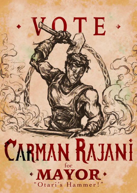
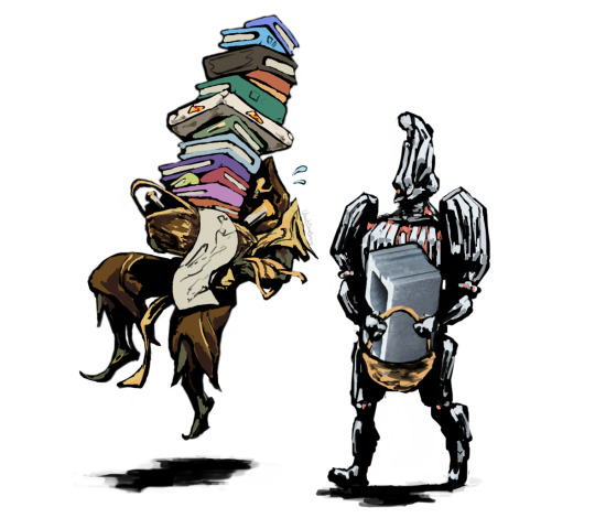
Varying opacity and size makes this one my favorites for sketching, especially since it can easily be nearly transparent or fully opaque which helps with value range.
I also like using it for silhouette sketches!
It can also be used for final linework, but it takes more work to get to a full opaque and its lack of texture makes it a little less interesting than Ink-7 Brush Rough imo.
Ink-7 Brush Rough:
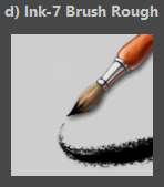
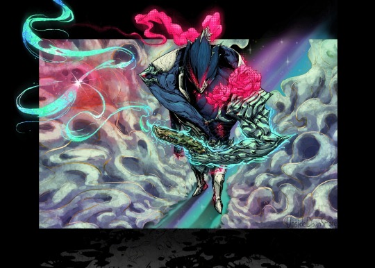
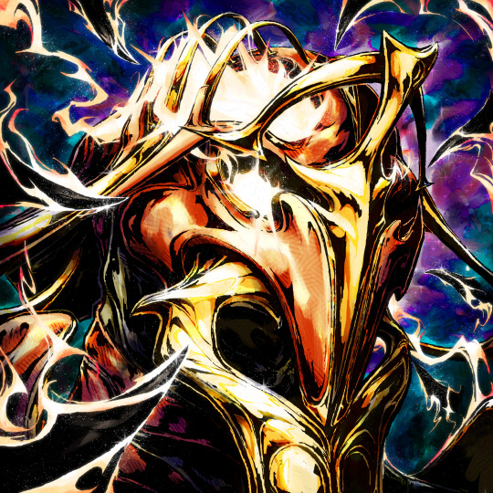
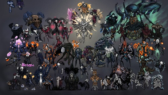
Really good for linework, especially for comic styled drawings with it's slight texture, varying weight, and opaqueness.
Also good for just filling in entire areas with a single color as well as non-smoothed shading!
Wet Bristles Rough:
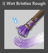
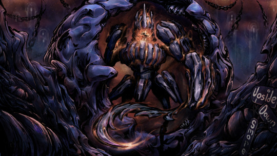
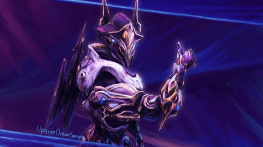
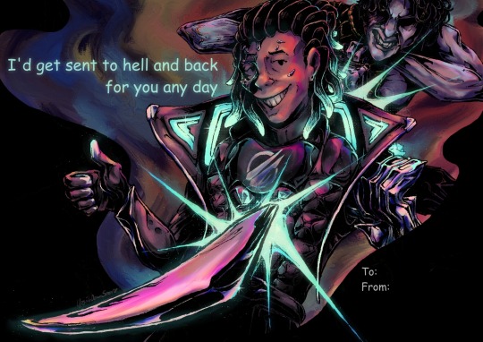
Actually just an amazing brush, its pressure sensitivity is crazy.
Blends strokes like paint and can vary in size and opacity.
Also has a nice subtle texture!
Amazing for smoother coloring and shading, especially if you want a more painterly style.
Watercolor Texture:

(hard to show examples of this, just assume that I've used it in any piece that has smooth shading lol)
Not the best for painting/drawing on its own, however I've found it to be really useful when set to white or black on an overlay layer for adding extra shading and/or highlighting on top of the shading I've already done.
I usually shade individual figures, objects, and parts separately, but using an overlay layer with Watercolor Texture (or even Shapes Square) on top of everything helps make the entire piece feel more cohesive.
Also adds a hint more texture!
Another thing to note is the importance of layer modes!
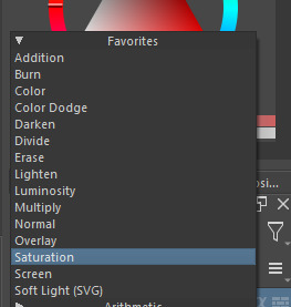
I know that you asked about brushes specifically, but many of these brushes (particularly those to do with effects and textures) work best when experimenting with different layer modes other than Normal. Overlay is generally a safe bet and most of the best for, well, overlaying multiple layers for interesting effects. But please try out all of them at any given opportunity, sometimes things like Burn, Color Dodge, Soft Light, etc can have more interesting effects!
In addition, mess with filter masks! You can even edit where they apply by drawing on the mask directly! HSV/HSL Adjustment (also accessible with ctrl+u) in particular is INSANELY useful for fiddling with the colors and balance of a piece, from individual layers to whole groups and drawings. I also really like blur filters, often times I'll duplicate a layer and make the bottom one blurred to add a glow affect to something without losing its definition.

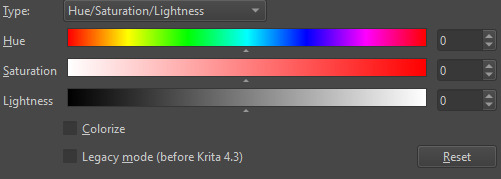

While this latter stuff isn't about brushes specifically, its generally very important to how I use and experiment with all these different brushes!
Anyways I hope this helps!! I kinda went overboard with this post, but I had a lot of fun writing it! Thank you again for the wonderful ask!! :)
#krita#krita art#warframe fanart#art#artists on tumblr#my art#UpsideDownSmore's art#art tips#art guide#art reference#long post#ask#didn't mean to spend so much time on this but ngl i'm actually so thrilled to talk about my art processes#like man i'm so grateful to be in the position where i can make an art guide like the ones made by people i look up to#sorry if this response is a bit long winded i just had to get a bunch out there lol#love asks like this :)#scheduling this 9 hours from now cause it is currently almost 1am lmao
39 notes
·
View notes
Note
Hii im the same anon who asked for the jewellery rendering tutorial. Sorry i keep asking for tuts but how do you render clothes,, it's currently my biggest struggle along with actually drawing the folds 😭😭
Hey there anon!! Don’t apologize!!! I actually really do enjoy answering questions, whether it’s drawing tips or my opinions and such on mammon!! It’s fun to talk to y’all when I can!
Anyways yeah I think I can explain my thought process when it comes to clothing and such!!
(Putting it under the cut cause it may be a bit long lolol)
So when I draw clothes, my main focus is to understand and be able to get across the texture/material of the clothes I’m making!! I find that when you can get across what material it is, other people will be able to fill in the blanks of what the clothes are supposed to be!!
For example, here’s my pool table mammon where he’s wearing a gold metallic puffy jacket:
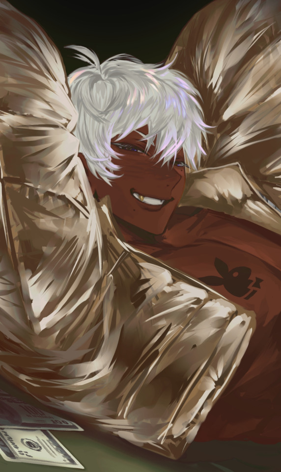
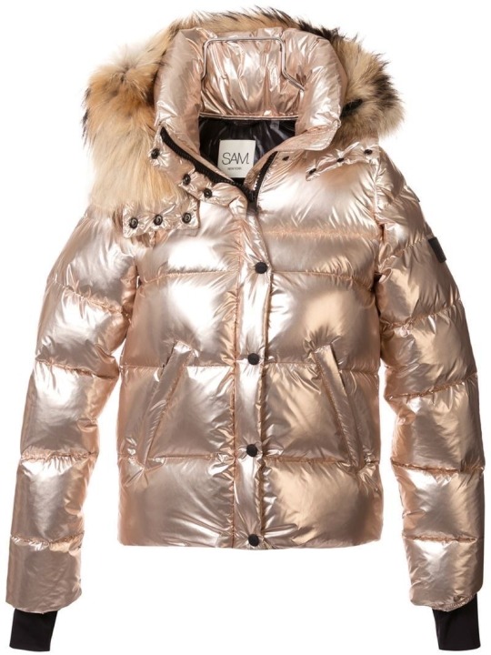
For reference, I looked for a picture that had similar material and overall shape to what I was drawing.
But rather than trying to copy the shading and folds line for line (which wouldn’t have worked either way since the angle, pose, lighting is different and would change a lot of things!), I look at which places the material looks the brightest and darkest, as well as where the clothing puffs and where it sticks to skin to be able to accurately get across the kinda clothes I wanna put my subject (usually mammon for me 🫶🥰) in!!
A few other examples would be these two mammons:
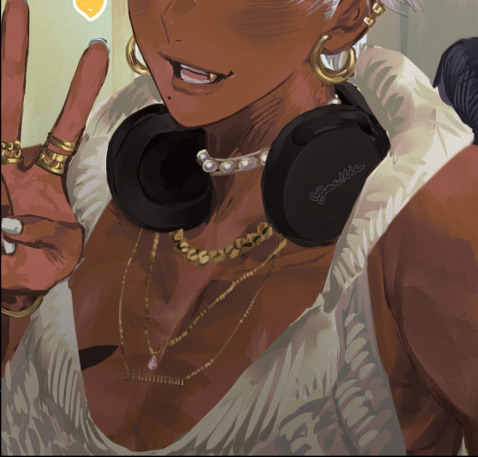
In these two pictures, mammon wears clothing that have a very distinctive texture to them, leather and knit! Even though I don’t draw every line or fold perfectly, I try to get across that it’s a knit sweater or that it’s a tight leather material by either drawing the wool stitching/pattern or having the shininess of the leather come through the dark material!
Even though it’s messy, you get what I’m trying to convey when you understand that it’s wool or leather or whatever material I’m trying to convey at the time!
Once you understand material, I think it becomes easier to understand folds!
Take this mammon for instance:
Because I understand denim fabric and because I looked at the jeans I wanna reference prior, I know that those folds/lines tend to be where the legs connect/around the crotch area, so I know to put those there! If it were a longer pair of jeans, I would put those folds around the knee areas, since there’s where denim tends to bunch up!
I think it’s very helpful to spend some time looking at fashion images online and when you’ve picked your clothing, to really look and see where clothes *tend* to fold into itself when it’s made of a certain thing! That way, when you draw something puffy, you know what spots is puffs at and where it sticks to, or if you’re drawing something that clings, you can see what spots cling to the skin and was spots have a looser fit!
I tend to spend a lot of time going on Pinterest lookin at fashion pictures and clothing and saving the ones I wanna draw mammon in, so I’ve built up my understanding of how material works! I still have plenty to learn, but I’ve built up my observation skills to a point where I can trust myself to get down a certain material once I’ve found a good reference!
Hopefully y’all found this helpful!! The way I draw is very much messy and only really drawing what I think is important and letting myself and others “fill in the blanks” when it comes to finer, finer details! My thought process is to draw enough to get the point across, even if it ends up looking more painterly and less clean than it should LOL but I’ve come to enjoy the way I draw :P!!
Anyways thank you so much for the question, I actually really love talking about my drawing process! I don’t tend to do it often, so when I do explain things, I think I also end up learning things myself when I look at my own art and explain it to all of you guys!!
#asks#mammon obey me#I used mammon for all my examples LOL#my little model helping me out 🫶🫶#isn’t he so cute and helpful 😍😍#it’s cause I love drawing different fashion types on mammon#I love playing Barbie dress up with my man 🥰
38 notes
·
View notes
Note
Less about OCs, but I'm interested to know what your process is like when creating a piece as detailed as that one you posted for Valentine's Day. How do you go about it? And do you happen to do time-lapse videos?
hmm can't say I can give an explanation that's terribly interesting or satisfying lol... I'm almost entirely self-taught, so "process" is a very loose and nebulous concept for me, and it changes from piece to piece. the one common thread among my works is that they all involve obscene amounts of trial and error. I don't have any recent time-lapses because I never think to record them, but if I did you would definitely see how often I feel the need to adjust and redo every little thing.
for the Valentine's Day piece, because it was a "remake" I had the benefit of a much more solid foundation than usual to start out with. however you can still see where I ended up deviating from the sketch phase - most obvious being her pose, the design of her hair, and the details of her sandals. (there were also meant to be candles on the dresser, but I forgot and didn't feel like adding them back in later and so I decided a vague suggestion of candlelight was enough lmao)
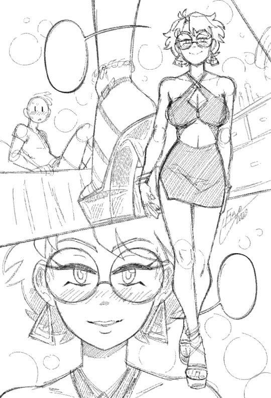
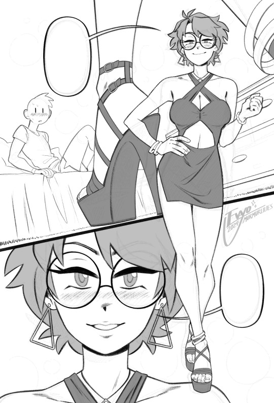
anyways, compared to everything else, sketching and linework are fairly straightforward and come most easily to me. there really isn't much to say, just scribble some messy lines and then whittle away at and draw over them till they magically become less messy!
when it comes to coloring and shading, things get a lot weirder and more complicated. this is where my process tends to vary the most, because it really depends on the mood of the piece. for this one I wanted something dark and seductive, so I covered the whole image in a layer of burgundy red, then painted the "lighting" on top across several Overlay layers. additional shadow details were brushed in on Multiply layers using deep purple instead of straight black, but ultimately I didn't want them to be too dark, as that initial layer of red was meant to serve as the primary "shadow" of the piece.
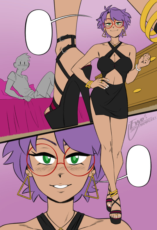
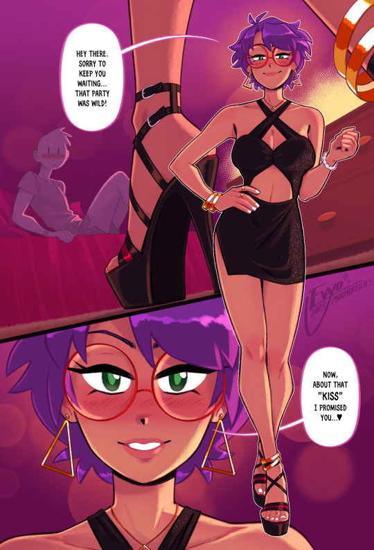
this is also usually where I decide which lines I want to "color" with clipping masks, which can either make certain elements pop or feel softer. it sorta brings the whole image together, giving it a much more painterly look overall. from there all that's left is to keep making adjustments and adding little details - the glittery effect on her dress was one of the last things I added, I thought it looked really nice!
...ok now take everything I just said and throw it all in a blender. because even though it might sound fairly orderly, the truth is I'm constantly making changes to all stages of my works, even the earliest ones, all the way to the end. I'll still be making adjustments to the linework and such after I've already put so much effort into the lights and shading! it's not the most efficient way of doing things... but again, trial and error. my perfectionism gets the better of me...
anyways I apologize if NONE of this made any sense, like I said I never had any formal training in art, so I'm not very good at teaching or explaining it!! at the end of the day my process is less about what makes logical sense and more about finding what feels right in a given moment. at the very least I hope it was a fun read lmao 🥳
#evayo asks#evayo art#glassborn#ocs#fun fact: i had no idea what to put in those dialogue bubbles till like an hour before upload LMAO... she could've been saying anything 🙊#art
42 notes
·
View notes
Text

🎆 Goodbye 2024! 🎇
From the bottom of my heart, thank you to all my lovely followers and supporters of my art. Honestly, I struggled a bit this year with my art. I've lost a lot of confidence in my usual art style, which means I started a lot of projects and then banished them to WIP hell. Now I feel like I can't draw anything in my usual style.
But there are some good things to come of this too! I made a bunch more animated pieces than ever before (keep an eye out later for my Art vs. Artist). Also I played around with a more painterly style which is super fun. Plus I really nailed down my chibi style!
With al that said, I'm always so inspired by all the incredible art I see on here, and I’m so glad I get to share my art with you. I hope it brings a smile to your face like it does to mine 😊 Wishing you all a safe and happy new year!
Here's the link to the template if you'd like to use it!
And here are all the featured pieces in their full glory!
January - A Fancy Lad
February - You and Me, Together in the Sea
March - Portrait of a Goodfisher
April - Alignment Chart Who?
May - Eunice Mermay
June - Team Stardust
July - Sweet Painted Lady
August - Midnight Snack
September - Resting in the House of Hades
October - Lust
November - Falling Up
December - Weight of the World
#i like how astarion and gal in august are weirdly staring at the poor lady in july lol#art summary#art summary 2024#summary of art 2024#2024 summary of art#artists on tumblr#my art#2024
2 notes
·
View notes
Text


EEE thank you @l3o-lion !! To answer your question, most of the animations I post on here are tweening, specifically with Live2D.
I like using it for gentle looping animations & backdrops. (Character animations are a whole different beast? I usually only keep them to a couple functions like 'HandMove' or 'HairGoWoosh'" but this is the VTuber-making software so it's totally possible to make more complex characters. )
I made a tutorial for how I animate with L2D below the cut, if you'd like to see the details! :D
This is the file for that Artfight attack. (quick disclaimer for anyone reading out of context: THIS IS NOT MY CHARACTER DESIGN, they belong to Finchstick over on Artfight!)
I drew the image itself in Krita - for this one I tried to go for more of a fuzzy, painterly style because I wanted to make it look like a muppet. L2D can handle fuzzy textures and gradients without too much trouble most of the time which is something I really like about animating with it.
______________
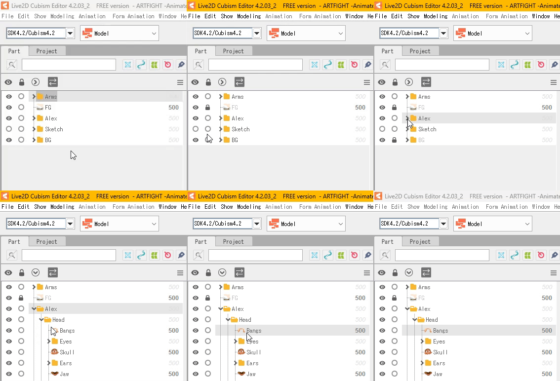
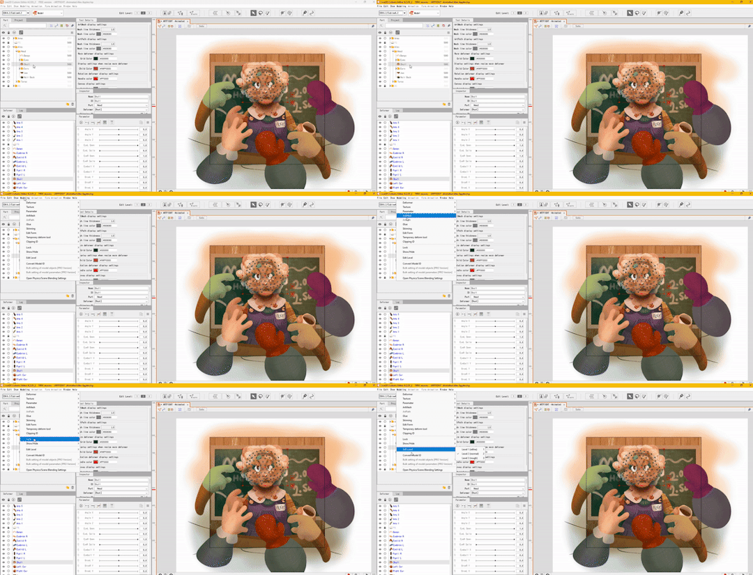
So! Each different moving piece has to be its own layer. Naming and organizing them into folders helps a lot once I export it into L2D. The finished image needs to be saved as a .PSD file.
After it's done, I'll open the .PSD file in L2D and it'll look something like this:

Once the file is open I find the moving pieces of my character and select them. (I also lock the static layers before doing anything )
_______ M E S H E S ________
Once I have my piece selected, I open the automatic mesh generator ( located above the image, to the left ) and automatic mesh it.

(Keep the mesh generator window open and select / apply mesh to each moving object.)
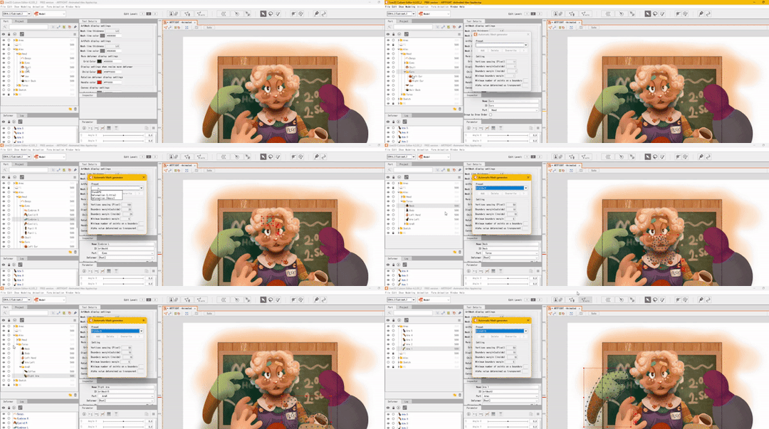
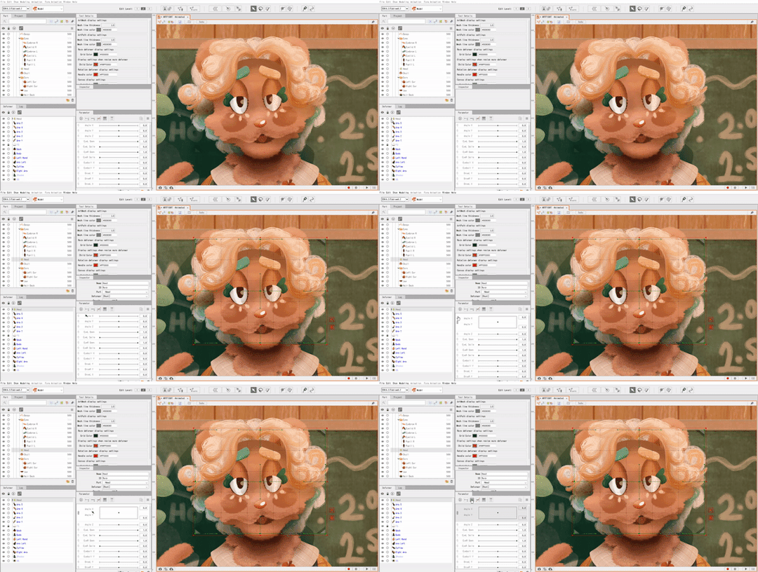
______ D E F O R M E R S _______
Once the pieces have a mesh on them I apply warp deformers for each part. (I try to apply the deformer for each body part to the largest piece making up that part. For example, the part being used for the head deformer here is the upper part of the head.)
Each part of the face also gets a deformer - each eye, the mouth, etc - and those get shoved into the parent "head" warp deformer.
The deformers allow for parts of the face to move with the head, but they also allow for you to set more parameters per part and make your model look more dynamic. (There's a 3 parameter limit in the free version but if I need to make another parameter work I'll just brute force it and make a 'head deformer deformer' etc)
_____ P A R A M E T E R S ______
Once the deformers are set up, I start setting the parameters.
The program opens with these default parameters which are all intended for rigging a face, you can make your own custom parameters at the bottom of the window.
As for the green dots here, they represent points of extremes on the parameter! You can change what these are by moving the slider over the green dot, and moving the mesh on the selected object.
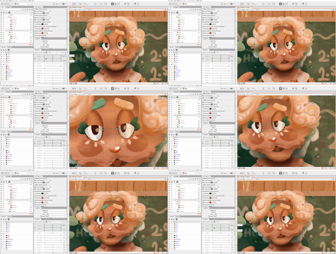
This can be a bit tedious, but it's fun to watch the model look more alive the more parameters you finish.
______ A N I M A T I N G _______
After I save my model as a .CMO3 file I open a new animation file in L2D, and drag and drop the .CMO3 into the window.

The model shows up much larger than the window. You can resize the window in the bottom left, (third and fourth fields from the top,) and shrink the model to fit inside.
(The free version has a limitation on how big your image can be in order to be exported. It usually takes me a bit of trial and error to get the right size for the image.)
The window below your image shows your tracks. You can have multiple models per animation, I usually just use one. The purple track represents the model while the orange represents the duration of the animation.
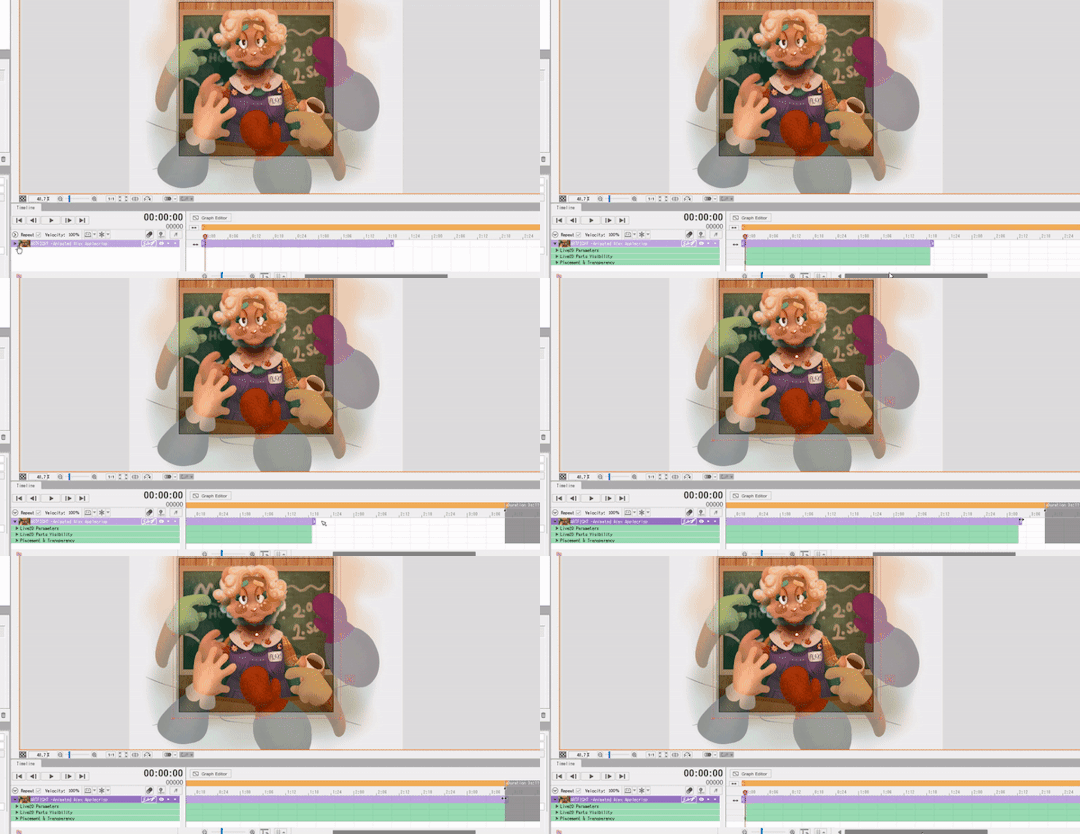
With that out of the way, it's time to set the keyframes! Under the purple model track there's a green drop-down window called 'Live2D Parameters'. Here, you can adjust your parameters in order to move your model to the right position.
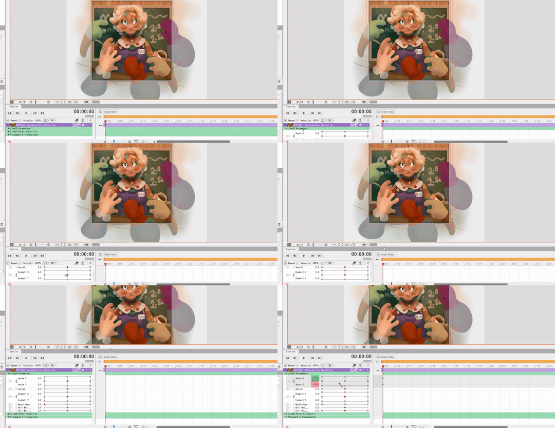
(In order to make a looping animation, you can copy all parameter values in the first keyframe by left RIGHT clicking the dot on the green Parameters track, and then paste them to the last rendered keyframe.)
I adjust the parameters and keyframes until I feel satisfied with the result. Once I'm done, I just go to File > Export Image/Video > GIF animation or Video.
I make sure my image is sized correctly, and save! And that's about it. ( For this specific animation I also put some effects over it in Clipchamp. )
20 notes
·
View notes
Note
any tips on lineart or coloring? I adore your art style!!!!!
thank you! this post might be a little rambley because i'm not the best at explaining things
ok for starters, i don't want to go into my own personal preferences for choosing colors too much. when i started drawing i really stuck with what other artists said was the "correct" way to do things and that can really hinder your art a lot, so i'm going to give general descriptions of colors and color schemes and let you decide which ones you find the most appealing or enjoyable to use. i think choosing colors comes down to personal preference most of all. don't take anything i (or any other artist) say as law, drawing is a lot more fun when you make your own decisions about it. if you want to use a lot of super bright/dull colors, or no colors at all, go for it! your art should be what you want it to. this post is more for people who want to know more about color schemes than for people who want to draw exactly how i do lol
also you can use solid black and white in your art its not illegal and it doesn't always look bad idk why this is such a common thing people say in tutorials/tips about colors

color schemes can be monochromatic or polychromatic, with my art i usually use different colors but i like to use monochromatic schemes sometimes too, art can look very nice with both of them. characters with multiple colors (like kirby) can be drawn with monochromatic palettes as long as you have varying values of the color.
with polychromatic color schemes, remember that less is more! limit your colors and try not to use way too many, it makes things less confusing. reuse colors for different things instead of adding new ones
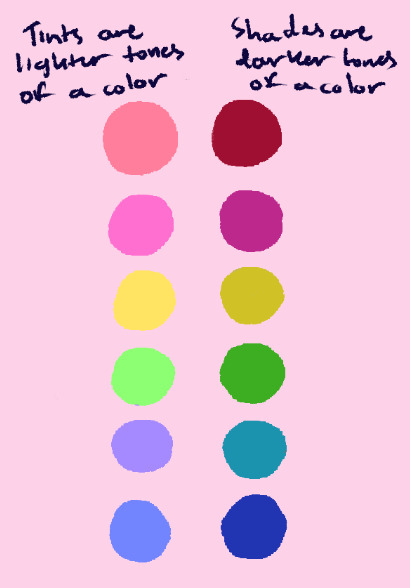
value is how light or dark a color is. i like to use color schemes with a lot of tints (or pastel colors), usually with a few darker colors in order to define shapes a little better. value is Very important to make the thing you're trying to draw clear to see and separate details from each other, so i'd study this before learning about picking colors individually.
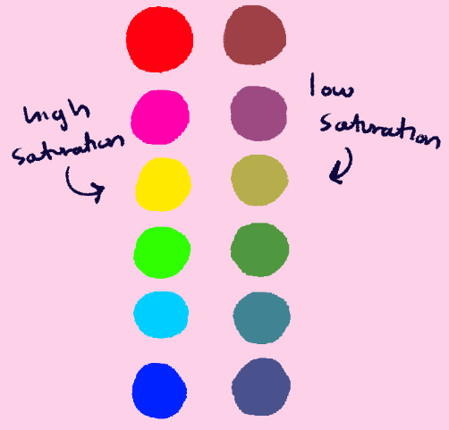
saturation is how "intense" a color is. it's different from value, and it works alongside it (saturated/desaturated colors have tints and shades.) i don't use many very saturated or destaturated colors, and a lot of my art kind of lies in the middle. when i do use them, i try not to put very saturated and very desaturated colors together in the same color scheme, as using all of one or the other can make things more cohesive. (also, don't make dark skintones too desaturated. they should be in the middle)
the most important thing to remember about color schemes is that colors don't work independently, they look best when they're cohesive with other colors. think about how you want something to look before you color it, consider if it's supposed to look cute or have a gloomy/dark feel, if its daytime or night, etc. try not to follow a character's reference sheet colors too strictly, and change them as needed given what you want your finished art to look like.
lineart is a lot more simple (at least to me). i usually use a dark blue or whatever color i associate with the character for it, and i like to keep the stablization setting very low, as that helps it make look more sketchy/painterly. (i use clip studio paint, so if anyone wants these brushes let me know and i'll put them in a different post)

hopefully this was a little helpful and not too much of a pain to read! i've gotten a Lot of asks about this so i felt like i should make this post as detailed as i can. do look for other resources if you want to learn more about this stuff, there's people way better at explaining things than i am lol
#i don't like those ''this is wrong and this is right'' kinds of art tutorials/tips so i hope this doesn't feel like that#except the cym and ryb thing. use cyan yellow magenta its infinitely better alway;s#asks#not daily#long post
27 notes
·
View notes
Note
For the artist ask! 22 and 30~?
22. do you have a favorite color palette to work with?
Depends what I’m doing! For more painterly pieces, I go with whatever best fits the mood, but for more cartoony things I love cool colors, especially blues and purples (with lil highlights of pink)! For character design, I love color palettes with three main colors (less than that is difficult and more than that is difficult to get right). Usually I go with one dark color, one light color that’s a complimentary hue to the dark one, and one other very saturated color! I do tend to go with desaturated colors a lot in general, though.
30. whats something youre proud of about your artstyle?
Definitely hair! It’s so much fun to do and always adds a lot of movement to a piece. Also any injuries that cause bleeding, although I don’t tend to draw those as much lol.
3 notes
·
View notes
Note
1, 11, 19 and 21 for the ask game!
YIPPEEEE
1 - Art programs you have but don’t use?
I mooch off my mother’s Adobe account, so I have photoshop… but never actually use it for art. I also have Gimp and MS Paint, but never open them, I’m wayyy too used to Firealpaca LMAO
11 - Do you listen to anything while drawing? If so, what?
Oh god. Okay. My music taste is ALWAYS shifting, so this answer is complicated. Sometimes I put my liked list on shuffle because it’s just easier than picking. Sometimes I put the five songs I’m obsessed with at any given time on repeat. Sometimes it’s the Danganronpa OST (refer to my username!). Lately it’s been a lot of System of a Down, specifically ATWA.
Usually, however, if I’m drawing someone else’s character, I ask if they have a playlist for that character, or if they associate any particular genre with them! Music usually gets me in a certain mood, and then I channel that mood into the personality and expression of what I draw. I can’t draw something light and pastel if I have metal music blasting.
It also gets difficult sometimes because I have bad misophonia. Most stuff that’s super soft or calm I cannot listen to or I want to blast holes in drywall like a guy named Kyle on too much Monster, so by that point I just put on the tamer stuff of my liked list.
19 - Favorite inanimate objects to draw?
One I love that many artists apparently can’t relate to is guitars specifically. I love bass and electric guitars because they have incredibly fun shapes and can be decked out with a lot of stickers if your character’s particularly cool. Acoustic guitars aren’t AS fun for me, but I still get a lot of enjoyment out of the shapes!
21 - Art styles nothing like your own but you like anyways?
This one’s a tough one for me to answer. I’ve never been particularly fond of hyperrealism, and my style borders an interesting edge between anime and Western cartoon (interestingly, someone has compared it to Boondocks before, where it’s a more Western cartoon style with heavy anime influence).
I will say the ones that stick out to me are pretty much any lineless or painterly styles that still manage a sharp, contrast-y look. Things that use a lot of saturated colors and excellent lighting work incredibly for me! I also will admit, I’m kind of a sucker for the “generic” anime style used for most vtube models. I watch a lot of Live2D showcases in my spare time.
(Also gonna take the time to plug my buddy @5tar-boy’s work because that style is NOTHING like my own, but their work with colors and designs is CAPTIVATING.)
Thank you for the ask!!
2 notes
·
View notes
Text
improvement hell day 9 and 10
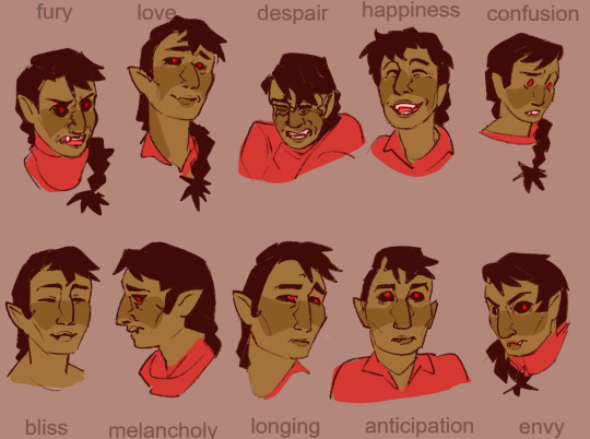
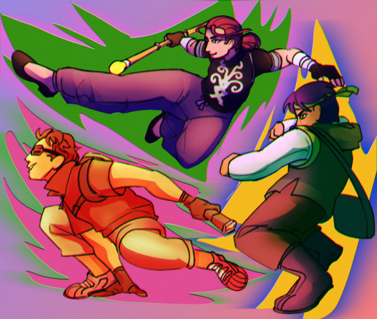
I don't wanna go into a lot of detail.
10 expressions - easy. just drew a bunch of Illiyas.
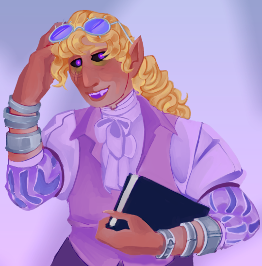
Artstyle emulation and lineless - I lumped em together cuz they would take too much time on their own, supposed to be Ava's demon but it's just more painterly than my usual style.
Matt hatter chronicles fanart - it was a good show. Also all of them are trans because I say so.
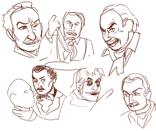
vincent price portraits - I love that bi villain chef freak.
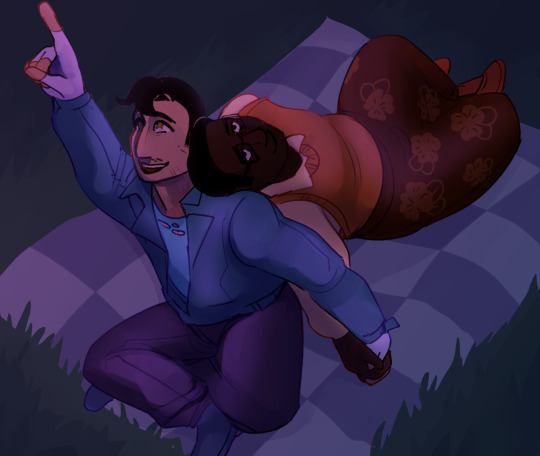
redraw - I'll post the original piece later for a comparison. I like the composition and anatomy better, but its not perfect.
As a reflection - I didn't improve. I just did the same old shit. It was fun trying out different things. but it was nothing all that new. maybe if it were over a whole month I would've pushed myself more. but Its fine the way it is.
2 notes
·
View notes
Text
@emerialyncodevenice CATCHING UP ON ECV REPLIIIEESSSSS HELLO‼️‼️ i don't think i have with this one BUT now that i think about it someone else did draw them a little similar to this and i'll have to send it to you!! #LAURARCNATION i'm actually outlining for realsies and very excited to start drawing pages again 💙💜⚔️🔭 the only thing i love more than hijack. my ocs and webcomic
THEY REALLY DO it would be so horrible and tragic if they were separated by franchises...... such a good thing they aren't!! the wedding was so beautiful
yeah 🥹🥹 yeah..... 😭😭. like right now. i have deadlines. i have conventions. i am dying.
ME TOOOOO you know it's always good!!!!

I LOOOOVE TLU AU requires a lot of working and messing around to make the personalities fit to the au bc jack and amalthea are very different people and i have extremely deep thoughts and loyalties to the last unicorn canon especially the book BUT. i will make it work no matter what. it's hijack and it's the last unicorn. i did not fly to another country to watch the 40th anniversary screening to be a quitter when it comes to a hijack au
LONG HAIR JACK >>>>>> and i went over the top with it for real. hijack has everything that's fun to draw for me EXCEPT ridiculously long CLAMP shoujo hair so i will shove that into whatever i can so help me god
thank you!! 😭😭 i tried to mimic the style of colouring the movie uses so less painterly than i usually do, except for the very painted background. i think i can paint the last unicorn backgrounds in my sleep with all of the ones i've done over the years
HAHAHA DON'T WE ALL yes we need to make sure to keep the fandom vocal post the movie's release to convert the new people to the hijack agenda
😁😁😁 i looooved drawing their faces ❤️❤️❤️

OOOOO ECV AU ECV AU ECV AU
OOOOO THIS IS FASCINATING ALREADY and i love hiccup naturally developing powers like this PLUS ties into not only the heart of a chief but the heart of a dragon as well 😁😁
HAHAHA AND THEN BY FALLING IN LOVE WITH HIM JACK STEALS HIS HEART actually now that i say that it would be REALLY COOL if that were how things resolved!! instead of hiccup needing to tie himself to someone like mim or mother nature he and jack end up tying themselves to each other's magic thus choosing to protect and stabilize each other

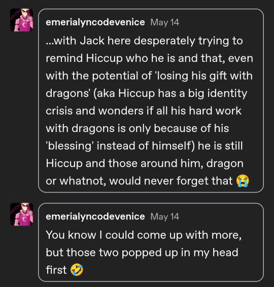
OOO THIS IS COOL TOO it could even be from stoick's side going back to hiccup the first but over the course of time has stopped appearing in new generations over the course of the dragon war?? and hiccup is the most recent appearance in generations and that could tie into feeling like an outcast even if no one quite knows what it Is about hiccup just that there's Something off....... until he starts training dragons and it becomes much more clear
PLEASE YOU KNOW I LOVE YOUR AUS!!!!!
2 notes
·
View notes
Text
Cheeky wee Art Recap
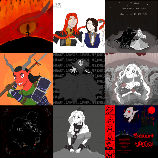
Aha haven't gotten to do anything like this before.. hmhmm.
I finally started doing digital art in October this year, and while it has presented so many skill-checks and struggle points, it's all been learning, practising, and honing whatever the hell I'm doing, which is a fun feeling.
So, I've put together the 9 things that I've been happiest with, most proud of, or just had a ton of fun making. Which I shall go into typical excruciating detail on. (and also share some traditionally done highlights for funsies)
Though in no super particular order, just visual appeal, I did purposefully place the top left, centre, and bottom right.
Top left is the initial painterly style that I first tried doing digital with, which I feel like was a style that (though I soon found the flaws with) helped my confidence in actually putting stuff down digitally, and feeling it out mechanically. I still really like how it turned out, it was a super cool visual I really wanted to portray.
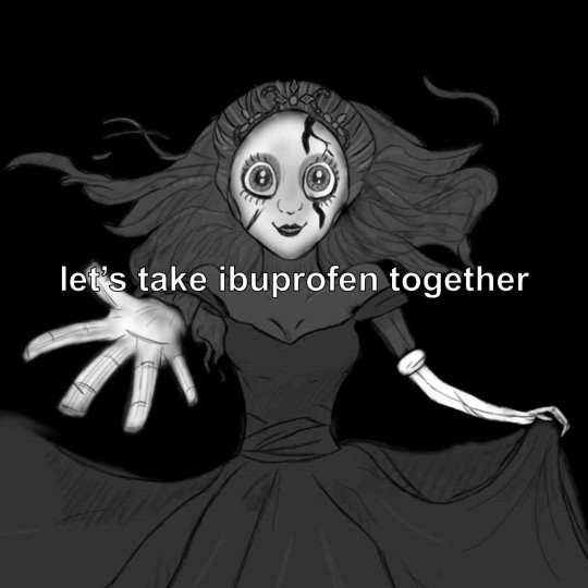
Then in the middle is where Hyperfixation(TM) does its magic and unlocks your full potential. I don't really know why I was determined to draw The Nightmare digitally, but hey I was shocked by my own ability and that really gave me the drive to continue. While it has been surpassed as what I think is my best work, it fills a pretty special role in this little art journey, hence a (memed) version of it has been my pfp since I posted it.
And finally I decided to put Remire Valley bottom right since it is the most recent thing I've done (literally yesterday) and I still really like it! The opinion-decay has been weaker than usual which is nice.
I still believe that Thorn (middle right) is the best thing I've made so far, and in general I'm like, so thankful to the slay the princess creators for inspiring me and influencing my art style in a way that I love.
My New Years resolution is to continue to draw pretty and/or spooky girls. and maybe a guy, sometimes.
Bonus Traditional Highlights
I did also some random traditional drawings here and there, mosty from before I started doing digital, though I believe the earliest drawing I'm gonna show here comes from about August.
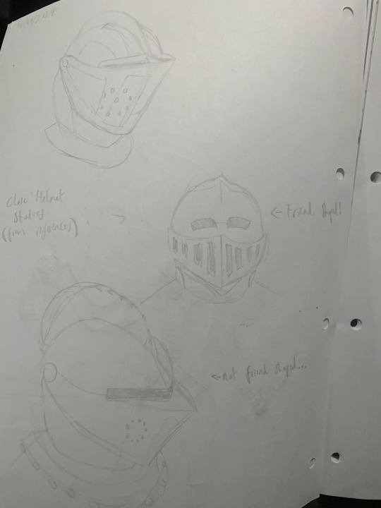
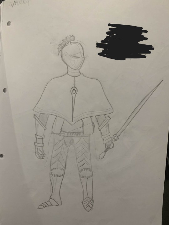
Never showed it off but I did this little practice of closed helmets which I found pretty fun, looked at some cool helmet references and tried my best to work out the shapes, and I think they actually turned out pretty cool. This study was done to prepare for doing the character design on the right, who is a prepared NPC for the dnd campaign, though I expect it will be some time until they ever turn up, so barring blocking their name/title I feel okay with showing them here in terms of spoilers. I can confidently say that they are not associated with any current plot threads, so they will arise when their own little story comes up.
Speaking of the dnd campaign, that was probably my biggest motivator for traditional art, I did so many sketches/concept art for things I have put in the campaign (and lots of things that are yet to appear, as seen). Of these, by far the ones I'm happiest with are the Peccatorum soldiers and their leader, The Pontiff.
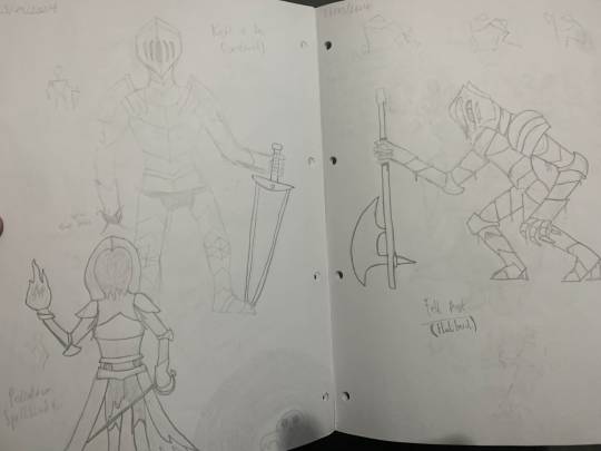
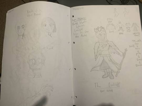
There's one other traditional thing that I thought I'd share, since it was a pretty neat exercise in character concepts and design, those being some interpretations of the 4 horsemen of the apocalypse.
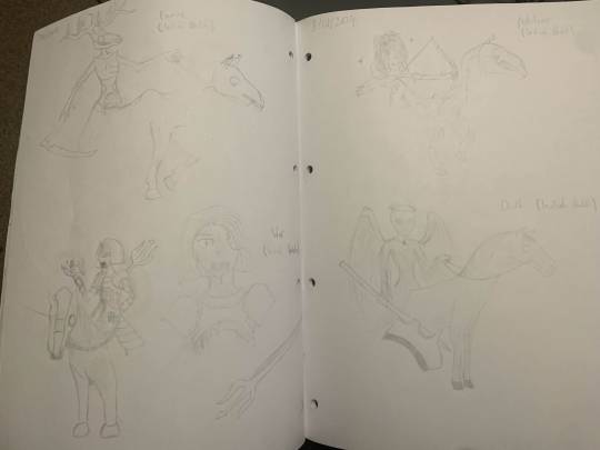
(or horsewomen, because of course they are)
These designs are probably my current idea for a redo in digital, since I really like some of the concepts and design elements, whilst I'd probably change/refine some others. That'll probably be my next big project, but I have ideas for other smaller drawings, and every now and then I'm still opening up the sketchbook to just do whatever.
So yeah, if there's one thing I can say about 2024 it's that it brought about the actualisation of multiple creative outlets (the dnd campaign, and doing more art than ever) which I'm super happy about, and I look forward to doing even more and seeing what 2025 will look like.
1 note
·
View note
Note
Hey, in your bobs burgers drawing (which is really good BTW) you draw on brown background. I've seen a lot of other artists do this too and I am just wondering why that is?
Thank you in advance if you answer this (no sweat if you don't!) and have a good timezone.
There are a few reasons for this actually!! Thank you for sending an ask, I love to geek out about art stuff like this.
For digital specifically, it reduces eyestrain, drawing high contrasting lines against a bright white background starts to hurt after a while. It doesn’t have to specifically be brown, but picking something a lil darker than white helps and not super saturated helps. I usually tend toward browns and like blue-grays (just depends on the vibe lol). I sometimes go a step further and will use something lighter than black against something darker than white (like for example, I enjoy an army green against beige). This is partially for like, feeling out colors and having fun, but it’s also just easier to look at over the course of several hours.
This is more of a traditional art stand point (but that’s where my education lies lol) Once you get to coloring or rendering, it kinda helps you identify the values (lightness/darkness) of the colors you’re going to use. If you already know what general color the BG will be it’s nice to work off of that, I usually go in Not Knowing That lol. If you have a more painterly style (which the Bob drawing isn’t the best example of) it also really unifies your color choices if you integrate or mix your background colors with your subject’s colors. When working traditionally I will physically mix a bit of my background paint colors with my more “star of the show” colors, and with digital you can do this by lowering the opacity (making something more see-through) or blending/including it throughout your drawing.
I straight up forgot to post the finished piece but here are some examples to illustrate the point some:


So you can kinda see how on pure white the shadows seem overly dramatic and things are comparatively dark. And with pure black, everyone seems weirdly glowy and they’re all very bright. And then on the neon green (for an extreme example) it really makes the color balance weird. Most of my art is very saturated in general, so this example isn’t very extreme, but a super bright background can really wash out a vibrant drawing and make it seem more bland, in addition to like making complimenting colors seem really extreme and similar colors more drab (like Linda’s red shirt seeming Extra Red against green, and everyone looking more orangey, but also Louise’s dress looking more murky)

For comparison against the brown, the colors are more grounded, you get the best of both worlds of seeing what is Actually dark and light. It isn’t a saturated color (but not fully gray) so the skin tones are less orange by comparison. In my real final piece I just ripped a background from the show and lowered the opacity over this brown to kinda draw attention away from it and keep the focus on the characters. (I’ll post it in a sec oops)
If anyone else has questions about why artists do certain things please feel free to send an ask, I am happy to explain anything I know!!
1 note
·
View note
Text
Journal Entry #1 - Convo w Mimi
Journal Entry #1 - Convo w Mimi
(In response to Mimi's essay "Against Bourgeois Art")
Mimi! Thanks for this. Finally got a chance to sit w it this morning. So manny things come up for me. The way bell talks about architecture and arts political functions in art on my mind, the way Angela talks about the vitality of imagination in revolution, the way Sandi Hilal (of DAAR) speaks of the importance of a love based practice. Its so funny i always forget u studied art history- for some reason i always think it was English. I’ve been thinking about Philip Guston alot from that era, really interesting career arc of making realisic oil paintings inline with class struggle realism - who then switched to more abstract renderings and ended his carrer at this really interesting inbetween. Funny enough he’s had this resurgence of controversy lately dude to abstract renderings he was making of kkk hoods/members in one era of his practice. Honestly, I came to his work from an intrest in more ‘painterly’ aspects- material, movement, gestures in the work - but I’ve since come to sit with it in other contexts as well. Been thinking and reading a lot about the things happening after abstract expressionist movement (eccentric abstraction, post minimalism, conceptualism etc) in the states, but more beyond too. There were things happening at that time that often isn’t highlighted usually because it was made by a woman and/or person of color ofc that are getting some more eyes now but were historically excluded from that conversation. Eva Hesse, Senga Ngudi, David Hammons, Ana Mendita, Beverly Buchanan, etc. and now coming to contemporary artist I feel like are continuing the tradition of what I’d like to think of as ‘hidden radicality’. Cameron Rowland, El Natsui, Park McArthur, Felix Gonzales Torres, Doris Salcedo, Martin Puryear to name a few. Something I’ve really been attracted to in peoples practices and output is this aspect of a trickster nature. Where there’s all this theory and research behind and underneath the work but then on the surface level, there’s this object that is birthed into physical form through that. Because I think there’s still is a finesse and a level of magic, alchemy - jen es se quoi (lol) that makes art making (to me) go beyond just being renderings of what’s happening or what can happen. It makes me think of this meme where its the bullying one and like figurative paintings are making fun of process/research based abstraction lmfao. I kinda hate figurative paintings for that reason😬. Like i appreciate their place in history and the foundation it’s laid for later movements but at least in the context of making art right now, in all mediums there’s something about being too on the nose that I think about alot. Like how can I trick, inspire, ignite or otherwise ‘convince’ people to look in a certain direction (all together in the same direction of love and not at each other?!?! 🫣) instead of being like “Yo this is the way to look, here’s the arrow”. I think thats part of the role of the artist. To uncover and excavate truth but also to like make it sexy lmao. The trojan horse aspect of something that is quite literally interesting, pleasant, sexy, cool, spiritually fulfilling and or inspiring to look at but actually pushes our perspective and knowledge (weather we know it at the time or not) is the art thats been really doing it for me, always and now more than ever.
0 notes
Text
2022 Megaman Summer Fanart Contest Results! (Part 1)
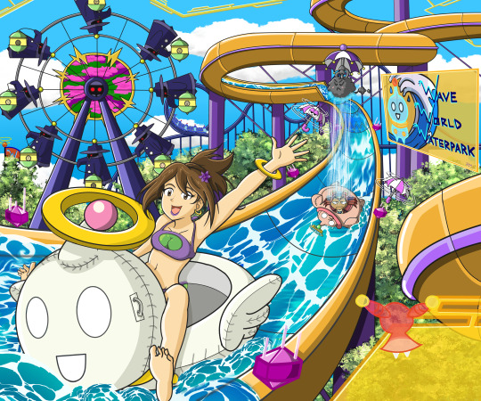
I will try to keep the dialogue short and sweet, but you know it’s hard. And I’m a little rushed in posting this, so apologies for anything that I did not proofread well. Hopefully I did not screw up any of the links. Thank you to all who participated, and hope you all can enjoy and heap loads of praise on everyone’s creations!
Hey, I did my own promo art for the first time in forever! I’ll post more on that later. This is more about you guys, first.
This will be broken up into 2 posts, due to the amount of entries in the first category. This post will just focus on Category 1. See Part 2 for Category 2 and 3.
I actually do have updates to one participant’s entries, but because it happened as I was writing this up, I have not have had the time to edit them in and reupload things. (Which had no effect on judging or these results) So expect a possible update to these posts late tonight after I get off work, which you can check out tomorrow.
Again, the top 3 who placed will be announced first, followed by the remaining entries in alphabetical order by alias. Winners will be contacted later on tonight, after I get home from work. Check your email/DMs tomorrow.
After the break, here are your winners and galleries full of art!
CATEGORY 1: Under my Nombrellan
For this category, participants were to draw a rainy day scene with the characters of their choice utilizing an umbrella or containing a character that was umbrella-based, like Nombrellan, in it.
And you guys made it really hard, because there were a lot of great ideas, and I probably made the theme too vague to judge it as well as I could with the others. Because I really had a time trying to place these. ^^; But that is also a testament to what you sent in.
After each entrant’s name, there will be a link to the entry, too, just in case the inserted external images don’t load for you. In the interest of not breaking your browser with the usual super-scrollingly-long post, entries consisting of more than 2 images will only have 2 embedded into this post, with links to each page separately.
[Full Cat. 1 gallery]
1.) @subzeroiceskater: [Entry]...is 23 pages, so I’m just going to link to the first page, and you can arrow to the right to view them all ($125 prize)


If you have been following my contests for the past few years, you know Subzeroiceskater has taken up the giant comic entry mantle from artists like Wintesm and Fenril Huayra. And those ambitions were well placed here, with a fabulous kids book-like story that will have you laughing and crying, with pages that are bright and cheery, and pages that are dark and sad. You incorporated multiple umbrella designs and characters, and told a very sweet story, which I feel like was your best yet.
2.) Zackxson: [Entry] ($75 prize)
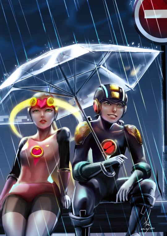
For pure technical style, your painterly piece stood out and looks fantastic! The glow from the yellows on both Rock and Roll draw my eye in amongst the dreary rain, and while it can be seen as a smaller detail, the digitalization lines of the umbrella was a nice touch. Overall, real fun to zoom in on and look at in close detail. The realism and lighting are just really well done!
3.) VCampan: [Entry] ($50 Prize)
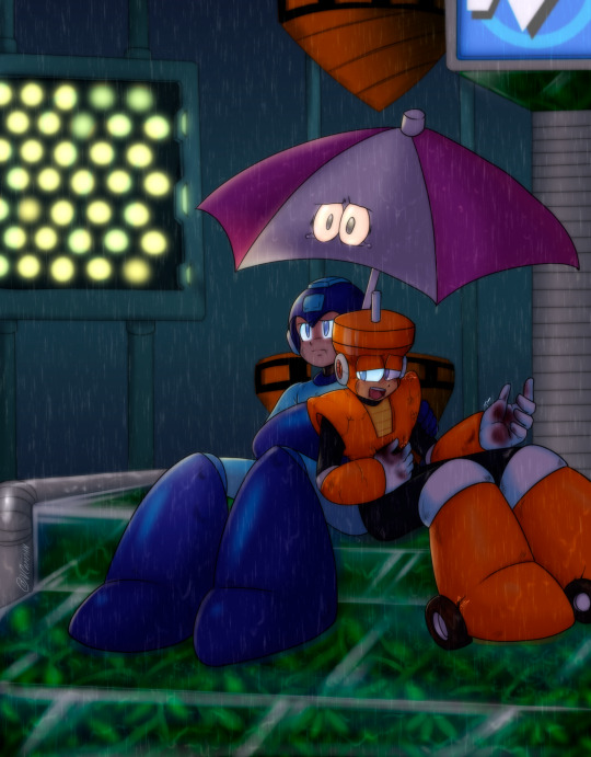
Defeat a Robot Master, and still have to sit there and listen to him spill his guts out to you after...well,...his guts have been blasted out. The emotions of the scene is what helped put this one here to me, as Rock is both being kind to his enemy, but seemingly not comfortable with it. And whatever Top is telling him sure got to that Nombrellan, who is welling up with tears, that it probably won’t be much different from the rain on the bots soon. The soft glow from the stage lights on them also turned out really nice.
And the remaining wonderful entries, in alphabetical order by alias:
@dahlia-the-nurd: [Entry]
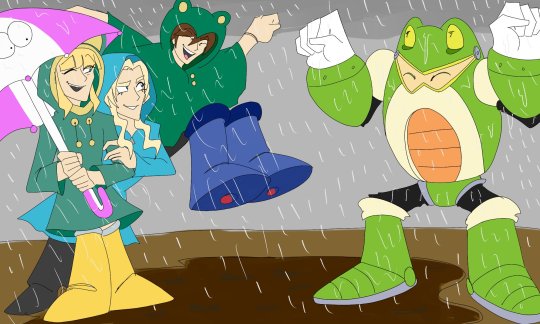
Toad jiggly time! Jumping in puddles and splashing around in the mud is part of the fun of rainy days, and it looks like everyone is having a good time in this scene. Until Rock’s feet splash that mess on everyone, that is. The Nombrellan sure looks like it doesn’t want to get all dirty, and knows what’s coming! LOL Love that the siblings have matching froggy ponchos. Just a cute, fun scene!
@digitallyfanged: [Entry]
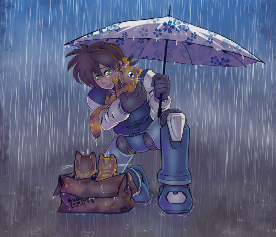
One of multiple entries featuring umbrellas as acts of kindness shielding furry friends, Volnutt has stumbled across a trio of kitties. The face on the one he’s holding is adorable. Not sure if it’s feeling uncomfortable being drenched or just being cuddled that close. LOL At least the claws aren’t out yet. Love the detail of the soaked cardboard box and how you drew the water dripping off of things like the cat’s tail and umbrella itself.
@dwn-059: [Entry]
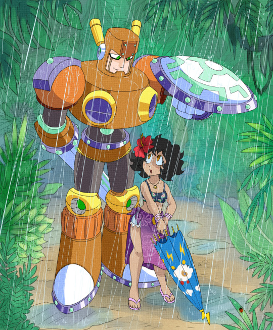
Of all your entries, this was probably my favorite in terms of overall detail and composition, but since you placed in a different category, that kept this one from placing here. Chivalrous Sword Man might not have an umbrella himself, but that shield works just as well. The background is so pretty, definitely fitting of the opening of his stage. Even the smallest of detail was a focus, like the solo ladybug on the leafy blade. The Sheep Man umbrella design turned out really cute!
Jewel Maiden: [Entry]
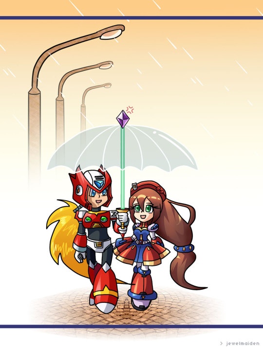
Living together in a world where only Reploids exist, as it almost feels dream-like with the white fog around them. Very clever take combining Zero’s Z-saber and Iris’ gem in your umbrella design, it definitely stood out as unique! The cobblestone path looks wonderful as well as they take their stroll.
Marquelle Power: [Entry]
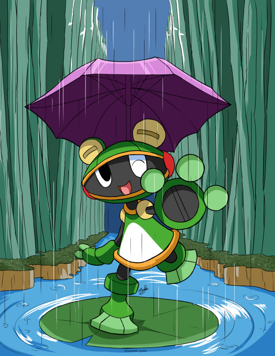
In the digital world, it must be nice to be able to have an umbrella sit above you without having to use your hands to hold it, as Toadman illustrates. Very cute pic, and reminiscent of his battle with him on the lilypad. The tall stands of water grass drawn in the background really frame him in nicely.
Mattasaurs: [Entry]
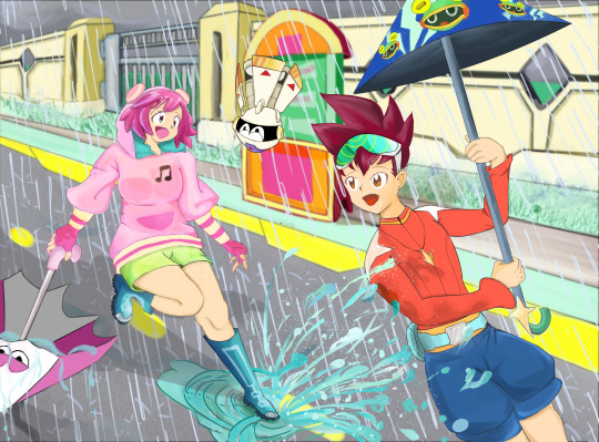
Another fun splashing in puddles pic, this time without the dirtiness of mud, as Misora gets Subaru all soaked outside of school. Just don’t hit that Tel Tel with anything that will change the rain to snow. The way the water splatters turned out really good, as is your background work of the school gate/wall. Subaru’s umbrella has a cute design with Toadman.EXE and the lightning bolts, while still incorporating a little shooting star into it.
Miralie: [Entry]
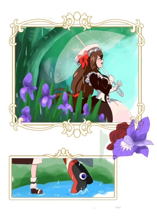
I really thought this was minimalistic-ly beautiful, telling a story without showing too much. Iris is obviously excited to see Zero outside of the frame, and it’s cutely funny to see the taller Zero’s heels lifting up like he was the one leaning in for a kiss with the shorter Iris. Fantastic job with the details of Valentine’s Day Iris’ dress, and I love how the lineart for her just curves and flows so well. Very pretty overall.
@nightopianfoxgirl: [Entry]
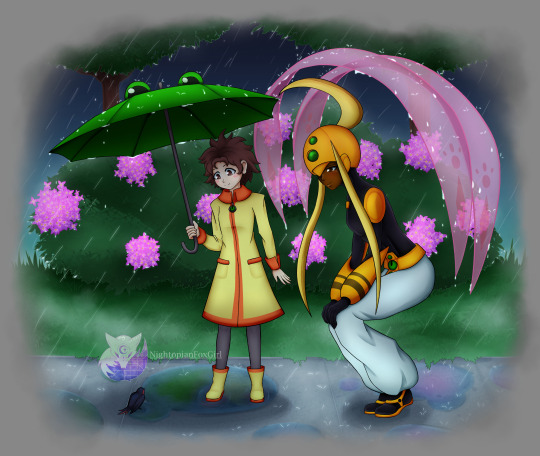
This scene with Mamoru and Serenade encountering a little birdy in the rain is very adorable, as is Mamoru’s froggy umbrella. I thought that was a very clever, yet subtle, design for the umbrella. Made me instantly think of the froggy trash can in EXE when I saw it. Also clever way to make use of Serenade’s scarf raiments to act like an umbrella to shield them from the rain. The way the water drips off of them turned out great as well. The pink hydrangeas in the background are pretty and add some cheer to a dreary day.
@papillonthepirate: [Entry]
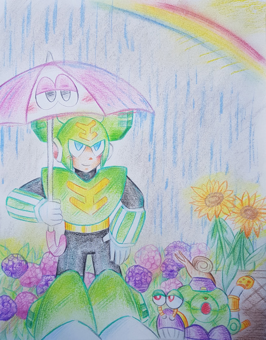
Sunshowers are a wonderful thing to experience, and you brought some brightness and cheeriness to a dreary theme with the rainbow overhead breaking through the storms. The ‘lil Escaroo with an even tinier real snail friend is super cute. The shading work with your colored pencils, especially on Tornado Man, turned out really good!
Ryan Vogler: [Entry]
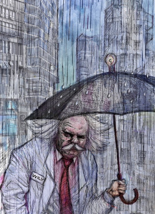
Only an evil genius would have an umbrella with a lightbulb on top of it. I would love to see this in animation action, as he thinks up a Robot Master that will surely defeat Mega Man this time, and the light above the umbrella just lights up super bright. Clever, and gave me a good laugh. The chaotic sketchiness of your linework is more noticeable zoomed in, but it really does reinforce the downpour of the rain in that way as well. That detail and style helped make the whole piece really unique, and I really liked it!
@stephodell: [Entry]
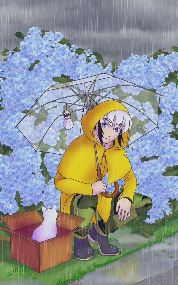
And finally, one more lone kitty in a cardboard box beside Enzan. The background detail with the huge amount of hydrangeas in bloom turned out very pretty, as did the little details like the blades of grass along the pooling water on the sidewalk. Having a clear umbrella lets that background stand out, and the ‘lil ghosty Blues hanging from it helps echo the transparency of it.
____________________________
And once again, head here for Part 2 of the results.
10 notes
·
View notes