Text
Evaluation
To evaluate my Don’t Panic project also for me known as Phasmophobia, I am pretty happy with how it turned out. I actually liked this project as I am a big fan of horror movies and scary stuff. I’m very into weird and creepy movies like Caroline etc. My personal favourite of the project would probably be my postcards as there is a different variety and was the ones I had to work/perfect the most. I like how I added a grain to most of them, they don’t look flat and I stuck to a colour scheme. I don’t have a least favourite as I worked hard on this Don’t Panic project that I can’t not like my stuff, however, that doesn’t mean I wouldn’t change any stuff about it. if I was to do my posters again, I would of made a different variety to choose from for my final poster, like how I did with my stickers. I think this because my different posters where too similar just had a different colour scheme, it made it too easy to pick my favourite one of the four posters. If I made them all different I would be more harder to pick my favourite one however that could be a good thing as I would have a more variety to choose from and end up with the better looking poster, and if I was to change my mind I would refine my decision and make sure I had the best poster to present. I have learnt a lot of things from this project. I have learnt the importance of planing/sketching out your work to have different directions for your final piece. I have used this technique a little in my postcards when I refined a few of them because they looked too flat and not appealing and when I was doing my stickers, I sketched out different illustrations of ghosts to choose from for my stickers and chose the best 2. I have also learnt to revisit my work. I did this for all pieces of work, for my poster, I revisited it and realised I forgot the title, foe my postcards, I saw that some looked too flat, not textured and not as effective as the rest and for my stickers I revisited and saw that the layout was way too boring and I had to revamp it and make it look appealing to the viewer. This learning experience was helpful as I have new techniques and talents I can bring and use for my next projects and I have some old techniques I have learnt not to use such as, thinking my work is fine and perfect first time and not having a thought process for my work. However I find those two techniques that I am abandoning helpful as they made me learn these new techniques and talents I can bring to future topics and it made me realise what not too do and there is always room for improvement.
0 notes
Text
Creation Of My Envelope For My Don’t Panic Pack - Final Outcome And Process.
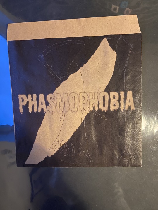
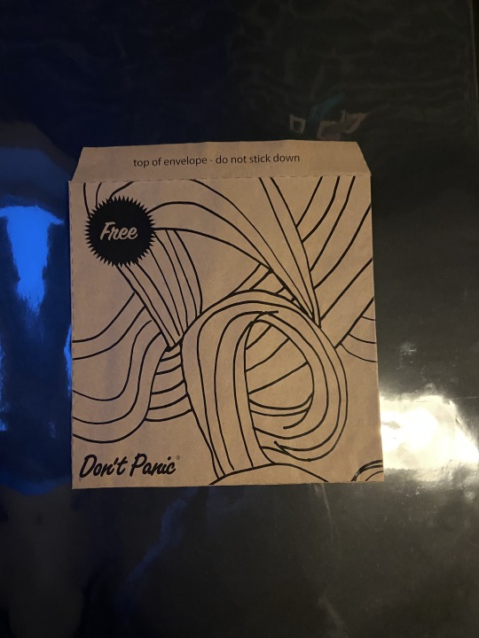
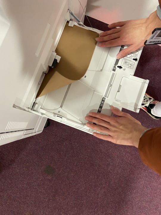
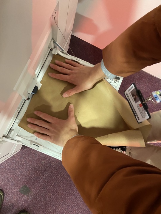
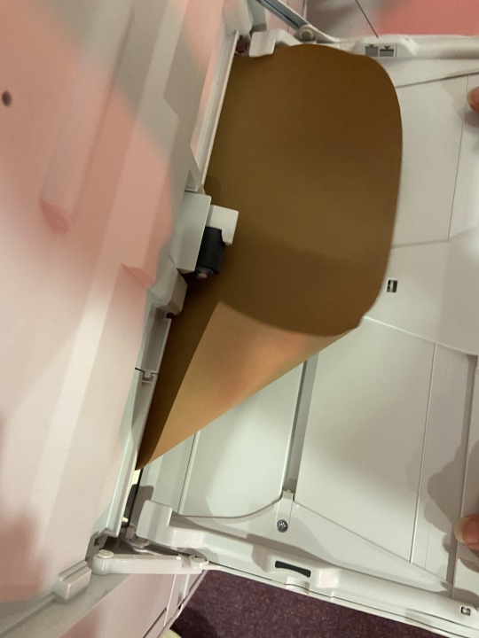
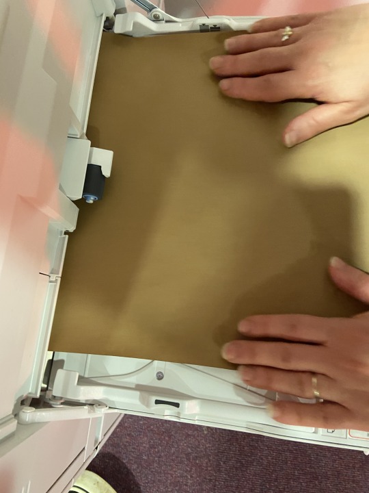
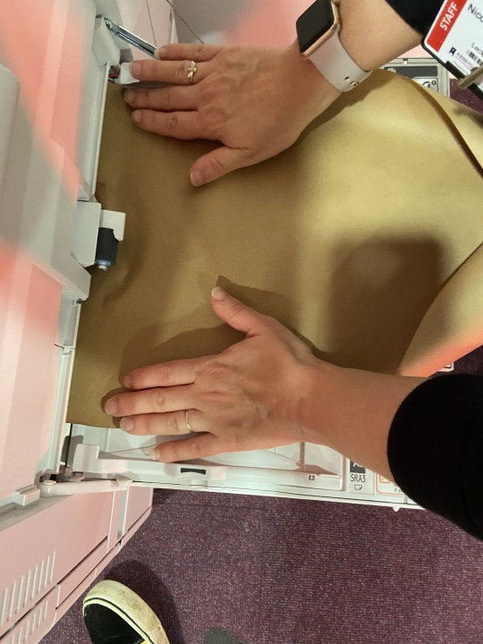
This is the process and final outcome of my printing my envelope for my Don’t Panic Pack. First I got some brown card and flattened it out. I got my design for the front and back of my envelope that I have posted about earlier and sent them off to the printer. When printing, I opened the paper tray and put the brown card in and held it flat until the printer took it. When the printer finished printed my front cover and back cover design on to the brown paper I took it and cut the brown paper on the marked out lines on my design to create the shape of the envelope. I them stuck down the marked out tabs making sure I don’t stick the top tab down as that it the envelope lid. Once I have glued the right tabs I stuck the back onto the glued tabs and pressed it down. The top images are how the envelope turned out, The front cover of the second image and the back cover is the first image. I am quite proud of it as it was my first time making an envelope. If I was to do it again I’d probably change the back cover to something more exciting and that matched with the front cover as I think the back cover is not as exciting as the front and I don’t think matched however overall I do think the envelope turned out good.
0 notes
Text
Sticker Pack Final Outcome And Process
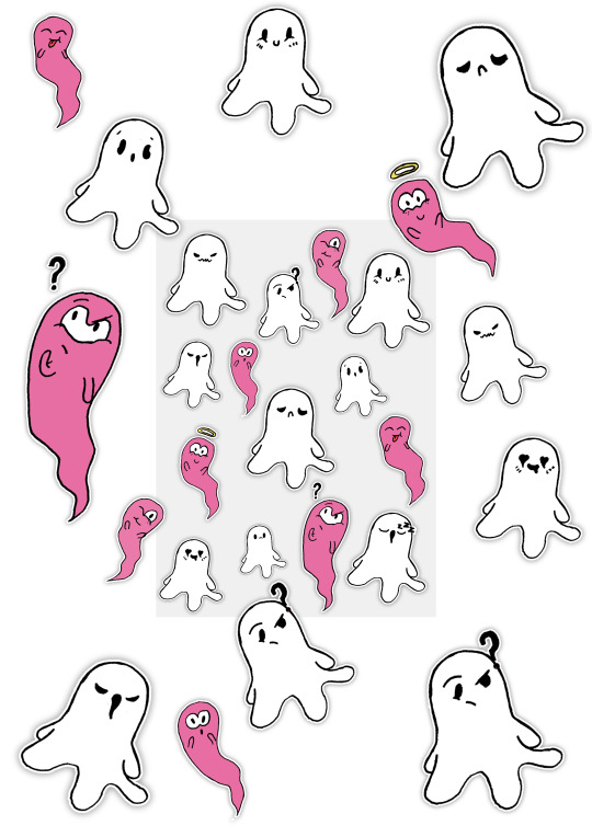
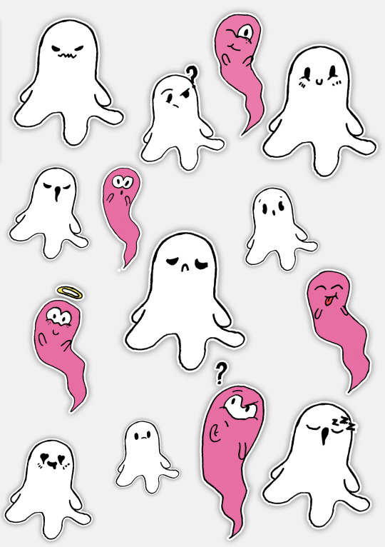


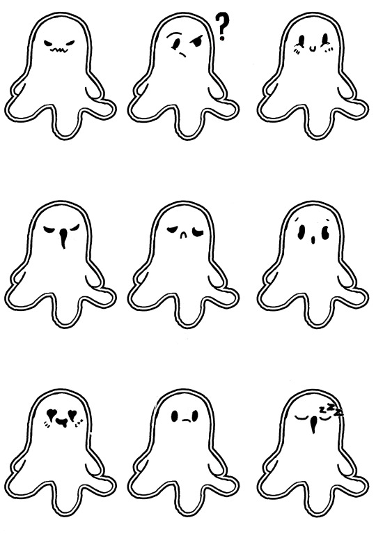
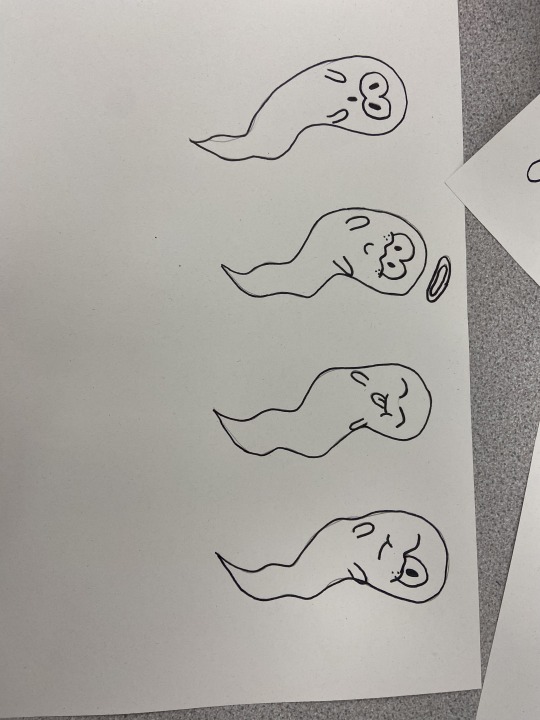
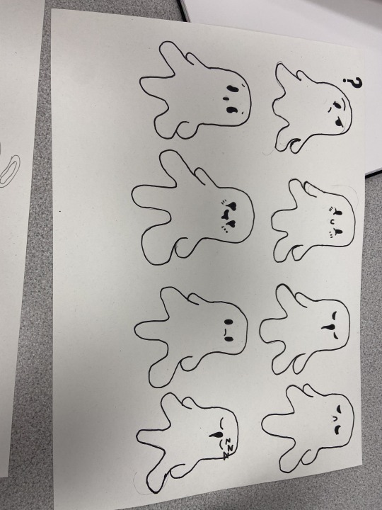
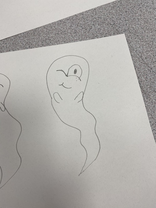
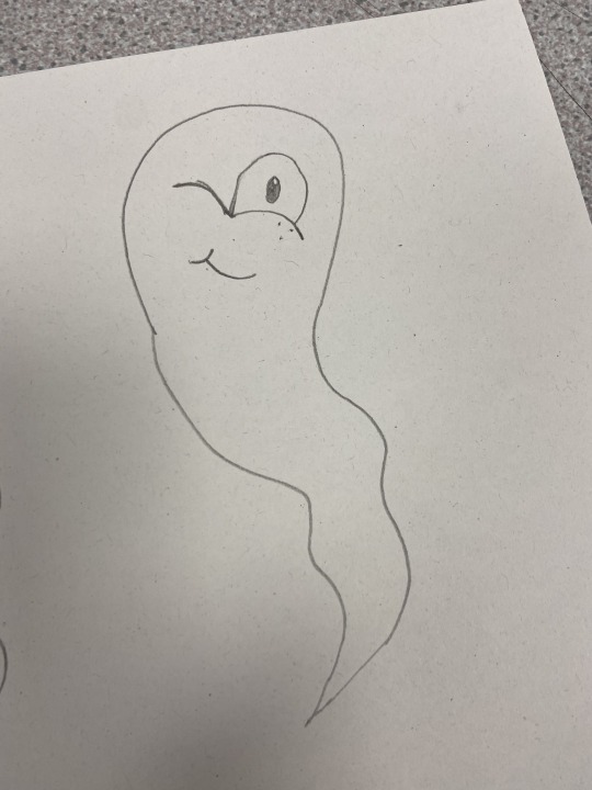
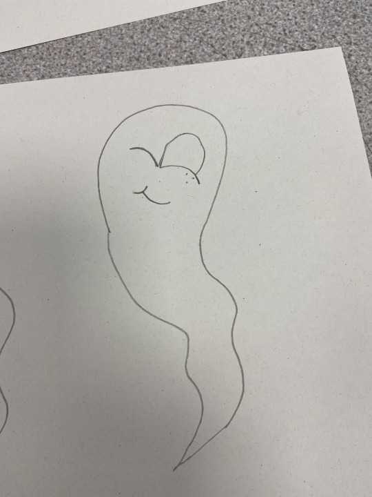
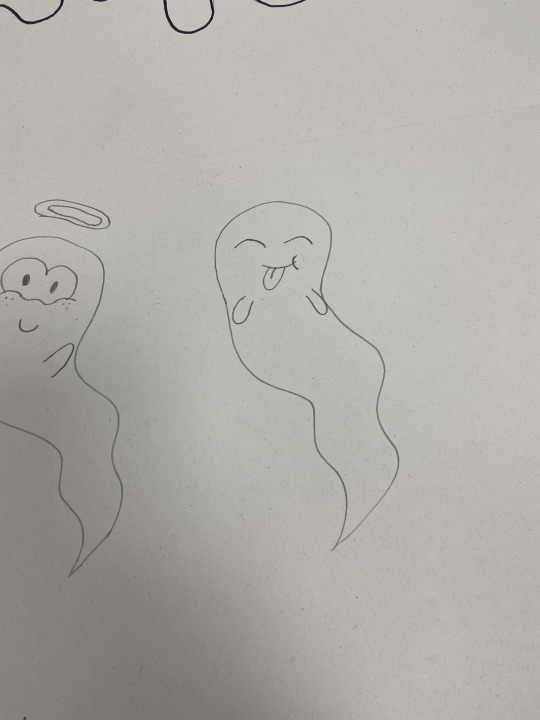
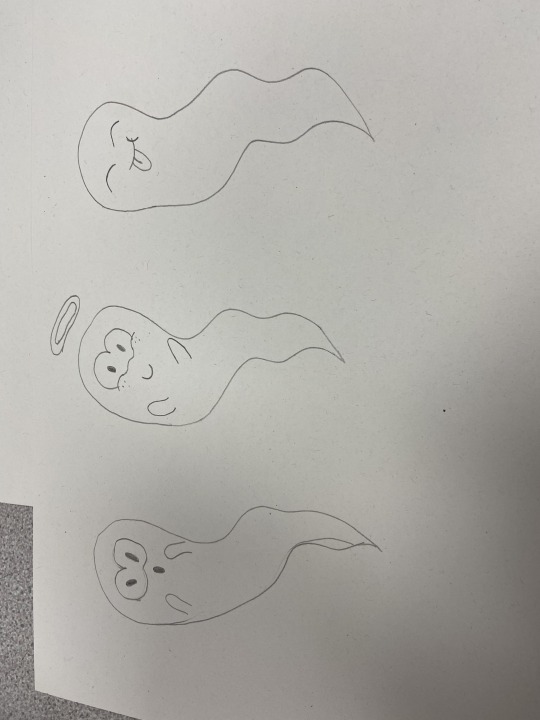
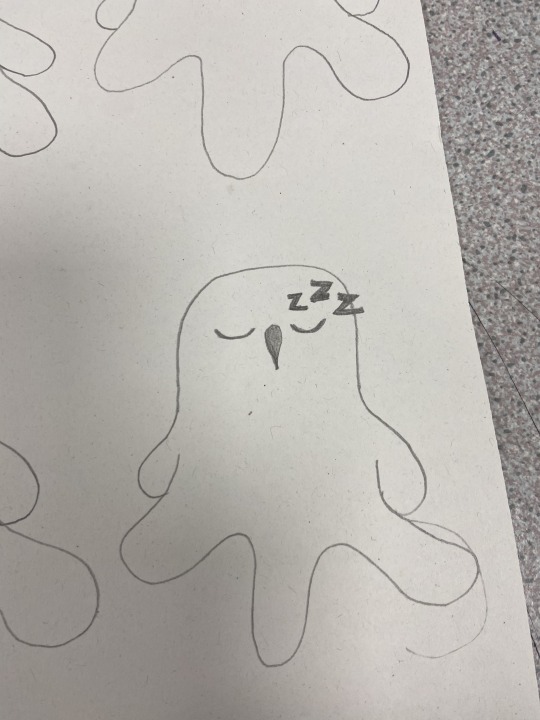
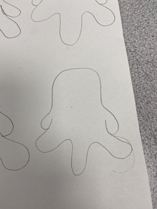
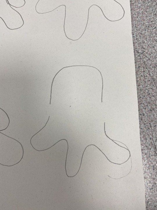
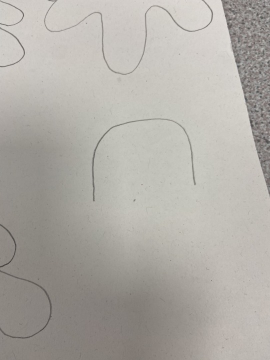
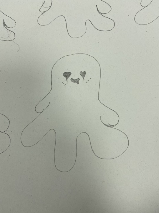
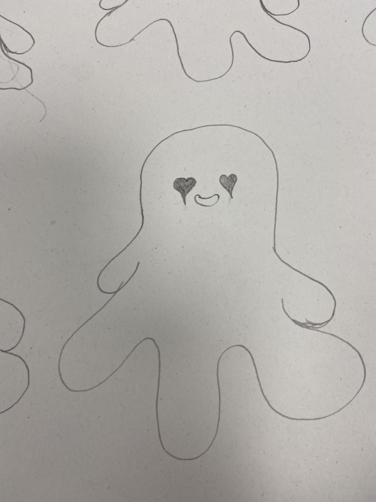
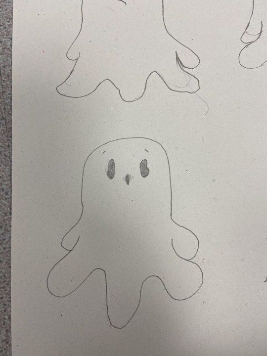
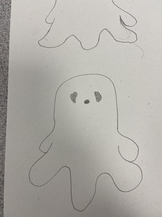
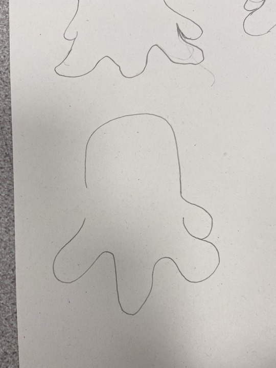
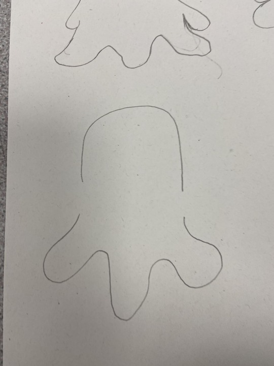
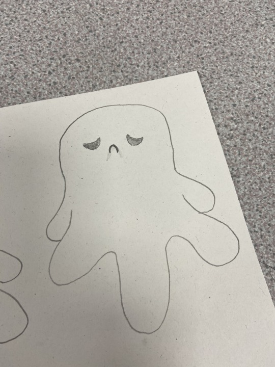
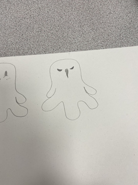
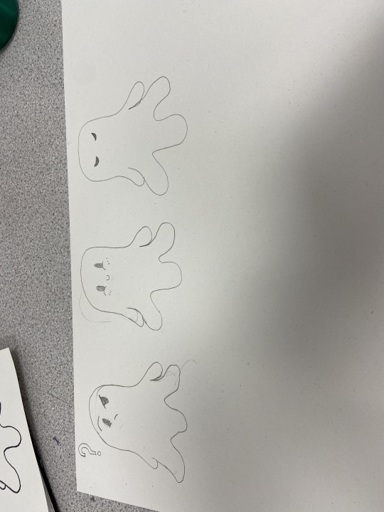
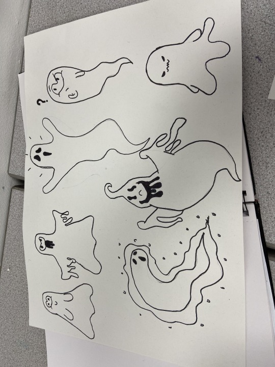
This is the process of my stickers, First I sketched different sketches of ghosts, I got my inspirations and references from typing cartoon ghosts into google images. I sketched out different ghosts first as I thought it would be a better idea to have a choice in which looks best to plan out my stickers more. I chose my 2 favourites which ones the top and bottom on the very far right. I then sketched out different emotions for the 2 ghosts I chose, 9 emotions to the bottom one (including the first one sketched out) and 5 emotions for the top one (including the first one sketched out). For the bottom one I had the haunting one, confused one, happy one, angry one, sad one, surprised one, in love one, annoyed one and a sleeping one. for the top ghost I sketched out a confused one, a surprised one, and happy angel one, and silly one and a happy winking one. I then scanned them in and dropped them into photoshop. and changed the image contrast and brightness to make it look more digital. I used the magic want tool at tolerance 99 and removed the background and added a white background on a separate layer so I could have more easier control over my stickers I sorted them into rows of just the white ghosts one and added a white stroke at size 10 and black boarder at size 20. When I referred back to my sticker mood board I realised the layout was way too boring and not fun. I also though the black boarder around the ghosts was a bit too much and didn’t work as the edges for the ghosts where too jagged and the black boarder made it noticeable. I took away the black boarder and added a drop shadow at opacity 75, distance 0, spread 20 and size 40. This made it a little better however it still looked boring. I then changed the sizes of the ghosts, some smaller some bigger and rearranged them in a more fun order. I made sure to add enough space for my other ghost stickers. I added the image for my other ghost stickers and changed the contrast and brightness to make it look more digital. I then got my magic wand tool at tolerance 99 and removed the background so I have more control over the stickers. I decided to add the same pink I used for my poster and postcards to make them fit in with the colour theme I had going on. I also coloured in any additional accessories the ghosts had. I placed them in the placement needed and added a white stroke at size 10 and a drop shadow at opacity 75, distance 0, spread 20 and size 40. I changed the white background to more of a light grey so they look more like a sticker pack. When presenting this in my portfolio, I opened up an A3 setting page, I then put the sticker pack which was made on a size A5 paper setting. in the middle of the page. I thought this was too plain and tried to make it look like my stickers where coming out of the envelope I made for my don’t panic pack however some sticker where covered up and not seen so I thought this wasn’t a good idea and then decided to display my sticker around the sticker pack to fill in the white space and not make it look plain and boring.
0 notes
Text
Sticker Pack Mood Board And Inspiration

Above is a couple of Images I have added to my Pinterest mood board for multiple sticker pack’s that inspire me and will help me to plan out my sticker pack for my Don’t Panic Pack. I like these stickers and how cute they look. My favourite stickers out of all these packs would be the ones with the cute little faces on. I personally think stickers should be fun so these stickers inspire me to create fun stickers that take a lighter side on a dark and scary fear. I want to create stickers that are more light hearted and fun as I think it would be a better experience alongside my other things being a bit weird and having a darker meaning. I personally have more enjoyment out of fun cute stickers than dingy dark stickers. I feel like have my stickers more light and fun in comparison to my other stuff is a good idea as the stickers would act as a fun side to it (getting more enjoyment out of the pack) and so that the sticker can have a multi-purpose use, meaning that they could potentially match with peoples style, preferences and theme, Just so the target audience that receive this would not have for example fun stickers on a book and then dark and dingy ones that are not as fun as the rest. I also would like to create different emotion for the stickers so even though there cute and colourful, they can still create the horror element in my theme, also depending on what the target audience can have different sticker for different object depending on how they feel or how they feel about the object they are sticking the sticker on to. For example if they had a school planer, they would have a fun one to represent friends and a tired one to represent how they feel about getting up early for school. I also feel like having the sticker more fun with different emotions is a good idea as the target audience that receives this might have kids or younger siblings and might give the stickers to them or a scenario similar to that.
0 notes
Text
Don’t Panic Pack Postcards, Final Outcomes and Processes.
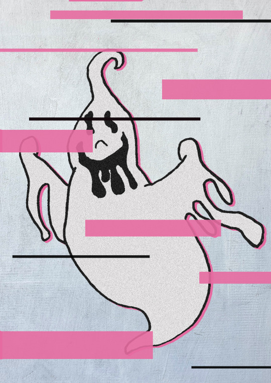
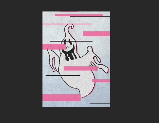
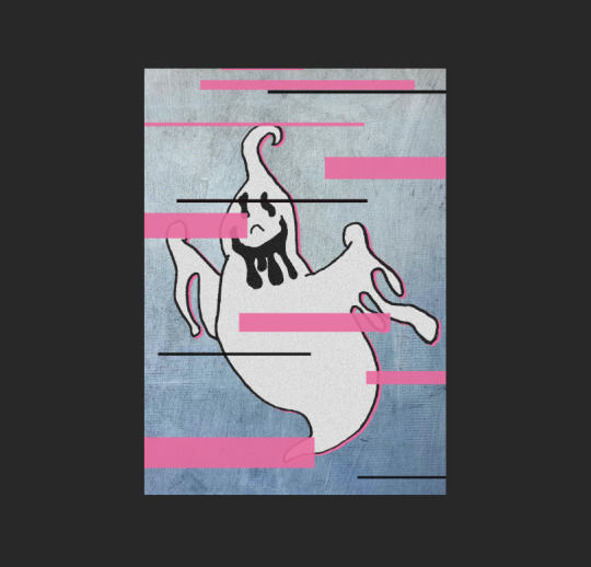
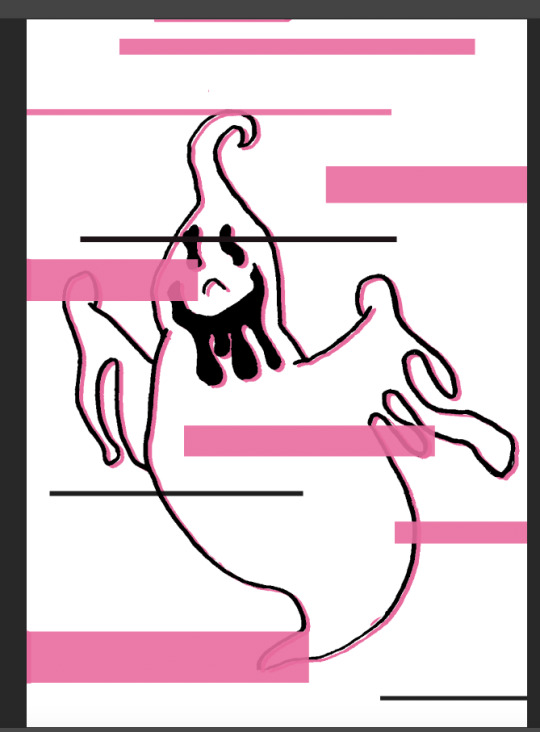
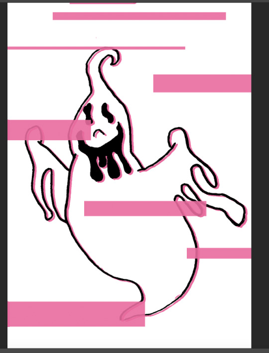
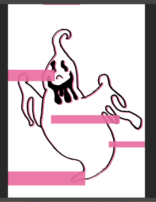
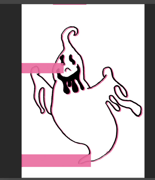
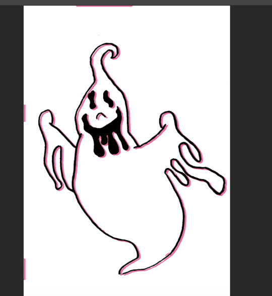
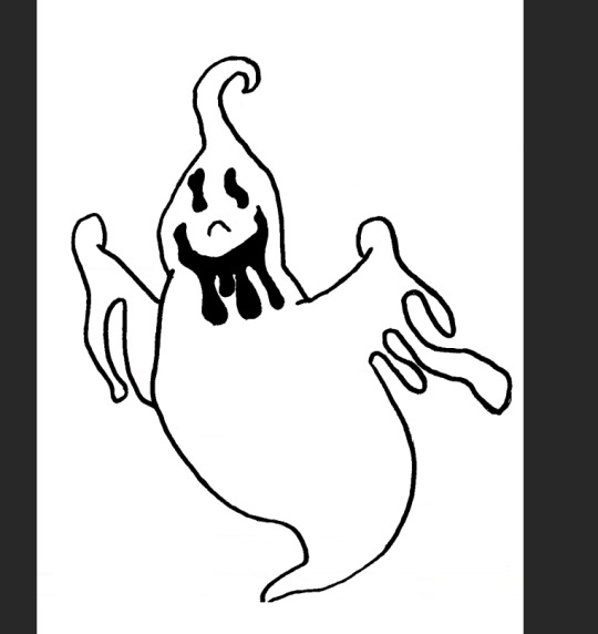
This was my first post card with the ghost on it. I used the ghost I sketched out in my stickers sketch plan out. I put it into photoshop and changed the image contrast and brightness to make it look more digital. I then added a pink drop shadow to add the pink element in. There was these weird bits of pink around the post card to I took advantage of this and decided to use this as an opportunity to add my glitch idea when planning out my postcards. I got my selection tool and selected different rectangles and filled them in with the bucket tool with the pink colour I used for my postcard theme. I thought it looks a little plain so I added 4 long and tiny black rectangles to add to the glitch effect. When the bucket tool was filling in the selected areas it filled it in a little translucent which was a good thing as it adds to the glitch effect. I thought the postcard looks too flat so I got a good grungy textured paper background of the website Pexels and added it in to photoshop. I changed the opacity of the background to 50 so the texture wasn’t too much. I then thought the ghost was too plain so I filled it in with white using the bucket tool. this removed the shadow on the inside but that wan’t too much of a worry. I then added a noise / grain and set the amount to 50. I thought this was perfect. it had texture but not too busy so I decided that was great for the finished postcard.
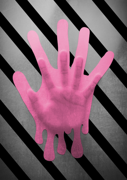
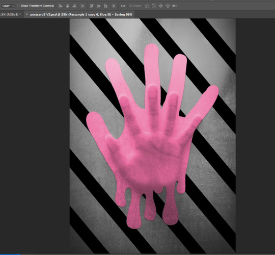
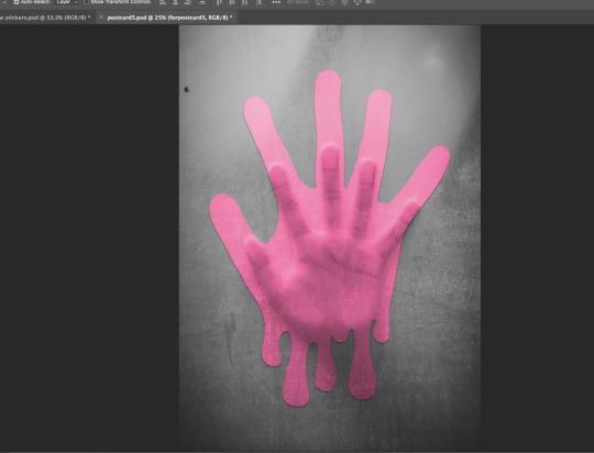
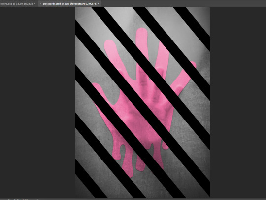
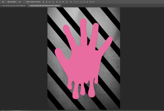
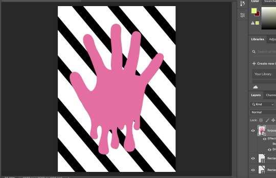
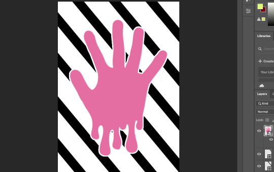
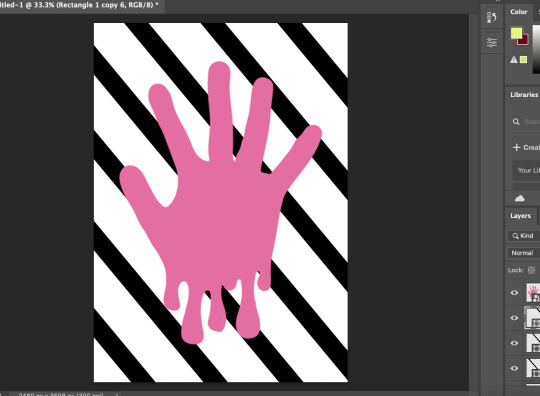
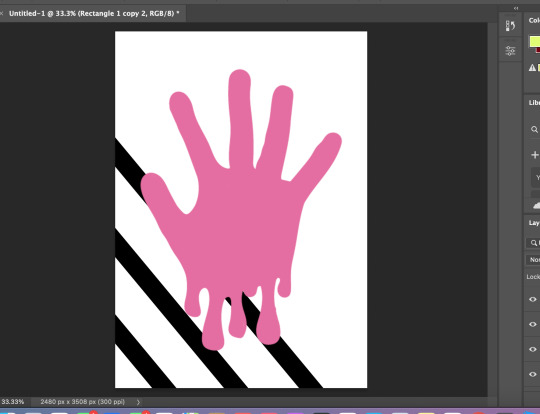
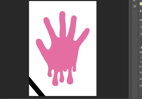
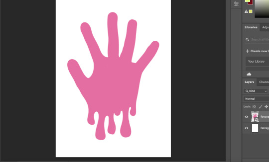
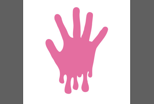
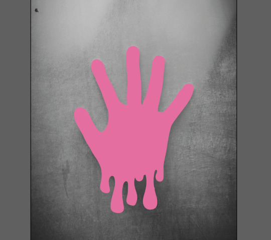
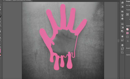
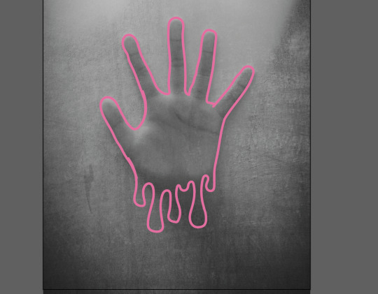
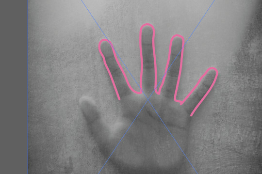
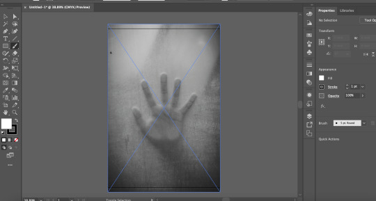
The idea for this postcard is that the hand is a ghost pressing their hand against a window of the house they died in. the ghost is trapped in the house they died in and they can’t escape. This postcard is suppose to represent life from a ghost’s view and their feelings not out reactions. I think that the ghost in this postcard it trapped and alone and can’t escape the memories of their death and that why they are stuck in the house. to create this i found a good image on pexels and outlined the hand in my postcard pink I have been using. I added drips to the bottom of the hand to add to the image. Then I filled in the hand with the pink I outlined it in. I then removed the original image and added the hand in to photoshop. I got the shape tool and added in a black line. I duplicated this line many times to create a stripped background. I added a white stroke to the hand but then I thought that didn’t look right and then decided to add a drop shadow instead. I thought the image looked way to flat so I dropped the original image of the hand pressed against the window in the background I played around with the settings and set the original image to ‘Darker Colour’ as I thought that looked best. i changed the hand setting to overlay as the other settings didn’t look as good and make the hand too faint to see. I thought the strips didn’t work with the image and turned off the layer, The postcard looked too plain so i added back the strips. Because of the setting I set for the hand, the stripes appeared in font of the hand so I got the magic wand tool at tolerance 99 and selected the hand, I then clicked on the stripes layer and clicked the back space. The hand now appeared in front of the stripes and was still able to keep the effect the overlay setting added to it. I decided this was good and used that as my final version of this specific postcard.
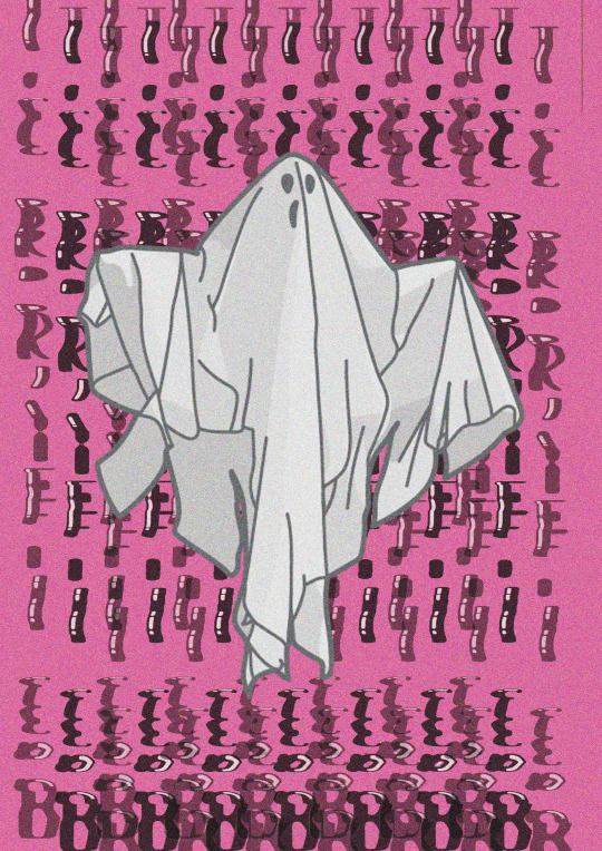
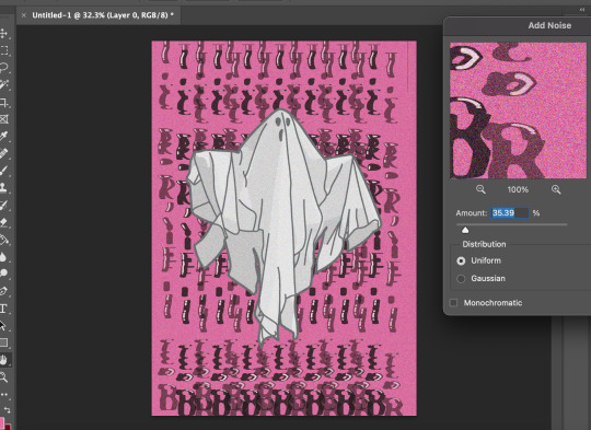
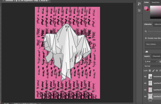
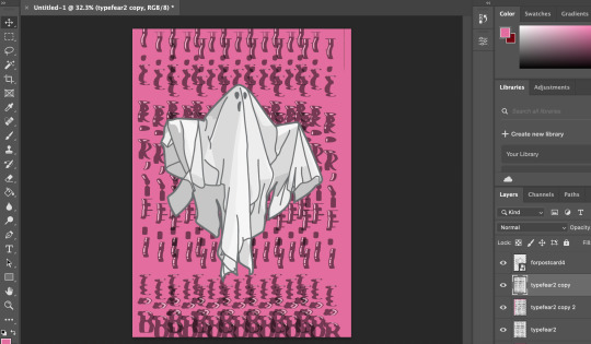
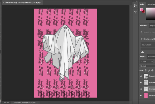
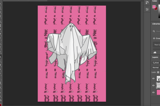
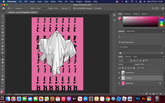
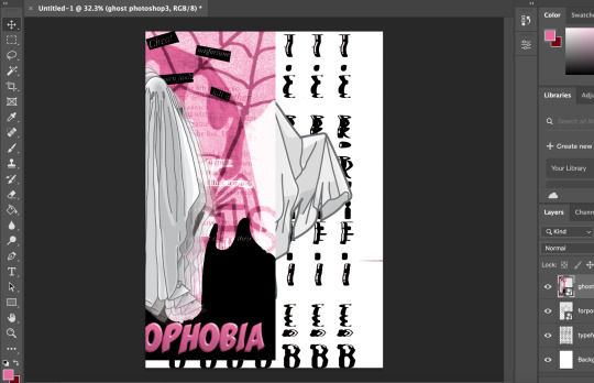
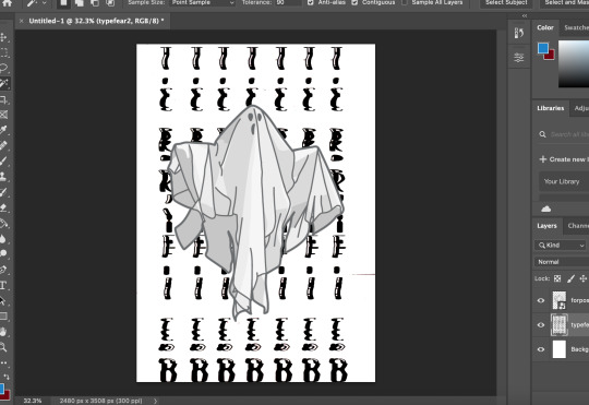
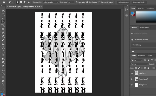
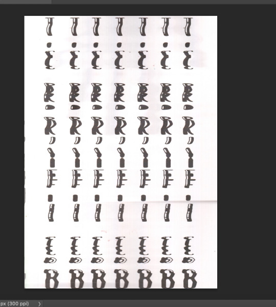
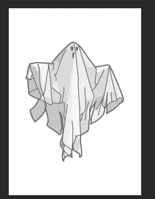
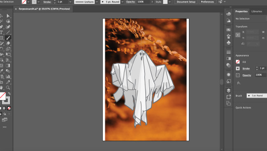
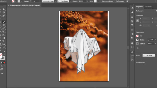
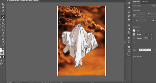
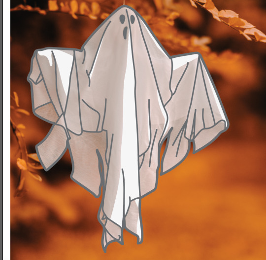
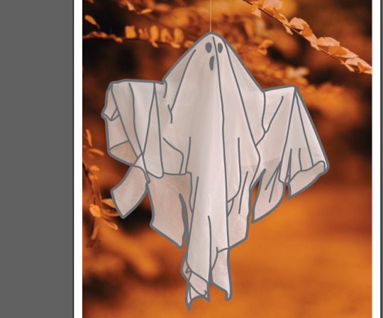
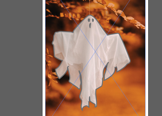
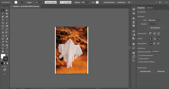
For this postcard I decided to have at most 2 postcards with ghosts on them. First I found a good image of the website Pexels and dropped it into illustrator. I Got the brush tool and outlined the ghost with a 1pt set brush, making sure there it no mistakes. Then I made my brush smaller to 0.75pt and outlines the details on / inside the ghost, making sure everything looks right and not too busy. I then coloured it with different shades of white and light grey to mimic the light and the shadows on the ghost in the image. I made sure the shadows where not too dark so they can blend in better. I then removed the original image and when into photoshop. I added in one of the warped scan type’s in for the background. I changed the image contrast and brightness to make it look more crisp and digital. I then removed the background with the want tool at 99 tolerance. I made the background the pink that I used for all postcards to make it fit in with the theme. I added in the ghost image and brought it to the front. I got the warped scan type and duplicated it, I changed the duplicated type scan and set the opacity to 50. I moved it a little below and to the right to create an echo ghost effect. I repeated this step and moved the second duplicated type scan to a little to the top left to add to the ghostly echo effect. The text became a little hard to read so I duplicated the original type scan once more and brought it to the front to make it a little more bolder and readable. I then added a noise / grain at amount 35 to add texture to the postcard.
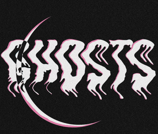
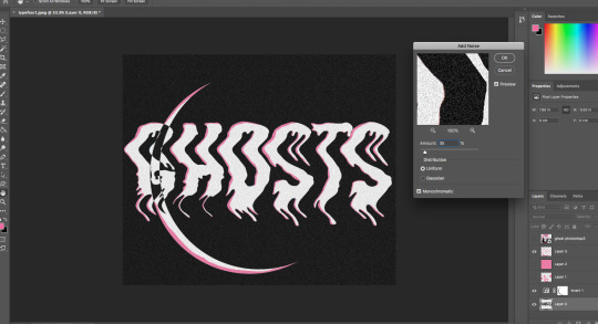
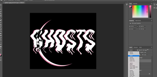
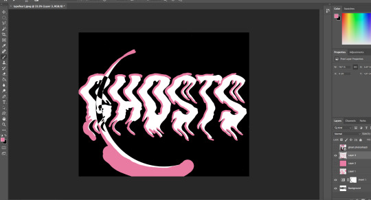
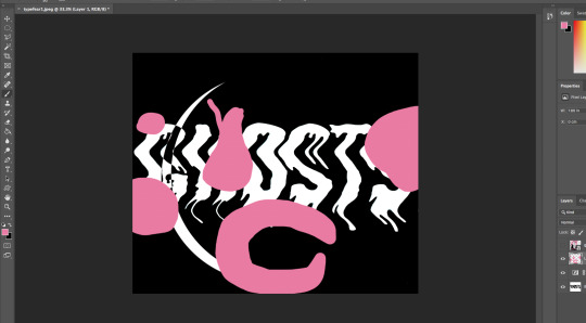
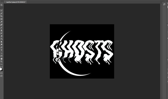

The process for this postcard was actually and outcome of a perfect mistake. I imported one of my warped scam type’s into photoshop and adjusted the image brightness and contrast. Then I inverted the image as I though it would be better appearance wise if it was inverted instead of the black text with the white background, I don’t think that would work as well with the pink as it would me inverting the image. I got my circle selection tool and drew a circle, then I accidentally missed clicked and it created this simplistic but really creepy moon running through the text. I decided I really liked this mistake made and went with it, I think this would off been better than whatever I planed to do originally which is not as creative or effective as what I managed to create in a miss click. I got my colour selector tool and selected the pink text on my poster for the postcard. I got my brush-tool and created an offset shadow in the text. I selected the background on the text, clicked on the layer of my offset shadow layer and deleted the excess around the text. I though that the offset shadow was a bit too thick so I got the rubber tool and thinned it out a bit and enthesised the ends to make them look more drippy like ghost goo. lastly I added a grain to the whole image and set the grain amount to 35, I was gonna make it 50 but I thought 50 was too much and stuck with the amount being 35.
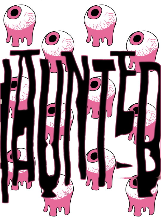
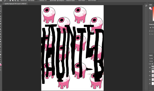
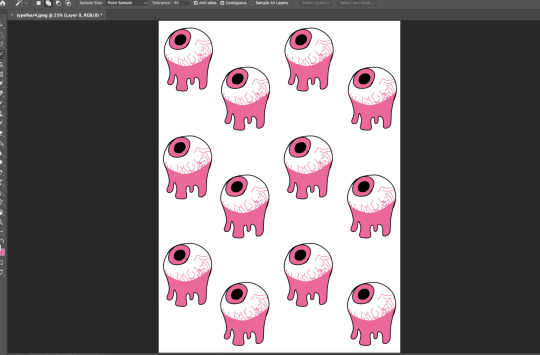
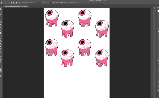
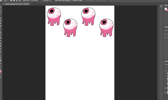
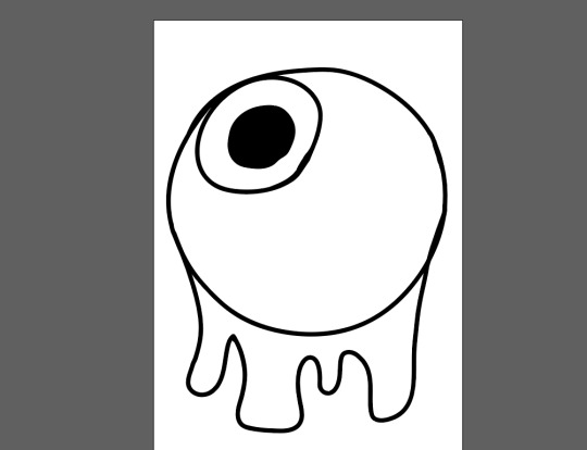
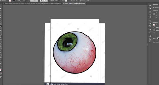
For this postcard I got an image of an eye from the internet and traced round it in illustrator. I added my own spin on it by adding a drip under it, making it look like the eye is dripping. I then filled it in with the set colour pallet for my postcards to keep it all in a theme style. I also added gagged lines to create veins in the eye, to make it look more creepy. I brought the eye image into photoshop and scaled it down and duplicated it in a four set formation, then I duplicated the four eyes and brought it below and repeated that step to create the background for the postcard. I added another warped scan text to the postcard and removed the background with the wand tool at 99 tolerance. Then I adjusted the image brightness and contrast to make it look more digital.
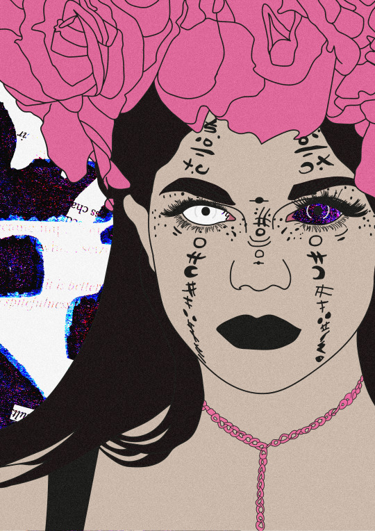
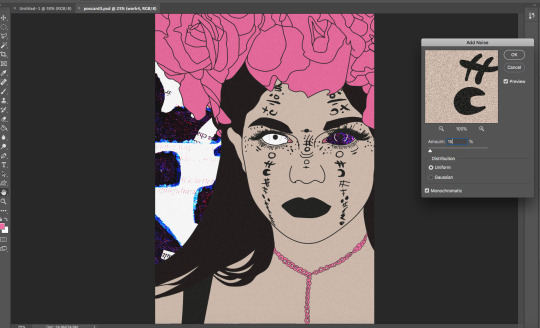
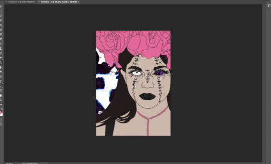
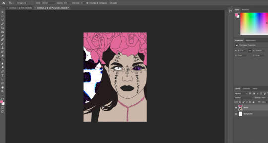
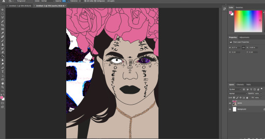
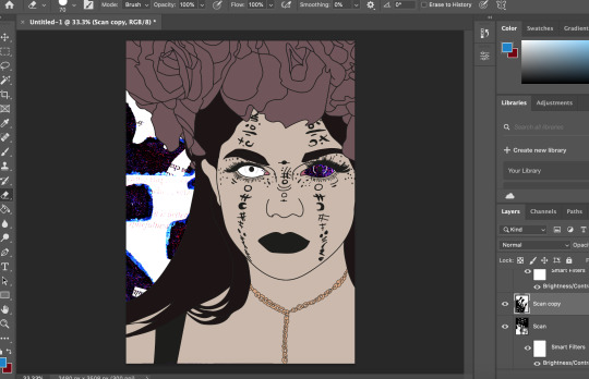
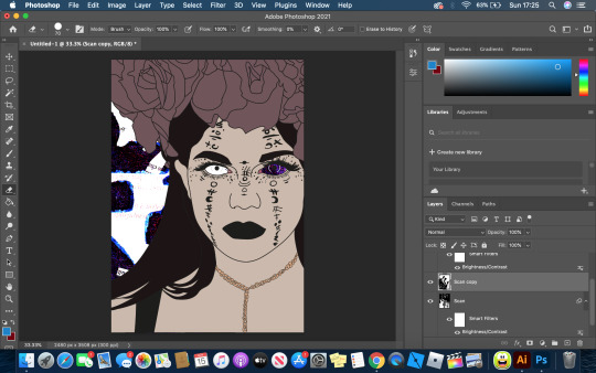
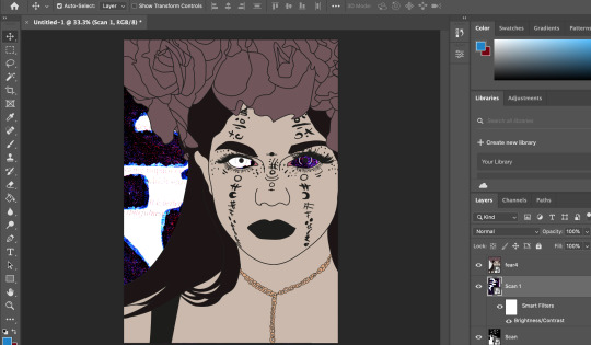
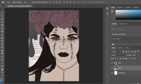
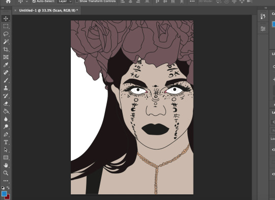
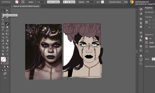
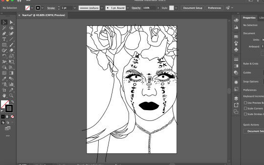
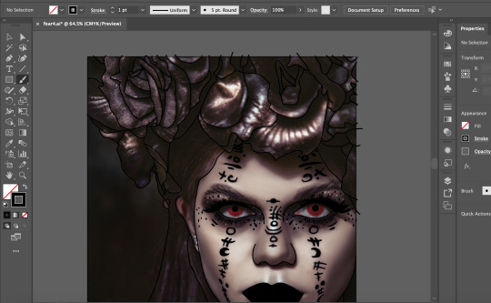
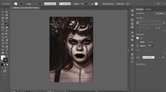
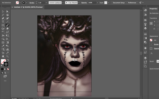
The idea for this one is a girl who is possessed by a ghost, The ghost has taken full control of her body and is not living her life. To make this, I found a good image on the website pexels. I brought it in to illustrator and outlined the image with the brush tool at 1pt brush, making sure that I have outlined everything. Once done, I removed the original image and started to colour the image in using the original image colours. A bronze / brown colour for the roses on her head, brown for the hair and eyebrows, black for the dress, gold for the neckless and a fleshy colour for the skin, I decided to leave the eyes white as I thought it would have a better effect to it and the red eyes didn’t really make her look possessed enough, I also didn’t fill in the eyes with white. I brought the image into photoshop and got my drawing from my fears penguin book for the background. I layered together three drawings for the background, two being the same image in different rotations, I also changed the the contrast and brightness for those two images. The third image I inverted it, did not change the the contrast for that layer and messed with the image and set it to lighten. This created a cool looking grain effect. I also like how the background goes through the eyes. it looks so much better to if I was to fill in the eyes with white. I then thought that this image does not fit in with my other post cards and change the colour of the roses and the neckless to the pink I used for the other postcards. This made it fit in way more and it looks like part of the postcard pack. Finally I added a noise / grain at amount 15 just to add to the image and make it not look too flat.
0 notes
Text
Pinterest Postcard Inspiration and Ideas.

Above is a mood board for a couple of examples for postcards that inspire me and could fit into my fears postcard theme. The glitch effect ones inspire me as I like the glitch effect, I think it looks cool and would be a new spin on the well known ghost appearance. Some of the glitch ones also include grain such as the second one. The text that says ‘Michelle’ is in a glitch theme and it has what appears as a grainy background which adds an unexpected horror element to it, I would love to bring this into my postcards as I think it would add to the effect and add texture (make it look less flat). The warped text ones inspire me as I like the way the text is warped how it is, it makes it look ghastly and creepy. I also want to add my warped text scans to some of my postcards as I like the outcome of the texts. I think the warped texts would be perfect for some of my postcards so they’re not all just ghosts planted everywhere and instead add some thought to it.

For my colour pallet inspiration plans, I have decided to use the colour pallet from my poster for my ‘Don’t Panic Pack’ as I really like the pink and how well it flows with the black and white. I like the idea of using a naturally happy colour and mixing it with black and white to create a creepy, horror esc design. To me it’s sort of like a contrast between the colours. Black represents fear and darkness, White represents the translucency of the ghost and the isolation of the ghost. The pink represents the past of the ghost, how good their life was and their outlook on their past life. I’d say the pink would symbolise the happiness the ghost has experienced in a past life and what they leave behind.
0 notes
Text
Ghosts Mind MAP
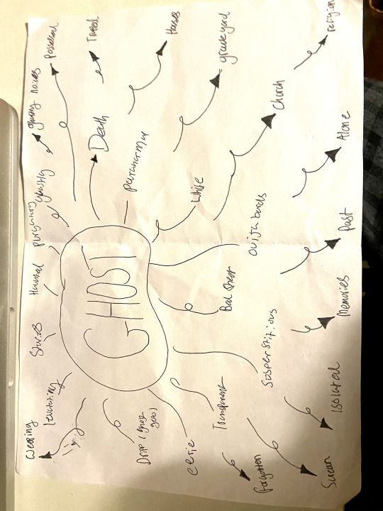
Here is my mind map for ghosts. I wrote down words relating to ghosts for my ‘Don’t Panic Pack’ as I chose ghosts as my fear. At first I wrote around 10 words relating to ghosts and added 4 more words to branch out my ideas. Then I wrote feeling and noise related words relating to ghosts to represent how the ghost became a ghost (how they died) or forgotten, their past and cries for help. These words will to help me with my postcards because I can refer to this when needing ideas for my drawings and content of my postcards and how to include a more unique feel to ghosts and not just the cliché ‘ghosts are scary’ as I want to represent the ghosts feelings and not our reactions to them.
0 notes
Text
Zine Images Research
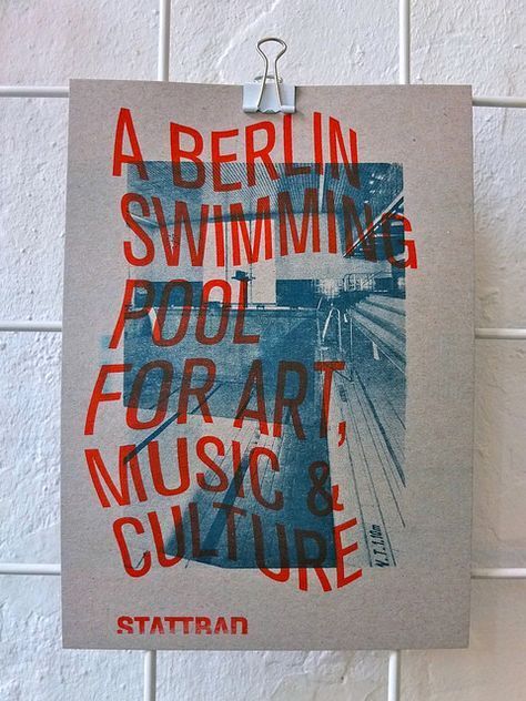
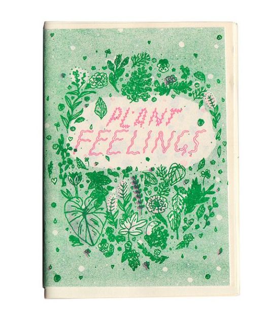
The first image is about a swimming pool so the blue is effective as it is a swimming pool and mixed with the red makes it stand out more as re and blue are opposite colours.
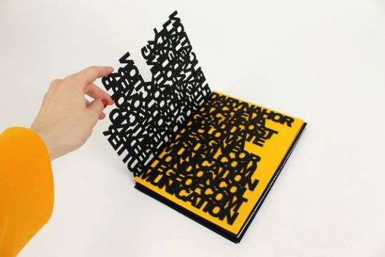
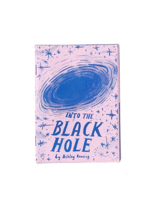
The second image has a 3D feel to it. the contrast between the 2 colours makes it pop. I like how one of the pages has been laser cut so it looks like it’s just words.
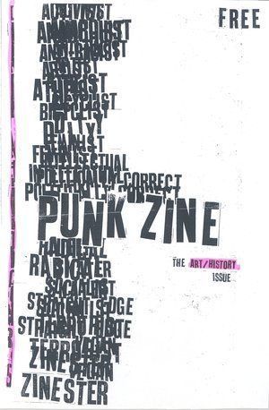
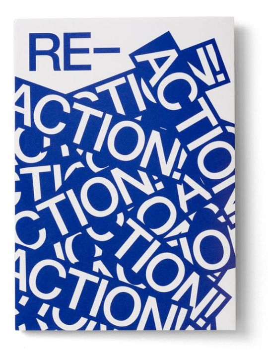
the third one is pretty simple, white background and black text. They have overlapped the text which makes it more exciting and in your face, They have also highlighted 2 words in pink to make they text stand out more.
In the forth one, the colour green has been used to the plants and to give it a tropical vibe. They also have used the colour pink for the text, two opposite colours. makes it stand out more.
In the fifth one, It’s all in the same shade rage, all blue or sort of a light blue/purple. The blue might of been chosen to represent black so the artist is still able to add detail and shades with out making it look messy.
The sixth one is very in your face with a flashy colour, the contrast between the blue text and the white background with the white text highlighted in blue makes it more visual and in your face.
0 notes
Text
Luke Dixon Research
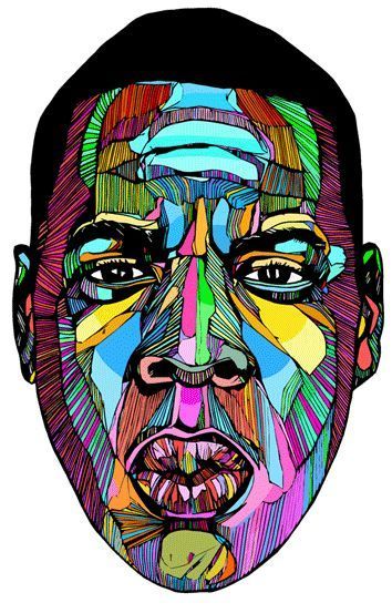
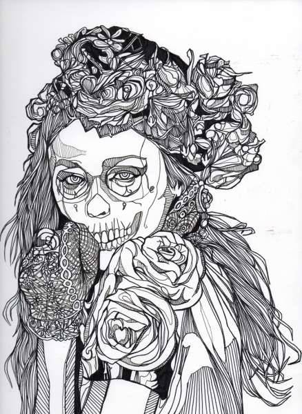
Luke Dixon is an illustrator / graphic artist and print maker who draws unique shapes to create faces/ people. then on he scans them in to his computer and from there he uses Photoshop or Illustrator to add or colour his pieces to make them look cooler. Luke’s mission is to ‘produce nice looking artwork’ according to his website.
I really like the use of all colours in the first image, the colours make the artwork pop and makes it look unique. All the colours work in a highlight and shadow way, the colours add to it and make it look real. I also think the shapes and lines help to compliment the colours, add’s to the real esc effect. I like how the colours have appeared to been planned out in a way so that no colours clash and ruin the artwork.
The second Image has no colour however it still looks amazing, I love the attention to detail, My favourite part of this image would be the roses or the gloves, there really detailed and actually makes up for the colours and acts like shade in the image. I think it was a good idea to leave this image colourless as the girl has skeleton face-paint on, it makes it look more creepy. I also like how Luke has used lines to create the illusion of shading where necessary.
I personally I like how Luke’s work is drawn and produced, it a really cool style and its very unique.
0 notes
Text
Saul Bass Research

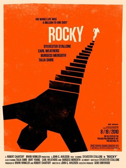
Saul Bass is a graphic designer best known for his emblematic movie posters. When creating a movie poster, he usually adds key essential elements from the movie. he has transformed the visuals of film advertising, before bass, movie posters where dominated by key scenes or characters from the film. His style is simple graphics, bold colours and eye catching.
in the shining poster, I like how there is a face in the word ‘the’ which makes is look really complicated mixed with the simple background, It’s a good mix. I like how the background was simple so it didn’t look too busy. This text effect sells the horror feel for the movie and how it’s eye-catching makes the viewer have high expectations for the movie. The noise in the face adds to the horror effect and solidifies it as a horror movie genre. The yellow background makes it eye-catching and makes the viewer want to see more.
In the Rocky poster. I like how the silhouette is running away from his shadow, It says a lot about the movie, As explained the simplistic design with the bold colours make the movie poster look really eye-catching and would make the viewer curious and want to watch the movie.
0 notes
Text
Ben Karfton Research
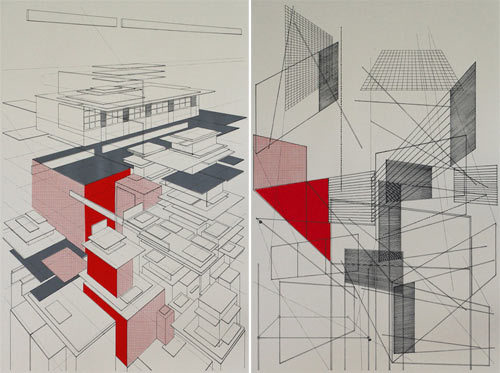
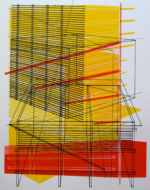
Ben Karfton is an architectural illustrator. In the top image I like how the left image is Ben’s normal work and the right image is like the buildings int he first image but all separated, this is interesting as is kinda shows how the building was made in a artistic and colourful way. I like how the use of red highlights some buildings in contrast to the lack of colours in the other buildings. In the last I like the use of the different angle buildings and how he has used colours and lines to create patterns. the different shapes of the buildings help to contrast them, to me the bottom building looks like the front and the top building looks like the side or back. I like how they have used more yellow then red as if the 2 use of colours was the same it wouldn’t of worked as well and the two colours clash, however the use of red compliments the yellow and doesn’t make it clash.
1 note
·
View note
Text
Little White Lies research


Little White Lies is a magazine company based in London who publish magazines with cool front covers of movie posters. Each magazine is inspired by the featured film which includes the main character or event. It was labeled as the ‘best designed film magazine on the shelf’ by The Guardian.
I personally like ‘The Shape Of Water’ (my first favourite) issue because the illustration is really well drawn and at first appearance, it looks like she is drowning in her own sorrow or guilt. I like the use of colours, Gray scale mixed with a red headband with green highlights all around. The red may indicate something has gone wrong or something bad will happen. The green highlights adds to the darkness and the drowning in your own guilt look of it.
My second favourite is the ‘Man On Wire’ issue because of the hypnotic, vintage like design of the sky in the background. It may represent the timeline the movie was set in. I also like the silhouette of a person walking on a wire. To me it resembles balancing stress and worries in life and staying calm through it. The skyline underneath the person represents the Hight of the balancing silhouette in the poster, adds to my idea of stress.
My last favourite is ‘Can movies save the world’ because of the time portal effect to it, It may resemble the history of movies, I think that because of the eye-catching landmarks different time periods such as a dinosaur etc. I also love how simple it is meaning many different interpretations of this LWL issue cover.
0 notes
Text
Chris Piascik (doodle art Research)

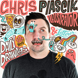
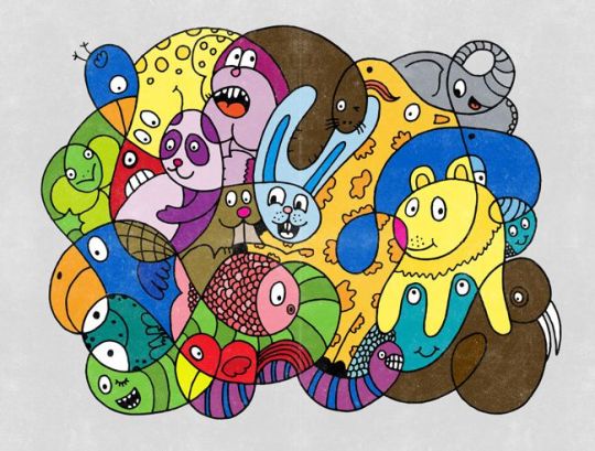
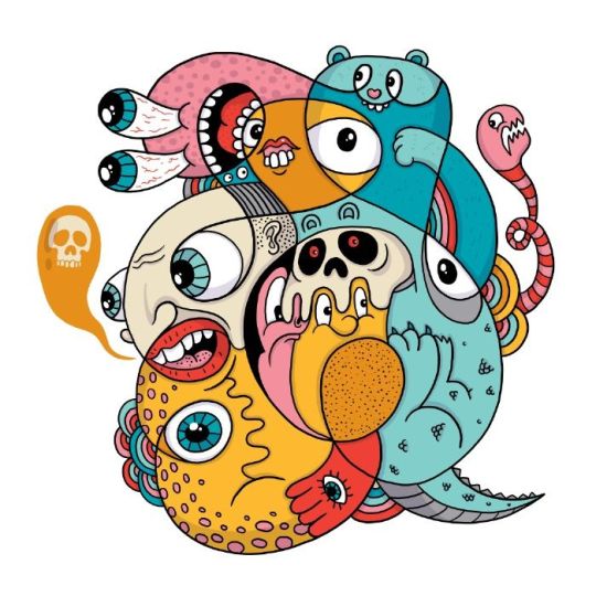
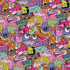
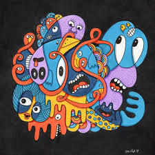
Chris is an independent Illustrator based in Boston who posts new drawings everyday. Chris said he ‘fell into illustrating on accident’, while working as a designer. This began when he started posting daily drawings everyday on his website, which he still does’. Chris never thought he could make a living out of illustrating. Chris also animates his illustrations and lettering, he claims he’s always loves drawing letters and started when he was a kid in competitions. Chris got into animated GIF’S as soon as he learned about the process in photoshop, the first GIF he did was a morphing letter. Chris said he gets inspired by old signs and motorcycle, his friends, punk zines, cartoons, music, BMX and skate boarding culture. Chris also draws complex circle squiggles and join them up so you can’t tell where they start and where they finish. He fills in the blank circles with illustrations such as, funny cartoon characters and interesting patterns. He fills in the gaps when necessary and makes the illustrations work. i think his work is a fun outlook and makes me feel inspired knowing that they came from simple drawings or squiggles. It makes me feel that anything is possible.
1 note
·
View note
Text
Text scans
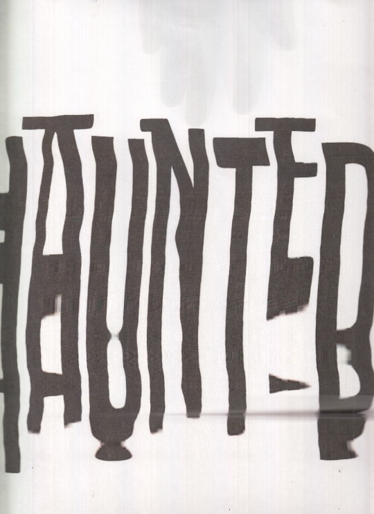
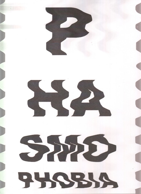
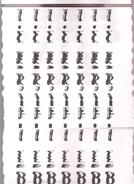
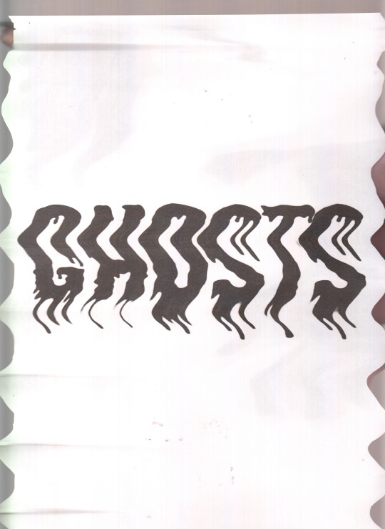
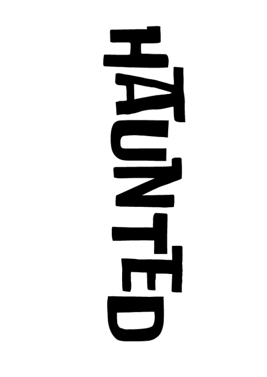
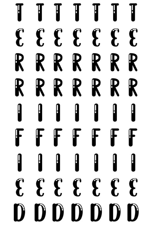
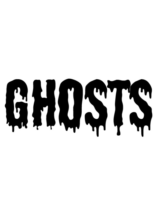
Here i have done type scans. First I typed out words that relate to ghosts on illustrator, Then I printed them out and got a scanner. Once I got everything i needed, I turned the scanner on and got the print outs and wiggles them around as they scanned. It created some cool distorted text! I’m defiantly gonna be using some of these for my fears post cards. I think the outcome of these scan type’s turned out good, My favourite one would be the ‘Ghosts’ one, The mix of the drippy font and the distort while scan worked well together.
0 notes
Text
BlipZine - Zine’s


Here is the creation of my 20 page Zine from start to finish. I used all Images I did in the Wednesday sessions and also edited a few as seen above. A lot of these pages where a mix of shapes and image in shapes with the odd pages that are full images. I had my original front page with title as ‘Gazine’ I decided that I didn’t like the overall look to it, the name didn’t have a ring to it and the font didn’t fit. I downloaded the font ‘Salty Ocean’ and changed the title to BlipZine, I googled words that are synonyms for glitch and Blip came up and stood out. I decided I liked the new revamp of the front page and stuck with it.
0 notes
Text
Designs For Don’t Panic Envelopes.
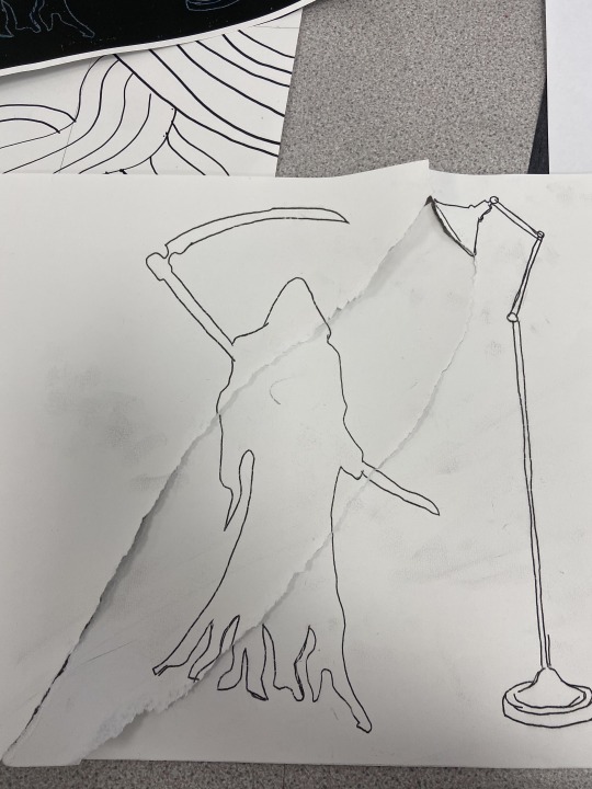
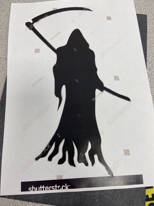
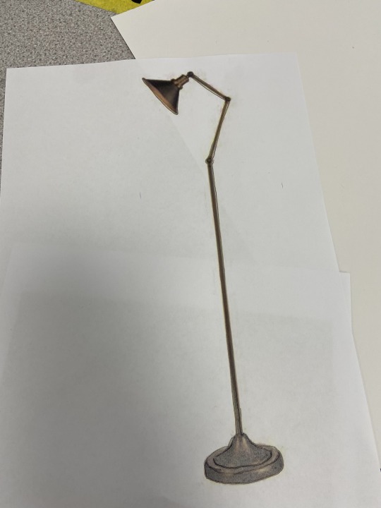
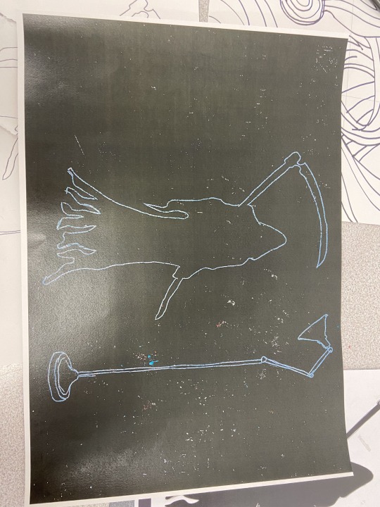
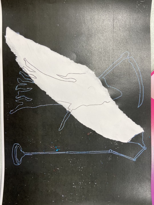
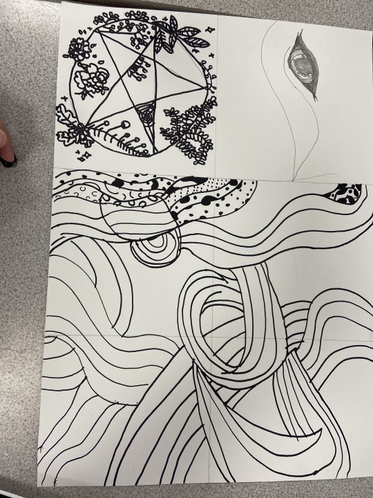


Here I was designing a front design and back design for my Font Panic envelop. As you can see from the last image, I have used the swirly ghost like design for the front instead of the star like one as it was more witchcraft like then ghost like. I then used my Grim Reaper silhouette for the back which was made with drawing around a printed picture on carbon paper then I inverted it on the printer and tipped my white paper version to stick on my inverted version to create the illusion of light shining from the vintage lamp.
0 notes
Text
Ghost Posters For Don’t Panic Pack


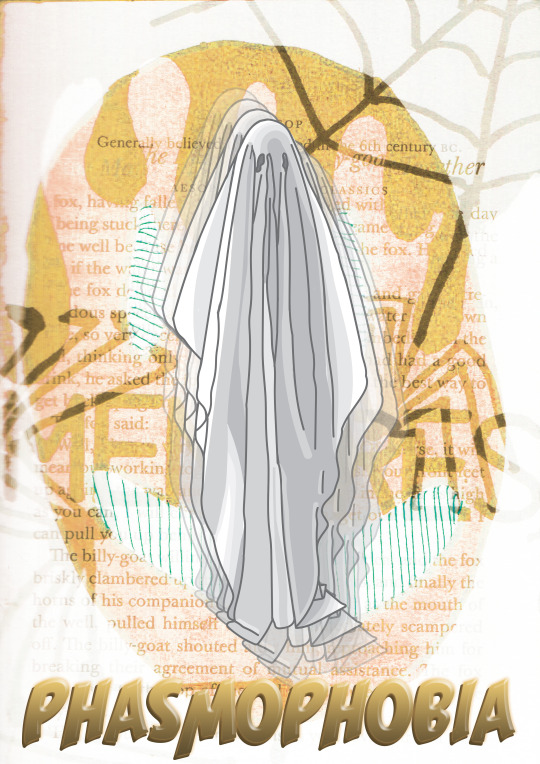
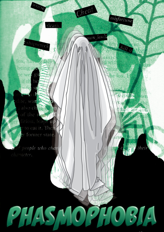
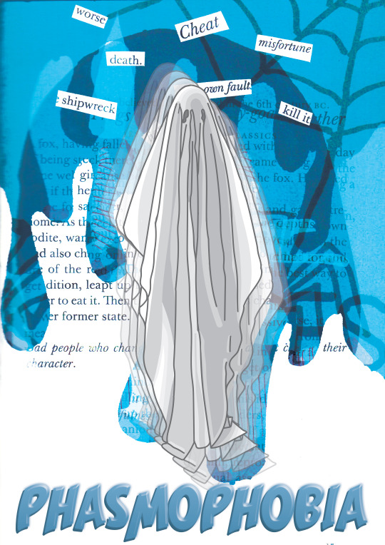
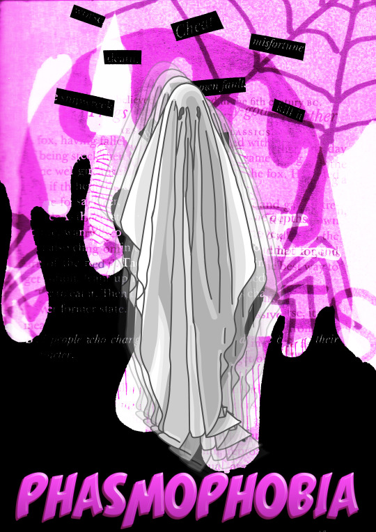
Here I have done different variations of a poster for the fear I’m doing for my Don’t Panic pack which is Phasmophobia AKA the fear of ghosts. While in the making of my poster in photoshop, I decided I didn’t like the dullness of it and changed the outcome to 4 different bright colours to match back and white such as Pink, Yellow, Green and Blue. My favourites are the pink one because it stands out and the colours work well together or the yellow one as its different from the others and was the outcome from a perfect mistake the only problem is that the colours are took much when together so they don’t really work as well. If I had to choose one I’d choose the pink one as it work well and stands out more, The colours aren’t and eye-saw.
0 notes