#this is the piece I redrew!! it’s been so long…
Explore tagged Tumblr posts
Text


heeyyy gaaanggg
the pose and the background of the album version (left) are based on oingo boingos only a lad album art. not cause i think he has anything to do with it but just cause ive been wantin to draw that pose for like. weeks and i didnt know who to put there. so why not my latest bug man.
#my art#digital art#digital painting#fanart#resident evil 7#ethan winters#goddd PLEAAASEEEE#i havent known if i was gonna post this or not multiple times in the process of drawin this. but ultimately i spent too much time on it to#NOT post it. embarrassment be damned#but at the same time what am i even doin yknow. what is this what is goin on pleaaseee PLEASEEEEE#I DONT KNOW ANYTHING ABOUT RESIDENT EVIL!!! I DONT KNOW N O T H I NG I KNOW LESS THAN NOTHING#HOW?? HOW DID I GET HERE??? WHY DID THIS HAPPEN???? i know exactly the answer to all those questions but it still boggles me how fast this#happened. usually it takes WEEKS if not MONTHS for me to start makin fanart. this was faaasttttt TOO FAST and im like. genuinely constantly#thinkin about this game. im ALWAYS thinkin about this game. part of why this took me so long to do is cause i always wanna play re7 or thin#about re7 in a strange and deranged way. ive actually genuinely been SICK WHAT HAPPENEDDDDDD#im losing it!! anyways this took me a looonggg ass time and i redrew it soo many timmmessss#i did like. 3 lineart passes. the album version i did 3 shading passes. i really struggled!! and ultimately i dont know how i feel about it#like i kinda resent it. for takin so long and makin me suffer so much#never again. never again will i spend that much time on a drawing. i HATE when drawins take a long time. i HATE that. it makes me madddd#ive been insane. ive been so insane. and im not gettin better like i cant sleep sometimes cause im thinkin about this game and this guy and#that gal like i think about them!! so! so much!! oh my god!!#in the time it took me to finish this ive done like 10 sketches for other pieces like. and ive had like 3 ideas ive written down.#and like 50 that i havent written or sketched.#IVE WRITTEN POETRY!! P O E T R Y !!!#i write the occasional poem when im feelin some kinda profound emotion but i NEVER write poetry about media SOBBING#anyways thats the post i think this is the beginnin of the end so lets hold hands and pray. ugh sorry if i get sick. im shakin.
148 notes
·
View notes
Photo
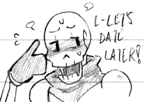
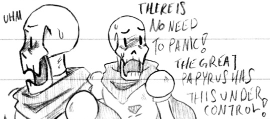


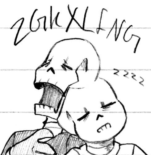
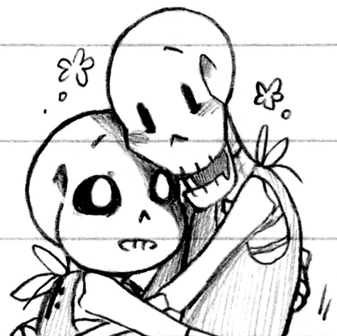
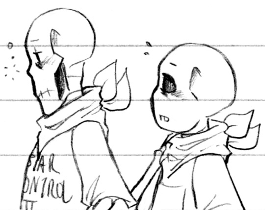
The best! The very best of skeletons! (Patreon)
#Doodles#UT#Handplates#Papyrus#Sans#A mix of several things! Some redraws and digital reconstruction and high editing/low cleaning >:3c#This paper Actually makes that possible thank goodness#It's not the best paper but it is better in that way for sure#Quicker is all I can ask for really#Anyhow! From the top!#In looking at the old doodle with a blushy Papyrus it looks like the only thing I ''redrew'' about it was the blush itself lol#And being a bit smiley#He's very cute when he's so distracted in battle haha leave him be he's very busy!#The second one was so fun! I was very stylistic with his lower jaw in the original :D The way he looks like an interlocked puzzle piece haha#I trust him he's definitely got this handled#Colour doodles! Red and blue boys! Tall and short long and stout <3 Love 'em#My two favourite colour tools my blood pen and my blue pencil ♪ I could've gone in with my various yellows but pfsh#A nice clean two-colour is very nice :) Or in Sans' case just blue haha#I was using the same blood pen in the original too! Well the same casing anyhow the ink has since been replaced hehe#Snuggling sleeping brothers <3 Another one that was digitally reconstructed! Hopefully it's not super obvious#Even back them I was doodling them sleeping on each other haha - Handplates was an influencing factor ♪#And now into the definitely-Handplates! I love how even in sleep Papyrus snores in capital letters and Sans in lowercase hehe#It's so cute! Sans will fall asleep at the drop of a hat but Papyrus is so much more obvious with his sleep!#Maybe it's like concentrated vs. evenly spread out haha#Babies!! Love them ;; That one was originally meant to be a comic panel but I got their posing wrong lol I misremembered#But they turned out so cute! Look at them!#I especially like Sans' super-glowing eye in the shade of Papyrus <3 Sweet lads#And a couple sleepy boys to practice skeletal profiles :) Nose? Teeth? They have a subtle silhouette but there are varying shapes!#I defaulted to a more chibi look on Sans tho haha his fused jaw and big eyes just give that kind of appearance ♪
410 notes
·
View notes
Text

“The stars collide when you and I intertwine for the first time”
#sheith#sheith posting#voltron legendary defender#. hai guys long time no see…#i was posting on twt 😭😭 im so sorry yall#but i am holysheithyall on twt and bsky now so erm 🫶#anyways i redrew an older (not really) piece bc i have been incredibly normal about kureith for some time now#they make me insane i am eating drywall#ill. try to post more here again. but no promises..#might post this on bsky (and/or twt) too idk
16 notes
·
View notes
Note
*Shaking you* your art is so good!
sorry i saw the tag that you've been a fan a submas for a long time and i got excited
THANK YOU SO MUCH!! 🧡
I don't have any old old art of them, but here! I redrew an older piece of them hard at work at their minimum wage jobs!!!

#my art#submas#ingo#emmet#do you recognise their shirts?#sorry if u ever ordered that sub before :(#thank you for the ask!!#i used to look up fanart of them on the school computers and get into MASSIVE trouble LOL!!!#gen 5 was awesome dont let anyone tell you otherwise
235 notes
·
View notes
Note
Lyss I plead and beg of you to redraw Monomon it's been so long since we've seen her I will draw a Genshin character for u if you do /lh

I redrew her a few months ago so this time she gets a more rendered piece :>
#now draw wriothesley from genshin impact :>#THAT IS WHAT YOU GET FOR OFFERING ME GENSHIN ART#/j of course lmao#but its her shes so silly#lyss art#my art#hollow knight#hollow knight gijinka#hk gijinka#monomon the teacher#hk monomon
217 notes
·
View notes
Text


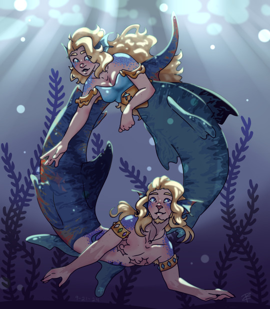
goodbye Mersmp
Super long message below!! (Funny story!)
and a message to the CCs at the end! <3
This is a piece that means so much to me. 21 months ago the designs for Theo and Faye got released. That day, i drew them! On paper with the supplies I had laying around, in a sketchbook smaller than my hand. At this point I was proud of my art but still very nervous about it. I had no idea how to draw them. I struggled a lot.
The second time I drew it, a year had passed. I felt I had been able to grow a lot as an artist and was excited to show how much I improved, so I redrew it! I loved how the lineart turned out and was so so excited to see the finished piece! But guess what? I hated it. I colored it in and still hate it to the point that I don’t even have the final version saved to my phone. It makes me feel ashamed.
But now, Mersmp has come to a close and the characters I have grown to care about so deeply have gotten their happy ending. So I wanted to give this piece that as well.
And finally, I think I can finally say I did.
I started drawing this final piece as soon as I was able to screenshot their epilogue designs. I was determined to make it right. So I sat down and drew, and drew, and drew, only taking an hour break to have dinner with a friend (don’t be like me). Finally, at 3am, eleven hours later, I was satisfied.
In this final piece are things that show just how tired I was. There are countless freckles on both characters, even under their scales! That’s a lot of dots. But wait… not the smallest. If you zoom in close enough they have pores! Much smaller than their freckles. That’s really a lot of dots! My freckle brush must have really come in clutch, right? WRONG! I dont have a freckle brush! All of this was done with one single smooth brush and I made Every. Single. Dot. Individually. That must have been pretty hard on my stylus, right? ONCE AGAIN WRONG! I don’t have a stylus! All of this was done on Ibis Paint x, a free art program, on an old janky ipad I got for free because it was so broken, all drawn with my finger. Even if I got a stylus, my ipad is too old to connect to any of them, including apple pencils.
The moral of this story is to never give up and not to let your resources limit your creativity. It doesn’t matter what medium you use, just do something to learn and keep pushing to improve. You will get there. Despite everything, you can do it.
And to the Mermp crew: Thank you for everything you have done. Through the story you have told and the community you have built, you have helped myself and others to grow in many ways. I myself learned a lot from Theo, learning that I do in fact go nonverbal at times and that does not mean there is anything wrong, and that I can feel conflicted and unsure about gender and expression. I learned I don’t need to be fixed. Just like I have now learned to look at the first redraw. I may not like it, but it is an expression of who I was at the time. Similar to Cella and Bite. Those characters may not like what they did in the past, but they are able to look back and recognize that it made them who they are today. If I always was proud of my first redraw, I may have never pressed myself to make this third one as beautiful. Thank you for the stories and lessons you have shared with us and allowing us to grow along side you and your characters.
And maybe, one day, a year or so from now, I can return to this and redraw it again, seeing what other things I enjoy in the future and how they may shape me to change.
With love, Turtle.
#artists on tumblr#fanart#my art#mer smp#mer smp theo#mer smp faye#mersmp theo#Mersmp finale#redraw#i love them sm#A message to the Mersmp creators
159 notes
·
View notes
Text
Just a bit of a personal thought, but I have grown to deeply dislike how social media, with its' competitive algorithm and need to have a perfect performance, is often giving people a really wrong idea of what is it actually to do art.
Most times, artists are rewarded by posting only their best work: A badly performing post in places like Instagram may affect how well your next post performs. It also prefers you to post finished pictures, very presentable sketches, that kind of stuff. Which is rarely the bulk of an artists' work. Even speedpaints have been chewed down into palatable videos barely reaching 15 seconds. Tiktok and Instagram reels prefer extremely short videos, and speedpaints are mostly just few (sparkles) aesthetic (sparkles) shots of minuscule parts of the process.
And all of that, I've found, gives people this really weird image of what is art actually like. A lot of starting artists grow to make idols out of bigger ones, thinking that these people can only create perfect pieces effortlessly, but that's not how it works. Very far from that. It's mostly that artists that keep active social media and have grown to know the game, know that showing the rough parts of art is not what gets you favoured by the algorithm.
I've been thinking about this ever since I saw a video on twitter of a fairly long speedpaint for what you usually see in social media, I think 4 minutes long, where the person redrew portions of the sketch up to five times. And a lot of people mentioned it was enlightening to see the struggle, to see that even a competent artist sometimes will struggle doing a little phone cord for an hour.
I think that's something I have kind of experienced, too. I'm not a big artist, but a lot of people have mentioned they find me intimidating still, up until they know me on Discord or something and realize I'm just a goof like any other. Up until I mention a face refused to work for 2 hours and I gave up, or how I randomly keep learning new basic functionalities in my drawing software of choice. And I think that's crucial to share too: Art is not a linear road! It isn't a smooth trip! You'll fail again and again and sometimes will end up going back to a previous point, then take another path. Sometimes you render a whole drawing and decide it looks bad so you start over. Sometimes you realize the lines came out wonky as hell and end up redoing it. Sometimes you gave a character 6 fingers or forgot people have eyebrows. It happens! And it's part of what making art is!
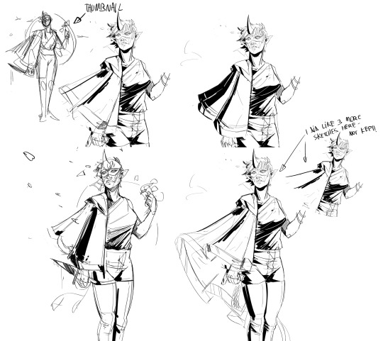
I mentioned this on Twitter- I rarely have visible proof of these struggles, but for an Artfight drawing (where I am trying to be speedy), I struggled with a cloak. For long. I made a thumbnail, I made a sketch, realized the cloak didn't work out, so I redrew it over and over again. I deleted most of the discarded sketches, but here's a few of the things that survived.
And like, I'm tired of not talking about this! I'm sad that people think they're failing because their art process isn't as smooth as it could be! So, yeah: I guess rant over, but I just have been thinking about this a bunch lately. If you'd like, do please feel free to reblog or share in replies any similar situations, struggles and flops. I think it could help people to realize how this is actually just a natural part of the process.
111 notes
·
View notes
Note
Hiii, do you have any tips for drafting out embroidery patterns? I've got one in mind, but drafting it out and color picking is so nerve-wracking!!
[Hi!!!! this got kinda really long so I'm gonna crop it under a read more. And I honestly don't have any real training/instruction in fiber arts so this is just how I do things, and probably others do them very differently!]
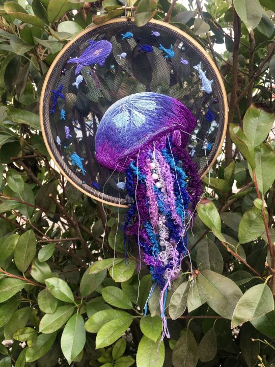
Haha so my fandom embroideries are VERY different from my non-fandom personal pieces in this respect. For non-fandom things i just kind of throw myself in like WAHOO FREEFORM LETS GO and go for a kind of messy colorful approach that ends up as things like this:
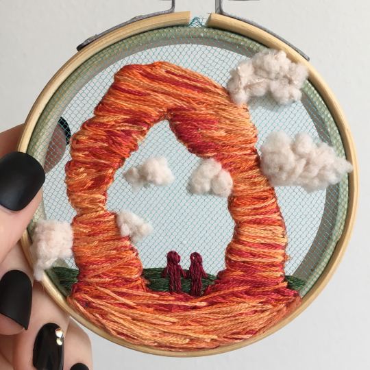
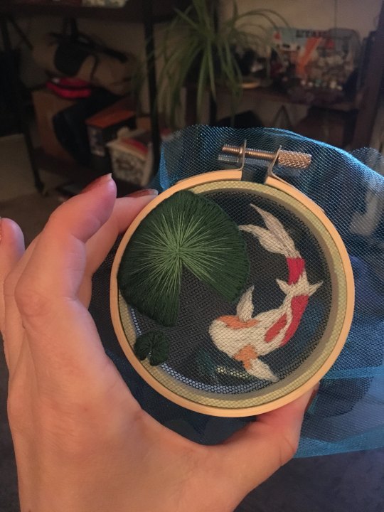
Versus my fandom stuff is way more structured and designed to fill space, be very precise, etc. So for those I do go in with a digital mock up of the design I make in photoshop, that I then color in, and then as my last step translate to thread colors.
For my Dragon Age series. this has been because I'm specifically trying to mimic the stained-glass style of art you see in parts of the game like the dialogue wheels, some icons, windows, etc. The icons in particular were really easy to copy into embroidery because they already come in handy circles:

This is mostly because I have desperately wanted to pick up stained glass work as a hobby for like 6 years now. As in once every 3-6 months I put everything I'd need to start doing it into an online shopping cart and look at the price total and then sadly close the window because I just don't actually have any space I could do it in (I live in a 2bed apartment so i have no garage or yard or anywhere it wouldn't make everything else a mess or be a hazard). The day after one of those events I impulse bought and completed a floral embroidery kit from the craft store and kinda was like... ok, well, I did this once how hard can it be to use this medium to mimic the hobby I wish I could be doing? Plus, it's only like 60 cents per color! I can afford that! So I took the first design I wanted to do, the romance icon, and basically redrew it sloppily in photoshop, then freehand-copied the design onto fabric and stitched it the next day:

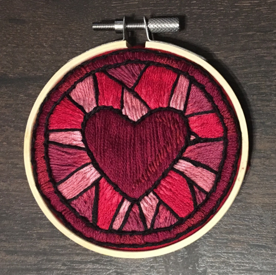
I learned a lot from this piece and changed my approach a little. Here you can see I tried shading in the parallel direction to my thread, which looked messy and added texture, so now I shade horizontally to my thread direction instead.
But it gave me a basic approach for turning the Tarot cards or DA Keep tiles (or any other art!) into embroidery patterns, which I couldn't copy as directly into this really smooth stained-glass style. There's a basic process I follow when doing these conversions that generally follows the same order, which I'll go through below.
STEP 1: SHAPES
The first thing I do is pick the shape of my display frame which is usually a circle, but could be an oval or rectangle too, since I hang the finished pieces on my wall to have nice way to show them off. I like to fill the whole space so knowing the size and shape of what I want the finished project to look like is a good goal for me. Since I am doing fandom pieces I want to be recognizable, I do stick pretty close to the "original" character design/art, but you can absolutely change as much as you want and freehand draw your own interpretation instead. If you're doing original art just substitute the below composition notes with "sketch out roughly what you want it to look like". I personally do my pattern drafting digitally as I find it easier, but you can do this part by hand too.
First, I keep the reference image I'm working off of open next to me while I work, and draw in the shape of my frame (here, a circle). If I'm adding in the little border to be fancy, I add a second inner circle. I keep these as their own top layer so I always know I'm working within the final "frame" and don't spend time designing any section that will fall outside it. Then I will take copies of the reference image and knock the layers down to 25-50% opacity, and start moving them around underneath the 'frame' layer until I like the way their positioning looks as a composition. Sometimes elements of a card I want to include don't all fit in, so I'll chop the section out and add an additional layer to throw in (like the background circle things in the Hermit design below). Or I'll just freehand things like adding much bigger diamonds behind Solas in my Hierophant design because I did NOT want to do 1000 tiny ones. Then once I'm satisfied with the general composition, I'll use the plain ol circular brush tool to trace out the major shapes of each element. I try to keep in mind that I can't go too small, and curvy lines are more difficult to fill in than straight ones. I usually do a rough messy version first, make it mostly transparent, and then a cleaner and more precise one over that.
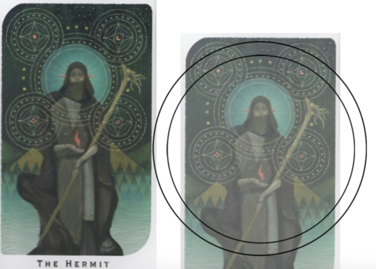


(you can see parts of the rough one on the left and the fully 'cleaned up' on the right for the Hierophant design)
Now: depending on what you are doing next with the pattern, this might be where you stop and start coloring. If you are planning to freehand your design or just trace it onto fabric (or even print it onto fabric here), there's no need to do more than this kind of lineart! However, if you are working digitally and want to create a scalable vector so you can print it at different sizes, you can use the pen tool in photoshop to trace your design and make a "work path" of the lineart. However, another note: THIS PART IS VERY FRUSTRATING AND TEDIOUS BECAUSE THE PEN TOOL WAS CREATED BY THE DEVIL TO TORMENT US. It is so so so easy to accidentally delete a line or even the whole path and not notice later on. Ask me how I know 😭 Anyway I'm not going to include a pen tool tutorial because I don't even know how to use it well and have to google or watch videos every other time I try to use it. But if you can muddle through it gets you some really clean lines that eventually look like this:

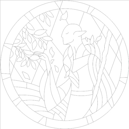
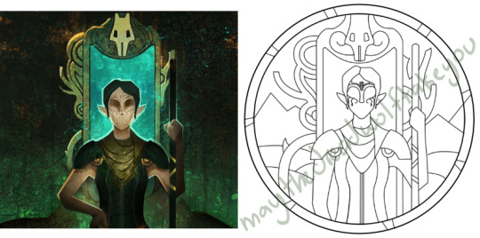
With the work path selected, you can select the brush tool/size/color and use the "stroke path" option to create lineart of the vector. Then you can save this as a transparent png file for use at different sizes and for printing and it looks so nice and clean! one of the big benefits to this is that you get really fine lines that are easier to be precise with stitching on. This is extra perfect if you are printing the design directly onto your fabric (which you can do with an at-home inkjet printer for designs under 8inches wide, as long as you stick a piece of stabilizer on the back of your fabric and cut it down to printer sheet size--this is what I do and can make another post about that process if people want haha), or if you are printing onto transfer paper like you can buy at craft stores.
This is where I end the lineart for my designs. After I have this, I move on to the next phase, which is...
STEP 2: COLOR
For interpreting my designs into thread, I start by thinking of it as flat colors first. You can't "shade" as easily with threads as you can with things like paint or brushes in digital art (though you can A Little, which I will get into), so to start color planning I pick the "main" color each section will be in the piece.

For the existing icons this was simple--I kept the same sections as the original designs, so for each I just color picked or eyeballed the color in photoshop and colored it in (but you could do this on paper with pencils, markers, whatever as well--they don't need to match your threads exactly and usually won't, it's just to give you an easy reference to follow as you go). For the tarot cards which were more complicated in coloration, I just did my best and went with what looked good next to each other, even if it was a little off the original art. It will be off more later anyway when you have to pick threads so don't stress it too much honestly. I will often make layers with different color options and turn them on/off for direct comparison to try to determine what I think looks best as well, like below where I was debating between more blue/desaturated for the background or brighter colors.

I do wanna note I have regrets about the color selection, shapes, or shading in EVERY SINGLE ONE of my finished pieces. But no one else ever comments or probably even notices! One aspect of this hobby is just learning to be satisfied with what you've made and using what you learned to get closer to your preferences next time. I'm only going back and redoing some of my designs' colors because I want to make it easier for others to choose on the patterns I sell, more than I care for just for myself. Also since I'm doing this lineart/stained glass looking approach where I go over the distinct shapes with black thread at the end, it means I get these clear delineations between sections you might not necessarily have in your own pieces, and that's ok.
Ok right. Now while shading/coloring in detail is hard with thread, you CAN make whats essentially dithered gradients. "Dithering" in the concept of art means using 2 (or more) colors to give the impression of a third color, or to gently scale between the existing binary rather than a hard line. Think of it like blocky pixel art or gameboy game images. If you're doing needlepainting, you use really small stitches close together to get this effect, which translates to "smaller pixes"--if you look at the jellyfish in my first photos that's a very messy casual version of that. If you want a better example, I recommend looking at @ammocharis 's pieces like these in her pinned post, which are truly amazing! I simply do not have the patience myself 😂 For my stained glass style, I work only in very long straight stitches, so I can only shade in one direction and have to be a little more precise with it.
So for shading, I think about in each section which direction my threads might go. Then perpendicular to that direction I pick which side will be the light one and which the darker one. Sometimes I color this in on my pattern mockup, but sometimes I don't! Or I'll only do it for certain sections to make sure I don't forget. Like for my Tower design I only colored it as flats, and waited until I selected threads to decide how the shading would go. I am currently working on a smaller, simplified version of my Hierophant design and I did add shading digitally for that one just for fun. But it's not as important as having the flat color version you can use to quick-reference how you want your design to go while you're stitching. You might also notice I don't actually color my gold--I just throw in a stock image of gold foil for that layer so I can't confuse it with any of my yellow thread sections.

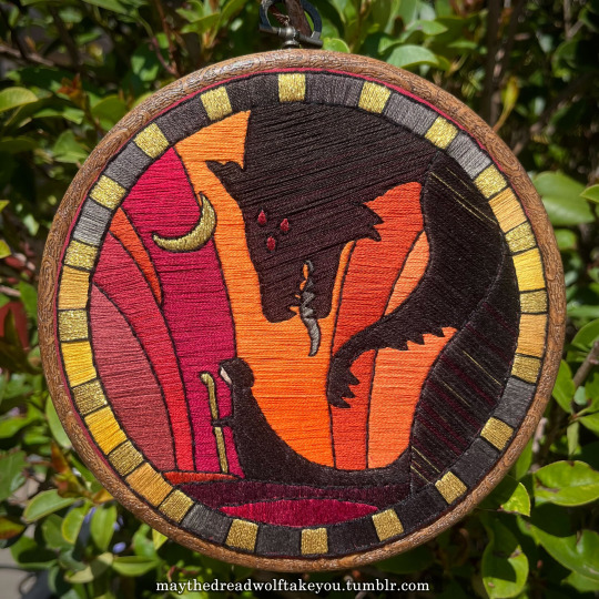

Here's a close up where you can kind of see what I mean by the "dithered" effect between colors--some are more obvious (like the red on the far left or middle orange) and others pretty subtle (dark grey to dark red on the wolf face):
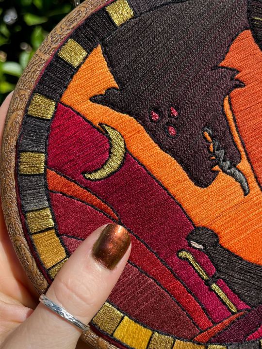
Now, while I use single layers of satin stitches for this, and just alternate thread colors increasing/decreasing as I go, you can accomplish the same thing with short overlapping stitches like with needlepainting, or with clusters of french knots, or whatever else. But in GENERAL you are going to be able to trick people into seeing gradients out of dithering best when you are using the same type of stitch for that whole area. So if I was using multiple stitch types like having french knots, daisy chains, ladder stitching or whatever else for some sections, I would keep those to contrasting areas/colors. A fantastic example of using different layered types of stitching to create more intricate color/texture in an embroidery would be these incredible tarot card depictions by @hattedhedgehog, which I like even better than my own embroideries. Here's his take on the Tower card as well for comparison to mine (I'm so in love with it!!!).
But anyway, at this phase, your design is actually still digital--the above is just to explain how it translates later in the process. The next step is...
STEP 3: THREAD SELECTION
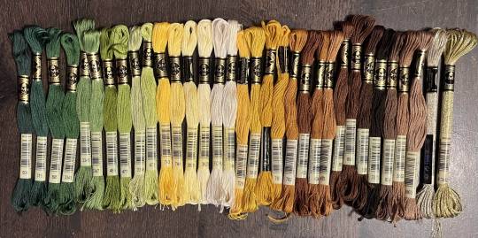
I will admit here I am not great at this part. I am constantly second guessing my thread colors, and can spend over an entire hour in the thread aisle at the craft store agonizing over choices. Really, I think this is just one of those things that takes practice and you get better at it over time. What I have had the best luck with is actually printing out a reference photo of my design/the original artwork and taking it with me. If you already have threads you can do this part at home too, but DMC alone has over 500 colors and I definitely don't even own half that so I like to torture myself by looking at them all together on the thread racks. Plus Anchor and Artiste and whatever other brands there are out there. One approach is to just sit there and pick out what you want for each section and line it all up together on top of your printout. Or in the case of my Tower I laid a bunch of options out on top of my template in the hoop to guess how they'd look in the frame.
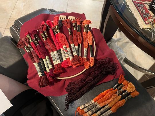
For me since I am also doing this dither shading thing, I also need 2-3 colors per sections depending on its size. Sometimes it's easy and the threads have a color just a little darker or lighter right next to them in the numerical lineup! Other times, there is no good match, or it looks too far away to shade nicely, or I want one to be a warmer or cooler tone than the other... which means a lot of standing and fretting to myself over it. I actually take a lot of photos at this stage because it can be easier to see how they will look in the end from a photo than in person to me? Idk why. Plus then after they get scrambled in my bag I remember wtf order I meant for them to go in later. But as long as you're not preventing other customers from shopping themselves, you can spend as long as you want staring at thread in the embroidery aisle and they won't kick you out unless it's closing time, so take your time.
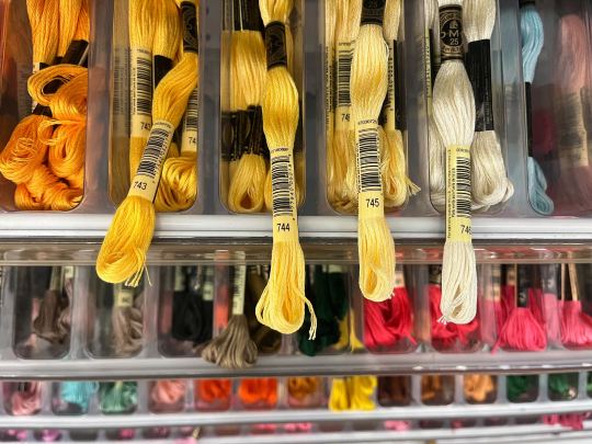
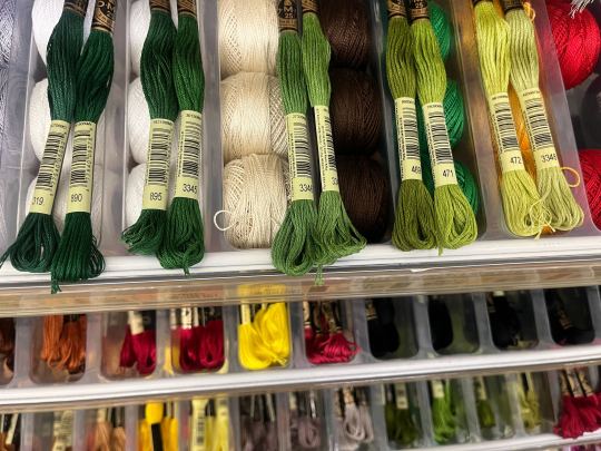
Now, IN THEORY, you can sort of combine steps 2 and 3 by color-selecting from your threads and using that to color in the design. However I have tried this and it led to mixed success because the photoshop eyedropper brush simply isn't actually that exact (in my experience, it desaturates compared to what we actually see). And because then you have to have the threads on hand while you're coloring... which means you might buy ones you don't end up using if you don't like them. So I prefer to just use this as a refinement step where I pick threads based on the design colors, then will re-color the design a second time to match those threads more closely to be sure I like the effect.
I've even used this as a tool when I needed to adjust my color choices mid-project, by digitally coloring over over my WIP:
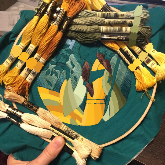
Or here's a design (but I haven't posted the finished piece yet bc it's a gift so shhh) I made with certain color tones initially, but after buying thread I re-did the color mockup to be more vibrant, because I liked those threads better in the store:


Once you have your thread, you can make yourself a little reference chart with the colors you intend noted on the sections you want them, like below:
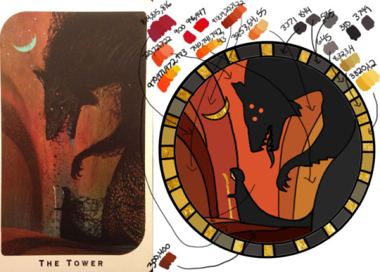
(note: i didn't end up sticking to these colors because I ended up dying my own thread for several sections. And then forgot I made this entirely and picked new ones because I put the project down for a year between design and stitching. Sigh).
Or for my Solas pattern I did this in a really detailed way, which i am sorry but i have redacted because... i have it for sale now and don't wanna just give that away haha. But if you buy the pattern from my shop this is one of the files you'd get with it, for ease of reference. I do also include a text-only list of them as well.

Now I don't go to this much trouble for all my designs, just the ones I put up for sale (or plan to). You can also just make a text list of your color plans if you want. Though for fun I also have been using my scrap thread to make these little "color palette" keyrings for my finished pieces, so if I ever remake them or update their patterns I will know what the original colors were, plus I can compare what i used to other threads if I wanna change part of the design up. This step is absolutely not necessary and I'm just doing it because I'm selling the patterns now, but they are kinda fun to look at.
And don't forget.. if you start a section in a certain color and decide you don't like it, you can just cut the threads and pull them out! I did that with my original hierophant piece actually. I had an entirely different color for one row of diamonds i thought just clashed way too much with the others, so I used photoshop to paint over it with some alternate options until I found one I liked better. Then I cut away all the old threads and put in the new color. It can be a little harder to fill a piece the second time since the fabric will have stretched out a little, but as long as you're using a good stabilizer it usually doesn't move too much.
You can also just make test swatches on spare fabric to test before you add them to your real piece. I wish I'd done this for some color transitions that didn't end up looking the way I wanted, but I am simply too lazy most of the time. My exception is usually for metallic, satin, or sparkly threads, because I want to know how they feel while embroidering. But if you're really worried about a certain color or shade it's a good thing to remember you can just do.
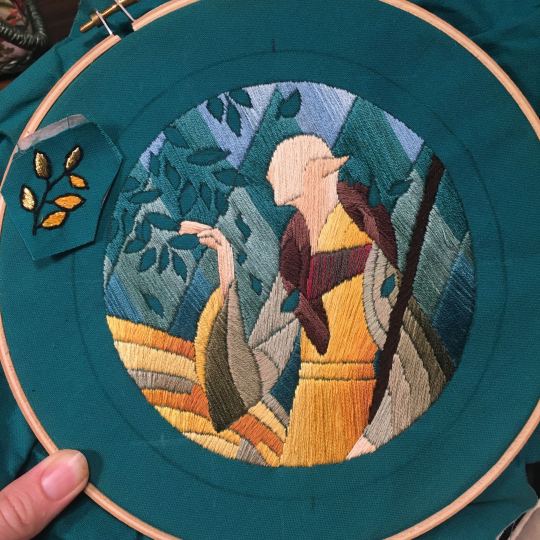
SO yep, that's my general process for drafting patterns. I start with the shapes/design, then do my flat color version, then I pick my threads. Makes it sound easy and short when phrased like that :) But I can honestly spend 8-10 hours just on making the lineart and coloring it in. If I was better at art, probably this would be less, but I'm working with what I've got (not much) 😂 I think all aspects of this are also something that gets easier over time, but it will probably never look as bad as you worry when you start out. I think all my pieces look awkward and rough right up until I do the finishing steps and move them to the display frame sometimes.
I hope this was helpful and answered your questions!! Feel free to post/share your WIPs to ask for feedback or advice ever too :) I've only ever had people in the embroidery community on tumblr be encouraging and helpful to me, and I'm happy to answer any questions myself when I can or if parts of this were confusing
#ramblings#my stuff#my embroidery#embroidery#dragon age embroidery#calicostorms#oh god tumblr changed the alignment of all my images so theyre all huge now great#WELL I keep tryign to rearrage them to be on the same line and it is NOT working so. thats how they will look i geuss#this is gonna annoy me all night... thats what i get for expectign a Functional Website though
28 notes
·
View notes
Text

One year ago today I finished the most amazing story of my life. As a tribute, I redrew my piece from August last year.
Old ver: here.
song: Dream, by Priscilla Ahn
This is going to be a long rant so be prepared.
I, in all honesty, cannot with any fibre of my being or in any space of my mind believe that it has been a full year since I finished Red dead redemption 2. The effect this stupid game had on me seems to have never lessened, even with the time that has passed since I completely finished it, and for a whole year it has found a very special, cosy little space in my heart which I find it hard to think it will ever leave. Everything about it came to near perfection: The characters, the story telling, the emotions it made me feel, hell even the graphics (which you would think would have lost some of their shine considering I played in 2023, 5 years after the games release) - and yet all at the same time in every person and life it presented to me it was so imperfect and broken that it seemed so real. Everything about it was so real.
Nothing on this earth could have ever prepared me for what was to come when I started playing. In fact, I remember my mindset going into it quite vividly: I remember I was bored one day, and decided to sit down and play 'a silly little cowboy game.' I knew how it would end since I started, but I never knew (and it never quite clicked through the months I spent working through the game) that I would become so attached to each and every individual that I would break down for weeks after finishing the whole endeavour. I didn't know that I would devote so many hours of my life to this game, all for it to end up in shambles - so much so that I haven't been able to pick up all the pieces 12 months later. I was completely unprepared.
I can still remember the visceral emotions I felt at certain points; The time that Dutch left Arthur to die, how Arthur after the fact had to present Rain Falls with his dead son. His last son. Watching Dutch lie to Arthur about the death of his own damn brother.
Seeing Hosea get shot, and Sean, and Lenny - and dear god watching Kieran walk beheaded into camp. Each and every one of these deaths broke me and I can still feel it.
I can still feel the fear I felt in the very last mission, worrying my pretty little head that Sadie and Charles would die - That John (and I) would lose the very last connection to the gang that he had.
I can still feel it all.
I don't know if this makes any sense at all, or if I'm just rehashing the points and feelings of everyone who has played before me - I'm simply rambling, spilling my thoughts out onto the table in the hopes they'll arrange themselves and I'll have some coherent (maybe even fond) thought process related to the completion of this game, instead of just sitting in silence whenever the topic is brought up without quite knowing how to order or process all the emotions that still rage.
Maybe next year I'll come back with something more important to say about the effects this game had on me, but until then just know that this piece of art quite literally touched my soul. It brought out feelings in me I never thought a piece of fiction could.
I miss it.
I miss them.
I miss Arthur.
#red dead redemption#red dead redemption 2#rdr#rdr2#rdr2 Arthur#arthur morgan#rdr arthur morgan#rdr2 john#john marston#rdr john#rdr john marston#jasons stank ass art#rdr fanart#rdr2 community#art#digital art#illustration#artists on tumblr#comic#comic strip
48 notes
·
View notes
Text
A Walk Down my Art Memory Lane!
Now that I’m thinking about my childhood Kirby art, I dug through my storage a bit and thought it’d be fun to share a few! Here are some of Baby Jojo’s drawings!
note: I was not active in any online Kirby art communities at the time and I never posted these anywhere so I made these drawings just for my own enjoyment hehehe.
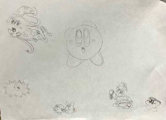

These are probably among my earliest Kirby drawings. Most likely ~2008!! I must’ve been in fifth grade maybe…? The first picture is a very rare example of pre-2022 Dedede sightings in my art. Around 2010 I became embarrassed and frustrated about not being able to figure his shapes out. So I spent the next 12 years avoiding him at all costs and instead sticking to the safer things to draw, like nice round Bronto Burts or Waddle Dees. Who knew it would take me writing an entire comic about him in 2022 to finally learn to draw him in my style!! :P
The second picture speaks for itself lol. I was the girl who googled “maskless meta knight” back when we had no fancy 3D renderings of his face. Just edits of anime screenshots and fanart of him holding his mask/getting his mask stolen and looking at you with the biggest, pearliest, white eyes. JPEG artifacts littered these images like sprinkles on a cupcake. And I would giggle and squee with every one like the baby fangirl of Meta Knight I was. :3
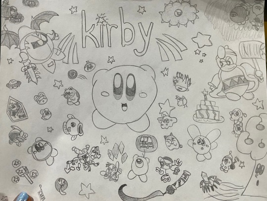
This one was probably ~2009. Very ambitious piece for me at that age. I struggled with the perfect roundness of Kirby haha. I had just gotten these cool alphabet stencils and couldn’t wait to write “Kirby” everywhere with them. This was probably the complete catalogue of Kirby characters I had the ability to draw at that time. It’s funny to think about how Magolor wouldn’t exist for another two years when I drew this.
Hmm. Maybe I should redraw this one day as a fun honor for my younger self.
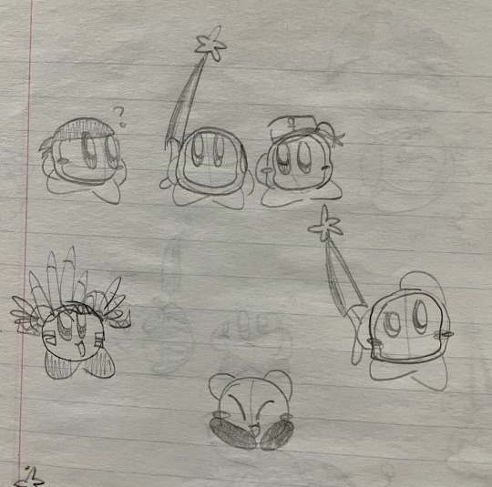
Triple Waddle Dees!! A rare but precious Sailor Dee sighting, and of course my sweet Bandana Dee. This was probably around 2011 after Return to Dreamland came out and I came to adore Bandee. :3

This is probably around 2012- some time after Mass Attack came out. I had this AU at the time where each of the 10 Kirbies from Mass Attack had their own personality trait from the original Kirby, and a permanent copy ability assigned to them. Hence the Spark Kirby having wings and a halo like in the game- where you get damaged and have to rescue the poor Angel Kirbies before you lose that life!
Also my Poppy Bro Jr OC that I don’t think I named at the time- but I redrew him recently and named him Allegro the Poppy Bro. I loved drawing his hair and his funny teeth :D
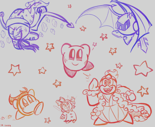
Finally, I redrew just a few of the characters from my old drawings tonight. Just doodling for fun, nothing serious. But it’s something my child self would be happy to know I could do.
Guess I’d better draw all the Dededes that Baby Jojo missed out on drawing!! Thank you to anyone who read to this point. I encourage anyone to draw things that would make their younger, baby self proud of you. ….even though I bet they already are proud of you. <3
Remember, as long as you keep drawing, you’ll improve at your pace! Just keep at it! You’ll notice that difference over the years!
#if this is interesting to anyone I’d love to share more of my childhood art haha it’s fun for me!#I can even show off my very first Kirbysona from like 12 years ago :3#very different than the bubble witch I am today hehe#irl content#jojo rambles#art#king dedede#bandana waddle dee#meta knight#ribbon#marx kirby#Kirby#kirby series#Kirby oc
69 notes
·
View notes
Text
【KHR AU】 XanLena ❤️💜🔥🪷


Nguyễn Selena (Nguyễn Nguyệt Vân Liên) 💜🪷
Figured it's been a long time since I posted about my wife, Selena~
Nguyễn Selena is my KHR OC who is a Vietnamese non-binary assassin. Her Vietnamese name is Nguyễn Nguyệt Vân Liên.
Her name, Selena, means "moon" 🌙
Her Vietnamese name, Liên, means "lotus flower" in Sino Viet 🪷
In my KHR AU, she joins the Varia as one of their members and lives at their headquarters with the rest of the core Varia members. My wife has NB flag colours~
My wife and her NB swag~ 💜🖤🤍💛
I mainly ship Selena with Xanxus.
In KHR, Xanxus is the leader of the Varia, an independent assassination squad under the Vongola mafia family. He was initially one of KHR's major antagonists.
Selena 💜🖤🤍💛🌙☁️🪷
English name: Nguyễn Selena (グエン・セリナ)
Vietnamese name: Nguyễn Nguyệt Vân Liên (阮月雲蓮)
Japanese alias name: Gen Suzuha (阮月雲蓮)
I resketched Selena's hair recently 💜
I resketched these quickly so it's not as refined but I'm still experimenting/trying to decide how I want Selena's hair to be drawn, whether I want to keep the curls in the back or not.
I feel like her ponytail is pretty iconic to her design. So if Selena got a TYL (10 Years Later) design, then I'd just add a bun on top of the ponytail.
Didn't redraw everything yet but just updated this for now
I redrew the bow and it has better lines but I prefer how pointy the shape of the OG bow was so I'll just combine the two eventually. I just wanted to get the new Selena down
Though both are nice! I just like how the shapes/silhouette of the hair are clearer now.
The XanLena chibis are pretty old doodles, so I'd like to redraw it sometime, but I still think it's cute ^^
My friend Feuri told me he likes how the softer upturned eyes of the OG Selena has a softer expression, so I'll keep both expressions ^^
I love both eyes in the Selena doodles hehe
Art Rambles
XanLena Doodle WIPs ❤️💜
Some recent + old doodles I drew before. I'm planning to refine them eventually!
Xanxus is wearing áo dài ("Long dress"), a type of Vietnamese traditional clothing
Selena is in her usual outfit I designed for her ^^
I think my art style is improving nicely! The way I draw faces is getting more refined
I'll redraw the hair later. I just sketched this quickly for now. Cuz I was just thinking about how I wanted to draw XanLena together more
I have a XanLena art idea in my head... Just need to get started with actually drawing it
Did a quick colour test today. I'll draw the rest later.
I wanna do a big XanLena piece eventually... And also XanLena in traditional Vietnamese clothing~ Matching couple clothing! 🥰💞
I rambled more about XanLena and Selena below.
You can read more under the cut!
Context
I added context for my mutuals who don’t know much about KHR, but would still like to tune into my KHR AUs and KHR OC stuff. Feel free to read only if you want!
Vongola Family = The KHR protagonist, Tsuna, is currently training to become the 10th generation boss of the Vongola family. Tsuna and co. are the Vongola family’s 10th generation guardians.
Varia = The Vongola family’s elite independent assassination squad. Their leader is Xanxus.
Source: (X)


Nguyễn Selena: Relationship Chart 💜


Selena's Name Interpretation 🌙☁️🪷


Notes


Misc Rambles
Sorry but I don't want to retype all this again so I'm just copy pasting from my Notion doc and side blog. I also included my rambles with friends!
Selena's info sheet and character relationship chart was inspired by FGO Materials' character profile formats where it lists a chara's general info, usage of pronouns, quotes, relationships with other charas, etc.
I still need to revamp the quotes with Selena's relationships with the other Varia members so I just posted Xanxus' part for now
Selena is the type who's calm and gentle but likes to keep to herself regarding matters that don't concern her. She's more aloof when she doesn't know the person well, but eventually opens up to the other Varia members.
I imagine Selena speaks in a really polite and formal way to Xanxus out of respect for him.
Xanxus and Hibari are my no. 1 fave KHR characters (tied) 🥰
Also used Glaze on my art as protections against A/I fart.
Also I'm just thinking of the recent FGO: Summer 7 event with Douman growing cursed morning glories (vampiric shikigami), flowers that suck blood.
I NEED THIS FOR SELENA...
DOUMAN BASED!!!
Selena's man eating plants 🥰💞
Selena is very soft and gentle, but she can be a little unhinged, as a treat!
Selena is a gardener and florist (flower enjoyer and enthusiast)
#khr#katekyo hitman reborn#katekyo home tutor#xanxus#khr oc#khr au#khr au oc#selena#nguyen selena#nguyen nguyet van lien#xanxus x selena#xanlena#xanlien#stepswordsen khr au#xanxus x lien#canon x oc#oc x canon#yume#yumeship#yumejin#yumejoshi#stepswordsen#stepswordsen art#nguyễn selena#nguyễn nguyệt vân liên#xanliên#stepswordsen varia au#wip#doodle#my art
7 notes
·
View notes
Text
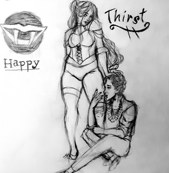
I did a quick little sketch (by quick, I mean it took me like 2 hours lol) I still struggle with feet and shoes...
I just saw a pose on pinterest and thought omg, what if Astarion and my tav... but he's biting their thigh 🤭
Ofc, I had to name it.. thirst... and I added the "Happy" symbol to kind of cover a sketch I did on the same page... You know... it wasn't originally supposed to be just one piece, I was practicing poses and I liked this one way too much to just leave it or risk messing up when I redrew it.
This is entirely self indulgent.. and intended to be Spawn Astarion because he's so babygirl 🥰😘😍
🤣 also I don't think I posted but I got through the Cazador fight not too long ago.. and
Spoilers and dumb ramble ahead:
For most of my day, I sat there wondering how the fuck I would beat that bastard... he was one shotting Shadowheart with his fucking lightning bolt, then sending his gas minions after the survivors. Astarion being in the ritual made it 10× more difficult.. so... I cheated... and fuck... It should have been obvious...
I LITERALLY FORGOT FOR THE ENTIRE FUCKING DAY THAT VAMPIRES ARE WEAK TO SUNLIGHT.. I blame Astarion and his parasite as well as Alucard for that one honestly.. the day walker thing kind of made me forget that omfg immunity to daylight is an exception, not the rule..
So I felt stupid.. once I got that, it was so much easier.. oh and almost constantly had Astarion in stealth kill mode until Cazadick was gone.
Also side note.. the VA for Cazador is perfect.. Like they really sells the "I'm a pathetic little worm, and your worst nightmare, fear me while I bitch and cry" LOL and again that's a compliment.. Larian really succeeded in making an evil character extremely grating and hatable which again, a good thing, not a bad thing.
The heartbreak I felt though afterwards when Astarion screams and cries.. God.. the second I got to this scene, I KNEW I couldn't let him ascend, doing so would be so cruel.. and yes.. this is ascended Astarion slander, I don't like my men too domineering.. maybe a little bit, but not enough to like kill innocent children and eat their hands or some shit lmfao (Doing a durge run too.. where I'm going to ascend Astarion and be a horrible bastard that eats babies) and I don't like that he loses the genuine feelings he has for tav/durge and becomes what he sought to destroy, an abuser.
Now.. the graveyard scene... I had tears in my eyes.. Honestly, the reason I love Astarion so much is because he is quite relatable. I will not go into detail, but I was.. SAed and abused as a kid. And honestly.. Seeing the bit where he scratched out his death date, made me feel hope.. for myself... For my own healing.. it truly meant so much seeing another survivor of abuse begin anew, find themselves again... even though I have done that already myself for the most part, I've found purpose, passions, love, heartbreak, etc and I've found some level of beauty in the life. I related quite a lot to the line about sex feeling tainted.. I am at a point where it no longer feels as terrible, I feel genuine enjoyment in it... (Can't do casual sex though.. That would trigger me into a ptsd attack) And I think part of that was letting myself go at my own pace, making sure my partners knew, and having control and the ability to consent and revoke consent at any point. Emotional attachment helped a great deal too.
I've rambled on enough.. but... Let me end this off by saying, If you went through unspeakable horrors at the hands of those who you thought were supposed to protect you, You are not alone, Even if you do not see it now, there is light at the end of the tunnel, keep on living, keep trying to find joy in little things. It does get better, what was done to you was horrible and you did not deserve it. I promise, you will see better days. You will be happy again, even if you feel like the pain will never end, there is always moments of calm.... live for those... live for your pets, live for your friends, the people around you, live for that cute thing you just ordered, live for that movie or TV series you're excited about watching... even the next patch for bg3.. or more Astarion content if that's your reason right now... and take it one day at a time. You will be okay.
If you need to vent out some shit, I'll listen, I may not know what to say or be able to offer comfort, but I will always lend an ear, even to a total stranger if they need it.
That's all from me, goodbye, until my next post.. whenever that will be ❤🖤❤🖤
#art#artists on tumblr#astarion ancunin#baldurs gate fanart#baldur's gate 3#baldurs gate astarion#bg3 astarion#astarion bg3#astarion#astarion brainrot#astarion x tav#astarion fanart#bg3 tav#tav x astarion#my tav#baldurs gate tav#tav#tav fanart#oc fanart#sketch#sketchbook#drawing#hand drawn#bg3 fanart#bg3 brainrot#bg3#a bit scandalous lol
24 notes
·
View notes
Text
it's been nearly two years since i started drawing on the regular so i redrew the first piece i made!!

previous versions under the cut, i'm quite happy with my progress :3
august 2022

december 2021

and august 2021. the journey’s been crazy thank you everyone who’s stuck with me and encouraged me for this long :D

hi taglist!! @oceans-calling @stainedinink @areus-in-a-little-cave @cloudedbusstops @neonkoii @aimsbucks @queerpressureduo @cavern-of-shenanigans @lithanecrane @j0nxer @popcornsalty @noctude @benzel @gayboyboobs @dykegenloss @the-rolol0ko @sunsplatteredfeathers @soapy-constitution
#spider draws#ranboo fanart#<- holy shit the return#i know my drawing anniversary is technically next month but i could not wait that long. yipee
49 notes
·
View notes
Note
How did you get into stardew valley? :3c
OKAY SO, I've actually been playing stardew for a LONG time. Someone commissioned me to draw their farmer x their love interest and the game was the payment. Don't ask for this commission piece because I don't think I have it anywhere tbh???
I have the exact date too of when I got it because right after an 8 hour playing session, I drew the beta design for Reina!!! March 12th 2017! Was when I started playing and created Reina for the very first time. Her old name was Ria no last name and she married Alex and completed the community center, or at least I hope I did...now that I think about it, I hated fishing so RIP....

Then I stopped playing for about two years, picked it back up in 2019 when it was on sale because multiplayer just came out and you got FOUR copies I think for one...(DOn't quote me on that, I have a bad memory and that's what I remember) So I bought it for my friends!!! But they hated the game so I didn't get to play with them....I think they like it more now, but I feel like that's because I won't shut up about my headcanons of Reina and Alex lol. And while I was replaying again, I redrew Reina! For some reason I wanted her to be really pretty? And girly for some reason. I think it was to contradict the tomboyish farmers that I normally saw in media. Like the farmer girls were really wild and one of the boys so I was like "I think I just want a super girly farmer" and so I tried my hardest to make her look pretty.
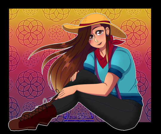


I actually forgot she has to wear glasses but normally wears contacts, so now she's blind without glasses. anyways what was I going with this? Might as well post another newer drawing of Reina
Here she is now in 2022/2023
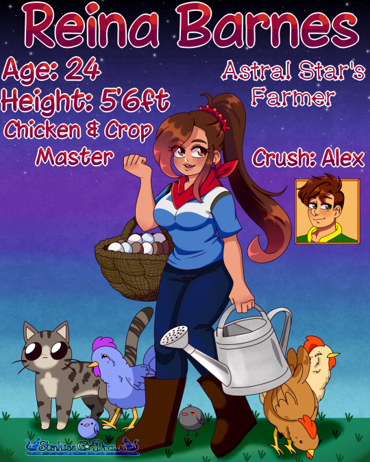

(Ignore that Alex drawing IT'S REALLY BAD) But here she is :D OH RIGHT STEPH YOU ARE ANOTHER BIGGGG REASON I am BACK in the Stardew fandom. Her AU is really good, I shoved my oc in there for funies lol. Plus I wanted Amari and Reina to be besties <33333
#stardew valley#stardew#stardew valley farmer#farmer reina#stardew farmer#sdv farmer#farmer x alex#alex sdv#alex stardew valley#stardew alex#stardew valley alex#sdv alex#my art#stinkiesdraws#my artwork#original character#digital art#my ocs#gojo stan#send me asks
42 notes
·
View notes
Text
-Gorebruary 2023!-
Week 1
Hello everyone! So, in 2020, I impulsively took a goretober list and decided to do in February, because I just could. It ended up being a little bit of tradition on my Instagram, only not done when I genuinely just didn’t have the time. I’ll reposting these here because idk. I just wanted to.
The format ended up being a picture followed by a short story, which I’ll also put beneath each image just to make it easier to read, along with a short personal blurb!
First off: I’m going to the trigger warnings from each image here. Sorry if stuff repeats.
Day 1/Crushed: Blood, mild body horror, organs, eye trauma(?)
Day 2/Decapitated: blood, decapitation/dismemberment
Day 3/pin cushion: needles, blood
Day 4/Amputation: depictions of medical procedures, missing limbs, lots a blood, medical themes
Day 5/Experiment: depictions of medical procedures, medical malpractice, lots a blood, medical themes
Day 6/Infection: cuts, mild blood, depictions of an infection, mild body horror, mild nudity(?)
Day 7/Body horror: Body horror (duh), blood, mentions of suicide in the story segment
With warnings aside, let’s begin the fun!

“Accidents happen.
Things get bumped over, slip out of hands, and clatter to the ground in pieces. It was okay, accidents happen. They were okay.
No one knows how to happened, but the cave collapsed after a loud boom was heard. Everyone got out, asking just what happened and who did it.
After spotting Mr. Riley, whoever did it, decided to keep their mouth shut.
Personal Note: I worked my ass off on this one, and there’s only a few things that I feel I did poorly on. I wanted to start things off with a bang and oh boy did I! For the story, which wasn’t a good as I thought it was like wow, I think I made it so the cave it was caused by Martha missing her shot and hitting the wall. Freddy just happened to be the one who died.
On another note, I was only able to work as well as I could because I’d make concept sketches ahead of time and made a ref sheet. Unfortunately, I don’t have access to my computer/ forgot to email myself the files so I might have to show those another time. It made work a lot better because sketching is such a long process and having a ref made it easier to color.

“Freddy prided himself on his unwavering will. When he wanted something, he did everything in his power to get it. Life was too short to wait and have it pass by, so he did it without care for the consequences.
In the manor, things were a bit different, and he was fully aware of his disadvantages. So, he made up for it by trying to be one step ahead of everyone. If it meant setting traps, hiding things, or telling little white lies, so be it. He was not going to allow himself any weakness.
He thought certain rules would protect him, he hoped they would protect him. After all, hunters could only do so much right-“
PN: this is technically a redraw of a 2020 gorebruary piece, but this one I like much better and uses cooler colors. Story wise, it was the ripper who did it after getting a little too frustrated and losing his cool. Freddy can be a little shit after all.

“Hmm, looks like I need to make some… last minute adjustments…
I’m sure you don’t mind helping, right?”
PN: I HATE THIS ONE. I hit a wall after the first two and relied way to heavily on 3D materials (a benefit of using clip studio paint) so it just looks off. Anatomy is off, pose is still, the story is just ass I shoved in last minute because I really didn’t enjoy making this one. If I redrew it, I’d change a LOT.


“Date: 1/9/XXXX
After the XXXXXXXX incident with subject 5-8-7, and getting the limbs that had been severed from subject 5-8-7 during the incident, we have decided to take one of our test subjects and jumpstart project XXXXXXXX.
At 9:20 am of January 9th, XXXX, we subdued subject 4-0-3, who had somehow informed of our plan and was resisting aggressively. We strapped him down and, due to destruction of our medical grade morphine, had to preform surgery without it.
He is still currently in a near-catatonic state, most likely due to shock, as shown in the picture. He has been patched up, hooked up to an IV and in care. As of me writing this, he hasn’t spoken a word.
Once we have him stabilized and make sure nothing becomes infected, we can move on to phase 2.
- Dr. XXXXXXX”
PN: this, along with the rest of the images for this week, are connected! It’s a resident evil inspired story which also features that years gorebruary “mascot” as a part of the story. Also, in sharp contrast to the previous image, I LOVE how this turned out. While I’d undoubtably made a few errors, I just have a soft spot for this image.


“Date: 1/12/XXXX
We proceeded in phase 2 of project XXXXX, but not without its complications.
Once again, subject 4-0-3 resisted violently, resulting in a few bruises for our staff and some lacerations to the chest on him. We bandaged him up, drugged him with laughing gas, and attached the severed ligaments from subject 5-8-7 to him. The stitching itself is poor quality, making it easier to take off if the limbs are rejected.
Instantly, the arm bonded with the body, even allowing subject 4-0-3 to twist his wrist. The leg has yet to be as responsive, it’s only noticeable changes being the slow increase in length, presumably to match the length of the natural leg.
Something peculiar should be noted: the sudden presence of black veins that are spreading not only on the foreign limbs but on subjects 4-0-3’s body as well. Currently, we are suspecting that’s it’s a bonding method of some sorts.
Subject 4-0-3 has been more quiet than ever, seemingly docile for the time being. He’s under constant supervision to make sure any changes will be noticed ahead of time.
-Dr. XXXXX”
(Note: I’m editing the story’s only a little bit. Nothing major, just for ease of reading)
PN: I like this image a little less. The colors aren’t as contrasting as I would’ve liked them, and the shading is not great. I’d change quite a bit if I did it today, mostly in the posing n such.

“Date: 1/21/XXXX
Time: 7:54 pm
Surprise to no one, Subject 4-0-3 for a severe infection. Discoloration, redness, swelling, boils leaking pus, and other standard symptoms. It’s repulsive to look at, and definitely should’ve been noticed sooner. I feel like an idiot for not noticing sooner, especially when the scratching began.
Outside of the infection, he’s having changes we just can’t fully explaining. The black veins and consumed both limbs, and has absorbed the stitching. His eyes have become discolored, and an identified fluid is just leaking from his face.
I’m more concerned about his sudden shift in behavior. He’s a cautious and guarded man, and he was practically mute when this project finally started. Now he’s chattier than ever, though how aware he is over the situation seems up to coin toss. He’s compliant, but that only makes more worried.
Jean took the photo of him and I, and I can’t say that I’m not having second thoughts about this. As I’m writing this, I’ve come to an disturbing realization: he shouldn’t be walking around with such ease. He’s as blind as a bat, shouldn’t he be struggling more?
On that note, I’m going to go and make a quick checkup on him, maybe even recommend sedation for the foreseeable future. Then, I’ll check on subject 5-8-7, who’s already fully recovered but far too quiet.
- Dr. Wesker”
PN: Tumblr is struggling to let me type. I’m mid about this one, just doesn’t feel all that standout. I’d chance a lot about this one.


“If you’re reading this, my name is Aiko Wesker and I fucked up.
This whole project was rigged from the start; she KNEW and was LETTING it happen, and now Freddy has mutated into something as twisted as her. Half the facility is dead, and no matter how many gunshots I hear the laughter just won’t stop.
They’re keeping me alive. She’s watching me as I’m writing this, staring at me with those soulless eyes. I’d kill myself if I could, but I don’t know if they’ll allow it.
I don’t know what their plan is and I don’t know what to do. May God have Mercy on my soul.”
PN: I don’t really like this pic. I didn’t work as hard as I should’ve and you can see it. You can also see the resident evil hinspo clear as day, which I should’ve really leaned more heavily on. This storyline is wrapped up though!
—
Thank you for being interested in this mess! I’d add more but Tumblr is bugging out hard so goodbye for now! Keep an eye open for week 2!
#freddy riley#idv lawyer#identity v#idv freddy#idv#my art#identity v freddy riley#identity v lawyer#idv freddy riley#fanart#tw g0re#mind the trigger warnings!#reposting my own art on another account#tumblr is so buggy sometimes#at least the mobile version#gorebruary
2 notes
·
View notes
Text
ANNOUNCING: a Storm Rider rerelease
▶YOU CAN READ IT HERE◀
What is this all about?
-This is a new release of my comic Storm Rider that ran from 2015 to 2019.
What's so special about this new release?
-The first 100 pages are completely redrawn (in 2017-early 2018) and are provided with a new translation that is more accurate than before, and there are important translation notes that can help understand certain things better.
There is one particular piece of foreshadowing in the story that I completely omitted from the original translation because it was untranslatable, but now I included a note that helps people to notice it.
If you've had these page redraws done for so long, why it took you so long to release them?
-I redrew these pages as part of a project that never came to be, and I had them sitting around unreleased for so long because I never had enough time or motivation to translate them in English.
This is something that I've been meaning to do for so long, but unfortunately couldn't until now.
What is this comic about?
-Maybe give this trailer a watch and see for yourself? It's only two minutes long.
youtube
(I spent like 7-8 hours just editing this video alone, it should encapsulate the feel I had for this comic when I created it)
How different are these new redrawn pages from the originals?
-Just take a look:

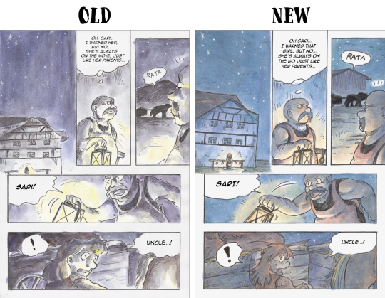

The old version will still be around, but I hope you'll at least check out the 100 redrawn and retranslated pages! I put a lot of work into them.
4 notes
·
View notes