Don't wanna be here? Send us removal request.
Text
Hi hello I am here to rant about our lord and savior, WolfQuest.
I got this game roughly 40 hours ago and I have 16 hours in the game already. It feeds the constant urge I have to just become wolf. Yet wolf quest somehow is able to make you feel things without any words. The constant challenge that these animals go through to survive. The way it is a constant dance between life and death. You must kill to eat and yet one day you will become that grass that your own prey feeds on. My break at work is about to end so I can’t keep rambling but AHHHH I LOVE THIS GAME
21 notes
·
View notes
Text
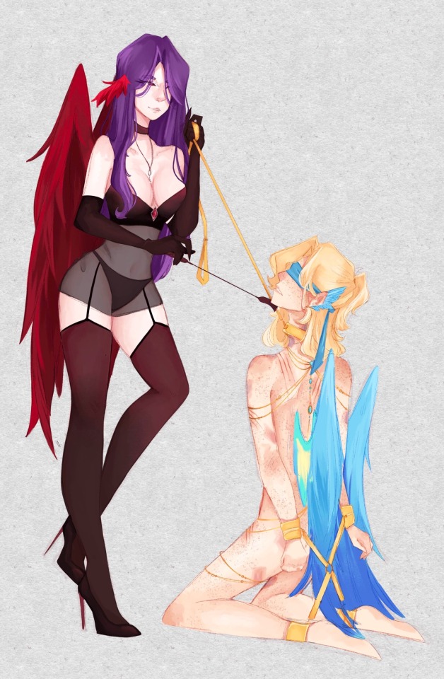
I did this for y’all, have fun :)
Warning 18+ content ahead!
Someone paid me the 20 bucks…..

18 notes
·
View notes
Text
Hi. I did the art thing again.

This is my dnd character, Magnus Lychin! It’s been forever since I even attempted to draw his werewolf form and I very much enjoy how it ended up! She’s just my little blorbo and I love them so much. <3
34 notes
·
View notes
Note
she would be PISSED
Hatchling Turtle was sooooo transphobic and ableist. Hah. Look how I ended up ✨💜
would younger you be angry with present-day you?
2K notes
·
View notes
Text

No one ever tell me anything bad about the person who runs this account.
388K notes
·
View notes
Text
executive dysfunction is legitimately physically uncomfortable. i’ll be trapped between two things, weirdly caught on how-much-time-it-might-take-me. i take hours worried im going to take hours doing things. i’ll sit on the floor for the entire day, caught up in the middle of not-doing the chores i actually do want to be doing.
& the amount of mental energy that goes into it. & the legitimate amount of anger and discomfort and self-hate. is not “being lazy”. it’d be a lot less work if i didn’t have to fight myself to just get up and do it.
i just need you to understand it’s not effortless. it’s never effortless. it’s not “okay let me just get up and finally start doing this.” it’s more like. i am slamming my foot on the pedal but the car is in neutral and nothing is moving. it’s more like shouting instructions into a dying telephone. it’s more like being trapped in a small electric box, and someone who hates me is administering shocks.
im trying. im trying. please help me get up.
76K notes
·
View notes
Text
I didn’t forget to put this on tumblr idk what you mean….
Anyways they’ve done no wrong ever ^^

173 notes
·
View notes
Text
So earlier in art class today, someone drew a characters hands in their pockets and mentioned that hands are really like the ultimate end boss of art, and most of us wholeheartedly agreed. So then, our teacher went ahead and free handed like a handful of hands on the board, earning a woah from a couple of students. So the one from earlier mentioned how it barely took the teacher ten seconds to do what I can’t do in three hours. And you know what he responded?
“It didn’t take me ten seconds, it took me forty years.”
And you know, that stuck with me somehow. Because yeah. Drawing a hand didn’t take him fourth years. But learning and practicing to draw a hand in ten seconds did. And I think there’s something to learn there but it’s so warm and my brain is fried so I can’t formulate the actual morale of the lesson.
71K notes
·
View notes
Text
My bones hurt. Hy brain hurt.
Me hurt.
also my hand might be swelling up, which has only happened when my… arthritis???? (We don’t know what it is- joint pain) flairs up real bad. It’s gonna be a fun few days then :D
The last time that my hands swelled up like this was literally about a year ago when my pain got so bad that I had to sit out of some of my classes due to how bad it hurt (I was raised by a farmer- we don’t stop to pain). I nearly constantly have lower body joint pain. It started in my hips years ago, then went to my knees and then ankles. Today my knees and hips really hurt. But once my lower back and elbows/shoulders/wrists/hands start to hurt? Oh man. Time to get out the painkillers like… yesterday.
yay
0 notes
Text
YEAHHH WE’RE GONNA DRAW SIEGE CHARACTERS IN MAID DRESSES AND HAVE SILLY TIMES-
(us being left alone always results in so much chaos. Please come watch and support Charlotte!! <3)
Hey guess what, I’m a streamer now! :D
Join me and turtle for a silly art stream!
On Thursday march 13 at 7:30 pm cet, 1:30 pm cst ^^
34 notes
·
View notes
Text
oh where do I start-
During my birth a blood vessel on my stomach burst, causing a spot above my belly button to now always stay pale but it is only visible when the rest of my skin gets really really red. Also my family may be psychic mediums and be able to sense things/speak to ghosts/control smoke :) (including myself)
@arlo-rose @knightcharlotte @auroras-shroom
it's so weird to me that everyone on this website is a human person outside of their weird internet niche so rb this with a random bit of your lore
80K notes
·
View notes
Text


Mr. Business and The Heavy have claimed the role of Luigi's giant goth girlfriends.
42K notes
·
View notes
Text


Welcome to my brainrot
#artists on tumblr#fanart#my art#i love them sm#<3#wwsmp#taetell art#wwsmp jaxper#wwsmp hexel#dnd oc#oc art#owen terramortis#daisy terramortis#terramortis smp#siege smp#siege smp io#siege smp Percy
98 notes
·
View notes
Text
you're very good at drawing huge tits. now lets see a fat body. no, a fat body. not thick thighs and big tits, fat. come on now. you're almost there. can we see under the tits? looks like you made the torso flat and thin again. we're almost there
5K notes
·
View notes
Text

:D
it’s a guy!
#artists on tumblr#fanart#my art#i love them sm#<3#wwsmp#wwsmp jay#taetell art#commissions open#I drew this on an iPad that is 11 years old with my finger#Do art out of spite :)
153 notes
·
View notes
Text


We have always existed, and we always will.
75K notes
·
View notes
Text
Small fantasy worldbuilding elements you might want to think about:
A currency that isn’t gold-standard/having gold be as valuable as tin
A currency that runs entirely on a perishable resource, like cocoa beans
A clock that isn’t 24-hours
More or less than four seasons/seasons other than the ones we know
Fantastical weather patterns like irregular cloud formations, iridescent rain
Multiple moons/no moon
Planetary rings
A northern lights effect, but near the equator
Roads that aren’t brown or grey/black, like San Juan’s blue bricks
Jewelry beyond precious gems and metals
Marriage signifiers other than wedding bands
The husband taking the wife's name / newlyweds inventing a new surname upon marriage
No concept of virginity or bastardry
More than 2 genders/no concept of gender
Monotheism, but not creationism
Gods that don’t look like people
Domesticated pets that aren’t re-skinned dogs and cats
Some normalized supernatural element that has nothing to do with the plot
Magical communication that isn’t Fantasy Zoom
“Books” that aren’t bound or scrolls
A nonverbal means of communicating, like sign language
A race of people who are obligate carnivores/ vegetarians/ vegans/ pescatarians (not religious, biological imperative)
I’ve done about half of these myself in one WIP or another and a little detail here or there goes a long way in reminding the audience that this isn’t Kansas anymore.
34K notes
·
View notes