#this is the first time I have drawn owen wilson and it is like my life has found meaning
Explore tagged Tumblr posts
Text

I had this dream that the show Loki was a mystery game where you could randomly generate any variant of a licensed character to help Mobius and the guy solve time crimes. The real challenge was getting everyone to get along
#ryo asuka#devilman#devilman crybaby#fan art#fandom#loki series#loki laufeyson#megamoth art#mobius m mobius#owen wilson#this is the first time I have drawn owen wilson and it is like my life has found meaning
16 notes
·
View notes
Text
Pictures of a Metaphor
Here is an image of a mushroom:

It’s interesting, it’s got okay composition, the mushroom’s obviously the focal point, but there’s other things that draw the eye in this scene too. There’s the dark red leaf in the upper lefthand corner that leads you away from the mushroom, to the pinecone, maybe you notice then, that there’s another pinecone to the very left, you might get drawn over to the green leaves in the upper right, before you’re coming back home to mushroom land.
This is a story before it’s been edited. It’s complete, it has flow, beginning middle and end. A bit muted, a little lacking in that *pizzaz*, but not horrible.
Some people are fine with this, the image above being exactly what they were going for. Tamed, real, raw. Others would be disappointed. After all that hard work of finding a subject, setting up the shot, and finally taking enough pictures to find a decent one, you’ve got… this, something that’s a bit too dull for some, or maybe just not what you were hoping for.
Now what if you throw in a little color? Made it warmer, fluffier, gave it some more detail and definition? You might get something like this:

It’s got a completely different vibe! It’s something that might catch your attention, compel you to stare at it for a little while. It’s more fun, kind of vintage.
But what if you were looking for something a bit more weird? Something with unexpected colors, something vibrant as hell that made you go ‘Wow’ like Owen Wilson? You might end up with something a little like this instead:

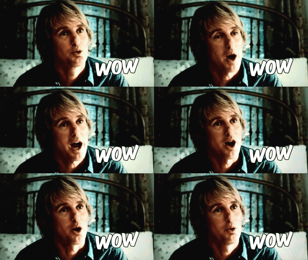
The greens and reds almost clash but there’s a strange, unexpected harmony. Intriguing blues and purples can be spotted throughout the image, if your eyes can focus long enough away from the vibrant greens and reds. It’s kinda bizarre. It makes you feel… something.
But maybe weird isn’t what you want. Maybe warm things make you cringe. So you add in a little darkness, change the tone, create conflict and angst. Or maybe you simply want to unsettle someone. It could end up looking like this:

Dark, cold, finding a mushroom out in the woods, near nightfall, you’re starving and don’t know if it’s poisonous or not.
But what if that’s not enough? What if you want to take that dull old mushroom photo, and bring it to the far edge of reality and then push it off? What if you want to throw it into the very pit that the word ‘insanity’ drug itself out of? What if you want to find pandora’s jar (it was never a box it was a jar folks) and bust it open, just to see if maybe a few more horrors were left inside? In simple terms, what if you just wanna make people’s skin crawl and their eyes need some bleach?

…Unsettling, to say the least.
All of these pictures, are the same exact picture, edited in different ways. What I’m trying to get across here, is that when the story’s done, on occasion, it’s really only just begun. My fiance’s first draft is his final project, and it’s a painstaking process, which he loathes every nano-second of. Me? I start strong with maybe something more like this:

And end stronger with something like this old familiar bad boy:

(It’s the weird one. I’m trying to say I write weird shit)
But sometimes, you finish a story, first draft DONE, and then it’s just… kinda meh. It doesn’t even really seem worth the time to fix it… POLISH THAT SHIT! Edit it until it SHINES! Beauty is waiting, it just needs a little slap here, a comma there, maybe some italics, and then BAM! Masterpeice. (Remember, Leonardo Da Vinci worked on the Mona Lisa for like ten thousand years, making little edits here and there. Don’t spend 10k years on it though, learn when to stop ((something you’d have to hold over Da Vinci’s head :D))
And if you need to get a story down, but are daunted by the task of taking the brutally agonzing steps of making it perfect on the first go round, then… Just don’t. Just take the dull picture with the good idea. Then edit the shit out of it until it looks like the image in your head.
Don’t let a first draft become your last and end up in the recycle bin. Ideas are fire and passion. Don’t snuff them out just because building them up would take work.
#writing advice#had this idea while editing photos a bunch of different ways#the warm and light green and angst/horror photos were edited by my handsome fiance ;)#writing help#first draft woes#how to get past certain types of writers block#writers block#clarence writes
9 notes
·
View notes
Text
Yes, Loki series director Kate Herron knows about your fan theory about the show, the analysis you posted to social media. No, she won’t tell you what she thinks about it, or whether you were right.
“I follow all the conversations on Twitter,” Herron told Polygon in an interview shortly after Loki’s season 1 finale. “I don’t always weigh in on them, because I made the show, so they don’t want me weighing in like, ‘Actually, guys…’ I think that’s the whole point of art — it should be up for debate and discussion.”
[Ed. note: Spoilers ahead for season 1 of Loki.]
Loki has been a hit for streaming service Disney Plus — episode 6 of the show, the final installment for this season, was reportedly watched by more households than any of the platform’s MCU finales to date. The series has been a popular source of fan conjecture and argument, with one particularly big rolling conversation focusing on whether the budding romantic relationship between trickster Asgardian Loki (Tom Hiddleston) and his alternate-universe counterpart Sylvie (Sophia Di Martino) is a form of incest.
Herron is willing to speak up about that one. “My interpretation of it is that they’re both Lokis, but they aren’t the same person,” she says. “I don’t see them as being like brother and sister. They have completely different backgrounds […] and I think that’s really important to her character. They sort of have the same role in terms of the universe and destiny, but they won’t make the same decisions.”
Herron says thematically, Loki falling for Sylvie is an exploration of “self-love,” but only in the sense that it’s Loki learning to understand his own motives and integrity. “[The show is] looking at the self and asking ‘What makes us us?’” Herron says. “I mean, look at all the Lokis across the show, they’re all completely different. I think there’s something beautiful about his romantic relationship with Sylvie, but they’re not interchangeable.”
Directing the final kiss between the two characters was a complicated process because it had to communicate something about each of them over the course of just a few seconds. Herron says the primary goal was creating a safe, comfortable environment for Hiddleston and Di Martino, and after that, she had to think about how to bring across Loki and Sylvie’s conflicting goals in that moment.
“It’s an interesting one, right?” she says. “Emotionally, from Sylvie’s perspective, I think it’s a goodbye. But it’s still a buildup of all these feelings. They’ve both grown through each other over the last few episodes. It was important to me that it didn’t feel like a trick, like she was deceiving him. She is obviously doing that, on one hand, but I don’t feel the kiss is any less genuine. I think she’s in a bad place, but her feelings are true.”
Herron says directing Hiddleston in the scene mostly came down to discussing the speech Loki gives Sylvie before the kiss. “That was really important, showing this new place for Loki,” Herron says. “In the first episode, he’s like, ‘I want the throne, I want to rule,’ and by episode 6, he isn’t focused on that selfish want. He just wants her to be okay.”
Loki writer and producer Eric Martin recently tweeted that he wished the show had been able to focus more time on two of its secondary characters, Owen Wilson’s Time Variance Authority agent Mobius M. Mobius, and Gugu Mbatha-Raw’s Ravonna Renslayer. “I wanted to explore her more deeply and really see their relationship,” he says, “But covid got in the way and we just didn’t have time.”
Asked if Loki and Sylvie’s relationship suffered from similar necessary edits, Herron says it’s true that the show’s creators and audience still don’t know everything Sylvie went through to make her so different from the Marvel Cinematic Universe’s original version of Loki. “We’ve seen her as a child, but she’s lived for thousands and thousands of years, in apocalypses on the run,” she says. “I think there’s so much more to delve into with Sylvie […] You’re filling in the blanks. You see [her on the planet] Lamentis, and it’s horrific. And you’re like, “Well, what kind of person would she be, growing up in apocalypses? What kind of personality would that give her?”
Herron says Sylvie’s backstory actually reminds her of the 1995 movie Jumanji, where a young boy is sucked into a magical board game in 1969, and emerges 26 years later as a full-grown man, played by with typical manic energy by Robin Williams. “It’s such a weird reference, but…” she says. “He’s a little boy when he ends up captive in that game, and when he comes out, it’s obviously been a life experience. With Sylvie, it’s similar. She was a child when she had to go on the run, so she’s had a very difficult life. I would love to see more of it. As Eric said, she’s a rich character, there’s so much to be explored.”
Herron says, though, that during her time on the show, material about Sylvie was added rather than cut — specifically, those scenes of her as a child, being kidnapped by the TVA. “This was before my time, but I know in the writers’ room, there were lots of avenues exploring Sylvie on the run and what her life was like,” Herron says. “I wouldn’t want to speak more to those, because I wasn’t there when they were being discussed. But something wasn’t in there that was important to me — I felt we should see her [history] in the TVA. Me and the team were talking about how it made complete sense, because episode 4 is all about twisting the idea that the TVA might be good on its head. And so that’s something that came in later, once I joined, was seeing her as a child. I think we needed to see that, not to understand her completely, but to get an idea of her motivations, why she’s so angry at this place.”
Talking more broadly about the series finale, Herron says the last few episodes weren’t as heavily referential as the first episodes, which she intended as “a love letter to sci-fi.” While early images like the TVA’s interrogation rooms had specific visual references from past science fiction, episode 6’s locations were drawn more from collaborations with the crew.
“The idea of the physical timeline being circular, our storyboard artists came up with that,” Herron says. “I had in the scripts, ‘We move through space to the end of time,” and then me and [storyboard artist Darrin Denlinger] discussed how we could play with the idea of time, while also adding MCU nods. He was like, ‘What if the timeline is circular?’ I think that’s such a striking image, like the Citadel at the End of Time is the needle on a record player. I just thought that was such a cool image, but it wasn’t necessarily taken from anything.”
Episode 6 focuses heavily on the mysterious figure He Who Remains and his citadel, a space she says was largely conceived by production designer Kasra Farahani. “I remember he brought in the art of the Citadel, and I thought it was beautiful,” Herron says. “He said, ‘The Citadel has been carved from an actual meteorite,’ which I thought was such an inspired idea. And He Who Remains’ office is the only finished portion of it.”
She says there are only a few direct homages in episode 6, including the zoom shot through space, which directly referenced a similar sequence in Robert Zemeckis’ 1997 film Contact.
“And then I have my Teletubbies reference for episode 5,” Herron says. “I wanted the Void to feel like an overgrown garden, like a kind of forgotten place. And I realized I’d pitched it as the British countryside. I remember trying to explain it to ILM, who did the visual effects, and saying, ‘Oh, you know, it’s like the Teletubbies. It’s just rolling hills, but they go on forever.’ That actually was quite a helpful reference in the end, which is funny.”
Asked for her favorite set memory from shooting the season, Herron says it comes down to Tom Hiddleston starting a mania for physical exertion before takes. “Sometimes he runs around set to get himself in the right mindset before he performs,” she says. “He does pushups. You know, you’re going into an action scene, you want to look like you’ve just been running. And it became infectious across all the cast. We’ve got so much footage of — I think Jack [Veal] ended up doing it, who plays Kid Loki. I’ve got [shots of] him and Sophia doing pushups and squats, just to get ready. It was so funny watching that echo across all the cast. I think all of them ended up doing those exercises with him at some point. It was so funny.”
“That might be my favorite set story, but it’s honestly, not a sweet one,” she adds. “I would say my favorite thing is his enthusiasm. He’s a very kind empathetic person. We were filming this in quite tough circumstances, a lot of people were far from home and isolating, and he brought this warmth and energy and joy to the set every day. And I think that made everyone feel very safe and very bonded. I’m forever grateful to him for doing that.”
187 notes
·
View notes
Text
Dumb Details From the Loki Trailer I noticed but then got too serious about
First - apparently it’s not a trailer, so I guess we’ll get ‘Trailer 1′ later? ‘Exclusive Clip’ hardly seems accurate, but hey, I’m not Disney’s marketing division. I wouldn’t live in a shoebox if I was.
Dumb detail no. 1:
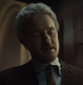
Owen Wilson’s jacket is...weird. Look closely.

And another shot:

Yeah...his jacket has a ‘reversed collar’. It’s a cut-out rather than cloth folding on top. Huh. What a strange design choice. What could it mean?
I’ve no idea, but that I watched the trailer enough times to notice this should concern you.
Detail No. 2
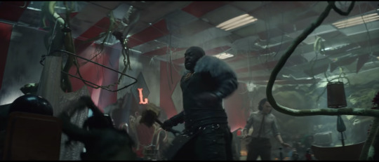
In this scene, we see what we can presume to be President Loki’s ‘Throne’. Notice the candy-canes. This is a Santa Claus throne, presumably from some mall Santa. This whole place might be in a mall, judging by the stuff in it.
But the Loki in this shot is not President Loki. Notice that he’s wearing brown pants, a thin brown tie, and the beige shirt he’s seen wearing in other parts of the trailer after he's apparently joined the TVA. President Loki wears black pants, a green vest and a wide green tie with a golden clip that resembles Loki’s little chevron he always has (more on that later).
So it would seem that Loki might meet President Loki here. President Loki might even be addressing him at the end of the trailer. It’s possible that his minions turn on him because there’s two Lokis and they don’t know which is the ‘imposter’.
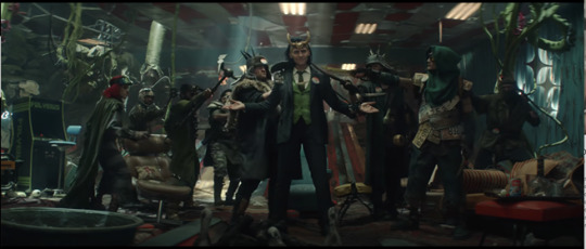
Speaking of, there’s a minion with bicycle handlebars grafted to a football helmet here, likely meant to resemble Loki. I dig it. There’s also cans of food scattered among the rubbish here. Makes sense that food production is non-existent since everyone has resorted to wearing license plates and spoons. Love how tattered the whole aesthetic is.
This reminds me of the opening Michael Waldron’s script ‘Worst Guy of All Time’, which featured a similar post-apocalyptic setting after the ‘worst guy’ ruins everything and makes himself king of the ashes. That’s likely what’s happened here, but I hope that Loki isn’t anything like Logan Paul, who was the inspiration for that title character.
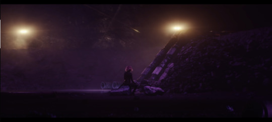
Ah, the mysterious female character watching a meteor shower WAY TOO CLOSE UP. But my eyes are drawn to one thing...

What is that oblong object with a shiny handle? Could it be...

A sword? I do love swords. Did you know there’s a bunch of pictures of me in the stock photos for ‘Fencing?’ That’s my cred for loving swords.
I suspect that this female character will be an amalgamation of Amora (shudder) and Sylvie and an alternate Loki of some kind. This sword is currently in her possession, but I wouldn’t be surprised if it or another timeline version of it becomes the Loki Show’s Loki′s weapon.
Loki has lacked a ‘weapon of his own’ in the MCU for quite some time. I mean, yes, he has his little knives, but they are many and disposable and something he chose for himself, rather than the two legendary weapons wielded by Odin and Thor, Gungnir and Mjolnir. In fact, throughout his appearances, Loki has seemed to want such a thing of his own - he briefly had Gungnir, and then the Gungnir-like scepter, and even tried to lift Mjolnir.
One might ask why Odin would’ve overlooked such an obvious show of favouritism. Why give Thor a storied weapon and leave Loki empty-handed? Heck, even Hela had the Necroblade.
In Thor 1, we might’ve assumed that the Casket of Ancient Winters was perhaps intended one day to be given to Loki, as it is shown with Mjolnir in the Vault and thus connected to it and the children who would inherit it. But in the comics, Odin did have another weapon of storied history put away for his second son: Gram the Sword.
It was locked for eons by Odin in a special vault which required five keys to be opened, and it was meant to be for Loki if he be worthy.[2] The five keys were infused by Odin with the powers of "journeys", "endurance", "secrets", "new beginnings", and "brotherhood", respectively.[3]
The sword, like everything else in comics, has a complicated history full of take-backs and twists, but let’s just leave it at ‘it’s a representation of Loki’s worthiness and belonging in the trifecta with Odin and Thor as a King of Asgard’. It gives him ‘equality’.
In the original mythology, it’s wielded by Sigurd to kill the dragon Fafnir, and the only relation it has to Loki is that Loki is partially responsible for Fafnir existing in the first place (my username is nod to this myth by the by. Sorry Ottär.) But hey, maybe that means we’re getting a dragon? The Fafnir would be very cool.
Or it could just be a bit of rebar in this mining quarry.
Then again...it appears somewhere else...
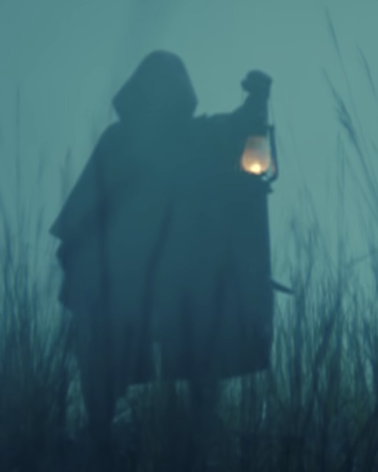
It’s easier to see in motion, but that’s a sword swinging on this person’s back.
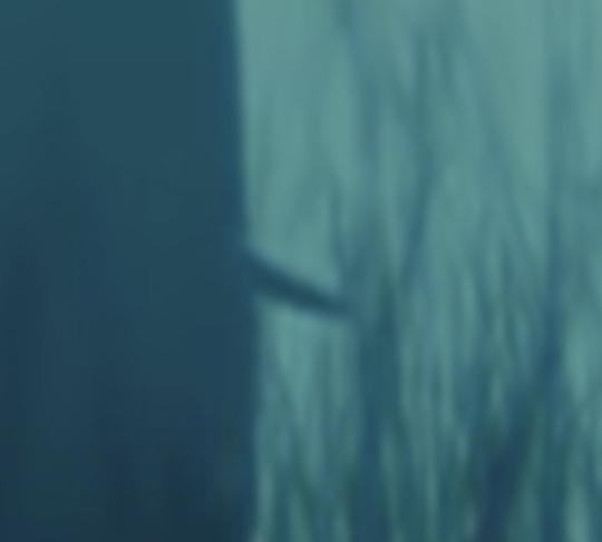
So the hooded figure is this lady...shall we call her Amylkie? Does that mean she’s the antagonist of this show? Well...maybe, but I suspect the true antagonist is foreshadowed here -
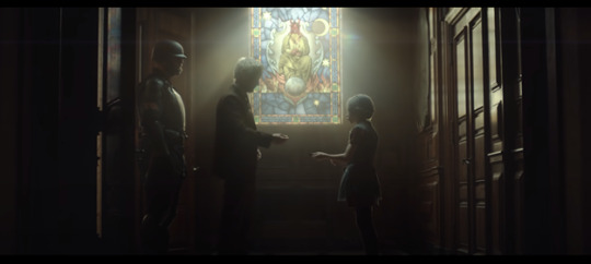
So, what’s going on here? A young girl (Young Amylkie? Some other TVA prisoner that the guard is watching over? An oracle, A Norn, or a kid who wandered off from the tour group in a basilica somewhere?) She’s giving Mobius M. Mobius a...piece of chocolate. Maybe he saw a Dementor, I dunno. I suspect it’ll be a MacGuffin of some kind later. He looks pretty concerned here, which contrasts with his ‘another day at the office’ blaséness when dealing with Loki. But of course this is the eye-catcher:
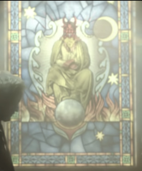
So, Norse Mythology. It’s been Christiannized. You can thank Snorri Sturluson for that, but you can google all about him later. Let’s just say that he made many Norse figures into equivalents for Christian ones. Baldur is Jesus, pure and a sacrificial lamb who dies for a greater good. And the devil is...Loki. Something the Marvel comics and the MCU have continued.
Here we have a devil, dressed in green and with a distinct shape on his chest:
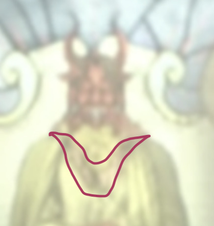
Hmmm...wait...I know that weird horny shape...
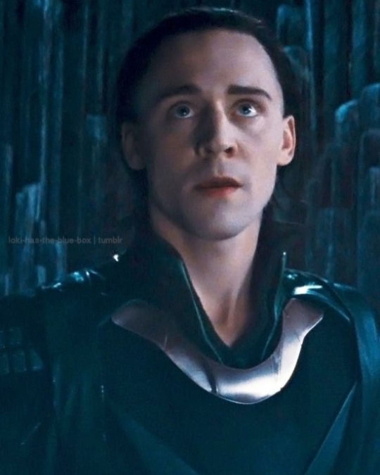
Ah. I’d say that cinches it. This is meant to be Loki. If you look at the devil’s hair, it also resembles Loki’s, being shoulder-length and black.
So, what’s devil-Loki doing? Laying an egg? Trying out a foot massager? For a second I thought it was a moon, but we see the moon over his left shoulder, amongst the stars. Which means this is - probably the Earth.
...Dammit; I live there.
So Earth is barren and being devoured by flames, likely caused by this Loki sitting atop of it (in a throne, no less). Aw gee, things look pretty bad, don’t they?
But wait - what’s that? Under the Earth (and, possibly, under the earth)?

It’s a plant. A shoot, to be exact.
Back to Ragnarok for a second. Ragnarok isn’t the apocalypse (something we see a lot of in this trailer - all of it seems to be exploring the end of days). Ragnarok is the fire meant to wipe out the old and fertilize the ground for the new. And after the gods have died, what happens? Well, Baldur emerges from Hel, one of the only surviving gods (hmm, seems him dying worked out, didn’t it?). He’s joined by Líf and Lífþrasir, who are the new first man and woman, who’s names mean ‘Life’ and who are pictured, usually, with plants and new life. It is they who are tasked who growing a new Yggdrasil after the destruction of the old. The previous first man and woman are Ask and Embla, meaning Ash Tree and Vine/Elm tree, so there’s a theme there.
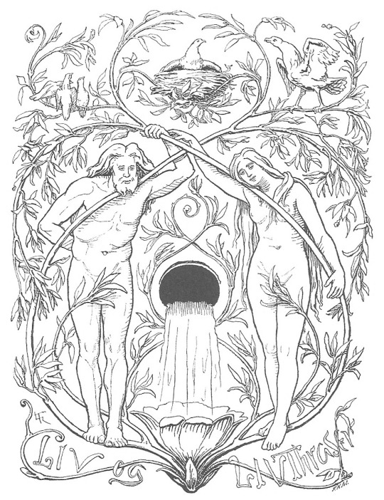
So a new sprout, possibly a tree, growing out of the destruction of the old.
This fits with Loki’s role as understood in mythology. He checks the arrogance of the gods, including when they tried to achieve immortality (sorry, Baldur, nothing personal), and that keeps the gods at their best. After Loki is imprisoned, the gods become weak, unhelpful and foolish, and Yggdrasil starts to rot. Eventually Loki escapes and returns along with Surtur (who also resembles this figure) to burn it all to the ground. This is also referenced in Thor:Ragnarok, with Loki releasing Surtur in the Vault, a place of thematic importance to Loki and one that represents the hidden secrets and sins of Asgard). You could say Ragnarok continued into Infinity War, where Loki played an important part in aiding Thanos’ destruction, giving up the stone to protect his brother and essentially dooming the rest of the universe - but also ultimately leading to its salvation, even if, like Myth Loki, he wasn’t around to see it.
So, we see Amylkie literally start a fire in the trailer -
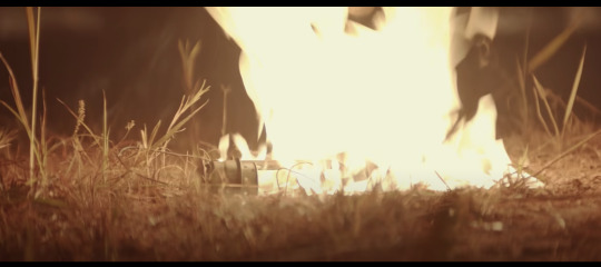
- in fact, this whole trailer is awash in flame -
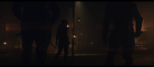
It’s fire, fire everywhere and she’s setting them!
It’s possible Amylkie’s our big bad, but I think there’s a chance she’s either a red herring, or, much like how Loki ‘worked’ with Thanos in The Avengers, she is the pawn of a greater foe -

- a Loki bent on destruction, for some reason or other. The TVA is obviously aware that this is the case, and it seems like they might be trying to ‘fight fire with fire’ by enlisting one Loki to combat another. The villain could be President Loki, since there's evidence of 2 Lokis in that scene - or maybe that's one of many Lokis, and the Big Bad Loki is being played by Hugh Grant as Old Loki. In any case, it would appear that Loki will be coming face-to-face with the worst versions of himself, and many of them. And, if I’m right about this scene:

...Loki will likely eventually discover that even his ‘good’ timeline ended in the destruction of his people and home, plus his own gruesome and torturous death. Although I think the TVA will keep that from him, and just show him the happy parts in an effort to inspire ‘good behaviour’. Until Loki inevitably discovers the rest of how that timeline played out and realize he’s been lied to. I don’t imagine he’ll take that very well...
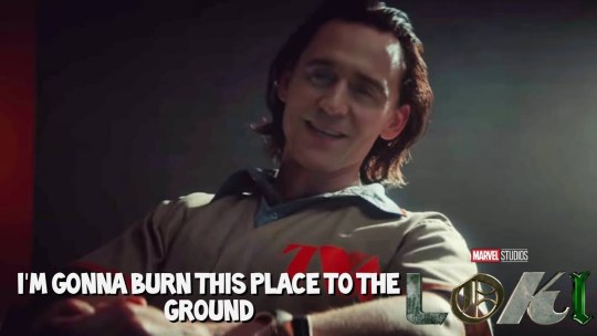
Damn, even our ‘hero’ Loki is burning stuff down! Does this mean that Loki is doomed, always meant to be an avatar of death and toasty destruction?
Well...let’s go back to that stained glass.
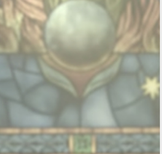
Hmmm...wait...I know that weird horny shape...
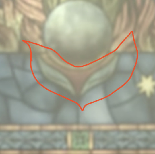
And there’s something else...the bottom of the Earth is being lit up, and not by fire. Light appears to be coming off this little plant.
What colour is this plant again? That’s right, green. Green is the colour of new life and growth and change and...hang on, I’ve heard that before, too...
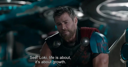
Hang on hang on HANG ON... let me have a look at the shape again.
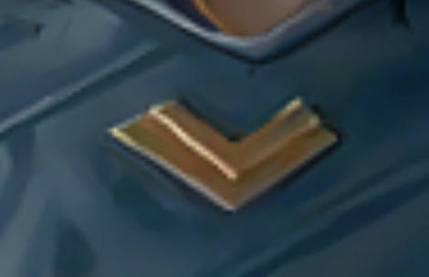
That’s...a letter. An L? For Loki? Like in the title sequence?
Wait...no, a different letter. An older letter. After all, Loki is old Norse. How do you spell his name in that again?

ᛚᛟᚲ ᛁ -
And ENHANCE on that third letter!
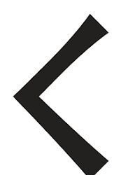
This, my friends, is a Kenaz/Kaunaz, or what would become 'K' in our alphabet. It is also known as the 'Loki Rune' (and the Ulcer Rune, for some reason. I suspect Odin understands why). It’s used to spell his name, but is also used on his own to represent him. Heck, it's even his Superman 'S' in the comics:
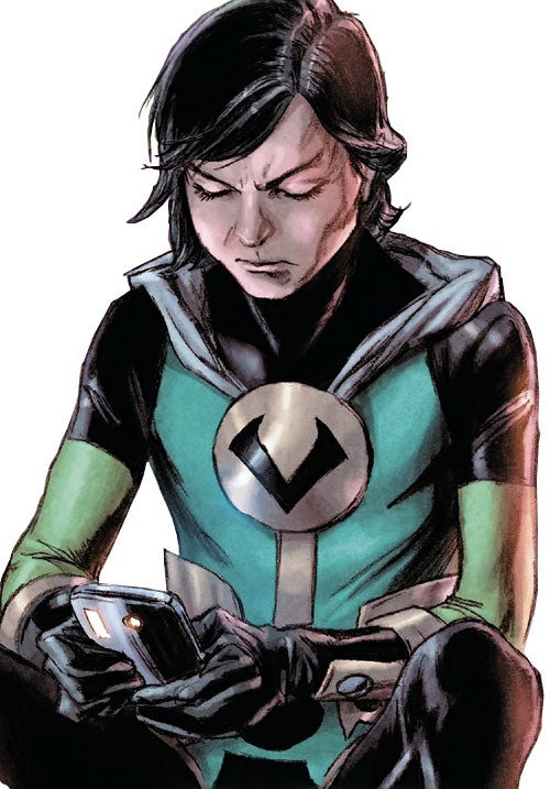
Runes are more than letters - they are symbols for concepts. So what else does it mean?
Primarly, it means ‘torch’.
And also ‘knowledge’ (ken). As well as ‘growth, change, the search for truth, decay, arrogance, elitism, feminine, kinship and creativity.’
...Okay, that’s a lot, but you have to admit it fits.
More specifically, it means ‘Mastery of the Fire’. As in, someone who has learned to tame fire so that it is helpful, not harmful. To bring light and, symbolically, knowledge.
There’s another way Loki’s been associated with fire - in the Wagner Ring Cycle, Das Rheingold, the opera that inspired much the Thor films’ aesthetic and certainly their helmets, Loki is called ‘Loge’, which means ‘Fire’. He’s usually dressed to match, too -

Many trickster figures are associated with fire. They are usually called ‘Fire-bringers’ - See: Raven, Lucifer, Prometheus, etc. They are often complex figures with a foot in different worlds, but who nonetheless help mankind with the gift of ‘fire’ - although they usually pay for it, and tend to be self-destructive.
(Side note. Lucifer means light-bringer, which is what luciferase is named after. Because it glows. Which is helpful in labs. In case someone needed to know that.)
Moving from a destructive fire-starter to a fire-bringer seems like a great character arc for Loki to take, especially given his rehabilitation in pop culture, the comics, and even wider culture. Loki has gone from being seen as an evil, deviant, destructive character to one who’s seen as a patron of the arts and creativity, of stories rather than lies. Heck, some scholars of Norse Mythology even posit that he’s the closet thing to a protagonist Norse Mythology has, so I guess that backfired, Snorri!). Being dressed in green and with the sprout clearly also being stylized after his Kaunaz, there’s foreshadowing that he’ll be capable of growing good things even out of ashes.
So, to sum up: Being ‘Satan’ sounds pretty bad, but with a little letter re-arranging like we see in the title sequence, you can be...

...practically a saint. Maybe even a saviour.
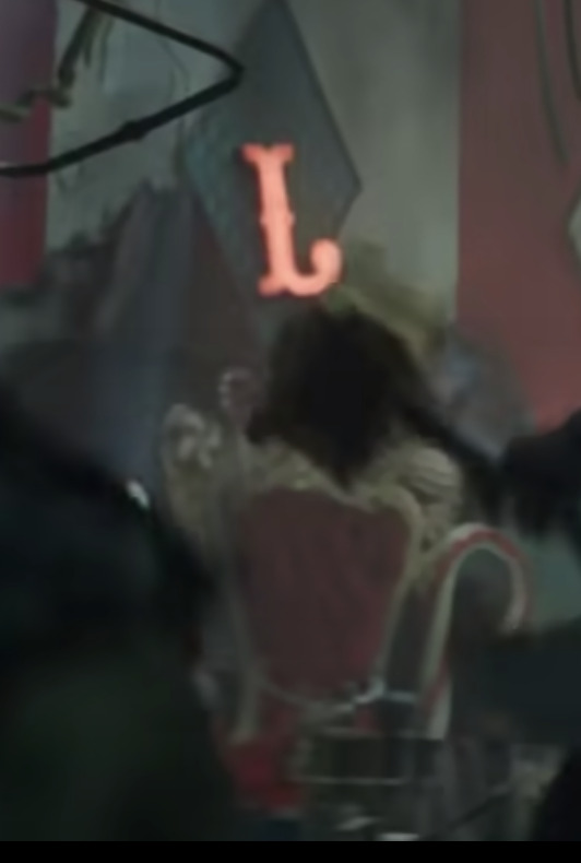
Merry Christmas, everybody.
#loki#trailer#details#meta#theories#theory#explanation#thor#tva#santa#devil#snorri sturluson whinging#christmas#fire#kaunaz#loki trailer
264 notes
·
View notes
Text
I’d like to start off this review with the reminder that these people put their heart and soul into their work. They work countless hours, while I sit on my ass and type on a blog. I have no film experience, or writing skill, yet plenty of opinions.
I was initially very excited for the series, I love Loki as a character and Tom Hiddleston always does a fantastic job playing him (I actually wish they had him write the character instead of giving him minimal input) However, I wish I didn't watch past episode 3. The directing and writing felt sloppy at best. Loki felt extremely out of character. The development he goes through feels overnight. Remember this is the same Loki that ripped out a guys eye and the next day is in the TVA.
We see Loki go through great change in Dark World and Ragnarok (I get it we can’t all be Taika Waititi) despite the limited scenes featuring him. I’m the movies we see his transition from evil, but he is still the god of mischief, first and foremost. Those movies were maybe 5 hours together, yet better translated the characters depth, than the entire show about him. If it really was about Loki... the series felt as if Loki is back seat to a long monologue filled with plot holes.
There is a severe lack of action. At one point it is addressed that magic cannot be used in the TVA; but Loki is still witty, a good fighter, and has super human strength. We see none of that here and he is reduced to a powerless shell of himself. The few over the top “super hero” effects used, were produced beautifully by the cgi and film crew. The TVA set was well produced and fun with the retro “DMV” feel. The simple costume design with neutral colors and progressively darker lighting, could've paired nicely in contrast against Loki’s character. He’s typically sarcastic, quick on his feet, egotistical, and energetically self absorbed. This series he didn’t even feel broken or exhausted, just bland. Hey, you should always have artistic vision and change material. But characters can only be changed so far, and so quickly without any sustainable reason. It felt almost like a fan-fiction written from the writers ideas, and not the source material.
One of my biggest issues and final straws was the relationship. The relationship felt very forced and wrong. Slyvie and Loki are essentially twins, due to the same parentage. A love interest is not necessary in every series, and it took away from this one severely. I found myself dreading the finale due to the obvious upcoming kiss. The director, Kate Herron, addressed that it was to represent self love...however if you have to explain why it's not incest, it's probably incest. I understand some people don't mind because Slyvie doesn't feel like a Loki (Maybe it's the fact that she looks like and is named after Enchantress rather than lady Loki...not very creative guys) But it made me very uncomfortable. The director is a LGBT woman herself, yet I feel she was locked in a very male gaze, heteronormative, direction. A woman can co-star without being a love interest. An example of this done well is Loki’s friendly relationship with Verity in the comic Agent of Asgard. They met and became friends in only a matter of comics, with better tangibility of relations. In the comics we also see as a version of Lady Loki, and expression of gender-fluidity; without feeling forced or “woke.” On that note, if Loki is established as gender fluid in the MCU, why is there only one female variant of him. The other variants even express surprise of there being a female variant.
Slyvie lacks depth and felt “gatekeep, gaslight, girlboss.” Sophia Di Martino plays Slyvie well and I have no qualms with the castings. I was very excited for a female character with more story than Black Widow, but it was never given. It’s been confirmed that Sylvie isn’t Enchantress, however for the sake of character design, continuity, and incest...I hope she is and that they’re just keeping it a secret.
With a second season coming, I’m glad a new director will be taking the reins. As bad as I feel saying it. Disney has the budget to do better, and not use a “well let’s see what they make” strategy.
I’m not sure how a series can feel so rushed and so empty at the same time. As if it was drawn out to waste time and tell us nothing.
I also found the secondary characters like Owen Wilson’s Mobius and Wunmi Mosaku who plays hunter b-15 likable but underused. Something that left a bad taste in my mouth was how all the characters played by POC were bad guys or killed off. For those unaware this is a trope often exercised by “progressive” creators, usually attempting to include black or Hispanic characters but promptly killing them off or reducing them to a villain. This all just contributes to an absolutely messy series.
No, I didn’t think they’d reverse Loki’s death, give us gender shifting Loki, or Lady Loki as she is from the comics. However the lack of coherent writing (not that I’m one to talk,) contrast of Loki’s character, and rushed emptiness, was a major disappointment. If you love this character, don’t go past episode 2. Feel free to let me know your thoughts both critically and enjoyability at face value.
TLDR: good acting, casting, special effects. Poor character development, weird incest relationship, empty “progressiveness” and lack of action.
Wouldn’t watch past episode 2 if I could go back in time
#loki#loki laufeyson#loki show#loki tv#loki series#loki odinson#slyvie#slyvie laufeydottir#lady loki#mcu#marvel
10 notes
·
View notes
Text
Hey everyone.
Bet you didn’t follow me to hear me talk about Loki, but here we are. It’s time to hear how I feel. Spoilers beneath the cut, as always.
First off; I loved Kang. I sincerely, purely loved him. I was pleased seeing him, I liked how he was doing his own thing.
Secondly; INCREDIBLE acting. Purely phenomenal shit. The eyes that Tom Hiddleston and Sophia Di Martino were able to do that purely just conveyed every heartbreaking emotion underneath was breathtaking. You could see their inner turmoil through every piece of the episode and I loved it. Heartbreak? Don’t know ‘em.
Owen Wilson and Gugu Mbatha-Raw were incredible as well. Mobius’ confrontation with Ravonna was tense and filled with his compassion and hope for better and Ravonna’s stubborness to get what she wanted in the end, and her final words before she walked through the gateway sent little shivers down my spine.
All in all; the acting was phenomenal. Kang was such a delight to watch; his disregard and unconcern punctured by moments of desperation and brief, sizzling anger was honestly a show to watch, along with his casual attitude. I loved him. I loved the other actors. They’re all amazing.
Okay. Now we get deeper.
Overall, the finale was not... good. At least, in my opinion.
I feel a great way to look at this would be to compare this to Wandavision, as the two will probably be involved in similar issues in the future of the MCU.
Wandavision had a conclusion. The story had a way to end that arc and show, while leaving bits and pieces open to spiral into a new thing, keeping us on our toes while also feeling fulfilled, knowing that it had ended for the time, that there was more to come, that the characters had prevailed for the moment, even if evil was still lingering.
This finale did not. Not only was there basically no good action whatsoever, something that Marvel has done for a long, long time and is a rather central piece to the universe, but there was no close or finish. And while I acknowledge it will be in preparation for Season 2, which I will expand on later, there was endless talking, barely punctured by Loki and Sylvie fighting for less than I had expected.
Kang talked. And talked. There was too much waiting, and while I understand the importance of tension, there was too little. Silence filled the void where there should’ve been something more.
Now, onto things that are slightly more positive/complimenting
Mobius and B-15 were doing something. I have basically no criticism about their parts they played, it was good to see them working together to free the workers of the TVA.
The fight/talk between Loki and Sylvie was very good. I liked it. The way Loki was trying to get her to actually just wait a minute and talk with him is something I unfortunately relate to.
And the kiss... several episodes ago I would’ve been a lot more upset. I understand it was a way for Sylvie to get him away from her with Kang’s device, but either way, I accepted last episode that I would have no control over this, that it’s more about self-acceptance and love more than anything, and that, in the end, this is all just fiction, and nothing matters. No, I’m not depressed, why would you ask.
The ending made me really damn upset, though. It hurts a lot. Loki doesn’t get a break. If you remember, this takes place DIRECTLY after Avengers. Only a few days ago, probably, Loki got away with the Tesseract after losing to the Avenger, found out he wasn’t meant to exist, and shoved into this situation with barely any other explanation.
And it hurts after knowing he made two friends, who he liked and trusted; Sylvie, who he cares about so deeply, and Mobius, his friend, who chose to trust his word and was going to take the TVA down for him, and Sylvie betrayed him by pushing him away, and now Mobius doesn’t even remember him. The angst is oncoming forever. I feel horrible for him
And then we have the second season.
Which at this point, I await, but I won’t hold my breath for. While interested to see the direction they’ll take the show in, I have to say I’ve drawn back a little from the idea. Excited for it? Yes. Awaiting it? Not... necessarily.
“Did you actually like the finale, though?” one might ask. Well, meh. Very in the middle. It felt rushed, and didn’t leave me satisfied.
Though I will revert to what I said before; this is fiction. In the end, I have no control over a multi-million dollar corporation who makes stories up for money, and I need to accept that.
For now, I linger in the depths with my fellow writers, fixing this with fanfiction.
Mad respect to the actors, though, I really appreciate them more than they could ever know for doing this so well.
And that’s a wrap, folks. I will now go see what others are thinking.
#my posts#loki#loki series#loki finale#loki episode 6#loki review#loki episode 6 review#loki finale review#loki positive#loki negative#loki positivity#loki negativity#loki laufeyson#sylvie#sylvie laufeydottir#really guys i am so neutral on this#just left feeling kinda 'meh'#mobius#kang#kang the conqueror#hunter b-15#ravonna renslayer#where did she go btw like what the hell#where are you going just be nice for god's sake#anyways#my reviews#loki spoilers#loki season finale
6 notes
·
View notes
Text
John Torrington: A Portrait of the Stoker as a Young Man
(Previous posts 1, 2, 3, 4, 5, 6, 7, 8)
Different forms of art have depicted Torrington in different ways. In my last post I discussed how in music Torrington seems to be depicted as either some sort of restless spirit or reanimated man-out-of-time, with a focus on his death and the eerie undead appearance of his mummified body. There’s not much of a focus on what he was like when he was alive, with the inspiration for these works coming from the image of his dead body. Sadly, we don’t have any pictures of what he looked like when he was alive, but that doesn’t mean people haven’t tried to imagine it. In fact, Torrington’s depiction in visual artworks often focus more on what he was like when he was alive, with various attempts at reconstructing what he may have looked like before he died and was buried on Beechey.
One of the first attempts at recreating what he may have looked like comes from the Nova documentary “Buried in Ice.” At the very end of the documentary, there are artistic reconstructions of Torrington, Hartnell, and Braine. I’m not entirely sure who the artist was, but the credits list an illustrator, Wayne Schneider, and he may have been the one to draw these. I can’t find the illustrations outside of the documentary, so please forgive the bad quality of the screenshot I had to use below.
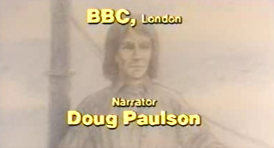
Here we have a John Torrington who looks aged before his time. He was only twenty when he died, but judging by the state of his lungs, he probably had a hard life, so he may have looked much older than his years. This is a very serious-looking Torrington, as if he were standing for a portrait or daguerreotype for several minutes and had to stay completely still.
This drawing also gives him almost shoulder-length hair. Owen Beattie was a technical consultant on the documentary, so he probably had a say in what the recreations of the Beechey Boys may have looked like. This makes me think that the hair length shown here is most likely how long his hair actually was. Yes, I know, I’m going on about his hair again, but due to the confusion over what his hair looked like, it tends to vary across artistic depictions, as we shall see.
Another thing of note in this recreation is the noticeable lines around his mouth. In the pictures of Torrington’s mummified body, there are prominent lines around his mouth, but how much of that was due to postmortem distortions and how much would have shown on his face in life is hard to know. The artwork above is not an official forensic facial reconstruction, and even official reconstructions are highly subjective, so this is just one possible interpretation.
There’s another artistic interpretation of Torrington from around the same time. Remember the children’s book Buried in Ice? Well, what’s a kid’s book without some illustrations?
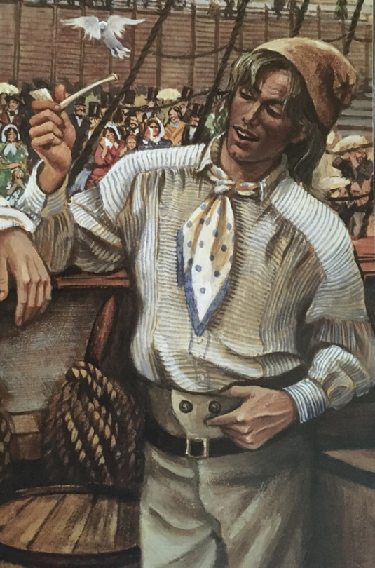
Now that’s the face of a man who got sick of backbreaking, lung-destroying labor in Manchester and said, “Screw it, I’m going to the Arctic.” The hair here is similar to that depicted in the documentary illustration, but the lines around his mouth are softened. The illustrations for this book were done by Janet Wilson, and she brought a liveliness to Torrington’s face that the somber drawing from the documentary greatly lacked. He still has a slightly careworn face, but he looks closer to his actual age. Janet Wilson also did wonderful detailing on the shirt that he was buried in, which he is wearing in her drawing. The kerchief tied around his head in death is here tied around his neck—and I love the inclusion of the blue border around the kerchief, which is not really noticeable in the photos from his exhumation but is noted in the reports on his burial clothes.
I’m fond of this picture because it gives Torrington some personality beyond that of a sad, tragic victim. It makes him seem like a real person who lived, with a bit of a sly and carefree attitude. He also gives off a kind of back alley salesman vibe, like he knows a guy who knows a guy who could sell you a kidney. But I especially like it because he’s smiling as he’s speaking, and after seeing picture after picture of Torrington’s frozen death grimace, I would love to know what he looked like when he smiled.
There’s another artistic reconstruction which I found on YouTube. It’s by artist M.A. Ludwig, who has a YouTube channel (under the name JudeMaris) dedicated to facial reconstructions of various historical figures, including all three of the Beechey Boys. Here’s Ludwig’s interpretation of what Torrington may have looked like:
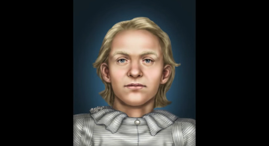
He looks much younger here than in either of the two previous interpretations. This John Torrington looks like a young man ready for adventure, with hopes and dreams of a long future. He has slightly shorter hair in this interpretation, but also, he’s blond. I’ve noticed confusion online about the color as well as length of Torrington’s hair, with a lot of people these days thinking he’s blond. I think that may have something to do with the wood shavings he’s resting on in photos, which as I discussed in a previous post, some people have confused for his hair. I’ve also encountered a few versions of the usual photos of him where the lighting looks different, resulting in the few visible wisps of his hair looking much lighter than official reports have described them. Interestingly, the blond hair makes him look younger and gives him an innocent and almost naïve appearance, completely different from the sly, I’ve-got-a-bridge-to-sell-you Torrington from the children’s book.
Now I’m going to move on to an artist who is well known to Franklinites. Kristina Gehrmann (@iceboundterror) is a German illustrator and graphic artist who specializes in works with a historical or fantasy setting. She has drawn many pictures inspired by the Franklin Expedition, and I have bought several of them from her shop on Etsy, including three different versions of the ships Terror and Erebus sailing in the Arctic or caught in the ice. Currently, those three pictures are on my wall next to a large painting I inherited from my grandparents of two non-Franklin-related ships that I pretend are Terror and Erebus anyway (I call this wall The Boat Place). Gehrmann also wrote and illustrated a graphic novel in German about the Franklin Expedition, Im Eisland, published in three parts and available through Amazon. But if, like me, you don’t speak German, Gerhmann has made an English translation, titled Icebound, available for free here.
Gehrmann has actually drawn two slightly different versions of Torrington, one of which is more like the artistic reconstructions shown above and the other is of a fictionalized Torrington in the graphic novel Im Eisland. I love both of her interpretations, but they are of two different styles. Let’s start with the graphic novel version.

Im Eisland uses a manga-like style, so this version of Torrington is based in that. It gives him a wide-eyed, youthful—and joyful—appearance (when he isn’t dying of consumption, of course). This is the happiest and liveliest Torrington I’ve seen. The manga art style results in some simplified features and a rather modern hairstyle, but there’s nothing wrong with using some artistic license to better convey the personality of a character.
Gerhmann’s other illustration of Torrington is possibly my favorite, even if it might not be the most accurate:

This is a lovely illustration, and it really plays up Torrington’s youth, making him look almost angelic. I’m going to be completely honest—he is very pretty. This version of Torrington is an incredibly handsome young lad, and if Torrington really looked like this, then I think he probably would have been very popular in life. I could go on, but I probably shouldn’t.
I also love the amazing detail on the shirt. You may have noticed some slight variations in these recreations when it comes to his shirt, and I think that’s due to the fact that his shirt looks downright complicated in the few pictures we have of it. There are horizontal stripes and vertical stripes. There’s a high collar and buttons and all these folds that it can be hard to see exactly what it looks like, and unfortunately there were no textile experts present during the exhumation, so there was no one to lay out the shirt and take a closer look at it before redressing and burying him. But every time someone gives their best attempt at figuring out the puzzle that is his shirt, I’m happy, and this one looks very close to how it may have actually looked. My one issue with this picture is that his hair is short and blond, which doesn’t fit the description provided in the autopsy report. But the facial features look true, so I tend to overlook that little nitpick.
This version of Torrington, by the way, is probably the most well-known interpretation. In fact, when you search for John Torrington on Google, this picture crops up:
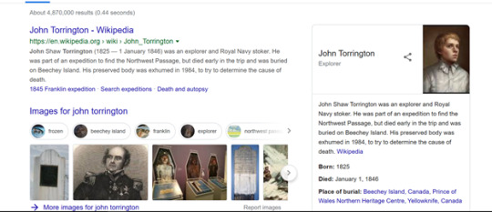
I have even seen online articles about Torrington that use this picture as a reconstruction example. This is in no way an official reconstruction of him, but it is by far the most popular. (And yes, I bought a copy of this picture, too.)
While reconstructions of what Torrington may have looked like when alive are common among artists depicting him, there is some artwork that uses images of his mummified body as inspiration instead. Irish artist Vincent Sheridan has a gorgeous collection of work inspired by the Franklin Expedition. Several of these feature the mummy of John Torrington, including an etching aptly named “John Torrington.”
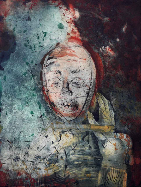
Torrington appears as a ghostly apparition in many of these prints, alongside the repeated imagery of a skull, two very physical signs of the human cost of the expedition. While most of the bodies of the men lost have yet to be found, their bones scattered or buried across King William Island, Torrington’s body is a stark reminder that this tragedy did happen, and that these men did die, not just vanish off the face of the earth. I’ve described Torrington as the poster boy for the expedition before, and here his death seems to represent the death of everyone who sailed with Franklin, his face a haunting piece of evidence for the fate that met them all.
Now, I’m not entirely sure how best to transition between that solemn reminder of death and this last piece of Torrington-inspired artwork that I would like to mention, so I’m just going to dive in. This next artwork also uses the image of Torrington’s mummy as inspiration, but in a completely different manner from Sheridan’s work. I refer, of course, to the John Torrington plushie.

This adorable little mummy plushie was created by craft artist Nancy Soares, aka sinnabunnycrafts on Etsy (@sinnaminie). Whether you think a plushie of a mummified body is in good taste or not, you have to agree that this little guy is freakin’ cute. I might be slightly biased, though, because he was originally crafted for a custom request from my sister as a birthday present for me. But now anyone can buy him or his Beechey buddies. This little guy even made a special appearance during John Geiger’s presentation at the Mystic Seaport Museum’s symposium, Franklin Lost and Found.
I think the fact that there’s a plushie of John Torrington is amazing. People used to take pictures of the recently deceased and use their dead loved one’s hair in jewelry to remember them, so this isn’t that different. To me, at least, it’s a memento to honor him, reminding me that Torrington was more than just a boy who died but a boy who once lived as well.
It is also super adorable.
Next: Torrington as depicted in literature. Spoiler alert! He dies. A lot.
<<Back | Next >>
Torrington Series Masterlist
30 notes
·
View notes
Text
Favorite Stuff from 2018: The Haunting of Hill House
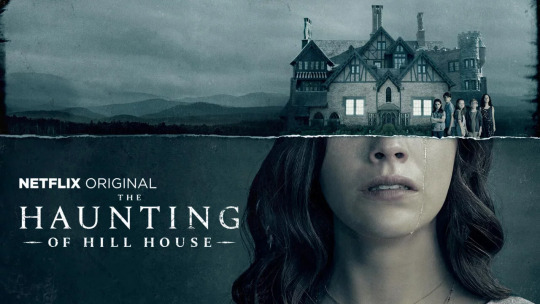
I tend to avoid horror movies. I scare pretty easily, and I generally find horror movie to not be particularly interesting enough in terms of things like character story to make me want to push past being scared to watch them. So when I saw Haunting of Hill House on Netflix, I didn't even really think of watching it. Now, the 1960s adaptation is one of the few horror films I will watch because it truly is an excellent film, but given the kinds of horror movies being made these days, I didn't think it would be worth my time.
Then I saw everyone talking about it. So I wanted to see at least what the fuss was about. By the end of the first episode I was immediately pulled in. As far as scares go, those first three episodes really did lull me into a false sense of security, with what seemed to be just a few blatantly scary-to-look at moments. I mean, upon rewatch, I started noticing the background ghosts and realized how false that sense of security was, but at the time I was thinking that maybe this would be more in line with the 1960s version and that we wouldn't actually SEE much of anything.
By the time the third episode happened and it became clear just how false that sense of security was, I was far to interested in the characters for me to quit.
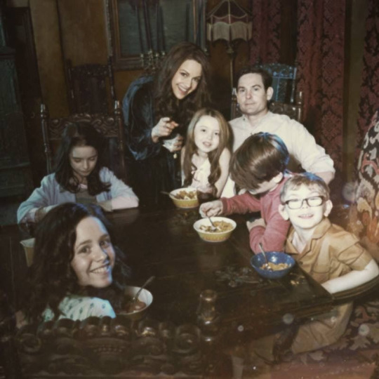
Characters are usually the thing to grab me the most. I've sat through many movies and shows where I found the story lacking because I found even just one character so fascinating. Obviously, the ideal situations is a good story and good characterization, both of which feed off of one another to create the best overall product. I do think that's what we get with Haunting of Hill House, but the thing that grabbed me so hard and didn't let go was the characters, they way these five kids and their parents were being written explored, they way there was such clear and understandable development, even when we didn't know exactly what happened, between the children we start with and the adults they become.
There's a lot to identify with in each character, and using them to explore these ideas about grief, what it does to is, and how we live with it is really the thing that makes this show so special. The idea of ghosts and hauntings being used as metaphors for the ghosts of the pasts, the mistakes the characters made, the things they want to forget, is hardly revolutionary, but The Haunting of Hill House explores those ideas so brilliantly in how much it really focuses on these characters and their story. The episodes, for most of the first half of the season, unfolds in a Lost-esque way, with each episode focusing on one of the siblings, flashing back to their childhood in the house and the things that happened to them there, and then taking us through their present, showing us how those events from their childhood has shaped who they are now. We get a deep, deep dive into these characters and who they are, and why they are who they are, and all of that characterization is so precise, so delicately handled.
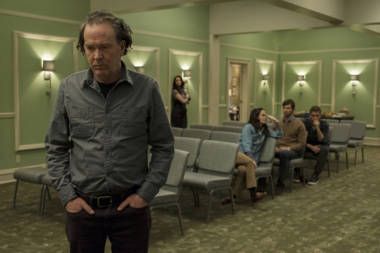
Beyond just how well each character is drawn and explored, we get to see these incredibly complex relationships within the family, and each one of those relationships, even when we don't get to see every single relationship in as much depth as others, is so interesting and so clearly shown for what it is and what it means. Relationships between families, and siblings in particular, can be some incredibly complicated, and The Haunting of Hill House doesn't just know that, it rolls around in it, making so much of the basis of the entire story in how these siblings relate to each other, how that effects each one of them, and how those relationships can change
I'm definitely a fan of long running series and the ways that characters can develop over years (I grew up on soap operas, for heaven's sake), but there is something to be said for a series with a limited run, where the writers KNOW it's going to be a limited run, where that characterization and character and relationship development can be fully realized and very carefully plotted to a natural fulfillment point. There's nothing superfluous. It's all very precise and careful. That's definitely one of The Haunting of Hill House's greatest strength, the way the character and relationships developments are paced. Story pacing is important as well, and the pacing in that regard is very well done. But this is a piece that relies so heavily on characters. We don't really get all that much mythology or story about the house itself and what's going on to make it so damn haunted, because that's not what the story is. It's not about these characters discovering the secret of the house. It's not about what they do to and about the house. It's about what the house does to THEM. The story comes from them, not the house, so the fact that the way these characters were managed, the way the reveals about them and their development were paced is the things that makes this show so special.
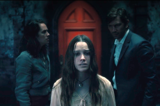
I know there's been some "this show doesn't have the same story as the book at all" complaints about The Haunting of Hill House. I don't agree at all that this is actually a problem. We already have a pretty much perfect adaptation of Shirley Jackson's book (the 1963 film The Haunting). That's a brilliant film, that took what Jackson wrote and produced a very faithful-to-the-text adaptation. So we don't need another adaptation that's just a reproduction of the book. The 1999 movies where Owen Wilson gets his head eaten off by a stone lion. Not every adaptation should be exact reproductions (in fact, really, no adaptation should be an exact reproduction, but that's a musing for another time). Not every adaptation is going to fit the idea of a "faithful" adaptation. And that's fine, as long as it's not purporting itself to be. It's a good thing. Some adaptations are going to be more "inspired by" than "an adaptation of". That's what Netflix's The Haunting of Hill House is. It takes the basis of Shirley Jackson's story, looks at the characters and the themes, and uses them to explore new ideas, and new themes.
This is a show I would recommend to anyone who love stories where the characters are at the forefront, regardless of genre. Even to people who don't like horror. Admittedly, this is a show that can be very spooky, and there are some definite jump scares. But the core of this show is the characters and relationships. For me, it was worth the scares to experience such incredible character work. This show is really something special, and I'm worried it's going to be too easily dismissed by a lot of people (and awards shows, if the Golden Globes is anything to judge by. Hopefully it won't be forgotten by the time Emmy voting rolls around) because it's a "horror" show or a "ghost story" series. Those things, truly, are secondary to what it really is at its heart: a story about siblings struggling with their childhoods, the way that's effected their lives, and how they continue to deal with the grief that's come with it.
91 notes
·
View notes
Text
Rebellious Stirrings
Category: Fanfiction - Homestuck Characters: Alpha Bro Strider (Alpha Dave); Alpha Mom Lalonde (Alpha Rose); Grandma English (Alpha Jade) Rating: T Warnings: N/A Originally written: 26 January 2018
Notes: Set in the early 2000s, probably. Rose and Dave are in their 20s. Rose is a single lady who likes to pursue guys who have zero romantic interest in her, apparently...
Another event. Another chaotic mass of swirling ballgowns and overdressed women fussing over their hair and make up, with men strutting about like peacocks with their tails fanned.
Rose Lalonde stood amongst it all, smiling thinly as a courtesy as she sipped a vodka martini, barely listening to the screenwriter who had sought her out of the crowd for what was apparently going to be a one-sided conversation about how the feminist movement was putting perfectly capable screenwriters like himself out of work in favour of some half-polished, female-focused plotline developed by one of the "insane" feminists that were apparently flooding the scene.
"I tell ya, Rose, women should stick to writing books. It's what y'all best at - leave the screen to the guys."
Rose continued to smile thinly at the man, though her gaze had turned deadly cold. Anyone who knew her well knew not to start complaining about feminism around her, but clearly this buffoon missed the memo on that topic.
She had already opened her mouth to respond when a much older woman suddenly seemed to appear from nowhere. Large round glasses reflected the light cast by chandelier yet still not enough to hide her unnaturally vibrant green eyes. She grinned toothily, throwing her arms around Rose's shoulders.
"Rose! I'm so glad to see you, dear! How have you been? Is the new novel coming along well? Oh, you absolutely MUST come and meet my friend, he'll be so delighted you're here! Excuse us,"
Quickly linking her arm in Rose's, and almost spilling some of her drink in the process, Jade English offered a brusque apology to the screenwriter before pulling Rose away, a pathway seeming to open through the crowd for the pair. Rose, cursing at missing such a golden opportunity to put a repeat offender in his place, allowed herself to be dragged along.
"Not that I'm not happy to see you, Ms English, but your timing is impeccable as ever. That one in particular is constantly complaining about the rise of women in media, and I don't know how many more of these oh-so-illustrious social events I can continue attending without expressing my true feelings."
"Never mind about that," English waved a hand flippantly, "He won't be attending any more of these; you're not the first person to raise a complaint. Besides, causing a scene with him will have caused irreparable damage to an alliance that needs to be damage-free. Rose, this is Dave Strider,"
English had dragged her to stand before a male in a plain black suit, with blonde hair styled neatly. As he turned to them, she realised he was wearing a pair of aviator shades, and almost snorted to herself. What was up with this guy? Did he really think so highly of himself that he would seriously wear shades not only indoors, but also at night?
That stoic expression. That relaxed stance. He was, in fact, more underdressed for this event than herself - she in a short-sleeved blouse and skirt, he in a simple three-piece one might wear to work for a business meeting, and the pair of them surrounded by ballgowns and tuxedos. It was only as she processed this thought that Rose realised he wasn't trying to be fashionable or pretentious - he was comfortable with being himself, didn't buy into all of the consumerism and arrogance of the social elite.
"Miss Lalonde," he remarked, smiling ever so slightly as he caught her hand and briefly pressed his lips to the back of it in a gesture that may as well have been forgotten in the modern age. Rose wasn't entirely swept off her feet, but she was impressed with the man's apparent chivalry, turning his back on the conversation with some other male to devote his full attention to the two women before him.
"Jade has told me enough about you that I don't even need to read your biography," he remarked, giving a small smirk to English before turning his attention back to Rose. "She's also told me that you don't like certain baked goods."
Ah. So this was how they knew each other. Briefly, Rose wondered if this was Jade's attempt at matchmaking - after all, they appeared to be the only two people in the room who didn't care about the illustrious event they were attending. And, she couldn't deny, he was strikingly handsome with a figure that appeared to boast some years of hard physical effort hidden beneath that suit (the part of her mind already feeling the effects of the alcohol wondered if he truly was as sculpted as she perceived), and his neatly-styled hair and tailored suit indicated he was aware of fashion trends enough to know what was always stylish.
They spoke for a while, first about her books - she hadn't anticipated anyone at a film festival gala to be so interested in the written arts beyond screenplay, but he had persisted with questions. Then they had discussed his interest in filmmaking; he had begun as a camera operator, worked his way into the production team for a few relatively major films - she noticed that he couldn't resist name-dropping the leading ladies he had worked with, but it seemed to be an unconscious habit more than an attempt to cause her jealousy. Now, he was working relentlessly to develop the comics he had drawn as a teenager into a film or two.
It was somewhere around Rose's fifth (or was it sixth?) vodka martini that they tentatively approached the topic of the Batterwitch. Rose was more than happy, given her state, to describe the various jabs at CrockerCorp's Empress, and Dave quickly explained several of the references he intended to leave within his film. Maybe the people would wake up, though given how eager they were to conform, it was doubtful.
Somewhere around Rose's tenth or twelfth drink was when her motor skills became so impaired that Dave insisted on driving her back to her hotel - not only providing her a safe escape from total social humiliation, but also providing himself with an excuse to leave the event. He didn't drink, and had driven himself there, so it was a simple case of the valet bringing the car around and Dave trying to quiz the name of her hotel from her.
Of course, Rose was having none of that. Mainly because she was on the verge of passing out into an alcohol-fuelled coma and the idea of waking up curled next to a toilet bowl once more was not appealing to her in the slightest.
They ended up at the apartment Dave was renting, devouring pizza while (ironically, Dave insisted) watching some godawful romantic comedy featuring Owen Wilson and Vince Vaughn, Rose curled up next to Dave on the couch with a bottle of water. She flirted at him tentatively, to test the waters during the breaks, or when they changed to another movie, but he didn't seem to even realise.
Maybe Jade had the right idea with this guy. He seemed like a gentleman, and absolutely disinterested in her romantically, as had all the other males she had ever pursued. Sometimes she wondered if her pursuit of difficult bachelors was indicative of some sort of disorder, but she was pulling blanks every time she tried to think of which mental disorder could manifest those types of symptoms.
To his credit, he barely even moved when she shifted closer, and she didn't even catch a hint of a blink when she lay her head on his shoulder, or when she shifted so that she was almost hugging him, putting his arm around her shoulders almost as if the action was subconscious. She wondered how many girls he had been with, less curiosity as the second wave of inebriation hit, and more out of concern for just how difficult it would be to impress him. Well, she was no movie starlet for sure, but she was comfortable enough in her own form to feel confident.
They were onto Cleopatra when she shifted, sitting up properly as the remnants of the alcohol took over her tired mind, playing on the hormones that she usually refused to acknowledge. The hand that had obediently remained in her lap now rose up, tracing a muscular abdomen shielded from her touch only by a thin layer of cotton, twisting his tie around her hand as she shifted to sit up, as he turned his shade-covered gaze on her.
"Rose, what are you doing?"
Still holding his tie, she reached up with her other hand, pulling his shades away. He half-heartedly tried to pull back, but it had no effect and she gently set the shades on the back of the couch, fingers returning to trace his jawline.
"Kiss me, Dave,"
"Wha--? NO!"
She tugged on his tie, pulling him closer, but he raised a hand just in time, covering her mouth before she forced them together. Startled by this, Rose let go of the tie and he reeled back, stumbling away from the couch as she fell back. At least she had broken that stiff, uncaring facade.
"What the hell is wrong with you?" he demanded, taking another step back, "There were over a hundred other dudes at that gala and out of all of them, you tried-- ugh, I can't even put it into words!"
"Fine, I'm sorry for being attracted to you," Rose rolled her eyes, not bothering to sit up, "Next time, I'll do my best to control my raging feminine hormones. After all, a woman who goes for what she likes is not what we want in our perfect, patriarchal society, is it?"
Oh god, now the politics. Sober Rose had apparently been locked away for the night, and now she was at the mercy of her drunk self.
"What? No, that's not what this is!" Dave cried, "You can't be attracted to me, either. That's more messed up than the healthcare system. Jesus, Rose, get a hold of yourself!"
"What, it's messed up for a single woman to be attracted to an apparently single man? Do you know how--"
"You're my goddamned sister! That's why it's messed up!"
Rose stopped as his words hit her, sinking in so fast they flushed away whatever alcohol was left in her system and bringing her to a sobering reality. Slowly, she sat up on the couch and looked up at Dave, mouth hanging slightly open. The revelation was so shocking to her, yet made so much sense. Jade had never even remotely attempted to match Rose up with anyone, had only ever introduced her to other Batterwitch protestors so that they could further their rebellion. How could she have even thought, even for a second...
Something in her expression must have shown, because Dave visibly relaxed, exhaling as he pinched the bridge of his nose.
"Jade never told you, did she?"
Rose shook her head. She was his sister. They'd even discussed their rare genetic deformity, the eye colours. And she had been too wrapped up in hormones to realise what it all meant. She had mistaken his interest as attraction, his concern as indication of romantic feelings.
Dave sat on the couch beside her, looking like he had just been told off for some childish prank.
"How much do you know about a game called SBURB?" he asked. Rose sighed heavily.
"Not all that much. It invites the apocalypse to the homeworld of anyone who plays it, apparently."
"Not exactly," Dave replied, "The apocalypse will happen, sure. And the game directly links to that. But it doesn't cause the apocalypse itself - the apocalypse was already happening. The game gives a few people a chance of survival..."
4 notes
·
View notes
Text
Loki Episode 5 Review: Journey Into Mystery
https://ift.tt/eA8V8J
This review contains spoilers for Marvel’s Loki episode 5, WandaVision and The Falcon and the Winter Soldier.
Loki Episode 5
“I am Loki. God of Outcasts. They see themselves in me, and I in them. All of us, alone together. It’s why my stories always end with someone trying to put me in a box. And begin with my spectacular escape.”
An except there from Daniel Kibblesmith’s Loki #5, and quite a prominent theme of Loki’s story in the Marvel Cinematic Universe to date. Classic Loki (a spectacular Richard E. Grant) declared part of it aloud in the fifth episode of Loki when he told his gathered counterparts that they only have one part to play in the story of life, the universe, and everything: the God of Outcasts.
But throughout the series to date, Loki has borne witness to all his terrible flaws made flesh, and right about now he is just sick to death of them. From the God of Outcasts to the God of Losers to the God of Mischief, Loki is tired – so very tired – of himself. He’s also falling in love with himself, but I’m not here to perform that kind of emotional labor. He can take that shit to his therapist and work it out in private.
“Wherever you go, there you are” fits just as well for Loki episode 5’s theme, as Loki got to know some other versions of himself while stranded in the Void; their mistakes laid bare. Kid Loki killed Thor (you could’ve heard a pin drop), Classic Loki survived his Avengers: Infinity War encounter with Thanos by using his beefed-up sorcery …to hide. Alligator Loki ate his neighbor’s cat. Boastful Loki kicked both Iron Man and Captain America’s asses and went on to collect the Infinity Stone set, and “Vote Loki” was all about claiming political power on Midgard, I suppose.
It’s hard to pick an MVP from this gaggle of Lokis on the run. While it’s tempting to immediately choose Alligator Loki (literally every shot of him broke any serious moment with a laugh) or Kid Loki, who I am looking forward to inevitably joining a future Young Avengers lineup, Classic Loki wielded the most thematic impact by revealing what would have happened if Loki had evaded death in the “sacred” MCU timeline: weariness, loneliness, and a mile of regret. Loki really got a chance to see where all his worthless baggage was taking him, drawn heavily in the lines of Classic Loki’s face.
While there was both a lot of emotional resonance and fun to be had in this particular installment of the series, it did suffer from the traditional problems of a penultimate episode. It had “one last boss to fight” in Alioth before our Loki-Sylvie duo forged ahead to challenge the big bad, and we also had to go through the motions of “formulating a successful plan of attack,” all of which drove up enough excitement for the finale but didn’t really get us any closer to the end of our own journey into mystery. After last week’s shocks and surprises, there was bound to be a little calm before the storm, but I’m probably not the only one who hoped for a little bit more oomph in amongst the admittedly extremely distracting and gleeful collection of Marvel Easter eggs onscreen.
It was definitely a relief to see Mobius had managed to stay alive in the Void after being pruned at Judge Renslayer’s behest. Many thanks to Marvel for pulling its own “Lightning McQueen to the rescue” moment in a pizza delivery car – alright, it wasn’t a jet ski, but there’s still time. It seems that Loki has made a real friend in all this weirdness, and I hope that this will be a friendship that endures beyond the end of the series. Owen Wilson has been an excellent addition to the MCU and seems to have had a lot of fun playing the character.
Though it was a pleasure to spend some time with Mobius, the Lokis, and their stories, there was some awkward blanket time with Loki and Sylvie that I really could have done without. I will reiterate that I wish this romance wasn’t happening; it just feels weird as hell. I love Sylvie as a character but making her a love interest for Loki still feels unfortunate and way too rushed.
In the end, Loki and Sylvie managed to enchant Alioth by combining their growing power, but unfortunately it was too late to save Classic Loki, something I do not have it in my heart to forgive at this time. Yes, of course they managed to open a portal to the place beyond the Void in an effort to confront the entity who may truly be behind the creation of the TVA, but would it have killed them to get the job done a few seconds earlier?
Who will be revealed as the villain of this show next week? My first instinct – and one I had when the first trailer was released despite getting all the details laughably wrong – was that Loki and Sylvie were about to meet the MCU’s version of Doctor Doom. The castle we see in the distance looks eerily like the Doomstadt of Battleworld. But so many hints in the series thus far have teased a Kang the Conqueror appearance!
However, in the back of my mind lies another, perhaps more realistic fact: this is the third Marvel Disney+ series, and in the first two there were “big bad” mysteries that were resolved without introducing a new MCU character at the end. In WandaVision it was not Mephisto pulling the strings, but Agatha. In The Falcon and the Winter Soldier, the Power Broker turned out to be Sharon Carter. In Loki, it is therefore just as likely that the man behind the TVA curtain will be someone we’ve already met: Loki himself.
As always, I’m looking forward to all your thoughts and theories in the comments, and I’ll see you next week for the finale!
cnx.cmd.push(function() { cnx({ playerId: "106e33c0-3911-473c-b599-b1426db57530", }).render("0270c398a82f44f49c23c16122516796"); });
The post Loki Episode 5 Review: Journey Into Mystery appeared first on Den of Geek.
from Den of Geek https://ift.tt/2V7zg6S
0 notes
Text

An Occasional Attempt to Read, Discuss and Review the Wonders of Comics By: John Rafferty, cranky old man, and Fan of All Things Comics
Short Takes
Short Reviews, where the Cranky Fat Guy Doesn’t Have Much to Say ———————————————————————
Flash #756 - 757 Reverse Flash Family / Legion of Zoom part 1
Writer: Joshua Wiliamson Artist: Christian Duce / Rafa Sandoval & Jordi Tarragona
‘I know my Daddy didn’t do it! You’re lying!’
Hooooo Boy!
Am I the only one that thinks this is just taking tooooo long to play out?
This is a book about speedsters, right?
When did Barry Allen become such a whiny twit? I mean, Iris has bigger stones than he does...
Hoping this gets better, because right now, Williamson is killing this book for me. It’s a shame, too, because some of the artwork is absolutely brilliant.
Hat’s off to Duce, and Sandoval and Tarragona, for making so much of this.
out of 5🌶 🌶 🌶 🌶
———————————————————————
Billionaire Island #1-2 (Ahoy Comics)
Writer: Mark Russell Art: Steve Pugh
‘Oh My God! Oh My God! Forty years in Action Movies, and I’m finally doing it, For Real!’
Imagine, if you will, a time where the rich don’t want to pay taxes any more, and will do just about anything to avoid doing so...
Welcome to Billionaire Island, conceived by Rick Canto, majority stock holder of AGGRO Corp.
Sanctuary to the Ultra-Rich, where anything goes, nothing is illegal, what happens there, well it definitely stays there. And, anyone who comes snooping around, well, they get the hamster wheel.
Enter our two protagonists, Shelley Bly (biting humor if there ever is some), and a mysterious assassin, who makes short work, and then assumes the identity of the CEO of AGGRO Corp, Corey Spagnola.
Where Pugh and Russell take us, well, I’m not sure it matters, as long as the laughs and the satire are as biting and uproarious as they already have been!
Hamster Wheel!
out of 5 🌶 🌶 🌶 🌶 🌶.5
———————————————————————
Road To Empire One-Shot
Writer: Robbie Thompson Artists: Mattia De Iulis, Javier Rodriguez and Alvaro Lopez
‘But you just said it yourself. We were peaceful once. Can’t we be so again?’
Once, there was two warring races, and Earth-616 stood between them.
The Kree-Skrull War occupied much of my childhood, what with the Avengers, the advent of Mar-Vell, the Original Captain Marvel, his Nega-Bands, and the joining to Rick (oh, yes, I need another job) Jones, the Super-Skrull, the Skrull Race, and the Fantastic Four, Carol Danvers, Kamala Khan, the retcon of the Inhumans for the Kree Terrigen Mist, the Kree experimentation on Humanity to create Inhumans, The Secret Invasion, Hulkling, and now.... the Sleeper Skrull-gents, waiting to be activated, after the Secret Invasion went belly up... the list goes on, and inexorably on....
But now, we get the ‘true’ history of the Three Races, Skrull, Kree and Cotati (who da Fu...) anyway, this is where we are.
Strangely enough, this is a neat little bottle story, giving a history lesson, from the view of a combatant. Too often, these history lesson type stories are told either from the viewpoint of the winner, or the loser, and when that happens, the other side is never portrayed in a sympathetic light. This story, maybe because it is told from the viewpoint of a mother, casts all sides as both right and wrong, except the Cotati, who appeared to have been totally obliterated by the Kree, in an effort to show how ‘advanced’ they were.
All in all, a neat story. I’m not sure it’s enough to drag me into the 800 titles that will be involved in this story, but I was dutifully impressed with this story, and art.
out of 5 🌶 🌶🌶 🌶 .5
———————————————————————
Batman The Adventure Continues 1 & 2
Writers: Alan Burnett and Paul Dini Artist: Ty Templeton
‘These rocket’s cost money, ya know!
Send the bill to Batgirl, 123 Try And Find Me Avenue, Gotham City!’
Well, for fans of Batman: The Animated Series, and Batman: The New Adventures, your time is nigh!
Did you ever have that show you watched, no matter what, and when it got cancelled, you wished, with all your might, it would come back... on another channel, on a streaming platform, somehow?
For some reason, the Powers That Be at DC / WB / ATT decided it was time to give the Little Kid in all of us something to enjoy... 20+ pages of Paul Dini / Alan Burnett goodness with Ty Templeton SPECIALNESS!
Two issues in, and I’m all a-giggle... Batman - Superman -Luthor - GIANT ROBOT, Bat Family - Slade Frickin’ Wilson!!!, and the stories are fun! They are well written, snappy dialoged, nicely transitioned stories... good enough for the pre-teen, with more than enough to tickle the memories of the these characters unfold as written during the 90’s.
Templeton's artwork captures the stylistics of the cartoon show, while enhancing it for the newer reader. The reader can see / hear Dini’s influences in the dialog, it moves similar to the cartoon of old, nary skipping a beat, grabbing the old memories, and dragging them to the forefront.
I hope this team can keep the established pace up. If they can, this will be my GO - TO Happy Place Book going forward!
out of 5 🌶 🌶 🌶 🌶 🌶 🌶
———————————————————————
Sleeping Beauties #1 ( From the fevered minds of Stephen and Owen King)
Adapted : Rio Youers Art: Alison Sampson
‘Sleeping Sickness. A Never-Ending Universe. Jeez, it sounds like High School’ They say it’s in the genes.
Talent, that is.
Well, I’m here to tell you, this is the evidence.
The King Family, in all it’s gory. Sorry, glory. Tabitha, with her Nodd’s Ridge stories, Joe Hill, well between Hill House Comics, Locke and Key, NOS4A2...and now Owen, with Sleeping Beauties, co-penned with his dad.
You know. The creepy guy from Castle Rock.
Anyway, this adaptation is pretty, stylish, and so far, pretty on point. Rio Yours is doing a nice job of staying true to source, while pushing the story quickly enough to make it palatable for the comics world.
The wonder is the art. This book is beautiful. It is very stylized, almost webbed together, Some of the artwork is very airy, as if it is intended to float, almost without perspective, while other panels stand out as meticulous, detailed studies in a single action, to capture the act in case there is a need to refer back to it later.
Like a King story, there is a great deal going on, some detail which the Reader might miss at first, but will be drawn to later.
This is a book to watch. It is guaranteed to be a limited run, but it is well worth catching.
out of 5🌶 🌶🌶🌶🌶
———————————————————————
Justice League 45-46-47 Cold War parts 2-3-4
Writer: Robert Venditti Pencils: Xermanico & Robson Rocha Inkers: Xermanico, Daniel Henriquez & Robson Rocha
Jim Corrigan... The Spectre... Themyscira... Tartarus!
The Gates of Hell are Opening! God’s Fist of Vengeance is no longer tethered to a human host! Tartarus, the FIRST GOD of THE HELLS is loosed upon the world!
And everyone is just being introspectively angry?
John Stewart and Batman don’t like each other?? This is news? Everyone’s pissed at Superman?? Hell, I’m pissed at Superman!! That was dumb!
Corrigan pissed at GOD?!!? The Spectre, the Spirit of Vengeance, has been corrupted?? Why does this feel like 4 issues of a CSPAN?
Pretty artwork, though...
out of 5 🌶 🌶🌶
#comic books#comics#dc comics#the flash#justice league#sleeping beauties#owen king#stephen king#empyre
0 notes
Text
Post R: CI Planning- Collated Quotes
Collated Relevant Quotes
In preparation for my Essay, I reviewed the quotes that I had found in each of my secondary sources, and identified those that would be most relevant in answering each of my three subtopics, and in proving or disproving my hypothesis.
My Subtopics:
1-Does Anderson have a prominent style and to what extent does this coincide with the features of post-modernism, thus affecting his portrayal as an auteur?
2 -How effectively is the theme of relationships portrayed in Anderson’s work?
3 -Anderson works with collaborators in almost all processes of creating his films, does this affect his standing as an auteur?
Quotes for Subtopic 1:
‘Equally, the need to create an entire world from scratch, right down to the finest detail, was something that suited Anderson. “it requires that you manufacture anything you think of”’ … ’”Then you can say: ‘It can look exactly like this and it would be nice if printed across it is that’”’ [Source1: s & s]
‘There’s usually some can or box of very bright scarves, and you tie them on. Well, everybody does it their own way.’…’the costume department had prepared these special tie things, and I was a little upset. ”You guys come in, you take the things out of the boxes- and put them on your heads your way. You do what you do.” And they each had some very strange way of doing it’…’and their personalities come through in that.’ [Source2: TWAC]
‘the way they [Suzy and Sam] cling to their books and records as if they’re driftwood in a stormy sea was also drawn from the director’s childhood. “I thought these two kids ought to have these talismans. When I was about that age I had objects which were crucial to me. I had this bag of Pilot Fineliner pens and a Zulu necklace from the New Orleans Mardi Gras and I carried them everywhere.” [Source3: Empire Magazine]
‘Anderson’s visual style is also often self-reflexive, drawing attention to the very act of looking. He is renowned for using perfectly centred shots and symmetrical compositions [Source4: The Conversation]- post modernism
We could perhaps counter claims that Anderson is worthy of auteur status. As a visual director, the characters he writes and the stories they occupy can be seen as rather one-dimensional and wooden – though ironically this is arguably one of his tropes.Anderson’s cinema could be said to be a triumph of style over substance, full of allusions that do not go anywhere deep or meaningful [Source4: the conversation]
‘This unbroken take encapsulates Anderson’s unbroken aesthetic: precise décor, costuming, and lighting, plus intricately choreographed camera work, capturing a moment that’s serious but not self-serious, and interrupted by a burst of cheerful, childlike anarchy’. [Source5: TWAC:TGBH]
All you have to do is look at his movie to know that his is the most meticulous style,’ … ’You’re agreeing to be part of his style, and his style is very visually precise, with shots that are very composed’ [Source5: TWAC:TGBH]
‘A mess of memories from his school days – appearing as an otter in a production of Noye’s Fludde, fantasising about running away with a girl in his class – would ferment for decades before providing material for Moonrise Kingdom. [Source7: The Guardian]
‘When you have a voice as unique as Anderson’s, Brooks said, “the voice must be served; all other exit doors, marked ‘expediency’ or ‘solid career move’, are sealed over [Source 7: The Guardian]
‘Every Wes Anderson film showcases a specific colour palette which establishes the text’s tonal quality.’ … ‘The Darjeeling Limited: bright yellow and pastel blues and browns; Moonrise Kingdom: blues, yellows and maroon and The Grand Budapest Hotel: pinks, beige and pastel blues.’ The use of clothing intertwines with this too, all significant costumes conforming to a simple primary colour palette and, in their simplicity, contributing to the individuality of the text. [Source9: Wordpress]
‘Wes Anderson’s irony is undirected, suffusive, and ambiguous, coming across less as a humorous practice and more as a contemporary condition or mood. As such, it is especially appropriate to the early 21st century. [Source10: MTV the new Auteur]
Much of Anderson’s films, in keeping with the auteur theory, is a self-reflection of his childhood (Mayshark, 2007, p. 115). His stylistic choices and thematic elements of his original screenplays are portrayed through his lens as if he were a character. [Source11: Color theory]
Quotes for Subtopic 2:
It’s heartening to see the difference between their disastrous first attempt at the feather ceremony, in which Francis expresses disappointment that no-one followed his script, and the second, in which all three brothers improvise and no one judges the others. [Source2: TWAC]
Anderson’s films are concerned with home and family ties: the old ones we do our best to escape from, and the new ones we build for ourselves in an attempt to fill the gap [Source8: The Telegraph]
‘Anderson’s films are all about family structure, its absence, its dissolution, its rebirth, and, above all, its eccentricity’ [Source11: La Camera Crayola]
The Darjeeling Limited, the three sons on the quest to find their mother find themselves at their father’s funeral, with whom they were not close. … After his death, his sons both covet and resent the car because of the void it represents in their lives and how they could never live up to the esteem of the vehicle itself. ‘ [Source12: Color Theory]
Social structure is one such large focus, as well as familial structures and intergenerational bonds and rivalries. Much of his work focuses on parents’ relationships with their children.’ [Source12: Color theory]
Quotes for Subtopic 3:
Anderson explored what you might call Method screenwriting. With collaborators Jason Schwartzman and Roman Coppola, who co-scripted, he lived the film in advance, acting out scenes in promising locations. “We went on this voyage of our own, discovering and gathering all sorts of things that made their way into it.” [Source3: Empire Magazine]
On a production level, Anderson maintains a number of core collaborations, generally working with the same cast and crew.’…’Such collaborations work in favour of the auteur approach because they suggest that a great director is able to marshal the activities of a creative ensemble, and is able drive an artistic team to fulfil their own vision.’ [Source4: The Conversation]
‘On a Wes Anderson film, you come knowing what you’re in for; a lot of the actors knew exactly what to expect. All you have to do is look at his movie to know that his is the most meticulous style,’ … ’You’re agreeing to be part of his style, and his style is very visually precise, with shots that are very composed’ [Source5: TWAC:TGBH]
These films are no walk in the park to make. Yet you see how many people come back, time and again. [Bill Murray has appeared in all of Anderson’s films since Rushmore; there are many other regulars.] Wes has a theory that because making a film takes up such a chunk of your life, the process should be enjoyable.“’ – Jeremy Dawson [Source7: The Guardian]
Over the past 18 years Anderson has collected a surrogate family of collaborators: Bill Murray, Owen Wilson, Adrien Brody and Anjelica Huston are among them, and they mostly keep coming back for more.’… ‘Why? His consistency as a filmmaker may be a factor, which is another way of saying they pretty much know what to expect. Nothing in Anderson’s work looks as if it has been left to chance. [Source8: The Telegraph]
‘Anderson’s strategy to foreground the collective has, interestingly, buoyed his reputation as auteur’ [Source11: La camera crayola]
1 note
·
View note
Text
Every Marvel Cinematic Universe TV series to date has had its own distinct look and feel, from the sitcom-derived pastiche episodes of WandaVision all the way back to the grim-and-gritty, dimly lit street narratives of Jessica Jones and Daredevil. Marvel’s Loki has been one of the MCU’s more distinctive-looking series, though, from the dimly lit, industrial-brown corridors of Time Variance Authority HQ to the vivid neon city of Sharoo on the doomed moon Lamentis-1.
Series director Kate Herron confirms that some of these designs were directly inspired by classic science fiction, while others were more personal experimentation. We sat down with Loki’s cinematographer, Autumn Durald Arkapaw, to break down what went into designing some of the most striking and memorable sequences from the series’ first three episodes.
This interview has been edited for concision and clarity.
EPISODE 1: TIME THEATER INTERROGATIONS
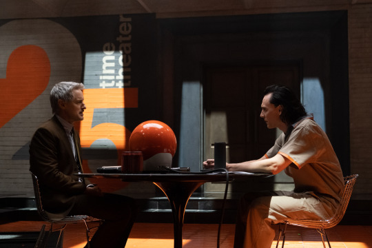
Autumn Durald Arkapaw: Kate [Herron]’s sensibilities led me to get the job in the first place. We shared those sensibilities, around noir films and more moody thrillers, so we were already on the same page as far as lighting and tone. So when it came to the Time Theater, Kasra [Farahani], the production designer, did a fantastic job of creating a space that had a lot of opportunity to feel textural and moody, and create symmetry. I’m big on symmetry. I like to frame center-punched, keeping in mind the architecture of the room, and framing for the architecture and the people at the same time. Stanley Kubrick does that very well. A Clockwork Orange obviously came up in our discussions. Some of our main references were David Fincher’s Zodiac and Terry Gilliam’s Brazil, and the original Blade Runner, in terms of creating spaces that feel strong and weighted, with the people in them placed in a way where the conversation feels very heavy, so you’re paying a lot of attention to the lines, and where your eyes are drawn.
We did some lighting changes above, in the Brutalist ceiling. The lights move, so when we’re cutting back and forth, you see the lights change on the actors. We’re trying to time those movements to the dialogue. The editing was fantastic with that scene. We shot a good amount of coverage, and [series stars Tom Hiddleston as Loki and Owen Wilson as Mobius] play in that space a lot. So we’re trying to always keep it interesting, every time they go back there, changing up the lighting and the projections. That’s probably one of my favorite spaces in the show.
And then the acting, obviously — they’re riffing off each other, and you’re in the room with them and feeling the energy. It was very exciting. That scene was up front in our schedule, so Owen and Tom were getting to know each other in general. We got to watch that happen before our eyes, and it was very comical.
One of the most noticable things about that space is the harsh, rectangular overhead spotlights — Tom Hiddleston starts his interrogation under a spotlight, and when he gets angry, he moves himself back under it. How did you discuss that kind of blocking and framing?
The thing with Tom is, he’s a genius. He’s just a fantastic actor, The amount of things I could say about how amazing he is on set, and character-wise, the list goes on and on. You can introduce marks and let actors know where you’d like them to be for a shot, but that doesn’t necessarily mean that’s where they’ll go. Some actors like to be more freeform. But with Tom, I wouldn’t have to say “Stand under that light.” He just knows, and he’ll play off that because of the space. He walks in, sees how it’s lit, knows our agenda, and uses that in the character.
So there were certain moments where he asked, “Is this what you’re thinking?” or we would have a discussion. But mostly, he uses the environment around him to tell the story as well, and he took in that lighting as part of the character. Actors know how they look in certain types of light. He’s very good at that. So he played with that in that space, for sure.
When we pull back and take in the whole room, the lighting feels punitive — the striped shadows are noir-movie standards, like light coming through blinds, but they also feel like prison bars. Is that something you discussed?
We never talked about prison bars, but in designing that space, Kasra was thinking about what that space was — being arrested, and being judged. It’s a claustrophobic space. Loki is slightly free to communicate and move around, but the walls and ceiling are concrete, there’s this fake light coming in, because obviously, in the TVA, there’s no day or night. You can see the light moving above, but there’s no sun there. It’s just moving at certain moments.
I had an idea, after seeing the latest Blade Runner, where Roger Deakins moves the lights around: Why don’t we have the lights move? It’s not easy to have big tungsten light sources above a ceiling set move like that, because it takes heavy motors. But my gaffer and key grip are amazing, and they figured out a way we could move the lights without causing shadows between each of the sections of lighting. It looks all like it’s moving at the same time. That took a lot of thought, getting those lights to move, and not just creating shafts of light that fade in and out. I think it helped a lot, because it’s very subtle. You’re only going to see it as they’re sitting. You’ll see sometimes the light moves from Owen’s shoulders into his eyes at the right moment, when you get lucky in the edit, and catch it at the right moment. It was great to have the resources to actually do stuff like that.
EPISODE 2: THE ROXXCART VARIANT PURSUIT
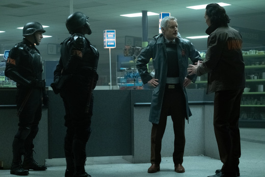
I’m a fan of green. If we’re designing a clinical environment, or a shopping mall, and we’ve got overhead fluorescents, I like to use cool white fluorescents that have kind of a green kick. I’m a big David Fincher fan, and there’s an undertone of green in his setups that I appreciate. So Roxxcart is a bigger shop that is now closed down, and Kasra outfitted it like a big-box Costco-type place? That wasn’t a full set — we went to this big warehouse, and he made it feel like that kind of store.
Above the space where we shot in, there were a bunch of fixtures. We completely removed those and put in our own tubes. They were RGB, and we could fade them and turn them off and on to our liking, flicker them, make them red when we wanted. When they’re cool white, I appreciate that green kick. I did a lookup-table color correction as well, to give it that tone. It’s meant to be clinical, but make you feel like you don’t know what’s at every turn. And we’re keeping lights on or off depending on which way we’re looking. Kate was a big fan of that space being very dark, with pockets of light. Our antagonist is supposed to come out of the darkness as people change identities.
We’re also trying to make that space look bigger than it actually was. We’re creating depth with light. That was a bitch to shoot — we had so much rigging. My team was amazing. If you go into a space like that, a Target or something, you’d think “The lighting here is not that big of a deal. It’s just overheads.” But being able to control all those overheads and make them different colors and flicker them takes a lot of rigging, with a dimmer board and the programming. In the editing afterward, it really does feel like a space that’s a lot bigger than it actually was. The red sequence is one of my favorites, for sure.
The camera is below waist level a lot in that sequence. What are you communicating there?
I always like to shoot low! It’s just how I see things. Some of my favorite films are detective thrillers from the past, Zodiac being one of those. I’ve always just loved shooting below the eyeline. Obviously there are moments in features I’ve shot where I want to be higher, because it’s more emotional or romantic or something. But in this kind of story, where you have these amazing spaces, and you have multiple characters you’re trying to frame, all facing off and being strong, I’m just a bigger fan of seeing a ceiling than a floor. It’s an appreciation I have, as far as it feeling more mysterious. When a character is looking more mysterious, and you’re not trusting them, you’re trying to figure them out, I love that kind of framing. It’s amazing.
EPISODE 3: FIGHTING TO REACH THE LAMENTIS-1 ARK
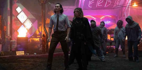
That sequence has a great backstory. I did a lot of prep with Kate. We started prep in Los Angeles before we ended up in Atlanta. We knew that sequence was coming up. but in the script, it just says “Okay, so they end up at Sharoo, and then go on.” The description of that sequence went through an evolution, with the filmmakers discussing things, building the set, and collaborating, so early on, we spitballed about what we thought that could be. Having the support of Marvel and being able to build, and being able to do great stunts, we went bigger.
With the sequence as it evolved, Children of Men was a big reference for us. Kate was really interested in that feeling. She wanted to be with the characters the whole way. We tried to figure out, should the camera be handheld? Should it be Steadicam? We ended up with Steadicam. We looked at some previous oners, because we wanted this sequence to feel like a oner to the audience. Obviously, there are cuts in there, but we seamed certain shots together so the audience wouldn’t feel as though we cut. The intention was to feel like you’re on the run with Loki and Sylvie, racing to the ark, building up tension. You’re there with them as they’re fighting.
My husband’s a DP, and he shot True Detective season 1. That oner in True Detective was something we looked at as well, because it’s just one of those great oners that feels real and has those kinds of textural elements. We did pre-viz, we did rehearsals in the space, prior to shooting there. We went there a couple times and did camera rehearsals. We had an amazing Steadicam operator who I’ve worked with on my last four projects and features. He’s very in tune with my eye, and he’s great with those kind of moves. Kasra understood that we needed certain paths to go down, to help us get from point A to point B, so it feels like a run, it doesn’t feel like people keep entering the same space. Obviously, it’s hard to build really big sets where you can go very far. So he did a great job of knowing what we needed, and then adding stunts, and figuring out how we could feel like we were turning corners whenever we’re moving into different spaces.
How big was the physical space? How much of what we’re seeing there is digital?
Shiroo was very different from Roxxcart. At Roxxcart, we had blue at the end of the aisles, so they look like they’re going on a lot longer than they are. But we traveled to that space. It wasn’t built. Shiroo was built on a backlot. That was a set we had full control over, to build to our liking. Above a certain point, as you’re looking up at the buildings, that’s VFX. But we built the actual buildings up to a certain height, and then beyond that is a digital extension. As far as the depth as well, beyond a certain part of the street, it’s a digital extension. Obviously, the ark is an extension, and we’re using the explosions as cues to do a lot of lighting cues. But it was a very big set, a gorgeous set. It has a lot of texture.
Kasra had the idea of painting a lot of the set in black-light paint, which I’d never seen before, and putting black lights everywhere. Also, we had a bunch of units on top that lit the set for the moon color and those sources, and we had VFX helping us stitch it all together. We had to shoot the sequences and look at the overlays on set to make sure we were creating matchups that would work in the final edit.
For me, that’s a very successful collaboration of in-camera elements — that whole set was real — and having explosions on set along with lighting cues, and then the effects to seam it together and do the extension above and the depth. So everyone really had to play like a good chunk of that. But they’d be effects overall, I think taking what we shot and making it feel like something that big, you know, the buildings are falling. Obviously, we didn’t drop buildings on people. There’s some foam stuff. That was really fun. We shot all that stuff at night.
The camera work in that sequence is some of the most dynamic movement in the series. What was the most difficult part about coordinating that sequence for you?
Rehashing it now, it was the prep. When we were actually there in the space with Tom and Sylvie, running through all of this stuff, it really made sense by that time. We’d been pre-vizing it and reworking it and massaging it for so long that ultimately, once we got on the set and had to follow them with the camera, and the energy was going, and we had the extras there, it all fell together. I think one day, we even wrapped a little early, because we’d just nailed it. When you’re prepping those types of shots, in your mind, you’re always like, “This is gonna be hard, it’s going to be difficult to seam these together, I like perfect headroom.” And you also want it to feel real, and people have to jump and fly and tumble into the frame. But on the day, our execution ended up being pretty good. So that was the most surprising thing to me, because it was kind of a pain in the ass prepping, because there are so many elements. And we’re doing six episodes, so we’re always working, trying to chase the next prep. But it really fell into place nicely.
62 notes
·
View notes
Text
After I went back to sleep this morning, I had a dream I was taking a field trip to France to learn about birds. I was put on the plane next to Owen Wilson, who seem to expect me to say something to him as soon as I sat down. I pulled out my drawing stuff, put up my carry on and sat next to him. (I never get the window seat :( ) So we're waiting to depart and after about thirty minutes he turns to me and finally says "So.... are you not gonna... ask for an autograph or..." I tell him this is my first international flight and that I would assume he wouldn't want to be bothered by me and my anxious prattling. He goes to say he's guilty of the same thing and I introduce myself and tell him about how much I loved Midnight in Paris and how ironic it feels to be going to France and he asks to go through my sketchbook. "I hope you don't mind if I draw you while we fly, I know it'll take some time to get to where we're going." "Just as long as you don't draw me as a sad Rhinoceros with his one sad tear." I remember the flight being really steady and I must have drawn two or three pictures of him. We even traded seats at one point so I could get better lighting and he asked if he could keep the drawing and my stipulation was if he could sign the other one. When we landed, he was escorted off the plane first and before he left he turned and thanked me for keeping his mind off of the flight and for the drawing and I thanked him for letting me sit by the window. When I made it to the hotel I discovered the inscription he left on the drawing which read something like "Hope you discover what you're looking for in France...." After that I attended a seminar with birds and got to hold a Golden Eagle and Jonathan fell asleep and it was just a really nice night for dreams QoQ
10 notes
·
View notes
Text
off the rack #1247
Monday, January 28, 2019
What a classic Canadian winter we're having right now. It was bitterly cold but sunny yesterday so I went for a walk around the boundary of our neighbourhood. I walked out to Bank Street, turned south to go to Alta Vista Drive, turned north-east to go to Heron Road, turned west to go back to Bank Street again and then up Portland Avenue and home. It was very invigorating. More snow is forecast and Ottawa may break its all time record for the amount of snow fallen in January. Thank Thor I don't have to shovel all of it.
What a great week for outstanding art. My eyes couldn't believe the work it was relishing with every comic book that I read. I generally choose the comic books that I want to read based on who writes it. When I flip through a new book that has nice art I will give it a try even though I don't recognise the writer's name. I do get disappointed when a writer I like is drawn by an artist that doesn't appeal to me, but I will continue to read the book. But if the story doesn't appeal to me even with beautiful art, I can't continue to read that comic. Monstress is a good example. I was surprised many times with the art this week. I haven't felt this happy after reading a pile of comic books in a long time.
Man Without Fear #4 - Jed MacKay (writer) Paolo Villanelli (art) Andres Mossa (colours) VC's Clayton Cowles (letters). Wilson Fisk, the Kingpin of Crime and still Mayor of New York City, pays a visit to Matt in the hospital. The biggest point that this issue makes is that Daredevil's secret identity is intact. When the Kingpin became mayor I thought the idea was ludicrous. Now not so much.
Hardcore #2 - Andy Diggle (writer) Alessandro Vitti (art) Adriano Lucas (colours) Thomas Mauer (letters). This issue of an impossible mission is action-packed. Agent Drake is trapped but good. I love this crazy off the wall stuff.
Superior Spider-Man #2 - Christos Gage (writer) Mike Hawthorne (pencils) Wade von Grawbadger with Victor Olazaba (inks) Jordie Bellaire (colours) VC's Clayton Cowles (letters). So why is Terrax terrorizing Earth again? Because he wants to rule the entire planet. Hey, why not. Otto makes a valiant effort to beat the cosmically powered villain but all seems lost until his ex-girlfriend comes to the rescue. I like how Otto uses his brain to augment brawn when he fights bad guys.
The Immortal Hulk #12 - Al Ewing (writer) Joe Bennett (main story pencils) Ruy Jose (main story inks) Eric Nguyen (flashbacks art) Paul Mounts (colours) VC's Cory Petit (letters). We are introduced to another side of the Hulk while he's in Hell. When the Hulk first hit the racks, he was just this big monster being pursued by the army. All he wanted was to be left alone but General Ross kept hounding him. Ever since they added multiple personalities to this character, he's become far more interesting. This story takes a serious look at Satan and what the devil means to mankind. A surprisingly mature theme for a super hero comic book.
Cover #5 - Brian Michael Bendis (writer) David Mack (art) Michael Avon Oeming (Owen art) Zu Orzu (colours) Carlos Mangual (letters). A comic book artists traveling around the world attending comic book conventions is an excellent cover for a spy. It's much more interesting because Max the artist is constantly out of his depth.
The Avante-Guards #1 - Carly Usdin (writer) Noah Hayes (art) Rebecca Nalty (colours) Ed Dukeshire (letters). I liked the art in this when I flipped through it so I pulled it off the rack to read. I'm glad I did. This is a slice-of-life comic book starring Charlene "Charlie" Bravo, a freshman at an arts college. She's a loner who I took a liking to after reading this first issue. Charlie meets perky go-getter Olivia who is trying to form a basketball team to play against other art colleges. I'm going to stick around to see if this southpaw joins the team. I really like the clever title of this book too.
Guardians of the Galaxy #1 - Donny Cates (writer) Geoff Shaw (art) Marte Gracia (colours) VC's Cory Petit (letters). Now see? This here is a new Marvel #1 that's worthy of being bought off the rack. It's a sequel to "Infinity Wars", which didn't hold my attention, and introduces the new team. Seems like the old team broke up during "Infinity Wars". If the new team isn't enough to get you hooked on this 6-issue story, then their first mission will. They have to stop the resurrection of Thanos. Y'see, the Mad Titan was killed in "Infinity Wars". There's guest stars galore and the one on the last page is another reason I want to keep reading. And wait until you see how Groot has changed. I haven't felt this excited after reading a Marvel #1 in some time.
Oliver #1 - Gary Whitta (writer) Darick Robertson (art) Diego Rodriguez (colours) Simon Bowland (letters). It's been a while since we've seen Darick Robertson's art on the racks. His work on "The Boys" made that series a highlight issue after issue. I think his work in this post apocalyptic story based in London, England is some of his best. Oliver is born into this hell hole but he grows up fast. There's a genetic mystery that's got me interested but it's the art that will keep me reading.
Blossoms 666 #1 - Cullen Bunn (writer) Laura Braga (art) Matt Herms (colours) Jack Morelli (letters). This new Archie Horror book should tide you over while you're waiting for the next Sabrina book to hit the racks. I know that the new Blossom twins have been recast as villains and this will show you how dark they've gotten. If the number of the beast isn't a hint, wait until you see what Cheryl is up to on the last page.
Naomi #1 - Brian Michael Bendis & David F. Walker (writers) Jamal Campbell (art) Josh Reed (letters). Have you given up on Riri Williams/Ironheart? I haven't yet, but it's not the same without Brian Michael Bendis writing her adventures. Well, if you're looking for a comic book just as cool and eye-popping gorgeous, please give this new DC/Wonder Comics a look see. It's very difficult to get a brand new character onto the racks that will get me jazzed but Brian has done it here. Superman makes a cameo but this is all about a troubled teen growing up in a small town. I can't wait to find out more about Naomi's mysterious past. Jamal Campbell's pretty art is a huge bonus.
Shazam #2 - Geoff Johns (writer) Marco Santucci (art) Mike Atiyeh (colours) Rob Leigh (letters). The big surprise at the end of the first issue gets a cursory two page mention before we join the Shazam siblings back in the grand central station of the Magiclands. There are seven lands to explore and Funland seems to be safe. Meanwhile, we get our first look at Mr. Mind and as an added bonus, his origin story. The art in this issue is really nice and we are left with another new character on the last page that makes me want to keep reading. King Kid, ruler of Funland: good or evil?
Avengers #13 - Jason Aaron (writer) Andrea Sorrentino (art) Justin Ponsor & Erick Arciniega (colours) VC's Cory Petit (letters). This is the origin story of Fan Fei, the very first Iron Fist from one million years BC. She deserves her own mini series by these guys. Andrea Sorrentino's art impressed me immensely when he did Green Arrow with Jeff Lemire and I think he's gotten better since. His stuff in here reminded me of Frank Quitely. It sure is pretty.
Batman #63 - Tom King (writer) Mikel Janin (art) Jordie Bellaire (colours) Clayton Cowles (letters). Knightmares part 3. Batman is trapped in a dream with Constantine. If the second hand smoke doesn't drive you crazy, the dream will. This look into Batman's psyche reminds me of the time he was captured during the Court of Owls story. It was nice to see Tom explore what might have happened if the Cat and the Bat got married.
Friendly Neighborhood Spider-Man #2 - Tom Taylor (writer) Juann Cabal (art) Nolan Woodard (colours) VC's Travis Lanham (letters). This isn't just friendly, it's amazing and spectacular. I haven't felt this much joy reading a Spider-Man/Peter Parker story since Brian Michael Bendis was writing Miles Morales/Spider-Man stories. The scene with the kids and Johnny Storm was cute. I like how Mayor Fisk's cameo establishes when this story happens. The cherry on top was the last page introducing a new character named The Rumor that made me giggle with glee. I can't wait to read #3.
0 notes
Text
Brianna Reviews: Grey’s Anatomy
Episode 5: Everyday Angel
Directed by: Chandra Wilson
Written by: Julie Wong

Episode Summary:
At the hospital, while Bailey and Jo work together to help solve a mysterious case of stomach pain; Alex learns to work with Link and not let his past with Jo upset him. Jackson returns much to Maggie's surprise, but initially she's less than happy with him until the matchmaker helps her realize the true problem. Levi believes he's mistakenly taken Nico's interactions as come-ons, and Richard teaches Andrew a lesson about being a leader. Outside the hospital, Owen and Amelia spend all day outside Betty's school in attempt to keep her from skipping. Meredith talks Teddy through her animosity towards Owen by helping her understand that Owen is a good guy and deserves to know he's the father of her child.
Ah...the good was short lived.
I really wanted the love to continue. I really did. And it just didn’t hit it with me. Sorry. So this week’s review is going to be brutal. But, this is MY opinion. You’re certainly welcomed to yours...you can comment with a post to your review or leave a comment down below.
But, please...no attacking

Okay, let’s start off like we always do...and I will share things I liked about the episode:
Amelia and Owen.

Why do I get the feeling that in a few short episodes this ship will be ruined? Why?
I absolutely loved them this episode...they were adorable. And they are in my #goals list when it comes to relationships. I love their interactions, and I think they are finally getting to know themselves for real this time and not some different version of themselves, i.e. Amelia’s tumor.
But, we get to see a caring side of Amelia and she finally opens up about her son. Which is a big deal. And for her to be finally comfortable telling Owen that...my heart flutters.
My heart flutters.
Bailey + Jo
The dynamic duo is back at it again...and this time, they’re helping a patient who begged for Meredith Grey. Like...she put her foot in the ground, made the line in the dirt, and she was not ready to see anyone other than the esteemed doctor herself.
Only, Meredith had taken a personal day.
So she was stuck with Bailey and Jo...which aren’t that bad, if you ask me. I mean, Bailey’s a freaking genius and works just as hard, if not more so, and is just as dedicated to the craft as Meredith. And in the end...they were the ones who found out what was ailing her...and, not Meredith Grey. Something Bailey pointed out, herself.
Oh...and I loved that addition Jo made when Bailey was making a case as to why she should choose them. It was just hilarious.
Jackson’s back!
Am I the only one excited that Jackson’s back? Yeah. No? Okay. This has a double-edged sword...so expect something more on this...but I am excited that Jackson’s back.
(And yes...it’s a bit contradictory...you know, you’re just gonna have to wait a minute.)
Jackson’s case.
Well, you’re probably wondering what made Jackson return in the first place? And that my friends is a patient, Rafi, who he stumbled upon in the forest, with Scapular osteochondroma, and he volunteered to help pro bono. He enlisted the help of Karev and Link to help him with the process. When the surgery uncovered another issue that would, in fact, lead them to make it so that the child could live...but not in the way that the child would be happy. But, luckily, Jackson is able to find another way...thanks to Maggie.
And they were able to save Rafi and give him the quality of life he would want.
Link & Alex Confrontation
Luckily, for us, the confrontation between the two doctors didn’t last long. And wasn’t drawn out...as other, certain drama...*cough, cough* Teddy.
In fact, it’s interesting to know...that Alex wasn’t upset with Link because of the relationship he shares with Jo. He wasn’t jealous.
He was upset because he thought/felt that he wasn’t there for Jo when she needed him. Remember Paul? Yeah, that’s what Karev was ultimately upset about.
And after the talk they had, I think Alex was able to move on. And I think their relationship won’t be stone cold anymore.
At least...I hope.
Link on guitar, DeLuca on Guitar, and Webber singing. What more do you want?!
Oh my God. Oh my God. Where the hell has this been all my life!? I mean...my heart fluttered, and I literally paused the show and danced around my living room...I was that happy...that excited about it.
I didn’t know Webber could sing...and I loved it.
I am happy that they chose to end it like this. I think it was a gift, and I really appreciate it. It was beautiful and it made my heart sing.
I wish they would do another musical episode...oh wait:
youtube
No...for the part where I’m not a fan of...and I’m not even going to try to keep it in order, so let’s get started:
Maggie.
Wasn’t long before she’s back in this list, wasn’t it?
There was like a small snippet where I thought she was going to grow a fucking backbone, but it was shortlived. Yeah, you can say I’m still butthurt about Japril, but I just don’t like Jaggie. (Do you know how hard it was for me to write that?)
I think I can actually put into words...why I don’t like about this couple. I mean...other than the fact that this relationship will NEVER match up to Jackson and April and the fact that they’re siblings. Kind of. (Jackson’s mother married Maggie’s biological dad, whom she has recognized as such.)
Especially since the last episode, she was literally in the “what I love” section and you know who was gone.
I think she turns to mush whenever Jackson is around. I think she turns into a little school girl and she can’t focus, everything she does....is literally centered around Jackson and her relationship with him. Why isn’t it working? Why can’t he talk to me? Why can’t he be more open?
Blah, blah, blah.
I’m not saying that she can’t be hurt or asking these questions, but again... the majority of the time, it’s occurring during work. A place of professionalism (another reason why I liked Alex and Link, Alex was able to put aside his dislike of Link to help save Rafi’s life.)
I don’t know. My observations could be wrong. But, that’s the impression I got.
Meredith Grey
Oh my God...really!?
I love Meredith Grey....so, so much...and you have to realize how painful it was to put this in this part of the list. But, Meredith...was shady as f••• in this episode. I mean...she stalked Teddy, brought her into her house, to talk about Owen’s baby.
I have a small question: Were Teddy and Meredith close when Teddy was on the series as a series regular? Did they have some sort of connection? Were they friends?
Because this feels so out of character. I know Meredith is trying to be the “good guy” and trying to be helpful...on all sides.
But, it didn’t feel like it. I have, like, zero impression that they stayed in touch over the years like she has done with Cristina, so I don’t get the “I need to help her” thing.
And what hurts the most, is the fact that she is literally doing this behind her sister’s back. The one who is going to get hurt the most by this...and she has no respect for her, no human decency to try to warn her.
She doesn’t treat this newfound relationship seriously, and doesn’t inform Teddy that “Hey, Amelia’s seriously seeing Owen.” I know she can’t really speak to her about Amelia’s true feelings, but on the same side as Meredith telling Amelia, she should tell Teddy what’s going on. Because they’re kinda...(if not officially) back together.
I had another two points, but one of them was kind of meaningless, and the other is a rant about yet another love triangle. And you know, I don’t want to say something prematurely, and not see the full picture, so I’m going to hold off on that...until it unfurls.
All in all, if we look back from the previous episode, I’m slightly bummed. It took one step forward, and then two steps back this episode. I didn’t get the old, warm, and cozy feelings I had from previous episodes.
And it just wasn’t my favorites. It wasn’t something I would watch again and again with love.
I’m going to give this episode a ....
B-
The things I loved about the episode, outweigh the things I don’t. And it wasn’t a horrible episode, just...very disappointing. I hope it goes back to the type of episode that aired a few weeks back...the episode that managed to get an “A” from me.
But, who knows. The season is just starting, it can still turn around. I hope.
0 notes