#this is so cool to look at. i love redrawing my old art to see what it would look like in my current style
Explore tagged Tumblr posts
Text
Same drawing, 8 years apart!
~2016

2019

2024

#this is so cool to look at. i love redrawing my old art to see what it would look like in my current style#the progress !! i've come a long way with my art#i think around 2015-2016 i started to try to learn to draw ponies. that's when i started making ocs and becoming more of an artist#i could go on about how cool i find this but i'll spare the ramblings lol#i never did outgrow my pony phase though LOL#mlp:fim#my little pony#applejack#pinkie pie#twilight sparkle#rarity#fluttershy#rainbow dash#omega's art tag
25 notes
·
View notes
Text

my page for @dgm20thproject !! i really recommend checking out the entire project because there's just so much amazing art and so much love for d gray-man from all the contributors! thank you to the mods for organizing this & happy 20th to this amazing series
#d gray man#allen walker#5hehzada art#very very very different from what i usually draw but this was a very fun challenge#really cannot overstate how neat the zine is...its a free digital zine so there's no excuse not to check it out! super cool seeing all the#different artstyles and how each artist chose to interpret their redraw page its so cool#mods were all lovely and so nice really had a good experience with this#also i've been meaning to draw dgm fanart (please do not look at my old fanart) and especially since i reread from the start recently so i#will do that soon....
20 notes
·
View notes
Text


i drew jiwon again after so long and im really happy about her design right now heheh
#oc#art#my oc#original character#illustration#character illustration#jiwon#i love her look right now a lot too#its like a redraw of an old watercolour painting i did back in 2019#its soooooo fun seeing the new art i make#so cool#i hope u guys like her too !!!
8 notes
·
View notes
Text
How to Create Paper Cut-Out Reliefs: Tips and Techniques for Beginners
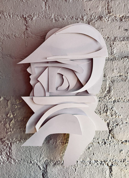
Back again with another lil' series of 2D wall relief paper cut-out forms. Both of the pieces below follow the same process and technique. Im really happy with the process and outcomes. Im working on animating them as we speak. I'll add them to this post later. My paintings inspire my drawings, and my drawings are inspired by those same forms found in my paintings. It makes sense that every so often I want to make those forms "pop out" and off the surface of a flat plane. Alas, it all starts with a quick sketch. See below, just a series of light loose free flowing lines take the lead, forward ->
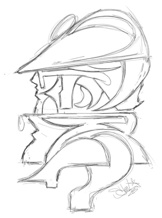
Here we have a dude posing for a profile style portrait. Most likely, this is inspired by the NYC B-Boys from the years 1983 - 87ish. Either way, it's nostalgia for me. Once the sketch feels good, I'll break out the paper and x-acto knife. I keep telling myself that one day Ill work with another material other than paper for these works, perhaps wood or metal.. It will happen, I can foresee it for sure, hang in there. Im using a white bristol paper for the cut outs, I believe it is the vellum type and not the glossy, but either or will work just fine. I love to cut paper and the whole medium of paper art in general.
Paper cut-outs, also known as paper cutting or Kirigami, is a traditional art form that involves cutting shapes and designs out of paper. The history of paper cutting can be traced back to ancient China and Japan, where it was practiced as a folk art. The Chinese and Japanese would create intricate designs, often featuring animals, plants, and mythical creatures, and use them as decorations for festivals and special occasions. I always loved it and have felt inspired by these pieces.
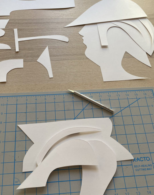
Using the sketch above, I apply the "map" of the shapes and forms that I see. Sometimes I redraw those forms on the paper that I will cut out, and sometimes I just "draw" with the x-acto knife to recreate the forms. Sometimes, it's a combination of both of those techniques. There is also a series of "out-take / byproduct" cut outs that do not make the final piece, those can be saved and used for the next piece, obviously!
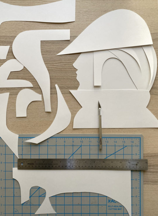
I layer the forms on top of each other to compose the arrangement as a whole, its fun to watch it all come together, in the next phase, you will need some kind of durable tape or you can make little paper forms that can be pasted to both sides of the forms as they stack, this will create the gauge and depth of the piece once it is placed onto the wall.
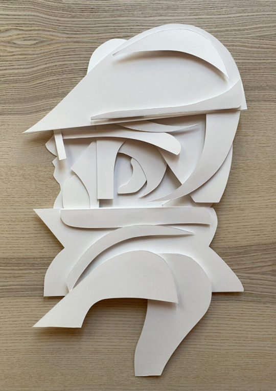
This is the final composition above, I love it! I used a roll of duct tape to make small cylinder forms that connect the pieces together, the piece as a whole comes "off of the surface of the wall" by about 1.5 - 2" inches - you can play with this a bit but keep in mind, the tape makes the piece heavier and it will want to comply with gravity :)

I hung the piece (also temporarily adhered via the same duct tape) for the photoshoot and to also get a good look at how it will function on the wall. I have an old painted fire place in my studio that is a great surface for hanging things, I love the contrast of textures between the bricks and the paper, as you know, the shadows will be super cool to see too.
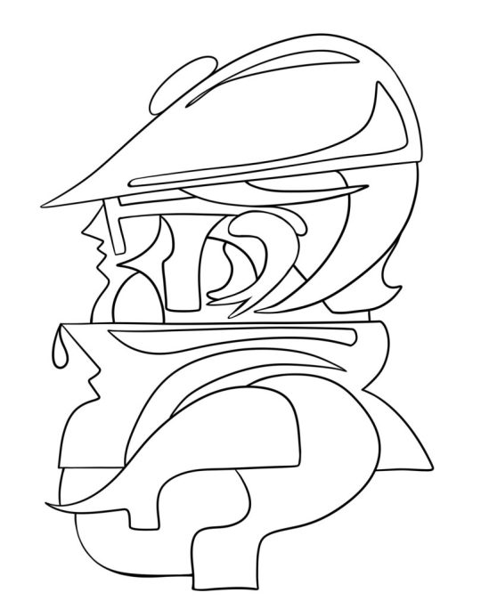
Once I had the whole piece constructed I took a few pictures of it. I immediately wanted a clean vector line drawing of the whole character. I brought the photo into adobe Fresco and used a vector brush to draw this lovely variation. This is how my brain works, I switch paths because I know they are really pipelines to the "next thing" that I will push this to, so forward we go.
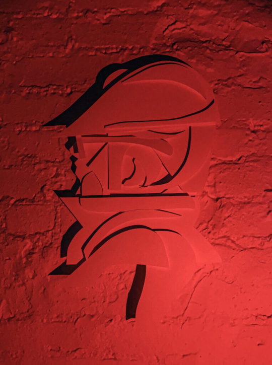
Then, it was light source and photo shoot time. Im not really happy with these picture as traditional "photographs" as I know I can do a much better job, but, as a series of "sketches" for a planned photo shoot, these will really help to make those plans a reality. I love neon colored lights. I have a bunch of them from various places and spaces that I found on the internet. Amazon has a great selection of flashlights with various colored light options. Get a few and play around with how the light can effect your work and the shadows that it creates. This is where the depth and gauge of your pieces play a role. The photos below are also a part of the same session, which all took place over a few days.
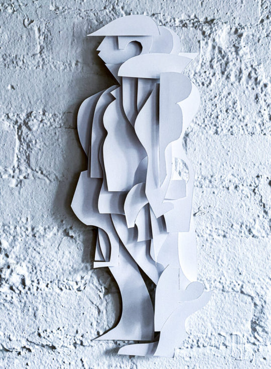
Here is another variation with a different character.. What do you think? Shall I make more?
#art#ryan seslow#ryanseslow#paper cut out#paper#paper art#2D design#2D#portrait#character design#graffiti#bboy#nyc#sculpture#paper sculpture
237 notes
·
View notes
Text
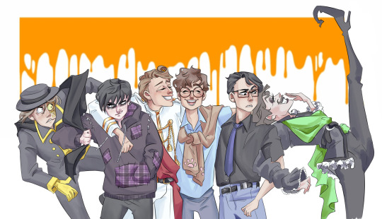
This thing had been rotting in my files for a year (minus three weeks but that's basically a year). It was a redraw of one of my first ever pieces for this fandom, and I still find it quite okay if a little stiff in places, so I thought I might as well share it since I don't draw that much anymore.
And then I had second thoughts, which obviously led to me posting it anyway, as you can see, but I realized I've almost made it a point not to draw anything related to Sasi anymore. As in at all. I can't, and I don't want to, and even sharing old art feels a bit 'meh'. It's too directly linked to my long going art block.
What I mean by that is that if I took all the followers I have out there and asked them what they know me or initially followed me for, you might have a fair amount of Lis 2 and the occasional Desert Bluffs afficionados, but you'd get an overwhelming majority of Sanders Sides. Sanders Sides fashion posts even. I was by no means famous for it or anything, but at my small artist scale, it was the biggest success I had.
And it makes it much harder to go back to it at all now. One, because I don't give a damn about the show anymore. Two, because I haven't been properly obsessing over anything in a while (there was a series early this year but given the actual emotional distress I get thinking about it I'm ruling it out). I haven't had real engagement from my own brain, nor real engagement from a broad audience -which makes sense, I'm not posting for anything that will reach a broad audience. But it takes its toll regardless.
Even when I finally finished writing a long fic, I couldn't help but feel 'all this for what ? Ten people or so and two hundreds have dropped it ?'. Which is a bad way to think about stuff you write for your own enjoyment but, you know, the brain gets happy with external validation even if you pretend really hard you don't care.
And so it feels tempting to go back to the golden goose just the time to get the creative juice pumping back, and I try, and I always end up frustrated and angry and feeling even less like making art that before. I'm not having fun with Sasi. Like an old friend you have nothing to say to and yet you have so much to say otherwise, so you get a bit frustrated, you know ? Not sure I'm making much sense, but that's how it feels. I want to have something like that again, but it won't be with Sanders Sides, and I somehow just want if off my radar.
It was left hanging, then lost its spark, and then I stopped caring altogether and I most likely won't even watch the finale when it does come out. I'm over it. I wish I wasn't though, because it does feel like the artistic spark won't come back all on its own this time, and the buzzing community made it so much easier to bounce back and do shit when your brain got wired all wrong.
It sounds like I'm just bawling after love and likes and stuff, and I guess that's part of it, in a way ? Like I'm in no place to do things for myself, and seeing the one thing I used to use to get back in the flow giving me a bored sense of dread doesn't feel too great.
Yet this drawing is still good ! I find it good ! I don't remember everything, but I can tell from the looks of it that I spent a while on it ! It's nice ! I should celebrate that. So I'm sharing it. I think it will be the last piece of Sasi I ever share, though. I'm not watching the finale when it comes out. I don't care about it. I'll just keep doodling my OCs and characters from cool books every once in a while. I'll write little things.
I just really, really need to stop trying to go back to it when it's clearly not working and not even for good reasons. It was a fun ride though ! So yeah. Basically. A whole ass rant for a one year old piece of art. I'm in my bi-annual depresso mood, nothing too surprising there.
#I don't know how to put it into smart words really#it's just. yeah it's like that.#there's a lack of sharing for me I guess#bouncing off people's ideas and all#I consume quite a bit still#but it's not the same#Sasi was my golden age in that matter and it's been years#end result I lowkey hate it now#sanders sides#you can reblog it btw the rant isn't the most personal thing#it's more of a thing about sharing and art and community and engagement I guess
145 notes
·
View notes
Text
Maybe it was the friends we made along the way!
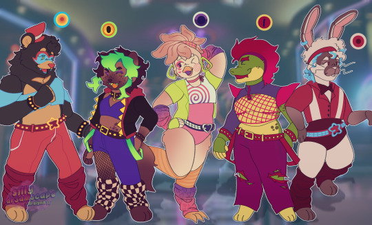
My security breach cast re-imagined when we first got the posters and merch leaks!!! I changed them into ocs because after seeing their in game designs I fell in love <33333
Another reason why Vanny is my fave is because I don't have to design her clothes /j
Extras and ramblings under the cut :
Zoomed in because I drew them on the same canvas like a goober :
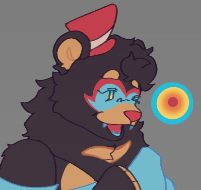
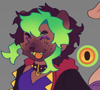
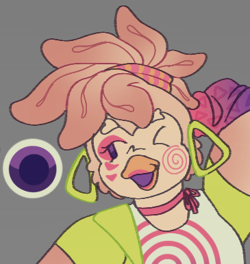
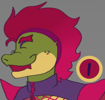
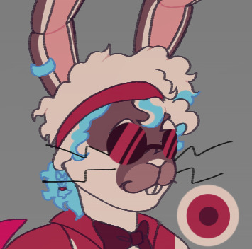
Many reasons why I chose to make the way it is are cause hehehehe
-I didn't like Roxy at first because off that funko leak being a reused model of Foxy. So I made her a hyena recolor using his model because I think they're cool, yet I still kept the fact she's the shortest because of Foxy in fnaf 1 being the shortest!!! And it did sorta happen with her being his replacement 😭She has short hair because I think one of her main appeals would be she would change up her hair every other week.
-Freddy is a moon bear because I miss Lefty. Also cuz I thought Fazbear Ent developed enough technology so that they could change colors during the night/dark like in the posters making them blacklight/neon. Also once again I miss Lefty and Also Nightmare. He had blue eyes freaky like that because I think FazEnt was developing new technologies to recognize guests by having their main stars test them out. And it did happen in the game so yay!!!
-I genuinely didn't think Bonnie would show up because off the leaks but at the time everyone designed their own version off him and so did I!!! I made him white and brown as a homage to Vannys help wanted mask. The blue streaks in his hair also relates to my Vanessa design. Reasons for this is because with how advanced the AI it was to trick them into thinking they were eachother friends. Why because the heartbreak would've been catastrophic.
-Chica didn't change much but I added brown because I love the color brown it is my top 1 color with purple following behind. Also because I love gradients I fucking love gradients you bet your ass if I add gradients I could <333 She has feather hair like that because off Big Bird I saw in a short fnaf sesame street horror yt video and that scared and gave me nightmares because of this one scene of a lady giving birth to his kid??? Idk it scared me alot. She's my favorite tho <3333
-Monty didn't change except he had circular glasses because I wanted him to match with Roxy as the newest additions to the Fazbear brand!!! Also man I wish one of them was a drummer but I couldn't decide between if Roxy or Monty would get it. I also didn't know Roxanne would be racing and gave her rock climbing. Reasons cause imagining her chasing you being able to climb walls would be scary. My only wish Is that I made his snout longer I want you to be able to hold it like a weapon
-They all have eyelashes because I think that is epic!!!
-Freddy is the tallest. Bonnie and Chica are the same height and Roxanne is the shortest
Might redraw them in my oc world version (if anyone would be interested it's basically also a robot story with my old fnaf oc's now turned rivals to Fazbear Entertainment) and not simplified but my other wips need me they are calling for me they are telling me to finish them and I must!!! Probably
And here's my older art after we got to see the game and the designs are wack oughhh :
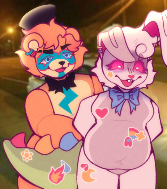
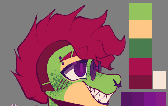

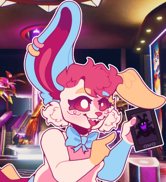
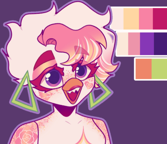
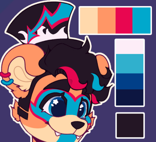
They would've fought with my pink yellow blue Vanny design!!! Which is the only one I redesigned because I love Vanny to much... You can see her pre-design here and oughh Pink Vanny <3333
-If you look closely Vanny has a Dino looking tail!!! And that's because I thought hey imagine each time we defeated an animatronic she'd sew a piece off their body onto her suit! So when we killed Monty she'd scavenged and get his tail!!! With Chica she got her chicken feet!! And with Roxanne she gets her teeth!!!
-Why because I associate her with Pinkamena cupcakes so much. Also to add onto my previous statement with Bonnie looking like her old mask. She changed her suit in the final act to solidify herself as the bad guy (final boss) who had been using the animatronics for his own gain.
-Man I never draw Chica with her head bow now that I think abt it same with Vanny's whiskers god what was I thinking!!!
Also sorry they're oddly cropped I watermark my stuff to remember what year I made them in and my old username is bad 💀
#fnaf#five nights at freddy's#fnaf security breach#fnaf sb#fnaf fanart#fnaf au#glamrock freddy#glamrock bonnie#glamrock chica#roxanne wolf#montgomery gator#my art#the seals sanctum
148 notes
·
View notes
Text
Creative Challenge Winners!!
Honorable mentions!
@fancypersonaskeletonturtle with Pain Inhibitors Jay
I LOVED the scientific reasoning behind your headcanon. I ate it right up. I see this headcanon a lot around the fandom but it never gets old. And your art is SO amazing. Jay looks super super cool.
@officercooks with colored eyes Jay
I've actually been so obsessed with this idea that I altered my Jay headcanonned design a little bit to include a yellow eye T-T. Seriously this is GENIUS and the way you drew the lightning grrr i ate it right up.
@ammo0648 with merge Jay
Dude I LOVE this idea. It makes so much sense considering what happens in DR. And again, I eat the scientific reasoning right up you killed it. Also the scars you drew on his back mhhhhhhh I love you and i love the art.
@lightning-chicken with the only submitted fanfiction!
I LOVED READING THIS!! I love the connection with Jay's mom, like, I've always thought about how his powers might be connected to her. You explored lightning in such a cool area that it made Jay so cool to me. Your writing is also just gorgeous in general.
And there is some art and a comic from a deactivated account, but it included Jay creating objects out of his lightning and that is amazing.
NOW FOR THE TOP THREE!!!
In THIRD PLACE!
@taddymason's lightning striking art

Your art in general makes me sob but THIS?? The way you draw the lightning?? And hsi hands glowing?? i love this. And I read the fic you wrote and this makes so much sense to me it could even be canon.
In SECOND PLACE
@vivilingriphyn's snake Jay

I. Ate. This. Up. You really cooked a whole meal. This is such a unique idea and I may redraw it in some way just because of how amazing this is. The snake idea KILLS. I love this thought that he can influence the shape/personality of the lightning he uses. And youur art is so beautiful.
AND FINALLY
DRUMROOLLLLLLL
FIRST PLACE GOES TO!!!
@adeleba's anxious Jay!

This idea is exactly what I was going for when I asked for this challenge. I love thinking about how Jay's powers affect his own mind and through that his own relationships. How each of the ninja deal with his powers and how his powers react to his own emotions is DELICIOUS. You portrayed it so perfectly in your art. I love you so much Adie.
AND THATS A WRAP!!! Check in for your prizes in DMs, details about what prizes you got found here. Thank you for participating! I love you all!!!
#and thats a wrap#ninjago#ninjago thoughts#ninjago jay#ninjago fanart#jay walker#ninjago challenge#shark300challenge
162 notes
·
View notes
Text

Some TBHK Fan art here!
My favourite characters are Kou and Mitsuba, but I made some Mitsuba Fan art a while ago so wanted to redraw him. For a while I’ve been a bit stumped on how I want to draw backgrounds. They don’t really look right to me a lot of the time.
Spoilers for newest arc, New World arc: The newest chapters are so cool! I’m rlly ecxited for the next few! Like, what happened to Hanako and Tsukasa? It seems like Tsukasa still died in this timeline, just way younger. The way Hanako is talking, I’m wondering if he made a deal with the entity under their house cuz he’s still alive, so he must have found a way to overcome the illness he had. Not to mention he lives in his old house. So many questions and so little answers!
Also I’m rlly happy to see Yashiro and Kou together again! I love their dynamic.
#art#artists on tumblr#digital art#artwork#my art#original character#Drawing#digital fanart#digital drawing#fan art#anime fanart#tbhk fanart#fanart#fandom#toilet bound hanako kun#character art#Toilet bound Hanako-kun#TBHK#tbhk#tbhk manga#tbhk mitsuba#tbhk spoilers#mitsuba sousuke#sousuke mitsuba#jshk fanart#JSHK#jshk#jshk spoilers#New world arc
20 notes
·
View notes
Text
Ninjago Remastered Designs!

THEY'RE DONE! After months of work!!! They are DOOOOOOOOOOONE. WOOOOOOOOOOO! Lol! Welp, these are my Ninjago designs! Basically, this is my take on the Ninja if they were in a 2d animated cartoon! And yes! I will be drawing more characters. Tumblr butchered the quality, so close ups and design notes are below the cut. They're pretty detailed, so I highly recommend checking them out. Feel free to ask questions about the designs! ⬇️⬇️⬇️ - ✒️🐉

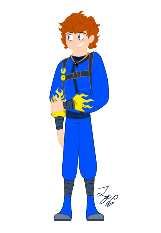


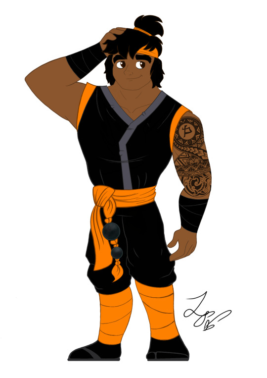
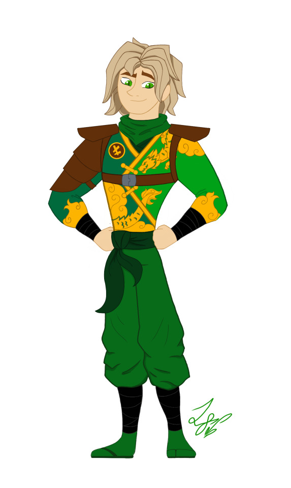
When designing these outfits, I tried to take inspiration from the ones in the show. And in terms of art style, drew inspiration from early 2000s cartoons, (Action Adventure ones specifically,) Anime inspired shows, and even a hint of traditional Disney animation. And while I designed them with a 2d cartoon in mind, most of the designs would most likely have to be simplified for them to be used in animation. So let's get started!
Kai: Kai was a pretty fun to work with. I actually didn't plan on giving him a sleeveless outfit. But it happened! And I like it! If you'll notice, the flame pattern on his vest mirrors the pattern on his sister Nya's outfit. I thought that would be a cool detail to include. It was inspired by their March of The Oni outfits. I also made sure to include his scar and bandaid. And gave him reddish brown eyes to signify his elemental power. Him and sister I imagine being Brazilian/Taiwanese. So I hope I captured their ethnicity properly. I'm pretty happy with this design. Especially his hair, which was hard to replicate.
Jay: Jay was a hard one for sure. I wasn't too sure how to vamp up his outfit. So I started by giving him some lightning patterns on his Gi. (At least I think that's what it's called?) And I decided to make it look a little baggy and soft. It just seemed to suit him. I tried something a little more form fitting and didn't look right. Also! A fun detail I included was his half the Yin Yang pendent around his neck! And of course Nya has her half. I imagine him having Irish ancestry, so I gave him pale, freckled skin. And gorgeous curly red hair. (As a fellow red head, I'm very proud.) Overall, I think he turned out pretty adorable. And his face is spot on.
Nya: Nya I pretty much got right on the first try! I just had a really clear vision of her in my head. I gave her a grey outfit with bright, vibrant blue details. The pattern on her Gi is inspired by Koi Scales. And she has her half of the Yin Yang pendent around her neck. I really like this one, because while it is simple, it's beautiful. And I think it reflects her element nicely. The only thing I missed was to give her a symbol like the rest. But overall, I love it! One more thing is that I wanted to give her and Pixal different hair. So when I finally release my Pixal design, you'll see that while they both have ponytails, I gave them different cut and styled ones. Should be neat!
Zane: Zane was the first one of the Ninjas I redesigned! I love how he turned out. I tried to give him a splintered ice effect on his outfit inspired by his Core minifigure and gave him his faithful falcon companion. Falcon has his old greyish purple feathers, but blue icy eyes to match his owner. I also wanted to give Zane flowing sleeves, that would look very majestic waving about in a blizzard wind. He is also incredibly tall. Taller than Cole even! I was inspired by the giant humanoid robots I'd seen in movies. In his cloaking disguise, I imagine him looking German. With blond hair, blue eyes, and light skin. I also like to think Dr Julian was German. (Was this influenced by my German ancestry? Who knows?)
Cole: You would not believe how many times I had to redraw this man's face. Haha! I just could find that sweet spot! That face that perfectly encapsulated his strong, but gentle personality. But I think I did it! His outfit is based on his Oni Trilogy Gi, with orange detailing. And he has his Island ponytail and bandana. I absolutely loved that hair style on him. So I had to use it! And if you'll notice, he has a beautiful tattoo on his right arm, with his symbol in the center. I imagine him being half Maori, from his mother's side. And the tattoo was inspired by Maori tattoos I saw pictures of. I'm not too sure how accurate those images were. But hopefully I hit the mark.
Lloyd: Finally! Our green Ninja Lloyd! His outfit was inspired by two things. Dragons, and his outfit from the Secrets of Forbidden Spinjitsu seasons. I gave him a beautiful golden dragon and cloud pattern on his clothes, a leather arm guard, and shoulder pads. If you look closer, you'll also see he has cat-like dragon eyes which pays homage to his dragon and Oni heritage. I like to think that depending on his emotions, his eyes will go from slits, to big and wide. So they are good indicators for his mood. I also imagine him being Japanese. But his powers give him his classic blond hair and green eyes. I'm very happy with this design. His hair, eyes, and face all look exactly how I see him in my head.
Well, that's all. I hope you enjoyed these designs and notes! I assure you, you will see more of the them.
Bye! - ✒️🐉
#ninjago#lego ninjago#ninjago lego#ninjago fanart#ninjago lloyd#ninjago jay#ninjago cole#ninjago au#nya smith#lloyd garmadon#lloyd ninjago#lloyd montgomery garmadon#jay ninjago#jay walker#nya ninjago#ninjago nya#cole brookestone#cole ninjago#cole brookstone#ninjago kai#kai jiang#kai ninjago#kai smith#zane ninjago#zane julien#ninjago zane#My art#ink dragon#Ninjago Remastered
78 notes
·
View notes
Text
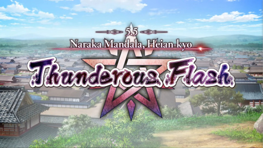
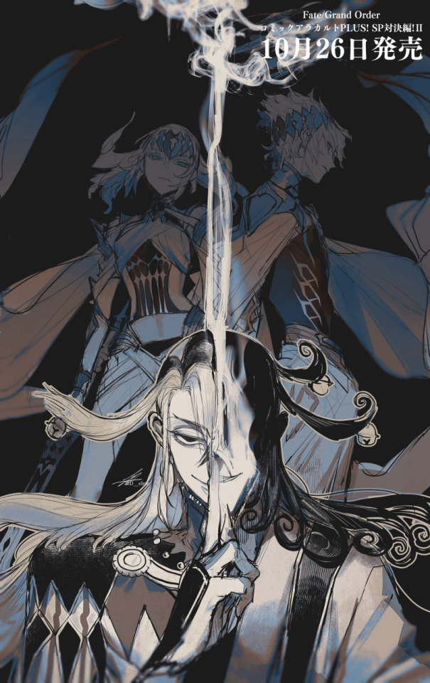
【FGO】 Beautiful Carnivore, the All-Ridiculing 💚🐈⬛
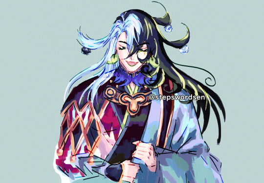

Beautiful Carnivore, the All-Ridiculing
一切嘲弄 美しき肉食獣
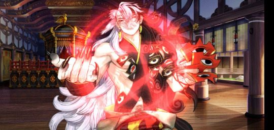
Original + Version with Gradient Maps
Quick Douman scribble 💚 Them!!! My evil NB GNC jester icon~ God eater clown! I love them so much!!! He is beauty, he is grace 💖✨
Douman coloured doodle WIP I did back in January 2023.
It's old, so I'd want to redraw it to make it consistent with my usual style, but I figured I'd post it for now since Idk when I'll get the chance to redraw it.
FGO popped off when they created an emotionally nuanced complex complicated jester who deeply loves the human they're obsessed with 💖✨ They are simply PEAK
Douman and LimGuda are EVERYTHING to me I've dedicated my soul to them since December 2020!!! 💚🧡🐈⬛🍊
"Beautiful Carnivore, the All-Ridiculing" is such a badass title for them oh my goddd I'm obsessed
I take lots of breaks from FGO but I'm always here to see my faves 👁️ Like awakening the slumbering beast...
Hasendow (Showichi Furumi), Douman's character artist is really good at harmonizing colours and working with green and yellow tones
I tend to use cooler tones and saturate pink/red hues in my arts (though it depends on the art for me). It also has nice contrast against their reds and greens! 💖
I already loved the colours of the OG that I chose but the others are so cool to see. It's fun to see the way low opacity gradient maps shift the colours in subtle ways WHOAAA
It's super messy but it's honestly one of my fave doodles in terms of colours 💗 I'm a big fan of the colours too hehe ✨
I used to airbrush the skin colour over the hair (which is a popular stylistic choice), but I don't do it anymore cuz I think my saturated art style looks better with higher contrast.
I think that Douman doodle has some of the best colour work I've done
It's a rough draft WIP so it's pretty messy, but I love the way the colours harmonize on this one 🤭 💗 I should do colour drafts more often…
I think it's cool to use the same green in their earrings and eyeliner, in their hair as well hehe
When I do these rough colour drafts, it's like if I took a bucket of paint and splashed it on the wall. Helps me get a sense of colours!
I love picking colours, and I think it'd be interesting to take this kind of painting style further whenever I get the chance to refine it more 💞
I definitely want to lean into this messy painting style. I wanna get stronger at the painterly style!
Because of Douman and Kuroha (KagePro), I've always wanted to draw mild horror pieces 🥰💞 It'd be super fun to draw Douman and LimGuda arts with mild artistic horror vibes in the future.
My cute kitty is so versatile. They can be cute silly and be peak horror all at once!
I need to get stronger at drawing them. Douman's design is the most detailed and complicated out of my faves, but I wanna draw LOTS of LimGuda... AHHH...
Check under the cut for the other versions (versions with gradient maps)
Other Versions


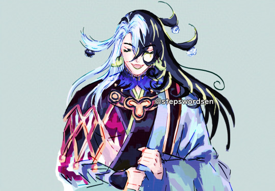

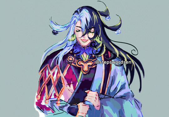

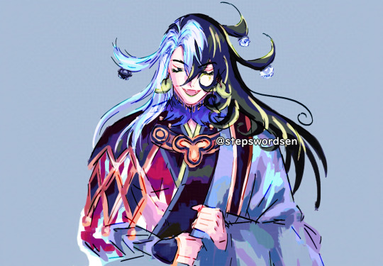
I think for some of these, I'd have to fix them manually cuz gradient maps and colour adjustment filters can throw the contrast out of wack so I'd paint over stuff later
Here's the rest of the batch of colour tests I did!
I did 18 in total but I only posted 10
Rambles
I've been obsessed with Ashiya Douman, the evil clown cat since December 2020. Didn't even take me a week to be obsessed. It took 5 days. Sen's Limbo December Descent 🙌
LimGuda is my comfort HC NBLNB ship 💚🧡 They've been one of my top fave ships since December 2020. The spice of a gay evil clown demon who hates humanity, with a karmic relationship of love/hate with the human they're in love with, is unparalleled.
I can’t get over how much I adore Douman. They’re simply the best. This chaos clown is a forever fave of mine~ I love how in-depth and nuanced this hot evil jester onmyouji is. The emotional nuance and complexity of this chara…
“WANTS TO WATCH THEM FALL TO HELL BUT UNWITTINGLY FALLS IN LOVE WITH THEM.” I’M DEVASTATED ABOUT THEM
The amount of detail that went into Douman's character and design is insane to me… Hasendow AKA Showichi Furumi (Douman's character artist/illustrator) has such a huge brain 🤯
My LimGuda collection is my pride and joy 🤭
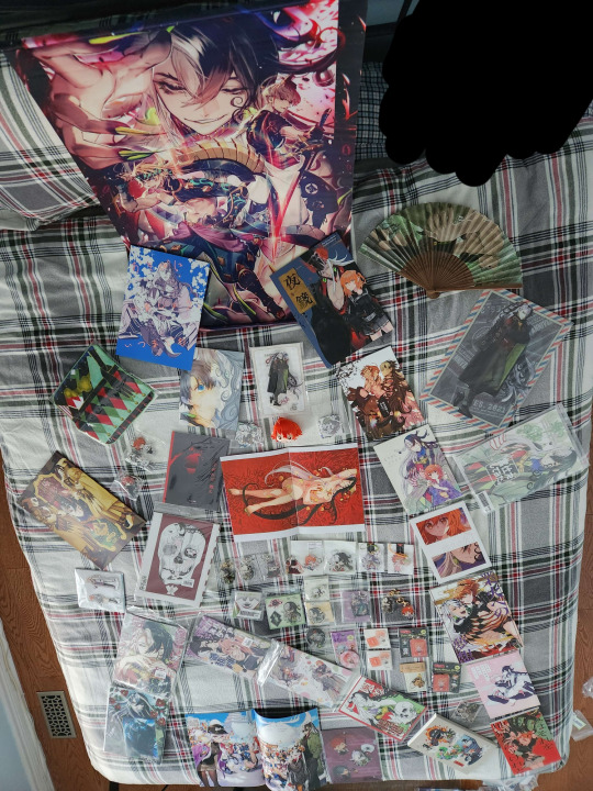

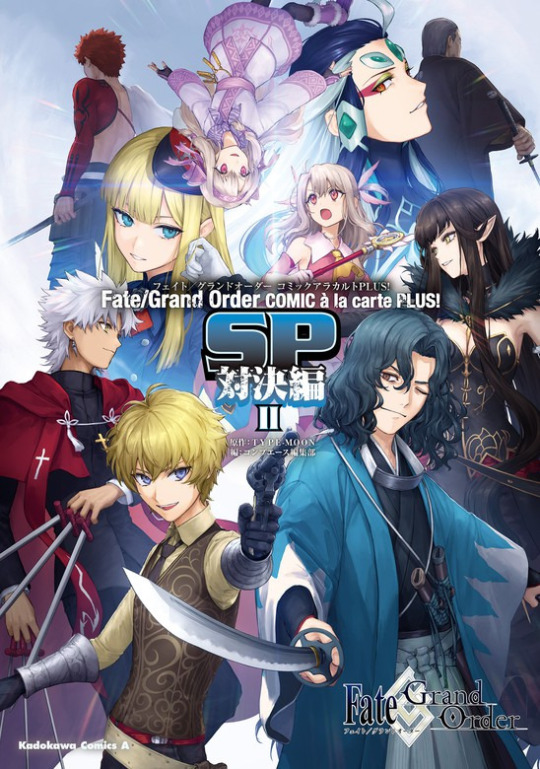
My Douman/LimGuda merch pile pentagram from November 2022 LMAO. This isn't even all of it
(I tried to mimic the pentagram as much as possible. I scribbled out where I was standing on the bed)
When Douman first released on FGO NA in November 2022, I made a Douman pentagram filled with my Douman and LimGuda merch and fan-merch.
I did this back in 2022, so I have even MORE now to add to the Douman collection, so there's no way all of it is gonna fit on my bed
Douman merch summoning circle catalyst! We did summon an evil demon into my Chaldea~ Welcome home! You are now reunited with your BELOVED 🫶💚🧡
The clean up's gonna be hell with how detailed Douman's design is, but I love working with their colours! I wanna draw LimGuda in matching green and red Áo tấc so bad!!! Matching couple clothes~ 💘💞
Douman loves them with curses… LIKE A CAT TIPPING OVER VASES CUZ THEY WANT TO BE PAID ATTENTION TO. The whole “Limbo gets defeated/is overwhelmed by the power of feelies and their S/O’s Candid Sincerity" trope I love to see in their ship works that I wanna draw eventually btw… I wanna draw them lots!!!
Cinna said “Douman just reminds me of that ‘cat reacts to separation anxiety by trying to maul their owner’ thing I saw one time” LMAO
Ashiya Douman vs. Dioscuri Anthology Comic by AU
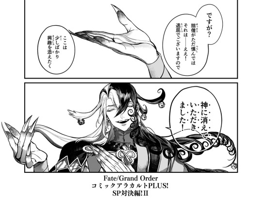
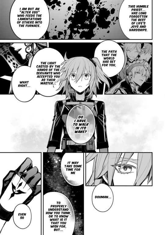
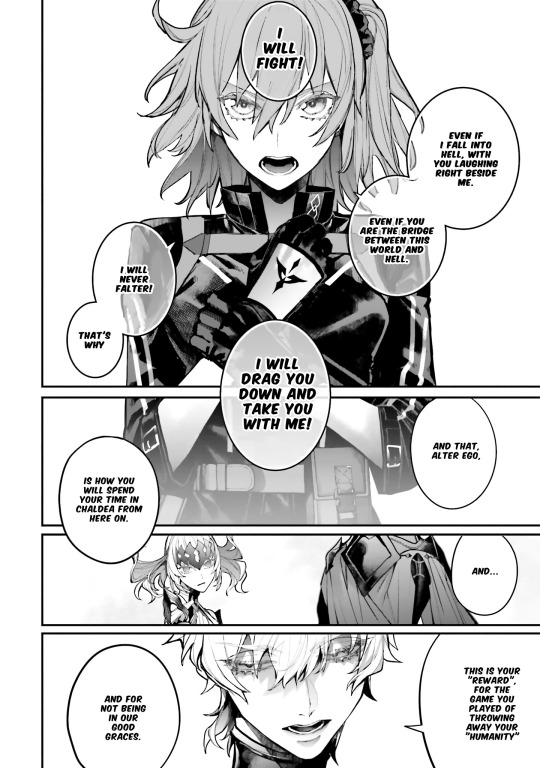

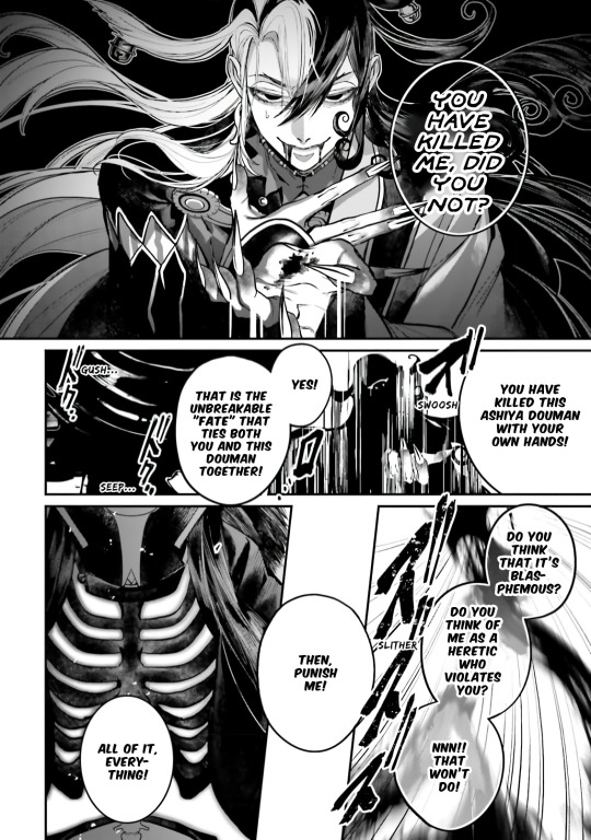
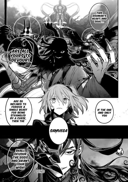
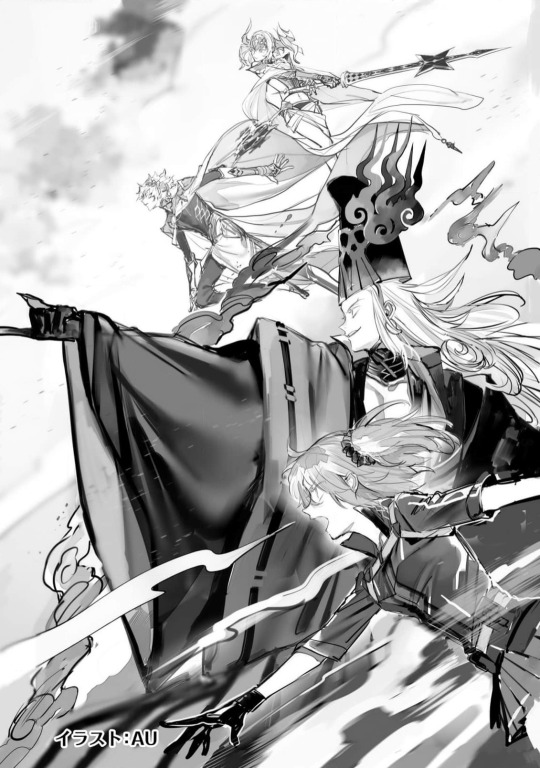
Source: (X)
(Context for my non-FGO mutuals following me)
Read the full 30+ pages above if you wanna check it out~
Reminds me of when I was rereading the Ashiya Douman vs. Dioscuri Anthology comic by AU (@/delete_au), that has huge amounts of LimGuda (Douman/Ritsuka) crumbs. DRIVES ME CRAZY...
AU (@/delete_au) is a popular Fate/Grand Order (FGO or Fate/GO) fan artist that's been commissioned to draw official works for Fate (including official merch)
AU’s art style is so intricately detailed and gorgeous. The perspectives, inking, and shading are so gorgeous. Huge art goals for me.
The Ashiya Douman vs. Dioscuri anthology comic has such beautiful art by AU (@/delete_au)
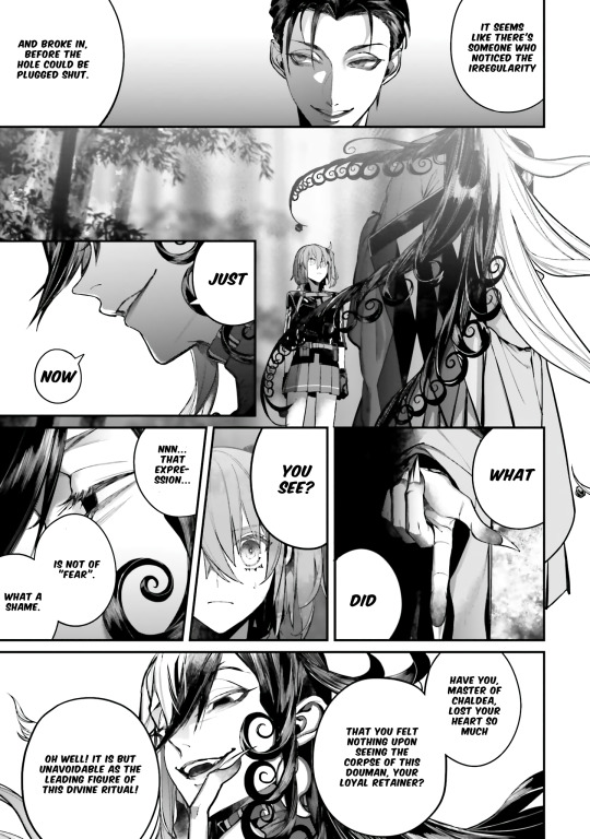
The way he sulks like a cat that wants to be paid attention to when Ritsuka hardly reacts when they sees the maimed shikigami 😭 Please give your kitty lots of attention!
Like once again Douman wants Ritsuka to pay attention to him and searches for reactions from them, but also, the way he refers to himself as their "loyal retainer"
Like a bird preening.
AU has a massive brain since the scenes, visuals, story and dialogue of this Anthology Comic were decided by them. It's also such a huge characterization surplus for Douman and such visual eye candy
Douman invited Ritsuka to fall into hell with them in-game in his My Room lines, and now they're the one inviting him, saying that they will drag him and take him along with them.
Douman tells them that the two of them are "bound by unbreakable/inseparable fate."
And the part where he sarcastically laughs at their speech by comparing it to Buddha's Great Vows, but also acknowledges their determination and tenacity... Aghhhh...
He makes this grandiose, deadly romantic speech back, telling them that they are "bound together by an unbreakable fate" (inseparable fate/karma)
JAW DROP??? THIS IS GAY AS HELL 🏳️🌈 LIMGUDA IS REAL!!! 💚🧡
I'm so glad for the fan-translation by u/kanramori
The EN fan-translation is SO good. I love the usage of Saṃvega at the end.

I got stuck on some parts reading the JP version cuz of Douman's vocabulary... I got to clear things up reading the VN fan-TL, and it was interesting to see how it was translated in Viet, but yeah the EN fan-TL cleared up so many things for me.
They drew the Ashiya Douman vs. Dioscuri chapter in one of the FGO anthologies. LIMGUDA ALSO INTERACT IN IT, AND THERE'S TONS OF LIMGUDA FOOD HEHEHEHE... Their art is so gorgeous. They're one of my favourite FGO artists, their works are stunning.
THE WHOLE THING IS SO DELICIOUS SO I'LL JUST SHOW A COUPLE PAGES FROM THE END, BUT OH MY GOD???
I LOVE THEMMMMMMMMMMM LOVE IS REALLLLLLL
LimGuda so good... NB evil clown demon and the human they're deadly obsessed with...
Douman is gigantic. Ritsuka's 200 cm tall (~6"7) bf that loves them!!!
AU'S DOUMAN COMIC FROM THE FGO ANTHOLOGY COMIC WITH DOUMAN AND RITSUKA IS MAKING ME SCREAM WTF /pos /endearing
LimGuda inspired SO much of my writing, including my writing for other ships from other interests I'm into.
"Black/white colour schemed meow meow mf with a bloodthirsty personality and violent tendencies, and/or deadly love/obsession, is paired with a warm empathetic s/o with a brighter disposition"
This Sen-core ship trope is present in all of my ships LMAO
Ashiya Douman vs. Dioscuri by AU (Viet Fan-TL)
The VN fan-TL is pretty much VERY similar since it's based on the same JP text as the source material, but I'll highlight some neat tidbits I noticed
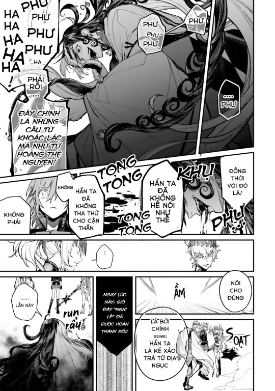
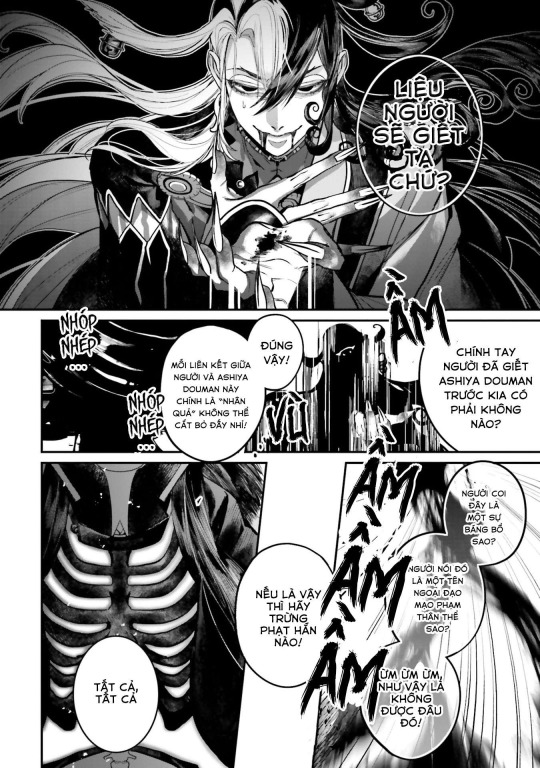
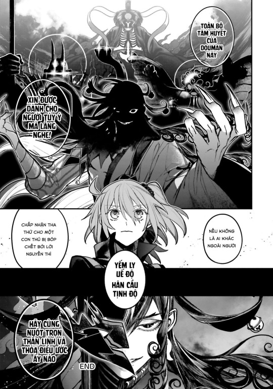
Source: (X)
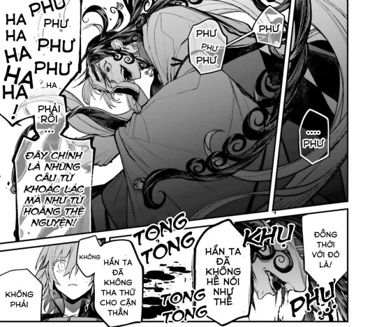
道満:これぞ弘誓のごとき大言壮語!
道満:そうでしょうとも!
Douman: Such boastful words, just like Buddha’s great vows!
JP uses 弘誓 (Guzei, “Buddha’s great vows”)
The VN fan-TL uses Tứ Hoằng Thệ Nguyện ("The Four Encompassing Vows") of Buddhism, the fourfold bodhisattva vow. Only difference is that it refers to it directly

道満:そう!あなたとこの道満を結ぶは断ち切れぬ「因果」にございます
Douman: Yes, that's right! You and this Douman are connected by an unbreakable “fate”
JP uses 因果 (inga, "cause and effect; karma; fate")
VN fan-TL uses "Unbreakable karma (cause and effect)"
Nhân quả = Karmic cause and effect in Buddhism
I love the wording of him describing the way he's bound to them as “Unbreakable fate”
It's so sexy and fits so well with Douman’s character, saying they have a connection of inseparable fate/karma.

道満:厭穢欣浄(えんえごんじょう)
Douman: En’e’gon’jyou. (“I abhor this tainted world, and seek rebirth in the Pure Land.”)
JP version has it as 厭穢欣浄 (En’e’gon’jyou, “I abhor this tainted world, and seek rebirth in the Pure Land.”)
The VN fan-TL translated it as: Yếm ly uế độ, hân cầu Tịnh Độ = "I detest and want to leave the defilement of the Samsara, and seek rebirth in the Pure Land"
...
厭離穢土 (Onriedo/Enriedo, “Abhorrence of [living in] this impure world”)
The antithesis of Onriedo is 欣求浄土 (Gongujyoudo, “Seeking rebirth in the Pure Land”)
These are Yojijukugo (four character compounds), and concepts of Pure Land Buddhism that became popularized in the Heian era.
The full term is 「おんりえど・ごんぐじょうど」 (Onriedo/Enriedo - Gongujyoudo). The two combined, make a pair.
The phrase is usually shortened to 厭穢欣浄 (En’e’gon’jyou/En’ne’gon’jyou)
In Buddhism, it means, “I am disgusted with this world (I want to leave the world of filth/suffering and stain), and seek the Pure Land [of Buddha]”
...
Both the EN fan-TL and VN fan-TL are super interesting to read! It's been churning in my thoughts all day...
#fgo#fate grand order#ashiya douman#douman#caster limbo#caster of limbo#alter ego limbo#fate#fate series#fate go#artists on tumblr#digital art#fate fanart#fgo fanart#limguda#limboguda#douman x ritsuka#my art#wip#doodle#stepswordsen art#stepswordsen#art#artwork#fanart#sketch
12 notes
·
View notes
Note
Sorry if you've answered this somewhere before, but do you have any advice for improving/practicing art?
I am not sure if I am the best person to be giving advice on this matter as there are a lot of aspects of my art that are lacking, but here are some tips that have worked for me personally that I think worth are trying!
This got kinda long so. Under the cut!
First, this is always important, and I know people are sick of hearing this but it's true: practice, practice, practice! Observing things is very important for art but you actually have to try your hand again and again in order to have a result that is to your liking when it comes to art. Please just try to draw as much as you can. You have a pen in your hand? Scribble something. This will also improve your linework.
Do NOT be afraid to use references. It is highly unlikely that you will just happen to be able to draw something you have never drawn before without a reference. If you can't find any refs, take your own pictures. (I do this a lot when it comes to drawing hands)
Most of the time we have these conceptions of how things look especially when it comes to anatomy but humans are all sooo vastly different so I believe it is important to broaden your vision by using diverse references
Don't be afraid to draw bad. Seriously. If a piece you just made sucks, don't beat yourself up about it. It is geniunely not that serious. Take a break and come back to it, if it is still not to your liking and you cannot improve it; it is okay to delete that drawing and try something else. You'll get it, I promise. Just keep practicing.
Most of the time I find that it helps A LOT to draw something I am obsessed with. When I am learning anatomy, I don't just always draw some random people's pics I found on the internet, I will sometimes make that drawing into a character/ship I love
Do redraws from your old art! It is so motivating and fun to see how you have improved and changed as an artist :3
I know it is not healthy to rely solely on validation, but it does help a lot! If you are part of a community, esp one with a lot of artists, don't hesitate to show them your work! You can also draw your friends' ocs and such if you want to, it really is a win win situation because you will be drawing something you want to draw and your friend will be so happy that you took the time to draw their character. I loved gifting people little doodles when I was part of an oc centred fandom :D
Also, since we are talking about validation, validate YOURSELF please. Imagine yourself 2 years, 5 years, 10 years whatever ago. How would you have felt if you saw your drawings today? You would have been so impressed! So take the time to appreciate your own work.
If there are any artists you adore, don't hesitate to try to redraw their drawings, or maybe just some aspects of their style that you love. If you do a redraw, it is advised that you do not post it as your own idea, but if the artist is ok with you posting it with credit, then you can do that too! :D
That being said, keep in mind that you don't have to post EVERYTHING you draw! I used to do that which put a lot of pressure onto me since I would get so upset whenever a drawing turned out bad, but when you realize that you can just not post it, that lifts a lot of tension.
Take care of yourselfff!!! Take care of your arm, your wrist, your back. I think there is this program that makes you take breaks every x minute which is called EyeLeo, you can install that or something similar. But please do take care of your health.
Sometimes breaks are needed. If nothing you draw looks right and you don't feel any joy in drawing, do take up another hobby for some time. Let yourself miss drawing.
Play around with styles and colors and lineweights, see what you like the best. I used to always get so upset that I didnt have a set style, my drawings vary a lot throughout each piece. But now I just keep it cool and don't think about it too much. Don't force yourself!
Also for me a part of drawing I ALWAYS look forward to when drawing canon characters is giving them alternate outfits I save on pinterest. I enjoy so much searching which outfits a character might wear. Maybe you can try this? I know drawing the same outfit over and over again for a character gets old.
Honestly being obsessed with something helps a lot with improving. Like a character or a pairing or whatever. Because you will just REALLY want to draw something for this thing you love, and you will just keep on doing and doing it. Really helpful
But 99.9% of the time, the thing you imagine will not translate completely identical to the canvas/paper. And that's OKAY! That means that you have a great imagination and you will try to get a satisfactory result. It just means more practicing. When you get an idea that you want to draw but don't feel like your skills are enough for, draw them anyway! That way you can see a lot more clearly what you need to work on. And do work on those things.
I think for reference images just find nude reference pictures of real life people. The drawing pose references we see on here or on pinterest with simple shapes ARE very convenient when you just wanna quickly draw something, but if your goal is to learn anatomy, then using a pic of an actual human is ideal.
Remember that art is supposed to be FUN. So do have fun. Experiment!!!
Also I would say like, when I was more of a beginner and tried to do fullbody drawings and such, it never looked good and I was quite discouraged but things started improving when I started to individually focus on things like eyes, noses, lips etc and then trying a more general approach with fullbodies. Might not be the same for everyone though!
I think that's all I can think about for now. Sorry if this is not that useful, but yeah! I would say the most important thing is to just practice honestly :D Go ahead, have fun, draw something! I wish you the best <3
15 notes
·
View notes
Text
Artfight Postmortem
as you may know, i am prone to reflection on my art and process and progress. herein, i'm gonna navel gaze a bit about artfight 2024.
top line: really enjoyed myself, did a bunch of new things and this was "The Year of Artist Friends" which is spectacular.
i completed 20 attacks this year, including my first ever mass attacks! altogether I drew 28 different characters (incl 4 of my own).
for the first time, I had *users* i wanted to attack, rather than just characters i'd gathered via search or discord. honestly, three years ago when i picked up the stylus i was just excited at the prospect of drawing for other people, period. artfight was a cool way to be in community without prerequisites. i didn't quite dare to dream i might make some real connections and make proper friends. and yet :) here we are! i went in with three 'art friends' and i'm leaving with at least three more
in addition to being the year of artist friends, this could be "the year of clip studio paint was on megasale a week before artfight" because i knocked out like 2 practice pieces before July 1st so i wouldn't be starting with completely unfamiliar tools, but i used/learned csp for the vast majority of my attacks. one i finished in krita (lonnie), and my final attack i only used krita.
definitely trial-by-fired myself! but it motivated me to explore csp, and most important, gave me a reason to practice practice practice. last year i drew almost exclusively humans, lots of full bodys, because i wanted to get a better grip on anatomy and drawing a variety of faces. it worked then, and, well, i think i learned more of csp in one month of artfight than i would have if i was just plodding through my personal projects for 33 days :) *looks at my wip folder with months old files* pretty sure.
ok i'm gonna look at a few faves/standouts now:


came in hot with 0tt0 here! the main brush for this one (froggy pencil) was a mainstay for the whole month. so versatile!!! and lovely texture. this isn't quiiite brat green but this was what made me go, hmm, what if i... did a few pieces inspired by this album i can't stop listening to?
and then i took a huge turn and just used a soft round brush for Desa and Iryna for my dear friend @bobomcfoe bc i really wanted to turn these out in something approaching my "usual style" of late and i feared getting too deep into the temptations of csp if i put them off. and, um, yeah i love them. i got sooo close to matching that angle but ahh i can see the tilt now! nonetheless, love these two, not least bc brookie has some of the most pleasing color palettes to work w :)


then on to Rosé and baby's first vector lines! you can RESIZE lines in csp. did you know that? i didn't know that. i did forget to use it as much as i could have in later ones though, so i still only kinda know it ig. and halftone shading! bc why not? another thing i really only did this once, but want to experiment with more
Rook here, for my new friend @gender-premium-tm, was me realizing how to use filters/filter layers in csp. now THAT is something i used a lot this month! also something i use often in krita. i must say, though the csp options are slightly more limited (afaik), they have oomph!


okay these two are my "explicitly brat pieces"! artfight keeps you moving, which i find really valuable, bc i could have dithered foreverrr over Lonnie's gif here. like, do i add his arm? maybe he should be wearing a shirt? or, what if i just draw him twice, instead of splitting the expressi--see it just never ends. and as i am always going on about, art is so precious bc it is a reflection of us when we make it. maybe for some future artfight i'll redraw this (as Lonnie's artist @wenmistry did for me with Ebon this year), but for july 2024, i'm amazed at how well i executed this for just 2.5 days of work! (i did forget his glasses, which realization gave me a different take on the composition, so this is high on my list of potential redraws)
and then Aagatha. this is in my top 3 for this year. the pink just works so well with the green and her artist added the song to her character playlist AND added the necklace to her actual dnd inventory. like. omg. the impact your art can have!!! how freaking cool is that???


two mass attacks! i was in a silly goofy mood. i feel like i really got a handle on vectors w the anthro mass attack, i adjusted every single point on that one by hand. weird what hyperfocus makes you do sometimes, but i learned a lot from that. mainly that i will probably never user vectors as my main linework tool. there are circumstances it is perfect for, and outside of that i'm good w my raster lines lol
which is exactly what i used for this other mass attack, featuring mostly my ocs. hey, sometimes you need to shake things up! i can see here the style starting to hew back to my "usual style", though i'm thinking that might have a lot to do with drawing 5 people very quickly. falling back on practiced techniques. and by this time i apparently knew csp well enough to reproduce them pretty closely! ooh, one thing this made me miss was the transform tool in krita. that floor was ROUGH to wrestle into place in csp.
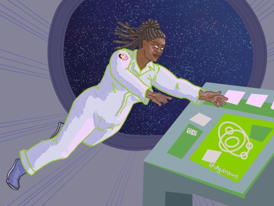


purple and green turned up a lot this year!
Echo is my crowning achievement with the froggy pencil, most of the shading here is just layers w that. and one last nod to brat green :)
i've worked in the paper cut style before (both my pfp's use it) but i really exploited csp's clipping layers to make Scraps here. they did make me briefly forget how they work in krita when i switched back, so well done w that
i played with gradient maps a little earlier in the month but for Okanar i actually made my own gradient! really a useful tool for ref'ing real human skin tones to make non-human ones, without muddying them up too much.

finally, Chaos. this actually might be my favorite! ironically this is the one that i made in krita. it was like, ahh, yes my old friend. wait where is the scroll bar. ah, okay, yes my old friend... the line layer is set to burn which just makes the whole thing so warm (and the cause of the red outlines on the earrings). used my old sable brush, a pattern fill set to overlay... my old stomping grounds! but plus a rendering technique i picked up this month and some other random habits i picked up in csp (like copying a detail to a new layer, moving it where i want a copy, and drawing/tracing it back onto the original layer in the new position. nothing i couldn't have been doing in krita all along, but made easier by the tool layout in csp, and therefore now discovered by me. amazing how one integrates new knowledge. it's like magic sometimes!!!)
that was a good roundup! if you actually read this to the end, wow! and thank you! i hope it was interesting... and inspiring! bc i want to read about your process and reflections too! yes you! and plz tag me, i'm always down to gush about art XD
7 notes
·
View notes
Text
I did more art today! But first, a show of improvement in art style (again)! (Warning! Fake blood!)
This is Hands (the first design):


The show of just his mouth without the mask is the only part of his design that I loved. He used to be a Sonic OC, and still is, just... without the killer tentacles. I think I drew him in 2022, November 8th (it was apparently a Tuesday, but I didn't write the year). He's a 13 year old dormouse that is mute, though the tentacles used to be why he didn't talk (couldn't open his mouth or they'd come out and stab everyone over the age of 10. Idk why).
But here's the redesign:

The mouth stayed the same, but the changes are obvious (yes, I drew on green construction paper. The pink sticky note's there bc I messed up his body too many times). He's got some fur, that one ear isn't torn for no reason anymore, and he's shaded! Also, the tentacles are gone. He's still 13, so he's just my son. This time, his eyes will be a more obvious Heterachromia than the pink and magenta I did the last time.
Whole page:

Drew my favorite character from one game and my second favorite from another. If you don't know who my second favorite is, just know the goat in that game is my favorite, I just didn't draw him.
Close-ups (of Sebastian and Lamb[ert]):


(I messed up Sebastian badly the first time, so I covered it with a sticky note and started over. Lambert's fine. I fixed his crown when I realized the eye isn't sideways no matter how cool it would be if it was)
Not sure if it's my first time drawing a character without a nose or not, but it turned out fine thanks to some reference photos I used. And I really felt like shading today. I don't normally shade my sketches because it doesn't look right 90% of the time, and also bc I'm lazy and don't like taking two minutes to add shadows.
(This post was brought to you by Cat Skeleton. M and Kat are fighting over what a good joke is...)
...
If y'all draw my OC, can you tag me? I'd love to see it! Remember: you're the only one that thinks your art is bad. It's our brains way of getting us to either give up or work harder. You see my improvement? It gets better! Keep going! Learn your style and build on it! Push boundaries! Redraw old art that makes you cringe! You'll see the improvement, I promise!
#artists on tumblr#oc#oc art#oc art dump#old art#new artwork#cult of the lamb#cotl lamb#cotl fanart#cotl#sebastian solace#roblox pressure#sonic oc#sonic original character#dormouse#anthropomorphic#anthro#cat posted#tw blood#cw blood#cw bl00d#tw bl0od
4 notes
·
View notes
Note
Hi! Love the art on your blog. I was curious, what's your history with SPM? Like, is there a specific thing about the game that incentivised you to draw SO MUCH incredible stuff on the game? Also, are there any head canons that you have for the Bleck Crew in your interpretations? Awesome stuff! Have a nice day! :O
Hello! So when I was a little tiny child I liked to see fanart and gameplays, so one day I saw a thumbnail and thought "oh this game looks quirky/pos", and I watched some videos and then became obsessed. Dimentio was my special little guy at that time too, I would always draw him and suffer with it because he has too many straight lines akshjd
So after I started really understanding the game, because I was 8 to 12 years old and English is not my native language (XD), I saw how cool the little details in the lore were, so time and time again I was trying to piece everything together in different ways, and while I was doing it, new headcanons appeared and more inspired I was to draw my ideas, or at least write some of them.
So about the Bleck crew, I have some headcanons for them, but if I talk about it here you'll get a 3 meter long post. I have an old post about it tho!
here!
Ah, I also have a compilation of panels that I made that illustrates their backstories very ominously, just be prepared for old art jumpscare (Mimi is particularly very different from how I draw her now)
here!
Some of them might be outdated since the post itself is extremely old already, but I think some of it is still valid. :)
The second one I'd like to redraw, but it'll be very difficult and I'm never in the mood to do so kjasdh
Thanks for the compliments, and I hope you have a very nice day too!
8 notes
·
View notes
Note
I'm currently watching Mandy because I recall you really liked it, and it's so cool to recognize so many details I find in your art and Godcleaver! It makes it even more interesting! If you feel inspired to say some things that you found particularly inspiring, I do want to hear! But you don't have to! I just wanted to thank you for making me discover this movie!
I must warn, it isn't even a "I really like it". It's a "rewired me on a level to the point of it's jsut my world". I'm glad it can be recognized as a huge influence! It's my fav movie so it's very near and dear to me, I have two old art pieces for it I did even (I might recolour the first pic and redraw the second). I'm glad you discovered it! It's really underrated for sure.
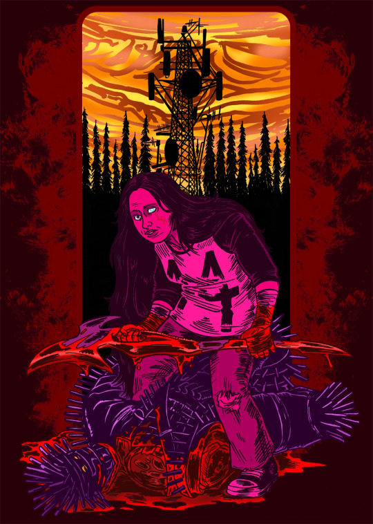
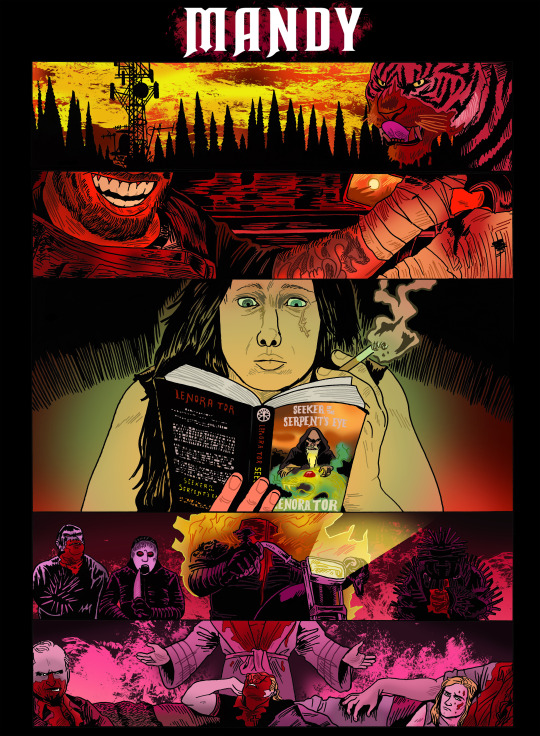
As for inspiration? Putting it under a read more because it will be insanely rambling and spoilers but know this is like ...a movie that is so important to me and IS me
There's a lot to the film that really speaks to what you see in my art. Music being it's own breathing heaving beast, a silent participant in the plot. The use of violent visceral colours like I'm staring at a bruise under blacklight that scratches such specific parts of the brain that frames this in an alien way, even if it's "the real world". Characters not being bad got being rightously angry and it drives them to the point of frenzy.
Dead wife/sad man stories are incredibly boring but something about this really spins the framing to the point I wouldn't even say it's one of those movies. Mandy is so fleshed out and important. We know who she is, we know she's had an incredibly horrible life before we met her/she met Red, but even with it, we see the sort of quiet cool person she is. She's someone we want to know. Dead partners in movies are so bland that we really in a way can't figure why we want to avenge them. We FEEL for her, we know who she is so the weight of her dead hits harder than anything. The death scene is incredible too, where it's jsut the throbbing synth, no sounds beyond that. We the the sleeping bag shaking and thrashing and we know what's happening, but nothing is ever exploitative on her part. We view the scene through the spectators and all their winding emotions, from Red's horror, the cultist's glee, the young girl, and Jeremiah's silent anguish and hate.
Mandy's dream sequence and the scene of ehr and Red talking of the starlings, another visit into these characters worlds, says so much without forcing a backstory. Red is almost an interesting foil here. We have just enought to figure what sort of character he is. He maybe was military/para-military and he has a drinking issue (by the scenes of him refusing a beer and him looking in the bathroom for a secret vodka bottle). He's a blank enough slate though that it let's us get to be the ones to experience Mandy. He truly loves and cares for her and we get to feel it because in how he is written and how scenes between them are shot, we ARE Red, with our own issues brought in.
Now to the meat of this situation. Mandy's death really is what makes the movie special because in how it's written and even stated by Panos Cosmatos himself, she IS the film. When Mandy dies, we no longer exist in our world. Mandy has moved into a another plane. She is Galactus and has devoured our world and we live in hers. The movie's sharp grinding as we start to peak into the phantasmagorical horror shifts because Mandy is being affected. When she gets high, everything is warped. When she dies, plots are set in motion.
My aggressive belief is when Red tastes the Biker's swill, Mandy takes him over. Not to say Red wasn't first motivated in revenge! He's the one to seek out his old friend and his weapon, he forges The Beast, he drives out to fight the bikers. We see though in the face of all this, he's jsut so emotional about it. His haunting response after Mandy dies, stumbling into the house and then the howling and chugging in the bathroom. When he's chained up and nailed to the floor in the house the bikers take over, he's jsut sobbing. Even fighting those two bikers, he all mania and emotion tearing them up. The moment he tastes the swill though? Something shifts. When he faces the main biker, there's no emotion, jsut quiet stalking, until the mention of "SHE'S ...STILL ...BURNING!"
Theory continues, we see Mandy in visions from Red, these nightmare shots of her rotting away, her adrift in the lake we see them in in the beginning, and extracting a jewel from an animal's corpse. It's like she speaks from whatever void she has now taken. The book Mandy reads is made for the movie, BUT I managed to track the fake cover. A story of a man stealing the power of witches stolen from a she-wyrm. A lone female warrior trudges to stop him. Fits the theory enough. When Red finds the Chemist, inferred to the the creator of the sludge, the way he speaks to Red is interesting. We don't have enough fo Red's character to know, but we have enough of Mandy's to make this scene interesting.
Chemist: Jovan Warrior, sent forth from the eye of the storm
-Mandy mentions in the beginning of her favourite planet being Jupiter, especially because of the eternal storms. Jove was one of the many names of the Roman god Jupiter.
Chemist: Oh man, they wronged you! Why they gotta be like that? You exude a cosmic darkness ...
-This is definitely inference because, as said, it's not like Red can't experience this, but it's so pointed. Mandy, destroyed by this cult that saw something in her, and the starling story, and the dream of the dead deer fetus. Something in her sits, dark and heavy, like the music tracks.
Red does not speak this whole time, but the Chemist talks as if there's conversation. The Chemist, so shot into another existence, maybe he IS talking with Mandy, on another level we can't comprehend. He sees the folding of worlds
When we go to find the cultists, another interesting thing comes up. The one cultist who never really comes off as feeling purposeful and involved is the young girl. The one who is willing to let Jeremiah blow her head off, the one he calls for after being upset about seeing Mandy. When Red kills Swan, the girl just watches. Mandy did see her there and maybe a kindred spirit of sorts, two people violently affected by events then and now in their lives. Maybe it's because she wasn't as malicious, who knows. Maybe it's Mandy who spares.
And finally, the last confrontation ...
In a way, I think Mandy killed Jeremiah first. His seduction and obsession, trying to impress her. Mandy is sent ROCKETING with how high she is and the scene where he speaks with ehr, their faces constantly melded, some sort of different thing is happening. Sure it's style for the movie and perhaps I can't put into words, but "You're a special one, Mandy" has meaning here. When he finally sheds his coat and is front of her, naked and showing her whatever he thinks passes for the divine, she laughs. It's a chuckle into a laugh into a cackling furious howl, ebcause we're seeing she's knowing she's pissing him off ow. This moment, he's crushed in front of his constant followers. He's embarrassed. In the spirit, I think he dies here, it's the first time someone tells him no and ridicules him.
In our final confrontation, it's the first time since the sludge, we hear him speak. A garbled, laid-over second voice
"The psychotic drowns ...while the mystic swims ...
You're drowning. I'm swimming."
When ahd our last Mandy dream already happen. Mandy taking a jewel from some great beast. This is the final act of revenge, killing the last monster. Jeremiah's desperation to make it up, but there's no emotion facing this, no mania or sadness. Red crushes his head, the garbling speaking
"I am your god now"
The movie ends with Red driving off. We see Mandy next to him in the Camaro and we see a vision. A shot of teh first time they met. And with all we know and all we've seen, this is finally the end. The manic iconic grin of Red looking to her as we driveoff into this alien fantasy landscape. The final bit of the film stating they are reborn into this carnal new world. They become one here finally.
And I mean, you can add your trans narratives in here, or even just state they are trans. Something about the total take of bodies, two sharing in one body, being whatever you choose to headcanon them as. I don't remember the thoughts I had on this, will edit when I remember, but I think it's a very trans film.
We're swallowed into this world of Mandy's. I know Red wears the Tiger shirt but I think Lizzie represents Mandy more. The tiger set loose into the Pacific Northwest is jsut what it is. We're watching her and Red's love become one huge angry beast, their love isn't corrupted. A frenzy and compassion and caring between two broken people that becomes so ravenous after this trauma, it takes chunks out of this world and rebuilds it, sharpens its fangs so it can devour the violators who encroached. A winding grizzled thing that pulses like the beatof the soundtrack. I jsut think it's a cool movie, sorry for any tangents or my being incoherent when talking about it.
Stream this, sound of the summer
youtube
36 notes
·
View notes
Text
2023 YEAR IN REVIEW!!!
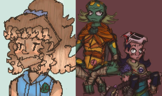
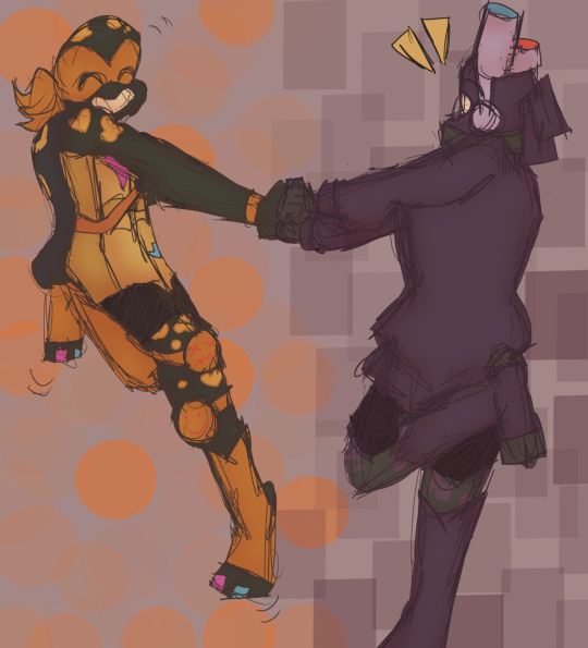
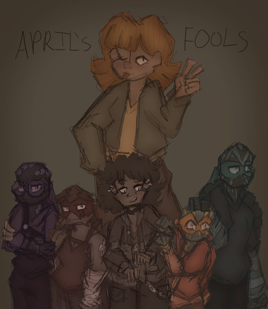
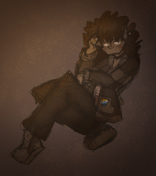
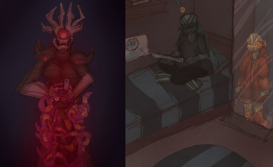
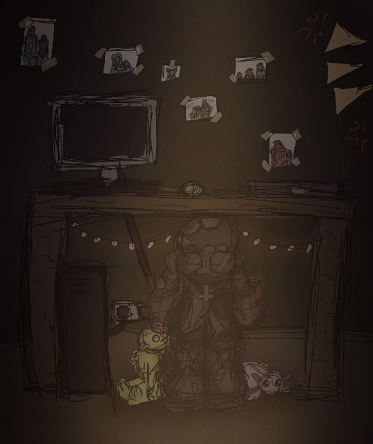

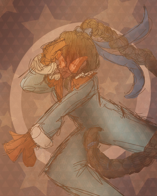
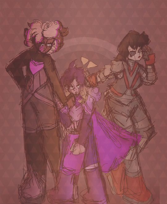

My artstyle changed a lot this year, especially after my shift from ibis paint to procreate after getting my iPad (drawing on an iPad is the BEST btw 100% recommend I love it way more than a phone and it didn’t die after a month like my old wacom 💀💀). I’m relatively happy with where my art is atm and I hope to continue to improve in 2024!
Explanation of all the silly art down below! (Mostly so I can tell y’all who the fanart is for but also cause I like rambling)
January: A drawing of my Rise Leo human design I did to test out a pixel brush I found for Ibis Paint. He’s very fun to draw hehe I need to draw him more-
February: I wanted to learn how to draw the future designs of Leo and Mikey along with CJ so I planned to draw them all together! I struggled with Leo though so I just got rid of him. Sorry Peepaw 😞😞💔💔💔
March: Fanart for @beannary ‘s TLP au! I love it so much so I had to draw smth for it hehe 😈😈💥💥💥 which reminds me I need to draw more at some point- might redraw it at some point cause I’m not super happy with how it turned out but I do like the idea a lot
April: The month I created Reticent! April’s Fools was the first episode I came up with so I drew a chapter poster! It ended up being very different to the chapter cover I drew a couple months later but it’s still cool :D Leo is being weirdly affectionate to Mikey though what the heck that isn’t like him smh. Although I guess it was meant to be purposefully exaggerated sooooo 🥰
May: Reticent Casey!!! I don’t have much to say it’s just Reticent Casey HDKSGXKSHD this wasnt a very good art month
June: Krangified Donnie is literally my favourite concept ever thats it that’s all I have to say dbskdbwkh I adore Krangified Donnie and if the Rise brainrot takes over the Reticent brainrot for a while then I will probably be drawing Krangified Donnie during that time sorry not sorry
July: Reticent Chapter 3’s cover yippee!!! Still my favourite Reticent cover although Chapter 8’s is a close second (I can’t wait to post it once it’s been betaread yippee!!!). The scribble over Leo’s eyes is literally just because I was struggling to draw his eyes and i was getting annoyed dbskdbskdb it’s actually a very common issue with him (common Ret!Leo L). Also Mikey being reflected in the mirror is a reference to Mirror Man by Jack Stauber which I’ve basically considered his theme song since @aaronymous999 introduced it to me ebwjcbkwhd thank you Mr. Aaronymous! Also somebody said he was in the barbie box and I still need to draw that to this day because Mikey would’ve killed to go see Barbie.
August: RET DONNIE WOOOOO he’s being bullied again!!! I drew that piece for a colour palette challenge request and realised I got the prompt wrong so I just made it into its own thing 💥💥💥 it’s usually a flickering light gif but I chose to just use the version with the light on for this post. The photos in the background were really fun to draw hehe either April’s or Mikey’s is my favourite.
September: MY 500 FOLLOWER DTIYS YIPPEE (/my 150 follower DTIYS for tumblr). This one took me. Forever to draw and I love it to pieces hehe it was really fun to design Mikey’s room and figure out outfits for the sillies and idk the concept of a sleepover just seemed really fun to me dbskbdkdb- and all the entries I got were so so awesome I loved them all to pieces!!! I still look at them all the time hehe
October: FANART OF @endlesslogo ‘S HUMAN RISE LEO DESIGN WOOOOOO!!! This was the piece I started rendering on hehe it was so much fun to draw!!!! Although I did have a fight with rendering the hair for over an hour svsjegksbdk HOW DO PEOPLE DO IT FR!!!
November: Me and my friends were working on a crossover between our TMNT iterations so I drew all of our Karai’s together!!! Confluence Karai is on the left, created by Salem and Marine, New Stars Karai is in the middle created by Starla, and Reticent Karai is on the right created by me! All our Karais have such cool designs AHHHHH literally dead over them constantly/pos
December: Most of December I spent drawing Christmas presents so this was my present for Salem!!! Confluence!Jonatello my beloved….
11 notes
·
View notes