#these are not their original colors but accents only I just wanted to simplify the drawing 😅
Explore tagged Tumblr posts
Text

For (belated) Women's Day!! (I know, but at least before March ends.) Wanted to show off all the women OCs I created in ESO, and my Argonian bias is very much apparent! 🦎✨
My lovely ladies~ From top to bottom and left to right: Dances-With-Colors*, Tislei, Ghada Rajida, Xeena-Ra*, Tumezi, Kicks-Many-Tails and Julei-Zu
#argonian#the elder scrolls#elder scrolls online#ESOfam#ESO#eso fanart#tes online#redguard#khajiit#these are not their original colors but accents only I just wanted to simplify the drawing 😅#Asterisk * bc it's not their actual in-game name I need to change it#Julei-Zu#Tumezi#Kicks-Many-Tails#Tislei#Ghada Rajida#Xeena-Ra#Dances-With-Colors#moj rad
204 notes
·
View notes
Note
Bit late for xmas, but have you reviewed snover?

Snover is very cute. These little evergreen-like creatures are known to be friendly and inquisitive towards humans, and will even gather around human footprints like we do with yetis. Aw!
Visually, I do like their design a lot as well. The brown, dark green, and white palette is unique and looks really nice, and it's not overly busy. The brown bottom kind resembles a pine cone or maybe bark, which fits with it being a "young" tree. I like the tail as an extra beastly addition, and the head fur resembling a snowy mountain peak is also a nice touch. Good stuff all around.

What's neat is that instead of just becoming a bigger tree creature, Snover evolves into the abominable snowman (that also happens to be a tree). It works great conceptually and gives the line a unique theme.
And visually, I like how it strategically drops the brown from its palette in favor of emphasizing the white and green. Said colors are nicely balanced, with it having a primarily white body with just a few accenting points of green. The shaggy face and big ol' eyebrows are also good and give it a great expression.
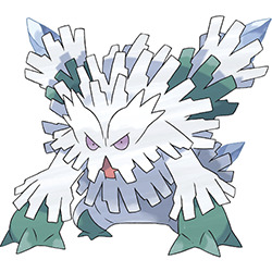
And mega Abomasnow's pretty decent. I really like how it's moved into a semi-quadrupedal stance kind of like a gorilla—it makes it look all the more dangerous. I also like that it doesn't really add any unnecessary new elements, instead just changing the anatomy up a bit, adding more fur, and expanding the four spikes on its back into a set of icy cannon-like structures.
My only issue with it is that the sheer amount of fur is a little overwhelming—there are at least five rows of it from the head back, not counting what's on the back spikes, chest, and arms. Obviously you want more fur than the original, but I feel like just dropping one or two of the back rows and simplifying the ones around the back spikes to one might've made it just a little easier to read. Still, not a big deal in the long run.

Overall, some really excellent weird tree creatures.
64 notes
·
View notes
Photo
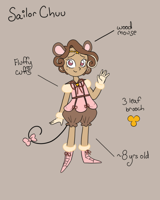

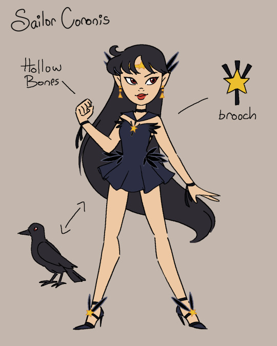
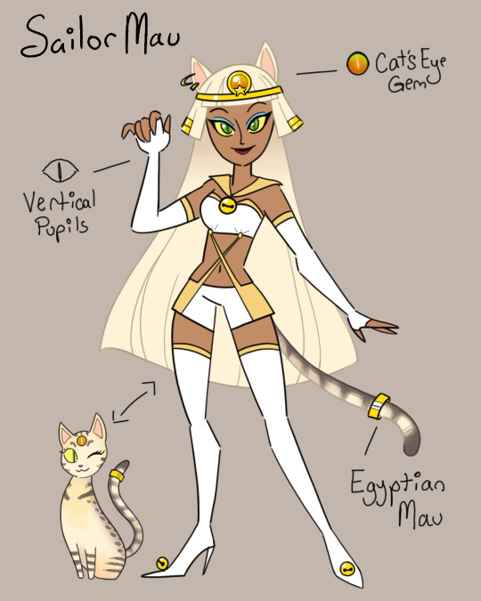

The Original Sailor Animamates! I’ve been working on these ladies for a while now and they’re finally done! Rather than redesign existing characters I wanted to elaborate on characters that were mentioned in the manga but never got proper designs. As always, species and design notes under the cut
General notes Shoutout to Myusse on Deviantart, their original animamates designs were a big inspiration to me
So the Animamates are kind of the least coordinated group of villains in the entire SM canon? Not a criticism, by-the-by, I think it makes sense when you consider that these are basically randos Galaxia plucked out from all across the galaxy. They’ve got two elements that all their designs share; the galaxia cuffs, and that each of their outfits features a gold star. However, I think the star is too common a motif in canon to really be specific to Galaxia (For example, literally all the eternal senshi designs have one) SO! I thought, what if the star is a popular symbol throughout the galaxy, and each planet their own addition to the symbol to make it unique? In this sense, when Shadow Galaxia’s animamates swore themselves to Galaxia, rather than gaining a symbol unique to them, they had their homeworld’s symbols stripped of individuality. Another note is that Galaxia’s animamates each stole their planet’s sailor crystal/starseed. Because of this I envisioned them to be kind of wearing someone else’s power ie sailor suit. My process for designing each of these was to take the designs of Galaxia’s animamates and work backwards, creating characters with similar elements but still making them distinct. Individual notes Sailor Chuu! Representative of the planet Chuu, homeworld of Sailor Iron Mouse. Side note, Iron Mouse is an interesting case as while she has mouse attributes, we never see if she can actually turn into a mouse the way that Phobos and Deimos can turn into crows or Luna can turn back and forth from a cat. I’d assume she (and Chuu, by extension) can, but we’ve got no evidence to back that up. I kept a lot of the same elements from Iron Mouse, gold beads, fluffy cuffs, ribbons, and what seems to be a structured, boned top. Because I designed Chuu to be notably younger than her evil counterpart, I swapped the panties+tights combo for a more kid friendly pair of puffy bloomers. Color-wise IM is JUST black and white, so I went for a more natural, mousy brown accented with a soft pink and cream color. I’ve given her an identical circlet/tiara, and an original brooch shaped to vaguely resemble a mouse head. Sailor Mermaid! Rep of the planet Mermaid, homeworld of Sailor Aluminum Siren. Her legs can turn into a tail because you can’t name a character “Sailor Mermaid” without giving her a mermaid tail, obvi. Again I’ve carried over several elements from her counterpart; flowing fabric, crisscrossing ribbons, shells, long flowy hair, and small wing ornaments that I can only assume are meant to be a reference to the Ancient Greek concept of sirens as women with bird features. As AS is pretty much all blue and purple, I shifted that to more green/turquoise palette, with purple, pink, and blue accents. I kept the structure of her top similar, but made it slightly more conservative with the inclusion of a sheer panel covering her stomach. I’ve taken the wing ornaments and converted them to a hair accessory. Her star is actually a small jeweled starfish, and I’ve given her more pearls in addition to the ones on her necklace.
Sailor Coronis! Coronis is unique amongst the animamates in that we actually see her! From the back, but still. We know she has a choker, short dress, and seems to have dark, straight hair similar to Phobos and Deimos. Along with Lead Crow I also included elements of Phobos and Deimos’ human outfits. Her outfit is one the simpler of the animamates, with star and feather ornaments, black straps/ribbons, a simple dress, and few pieces of jewelry. Because Lead Crow is overall rusty orange/brown, red, and black, I used primarily a cool toned dark blue and charcoal, with her eyes and lips being a bright red. Her earrings are similar to her counterparts’, except with a mirrored triangle bead, and gold to match the rest of her jewelry. She has a simple gold star circlet with feathers behind her ears. Her brooch resembles a simplified crow’s foot in addition to the gold star. Sailor Mau! Mau is a planet of cat-shifters, who spend most of their time as cats but can shift into humans in emergency situations/with a large influx of magic. I headcanon Mautians to be exclusively “domesticated” cat breeds ie no big cats. (A very silly headcanon of mine is that Earth is the only planet that actually got around to domesticating cats, so the only cats in space are Mautian. Aliens are very confused by Earth cats) Sailor Mau is based off the Egyptian Mau, thought to be the oldest cat breed in the world. Her hair and crown are meant to slightly resemble Ancient Egyptian accessories, as well as her gold earrings and tail cuff. Her Sailor Crystal takes the form of a cat’s eye gem, featured prominently along with a gold star on her crown. Her outfit has similar straps to Artemis’ human outfit, with boots resembling Diana’s. It’s primarily white, to contrast with Tin Nyanko’s primarily black suit, with pale orange accents and bells. Sailor Cocoon! Last of the bunch! Cocoon is a planet of butterfly/moth humanoids. She’s a trans girl because metaphor, and i made her more insect-like with segmented limbs and compound eyes. HMP’s wings resemble blue swallowtail wings, so I went with a similar shape in a different palette. Her outfit is based off of samba dance costumes, with a highly jeweled bodice, dark leotard, and sheer skirt. HMP’s outfit is primarily blue, magenta, and purple, so I went with a complementary palette of vibrant orange, green, and yellow. Her tiara is delicate green filigree, beads, and jewels; at the center of which is a golden star with orange butterfly wings.
#sailor moon#fanart#art#animation#anime#sailor heavy metal papillon#sailor tin nyanko#sailor aluminum siren#sailor lead crow#sailor iron mouse#sailor chuu#sailor chu#sailor mau#sailor mermaid#sailor coronis#original characters#character design#sailor cocoon#mermaid#coronis#mau#chuu#cocoon#star seed#sailor crystal#moon#sailor galaxia#shadow galaxia#sailor moon stars#stars arc
410 notes
·
View notes
Text
Writing In Eternian
Hey! I made a post about a little season 5 easter egg yesterday (not linking it here because for some reason it blocks the post from showing in the tags)and while I was poking through the tags, I noticed that a lot of people want to learn how to use First Ones writing! Writing and orthography are actually things I'm really interested in, so I decided to make this guide for people. It's a bit more in-depth than the official press release, so if you just want to use that, feel free!
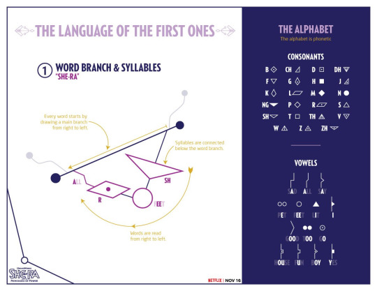
Here’s the original tweet from the She-Ra Twitter account, which has more examples: twitter. com /dreamworksshera/status/1055474341553623040
Here we go! Putting it under a break so it doesn't eat up your whole screen.
THE SOUNDS OF ENGLISH & THE IPA
So first of all, we need to start with a brief introduction to the IPA. (If you’re already familiar, you can skip to the next big heading.) Lots of languages use a lot of different letters or other characters to represent certain sounds, but when you're working with linguistics, you need to be able to say exactly what you mean. So, we made the International Phonetic Alphabet. This is a long list of individual letters and markings that represent very specific sounds, and you use them by placing them between slashes, like /d/, and sometimes to distinguish, you place the actual writing between corner brackets, like <d>. So for instance, /t/ and /h/ make the same sounds that <t> and <h> make in English, but <th> (usually) makes either the /θ/ or /ð/ sounds. These change based on where you live, but in general the consonants are the same for all English speakers.
Knowing this is important, because something I love about the First Ones alphabet is that it isn't just a letter substitution! Many "secret language" alphabets I've seen in kid's series (like Artemis Fowl, for instance) are just simple one-to-one substitutions for the Latin alphabet we use. But First Ones writing is actually very different! It uses the actual sounds made in the word. So if you wrote "cat" in the First Ones script (which I'm gonna call Eternian, after Eternia from He-Man, which flows better than "First Ones script"), it would actually look like "kat", because the letter c can be used for the sounds k or s, so it doesn't translate.
The alphabet we're using right now was created for the Latin language, derived from the Greek alphabet, which itself has a very long history behind it. English is NOT descended from Latin - it's a Germanic language, and the Germanic family is only kind of related to the Romantic family that developed out of Latin. However, a lot of our vocabulary has a Latin infusion because of mixing with Old French in the 1000s-1100s, and even before that, we used the Latin alphabet because it was the most common. This means that in order to express all the sounds we have, English speakers writing English had to combine different letters together; this, plus over a thousand years of different spellings and dialects, means that our orthography - our way of writing the sounds we say - is FUCKED. The Eternian alphabet is actually a much more efficient way of writing these sounds!
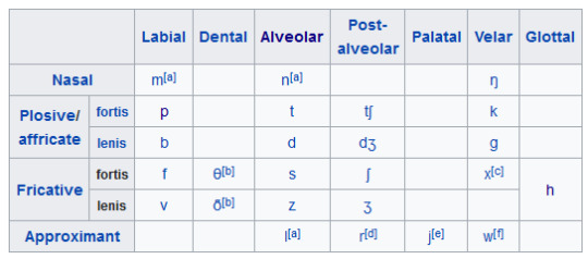
This is the total list of English consonants:
A few notes here:
To make sure you're not lost, /ŋ/ is <ng>, /j/ is <y>, /θ/ and /ð/ are <th>, /ʃ/ and /ʒ/ are <sh> and <zh> (the French <j>, not usually distinguished in English writing) respectively, and /tʃ/ and /dʒ/ are <ch> and the English <j> respectively.
Most consonants can come in voiced and unvoiced versions (although, because English is weird, these are called "fortis" and "lensis" because we pronounce them with different amounts of energy). /b/ is /p/, but pronounced using the vocal chords. Only the nasal sounds, the "approximants", and /h/ don't have pairs in English, although /h/ DOES actually have a common voiced pair, and you can technically pronounce the others voiceless in some languages although it's very rare.
The /x/ sound, famously the end of the Scottish word "loch", is only found in Celtic accents (Scottish, Irish, Welsh) and in the South African accent (because of influence from Dutch). Other English speakers realize it as /k/.
The /r/ sound is weird. What /r/ technically represents is a trill, like in the Spanish <rr>. However, in English, that trill is very rare; what we use <r> for is called a "postalveolar approximant", [ɹ̠]. However, it is usually easier just to write the letter r, so that's how we transcribe it for English's IPA.
English also sometimes has what are called "syllabic consonants", which are consonants that can act as the center of a syllable in the place of a vowel. In English, these are mostly /l/, /m/, and /n/. For instance, the word "bottle" is technically pronounced [ˈbɑɾl̩] in General American English, and the same goes for words like "rhythm" and "button"; however, because this would complicate things a lot, phonologists consider it to include a very small vowel, so with the example of "bottle", it would be /ˈbɑtəl/ instead.
The vowels are a bit more weird than the consonants. Our alphabet was originally created for Latin, which only has ten vowel sounds, long and short a, e, i, o, and u (although technically the short vowels are /a ɛ ɪ ɔ ʊ/ instead of /a e i o u/, because fuck it I guess). However, we have a MUCH different vowel "inventory" in English - instead of the uniform 10 paired Latin vowels, in General American English we have anywhere from 11-13 vowels depending on your interpretation along with three diphthongs (combinations of two vowels used as a single vowel):
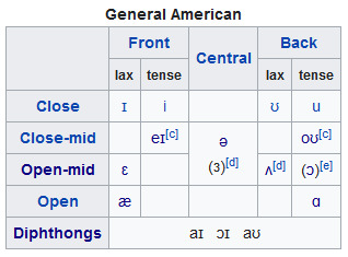
If you look at the British (Received Pronunciation) chart it's much different from that, which is why the accents are so distinct; however, Eternian is made with GA English in mind, so I'm just going to focus on that.
More notes:
/ə/ (a schwa, like in "uh"), /ɜ/ (very similar and hard to distinguish in writing), and /ʌ/ (something between an "uh" and an "ah"), are all very close to each other and sometimes interchangeable, especially between the first two.
/oʊ/ is usually simplified to /o/, and /eɪ/ is sometimes simplified to /e/, since the normal versions of those sounds don't show up so we don't have to make the difference clear.
A lot of accents in North America make /ɔ/ sounds (similar to "aw" or "au", like in "caught") into /ɑ/ sounds (the o in "hot").
Now, let's move on to the alphabet!
ETERNIAN GLYPHS & SIGILS
The "letters" of the Eternian alphabet, in my opinion, are better described using the more general term "glyph". This is because, while they are distinct shapes that mean specific sounds, they are used kind of artistically and variably within one large interconnected word-shape called a "sigil", much different than we would consider letters in the English alphabet. These glyphs are organized in words by lines starting at the basic shape of the sigil and stringing them together in order.
Eternian glyphs are split into two major categories that differ by shape: consonants and vowels.
CONSONANTS
The system of glyphs for Eternian consonants is actually very easy to remember, once you get the shapes down! Let's go back to the voiced/voiceless pairs. English has eight pairs of these, four plosives (made by quickly starting and stopping air with your mouth) and four fricatives (made by constantly moving air through your mouth). These eight pairs - along with another pair for /r/ and /l/ even though they aren't voiced/voiceless, because they're also closely related - make up most of the sounds in English and most of the consonant glyphs in Eternian. In each of these pairs, the voiceless (and /l/) have a basic, empty polygon shape; the voiced pair (and /r/) use the exact same shape, but with a dot in the middle. Like so:
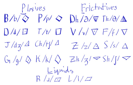
Outside of this, English has four more vowels - /m/, /n/, /ŋ/, and /h/ - and two "semivowels", which can be used either as a vowel or a consonant. One of these semivowels, /j/ (the English y), is used as a vowel in Eternian, while the other, /w/, is treated as a consonant. Except for /w/, these remaining consonants are all marked by the fact that they’re solid color; they also all use the same basic shapes as many of the others, but aren’t related to the sounds which share their shape:
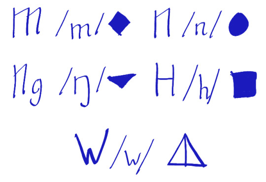
Pretty simple once you get the hang of it! Excuse the messiness; if you want a more precise rendering, you can reference the original release at the top.
I'm pretty sure this is all accurate, but there's one thing that seems weird to me. In English, <th> can be used to express either voiceless /θ/ or voiced /ð/. However, in Eternian, they gave us a "dh" glyph. I assume that this is meant to represent /ð/. However, in Wrong Hordak's "Smooch The Chef" apron, "the" is spelled with the glyph used for /θ/. But honestly I'm just assuming human error on that one, especially because /ð/ is very rare at the beginning of words except for articles or pronouns like the and these, most cases of <th> at the beginning of a word are /θ/ like in "thorn".
Now, for vowels!
VOWELS
Like I said earlier, this bit is much more complicated to get than the consonants, but luckily, this is actually much better for English than Latin letters!
Eternian vowel glyphs are divided, seemingly at random, into two subsets with a single exception. First are line-glyphs, which are formed by altering the connective line between two geometric glyphs. The others are circle-glyphs, the ones used for /ɛ/, /i/, /u/, and /o/. These function in the exact same way as the consonant glyphs, except that they are all circles where none of the consonants (except /n/) are.
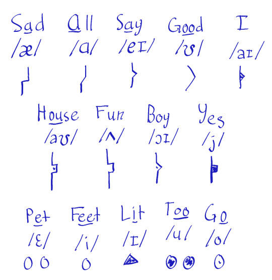
There's a few issues here with transcribing words, but they mostly come out of simplifying English's horrible vowel fluidity. For instance, there's no distinct letter for writing the schwa /ə/, but it can be folded into the letter for /ʌ/. That, and combining /ɔ/ with /ɑ/, simplify 16 sounds into 13 letters. The last letter, /j/, is the other semivowel I mentioned above; <y> in English can be used for either /j/ or /aɪ/ and /ɪ/, but this letter specifically represents the /j/ sound like in "yes" or "yak".
BRINGING IT TOGETHER
This is where things get very interesting. Let's start with the basics, walking through how to write the word "Adora".
Eternian, as a writing system, is much more artistic by design than Latin, and words and sentences can be constructed in many ways which are all read the same way. Eternian words - better called "sigils" - are read right-to-left, like Hebrew, Arabic, or traditional Japanese and Chinese. We form the sigils starting with a line sloping down in that direction book-ended with dots. The exact angle and length doesn't matter, but the right side is always noticeably higher than the left, like this:

We then add two additional decorative lines built off of that base, which end in dots:
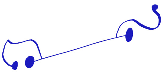
These flourishes can be curved, geometric, or a mix of both, and often inform a lot about the "personality" of both a sigil and its writer, and can distinguish one sigil from another. They're like the sigil's signature. They can be any shape or length, but never overlap with themselves or other lines.
The next step is to begin adding the sounds. Much like the flourishes, these are constructed differently for every sigil, although again they are all read from right-to-left and the symbols are placed with that in mind. These are strung down from the sigil's base, connecting with straight lines. Let's start by placing the a-sound in "Adora" near the right-side edge of the line (this is the /ʌ/ line-glyph, like the u in "fun"):
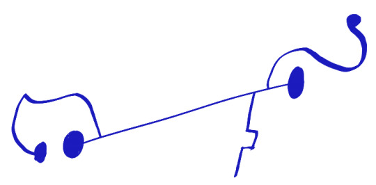
Because the /ʌ/ glyph is a line, it replaces the normal connecting line. Let's finish this syllable line with the /d/ glyph:
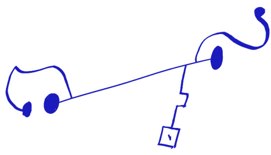
...and then add another line with the glyphs for /orʌ/:
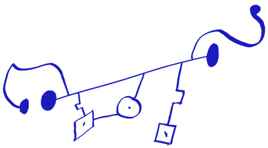
Generally, when a cluster ends with a line-glyph, it connects back to the base line. Clusters not at the end cannot end on a line-glyph (though I'm not sure about what to do for line-glyph-only words like "I" or "a" - perhaps the base line is changed, the line curves in an arc, or it ends at the changed portion?). Additionally, line-glyphs are always turned in the direction they're going - the beginning and ending /ʌ/ glyphs are flipped from each other, because the ending glyph is turned upwards going towards the base line while the beginning is stemming from it.
The important thing to remember is that sigils can be formed in a variety of ways - the flourishes, line angles, how you structure the syllables, all of these are dependent on the writer, so long as they follow those general rules. I constructed that sigil “AD.ORA”, but it could just as easily be “ADO.RA”, and in larger words there’s much more potential for structural changes.
Sigils in a sentence are connected through lines which meet the word next to each of the flourishes, and which bend to fit the shape of the sentence. Sentences are not read in any specific direction, but words are clustered in aesthetically pleasing ways and sentence order is shown by these connecting lines. However, The initial word in a sentence only has a line connecting on its left side, the final word only has a line on its right side, and words in between connect to the previous word on their right and the next word on their left.
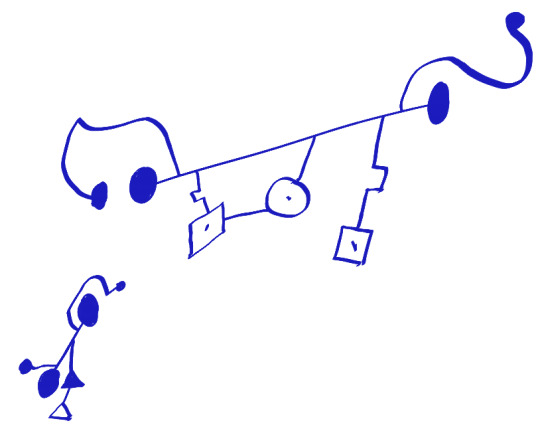
Let's try extending this to a simple sentence - "Adora is She-Ra." We already have the She-Ra sigil from canon, so we just need to connect them with the word "is".
First, let's write the next word, below and to the left:
And connect the two with a line:
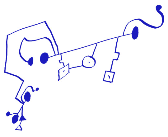
And then repeat with the "She-Ra" sigil.
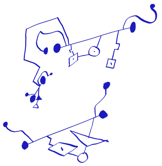
...and finally...
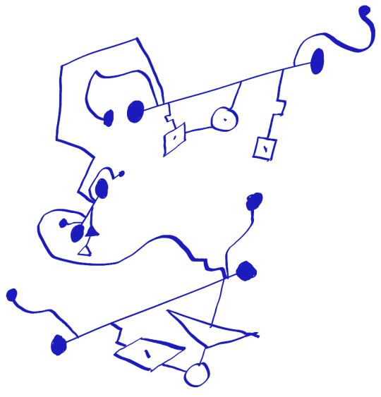
There we go! You've officially written a sentence using Eternian glyphs! I hope you have fun with it! If you have any questions feel free to shoot me an ask. Thanks for reading!
231 notes
·
View notes
Text
Hi Good Omens fans, ever since making this blog, and trawling through the archives for old art, I have been thinking again about trends from before the TV-show, and the way people draw Aziraphale and Crowley. I wanted to make this post addressing it but this is not “discourse” or to start a fight, in fact I would be perfectly content if all I did was make people think critically about what I am about to say and not even interact with this post at all, but I feel like I need to say it.
Talking about any racist undertones to the way people draw our two favorite boys usually makes people dig their heels in pretty fast. This is not a callout post for any artist in particular, this is not me trying to be overly critical of artists especially since they have more talent and skill than I do, and I’m going to address some common counterpoints that I frankly find unsatisfactory. Let’s just take a moment to set aside our defensiveness and think objectively about these trends. It took me a while to unlearn my dismissive attitude about these concerns so maybe I can help others get over that hurdle a little faster. Now let’s begin.
I’ve been kicking around the Good Omens fandom since maybe 2015 and for art based in book canon, whether it was made before the TV show came out, or because the artist is consciously drawing different, original designs, I’m going to estimate that a decent 75% of all fanart looks like this

Aziraphale is white and blonde and blue-eyed while Crowley is the typical “racially ambiguous” brown skin tone it’s become so popular to draw podcast characters as nowadays.
And the question is why? With the obvious answer being “it’s racist,” but let’s delve a little deeper than that.
A common thing I hear is that people get appearance headcanons fixed in their mind because the coverart of the book pictures the characters a certain way. My first point is this only shifts the question to why the illustrators drew them that way, when there aren’t many physical descriptions in the book. My second point is that while there definitely are cover arts that picture Aziraphale as cherubic, blonde, and white and Crowley as swarthy, dark-skinned, and racially ambiguous...
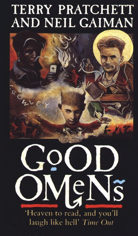
(side note: why is Crowley’s hand so tiny? what the hell is going on in this cover?)
It’s much more common for the covers to simplified, stylized, and without any particular unambiguous skin tones
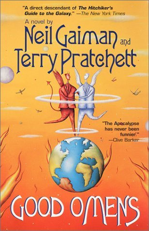
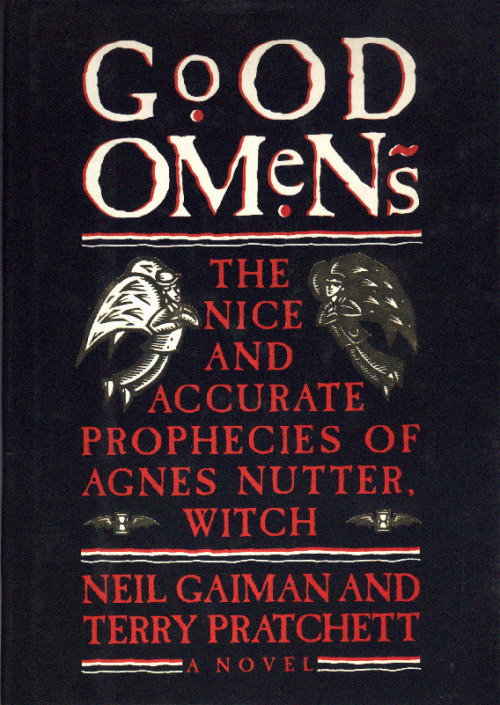
I don’t know about the UK but the most popular version in the United States is the dual black and white matching covers
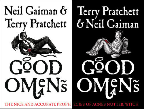
And while you could make an argument that the shading on Crowley’s face could suggest a darker skintone, it seems obvious to me that lacking any color these are not supposed to suggest any particular race for either of these two, and the contrasting colors are a stylistic choice to emphasize how they are on opposite sides. If anything, to me it suggests they are both white.
In short I simply do not buy the argument that people are drawing Aziraphale and Crowley this way because that’s how they were represented on the cover art of the book. If you draw them the way they are on the cover then whatever, I don’t care, but I don’t believe that’s what’s driving this trend.
The second thing people will say is that Good Omens is a work of satire, and it’s based in Christian mythology which has this trend of depicting angels as white, and it is embodying the trope of a “white, cherubic angel” paired with a dark-skinned demon for the explicit purpose of subverting the trope of “white angel is good, dark demon is bad” since Aziraphale is not an unambiguous hero and Crowley is not a villain. “It’s not actually like that because Crowley isn’t a bad demon, and Aziraphale isn’t actually a perfect angel” is the argument. This has a certain logic to it and allows some nuance to the topic, but to this I say:
Uncritically reproducing a trope, even in the context of a satire novel, is not enough to subvert it. Good Omens is not criticising the racist history of the church, and while the book does have some pointed jabs at white British culture (such as Madam Tracy conning gullible Brits with an unbelievably ignorant stereotype of a Native American) it is not being critical of the conception of angels as white and blonde or the literal demonization of non-white people. That’s just not what the book is about. So making the angel white and the demon dark-skinned, playing directly into harmful tropes and stereotypes, is not somehow subversive or counter-cultural when doing so doesn’t say anything about anything.


Please consider fully the ramifications of the conception of white and blonde people as innocent and cherubic and dark-skinned people as infernal and mischievous, especially in modern contexts...
Black people are more likely to be viewed as violent, angry, and dangerous. Priming with a dark-skinned face makes people more likely to mistake a tool for a gun. Black people are viewed as experiencing pain less intensely by medical professionals. Black men are viewed as physically larger and more imposing than they actually are. The subconscious racial bias favoring light skin is so ingrained it’s measurable by objective scientific studies, on top of the anecdotal evidence of things like news stories choosing flattering, “cherubic” pictures of white and blond criminals while using unflattering mugshots for non-white offenders.
This is why I say that if you’re going to invoke the “whites are angelic” trope, you better have a damn good subversion of it to justify it, because this idea causes real harm to real people in the real world. And Aziraphale being a bit of a bastard despite being an angel, I just don’t see that as sufficient. I am especially cautious of when it’s my fellow white fans that make this argument, not because I believe they do this out of any sort of malice or hatred of people with dark skin, but because I know first-hand it stems from a dismissiveness rooted in not wanting to think about it for too long because it makes us uncomfortable. Non-white people do not have the luxury of not thinking about it, because it’s part of their life.
Now the strongest textual evidence people use, in the absence of much real descriptor, is this:
"Many people, meeting Aziraphale for the first time, formed three impressions: that he was English, that he was intelligent, and that he was gayer than a tree full of monkeys on nitrous oxide. Two of these were wrong; Heaven is not in England, whatever certain poets may have thought, and angels are sexless unless they really want to make an effort"
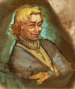
This piece of art has circulated in the fandom for so long I don’t know the original artist and it’s been used for everything from fancovers to perfume. This is where I found it and it’s one of the first things that come up when you google this quote about Aziraphale.
Doesn’t it just feel like this is the man that’s describing, some blonde effeminate gay man? Well guess what, there’s the “blonde as innocence” trope rearing its ugly head again, because the stereotype of gay men and effeminacy as being a white and blonde thing is--ding ding ding you guessed it--racism. And why would intelligent suggest a white and blonde person, except if the stereotype of a dark-skinned person is less intelligent?
Now the point of “people assume Aziraphale is British” is another sticking point people will often use, claiming that the stereotype of a British person is white and blonde. I guess this has some merit, since the British empire was one of the biggest forces behind white colonial expansion, and it seems disingenuous to assign “British” as “nonwhite” as soon as we’re being satirical, in the same way I found it distasteful that the TV show made God female when so many of the criticisms of the church are about its misogyny and lose their teeth as soon as God is no longer male.
However consider that 1.4 million Indian people live in the UK. I heard a man say aloud once that the concept of a black person having a British accent was a little funny, as though Doctor Who doesn’t exist and have black people on it. And I’m not overly familiar with the social landscape of the UK, but I understand they’re experiencing a xenophobia boom and non-white Brits aren’t considered “really British.” The stereotype of non-white people not being British only exists because of reinforcement in media. If you really want to be subversive, drawing Aziraphale as Indian goes way further than drawing him as white IMO.
Now let’s talk about Crowley. He is almost always drawn with a darker skin tone than Aziraphale, even when they are both white, and while I’ve outlined above how this is problematic on terms of linking light skin with innocence, I think it does have an extra layer. I think it also has to do with the exotification and fetishization of brown skin and non-white people.
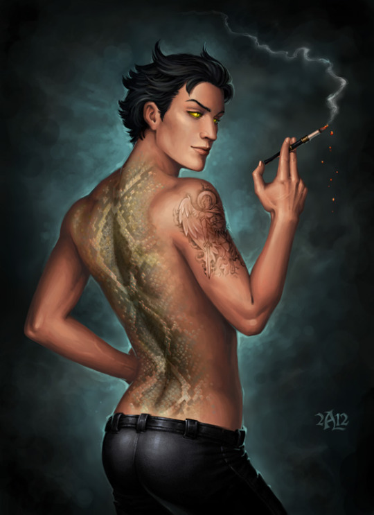
This artist’s tumblr is gone now but their art is still on dA and while it’s definitely beautiful and well-done, I think this is a very good example of what I’m talking about.
Crowley and Aziraphale necessarily contrast each other, so describing Aziraphale as “British” might suggest that Crowley is “foreign-looking.” I also know *ahem* that the fandom generally thirsts over Crowley to hell and back, so making him a swarthy, tall dark and handsome is not necessarily surprising.
An interesting thing happened when the TV show came out, and everyone started drawing Michael Sheen!Aziraphale and David Tennant!Crowley more and more often: It’s not ubiquitous, but it does happen that sometimes artists will draw David Tennant’s skin darker than it actually is. The subconscious urge to see Crowley with dark skin is for some reason that strong for many people. And I really encourage people doing this to think about why. Not naming any names but I’ve working with fanartists before for collabs who I had to ask to lighten “bad guy” demon’s skin tones because it looked like they were making the skin darker on purpose to make them look scarier. This person is a perfectly pleasant person who tries not to be racist! And we both still fell into it accidentally, and it took me a while to notice and point it out, because the ingrained stigmatization of darker skin is pervasive yet often goes unnoticed.
What is the solution? I don’t know, and as a white person I’m not really qualified to make that call. Do we draw them both with the exact same skin tone? Is it better to make them both white? Should we make both of them non-white? Should we only make Aziraphale non-white? I am consciously aware of the fact that the Good Omens fandom is mostly white people, so most of the art we make is being both made by and consumed by white people, so I don’t feel comfortable saying “draw these characters of color specifically” because that can also veer into fetishization territory very quickly. This is not specific to good omens but I think we should pay attention to what fans of color say in all fandom spaces and weigh our choices even if they seem insignificant. And it’s important to realize that fans of color will not be a monolith in their opinion either, and it’s our responsibility to recognize that everyone can be affected by racism and social issues differently, the same way all women are affected by misogyny differently so just because one woman says such as such is misogynistic and another says it’s not. I’m sure there are non-white fans who think it’s perfectly fine to draw Aziraphale as white and Crowley as ambiguously non-white. I’m not saying they’re wrong. And I’m not saying you can’t reblog this kind of art, or that people who make or made it should feel bad about themselves. But so often this sort of thing goes unaddressed just because people don’t like thinking about it, and well, avoiding hard questions never really goes well I think.
195 notes
·
View notes
Text
The Wolf
AN: Something I’ve been sitting on for a while! 18+ please.
Warnings: Cursing, concert/festival, feelings of being watched, smut, consensual, Original Male Character x Female Reader
Summary: You’re alone at a crowded festival and keep feeling like someone is watching you.
I had bought tickets to a nearby electronic festival in hopes of relieving some stress from work. I was hoping that I’d be joined by a couple friends who claimed to buy tickets, also. When I got bailed on at the last minute, I was frustrated, sure, but still decided to go on my own. A couple people from work said they’d also be there but I wasn’t going to hold my breath waiting for them.
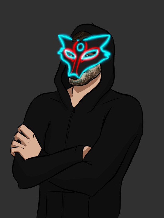
Throughout the day, I bounced my way from one stage to another, hanging back and enjoying the energy. As the evening progressed and colorful LEDs filled the space around me, my eyes were continually drawn to one mask in particular. It was an overly simplified outline of a wolf face, outlined in blue-green LEDs with a few red accents. The figure wore a hood, partially hiding the top of their head, letting a few strands of hair poke through the top. I was intrigued the first time I saw the figure's mask but brushed it off soon after, as I made my way to another stage. Any time chills ran over my skin, I looked around, always seeing that mask in the crowd towering over everyone else but writing the chills off as me being underprepared for the cold night air.
I was eventually able to push my way to the rail, at a stage, for some semblance of breathing room. The majority of people around me had bright, flashing masks and insane costumes, while my own colorful half mask had been abandoned early on as it made my face sweaty.
I was able to lose myself in the music with bodies writhing around me, not that I paid any attention to them. When the artist finished their set, I felt the hairs on the back of my neck stand up as the pit calmed down. I furrowed my brows, looking around nonchalantly until my gaze landed on the mask from before, staring my way, from a few people down the rail. The dark pits, where their eyes should be, made me dizzy as the LEDs put me in a trance. The intense stillness caused me to look away almost as quickly as I had seen them.
Soon after, I heard dissatisfied grumbles behind me until a new pair of arms rested on the rail next to me. Their fingers wrung together almost nervously, while they stared at the stage. I gathered the courage to glance at their profile, seeing the profile of the wolf mask with a bearded cheek and an ear peeking out from the side of the mask.
I gulped, but pushed against the man’s forearm, getting his attention and causing his head to turn toward me, “You’ve been following me all evening. What’s your deal?”
He tilted his head at me silently, while I imagined him squinting at me through the mask. The mask covered almost the entirety of the front of his face, narrowing and ending near the middle of his mouth. His tongue poked out from between his lips, swiping along his bottom lip as he came up with his excuse.
“Wanted to make sure you were alright,” he shrugged, his murmur barely audible over the sounds around us.
“You don’t even know me,” I answered warily.
“No, but I noticed you were alone, which means other people have as well,” he spoke up with a rugged, mildly gravelly voice cutting through the chattering crowd.
“How noble, yet creepy of you,” I raised an eyebrow at him.
He shrugged silently, unbothered by the accusation. A popular song came on over the speakers to keep the pit warmed up for the next act, causing people around us to start dancing again. He glanced at the stage and then back at me, his chin moving in a chewing motion as he presumably chewed on his lip.
“Need a dance partner?” he asked so softly over the crowd that I almost missed it.
“Are you offering?” I wondered aloud, raking my eyes down his form, which was dressed in all black but illuminated by the bright neon lights. He was tall, there was no mistaking that, with the right amount of heft in his upper body.
He tilted his head slightly and nodded, “Yea.”
His low, gruff voice almost killed me then and there. It was my turn to worry my lip between my teeth, taking a deep breath, and finally nodding, “Sure.”
I understood what agreeing to him meant. These kinds of festivals aren’t exactly known for their modesty. He slid smoothly between me and the person behind me, letting his large hand slide along my hip and still as he settled behind me. Both hands dropped to my hips as I swayed against him to the beat of the music.
The last artist came onstage, halting the dancing for a moment as people cheered and the artist introduced themselves. The thumping beats soon filled the space again, with a variety of dancing happening around us. The beauty of these festivals was there was no one way to dance, giving freedom to everyone. His hands met my waist, dragging down lightly until they rested on my hips again. I dropped my hands to his, feeling soft skin and thick fingers tighten their hold on me. I bit back a smile as I felt his hips press firmly against mine, while his hands slowed my hips down. He took control of the rhythm and I was more than happy to let him, the way things were going.
“You’re fucking gorgeous,” he rumbled in my ear, allowing his lips to brush the edge of my ear.
The vibrations in his voice sent yet another series of chills down my neck. I brushed my hair to the opposite side of my neck, letting the cool air hit my skin. One of his hands released my hip, assisting in brushing the hair out of the way before dropping his lips to barely skim the skin behind my ear. I didn’t stop him, nor did I want to. Instead, I lolled my head away from him so he'd have more room. He used his free hand to push his mask up to the top of his head for unrestricted access. His lips met my neck, teasing the skin with a series of closed-mouth kisses.
I tried to sneak a peek at his face, only for him to catch on to the movement of my eyes before I tried to turn my head. He slid his hand up the front of my neck, free of overbearing pressure, serving only to guide my face forward again. His fingers grasped my jaw lightly, stilling my movements, and getting the point across clearly. I abandoned my previous mission and allowed myself to enjoy the mystery instead.
The touch of his nose and burning of his facial hair overloaded the nerves under my skin, as his mouth continued its journey. I lost myself for a moment, letting soft moan escape through my lips at the feeling. His lips formed into a wolfish grin as he picked up the sound, letting his teeth barely graze my neck.
“That was a lovely sound I wouldn’t mind hearing again,” he murmured, bringing his lips back to my ear.
I reached a hand behind me, letting it rest on the back of his neck, “Then give me a reason to make it again.” He let out a low groan, sighing against my neck. His hands fingered the edge of my waistband, dipping below just enough to make my skin jump as we were consumed by the music once more.
By the end of the set, I was an aching mess. Before I could turn around, he had put his mask back in place, preferring to keep the charade up a little longer. He held me in his arms as I stood face to face with him, keeping me plastered against him.
His mouth dropped to my ear, “I know some place we can go if you’re up for it.” He punctuated his proposition with a gentle grind of his hips.
“Let’s go, then,” I licked at my lips in anticipation.
He took my hand and led me away from the crowds, towards a gathering of extravagant tents. In an effort to save money, I had passed on the VIP package that included one of these fully furnished tents. I stopped in my tracks as he pulled us toward the entrance to the tent area, framed by staff to check wristbands.
“Wait! I don’t have VIP,” I showed him my wristband.
He tugged his sleeve up, revealing a tightly muscled forearm and a VIP wristband. Well, shit.
“Alright, then,” I shrugged and followed him in.
He led me to one and ushered me inside, immediately seeing a half made bed and bag of clothes tucked in a corner. His body heat radiated behind me as his hands slid up my sides, taking my shirt with them.
He halted his hands halfway up, “This alright? Tell me to stop.”
“Keep going,” I pleaded, pushing his hand with mine, “please.”
He tugged the shirt up and over my head, tossing the shirt and stopping to admire the smooth expanse of my back. In his daze, I turned around and slid the zipper of his jacket down which he happily shrugged off his shoulders. Unsurprisingly, he was sporting a black t-shirt that revealed bits and pieces of tattoos on his upper arms. I ran my hands from his forearms up to his upper arms, pausing to smirk up at him.
“Go sit down,” I nodded toward the bed.
He grinned down at me, the light inside the tent allowing me to see the humored glint in his eyes through the mask, “Yea? What for?”
“Why don’t you go find out?”
He took his bottom lip between his teeth, grinning underneath the mask and stalking over to the bed. Before he could sit down, I grabbed him by the belt and undid it and the button of his pants quickly. He kicked off his shoes and lower garments hastily, sitting on the edge of the bed and looking up at me almost obediently. I dropped to my knees, between his legs, feeling his stare as he moved my hair away from my face. He was thicker than I’d had before, but I didn’t let his size deter me.
I wrapped my lips around the head of his cock, hearing him sigh in relief as I gently sucked. He leaned back, resting his forearms on the bed and giving me more room to work with. Curses dropped from his lips as I took him as far as he could go. He leaned his weight on one forearm, using the other hand to wrap itself in my hair. He hit the back of my throat, letting out deep groan and letting his head loll back.
“Again, just like that, darling,” he moaned, pressing down on the back of my head so I’d get the hint.
I glanced up at the thick line of his neck as he tensed and relaxed. I continued to deep throat him, loving the sounds that ripped from his chest but having to ignore the growing ache in my jaw. Eventually, I let him slip from my mouth, using my hand to keep him going.
He sat up, taking notice of my discomfort, “Easy, easy,” he cooed. He ran his thumb along my aching cheek, “Don’t force it,” he murmured, gently massaging my jaw. “C’mere,” he guided me to my feet and coaxed me into straddling his lap while he sat on the edge of the bed.
I looked down at the mask, attempting to see through it to no avail. I let my hands wander up the back of his neck and around to the side of the mask, where I found the off switch. I flicked it off, the absence of colored light revealing a white base mask. My fingers found the bottom edge of the mask, pushing it up his face and smiling when he didn’t stop me. My eyes travelled upwards as new features of his face were revealed, taking in the sight of his bearded face; soft, parted lips; and strong nose. I finished taking the mask off, letting it fall from my fingers and onto the floor. I took in his face once more, seeing him analyze whether or not I was disappointed in what I revealed.
I took his neck in my hands, coaxing him to meet me halfway before our lips were fused together. His hands travelled up my back, one finding the back of my neck and deepening the kiss. He stood slightly, with me in his arms, turning us so that I was closest to the bed and letting us fall back on it in a heap. His hands blindly found the clasp of my pants, shoving as much material down as he could and sliding his hand down. I gasped into his mouth as his fingers met the hours worth of wetness he caused.
“Is this all for me?” He broke the kiss and grinned down at my expression as his fingertips grazed my clit.
My lips were barely able to form a silent answer before his wonderfully thick fingers were splitting me open. His fingers stretched me in light preparation of what was to come. I arched my hips into his hand, blindly reaching down to wrap my hand around his cock where it pressed against my stomach.
He reluctantly pulled himself away, standing and rifling through his bag. He tugged his shirt over his head, turning back towards me to see that I had rid myself of the rest of my clothing. He ripped open the small packet in his hands, rolling the condom on with renewed fervor when he saw the state of my undress.
He stretched himself out on the bed, eyeing me as I crawled up his body. I hovered over his lap, feeling him line himself up with anticipation written on his face. I sank down on him slowly, enjoying the stretch and burn coupled with his drawn out groan. His hands flew to my hips, holding on tightly as helped guide my movements.
“Lean back, darling,” He said through a moan as he sank deeper. He sucked one of his thumbs into his mouth, then maneuvered it between us and rubbed my clit in tight circles. I leaned over him, nipping at his neck and shoulders gently. He quickly adjusted his hand between us to use his fingers instead.
“Harder,” he sighed, stretching his neck out further.
I bit down as he met my thrust with one of his own, moaning against his skin. I stopped just short of breaking skin. I fisted a hand in his hair, tightening my hand until I was gasping my release and clamping down around him. He whispered a curse at the tightening, latching onto my neck to keep me in place. He didn’t last much longer, wrapping his arms around me in a tight embrace as he trembled under me. He continued biting at my neck until I pinched his arm, earning a laugh that vibrated throughout his chest.
We eventually untangled ourselves and cleaned up a bit. I gathered my clothes into my arms, stilling my actions when I heard his voice.
“You can stay the night, you know?” he shrugged. He folded his arms behind his head, a satisfied smirk across his lips as he admired his handwork. “Beats driving home at this hour,” he shrugged. “Plus, a quickie in the morning won’t hurt, right?” he joked.
I rolled my eyes, depositing my clothes in a neat pile on the floor. I slid under the covers next to him, keeping a decent distance while he busied himself by turning the lights out.
When consciousness took over in the morning, I blinked my eyes open at the unfamiliar surroundings. A heavy arm had situated itself over me with a soothing warmth behind me. As my eyes threatened to close, a disruptive snore broke me out of my stupor. My eyes shot open, my mind immediately figuring out how to ease myself out of the embrace. I, somehow, managed to weasel my way out with out waking him and dressed quietly before disappearing. I didn’t know what I was thinking, staying with some stranger, but I was honestly glad I had.
#original male character x reader#reader insert#fanfiction#oc x reader#female reader#original male character x female reader#oc x female reader#smut
16 notes
·
View notes
Photo

IT IS FINISHED no seriously, this took ages. First couple of days were fine and motoring along with progress, then I was laid out for a week-ish with health problems. Then once I was well enough again I was back to being fixated on finishing this piece of my lad Joshua here for another handful of days, so I’m super glad this is done now. More talk about the painting, details and process under the cut:
Art Entry 01, Joshua Rook, Junior Deputy of Hope County. Regarding the painting’s execution, stylistic choices, practiced methods, and speculation on further experimentation for skill and stylization. _____________________________ Honestly I thought that the uniform’s large swatches of green fabric would be more difficult than it actually was. Turns out that was the easier part compared to the shoulder patch and metal badge. x’D The metal badge design is based off of and inspired by a custom-ordered cosplay badge design I found while looking for references, in this post here (link,) from v-i-d-e-n-o-i-r’s blog and Far Cry 5 cosplay. There are some differences in the painting’s rendition above, namely I flattened the middle section and made it all concentric polished metal instead of painted and the great seal rendition in the middle doesn’t have silver lineart either. Those choices are as much for aesthetic reasons of eliminating the blue ring so it was all a fairly simple mono-material-looking surface as it was for simplifying having to forego painting the foreshortening that a spherical dome might entail. Also just because the rest of the metal turned out looking good enough that an additional bit of shiny metal seemed like it’d fit right in for this. That being said, the badge design that inspired this one is rad and awesome looking—and I totally didn’t realize it wasn’t quite like the badges from in-game assets until after I’d painted it. x’D So, I decided to stick with this one since it’s simpler and has cleaner lines, and less engraving to pick out highlights on. Metal is very hit or miss for me to get right, so I’m very pleased with how this one came out! :D I think I did well on that one. The shoulder patch originally I was looking at real world references and ended up changing the shape once I actually looked at in-game references on Staci and Joey—who I discovered have slightly different details on their uniforms, like the font for their name tags—Staci’s has an old-timey-looking-font with serifs, Joey’s is a non-serif more modern-style font. Some pictures have them having different buttons on their uniforms either in color or shape (the former being exported assets, the latter being in-game gifs/screenies/etc.) This is also how I learned that the little landscape with the shovel, pickaxe and plough/plow are part of the great seal of Montana. I had no flipping idea that was what it was, looking at the patches in-game. The cosplay community does some great work for that, for which I’m grateful. I ended up looking up references of what the state seal’s design was so as to see the smaller details, and to find out what the motto meant ”Oro y Plata,” meant, leading to etymology googling adventures from there, as usual. All important details to paint though I think here, since Joshua’s deputy uniform is symbolically significant to him and will remain so throughout his story as part of his internal conflict for a couple of reasons. One thing I knew I should’ve done from the start, and reminded myself to do, was the fact that I should paint all skin sections at the same time, so as to ensure they all came out the same shades. I did not do this. x’D I’ll have to actually try to do that next time honestly. Same with the hair sections, while I like how they came out, I do feel the differences between the three major segments in terms of brushwork is not as coherent as I’d like, even if beard hair is not necessarily similar in how it lays to scalp hair, particularly with length and such taken into consideration. Still, not bad. Could’ve used more refs for the backlighting and figuring out how the highlights would fit best on the ponytail, but I think the hair curves turned out nice there in particular. Overall, Joshua’s hair ended up messier than I’d thought with how the locks all end up looping this way and that across his head, but it does actually fit him well as a character for his hairstyle to be messy and loosely held together, but functional. It did end up longer than I’d intended, so we have him likely ending up with a nerdy Jesus hairstyle when it’s down. x’D (Thanks to @undead-gearhead for that mental imagery, I shall take great amusement in that should I get around to drawing Joshua with his hair down.) Aside from that, I think I’m slowly improving on figuring out how to paint glasses, though I’m thinking in the future I should test more layered reflective light on them or something where the frames are in contact or close to skin, particularly around the glasses’ bridge across the nose and such. Then there are the other deviation details added—like using dark green instead of the black for the uniform accents. The faded black looks great in-game, but I do think the buttons pop more against dark green instead for this painting. I’m a little bit surprised how well the button-placket section came out, Clip Studio Paint crashed when I painted the first rendition of it, sadly losing all that work. I thought it’d be okay but turns out it didn’t quite get to auto-save that recently enough, but the second go around turned out quite well I think, possibly better. I was originally planning to try to put more textured brushwork across the flat sections of the uniform material, but decided to skip it for speed—I’ll test that elsewhere perhaps, though I think it came out well with the watercolor brushes layered on top of one another like that as is. Among the other smaller details, there’s some tweaks and such for how Joshua’s eye shape, eyebrows, nose shape, hairline etc came out compared to references of Greg Bryk in his role as Joseph Seed. I think Joshua did come out looking like he’s obviously related to the Seeds as I was hoping for, but I’m kind of on the fence that people would look at him and automatically assume it’s Joseph specifically that he’s descended from. I hope so, but either way, that’s how he’s written in-fic. x’D Overall, I would consider this painting a success, though as usual I do wish it’d been faster to finish. I do think this was good practice for detail work, and metal shading, also: buttons. Still haven’t figured out how to paint lips with more pink or red tones, I don’t like the way they look when painted sadly, unless it’s lipstick. That may end up being a stylistic element perhaps, along with how I paint the lines for fingernails and other such details. Fun fact: I have to leave the shading on the eyes for last, or else my brain goes “The eyes are done! We’re done! Call it a day.” I’m not sure why, but so far, leaving them as flats until the end seems to work a treat for keeping me focused on finishing the rest of the work with less mental dissonance. Now if only I could figure out why despite knowing I should do all the exposed skin portions at the same time, I don’t follow through on that naturally as far as inclinations go. Maybe it’s a layer organization thing and perception of wanting, say, the cloth to be done first before working “down” to the hands and such in the sense of working from the head down? I’ll have to think on that some more and test things in the next painting. Perhaps color coding the order of layers to paint will help? CSP does have a nice layer-icon-color function that I’ve dabbled with here and there. There are so many brushes, I really do need to test out more of them, I use, what, four or five total, but primarily somewhere around two or three. Hm, but what to do with texture, and how to utilize it so? Hmmm, as far as personal appeal for methodology goes, I might prefer to use textures in select pieces for more emotional emphasis? If I can figure out how to do that in a messier speed-paint style of things. Rougher textures for conflict, for example. That sounds like an interesting idea to explore, I’ll have to remember that for a later piece. Maybe more heavily textured brushes will also help with the mental itch to refine things to a cleaner-level of refining instead of leaving it in a more organically rough state. Hm, maybe it’s a “mental texture” aversion or something, as far as an interplay between the brush’s texture and the flow of the linework/brushstroke. Perhaps more uneven brushes echo that in a complimentary fashion to better allow less mental discomfort for me personally when trying to paint in a faster, looser fashion? Honestly, very tempting to go try that out sooner rather than later on some art ideas I have, but I’ve been missing my writing very much of late with two time-demanding paintings back to back. So, ideas for a later time to experiment with.
#Far Cry 5#FC 5#Far Cry 5 AU#FC 5 AU#deputy joshua rook#my art#ofravensandgenesis's art#art talk#chatter#writing about art#writing about fanart#queue
23 notes
·
View notes
Text
228. Sonic the Hedgehog #160

Birthday Bash! (Part One): Giving and Receiving
Writer: Ian Flynn Pencils: Tracy Yardley! Colors: Jason Jensen
Welcome to the beginning of Ian Flynn's reign, everyone! As many of you will know, Ian is a fan favorite amongst readers of the comics, and for good reason. Objectively, I'd say he has a much better sense than any previous writer of how to construct dynamic and interesting stories, as well as a great head for writing dialogue. Every character has their own unique voice when speaking, and as someone who takes a particular interest in dialogue in her own writing, it's something I admire a lot, especially given how stilted and unnaturally formal a lot of dialogue by Karl and especially Kenders often sounded, regardless of who was speaking. That said, I think that it took a good year or so for him to fully come into his own as head writer for the series, so some earlier issues are a bit strange and not up to par with a lot of his later work. Some of this, to be fair, is due to him essentially playing clean-up for this first year, untangling a lot of the bizarre leftover plot threads that Karl and Kenders left behind, and generally trying to make the world of the comics conform a little better to that of the games. All that aside, anyone reading the comics will likely notice an immediate and apparent improvement in the overall quality of the work starting with this issue. This is helped along, in addition, by none other than the very talented artist Tracy Yardley! who always (well, almost always) introduces himself in the story credits with an exclamation mark. It's kind of his calling card. Tracy took a while to really improve his art as well, so while his earliest issues sometimes have some strange proportions and poses, later on his style became easily one of the most visually attractive and recognizable ones in the series, simplifying a lot of the inconsistencies that many character designs had as well as doing away with the strange pseudo-human proportions that some artists tended to favor, particularly with the female characters. All this said, I will say that Ian isn't going to be immune to my criticism, as while I do recognize his skill as a writer and the good things he brought to the table, there are definitely some problems I have with the way he handled certain things. We'll cross those bridges when we come to them, however, so for now, let's dive into the new world he's creating and see how he does!
Elias and Sonic are walking on the outskirts of Knothole as Elias explains why his father approved the Metal Sonic troopers from last issue. We don't even really get to hear the explanation, but to be fair, we hardly need one, as the idea was so insane to begin with that the only true explanation is that Kenders needed a plot device. Sonic tries to make Elias promise that "you royals" won't hit him with any more weird surprises, and Elias says they only have one more, leading him to a building next to where the Great Oak Slide into the village ends.

I mean, canonically he's supposed to be turning seventeen here, even though realistically he should be turning eighteen, because remember, for him to have turned sixteen in StH#68, had the Robians be deroboticized in early June in StH#123, and still have managed to spend close to a year in space before turning seventeen, literally everything in between the two aforementioned issues would have had to take place in the span of a few weeks - yes, that's counting the month-and-a-half time span that Sonic was confined to Knothole, as well as major events like Eggman's return and the entire Green Knuckles saga. You can see why this huge discrepancy still bothers me, right? Hmph. Anyway, no sooner has the party begun than an explosion destroys the door, and two new players enter the scene - Bean the Dynamite and Bark the Polar Bear from Sonic the Fighters! Nack's been part of the comic for long enough now, so it's cool to see these two make their first appearance. Bark is totally silent - as far as I remember, he never says a single word during the entirety of the comic - but Bean, in the absence of an obvious personality to draw from in the game, has subsequently been given the personality trait of "criminally insane" in the comics.. He's erratic, he talks to himself, he cracks jokes where jokes really shouldn't be cracked, and most importantly of all, he loves his goddamn bombs. Bean starts chucking said bombs left and right at the various Freedom Fighters in the base, while Sonic tangles with Bark. He seems to think these guys are only after him due to something Evil Sonic did in his place, something which he has by now apparently finally explained to all the women of Knothole, and manages to break away from Bark to stop Bean's bombing spree by pinning him to a wall and asking about Evil Sonic. However, Bean happily insists there's been no mistake and he wasn't even aware of Sonic having an evil twin, nor does he particularly care. Oh, speaking of Evil Sonic…
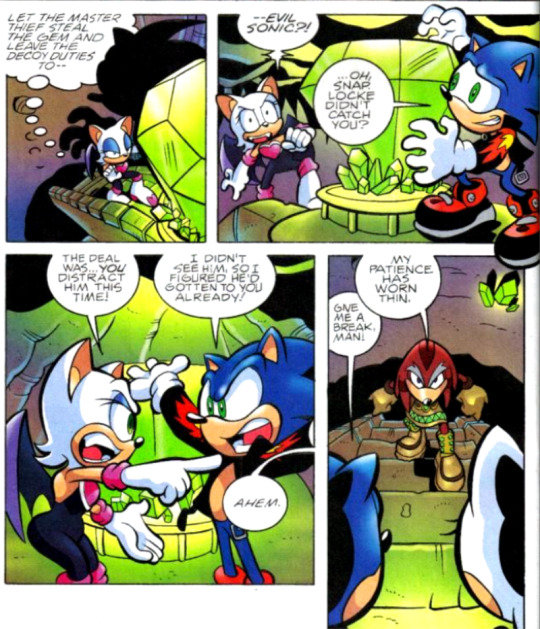
Huh, it seems that Evil Sonic has actually explained his true identity to Rouge in between their previous failed attempt and now. I'm surprised she hasn't outright abandoned him by now due to Rouge not exactly being evil-aligned to begin with, but I guess the pull of the shiny is just too strong for her to resist. And as it turns out, Bean suffers from a similar insatiable need! Fiona pulls out a ring of keys and shakes them around, completely distracting Bean from his current activity of bashing Sonic's head in, and throws them out the hole he made in the wall, prompting him to immediately abandon everything to chase after them. Fiona then advances on Bark, who by now has gotten himself cornered by every Freedom Fighter in the room, and convinces him to stand down as he's outnumbered. Outside, Bean plays with the keys and talks to them, seemingly convinced that they're a beautiful woman with an "adorable accent" who wants his number, when a suspiciously-Shadow-shaped shadow converges on him, prompting him to try to invite him into smashing Sonic as well. Good luck there, buddy, I don't think Shadow usually runs with crazy…
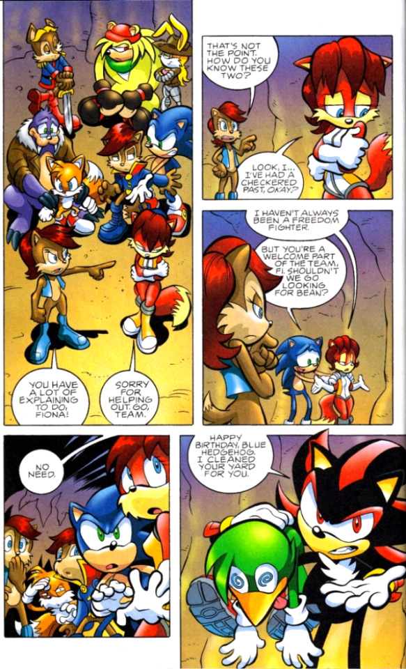
Geez, Sally, cut Fiona some slack. Not everyone had a squeaky-clean record - hell, just look at Shadow! Back in the Chaos Chamber, Rouge and Evil Sonic begin to battle Locke, who tosses Evil Sonic to the side as he perceives Rouge to be the bigger threat. However, that turns out to be a bit of a bad idea, as with Rouge tied up in the fight, Evil Sonic takes his chance to go after the Master Emerald without her, obviously recognizing it as more than just a shiny trinket.

Back in Knothole, Shadow explains that he's only here to thank Sonic for saving Hope, as he knows he wouldn't have been able to do it on his own, and reminds him that as soon as he leaves this building they're back to being enemies, as Shadow's still aligned with Eggman for now. Sonic, to his credit, seems to recognize that Shadow is only allied with Eggman because he doesn't yet know better, and cheerfully invites him to come back here whenever he cuts out on that deal in the future. It's at this point that everyone realizes Bean has quietly snuck into the brain trust's comms room to casually let Eggman know that he and Bark failed to take Sonic down, and when Fiona ushers him back out of the room, Eggman is only too happy to let Sonic know personally that he wishes him a happy birthday and he's sending him a new, more metallic present. Within seconds a thud outside alerts them to the arrival of this present, and everyone rushes out to see a strange figure emerging from an egg pod - a figure which resolves itself into the combined forms of Crocbot and Octobot, now merged into the singular entity of… Croctobot! (Don't worry, Ian knows just how silly this is and even acknowledges it next issue.) But what of Evil Sonic and Rouge? How is their fight faring against Locke after the former got knocked aside? Well, Evil Sonic takes his chance to dramatically emerge from behind the emerald as the other two get ready to continue their fight…
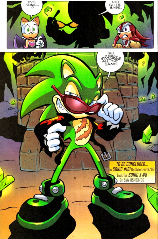
Plot twist! How many people actually didn't know by now that Evil Sonic and Scourge were the same person? I'm guessing there had to be at least a few of you. You can actually already see Ian's new plans being put into action - it's very telling of his intentions when the very first issue he ever pens immediately makes a point of distinguishing a rather tired and boring character into a new and improved version of himself, with a unique name and new, visually distinct look. Apparently Kenders, who if you recall is the original creator of Evil Sonic, never liked this and continued to insist on referring to him as Evil Sonic, but screw that, Scourge is a much more interesting character and this was a change that sorely needed to be made.
Sonic Rush (Part One of Two)
Writer/Pencils: Tania Del Rio Colors: Ben Hunzeker
So unfortunately, Sonic Adventure 2 isn't the only case in the preboot of a partial adaption of a game being included without any actual ending. Sonic Rush, the game, introduces Blaze, a cat from an alternate dimension that is controlled by the Sol Emeralds rather than the Chaos Emeralds, and most of the plot revolves around the Sol Emeralds ending up in Sonic's dimension and her trying to recollect them to bring back to her own world. However, things are a bit different in the comics universe. In this story, Blaze comes to Sonic's dimension because, apparently, she's been having nonstop dreams about him, dreams which show her visions of Eggman threatening the Sol Emeralds and Sonic helping her protect them. She's frustrated that she would have to rely on anyone else to help her protect the emeralds at all, believing them to be her sole responsibility, but nonetheless she's tracked Sonic to Knothole. However, while deliberating her next move, a squad of swatbots - yes, ordinary ones, it's been a while since we've seen them rather than shadow-bots - happen upon her and decide that they should take her in for interrogation.
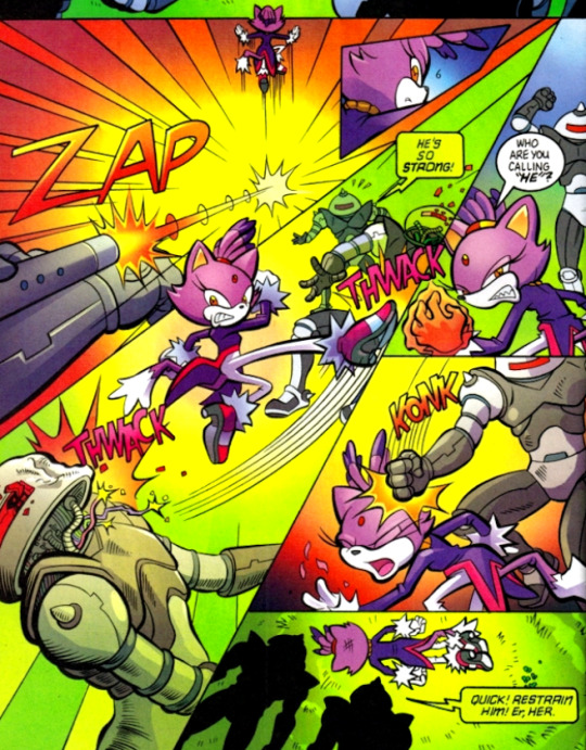
Yeah, I guess Blaze doesn't understand the dangers present in this universe yet, does she? An hour or so later, Rotor sends for Sonic, informing him that they caught the aftermath of Blaze's capture on their video surveillance. Neither of them know who she is, but they decide she can't be from their village, since she left several disabled swatbots behind, while most people in Knothole are noncombatants and those that aren't are accounted for elsewhere. Sonic rushes out to find their trail and tracks them to a nearby facility set up amidst the trees, and while he begins fighting his way in, the scientific robots in the building go about studying their new specimen.
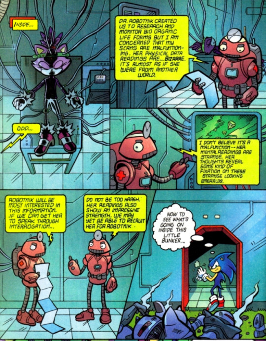
Sorry, but why the hell would Eggman be looking to add some random Mobian to his team? He only likes robots anyway, and tends to either betray or enslave every living being that comes to him. Blaze suddenly awakens and becomes furious - not that she's been captured, mind you, but that they took off her coat while studying her. She must be really goddamn attached to her coat, because she starts absolutely trashing the place, exploding into flames and screaming so loudly that Sonic becomes genuinely worried about her wellbeing, rushing to where he last heard her. The door of the lab she's in is completely blasted off its hinges by the force of Blaze's explosions, but thankfully after this she seems to have found her coat, because the blasts subside and she appears in the doorway wearing it once again, staring down at an utterly shocked Sonic with a look of fiery fury (the literal flames coating her entire body probably help with the "fiery" bit). Uh… good luck dealing with that, buddy boy!
#nala reads archie sonic preboot#archie sonic#archie sonic preboot#writer: ian flynn#writer: tania del rio#pencils: tracy yardley#pencils: tania del rio#colors: jason jensen#colors: ben hunzeker
9 notes
·
View notes
Text
Launchpad’s Association With Della Duck: Ballads of Dangerous Chemistry

Part 1 | Part 2 || Part 3 | Part 4| Part 5 || Continued from Part 6
One of the many things I've noticed in DuckTales is that certain elements from earlier episodes tend to return in the later portion of the season. Sometimes as a running gag or an Easter egg, but other times, they end up revealing to be an important concept that's extremely relevant to the story.
The Season 1 finale was a good example of this: The boys hijacking Donald's Houseboat in the pilot to go to Cape Suzette comes back as Donald wanting to move there when the boys no longer want anything to do with Scrooge. The bag of marbles Scrooge gave the boys when they first arrive to the mansion comes back as a way for Scrooge to reminisce about having them around. The silly cutout of Gyro from "Beware of The B.U.D.D.Y System!" is seen floating around in the underwater lab after the area was destroyed by the shadows.
Sometimes it doesn't even take that long for the early elements to reappear; they can be contained within the episode itself by giving us hints in the very beginning of it and later come into play towards the ending. Scrooge was right from the start when he blamed Glomgold in "The 87 Cent Solution!" and the ending of the Darkwing Duck series finale basically foreshadowed the entirety of "The Duck Knight Returns!". If Della paid attention as she was attempting to fix the rocket on her own, she would have known about Gold Tech way ahead of time.
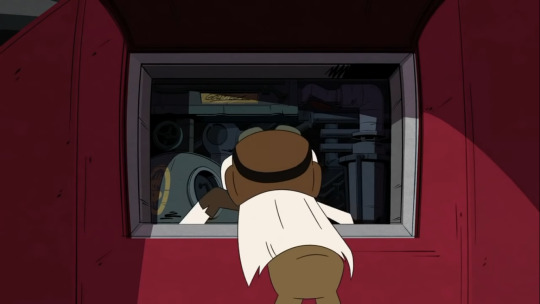

Two years ago at the D23 Expo, it was announced during the DuckTales panel that Duckworth was already shown, but no one had found him yet. Many of us searched around for the butler dog and every character we guessed was rejected by the show-runners. It wasn't until "McMystery at McDuck McManor" that Duckworth was revealed to be the ram-headed spirit we've been seeing in the intro! The answer to the mystery was right there in front of our faces! But we didn't realize it because the appearance of the person we were looking for was altered.
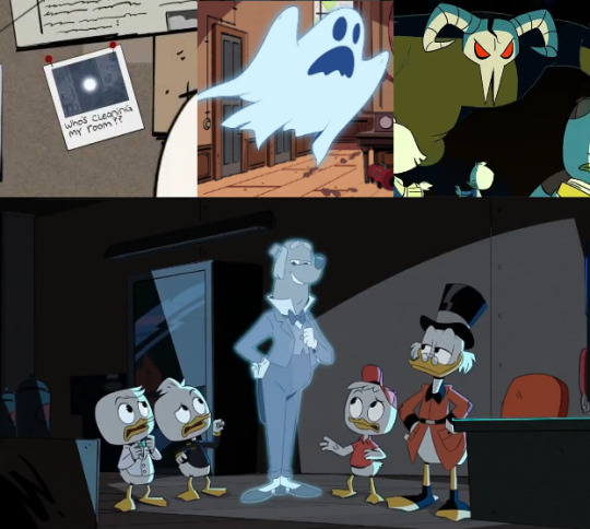
Bᴇғᴏʀᴇ Dᴜᴄᴋᴡᴏʀᴛʜ’s ʀᴇᴠᴇᴀʟ, ʜᴇ ᴡᴀs ʜɪɴᴛᴇᴅ ᴀᴛ ᴀ ᴄᴏᴜᴘʟᴇ ᴛɪᴍᴇs ᴡʜᴇʀᴇ ʜɪs ʟɪᴋᴇɴᴇss ᴡᴀs ᴏʙsᴄᴜʀᴇᴅ: Tʜᴇ ɢʜᴏsᴛ ᴄʜᴀsɪɴɢ ᴛʜᴇ ᴋɪᴅs ɪɴ Mʀs. Bᴇᴀᴋʟᴇʏ’s sʜᴏʀᴛ , ᴛʜᴇ ᴘʜᴏᴛᴏɢʀᴀᴘʜ ᴏғ ᴀ ғʟᴏᴀᴛɪɴɢ ᴏʀʙ ᴏғ ʟɪɢʜᴛ ᴏɴ Wᴇʙʙʏ’s ʙᴏᴀʀᴅ
Sᴛʀᴀɴɢᴇʟʏ ᴇɴᴏᴜɢʜ, Lᴀᴜɴᴄʜᴘᴀᴅ ᴡᴀsɴ'ᴛ ᴘʀᴇsᴇɴᴛ ɪɴ "MᴄMᴀɴᴏʀ" ᴀᴛ ᴀʟʟ ᴅᴇsᴘɪᴛᴇ ʟɪᴠɪɴɢ ɪɴ ᴀ sᴇᴄᴛɪᴏɴ ᴏғ ᴛʜᴇ ᴍᴀɴsɪᴏɴ' s ɢᴀʀᴀɢᴇ...
This proves that we don't always have to look too far to figure things out, so, after thinking about amnesia, I had to take another look at "The Ballad of Duke Baloney!". It features a confirmed case of the condition and a good example of applying one similar character to another.
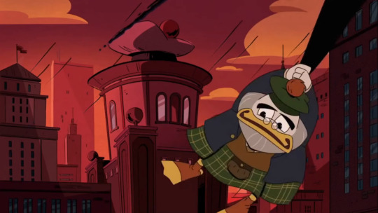
The episode begins with a flashback to the happenings of "The Shadow War!", a pretty significant event. Glomgold fails to prevent his shadow from flying off and ends up falling into the marina. He loses consciousness and is eventually found by two fishers, trapped in their fisher net. He can no longer remember the whole ordeal that caused him to take on his false Scottish persona and reverts back to who he used to be: Duke Baloney.
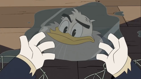
The name Duke Balony, derives from a completely different character named The Duke of Baloni. He comes from an old Carl Barks story that predates Glomgold's character and was the first to be titled "Second-Richest Duck in the World". The show-runners used this similarity as a part of giving an in-universe explanation to why Flintheart Glomgold went from South African like he was in the earlier Scrooge McDuck comics, to Scottish like he was in the original DuckTales series.

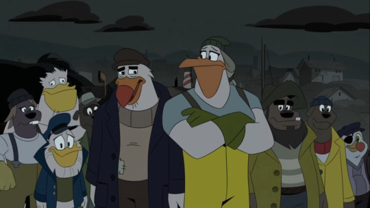
Four months later, after Flintheart is reported to have gone missing, Webby and Louie stop by Bait 'N' Such to find him as a completely different person: His demeanor is much kinder, he talks with a different accent, he sports a real beard and now wears a fisherman outfit.
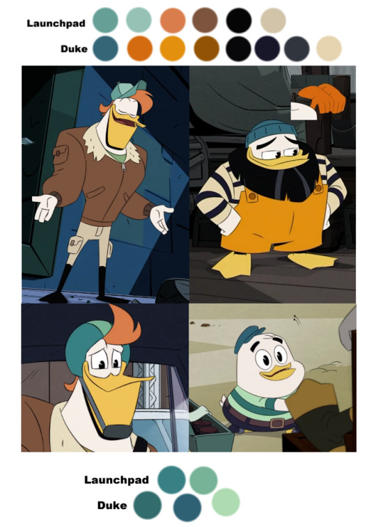
Speaking of which, Duke and LP share a lot of similar colors. Even Young Duke wears teal and green; something that was mainly exclusive to both Launchpad and Della.
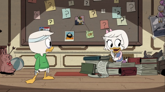
The kids aren't exactly sure what to think. Was this really Glomgold? Or were they mistaking a random stranger for him? Was he genuinely suffering from amnesia? Or was this another one of his crazy schemes? As they try to figure out his true intentions, they discover Duke has a suspicious, gold money clip in his possession. This causes Webby and Louie to start an investigation where they discover Duke Baloney's records are non-existent and Flintheart Glomgold's records do not extend past his arrival to Duckburg in the 80's.
Meanwhile, Duke's evil persona slowly starts to re-emerge after one of Scrooge's fishing boats roll into the dock. He can't remember Scrooge's name, he can't even remember his face when they meet, but he suddenly grows negative feelings towards the boat and he's not exactly sure why. He starts coming up with elaborate plans to outrank it and he ends up having a dream full of subliminal messages about his past.

As Duke starts to question who he really is, he notices that Webby and Louie are out at sea as a thunderstorm is approaching. He plans to go out and rescue them but a boat crane hits him on the head, causing him to fall into the marina much like he did before. It's in his second time of unconsciousness where he remembers why he started his Scottish persona in the first place: When Duke was a child, Scrooge failed at teaching him a sense of self reliance by only paying partially for his shoe shining services. Feeling cheated, he secretly stole Scrooge's money clip and vowed to do whatever it takes to out-best him at everything and steal his title of "Richest Duck in the World".
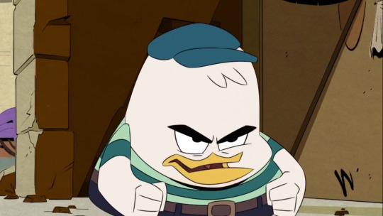
When Duke comes to at the surface, he reverts back to his evil ways. He displays this as he tricks Webby into giving him her hand only for him throw her out of the boat to make room for himself. The other fishers are very shocked to see their friend act like this.
Glomgold makes his way back to his office to reclaim his company from Zan Owlson and to challenge Scrooge with the fiscal year bet. Scrooge refuses until Glomgold taunts him with the money clip he had stolen from him. McDuck becomes surprised, and angry, that his greatest rival has a significant connection to his past.

So, if Launchpad has amnesia, what could Glomgold's situation be telling us about his?
Glomgold's amnesia was tied to a big event as well as LP's could be if he was involved with the cosmic storm.
Glomgold goes missing in the sea, an environment that is very similar to outer-space.
Following his disappearance, Glomgold ended up looking like a different person with a new profession. Launchpad is completely unrecognizable to Della in spite of many signs that they could have something to do with each other's backgrounds and there are also possible signs that he might not be a legitimate airplane pilot.
Glomgold had Scrooge's money clip on him. Maybe LP has some sort of mysterious item or something like a scar or a birthmark that could help prove that he's the father.
Information on both Duke and Glomgold is extremely limited. Launchpad's records probably don't go very far either.
Duke's sudden hatred for Scrooge's boat reminds me of Launchpad's sudden attachment to Dewey. The triplet hasn't done much to or for Launchpad prior "Terror of The Terrafimians!”; he caused a trap to dump a pile of snakes onto Launchpad without apologizing. Dewey doesn't show any concern towards him until he comes back from his search in "Gander"...and yet, Launchpad established him as his best friend. He may not even be sure why he does. I've been theorizing for the longest time that Dewey could be reminding him of Della.
In the Theme Song Takeover, Launchpad sings about being on the Houseboat with Dewey specifically without acknowledging that Scrooge, Donald, Huey and Louie are there too. He did a similar thing in “Jaw$!” when he simplified Huey and Louie as “Dewey’s Brothers”. Aside from giving us potential clues about Della, Issue 18 highlighted Launchpad’s friendship with Dewey as well. When he realizes the severity of the tsunami alert, he immediately grabs Dewey and wants to head to safety instead of thinking to grab both Dewey and Webby at the same time. The retail incentive cover for this issue features a bunch of Dewey photos with Launchpad facing them.
Duke has a dream full of symbolism revolving around his Scottish persona. Launchpad’s line in “The 87 Cent Solution!” when Scrooge causes Gizmoduck to accidentally shoot the Sunchaser with a torpedo, reminds me a bit of this. He said the situation reminded him of every nightmare he’s ever had....why is he having dreams of accidentally hitting Dewey with the plane? What does this mean? Is he afraid that there will be a day where he hurts someone he cares about? Has this already happened in the past?
Was the mishap reminiscent of what happened during the cosmic storm? Scrooge accidentally causes Gizmoduck to fire his torpedoes (lightning?), they hit the plane (spacecraft?), smoke fills the vehicle (radiation clouds?) and he comes close to hitting someone he cares about (Della?)
After seeing the boat, Glomgold's old ways start to creep back into his mind. I think after being exposed to Della's presence for the first time in years, Launchpad will start to act a bit like his older self and do things that Della will recognize.
Glomgold had to get knocked back into the sea to return to how he normally is. Will Launchpad have to have another stressful incident or head injury to help him remember who he was?
There's a line from "The Impossible Summit of Mt. Neverrest!" where he says "NO! This is not the end of Launchpad McQuack! It WILL be by plane crash, or not at all!" Was that possibly hinting towards this?
Duke actually says a line a bit similar to this where he says “All I need to know, is that I came from the sea...and I’ll die buy it...”
A thunderstorm was involved and a rescue was underway, just like how Della could have been trying to rescue the father while she was caught up in the cosmic storm.
Glomgold's beard gets zapped with lightning from the storm, burning it into nothing. Launchpad possibly implied that he himself survived a lightning strike of some sort.
This episode was about a villain turning back into a good guy after losing his memory. Did Launchpad use to be a bad person? Or someone who was generally good, but made a bad decision? Or just unknowingly caused a bunch of bad things to happen? If Launchpad was the reason behind Della taking the Spear, then it’s partially his fault for Della getting stuck on the moon, losing her leg, Donald and Scrooge's separation, the boys growing up financially unstable without a mother, the depletion of the Money Bin, almost making Scrooge go bankrupt, Scrooge's retirement and depression, the family splitting up for a second time, Donald being sent to jail and the upcoming invasion. Even if the incident was beyond his control, he'll still feel horrible about causing such a chain reaction.
Not really counting on this, but if amnesia caused Glomgold to revert back to his original accent, could breaking out of amnesia cause Launchpad to revert back to his? In the original DuckTales series, Launchpad had more of a Northeastern accent. There are certain points in the cadence of Della's voice that reminds me of how Launchpad speaks in the reboot; more notably when she slips into a lower register
"Iiiit's fiiiine, I'm sure the flavor will wear off soon…"
"I've activated my distress beacon, so you can pinpoint my location and COME GET ME."
"I bet the boys have hatched by now... I'm not even sure what they look like…"
"I was gone for a decade and everyone was just fine…"
Glomgold's change in voice was brought on by copying off of Scrooge. Perhaps Launchpad is emulating Della in that way as well.
There are a few other lines in this episode that reminded me of some lines Launchpad has said in the previous season:
When Duke shares his crazy plans to outdo Scrooge's boat by over-fishing, Mann makes a comment.

"...But it's like you always say, 'sharing is caring'."
Duke takes a moment to think about this.
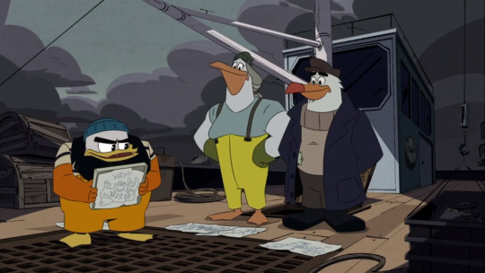
"That does sound like me...or does it?"
This reminds me of the scene in "The Spear of Selene!" where Scrooge orders Launchpad to get the plane back in the air after crash landing on Ithaquack. Launchpad responds.

"Sorry, Mr. McDee, gotta figure out what this flashing red light means. I always say: Better to be safe than... whatever the opposite of safe is!"
He then looks off to the side with uncertainty afterwards, like he's not exactly sure where this phrase came from, but he could have sworn he said it at some point.

"Yeah, I do say that.”
But then Scrooge fires back.

"WHEN HAVE YOU EVER SAID THAT?!"
Could this little break in character be implying that Launchpad was a safer person at some point in his life?
When Duke notices Webby and Louie out at sea when the storm is about to start, he begins to speak.

“I'll save ya! Or my name isn't--”
But then he gets hit with a crane and falls into the water. This reminds me of LP's quote in “The Secret(s) of Castle McDuck!” when he's trying to help Scrooge win his parents’ approval. In disguise, he says
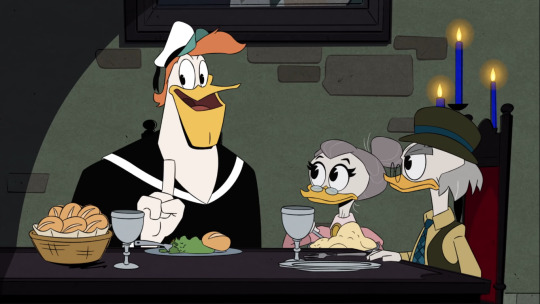
“He's a real family man or my name isn't Launchpad Mc...Donald Duck.”
We all know he isn't Donald and he was close to saying Launchpad McQuack wasn't his real name.
This may not count, but When Duke reached out to Webby and said “Give me your hand!”, it reminded me of when LP said the same thing to Dewey in “B.U.D.D.Y” as well as Scrooge in "Last Crash" when he's going after Dewey outside of the plane. Duke pulls Webby into the water and the limo rides over a rock causing Dewey to come out of the self-driving car and fly out of LP's grip.

After developing my new theory about Della and Launchpad's connection, I later realized how the two episodes I’ve been zeroing in on the most, are next to each other in order of production. One dealt with the ideas of genetic mutation in a space-like environment, combined with the concept of going on a secret trip to meet up with a family member and a lover. Then right after that, there's the idea of someone having amnesia after a big event causes their long absence and then struggling to figure out who they really are when elements from their past start to seep back into their life. A connection between the two is looking very likely. Both stories were set in aquatic places and may have even occurred around the same time. I came across a theory that Huey, Dewey and Launchpad visited the Mid-Atlantic ridge while Webby and Louie went fishing, which would explain why they weren't present in the other's episode. __
If Launchpad was affected by the cosmic storm, what else could it have done to him aside from changing the way he looks?
I've put together a list of abilities he may have gained from this:
Immortality
In "The Most Dangerous Game...Night!" Louie tells Huey that he's convinced Launchpad is immortal due to the amount of plane crashes he's survived. LP doesn't respond to this comment and later refuses to answer Huey about how he survived the Tower of Infinity when it collapsed.
I think there's enough weight to Louie's remark for it to be more than simply a one-off joke because there are multiple times where he's shown to be pretty resilient. Launchpad can get sick or hurt, but he recovers incredibly well to injuries and has, as Fisher said when he was describing Duke, "a freakishly high tolerance for pain".
After the snakes from the Atlantean trap bit him, he brushes the situation off like it's not a big deal. He's hindered by the venom, but he's still conscious enough to climb down the bridge when it breaks (for the most part) and helps Webby to lie to her grandmother by posing as a Swedish person. When Glomgold announced that he's about to blow up the city, Launchpad’s facial swelling suddenly goes down and he’s well enough to quickly drive the sub to safety. Also, when Launchpad returns to the Sunchaser after looking for Ziyi, a bunch of arrows are pierced through his armor and he has an eye-patch over his eye. He’s winded by having to run to the to the plane in time and escape the danger he went though, but he isn’t wincing from his injuries. He isn’t really fazed by them at all.
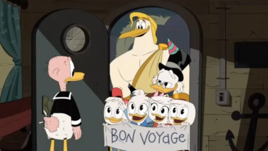
Sᴛᴏʀᴋᴜʟᴇs sᴇᴇᴍs ᴛᴏ ʙᴇ ᴀ ᴘʟᴀᴄᴇʜᴏʟᴅᴇʀ ғᴏʀ Lᴀᴜɴᴄʜᴘᴀᴅ ᴡʜᴇɴᴇᴠᴇʀ ʜᴇ's ɴᴏᴛ ᴘᴀʀᴛɪᴄɪᴘᴀᴛɪɴɢ ɪɴ ᴄᴇʀᴛᴀɪɴ ᴇᴘɪsᴏᴅᴇs. Pᴇʀʜᴀᴘs ʜᴇ ʀᴇᴘʀᴇsᴇɴᴛs Lᴀᴜɴᴄʜᴘᴀᴅ's ɪᴍᴍᴏʀᴛᴀʟɪᴛʏ ɪɴ ᴀ ᴡᴀʏ.
Strength
“The Missing Links of Moorshire!” is a good example of Launchpad’s strength. Towards the end of the episode, he’s shown to lift Huey, Dewey, Louie, Webby and Scrooge with ease. Even earlier in the episode, he’s able to push a water-logged golf cart out of a lake, which on average is somewhere between 900 to 1100 lbs when it’s dry.
The cosmic storm may have increased his strength, but the workout equipment in his room would indicate that he needs to maintain it to a degree. Maybe it's a Hercules-type situation; even during his weaker points, he’s still pretty strong, but working out just makes him even more abnormally strong.
Agility
As seen in “Shadow War” and “Duck Knight”, LP is a very capable fighter. He has good reflexes, allowing him to dodge most attacks. Even though the venom from the snakes impaired him, he was still able to defend himself from Glomgold’s henchmen. In “Last Crash”, he ran on top of falling items to keep himself from falling out of the plane. And when he was fighting off the shadows on top of the plane, he never lost his balance.
Speed
I'm not really sure with this one, but in "Game Night" Launchpad was able to make it over to Louie and Huey after getting struck with the shrink ray. Perhaps this was ignored for convince, but running fast would explain how he was able to survive the collapse of the Jenga tower.
Aquatic Respiration
I think this is starting to become more apparent. After "Whatever Happened to Della Duck?!" aired, I started to wonder if Launchpad may have used Oxy-Chew when he went to visit Oceanika. But after "Friendship Hates Magic!"....I don't think this is the case. In the scene where he's drinking pea soup through a silly straw, one of the peas gets stuck and he struggles with it until his face starts to turn blue. He faints and all the air in his lungs exits his body before face-planting into his bowl. Then he makes a muffled inhaling noise without choking…
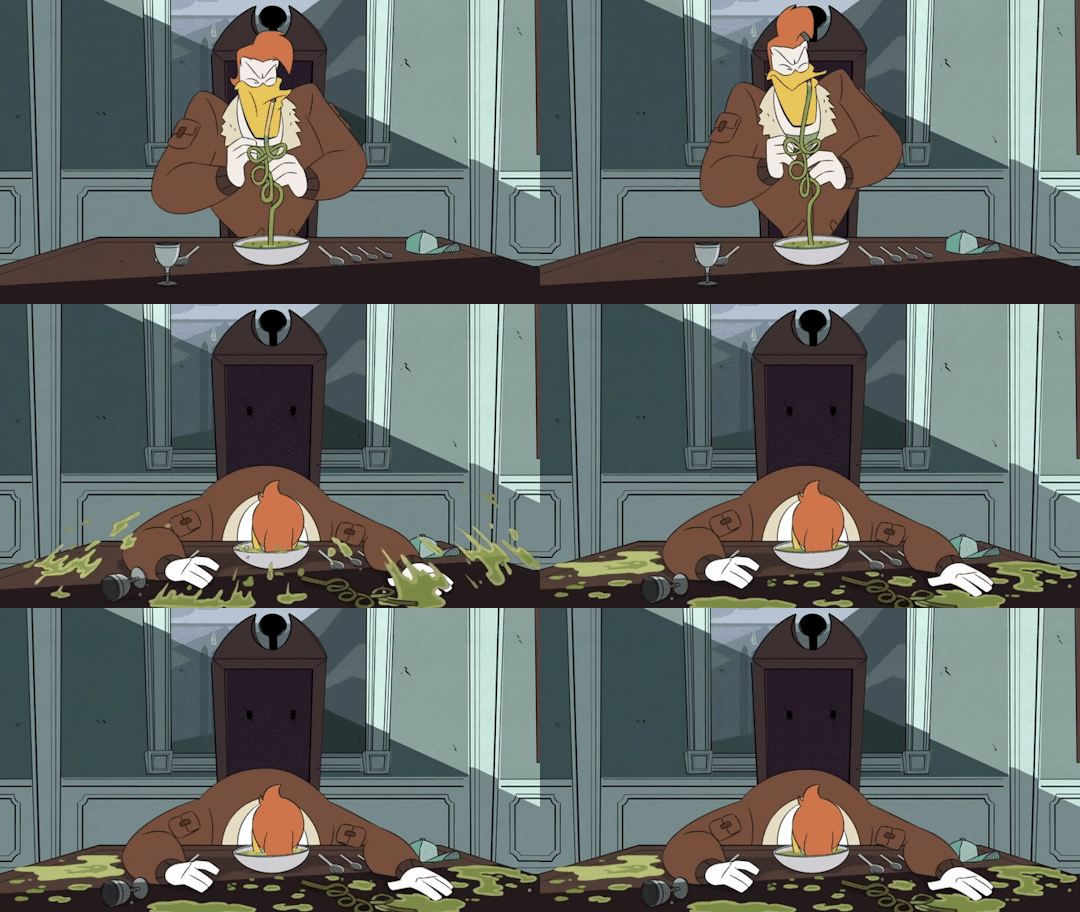
Lᴀᴜɴᴄʜᴘᴀᴅ sɪᴛs ɪɴ ғʀᴏɴᴛ ᴏғ ᴀ ᴘᴀɪɴᴛɪɴɢ ᴏғ ᴛʜᴇ sᴇᴀsɪᴅᴇ ᴀs ᴛʜɪs ɪs ʜᴀᴘᴘᴇɴɪɴɢ.
In “Neverrest”, Launchpad keeps his mouth open as he falls into the hot spring and doesn’t gasp for air when he bursts out of it. When he comes back to the lighthouse in "Depths", he simply resurfaces with no problem. He isn't panting for air until he has to climb up onto the platform, which can be a bit tiring after staying in the water for so long. So, uh...I guess Launchpad has gills somewhere on his beak...? Granted, if he did have Oxy-Chew at some point, he could have ended up swallowing it; I mean, that stuff is pretty powerful when you chew it alone, but I'm leaning on mutation with this one.
Electrical Powers
After getting caught in a cloud full of radiation and lightning, it would make a ton of sense for Launchpad to have some sort of connection to electricity. But what kind of connection exactly? Can he generate his own? Can he bend and levitate metal objects to his will? Does he serve as a special conductor? It's really hard to tell since there aren't any on obviously examples, but perhaps there could be something with the latter option.
The ending to “The Spear of Selene!” was very baffling. During my first viewing, I thought Launchpad was scared to leave the plane for some reason, but he ends up disassembling the plane; preventing the family from leaving and bringing him out in the open. Then, during my latest viewing, I realized that the plane isn’t simply taken apart, it looks like it was ripped apart. The pieces are damaged...one of the engines are chipped and dented, one of the propeller blades are also chipped, the tail of the plane has a cracked wing, the control board is all dented with the yoke snapped off...was he really that obsessed with figuring out the problem that he couldn’t just use tools to separate the plane properly? This made me wonder if there could have been an explosion from inside of the Sunchaser. Could another lightning bolt have hit the plane and it was strong enough for Launchpad to react to it? The first time the plane was struck, he’s quickly able to engage a control to stop it from affecting the plane.

The plane parts don’t seem to have any burn marks on them and Launchpad’s clothes aren’t singed or anything, so perhaps there was a different kind of electrical mishap or something that resulted from another side effect of the cosmic storm.
Sixth Sense
Maybe this is purely for meta humor, but LP seems to have this underlying fourth wall-y awareness. At the end of “Moonshire”, the camera is gone, but he still faces the audience and addresses the lesson to be learned. He then undercuts himself as if he didn't want us to know how insightful he is.
In "Terror of The Terrafimians!", he questions if Huey, Webby and Lena were the only three missing from the group when Magica technically counts as a fourth person.
Good Hearing
You would think that after constantly hearing the sound of breaking glass and denting metal on a daily basis, it would take a toll on Launchpad's hearing, but he seems to be a good listener.
Even though we weren't able to see his reaction to Scrooge's story about the Spear of Selene, he must have heard it in spite of being all the way on the other side of the plane and being sorta barricaded by a bunch of stuff to help balance the weight. If the boys informed him about what happened, he would have taken their word for it when he was talking over the intercom in "Shadow War", not point out how they’re the ones who blame Scrooge.
After "Nothing Can Stop Della Duck!" aired, I've been trying to figure out how Launchpad knew that Della was in the houseboat. She wasn't being very loud and he said "Thought I'd come over to introduce myself," implying that he knew about her being in there and stalled afterwards. He could have seen her as she was walking to the other side of the pool to board the houseboat, but it would have to have been somewhere where she wouldn’t have been able to notice him. Maybe looking out the window from inside the house. If not, he could have heard her in the boat as he was passing by. She didn’t start talking until around the time he came over, so if this were the case, he would have already known whose voice it was coming out of the houseboat. If he knew about Della being in the mansion this whole time, why did it take him so long to talk to her?
Weight Manipulation?
Part of me sorta wonders if LP has the ability to make himself lighter when he needs to be; holding back so he won't hurt anyone. This would explain things like how Scrooge was able to save LP from falling out of the plane in “Last Crash” without dislocating his shoulder and how Webby was able to knock LP down in “Shadow War”.
But then again, determination, anger and stubbornness act a bit like super powers to some of the characters. It gives them a boost of strength when the stakes are high and allows them to do things they wouldn’t normally be able to do or shouldn't be able to do based on their body type. Scrooge was able to throw everyone off of him in “87 Cent Solution”, and enjoys swimming around in one of the most heavy metals in existence. Huey dragged LP back to the log in “Only Child” even after he wasn’t able to lift any part of that log. He was also able to lift three kids along with his uncle in “Moorshire” and was strong enough to keep the demon dog at bay in “McManor”. Then there's both Drake and Jim who can go through a bunch of injuries and still get back up after them.
This guess, along with the others I've discussed in this list, might just be part of cartoon logic and isn't meant to be an indication of anything outside of humor or convenience.
The Ability to Be Manipulated?
As I was putting this list together, I suddenly thought: If there's a Greek connection to the cosmic storm, what if Zeus is able to manipulate LP similarly to how he was able to manipulate Storkules with the siren? If Launchpad does have good hearing, what if he heard the siren and that's what caused him to destroy the Sunchaser? Launchpad loves music and, as seen in "Sky Pirates", gets easily distracted by it. The plane was fine when Donald was trying to leave the lightning barrier, but then after the singing and fighting continued, it's in shambles.

Zeus used the siren because he knew it would affect Storkules directly. Scrooge, Huey and Louie were not affected by the singing after later taking their hands from over their ear...holes. Dewey, Webby and Selene couldn't be affected because the temple was way up high on the island. The Sunchaser, however, was located right around the corner. Since Zeus wasn't affected by the siren either, perhaps there's something in the lyrics that affects immortals who rank lower than himself.
__
Back in April, I observed the Spear manual scenes in “Whatever Happened” and noticed that “DT-87” and “DT-18” were mentioned. These are abbreviations for “DuckTales 1987”, the year the original series came out and “DuckTales 2018”, the year Season 2 premiered. The numbers “7-15”, “7-16”, “7-18” and “207” were also featured.
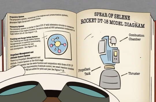
“207” as well as the other 7’s refer to “Whatever Happened”’s production code, so I figured 15, 16 and 18 were also referring to other Season 2 episodes that might relate to 7. So far, Episode 15, "The Dangerous Chemistry of Gandra Dee!" and Episode 16, "The Duck Knight Returns!", have provided things that could be leading up to why Della took the Spear and how it could have to do with the father. Launchpad was present in both episodes, and both shared some similar themes.
Episode 15 opens up with a thunderstorm storm. Gizmoduck is facing off against an evil scientist named Dr. Atmoz Fear, who's taking advantage of the storm by using one of his devices to manipulate the lightning. When he tries to zap Gizmoduck with it, it reminds me a bit of Gyro and his shrink ray in "Game Night".

Dʀ. Aᴛᴍᴏᴢ Fᴇᴀʀ sʜᴀʀᴇs sᴏᴍᴇ ᴄᴏʟᴏʀs ᴡɪᴛʜ Lᴀᴜɴᴄʜᴘᴀᴅ: Hᴇ ʜᴀs ʀᴇᴅ ʜᴀɪʀ, ᴀ ɢʀᴇᴇɴ sʜɪʀᴛ, ᴀ ʙʟᴀᴄᴋ ᴍᴀsᴋ ᴀɴᴅ ᴛʜᴇ ᴄᴏʟᴏʀs ᴏғ ʜɪs ғᴇᴀᴛʜᴇʀs ᴀɴᴅ ʟᴀʙ ᴄᴏᴀᴛ, sᴇᴇᴍ ᴛᴏ ʙᴇ ᴛʜᴇ ɪɴᴠᴇʀsᴇ ᴏғ LP's ғᴇᴀᴛʜᴇʀs ᴀɴᴅ ғᴜʀʀᴇᴅ ᴄᴏʟʟᴀʀ.
After the villain is defeated, Fenton meets Gandra, someone else who also works in the scientific fields. Unlike Fenton, who's more professional with his work, she's more on the rebellious side. A similar thing can be said about Della and Launchpad when it comes to aviation.
Fenton schedules a science date with Gandra, but he's very hesitant to call it such. If Della took the Spear because she was trying to save the father and failed, I can see her being very hesitant about getting back into a romantic relationship.

On their way to pick up Gandra in the limo, Launchpad conversates with Fenton by going down a list of special someone’s he’s previously dated. A couple of mentions in this list caught my attention; the first being how Launchpad claims to have dated a clone of himself. I think this is a meta thing we aren't supposed to take seriously. Because...why would this be suggested if a legitimate clone of yourself is basically your twin sibling, your child or somewhere in-between that...? Maybe it’s just me, but he blinks rather oddly right after he says this. There's also a pause as he stops the limo and begins to furrow his brow. Either he’s thinking really hard about everyone he's dated or he's a bit confused to where these more weirder memories are coming from.

What makes it even harder to take this clone claim seriously is that this is the same character who thinks Fenton is an actual robot because of the Gizmo suit and who also confused someone for a yeti in “Neverrest”. The word "clone" does have a non-literal meaning, so if we consider this and break it down...LP previously dated another goofy pilot who tends to wear teal and green, has a positive outlook on life in spite of all the hardships they face, never gives up, loves adventure, loves family, and doesn't like the idea of being replaced...?
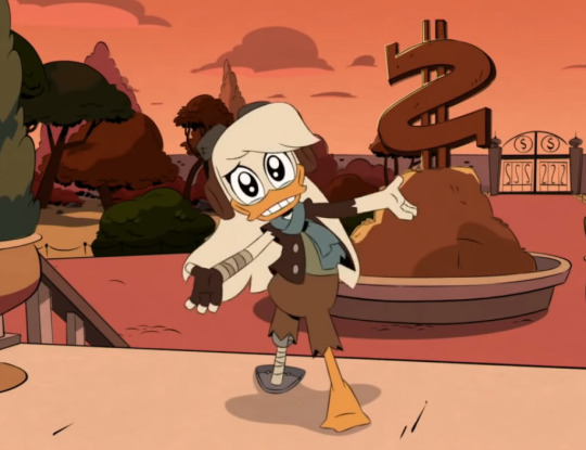
I’ve joked to myself in the past about Della sort of being a female version of Launchpad due to their colors and how they have a similar way about themselves. Della's character pre-dates Launchpad but she was never described as a fearless pilot until the "Family Ties" comic was released in 2014, twenty-seven years after DuckTales debuted. (This comic is where the reboot got its inspiration for Della's character and story arc.)
If LP really does have amnesia, he can’t remember Della as a person, so it would be easy for him to consider her as a copy of himself. Scrooge made it extremely difficult to get information about Della after she went missing so anything that Launchpad is emulating from her had to be based on knowledge prior to that point.
Another reason why this could be a sly reference to Della is because every time we get information about Launchpad’s love-life, we’re always given something that can be traced back to Della: Della isn’t a deadly ninja, but Ziyi’s situation in “Gander” involved her disappearing and possibly leaving her offspring behind. (I’m assuming Ziyi was being referred to due to the order of the list and being the only previously mentioned lover with an Asian background. Perhaps she has some Japanese origins as well as Chinese.) Della isn’t a forbidden mermaid, but Oceanika’s situation in “Depths” involved her calling out to Launchpad in a sing-song manner, wearing similar colors to both Launchpad and Della, and ended with Launchpad returning with a golden spear and trio of color-coded sea creatures that come from eggs. One of Launchpad’s lines in “The Twelve Days of Christmas” involved his true love giving him “eleven planes a-flying”. Regardless of how strange that statement was, it still planted the idea that there are two Launchpads, which technically, may be true persona-wise.
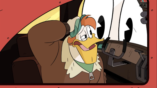
Tʜɪs ᴍᴀʏ ɴᴏᴛ ᴄᴏᴜɴᴛ, ʙᴜᴛ ɪɴ ᴛʜᴇ Tʜᴇᴍᴇ Sᴏɴɢ Tᴀᴋᴇᴏᴠᴇʀ, ᴀғᴛᴇʀ Lᴀᴜɴᴄʜᴘᴀᴅ ʜɪᴛs ʜɪs ʜᴇᴀᴅ ɪɴ ᴛʜᴇ ʟᴏɢᴏ ᴄʀᴀsʜ, ʜᴇ sᴇᴇs ᴀ ʟᴀʀɢᴇʀ ᴠᴇʀsɪᴏɴ ᴏғ ʜɪᴍsᴇʟғ ᴏᴜᴛsɪᴅᴇ ᴏғ ᴛʜᴇ ᴡɪɴᴅᴏᴡ. Nᴏᴛ ᴏɴʟʏ ᴄᴏᴜʟᴅ ᴛʜɪs ʙᴇ ʀᴇғᴇʀʀɪɴɢ ᴛᴏ Lᴀᴜɴᴄʜᴘᴀᴅ ʙᴇɪɴɢ ᴛᴡᴏ ᴘᴇᴏᴘʟᴇ, ʙᴜᴛ ʜᴏᴡ ᴛʜᴇ sᴛᴏʀᴍ ᴍᴀᴅᴇ ɢʀᴏᴡ ʙɪɢɢᴇʀ ᴛʜᴀɴ ʜᴇ ᴡᴀs ɪɴ ᴛʜᴇ ᴘᴀsᴛ.
The second mention in Launchpad’s list of lovers that caught my attention was the talking cloud of energy. Similarly to the pause after talking about a clone, he gets cut off right after he says this. A cloud of energy is basically a cloud full of lightning and that reminds me a lot of the cosmic storm. Since the cloud had the ability to talk, could this claim be based on a memory of Della trying to contact him while he was in the cosmic storm?

Fenton and Gandra’s date takes place at night in Gyro’s underwater lab. The moon is mentioned and it’s likeness is sort of shown through the string of lights used to decorate the room. Outside of the lab’s window is a starfish that is colored with a shade very close to Fenton’s purple shirt. He sits on the side of the table where the creature is located. The scenery is reminding me of the sea-space connections the show has been making. The starfish not only reminds me of stars in general but how the blue starfish attached to Launchpad at the end of “Depths” was a similar color to Della’s teal scarf. I’ve noted in another post that the starfish could have to do with Della because it also shares traits with Dewey and he’s constantly being compared to her, but what makes Della even more like the starfish is her ability to adapt. She lost her leg, but she was able to make a new one. Starfish can regenerate their limbs when they lose them.

When Fenton shows Gandra his Fentonium project, he described the invention as "An innovative generator from a mild-mannered source." If Launchpad has any electrical powers, this makes me wonder if they'll eventually be put to scientific use.
It’s later revealed that Gandra is a spy working for Waddle. Her main objective for going on a date with Fenton was to get him to say his Gizmoduck passcode to activate the nanite serum she made for Mark Beaks. For Gandra, the nanites gave her the power to deliver electrical shocks. For Mark, the nanites enhanced his body by giving him a muscular physique, a more prominent chin and gruffer voice to go with it.
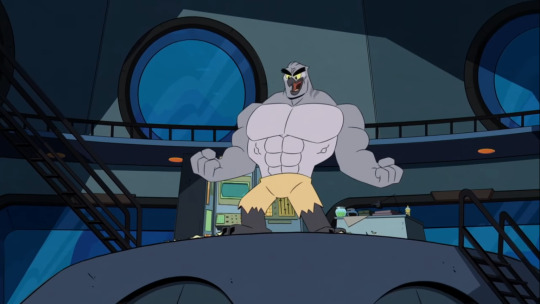

Tʜᴇ ᴄᴏɴᴄᴇᴘᴛs ᴏғ ᴇʟᴇᴄᴛʀɪᴄɪᴛʏ ᴀɴᴅ ᴇxᴛʀᴇᴍᴇ ᴘʜʏsɪᴄᴀʟ ᴛʀᴀɴsғᴏʀᴍᴀᴛɪᴏɴs sᴇᴇᴍ ᴛᴏ ʙᴇ ɪɴᴄʀᴇᴀsɪɴɢ. Tʜᴇ ᴍɪᴅ-sᴇᴀsᴏɴ ᴛʀᴀɪʟᴇʀ ғᴏʀ Sᴇᴀsᴏɴ 2 ғᴇᴀᴛᴜʀᴇs ᴀ ᴄʟɪᴘ ғʀᴏᴍ ᴀɴ ᴜᴘᴄᴏᴍɪɴɢ ᴇᴘɪsᴏᴅᴇ ᴡʜᴇʀᴇ Hᴜᴇʏ ᴛʀᴀɴsғᴏʀᴍs ɪɴᴛᴏ ᴀ Sᴜᴘᴇʀ Sᴀɪʏᴀɴ ɪɴsᴘɪʀᴇᴅ ᴠᴇʀsɪᴏɴ ᴏғ ʜɪᴍsᴇʟғ ᴡɪᴛʜ ᴀ ʟɪɢʜᴛɴɪɴɢ ʙᴏʟᴛ ʜɪɢʜʟɪɢʜᴛ ɪɴ ʜɪs ʜᴀɪʀ. Lᴀᴜɴᴄʜᴘᴀᴅ ᴀɴᴅ Mᴀʀᴋ ᴀʀᴇ sʜᴏᴡɴ ʀɪɢʜᴛ ʙᴇғᴏʀᴇ ᴛʜɪs.
After the secret plan unfurls, Fenton turns into Gizmoduck. He responds to Mark's mutation:
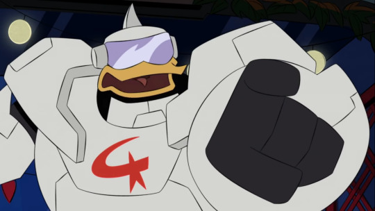
“You've always been a monster, but now, you are a literal monster!”
This reminds me a lot of the monster stuff in "Terror". I always feel weird when I try to make sense of that portion of the plot because I feel like I haven't figured it out yet, but something is definitely going on. Since that episode has aired, there have been multiple cases where a character is considered a physical or figurative monster and whether that makes them a good person or a bad person. And there's always an "M" alliteration tied to it:

Mole Monster and McQuack in “Terror of The Terrafirmians!”
"I can't believe my best friend is a mole monster..."
"Wait...am I a mole monster? But I'm a good guy! Then that means...mole monster can also be good guys."

Magica and Monster in “The Other Bin of Scrooge McDuck!”
"They'll turn on you; call you a monster!
“You’re the monster here! And I know just the hunter to take you down...”
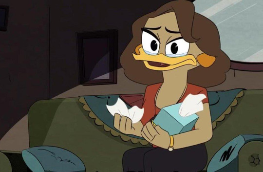
Monstro and M’Ma in "Who Is Gizmoduck?!"
"Eres un monstro, Diego!"
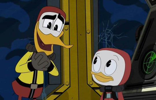
Monster and Mitzi in "The Depths of Cousin Fethry!"
"She's not a monster, she's a Mitzi!"

Moon Mite and Mother in "Whatever Happened to Della Duck?!"
“The mite isn't a monster, it's a mother!"
In an earlier post, I began to wonder if it would end up circling back to Launchpad since he's the one who started it. I thought maybe he'd feel like a monster in a figurative sense for accidentally abandoning his kids, but now it could also be something involving his genetic mutations. Maybe even a betrayal or theft of some sort since those concepts seem to be lingering in the background.
With all these M's going on and the high possibility of Launchpad's foreign names being used for Huey and Dewey, perhaps Launchpad's real name is Maxwell as in his Danish name, Max Motor. Joseph as in his Spanish name, Joe McQuack could also be another possibility. Since HDL went from more outlandish names to more plausible names, it's likely Launchpad's real name is something more standard.
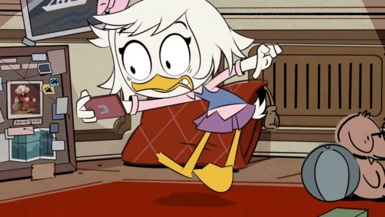
Lᴀsᴛ ʏᴇᴀʀ, Dɪsɴᴇʏ ʀᴇʟᴇᴀsᴇᴅ ᴀ sᴇʀɪᴇs ᴏғ sʜᴏʀᴛs ᴄᴀʟʟᴇᴅ Wᴇʙʙʏ Rᴇᴀᴄᴛs, ᴡʜᴇʀᴇ sʜᴇ ᴡᴏᴜʟᴅ ᴡᴀᴛᴄʜ ᴄʟɪᴘs ғʀᴏᴍ ᴏᴛʜᴇʀ Dɪsɴᴇʏ Cʜᴀɴɴᴇʟ ʀᴇʟᴀᴛᴇᴅ ᴍᴇᴅɪᴀ ᴀɴᴅ ᴅʀᴇᴡ ᴄᴏᴍᴘᴀʀɪsᴏɴs ᴛᴏ ᴛʜɪɴɢs ᴛʜᴀᴛ ᴇᴠᴇɴᴛᴜᴀʟʟʏ ʜᴀᴘᴘᴇɴᴇᴅ ʟᴀᴛᴇʀ ɪɴ ᴛʜᴇ sʜᴏᴡ. Dᴜʀɪɴɢ ʜᴇʀ ʀᴇᴀᴄᴛɪᴏɴ ᴛᴏ Bᴇx's sᴇᴄʀᴇ�� ғʀᴏᴍ Aɴᴅɪ Mᴀᴄᴋ, sʜᴇ ᴄᴏᴍᴘᴀʀᴇᴅ ᴛʜᴇ ᴄʜᴀʀᴀᴄᴛᴇʀ ᴛᴏ Lᴀᴜɴᴄʜᴘᴀᴅ ᴀs sᴏᴍᴇᴏɴᴇ ᴡʜᴏ's "ᴍᴀᴅᴇ ᴛᴏᴏ ᴍᴀɴʏ ᴍɪsᴛᴀᴋᴇs". Tʜᴇɴ ᴛᴏᴡᴀʀᴅs ᴛʜᴇ ᴇɴᴅ, ɪᴛ's ʀᴇᴠᴇᴀʟᴇᴅ ᴛʜᴀᴛ Bᴇx ᴡᴀs ɴᴇᴠᴇʀ Aɴᴅɪ's ᴏʟᴅᴇʀ sɪsᴛᴇʀ; sʜᴇ's ʜᴇʀ ᴍᴏᴛʜᴇʀ. Tʜɪs ᴄᴀᴜsᴇs Wᴇʙʙʏ ᴛᴏ ᴡᴏɴᴅᴇʀ ᴡʜᴏ ᴛʜᴇ ғᴀᴛʜᴇʀ ɪs.
When Fenton and Gandra make amends and try to come up with a way to stop Mega Beaks from wreaking any more havoc, Fenton points out that in spite of Mark's body being altered, he's still the same weak, ego-fuel person underneath those alterations. A similar thing can be said for Duke; even after he forgot about his Scottish persona, he was still Flintheart Glomgold and this became evident as he began to revert back into him.
When Mega Beaks is able to catch the Fentonium-laced paddle ball Fenton throws at him, he's amazed.

"Wow, I never actually caught a ball before! Well, who's the loser now, coach DAD?!"
This is the second time someone's father was mentioned in the episode. Before the date, M'ma mentions Fenton's father when she gives her son his suit to wear. Perhaps Della has one of the father's belongings that she'll pass down to her sons too.
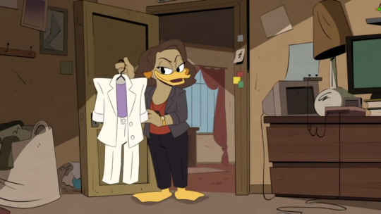
___
Episode 16 was about two different people sharing the same alternative persona: Jim Starling as the original Darkwing Duck and Drake Mallard as the new one. Jim is outraged that he’s being replaced on a new Darkwing production after years of trying to make a comeback. Being disappointed by the gritty direction of the reboot, Launchpad sees Drake in a negative light and agrees to help Jim sabotage the movie. It was supposed to be for the greater good, but when Launchpad tries to go with the plan and lock Drake in his own trailer, his heroism is questioned. Drake isn’t a bad person and it turns out that he’s a huge Darkwing fan much like Launchpad himself. Was crushing the dreams of playing his childhood hero the right thing to do?
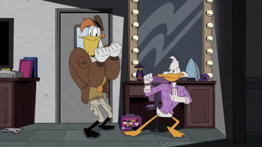
Once they find common ground, Launchpad devises a new plan where all three of them work together to help make a Darkwing Duck movie that new and old fans can enjoy. Unfortunately, Jim is too full of obsession and desperation to finally give the show a proper conclusion, that he becomes selfish. He ignores Drake when he tries to propose LP’s new idea to him and locks him away. He then refuses to follow the script and ends up destroying the movie set with his defiance. Drake soon breaks free and challenges Jim, leading Darkwing into fighting with himself. Launchpad tries to snap Jim out of it and remind him of the hero he’s supposed to be. While it does cause Jim to literally reflect on what he was becoming and helped him to save both Drake and Launchpad from the surging lightning tower before it exploded, it ultimately wasn’t enough. The one who was presumed to be bad turned out to be good, and the one who was presumed to be good, became bad, leaving Darkwing as both the hero and villain of his own story.

Ok, so, there’s a lot of identity struggle going on along with frustration over getting replaced after years of trying to get back into the spotlight. This seems like more supporting evidence that Launchpad will be faced with a situation where he’ll be confused about who he really is, but could this also be hinting that Della might go a little too far with her rivalry against Launchpad?
A lot of DW episodes so far seem to contain LP’s fear of being fired...but he’s considered honorary family; it’s hard to imagine Launchpad getting kicked out to take a permanent leave to St. Canard in this continuity. Launchpad wasn’t working for Scrooge in the original Darkwing Duck series because it took place in an alternate universe. Even with DW’s world integrated into the reboot, it’s still DuckTales at it’s base. It wouldn’t feel right for Launchpad to suddenly get removed from the main cast. I think similarly to Drake, Della will find some common ground with LP before anything is able to get out of hand.
When Dewey expresses his ideas to make the Darkwing film better, he mentions aliens, Megavolt and lightning towers. When Jim threatens to zap Alistair Boorswan with Megavolt's lightning ray, Launchpad steps in between them; willing to get hit to protect the director. Drake displays a high tolerance for pain as he survives a box of explosives going off, getting a piano dropped on him and getting zapped several times.
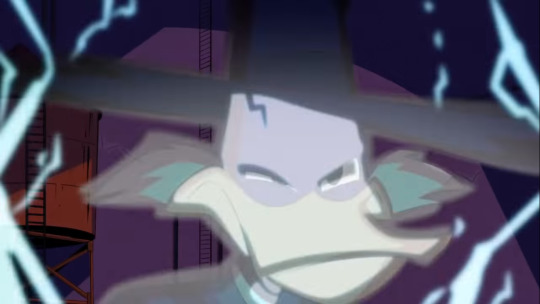
As Dʀᴀᴋᴇ ɢᴇᴛs ᴢᴀᴘᴘᴇᴅ, ᴛʜᴇʀᴇ's ᴀ ᴠɪsɪʙʟᴇ ᴄʀᴀᴄᴋ ɪɴ ʜɪs sᴋᴜʟʟ; ᴀ sɪɢɴ ᴛʜᴀᴛ ʜᴇ's sᴜsᴛᴀɪɴᴇᴅ ᴀ ʜᴇᴀᴅ ɪɴᴊᴜʀʏ.
...ᴡᴀɪᴛ ᴀ ᴍɪɴᴜᴛᴇ, ᴡʜʏ ᴅɪᴅ Dᴇᴡᴇʏ ᴏʀᴅᴇʀ ᴀᴄᴛᴜᴀʟ ᴡᴇᴀᴘᴏɴs ғᴏʀ ᴛʜᴇ ᴍᴏᴠɪᴇ?!
An artificial thunderstorm is created when Launchpad turns on the rain machine to stop the movie set from being on fire. When he delivers his speech about how heroic and important Darkwing Duck is as a character, he stands in front of one of the lightning towers. At the mention of the word "light", there's an upsurge of power as the camera pans from Launchpad to the top of the tower. The structure sends sparks everywhere, but Launchpad is completely unfazed by this and continues his speech.
A tattered image of the moon and a starry sky hangs in the background as this is going on... could this scene be proving that Launchpad has some degree of electrical manipulation? Is it only evident when he's extremely passionate about something? If this was purely the result of the rain machine being activated, wouldn't it have taken a much shorter time for the lightning tower to react?


Tʜᴇ ʟɪɢʜᴛɪɴɢ ᴅᴜʀɪɴɢ Lᴀᴜɴᴄʜᴘᴀᴅ's sᴘᴇᴇᴄʜ ɪs ᴄʟᴏsᴇ ᴛᴏ ᴛʜᴇ ʟɪɢʜᴛɪɴɢ ᴛʜᴀᴛ ᴡᴇɴᴛ ᴏɴ ɪɴ "Tᴇʀʀᴏʀ"'s sᴜʙᴡᴀʏ ᴄʀᴀsʜ. Iɴᴛᴇʀᴇsᴛɪɴɢʟʏ ᴇɴᴏᴜɢʜ, ᴛʜᴇʀᴇ's ᴀ sᴘᴀʀᴋɪɴɢ ғɪxᴛᴜʀᴇ ᴏɴ Lᴀᴜɴᴄʜᴘᴀᴅ's sɪᴅᴇ ᴀғᴛᴇʀ ʜᴇ ᴇxɪsᴛs ᴛʜᴇ ᴄᴀʀ ᴀɴᴅ ᴡʜᴇɴ ʜᴇ ʟɪᴛᴇʀᴀʟʟʏ ʀᴇғʟᴇᴄᴛs ᴏɴ ᴡʜᴇᴛʜᴇʀ ʜᴇ's ᴀ ᴍᴏʟᴇ ᴍᴏɴsᴛᴇʀ ᴏʀ ɴᴏᴛ, ᴛᴡᴏ Lᴀᴜɴᴄʜᴘᴀᴅ's ᴀʀᴇ sʜᴏᴡɴ.
When Jim and Drake notice the lightning tower is growing unstable, they both run towards Launchpad to save him. In a hassle to be heroic again, Jim pushes both of his fans out of the way and suffers from the explosion. The rescuer is believed to be dead but he's alive and takes on a new persona: Negaduck. The event figuratively turns him into a monster.

So, there's a rescue, an electrical based event, survival from that event, a re-branding of oneself and someone is considered a monster. If Launchpad truly is responsible for blowing up the tower, he's the one who "killed" Jim. Drake blames himself, kinda like how everyone blames Della for the Spear incident when it could have been due to her going after Launchpad.
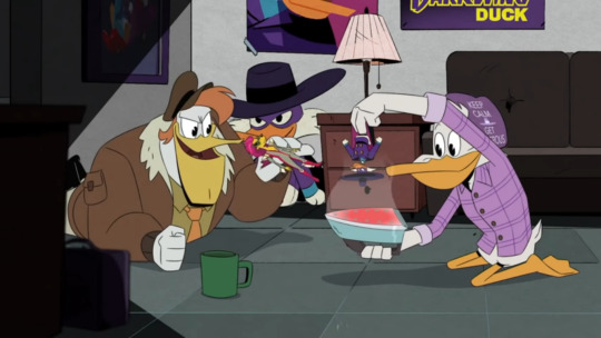
Wʜᴇɴ Dʀᴀᴋᴇ ᴀɴᴅ LP ᴀʀᴇ ᴘʟᴀʏɪɴɢ ᴡɪᴛʜ ᴛʜᴇ DWD ᴀᴄᴛɪᴏɴ ғɪɢᴜʀᴇs, Lᴀᴜɴᴄʜᴘᴀᴅ ᴘʟᴀʏs ᴀ ᴠɪʟʟᴀɪɴ ᴀɴᴅ ᴀᴄᴄɪᴅᴇɴᴛᴀʟʟʏ ᴋɴᴏᴄᴋs ᴏᴠᴇʀ ᴀ ᴄᴜᴘ ᴏғ ᴡᴀᴛᴇʀ, ᴡʜɪᴄʜ ᴇᴠᴇɴᴛᴜᴀʟʟʏ ʟᴇᴀᴅs ᴛᴏ Dʀᴀᴋᴇ ʜᴜʀᴛɪɴɢ ʜɪs ғᴏᴏᴛ.
This episode made me realize a loose pattern that seems to be going on with two similar character that rival each other. One pretty much stays consistent (Scrooge, Lena, Drake), while the other goes through a major change that emulates the other (Glomgold, Violet, Jim). There’s usually an event and or a disappearance tied to their change (Scrooge’s Africa visit, the Shadow War, the tower explosion). The changed character is seen negatively and could be considered a monster. And at some point, one of the rivaling characters realize that the other has a significant connection to their past (The money clip, the amulet, the table signing).
I think Della and Launchpad could be following this pattern too. As noted by Scrooge in “Nothing Can” and “Raiders of The Doomsday Vault!”, Della’s hasn’t really changed at her base. Thus, making Launchpad the one who has most likely gone through a major change. Launchpad was established as Della’s double when she considered him to be her replacement and views him negatively. We know for sure that one of them went missing during an event and there’s enough potential hinting to suggest that they have a significant connection in their past.

Tʜᴇ ʟᴀᴛᴛᴇʀ ᴘᴏʀᴛɪᴏɴ ᴏғ ᴛʜᴇ ᴘᴀᴛᴛᴇʀɴ ᴡᴀs ᴘʀᴇsᴇɴᴛ ɪɴ "Lᴀsᴛ Cʜʀsɪᴛᴍᴀs!" ᴡʜᴇʀᴇ ᴛʜᴇ ᴡᴇɴᴅɪɢᴏ ᴡᴀs ʀᴇᴠᴇᴀʟᴇᴅ ᴛᴏ ʙᴇ ᴛʜᴇ Gʜᴏsᴛ ᴏғ Cʜʀɪsᴛᴍᴀs Pᴀsᴛ. Iɴ sᴘɪᴛᴇ ᴏғ ʜɪs ᴍᴏɴsᴛʀᴏᴜs ᴇxᴛᴇʀɪᴏʀ, ʜᴇ ᴡᴀs sᴛɪʟʟ ᴛʜᴇ sᴀᴍᴇ ᴘᴇʀsᴏɴ ᴏɴ ᴛʜᴇ ɪɴsɪᴅᴇ.
Another number featured in the Spear’s manual was “800”. I couldn't figure out what it could mean at the time, but it could stand for "Friendship Hates Magic!". WDTV press has it listed as Episode 8 in order of production. This episode featured concepts of taking a dangerous risk to bringing someone back from the unknown, Launchpad bonding with a co-worker, possibly displaying one of his special abilities, hinting towards “Duck Knight” and the idea of someone who was thought of as being gone but they’ve actually been hanging around this whole time. When Lena is back to her solid form, Launchpad appears soon after the magical clouds of smoke begin to clear.

The number 17 is missing in the sequence that was highlighted in the manual. Perhaps there's something secretive about Episode 17. Or maybe the plot could be dealing with something or someone that’s missing. It could be when the family realizes Donald is missing or how his jail time is going on the Moon. It could also be something regarding the father; like Della opening up to the boys about him. I guess it could mean that this episode isn’t relevant to Episode 7, but that feels a bit less likely.
In my next post, I'm going to discuss how the arrangement of a scene can give us subtle hints about the future; starting with a closer look at Donald's family photo wall.
Are you up for even more reading? Continue here.
#ducktales#ducktales 2017#ducktales reboot#Flintheart Glomgold#jim starling#drake mallard#darkwing duck#gandra dee#Fenton Crackshell Cabrera#launchpad mcquack#della duck#duke baloney#The Ballad of Duke Baloney#The Duck Knight Rises#The Dangerous Chemistry of Gandra Dee#What Ever Happened to Della Duck#Whatever Happened to Della Duck#Whatever Happened to Della Duck?!#What Ever Happened to Della Duck?!#launchpad mcquack theories#ducky thoughts#duck theories#della duck theories#disney channel#disney#delpad#launchdad#launchpad's association with della duck#long post is long
26 notes
·
View notes
Text
•|| ABOUT: MiniDora and its functions.

Mini-Doras (ミニドラ[たち]) are one of the gadgets of Doraemon. They are mini versions of Doraemon with different color variation such as red, green and yellow variations. They can think and feel for themselves, and communicate with Doraemon through the "Mini-Dora" language (consisting of words like “Dorara” and speaking with gibberish accent). They act as helpers for all sorts of tasks, such as repairing the internal mechanism of Doraemon. (Sourced from Wikipedia.)
Just as I mentioned in this post the MiniDoras were created by the Robot School’s Principal Teraodai to honor Doraemon's service to the Time Patrol in the capture of two highly-wanted criminals (events that took place during the 2112/Origins OVA). This robots were build soleily to assist Doraemon, although Dorami also owns a MiniDora herself after recovering it from being missdelivered in the time period in which Nobita was already married to Shizuka and had a son (events from the Mini-Dora SOS!! OVA).
Of course, since this gadget was made with that purpose, the MiniDoras all resemble Doraemon’s model, although they come on different colors and on a way smaller scale to the original. Due to their much smaller size, they have a much simpler hardware and sofware to the point where the MiniDoras have the mentality and basically act like children (being loud and always wanting to play, being unaware of the gravity of the situations around it) when not given proper instructions/being misused. Their much simpler software also makes them incapable of speaking a language humans can speak, having their own language (similar to dora-like gibberish) only Doraemon and Dorami seem capable of understanding/translate.
Just like Doraemon the MiniDoras also come with a 4D Pocket of their own (although it is not confirmed if it’s a much simplified/limited version of the mentioned or it’s just a smaller-in-size version of the pocket), from which they can pull gadgets from... on a small scale, of course, these are gadgets designed only for the MiniDoras to use. When given instructions they’re very efficent and know how to administrate their gadgets but when in unexperienced hands the only way of getting a MiniDora to pull out a gadget is via feeding it a dorayaki.
What are its functions though?? As stated, the MiniDoras were created to be Doraemon’s assist robots, but that’s a rather vague statement, here are some things a MiniDora can do when given proper instructions:
MiniDora can pull gadgets from his 4D Pocket just like the robot its based on. Whenever the situation requires it the MiniDoras can pull and use the right gadgets (like when needing to go somewhere it pulls the Anywhere Door out), the only issue is the small size of the mentioned, often not being helpul unless they are the same size as MiniDora.
The MiniDora is a teamwork robot. It can be used to pick-up gagdgets and any other items around as long as several MiniDoras are around do the job, just like many other tasks that involve working together as a group. Whoever, Doraemon doesn’t use the MiniDora for this means, but a fellow classmate of his, Dorarinho (who owns 11 MiniDoras that look like him and that he uses to play soccer with, and seems to be the only other robot who uses MiniDoras).
The MiniDoras can keep track of Doraemon’s status. Due to sharing models with the mentioned, the MiniDoras are also connected to Doraemon, capable of monitoring his status no matter the distance. This is seen in Nobita’s Escape From Robot Court in which MiniDora was used to keep track and inform everyone of Doraemon’s situation at the robot hospital after falling critically ill and going under reparations.
The MiniDoras can also assist Doraemon with his own reparations. Not only they can keep track of his health but can also be used to assist others into repairing Doraemon’s internal components. They have Doraemon’s internal map in their memories for easy and fast navigation during critical moments (like in Doraemon is Really Sick?, I apologize for not owning the sub. english ver of some of these episodes, RIP, I work with what I have got).
The MiniDoras’ sole purpose is to help Doraemon in whatever, no matter what it is. They can do hard-labour, they can help and protect others with their own bodies, assist with mundane and even medical-related tasks. When used properly these gadgets are extremely useful but it is easier to misuse a MiniDora if you don’t know what do you want it for, or if you don’t know how does it work. Use a MiniDora wisely and you will have a very valuable ally.
#•|| ⏰ (About!Doraemon.)#•|| ⏰ (Meta.)#•|| ⏰ (Canon.)#(It technically falls under the last category because it's one of his gadgets.)#(Ngl; I always wanted to talk about the MiniDoras because I simply l o v e them.)#(They're super cute; like babies; I would love to own one myself.)#(But yeah; I will add this to the Gadget Page soon.)
9 notes
·
View notes
Text
Coffee Table

Coffee is a sensational and traditional vehemence crafted with love and avidity. As we all know “ good communication is just as stimulating as black coffee, and just as hard to sleep after “, its better if we indulge ourselves in an enduring conversation with great zeal and gathering all our memories to be shared all over in a coffee table and get flew by enchanting moments. A coffee table is a key furniture for all your living room. It describes the whole notion and feelings of your love for your close ones and your remembrance moments all just in one panorama slide. It's such a beautiful feeling !. The coffee table is not only an idol for your home interior but the main module for a coffee shop. It looks so cool to look upon a barista preparing a warm and luscious coffee, cappuccinos, espresso, lattes. Right? And, yup, you enjoy all this divine just sitting with your favorite people and with your favorite gossips. I just made your day! Okay, let us jump into types of coffee tables. You surely will like it! A coffee table is a long and lengthen, low table that is intended to be positioned in front (or next to) of a sofa or upholstered chairs to accommodate drinks, magazines, books, decorative objects, and other small items to be used when seated, such as coasters for beverages. Throughout Europe, during the Late Victorian era, the first tables specifically designed as and called coffee tables seem to have been manufactured throughout Britain. Later coffee tables were built as low tables and based on the tables used in tea gardens this concept may have originated from the Ottoman Empire.
Different Types Of Coffee Tables
SHAKER COFFEE TABLES Shaker furniture is a distinctive type of furniture founded in the Second Appearing of Christ by the United Society of Believers, commonly known as Shakers, a religious sect that had guiding principles of simplicity, usefulness, and integrity. Their values were expressed in minimalist designs with well-made furniture. Furniture was carefully crafted, of functional form and proportion. Instead of using ornamentation — such as inlays, carvings, metal handles, or veneers — that was seen as prideful or deceitful, they created "creative solutions such as asymmetric drawer configurations and multipurpose ways to create visual interest". Furniture was made of timber of plum, oak or pine, normally dyed or painted with one of the colors prescribed by the religion, generally blue, red, yellow or green. Drawer pulls is made of wood for dressers or other furniture. Shaker's iconic coffee table design allows it to function in a multitude of environments. It features simple straight legs, Shaker wood knob dovetail drawer and a subtle bevel to the finest accuracy. COTTAGE COFFEE TABLES Cottage design is in some respects just as much a frame of mind as it is a formal approach. In the way it honors imperfections, common gems and mixed furniture families there is a daily calm. Cottages tend to be modest, unpretentious and full of heart — characteristics most of us would be proud to assert. Feminine lines and information feature both the cottage and country styles, such as turning. INDUSTRIAL COFFEE TABLES Industrial style or industrial chic refers to an aesthetic movement in interior design that takes cues from old factories and manufacturing spaces that have been turned into lofts and other living spaces in recent years. These Industrial style components include weathered furniture, construction structures, exposed bricks, industrial lighting fixtures, and concrete. Industrial architecture evokes the purposeful appearance and sound of machine machinery, using metal and wood in more rough-hewn, rugged construction. MID CENTURY COFFEE TABLE Modern in the mid-century refers to the style of interior design which was common between the 1950s and 1960s. Classic coffee tables from the mid-century are distinguished by smooth, simple lines and bentwood or plastic molding construction. Wooden furniture has a flat finish, most of the time, to show off its natural beauty. PARSONS COFFEE TABLE A conventional square or rectangular table, a table with parsons has four straight, triangular legs which are as thick as the flat top. The table for the parsons is a modern design developed during the 1930s. Though it has a plain outline, it is possible to embellish a parsons coffee table with upholstery or different materials to suit several style schemes. MODERN COFFEE TABLE OR NOGUCHI COFFEE TABLE The Noguchi table is a modernist piece of furniture that was first manufactured in the mid-20th century. It was designed in the USA by Japanese American artist and industrial designer Isamu Noguchi, introduced by Herman Miller in 1947. The Noguchi table consists of a wooden base made of two matching curved pieces of wood and a heavy glass plate lid. Initially, the foundation was made in walnut, birch, and cherry. It was later sold in ebonized walnut. Also during the first year, the table was on the market, the cherry bases were made, and have since been highly sought after. Birch bases were discontinued after 1954. As of 2016, the table is available in ebon finish, walnut, white ash, and natural cherry. The top was originally issued in thick plate glass measuring 7⁄8 inches (22 mm). The width of the rim was lowered to 3⁄4 inches (19 mm) in 1965, and its base height was increased, increasing the total height of the table from 15 inches (380 mm) to 15.75 inches (400 mm). CONTEMPORARY COFFEE TABLE While contemporary and trendy may seem to be synonymous, contemporary style applies to what is popular today. Contemporary styles also incorporate bold, colorful accents in solid interiors. A common feature of contemporary coffee tables are glass tops and metal bases.
Different Types Of Tabletop Materials
Let's discuss some common tabletop materials. METAL Metal coffee tables made of robust iron, steel aluminum, or other alloys are a popular pick. This easy-to-clean coffee table is often complemented with a glass top or a wood-and-glass mix. WOOD Wood is by far the most natural surface of a coffee table and is prone to water circles, so most people use trivets and coasters to cover it. GLASS Glass is another popular top-material. Another thing to keep in mind when buying a glass-topped table is that water circles and drops will become more noticeable on glass, and frequent cleaning will be required. STONE Choose a slate-, stone- or marble-topped table for a typical, stately feel. Maintenance of a stone top may depend on the stone size. UPHOLSTERED If you want a cushy place to rest your feet, and upholstered tabletop has the robustness of a coffee table but an ottoman's convenience. Placing a serving tray on top of a cushioned coffee table will give you a place to rest a drink without thinking about spilling it.
COCKTAIL TABLE vs COFFEE TABLE
A cocktail table is a square or rectangular shaped coffee table. For comparison, a coffee table is a round or oval drink bar. Confused?? Let's simplify life. By theory, a dinner table is the same as a coffee table. There is no harm in saying this because all tables are set in front of the couch at the end of the day, both are used for entertaining guests and can be used to place the coffee and drink! Yeah, next time you're asked by a shopkeeper if you want a coffee table or a cocktail table, just answer the "highly intellectual" question and go for your choice, rectangular or round, who cares? All the perfectionists and decor lovers read this article, make sure you don't purchase a coffee table on the pretext of purchasing a cocktail seat. When you want a cocktail bar, choose a rectangular or square-shaped table. A square coffee table. In a home, all tables are equally useful. There are no additional benefits or inconveniences of picking each. This is because they both have the same facilities. One must have found that each adult in the house will use the same table for various purposes. Some like resting their foot on it while enjoying a nice warm coffee, most use it to entertain guests, some like putting magazines and newspapers on it while some just like playing a game of shouting, chess! There are various types of coffee and drink tables on sale these days: wood, glass tops, stainless and even leather tables. For many people, style and architecture is also an important issue. The table will, after all, suit the house's interiors, and compliment the sofa. Nowadays you can find different styles, from victorian designs to new, contemporary and traditional designs.
What to keep in mind before buying your very first coffee table for your home?
Function When you buy a coffee table think long and hard about how (and be honest!) you'll use it. Is this a relaxed room in which people want to put their feet up? If so, you certainly don't want a tabletop with bottles. Are you lots of items to put on it? If so you want a solid piece with a finish that doesn't chip or get labeled quickly. Want additional storage? Then a table which opens or has a shelf at the bottom could be the right choice. The way you intend to use your table when you go shopping will help inform your decision. Decide your design Coffee tables are available in every possible style-make sure you find a coffee table that matches your room's theme. It doesn't mean "matching" Stylistically you can choose one that either blends in or sticks out— either blending in with or juxtaposing the look and form of other objects in the space. You'll want to weigh the materials, the shape, and how the rest of the furniture will look. Consider taking some snapshots of your furniture when you're going out, so you can see how it all fits together. Decide the best shape Traditionally rectangular coffee tables were the most common but far from being the only choice. Coffee tables can be circular, rectangular, square, octagonal - that's what you call. The best design for your room would depend on several factors including the available space, the rest of your furniture and lifestyle. (A household with small children, for example, might want to avoid a low table with sharp corners.) Note the other shapes in the room when talking about form. Compute your space Please check the room before you purchase a coffee table. Ideally, the height should be slightly lower than the sitting height of the adjacent couch and chairs. The length of the couch should be about two thirds long. There should also be around 14"—18 "between the sofa and the table (do not buy a table which is too large if your space is limited). Estimate and think about the budget As with any piece of furniture, beyond imagination, coffee tables can be dirt cheap or expensive. Remember the estimate and the size of the table in space. When you expect it to get a lot of wear and tear it might be a good idea to be on the less expensive side so you can repair it if necessary. If not, you might want to buy something timeless which will stand the test of time as a piece of investment. Coffee table substitutes Thinking outside the box is no wrong. Upholstered ottomans are popular coffee table replacements, with trays placed on top. We will add an element of warmth and softness. Storage trunks often work well and provide a spot for blankets and other things to be kept. There is no law that you just need to have one coffee table, too. Most people prefer two smaller boards, which can be bought.
Tips for styling coffee table
Now you have the best coffee table. So you may further want to decorate it too, hence we have some tips below to style your coffee table. The adroitness art of coffee table styling Coffee table decoration is something of a craft. Since coffee tables typically have prominent positions in living rooms, it is vital that they look good but it is equally important that they function in the manner they are supposed to function. Sarah Greenman's displays like this need to be appealing without interrupting the flow of the rest of the room. Luckily, it's easy to master coffee table styling as long as you keep those rules in mind. Keep things cool Stability is a significant component of any coffee table show and symmetry is one of the simplest ways to achieve stability. In the case of this Amanda Carol Interiors modeled example, a central focus grounds the view while smaller objects of equivalent visual weight round it out on either side. Remember that while the objects on either side are not alike, in terms of size and sound they cancel each other out. Setting up is important The composition is a tricky thing to get the hang of, and when it comes to coffee table style it is the item most people have trouble with. The trick is to think about how the whole collection of objects in a vignette fits together. We will sometimes communicate through color, sometimes through form, sometimes through design and sometimes through the pattern. Once the whole show has been assembled, it will read as one package, combining each object with those around it. And when done well, as in this show by Massimo Interiors, even seemingly unconnected objects will be read together as one. It takes practice to get the design of a display right so experiment around with objects and their positioning until it feels right for you. Use a tray There are easy technique stylists and decorators like Vanessa Francis use to make sure things fit in a show together. They use a tray to corral things all over. It's a smart way to force things together and it helps to unify the feel of a vignette. If you have compositional issues taking all the things and work within a tray's boundaries. If it's not fitting, get rid of it. Dimensions Matters When it comes to styling the coffee table it is important to use items of the right size. Items should have enough visual weight to not get lost, but they should never be so big that they will overwhelm the space or disrupt the table's functionality. As in this Park & Oak Design display, there should still be room in your home to put down a drink, book, remote control, or whatever else makes sense. Get hands-on your room Displays of a coffee table are not in isolation. They need to work within the space with the other things. The coffee table design in this transitional Cortney Bishop Design living room imitates some of the rustic undertones of the rest of the house. For starters, the mantel's rough wood and the wood blinds are complemented with a natural wood coffee table and some of the highlights. Although there is always room for contrast, the objects should reinforce the decor, not stand out like a sore thumb. Keep it Low As a general rule, you should never have anything so big when making a coffee table show that it hinders the view of people seated on either side of the table. The branches are subtly soft in the case of this show from Digs Design Company, so the result is not as distracting as the stronger object would be. When the room is being used, a lower view may be helpful. Although tall floral arrangements are often deserving of Instagram, they aren't always tailored to everyday life realities. Avoid throng Often loading a table surface with a lot of treasured accessories can be difficult to avoid. The table must not overwhelm and interrupt its functionality. When it's just for show like Alexander James is in this room, it can be fun, but if it's a place where you want to set up a drink or put your feet up, you need to make sure there's time to do it. Leave enough room to allow things to breathe, and leave room for anything you may need. Hold The Classics Uncertain what products to use? Jennifer Reynolds Interiors take a lesson from that set. For modern, there are books, flowers and one or two decorative objects that can't go wrong. The reasons are, they're still running. Books can be lined, a floral arrangement offers a little bit of sophistication and a beautiful item creates a slice of conversation. Creating something deserving of Pinterest is that simple. Take a 360 Approach When it comes to styling the coffee table remember taking a 360 approach. In a central area of a house, a coffee table is often mounted, so that people can see it from all angles. Try to avoid doing stuff from all angles which don't look good. For example, if you place a picture frame on a coffee table someone needs to look at the back of it. Alternatively, a vase looks good from every perspective. Include a Plot Frame Seek to use at least one stand out piece at all times. It could be an odd object that sparks discussion, something that has a unique shape or something far lighter than the other objects, like the green flowers that Urrutia Design shows in this room. These are basic and suit the show well, yet the eye is immediately drawn to the vivid, fresh color. A coffee table view, just like in a house, will benefit from having a focal point. Attach a floral arrangement Virtually any coffee table show will take advantage of a floral setup. No matter how big or how small, flowers like those in this show by Jennifer Reynolds Interiors give a splash of freshness to a display— and a room — that can bring life. They're perfect too because you can explore different types of colors and have some fun. Don't be afraid to try that hue you wouldn't use in the room otherwise. Since flowers aren't particularly long-lasting, experimenting is a great way to.
Top 11 Coffee Table In India
So now you can have your favorite coffee table which you can decorate to make it more enchanting. We have settled up some quality coffee table from the best brands that probably can be your choice. So, Yeah go have 1. Balaji Solid Wood Coffee Table (Finish Color - Provincial Teak)

PIC CREDIT: flipkart.com This beautifully designed coffee table is made out of mango wood by Balaji, an esteemed brand for producing this type of exquisite coffee table set. Covered with a detachable glass tabletop to make it more attractive and also for convenience to keep stuffs. Also, you can put some glossy showpieces or floral flowers to style it. It comes with an extension of drawers where you can keep your daily stuffs or magazines or newspaper, whatever you fond of! The manufactured product is blended up with solid wood to make it robust and long-lasting. The whole coffee table furniture takes up some space in your room which still makes the entire living room cozy and elegant. A perfect match for a bungalow style home architecture. PROSCONSMango wood and solid wood gives a natural look to the furniture.Price can be a bit high because of solid woodThe glue used maintains strong bonds, so you can use the coffee table without any difficulty.The detachable glass top can be easily fixed up with rubber blocks. KEY SPECS: Primary material: Solid wood Secondary material: Mango wood Color: Brown Finish color: Provincial teak Finish Type: Lacquer Dimension: W x H x D: 119 cm x 50 cm x 61 cm (3 ft 10 in x 1 ft 7 in x 2 ft) Storage included: yes Assembly required: Pre-assembled CHECK PRICE ON FLIPKART 2. Allie Wood Sheesham Wood Solid Wood Coffee Table (Finish Color - Mahogany Finish)

PIC CREDIT: Flipkart.com This aesthetic coffee table is by Allie wood, a worth trusty brand for table furniture is made out of Sheesham oak, with a tabletop that is spacious and perfect for serving food items. Padded cushions are sturdy and cozy to provide a comfortable rest. This coffee table sports a simple square outline and an X-frame foundation that beautifully nestles four cushioned stools. This compact package is the perfect option for those in need of extra space and style. It's about having a nice gourmet coffee time with your family or treating friends with homemade refreshments. Gives a basic and enlighten emotion to French and prairie home style architecture. PROSCONSSheesham wood gives a very smooth and shiny finish.Not water resistant This beautiful coffee table was formulated double-chemically to keep termites at bay.It comes with stool having padded cushions. KEY SPECS: Primary material: Solid wood Secondary material: Sheesham wood Color: Brown Finish color: mahogany finish Finish type: paint Dimension: W x H x D: 88 cm x 45 cm x 88 cm (2 ft 10 in x 1 ft 5 in x 2 ft 10 in) Storage included: no Assembly required: Pre-assembled CHECK PRICE ON FLIPKART 3. Flipkart Perfect Homes PureWood Sheesham Coffee Table (Finish Color - Espresso)

PIC CREDIT: Flipkart.com Well this coffee table by Flipkart perfect home, known for its innovative work, is a true attention seeker. Well furnished with brown color with a natural finish color of espresso giving the whole look a rich quality. Made out of Sheesham wood, making it highly durable and sturdy to use. It comes with four stool padded with cushion and tabletop for your conventional utility. A basic design with artistic and quintessential looks to fit in a Florida and modern home architecture. PROSCONSSheesham wood gives a very smooth and shiny finish.Woodcarvings happen in Sheesham woodA robust solid-wood coffee table comes from reputed plantations and is ideal for your living room.It comes with stool having padded cushions. KEY SPECS: Primary material: Solid wood Secondary material: Sheesham wood Color: Black Finish color: espresso Finish type: paint Dimension: W x H x D: 85 cm x 44 cm x 85 cm (2 ft 9 in x 1 ft 5 in x 2 ft 9 in) Storage included: no Assembly required: Pre-assembled CHECK PRICE ON FLIPKART 4. Induscraft Sheesham Wood Glass Coffee Table (Finish Color - Brown)

PIC CREDIT: flipkart.com Lay your eyes on this exquisite coffee table by induscraft, a very well known brand always keeping our trust to a height. The coffee table is well featured with a pellucid although huge glass table top giving it a shining look. The glass tabletop is attached to the wood with the help of a vacuum. The glass-top furniture is made from Sheesham wood and features both a sealant and a lacquer finish to make it moisture resistant. The wood used in the production process has undergone cleaning by Kiln Chamber, making it completely dry. It can be a well fit for contemporary and modern home style houses. PROSCONSSheesham wood gives a very smooth and shiny finish.Woodcarvings happen in Sheesham woodThis sturdy coffee table is completely dry for use with the Kiln Chamber Seasoning.It comes with under covered wood where you can conventionally place and organize your things. KEY SPECS: Primary material: Solid wood Secondary material: Sheesham wood Color: Brown Finish color: brown Finish type: lacquer Dimension: W x H x D: 83.82 cm x 31.75 cm x 83.82 cm (2 ft 9 in x 1 ft x 2 ft 9 in) Storage included: yes Assembly required: Pre-assembled CHECK PRICE ON FLIPKART 5. Flipkart Perfect Homes PureWood Sheesham Coffee Table (Finish Color - Grey Walnut)

PIC CREDIT: Flipkart.com Bring to your home this really uber-chic coffee table furniture by Flipkart perfect homes. Made out of pure Sheesham wood blended up with solid wood to make it more durable and decay-resistant. This grey walnut color gives a beautiful sensation and a warm environment for your living room. It can be used as a prop too for your photoshoot session. What more you need? And goes perfectly with any contemporary or cape cod styled home décor. PROSCONSSheesham wood gives a very smooth and shiny finish.Woodcarvings happen in Sheesham woodThis pre-assembled coffee table comes with an insulation agent and lacquer to ensure that the table can not be hindered by any humidity build-up. KEY SPECS: Primary material: Solid wood Secondary material: Sheesham wood Color: Brown Finish color: grey walnut Finish type: lacquer Dimension: W x H x D: 80 cm x 35 cm x 80 cm (2 ft 7 in x 1 ft 1 in x 2 ft 7 in) Storage included: no Assembly required: Pre-assembled CHECK PRICE ON FLIPKART 6. Flipkart Perfect Homes PureWood Sheesham Coffee Table (Finish Color - Mahogany)

PIC CREDIT: Flipkart.com Make your life comfortable with this elegant coffee table by Flipkart Perfect homes. Made out of Sheesham wood which gives the table a smooth and shiny finish. It comes with two stool padded with a cushion to make it more convenient for you to sit and have your favorite cup of coffee. The coffee table has a finish color of mahogany which personifies the snug and cozy circumstances of the room and all the memories that are building up with your close ones. Goes well with wood or stone style home architecture. PROSCONSSheesham wood gives a very smooth and shiny finish.Wax rubdown is required.Have solid joints, making the coffee table robust and reliable at the test. KEY SPECS: Primary material: Solid wood Secondary material: Sheesham wood Color: Brown Finish color: mahogany Finish type: lacquer Dimension: W x H x D: 99 cm x 42 cm x 50 cm (3 ft 2 in x 1 ft 4 in x 1 ft 7 in) Storage included: no Assembly required: Pre-assembled CHECK PRICE ON FLIPKART 7. RoyalOak Cyra Glass Coffee Table (Finish Color - Black)

PIC CREDIT: Flipkart.com This opulent coffee table is an epitome of classic and affluent nature. Offered by Royaloak which is a well-venerated brand for their creative and trustworthy product. Make your guests and friend amaze with this archetypal coffee table and have memorable moments. Made out of tempered glass making it highly durable. With a glass top and a simple leg, this table strips the perfect balance between elegance and functionality with an intelligently designed storage place. Impeccable for Georgian home architecture. PROSCONSOnly high-quality tempered glass offers crystal clearness and excellent performance in a variety of environments.Tempered glass can break. KEY SPECS: Primary material: Tempered glass Secondary material: engineered wood Color: Black Finish color: black Finish type: glass Dimension: W x H x D: 110 cm x 43 cm x 60 cm (3 ft 7 in x 1 ft 4 in x 1 ft 11 in) Storage included: no Assembly required: Pre-assembled CHECK PRICE ON FLIPKART 8. Crystal Furnitech Sigma Engineered Wood Coffee Table (Finish Color - wallnut + wenge)

PIC CREDIT: Flipkart.com Let us jump into this wallnut blended with wenge finished coffee table by Crystal Furnitech. Crystal furnitech has the best quality and fashionable furniture choices for you at most competitive prices on the market as a wholesale furniture manufacturer. Made out of particle board giving the table a hefty nature and making it highly durable. You surely will want to have a pleasant gourmet coffee with your family or treat your friends with homemade food. A simple design with an artistic and necessary appearance making it suited for Mediterranean home style architecture. PROSCONSParticleboard furniture is light weighted.Particleboard is not eco-friendly. KEY SPECS: Primary material: particleboard Secondary material: engineered wood Color: Brown Finish color: walnut + wenge Finish type: lacquer Dimension: W x H x D: 118 cm x 38 cm x 60 cm (3 ft 10 in x 1 ft 2 in x 1 ft 11 in) Storage included: no Assembly required: Pre-assembled CHECK PRICE ON FLIPKART 9. Crystal Furnitech Avia Engineered Wood Coffee Table (Finish Color - Wenge)

PIC CREDIT: Flipkart.com This eye-catchy coffee table is presented by crystal furnitech. This coffee table is very fashionable and follows the modern, people-friendly theme. It has a very tricky shape making it highly voguish and can be used as a prop too. Besides this, it is made of particle board making it robust. Grab it for your log or shingle home architecture. PROSCONSParticleboard furniture is light weighted.Particleboard furniture is not long-lasting. KEY SPECS: Primary material: particleboard Secondary material: engineered wood Color: Brown Finish color: wenge Finish type: lacquer Dimension: W x H x D: 90 cm x 47 cm x 45 cm (2 ft 11 in x 1 ft 6 in x 1 ft 5 in) Storage included: yes Assembly required: Pre-assembled CHECK PRICE ON FLIPKART 10. Delite Kom Pure Engineered Wood Coffee Table (Finish Color - Wenge)

PIC CREDIT: Flipkart.com Introducing this enchanting wenge colored coffee table by Delite kom to you people, one of the best dealers with quality and budget fit prices. Built with high-quality, engineered wood that symphonizes the coffee table’s inner fidelity and gesture. A portable table of coffee stood on the hip of castors. Designed to matt finish in dark acacia pigment. Coffee table made of solid, durable material of high quality to last for a very long time. Best fit in space in the bedroom or living room of modern or mid-modern home style. PROSCONSEngineered wood is more frugal than plywood, rendering furniture very durable.Engineered wood may have an adverse effect on health.Vulnerable to water. KEY SPECS: Primary material: particleboard Secondary material: engineered wood Color: Brown Finish color: wenge Finish type: lacquer Dimension: W x H x D: 90 cm x 45 cm x 40 cm (2 ft 11 in x 1 ft 5 in x 1 ft 3 in) Storage included: yes Assembly required: Pre-assembled CHECK PRICE ON FLIPKART 11. Spacewood Engineered Wood Coffee Table (Finish Color - Vermount)

PIC CREDIT: Flipkart.com This beautiful wooden coffee table is presented by Spacewood, one of the best sellers deserving of their excellent efforts to bring and deliver the best quality product to your home at a low price. This coffee table reflects the ideal centerpiece for small spaces. This offers the space a bit of modern allure and can be a starting point for discussion. Featured with an under the shelf where you can organize your magazine and newspapers. This coffee table has an impeccable effect on Traditional and Victorian home architecture. Must-buy furniture and a piece of excellent furniture to bring your elegant home design into the decor. PROSCONSThe engineered wood is more frugal than the plywood, rendering the furniture highly sturdy.Engineered wood may have an adverse effect on health.Vulnerable to water. KEY SPECS: Primary material: particleboard Secondary material: engineered wood Color: Brown Finish color: vermount Finish type: melamine Dimension: W x H x D: 80 cm x 41 cm x 40 cm (2 ft 7 in x 1 ft 4 in x 1 ft 3 in) Storage included: yes Assembly required: Pre-assembled CHECK PRICE ON FLIPKART
CONCLUSION
So here we're stopping our journey through the coffee table you might encounter with. We hope that our review and advice on these different types of coffee table has helped you to think before making any purchasing decision, and has also provided some context for looking at it. What are your ideas for setting up a coffee table that will match your home decor? What is your preferred way to style a coffee table? Leave a line below! That’s all from us, stay fashionable! Read the full article
0 notes
Text
Because You Know We Love A Painted Brick House…
By now you know that we’re nothing short of OBSESSED with the results of painting our brick house white last fall. It has probably been one of our favorite makeovers in our 13 years of homeownership. So for anyone else who might be considering doing something similar, we wanted to share some advice and some exciting news! And also some spring pics of the house, because it’s the first time we’ve gotten to see her with the white flowering dogwoods out front and it makes my heart wanna burst.

Wait but first I should passionately proclaim that we don’t think that all brick should be painted. We still very much love an unpainted brick home or a natural brick accent, especially when it’s beautiful historic brick – like the 100-year-old brick chimneys that we exposed at our beach houses – or the wide reclaimed brick steps that we added to both of them.
But then there was the brick on this house, which wasn’t particularly old or charming (it was from the early eighties and sported a blotchy maroon and dark brown color, with yellow-beige mortar that was applied with little messy triangles in some of the corners). You can see what I mean below:

See how the white swatch of paint immediately neutralized all of our issues with it, and basically brought this brick back into that “ahhh, it looks so historic and stately and classic” arena? The point is that there are a ton of different types of brick, and some of it is gorgeous and amazing just as it is, and some of it isn’t even close to what you would have chosen – and you don’t have to live with it that way! If you’ve disliked yours for a while, our first suggestion is just to trust your instincts and think deeply about it. If you’re not quite sure you want the painted look, don’t do it! But if you’re 110% sure like we were when we finally went for it, well, it’s a good indication that you’ll love the result. Whenever we see old pictures we’re like… “yeah, zero regrets… except that we didn’t do it sooner!”

Even if you’re sure you want to go for it, we know it’s not a decision to make lightly. Believe me, we went through a whole smorgasbord of concerns and reasons NOT to do it over the years, like:
What if we regret painting the brick?
What if we don’t like the color?
What will the neighbors think?
What if it’s much harder to maintain?
What if it’s wildly expensive to do?
But again, now that we’re on the other side of the project, we can assure you that NONE of those concerns were founded. In fact, we’re faaaar more in love with the “after” than we ever expected to be (you can see how much it cost & learn more about the process here).

And if you followed along with our decision-making process last summer on the podcast, you know a big reason we finally worked up the confidence to take the plunge was finding the right paint product. It was actually one a bunch of you guys recommended to us, called Romabio Masonry Flat (at the time it was called Boidomus I).
We hadn’t heard of it before, but learning that it’s a breathable mineral paint specially made for brick and other masonry, so it won’t crack or peel like latex paints tend to do overtime (because it doesn’t seal brick at all – it lets it breathe) – well, that really piqued our interest. And the more we learned about it, the better we felt moving forward with the project, like:
it has a 20-year warranty
it’s eco-friendly
it’s naturally mold resistant
it’s what they use to paint historic brick buildings in Europe
it has this BEAUTIFUL matte finish that looks so classic and never too garish or shiny)
As our pro painter later told us: “it’s like painting brick with brick.”
You can read more about why we chose it here.

Romabio didn’t sponsor our makeover (we paid for everything ourselves!) but we did get to know the husband-and-wife duo behind Romabio throughout the process, because I’m a gal who asks 10,000 questions. Ha! And then after we finished our house painting project last fall, and we loved the result so much, they came to us a few months later and asked if we’d ever want to curate a paint color collection to help simplify the decision-making process for other homeowners. Took us about two seconds to say: “Um… YES!”
Choosing a paint color can feel agonizing for any space, but we had just experienced firsthand how nerve-wracking it was to pick one for our exterior. So the idea of getting to help other people choose the right one without worrying and second guessing themselves quite so much sounded great. Plus I’m a lady who likes to play with paint swatches and imagine what I’d do to every single house I walk or drive by on the street – so basically it was a dream project to pull together a collection of our fifteen favorite exterior paint colors for brick or stone. Literally the ones we would use if it was our house that we were painting (oh to have 15 houses to try these all out on…).

Note: Mineral paint can only go so dark because it’s made from natural materials – aka: minerals. So that’s why you don’t see anything suuuper dark in the collection. Also, dark colors have a tendency to fade outside and Romabio wants everything they make to be super durable and easy maintenance – remember they have a 20 year warranty ;)
We took a lot of our inspiration for the collection from many of the historic painted brick houses in our hometown of Richmond, Virginia. Specifically a gorgeous neighborhood here called The Fan. There are literally blocks and blocks of painted brick eye-candy to soak in, covering just about every color in the rainbow. We love strolling through that neighborhood just for kicks, so it was pretty fun to take a bunch of trips there with our paint swatches in hand and call it “research.”

Speaking of paint swatches, we used Romabio’s stock color deck as a starting point while we walked around downtown, and we began zeroing in on some classic no-fail neutrals (think greiges, khakis, sand tones, and chocolates) as well as some options for those who want a bit more color (misty blues, mossy greens, even a subtle blush pink). The paint blobs in our collection might look somewhat muted or subdued on your screen, but anything with too much color saturation can quickly read as “too crazy” or “too bright” on an entire house’s exterior, especially when the sun hits it. So things needed enough gray or tan (aka “muddiness”) in the color to keep it classic and stately.

Once we zeroed in on a few dozen favorites, Romabio sent us painted swatches so we could tinker and fine-tune (lightening some, graying others, and eliminating too-similar options). Our goal was to simplify the decision-making process, after all, so offering 10 slightly different blues felt like it would defeat the purpose REAL FAST. So if you want a light warm gray, we gave you one (Instant Chateau). Looking for a deep gray blue? Navy Steel is your guy. We did a couple rounds of narrowing and adjusting (always taking things back to The Fan for a real world gut check) so we could be certain we LOVED EVERY. LAST. COLOR

During some of our paint color reconnaissance missions, we also witnessed some examples of what can happen when you don’t use masonry paint on your brick. Not only can latex paints sometimes give you that extra shiny finish, they can also peel and crack over time since the brick can’t breathe and it traps in moisture which is actually damaging to the brick as well as the paint job.

Before locking in our final color selections, we painted sample brick boards with every option to help us better picture what they’d look like on a brick house (you may have caught a sneak peek of these on Instagram). And, well, WE LOVE THEM ALL SO MUCH I KINDA WANT 14 MORE BRICK HOUSES TO PAINT (#JohnSaidNo).

The final step was naming them all, which was THE MOST FUN (you guys know I’ve always wanted to name nail polish and paint swatches). And since we love an outtake, here are some names that we left on the cutting room floor (but laughed at for a while before we cut them):
Green Day
Villa Rosa (RHOBH anyone?)
Theon Greyjoy (GOT anyone?)
Red Wedding
Rachel Green (Friends anyone?)
Moss Gellar
And probably our favorite: Mossy “Mossdemeaner” Elliott
In the end, we were aiming for names you’d be proud to put on your house (I think “So Succulent” is my favorite) and we also worked in a few nods to the town that inspired us (like River City and Richmond White). Actually, Richmond White is the exact white color that we used on our house. It’s not too stark and blinding or too yellow – it’s just about the perfect tone, even if you mix it with bright white trim (which is what we have on our house thanks to white vinyl wrapped windows that can’t be painted).

You may remember that to land on our final white paint color for the project, we agonized. We took home dozens of swatches, narrowed it down to four colors, and then had Romabio color match the Masonry Flat Paint to a few Sherwin Williams and Benjamin Moore colors, which we then painted onto the house to make our final pick. And then we had Romabio color match that swatch again to make us big buckets to cover the whole house. Whew.

But since color matching isn’t an exact science across different paint brands (the different pigments and bases in each company’s formula make it difficult to get the exact original color – more on that here), we wanted to give you guys a foolproof way to replicate the exact white that’s on our house without worrying about any margin for error due to the color matching process. So now you can just ask for “Richmond White” which is the true color we used (it’s the original formula they created for our house using their own pigments & bases).
You can visit the Romabio website to learn more about our color collection with them and soak up all the info on their masonry paint (why it’s so much more durable than latex paint, and what you can & can’t paint with it). And you can order all 15 colors on Amazon. WOOT! Just be sure to check Romabio’s info about what materials it works on and to see if you need a primer or not (for example, already painted brick needs this primer – and you can always call Romabio with questions at 678-905-3700).
Oh and it works on interior brick too (like your fireplace – and you’d probably only need a 1 or a 2.5 liter bucket!). They can also make any of these colors in their standard interior wall paint if you see one that you’d love indoors (just call them for that and they can ship you interior paint in the exact color).

Over on their website we also shared some tips about how to choose an exterior color that works with your existing trim & roof colors, and even pulled together some fun door color ideas to go with some of the colors in our collection.
And if you have any technical questions about the paint, its application, or how to get a small bucket to test any color before diving in, just ask the folks over at Romabio. We picked the colors, but they’re the actual paint pros ;)

Also, if you guys use any of our colors, PLEASE PLEASE PLEASE SEND US PICS (you can also tag them with #YHLforRomabio so we’ll see them on Instagram). I can promise I won’t cry over them.
Just kidding I totally will.
The post Because You Know We Love A Painted Brick House… appeared first on Young House Love.
Because You Know We Love A Painted Brick House… published first on https://bakerskitchenslimited.tumblr.com/
0 notes
Text
Because You Know We Love A Painted Brick House…
By now you know that we’re nothing short of OBSESSED with the results of painting our brick house white last fall. It has probably been one of our favorite makeovers in our 13 years of homeownership. So for anyone else who might be considering doing something similar, we wanted to share some advice and some exciting news! And also some spring pics of the house, because it’s the first time we’ve gotten to see her with the white flowering dogwoods out front and it makes my heart wanna burst.

Wait but first I should passionately proclaim that we don’t think that all brick should be painted. We still very much love an unpainted brick home or a natural brick accent, especially when it’s beautiful historic brick – like the 100-year-old brick chimneys that we exposed at our beach houses – or the wide reclaimed brick steps that we added to both of them.
But then there was the brick on this house, which wasn’t particularly old or charming (it was from the early eighties and sported a blotchy maroon and dark brown color, with yellow-beige mortar that was applied with little messy triangles in some of the corners). You can see what I mean below:

See how the white swatch of paint immediately neutralized all of our issues with it, and basically brought this brick back into that “ahhh, it looks so historic and stately and classic” arena? The point is that there are a ton of different types of brick, and some of it is gorgeous and amazing just as it is, and some of it isn’t even close to what you would have chosen – and you don’t have to live with it that way! If you’ve disliked yours for a while, our first suggestion is just to trust your instincts and think deeply about it. If you’re not quite sure you want the painted look, don’t do it! But if you’re 110% sure like we were when we finally went for it, well, it’s a good indication that you’ll love the result. Whenever we see old pictures we’re like… “yeah, zero regrets… except that we didn’t do it sooner!”

Even if you’re sure you want to go for it, we know it’s not a decision to make lightly. Believe me, we went through a whole smorgasbord of concerns and reasons NOT to do it over the years, like:
What if we regret painting the brick?
What if we don’t like the color?
What will the neighbors think?
What if it’s much harder to maintain?
What if it’s wildly expensive to do?
But again, now that we’re on the other side of the project, we can assure you that NONE of those concerns were founded. In fact, we’re faaaar more in love with the “after” than we ever expected to be (you can see how much it cost & learn more about the process here).

And if you followed along with our decision-making process last summer on the podcast, you know a big reason we finally worked up the confidence to take the plunge was finding the right paint product. It was actually one a bunch of you guys recommended to us, called Romabio Masonry Flat (at the time it was called Boidomus I).
We hadn’t heard of it before, but learning that it’s a breathable mineral paint specially made for brick and other masonry, so it won’t crack or peel like latex paints tend to do overtime (because it doesn’t seal brick at all – it lets it breathe) – well, that really piqued our interest. And the more we learned about it, the better we felt moving forward with the project, like:
it has a 20-year warranty
it’s eco-friendly
it’s naturally mold resistant
it’s what they use to paint historic brick buildings in Europe
it has this BEAUTIFUL matte finish that looks so classic and never too garish or shiny)
As our pro painter later told us: “it’s like painting brick with brick.”
You can read more about why we chose it here.

Romabio didn’t sponsor our makeover (we paid for everything ourselves!) but we did get to know the husband-and-wife duo behind Romabio throughout the process, because I’m a gal who asks 10,000 questions. Ha! And then after we finished our house painting project last fall, and we loved the result so much, they came to us a few months later and asked if we’d ever want to curate a paint color collection to help simplify the decision-making process for other homeowners. Took us about two seconds to say: “Um… YES!”
Choosing a paint color can feel agonizing for any space, but we had just experienced firsthand how nerve-wracking it was to pick one for our exterior. So the idea of getting to help other people choose the right one without worrying and second guessing themselves quite so much sounded great. Plus I’m a lady who likes to play with paint swatches and imagine what I’d do to every single house I walk or drive by on the street – so basically it was a dream project to pull together a collection of our fifteen favorite exterior paint colors for brick or stone. Literally the ones we would use if it was our house that we were painting (oh to have 15 houses to try these all out on…).

Note: Mineral paint can only go so dark because it’s made from natural materials – aka: minerals. So that’s why you don’t see anything suuuper dark in the collection. Also, dark colors have a tendency to fade outside and Romabio wants everything they make to be super durable and easy maintenance – remember they have a 20 year warranty ;)
We took a lot of our inspiration for the collection from many of the historic painted brick houses in our hometown of Richmond, Virginia. Specifically a gorgeous neighborhood here called The Fan. There are literally blocks and blocks of painted brick eye-candy to soak in, covering just about every color in the rainbow. We love strolling through that neighborhood just for kicks, so it was pretty fun to take a bunch of trips there with our paint swatches in hand and call it “research.”

Speaking of paint swatches, we used Romabio’s stock color deck as a starting point while we walked around downtown, and we began zeroing in on some classic no-fail neutrals (think greiges, khakis, sand tones, and chocolates) as well as some options for those who want a bit more color (misty blues, mossy greens, even a subtle blush pink). The paint blobs in our collection might look somewhat muted or subdued on your screen, but anything with too much color saturation can quickly read as “too crazy” or “too bright” on an entire house’s exterior, especially when the sun hits it. So things needed enough gray or tan (aka “muddiness”) in the color to keep it classic and stately.

Once we zeroed in on a few dozen favorites, Romabio sent us painted swatches so we could tinker and fine-tune (lightening some, graying others, and eliminating too-similar options). Our goal was to simplify the decision-making process, after all, so offering 10 slightly different blues felt like it would defeat the purpose REAL FAST. So if you want a light warm gray, we gave you one (Instant Chateau). Looking for a deep gray blue? Navy Steel is your guy. We did a couple rounds of narrowing and adjusting (always taking things back to The Fan for a real world gut check) so we could be certain we LOVED EVERY. LAST. COLOR

During some of our paint color reconnaissance missions, we also witnessed some examples of what can happen when you don’t use masonry paint on your brick. Not only can latex paints sometimes give you that extra shiny finish, they can also peel and crack over time since the brick can’t breathe and it traps in moisture which is actually damaging to the brick as well as the paint job.

Before locking in our final color selections, we painted sample brick boards with every option to help us better picture what they’d look like on a brick house (you may have caught a sneak peek of these on Instagram). And, well, WE LOVE THEM ALL SO MUCH I KINDA WANT 14 MORE BRICK HOUSES TO PAINT (#JohnSaidNo).

The final step was naming them all, which was THE MOST FUN (you guys know I’ve always wanted to name nail polish and paint swatches). And since we love an outtake, here are some names that we left on the cutting room floor (but laughed at for a while before we cut them):
Green Day
Villa Rosa (RHOBH anyone?)
Theon Greyjoy (GOT anyone?)
Red Wedding
Rachel Green (Friends anyone?)
Moss Gellar
And probably our favorite: Mossy “Mossdemeaner” Elliott
In the end, we were aiming for names you’d be proud to put on your house (I think “So Succulent” is my favorite) and we also worked in a few nods to the town that inspired us (like River City and Richmond White). Actually, Richmond White is the exact white color that we used on our house. It’s not too stark and blinding or too yellow – it’s just about the perfect tone, even if you mix it with bright white trim (which is what we have on our house thanks to white vinyl wrapped windows that can’t be painted).

You may remember that to land on our final white paint color for the project, we agonized. We took home dozens of swatches, narrowed it down to four colors, and then had Romabio color match the Masonry Flat Paint to a few Sherwin Williams and Benjamin Moore colors, which we then painted onto the house to make our final pick. And then we had Romabio color match that swatch again to make us big buckets to cover the whole house. Whew.

But since color matching isn’t an exact science across different paint brands (the different pigments and bases in each company’s formula make it difficult to get the exact original color – more on that here), we wanted to give you guys a foolproof way to replicate the exact white that’s on our house without worrying about any margin for error due to the color matching process. So now you can just ask for “Richmond White” which is the true color we used (it’s the original formula they created for our house using their own pigments & bases).
You can visit the Romabio website to learn more about our color collection with them and soak up all the info on their masonry paint (why it’s so much more durable than latex paint, and what you can & can’t paint with it). And you can order all 15 colors on Amazon. WOOT! Just be sure to check Romabio’s info about what materials it works on and to see if you need a primer or not (for example, already painted brick needs this primer – and you can always call Romabio with questions at 678-905-3700).
Oh and it works on interior brick too (like your fireplace – and you’d probably only need a 1 or a 2.5 liter bucket!). They can also make any of these colors in their standard interior wall paint if you see one that you’d love indoors (just call them for that and they can ship you interior paint in the exact color).

Over on their website we also shared some tips about how to choose an exterior color that works with your existing trim & roof colors, and even pulled together some fun door color ideas to go with some of the colors in our collection.
And if you have any technical questions about the paint, its application, or how to get a small bucket to test any color before diving in, just ask the folks over at Romabio. We picked the colors, but they’re the actual paint pros ;)

Also, if you guys use any of our colors, PLEASE PLEASE PLEASE SEND US PICS (you can also tag them with #YHLforRomabio so we’ll see them on Instagram). I can promise I won’t cry over them.
Just kidding I totally will.
The post Because You Know We Love A Painted Brick House… appeared first on Young House Love.
Because You Know We Love A Painted Brick House… published first on https://aireloomreview.tumblr.com/
0 notes
Text
Because You Know We Love A Painted Brick House…
By now you know that we’re nothing short of OBSESSED with the results of painting our brick house white last fall. It has probably been one of our favorite makeovers in our 13 years of homeownership. So for anyone else who might be considering doing something similar, we wanted to share some advice and some exciting news! And also some spring pics of the house, because it’s the first time we’ve gotten to see her with the white flowering dogwoods out front and it makes my heart wanna burst.

Wait but first I should passionately proclaim that we don’t think that all brick should be painted. We still very much love an unpainted brick home or a natural brick accent, especially when it’s beautiful historic brick – like the 100-year-old brick chimneys that we exposed at our beach houses – or the wide reclaimed brick steps that we added to both of them.
But then there was the brick on this house, which wasn’t particularly old or charming (it was from the early eighties and sported a blotchy maroon and dark brown color, with yellow-beige mortar that was applied with little messy triangles in some of the corners). You can see what I mean below:
See how the white swatch of paint immediately neutralized all of our issues with it, and basically brought this brick back into that “ahhh, it looks so historic and stately and classic” arena? The point is that there are a ton of different types of brick, and some of it is gorgeous and amazing just as it is, and some of it isn’t even close to what you would have chosen – and you don’t have to live with it that way! If you’ve disliked yours for a while, our first suggestion is just to trust your instincts and think deeply about it. If you’re not quite sure you want the painted look, don’t do it! But if you’re 110% sure like we were when we finally went for it, well, it’s a good indication that you’ll love the result. Whenever we see old pictures we’re like… “yeah, zero regrets… except that we didn’t do it sooner!”
Even if you’re sure you want to go for it, we know it’s not a decision to make lightly. Believe me, we went through a whole smorgasbord of concerns and reasons NOT to do it over the years, like:
What if we regret painting the brick?
What if we don’t like the color?
What will the neighbors think?
What if it’s much harder to maintain?
What if it’s wildly expensive to do?
But again, now that we’re on the other side of the project, we can assure you that NONE of those concerns were founded. In fact, we’re faaaar more in love with the “after” than we ever expected to be (you can see how much it cost & learn more about the process here).

And if you followed along with our decision-making process last summer on the podcast, you know a big reason we finally worked up the confidence to take the plunge was finding the right paint product. It was actually one a bunch of you guys recommended to us, called Romabio Masonry Flat (at the time it was called Boidomus I).
We hadn’t heard of it before, but learning that it’s a breathable mineral paint specially made for brick and other masonry, so it won’t crack or peel like latex paints tend to do overtime (because it doesn’t seal brick at all – it lets it breathe) – well, that really piqued our interest. And the more we learned about it, the better we felt moving forward with the project, like:
it has a 20-year warranty
it’s eco-friendly
it’s naturally mold resistant
it’s what they use to paint historic brick buildings in Europe
it has this BEAUTIFUL matte finish that looks so classic and never too garish or shiny)
As our pro painter later told us: “it’s like painting brick with brick.”
You can read more about why we chose it here.

Romabio didn’t sponsor our makeover (we paid for everything ourselves!) but we did get to know the husband-and-wife duo behind Romabio throughout the process, because I’m a gal who asks 10,000 questions. Ha! And then after we finished our house painting project last fall, and we loved the result so much, they came to us a few months later and asked if we’d ever want to curate a paint color collection to help simplify the decision-making process for other homeowners. Took us about two seconds to say: “Um… YES!”
Choosing a paint color can feel agonizing for any space, but we had just experienced firsthand how nerve-wracking it was to pick one for our exterior. So the idea of getting to help other people choose the right one without worrying and second guessing themselves quite so much sounded great. Plus I’m a lady who likes to play with paint swatches and imagine what I’d do to every single house I walk or drive by on the street – so basically it was a dream project to pull together a collection of our fifteen favorite exterior paint colors for brick or stone. Literally the ones we would use if it was our house that we were painting (oh to have 15 houses to try these all out on…).
Note: Mineral paint can only go so dark because it’s made from natural materials – aka: minerals. So that’s why you don’t see anything suuuper dark in the collection. Also, dark colors have a tendency to fade outside and Romabio wants everything they make to be super durable and easy maintenance – remember they have a 20 year warranty ;)
We took a lot of our inspiration for the collection from many of the historic painted brick houses in our hometown of Richmond, Virginia. Specifically a gorgeous neighborhood here called The Fan. There are literally blocks and blocks of painted brick eye-candy to soak in, covering just about every color in the rainbow. We love strolling through that neighborhood just for kicks, so it was pretty fun to take a bunch of trips there with our paint swatches in hand and call it “research.”

Speaking of paint swatches, we used Romabio’s stock color deck as a starting point while we walked around downtown, and we began zeroing in on some classic no-fail neutrals (think greiges, khakis, sand tones, and chocolates) as well as some options for those who want a bit more color (misty blues, mossy greens, even a subtle blush pink). The paint blobs in our collection might look somewhat muted or subdued on your screen, but anything with too much color saturation can quickly read as “too crazy” or “too bright” on an entire house’s exterior, especially when the sun hits it. So things needed enough gray or tan (aka “muddiness”) in the color to keep it classic and stately.

Once we zeroed in on a few dozen favorites, Romabio sent us painted swatches so we could tinker and fine-tune (lightening some, graying others, and eliminating too-similar options). Our goal was to simplify the decision-making process, after all, so offering 10 slightly different blues felt like it would defeat the purpose REAL FAST. So if you want a light warm gray, we gave you one (Instant Chateau). Looking for a deep gray blue? Navy Steel is your guy. We did a couple rounds of narrowing and adjusting (always taking things back to The Fan for a real world gut check) so we could be certain we LOVED EVERY. LAST. COLOR
During some of our paint color reconnaissance missions, we also witnessed some examples of what can happen when you don’t use masonry paint on your brick. Not only can latex paints sometimes give you that extra shiny finish, they can also peel and crack over time since the brick can’t breathe and it traps in moisture which is actually damaging to the brick as well as the paint job.

Before locking in our final color selections, we painted sample brick boards with every option to help us better picture what they’d look like on a brick house (you may have caught a sneak peek of these on Instagram). And, well, WE LOVE THEM ALL SO MUCH I KINDA WANT 14 MORE BRICK HOUSES TO PAINT (#JohnSaidNo).

The final step was naming them all, which was THE MOST FUN (you guys know I’ve always wanted to name nail polish and paint swatches). And since we love an outtake, here are some names that we left on the cutting room floor (but laughed at for a while before we cut them):
Green Day
Villa Rosa (RHOBH anyone?)
Theon Greyjoy (GOT anyone?)
Red Wedding
Rachel Green (Friends anyone?)
Moss Gellar
And probably our favorite: Mossy “Mossdemeaner” Elliott
In the end, we were aiming for names you’d be proud to put on your house (I think “So Succulent” is my favorite) and we also worked in a few nods to the town that inspired us (like River City and Richmond White). Actually, Richmond White is the exact white color that we used on our house. It’s not too stark and blinding or too yellow – it’s just about the perfect tone, even if you mix it with bright white trim (which is what we have on our house thanks to white vinyl wrapped windows that can’t be painted).
You may remember that to land on our final white paint color for the project, we agonized. We took home dozens of swatches, narrowed it down to four colors, and then had Romabio color match the Masonry Flat Paint to a few Sherwin Williams and Benjamin Moore colors, which we then painted onto the house to make our final pick. And then we had Romabio color match that swatch again to make us big buckets to cover the whole house. Whew.

But since color matching isn’t an exact science across different paint brands (the different pigments and bases in each company’s formula make it difficult to get the exact original color – more on that here), we wanted to give you guys a foolproof way to replicate the exact white that’s on our house without worrying about any margin for error due to the color matching process. So now you can just ask for “Richmond White” which is the true color we used (it’s the original formula they created for our house using their own pigments & bases).
You can visit the Romabio website to learn more about our color collection with them and soak up all the info on their masonry paint (why it’s so much more durable than latex paint, and what you can & can’t paint with it). And you can order all 15 colors on Amazon. WOOT! Just be sure to check Romabio’s info about what materials it works on and to see if you need a primer or not (for example, already painted brick needs this primer – and you can always call Romabio with questions at 678-905-3700).
Oh and it works on interior brick too (like your fireplace – and you’d probably only need a 1 or a 2.5 liter bucket!). They can also make any of these colors in their standard interior wall paint if you see one that you’d love indoors (just call them for that and they can ship you interior paint in the exact color).

Over on their website we also shared some tips about how to choose an exterior color that works with your existing trim & roof colors, and even pulled together some fun door color ideas to go with some of the colors in our collection.
And if you have any technical questions about the paint, its application, or how to get a small bucket to test any color before diving in, just ask the folks over at Romabio. We picked the colors, but they’re the actual paint pros ;)

Also, if you guys use any of our colors, PLEASE PLEASE PLEASE SEND US PICS (you can also tag them with #YHLforRomabio so we’ll see them on Instagram). I can promise I won’t cry over them.
Just kidding I totally will.
The post Because You Know We Love A Painted Brick House… appeared first on Young House Love.
Because You Know We Love A Painted Brick House… published first on https://novaformmattressreview.tumblr.com/
0 notes
Photo

Because You Know We Love A Painted Brick House… http://bit.ly/2IXrAfq
By now you know that we’re nothing short of OBSESSED with the results of painting our brick house white last fall. It has probably been one of our favorite makeovers in our 13 years of homeownership. So for anyone else who might be considering doing something similar, we wanted to share some advice and some exciting news! And also some spring pics of the house, because it’s the first time we’ve gotten to see her with the white flowering dogwoods out front and it makes my heart wanna burst.

Wait but first I should passionately proclaim that we don’t think that all brick should be painted. We still very much love an unpainted brick home or a natural brick accent, especially when it’s beautiful historic brick – like the 100-year-old brick chimneys that we exposed at our beach houses – or the wide reclaimed brick steps that we added to both of them.
But then there was the brick on this house, which wasn’t particularly old or charming (it was from the early eighties and sported a blotchy maroon and dark brown color, with yellow-beige mortar that was applied with little messy triangles in some of the corners). You can see what I mean below:

See how the white swatch of paint immediately neutralized all of our issues with it, and basically brought this brick back into that “ahhh, it looks so historic and stately and classic” arena? The point is that there are a ton of different types of brick, and some of it is gorgeous and amazing just as it is, and some of it isn’t even close to what you would have chosen – and you don’t have to live with it that way! If you’ve disliked yours for a while, our first suggestion is just to trust your instincts and think deeply about it. If you’re not quite sure you want the painted look, don’t do it! But if you’re 110% sure like we were when we finally went for it, well, it’s a good indication that you’ll love the result. Whenever we see old pictures we’re like… “yeah, zero regrets… except that we didn’t do it sooner!”

Even if you’re sure you want to go for it, we know it’s not a decision to make lightly. Believe me, we went through a whole smorgasbord of concerns and reasons NOT to do it over the years, like:
What if we regret painting the brick?
What if we don’t like the color?
What will the neighbors think?
What if it’s much harder to maintain?
What if it’s wildly expensive to do?
But again, now that we’re on the other side of the project, we can assure you that NONE of those concerns were founded. In fact, we’re faaaar more in love with the “after” than we ever expected to be (you can see how much it cost & learn more about the process here).

And if you followed along with our decision-making process last summer on the podcast, you know a big reason we finally worked up the confidence to take the plunge was finding the right paint product. It was actually one a bunch of you guys recommended to us, called Romabio Masonry Flat (at the time it was called Boidomus I).
We hadn’t heard of it before, but learning that it’s a breathable mineral paint specially made for brick and other masonry, so it won’t crack or peel like latex paints tend to do overtime (because it doesn’t seal brick at all – it lets it breathe) – well, that really piqued our interest. And the more we learned about it, the better we felt moving forward with the project, like:
it has a 20-year warranty
it’s eco-friendly
it’s naturally mold resistant
it’s what they use to paint historic brick buildings in Europe
it has this BEAUTIFUL matte finish that looks so classic and never too garish or shiny)
As our pro painter later told us: “it’s like painting brick with brick.”
You can read more about why we chose it here.

Romabio didn’t sponsor our makeover (we paid for everything ourselves!) but we did get to know the husband-and-wife duo behind Romabio throughout the process, because I’m a gal who asks 10,000 questions. Ha! And then after we finished our house painting project last fall, and we loved the result so much, they came to us a few months later and asked if we’d ever want to curate a paint color collection to help simplify the decision-making process for other homeowners. Took us about two seconds to say: “Um… YES!”
Choosing a paint color can feel agonizing for any space, but we had just experienced firsthand how nerve-wracking it was to pick one for our exterior. So the idea of getting to help other people choose the right one without worrying and second guessing themselves quite so much sounded great. Plus I’m a lady who likes to play with paint swatches and imagine what I’d do to every single house I walk or drive by on the street – so basically it was a dream project to pull together a collection of our fifteen favorite exterior paint colors for brick or stone. Literally the ones we would use if it was our house that we were painting (oh to have 15 houses to try these all out on…).

Note: Mineral paint can only go so dark because it’s made from natural materials – aka: minerals. So that’s why you don’t see anything suuuper dark in the collection. Also, dark colors have a tendency to fade outside and Romabio wants everything they make to be super durable and easy maintenance – remember they have a 20 year warranty ;)
We took a lot of our inspiration for the collection from many of the historic painted brick houses in our hometown of Richmond, Virginia. Specifically a gorgeous neighborhood here called The Fan. There are literally blocks and blocks of painted brick eye-candy to soak in, covering just about every color in the rainbow. We love strolling through that neighborhood just for kicks, so it was pretty fun to take a bunch of trips there with our paint swatches in hand and call it “research.”

Speaking of paint swatches, we used Romabio’s stock color deck as a starting point while we walked around downtown, and we began zeroing in on some classic no-fail neutrals (think greiges, khakis, sand tones, and chocolates) as well as some options for those who want a bit more color (misty blues, mossy greens, even a subtle blush pink). The paint blobs in our collection might look somewhat muted or subdued on your screen, but anything with too much color saturation can quickly read as “too crazy” or “too bright” on an entire house’s exterior, especially when the sun hits it. So things needed enough gray or tan (aka “muddiness”) in the color to keep it classic and stately.

Once we zeroed in on a few dozen favorites, Romabio sent us painted swatches so we could tinker and fine-tune (lightening some, graying others, and eliminating too-similar options). Our goal was to simplify the decision-making process, after all, so offering 10 slightly different blues felt like it would defeat the purpose REAL FAST. So if you want a light warm gray, we gave you one (Instant Chateau). Looking for a deep gray blue? Navy Steel is your guy. We did a couple rounds of narrowing and adjusting (always taking things back to The Fan for a real world gut check) so we could be certain we LOVED EVERY. LAST. COLOR

During some of our paint color reconnaissance missions, we also witnessed some examples of what can happen when you don’t use masonry paint on your brick. Not only can latex paints sometimes give you that extra shiny finish, they can also peel and crack over time since the brick can’t breathe and it traps in moisture which is actually damaging to the brick as well as the paint job.

Before locking in our final color selections, we painted sample brick boards with every option to help us better picture what they’d look like on a brick house (you may have caught a sneak peek of these on Instagram). And, well, WE LOVE THEM ALL SO MUCH I KINDA WANT 14 MORE BRICK HOUSES TO PAINT (#JohnSaidNo).

The final step was naming them all, which was THE MOST FUN (you guys know I’ve always wanted to name nail polish and paint swatches). And since we love an outtake, here are some names that we left on the cutting room floor (but laughed at for a while before we cut them):
Green Day
Villa Rosa (RHOBH anyone?)
Theon Greyjoy (GOT anyone?)
Red Wedding
Rachel Green (Friends anyone?)
Moss Gellar
And probably our favorite: Mossy “Mossdemeaner” Elliott
In the end, we were aiming for names you’d be proud to put on your house (I think “So Succulent” is my favorite) and we also worked in a few nods to the town that inspired us (like River City and Richmond White). Actually, Richmond White is the exact white color that we used on our house. It’s not too stark and blinding or too yellow – it’s just about the perfect tone, even if you mix it with bright white trim (which is what we have on our house thanks to white vinyl wrapped windows that can’t be painted).

You may remember that to land on our final white paint color for the project, we agonized. We took home dozens of swatches, narrowed it down to four colors, and then had Romabio color match the Masonry Flat Paint to a few Sherwin Williams and Benjamin Moore colors, which we then painted onto the house to make our final pick. And then we had Romabio color match that swatch again to make us big buckets to cover the whole house. Whew.

But since color matching isn’t an exact science across different paint brands (the different pigments and bases in each company’s formula make it difficult to get the exact original color – more on that here), we wanted to give you guys a foolproof way to replicate the exact white that’s on our house without worrying about any margin for error due to the color matching process. So now you can just ask for “Richmond White” which is the true color we used (it’s the original formula they created for our house using their own pigments & bases).
You can visit the Romabio website to learn more about our color collection with them and soak up all the info on their masonry paint (why it’s so much more durable than latex paint, and what you can & can’t paint with it). And you can order all 15 colors on Amazon. WOOT! Just be sure to check Romabio’s info about what materials it works on and to see if you need a primer or not (for example, already painted brick needs this primer – and you can always call Romabio with questions at 678-905-3700).
Oh and it works on interior brick too (like your fireplace – and you’d probably only need a 1 or a 2.5 liter bucket!). They can also make any of these colors in their standard interior wall paint if you see one that you’d love indoors (just call them for that and they can ship you interior paint in the exact color).

Over on their website we also shared some tips about how to choose an exterior color that works with your existing trim & roof colors, and even pulled together some fun door color ideas to go with some of the colors in our collection.
And if you have any technical questions about the paint, its application, or how to get a small bucket to test any color before diving in, just ask the folks over at Romabio. We picked the colors, but they’re the actual paint pros ;)

Also, if you guys use any of our colors, PLEASE PLEASE PLEASE SEND US PICS (you can also tag them with #YHLforRomabio so we’ll see them on Instagram). I can promise I won’t cry over them.
Just kidding I totally will.
The post Because You Know We Love A Painted Brick House… appeared first on Young House Love.


0 notes
Text
Because You Know We Love A Painted Brick House…
By now you know that we’re nothing short of OBSESSED with the results of painting our brick house white last fall. It has probably been one of our favorite makeovers in our 13 years of homeownership. So for anyone else who might be considering doing something similar, we wanted to share some advice and some exciting news! And also some spring pics of the house, because it’s the first time we’ve gotten to see her with the white flowering dogwoods out front and it makes my heart wanna burst.

Wait but first I should passionately proclaim that we don’t think that all brick should be painted. We still very much love an unpainted brick home or a natural brick accent, especially when it’s beautiful historic brick – like the 100-year-old brick chimneys that we exposed at our beach houses – or the wide reclaimed brick steps that we added to both of them.
But then there was the brick on this house, which wasn’t particularly old or charming (it was from the early eighties and sported a blotchy maroon and dark brown color, with yellow-beige mortar that was applied with little messy triangles in some of the corners). You can see what I mean below:

See how the white swatch of paint immediately neutralized all of our issues with it, and basically brought this brick back into that “ahhh, it looks so historic and stately and classic” arena? The point is that there are a ton of different types of brick, and some of it is gorgeous and amazing just as it is, and some of it isn’t even close to what you would have chosen – and you don’t have to live with it that way! If you’ve disliked yours for a while, our first suggestion is just to trust your instincts and think deeply about it. If you’re not quite sure you want the painted look, don’t do it! But if you’re 110% sure like we were when we finally went for it, well, it’s a good indication that you’ll love the result. Whenever we see old pictures we’re like… “yeah, zero regrets… except that we didn’t do it sooner!”

Even if you’re sure you want to go for it, we know it’s not a decision to make lightly. Believe me, we went through a whole smorgasbord of concerns and reasons NOT to do it over the years, like:
What if we regret painting the brick?
What if we don’t like the color?
What will the neighbors think?
What if it’s much harder to maintain?
What if it’s wildly expensive to do?
But again, now that we’re on the other side of the project, we can assure you that NONE of those concerns were founded. In fact, we’re faaaar more in love with the “after” than we ever expected to be (you can see how much it cost & learn more about the process here).

And if you followed along with our decision-making process last summer on the podcast, you know a big reason we finally worked up the confidence to take the plunge was finding the right paint product. It was actually one a bunch of you guys recommended to us, called Romabio Masonry Flat (at the time it was called Boidomus I).
We hadn’t heard of it before, but learning that it’s a breathable mineral paint specially made for brick and other masonry, so it won’t crack or peel like latex paints tend to do overtime (because it doesn’t seal brick at all – it lets it breathe) – well, that really piqued our interest. And the more we learned about it, the better we felt moving forward with the project, like:
it has a 20-year warranty
it’s eco-friendly
it’s naturally mold resistant
it’s what they use to paint historic brick buildings in Europe
it has this BEAUTIFUL matte finish that looks so classic and never too garish or shiny)
As our pro painter later told us: “it’s like painting brick with brick.”
You can read more about why we chose it here.

Romabio didn’t sponsor our makeover (we paid for everything ourselves!) but we did get to know the husband-and-wife duo behind Romabio throughout the process, because I’m a gal who asks 10,000 questions. Ha! And then after we finished our house painting project last fall, and we loved the result so much, they came to us a few months later and asked if we’d ever want to curate a paint color collection to help simplify the decision-making process for other homeowners. Took us about two seconds to say: “Um… YES!”
Choosing a paint color can feel agonizing for any space, but we had just experienced firsthand how nerve-wracking it was to pick one for our exterior. So the idea of getting to help other people choose the right one without worrying and second guessing themselves quite so much sounded great. Plus I’m a lady who likes to play with paint swatches and imagine what I’d do to every single house I walk or drive by on the street – so basically it was a dream project to pull together a collection of our fifteen favorite exterior paint colors for brick or stone. Literally the ones we would use if it was our house that we were painting (oh to have 15 houses to try these all out on…).

Note: Mineral paint can only go so dark because it’s made from natural materials – aka: minerals. So that’s why you don’t see anything suuuper dark in the collection. Also, dark colors have a tendency to fade outside and Romabio wants everything they make to be super durable and easy maintenance – remember they have a 20 year warranty ;)
We took a lot of our inspiration for the collection from many of the historic painted brick houses in our hometown of Richmond, Virginia. Specifically a gorgeous neighborhood here called The Fan. There are literally blocks and blocks of painted brick eye-candy to soak in, covering just about every color in the rainbow. We love strolling through that neighborhood just for kicks, so it was pretty fun to take a bunch of trips there with our paint swatches in hand and call it “research.”

Speaking of paint swatches, we used Romabio’s stock color deck as a starting point while we walked around downtown, and we began zeroing in on some classic no-fail neutrals (think greiges, khakis, sand tones, and chocolates) as well as some options for those who want a bit more color (misty blues, mossy greens, even a subtle blush pink). The paint blobs in our collection might look somewhat muted or subdued on your screen, but anything with too much color saturation can quickly read as “too crazy” or “too bright” on an entire house’s exterior, especially when the sun hits it. So things needed enough gray or tan (aka “muddiness”) in the color to keep it classic and stately.

Once we zeroed in on a few dozen favorites, Romabio sent us painted swatches so we could tinker and fine-tune (lightening some, graying others, and eliminating too-similar options). Our goal was to simplify the decision-making process, after all, so offering 10 slightly different blues felt like it would defeat the purpose REAL FAST. So if you want a light warm gray, we gave you one (Instant Chateau). Looking for a deep gray blue? Navy Steel is your guy. We did a couple rounds of narrowing and adjusting (always taking things back to The Fan for a real world gut check) so we could be certain we LOVED EVERY. LAST. COLOR

During some of our paint color reconnaissance missions, we also witnessed some examples of what can happen when you don’t use masonry paint on your brick. Not only can latex paints sometimes give you that extra shiny finish, they can also peel and crack over time since the brick can’t breathe and it traps in moisture which is actually damaging to the brick as well as the paint job.

Before locking in our final color selections, we painted sample brick boards with every option to help us better picture what they’d look like on a brick house (you may have caught a sneak peek of these on Instagram). And, well, WE LOVE THEM ALL SO MUCH I KINDA WANT 14 MORE BRICK HOUSES TO PAINT (#JohnSaidNo).

The final step was naming them all, which was THE MOST FUN (you guys know I’ve always wanted to name nail polish and paint swatches). And since we love an outtake, here are some names that we left on the cutting room floor (but laughed at for a while before we cut them):
Green Day
Villa Rosa (RHOBH anyone?)
Theon Greyjoy (GOT anyone?)
Red Wedding
Rachel Green (Friends anyone?)
Moss Gellar
And probably our favorite: Mossy “Mossdemeaner” Elliott
In the end, we were aiming for names you’d be proud to put on your house (I think “So Succulent” is my favorite) and we also worked in a few nods to the town that inspired us (like River City and Richmond White). Actually, Richmond White is the exact white color that we used on our house. It’s not too stark and blinding or too yellow – it’s just about the perfect tone, even if you mix it with bright white trim (which is what we have on our house thanks to white vinyl wrapped windows that can’t be painted).

You may remember that to land on our final white paint color for the project, we agonized. We took home dozens of swatches, narrowed it down to four colors, and then had Romabio color match the Masonry Flat Paint to a few Sherwin Williams and Benjamin Moore colors, which we then painted onto the house to make our final pick. And then we had Romabio color match that swatch again to make us big buckets to cover the whole house. Whew.

But since color matching isn’t an exact science across different paint brands (the different pigments and bases in each company’s formula make it difficult to get the exact original color – more on that here), we wanted to give you guys a foolproof way to replicate the exact white that’s on our house without worrying about any margin for error due to the color matching process. So now you can just ask for “Richmond White” which is the true color we used (it’s the original formula they created for our house using their own pigments & bases).
You can visit the Romabio website to learn more about our color collection with them and soak up all the info on their masonry paint (why it’s so much more durable than latex paint, and what you can & can’t paint with it). And you can order all 15 colors on Amazon. WOOT! Just be sure to check Romabio’s info about what materials it works on and to see if you need a primer or not (for example, already painted brick needs this primer – and you can always call Romabio with questions at 678-905-3700).
Oh and it works on interior brick too (like your fireplace – and you’d probably only need a 1 or a 2.5 liter bucket!). They can also make any of these colors in their standard interior wall paint if you see one that you’d love indoors (just call them for that and they can ship you interior paint in the exact color).

Over on their website we also shared some tips about how to choose an exterior color that works with your existing trim & roof colors, and even pulled together some fun door color ideas to go with some of the colors in our collection.
And if you have any technical questions about the paint, its application, or how to get a small bucket to test any color before diving in, just ask the folks over at Romabio. We picked the colors, but they’re the actual paint pros ;)

Also, if you guys use any of our colors, PLEASE PLEASE PLEASE SEND US PICS (you can also tag them with #YHLforRomabio so we’ll see them on Instagram). I can promise I won’t cry over them.
Just kidding I totally will.
The post Because You Know We Love A Painted Brick House… appeared first on Young House Love.
Because You Know We Love A Painted Brick House… published first on https://carpetgurus.tumblr.com/
0 notes