#the patterns are a bit too much and i dont like how they fit and how i tied the string loll
Explore tagged Tumblr posts
Visit Tumblr Blog
Explore Tumblr blogs with no restrictions, modern design and the best experience.
Last Seen Tumblr Blogs


Fun Fact
There were a total of 171.5 billion posts on Tumblr in 2019.
Text


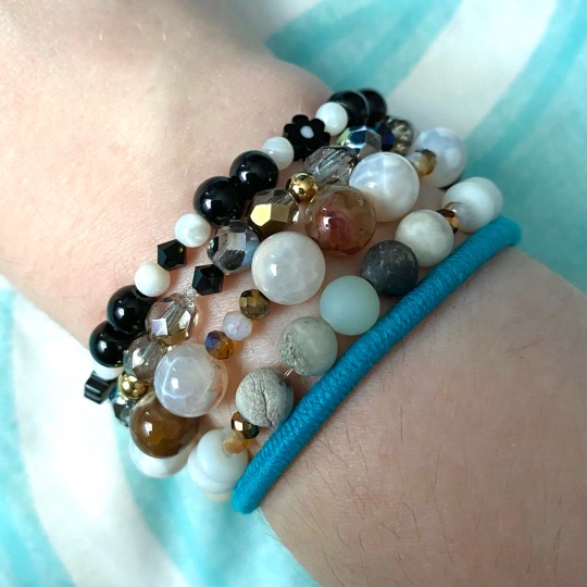
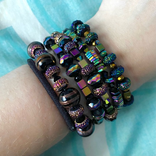
all my bracelets so far ^w^
#i wanna get stronger string and then redo the ones w the larger beads on them#dont like how flimsy they feel for how big the beads are#and everythingin the last pic. those are the first ones i made so i feel like i def gotta redo them#the patterns are a bit too much and i dont like how they fit and how i tied the string loll#except that very top one towards my hand. that one i made later on so its all good#but the bottom four. gotta be redone#once i get more string !!!#brot posts#i literally just. keep making bracelets idk whays going on. its addicting though#never expected this to become a hobby of mine and here i am like a month into it#and its still going strong
3 notes
·
View notes
Note
Hey mei!
Can i request a Spencer x Reader where reader crochets? And they dress super colourful and become like besties with garcia🤞 very much stevie nicks vibes maybe theyre a bit spritual aswell🧘♀️
maybe GN!reader but i dont mind.
Thank youu 💞💞
I wasn't sure how to incorporate all of that into one blurb so i focused more on the first aspects!
--
“Spencer.” You’re breathless as you stop by his desk, having rushed from the kitchen to get there the moment he sat down, “I made you something.”
You announce it proudly, with the puff of your chest and a bright, shiny grin. He’s used to receiving gifts from you, you jokingly call him your sugar baby, and at this point he thinks it’s true. Yarn is expensive, he’s found, and you go through an alarming rate to weave it together for him.
“Really?” He raises an eyebrow, looking up curiously at you, “Can I see it now, or do I have to wait?”
“You can see it now,” You reach for your bag at his question, finger hooking around something inside before you narrow your eyes at him. That’s his cue, and he snaps his eyes shut, clenching them tightly so that you won’t be able to accuse him of peeking while holding his hands out.
He hears the rustle of your bag, of whatever’s tucked inside, then something soft, alarmingly so, is placed on his palms.
“There,” You him, “Open, Spence.”
His eyes land on a much larger mass of fabric than he’d been expecting to find, used to flower-print bookmarks and water bottle sleeves from your craft. This is bigger, with multiple colors of yarn woven in— this is a sweater vest. It’s primarily brown, a few different shades in a pattern together, but it seems that you couldn't resist adding one of your own pops of color, a splash of green thrown in to give it a mossy appearance.
"Wow," He mumbles, fingers tracing the soft material, "Angel, this is- wow, you made this?"
"I did," You grin, leaning down to kiss his cheek. It's rushed and a little sloppy, but it's Spencer's favorite kind, because it feels like you're racing to love him.
"Thank you," He turns to hug you, letting the vest hang from his grip, "Is it- do I need to wash it or something, before I wear it?"
"No," You giggle, "Just wear it whenever, Spence."
He stands clumsily from his chair, abrupt and sticking out like a sore thumb in the quiet, still bullpen, "I'm gonna wear it now."
He wrestles with the sweater vest he's got on, one of his favorites but now paling in comparison to yours. He lets it fall haphazardly onto his desk, but he'll tuck it away neatly in his bag later. The sweater vest is a perfect fit on him, and he wonders if you've been checking the sizing of his clothes while he's been sleeping.
"Angel this is perfect," He commends you, grinning adoringly at the satisfied smile on your face, "You should sell these or something."
"No, that's too big of a commitment," You wrinkle your nose at the idea, "But, if you want, I can make you a full sweater?"
His brows shoot up until they're nearly enveloped by the hair hanging over his face. He can't imagine the time it would take to hand craft an entire sweater, in fact, he's still in awe you've made him the vest, so he tugs your contemplative face into his chest with an arm around your waist.
"I love whatever you make me," He promises, kissing the crown of your head, "But if that's too much work for you, don't strain yourself. I need all of your fingers in tact," He takes your hand in his, intertwining your digits, "I couldn't hold your hand if you broke it crocheting too close to the sun."
#spencer reid#spencer reid x reader#spencer reid imagine#spencer reid scenario#spencer reid oneshot#spencer reid one-shot#spencer reid one shot#spencer reid headcanons#spencer reid headcanon#spencer reid hc#spencer reid hcs#spencer reid fanfiction#spencer reid fanfic#spencer reid fic#spencer reid blurb#spencer reid drabble#spencer reid dialogue#spencer reid fluff#spencer reid x reader fanfiction
1K notes
·
View notes
Text
also i yap a lot about my patches n shit but like. if any of u have any questions and want to make your own BE MY GUEST i would love to answer
i was blessed with having very cool irl friends who taught me everything i know but i would love to help that knowledge go further
so here’s some basic stuff about what i use/do/tips and tricks. I'm gonna be linking sites to give you a point of reference for the materials i'm talking about, but buy local if you can!! these materials are common in art stores n stuff
MAKING PATCHES
If you've never made stamps before, i recommend this material. It's a lot softer and will get you used to the whole process. Once you're used to it, you can move to the grey stuff which is a whole lot cheaper. You're gonna need carving tools, some of my friends use old wood carving tools, i use this one, interchangeable blades, and the blades can be stored in the handle. As for ink, i use this stuff (black and white). To roll the ink onto the stamp, i use an old picture frame for its glass panel and roll out my ink on there with a brayer, then roll it onto the stamp. I know some friends who use a lint roller and old comic book pages tho and it works well! (you can use the page until it starts to absorb too much moisture and gets fragile)
You can also make fabric paint with equal parts cheap acrylic paint and fabric softener!!
WHAT DO I MAKE?
i really love this post by whyenn-reader, i recommend reading it!!!
ATTACHING TO CLOTHES
I usually sew my patches on with dental floss, SUPER durable, will not break, and survives better than you'd think through the wash. I wash my clothes on low heat and dry on low though, but w those settings my patches have come out completely unscathed. You could also use fishing line but like. dental floss is cheaper lol. waxed, flavored, doesn't matter (though i scrape off a bit of wax by passing it through my nails just so there's a bit less wax)
I use these needles, but one of my friends with mobility issues uses curved needles like this!! tbh on bad joint days i also use these but i still prefer straight needles because i’m so used to them and it’s not exactly the same movement!
As for patch pants or crust pants: USE LOOSE PANTS AND MAKE SURE THEY ARE STRAIGHT LEGGED you will thank yourself later! stitching patches onto stuff will make it contract a bit so make sure you have room for that. And it's easier to fit patches onto straight legged pants since they dont have a weird pattern (especially if you want to do a big patch, you'll have to take those weird shapes into account and it wont fit like you think it will!)
also: DON'T USE PANTS THAT STRETCH! pants that stretch with your body movements + patches and stitches that don't stretch = broken stitches, possibly ripped pants and just overall a Bad Time
Overall it's a good idea to put political patches on the front of your clothing. if someone who disagrees sees your patch and reacts to it, you will see their reaction and will know how to behave with this person. PARTICULARLY IMPORTANT FOR ANY PRIDE PATCHES!!!
also kind of related, yes patched clothing is cool but it is also a unique piece of clothing!! don't wear them to protests!! (fight the urge, i know it's hard!!!!)
I am also a big big fan of making extra pockets on your clothes! I have a bunch of internal pockets in my jacket, and special lighter + sticker pockets on my pants!
MENDING
Patch pants and jackets are cool and all but my favorite way of modifying clothes is mending them!! use contrasting colors, have fun :D
here's a darning guide ---
ok that's all i can think of, i'll edit if i think of something else
#resources#solarpunk#patch jacket#punk fashion#punk#mending#crust pants#crust punk#punk patches#lino patches#patches#battle jacket#diy or die#diy punk#diy fashion#guide#sewing
29 notes
·
View notes
Note
Hello 👋
Swallowing my nerves at last to send you an ask! I was just wondering, what inspires your designs? Are their inspirations in stuff like movies or games? Or just things you come up with yourself?
i .. honestly its kinda hard to tell, sometimes i just randomly think of something, like some detail, or color combination and try to incorporate that into a design somehow; it can come from anywhere, like the color scheme of a pithaya/dragonfruit is something i have been wanting to make a design with for ages but havent come up with anything good in all those years ;O;
im a very easily fascinated by color, espeically in nature, like sometimes i just stop and stare at something like i froze in time bc i just woooooooooooooah color! i probably look like a weirdo doing that though
its really hard to pinpoint anything specifically, the most is probably .. other artists? i guess? which always makes me nervous bc my memory is shit in most areas of life and i worry myself to pieces whether i unintentionally "stole" an idea and just dont remember and think it was my own, it goes further that sometimes i see something that makes me want to draw a similar concept but dont bc i dont want to 'steal' even if that couldnt be further from my intention (have been accused of that before ..)
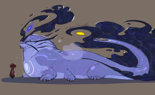
that said for my ocs specifically .. most are rather old and have just kinda evolved out of their awkward first iterations (shargons first iteration was a hauro-howl- copy that was really just some human covered in feathers .. another oc was once a hellboy copy but in green- havent drawn nor redeisgn them in ages lol), the biggest inspirations for them is a mix of animals, bonus if you dont see them often- im a big shark, whale and sea creatures in general nerd so i tend to take from them as a priority but always trying to be less directly animal and mostly just .. features that work together
Eadrya is one of the newer OCs- i started to write but then looked at my folders and oh they are from 2017 .., i even made a design timeline for them how much they, and my art, have changed back in 2020, so thats also way outdated now lol (they apparently started as a whale .. thing? its like a pokemon evolution lol)
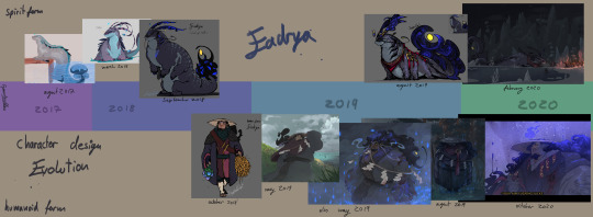
this is them now (i like this sketch still, though shargons design is now also outdated lmao)
this ones from early 2023 so also outdated now but you get the point
for demons i try to be a bit more wild on shapes and colors while still adhering to the rules of how they work (humanoid form, demon form, animalistic, one element each and more or less made to fit that, 4 arms is very common, look to be bost scary and wild but also something that would make you stop in tracks and stare in awe and fear if you crossed paths)
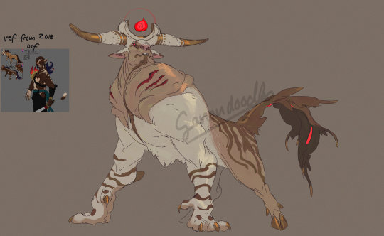
often times designs just kinda .. happen, i have maybe the idea ok i wanna make something with a white and red pattern also moose or those big horned cows are cool and kinda scary so maybe sth akin to that (though this one is technically a redesign too- its also pretty much entirely different)
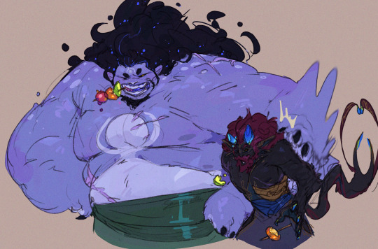
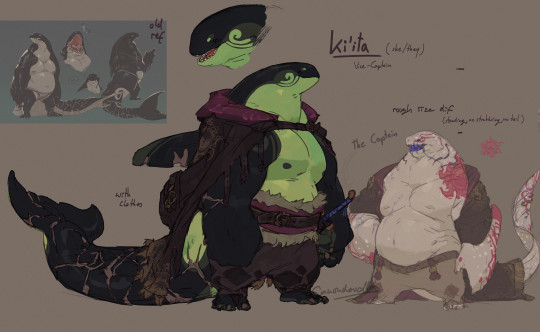
for non demons but still non human i go for a much more restrained design, mainly inspired directly by an animal and giving the color scheme a good spin, plus adding unconventional body shapes, like ki'ita is also a good example, her old idea was just orca anthro pirate and just by making the white green instead in her most recent redesign already adds that little spin to it
that can have its pitfalls though, as i often fall into the big arm small head small legs scheme over and over xD
alot of it is trial and error, deciding on the colors can take me hours bc im always searching for my little rule of having one contrast color that shows up in very few places to draw attention to it (like with Eadrya its those bright yellow eyes and thingy at their tail)
and that is all about myy own ocs, when its fandom stuff it works kinda similar though, either in the connections i wanna draw or just thinking it further- like how deities in destiny work also just kinda .. happened like an ever derailing train
like for demise i was at first really just im gonna give him horns bc horns are cool and he got those on the starting mural in the game- so how his hair work? well maybe it isnt hair actually and just unbound energy, im making him a deity too and fit hylias design to his so, yeah, then so how does it work, ok he gotta have a skeleton still, but what if his entire actual body is made up of pure magical energy with its core in the ribcage? with the core in the ribcage >:3c and the scales you see are just like cooled down lava as an armor bc his thing is fire and earth !! the normal blood? is a thin layer of skin imiated from mortals to keep the scales together and flexible so if he ACTUALLY gets hurt hed bleed magic that looks more like lava and any normal blood you see is just the armor- so why does he have a skeleton still instead of being just energy? maybe its gotta be bound to something OH and what if all of the deities started as mortals like a mirror to the trio later on and the gods cannot have direct influence to the worlds so they needed a right hand that is neither god nor mortal but both by killing a mortal by whatever their element will be (demise burned, hylia drowned etc) and their skeleton and spirit is kept but put into a body of magic- OH what if their spirit core is like almost piloting their bodies like a mech in a way bc if youd look close youd see that every strand of magic is actual a hand of their spirit so it makes it more weird and other bc hed be able to reach out with thousands of burning claws of all shapes and sizes like the beheaded forest god at the end of mononoke- SO if hed lose and arm or something all those strands would untangle and rearrange his bones back together-OH MY GOD the whole armor idea works so well for ghirahims dark armor so what if demise had two swords once and lost one and since has forged an armor similar to his own for ghirahim out fo fear of losing him t---
and that all is a process that happens over several weeks and months not rarely while i am drawing something mindlessly and suddendly *have a thought* and omg that makes so much sense-
so "what" inspires my designs? an ever derailing train of thought about making cool thick monsters that arent the evil thing to get rid of for once? cool color schemes? idk it just kinda happens??
#ganondoodles answers#dont think this was the point of the ask#maybe i shouldnt actually try to answer any questions bc im inherently bad at ... having an answer#i havent even gotten into the anatomy of demons in my oc stuff#yes they ... they got organs#i dont know why id need to think about how and what and their arrangmeent#but i ssure did#I DIDNT EVEN GET INTO HOW DEMONS WORK-#wasnt the ask#my brain is an unstoppable train that never lets me rest#writing soem stuff out like that really makes me realize just how MUCH THERE IS#no wonder i got not space left for any actually important information#like i couldnt tell you my phone number i have had for years but i sure could draw an anatomical study of a demon oc lol#this took me an hour to write.#why am i like this
63 notes
·
View notes
Text
hey chat sorry for the month of inactivity. i was unmotivated to do anything with this blog
but then i looked at some of the art on here and realized that i just lost my love for the character designs. so you know how we're gonna fix that? we're redesigning some characters bayybeeee 😈
starting with the man the myth the legend, here is UNPLEZZIE 2.0
he's probably the only one i had genuine problems with other than not being very aesthetically pleasing. he seemed too boring, his proportions were always a bit wonky, and the way he became more and more simple the more i drew him dumbed him down to just...awkward.
for this redesign, i kept all the features that made him my unpleasant. the only really signature thing i changed was his hair, sorry not sorry he had to fire his barber. i changed his scars to be far less opaque as to not clutter him up (which was the main reason i left them out most of the time), the only drawback is that i'm no longer just scribbling them in with a brush, they're actual geometry, so i cut back on the arms just for my own sake. also his tail now looks (and acts) like an actual docked tail.
next is the QSWX GVCTXMG AMXLSYX VIEPPC FIMRK GVCTXMG GLEVEGXIV SJ XLI CIEV, here is CREEPY 2.0
creepy was probably my least favorite character to draw. its head shape with the hair that always ends off screen, the 4 arms, the lack of any real way to move visible, it has always been a mess of a character. don't get me wrong, creepy is my second favorite character to write for (beaten only by neuro), i love its personality and its inflection, i just never got the chance to show that because i hated drawing it so much.
so for the redesign, i've basically reimagined it. its face hair now has an actual definitive ending, it has a more unique shape, and is just much more expunged-friendly in my opinion. it looks even more like its mom now...
next is this one, i thought she was american. here's PARANORMAL 2.0
i'm gonna be totally honest i have no idea what i was doing when designing para for the first time. that outfit was 100% subconsciously stolen from some other character i can't think of right now. it also really just didn't fit her character at all. also i dont know why i gave her boobs???? what????
anyways for the redesign she's basically a whole new design now. i wanted to play with some shape language. also, para always had a sort of inhuman quality to me, despite her personality, so i've given her inverted eyes and some animalistic features. i guess it adds irony or something, i dunno.
and finally, the moment GERIATRIC CAT you've all been waiting for, UNNERVING 2.0
in truth nervy's design is my favorite. the only gripe i had is the lack of legs, like with creepy. also i had to give her one of the same pride flag ass gradient as the rest so she'd fit in with the rest. other than all that i love her she is perfect just the way she is with minor adjustments
that's all the redesigns done!! i only did these 4 because stabby is not mine to redesign and NEURO is perfect just the way it is. feel free to give me any constructive criticism for these redesigns, i can always tweak em a bit. also the more stripy gradients wont a pattern that follows the contours of the body but rather just unmoving plaid always. i hope this lengthy yap sesh contributed something to something, maybe gave some insight into my characters.
and if you got this far i put a public discord server link in the intro post. you dont gotta ask anymore. dont tell anyone....shhh....*lovingly puts my finger on your lips* *smirks* *bolts away* *gets hit by truck* *instantly fatal*
#regretevator#regretevator roblox#roblox regretevator#ooc unpleasant#regretevator unpleasant#unpleasant gradient#creepy gradient#paranormal gradient#unnerving gradient#gradient oc#regretevator gradient oc
47 notes
·
View notes
Note
Hello! I just wanted to say that I love your art a lot, especially how you draw lizardfolk and stuff! Seeing ur funky little doodles is always fun.
(Any tips on drawing lizardfolk? I really need to get better at them)
aw thank you so much!! <3333
i want to preface the tip-giving bit with this little clarification: there are SO many ways to draw lizardfolk, what im critiquing here are directed at myself — they’re things that i, personally, noticed in my own art and realized i didnt like, so i changed it. there are a ton of amazing artists in this fandom (and in general) who draw lizardfolk characters in the way that i dont like to, but i still enjoy their art because it fits their style or its just how they like to do it, etc etc. take my advice if it helps, but leave it if doesn’t! <3
when it comes to drawing lizardfolk, the main thing i pay attention to is the head and neck. since lizards don’t stand upright, their necks go straight (if that makes sense?). but humans’ heads protrude both forward (with the jaw and chin and whatnot) and backward (the back of the skull). at one point i drew it by just drawing a human head and superimposing a snout where the nose and mouth are
i find that — with my style specifically — it was really unbalanced and looked too human, just…weird in general?
so, my biggest tip is to draw a lizard head and kind of “bend” the neck to connect it to the torso (another way to word it is to make the outer curve of the neck be the opposite way that a human neck curves) — it looks more natural imo
some notes relating to this because visuals might be helpful?

another tip i have is to use the little thingies above the eyes as eyebrows-equivalent! it really helps me with getting expressions across
i also like the top of the head to be a little flat and for the brow ridges (^) to be on the top: basically, i dont give them much of a forehead lol
another thing (specific to semirealism maybe?) i do is to just sort of simplify the heads into eye, head shape, snout, mouth, and eyebrow ridge — i dont pay much attention to complex patterns or individual scales (i tend to imply scales with little curves in my doodles, and with ‘blobs of color’ in my rendered art), just the overall vibe yk?

i hope this helps!! <3
i tried to explain why i do things so its easier for anyone who’s not sure whether to incorporate this advice to see if it fits with how they draw and such
#my art#ask answered#lizardfolk#kremy nation#-> tagging it as this because i figure it might be helpful to other kremy enjoyers out here
19 notes
·
View notes
Note
Hey , how are you ? Hope you are doing well. As a dragonkin myself , I wanted to ask you how you realised that you were a dragon and how it you find your dragon species and dragon body ?
hello! im doing fine, thanks for asking! lets see... before i realised i was a dragon, i kinda already knew i was nonhuman. being called a human never felt good for me, and id always had these instincts and impulses that didnt make sense for a human to have. i had a very active imagination, and i was always daydreaming about growing wings on my back or otherwise transforming into a nonhuman creature; winged creatures fascinated me. unicorns, dragons, pokemon, birds... i used to make little drawings of a lot of different creatures in the margins of my notebooks. i imagined myself as this creatures, and wanted to be like them. i sorta... trained myself to have wings, first in my dreams and later in real life, in the form of phantom limbs. they made me happy and i didnt tell anyone about them, so i didnt think much of it.
i found out about the otherkin community when i was 18, but i didnt think much of it to be honest. i thought it didnt fit me, and i left it at that. but eventually, i discovered that having phantom limbs wasnt... common, to say the least (i think my thought process was something along the lines of "yeah, probably everyone feels the constant sensation of invisible limbs superimposed over their physical body :) im normal :)"), and again i fell into the questioning hole. long story short, i thought i was a crow, then a harpy, then a monster-thing with wings, then i didnt know what i was anymore, and finally i thought "holy shit, i can be a dragon???", and that was that. not very exciting, i know.
as for my appearance, it was a Process. i knew i was a western dragon from the start: four legs, two wings, a tail, two horns, all that. the details were a bit harder though. first i tried on different colours in my mind, taking note of which ones felt right, "like me", and trying to see them on my body. i dont know how to explain it, but when i found the specific shade of blue my scales are, something clicked in my mind. it was like a "its me!" feeling. i found out about my half-feathered wings a bit later, i think a couple of months after my awakening? i always knew i had feathers on my wings, but i repressed it because i wanted to fit the specific idea of a dragon that i had in my mind. but eventually, i had to accept that i was a little bit weird and embraced my weird ass (affectionate) wings. all the other details i figured them out eventually or just... made them the fuck out. yeah, you can do that! you can literally just think, "hey, wouldnt this be cool?" and add it to your appearance. my little scale details? made them the fuck out. my lateral line? made it the fuck out. my chest scales? okay, i cheated a bit because i used my phantom limbs for those. but their colour? I Made It The Fuck Out. you can just do it. no one can stop you.
ill leave you a couple online dragon makers here so you can play with appearances and stuff. they were helpful for me when i was just starting, so i hope theyll help you too!
really good 3D dragon maker, with lots of options for body types!
2D builder, a bit more limited but still very good
i havent actually tried this one, but its a cool dragon maker game
flight rising dragon builder! it has tons of patterns and colours, but can be a bit overwhelming
and as always, good luck with your journey! :}
18 notes
·
View notes
Text
✨2024 makes wrap up! ✨
this ended up being a big year for me in terms of makes, though it didnt really feel like it at the time! im also realising how many of these projects i never did a proper wrap up post for, so i will try and do some more of those over the coming weeks!
Total sewing projects: 11 Costumes completed: 3 UFOS finished: 1.5 (one was a long-awaited alteration) buttons sewed for coworkers: 13 (ish)
and the full list, with links to posts as i write them!
Anne Pants
Anne Blouse
Anne Corset
Flora Dress
Janet Skirt
Record Bag
Ginny Skirt alteration
Ginny Vest
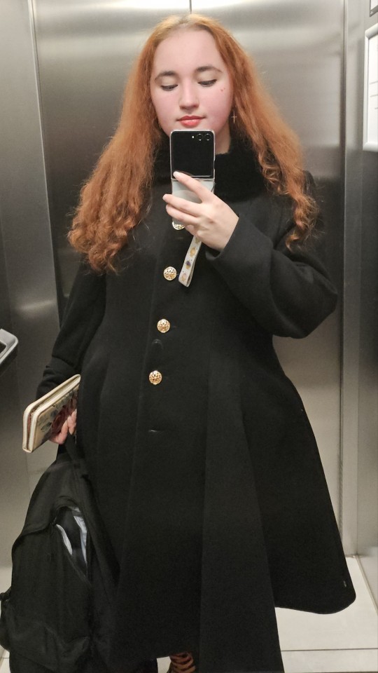
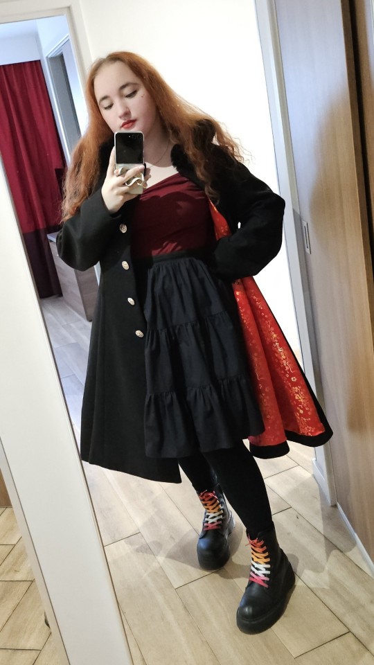
The Coat
Skirt alteration
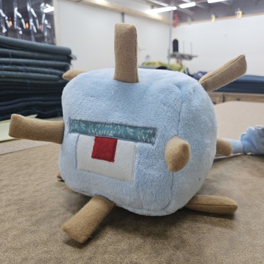
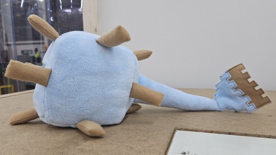
Minecraft Guardian plushie
bonus mentions:
(things that werent sewing projects or didnt get completed, but felt important enough not to leave off!)
Anne necklace
Cross stitch progress
design a dress
swallow ita bag
below the cut ive wrote a little about the projects with pictures, if you wanna read more in depth thoughts!
Anne took up most of the start of my year, working from february to may on the parts of the costume. it took me outside my comfort zone in a lot of ways- my first time making pants, and the corset presented a whole bunch of new challenges, being in leather- any seam i made was impossible to fix. i made a whole bunch of mistakes, but im incredibly happy with the overall results anyway.
I took a break after Anne, chilled out, did some cross stitch, only to jump head first into Flora on an impulse (aka my friend said "do you want to?" and i said "say less") In spite of the time crunch, she was quite an easy build, following a pattern, not too much fitting, and most of the problems ended up being of my own making. after coming back to redo her hem in october, im super happy with how things came out!
I floated around for a bit over the summer, messing around with patterning the wing collar for the design-a-dress for a while, working on my Janet skirt, and patterning a couple other miscellaneous things before throwing myself into mcm prep again! as mentioned, i redid my Flora hem, and i also decided to learn a new type of skill! bag making!!!
Looking at my archive, i dont think i ever posted anything about the bag i made for Maggie, which is frankly a crime, because i love this thing!!! it was absolutely a learning curve & i didnt have all the best choice of materials (it was mostly scraps from my job and things from in my stash) but i really did learn so much that i can take forward into the future- which there definitely will be a future! i already have plans for at least three more bag projects, and im gonna figure out how to make ita bags too :D
then it was full steam ahead into november, and i decided i could finish another costume this year, and so it was time for Ginny! She was a mix of refashioning & from scratch work, but every fabric piece was made with recycled materials. I loved making this costume, it was super fun to mess around with techniques with no worry about how professional it looked at the end because she was such an obscure costume!
At the same time i was working on Ginny, i decided it was high time i finally finished the coat i started working on... two years ago ''':) this too was all about learning new techniques and understanding proper construction, and i am so, so happy with the results. theres definitely a couple pieces id like to come back and revisit at some point (looking at you, collar -_-) but i know those are mostly things only im going to see. im so glad i put it down for a while, i think ive done a lot better than i would have done this time last year- and i know when ive given it some time and come back again, ill do better then, too. but its wearable and cute, and i finally have a lovely winter coat :)
I thought i would be finishing the year with a couple of long overdue alterations to my favourite skirts, but i ended up only getting one done when my coworker asked for help making a christmas present for their friends kid. the second she showed me the pattern, i knew i could do better, and so i wrapped up my year with a mad dash to make a plushie guardian in a week before i finished work for the year.
You should know by now i love a challenge, and this sure was something different! i think id do things differently if i had more time, but im super happy with how this guy came out! it was great practice for satin stitching on my machine & working with tricky fabrics, and i think id definitely like to make another one, with a few changes to the design- and the colours of the fabric, as i had nothing to do with those! im telling the kid its a shiny guardian ;) either way, i hope the kid has a great time using him as a mace !!
and thats my year in review!! im hoping next year ill be able to do another one of these and be just as proud of everything ive achieved :)
#LOVE to talk about my plans. hate to post finished pictures#(mostly bc i get frustrated to the enddddd)#i will try and spend some time writing them up this week though!!! i feel like especially for anne i jst. stopped writing halfway through#i think the summary is. im just. so so proud of myself actually#i felt like this was a weird year in terms of being productive#i had mad periods and then months off#and i shoved a whole bunch of stuff into the end of this year#id like to not do that next year#but even if i didnt achieve the Most amount of things. im still so so proud#i did that#looking at it all in one post. im so proud of me#i cant wait to see who ill grow into#sewing#year in review#2024 wrapped#cosplay#sewist#im counting each piece of a cosplay as its own thing bc if it wasnt for a cosplay then it would be an individual garment#i havent included the Details but yeah. anne blouse was its whole own thing
11 notes
·
View notes
Text
ok lets see how far i can go. im gonna startt. kim just gonna start.
fair warning this will either seem like incoherent rambling because my thoughts are hard to formulate or just me wanting to be rude about the sequels past we love katamari despite never playing them (i wrote this line after i finished the whole post)
anyways im about to list alot of king's outfits over the games and then rate them on 1) whether i like them personally (partly removed from context), and 2) whether i think they actually fit king. im doing this for absolutely no fucking reason and honestly im scared ill be very wrong or biased but im mnot being paid to do this for gods sakes im writign a tumblr post. i wont get cancelled for getting king incorrect. anyways
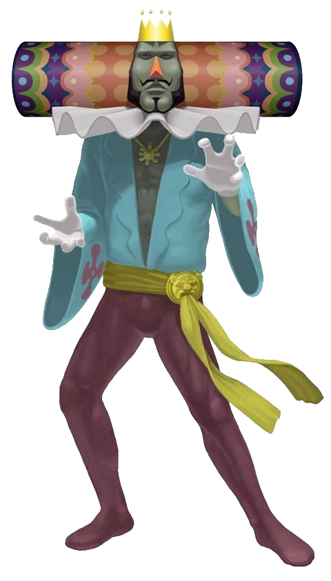
katamari damacy

(im probably going to switch between using game screenshots and transparent images)
1#: yeah i like it. he looks stupid and i like it. the cape and whatever the collar is called, in combo with the chain and gold accessories looks so silly. he doesnt look like a king besides the crown. he looks like he wants to be cool but doesnt know what that means but he knows nobody will question it cuz hes the king after all.
headdress: perfectly over-loaded. you have way too much going on. you dont need those blinking lights. and you really dont need those patterns and colors. can i try it on
2#: well its hard to say since this is the first one. and of course the first one fits him cuz. its the first one. but i think it gets his impression off very well. its a prussian blue v neck and a golden chain, with sort of maroon tights and a golden belt with the face of a lioness. bracelets and rings, and of course the triangle ruffle collar and purple flower pattern cape. its a mixed warddrobe, kind of silly, i think it works well with how you cant really take him seriously, too. rude and hurtful, yet also he. dresses like this. a kings crown, cape and collar, but his personal style underneath it. also expresses how he may be king, but hes not really taking that as being his role - rather, being himself means to be king. or being king is like, a side thing, not as important as just doing what he wants. maybe a bit of a reach, dont know if i managed to explain what im feeling properly... also, his actual clothing besides his headress isnt actually complicated, which is an interesting contrast. you would think he wants you to pay attention to his face, and not his body. he is egotistical, it makes sense that he wants you to look at him and pay attention to him in general, but the emphasis on his face is interesting.
headdress: absolutely fits. very extravagant in a way that works. the colors arent bright as hell either, which im glad they did because if they were neon and too flashy itd look too obnoxious. well itd look bad but also hes not about exactly "standing out". he loves attention, but he still has his style, and that style IS colorful, but not neon. i think it fits him well, it teeters on being over the top and subtle at the same time, like complex embroideries perhaps
we love katamari

1#: also like it. has the same color scheme of blue top and magenta purplish bottoms. though here its a bit less saturated and lighter in color. the flowers on the sleeves are a nice touch since hes no longer wearing his flower cape, and the golden ankle ring, as hes wearing nothing on his hands but his wedding ring.
headdress: neat!! i like this more than katamari damacy, but just because its kind of cute. well i like them both, but this one is easier to draw (lol) and the color scheme is nice. the lights are now flashing from the spaces of color, instead of looking like round lightbulbs, if that makes sense, and it seems more casual this way, somehow.
2#: it kinda fucks me up. but judging king in we love katamari, from how different he is compared to katamari damacy, this outfit seems kind of perfect to showcase how (almost eerily) laid back he seems to be in we love. his ruffle collar is now smoothed out, its wiggly instead of sharp. hes wearing a very wide sleeve light cyan top, a purplish flower on each sleeve, with a squiggly cut on the lapel, open to reveal his chest and a golden chain, with a piece that looks perhaps like a flower attached to it. he now has a band wrapped around his waist instead of the golden belt, with a golden lioness head piece holding it in place. lighter wine color tights. its so- i dont know. king starts off obviously excited at the fanbase and attention hes getting, so its curious he puts down the iconic outfit and gets into something so comfortable. he wants to stand out less, all of a sudden. its still very much a king outfit, but he dropped so much, i wonder why. hes laying back as usual to let prince do his work but hes really leaning into it now. not just that, but he seems almost less hurtful than katamari damacy. more open. hes still full of himself, but its toned down, muted. his occasional interjections talking about his childhood and papa are offputting in the sense that its unusual. and this outfit is unusual, too, in comparison. katamari damacys impression is that hes pompous but a bit silly (and also just a dick), we love katamaris impression is that hes egoistic- but aimless. he seems more forgetful and more lost in thought. the cape missing could also be symbolic of his openness, even if a bit cheesy. i noted that his cape might also hold some emotional weight similar to the crown, but thats based on my feelings.
headdress: reflects the casuality. its got a smaller color palette now, less patterns, and more flat spaces of color. reminds more of his headdress patterns in his childhood. its also longer now, but i dont have anything to add for that.
me & my katamari

this is where i start to get a bit iffy in general. the games are no longer directed by keita, and king doesnt actually progress any. he stays the same or changes purely because different people are writing his dialouge. me & my katamari seems to have no story otherwise, or cutscenes, even - so from here on i suppose i do get biased but there isnt much character to go off of. however- i did not play any of the games besides the first two, so i am watching gameplays.
1#: i think its alright. i dont really like the combo of colors, it feels weird with the super yellow thin cape, but it is a swimsuit style thing. i wish they changed the collar, though, or outright removed it. it feels wrong to be in there.
headdress: ehh too neon, doesnt help with colors.
2#: this is. alright, its ok. the swimsuit is relatively simple too, thought the yellow cape doesnt seem like something hed wear, especially since its supposed to be a swimsuit- a cape would make it very hard to swim, though kings zaniness could get him to wear a cape if it means looks over functionality. it isnt his normal cape of course, though im a bit sad the flower pattern is entirely missing here, or even a hint of it. instead its a swimsuit.. something... with wine and orange, and what looks like a necklace. its not a necklace exactly, but i dont know the name for this. its also got a lioness head. i dont really get the golden armband around his left arm, but eh. i think its passable overall but straying further from kings personality, though given he is just like. having a splash and having fun. and it is skin tight, which isnt really that important, but its not swimming boxers or something. swimming suit still with a touch of decency. i guess it wouldve been repetitive if this one also had a v cut, but to continue onward from we love katamari, if it had to be real casual and open as a sort of conclusion to we love katamari, i could imagine something similar to this swimsuit, but its a one-piece that covers his legs and chest but leaves his arms free. idk though. i also added this bit in an edit, so now im starting to think about actually sitting down and redesigning it, but im uh. not able to rn. and you cant save edits as drafts. oh well.
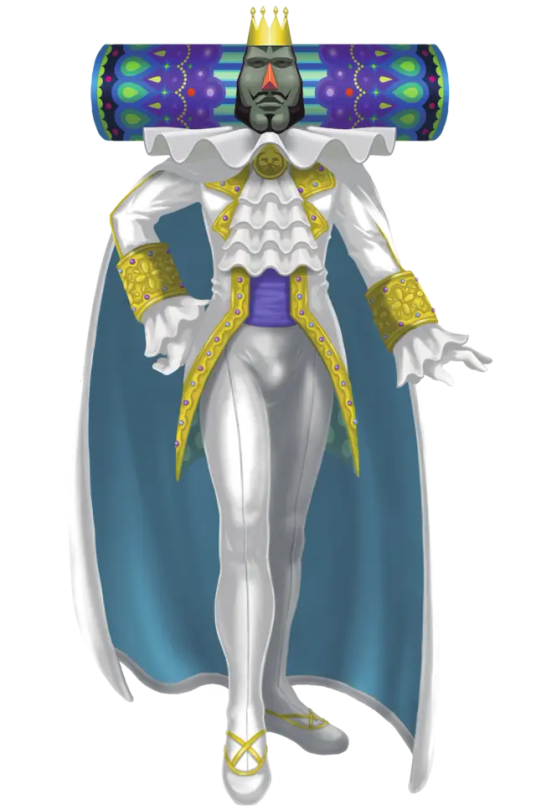
beautiful katamari

1#: really very stupid looking. i think the sleeves and puffy pants are very funny but boy i dont like this. dont really like the colors. id try it on myself tho. again, with the wiggly collar- this straight up just doesnt change in all games after we love katamari.
headdress: meh. not a big fan. its getting a bit boring now.
2#: not sure what to say. king wouldnt wear this. its really not his style. it looks more like a jesters outfit, and the lack of shoes makes it look even stranger. the weird random opening that shows a bit of his stomach is also a bit nonsensical, alone in terms of how the hell this piece of clothing works. the pants are too puffy- stripes arent something that make sense as a pattern for him. and the whole theatrics thing, with king talking to you from behind curtains he opens up, on a stage like background, feels out of character. hes not one for theatrics (literal). he likes admiration but he performs by showing off what he can do physically, not through theater or a play. not that its said he does, but the theater bit is just weird. doesnt fit him as a character.
headdress: in combo with the outfit it just doesnt make much sense, it doesnt really harmonize. its alot of shapes and colors, but not with much consideration. the colors seem to be random. the headdress and outfit are kind of at equilibrium with how much they catch your attention. obviously the headdress is more saturated and in game it has blinking lights, but you do have to look longer at the outfit, and it kind of sticks out with how it seems like such a weird pick for him. also it is just kind of a silly looking thing. maybe im just looking too hard though.
also ill b real im just getting more mad at the gameplay. the physics are missing and the katamari feels way too fast and responsive, which is frustrating me, and the game is basically back to basics with you and king and nobody else, which makes kings lines disappointing, but once again, i handle watching a game and playing it differently, and i already have bad feelings about the sequels besides we love katamari as they arent directed by keita, and king is such a specific character. the gameplay part is irrelevant though but it is making me want to watch it less. lol.
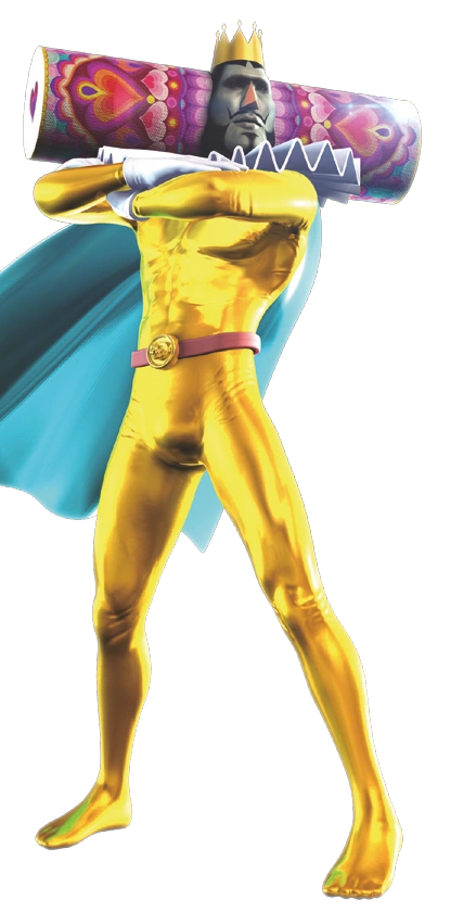
katamari forever
1#: curious! i like this outfit, removed from context. i cant say i like it as a king outfit at all, but i just like this type of outfit. fucking. no idea what that thing hes wearing at his collar is called but i have a little soft spot for that thing. hehe. dont care that its a king outfit though.
headdress: i like the colors! its mainly blues, purples and greens, but i like it. the patterns work fine for me. still boring though.
2#: this is hard. katamari forever has a bit more substance, but the whole plot literally is that king loses his memories. though he IS wearing this before he loses his memories. he has dialouge as he has levels, but technically, roboking is the main character in this. doesnt really matter, you can choose between either of their levels at free will i believe. thissss outfit is. sssssss. i dont know. the direction its taking with the fancy dandiness isnt out of place for *a* king, but it is out of place for *the* king of all cosmos. his suit and whole shebang being so bright is incredibly juxtaposed to his comfy darker pallette of katamari damacy and we love katamari - yet hes still the same character? hes not changed. he still belittles prince for low scores and small katamaris, still pretty egotistical. his outfit doesnt reflect anything on a deeper level. if anything just reflects a change in taste, but thats really not that interesting. theres cutscenes (finally) but these say nothing as hes asleep in those cutscenes. so theres nothing more to pull out of that. his responses to low or high scores seem to be mostly the same, and rather short, to be honest. when he requests something, its also pretty short. theres not alot to take out of that.
touch my katamari
1#: scared. scared of touch my katamari. i dont like this outfit but also i just dont like kings 3d model. like i dont need to tell you his face his scary and uncanny looking. its not that bad in this image but if you see even one closeup of his face its just. uncomfortable. his collar is sharp and triangle-y again, though.
headdress: i like the hearts hehe. thats about it though. dont like the fabric overlay over the texture, was kind of unnecessary. i want to spare you from looking at a closeup of the kings face though.
2#: man i dont know bro
im also getting tired and Hooo shit look at the time. i know i shouldnt do these things but you know how it is. i dont know why i did this, to be honest, but i just felt like talking a bit. my mind is a little too full on things around the cosmic family(s) and im already thinking more about queens family. oh well. i have no idea whether to tag this. i suppose i would conclude it here, despite the indeed dry touch my katamari review... this is just my little thing for me. im sure if i tag it with the katamari tag Nothing bad will happen. im going to sleep.
extra:
THIS IS AMAZING KATAMARI not tap my katamari. you can see the edge of the title literally right there in the image but i was too distracted by their whismy.

queen ❤️
amazing katamari is just a mobile endless runner so theres no story but i will say: i like this! its cute! its simple, and a combo of the katamari damacy and we love katamari outfits. yea its not special, but its ok! though again with the collar... would've liked if they kept either one or the other collar piece. but thats about it, no deep analysis. i just think this render and art style is cute in general, so exclude this from the review. headdress is neat too. again nothing special but atleast it isnt so neon, mainly pinks purples and blues. completely taking it as being cute art though.
bonus AGAIN:

roboking. there will be no outfit review its just king but robo. hes also an entirely different character anyway so an analysis doesnt make sense. but i like that his belt looks stupid and his colors go pretty well, purple yellow blue. and that his eyes are always angled down. i just like robots. all im putting him here for is to say i think his pathetic self is entertaining and i kinda wish katamari forever was better. it couldve been good. but yeah ending this off with sad little roboking. thanks for reading. bye bye
25 notes
·
View notes
Note
Hiii your icons are so pretty, would you have a tutorial on them or tips on how to do it?
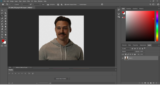
hello lovely and thank you so much!! i have been making icons for a long time, but have also just started with this style of icon, so i don't know how much of a help i can be but i'll try my best! i make all my icons in photoshop, but when i first started i used gimp, it works similar and i'd recommend it if you dont want to commit to ps just yet. this ended up getting kinda long because i went step by step on how i make my icons like the ones from this post, with a bunch of tips and tutorials linked, so i put it under a read more. i specifically go deeper into how to change the colours of his hoodie depending on your background/preferences. i hope i could help even a little bit!
1. the base
one of the first steps is deciding what you want the base to look like. you can do just a solid colour, gradients, patterns, etc. you can use the solid colours and gradients that are already a feature in photoshop, but there are also a lot of amazing resources and bases by other talented people either on here or on deviantart. just look up icon textures on deviantart, you'll be able to find a bunch of textures and pre-set gradients you can use as your base. this is a really great pack you can find on deviantart that offers a bunch of bases. if you'd like to make gradients yourself, here's a really good tutorial! i am not really an expert on explaining how to use textures because i've only really just started with headers.
2. the picture/png
onto the star of the show - the person you want to have in your icon. i usually get those from screencaps from whatever show/movie i am making icons of. you can get screencaps of most shows and movies from screencaped.net. i then isolate the person i want to be in my icon so that the background is removed and transparent. you can do that yourself, here is a very good tutorial on how to do that in photoshop, or you can use other platforms like canva or adobe express, that have features to remove the background for you. you usually cannot adjust those, so if they dont cut out things the correct way you have to adjust in photoshop afterwards. when chosing a screencap you should make sure that the person and silhupette are clear and delinated from the background, without any obstruction in the foreground, so that you can cut out the entire figure easily without parts of their body missing. i usually also look for screencaps where the head and the sites aren't cut off, so that i can freely adjust the sizing and move the figure around. i also try my best to get a scene where the lighting is alright so that i don't have to fight for my life colouring it, but sometimes it can't be helped.
this is one of the screencaps i used for my recent eddie icons and it's a good example: his upper body is clearly seperated from the background, nothing is cut off, etc.
this screenshot is an example that i personally wouldnt use because there is a jug in the foreground in front of eddie that would be in the icon as well.
buck looks very cute in his lil hat but the shot is cut off on the right and on top, so i didn't end up using it either. you just kinda go through the screencaps you have (or take your own) and figure out which frames fit for the type of icon you'd like to make.
if you'd like to make screencaps yourself, here is an easy tutorial to follow!
3. basic colouring
when i make icons like these, i usually dont go too crazy with the editing, i mostly just adjust the lighting and colouring the create a well-lit base. here you can see the unedited png (first picture) and then once ive used a basic colouring (second picture).


this is a very good tutorial on basic colouring using curves, hues, etc, as i've done as well. it is for gif-making but those same editing steps can be applied to still pictures as well.
4. colour isolation
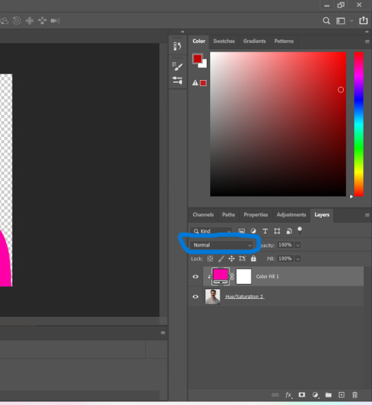
the icons i am currently making are in a style that you can see a lot around tumblr - where parts of the person in the icon, usually their clothes and other accessories, are edited to be a certain colour that matches the background, and that colour can be changed to match different bases. you can see that the hoodie eddie is wearing has a different colour to match the different colours of the background.
i desperately tried to find the tutorial that i used to learn how to do this but i can't, so i'll try my best to explain it myself (brace yourself). i have seen people do this by drawing onto the png, but i use a different method. for this you'll need to have some basic knowledge on layer masks.
we're gonna start with our png image that already has the colouring applied to it (1).

now, click on the layer and add a solid color layer (2). you do that by clicking the symbol i've marked on the bottom and then selecting "solid color...".
in the screen that pops up now you can select the colour you would like the accents to have (3). choose the colour you want and then click "OK".

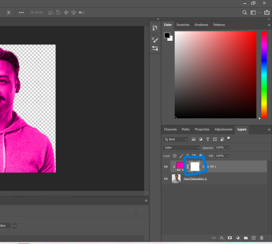
your entire image should be in the colour you chose. now right-click on the solid colour layer in the layers panel on the right and select "create clipping mask" (4). this will apply the solid colour layer only to the cut out of your lil guy. it should looks like this now (5).


now we're going to adjust the blend mode. right now it should be set to "normal" (6). click onto the drop down arrow and select the blend mode "colour"(7).

now we can see eddies features again! now we want to edit it so that the pink is only on the parts that we want to be colourful. for this left-click on the white box in your solid color layer (8) so that it's selected. after that select the brush tool (9) and make sure it's set to black. we use black to take colour away and white to add colour back in.
now go over all the parts that you don't want to be colourful. if you accidently take too much away don't worry, just switch the brush colour to white and go over what you want to add in again. it looks like this (10) for me afterwards.
you can change your colour if you double click on the little pink box of your colour layer and adjust it however you want.
5. adjustments
after i've done everything listed above i usually group the two layers (your cutout and the solid colour layer) together so i can move them as one (11). after that i pull the group over onto my base and adjust it so that fits properly (12).

now that the cutout is on the base layer i usually go in to properly adjust the colours and make sure the colours on the cutout match well with the background. you can do that by changing the colour manually or using the eyedropper tool. and voilá! i know it sounds like a lot right now reading this, but once you've gotten the hang of it, it really isnt that hard.
i hope this was at least somewhat understandable and that i could help a bit! there are a ton of amazing tutorials out there for all parts of editing and photoshop in general that go deep into details in case there is a specific part you want to learn more about. for now i hope this gives you at least a small overview.
18 notes
·
View notes
Note
NOW THAT SOMEONE ELSE BROUGHT IT UP YES there's very peculiar things in the artstyle, one being obviously the eyes (both on doodle (unserious) and rendered (serious) artworks) The eyes are very distinctive to the character! They add so much to them!! Forever gonna be obsessed with how they are drawn
Azai feels a lot like a predator in like, immediate danger kind of way. Saran feels more ominous, looming, the tentacles dont really add much to that (despite the amount of eyes, funny enouhj) but rather, it's thanks to him often being drawn with his eyes closed and smiling (Which fits their characters!! Azai is dangerous, yes, but Saran is worse now, and he is after Azai, and Azai doesn't realize it yet!. To quote you, he's making use of every blind spot to crawl closer to Azai and get what he's after)
Even from child Saran, he just feels like he's constantly scheming lol. The danger is high but may not be directed at you (Saran) vs feels like if his eyes fell on you, its because you fucked up (Azai)
Others like Vika or Luka (who have this ethereal look to them usually) feel a lot more, i would say open? But also feel like their eyes are rather empty compared to the vibe the other two give off?? Half the time Vika's eyes give off a vibe he's not quite there (disconnect between body and person. Which is literally what the parasite caused) that is fascinating! I would argue he feels more present in artwork where the character has his eyes closed/his face is not shown at all. It's incredible!!
For Luka it's a but softer, but its a similar sensation. It feels absent too but more in the way a person can be when they're deep in thought. Ivan's eyes I refuse to look at enough to analyze properly lol. Your art style highlights a part of canon that unnerves me lol. I think it might be due to the red dot in his eye but his eyes feel too focused? He has one feet in each side at the line between devotion and obsession
He and Saran are always looking, but funny enough despite the amount of eyes Saran has, Ivan beats him in intensity
(I am slowly making my way through the other OC's so review pending on how their gaze feels too. I will say now that the vampire guy whose name i cannot remember currently for the life of me feels skittish. Which, he's drawn skittish, so that tracks. He feels like he's one thing going wrong away from a meltdown lol. Highstrung)
The second thing is, on those that are rendered, colors!! The pallette usually skews towards colors that are more contrasting (WHICH IS LOVELY), and that pattern even sorta follows to the black and white pieces because you will have things that are glaringly stark (/pos) against the white background. Looking at other's quick doodles and black/white pieces, that contrasting feel seems to be unique for yours (fun thing to look at, it seems that some characters are less prone to looking that way (softer, thinner lines, less blocks of contrasting color more gradients that tend to melt into the background color))
Third thing is hair. So soft. Lovely. I haven't been able to pinpoint what it is exactly (maybe it's that messy-like appearance? Like, it doesn't FEEL like messy hair (there's Saran's bed hair for comparison lol) but there's something about it. It eludes me. The closest my brain is getting is "uncanny perfection/natural mess". If that were a scale the hair would be firmly on the natural side
I just like the vibe hair has in your style. Very fluffy
(The bonus thing is expressions. Goes with what I said about the eyes, but the expression (both face and body) tie it in as a whole. Their body language is really good. I find particularly pleasing the way confidence is portrayed through some of the actions (it shines a bit more in the NSFW blog) or the pose. Beautiful)
(This is just me going on a tangent about a particular variant of all of the above, but in the Bonus to that mini comic about Vika being insecure in how he will change while Saran remains the same, the way Saran wraps his arms around Vika and the style changes to something a bit more goofy (reflecting how Saran starts acting to cheer up Vika) is very neat to me. I think about that a lot. It screams safe)
-eepy 🦜
Sorry for the long rant lol
OMGGG WAAAHHH read it twice and held it close
i dont even know what to say but its crazyyy how you figure them all out just by how i draw their eyes etc, im always unsure if i can get atmosphere or vibes across properly but waaa
even vin (you corrected vampire to elf later so i understood u meant him) who i showed maybe like once or twice since i didnt post much of that old project you got right, yes hes always on the verge of snapping and breaking down akjsbck
dont apologize for the long message!!! love all ur messages honestly, im gonna save this fr sob
15 notes
·
View notes
Text
sun moon pokemon notes
since i keep seeing people in the tags asking about it and so i dont forget
SUN
the main reason i chose Leavanny was because im tired of seeing him as a fire type! i almost leaned to an electric type until i saw that leavanny is the Nurturing pokemon and has those big leaves on its head and is known to make clothing! since i'd already settled on moon being a banette, that just seemed to really fit
sun is partially blind in this. he can 'see' with his antennae in a similar sense to that scene in Wolfwalkers. His eyes can see shapes and shadows, but its more like being severely near-sighted.
he can always find moon no matter how hard he tries to hide or disappear. he may act dramatic when moon scares him but moon knows it wasnt real. it doesnt stop them from doing this frequently and pretending it is
his job is something typical for one of this species. daycare [duh] or teacher or something, something that he wouldve enjoyed more had it not been expected of him just because he was born a leavanny.
hes got the ability insomnia which combats moon's ability, bad dreams
i also just super like sun not being a fire type!! a lot !!! i actually hc that he dislikes fire and, if he could choose any pokemon to be, it would probably be a heliolisk! [although he does very much enjoy the extra senses and the ability to manipulate vines to wrangle his charges] [he does NOT appreciate how he is assumed to be weak because hes a grass/bug and makes it a point to show his strength sometimes in subtle ways]
He's actually. very fond of moon even if he acts dramatically annoyed. dont talk about moon or he will rip u to shreds.
MOON
Im surprised more people don't make moon a banette. seriously. a plush who was once beloved and was forgotten and filled with so much grief and anguish that it came to life? seeking the life it once had but losing all memory of it? the zipper mouth and cat ears and Hat Tail?????
he met sun when he was near death. sun found him and stitched him back together. [ i also hc that banette are still filled with stuffing <3 no blood and guts only stuffing and squishing ]
the patterns on his body were leftover fabric that sun had on hand. the only real part of his original body are the white bits, the rest too torn to salvage.
you cant tell in the art bc ive decided this Now but the stars on the black parts were either drawn on or patched on by sun, requested by moon. he thinks the star patterns are cute<3
he.. likes sun. no surprise there of course. but hes the one who falls first, hanging around all the time just because he enjoys it. enjoys his colors, the way his leaves twitch when hes annoyed or how his antennae curl when hes flustered.
he haunts naughty students who make sun's life unnecessarily difficult. unless its something funny that makes him laugh, then they get One pass and a simple whisper of their name in the dead of the night to freak them out a little.
the bell at the end of his little 'hat' thing doesnt really ring unless he makes it. the pros of being a ghost; manipulating your own body and anything attached to it
7 notes
·
View notes
Note
In the theme of that last post (and making you make good on your word) i wanna hear all your thoughts and inspirations for Mimsy and how she's changed over the years 👀💕 ilyb
MORGAN ILYYYY 💞💞💞 ofcccc anything for you what..... and tbh this is so indulgent for me you dont even knowwwwwwwww. bc each year i feel like i grow a better grasp on who she is as a person & the reasoning behind her decisions, but also just generally i feel like ive also really grasped her style and where i want to go in her character design. which you've already seen ofc, my loveliest dm 😌 but ill show some snippets here too so i don't feel like im doing her dirty lmao.
that being said if any of my party members could avoid this post ill love you forever.......... 🙏🙏
ive def said this before on here but mimyr's initial inspiration came from user rennybu's design of THEIR wonderful firbolg Loam, and user ckiddo's general stylisation of firbolgs + Caduceus Clay interpretations. i had really pining to make a firbolg before our campaign started and since ours was so centered around islands and the sea, i thought that make for an interesting mix as a sea-faring firbolg i hadnt really seen before, hitching rides to explore outside their secluded home. so especially in her very first design/portrait art, i leaned harder into that vibe. this is also where i first decided her clan would be represented with a mint green and it's been reoccurring since, just with the support of other colors later on. also i kind of miss her big ole ears.... they were so cute but i was also not 100% settled how i wanted blogs to look yet so she doesn't even have her tail until design 2 and her features slowly get more cow-ish.
then we had our second big design change!! right after the big ship wreck and we finally get new clothes on land. there's a literal strip of identity since our members were... literally stripped of our belongings and clothes since the ship incident so honestly there's not much to say with this one other than i imagine it's her best scrounging of cloth in a way that's comfortable to her. its more earthy, loose, comfortable, good for traveling in the hot city we were in. i imagine she specifically chose pieces with the fun beadwork/stitching and colors because she found it pretty. also im now realizing 2 years later how short she looks here oh my god. she is 7 foot, i got my proportions so wrong lmao 😭 and she gets far more wide-eyed by the 3rd which is interesting

and then there was the third iteration, im including the 4th design (second) with it too since it's really just a change in the position of her wrap but it was done at a much later time hence the style difference. im not going to lie im not a huge fan of these looking back, i think it look too cluttered but i think moving the wrap did help break it up a bit even if i still really enjoy the silhouette of the first one. although there was a more lore motivated reason for the wrap moving lmao. i remember really wanting to incorporate that dark blue, which i still do, because i think it goes nicely with the mint. i really don't like her wrap pattern though, i think it's perfectly pretty outside of this but i would've preferred to do something more elaborate and fantastical and fitting to her and not bedsheet pattern. but i couldn't come up with better at the time so it is what it is 🤷♀️
it brings over elements of the old design like with the waist wrap, which i think is true to her character. she is a person who likes to hoard however she can, save past materials and repurpose them. in her very first design i was even imagining her head wrap to be an old baby blanket repurposed. also i feel wishy washy about the under sweater layer but since we were moving into a colder climate it seemed fine enough at the time. i thought it looks too clingy but i think my real issue with it is that it would've felt more appropriate if she had more of a loose, flowy layer on top of it, like a robe or loose blouse? it's definitely something im considering to be done for the future.

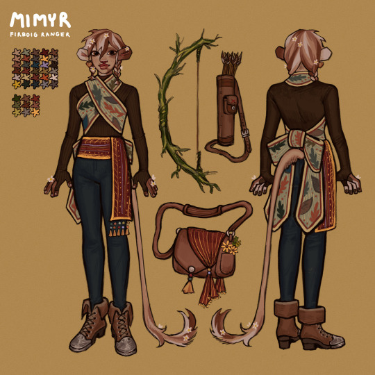
honestly her outfits up until this point are what have really pushed me to want to step up my game and do better for her so in all this time ive been really crafting just how i visualize her style. i want to do more billowy, loose clothing with a lot of layering, things she'd feel comfortable in. including floral aspects, simple stichwork, simple fastenings that would be easy to take on and off like cloth belts/wraps. things that wouldn't annoy her or get in the way of pulling back a bow. admittedly the sleeves below may be a bit too long for that reason so it might help having some way to tie it up to her elbows or something and let it down when she gets cold.
below are some concepts of that ive been really happy with so far, plus a cute baby mimsy's outfit design lmao. AND a short hair mimsy which i can guarantee will happen at least once in the future bc she's sooooooo cute. i want to add more baubles and trinkets in her hair and maybe some hair wraps because she loves tying stuff into it and i never draw it 💔 heartbreaking


something i didn't mention as well is recently ive been thinking she's gotten too cow-ish so ive been trying to bring back that initial inspiration from c-kiddo's work with firbolgs having more cat-like (?) feature as well, which adds a fun element i think. like whiskers. i think it looks cute n feels more whimsical......

ok. POST OVER !
9 notes
·
View notes
Text
Its interesting to me how the atma avatars were made to look like their human counterparts. For me the most obvious example is Roland, not only can you see the similarities in the color with Indra being a bit more saturated, but you can also see how the jacket cooralates to the copper (skirt?) thingie. Another feature you can point out its that indra its the god of storms and the desing of indra has cooper as its main color, which can be associated with electricity. But also works well with the more normal personality Roland has respect the rest of the characters.

You can actually make these associations with most of the cast
The shape of the hood of Gale makes it look similar to vayu's head, but also the insect styled poncho goes really well with how odd Gale is at the beggining of the games. You can see how they wanted not only to represent the character but also their personalities. Same goes for Cielo here, the rainbow color relates with the more child like personality, and the wings on his legs can be seen in the bags he wears near his thighs.

Obviously the colors too are the colors of their elements, but Cielo is bright all around, and Gale is only green in the poncho while keeping the sterile grey underneath. Again it points to their personalities, bright blue is fun and sterile grey is flat and boring.
You could go on and on with these but something that always bothered me, Argilla's avatar to me doesn't really work like that. Okay so the demon is more femenine well okay, is Argilla's personality being a woman? Nah lets take a deeper look. Brown camo pattern yeah fits the earth element, can it be coorelated with Argilla's personality and traits, not really. I think the bright red extensible arms and face are more like it, but for me doesn't really makes the cut , acording to my roomate the arms look like her hair, but i dont really see it. However the red color clearly fits argilla's emotional and strong personality. But why is the demon so spiky? Is it because its a demon? maybe with the red they went for the rose look ? i honestly have no idea what they were going for here
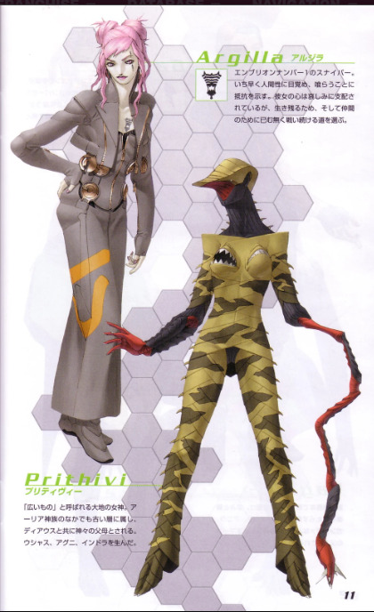
Then there is the mouth breast, You have NO FUCKING CLUE how much i hate these, with Heat id argue that 2 mouths are because he has like the big hunger™, he likes to eat people so he gets 2 mouths, for better eating experience. But what does mouth breast do here for the desing, so like its the inverse of what boobs do? so like an ironic thing, because she in the lore is also supposed to be a mother. They are also kinda in a unconfortable spot to eat and it fits the idea that Argilla doesnt enjoy the cannibalism thingie. But other than that i just think they are for sock value, like look at the demon its demonic, which would also explain the spikes and maybe the weird arms. I just dont really get it.
OH AND VARNANI ALSO EXIST, i just dont want to get into that mess
48 notes
·
View notes
Photo

aaugh i never thought i would procrastinate so hard on posting here but whaddaya know this has been sitting in my drafts for days.. mostly because school has started up again for me and im too tired in the evenings to write out my thoughts on things SJKKHJ
anyways, ive been feeling extremely nostalgic recently, so as a bit of a warmup-gone-out-of-control here are the fake (well, backup) prophecy dragonets! remember this reveal absolutely shocking me reading the books as a kid. their dynamic is wacky.
an in depth explanation of their designs under the cut!
something i initially didnt like, but now think is a striking visual, is the fact that their designs really don’t go together - especially compared to the actual prophecy dragonets. was puzzling over this for ages, trying to figure out how to make them more cohesive, but eventually just decided to leave it. i think it fits since they really dont get along lol.
the problem with making starflight (check previous posts/tags) purplish is that now fatespeaker has to be a more saturated purple to distinguish the two - she additionally has faint teardrop scales by her eyes to add some spice to her design. i think canon should give nightwings more unique silver scale patterns as well, like fatespeaker's "bracelets" (sadly not included here)!
i want to eventually revisit flames scar, it didnt really come out how i wanted it to. other than that, i like his colours and his pose! you might notice that as i recall how to draw dragons again ive slowly been working on my poses and expressions, making them more dynamic.
seawings are one of my favourite tribes to draw so i really liked designing squid, although he hasn’t really made that much of an impression on me. i should eventually make a palette tracker of all the colours for the tribes, to make them more unified? or alternatively, focus more on the shapes and attributes of each one. i like making seawings squishy and frilly, like some sea animals!
viper is probably my favourite design out of this batch! i really like her colours, although they border more on the palette id use for ocs - eg. is she recognizable as a canon character? i do like her pose though!
and finally ochre - i seriously can’t remember any of this guys dialogue. with this though i did manage to nail down my mudwing designs, varying horns and tusks. maybe i’ll draw clay’s sibs next?? no one knows, not even i.. but i am currently in a character designing mood!
#wof#wings of fire#the false dragonets#fatespeaker#flame#squid#viper#ochre#my designs#long time no see!#can't promise that i'll post more frequently but here's to trying
124 notes
·
View notes
Note
HELLO OOMF I HAVE COME TO BE OBNOXIOUS AND ANNOYING I HOPE YOU ENJOY
I use text effects here so. guide is . Bold and italic are the lyrics. Orange text is just text im highlighting and Red text is additional voices that arent from the singers perspective. This makes sense i swear
OKAY THIS SONG IS SO MIGO. and her thoughts about lunia when she was starting to corrupt herself. I'm going to explain why trust me on this
So just to overview, the songs meaning is the seeing the worlds inhumanity of violence and feeling like a lone monster for despising it. The world needs to be purged and the singer will commit the killings that have to happen for it. The "you" referred to in the song is someone the singer cares for and the only one who can be salvaged from their deeds. this song is so me core (im unwell) !! Just want to get that out the way because it maybe influences my thoughts a bit idk
"Somethings terrorized my psyche to get even/ Lately you're the only human I believe in/ I try to understand his logic but there's just no pattern there / No sympathetic voices anywhere, there's blood in my hair" The highlighted lyrics Are repeated multiple times throughout the song… I'll get deeper into it in the next verse
"I'm considered ugly from every angle" THIS LINE IS FOR ALL OF YALL WHO CALL MIGO AN UGLY LITTLE SHIT!!! LEAVE HER ALONEE 😭 Okay but slightly more seriously but still half joking This line is about how everyone sees migo as just lunias dream creature yah 🔥 (I'm making shit up to be able to mention this line I just like it)
"You're the only beauty I don't wanna strangle" Going in hand with the previous line, how being a dream creature makes her 'lesser'(ugly), either that's how people view her or how she feels people view her SO That would make Lunia the beautiful one in comparison. Migo started holding a grudge against dreamers but Lunia was the only one she thought was okay
"Cant you hear me crying out for guidance? "Yes we hear but we dont care"" I think this line is like. I think it could be Migos goal really is just to spend more time with Lunia despite her fucked up way of going about it .yk? Lunia made Migo because she was lonely, and when Lunia no longer needed migo she left her at the castle by herself. Shes like an emotional support dog that gets abandoned when theyre no longer needed. Thats kinda how i see her and why shes sorta crying out for Lunia to come back and spend more time together like they used to before she became a dreamkeeper
"No sympathetic victims anywhere, Theres blood in my hair" YIPEE I can talk about this now !! I think. this line is very much a lot of the reason why i think this song fits migoo. The line seems like the singer is crying for help to their own victims, thus being sad that none of them feel any sympathy for them. "theres blood in my hair" represents the violence theyve caused. So here it shows how migo wants the children she takes the imagination from to make grimspawn to Feel bad for her, for Lunia to feel bad for how she left her and to go back to her. Migo acknowledges the violence theyve caused and the intensity in which the line is sung (especially at the end of the song) Makes it feel like shes starting to understand theres no coming back from this, but does it even matter? Whats done is done
Okay i COULD analyze nearly every line but i feel like passing out so i will only do the important onesss
"When I die, i want you to die too not trying to stay in this dimension without you, spit on this planet without you" This is like showing migos want to be with lunia to an unhealthy degree !She jsut wants to be with her always and forever and I think the abondment she felt made her angry at lunia but migo doesnt truly hate her, shes just mad. Like. idk if this is making sense .. Like migo is saying wherever She goes herself whether that be to glory or to death she wants lunia to be there tooo
"..Lament our descent into some ancient reptilian form like an agnostic transubstantiation/ You wanna know what that is? Use your imagination"
Yaeh i just think this line is silly because. saying Use your imagination To a person who can actually dreamcraftt. while she cant. envy. also cause night hunter says that line in ep 2 and idk its sily
"They paralyze my psyche to get even / Lately youre the only dancer I believe in/ Im a butcher now with blood in my hair / No sympathetic voices anywhere, theres blood in my hair/ Anti-human armies spring from every angle/ Youre the only soldier I dont wanna strangle"
'Anti human armies' is the Night Bureau, and once again saying that the only agent migo will spare is Lunia herself
"I can see its a dolorous fate/ "So dont expect us to cooperate"/ Anyway, its five lives too late and theres blood in my hair"
I had to google this but Dolorous means sorrowful. The Night bureau will probably never forgive her, "five lives too late" as in shes already commited violence. Shes doomed herself to a bad end where no one will be happy so its like the Night Bureau telling her Yeah dont expect forgiveness from us 👍
"My head is a most obliging harbor for this illusion/ Will these Irish eyes be stung by tears of confusion/ Will you meet the common end to your odd shaped mission, hope it isnt true/ I dont believe in that kind of god but still I pray for you" I think this passage can be sung from Lunias perspective !! Shes worried and shes scared but she holds out hope that migo will come back around. The Odd shaped mission being her violent way of getting what she wants but Lunia hopes they can comprimise and all of the nightmares will stop.
"We will produce vanity holocausts / We will commit acts of misery/ We will weaponize sightless innocents/ Then we will forget" Basically what the nightmare king has done and what she will continue to do. Acts of misery. Theres no stopping this
NOW THE SECOND BIGGEST REASON WHY I THINK THIS SONG IS SO HER, THIS LINE
"I suffered pompous death to find her kingdom razed" The rediscovering of Castle Nocturnia and the hope that Lunia may still be there. When the Nightmare King gets to it he sees the state of distruction and knows that after migos own self death that she experienced being stuck in the guardian for quite a while, that Lunia was also truly gone. Revalation.
"Cherub corpses in the vapor, Martyrs wrapped in butcher paper" Its at this point where she sees all the damage shes caused to get here, the death and the tragedy. Shes most definetly responsible for many deaths for those who fought till the end to protect the dream world from her. But at this point of so much what is the point of stopping? The blood has been spilt already and its not like she feels bad about it . "There's no sympathetic voices anywhere, there's blood in my hair"
Now the end of the song, I love this part because it sounds like a final breakdown after everything in the song. so so cool
"I saw you laughing but tomorrow you'll say you were there" No one takes her seriously beofre she becomes the nightmare king 😎
"You looked at me in disgust, girl, Why should I care? Theres blood in my hair... Fuck!"
After migo tries to trap Lunia, she knows she now sees her with fear in her eyes so at this point there is no going back. Full force into violence! To do all that she will do and cause all the pain she will cause
SOOO THATS MY ANALYSIS I HOPE YOU ENJOYED. im normal about this song and about migo. !
OH MY GOSH OOMF THIS IS INSANE 🔥🔥 I’m gonna do a live breakdown cause I think I would forget what I’m gonna say if I go back and forth.
First things first the text guide that’s how you know it’s gonna be fire.
Sorry oomf I was one of the ones who called Migo ugly SORRY 😓
Lunia really did do all that now that you think of it tbh 😭😭 she really made a whole dream creature (which probably takes a lot of energy) just to leave it as soon as she didn’t need it GIRL THAT IS BASICALLY YOUR CHILD WHAT ARE YOU DOING
Migo wanting to spend every single second with Lunia only to be left alone abandoned by her TRAPPED BY HER OWN CREATION?? I wouldn’t recover actually I guess nightmare king had some right to act like that
“You’re the only solider I don’t wanna strangle” OKAY WOW
“Five lives too late” yeah buddy no one’s forgiving you now 😭 i can see a timeline where lunia somehow got her to calm down and for the bureau to be maybe somewhat understanding of the situation (especially with the old nice grand inspector in charge) but with Lunia being the only one who knew the full side of the story (other than NK herself) disappearing all chances of the story being told and some sympathy being brought up is gone
Lunia holding hope for Migo I feel sick
GOING TO CASTLE NOCTURNIA HOPING SHE WOULD BE THERE YOU SERIOUSLY WANT TO KILL ME
Sooo glad you brought up all the deaths she’s caused. No one really talks about it?? Even though it’s such a real possibility to everyone, imagine dreamers CHILD dreamers going to sleep one night and never waking up again because a night terror got them.
Also a big issue with the bureau in general cause why are you employing everyone of every age to fight and become either child soldiers or soldiers past their age 😭 Dawg Royce should be in retirement NOT the grand inspector!!!
SO PEAK OOMF. PLEAAASE I UNDERSTAND SO DEEPLY THIS IS SO GOOD. Oh my god I think you should also be the number one Migo/NK fan THIS IS INSANE!!!
If you have any more…please…share… this is so peak
6 notes
·
View notes